All posts by Sienna C

Filters

Author:
Category:

Street Photo Image Analysis

Image result for cartier bresson broken wall
Henri Cartier-Bresson, Seville, Spain 1933

Visual

The black and white creates nice shadows and enhances the various dark and light tones throughout the image. The broken wall creates a natural frame, adding depth and is useful to guide the viewers eyes to the wanted areas of the image. The rough broken border of the fame however, juxtaposes the smooth, flat wall that was there before. The subjects are dominant and clear in the foreground, and gradually fade out to the background, which all contributes to the images depth.

Technical

The subjects right at the foreground are slightly blurred as the cameras focus is on the middle section, the center of the frame. The image seems to have illuminating natural lighting, however its slightly overexposed as it has lots of light tones overall. The black and white could make it harder for the scene to be understood, as there could be details masked by the light and shaded tones.

Conceptual

The image was taken before the Spanish civil war in 1993, however that is quite confusing for the viewer to know as it looks like the children are playing in war ruins. The meaning of the image is to display the poor living conditions of the children, pre-war, to create a sympathetic message for the viewer

Contextual

These shots were taken in Seville, and these photos depicting broken buildings and some showing injured children, became associated with the horrors of the Spanish civil war, even though it was taken 3 years before the war had taken place.

Candid/Street Case Study: Henri Cartier-Bresson

Henri Cartier-Bresson was a french humanist photographer, considered a pioneer in candid and street photography. Born in 1908, he took up photography in the 1930s and saw the art of photography as a way of capturing a “decisive moment” in time and preserving it forever.

He acquired a 50nm camera, giving him anonymity in a crowd during the intimate moments he wanted to capture and preserve, which was essential as most people act unnaturally when aware they are being photographed.

Cartier-Bresson published his book in 1952, called “Images à la sauvette”, meaning images taken hastily. The English translation was “The Decisive Moment” and it included 126 pictures from his travels over the world. The cover was drawn by Henri Matisse, who met Cartier-Bresson when he escaped a German work camp in 1943.

His dramatic black and white images are among the most iconic of the 20th century. His inentive work aided in defining the creative potential of modern photography, and his ability to capture life in the moment made his work creative evidence of important people and moments throughout history

Portraiture

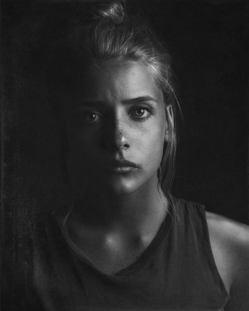
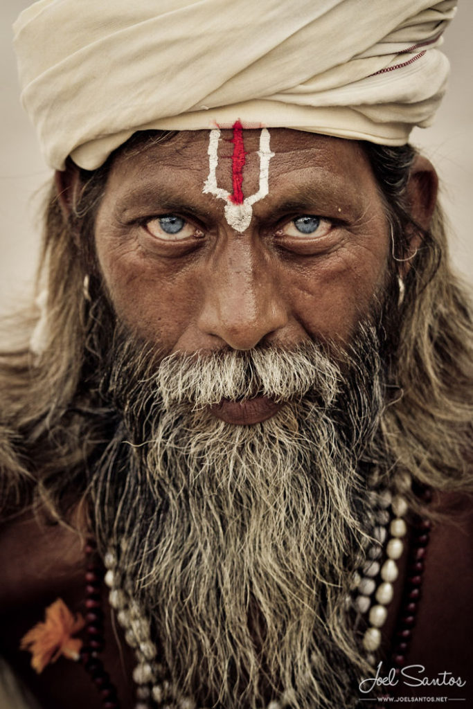
Portrait photography is an image of a person or group of people, capturing the personality of the subject. Lighting, backdrops and poses can influence the mood of the portrait, and further portray certain emotions and feelings.

There are many forms of portrait imagery taken in different ways such as head shots, half body, three quarter length, at different angles and heights, but they could fall into a few categories including:

Candid: Taking photos of people without having them pose or even realize their photo is being taken. This enables you to catch someone in the moment, creating a naturalistic photograph, that reflects the true emotions of the subject

Environmental: This type of portrait is taken in the subject’s usual environment, such as in their home or workplace, and typically illuminates the subject’s life and surroundings.

Formal: Formal portraits refer to photos usually taken for a specific occasion such as wedding or school photographs, where the subject is arranged to pose under chosen lighting conditions often in a studio.

Informal: The opposite of formal portraits, with a casual and relaxed mood to the image that shows the personality of the subject. These types of portraits aren’t usually taken in studio lighting, but are still positioned with effective lighting, with the rule of thirds and depth of field in mind.

Other examples of portrait photography:

Altered Landscapes – Del Grosso Inspired

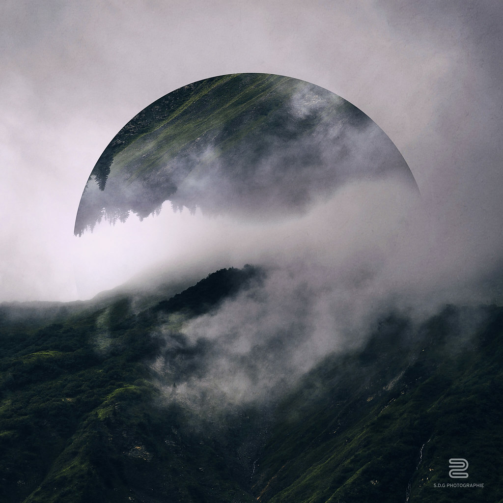
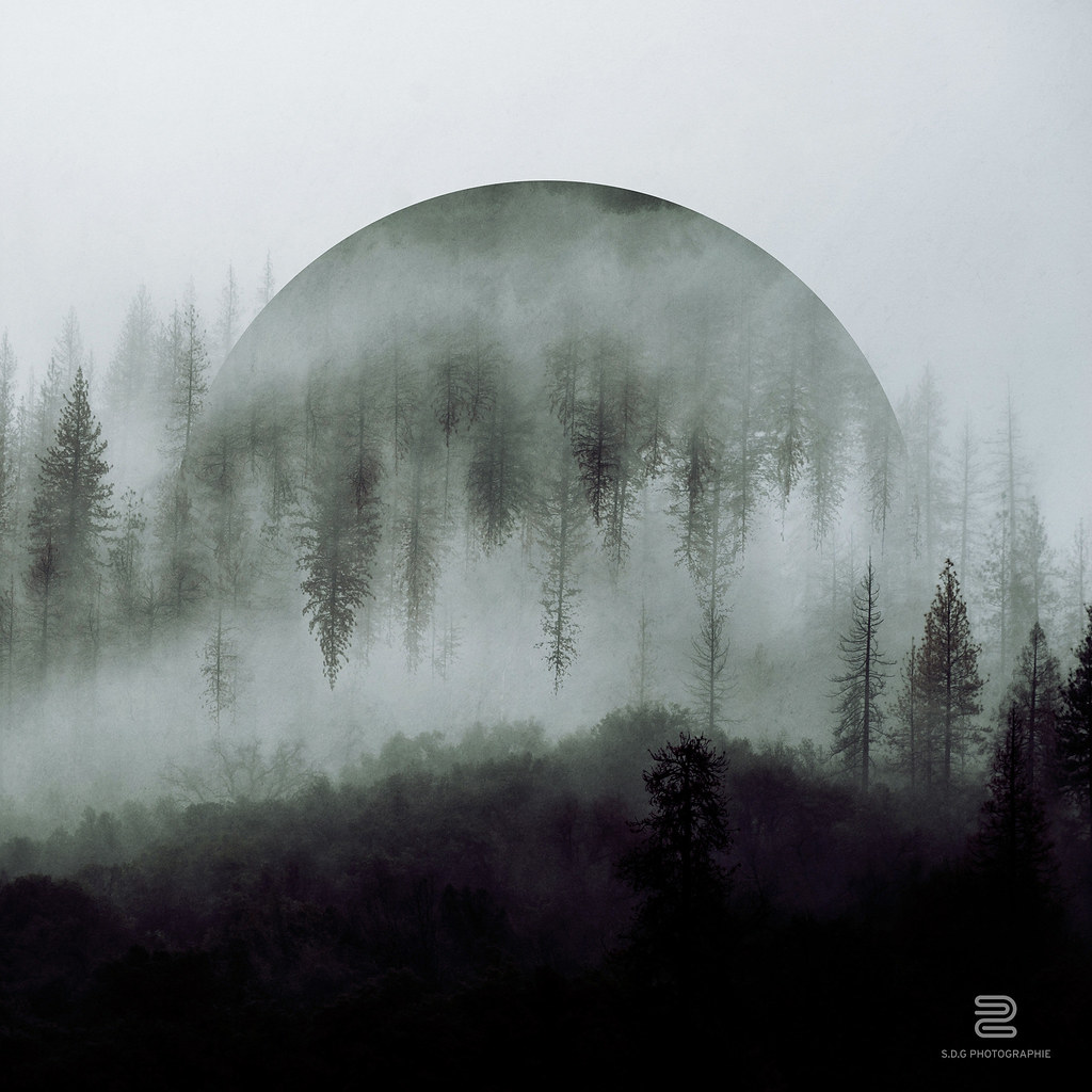
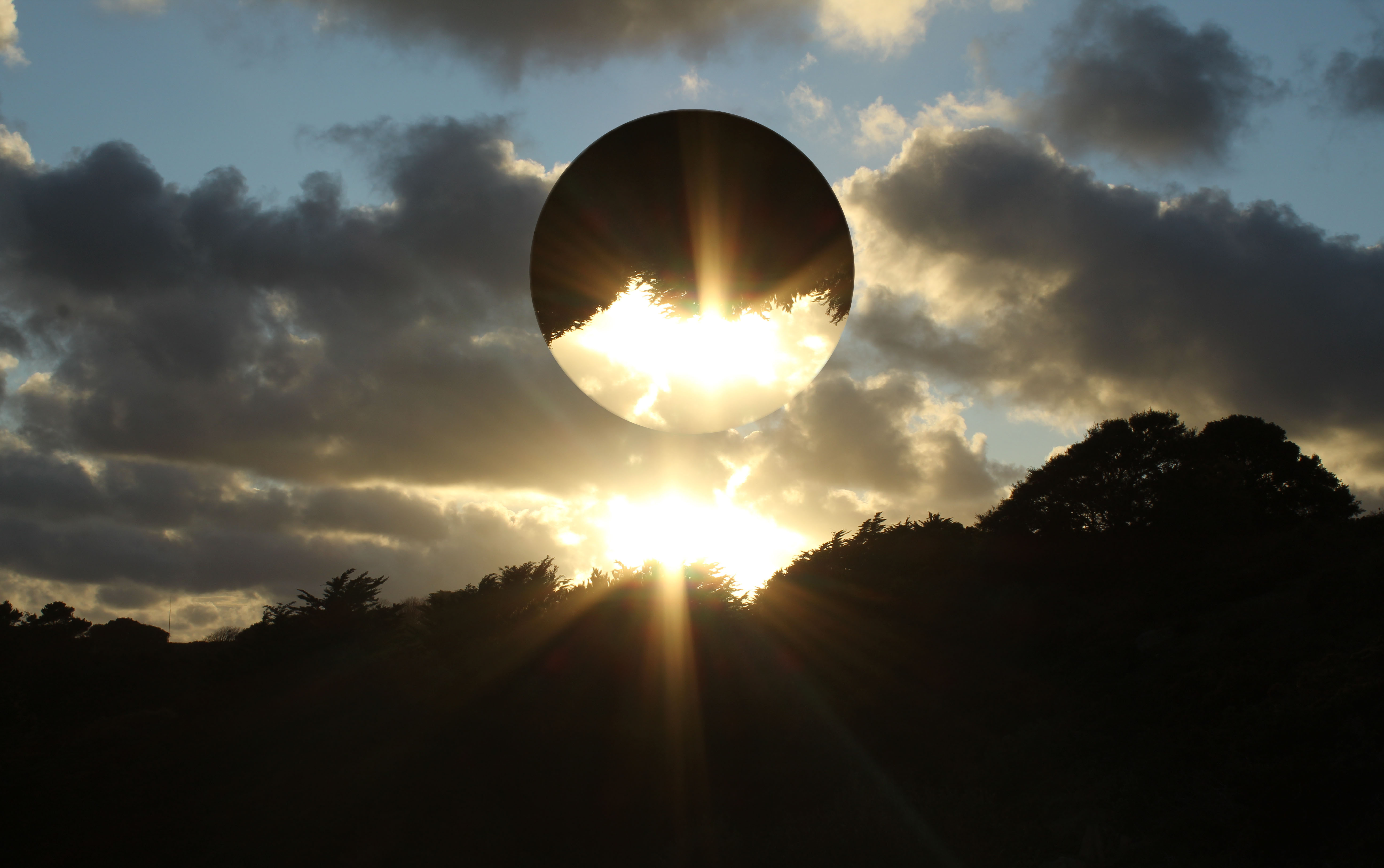
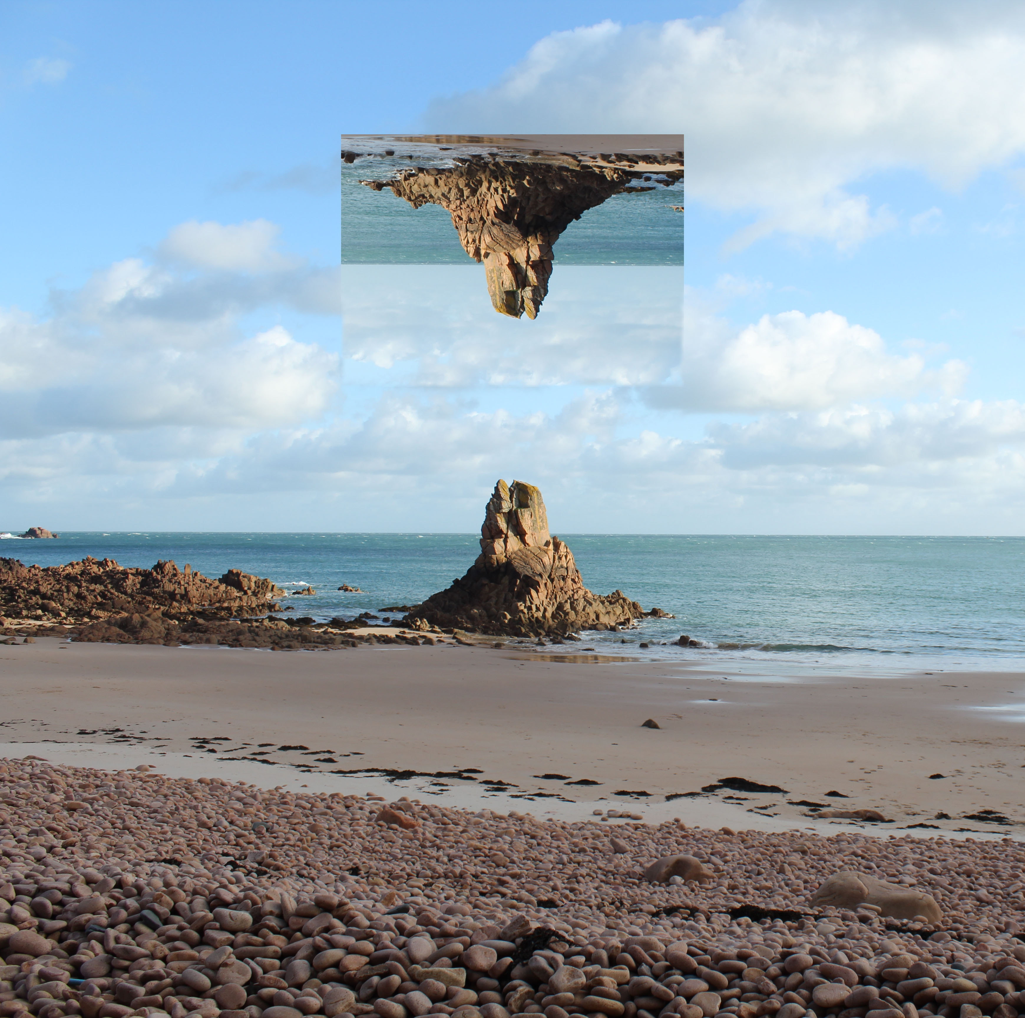
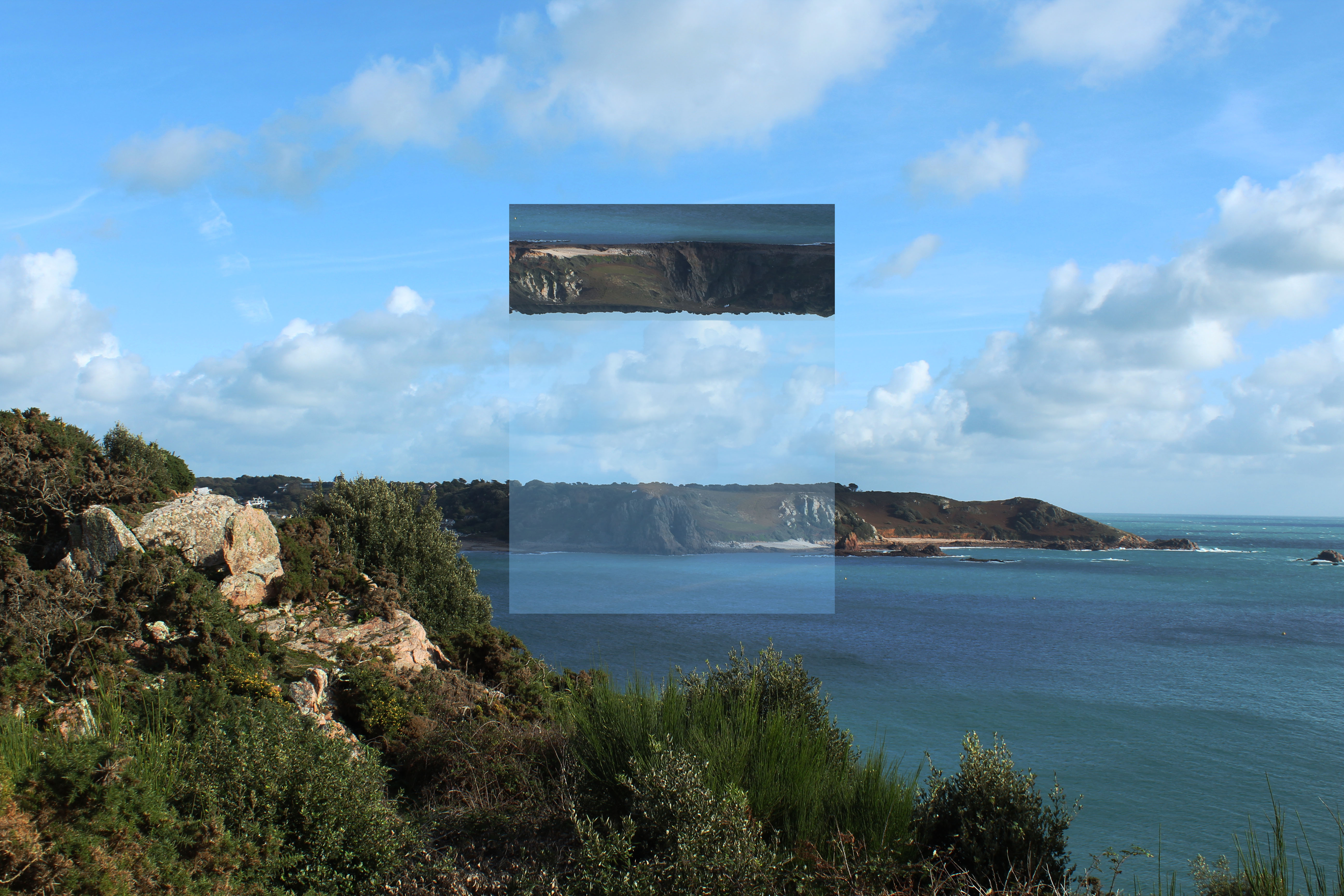
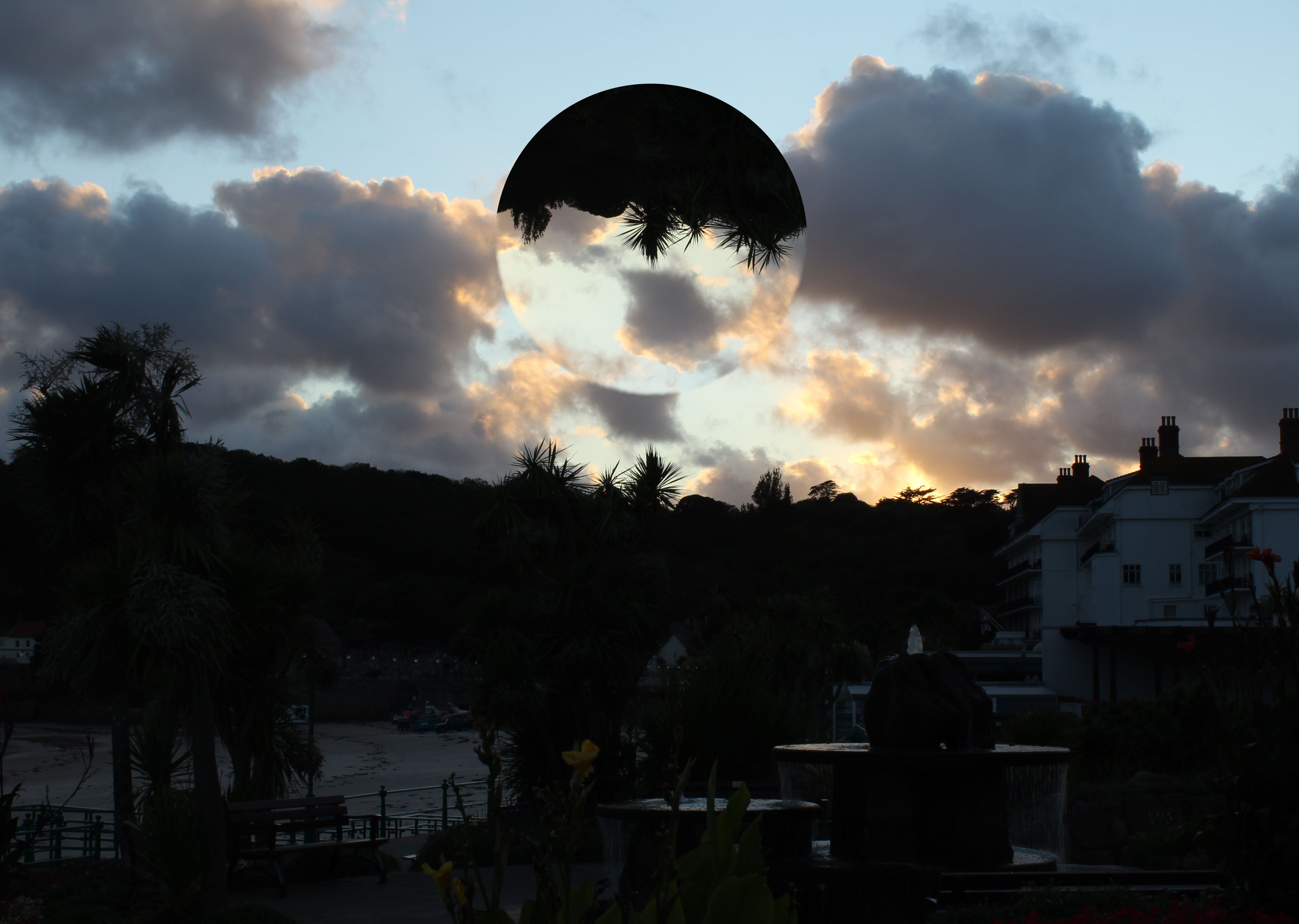
Sebastian Del Grosso is a french photographer who publishes all his work online. He created a photography project called ‘Geometrica’ that was inspired by Einstein.
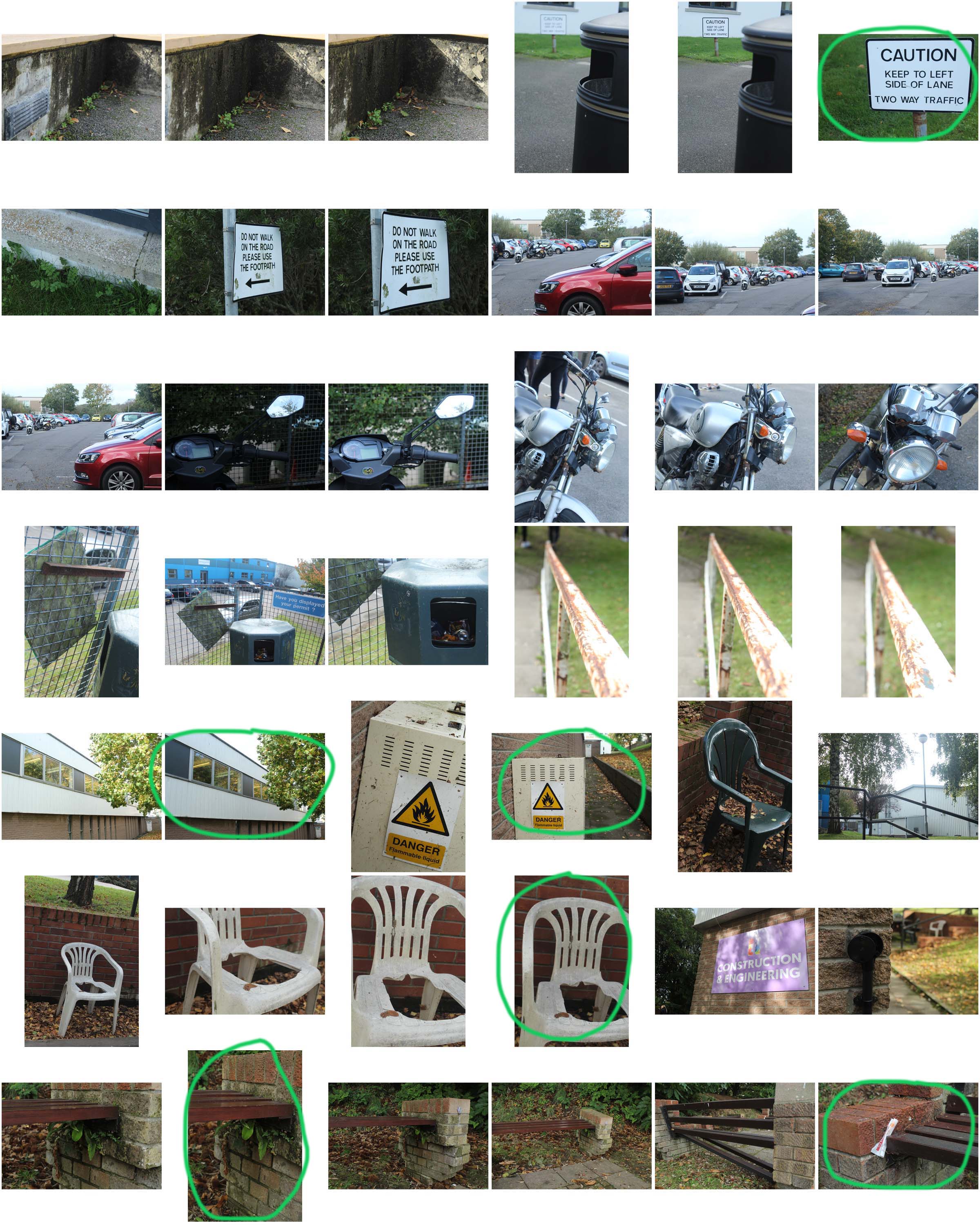
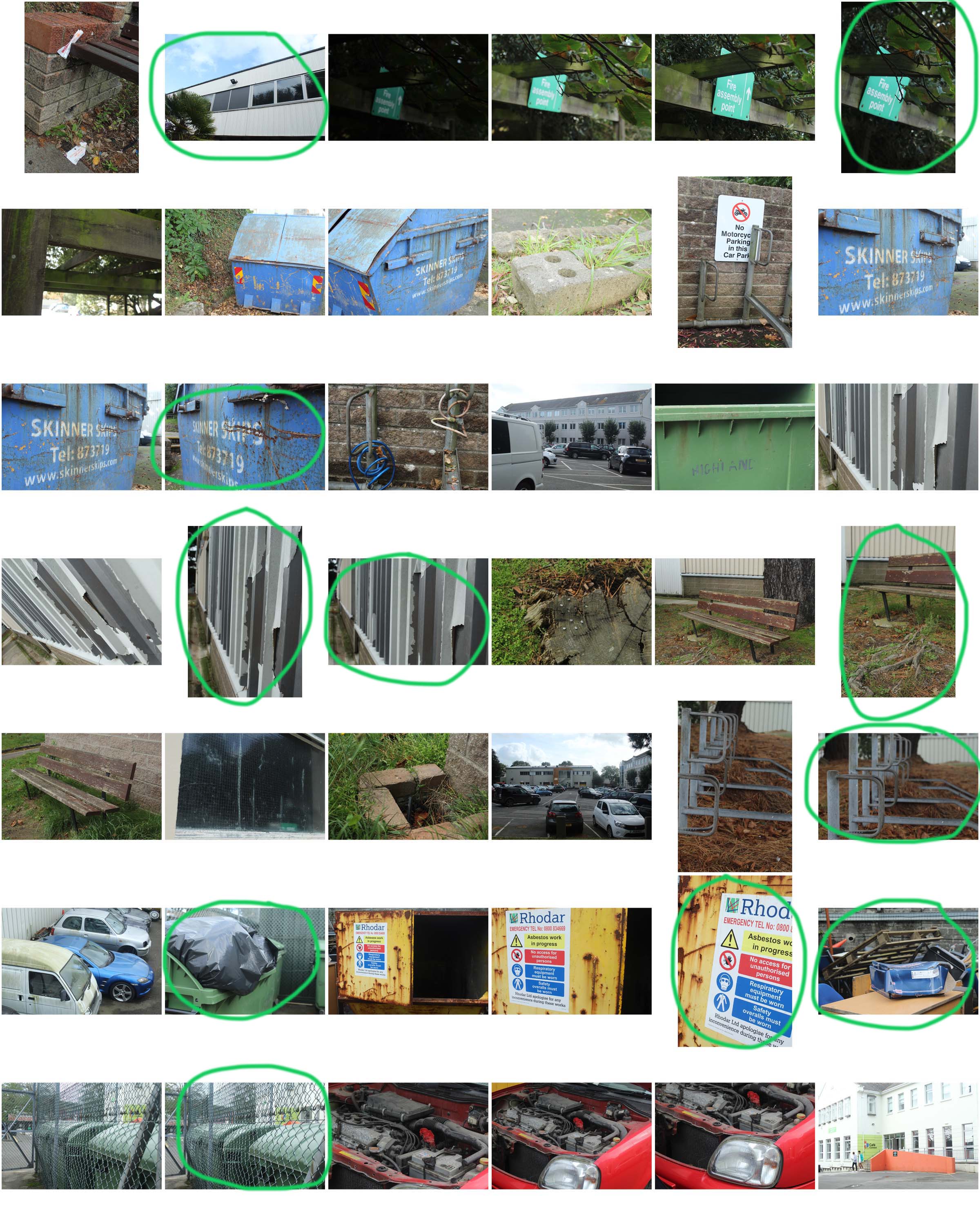
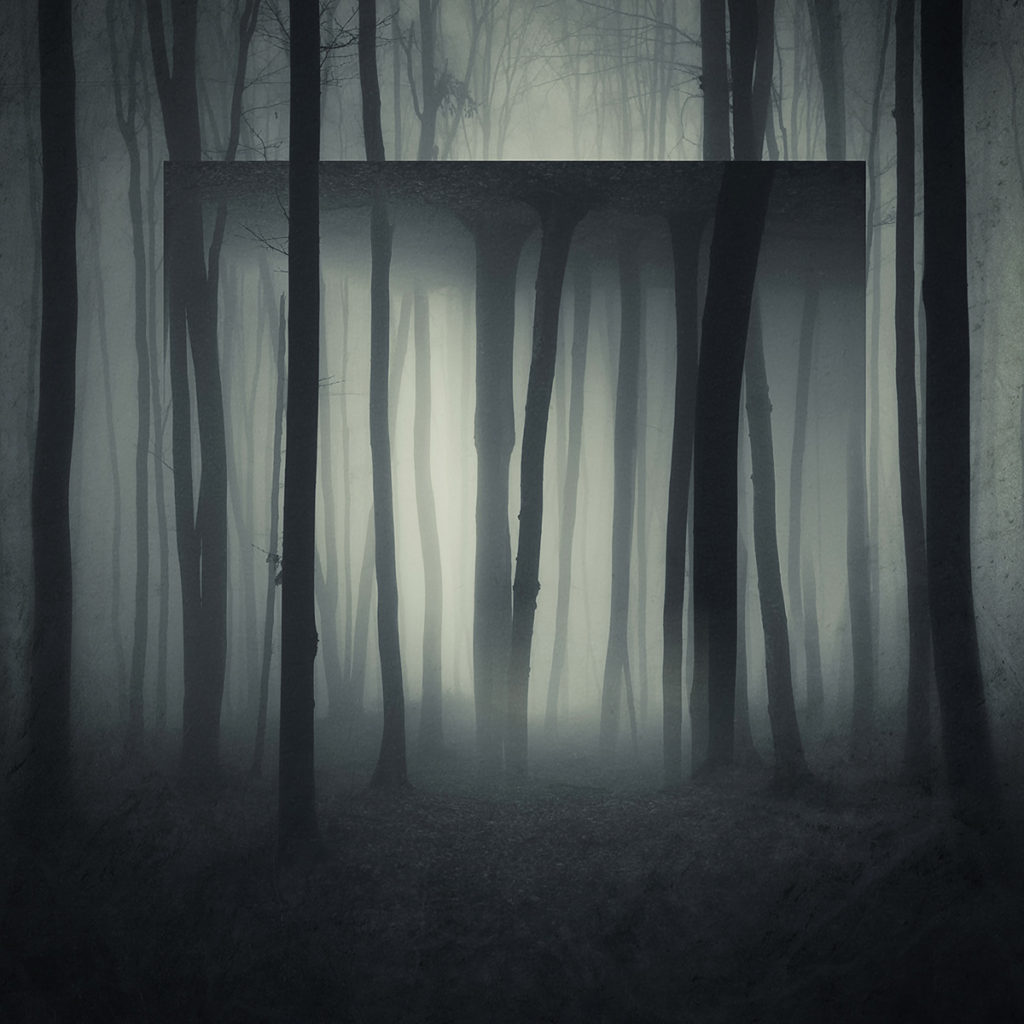
He uses a landscape picture and geometric shapes and plays around with its orientation, opacity and position copied onto the image. Some have clear altered shapes with hard lines and often mirrored, whereas others are only slightly resized or moved with soft lines.

Some other attempts inspired by Del Grosso

Altered Landscapes

This could be in the style of Tanja Deman as in its a landscape and urban picture stitched together, but isnt in her classic black and white, and is less dramatic
This is in the style of some dude i cant remember but i liked the extreme use of reptition, that makes the image confusing and difficult to understand
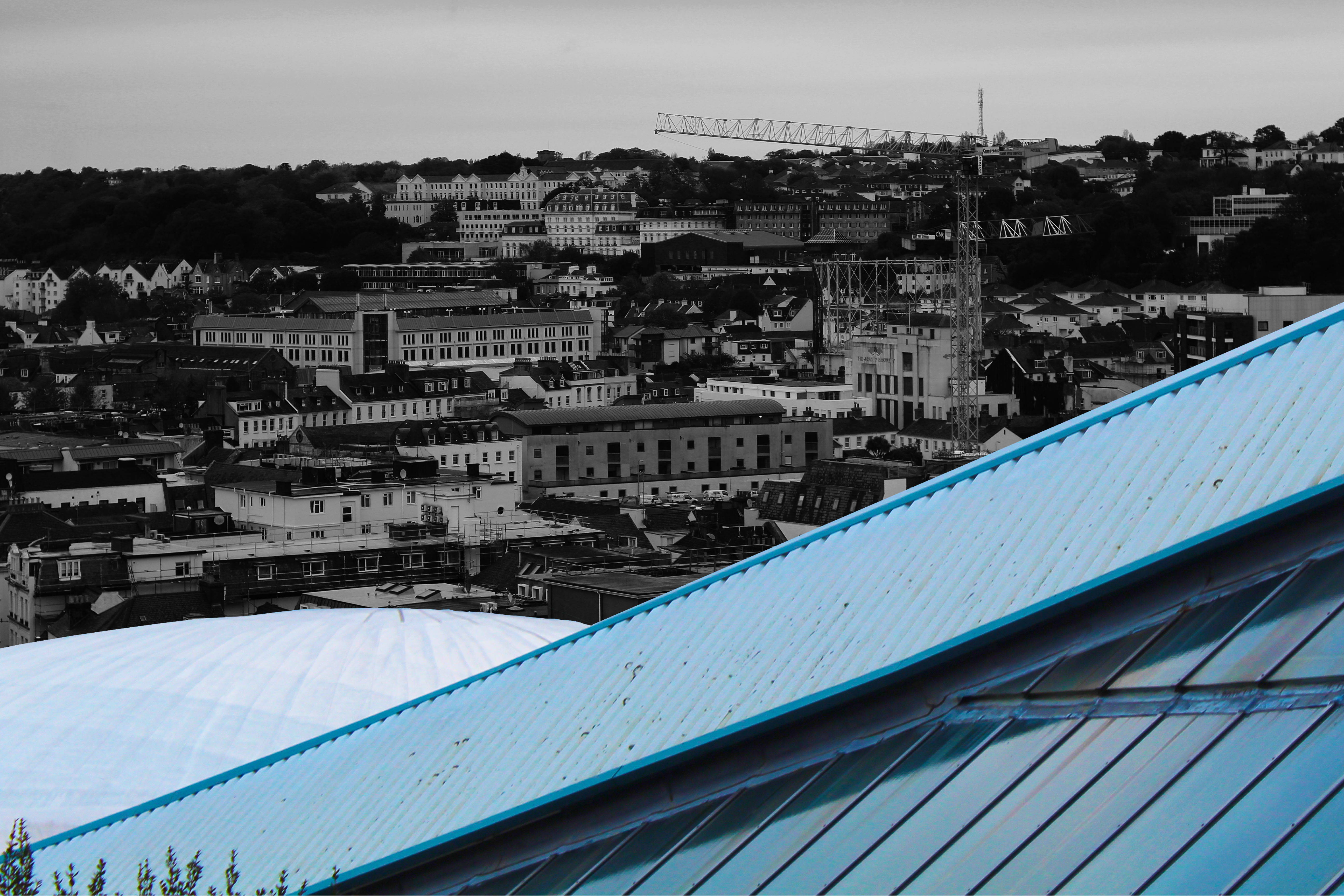
This isnt inspired by anyone but i wanted to incorporate lines and colour contrast, with the black and white busy background cut by the bright triangle and dome of the fort regent building

Edited Urban Images

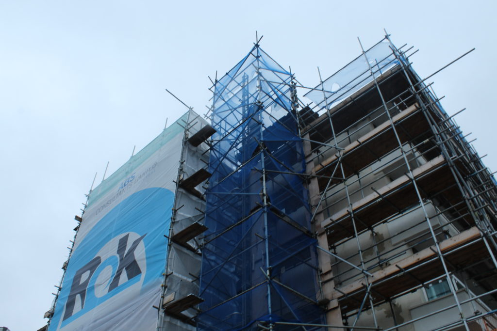
For this image i took inspiration from Keld Helmeder-Petersen and his black light style, using it to darken the center of the scaffolding to slowly get lighter outward, but still stand out from the grey sky behind
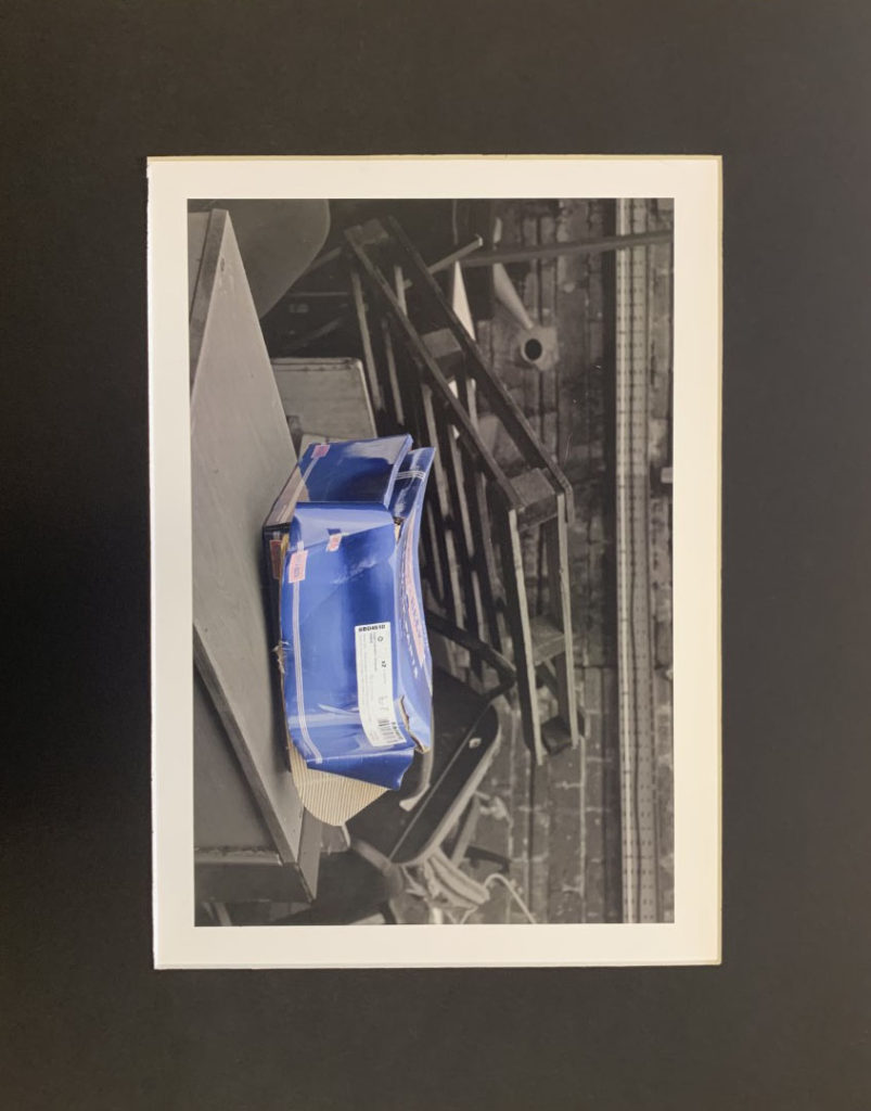
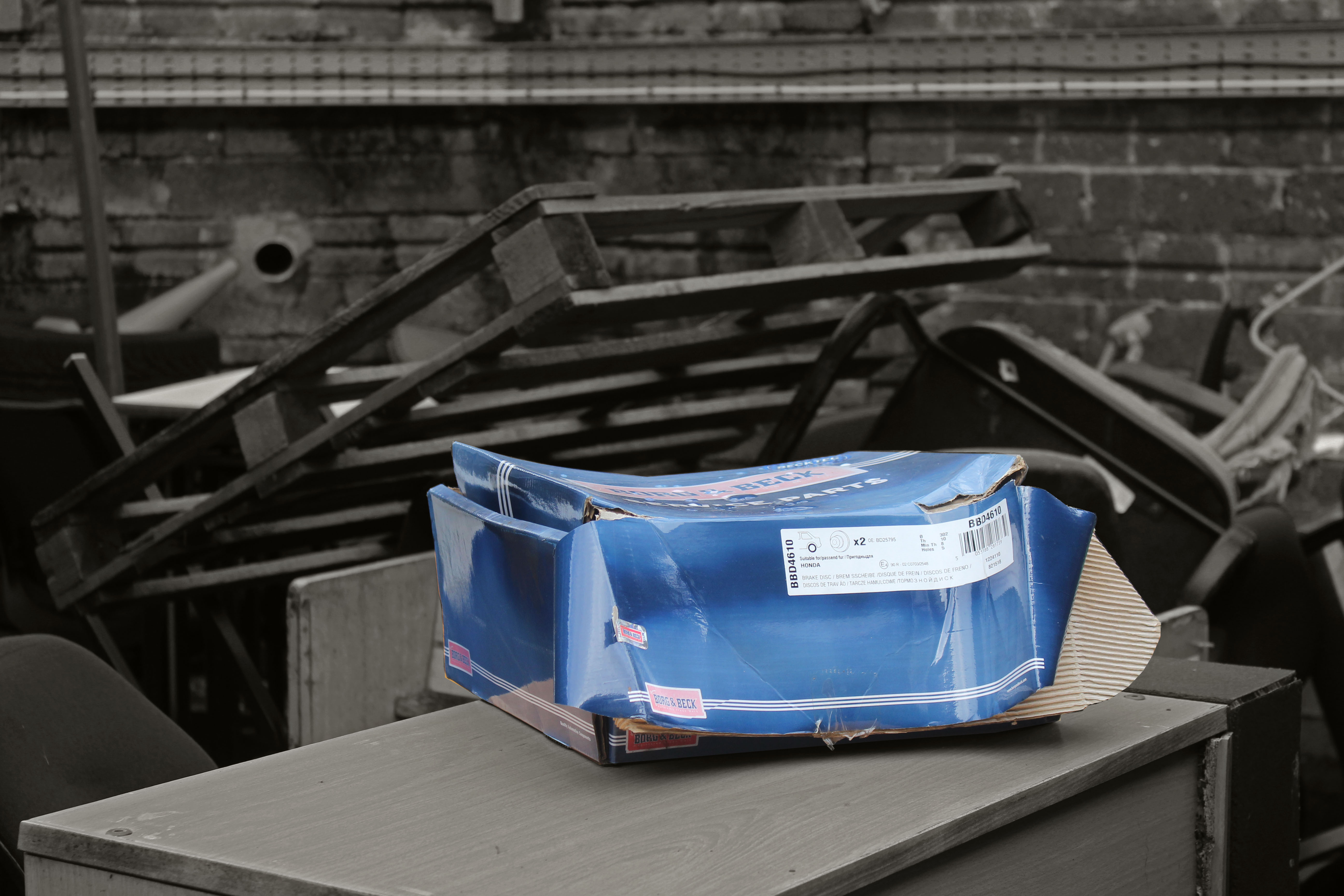
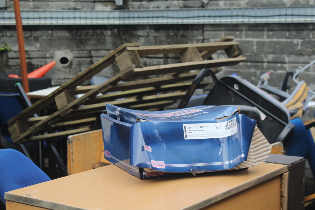
In this image i liked how cluttered it was in the background, and so thought by focusing on the box in the center,, and further leaving it unedited, would bring immediate attention to the worn out shoe box in the foreground
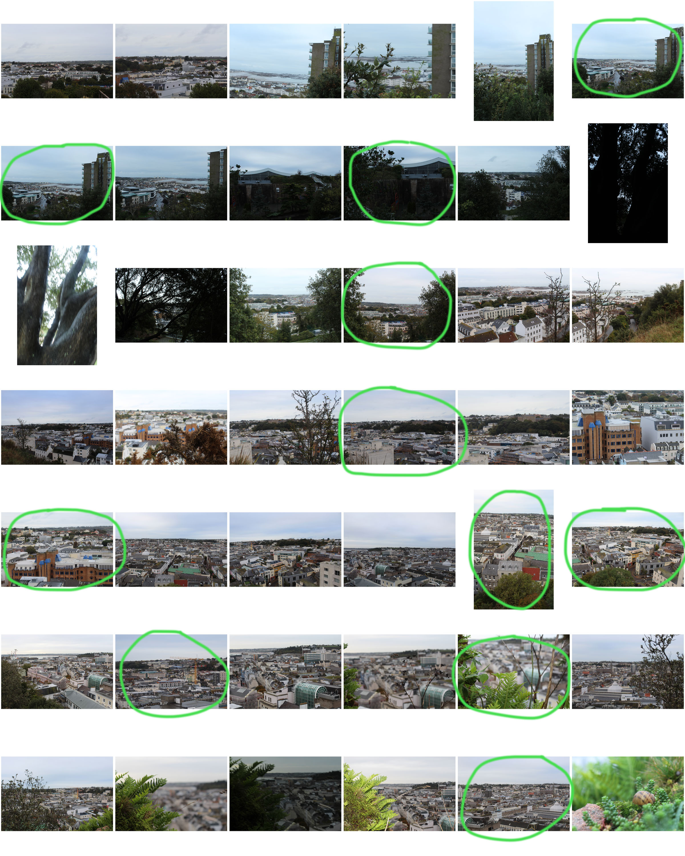
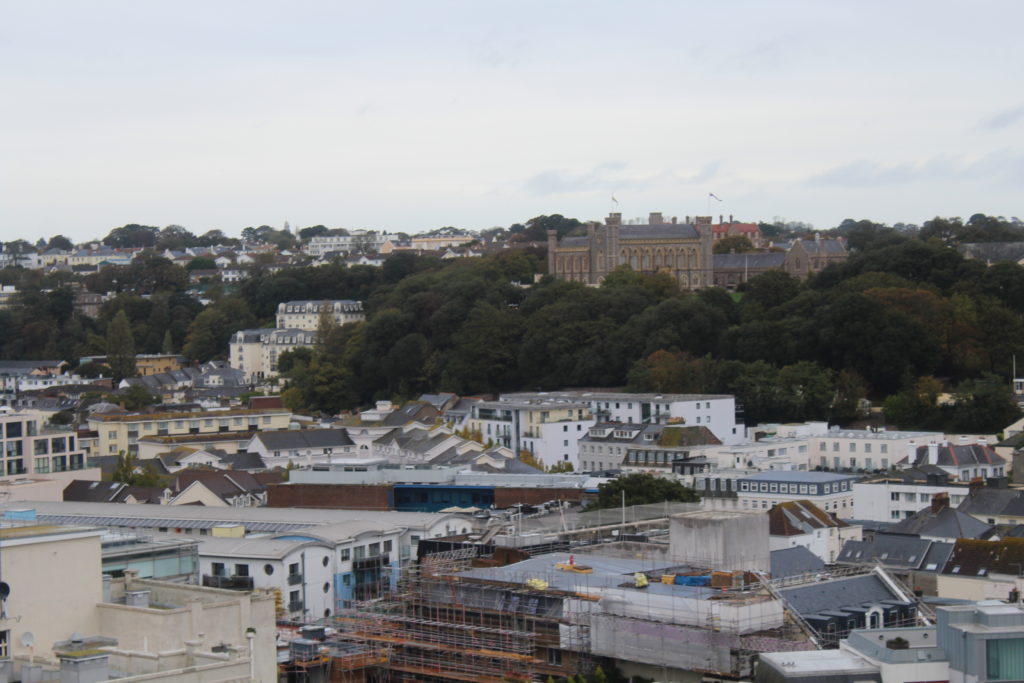
For this image i selected specific areas in the busy urban landscape, and changed the vibrance and contrast to highlight them, and then slightly enlarge them to further emphasize. My favourite section is the white building near the front as its very vibrant, and also the Victoria college building as its on the horizon and was easy to pick out, especially above the greenery.
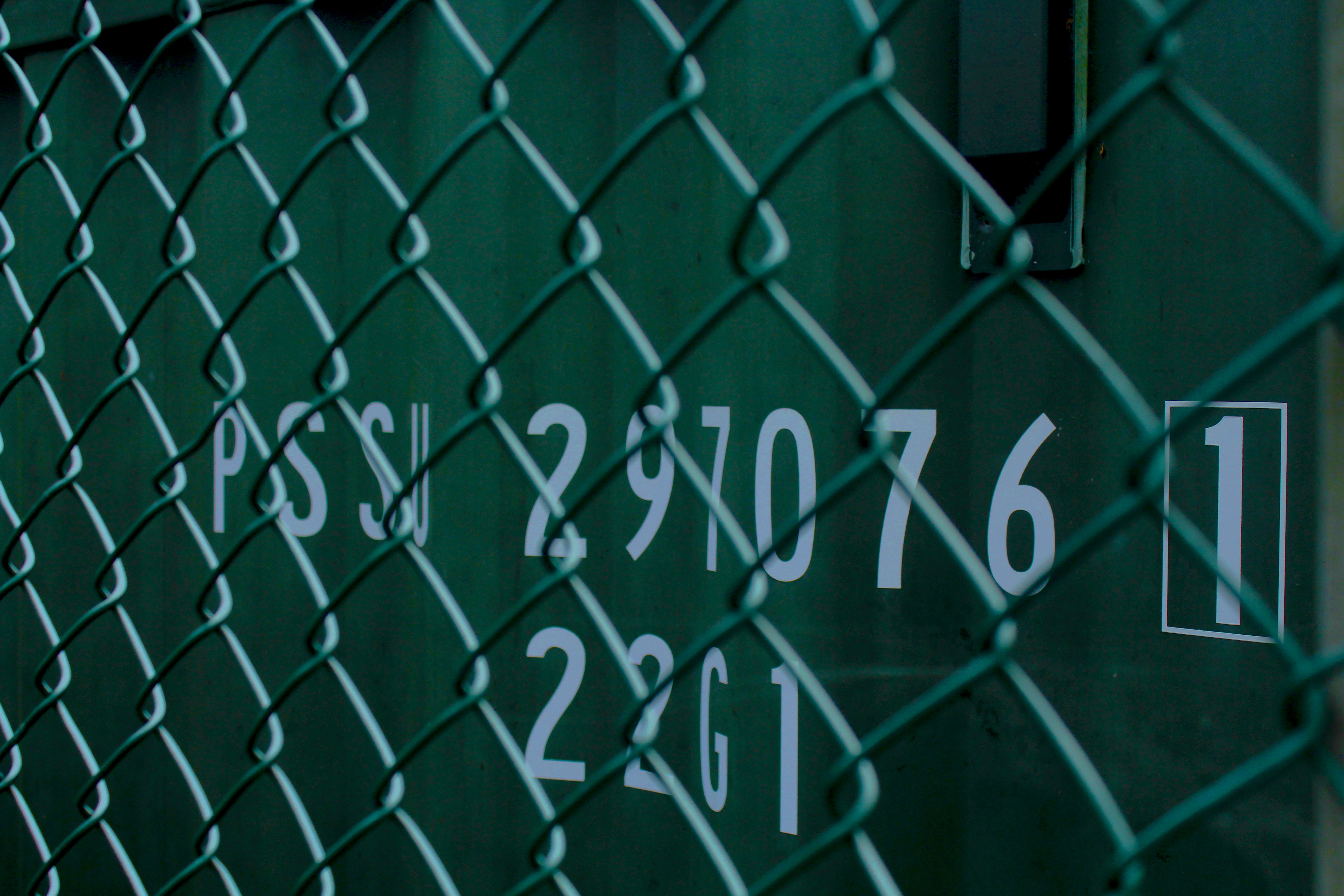
I liked the focus of the lettering on this image, through the cage as the repeating lines add a nice effect with the highlight of the white on the text and the side of the wire