All posts by Sienna C

Filters

Author:
Category:

Evaluation

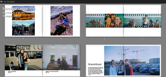
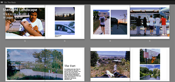
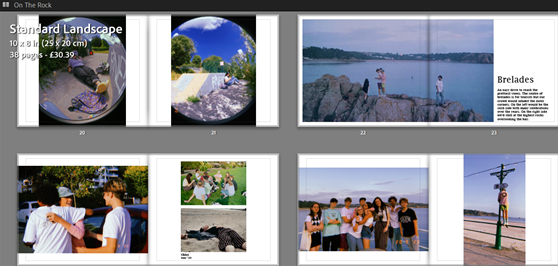
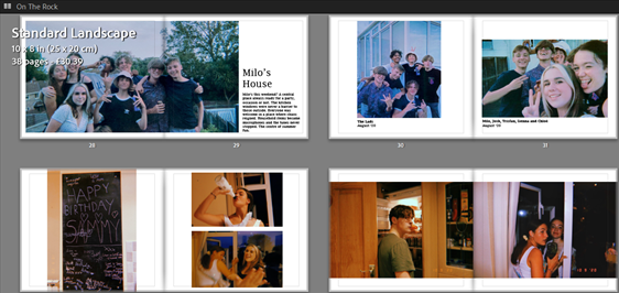
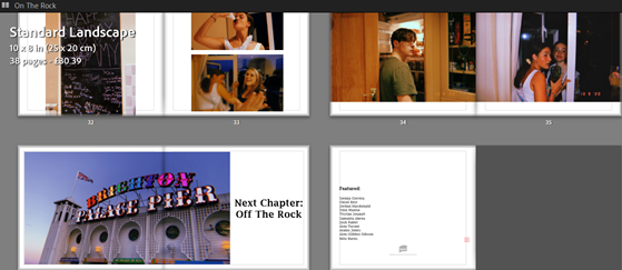
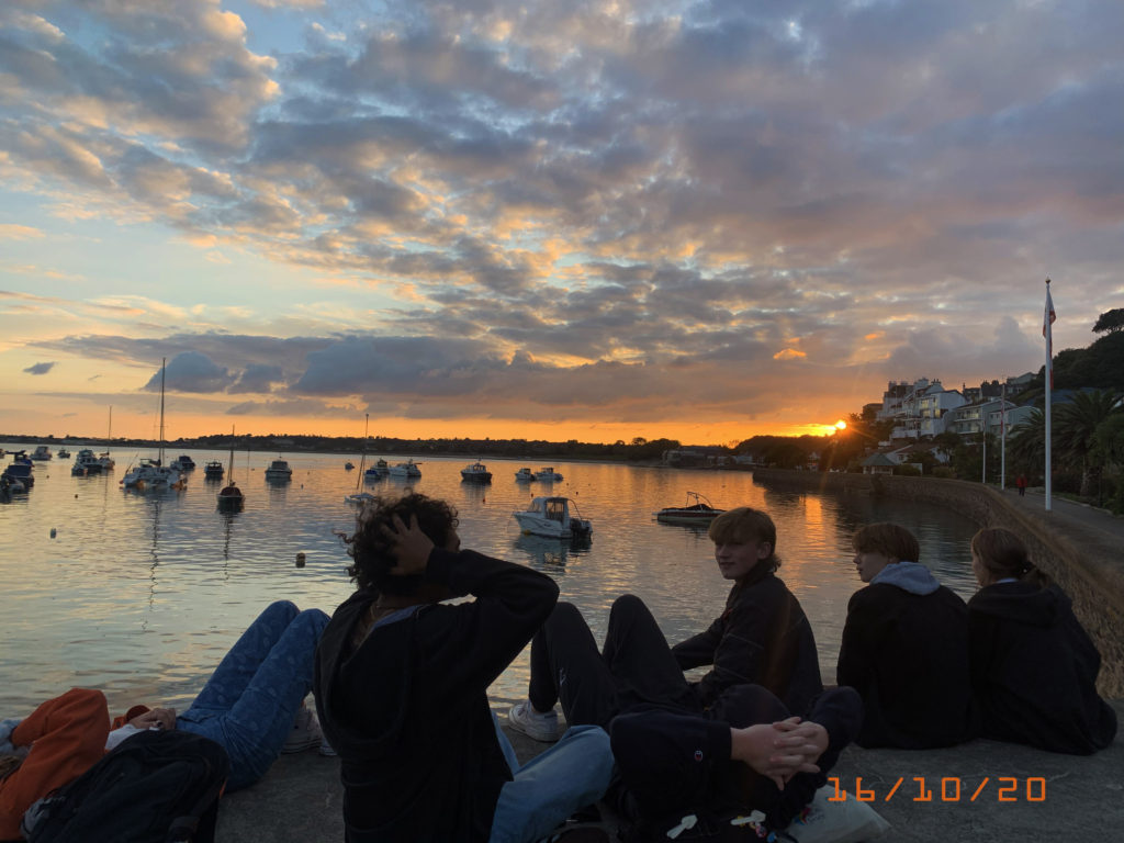
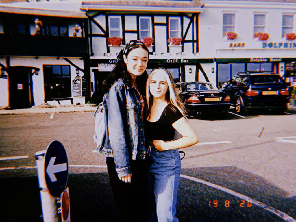
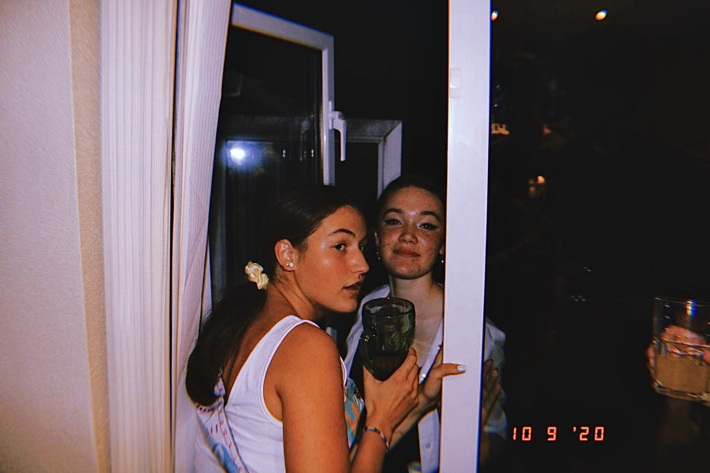
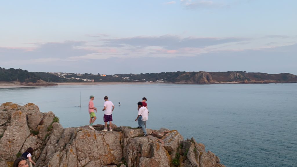
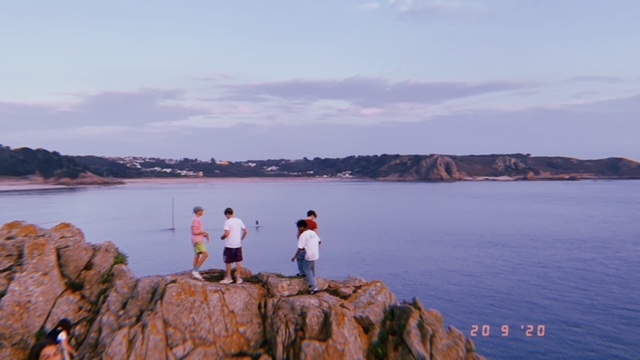
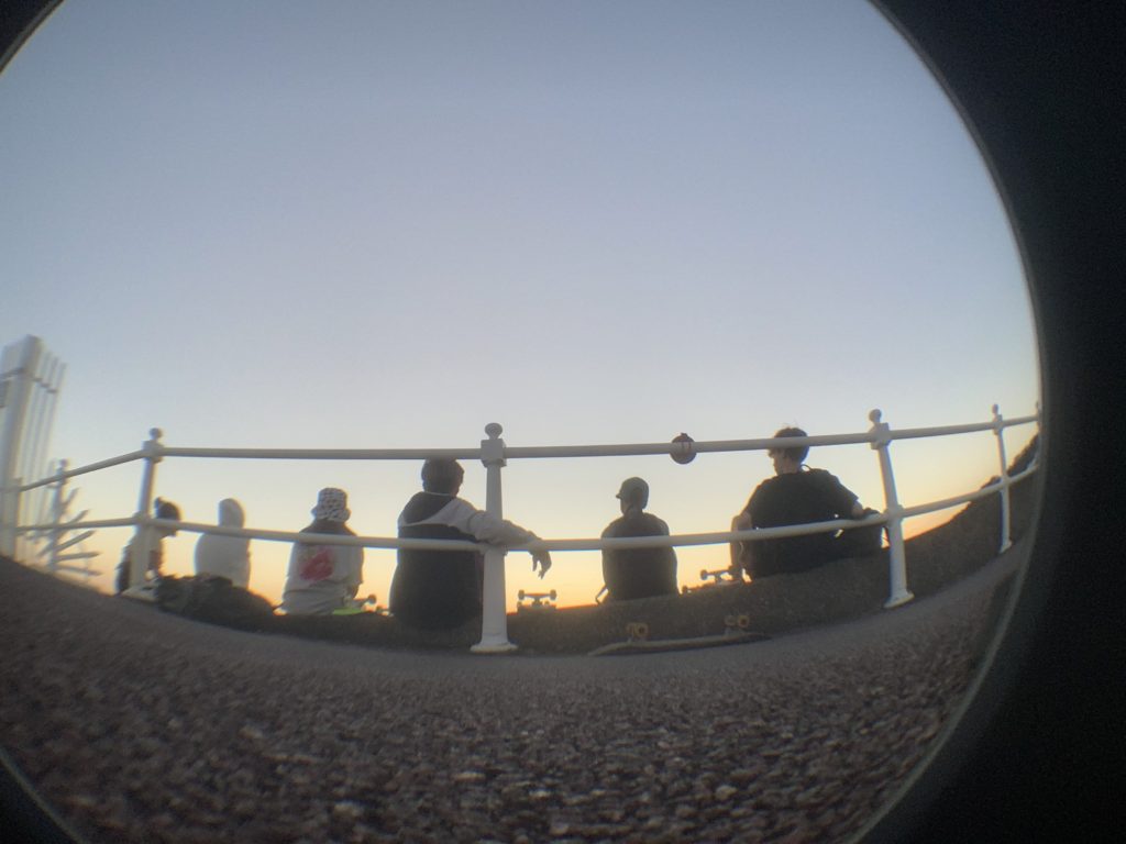
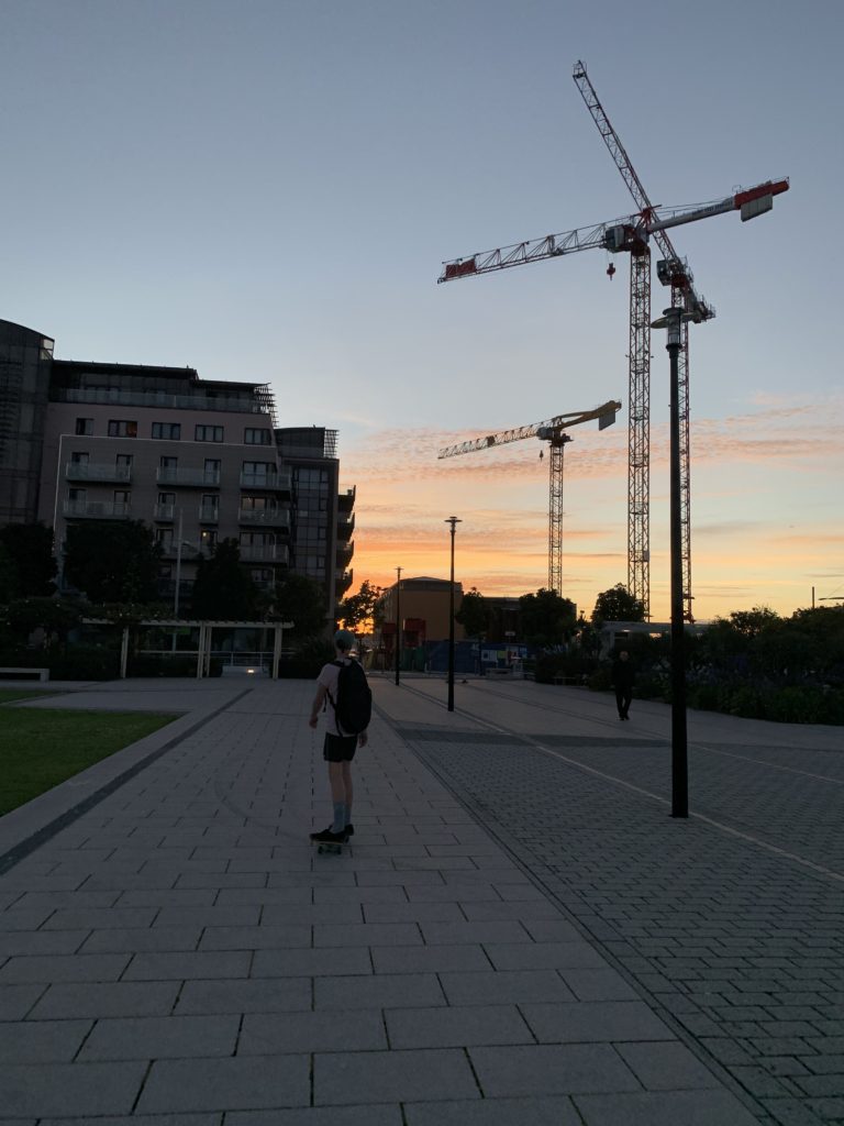
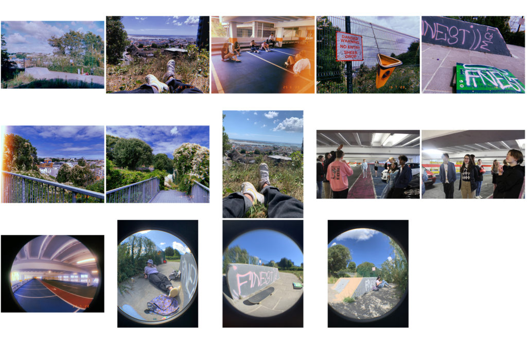
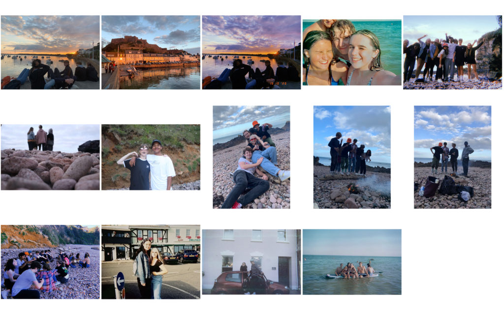
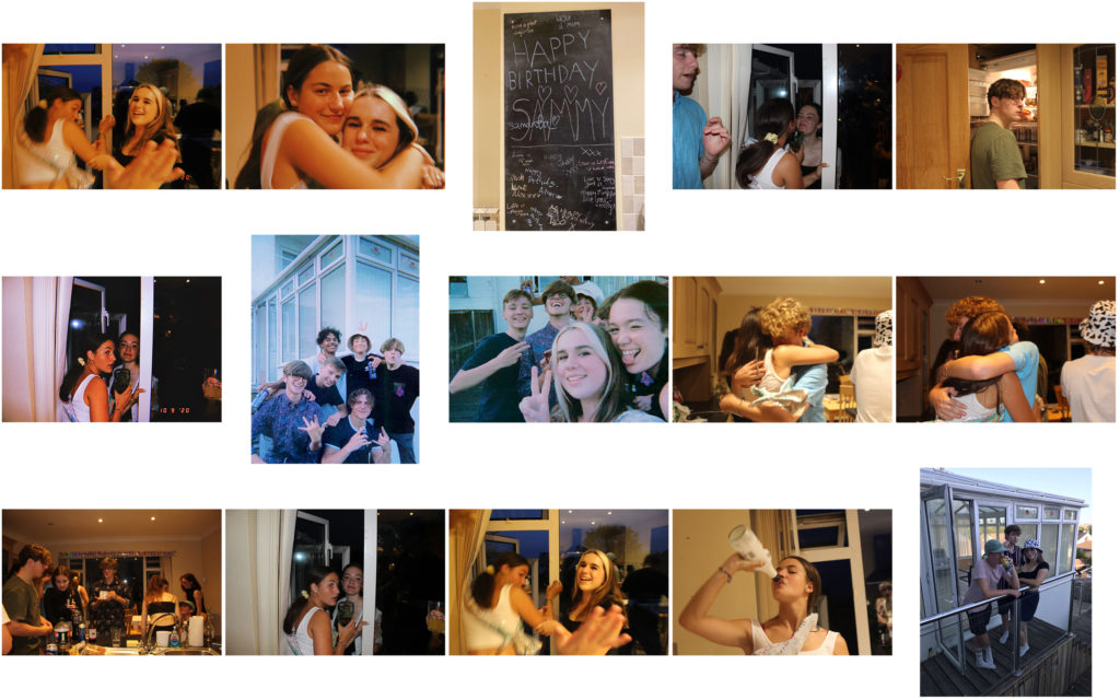
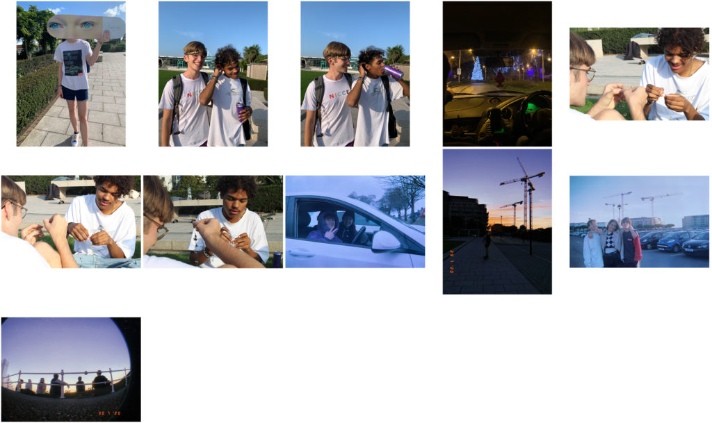
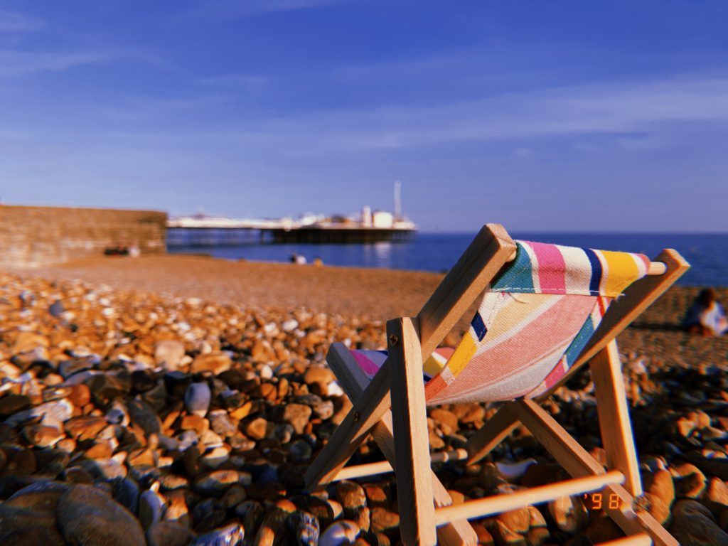
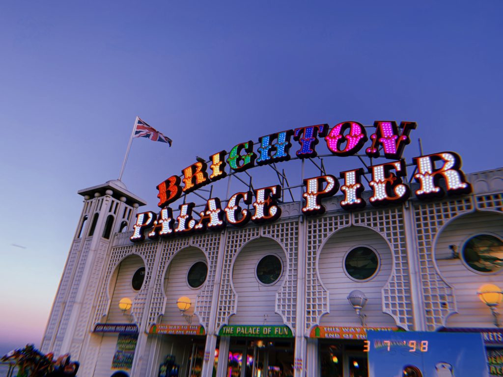
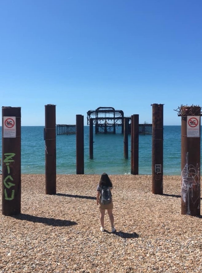
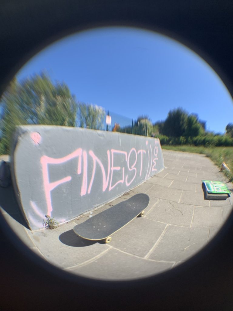
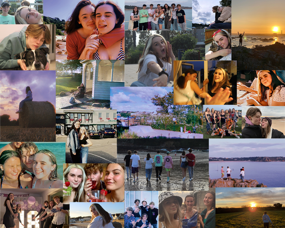
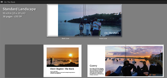
The exam brief was to create a project representing the theme of transition, and as i explaining in my statement of intent, i wanted to show this through exploring jersey life, and detailing pivotal memories and places on the island. I explored this in my book as two visible chapters, the first of summer life with my friends on the island, and at the end presenting the second chapter, as a nod to Brighton, leaving island life for university in the UK. For each location i began with a double page spread image, using the slang term our friendship group would use for that place as the title; however i left that as the only text for those title pages, as in my statement i was going to also caption those images, but once i started to layout my photobook, i thought more text took away from the displayed image. and then a few pages of images from notable memories made there, some captioning whose in the image, and some had a time stamp of the date. I then decided to only use one image of Brighton at the end, the Brighton pier with its iconic neon sign saying as such, as to show the transition to where the next chapter of my life is taking me.

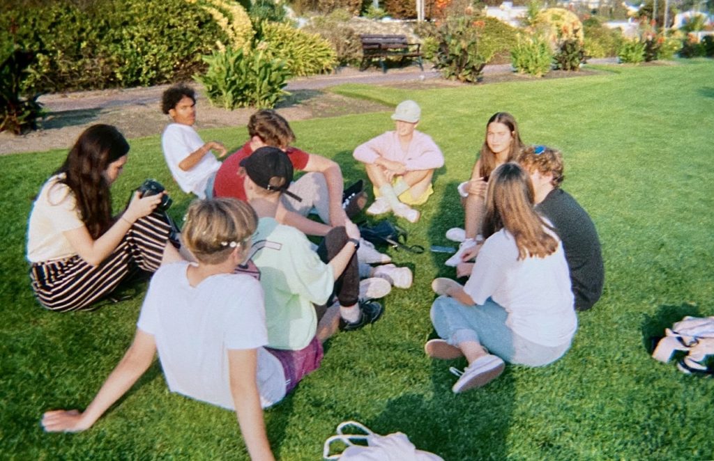
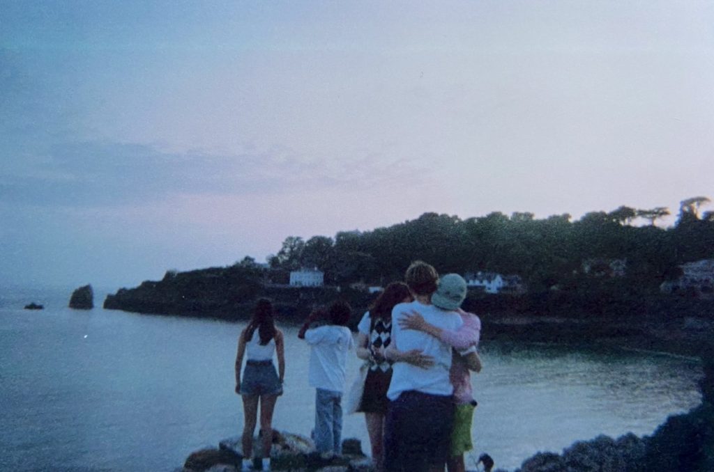
My entire book is mixed between group images and landscapes, showing us in each sentimental location. These images were archived, taken mostly from last summer, and followed the vernacular style of Martin Parr, who also used candid, imperfect imagery, mostly seaside capturing peoples daily experiences, which ideas i followed when choosing the images for my photobook. At the beginning of Parr’s book ‘The Last Resort’ he shows an old-timey image of Brighton (the chosen location of all the books images) and at the end uses another titled ‘New Brighton’ which unintentionally matched with where i’m moving to university, but follows the same idea of a ‘new chapter’.

My final product, the photobook, contains 40 images, including the cover image, curated to tell the narrative of a group of teenagers going through island life. Overall I am very happy with my final book and the way it looks together as a whole. I think the casual and candid style of my images tell a personal story of my adolescent life, along with the bursts of text which gave a further insight into my island memories. If i were to add to or re-style my book i would probably mix in some more large landscape shots, to capture more of the beauty of each location. However i am very happy with the outcome of my project, and due to it highlighting my personal experiences, it will be nice to have this book and be able to look back on my teenage life in the years to come.

Artist Reference – Martin Parr

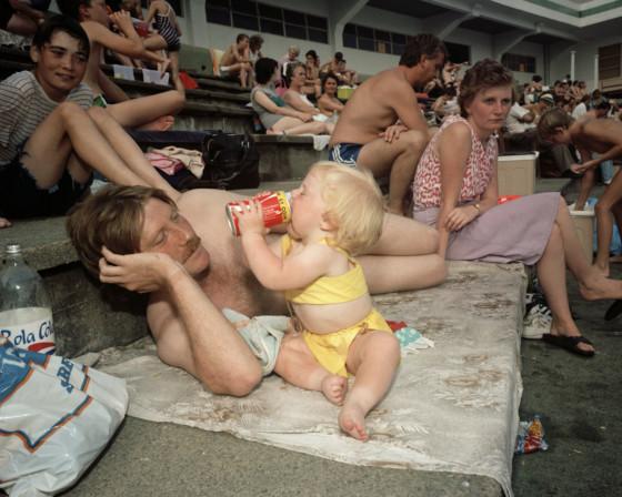
Martin Parr is a British photographer and photojournalist whose work is often defined by its depiction of people’s leisure activities, either as a family, among friends, or alone. He has made projects in many different locations over the decades, but he has said that “The beach is always going to be an integral part of what I do – it just goes on and on”.
His photobook “The Last Resort” is a prime example of this. Taken in Brighton in the 80s, it shows a typical British summer day out for the normal people of England at the time, without glorifying or demonising the situation or the people. His signature use of vibrant colours and photographic flash make these images seem as though they could be found in anyone’s old family photo album, making them feel distinctly human and candid.

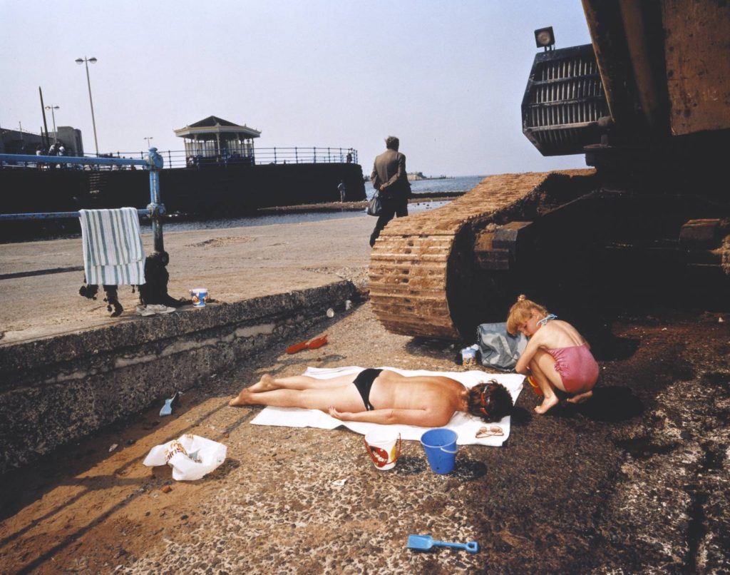
This photo is a prime example of Parr’s photographic style and the type of subjects he had in his images. The two children in the centre look like siblings and so it is an example of the sort of family dynamics of the time, where people would often have larger families and the children would be expected to look after themselves and each other to a certain extent. The colours are saturated and it’s clear that flash has been used, even though it looks like a bright and sunny day.

Editing

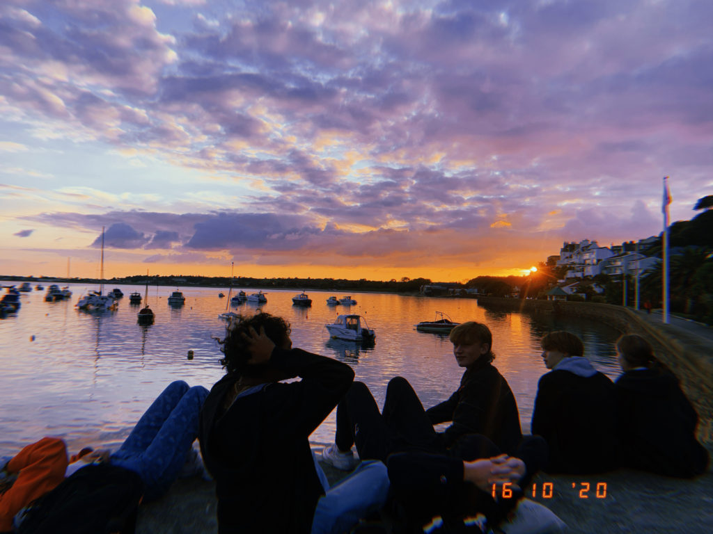
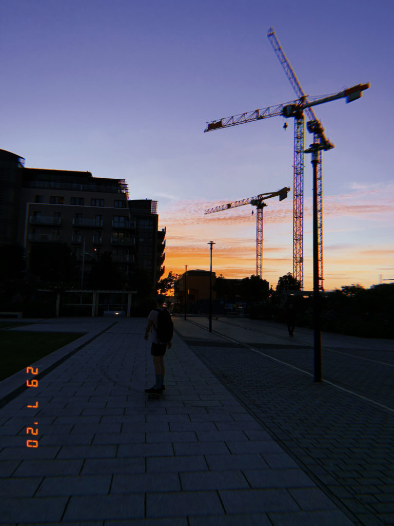
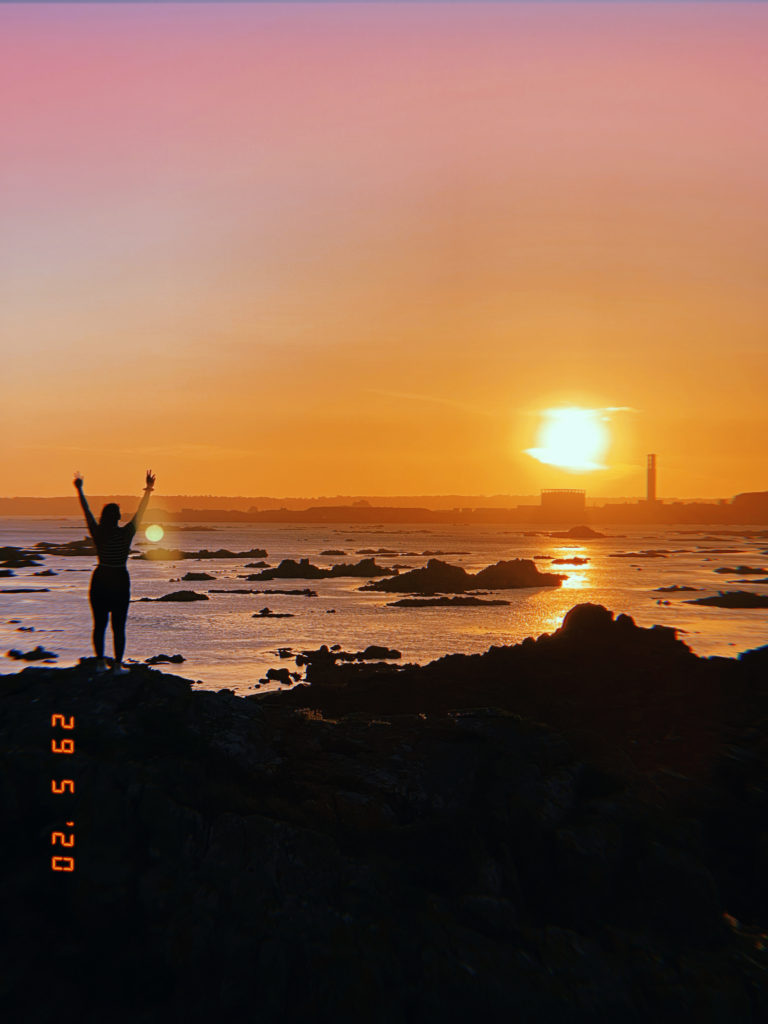
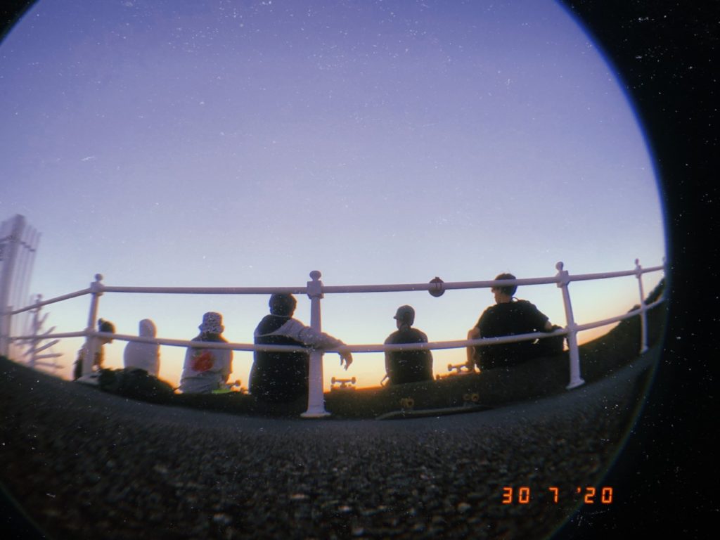
For my images, i intend to add a time stamp as they are mostly archived images, but also edit the colours too seem more ‘glowy’ and contrasted. I am deciding between editing all images on photoshop and adding my own timestamp, or using an application (HUJI) that will add a timestamp and change the contrast itself, and correct it after.

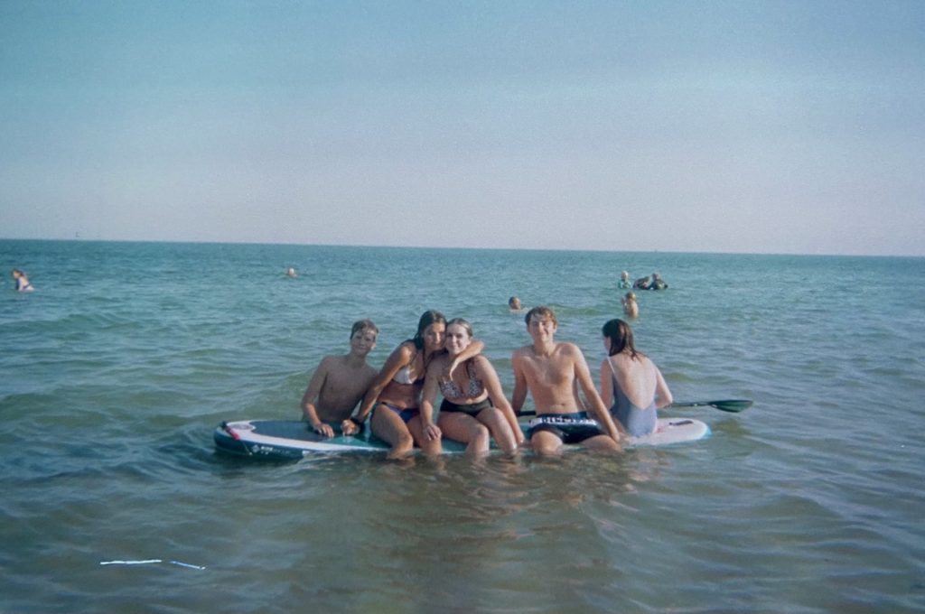
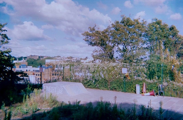
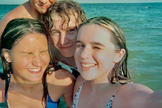
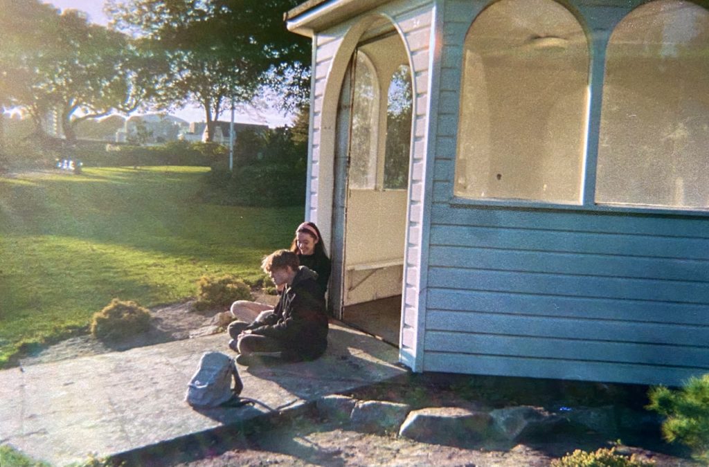
I think i will add the huji effect to all of my images and then edit them further in photoshop to colour correct it and bring it back closer to the original, but with the timestamp. However, for the images i’m using that are disposables, i may have to edit the originals in photoshop as i wish to keep their natural colour, and then use a timestamp as text under the image, as i will have to find the date they were originally taken, not developed.

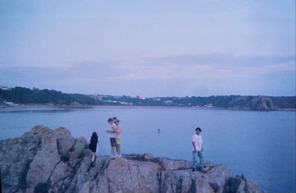
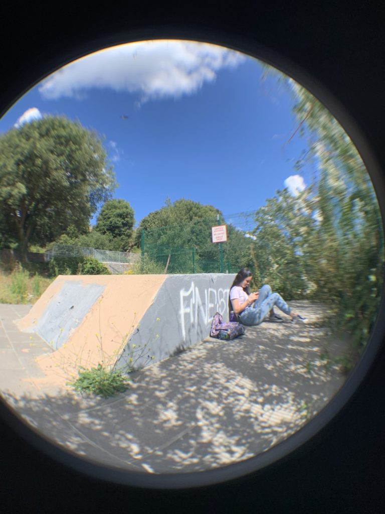
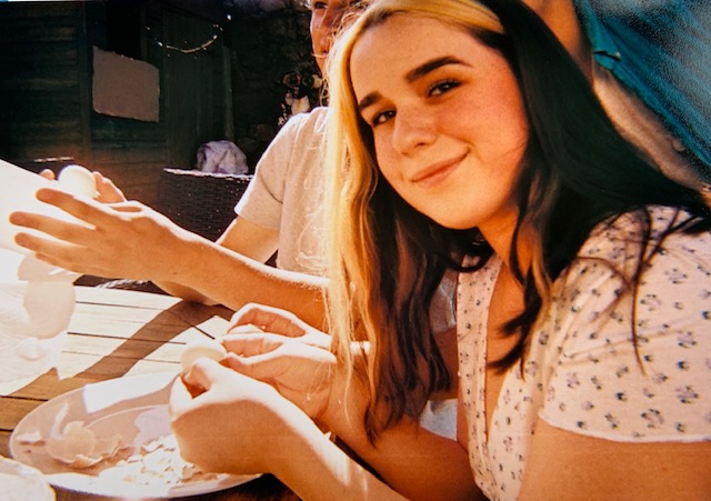
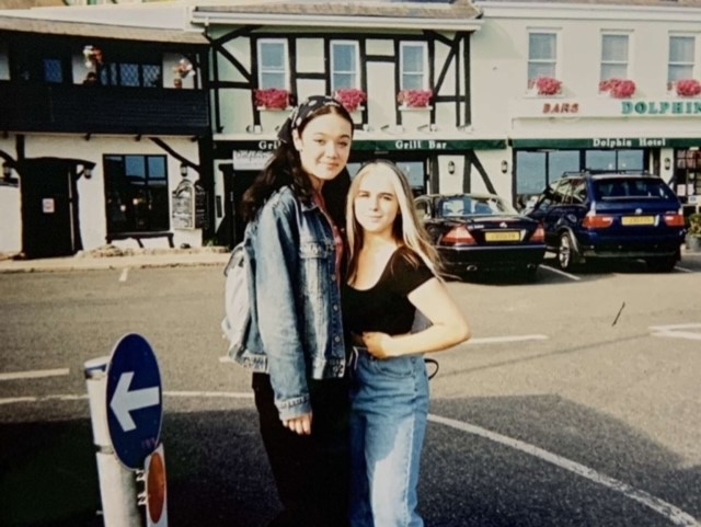
Disposable examples:

Selection Process

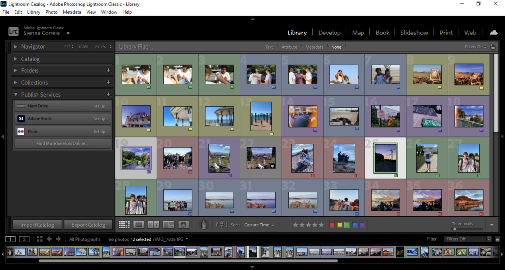
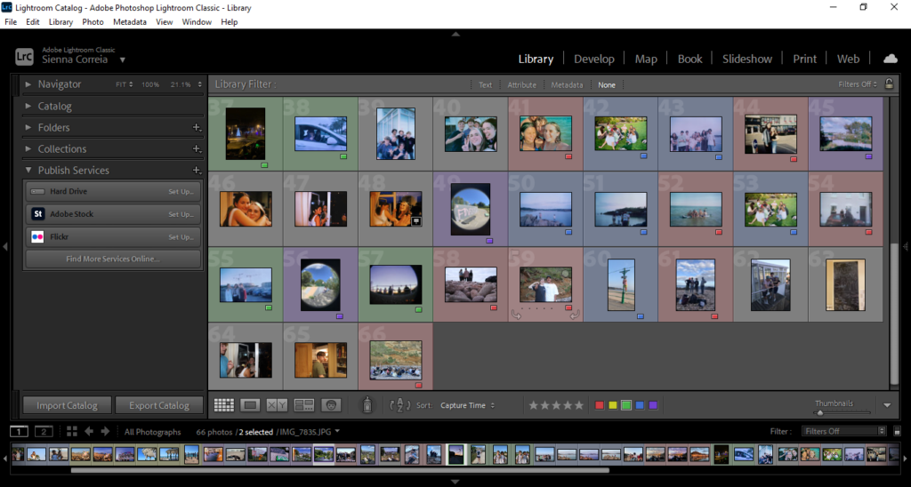
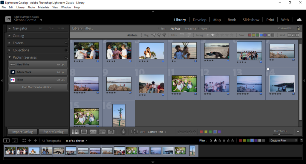
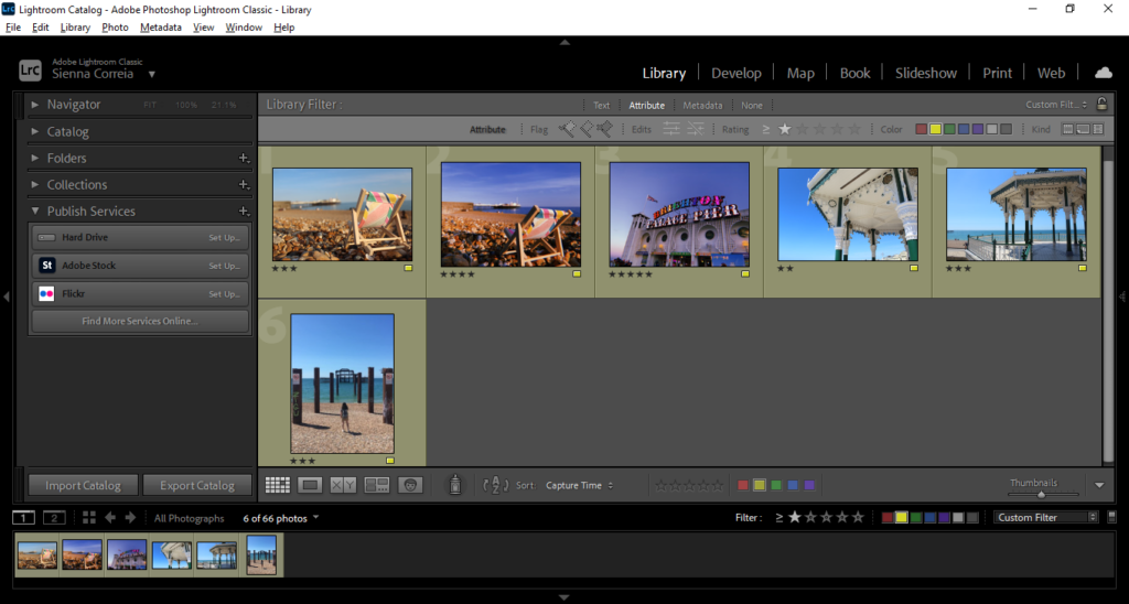
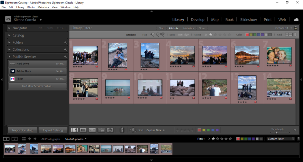
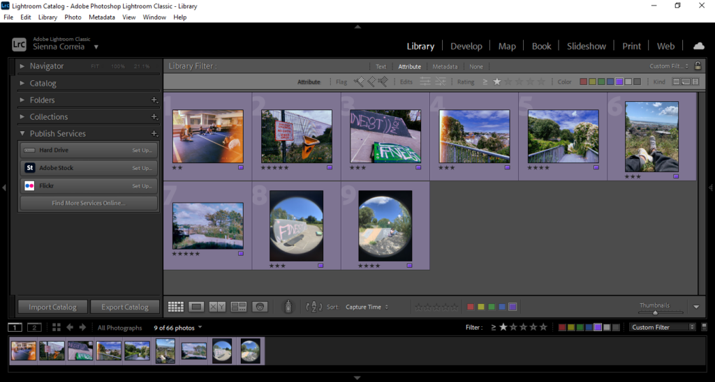
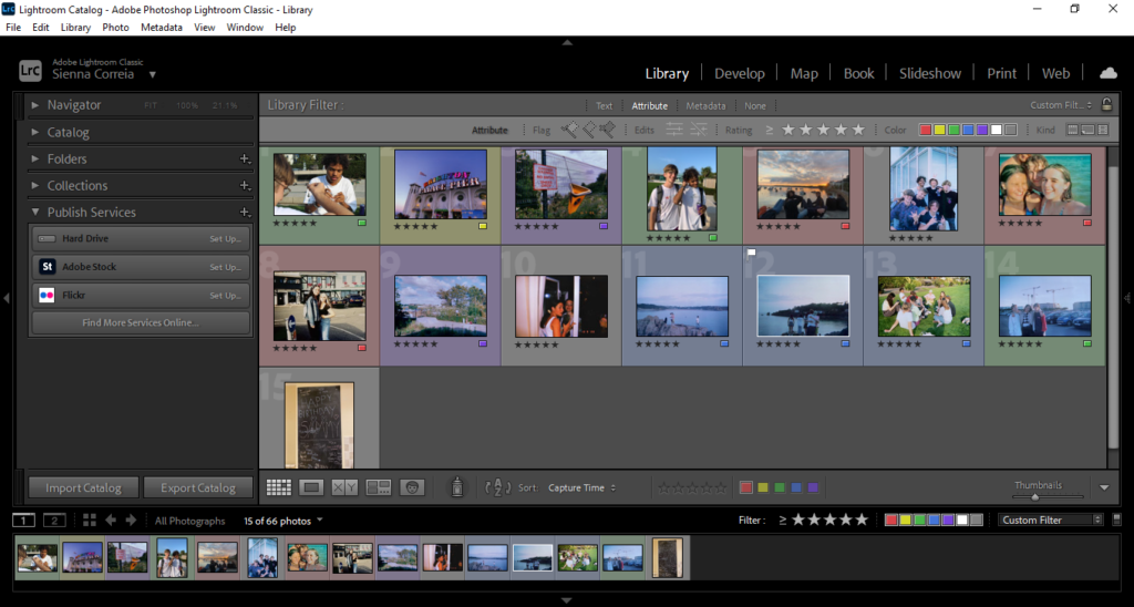
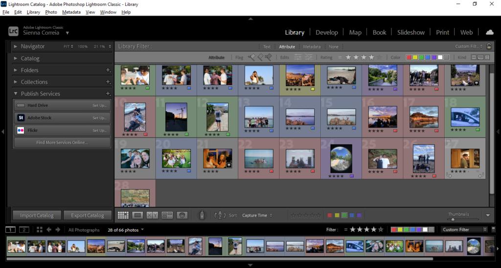
I imported all my images into lightroom and gave them all a colour to create a key for which setting each are

Green = Waterfront

Blue = St. Brelades

Yellow = Brighton

Red = Gorey

Purple = Fort

None = Milos House

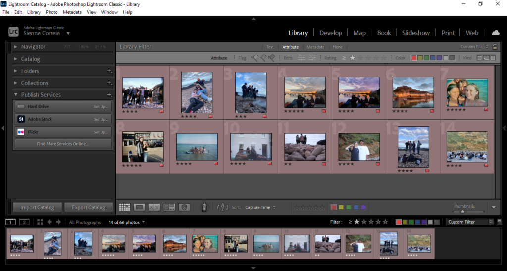
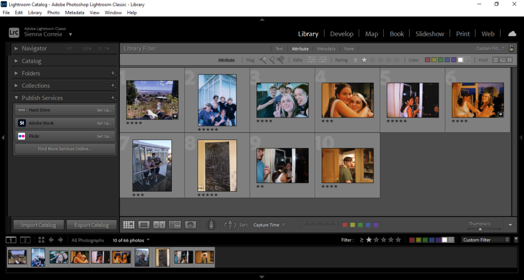
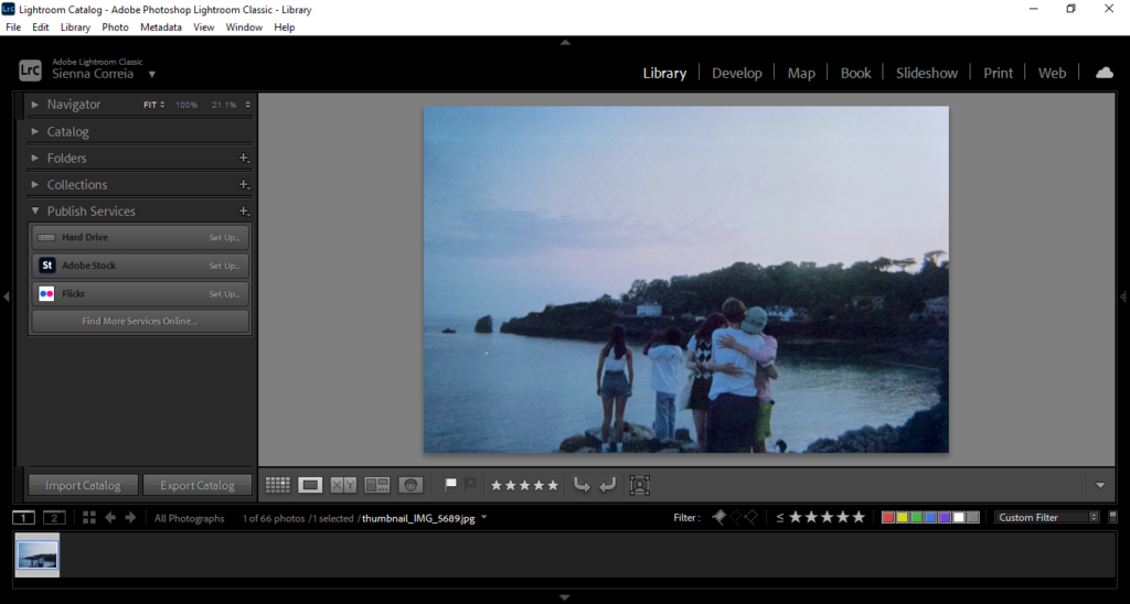
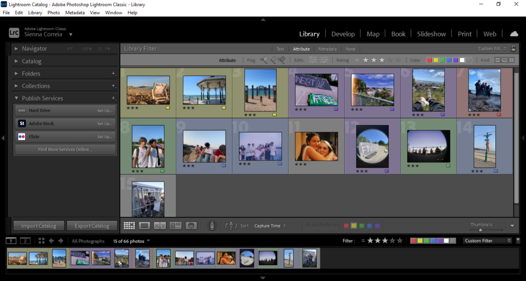
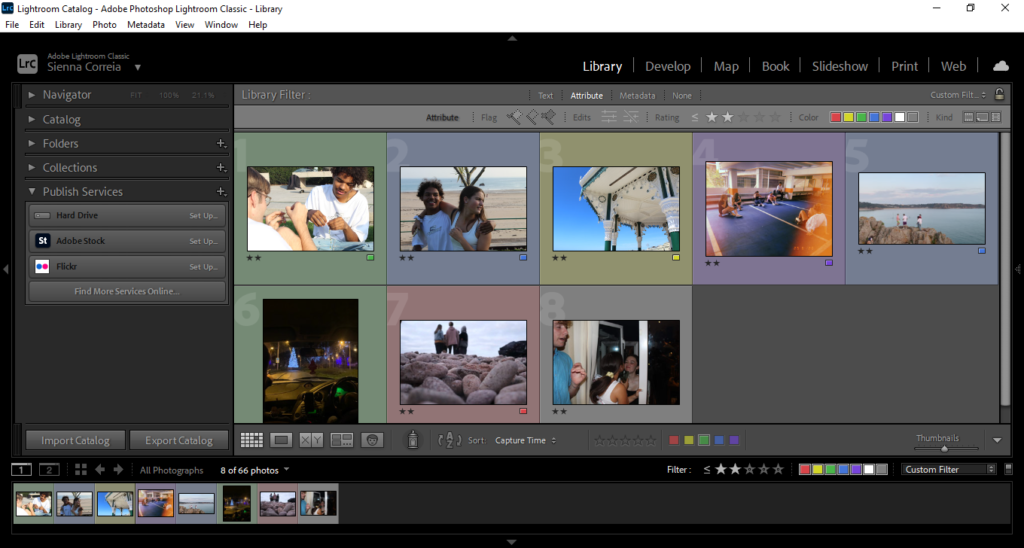
I then ranked all the images using the star rating, with 5 meaning i intend to use, 4 i may use, 3 could use, 2 or below most likely not using. I also flagged one image that i think i will use for my cover

Flagged

5 stars

4 stars

3 stars

2 or less stars

Statement of intent

Ideas:

in three words: jersey, friendships, sentimental

in a sentence: a project following a group of friends through the last summer in jersey before leaving the island, highlighting memories and moments of key locations

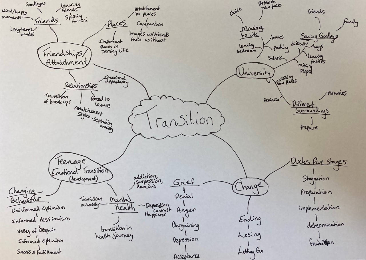
This photobook will be a study on the transition of the free experiences of island life, the importance of certain places and personal development, and moving on from this isolated experience to bigger things. Moving away from home, especially away to university, always represents a huge transitional period, often the first big solo move in someone’s life. Through my images i want to highlight key places in my adolescent life that shows pivotal moments, captioning all the images and briefly explaining memories and frequent summer occurrence’s. These will be the main part of the book, and at the end I want to show some images of what’s next, Brighton which is where I’m moving to university, and mark it as the start of my next life chapter.

DESIGN-

  • mix of landscape and portrait images
  • both views of the places, and group photos of friendships
  • all colour images
  • each place has a short description of what that location means to me/my friendship group
  • different combination of layout ideas
  • Editing with time stamps and more brightly contrasted images, and disposable grainy images with more cool tones
  • Title of each place with the description

I dont have a name for my book yet, but i want the name of the book to reference island life, and how growing up on jersey is such a small and safe childhood experience, whichtransitions into moving away to the uk.