All posts by Oliwia F

Filters

Author:
Category:

JESSE TREECE

Image result for jesse treece

Collage artist Jesse Treece lives and works in Seattle USA. Using old magazine clippings, he experimented one evening, creating a visual story out of the various cuttings. this became his first photomontage. Jesse creates amazing collages from vintage materials, giving his work an aesthetic, authentic look. His way of composing photomontages can be described as surreal, disturbing and absurd. however, bright colours, interesting composition make for beautiful artworks.

Image result for jesse treece analysis

VISUAL TECHNICAL CONCEPTUAL CONTEXTUAL: the focal point of the collage is the bag and tomatoes inside, since they are both very bright, vibrant and warm tones, linking to the concept of the colour theory. The background and foreground is finished with a grain, which helps exaggerate a vintage look. 

PHOTOMONTAGE

HISTORY

Image result for photo montage jesse

An important aspect of photography is the physical photo, and in our modern era surrounding technology, it seems the printing process is no longer valuable in as many ways as it was in past years. However, since the 19th century, photographers have experimented with the physicality of photographs, creating revolutionary techniques. One of these was the development of photomontage, whereby artworks consisted of a combination of many photographs in one.

The art of photomontage, various images are composed by cutting, gluing, arranging and overlapping two or more photos to create one modified image. This can be with abstract shapes and even writing. The technique can be tracked back dark room printing attempts in a double exposure and masking approach. Now we use a variety of editing software to imitate this affect. Even through the initialisation of technology, today, we can talk about photo montage as a digital and/or printed piece.

Many photomontages explored issues such as economic inequality, police and war brutality’s, well as other non political ideas such as those expressed by surrealists to reflect the workings of the unconscious mind. In Jersey, jewish surrealist Claude Cahun, used photomontage as a form of expression.

The most famous photo could have come from Oscar Rejlander during the mid-Victorian era when experimenting with combination printing. However the Dadaists adopted the technique using actual photographs to emphasise the destruction of war. These ‘monteurs’ included people such as Hannah Höch and Raoul Hausmann.

PHOTOMONTAGE EXAMPLES:

Raoul Hausmann ‘The Art Critic’
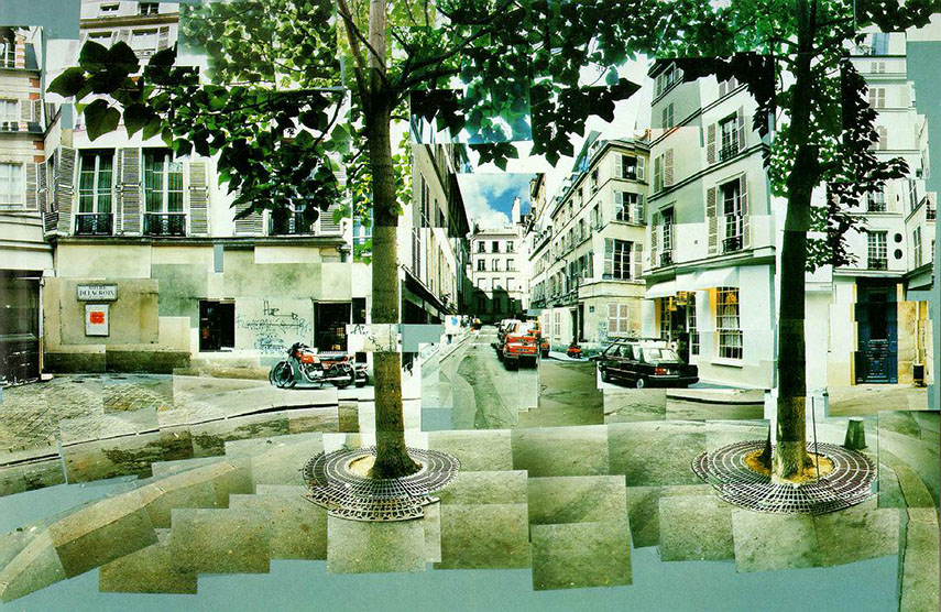
David Hockney created his "joiners" using varying numbers of Polaroid snaps or photolab-prints of a single subject to arrange a patchwork and make a composite image.
David Hockney composed his “joiners” using varying numbers of Polaroid snaps or photolab-prints of a single subject to arrange a patchwork and make a composite image.

ARNOLD NEWMAN

CONTEXT:

New York based freelance photographer and portraitist Arnold Newman is recognized as a pioneer of environmental portraiture, changing the ways photographers viewed portraiture in the 20th and 21st century. One of his most famous pieces, often described as a defiant stand agains people in power. One of these people was German industrialist Alfred Krupp, who, along with his father build an empire through their support of the Nazi party. Newman was commissioned to photograph Krupp by Newsweek magazine, however the photos portray the man to look menacing and intimidating.

TECHNICAL:

Arnold Newman uses the sparse natural lighting of the train station to create a ‘gloomy’ atmosphere in this photo, since the lighting the the building is dim and irregular. The photographer also avoids the use of flash which means the foreground, being Krupp’s portrait, is not illuminated. However the subject is surrounded by neutral white light from the left and right, increasing shadows on the centre of the mans face in a symmetrical manor. There is a shallow depth of field in the photo as the the focal point id the portrait in the foreground. you can also see there is not much grain visible, but Newman clearly uses a high contrast in the image, to imitate a sinister look of Krupp

VISUAL:

The colour, tone and white balance are very important in this photo in order to create an ‘evil’ look to the man in the foreground. By including a green tint to the shadows of the image, Newman manages to aid the theory of colour composition in the photograph. By having lighter whites, and contrasting warmer tones like oranges such as ones on the Mans face, bring out a focal point. These warm tones contrasting the darker green shadows lead the viewer’s eyes and draw attention to certain parts of the photo. One of the most important features is the use of line and shape. Newman incorporates symmetry and vertical lines to suggest the feeling of power, concrete pillars either side of Krupp. In this composition, the two halves of the image are almost mirror images of each other which creates a sense of harmony and aesthetic balance, however this is ironic since the foreground( portrait of Krupp) represents corruption and chaos.

CONCEPTUAL

Arnold Newman is a political photographer and was extremely clever in the positioning of Krupp in order to express a very strong image of him, and expose to the viewer the kind of person Krupp was. he specifically does this through the mans posture, with his hands under his chin and body leaning forward which suggests authority. The fact that the photographer is Jewish would also give motive to photograph this corrupt Nazi supporter in this way, and show what he personally sees through his own eyes through the camera itself.

OCCUPATION & LIBERATION

EDITING

Processed with VSCO with 3 preset

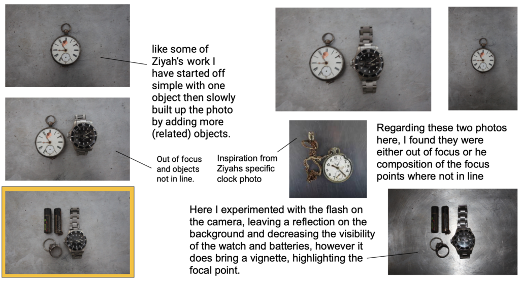
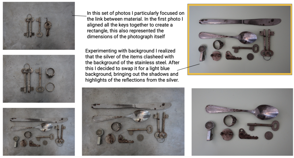
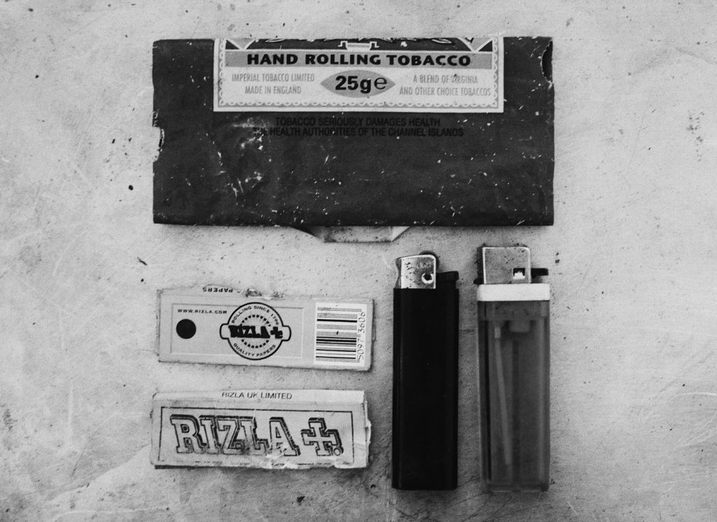
Deciding on the photos with the correct focal points, and the least shadows to make the image look more in proportion, I proceeded to edit them, in the photo below (taken from my second shoot) I made sure that the contrast had been increased and exposure lowered. This edit is inspired by the ‘authentic’ approach to old photos, with no colour, I accomplished this with the use of a filter aswell.

  • Increase of exposure, shadows and tone
  • Adjustments in cropping and straightening
  • Increase in colours particularly pinks and reds to bring out colours of the items selected for this shoot
  • also adding a filter

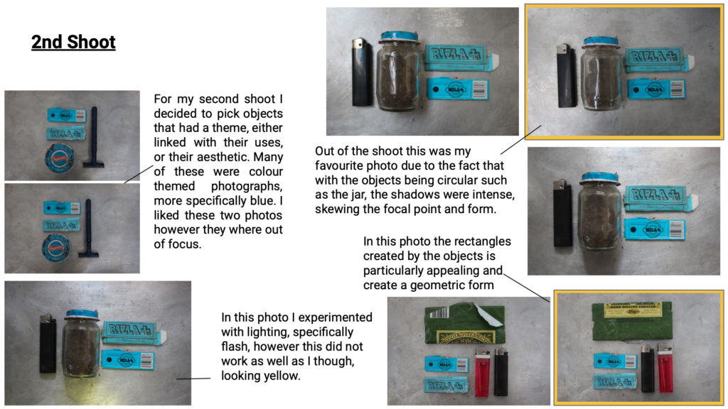
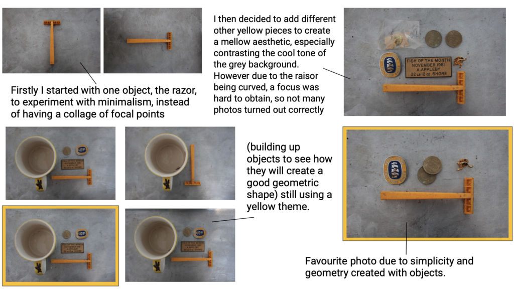
Due to the mass of yellow as the focal point of the photo, I slightly increased the yellow to make to foreground even stronger. By also increasing the contrast and shadows it evened out any odd shadows that were breaking the form in the background. As well as the I made sure that the items were in the correct place using grid lines. This along with cropping the image made sure for a evenly centres focal point.

To edit I have used VSCO, a simple photo editing app. In this photo I have enhanced the contrast and exposure to lighten yet keep the objects definition. As well as this i simple cropped and straightened the photo in order to align the sides with the form of the items in focus.

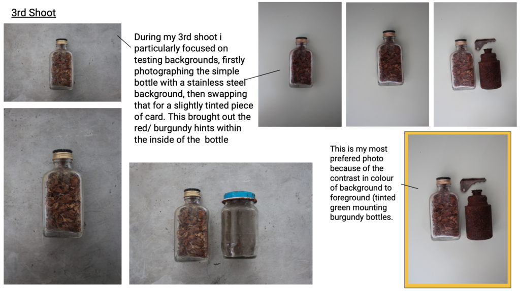
In this photo I also straightened and cropped the image, however due to the two metals (background and foreground) I increased highlights and shadows, making it more clear to view. I furthermore softened the tones of the colours, cooling the image to create a blue/ silver theme.

FINAL PHOTOGRAPH

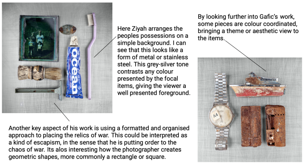
This is my chosen photo from my 3 shoots, due to the fact that it firstly represents the object’s that would be in personal use, much like the ones in the photos taken by Ziyah Gafic. This is personally my favourite due to the link between each item, being silver. This means that every item reflected in a similar way. Furthermore, even though  most of the objects are rounded, I like the way they create a rectangular form. I also think that the editing of B&W improves the contrast the the background, making the focal points more visible.