All posts by Oliwia F

Filters

Author:
Category:

IDENTITY PHOTOSHOOT 1

PHOTOSHOOT PLAN:

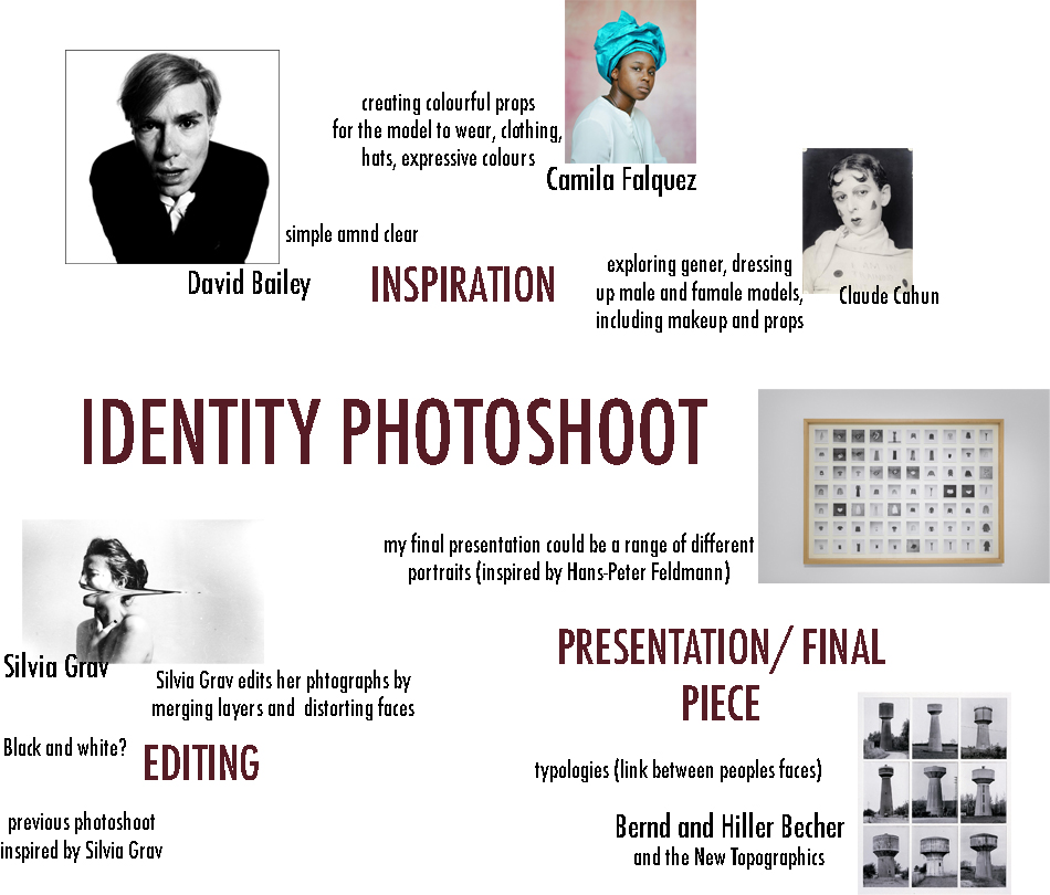
INSPIRATION:

WHO

I will be taking photographs of my female friend at Hautlieu school.

WHAT

I will focus on the face of the model, specifically on facial features such as nose, eyes, mouth, and collectively together to form facial expressions. I may experiment with emotions, taking photos of the model, with a range of expressions; happy, sad, scared.

WHERE

I will have my photoshoot in the studio, where I can use the black and white curtains to create the backdrop. I will also be able to set up a 2 or 3 point lighting system to illuminate my model.

WHEN

I will take the photographs on Monday the 13th of January, through the entire day, depending on when the studio is free and when my models are free.

WHY

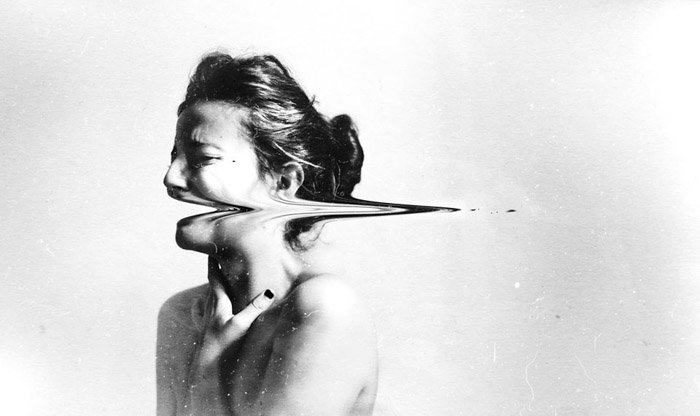
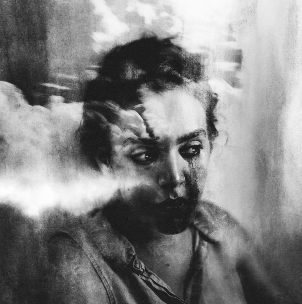
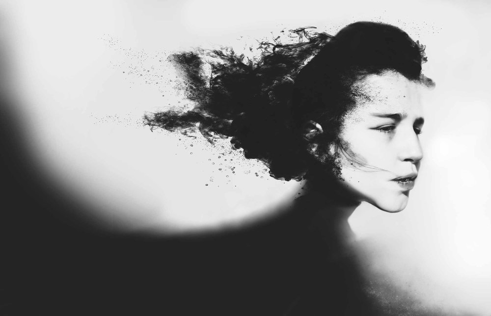
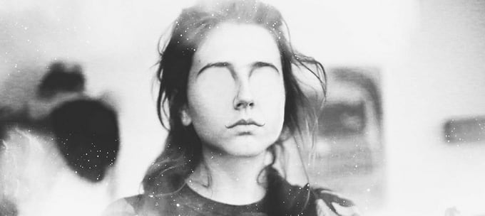
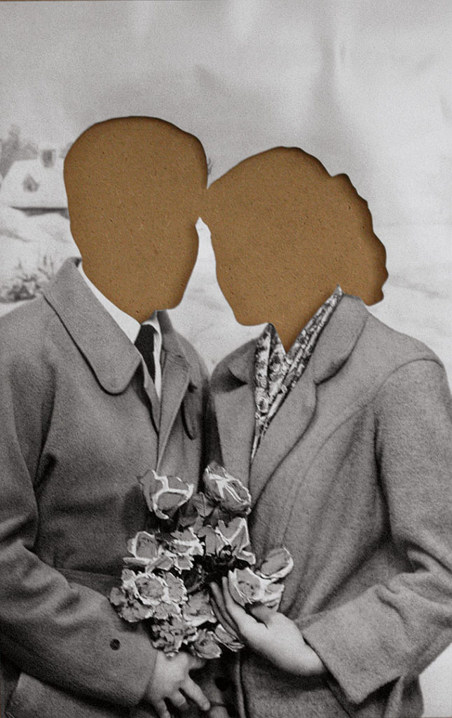
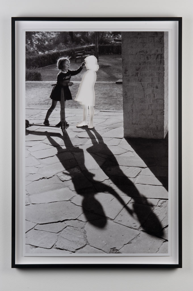
My idea is to edit the images in a similar style to Silvia Grav, to explore idea that ones identity can be aspects of their body (specifically face). It will bring the idea that someone can be identified through their facial features, and can be unidentifiable when facial features are blurred. The concept is to focus on the manipulation of facial features that identify someone, suggesting that faces can be one of the simplest forms of one’s identity.

Editing inspiration from one of Silvia Grav’s images:

HOW

I will set up the studio with the camera on a tripod to prevent camera shakes, so the images are in focus, as well as having a two point lighting system with a neutral coloured LED panel illuminating the subject. However, to create softer lighting and decrease shadows, I may use a three point lighting system instead. The camera should be around 200 so that the image isn’t grainy, and the shutter speed should be short to keep the image in focus as the model may move around( 1/250). The aperture should be an average f/4.

SILVIA GRAV AND IDENTITY PHOTOGRAPHY

WHO IS SILVIA GRAV?

 Silvia Grav is a Spanish photographer who creates dreamy, mesmerising images edited with harsh contrasts and light effects. These editing techniques produce mysterious sceneries in which young models have rays of white lines and smoke like shadows moving across them and the rest of the photograph. Grav seems to use a variation of different layers to create her final photo, layering images with different opacities.

At 18 she dropped out of Fine Arts the first year. After this her work got discovered and became viral after being published in media such as Juxtapoz, Communication Arts, Vice, The Huffington Post, This Is Colossal and My Modern Met.

PHOTO ANALYSIS:

CONTEXTAL/CONSEPTUAL:

The true woman cannot be seen in the image due to the warp across her mouth. She is shown portraying some intense emotion which may show a sign of her mental state. The concept of the workday be to show someone through their emotion, linking to the idea of emotional or mental identity

TECHNICAL: 

The lighting of this image is generally quite light, clearly taken with a daylight source of lighting. You can see this lighting is natural, reflecting the focus of the photograph. The image looks to have been reasonably exposed, with a high contrast between the backdrop of the image and the model herself. The shadows of her figure and hair seem to be very dark (almost black) compared the the rest of the image.

The aperture of the photograph cannot be exactly determined as the background id barely visible, however the model is in focus. The shutter speed seems to be average, maybe 1/125 as the image seems to be regularly exposed, but also quite focused and sharp. The ISO also seems to be low as the image was taken in daylight maybe even a studio, so probably around ISO200.

VISUAL:

The image shows an almost nude woman with her hair up, holding her neck. The colour of the image is clearly in black-and-white with A clear use of tone being used between light backgrounds and dark shadows of the model. There seems to be some form in the photograph as there is some difference in shadows and highlights on the models body. The editing of the photograph is interesting as there seems to be a stretched or warped section on the models mouth being drawn to the left, which leads the eye fo this focal point.


IDENTITY AND PLACE WITHIN PORTRAITURE

WHAT IS ‘IDENTITY’?

“Identity is the qualities, beliefs, personality, looks and/or expressions that make a person or group, in psychology. Categorising identity can be positive or destructive, as psychological identity relates to self-image, self-esteem, and individuality.”

The idea of identity can relate to a more philosophical, deeper personal meaning about the way you want people to perceive you. It involves questioning yourself:

  • who you are
  • the way you think about yourself
  • the way you are viewed by the world
  • the characteristics that define you
  • An example of identity is a person’s name

PHOTOGRAPHERS WHO EXPLORE IDENTITY:

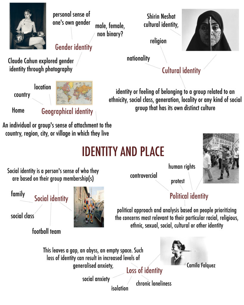
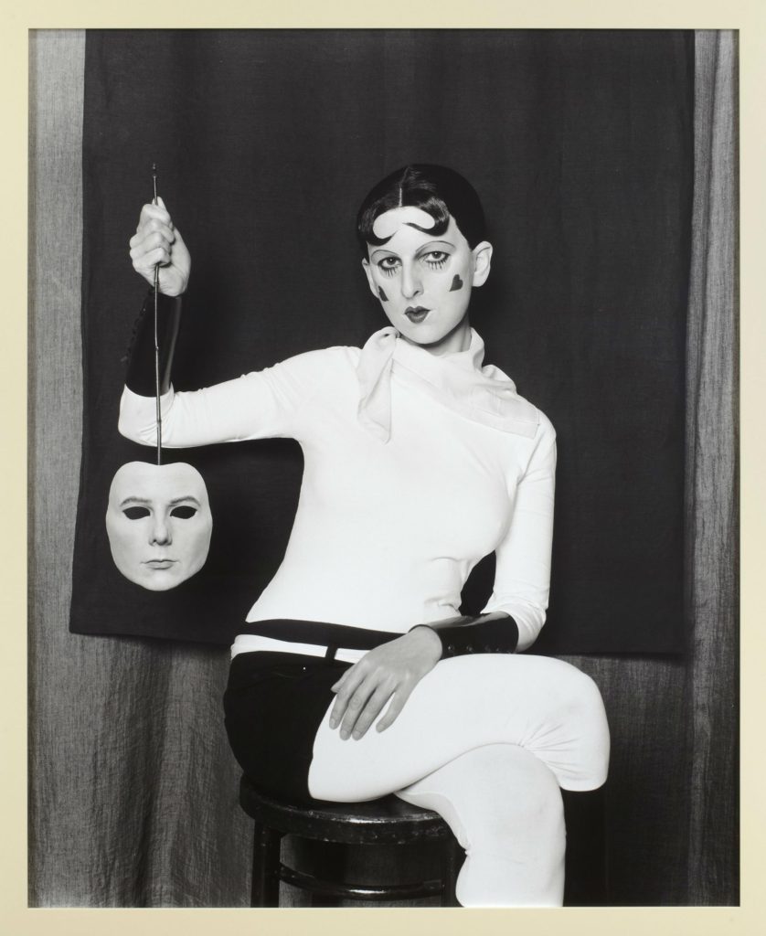
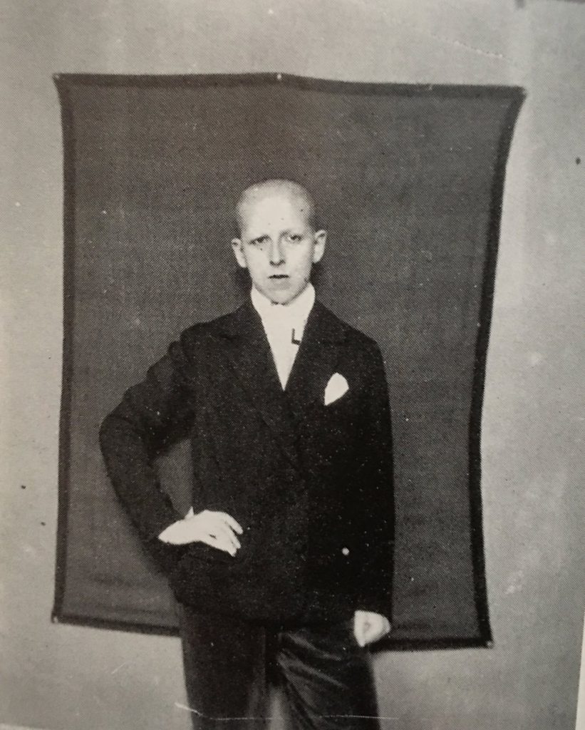
Claude Cahun was a Surrealist photographer whose work explored gender identity and the subconscious mind. The artist worked with her lover Marcel Moore to create self-portraits from 1928 showing her attitude and style. In her pieces she stares defiantly at the camera in an outfit that looks neither conventionally masculine nor feminine.

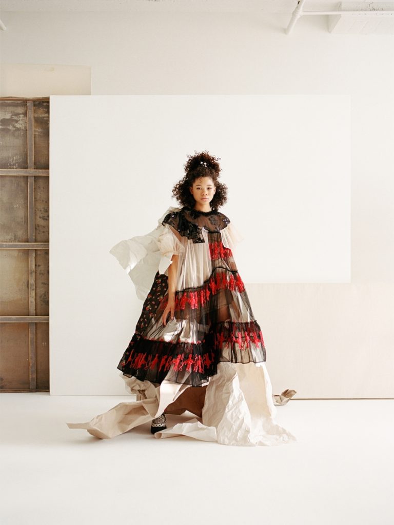
Camila Falquez is a photographer and director with a creative point of view shaped by her background in ballet and contemporary dance. She is inspired by the human body and sees its movement through space as a kind of universal language, which she uses to express people identity through fashion and emotion. Falquez has photographed for labels including Nike, Barneys, Kanebo and Louis Vuitton.

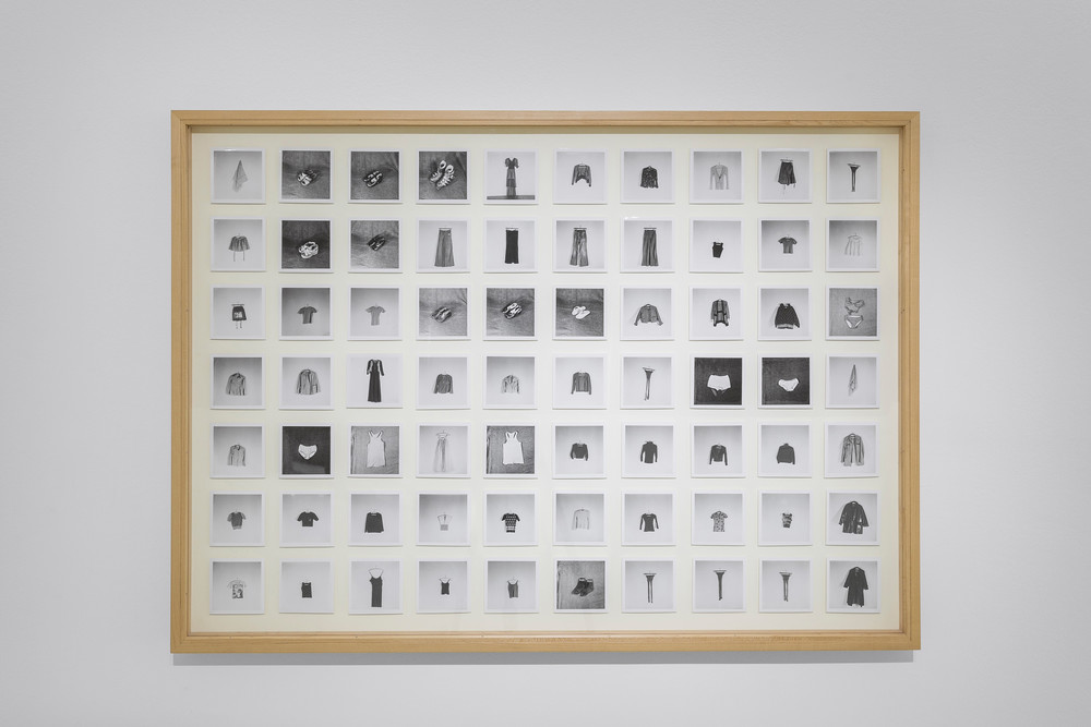
Hans-Peter Feldmann is a German conceptual artist who has worked in multiple formats, from drawings and sculptures to artistic books and photographic essays. One of his most famous works is his 1973 piece “All the Clothes of a Woman” featuring 70 pieces of one woman’s wardrobe photographed one by one, showing the parts of a woman that make her, herself, linking to ones personal identity.

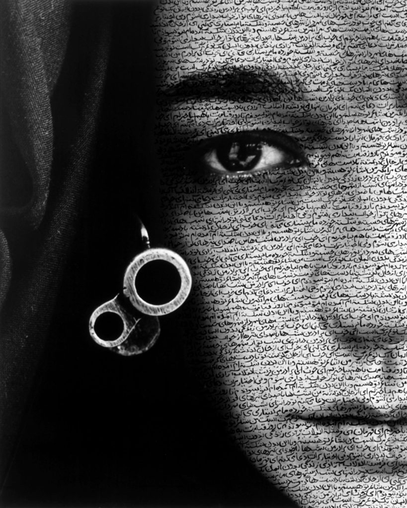
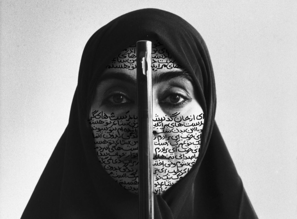
Shirin Neshat created a photographic series called “Women of Allah” which examines the complexities of women’s identities in the midst of a changing cultural landscape in the Middle East. It shows both through the view of Western representations of Muslim women, and through the more intimate subject of personal and religious conviction.

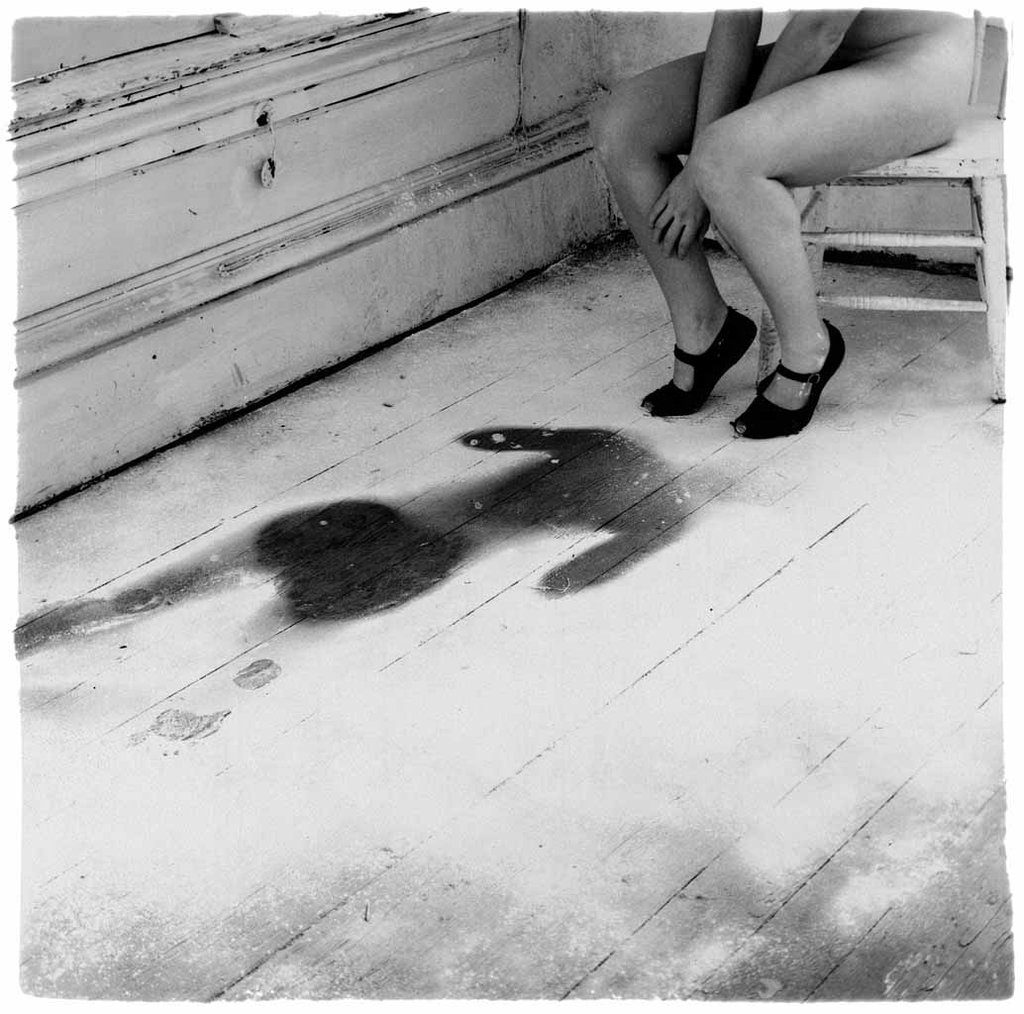
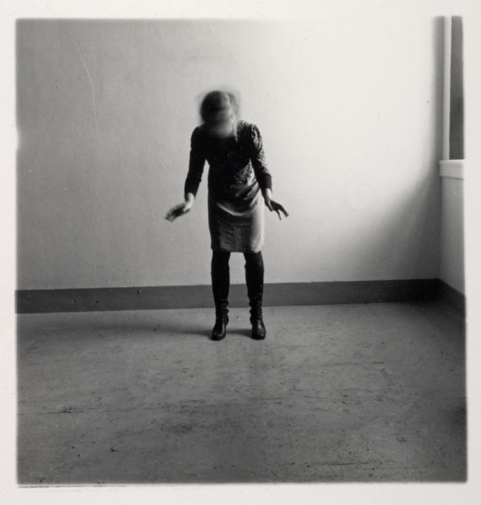
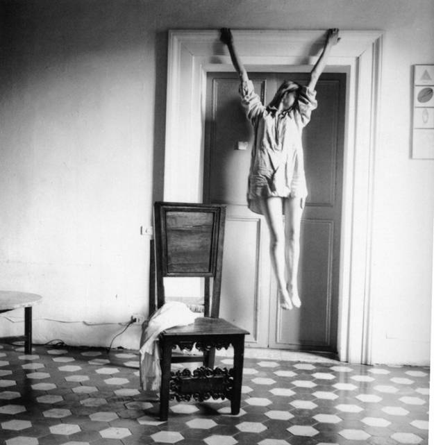
Francesca Woodman is best known for photographing herself, but her pictures are not self-portraits in the traditional sense. She is often nude or semi-nude and usually seen half hidden or obscured – sometimes by furniture, sometimes by slow exposures that blur her figure. She uses this ghosty presence to express her identity, focusing on the deeper meaning of mental health, depression and anxiety.

TABLEAU VIVANT PLAN, OUTCOMES AND FINAL IMAGE

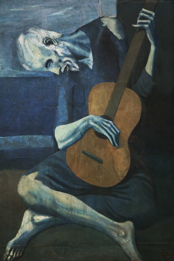
Picasso made this painting right after the death of his close friend in 1903. This painting shows an old, blind, tired man with bare clothes on his shoulder. Playing in the streets of Barcelona with his guitar. He made many paintings which illustrated the hardship of the poor, the ill and those cast out of society. The blue hue to the painting brings a melancholy mood to it, adding to the sadness of the man in the image. I have decided to recreate this image as a part of my tableau portrait photography study.

PHOTOSHOOT PLAN:

WHO

I will be photographing my friend Aimee, and she will mimic the subject in Picasso’s painting,

WHAT

I will photograph the model holding a guitar, similarly in position wise to resemble the old man holding his guitar in Picasso’s painting.

WHERE

I will be completing the photoshoot in the school studio as I will be able to create adequate lighting that mimics the painting, through the use of led panels and other lighting and camera equipment available.

WHEN

my photoshoot will take place during a photography lesson during the first week of December.

WHY

I think that this is an interesting painting to create a tableaux vivant from, as the painting shows lot of emotion. I also enjoy the composition of the painting and think that it the models position with the guitar will be challenging to mimic.

HOW

I will be able to replicate the blue hue of the painting by using a blue gel filter on the led lights. I will also use a one point lighting system ( coming from the left hand side of the model) the to illuminate the model and the guitar. I will use ISO 200 to take the image, an exposure time of 1/8 and a shutter speed of f/4.

CONTACTS:

EDITING AND MANIPULATION PROCESS OF FINAL IMAGE:

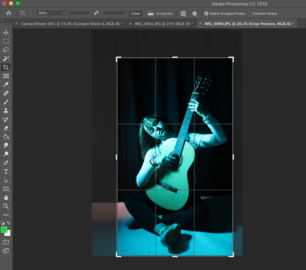
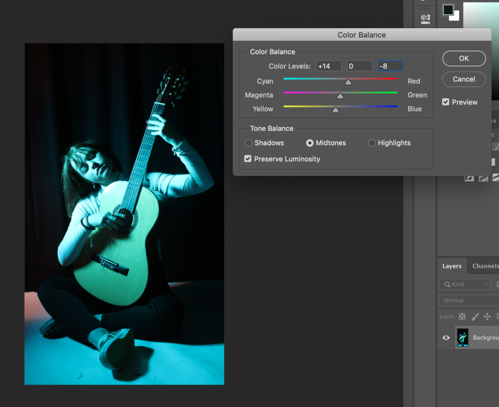
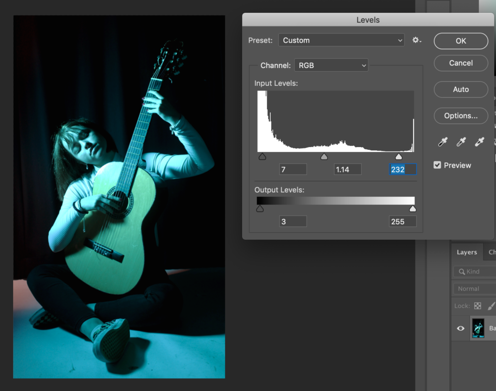
Taking the chosen photograph to photoshop, I firstly started by cropping the image, with a boarder of space between the model and the edge of the photograph, as well as mimicking Picasso’s composition. I secondly altered the colour balance of the image, allowing for the midtones to be altered to warmer shades of red and yellow (as shown by the image above). This gave the image more depth and contrast between colours.

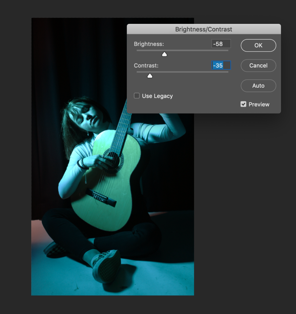
After this, I altered the brightness/ contrast of t. as the contrast of the picture was already very contrasted from initially taking the photograph, I decided to decrease the contrast to -35. Then I manipulated the brightness to -58. I found this helped the highlights become more muted as the initial image had very bright whited from the models shirt and reflection of light off of the guitar.

FINAL IMAGE:

EVALUATION:

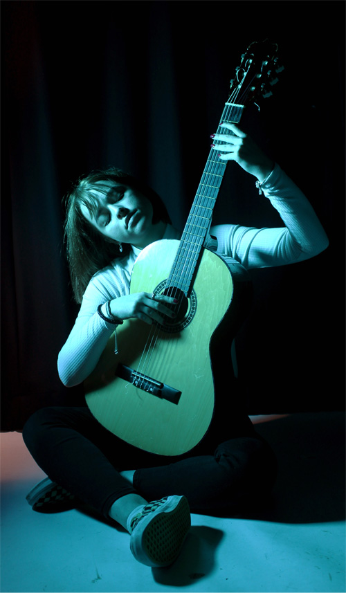
From looking at my final photograph, I can see that I have completed what I intended to achieve. I think that the lighting I set up to take the photoshoot, resembles my idea of how I wanted it to look. I also think that the backdrop of black, created contrast to the model. The emotion in the face of the model is solemn and calm, reflecting the subject in Picasso’s piece. However, I think that it could be improved using a two point lighting system instead of one, with one key light ( containing a blue filter), and a second white fill light to allow the subject to be illuminated more, as the image is very dark.

JEFF WALL AS A TABLEAU PHOTOGRAPHER

Jeff Wall was born in 1946 in Vancouver, where he lives and works. Jeff Wall is renowned for large-format photographs, ranging from subjects in urban environment settings, to nineteenth-century historic painting inspired Tableaux pieces. He studied art history at London’s Courtauld Institute – with his interest in contemporary media to create one of most influential ideas in contemporary art. He has exhibited widely, including solo exhibitions at Kunsthalle Mannheim, Germany, touring to Mudam Luxembourg (2018); Pérez Art Museum, Miami (2015); Stedelijk Museum, Amsterdam, touring to Kunsthaus Bregnez, as well and many other destinations.

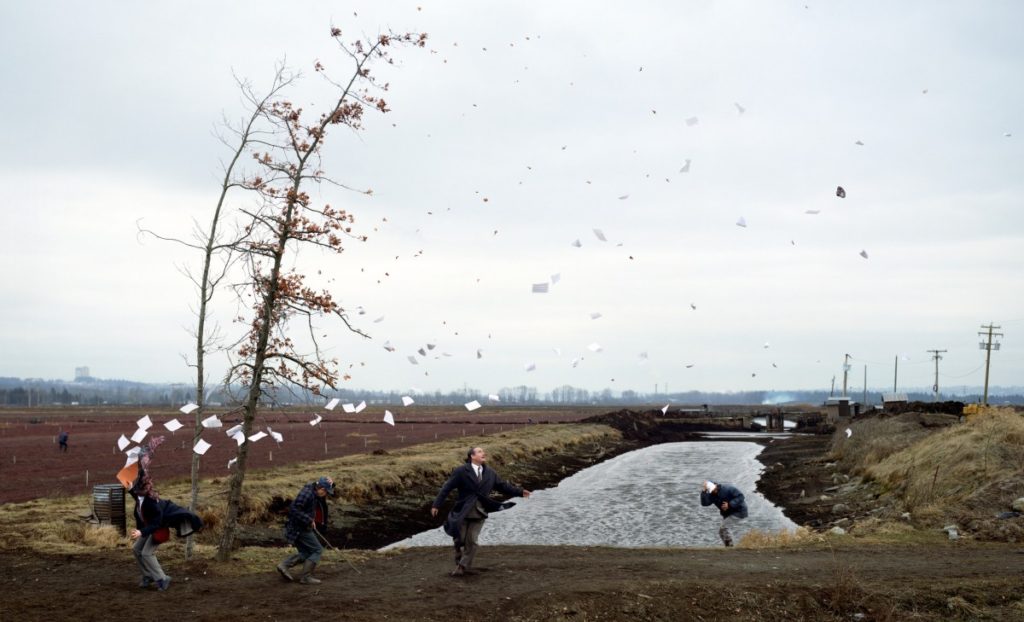
A Sudden Gust of Wind (after Hokusai) 1993

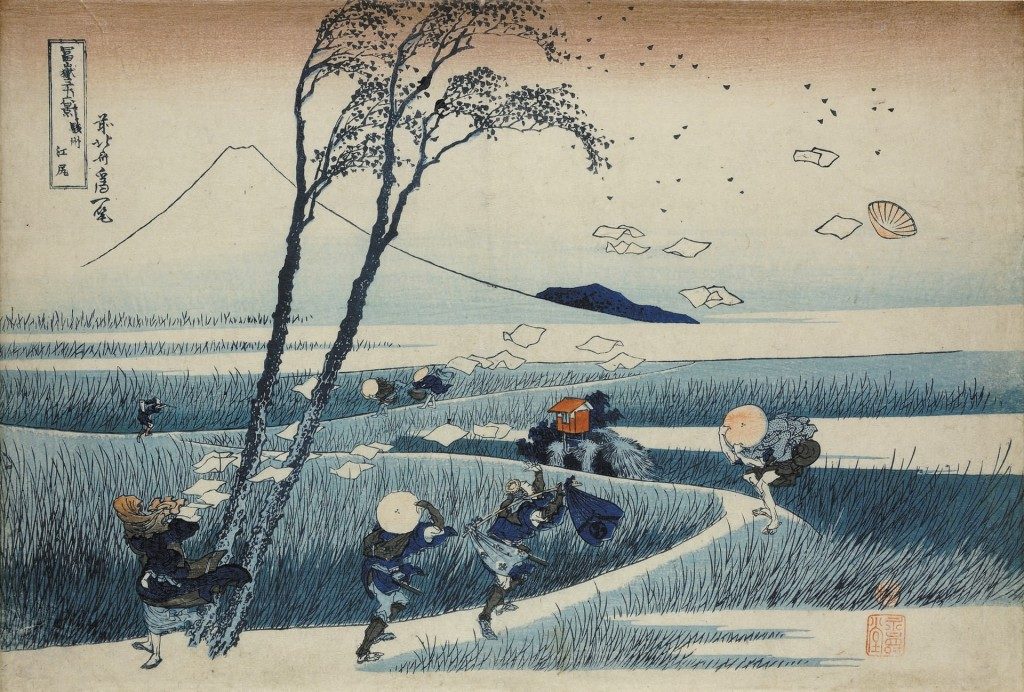
Wall carefully stages the scenes in his photographs, intricately designing every detail to achieve his desired final visual effects. Ironically, the final images often appear to be mid-action, spontaneous, and candid moments such as ‘A Sudden Gust of Wind’ (after Hokusai) (1993). This Tableau was created after Hokusai’s scene in a woodcut print where the painting shows seven individuals caught off-guard in the wind at different points along a narrow path.

ANALYSIS:

CONTEXTAL/CONSEPTUAL:

Jeff Walls piece ‘A Sudden Gust of Wind‘ is a response to the work of Katsushika Hokusai (1760-1849), one of Japan’s most famous and enduring artists. Wall seems to refer to Hokusai’s series of 19th century Japanese woodblock prints called ‘ThirtySix Views of Mount Fuji, specifically re-staging ‘Ejiri in Suruga Province’. Hokusai created a series of landscape prints of Mount Fuji as it is a popular subject for Japanese art due to its cultural and religious significance.

TECHNICAL: 

The lighting of this image is generally quite light, clearly taken with a daylight source of lighting. You can see this lighting is natural, reflecting the focus of the photograph. The image looks to have been reasonably exposed, with a high contrast between the soft grey clouds in the sky , and the dominant branches of the tree, reddish tones of the ground and deep brown earth edging the river.

The aperture of the photograph looks as if is around f/16 as there is a large depth of field. The shutter speed seems to be quite long, maybe 1/1000 as the image seems to be underexposed and quite focused and sharp, especially with the moving pieces of paper in the air. The ISO also seems to be low as the image was taken in daylight, so probably around ISO200.

VISUAL:

Similarly to Hokusai’s print, on the left, there’s a woman with her scarf blown around her face. Paper is being dispersed by the gust. Two men hold their hats to their heads while a third gazes up into the sky, where his hat is being carried away by the wind. Two narrow trees bend by the force of the wind, releasing dead leaves which mingle with the floating papers. however, Hokusai’s image is a print rather than an image.

The colour of the image is generally quite dull, with very ash tones colours coming from the grey/blue sky and river, as well as maroon reds from the tree leaves and soil in the fields. The contrast seems to be high as shadows coming from the edge of the river seem to be almost black, contrary to the bright white floating papers in the wind. the composition seems to almost exactly reflect that of Hokusai’s artwork ‘Ejiri in Suruga Province’

TABLEAU PORTRAIT PHOTOGRAPHY

WHAT IS A TABLEAU VIVANT?

Tableau vivant is french for ‘living picture’, and is a static scene containing one or more actors or models. They are stationary and silent, usually in costume, carefully posed, with props and/or scenery, the setting may also be theatrically lit. It works to combine both theatre and the visual arts. A tableau photograph can be achieved through staged photography, where a scene is set up, with models, posed, artificially purposefully lit, propped, set designed by the person taking the photo.

EXAMPLES:

HISTORY OF TABLEAU PHOTOGRAPHY:

‘Tableau Vivant’ was first used in the eighteenth century by French philosopher Denis Diderot to describe paintings with a certain type of composition. Tableau paintings were natural and realistic, and had the effect of walling off the observer from the drama taking place.

In the 1860s, the concept of tableau reached a crisis with Édouard Manet, a French modernist painter, decisively rejected the idea of tableau as suggested by Diderot, in his desire to make paintings that were realistic rather than idealised. He painted his characters facing the viewer with a new vehemence that challenged the beholder. In the 1970s, a group of aspiring young artists such as Jeff Wall and Andreas Gursky began to make large format photographs that resembled paintings, that were designed to hang on a wall. As a result these photographers were obliged to take on the very same issues revealing the continued importance of tableau in contemporary art.

TABLEAU VIVANT IN PAINTINGS:
TABLEAU VIVANT PHOTOS AND PAINTINGS ALSO SHOW VARIOUS ASPECTS OF SYMBOLISM AND ALLEGORY:

Allegory in art is when the subject of the artwork, or the various elements that create the composition, is used to symbolise a deeper moral or spiritual meaning such as life, death, love, virtue, justice etc. Allegory is clearly represented in the ‘Christ in the House of His Parents‘ by John Everett Millais.

This is Millais’s first important religious subject, showing a scene from the boyhood of Christ. Exhibited at the Royal Academy in 1850, it was given no title, but accompanied by a biblical quotation: ‘And one shall say unto him, What are those wounds in thine hands? Then he shall answer, Those with which I was wounded in the house of my friends.’ (Zech. 13:6).

Christian symbolism is prominent in the painting:

  • The carpenter’s triangle on the wall above Christ’s head, symbolises the Holy Trinity.
  •  The wood and nails prefigure the crucifixion
  • The young St John is shown fetching a bowl of water with which to bathe the wound. This clearly identifies him as the Baptist

CHIAROSCURO IN STUDIO PHOTOGRAPHY

WHAT IS CHIAROSCURO?

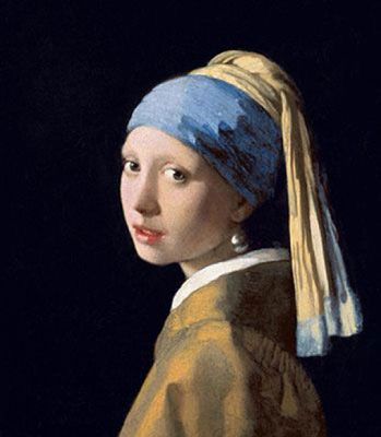
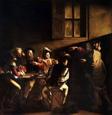
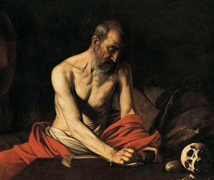
The word chiaroscuro translates in Italian for light and shadow. It is a classic technique used in the works of artists like Rembrandt, da Vinci, and Caravaggio. It refers to the use of light and shadow to create the illusion of light from a specific source shining on the figures and objects in the painting. For example chiaroscuro is present in the painting ‘Girl with the Pearl Earring’ (c.1665) by Johannes Vermeer. This famous portrait shows a young woman, standing in front of a dark background, as she gazes out at the viewer.

The technique was vey popular during the Renaissance, where the term originated from. It involved drawing on coloured paper, where the artist worked from the paper’s base tone toward light using white gouache, and toward dark using ink, body-colour or watercolour.

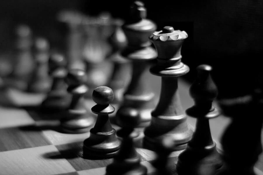
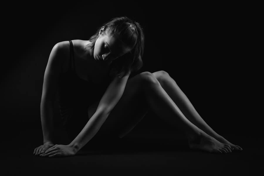
Chiaroscuro in photography is a technique and style often talked about as “clair obscur” or “extreme low key”. This style of photography is often well-suited for portraits, still life, and boudoir, or to give a scene the illusion of being three-dimensional. This technique can be used to light a variety of portraits (full body, headshot etc) and object, such as guitars of chess pieces.

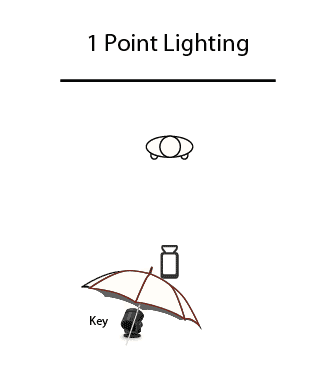
Chiaroscuro is popular in studio photography as the lighting equipment and backdrops available allow photographer to complete the technique accurately. Chiaroscuro usually consists of a 1 point lighting system in a dark room with a back backdrop, so there is only one source and direction of light

STUDIO PORTRAIT PHOTOGRAPHY

WHAT ARE STUDIO PORTRAITS?

Studio portraits are portrait photographs composed and captured in a studio, this means the photographer has control over the lighting of the composition of the subject and can adjust direction and intensity of light. Studio photography is preformed indoors. There are many ways to light a subject’s/ objects face, some of them are:

  • Three-point lighting
  • Key-light
  • High-Key
  • Low-Key
  • Fill-in light
  • Back light
  • Flash

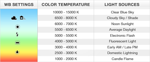
Many other aspects of study portraits photography will affect the final photo taken , such as intensity of the direction and temperature of the light and white balance. The table below shows the Kelvin Colour temperature scale. It is a way to describe the light appearance provided by a light bulb. It is measured in degrees of Kelvin (K) on a scale from 1,000 to 10,000. Usually, Kelvin temperatures for commercial and residential lighting applications fall somewhere on a scale from 2000K to 6500K.

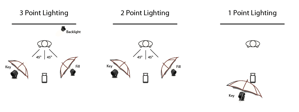
Lighting positioning techniques are also used to create diversity in studio portraiture, and a 3 point lighting system is the most common. The Three Point Lighting is a technique used in visual media such as video, film, still photography and many more. It is used to light a subject from three different light sources and angles. This is done in order to manipulate shadows, create contrast, and increase the overall quality of the footage that is captured.

  •  the Fill light is placed on the opposite side of the key light. It is used to fill the shadows created by the key. The fill will usually be softer and less bright than the key
  • the key light is the main light used to illuminate your subject, It is most often placed at an angle that lights one section of your subject. This angle can range from 15 and 70 degrees, with 45 degrees being most common.
  • the backlights purpose is to offset the flattening of dimensions caused by your key and fill light. It approaches from behind your subject, often at an angle.
WHY DO WE USE STUDIO LIGHTING?

Studio lighting is essential to most photographers’, especially in studios. It allows us to create natural lighting effects in a variety of situations, and is far more controllable than a flashgun. Indoors, it allows photographers to illuminate objects or subjects in specific ways, using different techniques such as chiaroscuro.

HISTORY

Studio photography goes back to 19th century and photographic technology has been continuously evolving since the first photographs shot with all-natural materials in 1824. The first studio photographers had to carefully combine chemicals in precise amounts for every single exposure, however now, today’s modern digital SLR cameras capable of capturing razor-sharp images without film.
With advancements in equipment, technology and techniques, studio photography began to develop as it became easier to produce high-quality images indoors. The first commercial studio photography was portraits of people. By the 1940s, studio photography had almost completely replaced painting for portraiture as the photography process was much simpler and took less time.

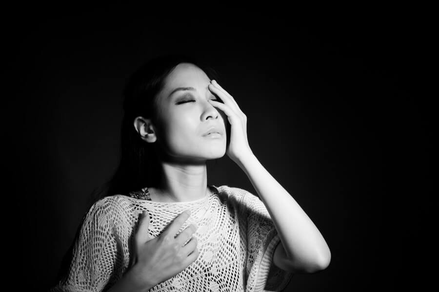
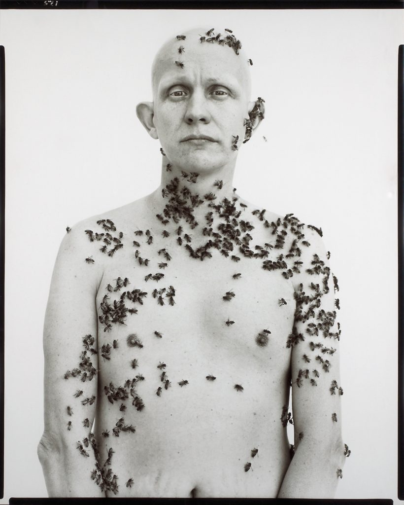
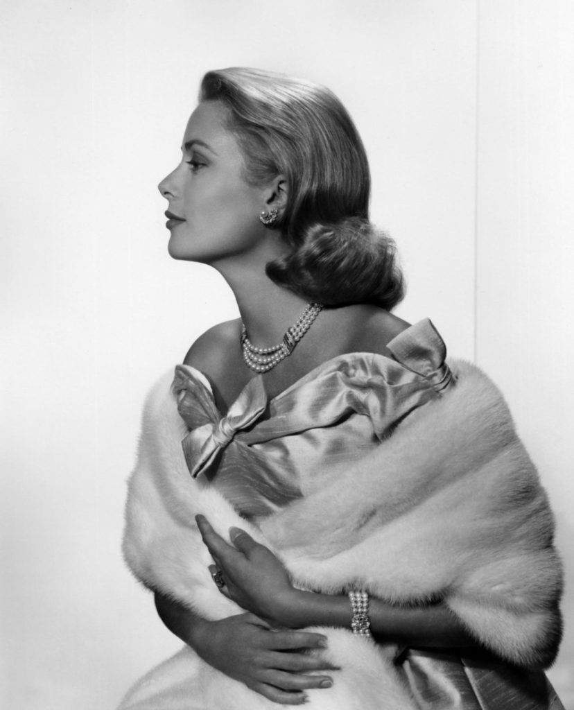
EXAMPLES OF STUDIO PORTRAITS:

ENVIRONMENTAL PORTRAIT PHOTOGRAPHY; FINAL IMAGE AND EVALUATION

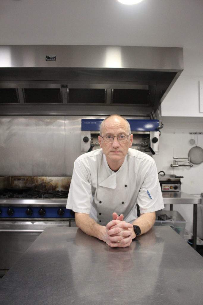
FINAL IMAGE:

EVALUATION:

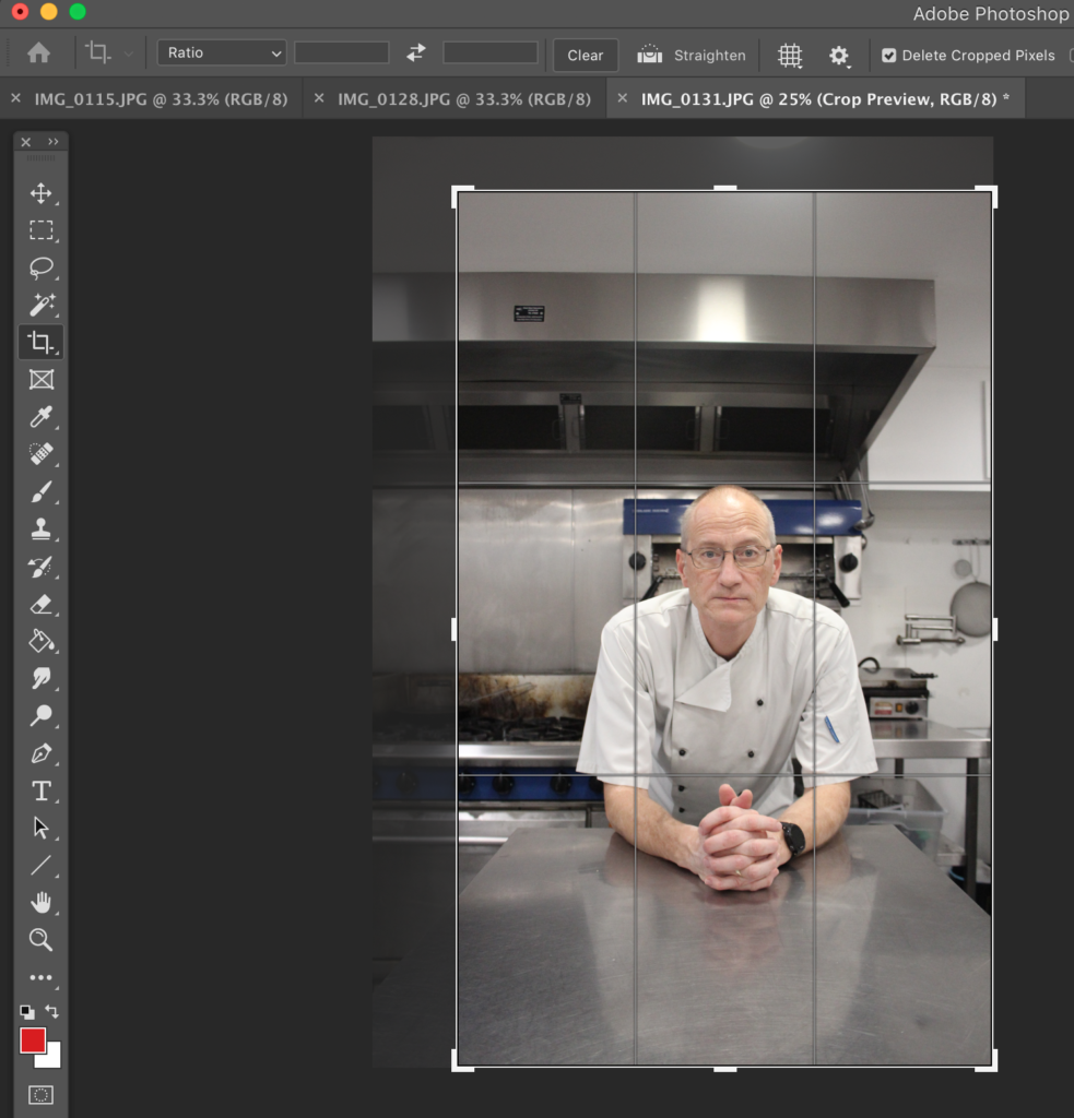
I think that this image full represents my ideas on how I wanted the final product to look. I think that the model was easy to work with and created the poses and expressions I wanted. This was my best image in my photoshoot displaying the model in a calm and comfortable position leaning over the metal table top, also holding a confident yet relaxed expression. I enjoy that the model is wearing a chefs uniform, linking to his profession. I decided to edit this as my final images as I prefer the composition on the background and that objects in the background are out of focus, laving the model in focus, drawing our eyes to the centre.

ENVIRONMENTAL PORTRAIT OUTCOMES AND EDITS.

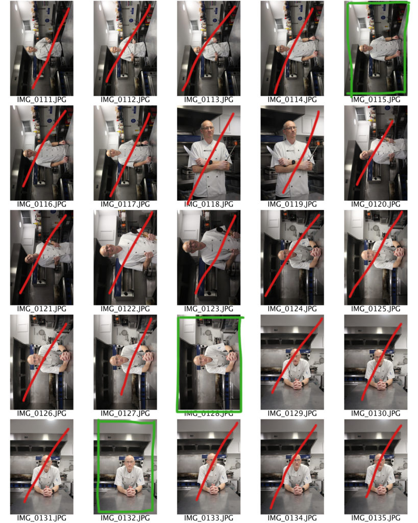
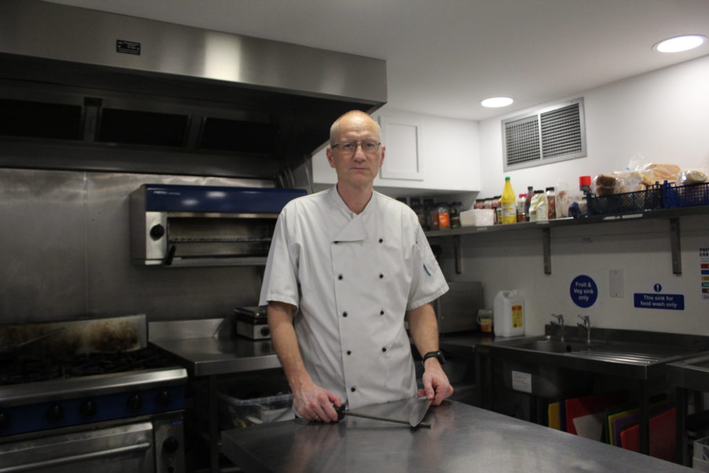
During my photoshoot it was very difficult to communicate to the models/ persons in public, how I wanted them to pose in my photographs. Another problem I encountered was that many people did not want to be photographed, which meant it was very difficult to get a large variety in my photographs. However I think that my camera setting where close to accurate in helping me produce focused images during the photoshoot. Out of the photographs I have decided to pick images 0115, 0128 and 0132 to be edited and manipulated, however, I will probably only have one final image. These images where the most successful as they are the most focused out of the photographs in the shoot. As well as this the model in the images being well positioned.

CONTACTS:

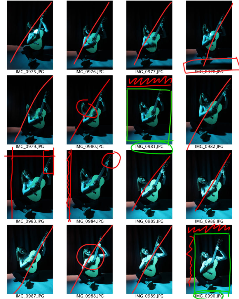
IMAGE SELECTION:

I think that this image turned out particularly well as the subject reflected a concentrated, proud look, which was the ideal expression I wanted the model to give. I think that the models pose, leaning across the table looks comfortable.

EDITING OF FINAL IMAGE: