All posts by Oliwia F

Filters

Author:
Category:

PHOTO-ZINE INSPIRATION

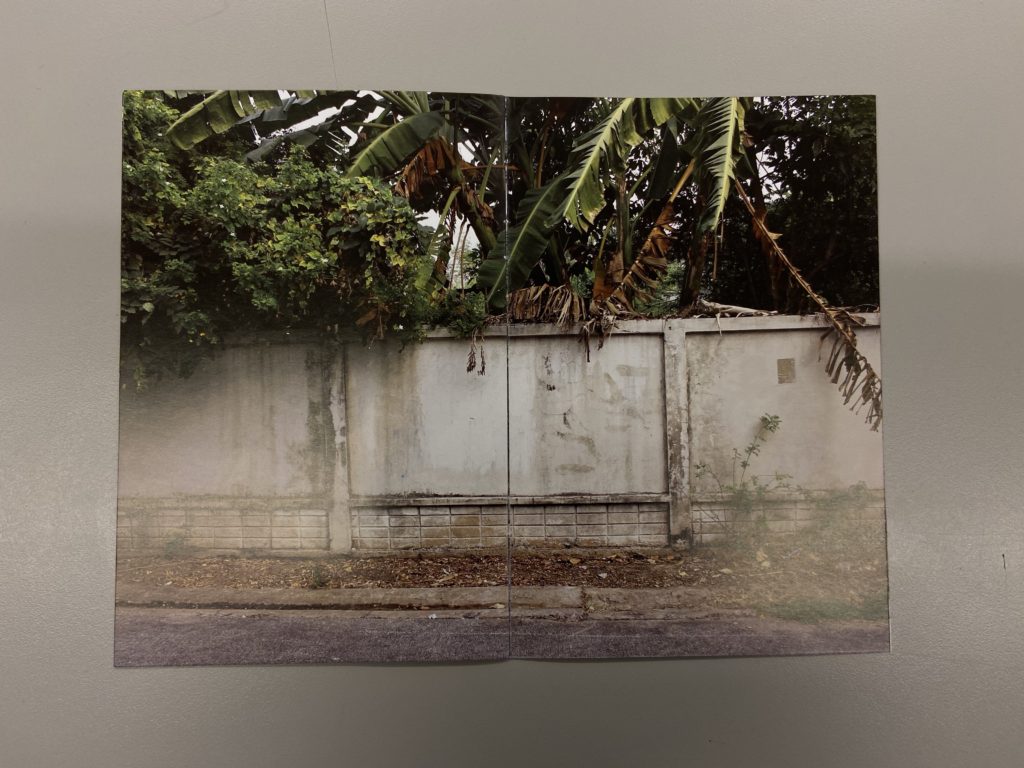
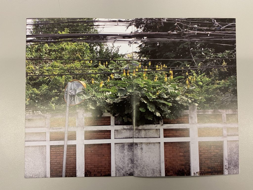
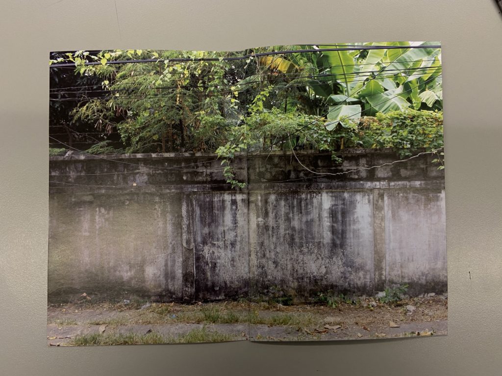
Concrete Jungle by Dale Konstanz

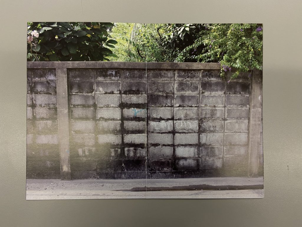
In the zine ‘Concrete Jungle’ by Dale Konstanz, the images on each page show a clear link to one another. The photographer has made such a strong connection by following the same basic principle in each image, this being that there is a wall on the bottom half, with greenery flowing over the top. there is an interesting colour scene to the images, with cool grey colours coming from the wall and luscious greens and yellows common g from the jungle aspect of the photos . This clever layout has a direct bond to the title of the Photo-zine, ‘concrete jungle’, (concrete linking to the wall, and jungle linking to the foliage over the top of the wall).

This intelligent thought process has inspired me to ensure that I make clear and well though links with each image through the zine, most importantly to the title. I also enjoy the way the images are displayed on the page. They seem to fill the whole entire page with no white boarders, drawing more attention to the image itself

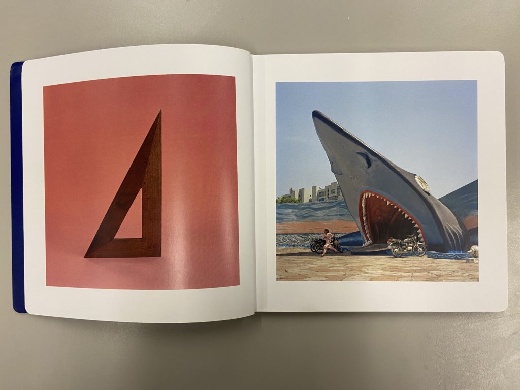
This equals That by Jason Fulford and Tamara Shopsin

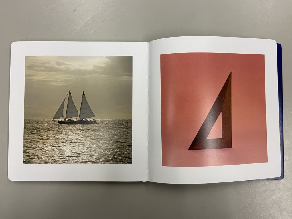
In the book ‘This equals That’ by Jason Fulford and Tamara Shopsin, there is a very clever layout of the photographs, and a clear and thoughtful story. Each image has a certain pattern, shape, colour that is reflected in the next image, each time you turn a page it starts with the image from the last. This reinforces the storyline, linking one image to another. The bond between the photos in shown in the image above (the first image image in the book), where the triangle of the wooden structure is complemented with the triangular shape of the sharks mouth.

The two images also contrast each other in colour, blue and red. I am particularly interested in the formal boarders around each image, which makes a brilliant systematic lay out. The book then finishes the the staring photograph liking back to the start of the book, but also giving a well rounded end photograph, showing the book has a clear and structured end and beginning. I would like to ensure that in my own photo-zine, there is a clear end and beginning. I would also like there to be contrast and links between photographs like in ‘This equals That’.

Looking For Alice by Sian Davey

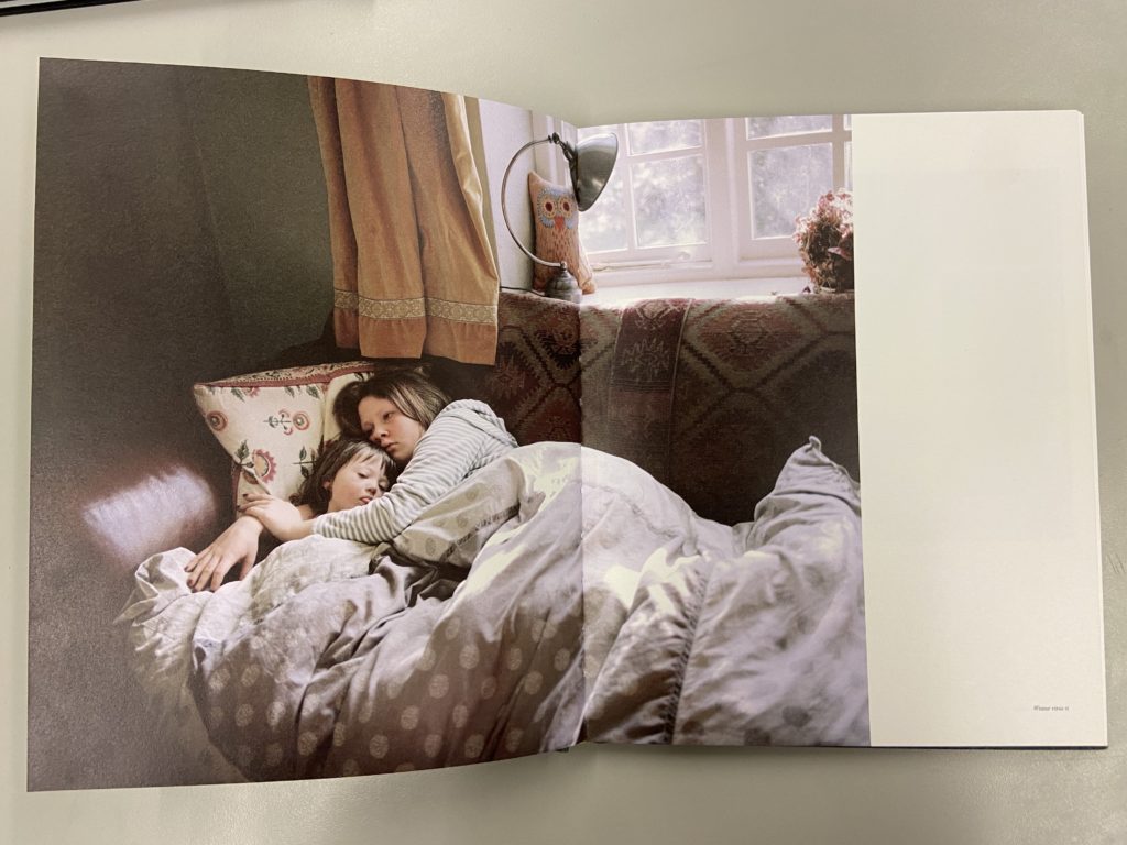
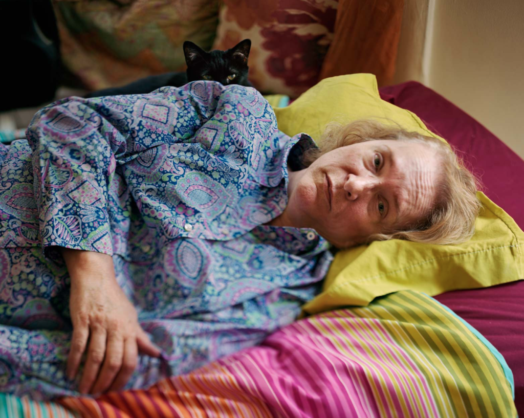
In the book ‘Looking For Alice’ by Sian Davey. The images are interestingly layed out in the book, for example in the image above, the photo fills one side of the page, however it only fills one half on the next. This leaves an intriguing black space on the right hand side of the pages. This is a clever concept and I may use this idea in my own photo-zine.

All Quiet on the Home Front by Colin Pantall

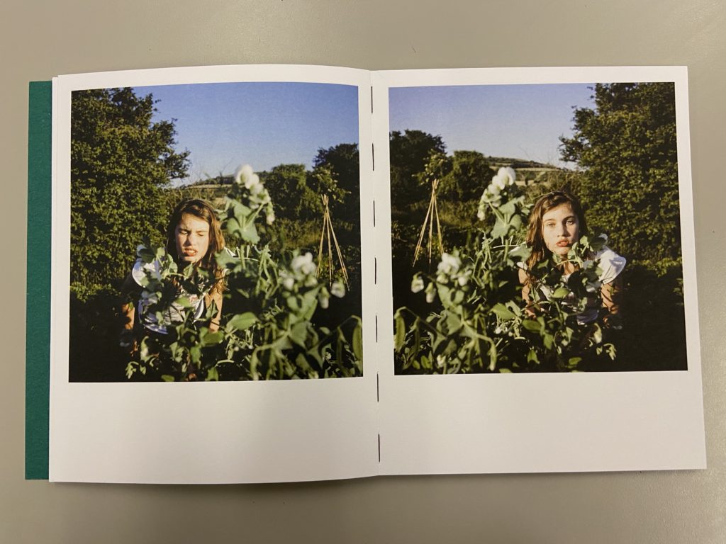
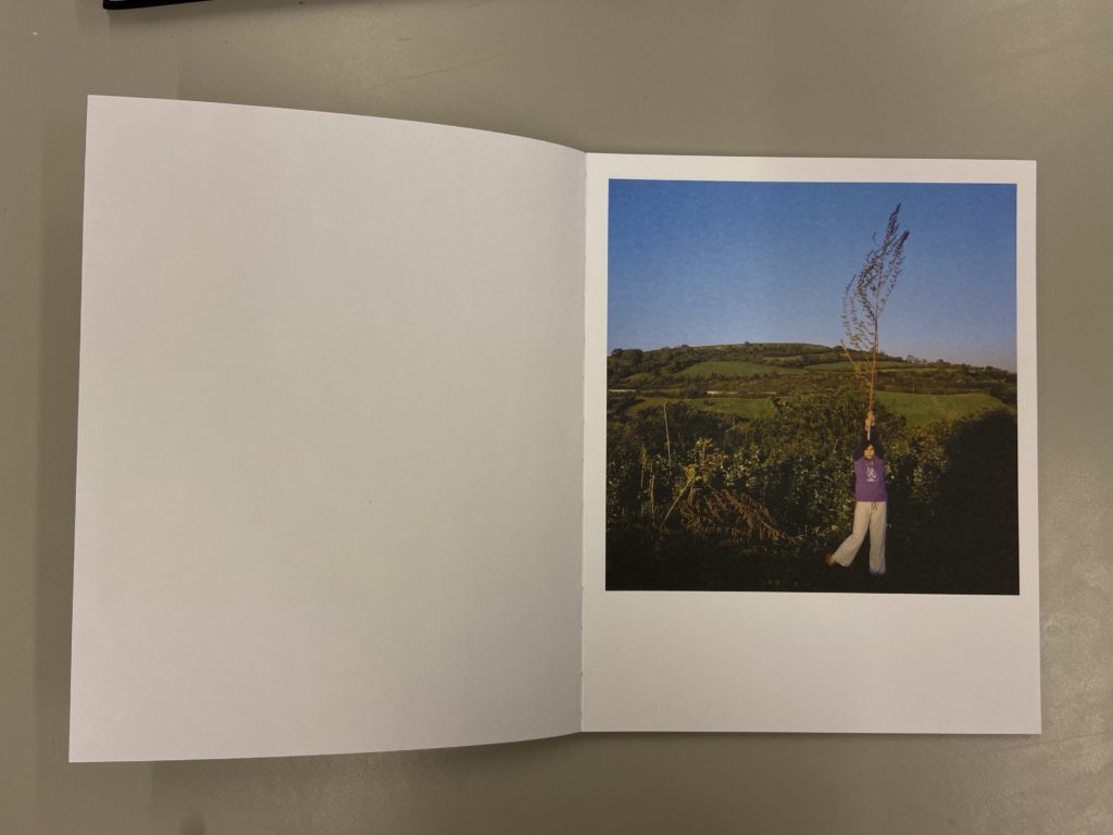
These three images are from the book ‘All Quiet on the Home Front’ by Colin Pantall. The two images on the top are of his daughter (which the book is about). I really enjoy the layout of the two images on the left page, they seems to mirror each other even though they are different images. in all three photographs they seem to be positioned on the page to make them look like Polaroid pictures. I may use this interesting layout in my photo-zine.
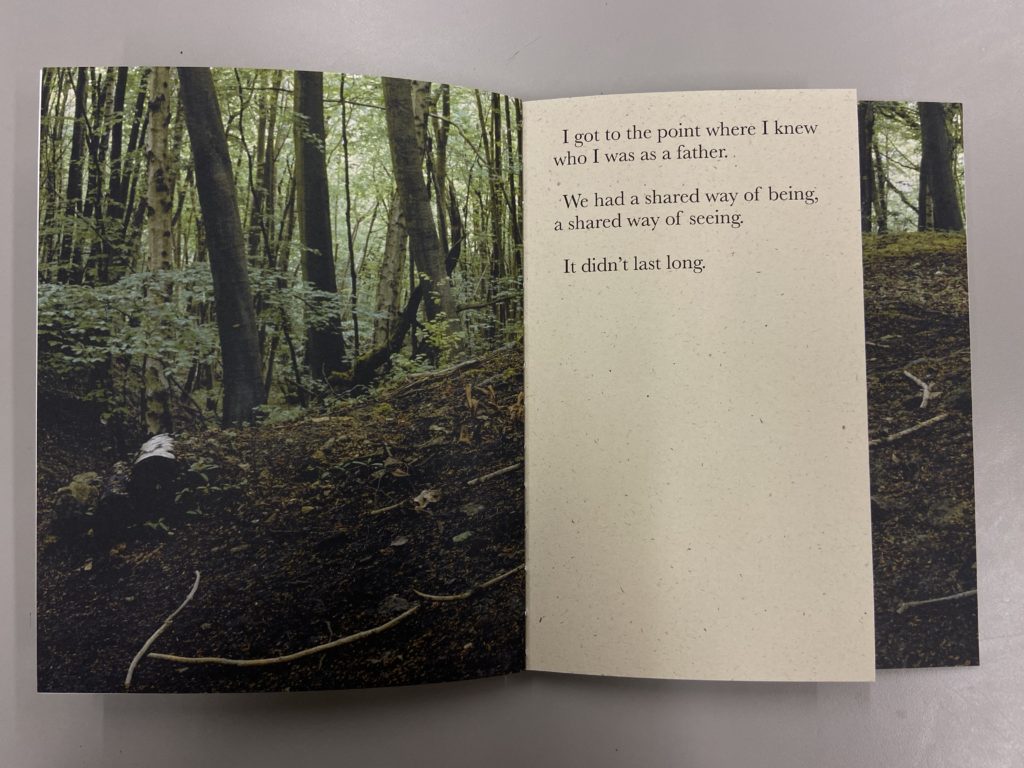
In the book he explains, using text on some pages, that he didn’t know who he was until his daughter was born, and after tat moment he became a father. I like the way Pantall uses smaller pages to narrate the book using small sentences. It makes sure the viewer understands what the story is about, and breaks up the photos in the book slightly.

WORKING IN LIGHTROOM

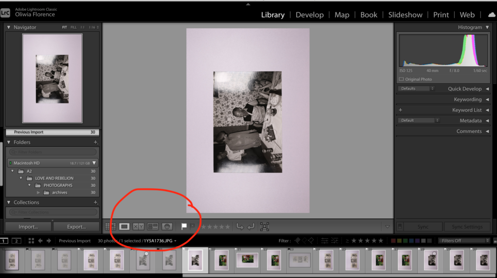
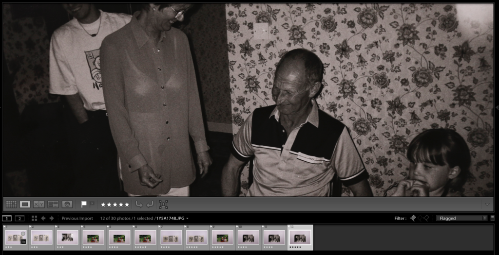
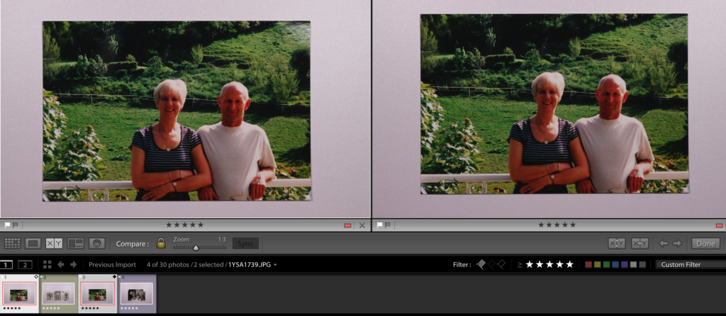
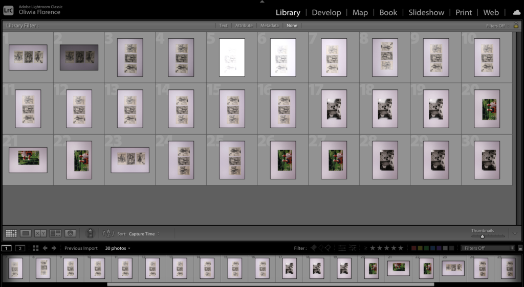
The screen shot above on the left shows the grid view of all my outcomes from a small photoshoot of archives photos of my grandparents I took for my photo-zine. After importing them to Lightroom, I then went though all of my photographs one by one on survey view (shown on the right) and flagged them as ‘picked’ if they where good and flagged them as ‘rejected’ if there where not so good.

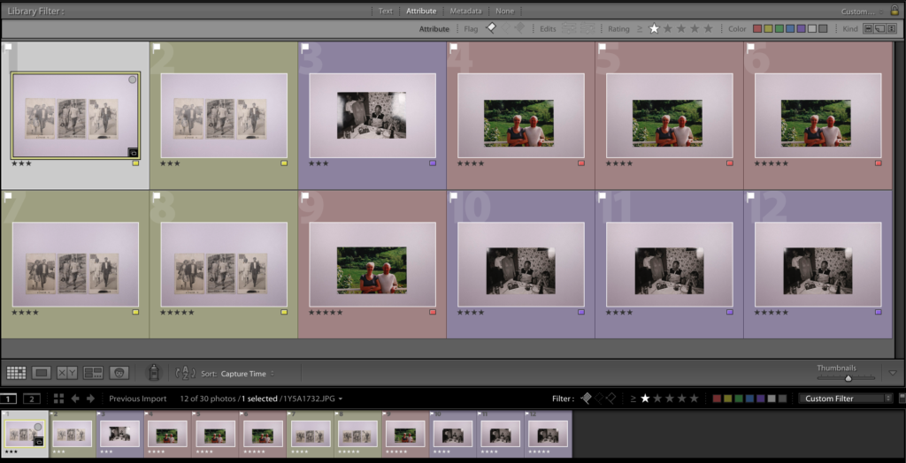
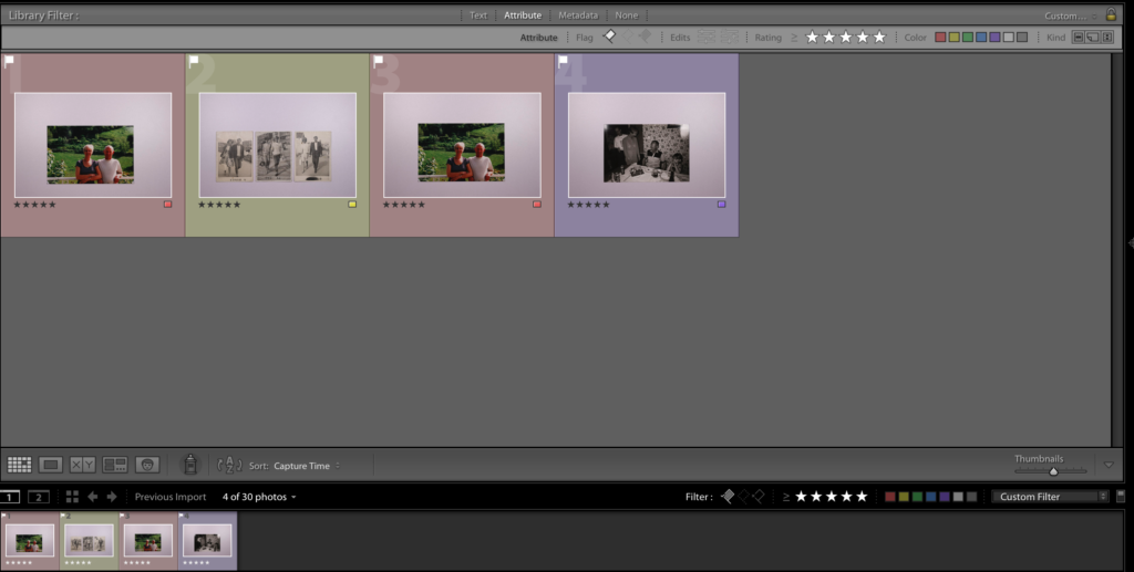
Then by using the filter option on Lightroom to only show the images I flagged as picked, I zoomed in on each of my images to analyse them. Secondly I rated each photo out of 5 stars on its, focus, exposure, etc. This allowed my to view my photos one by one to make sure they where good quality. In the two images below I colour coordinated the images that where the same, and then set the filter to show what images I set as 5 stars (my best photos)

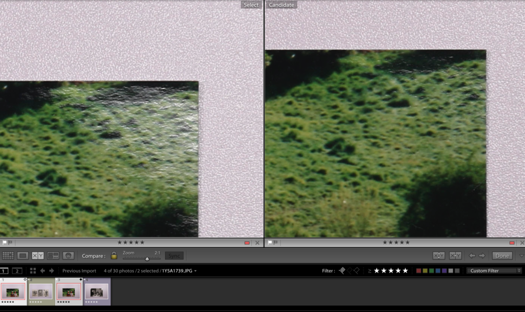
After setting the filter to a 5 star rating, I saw that there where two red coded images left to choose from. I used the compare tool and zoom tool to see the differences between both and spotted that the image on the right has less shine from the lights from the photo stand. This would be my final image. Finally I took the photos from library to develop and edited them to suit what I wanted.

My three final images:

A LOVE STORY

PHOTOSHOOT PLAN 1 – my grandparents

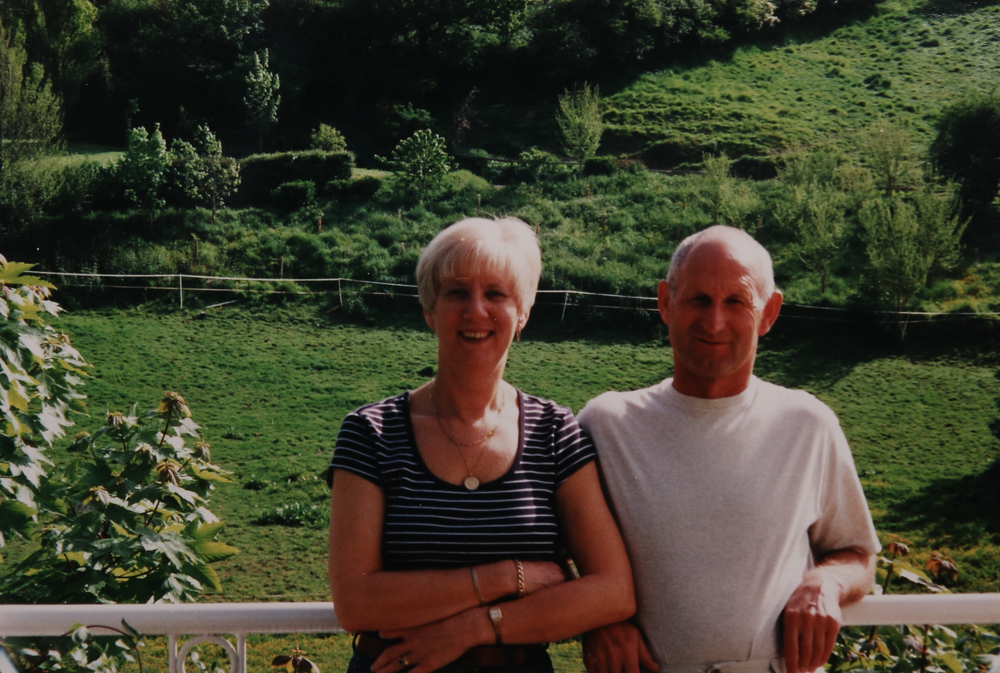
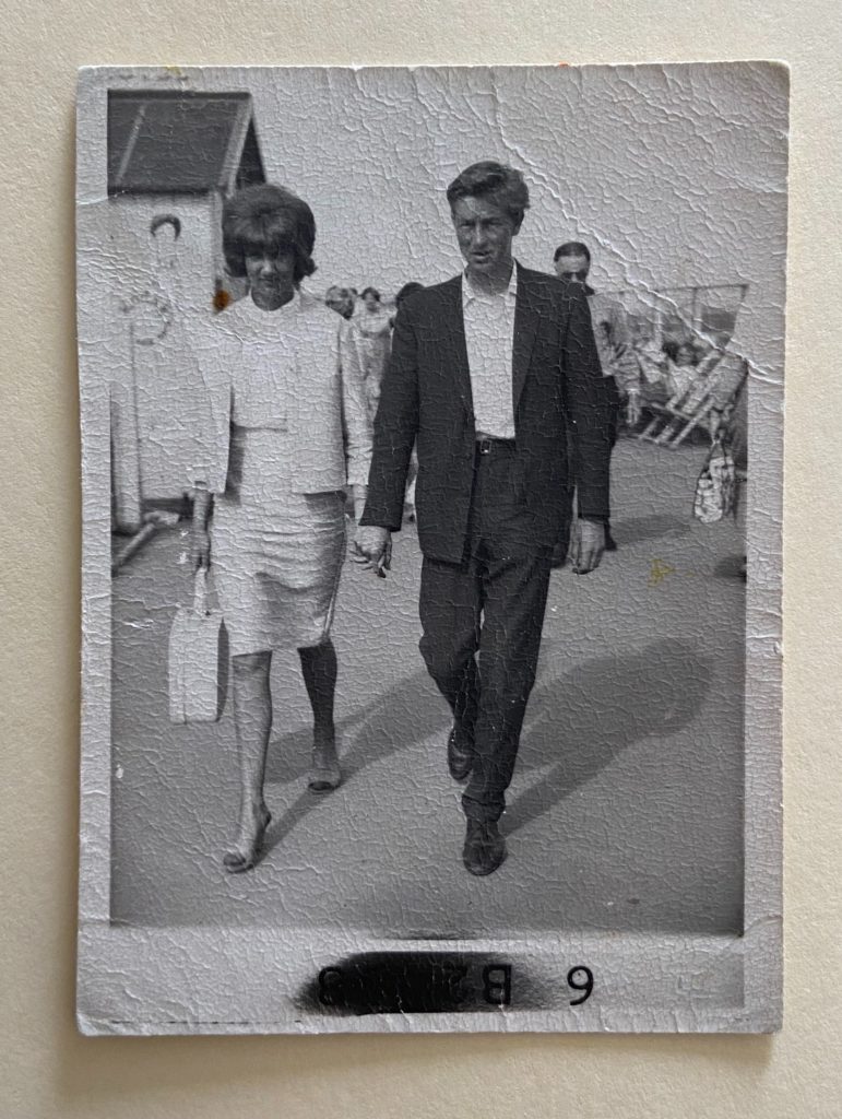
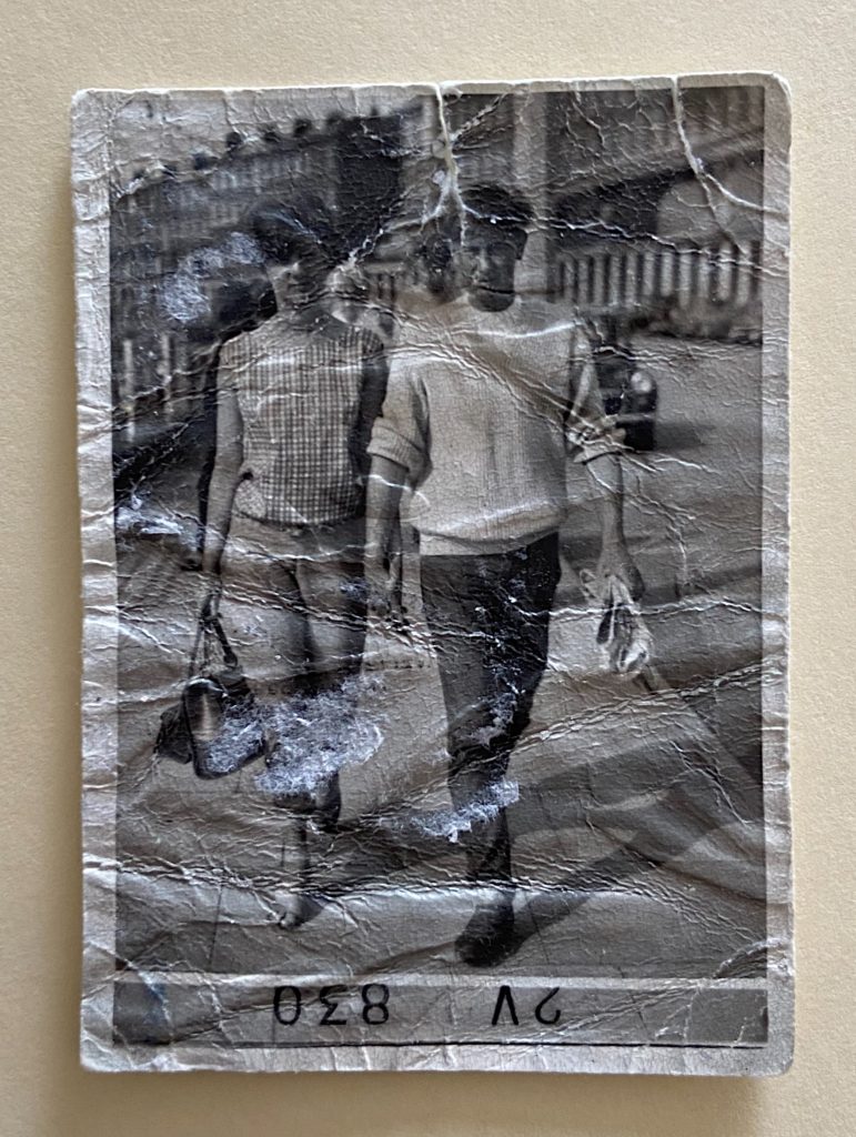
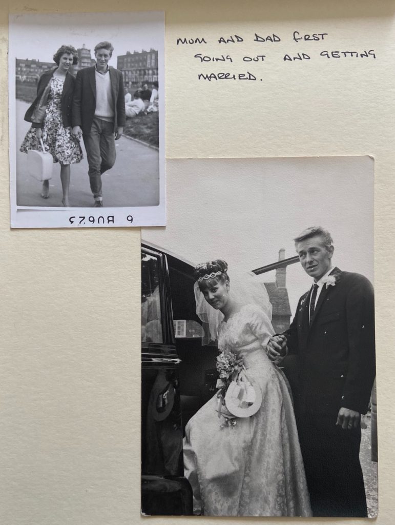
One of my initial ideas was to use a mixture of archived photographs of my grandparents, my nan with my grandad, nan with her new husband. These images will be in the beginning of my photo-zine as it’s the first relationship of the 3 generations. These photographs are all from family photo albums that have been passed down. Below are some I have already, the first image shows my grandparents marriage and a smaller photo of them together when they where younger, some photos show them both together and some are just of my grandad.

For my first photoshoot, I plan to use the photo-stand to digitalise my archived images of my grandparents. This will mean that my images are clearly lit up and taken directly from above. Below are some of the image I plan to retake using the photo-stand.

From this selection I decided that images 1, 3 and 6 would be ideal to photograph as a set for my photo-zine as I am working in threes (three relationships in three generations). I have also decided on two other images that I will shown in my Lightroom work later on.

After taking the images using the photo-stand, I transferred them into Lightroom (screenshot below). Although it was only a small photoshoot because I was only retaking images, I found the camera difficult to work with as there was a very bright light source from the equipment, which meant I had to adjust the camera settings differently. Below are all 30 images that I have put into Lightroom and will work with.
A LOVE STORY- specification

PLANNING: 

Below is a specification that provides an interpretation and plan of how I intend to explore A Love Story. This will include at least 3 photoshoots that I will complete in the next 2-3 weeks. It was also explain how I want my images to look and feel, including visual references to artists/photographers in terms of style, approach, intentions, aesthetics concept and outcome. The final outcome will be a 16 page photo-zine, sequenced together as a set forms a narrative that visualises my love story. 

STORY: What is my love story?

  • 3 words: A love story.
  • A sentence: The harsh reality that not all relationships work out, and that love is not all smooth sailing.
  • A paragraph: My grandparents relationship showed the true hardships of marriage, it ripped apart my fathers teenage-hood, and left a hole in mine. As my grandad fell ill with cancer, my nan found new love with another man, leaving my dad and auntie in the middle or a raging mess. The close family relationships broke, leaving my dad without his mother and father, and me and my sister without grandparents. Their story shows the selfishness of love and how much that affects future generations, especially for me and my sister whom had no loving relationship with my nan. When my nan died, the classic idea of mourning was tossed aside; how do you let go of a love that was never there?

NARRATIVE: How will I tell my story?

  • Images > new photographic responses, photo-shoots etc
  • Archives > old photos from family albums

My idea is to use a mixture of archived photographs of my grandparents, my nan with my grandad, nan with her new husband. These photographs are all from family photo albums that have been passed down. I intend to tell my story including new photographs from my current relationship, and my parents relationship to link to the idea of the relationships through the generations. I may want to use some words or sentences to explain some stages of the story, and as well as this I may use my or my friends current relationships to contrast my nan and grandads marriage/ my or my parents relationship.

AUDIENCE: Who is it for?

Most image makers tend to overlook the experience of the viewer. Considering who my audience is and how they may engage with my photo-zine is important factor when I am designing/ making it. 

  • age group, demographic, social/ cultural background etc.

ALEC SOTH

Alec Soth is a photographer born and based in Minneapolis, Minnesota, famous for his ‘documentary style’ photographs which where influenced by Walker Evans traditional American photography. Soth is interested in and focuses on the relationship between narrative and metaphor, and draws many comparisons to literature, although, he believes photography to be more “like poetry than writing a novel.” He has published over twenty-five books, some of them are Sleeping by the Mississippi (2004), NIAGARA (2006), Broken Manual (2010), and I Know How Furiously Your Heart is Beating (2019).

In an interview with Hanya Yanagihara in early 2019 for the New York Times magazine, Soth begins to talk about how and why he takes his photographs the way he does, explaining that “When I started this project, my only intention was to spend time with another person in a room, any room. But after I photographed Anna Halprin, I decided it should be in the subject’s home. This makes them more comfortable. It’s also more stuff to help reveal what might be going on inside of them”.

His second project NIAGARA was an exploration of ‘love‘ and long term relationships and commitment, which I can directly link to my theme of love in my blog so far. One of the main points that Soth has repeated thought various interviews is that he was interested in making the focus and person he was photographing comfortable, by being in a familiar environment that they love and cherish.

I Know How Furiously Your Heart Is Beating, Anna. Kentfield, California.

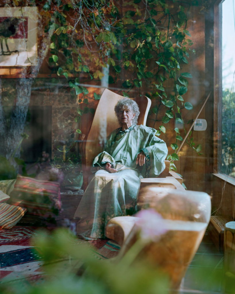
This is one of my favourite of Soth’s photographs. It shows an old woman, who we can assume to be Anna from Kentfield in California sitting comfortable in a chair in a beautiful seating area. The lighting is clearly a natural daylight coming though the windows. I think that the image Soth’s taken is very clever, as the woman home is obviously filled with plans and vines, and the fact that Soth has taken the image from outside has mean that a delicate reflection of greenery and sunlight is placed around the frame of the photograph. In the centre of the image is a full length body shot of Anna, sitting in her home. The image is obviously taken with a lower F/ as the outer parts og the image are out of focus.

Contextually, the image has been taken outside for different reason, and that being that it makes the model more comfortable in their own space. By taking the photograph from outside the building, Soth sticks to an important though he keeps in mind; to allow the subject t to be photographed in their own home. By leaving the room that the subject is in, it should allow them to be even more comfortable inside their own personal space, and this allows Soth to capture the most neutral, relaxed and free image of the subject possible. His reasoning for photographing people in their homes is to find chemistry with strangers while photographing loners and dreamers. This directly links to the image of Anna above in relation to the fact that she may be lonely being an older woman. Alec Soth manages to find a simple and calm chemistry with Anna while taking her photograph ,while she lets him take look into her life.

“I fell in love with the process of taking pictures, with wandering around finding things. To me it feels like a kind of performance. The picture is a document of that performance”

Alec Soth

HENRY MULLINS

Henry Mullins was the first professional photographer to move to jersey and establish a portraiture business in the early days of photography. Mullins moved to Jersey in July 1848, and set up a studio known as the Royal Saloon, at 7 Royal Square, where he worked for 26 years. A wide collection of his photographs (now held by La Société Jersiaise) shows that there where plenty of willing people on the island prepared to pay half a guinea (promoted as “one half of that in London”) to have their portrait taken by him.

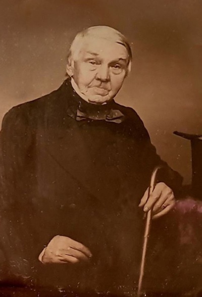
To the right is an early and brilliant quality portrait. A Mr Bolton, photographed by Henry Mullins in 1849-50. Mullins speciality was ‘Cartes de Visite’. The photographic archive of La Société contains a massive collection of these, the on line archive contains 9600 images, and the majority of these are sets of up to 16 photos taken in a single sitting.

https://www.theislandwiki.org/index.php/Henry_Mullins

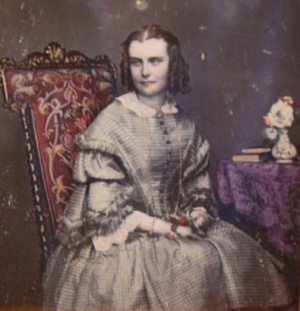
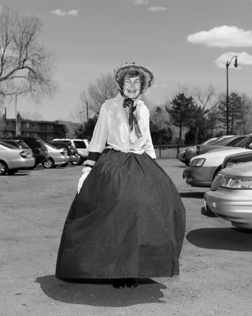
A very early Daguerrotype (a unique image on a silvered copper plate) portrait by Henry Mullins of a woman dressed beautifully. The Daguerrotype was the first successful photographic process.
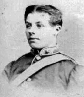
Mullins was also popular with officers (as well as of their wives and children) of the Royal Militia Island of Jersey, as it was very popular to have portraits taken. The pictures of these officers show clearly the fashion in the mid-1800s, being long hair, whiskers and beards.

LOVE

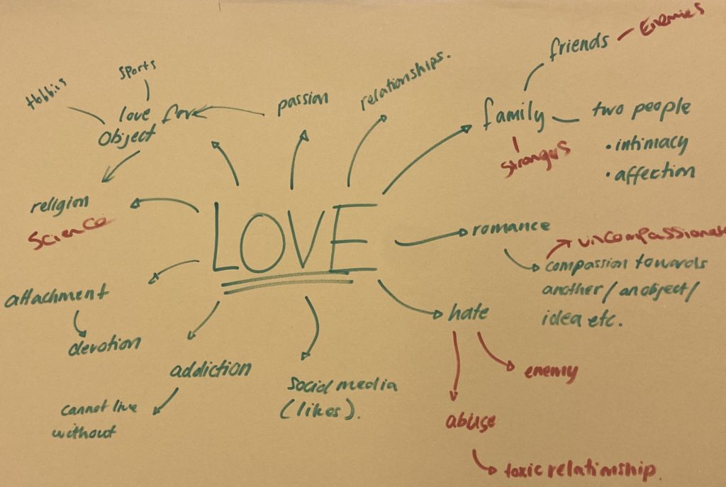
WHAT IS LOVE?

‘When we love someone we experience the same positive thoughts and experiences as when we like a person. But we also experience a deep sense of care and commitment towards that person. Being “in love” includes all the above but also involves feelings of sexual arousal and attraction.’ – https://theconversation.com/what-is-love-139212

There are many different ideas of what love is. Love can be an addiction, a relationship, friendship, and many more other things. It’s not only people who perceive, show and feel love in the same way, for example, many cultures have different values and feelings toward ‘Love’.

You don’t always have to love one person/ people, many other forms of love can be toward an object or idea, e.g. religion. Many political views come from love such as controversial views about ‘free love’ and things such as polygamy, gay couples and other alike topics. Many movement have been started to fight these issues.

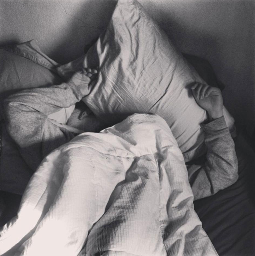
Carolyn Drake tanks about her lover, Andres, who doesn’t particularly like being photographed. Waking up a couple hours before him, she can’t resist to snap a shot to express how natural the moment is. She states ” Love is a complicated thing. I see the pictures as an expression of love, but also of the selfishness in love.”

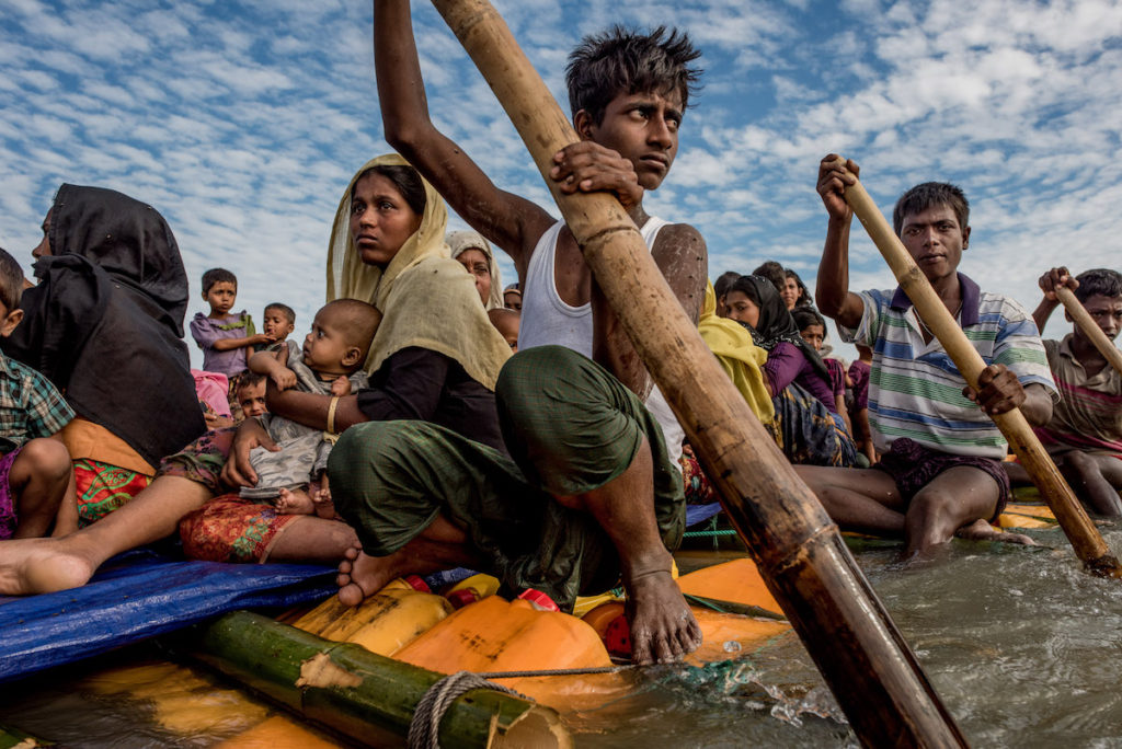
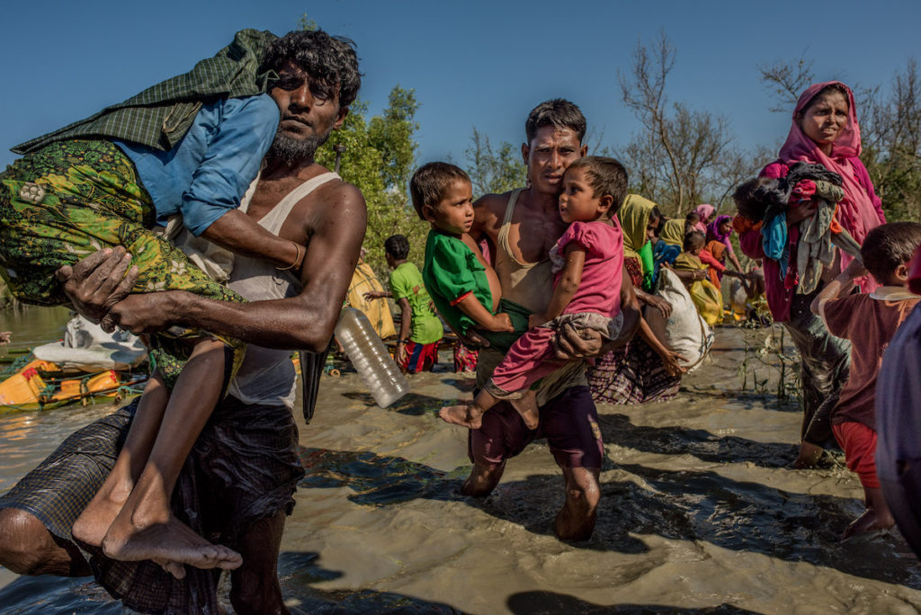
Tomas Munita is an independent documentary photographer. He focuses on photographing social and environmental issues. In the photos above, he documents refugees with their families crossing the Naf river. His photos explore a strong sense of love and community in difficult times.

FAMILY ARCHIVES

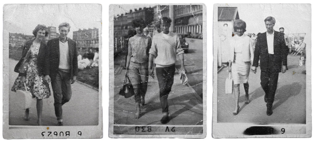
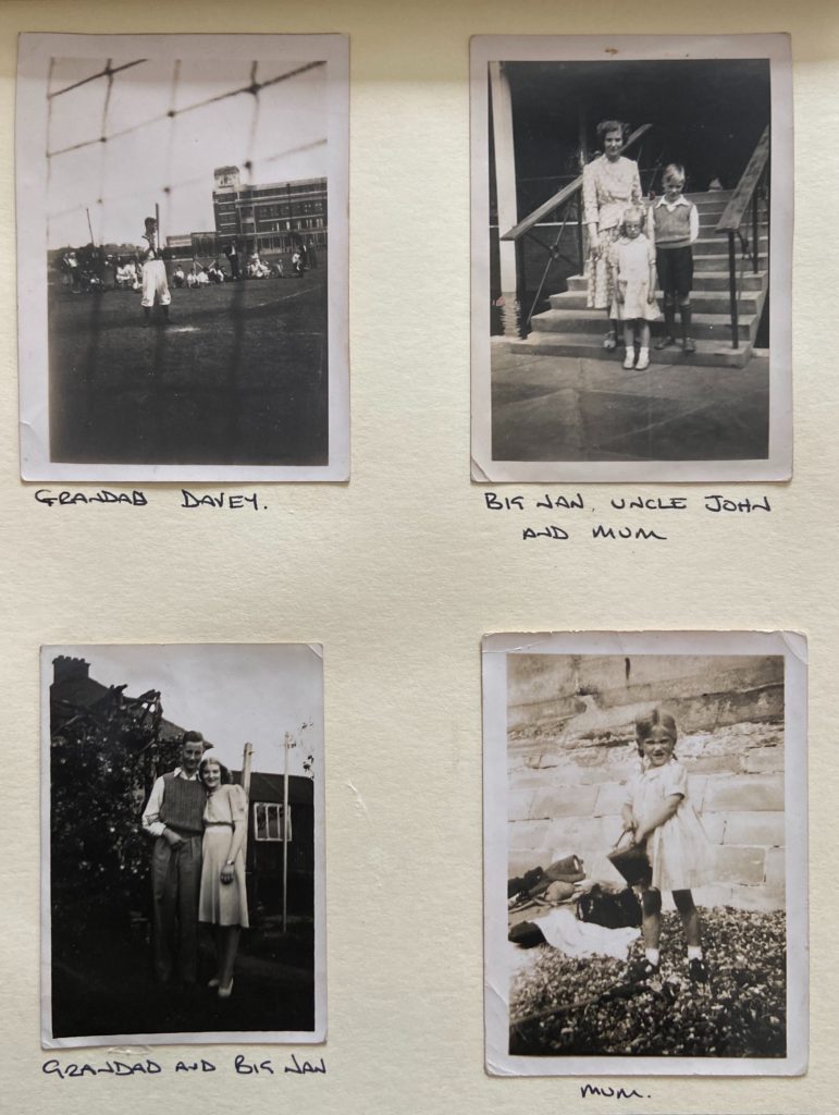
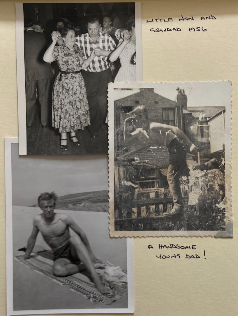
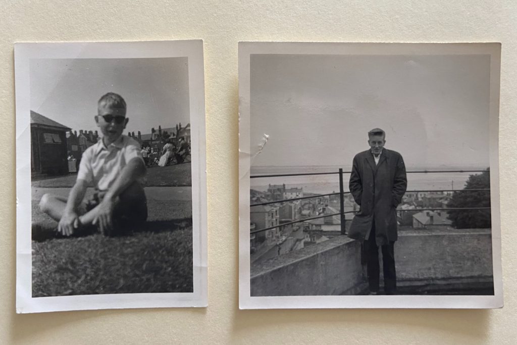
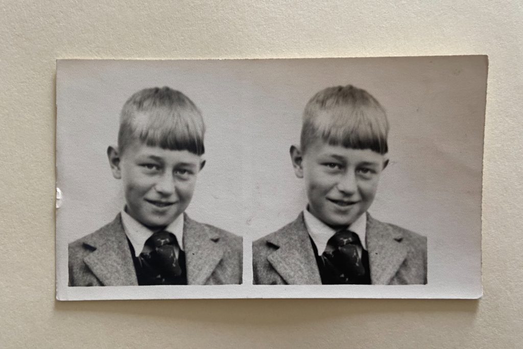
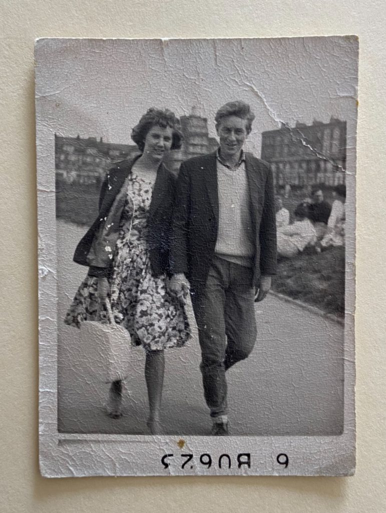
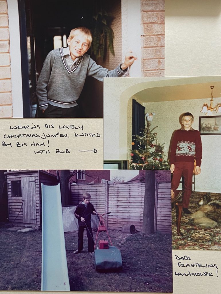
Many of the Photographs I have to look back on are from my dads side of the family. Compared to my mothers family who didn’t have a camera until my mom was in her teens, my dads family frequently took photographs of weddings and everyday life. Many of the photographs we own are in pristine condition and kept in separate family photo albums. These are some of the oldest photos in out family archives.
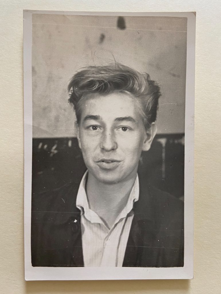
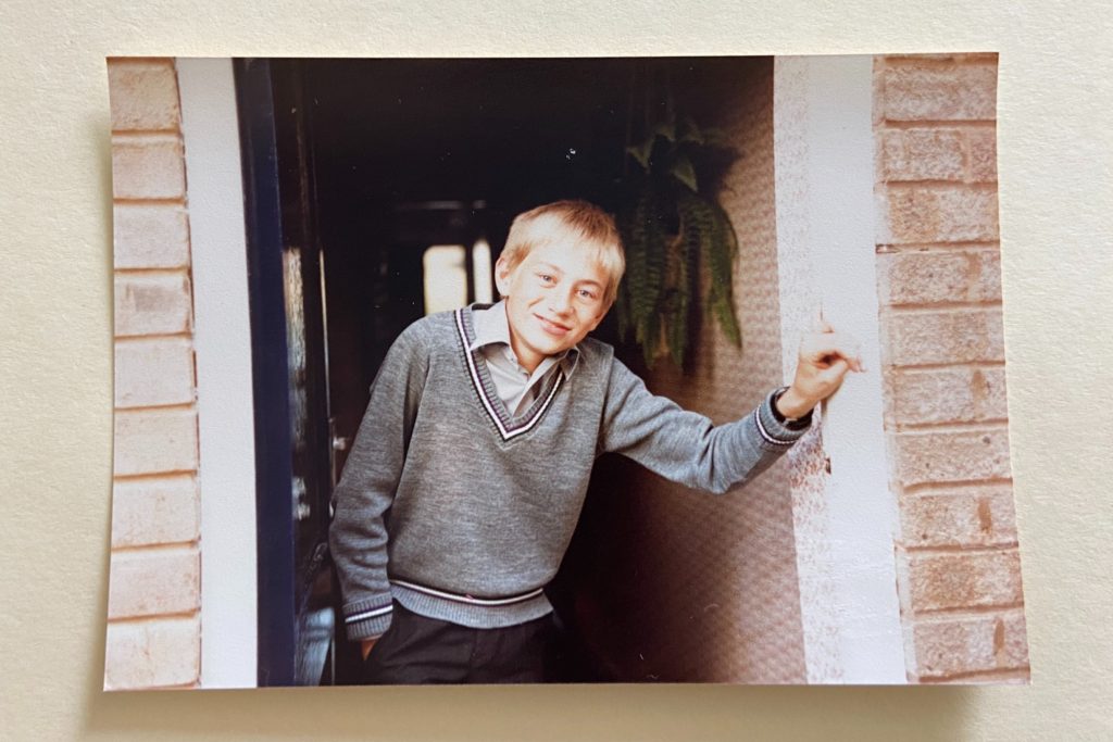
The photos above are of my grandad and my nan when they where young. My graded was a ‘Teddy boy’ – ‘A British subculture of young men wearing clothes partly inspired by the styles worn by dandies in the Edwardian period, which Savile Row tailors had attempted to re-introduce in Britain after the Second World War’, as shown by the blazers and jumpers he wore. Almost all the final photographs below are of my dad when he was younger, so I will probably attempt to recreate them with him now that he is older. This will hopefully create contrast to two different time periods, while making direct links to the past and preset.

PHOTOSHOOT PLAN:

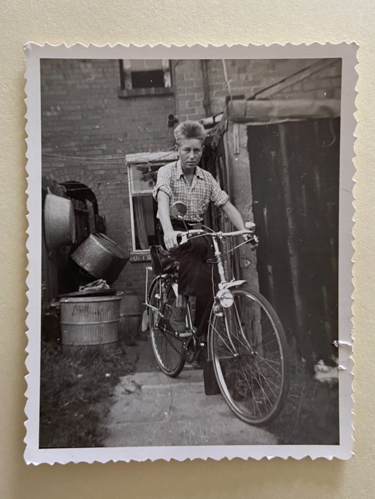
These will be the two photographs I will try to recreate. The first image is my grandad on a bike outside of his house, and although he isn’t able to be in the photograph anymore, I would like to recreate the image using my dad instead. The second image is a younger photograph of my dad, which I will also use my dad to recreate. Even though it won’t be in the same house as his own when he was a child, it will be the current one he lives in now.

I intend to take my photographs in-front of the doorway of my house, and the entrance to my back garden to try to recreate as closely as possible to the images.

I will also try to match the clothes as closely as possible: using a checkered shirt and black trousers for the first image, and a blue shirt with a V neck jumper for the second image.

During the photoshoot I will make sure I have a range of half body / three quarter length / full length body shots, that look similar to the images I intend to copy.

The type of light is natural daylight so the camera settings I will use are ISO 200 to take the image, an exposure time of 1/8 and a shutter speed of f/4. I will also set up a tripod to prevent camera shakes and receive a clear, focused image.

WHAT MAKES AN IMAGE ICONIC?

When a photograph is considered iconic, it relates to the fact that it’s very influential and recognisable, famous even. The images that are labelled ‘iconic’ are embedded in our history and culture, often having a huge global impact on society. They may define a major event in history, or even come to create one. However what about the images, make them iconic?

Alberto Korda’s photograph of Che Guevara taken March 5, 1960 would be one of the most influential photographs in the course of history, becoming the global symbol of revolution and rebellion, but what aspects of the photograph make it so unforgettable?

Susan Bright talks about the photograph of Che Guevara in response to the question ‘Why is it famous’. She talks about the criteria that makes an image iconic, and, for Alberto Korda’s photograph of Che Guevara there seems to be a strong social value that influence its power as an image. There are many technical qualities of the photograph that contribute to it’s memorability, for example, its high contrast in blacks and whites, the upward angle of the camera shot, the focal point only being the face of Che Guevara, looking on with power and strength.

ZANELE MUHOLI

REPRESENTING BLACK LIVES IN THE LGBTQ COMMUNITY

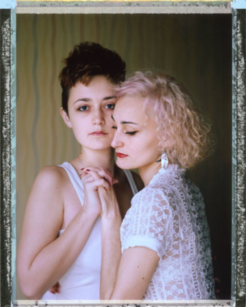
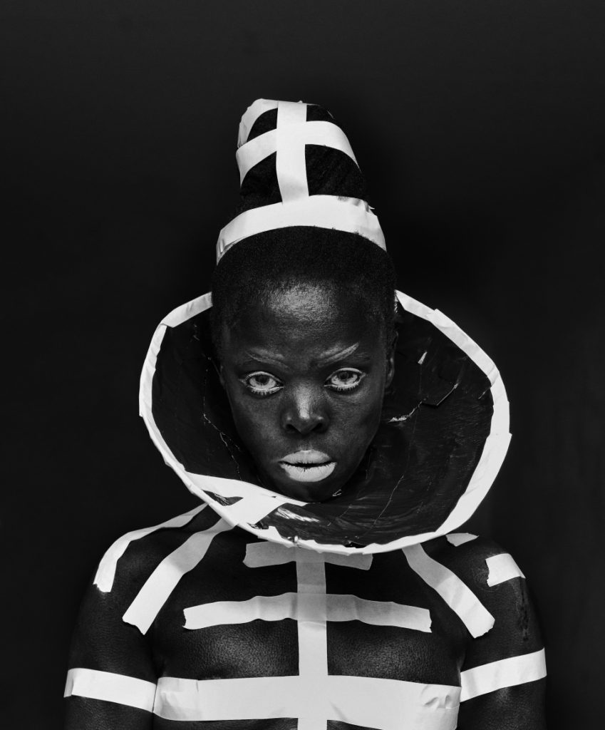
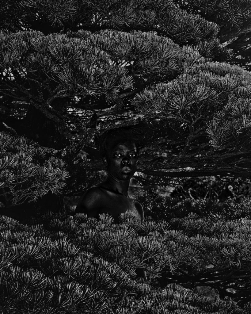
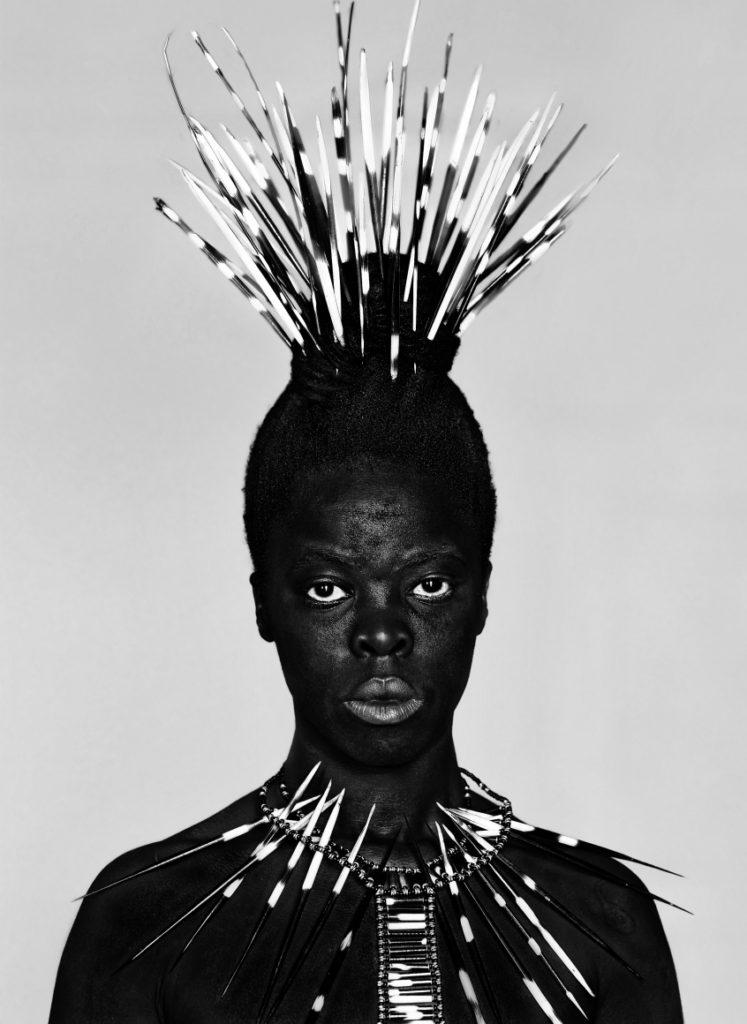
Zanele Muholi is one of the most influential photographers/ artists today, exploring topics such as racism, labour, Eurocentrism and sexual politics, as well as showcasing South Africa’s black lesbian, gay, trans, queer and intersex communities. Muholi is a South Africa queer, non-binary visual activist (who uses the pronouns they/them/their) documenting various peoples lives in townships in South Africa. Their work is often bold and confrontational, addressing issues in racism and politics that come with race.

They focus on an ongoing project called “faces and phases” which depicts black lesbian and transgender people in response to the continuing discrimination and violence the LGBTI community faces. “Muholi’s self-proclaimed mission is ‘to re-write a black queer and trans visual history of South Africa for the world to know of our resistance and existence at the height of hate crimes in SA and beyond.'” –

https://www.yanceyrichardson.com/artists/zanele-muholi?view=slider#8

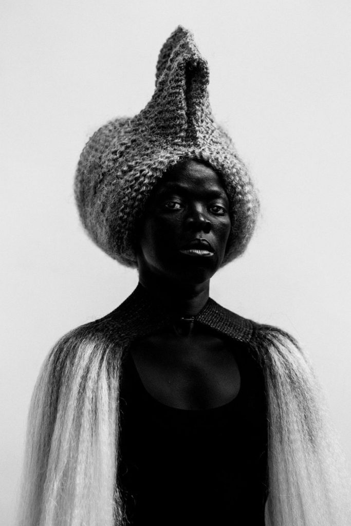
In another series, Somnyama Ngonyama (Hail the Dark Lioness) Muholi points the camera at themselves to be the model and the photographer, to experiment with characters and looks. They exaggerate skin tones to be darker through editing which increases the depth and contrast of the photograph its self, so they can take back their blackness, and offset the culturally dominant images of black women in modern day media.

  • Zabo I, Kyoto, Japan, 2017. From the series Somnyama Ngonyama

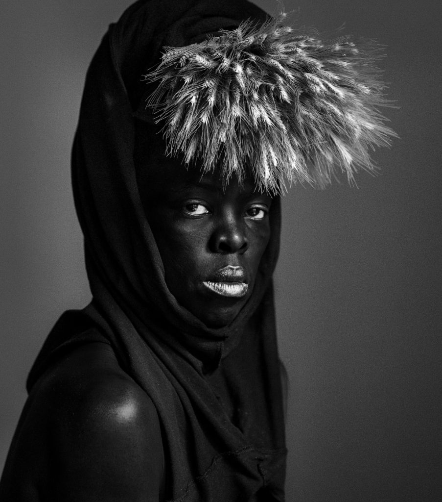
MaID X, Durban, 2016

MaID X, Durban, 2016. From the series Somnyama Ngonyama. Gelatin silver print, 19 2/3 x 14 inches

CRITICAL/ CONTEXTUAL

VISUAL

TECHNICAL