For my project I have decided to use Bookwright as it is a relatively easy and well made program to make my photo-book. I created an account with blurb and downloaded bookwright. I chose a small square layout ( 18cm x 18cm ) with premium matte paper and a hardcover design.
COVER DESIGN:
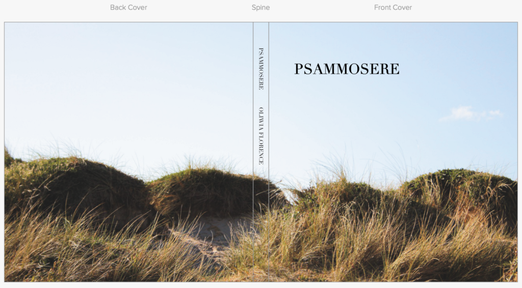
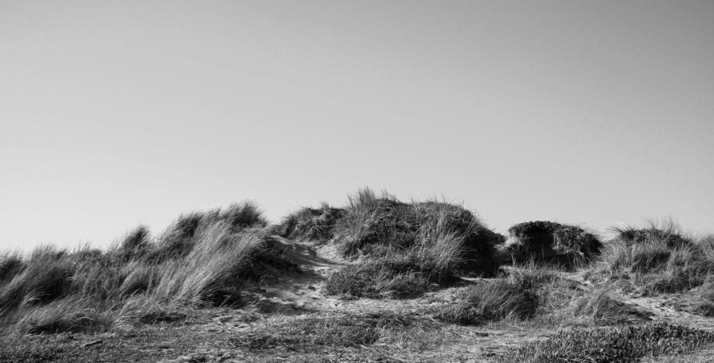
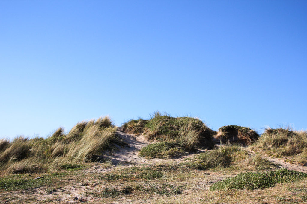
Above is my final edited cover image that I will use to wrap my photo-book cover with. Within my photoshoot, I couldn’t decide between two images to span across the front and back of the cover pages. I decided that no matter what image went on the cover, it would be in colour. The image above is the photo I used to cover my page. I firstly enhanced some of the warmer tones in the images to bring out the yellow colours of the sandand grass , so that it would better contrast the bright blue sky. I also increased the exposure and contrast to create better distinction between highlights and shadows. As well as this I lightly increased black and highlights, while keeping shadows the same.
MY FINAL COVER DESIGN:
MY PAGE DESIGN:
I decided to set up all my image sizes and orientations on my page. I chose to use a random arangement of image size and layout so create diversity in the book. as well as this, I’ve included gaps on pages between photographs to keep the images separated and bring more attention to the photos that are there. I wanted the book to be simple and elegant, and showcase the beauty in the minimal images that represent so much about the dune succession.
I have also decided to keep the pages white to contrast the images.
all images are different dimentions
all images are a different place on the page.
text will not go underneath the images
all images apart from the cover are in black and white
FINAL BOOK LAYOUT:
EVALUATION
I think that the book is very successful. I am very happy with the images that I produced for the photo book were very unique and well-edited. I think that all of the compositions of the photographs are very centered and symmetrical so create an interesting image to look at. I like how I’ve used different compositions and photo sizes to create diversity and change Although, next time I would definitely make sure that the editing process is more interesting. I would have liked to have experimented more with day/night time, weathers, coloured lights and outfits possibly. Even though the images are interesting, I would have definitely have liked to take more inspiration from artists and photographers.
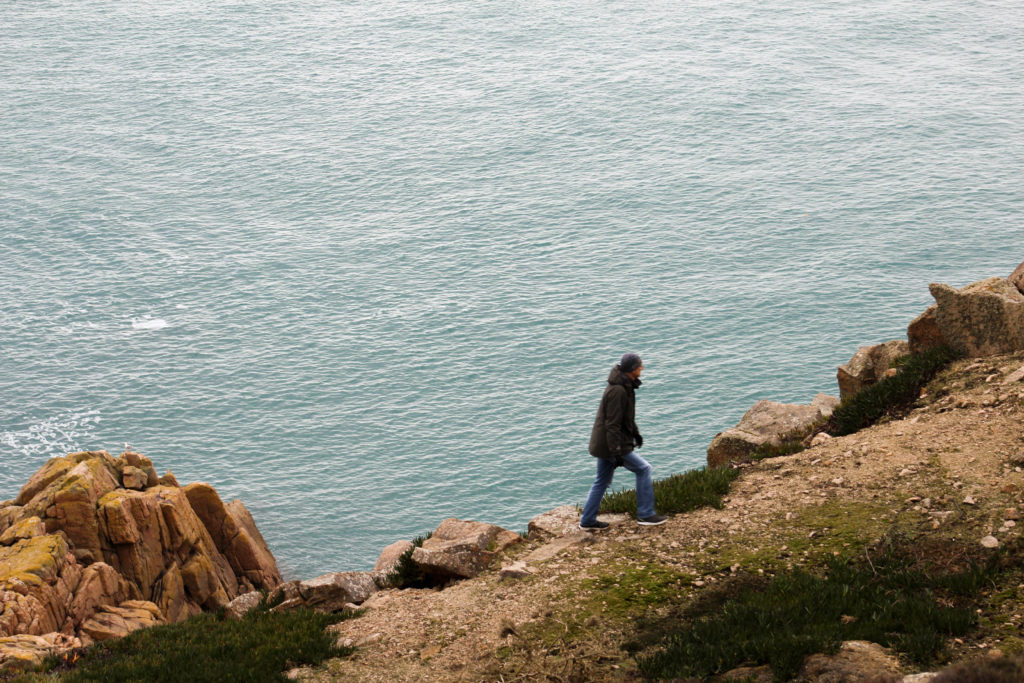
My last photoshoot is in the grey dunes, further up the transitioning sand dunes. I set up my camera on a tripod to make sure all of my images where in focus. I would also use the self timer tool on the camera as I would be the model in the images. I planned on wearing a black dress and continuing that outfit throughout all of my images, again using myself as the model. The camera setting were very difficult to set up due to the movement of myself and the marram grass, so I had to use the autofocus tool in order to make sure all of my images came out clear with myself as the focus. Within my images, I had some of myself crouching down in the grass, mimicking the images at the beginning of the book where I was crawling out the sea. I think this would be a interesting concept as I am crawling my way through dunes.
After taking all of my images onto Lightroom, I was able to start picking and rejecting images using the P and X keys. Many of the images wherent up to scratch as it was extremely difficult to take images of myself as the model. I think that the images that came out good where extremely beautiful and really exaggerated the movement of the grass and wind. I think that the black dress contrased will to the yellow grass and sky as the darkness of it brought attention to me as well as the landscape around.
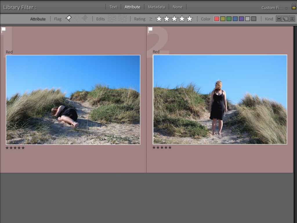
After flagging and rejecting my images, I went through and rated all of them out of 5 in order to start refining my decisions and options. I also used the compare tool ( shown in the image below) on Lightroom so that I was able to look at two similar images to decide which one had better composition and focus. I later decided on the two images below to end the pages of my photobook. I think that their symmetry and focal points where the best and that they made very interesting and elegant images. I gave them 5/5 stars and used the filter tool on Lightroom so that I could only view them, which would make the editing process much easier to do.
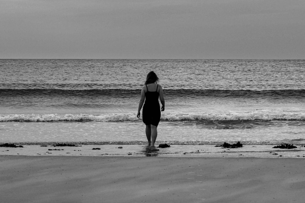
Out of the two images below, I decided on the image on the right. It was more in focused however, I took the photo into photoshop in order to fix the straps on the dress. This was a quick fix using the smudge tool. After this process I took the image back into lightroom in order to colour correct the images to black and white. I also chose one of the photo that didn’t include myself as the model in.
EDITING
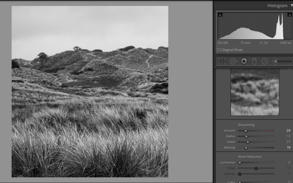
During the editing process I decided to make the images Black and white like I specified in my planning. I cropped the images to my desired proportions and angled the images so that the horizon line was exactly horizontal. I started by editing the image on the left by increasing the exposure and contrast to accentuate the highlights and shadows in the black and white. In the image on the right, I centresd myself directly in the middle, bringing focus to the model. I also increased the black so that the dress I was wearing was more visible. I copied and pasted the editing process onto the image on the right to keep the tones consistent within each photograph, I plan to to this to the rest of my images.
ALL FINAL IMAGES
I think that this photoshoot was very successful. I am very happy with the images that I produced from the shoot were very unique and well-edited. I think that all of the compositions of the photographs are very centered and symmetrical so create an interesting image to look at. Although, next time I would definitely make sure that the editing process is more interesting. I would have liked to have experimented more with day/night time, weathers, coloured lights and outfits possibly. Even though the images are interesting, I would have definitely have liked to take more inspiration from artists and photographers.
During this shoot, I planned to find and edit and image for the cover of my book, psammosere. I think the images from this shoot of the embryo dunes are extremely beautiful and clearly outline and represent the sand dunes. Similarly to my last photoshoot, I set up my tripod, set my iso to 100 on the manual setting and aperture to f/16, as well as the shutter to 1/100 second. This allowed me to get well exposed images that where in focus. These smaller dunes where directly above the beach so follow the pattern of the succession of the sand dunes.
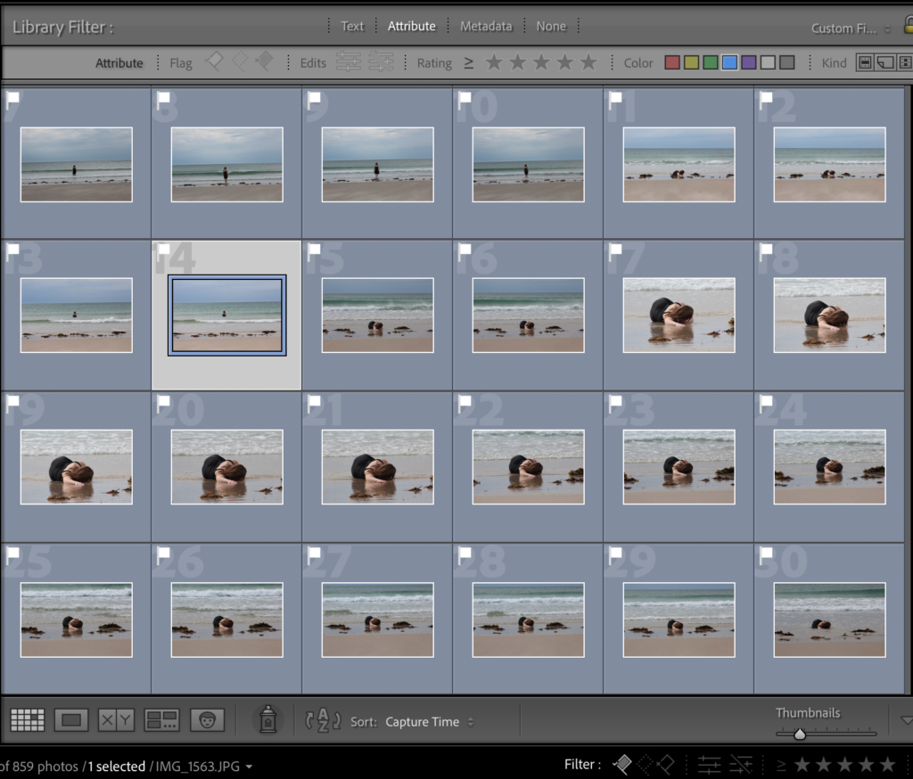
I started off by colour labelling all this images from this particular photoshoot in red so that I was able to view the images better. I went through each image one by one and X to reject/ P to pick each image, depending on whether I liked the image or not. After this process I filtered the images so I could only see the picked ones, this then allowed me to start rating the images, aided by the compare tool to see which image is better focused out of two similar photos. At the end of these processes I was left with 4 images at the end of this; two that had myself the model in, and two I was hoping to use as my cover image (image shown at the bottom).
COVER IMAGE
Within my photoshoot, I couldn’t decide between these two images to span across the front and back of the cover pages. I decided that no matter what image went on the cover, it would be in colour. So I look both images into develop to start playing with colours. I firstly enhanced some of the warmer tones in the images to bring out the yellow colours of the sand, so that it would better contrast the bright blue sky. I also increased the exposure and contrast to create better distinction between highlights and shadows. As well as this I lightly increased black and highlights, while keeping shadows the same. I completed the same editing process with both images
I decided to see what image would look better on the cover by taking them into bookwright and comparing them. The images below show what each image looks like on the cover. I made the title of my book Psammosere and further wrote my name on the spine with the title. Even though both of these images are really stunning and elegantly represent how the sand dunes look, I prefer the colours and bright strands of marram grass in the bottom image. Although, I’d really like to use the top image within my book, and its inspired me to not just use images of myself in the black dress in all my images, but of the landscape by its self too.
final image for the cover page
EDITING MY BOOK IMAGES
These are the two images that I was hoping to use inside the pages of my book. I really love the composition of these images and how the grass flows with the direction of the wind. I really enjoy how the marram grass flows over me in the image on the left, I also this that my positioning, which is similar to one in the initial sea photoshoot, is a gentle and calming pose. It can be seen that I am possibly intimidated by the growing grass. I edited these images similarly to the others in previous shoots to keep consistency.
FINAL IMAGES
when looking at this photo book in class, I was very inspired by its layout, particularly this spread on the left. They look as if they are the same image mirrored but in fact, it’s a different shot but still mirrored. I thought I would try this with my square image just below. I will similarly have it on a double page spread, adding diversity to the images in my book. I particularly like the way my hair mimics the way the wind moves the grass. These 3 images will form the middle of my book, being in the embryo dunes.
EVALUATION
I think that this photoshoot was very successful. I am very happy with the images that I produced from the shoot were very unique and well-edited. I think that all of the compositions of the photographs are very centered and symmetrical so create an interesting image to look at. Although, next time I would definitely make sure that the editing process is more interesting. I would have liked to have experimented more with day/night time, weathers, coloured lights and outfits possibly. Even though the images are interesting, I would have definitely have liked to take more inspiration from artists and photographers.
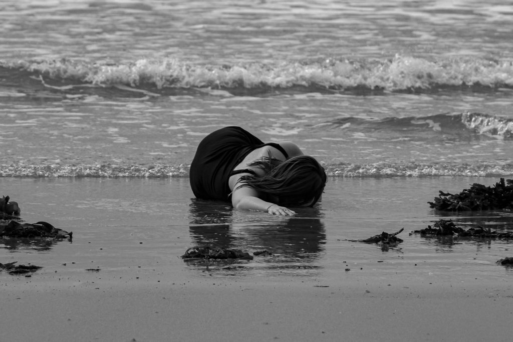
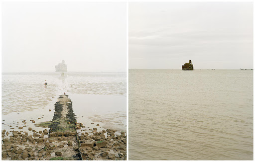
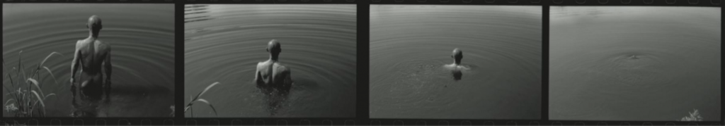
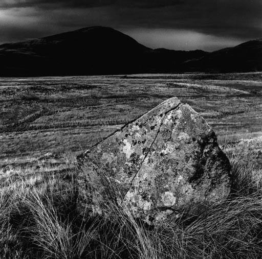
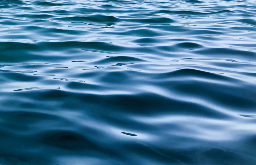
I started my photo book development by starting with a Michael Marten inspired photoshoot. I based my photoshoot at Le Braye beach where the waves are smaller and more calm. I was initially inspired by the image below and its powerful tidal message. My main idea was to start my photoshoot at the bottom of the sand dune succession transition; the sea. Images from this shoot will begin the story line of my book. I would similarly like to use a model (myself) to act as the sculpture of the figure in Michael Martens image below.
CAMERA SETTINGS
I set up my camera on a tripod to make sure all of my images where in focus. I would also use the self timer tool on the camera as I would be the model in the images. I planned on wearing a black dress and continuing that outfit throughout all of my images, again using myself as the model. The camera setting were very difficult to set up due to the movement of myself and the waves, so I had to use the autofocus tool in order to make sure all of my images came out clear with myself as the focus. Within my images, I had some of my lying down in the sand as if I was dragging myself out of the water. I think this would be a interesting concept as I am crawling my way through dunes. I also took some of myself in the sea, similar to the Michael Martens image below.
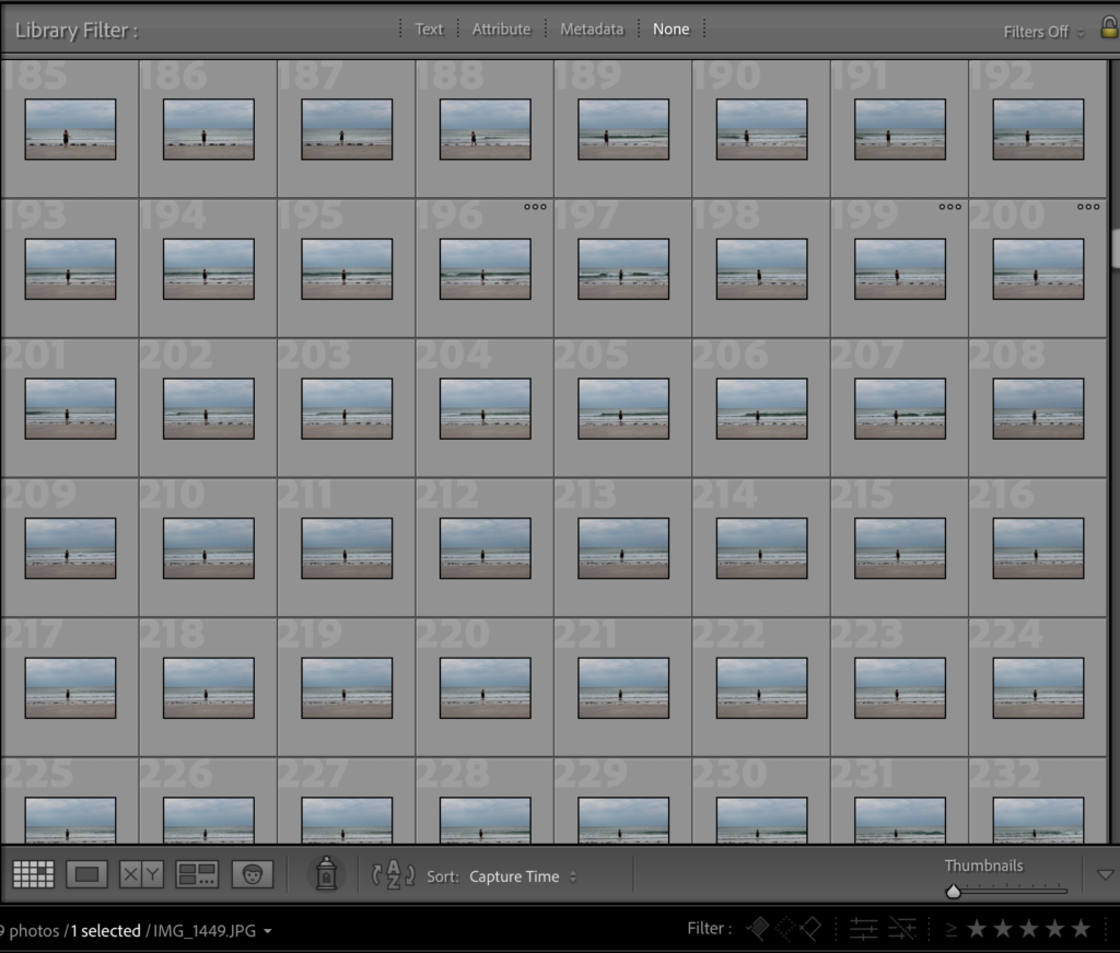
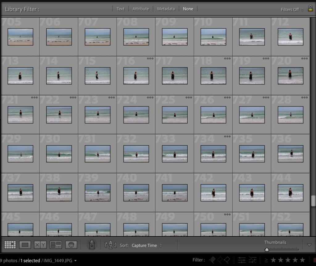
After taking all of my images onto Lightroom, I was able to start picking and rejecting images using the P and X keys. Many of the images wherent up to scratch as it was extremely difficult to take images of myself as the model. I think that the images that came out good where extremely beautiful and really exaggerated the movement of the tides. I think that the black dress contrased will to the sand and sea as the darkness of it brought attention to me as well as the landscape around.
After flagging and rejecting my images, I went through and rated all of them out of 5 in order to start refining my decisions and options. I also used the compare tool ( shown in the image below) on Lightroom so that I was able to look at two similar images to decide which one had better composition and focus. I later decided on te two images below to start the first pages of my photobook. I think that their symmetry and focal points where the best and that they made very interesting and elegant images. I gave them 5/5 stars and used the filter tool on Lightrrom so that I could only view them, which would make the editing process much easier to do.
During the editing process I decided to make the images Black and white like I specified in my planning. I cropped the images to my desired proportions and angled the images so that the horizon line was exactly horizontal (image on the left). I started by editing the image on the left by increasing the exposure and contrast to accentuate the highlights and shadows in the black and white. In both images I centres myself directly in the middle, bringing focus to the model. I also increased the black so that the dress I was wearing was more visible. I copied and pasted the editing process onto the image on the right to keep the tones consistent within each photograph, I plan to to this to the rest of my images.
In my photo book, I’d like to explore with idea of transition within nature. My main idea is to look that the sand dune succession on the coast of jersey. On an island we are very lucky to have the landscape that we do. from the sea its self, the landscape transitions from beach, to dunes, to the woods. Throught my book I would like to use a model to act in each other different section on the dunes. St Ouens beach goes through a series of phases to become dunes. Primary succession can happen when bare sand is colonised by plants. Over time, the sand builds up into sand dunes, raising the ground above the height of sea level. Succession in sand dunes is sometimes called a psammosere.
Within my book, that I will create using bookwright and blurb, I will explore all sections of the sand dunes in order to see the full TRANSITION of the coastal succession. I would like to keep all artificial features out of my images, like buildings and roads to make the images as natural as possible, focusing on the dunes and sea. I’d like there to be one image from each part of the dunes/beach/woods. I think the transition of the coast is extremely beautiful and inspirational
How you want your book to look and feel. It could possibly have a textured surface, like canvas to mimic the texture of marram grass, a plant that grows on the dunes.
Paper and ink. matte images and matte pages.
Format, size and orientation. small square
Binding and cover.
Title : some of my ideas have been succession or psammosere; a seral community, an ecological succession that began life on newly exposed coastal sand. Most common psammoseres are sand dune systems.
Structure and architecture: I would like a organised sequence of images, starting with the sea and ending in the woods, so that there is a clear TRANSITION of the coastal landscape. One image per page preferably, and all the images will be the same size. Most of the images will be edited in the same way to keep consistency and authenticity.
Design and layout. Editing and sequencing. There will be one image per page in the same orientation, mainly landscape and not portrait. I would like my photos to be in back and white, so the viewer can focus on the landscape. I think that having the images in black really draws attention to the contrasts in the landscape, and accentuated the highlights and shadows in each image. Systematic sequencing will be very important to create a smooth transition from image to image and scene to scene. I would like to have one image on each double page spread, again creating further focal point to the images in the book.
Images. New photographic responses will be created during photo-shoots. I will include a model within my images to exaggerate the movement of the wind, waves etc. images will be in black and white like I’ve said before. I’d possible like to include a coloured image of the sand dunes on the cover of my book to add context and contrast to the images in the book. It will also make to viewer think about what colours the black and white images may have.
text. I dont plan on having any letters, documents, poems, text messages in my book, however I may include how each natural structure is formed in the dunes. These may caption each photograph in my book. There will be short caption to each image, explaining what coastal feature is in the image, like a story line to sand dune succession however, depending on how each image looks on the page, I may not include captions at all.
MY IMAGES WILL GO IN THE ORDER OF SAND DUNE SUCCESSION IN THE ORDER:
the sea
the beach
the embryo dunes
the grey dunes (higher dunes)
possibly a dune slack (pond)
the woods
2. Produce a mood-board of design ideas for inspiration. Look atBLURB online book making website, photo books from photographers or see previous books produced by Hautlieu students on the table in class:
Michael Martens work has been an exteremly large influence for me. Michael Marten was born in London and began taking photographs as a young teen and since then he has been involved with photography. His first job was caption writer at the Camera Press photo agency. During 1973 Michael was one of a group who published ‘An Index of Possibilities’, an alternative encyclopedia of ideas. In 1979 he started the specialist photo agency, Science Photo Library. He has co-authored several books of scientific imagery, including ‘Worlds Within Worlds’ (1978) and ‘The Particle Odyssey’ (2002).
Since 2003 Michael has concentrated on landscape photography. His first major series was ‘Sea Change’ (2003-12). A second project, ‘Godrevy’, was exhibited and published in 2015. I was immediately mesmerized by his ‘Sea Change’ images that clearly have been made carefully over a long period of time. Even though they are not particularly edited, the contents of the photos is enough to create a beautiful contrast.
For eight years, Michael Marten has been roaming the British coastline, recording this lost-and-found littoral landscape. At the beginning of his project he became “a student of tides”. He began with the rudiments: the daily rhythms of flood and ebb; the lunar-monthly rhythms of high spring tides (occurring around the full and new moons) and low neap tides (when the moon is on the wax or wane); the existence of solar as well as lunar tidal pulls.
He studied how the sea bed, topography and barometric pressure can all locally affect tides, he aslo examined the tide tables issued by the UK Hydrographic Office, and he came to comprehend that tides might best be imagined not as lateral sloshings back and forth, but as sets of shifting gyres, rotating around a roving “amphidromic point”, known as the “point of no tide”.
“A sense of threat, as well as one of miracle, attends Marten’s images. The people who fill the beaches at low tide seem still to be there at high tide, invisibly in their fixed positions, swallowed by metres of sea. This, perhaps, is the most charismatic aspect of his work: the cognitive dissonance between the serene and the sinister.”
SEA CHANGE AS AN INSPIRATION
This book by Marten has really sparked my interest in making a series books, where perhaps, my model could be in the same or similar positions in different bodies of water or nature. I could have my model moving in to bodies of water such as the sea, similar to Antony Gormley’s work with sculpture work.
PHOTO ANALYSIS
CONTEXTAL/CONSEPTUAL:
Micheal Martin’s artwork has been extremely influential on the people living on the English coast, as it really remind people of the coast and tides natural beauty and power: “It is hard, in an era of anxiety at climate change and creeping sea levels, not to find in these images a fore-glimpse of future inundations; hard, in particular, not to be disturbed by the sight of Antony Gormley’s iron men on Liverpool’s vulnerable Crosby coast, standing calm, still and unperturbed as the rising water drowns them.”
TECHNICAL:
The lighting of this image is generally quite light, clearly taken with a dim, foggy but bright daylight setup. The fog contributes to a softer and warmer tones sky and sea as not much reflection between the two is visible. The image looks to have been reasonably exposed. The shadows aren’t too strong in the image, apart from the change in darkness between the wall in the first image and then the switch to the darker oil rig in the second image.
The aperture probably around f/11 in both images, as both the background and foreground are in perfect focus. The shutter speed seems to be average, maybe 1/125 as the image seems to be regularly exposed, but also quite focused and sharp. The ISO also seems to be low as the image was taken outside in daylight, so probably around ISO100.
VISUAL:
I really enjoy this image from Martens project Sea Change. The colours in these two images are immediately very striking, and contrast plays a huge part when comparing the two almost identical images. On the left you see a sort on wall or slipway that points directly to the oil rig that stands in the ocean. The rig is blurred by the fog while the rocks surrounding the wall are clear and contrasted. Then, when you look at the image on the right, the oil rig sits effortlessly on the ocean which is a warm sandy colour, like the beach underneath. The wall is not visible anymore as well as the beach and rocks which have been concealed by the flowing tide. The oil rigs in each image are almost centred in the frame, further implying they are in the same place and the tides have moved.
My intention with this exam project is to incorporate all 3 exam topics together; freedoms, limitations and transitions. I feel quite inspired by Michael Martin tidal artwork and Grade Solomons dreamlike artwork, where they experiment with light and changing tides. I would like to work with the ideas of transitioning weather states and water forms, as well as experimenting with coloured light and daylight/nightlight to add a dream like or even nightmareish quality to my images. I have worked on creating a book before and feel it would be a great idea to use my skills and experience to create one again. I would make many changes to the layout of my book, including how and where images are placed. I feel like this would be a great was of presenting my sets of images as it brings a greater storyline and connection to them.
Similar to Michael Martin, id like to use the coast within my photographs, however, instead of waiting for the tides to move, I’d move my model instead, creating a complementary photograph to the image below. Taking on Solomons ideas about dreams and nightmares, I wish to include water as a symbol for deeper meaning within dreams. Dreaming , to myself and many others, can be a release from reality; somewhere where you have a freedom to feel and do what you want to, even though ones power over a dream may be limited.
“Water is a very powerful symbol in our dreams and dreams about water can mean many, many things. Water is shapeless, odourless, tasteless, vital to our life, and part of a never ending cycle. When you dream about water, you will likely find some very insightful information that will help you on your life path…Water can be both negative or positive in your dream, so it is important that you consider both possibilities and pay very close attention to the other dream symbols in the dream to fully understand it.”
“Water in a dream may symbolize emotions that run deep, or perhaps (if the water is muddy) feelings that are confused and unclear. Water may be cleansing and healing, or water could swallow you up and threaten to drown you much like an overwhelming emotion such as anger or pain”
In my photo book, I’d also like to explore with idea of transition within nature. My main idea is to look that the sand dune succession on the coast of jersey. On an island we are very lucky to have the landscape that we do. from the sea its self, the landscape transitions from beach, to dunes, to the woods. Throught my book I would like to use a model to act in each other different section on the dunes. St Ouens beach goes through a series of phases to become dunes. Primary succession can happen when bare sand is colonised by plants. Over time, the sand builds up into sand dunes, raising the ground above the height of sea level. Succession in sand dunes is sometimes called a psammosere.
When taking inspiration from Grade Solomon, It is easy to be mesmerised by his fantasy like images that have a beautiful but unrealistic quality about them. The coloured lights that he uses in his photographs seem to illuminate his outdoor scenes beautifully. Although when taking about dreams, colours and what people perceive has a massive influence on whats happening within those subconscious thoughts. I intend to use these colours in my photoshoots to create a more dream like quality to the images, and to have a deeper meaning to each image, colour also adds interesting shallows and highlights that may reflect on water surfaces, the surrounding nature and scene and the models body. Colours have significant meanings:
RED: can indicate something intense, vital, animated, feeling sexy or having sensual urges, feeling the need to go out, to feel assertive or forceful or having inflammation or injury.
ORANGE: you may get the feeling of shaking off shackles, widening your sphere of influence, restlessness, driven by desires and hopes, wanting more contact with others.
YELLOW: seeking solution, feeling hope about the future, trying to find a way out of certain circumstances or situations, needing a change for relief.
GREEN: need to establish yourself, wanting recognition, maintaining control of events, wanting what is due, wanting routine without changes, needing money for security, needing healing or better health.
BLUE:Tranquility, peace and quietness is what the color blue can be interpreted as in dreams. It also means needing rest, a relationship where the dreamer feels trusted and also feeling the need to belong.
VIOLET: mystic union with someone or something, magical state where wishes are fulfilled, intimate or erotic feelings and even heightened intuition.
BROWN:dreamer seeking physical comforts through food, sleep, sex etc. Dirty brown color meanings in dreams include illness, whereas natural wooden brown colors means that there is a concern about the home, family, children or a search for one’s roots and true self.
GRAY: symbolic of being neutral or an observer. Gray means shielding yourself from situations and commitments, and going through the motions without emotional involvement. It is also indicative of the person trying to escape anxious situations or an urge that the dreamer usually cannot identify.
BLACK: Shiny and luxurious black colors refer to going deep within oneself so that the new self can emerge. However, a dream wherein the dreamer moves into the darkness or blackness means that he is undergoing a personality change, or that certain situations in his life has made him feel threatened, or fate has dealt him/her a blow. The color black is also a representation of the unconscious.
WHITE: White in dreams can be interpreted as newness, new beginnings, new awareness, or feeling open and accepting, unprepared, alone or isolated.
‘the absence of or release from ties, obligations, etc… ease or facility of movement or action: to enjoy the freedom of living in the country... frankness of manner or speech… the state of being free or at liberty rather than in confinement or under physical restraint… exemption from external control, interference, regulation, etc… the power to determine action without restraint… political or national independence.’
LIMITATION : noun –
‘a limiting condition; restrictive weakness; lack of capacity; inability or handicap… something that limits; a limit or bound; restriction… the act of limiting…the state of being limited.’
”Archibald MacLeish wrote ‘Freedom is the right to choose’. Originally expressed in a political context, this phrase could also sum up many of the fundamental ideas that have inspired artists. For the Fauves it was the right to paint in whatever colours they chose. For the Cubists, the choice was how to depict form and space. In Marcel Duchamp’s ‘Ready-mades’ he chose ordinary objects to be transformed into pieces of artwork. Artists and designers relish the freedom to explore ideas and express their own personality in their work. ”
Things that have/create freedom and have limitations:
”The shutter and aperture controls of a camera limit the exposure time and depth of field of a photographic image. The compositional limits of the picture frame seen through the viewfinder are also a great source of creative potential. For instance, Alex Webb plays creatively with composition, colour, space and scale. Lee Friedlander used devices such as mirrors to create pictures within pictures in his photographs, simultaneously expanding and limiting our view of the scene. This echoed his wider sense of America as a disjointed place made up of individual and disconnected parts. Henri Cartier-Bresson, Francesca Woodman, and Kate Steciw all use framing in original and expressive ways. The photographer Richard Avedon wrote ‘Start with a style and you are in chains – start with an idea and you are free’.”
types of freedom:
sexual freedom
political freedom
religious freedom
Freedom of speech
Freedom of education
social freedom
ALEX WEBB:
“I only know how to approach a place by walking. For what does a street photographer do but walk and watch and wait and talk, and then watch and wait some more, trying to remain confident that the unexpected, the unknown, or the secret heart of the known awaits just around the corner”
LEE FREIDLANDER:
GRADE SOLOMON:
“Grade Solomon is a Korean-American, fine art photographer currently based in Richmond, Virginia. His work explores the emotions tied to color through conceptual landscapes and dreamlike portraits. Often his images feature mundane but captivating subject matter found throughout suburban & industrial America placed at night. Through his images, Grade creates his own depiction of reality rather than attempting to represent it. Taking inspiration from recurring dreams, distant memories, and emotional experiences such as love, loss, and discomfort.”
I personally really enjoy Solomon’s work. It shows the freedom that light and colour can have on a landscape. He talks about creating dream like images and how dreams have so much freedom to be whatever they want. His images are surreal and full of bright and aesthetic colours.
– finding colour in the dark :
POLITICAL FREEDOM:
Zhang Huan wanted to show how it felt to be caged in a country with few political freedoms. In 2005 he staged a performance where he remained caged in a metal box with only a narrow, keyhole-like slot to receive air and food. The photographer Rong Rong took memorable photographs of this and other performances by Zhang Huan. In The Urge to See Josef Koudelka recorded the exact moment that the short-lived freedom of the Prague Spring uprising came to an end, raising his arm to photograph his watch as Russian tanks rumbled into the city along the street below his apartment. In contrast, Raymond Depardon captured the drama of the fall of the Berlin Wall.
Zhang Huan and Rong Rong:
FREEDOM OF IDENTITY
Lisette Model’s photograph of a woman on the beach at Coney Island in New York demonstrated an early and resolute intention to show people comfortable and free as themselves rather than conforming to preconceived stereotypes. John Coplans, Jo Spence, Diane Arbus, Claude Cahun and Hellen van Meene take photographs that attempt to escape limiting notions of identity. some photographers include:
Claude Cahun
Jo Spence
Lisette
John Coplans
Jo Spence
Jo Spence
Claude Cahun
claude Cahun
Self-Portrait (Back with Arms Above) 1984 John Coplans
John Coplans
Lisette’s model photography
Lisette’s model photography
Lisette’s model photography
TRANSITION: noun:
“movement, passage, or change from one position, state, stage, subject, concept, etc., to another; change: the transition from adolescence to adulthood. a passage from one scene to another by sound effects, music, etc., as in a television program, theatrical production, or the like.”
During the Love and Rebellion project, there has been a possibility of producing a newspaper based on the themes of love and rebellion. I have decided to focus on designing 4 versions of a newspaper spreads using images from my photo book; dear Liw, and from my film, multiple identities. Shannon O’Donnell uses the technique of selecting key frames from the timeline in Premier and presenting them as still-images. I will also print my spreads as final outcomes for mounting.
INSPIRATIONS:
Death Comes to the Old Lady, 1969
Things Are Queer, 1973
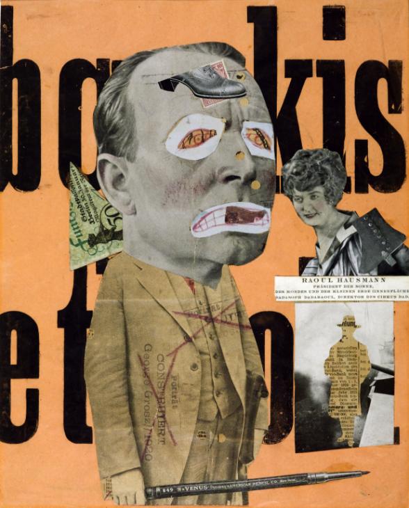
The Art Critic 1919-20 Raoul Hausmann 1886-1971
Claude Cahun
EXPERIMENTING WITH FILM STILLS:
SEQUENCE / STORY BOARD:
Here are 9 images from my film, Multiple Identities, which display the major/ key frames in my short film. The first 4 represent the stereotypical women identity, the 5th and 6th represents coming back to a neutral identity, and the last 3 represent the stereotypes of being a man. Here is also 9 images from my photo book what compliment each other the best to create a story board.
MONTAGE:
These two montages are what I enjoyed putting together the most, as I am able to show my creativity through them. Foe the two collages I’ve tries to mix the female and male scenes together. The one of the left is my model earring the suit but I have edited in the fur coat instead. Her hair is tied back however I’ve places earring and lips with lipstick on her. On the right is the opposite, with her completely wearing the suit but with er hair down, being more feminine.
The montage underneath was created from images from by photo book; dear, Liw. I’ve used different textured from a couple of my images to create an interesting monatge.
JUXTAPOSITION:
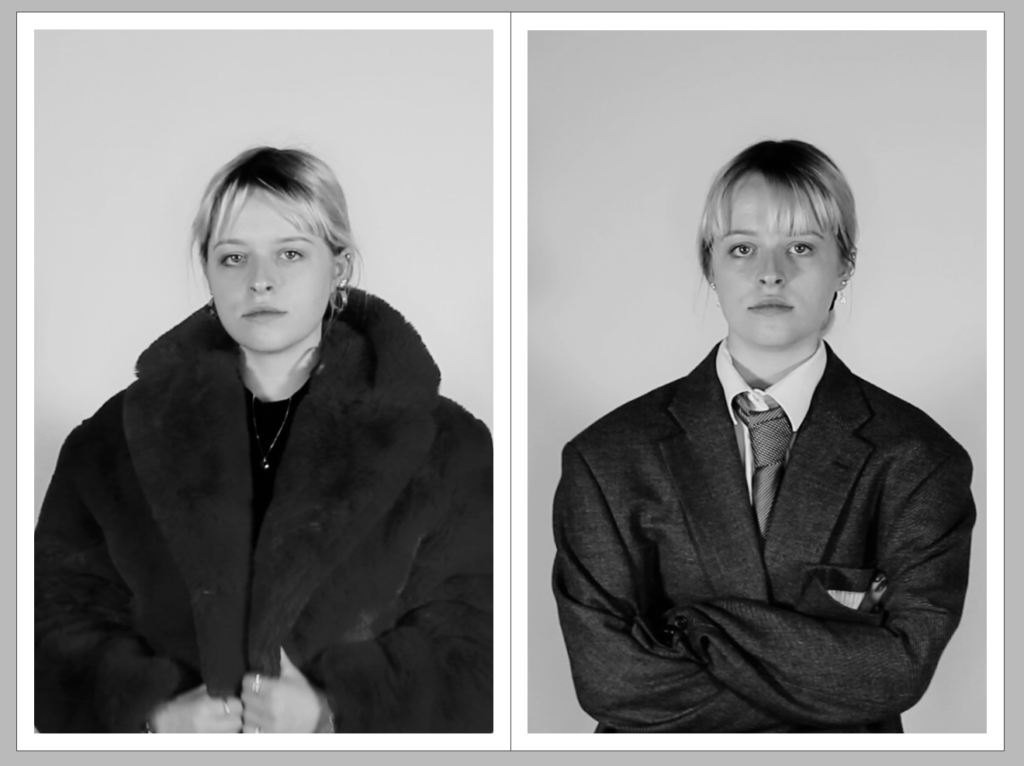
This juxtaposition is one of the most important spreads in my piece. It shows the two identities that my model has expressed in the film. The first image on the left shows the stereotypical women’s identity, with ‘girly’ clothing, makeup and jewellery, while the contrasting photo on the right shows the stereotypical identity of a man, with a suit and tie, no makeup or jewellery. I think these two images contrast each other very well because they explain how one gender can express their personality and individuality in different ways, no matter what the stereotypes are. I like how their facial expressions are the same as it continues to show that they are the same person being revealed in different ways.
The images below are from my photo book. I think that the orange and the blue contrast very nicely to create a juxtaposition
FULL-BLEED:
I really enjoyed the composition of this still image from my short film and I have decided to use it as a full bleed for my newspaper spread. The image shows my model putting on a tie for the ‘mens’ outfit, however the positioning of her hands and the soft glare feels very feminine and gentle to me, and is somewhat a juxtaposition in one image itself. I love how the shadows from the model fill the backdrop and leave a halo of light around her head, centring face as the focal point. I really enjoy how the image is mid motion, and seems very candid and relaxed. I also made sure that the models face was not in the middle of the speed to ensue the fold of the page would not distort the focus.
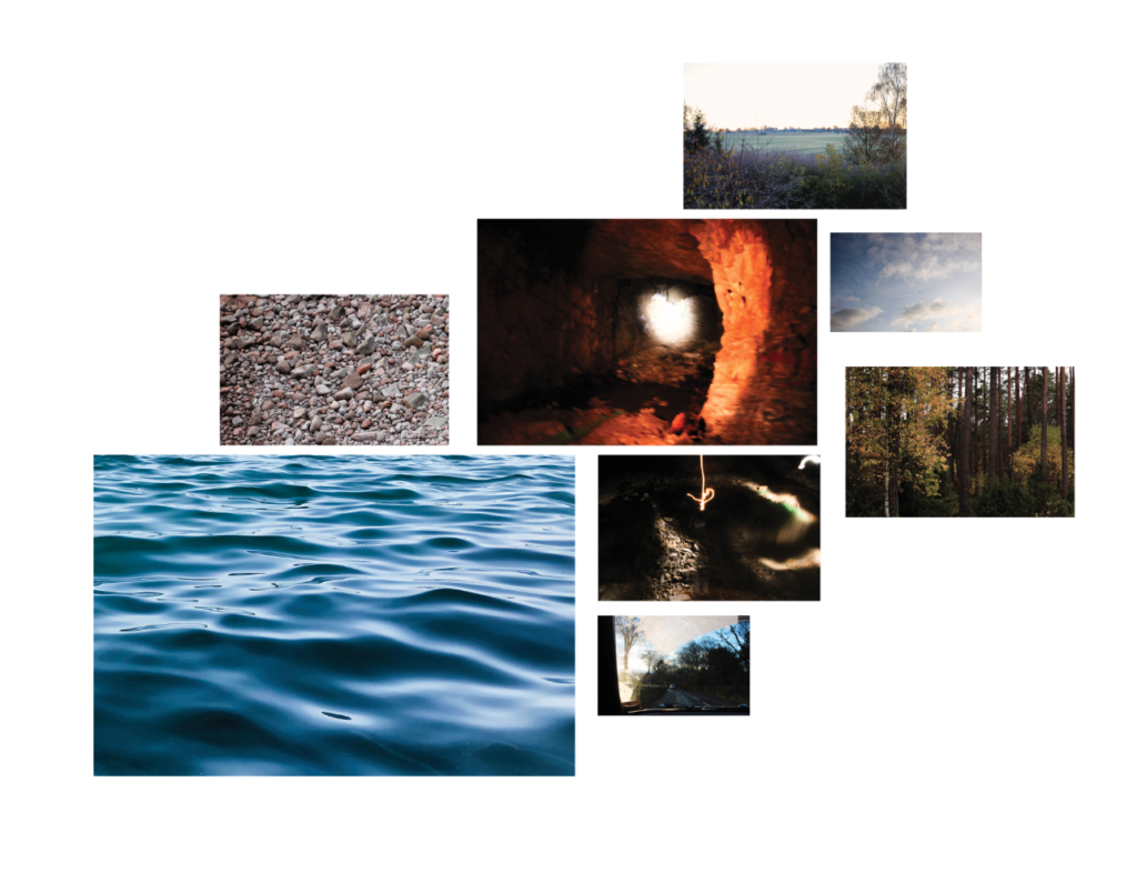
After finishing my photobook, I have selected a range of (5-7) final prints. here are a couple ways and ideas of how I’d like to present them. In photoshop I have produced a mock display ( of a document sized A1: 594 x 841mm) using different image sizes, for example: A3 x 2, A4 x 2, A5 x 3 images I would like to use are below:
COMPOSITION IDEAS:
I chose 8 images from my book that I wanted to use. I thought about the colours and the composition of each image and how they will compliment each other. I really enjoyed the layout of composition 2 and I will use this layout for my final print design.
composition 1
composition 2
composition 3
composition 4
PREPARE AND SAVE IMAGES FOR PRINTING: In Photoshop resize each high-res image (4000 pixels) to correct print size.
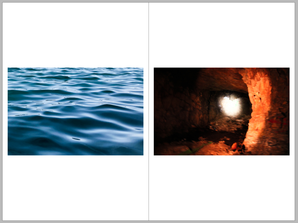
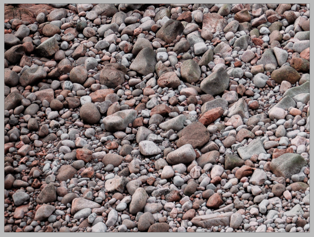
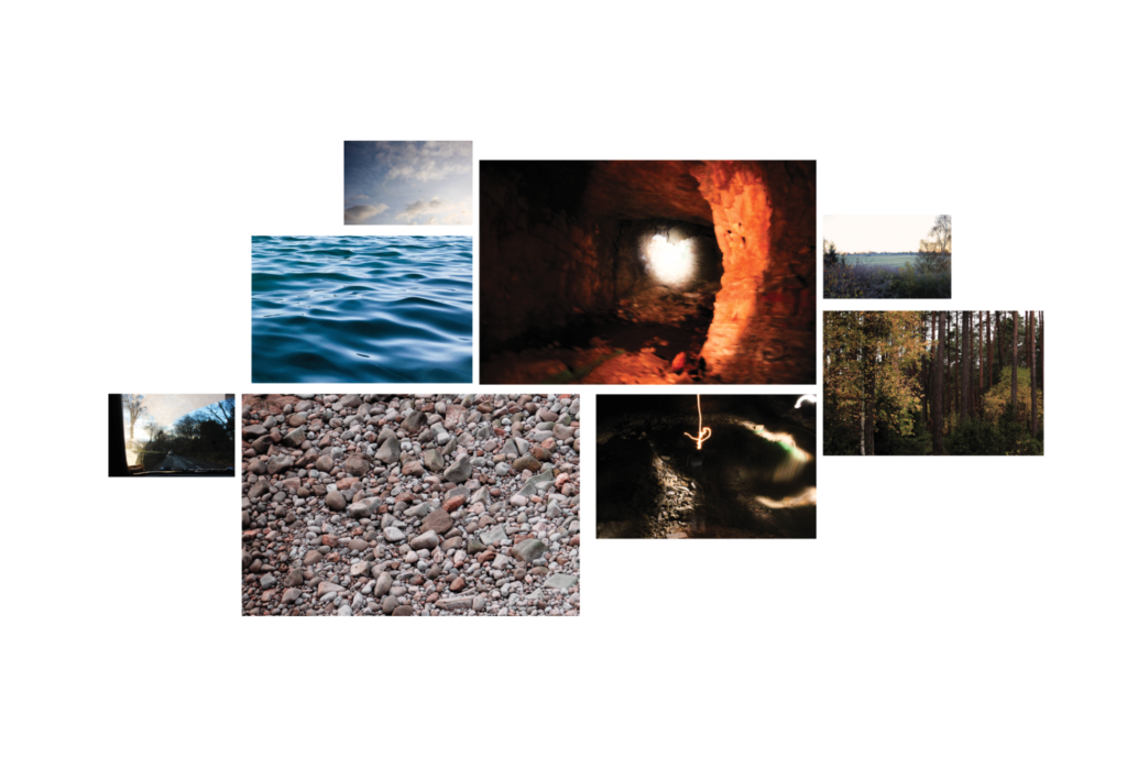
A4: 297x420mm x 3 – sky – car – forest A3: 210x297mm x 3 – sea – cave – sunrise A2: 148x210mm x 2 – orange cave – rocks
LARGER PRINTS: A2
I am going to print this image as a larger print, I like its jumbled compostiotion and patterns.