All posts by Micah De G

Filters

Author:
Category:

“What Makes an Image Iconic?”

Powerful image of Black man helping white protester in London race ...
BLM protester carrying white man to safety

Introduction

“What makes an image iconic?” This is a question most photographers have thought at least once in their career. For some this is the most important thing to them and spend their lives chasing and searching for such types of images. Once in a while, an image pops up that really makes people stop and think. It can often get shared all over social media or around the whole photography culture. But it is the those types of images that we still remember many years later that have incredible meaning.

Analysis

The image of the BLM protester carrying a white man to safety has become a very well known image in light of all that is going on in America and around the world. What made this image stand out was the spontaneous nature of the image, the authenticity but most importantly; the context behind. In Sophia Smith Galer’s article “How to create an iconic image” she states “I think in our image-overloaded world we’re struck by their authenticity, that they are spontaneous images that even so subscribe to visual themes we’re now so used to seeing staged.” What she is saying is we struggle to know the authenticity of these images because many photos are staged to create a meaning and show a certain perspective. The way I see it is, sometimes a staged image is not always a bad thing. For example, this image of a black man carrying a white man to safety during a BLM protest could be real but it could be fake. But does it really matter if it is or not? Is it still evoking emotion? Is it portraying something that happens? Is it representing a group of people or a society where people help each other? I believe this image is real.

“What were the circumstances of the photograph” This is one of the questions used when analysing iconic images from the ‘Why is it famous article’ The image was taken during an event in history where there is a lot of hate and tension between whites and blacks. There have been many images created over the last few months depicting white people as the enemies and an overpowering force. This is as a result of the black lives matter response to police brutality in America and worldwide. The fact that this image shows a black man rescuing a white man from a group of black protesters who are angry and wanting to take it out on and beat the white man. The fact is that the man carrying the other man is at the protest because he is angry, he is fed up with the racial discrimination and the way blacks are treated but he looks beyond that and sees a human life in danger, no matter the colour of the skin. Another question from the ‘Why is it famous’ article was “we might ask, what is the social value of the image”. I think what has made this image so iconic in light of recent times a black man stopping a white man from being hurt. When looking back through history, everybody should be aware of the slave trade. The way white men treated black people was horrific. They treated them like animals, as if they weren’t human. For centuries black slaves were made to work for nothing, with slave captains looking upon them with no sense of humanity. But unfortunately even when the slave trade was finally abolished, it didn’t end there, the whole ‘Black Lives Matter’ movement is because there is still racial inequality. This image is iconic because of social values because despite the way black people have been treated for hundreds of years, this man has chosen not to get revenge or even let it happen. Despite all that blacks have gone through, he has chosen to rise up and save another human life. Discussion

Conclusion

To conclude I think what really makes an image iconic is an an image is ‘instantly recognisable even when their political context has been stripped away’. this is the ultimate test for if an image is really ‘iconic’ in 10, 20, 30 years will this image of a BLM protester carrying a white man to safety still be as powerful and well known? Will children being born in the next decade know of this image and know what it represents? It can be hard to tell because iconic images that we know of now had a different context behind them than what we are living now. So in the next 10, 20, 30 years we don’t know what the social context will be, we don’t know if there will still be racial injustice or what society looks like. But I believe that a true iconic image can be found by standing the test of time. It is only in years to come will we know if this image is really an iconic one.

Task 5: Response

Shoot Plan

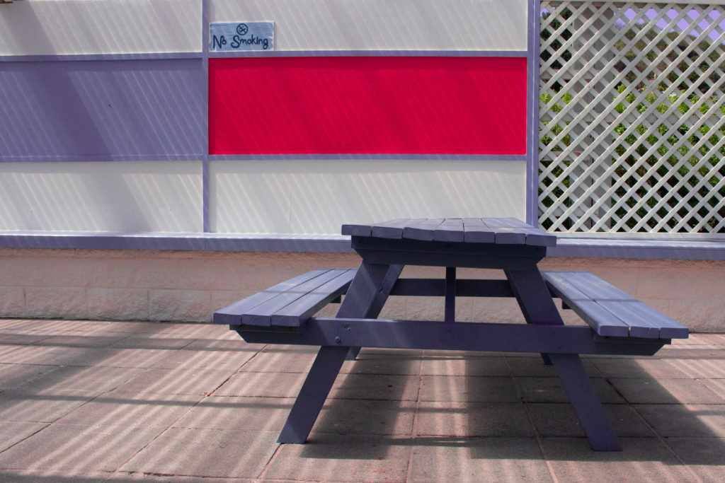
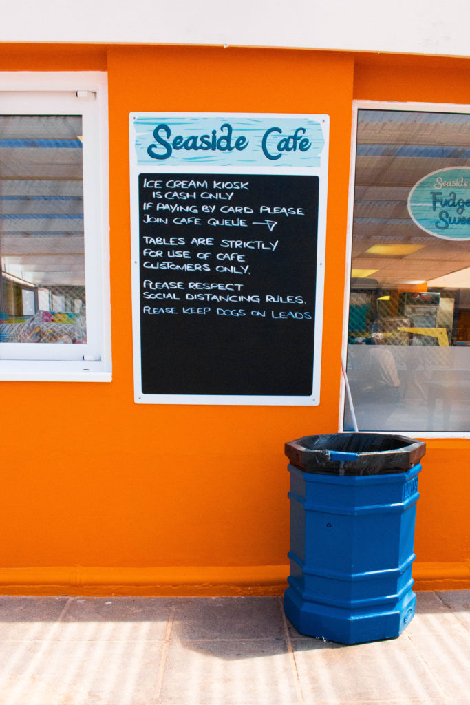
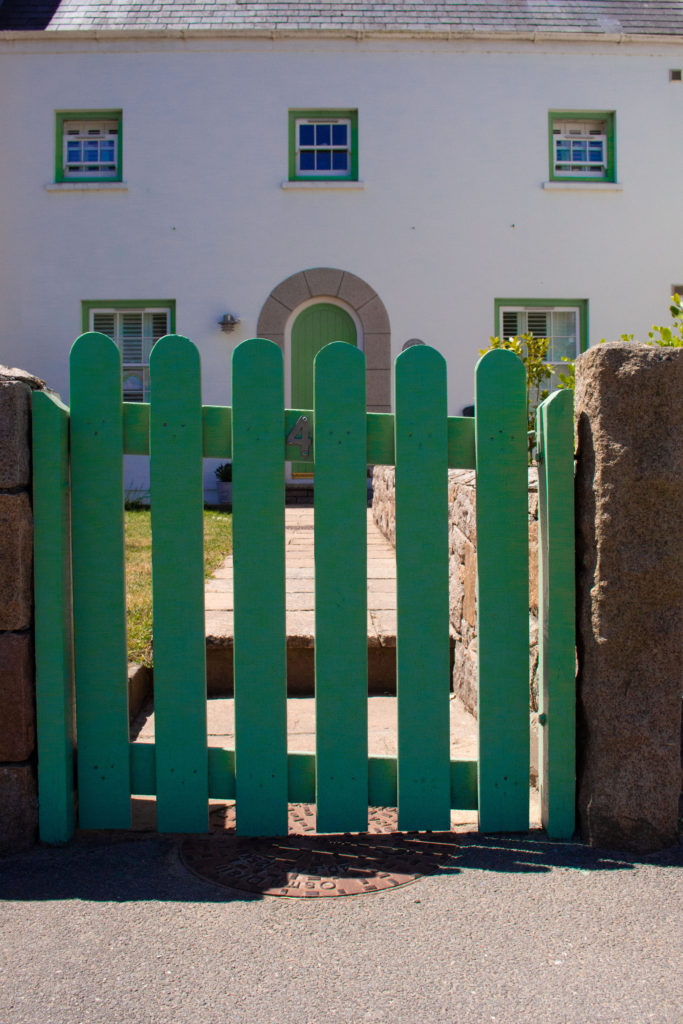
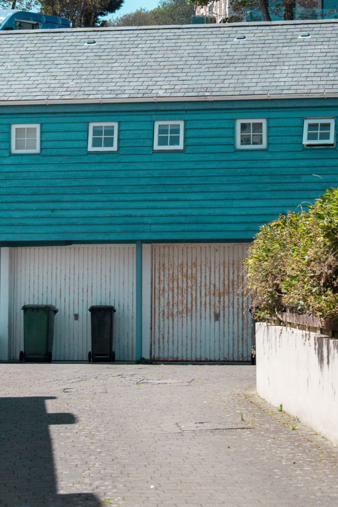
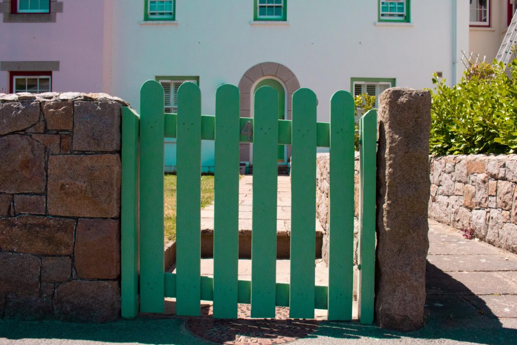
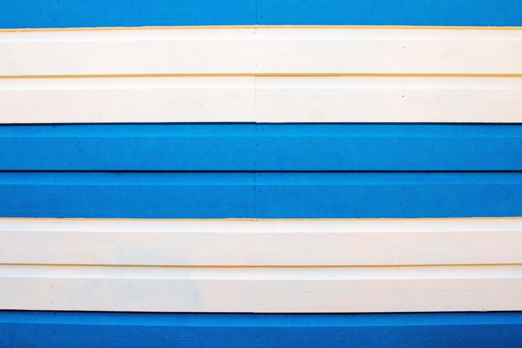
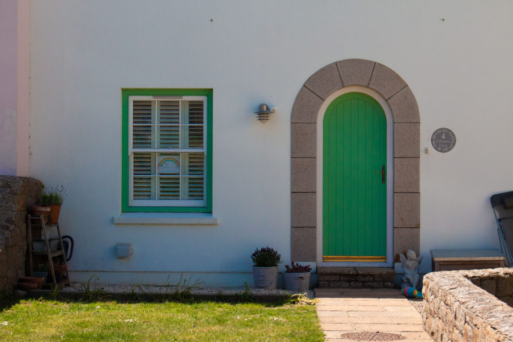
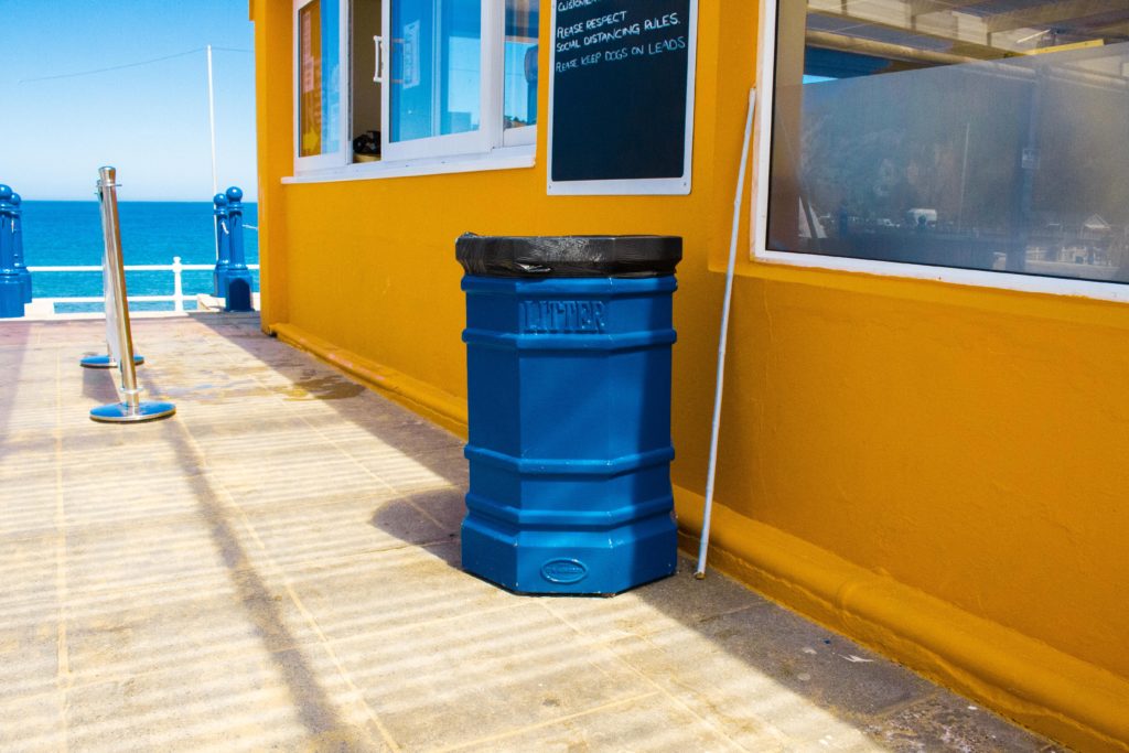
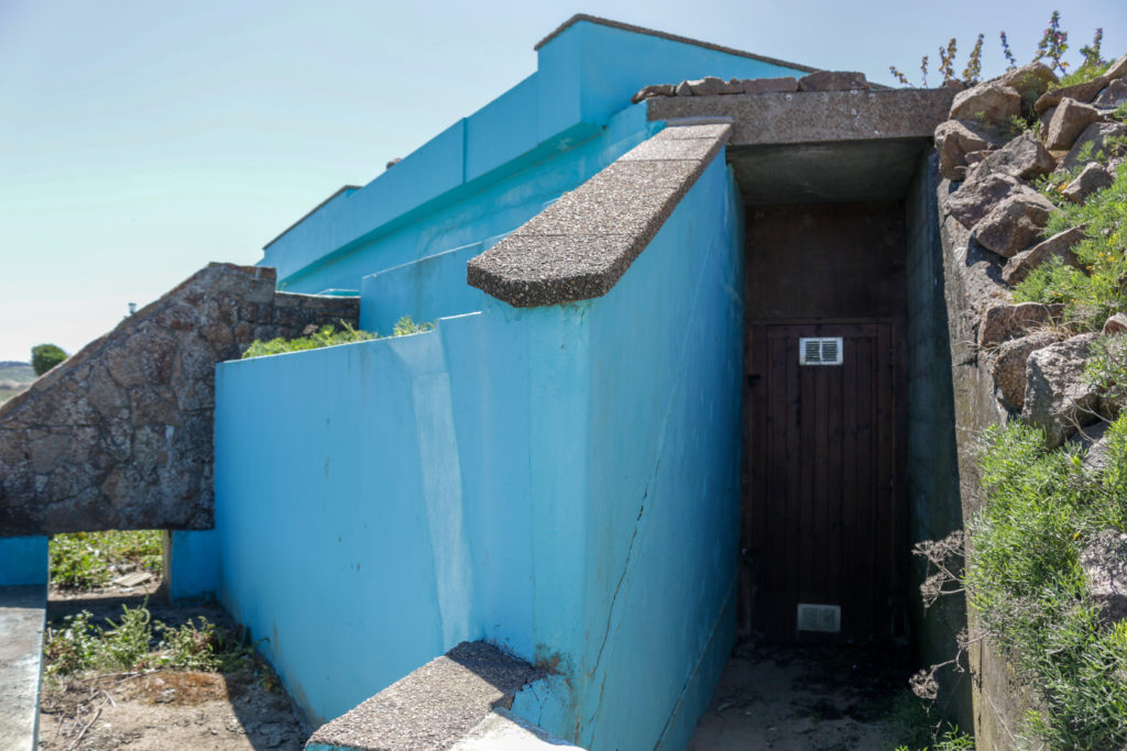
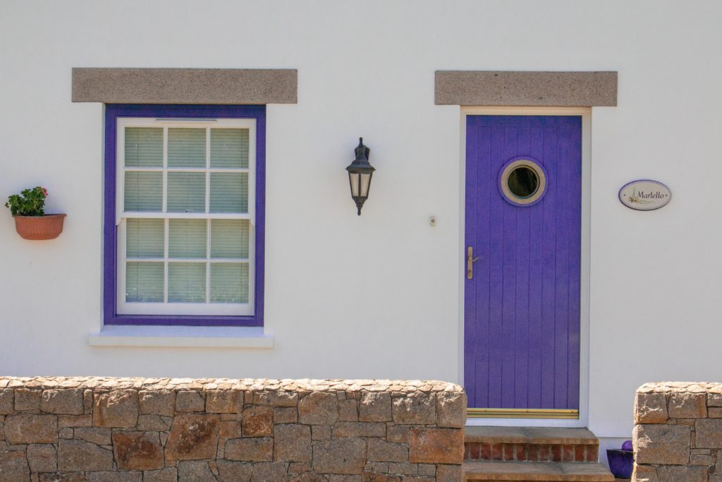
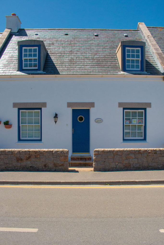
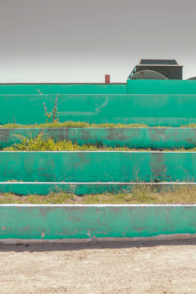
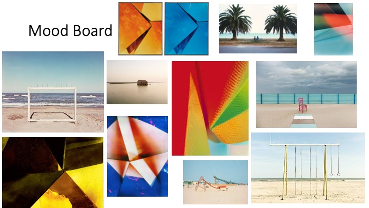
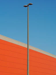
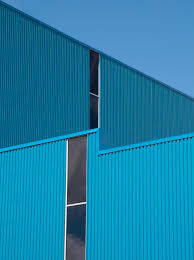
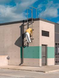
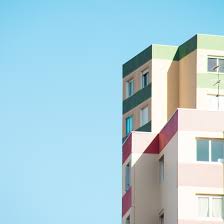
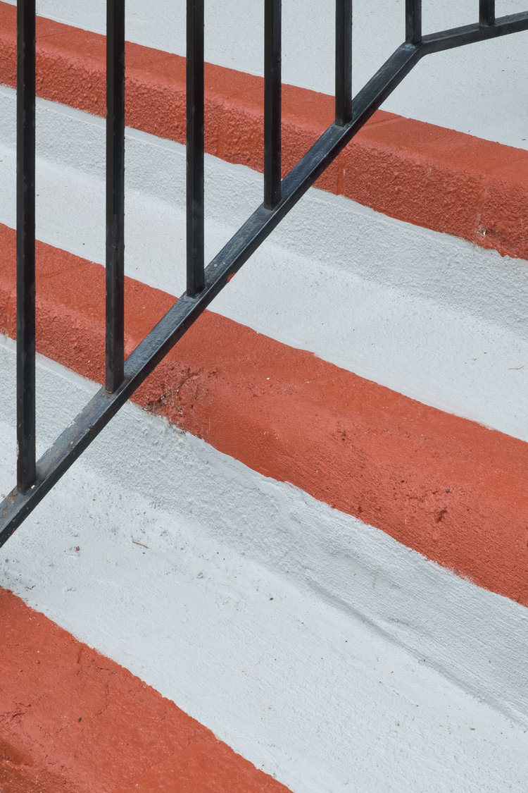
WHAT: This shoot is about exploring colour and architecture out in the world. I will be looking for the colour in architecture or in other forms. This will involve exploring for colourful buildings, looking for unusual compositions and colours that aren’t usually seen in their setting.

WHERE/WHEN: I am going to go down to Greve de Lecq and St Ouens bay because there are quite a lot of colourfull buildings, especially Greve de Lecq. I will go in the middle of the day to get harsh shadows as I think this will work well with the theme

HOW: I am going to use a small aperture for this shoot as I want to show a depth of field rather that using a shallow focus. There will be lots of light outside which will allow me to have a fast shutter speed and keep the ISO down. I will also use a deadopan tecnique for a lot of the images

EQUIPMENT: I will be using similar equipment for this shoot as the other ones. I will be using my Canon 70d and 18-55 kit lens. This will give me more versitility as I can zoom in or out to help frame the image. I may my 35mm prime lens but it will probably be much harder to frame my shots because I will have to move around more to get my subject in the right framing.

Contact sheet

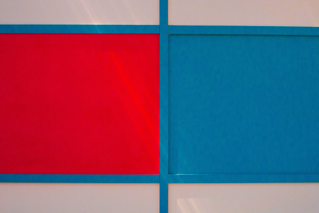
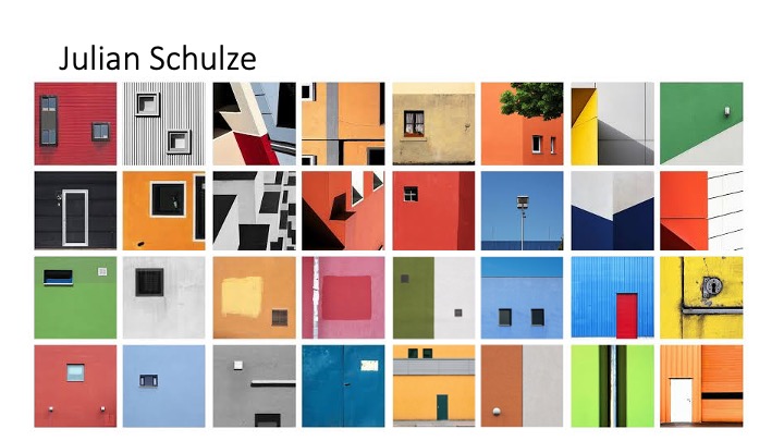
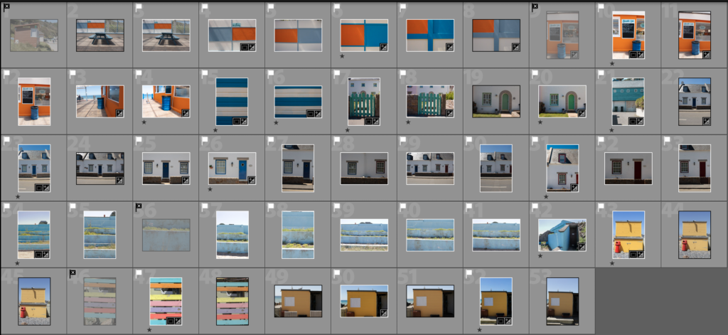
Overall I wasn’t too happy with this shoot, I found a few good locations where there were nice colours but nothing that was really similar to Julian Schulze’s images. Anyway I got a few good images. In lightroom I went through and flagged the good ones with the white flagg and rejected some of the definite bad ones with the black flag.

Edit Process

Edits

Best Images / Evaluation

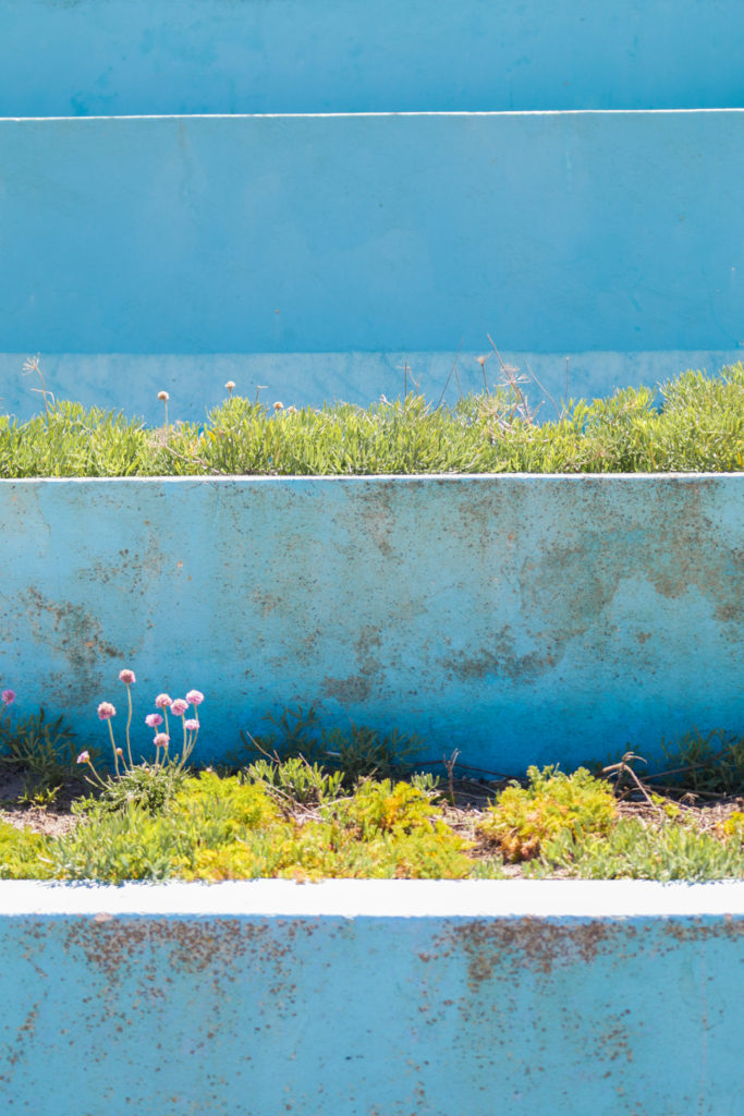
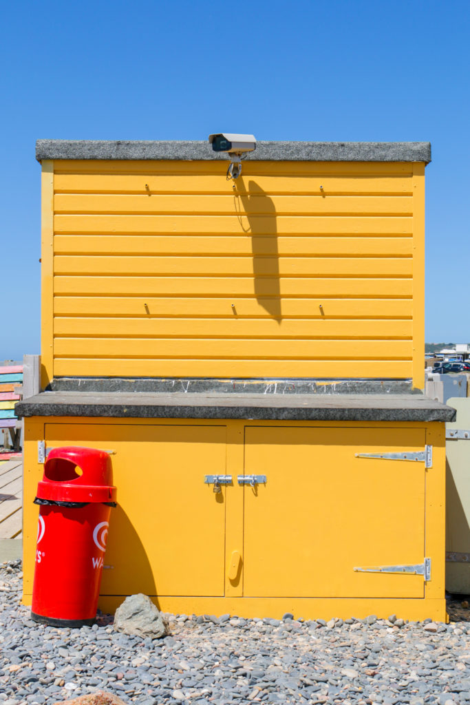
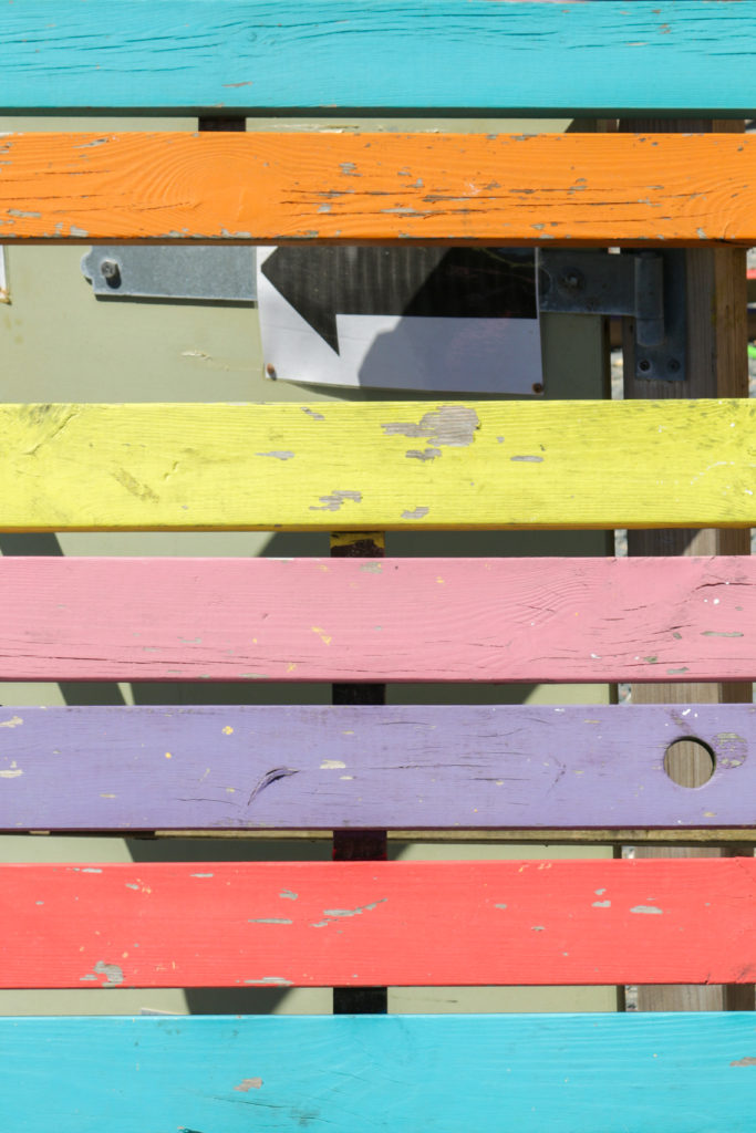
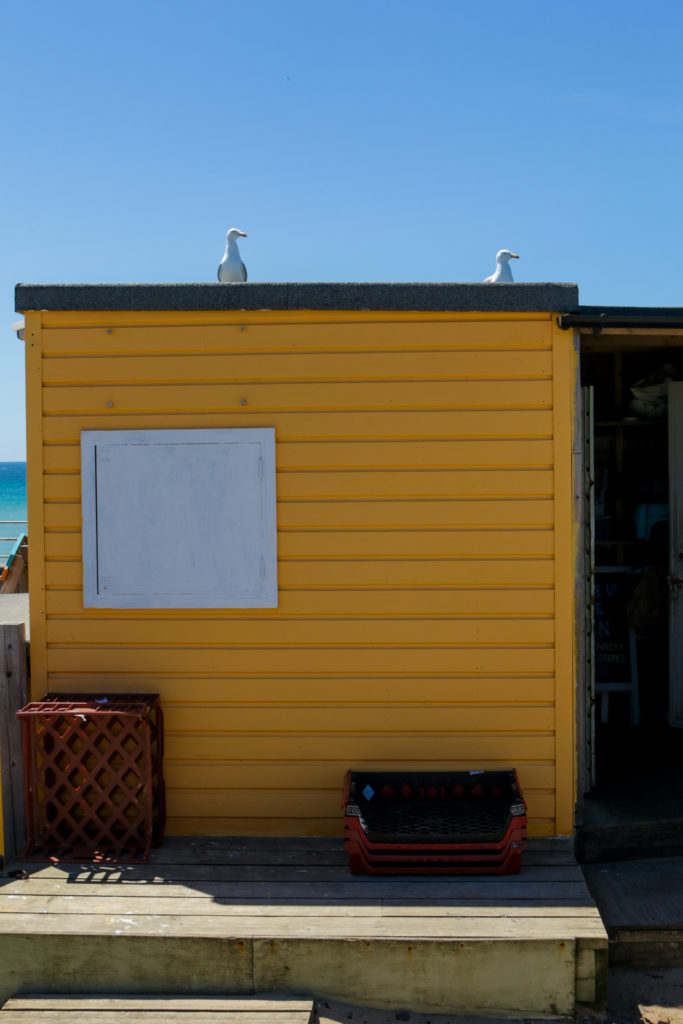
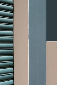
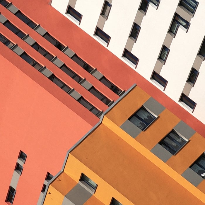
I like these images because they are colourful and I accomplished what I set out to do. I felt that I successfully captured photos of buildings and architecture that were colourful and also had colours that were bright and incongruent. However, I feel that I could have done much better and this is far from my best work. With better planning I think I could have achieved much better results, therefore I would like to improve on these images by doing another shoot.

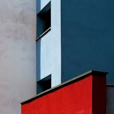
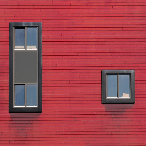
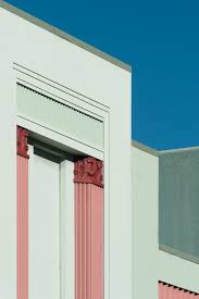
Looking at Julian’s images, I have managed to resemble his style for example these images share some similar characteristics. The framing is similar, both images are colourful and include windows. However, what makes Schulze’s images unique and different to mine are that they have a surreal quality, they look almost fake but you can tell they are real.

Task 5: julian schulze

Case Study

Julian Schulze is a german photographer who takes a lot of abstract and surreal photos. He states that he is ‘always on the go to find inspiring architecture’ . His style of photography is very unique. He looks for interesting architecture that encompass a lot of colour. His images are also often symmetrical and feature geometric shapes, many of his photos are shot in a deadpan style and feature a windows in many pictures. He likes to travel and be constantly travelling, documenting what he sees and the way he views it. Looking at his work, you can instantly see that there is a lot of colour, pretty much all his images are vibant and include one, two or three colours. He doesn’t overdo his photos by using loads of colours.

Analaysis

NATURAL vs MAN MADE: both images encompass man made objects as they are architectural images of buildings. There is no natural elements to either of the images.

REPETITION/RHYTHM: None of the images show much repetition apart from the right image which has repetition of the redbricks.

DEPTH: The image on the left shows a lot more depth than the right image. The image on the right was taken in a deadpan style which means straight on, because it is a picture of a wall which is flat the image feels very shallow, also nomatter what aperture is used (apart from a tiltshift lens), the whole image would remain infocus because everything in the image is the same distance from the sensor. The image in the left show depth as it shows 3dimensions, it has parts of the building from different anlges to show depth. The image was also taken using a small aperture as everything in the image is in focus.

TONE: tone refers to the values of light and dark areas in the image, the left image has a lot more contrast meaning that there are very dark areas and very light areas. The right image has a lot less contrast.

LIGHT: The lighting in the right image is much softer than the lighting in the right image. I can tell this because there are soft fading shadows underneath the windowsills in the right image, whereas in the left image has hard shadows cast from the other buildings. This means that the left image was taken in the middle of the day with less clouds and harsh sun light, and the right image was taken on an overcast day with more diffused light.

LINE: The left image has more lines going in different directions, the lines from the building lead my eyes to the window at the top. The right images has different lines because there isn’t much depth, but there are lines in the bricks.

FRAMING/CROPPING: the framing in both images have been thought about and framed to a certain desire. The right image is very symmetrical and has been framed to give equal room either side of each window. The left image has been framed to look almost like a 3d axis.

Task 4: Response

Shoot Plan:

WHAT: This topic is about capturing subtleties and nuances, this means taking photos which have small details that make the images interesting. Whether is be some people in the distance doing something, or an object that is significant but is not huge in the frame. I am going to go out and look for compositions which contain small details within a big picture which help to tell a story. Luigi Ghirri’s images tend to show juxtaposition as well as they often have climbing frames or other objects on the beach that you wouldn’t usually find there.

WHERE/WHEN: I plan to go down to Greve de Lecq and St Ouen’s Bay in the middle of the day. I have chosen these locations as Luigi Ghirri shot a lot of his photos on the beach or near the sea. In his images the sky is blue and there are little or no clouds, therefore, I hope to be able to shoot on a day with no clouds. Especially down at St Ouen’s bay, there are a lot of run down buildings and the landscape is quite bland in color which will help to emphasize the colours from the buildings.

HOW/EQUIPMENT: Ghirri’s images would have all been shot on film, most likely 35mm film. To try and resemble the look of film to the best I can I am going to use a small aperture of at least f9 and ranging to f18. Wide aperture photography was not as popular during the time of using film and especially on landscape photos a wide aperture was used. Film often had ‘film grain’ on the images which is one of the tell tale signs of film photography. I could emulate this by using a high ISO but I would rather put in the artificial grain in lightroom as using a high ISO can ruin the image. I am going to use my Canon 70d with the kit lens as it will give me a good focal range from 18mm which is wide to 55mm which is more zoomed in. I will probably shoot most fotos at 24mm to eliminate lens distortion on the edges.

Contact Sheet:

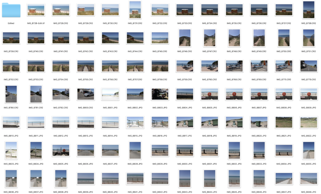
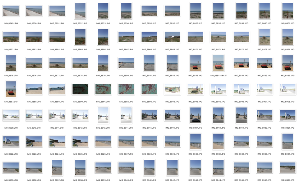
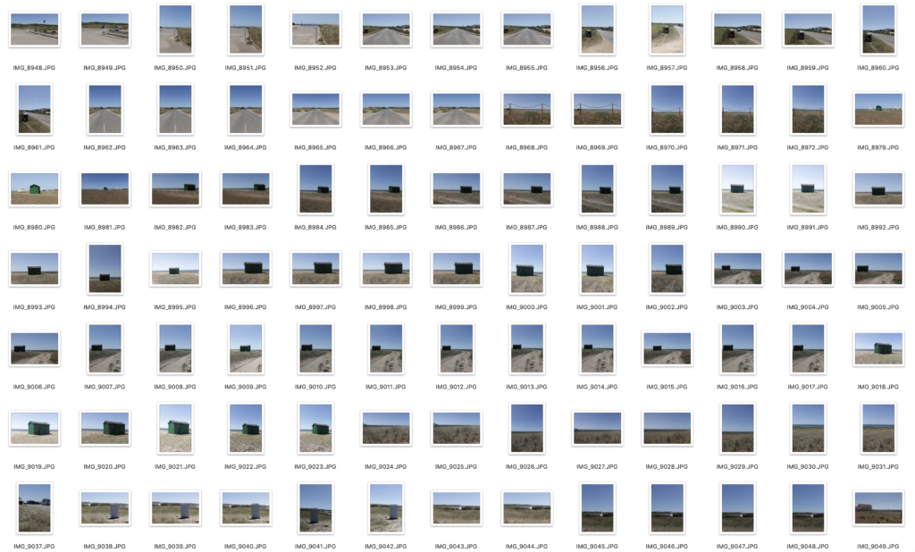
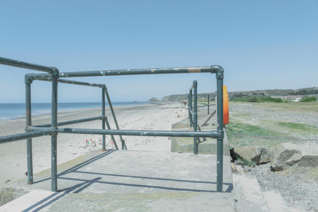
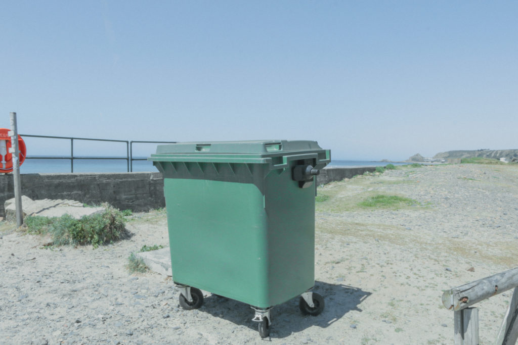
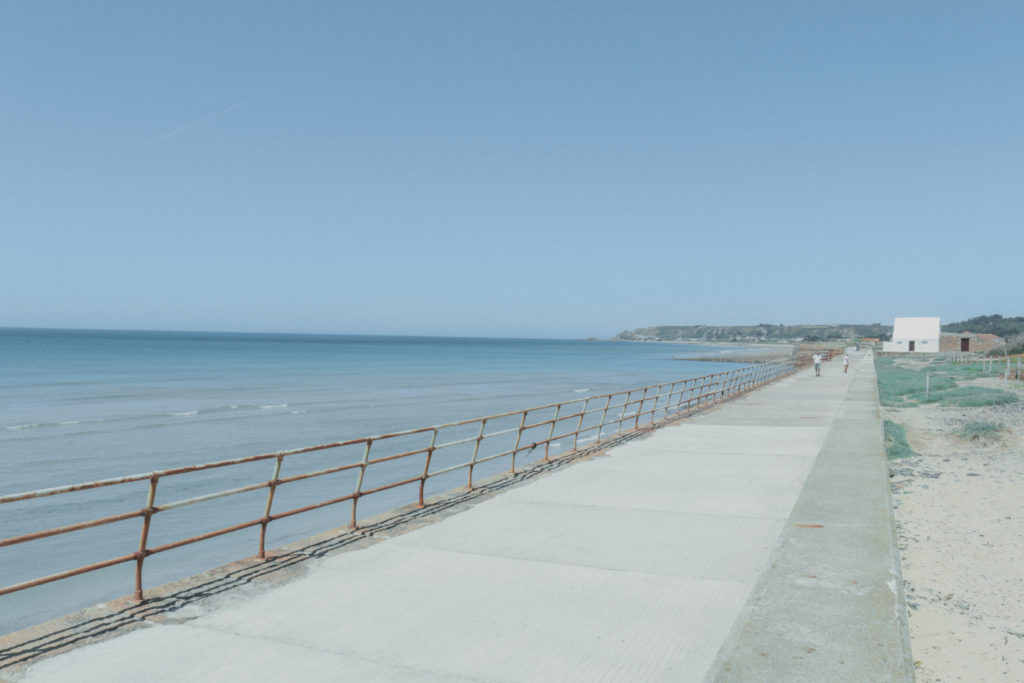
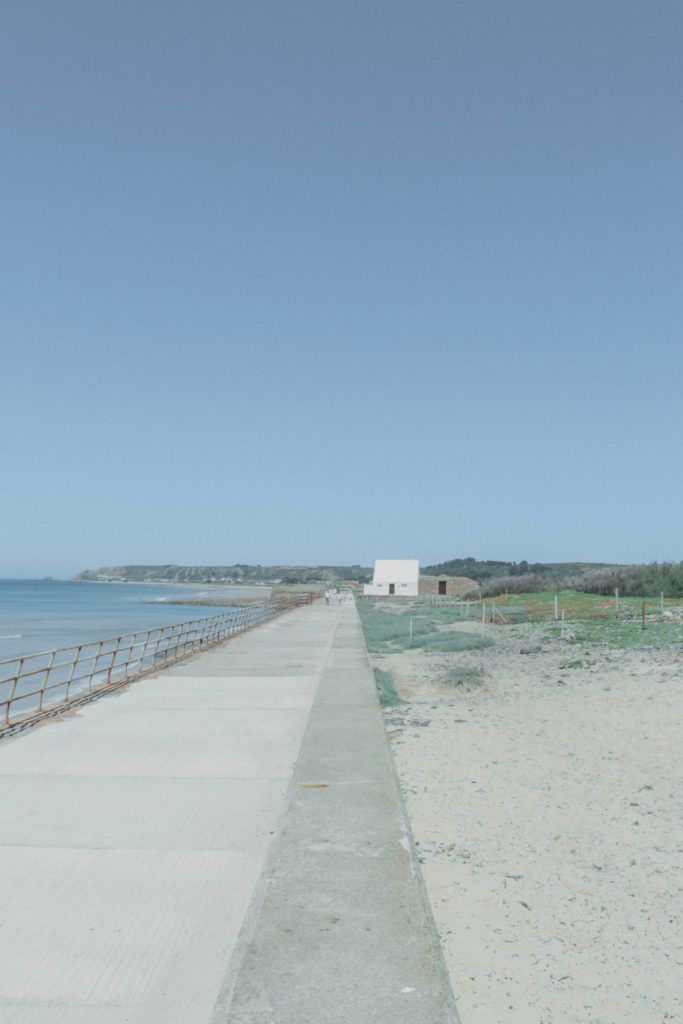
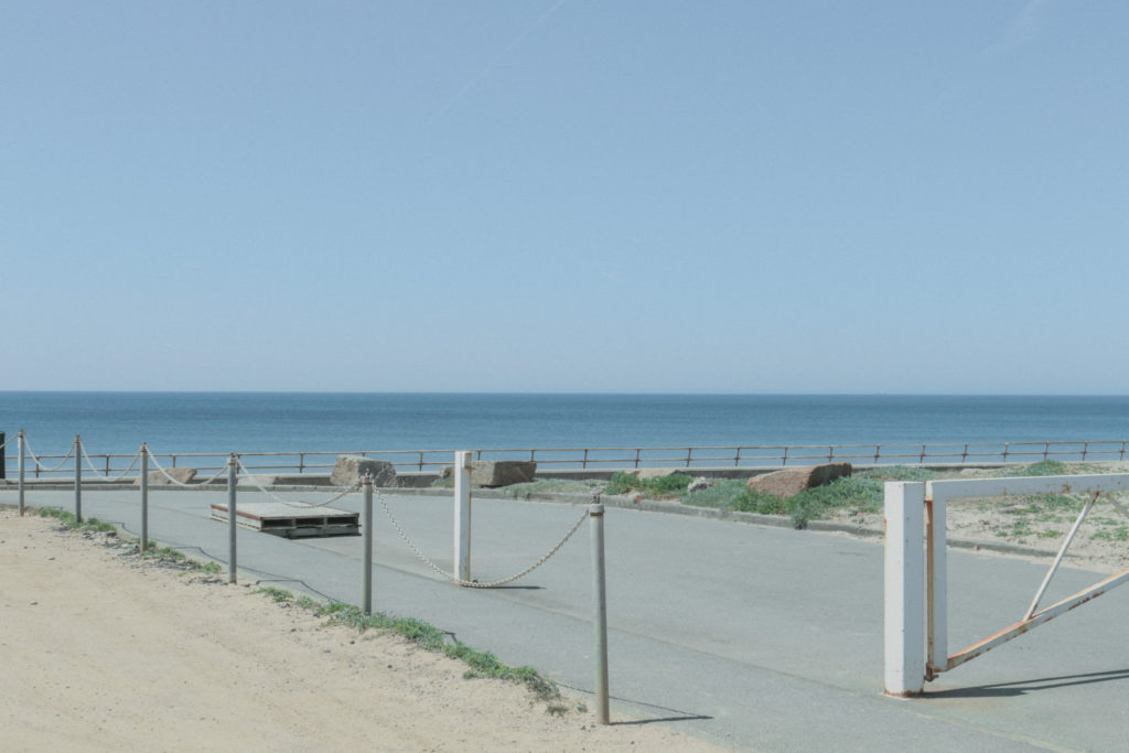
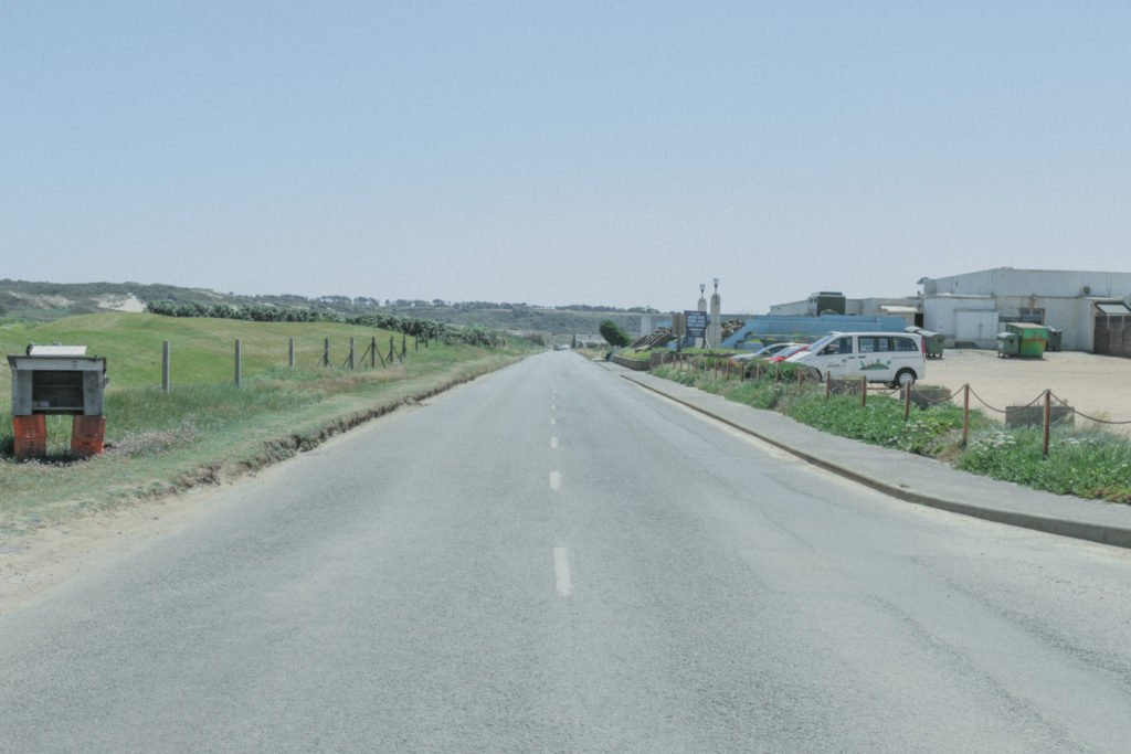
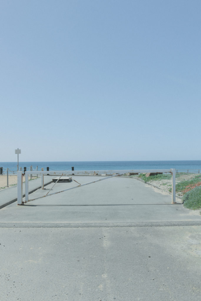
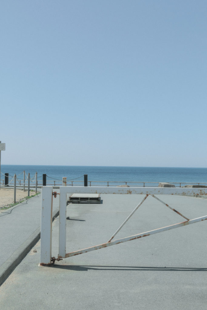
I took a lot of photos on this shoot as I wanted to have plenty of angles and orientations to choose from when editing. I went down to greve de lecq but that location was not as successful. I then made my way along St Ouen’s Bay looking for interesting compositions. I tried hard to make sure I exposed each shot well. This meant that all of these photos are possible good ones. However, this made the editing process harder as I had to choose between lots of good images.

Edit Process:

I began my going through all the images in lightroom and selecting the good ones, flagging them by pressing ‘P’. I editing my first images lifting the blacks and bringing down the whites to give the image a flat look. I gave it a green tint, added artificial grain and cropped it to correct the horizon line. I then made a preset of the edit so I could apply it to all the images. I then went back through all the images making smaller adjustments like exposure and basic correction to fine tune each image. I then rated the images I edited with 1 star and the best images with 2 stars. I then exported all the 2 star images with a low resolution preset I had made so they could be uploaded to the blog.

Edits:

Best Images:

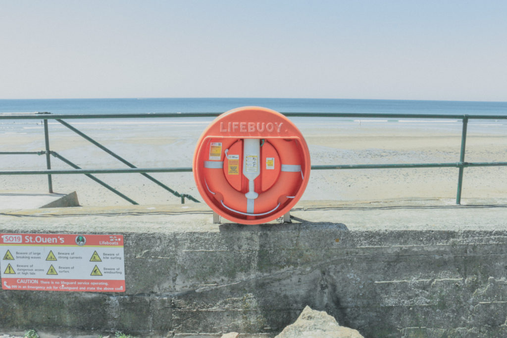
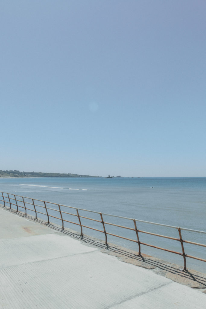
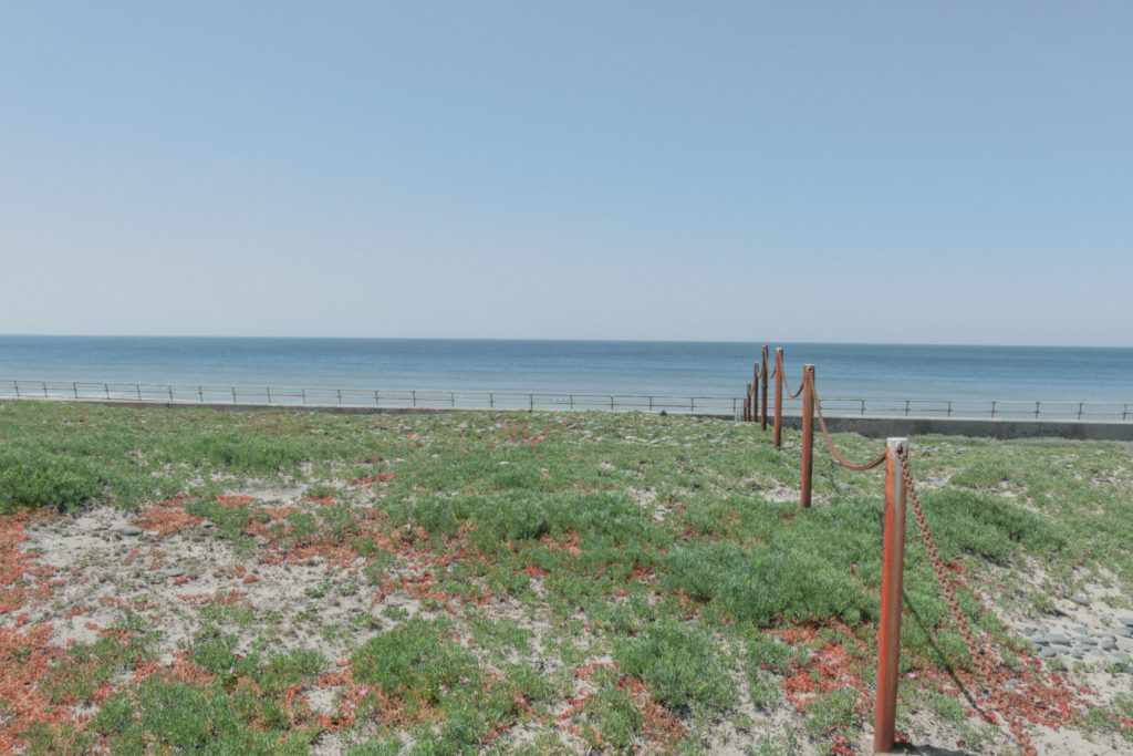
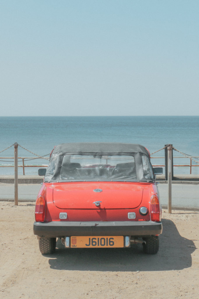
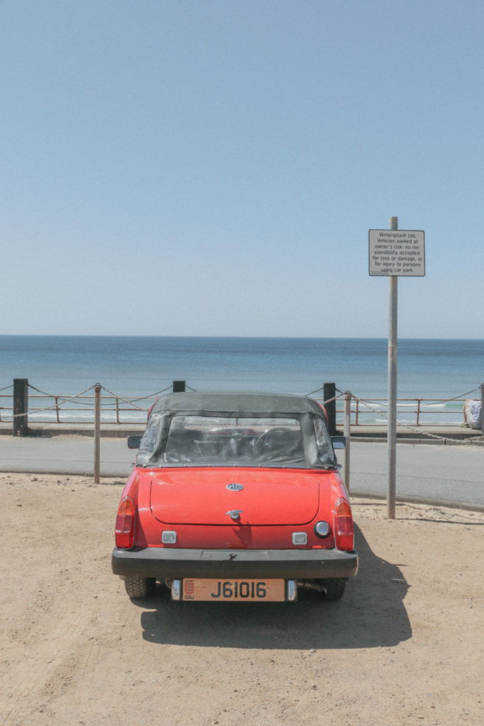
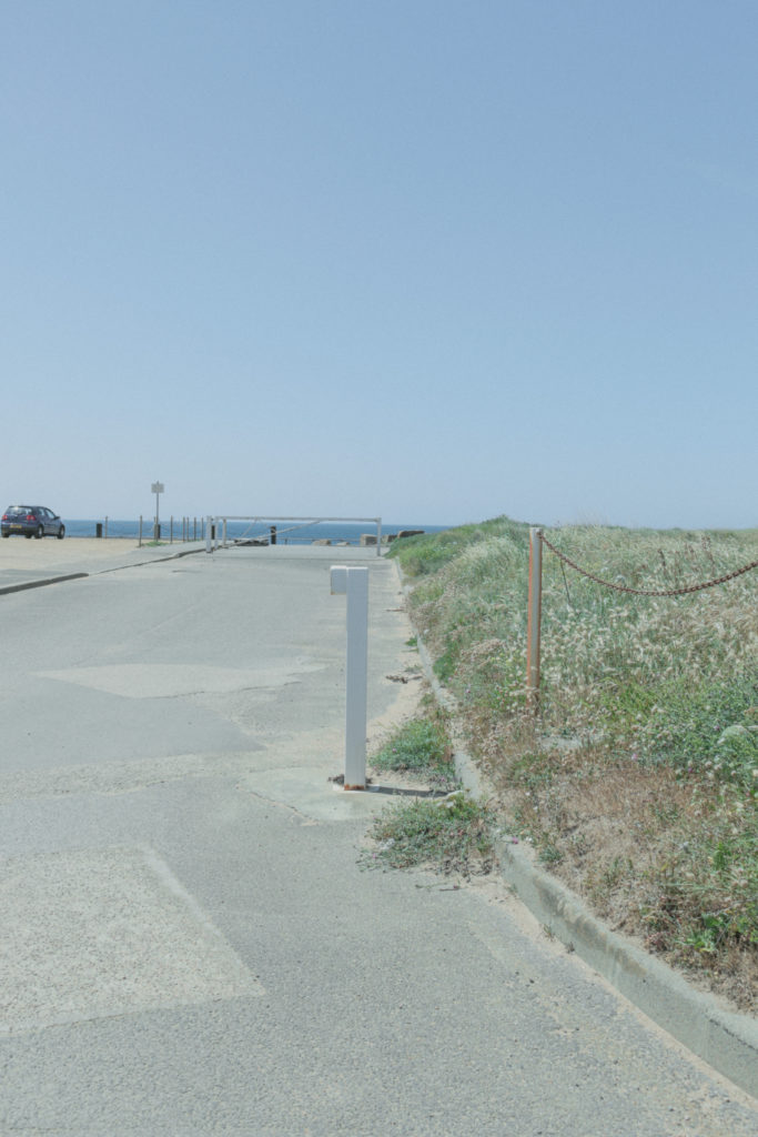
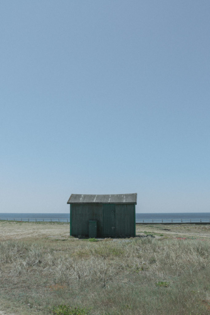
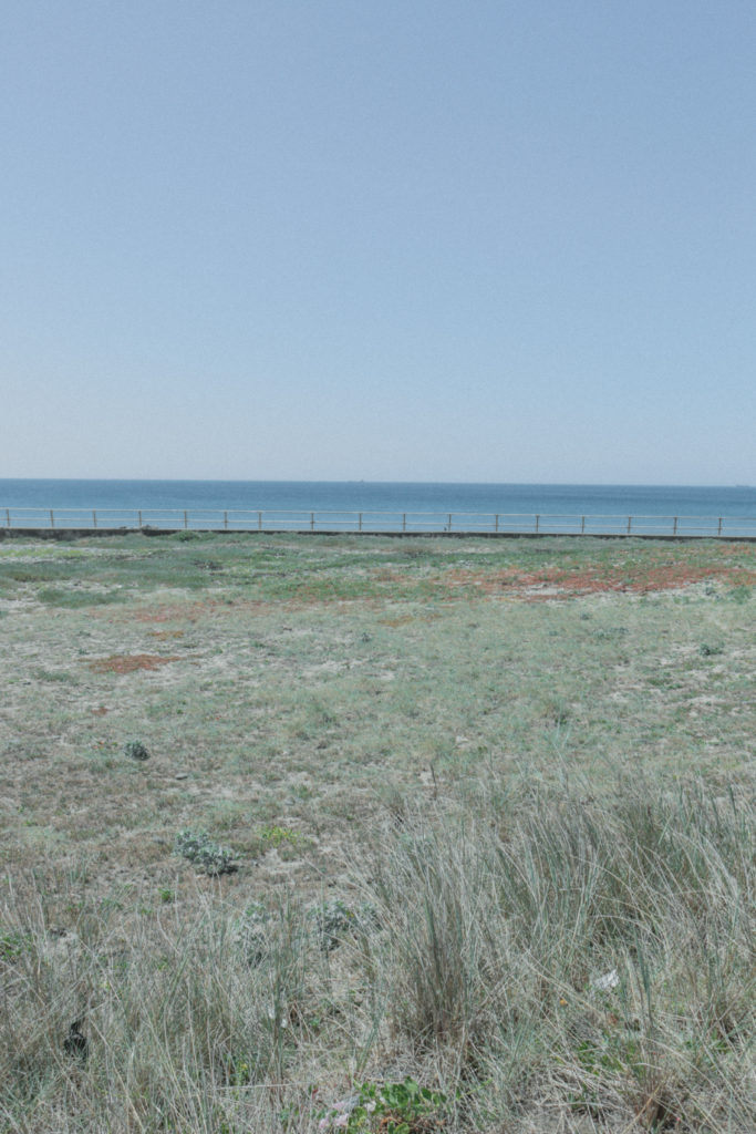
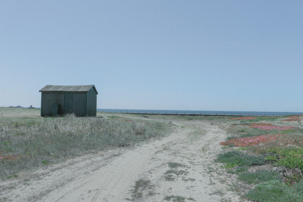
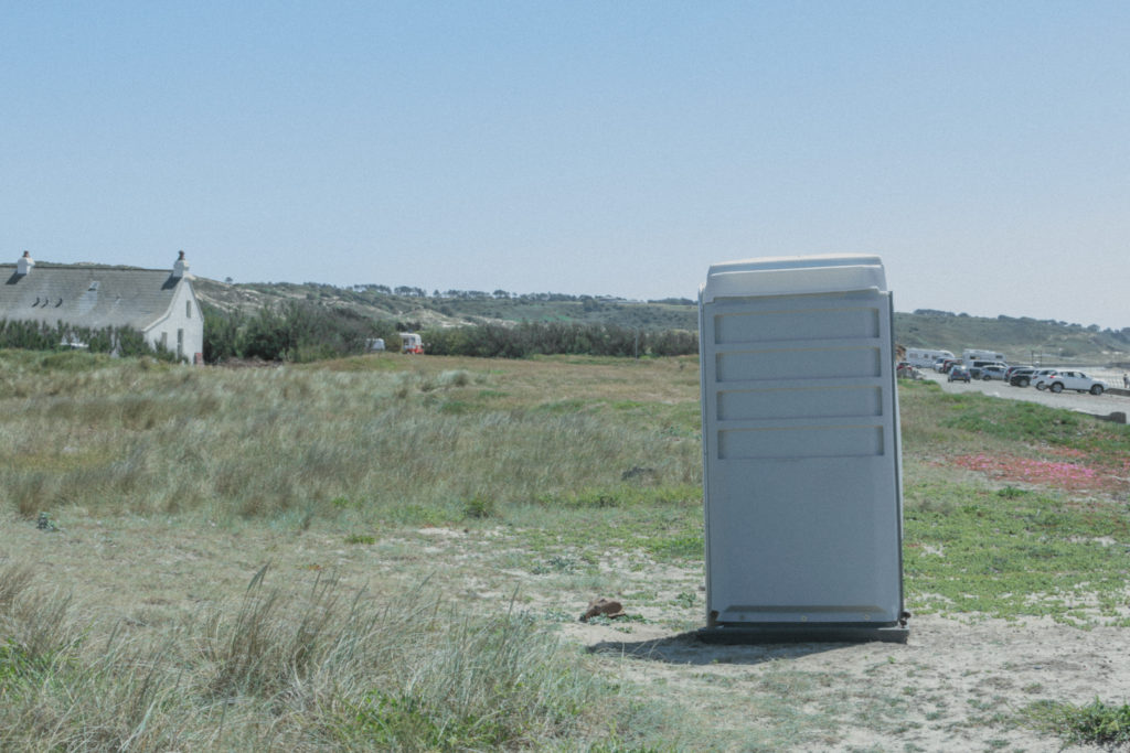
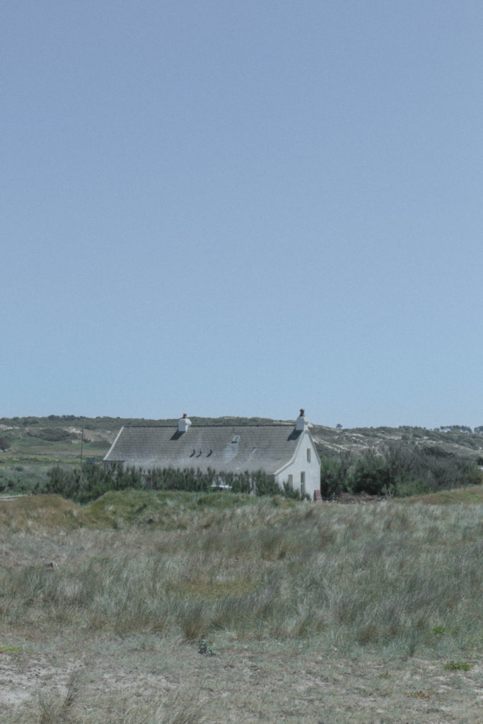
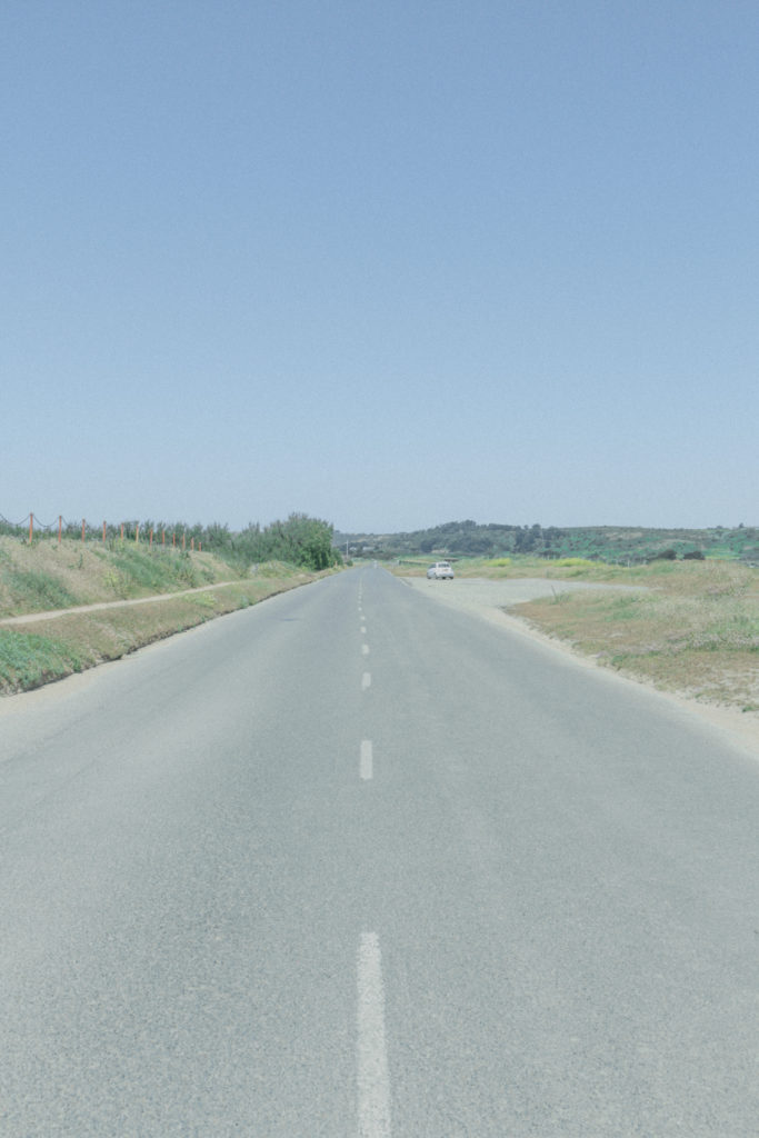
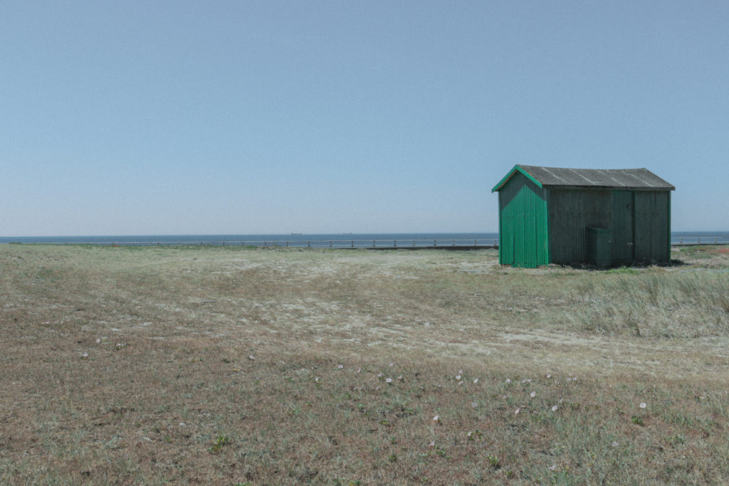
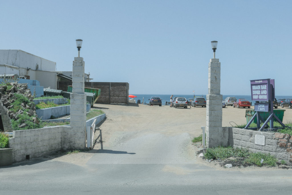
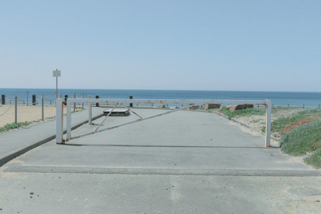
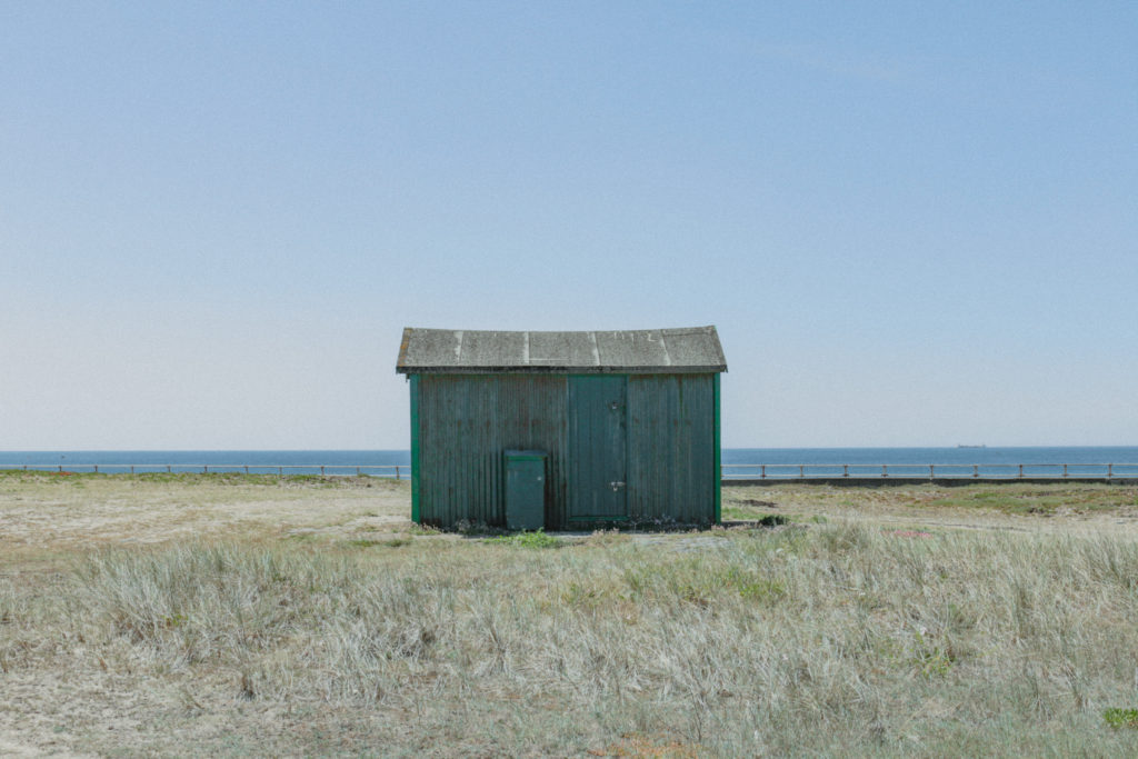
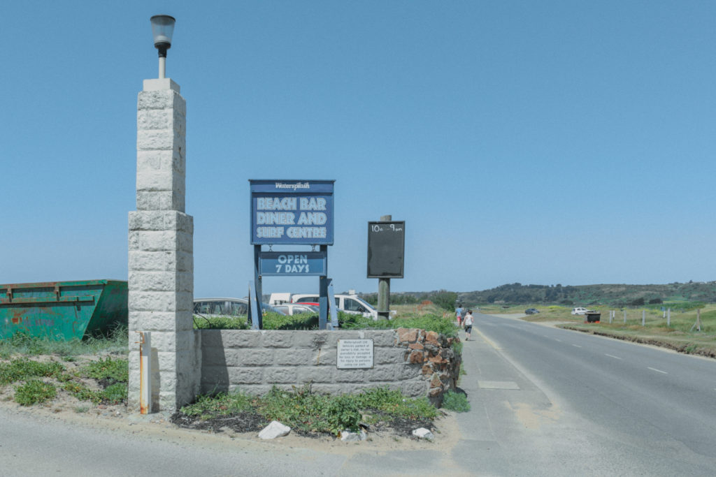
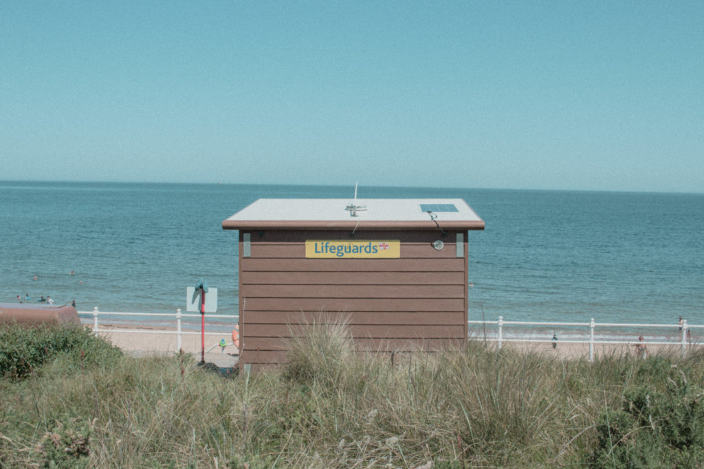
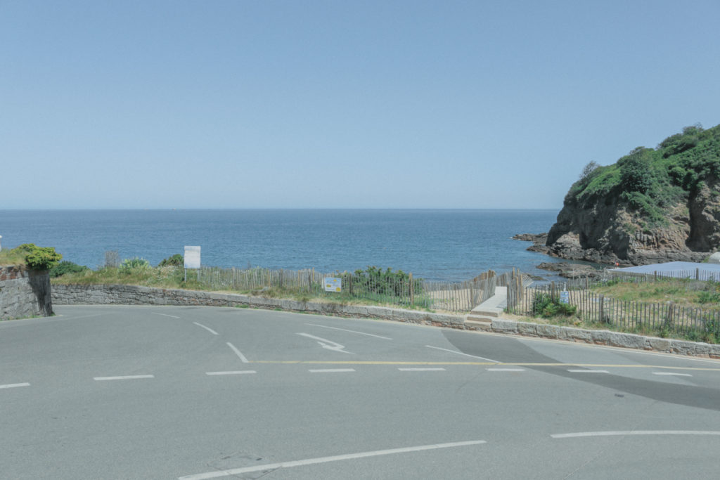
These are my favourite images because I took Ghirri’s style and made my own compositions. My images each contain subtle or naunces that make the scene different. For example there is a green shed in the middle of the sand dunes infront of the beach and on the empty coast road there is a small car parked in the distance.

Compare/ Evaluation:

Il Profilo delle Nuvole by Luigi Ghirri (505PH) — Atlas of Places
Luigi Ghirri’s Image
My Image
Luigi Ghirri: frameless landscapes • LOOK LATERAL
Luigi Ghirri’s Image
My Image
LUIGI GHIRRI THINKING USING PHOTOGRAPHS - Luca Galofaro - Medium
Luigi Ghirri’s Image
My Image
Il Profilo delle Nuvole by Luigi Ghirri (505PH) — Atlas of Places
Luigi Ghirri’s Image
My Image

I think that these images best resemble the style of Luigi Ghirri. I edited them to have a ‘film’ look’, used a small aperture and tried to frame and compose the image so i didn’t include aspects that show the age of the image. I think this shoot was successful and I understand the topic of subtleties and naunces. To improve I think I could have got more creative and asked people to be models in m photos. I should have gone onto the beach to get the sand in shot aswell.

Task 4: Luigi Ghirri

Case Study

Luigi Ghirri was born in Scandiano, Italy 5th January 1943 and was an artist and photographer. His work gained a reputation around the world with a unique style and he became regarded as a pioneer of ‘contemporary photography and showing the relationship between reality and fiction. His work has been featured in numerous exhibitions and can be seen in museums around the world. He stated his career in the 70’s and published his his first series ‘Atlante’ in 1973. This series contained images from a geographical atlas and was trying to see a new perspective of landscapes. ‘Kodachrome’ was his second series from 1978 and feature cropped images of landscapes in a deadpan state which was meant to show little emotion. The photographs that I am studying for this task are from the series ‘Kodachrome’.

Analysis

KOMP — Luigi Ghirri - Marina di Ravenna, 1972 Chrome...
Marina di Ravenna (Kodachrome) 1972

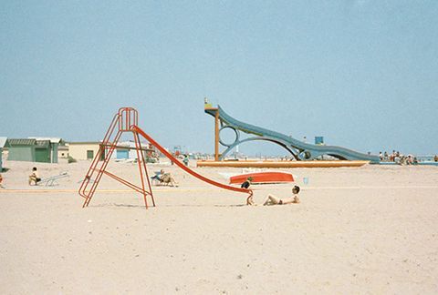
VISUAL: At first glance this image has a lot of colour, the red slide, blue sky, yellow sand, green building and many other small accents of colour. The focal point of the image is the red slide as it is the closest object to the lens and the shape of it leads my eyes to the top of the slide. The image is nicely exposed and there are not many harsh shadows. The images have a green tint to them but the colours are still vibrant.

TECHNICAL: This image was taken on film, this is evident because of the grain that can bee seen in the image. On digital cameras ‘noise’ or ‘grain’ can only be seen when the ISO is high which is only usually in low light situations. Also the image looks quite ‘flat’ by this I mean there is not a lot of contrast between the highlight, whites and shadows, blacks. Film often had this look where the whites are quite washed out and grey and the blacks looked quite raised. I imagine medium to fast shutter speed was used as the image is sharp and the photo was taken in the middle of the day when the sun is very bright so a fast shutter would have been needed. A small aperture was used as the whole picture is in focus.

CONTEXT/CONCEPT: This image along with most of the other images in the series uses a deadpan technique. Ghirri did this to make the images seem like they have no emotion. A deadpan technique is when the subject or landscape is taken from a straight on view, for example it looks like this image was taken at 90 degrees to the sea and so is straight on against the slides. Luigi’s use of this technique and hues of the image create a subtle emotional vibe from the images. The images can be described as having ‘a meticulously rich way of viewing the world’.

Task 4: subtleties and nuances

  • Nuances are the small differences between things. For example royal blue and ocean blue.
  • Subtletites are things that sometime go unknowticed but add to the detail of something.

As nouns the difference between nuance and subtletyis that nuance is a minor distinction while subtlety is (uncountable) the quality or fact of being subtle.

This topic is about capturing subtle and naunce aspects in a bigger picture. Perhaps a small detail in a landscape that tells the story.

Task 5: Shape, Colour and Minimalism

Definition/Intro

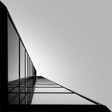
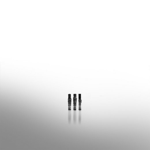
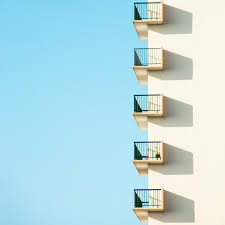
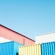
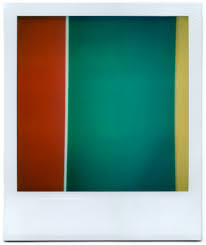
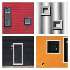
This subject combines the shape, colour and minimalism to create simple abstract images of scenes that are real. A lot of these artists have similar styles and their images look quite similar however they each have certain feature that make them unique.

Key Artists

Kyle Jeffers –

Kyle Jeffers : Photo | Journal paper, Instagram posts, Instagram
Kyle Jeffers Captures Corners You Never Thought Could Be So ...
Q&A con el fotógrafo Kyle Jeffers: "Tiendo a crear la imagen antes ...

Kevin Saint James –

architecture on Behance
Magnificent Black and White Photography by Kevin Saint Grey ...
Miguel Hernández on Twitter: "#minimalist #photography by Kevin ...

Matthieu Venot –

Matthieu Venot
Meet Matthieu Venot, the Self-Taught French Photographer Behind ...
Matthieu Venot

Grant Hamilton –

Red Green Yellow | Grant Hamilton | Flickr
216 Best Grant Hamilton: Polaroid Photography images | Photography ...

Julian Schulze –

Photographic Work — Julian Schulze Photography
Julian Schulze Photography
13 Beautiful Examples of Minimalist Photography by Julian Schulze ...

Jon Setter –

The Urban Text - Jon Setter - SEEN Magazine
JON SETTER
JON SETTER

Task 3: Aaron Siskind

Case Study

Aaron Siskind was an American photographer born in New York City 1903. His ‘work focuses on the details of things, presented as flat surfaces’. He grew up on the lower east side of New York City with his Jewish, Russian Parents. Once he had graduated city college he became a grade school English teacher which would be his job for the next 25 years. He didn’t gain a real interest in photography until he was around 26 when he got married in 1929. One of his wedding gifts was a camera which he used on his honeymoon. From then on he became fascinated with photography and the way in which a camera perceives objects. In the 1930’s during Siskind’s early career, he was a member of the ‘New York Photo League’ where he produced numerous series of images, one of those series being the “Harlem Document”. This was a series documenting New York during the depression especially focusing on the area of Harlem. The project was ended by 1941 as America entered into WW2, Siskind had left the Photo League and began to explore ‘Abstraction’. His work was influenced by Abstract Expressionists and his images would often feature along side them. He would spend time framing and positioning his camera to achieve the perfect composition. He would peel paint to create sculptures and manipulate strands of seaweed into calligraphy.

Analysis

Aaron Siskind | Jerome, Arizona 21 | The Met

VISUAL: This composition was made by peeling the paint in what looks like a wall to create low-relief structure. You can see a lot of texture from the paint, the cracks and the background. The texture, shadows and peeled paint make the image more dramatic and old, it makes the viewer think that it is really old or has gone through something to make it look the way it is. I think natural lighting was used

TECHNICAL: This image is very hard to explain the settings on the camera because the image is very shallow meaning there is not much depth. This makes the image hard to tell what aperture was used because the is not enough depth to show a shallow depth of field. However, I think that this image would have been taken using an aperture ranging from f4 to f9. A low ISO was used because there is minimal grain and a fast shutter was used as everything is sharp. But again this is hard to judge as if a tripod was used then a long shutter may have been used.

CONCEPT/CONTEXT: Siskind liked to transform everyday objects or natural things and transform them into new structures. In this image he peeled the paint on what may be a door to look like it almost like the shape of a person.

Task 3: Response

Shoot Plan

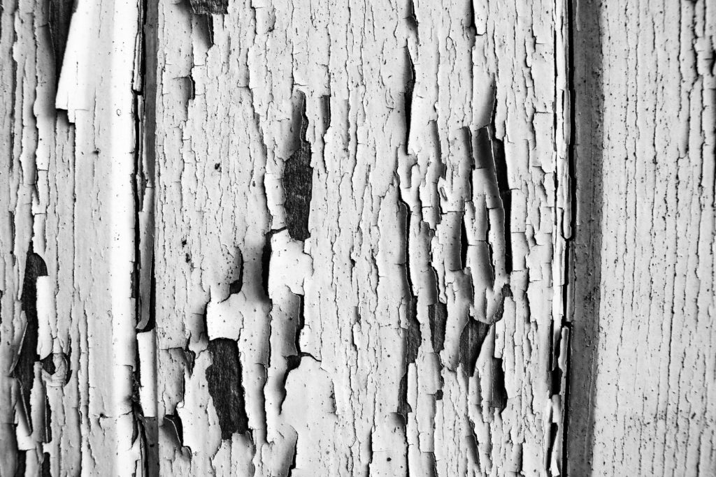
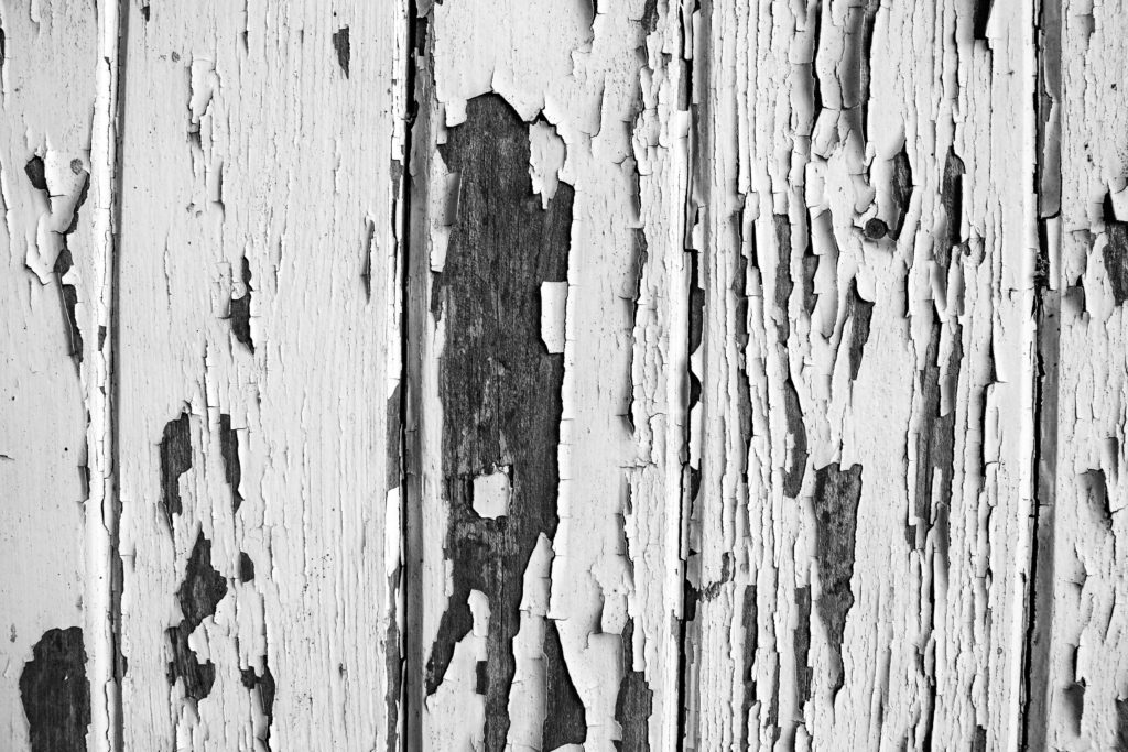
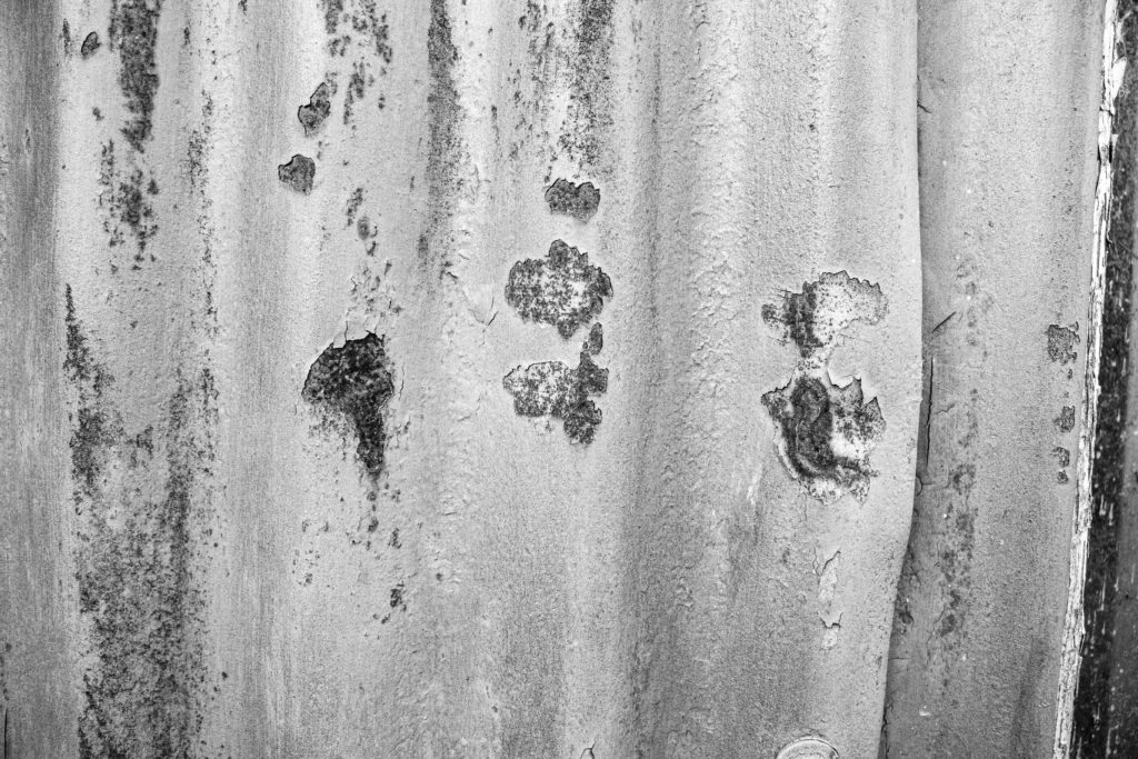
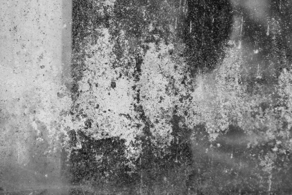
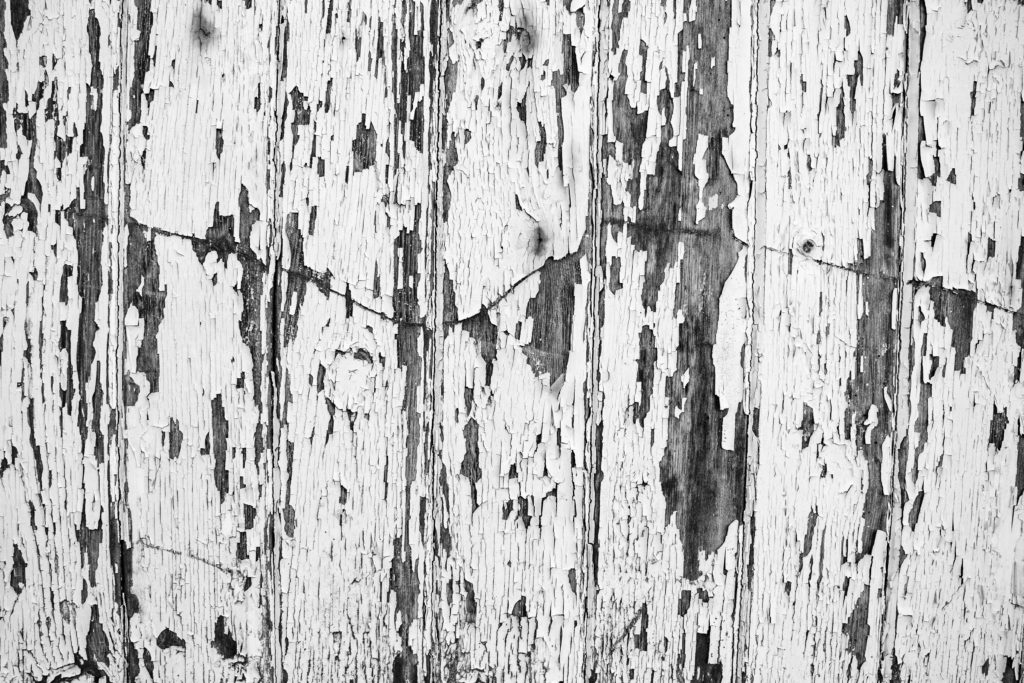
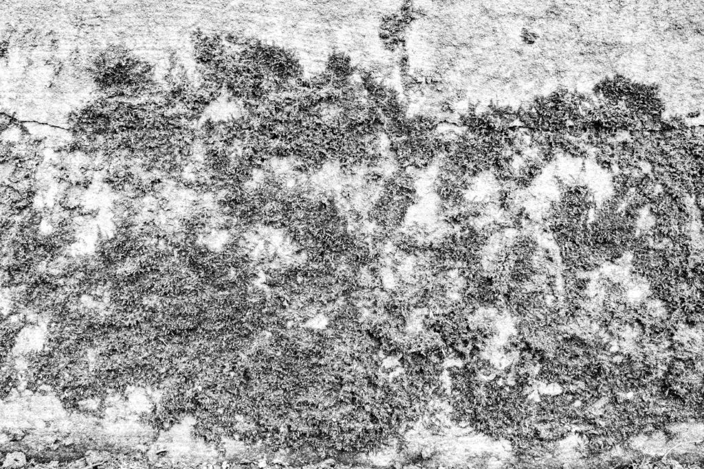
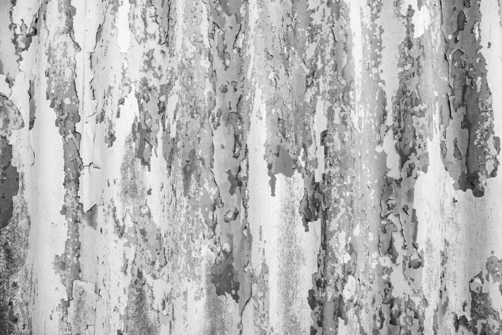
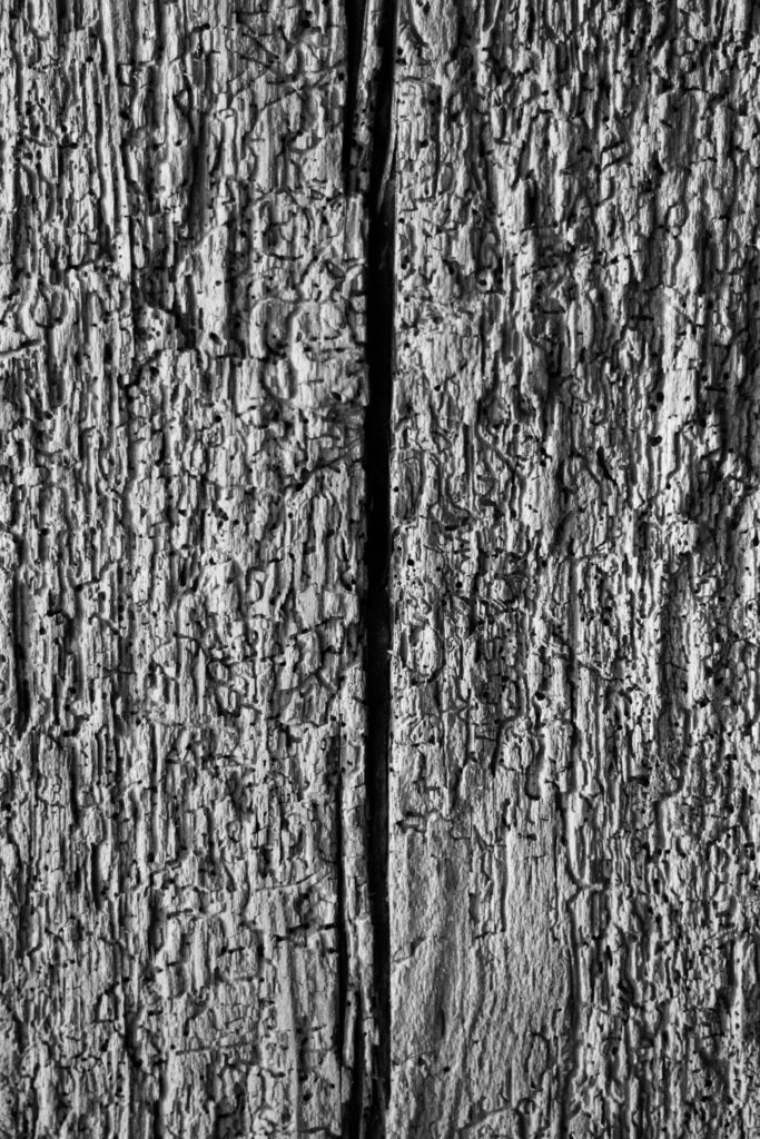
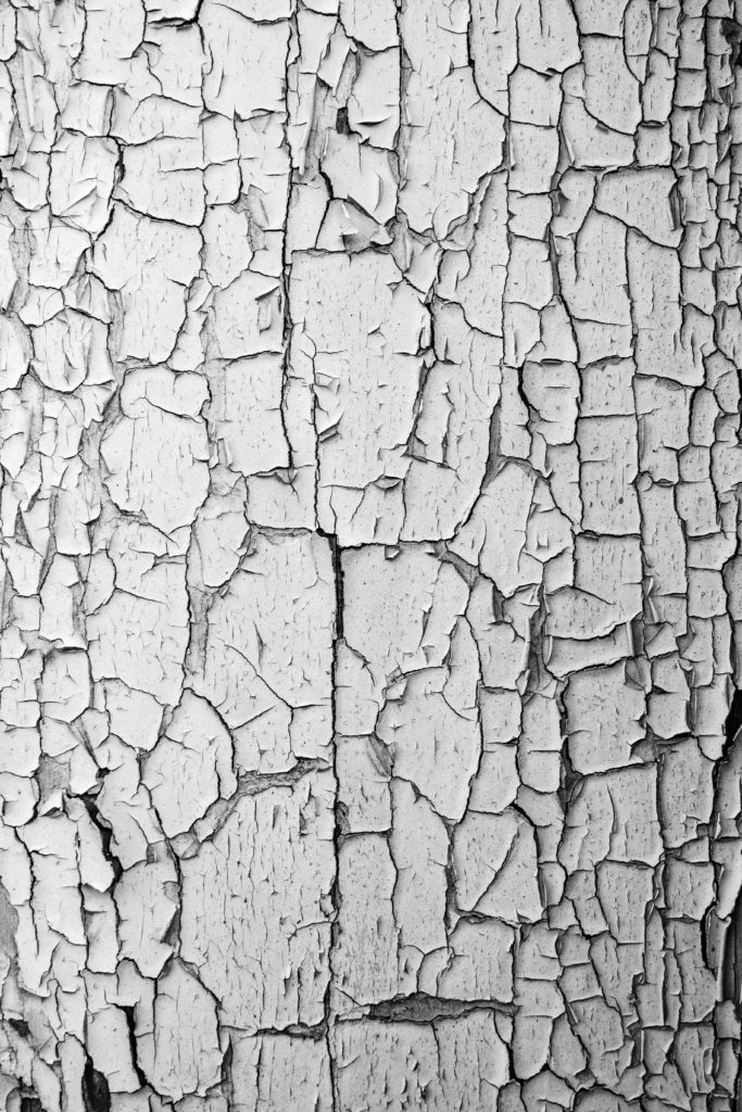
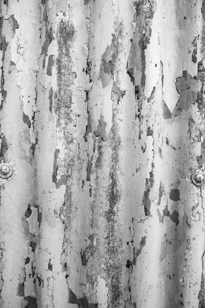
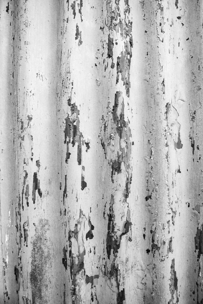
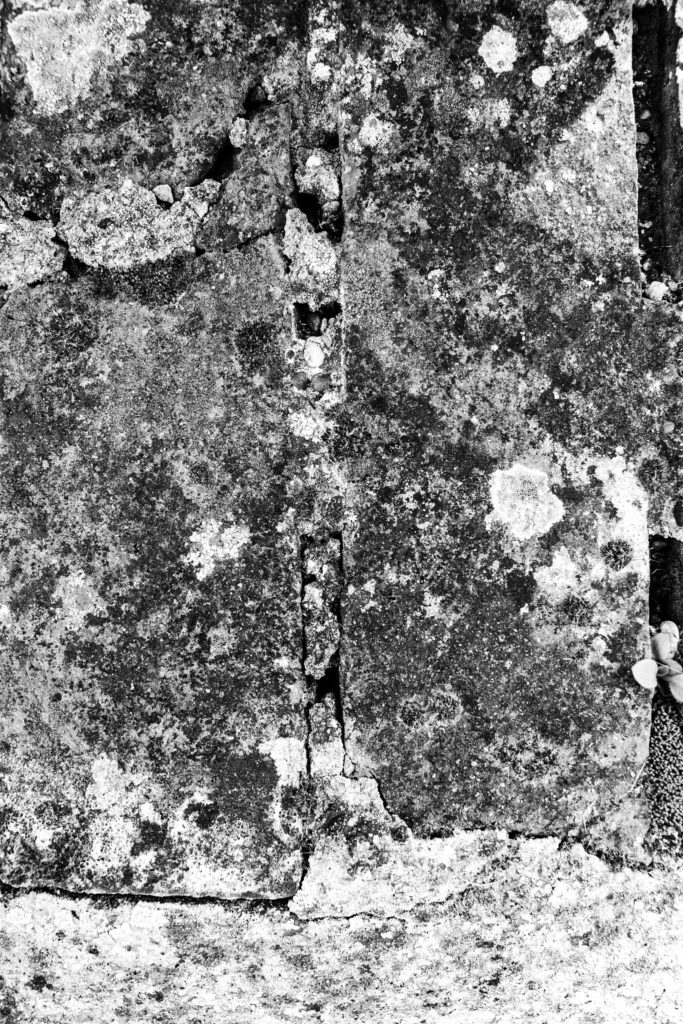
WHAT: This shoot is about capturing and exploring different textures and surfaces. My plan is to walk around my house and where I live looking for different surfaces. Already, I plan to take pictures of cracked and peeling paint, wood knots, wood grain, and bricks. I am going to mainly shoot things straight on therefore not showing any depth but I may change the angle of the camera for some shots to show some depth and 3d look in the image.

WHERE: I have an old shed near my house that belongs to my family that is rotting and has a lot of peeling and cracked paint on it which I can photograph. I am also going to wander around my yard and the lanes near my house looking for different surfaces and textures, for example rotting wood, leechy walls, bricks, rusty metal and so on. There are also some wooden beams in my house that are full of cracks and wholes from wood worms.

WHEN: I will try and shoot everything at once and will do it on day when it is not too sunny. This will give me nice even lighting across the subjects rather than harsh shadows and high contrast.

HOW: I am going to use my canon 70d for all of these photos and not use my phone. I am doing this because I need to capture as much detail as possible if I need to crop in or adjust the framing. I am going to use a mixture of my 50mm 1.8 and the kit lens depending on how much light I can get. For example there will be no issues outside as there will be plenty of light.
Contact Sheet

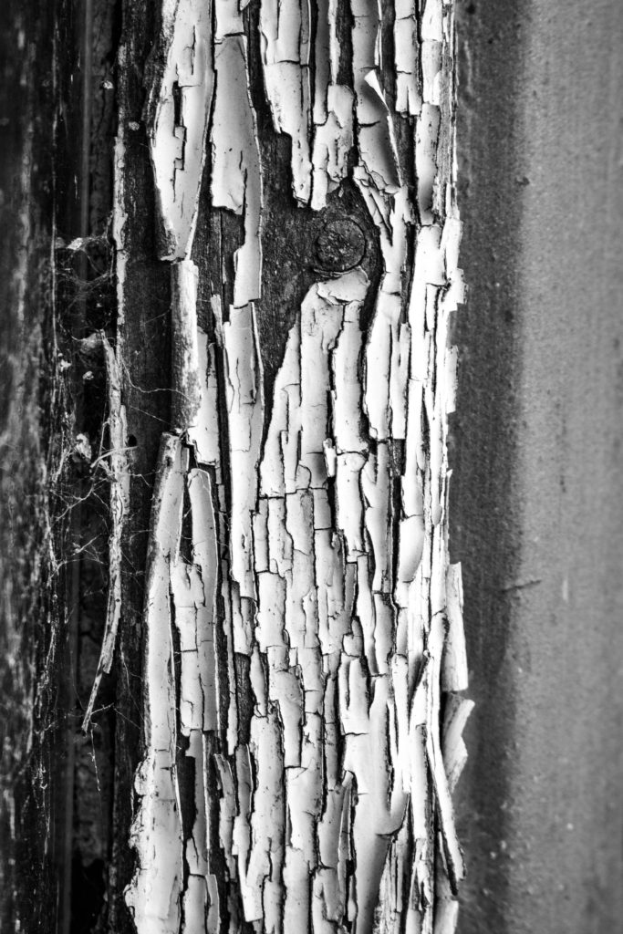
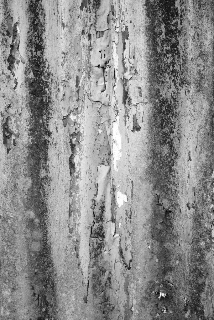
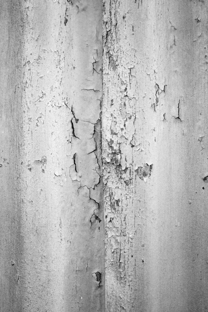
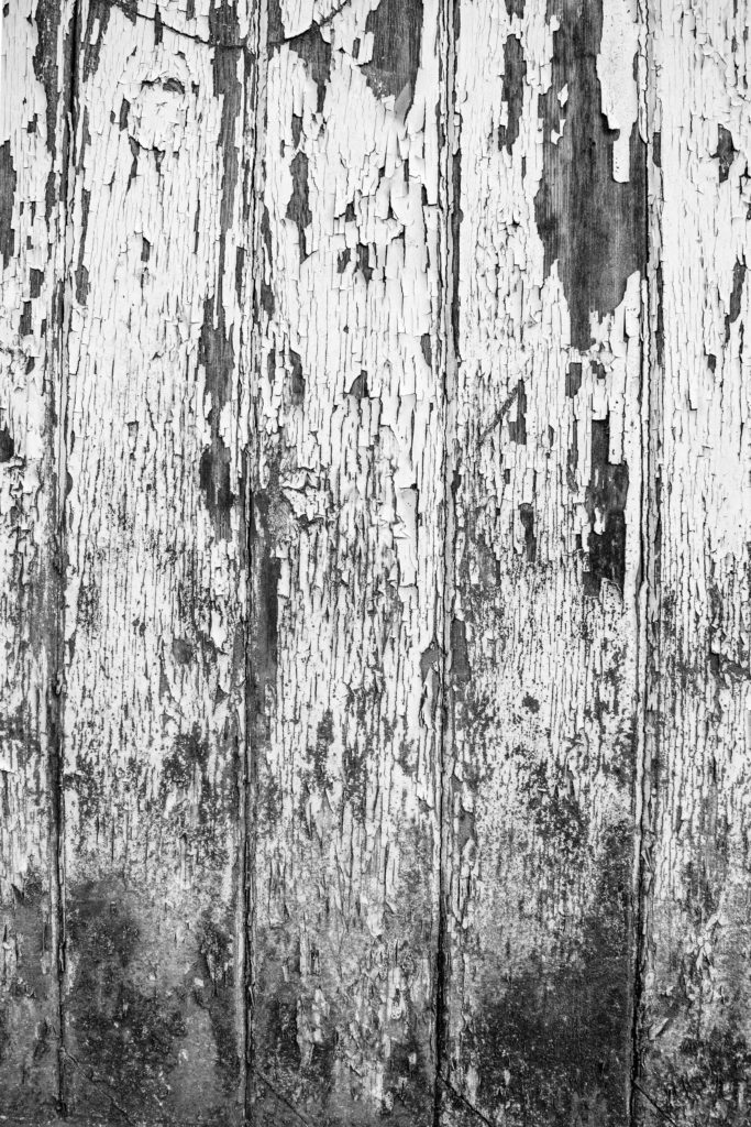
This surfaces photoshoot was successful, I think I accurately captured some images that are similar to the style of Aaron Siskind. The I imported the images into Lightroom I filtered the good images by pressing ‘P’ on the keyboard to flag them. I edited them and then rated them with one or two stars depending on how good each edit was.

Edit Process

Edits

Evaluation / Comparison

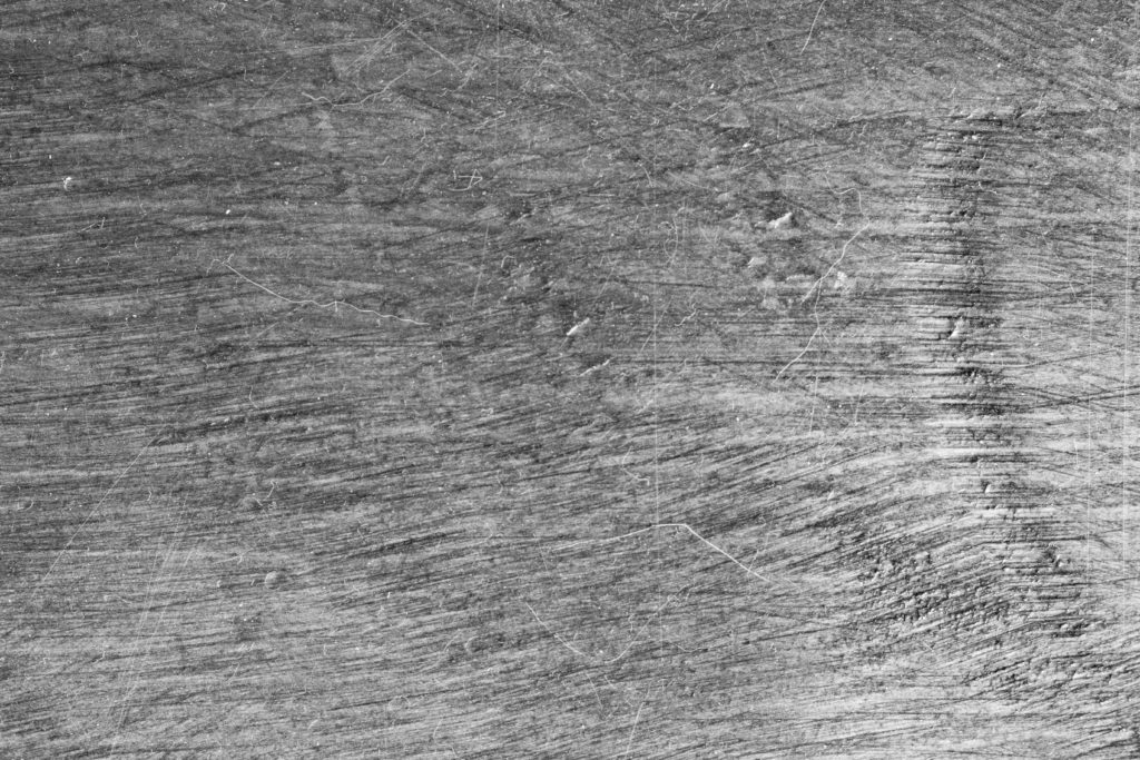
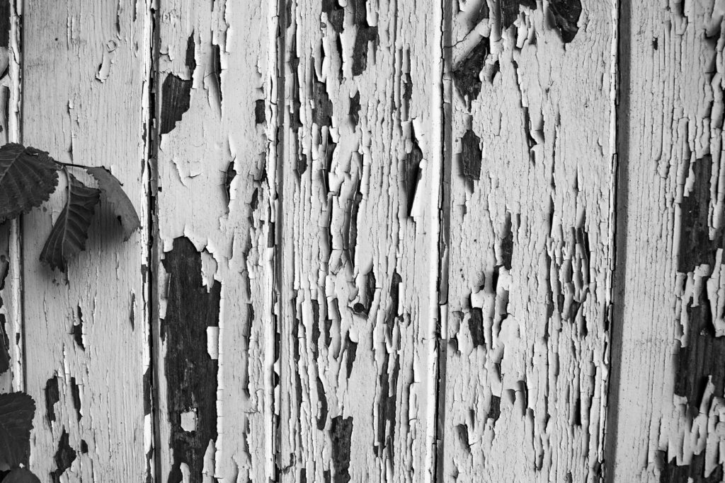
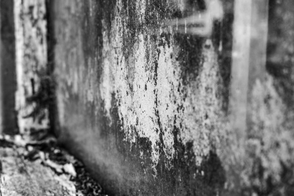
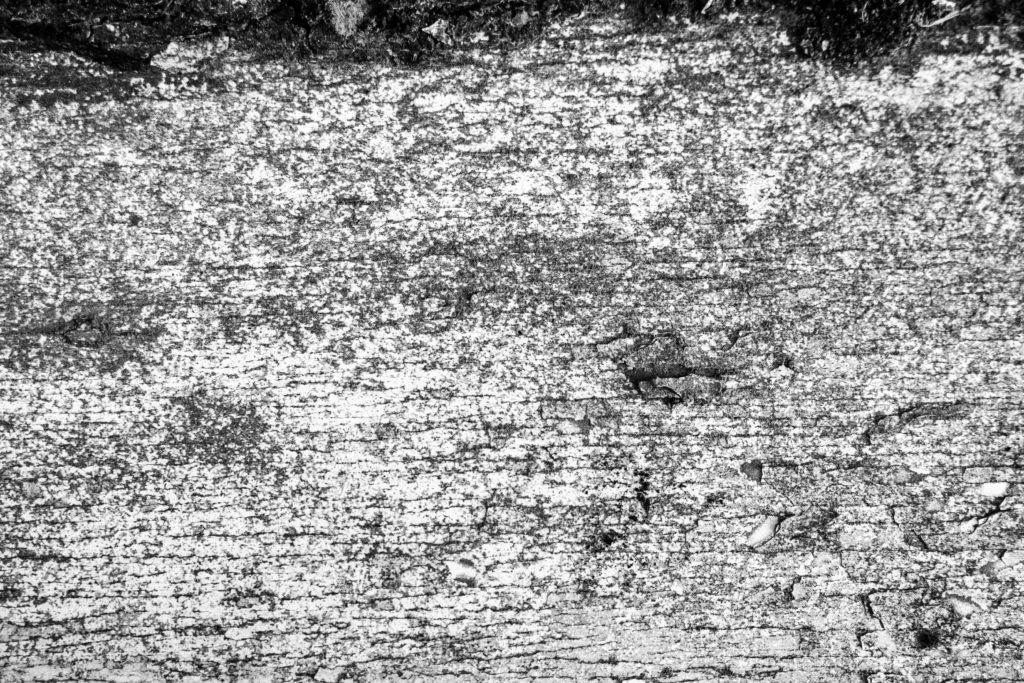
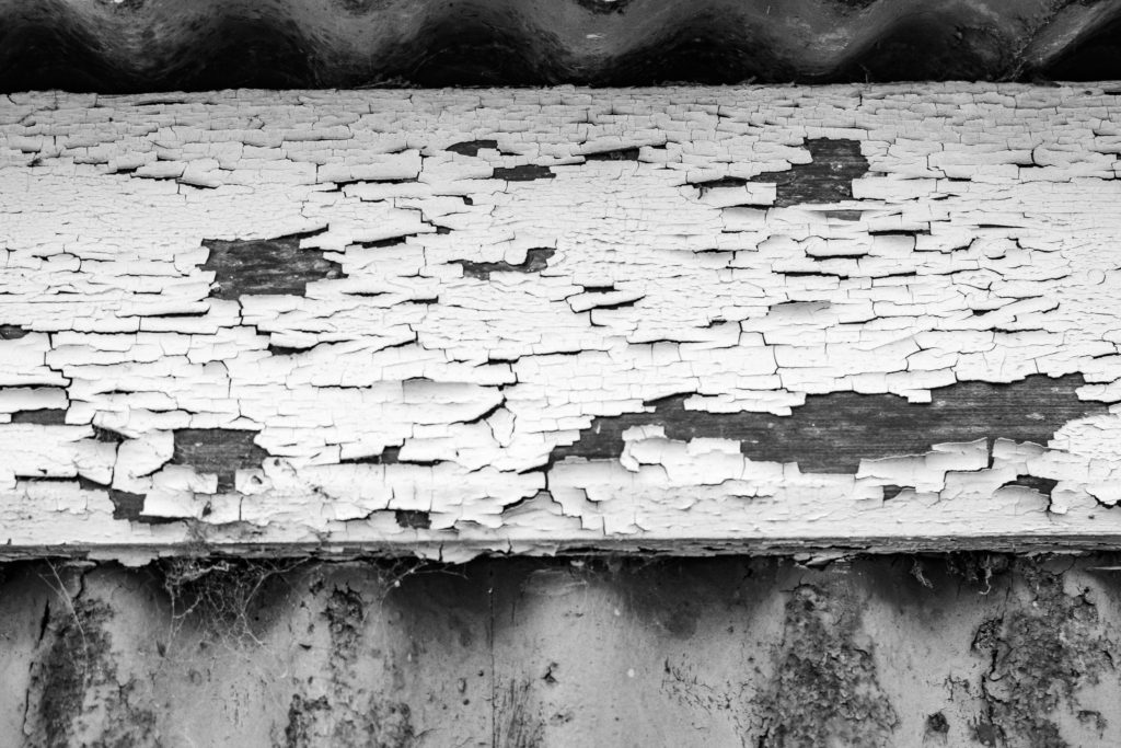
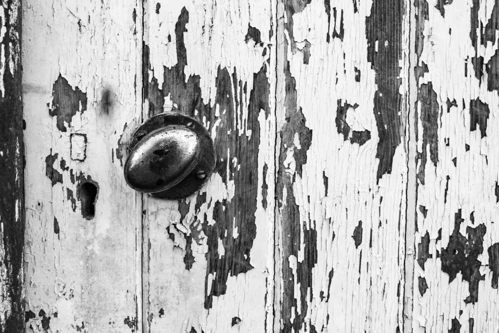
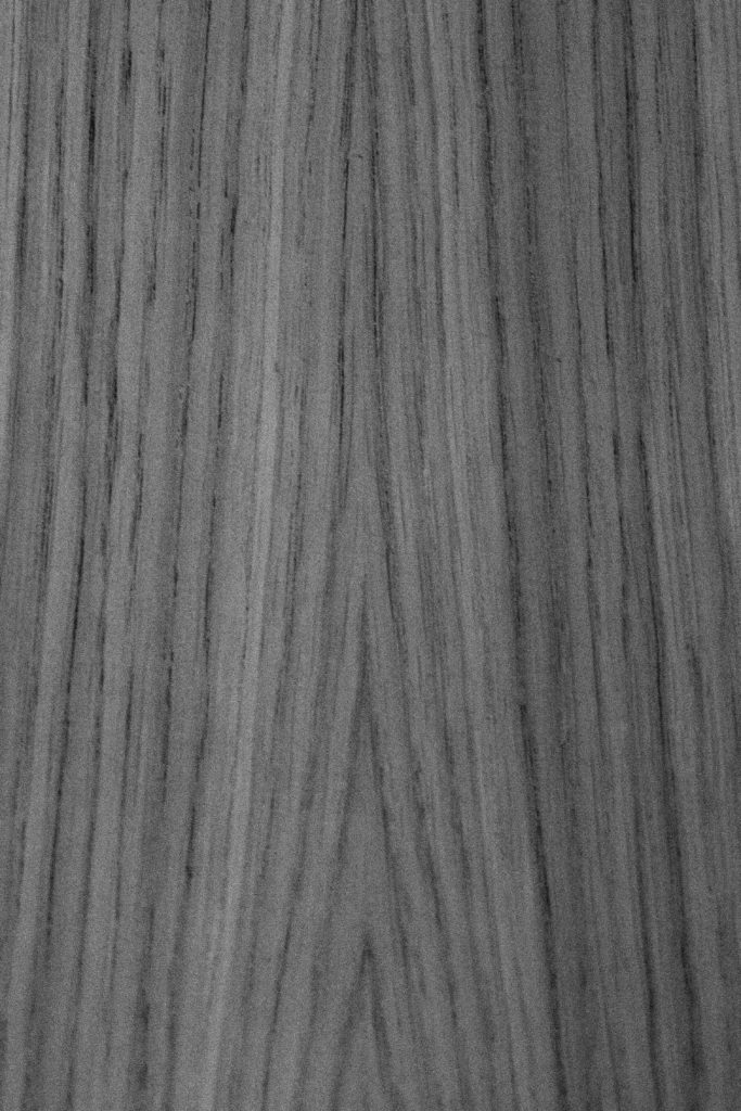
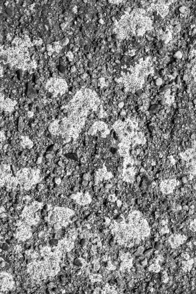
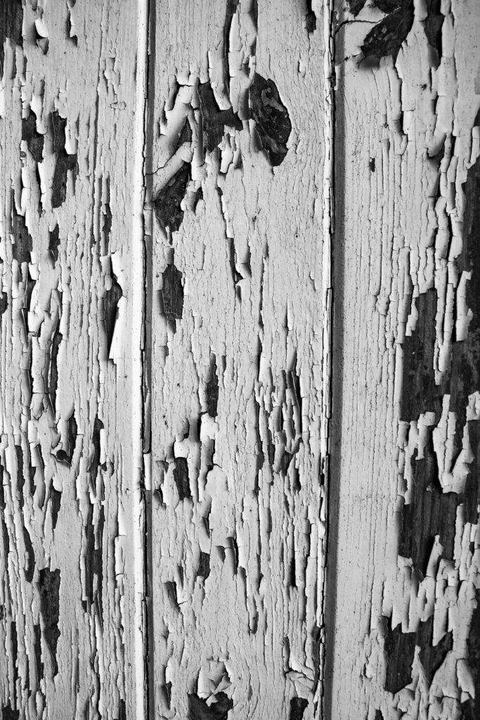
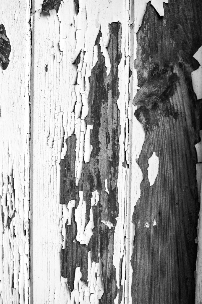
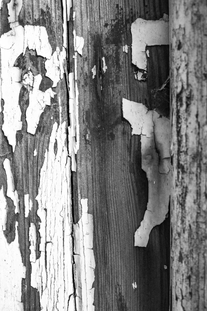
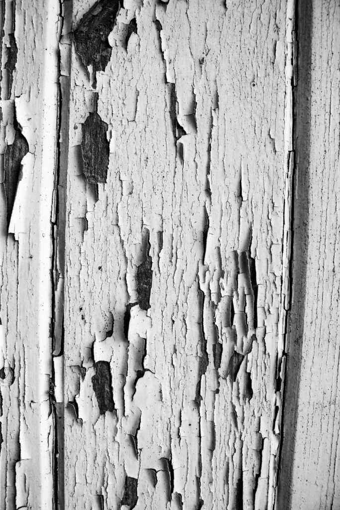
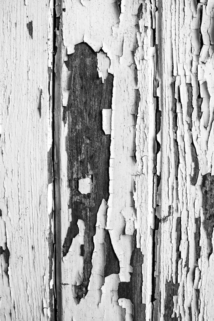
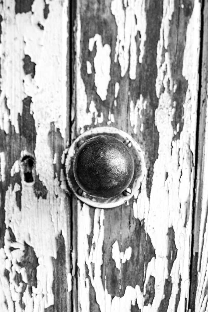
These are my favourite images because I think they look the more professional compared to some of the others that just look like anyone has taken a random picture of pain pealing. I also thing they resemble Aaron Siskind’s style well. Once I had edited them they look older and more like something he would take. Overall I am very happy with the way these images came out.
The top image looks a bit like a dear or some sort of animal, I didn’t realise this until later when I was editing it. The knot in the wood looks like and eye and there is a crack in thee wood on the bottom left that looks like a mouth. This links well to his photos as he often looks for patterns or shapes in his the picture he takes.

The second image I really like because I managed to get the perspective exactly right. By this I mean that I shot it square on to the surface so none of the lines are warped or bowing. I like the way the cracks and pealing paint are all over the image. I also like the contrast between the white paint and the dark shadows of the wood underneath, it brings a good balance to the image.
Overall I am very happy with the way these images came out.