All posts by Lawrence B

Filters

Author:
Category:

claude cahun & shannon O’DONNELL

Cahun

O’Donnell

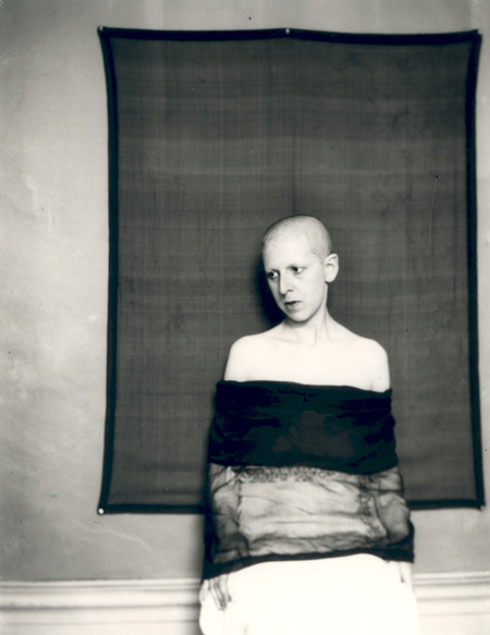
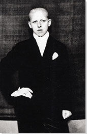
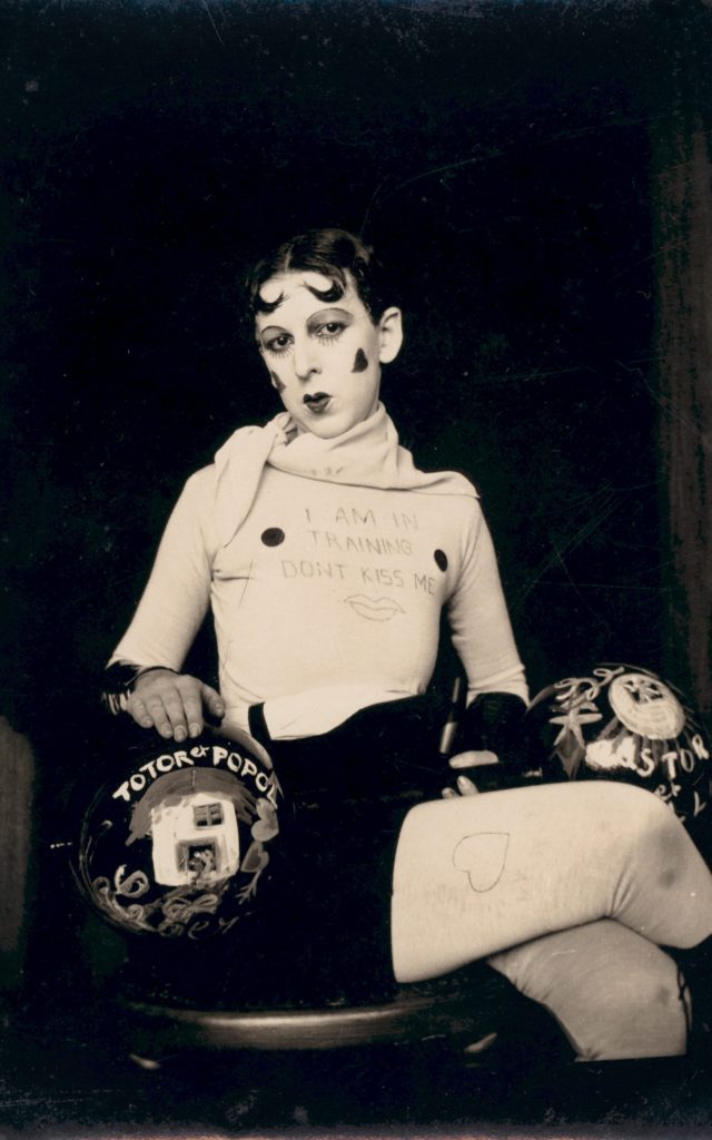
Claude Cahun (real name is Lucy Renee Mathilde Schwob) was a writer, sculptor and photographer born in 1894. Her self portrait work was very influential, empowering women and contradicting very unfair female gender roles in late 1910’s until her death in 1954. Cahun presented herself in men’s clothing, and with short hair. This work was courageous as it was difficult for women to freely express themselves during the times her portraits were taken. For her time, Cahun’s work was considered ‘different’ and ‘odd’ leading to people categorizing her in the Surrealistic artist group. Cahun lived in Jersey during World War II as a Jewish gender neutral person.
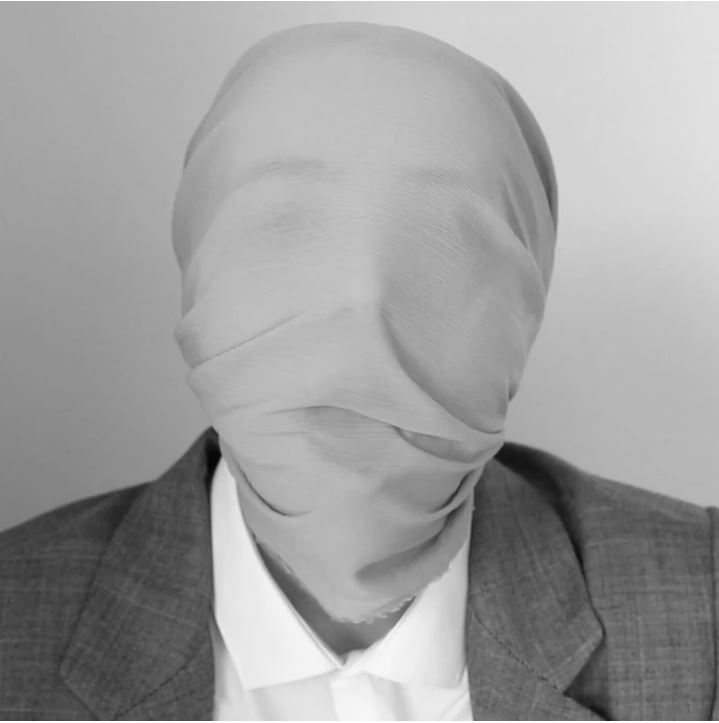
Technical

  • Close up shot which are often linked with emotion and encourage the viewer to try and understand how the subject feels.
  • Soft Black & White to create a neutral image with emotion.

Visual

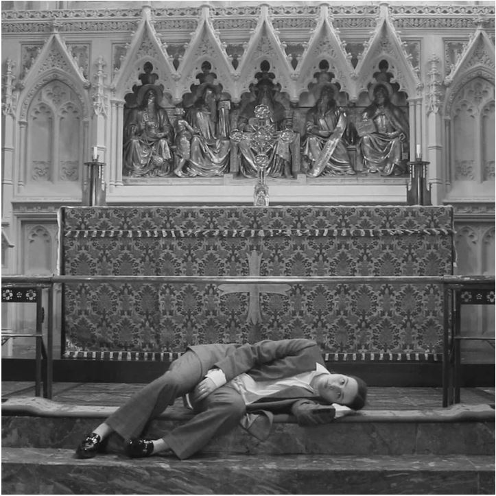
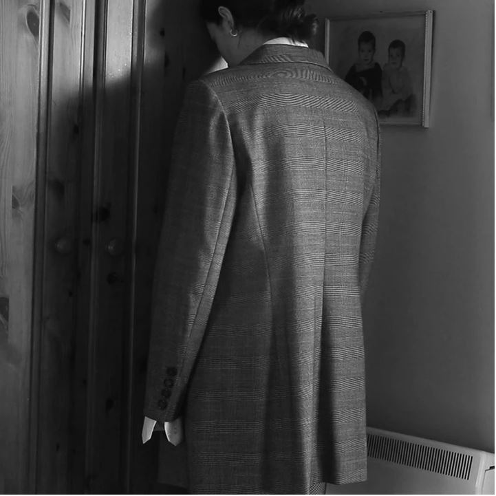
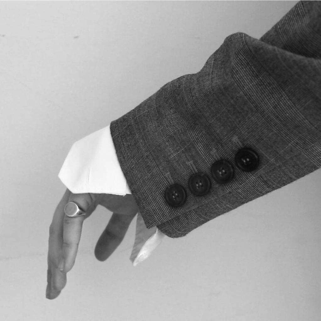
  • The item over O’Donnell’s head removes all sense of identity from her and creates a sort of ‘blank’ human.
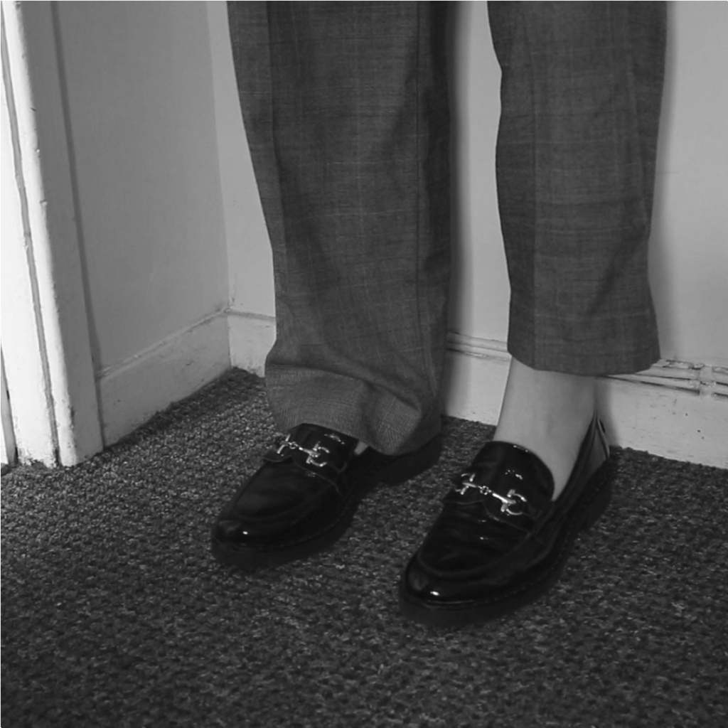
  • The bland suit and shirt compliment the item over her head and further emphasizes the loss of identity.
  • The male clothing contradicts gender stereotypes.
  • The background of the image and the item are very similar in their colour causing them to appear as if they are merging with one another. I feel as if this is a statement towards gender stereotypes and performativity making everyone the same.

Conceptual

  • This image is taken from O’Donnell’s short film ‘That’s Not The Way The River Flows’ which highlights the issues surrounding gender and it’s affects on individual identity.
  • O’Donnell says ‘ As we unpick the complicated narrative of gender and the generalisations that it encapsulates, we are forced to re-imagine what it is that makes us who we are and what we want or can identify as.’ I believe this image represents her idea of re imagining who we are by creating a ‘blank’ human with space for a new identity.
  • Her use of male clothing also contrasts the ‘generalisations of gender’ which she comments on / brings attention to throughout her film.
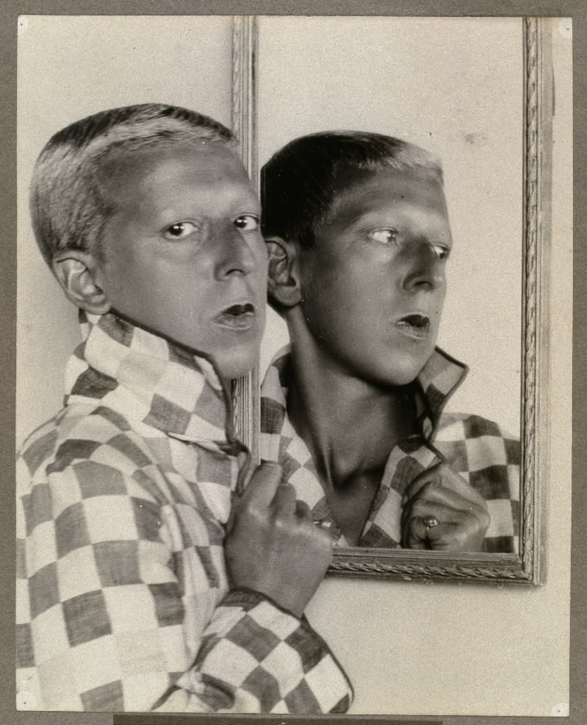
Technical

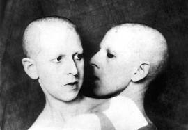
  • Close up shot which are often linked with emotion and encourage the viewer to try and understand how the subject feels.
  • Soft Black & White to create a neutral image with emotion could be a link to Cahun’s neautral gender.

Visual

  • We can see a mirror in this photo which shows a different view of Cahun through the reflection. This can be seen as a link to her duplicitous identity (her true self and the identity she hides behind). Cahun said ‘Under this mask, another mask. I will never be finished removing all these faces.’ this links well with this image as we see a portrayal of two masks through the use of the mirror.
  • The male clothing contradicts gender stereotypes and the very short hair adds to this making it difficult to assume a gender with no knowledge of Cahun.

Conceptual

  • Her use of male clothing also contrasts the ‘generalisations of gender’ which were very prevalent in the late 1910’s.

Protest and movements

Suffragette Movement

A suffragette was a member of an activist women’s organisations in the early 20th century who, under the banner “Votes for Women”, fought for the right to vote in public elections.
Emmeline Pankhurst became involved in women’s suffrage in 1880. She was a founding member of the WSPU (Women’s Social and Political Union) in 1903 and led it until it disbanded in 1918. Under her leadership the WSPU was a highly organised group and like other members she was imprisoned and went on hunger strike protests.
In 1908 the co-editor of the WSPU’s newspaper, Votes for Women, Emmeline Pethick-Lawrence, designed the suffragettes’ colour scheme of purple for loyalty and dignity, white for purity, and green for hope.

Emily Wilding Davison (suffragette) who died at the Epsom racecourse during the Derby 100 years ago under the hooves of the king’s horse has been saluted by some as a brave martyr and attacked by others as an irresponsible anarchist.

The movement has influence many other feminist protests in more modern times eg. Me Too movement, FEMEN movement

The suffragettes main challenge was to gain the right for women to vote. Photography played a role in their eventual success by spreading awareness of the movement to larger numbers of people.

Dadaism

Dadaism was a movement with explicitly political overtones – a reaction to the senseless slaughter of the trenches of WWI. It essentially declared war against war, countering the absurdity of the establishment’s descent into chaos with its own kind of nonsense.

Abstraction and Expressionism were the main influences on Dada, followed by Cubism and, to a lesser extent, Futurism.

At the first public Dada soiree on July 14, 1916, Dada founder Hugo Ball read from the Dada Manifesto: “How does one achieve eternal bliss? By saying dada.”

Photography allowed for people to take absurd photos to join the movement but also allowed for sculptors and other physical art to be recorded and spread to a wider audience. raising awareness for the artistic movement.

Shannon O’DONNELL

  • university of south wales
  • politics (local / global)
  • Claude Cahun
  • Duane Michals
  • Casa susanna
  • Walter Pfieffer
  • Adi Nes
  • ‘Masculinities’ book
  • The cat and the mice
  • Suffragette movement
  • Judith Butler
  • Gender performativity
  • That’s not the way the river flows
  • poetry

Identity politics and culture wars

Identity politics create separate groups mainly based on religion, race, class and social background. These groups all fight for their dominant ideologies (concerns, agendas, projects) to be the main way of life within their societies. Although this group mentality can help get things done for themselves it can have a very negative affect on society as all groups will have different beliefs leading to discrimination against minor groups.

Identity Politics Devalues Individual People - WSJ

Culture wars discuss the conflicts between social groups and explains the fight for dominance of their beliefs and values. Certain issues that have caused major issues are abortion, homosexuality, gender, pornography, multiculturalism and racial viewpoints. An advantage to one dominant ideology in society is that there would be no conflict over decisions surrounding these issues, however, the final decision may be wrong / unfair.

Geneva Conventions for the Culture War - WSJ

The male identity is a very prevalent subject today and is highly affected by identity politics. In gender studies, hegemonic masculinity is part of R. W. Connell’s gender order theory, which recognises multiple masculinities that vary across time, culture and the individual. The male identity can be seen in two distinct ways: The identity of man as a single gender and the identity of specific groups of men in relation to the dominant male group (white, middle class, heterosexual) The best example of hegemonic masculinity is the dominance of heterosexual men and the subordination of homosexual men.

zine

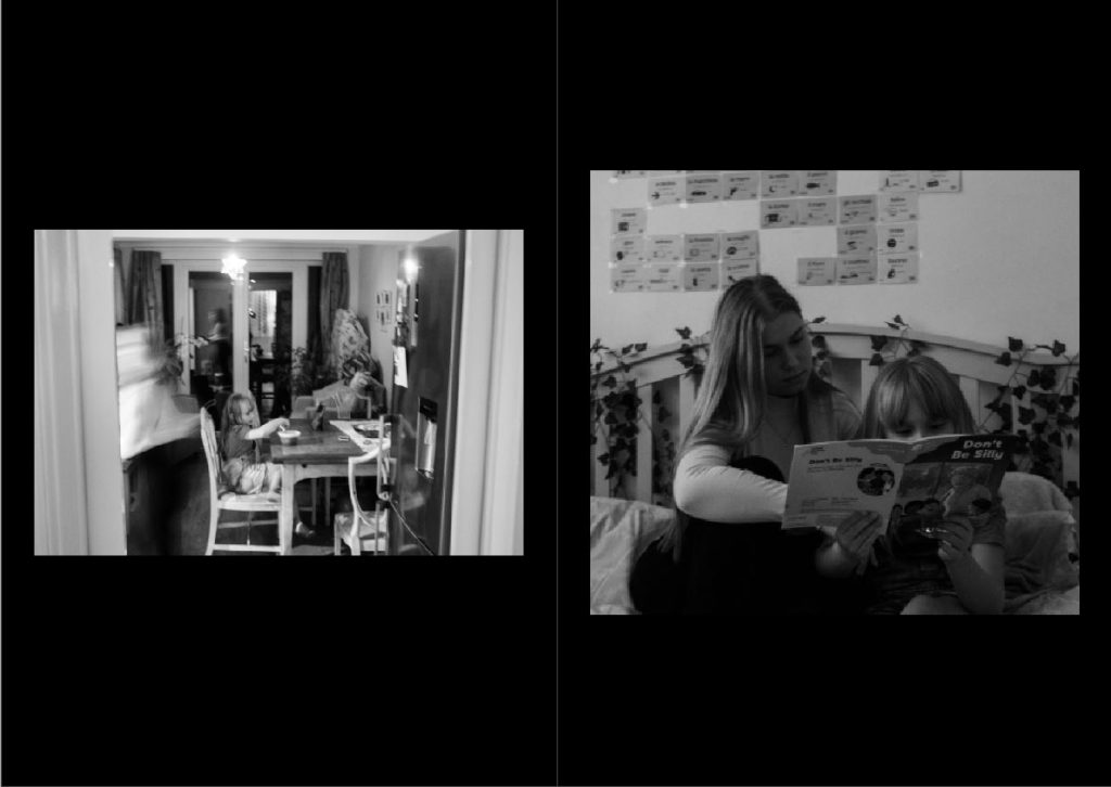
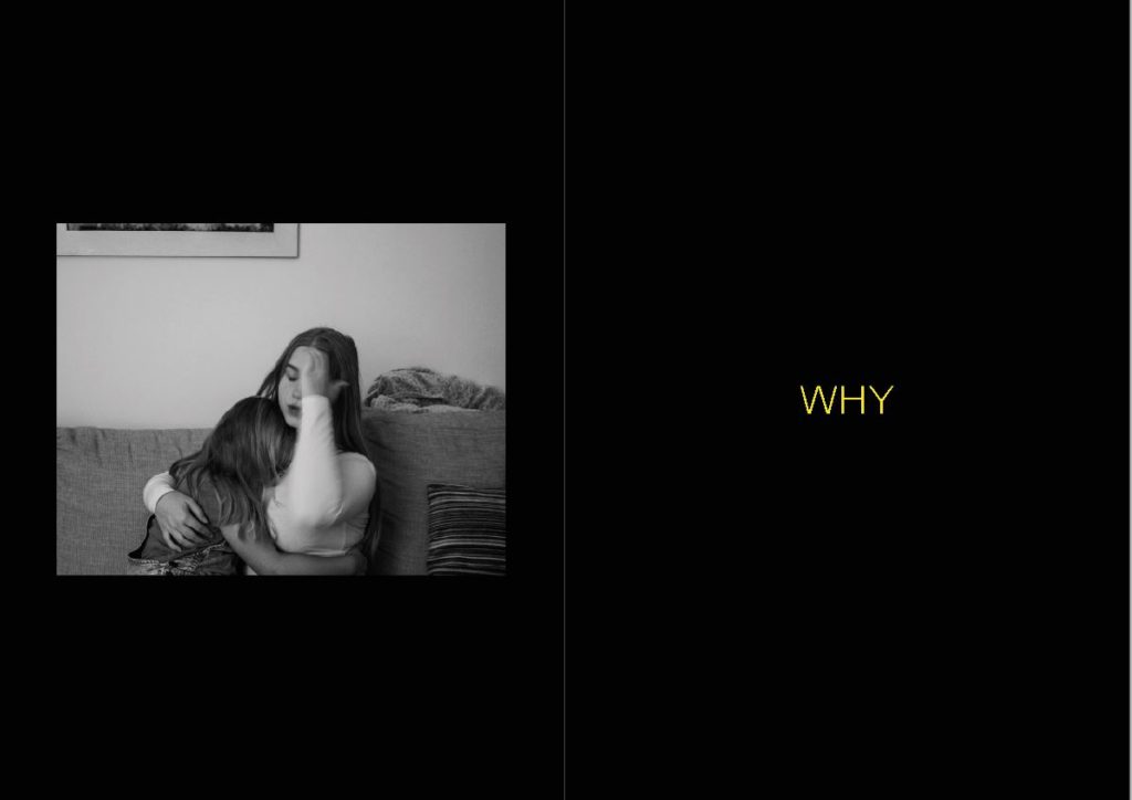
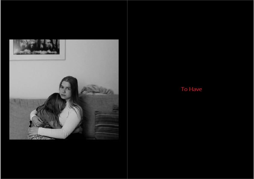
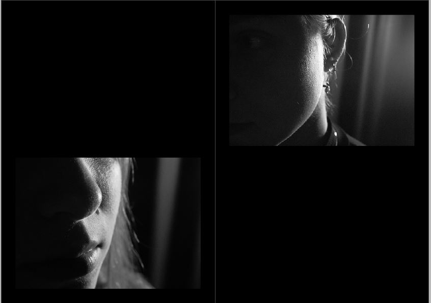
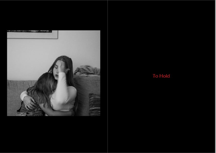
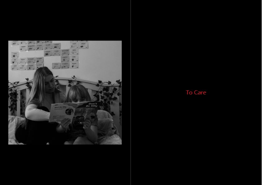
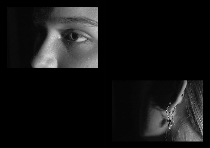
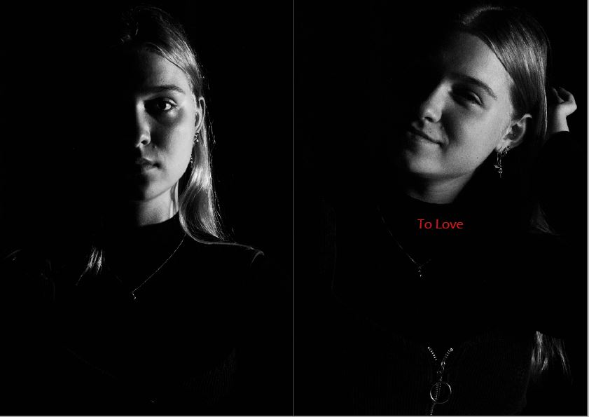
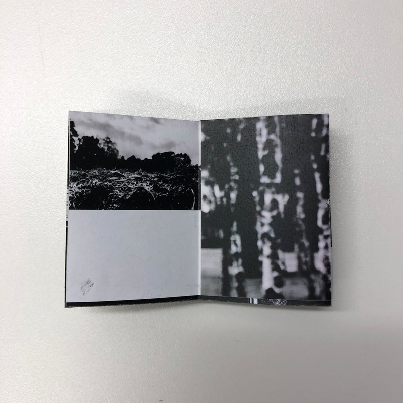
This is the first sequence I created for my zine

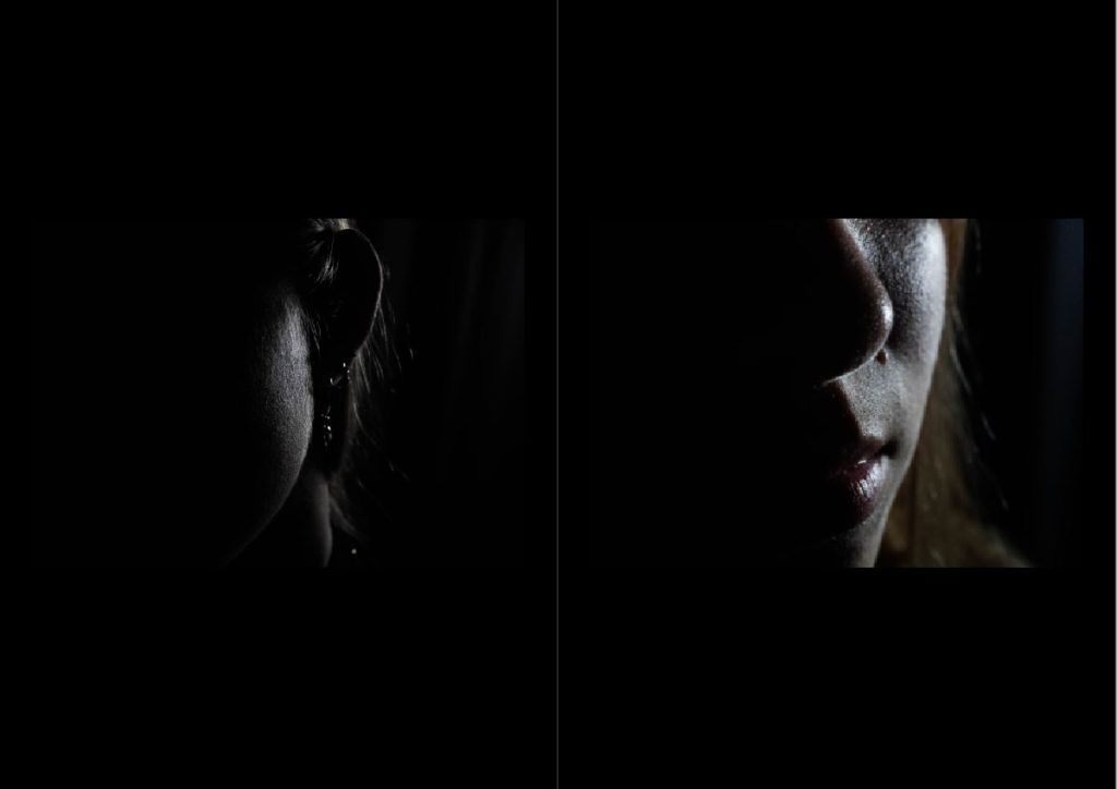
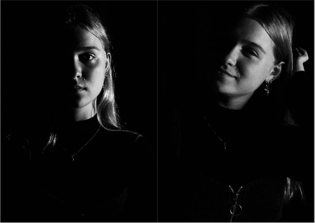
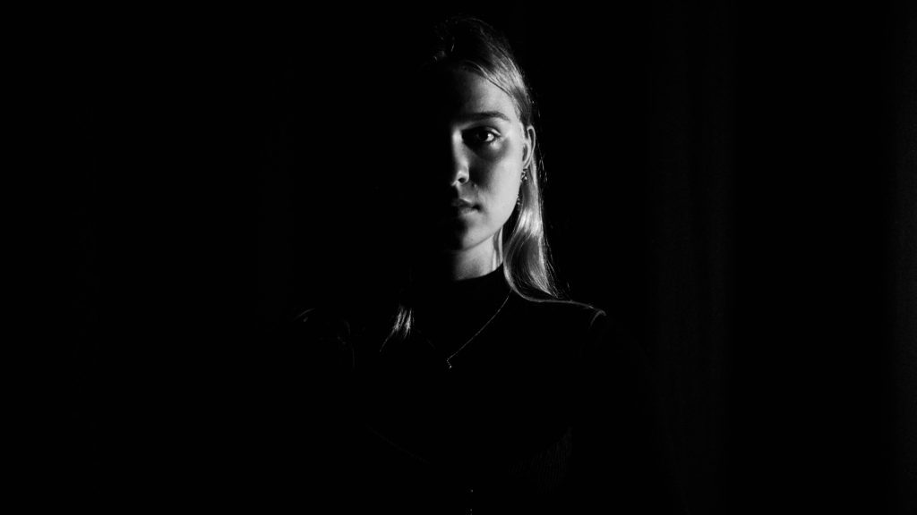
The first half of the zine consists of high key images of Paulina and her sister where as the second half of the zine progresses in a darker lower key set of images. I am trying to tell the story of someone who has an almost split personality ( a caring and loving side against a darker more emotional side) The text on page 2 and 6 is going to change as it is only there as an example for now and I am likely to replace the image on page 5 as I feel it does not posses enough meaning or represent my narrative well.

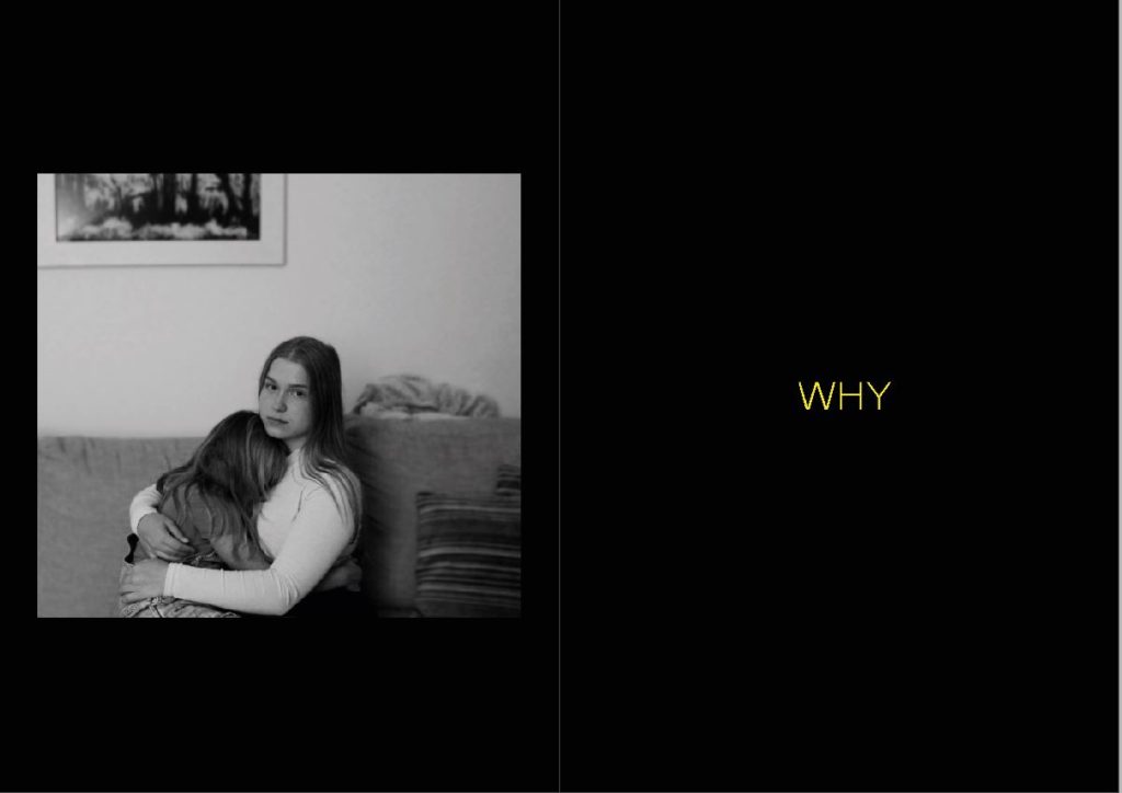
My opening image is a strong portrait of the sisters to show the connection between them and develop a first idea of Paulina as an individual.

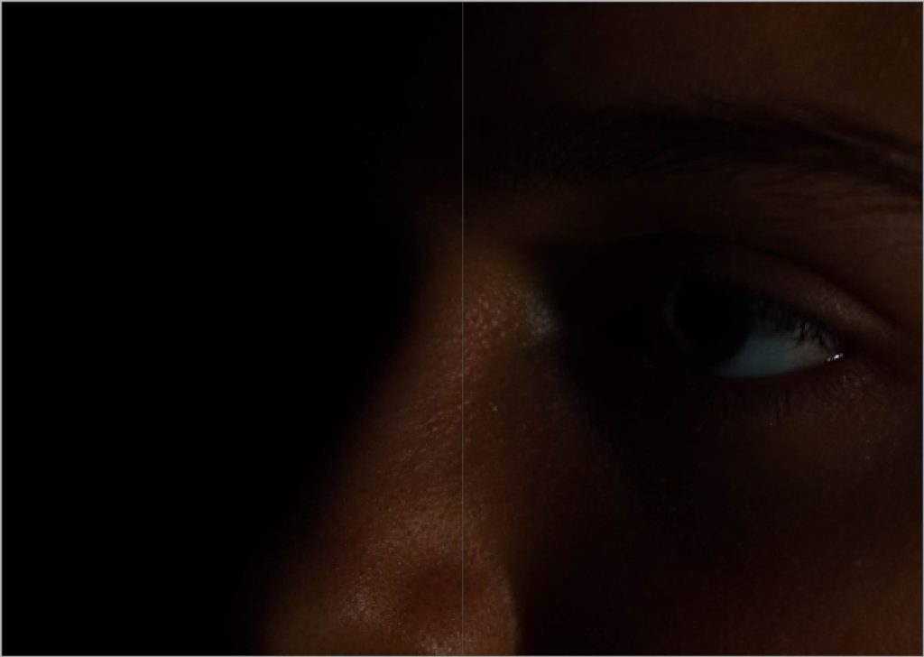
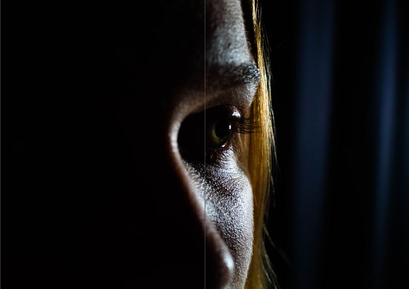
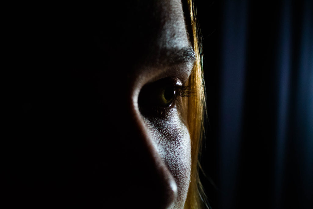
My middle image is an extreme close up of Paulina and also the first and colour image. I chose this image to separate the halves of this zine as it best represents the sense isolation and separation from love she feels.

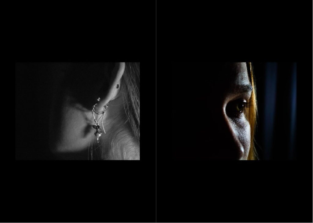
My last page consists of two similar portraits of Paulina that both convey different emotion. I am using these images to emphasise the split between her feelings.

Final sequence

My first and final image have remained the same as my first sequence however I have selected a more powerful image for the middle of the zine. This image is still the first colour image but is also now the only photo in colour. This further emphasises the importance of this image and it’s meaning.

Although the order of my images are not in separate halves any more the high key vs low key theme is still relevant and shows the split in her personality.

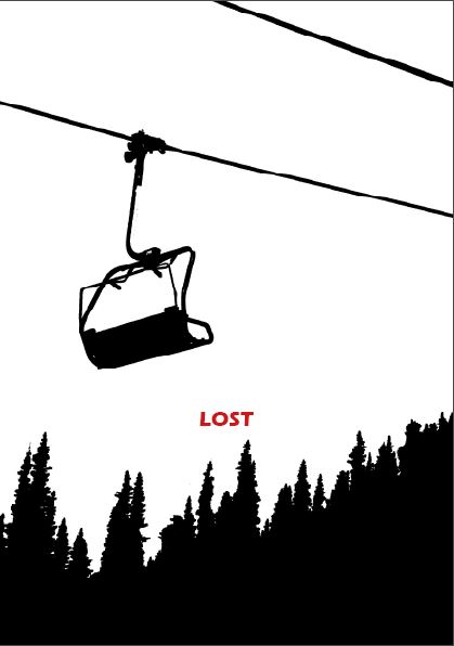
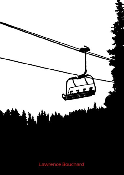
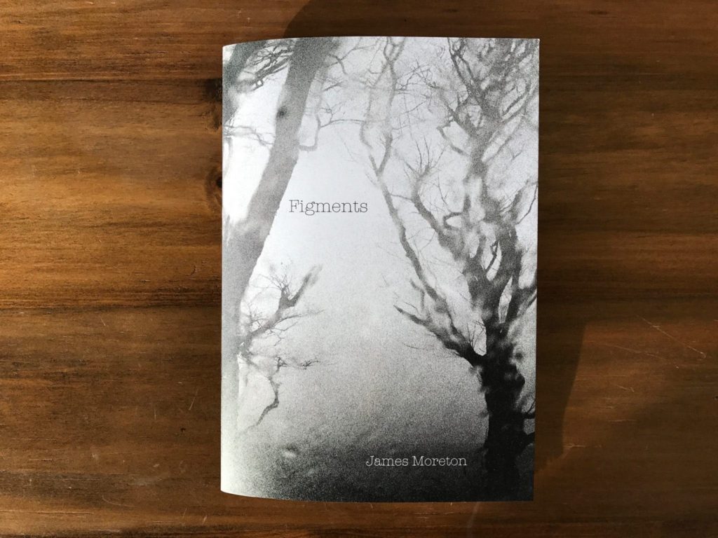
My new front / back cover shows two things that are meant to be together, however they are separated by the book. I liked this for my cover as it is an appropriate metaphor for the themes of this Zine and it is different from the rest of the photos showcased, this difference amplifies the meaning of the image.

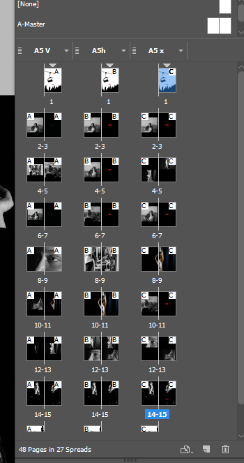
I ended up with three alternate layouts. After some feedback I went with the 3rd layout shown below. This was the best layout as there was a constant and clear narrative throughout the sequence and it used my best images.

Overall I am pleased with my zine and I think it represents a good narrative with high quality images and an interesting sequence. I believe I could have completed an extra photo shoot to further develop the quality of my zine and therefore would have been able to follow my original specification more closely. I am happy with the final print of my zine as the dark images appear to merge with the black background of the pages. This brings the book together and incorporates it within the narrative demonstrating confinement and isolation. The images from different photo shoots are never shown on the same page as I wanted to truly enforce the idea of the split between her personality and the difference in the way she acts around loved ones and by her self. The final spread is the only bridge between these two feelings. I used this to finally compare the two sides to this story side by side so it was clear to the viewer.

Zine Research

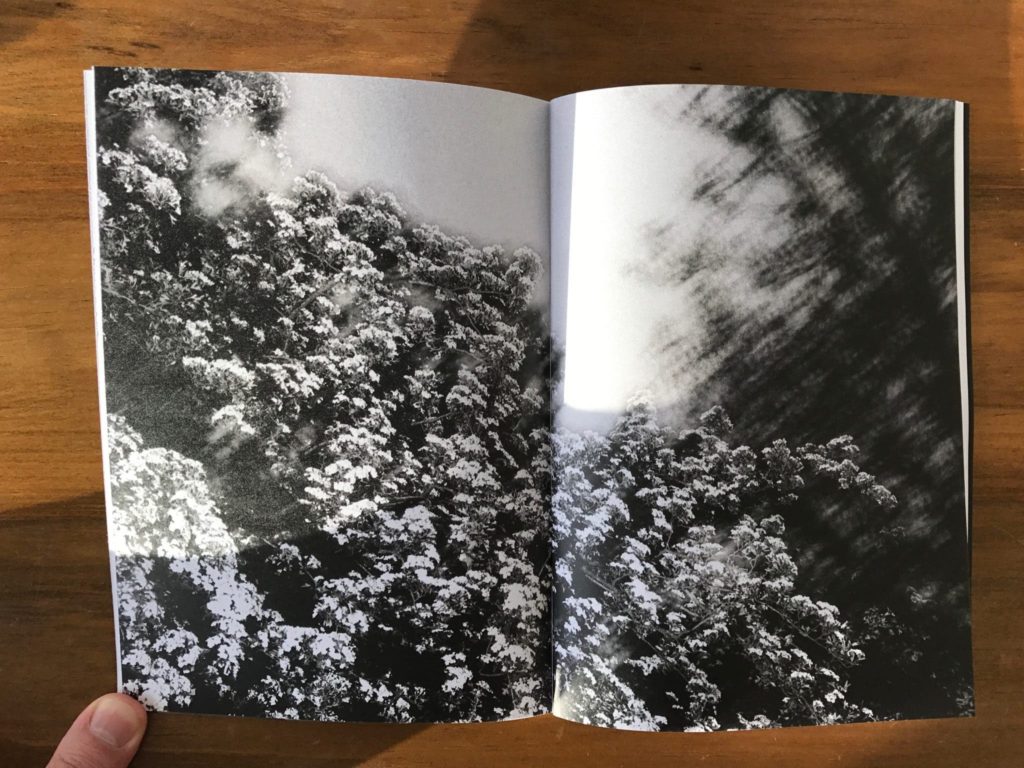
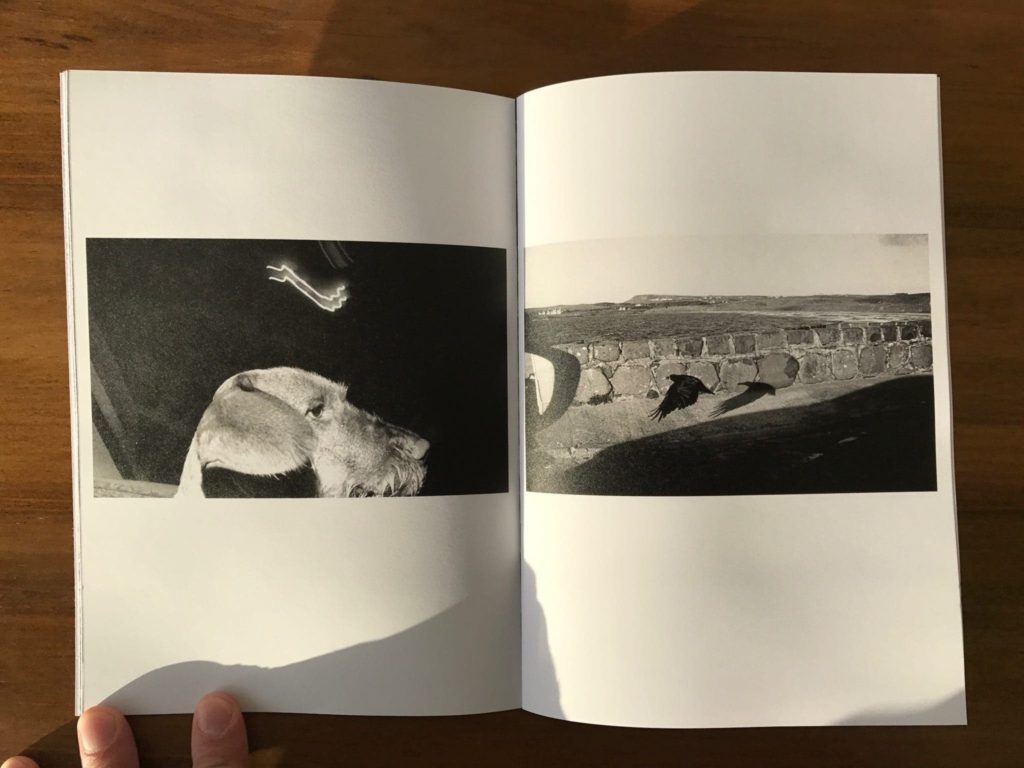
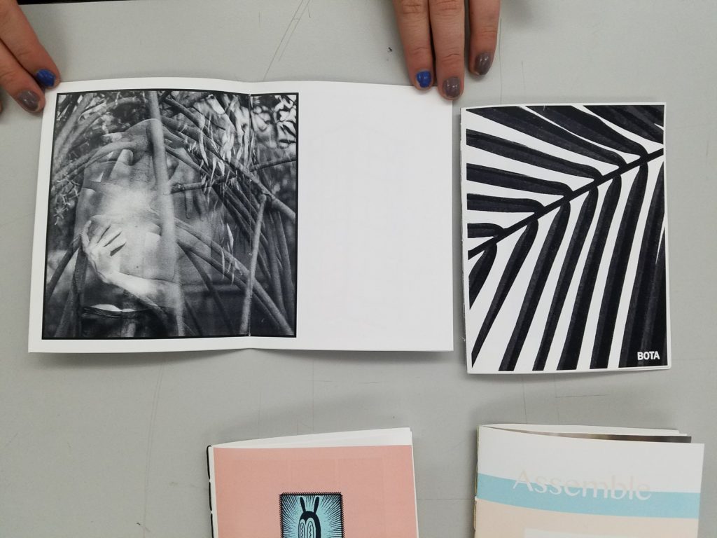
I want my zine to have black pages with yellow text on certain pages. Some of my photos will be very dark so I am hoping they appear as if they are emerging from the black of the booklet itself.

I like the front cover of the top right image as it represents isolation, loss and darkness which are similar to the themes I am wanting to represent in my product.

Laia abril

Abril is a Spanish photographer who heavily focuses on the topics of Sexuality, eating disorders and misogyny.

She has won the photobook of the year award and the Paul Huf award for her work.

Born in Spain, Abril became a journalist until she moved the New York City to study photography. She eventually got a job at Colors magazine where she worked as a staff photographer and consultant photo editor.

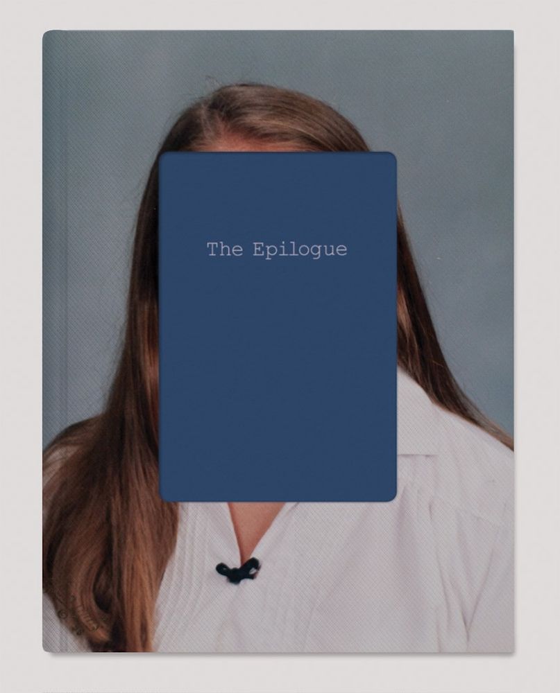
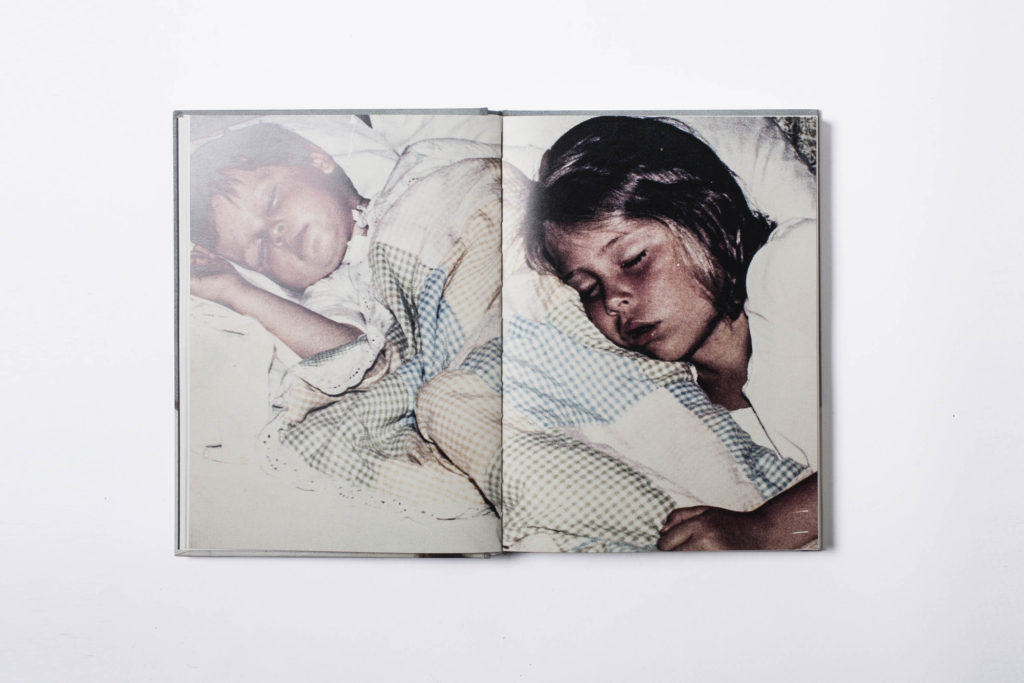
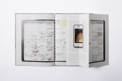
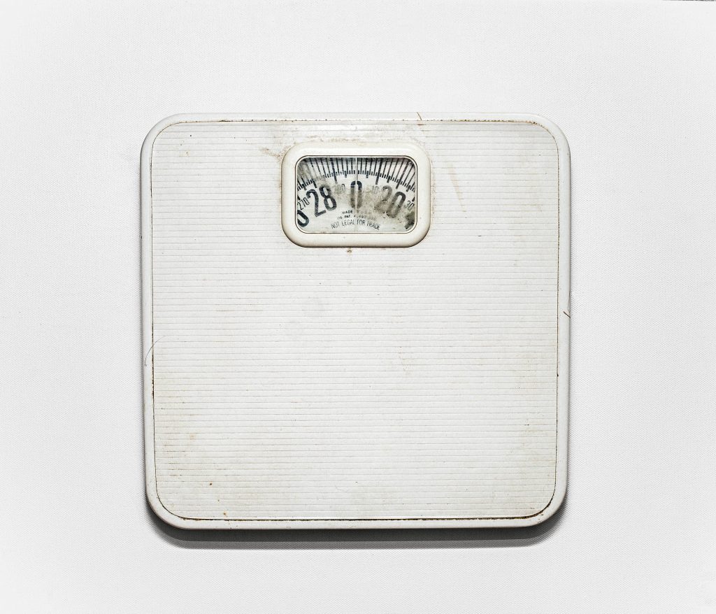
In Abril’s book ‘The Epilogue’ she follows the tragic story of a girl who died of bulimia and her family. The majority of the book consists of portraits, archived images / notes and images of specific items and buildings with relevance to the family. However in the very middle of the book there is a hallowing image of the girls scales from her home. This photo brings a lot of emphasis to the scales which is understandable as people who have bulimia often become very obsessed with them. It seems fair to say that the scales are what killed this girl and her obsession with them was severely unhealthy.

I would like to match this technique with my zine and produce an image with direct relevance and effect to the subjects of my other portraits.

Lightroom

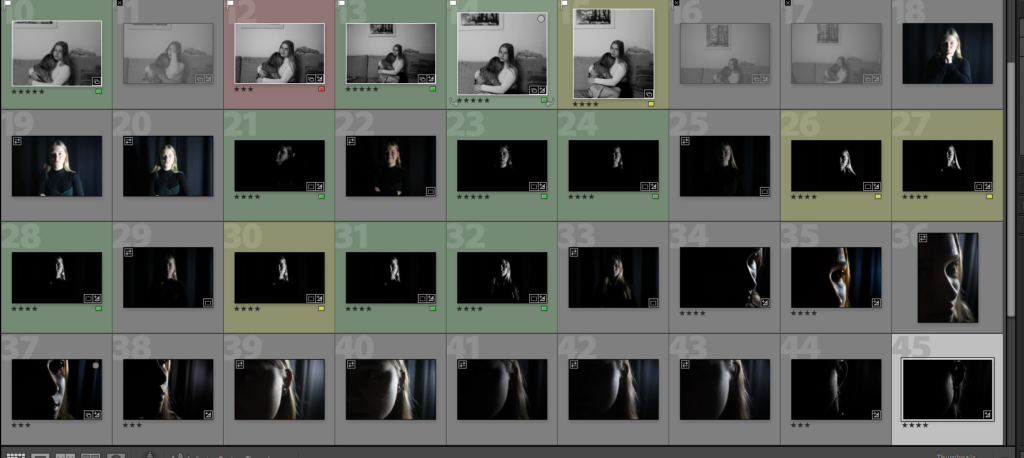
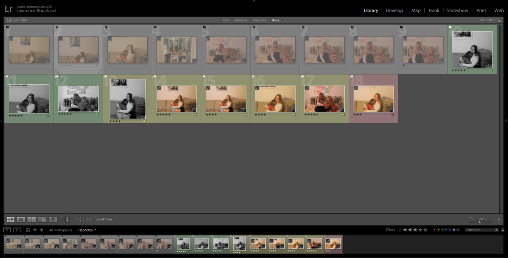
I used the pick (P) and reject (X) tools to separate my images from ones I want to use and ones I don’t, leaving me with 9 photos. I then sorted my usable images with ratings from 3 to 5 stars and either green yellow or red to narrow down my selection.

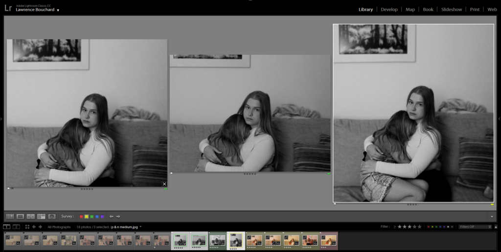
I place these three images side by side, as they were very similar, to help me with my selection. I picked my favorite and least favorite based mainly on the framing and focus of the images.

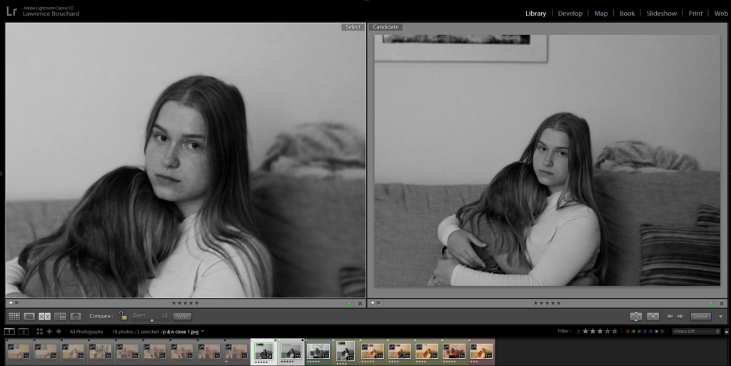
I then compared my two favorite images and used the magnification tool to make sure they were both in focus and clear.

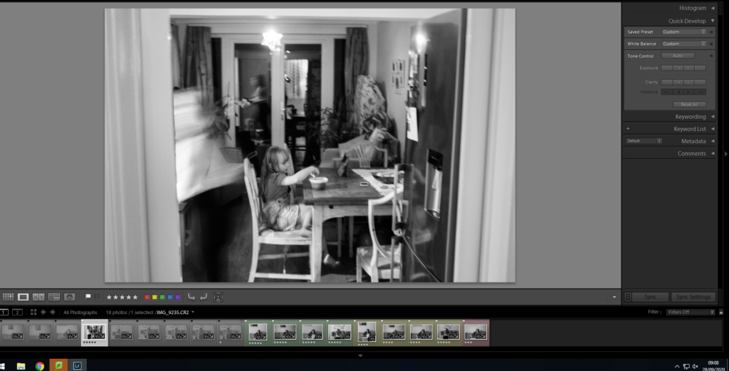
I applied my editing to all the photos I had taken and ended up finding a new possible image I hadn’t thought about using before.

PHOTO SHOOT 2 plan

WHO

Same subject as first photo shoot.

WHERE

Studio to get perfect lighting

WHAT

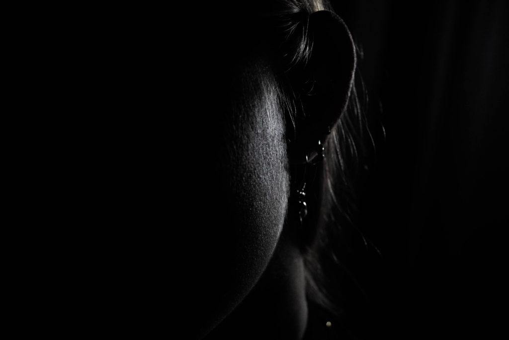
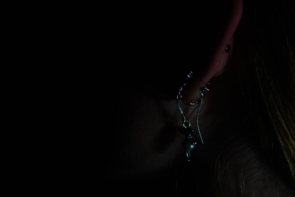
Extreme close ups of facial features or body parts

One point lighting / low lighting

EDITING

Black and white

high contrast

blur