mirror reflection different 
All posts by Lawrence B
Filters
Transition
Final print images
A3 Landscape
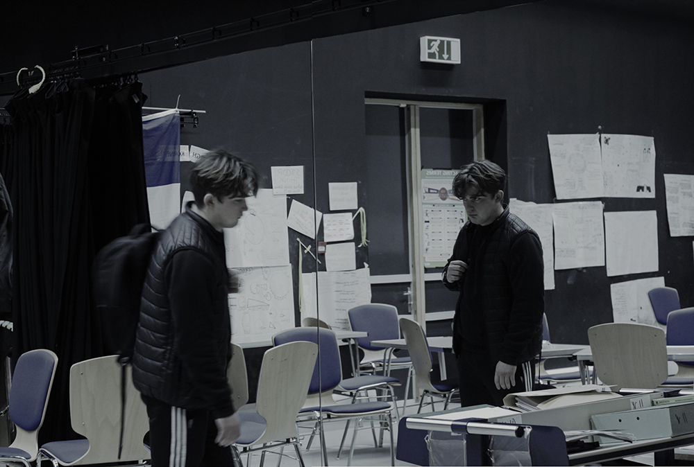
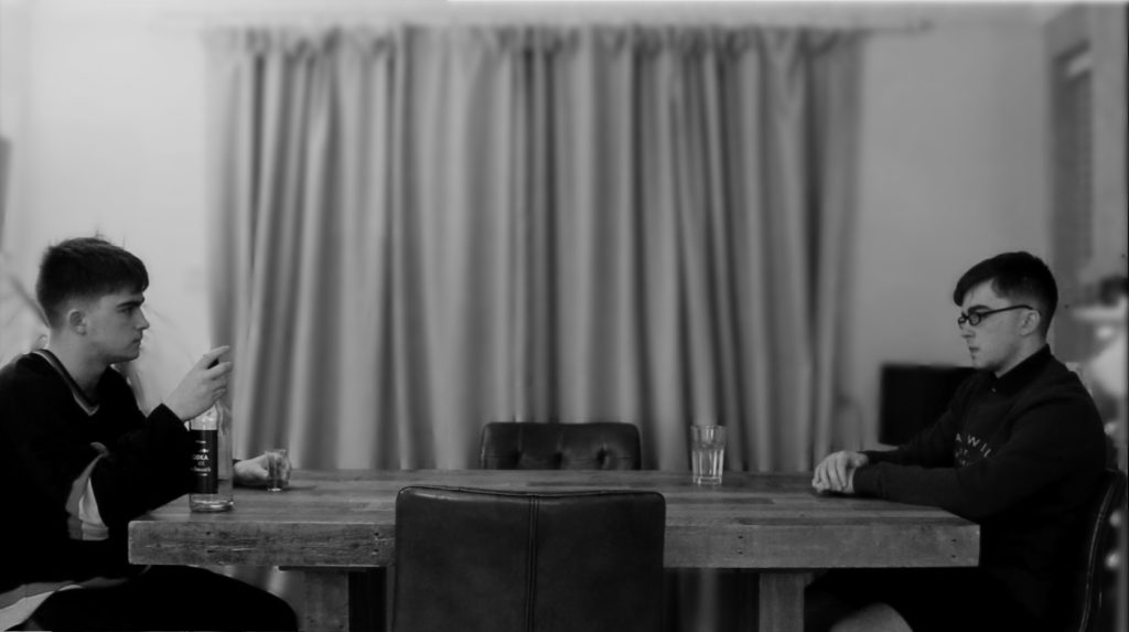
For this image I dropped the saturation near to 0 in order to create a dull effect. I did this to emphasise the lack of happiness and enjoyment that the subject feels about the world and him self. The image itself is meant to depict the detachment and hatred the subject feels toward himself due to his reflection not matching his actions and staring back at him.
A3 Landscape
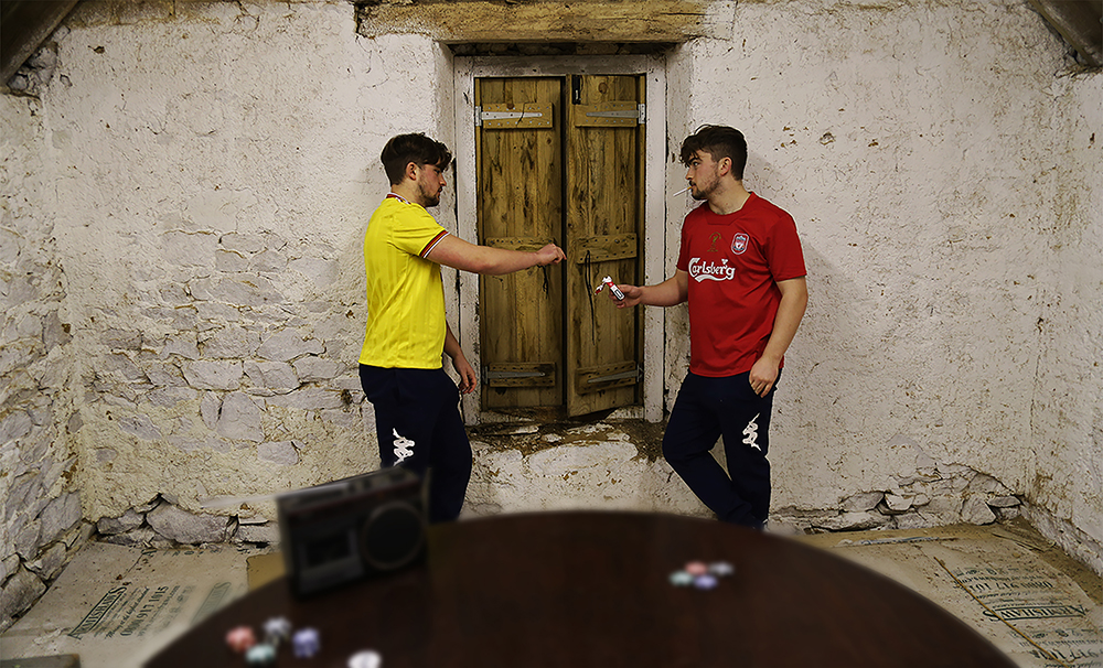
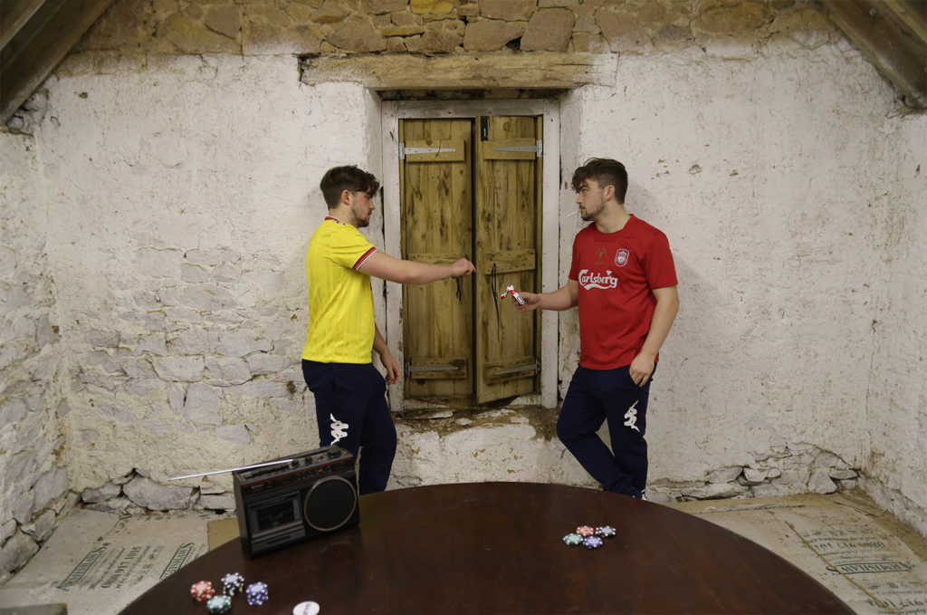
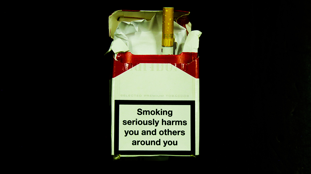
In comparison with the last photo, this image has a high saturation with a bright colour pallet seen in the t-shirts, poker chips and the cigarettes. This image is meant to amplify the commonality of smoking among young male adults. Many images from my photo-book represent the same subject carrying out actions considered ‘taboo’ with a sense of normality and this specific image is the strongest both visually and conceptually.
A4 Landscape
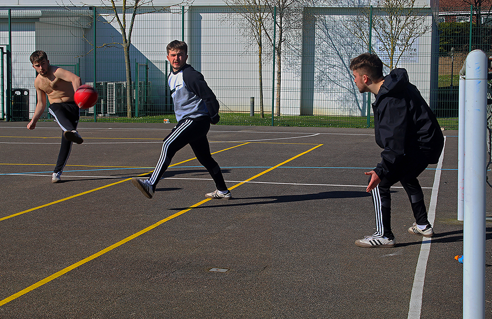
This image is a link to the few things that stay with us from childhood through to adulthood. I created this image with intense colours to emphasise the enjoyment felt by the subject. The subject himself is repeated to amplify that his identity is not needed in order to understand the meaning of the photo
A5 Landscape
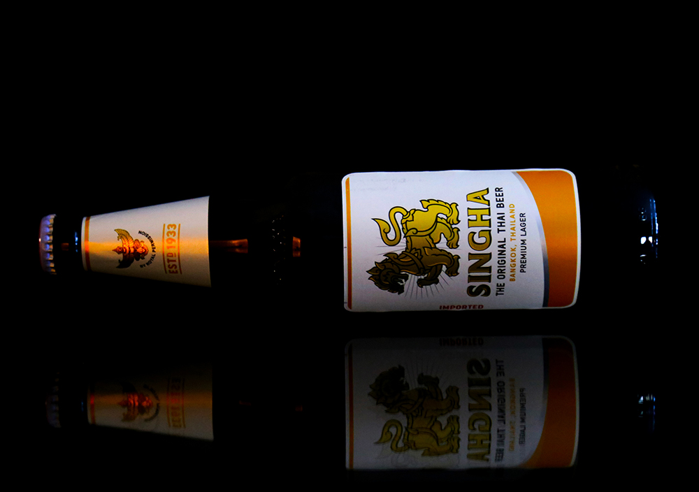
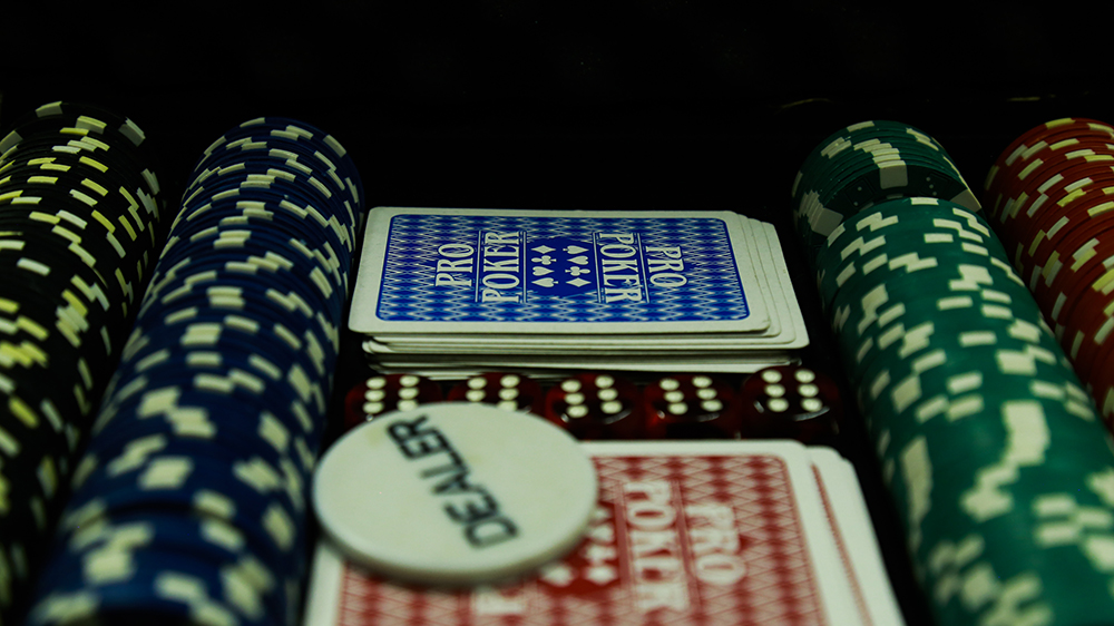
Finally, these three images were used to draw attention to the use of the objects in their respective images as it may have otherwise gone unseen. The photos themselves have clear meaning and are presented with no distractions in an attempt to fully emphasise this meaning.
Final Sequence + Evaluation
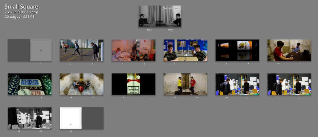
Evaluation:
I created this photobook in an attempt to demonstrate the experiences and struggles that a teenage boy faces when passing through to adulthood. This is the final layout for my photobook. I have began and ended the book with black and white images as a way of showing that the experiences and thoughts of many teenage boys are trapped within them selves. Other than these two images, the rest of the book is very vivid and bright creating an almost psychedelic colour scheme. My original plan was to create the book in black and white to amplify the deep emotion I have attempted to portray. However, upon inspection of my first photoshoot I decided that the images would be a lot more powerful in heavily saturated colour. This creates frantic images with a lot to look at and emphasises the bestrewed mind of the teenage boy. The use of the multi-protagonist effect in my ages definitely proved to be the biggest obstacle. I believe if I had known how challenging this process would be, I could have planned more photoshoots and allowed my self more time for editing, so that my book could have consisted of more images. The sequence its self is split into three distinct portions. The first three images are highly saturated pictures all consisting of their own metaphorical meaning in relation to the teenage mind. The subsequent six images come in pairs, I have compared the three photos of Charlie with the objects ‘hidden in plain sight’ within the photos. I emphasised the Alcohol, cigarettes and poker to show these ‘taboo’ objects and how they are so simply and easily introduced into the life of a young teenager. I chose to show the closeups of the images before the photo they are compared with as an attempt to foreshadow what was to come. I believe this was the main meaning of my photobook followed by the effect this has on an individuals mind and their love towards themselves. This is seen in my final three images where I present Charlies reflection in a mirror not representing him properly. I did this to heighten the idea that he is disconnected from himself and not only does he not recognise the person he sees in the mirror but they are two completely different people. Overall I am happy with the outcome of my photobook, although it did not go exactly to plan, I believe that I still managed to convey meaning and a narrative in the way that I wanted to.
image development
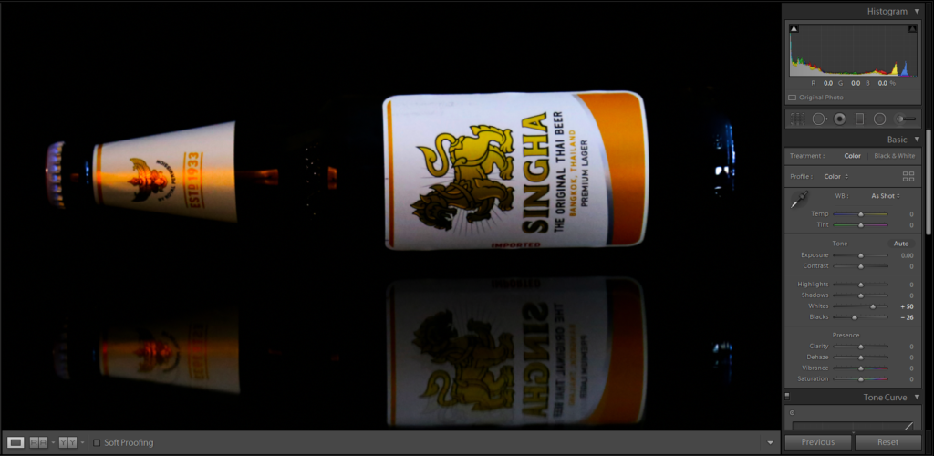
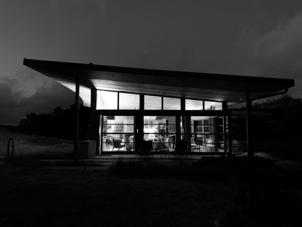
In order to make this image appear as if it is in complete darkness I increased the contrast and decreased the brightness on photoshop and then adjusted the whites & blacks in Lightroom. I used a computer screen to hold the image to create the reflection and I coloured out parts of the computer using the clone stamp tool to create complete darkness.
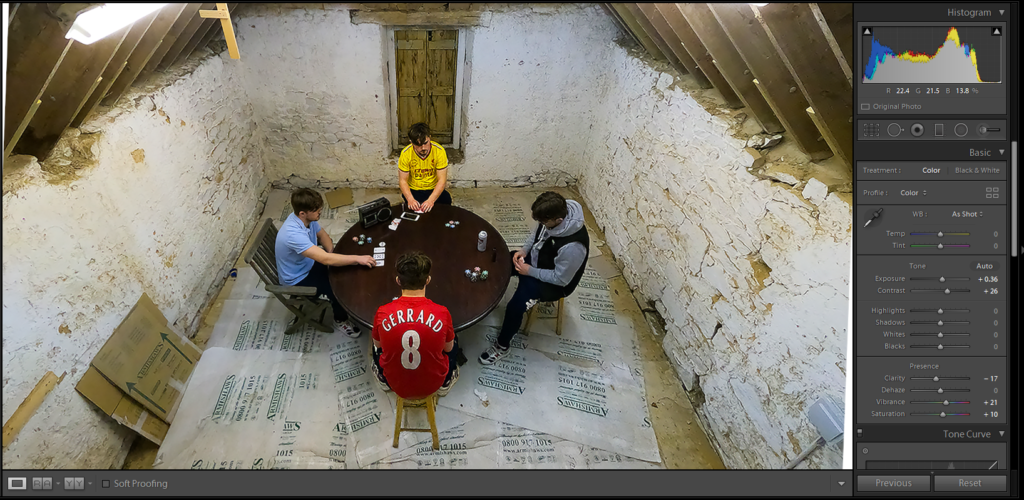
I took this photo with a Go-Pro attached to a beam in the ceiling. I has to rotate the image in order to make it more symmetrical and I then had to readjust the colour, clarity and contrast in order to make the image look more like my other two final pieces from this shoot.
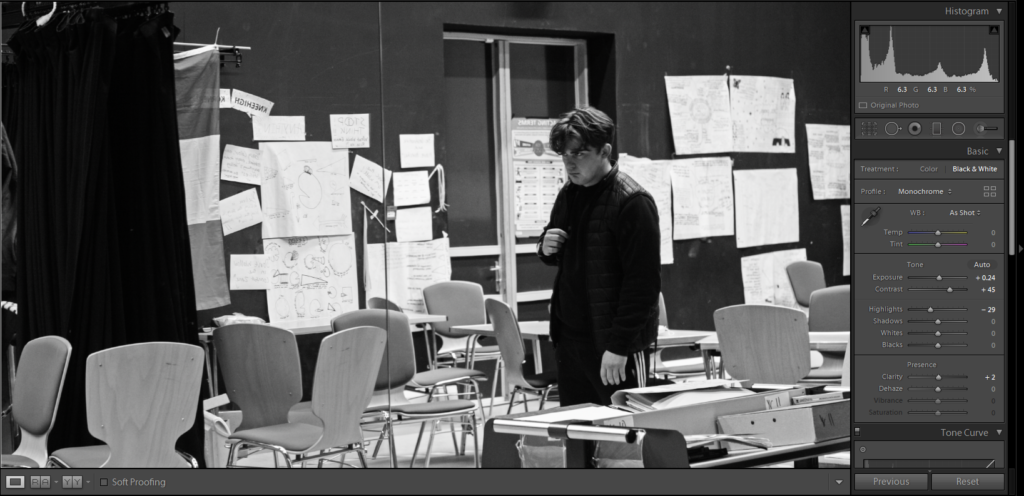
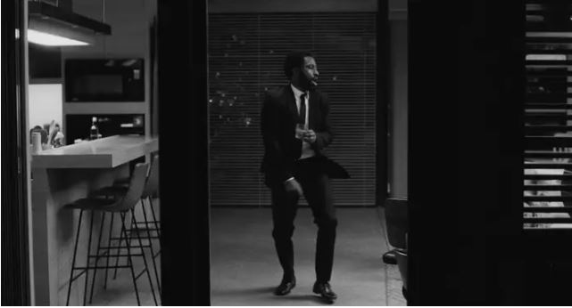
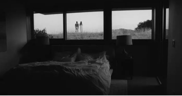
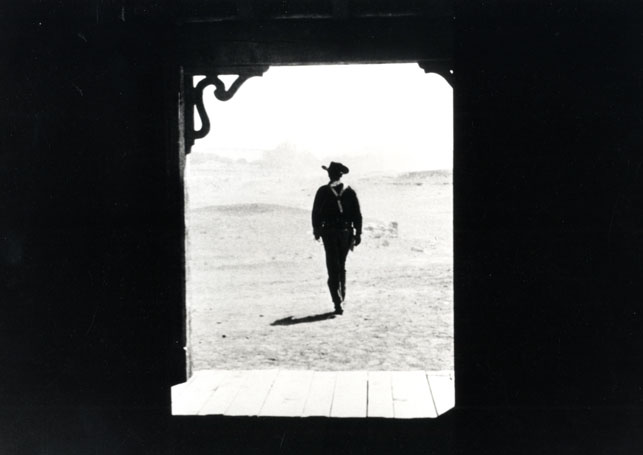
This is the final photo in my sequence, so I made it B&W to amplify the emotional effect of this reflection of charlie. I kept the mirror reflection yet I removed charlie from the image to emphasise a sense of disconnection from himself.
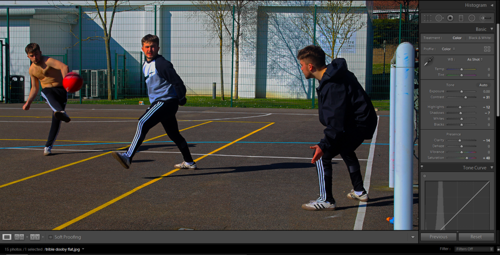
For this image I have increased the saturation to greatly increase the vibrant colours within the photo. I was aiming to create a sense of joyfulness in this picture as it is the only photo that I believe holds a connection between childhood and young adulthood in relation to my subject.

I wanted to compare these two images side by side as I am trying to draw emphasis to the unhealthy habits that form due to peer pressure and ‘lad culture’, however I also wanted all my images to have a full bleed across the entire page so they can be viewed in as much detail as possible.
Essay
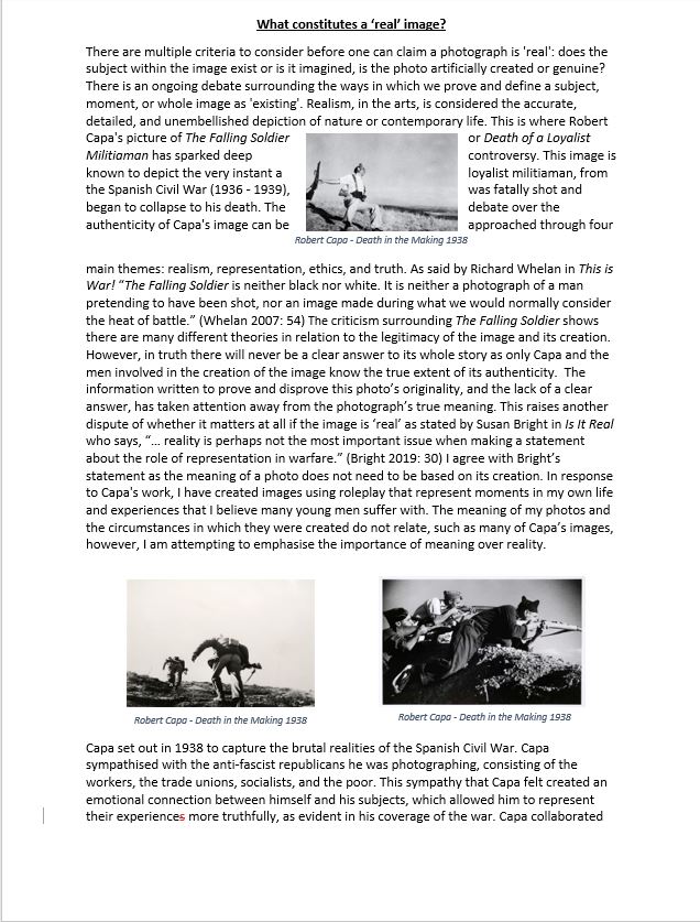
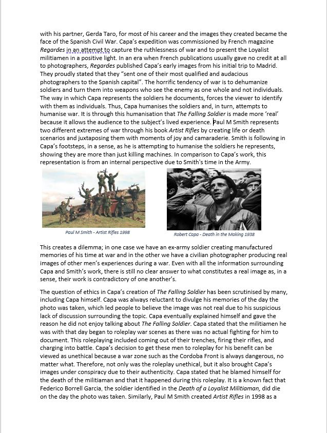
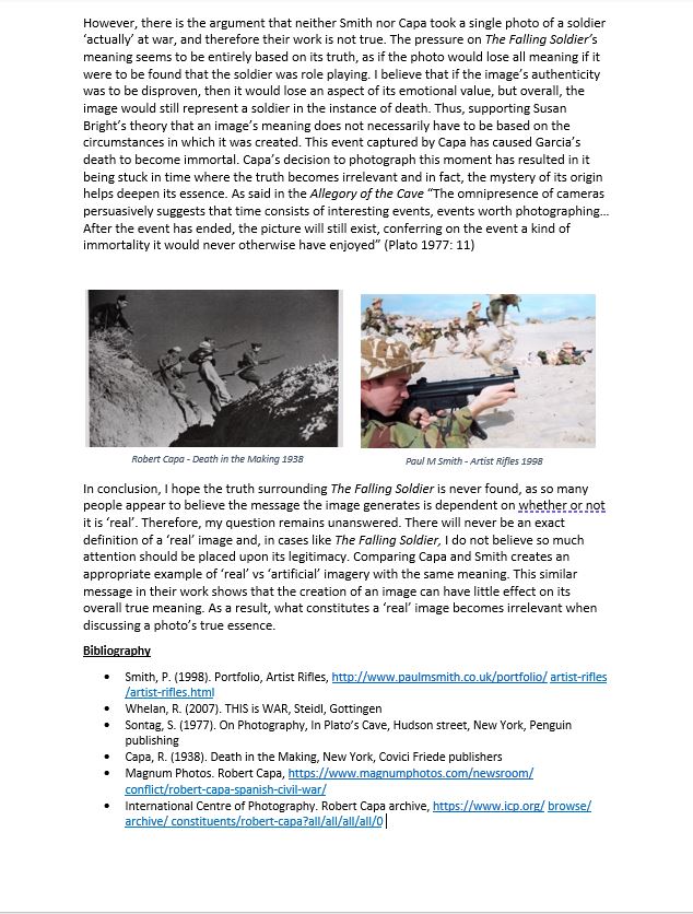
What Constitutes a ‘Real’ Image?

specification
Narrative: What is your story?
Describe in:
- 3 words belonging and identifying
- A sentence a story of a young lad trying to fit in and conform
- A paragraph I am telling the story of the life of an average teenage boy in Jersey and the struggles and pressures that occur. I am trying to communicate with the viewer from an internal perspective how these pressures affect someones well being and safety. I want to demonstrate the result of societal pressures on a young male adult from childhood through to adulthood. I am using the repetition of the protagonist technique to draw attention away from the subject himself and towards the ideologies and conventions that he represents
Design: Consider the following
- How you want your book to look and feel – I want the book to feel hard, heavy and real to emphasize the importance of the subject matter.
- Paper and ink – rough paper / gritty
- Format, size and orientation – Landscape orientation
- Binding and cover
- Title – Arrogance Love Fury Innocence Envy
- Structure and architecture
- Design and layout -Full bleed images, minimal comparison to amplify the meaning of each individual image
- Images and text
Attention Service member – time to reenlist.
This book tells a vivid and detailed experience of an american army soldier on different tours in Afghanistan and Iraq. The book begins and ends with black and white images of life before and after the army, images of a young girl, possibly Brody’s daughter, symbolizes innocence and a representation of what people are protecting by joining the army. A full bleed is used for ‘army’ portion of the book which helps continue the story and emphasize the scale of warfare and its effect. The book consists of many detailed image that are kept natural and unembellished, this draws out the rawness of war and the brutality that soldiers face.

Ben Brody is an independent photographer, educator, and picture editor working on long-form projects related to the American wars in Iraq and Afghanistan, and their aftermath. Brody enlisted in the U.S. Army in 2002, when he was twenty-two years old, not because he supported the impending invasion of Iraq—even then he was “skeptical”—but because he wanted to photograph it.

Brody quotes:
- I wanted them to feel the murderous heat and arbitrary death and relentless absurdity that came with my job
- You learned what pictures the Public Affairs Officer would release and what he wouldn’t … Soldiers looking calm or stoic. Yes. Soldiers looking angry or frightened or exhausted or confused or lost with eyes like the bottom of the ocean. No.
- meaning that my account didn’t conform to his tightly scripted vision of what victory was supposed to look like. (in reference to the regulation of certain images)

Narrative and design
An extremely obvious yet effective layout within this book is the margins/bleed of the images. The life before and after the army are all B&W images in different sizes and dimensions taking up certain parts of the page. In contrast the colour photos made during war time are full bleed images to emphasize the realism they represent and the lacking margin for error in the army. The full bleed also means that there is a lot going on within every page which symbolises the chaos of war. The use of media and newspaper extracts within the book support the realism that Brody is attempting to represent. The story is told from a strange perspective with images appearing as if an outsider is looking in, however the photographer was apart of the army with the men photographed. There are no images from the war portion of the book shown on the same page which draws attention to the importance and meaning of every single image. The title is a literal reference to and army letter received by Brody which further amplifies the theme of realism.

first edits
