All posts by Jessica P

Filters

Author:
Category:

researching photo-zines

what is a photo-zine?

dictionary definition : “self-published, often handmade collection of photographs laid out in a magazine style.”

I want my photo-zine to have warm mood, so I am going to edit my images to have a high temperature. I want to do this because this type of love story I am narrating is warm and familiar.

in my photo-zine I am going tell a narrative of a love story, however this story doesn’t contain 2 people loving each romantically, but a dad, a daughter and a horse sharing the love of living a life in nature and the peace it holds.

I want the layouts to flow with the narrative and be easy on the eye. For some of the layouts I want to have grid effect, to display many images that relate to each other. On other pages I want full bleed images, this layout will be used for photographs that have a lot of importance relating to the narrative.

On certain pages, when a piece of text is necessary I will add one, it will mostly be found quotes or short pieces of text needed to elaborate on my narrative.

identity politics and culture wars

MY VIEWS

I wouldn’t say I had a major view on this topic. I believe that people, whoever they are, where they are from and what they believe to be true should be able to voice their opinion. Voicing your opinion is a human right, therefore everyone who is human can do this. My views alone do not impact on society as i feel my voice has no power in the wider community. I believe political parties should not be a thing, as they cause major divides in countries and wars and disputes.

OTHERS VIEWS AND ITS IMPACT ON SOCIETY

Some people have extreme views, of those who are different to them and these views have meant that others are prejudiced against, and felt to be lesser than others. I feel this is wrong, as everyone is equal and has the opportunity to be however they want to be. The media has caused a massive uproar relating to this topic, as anyone can voice their opinion and anyone can reply with their opposing view almost immediately, and from there it takes a downward spiral.

shannon O’Donnel – notes

inspirations

  • claude cahun- radical, rebellious, Jewish lesbian women
  • duane michals- simple
  • casa susanna- place where transgender people go to freely express themselves, amateur photographers, snapshots
  • walter pfeiffer- poetic images
  • adi nes- 100% staged, delves into masculinity, sexuality and war, jewish israli

research

  • films
  • news
  • other photographers
  • surveys
  • interviews
  • books
  • theorists
  • exhibitions
  • talks
  • local politics

theorists

  • judith butler- gender constructs
  • june singer- androgyny, ‘not being gendered but yourself’

how do you form your stories?

  • juxtaposing images
  • colours
  • wants viewers to interpret story in any way that they want
  • different types of images (layouts)

her work?

  • shrinking violet- feminism, gender roles
  • abort mission- abortion, church and christianity, view of womens bodies, photographing different people
  • by your bedside- personal experiences, shot on medium form, therapeutic process, sound and film and photography
  • susans sleep- audio scapes, lots of sound, ambient sounds, interviews, shot on lots of different things
  • the cat and the mice- based on suffragettes in wales, based from archives, revisited places of significance, photographed contemporary activists
  • thats not the way the river flows- centered on gender constructs, film, mixed with poetry, music and ambient sounds

what makes an image iconic?

The word iconic itself means “widely known and well-established”. Therefore, for an image to be iconic it must be familiar and successful, but how does an image become this? Not every image taken has the capabilities to be “iconic”, because they are boring, lack aesthetics and conceptual ideas. An iconic image should immediately trigger certain powerful emotions, meaning that a photo posted on Instagram by Joe Bloggs of his lunch will never reach the level of exposure to become ‘the image’, ‘the image’ that everyone knows, understands and can connect to. Social media, itself, has created a problem with considering iconic images, due to the fast pace and replaceable capabilities of all the platforms, such as Instagram and Twitter. An example of an iconic image would be Alberto Kordas’ photograph of Che Guevera, a revolutionary leader, whose portrait has been used and placed on everything imaginable. Another example of an iconic image would be Nick Uts’ image of Vietnamese children fleeing their village after a bomb was dropped there. Both images capture something of interest and meaning and make them the iconic image that they are.  

For an image to be iconic it must be recognisable, as viewers need to be able to distinguish it from other images. This means that the image needs to be well thought out before being taken, therefore the photographer must understand and be able achieve the technical aspects of photo making, such as, composition, colour, texture etc. A recognisable image must be able to be identified by lots of people, despite their ethnicity or the language they speak. An iconic image must hold meaning, context and conceptual ideas. This is because an image that has all these things can be understood and interpreted by anyone. Once an image is understood the viewer will remember it and latch an emotion to it. No matter what nationality, age, gender an iconic image should say something to everyone. An emotive image of a war zone will hold meaning and make the viewer feel something, whereas a picture of a bowl of pasta holds no conceptual ideas or meaning, therefore no emotions can be attached to it either. An eye-catching image will attract viewers and will make them connect to the image too. Whereas a boring image will not attract any viewers and will not become well known. 

The image of the black man carrying the white man to safety in the recent riots is considered to be the new ‘iconic’ image. The context of the image is that the white man was against the Black Lives Matter movement, however the black man still become the saviour and helped him no matter is political agenda. This picture contrasts with the statement ‘white saviour’ as the black man is saving the day instead of automatic thinking it should be the white person saving the day. This particularly shows how people are the same, no matter the colour of their skin, and everyone is worthy of help and can give help too. 

Some may say that there is no such thing as an iconic image. Why is this? Social media a platform for images to be uploaded, seen, and shared by millions of people. Images trend, and then are quickly replaced. When refreshing any timeline on any social media platform, images are displaced and probably never seen again. This means that images never get enough time or exposure to even become well known, let alone iconic. Yet again to gain publicity, the person who shares the image must have a large following otherwise the images will never be seen by many people.  

USING LIGHTROOM

I imported all my images I took into lightroom. I added a new collection called, ‘A Love Story’, which is where I placed all the images I took in. I started to select certain images for my editing process. I did this first by using the system of P&X, by pressing P it meant that these images had a white flag attached to them and pressing X meant that these images had a black flag attached to them and were faded over. I then looked at the images in more detail and used the star rating on the white flag images. 5 stars was to indicate images that I really liked, 4 stars indicated images that i may use in the future and 3 stars indicated images that will probably not be used. After this I then used the traffic light system to allocated images that will be edited. Red stating no, orange stating maybe and green stating definitely. During this process I used different viewing styles, compare view, survey view and single view. I also used the magnifying glass tool to check that the images were in focus.

designing my photo-zine

When designing my photo-zine I had to make many design decisions in order for it to fit the aesthetics I had in mind. During this process I took many screenshots to make the decisions. Below are the screenshots and why I made the choice I did.

page 1: here I was deciding what and where to place my title. The first image is my final decision because it looked clean and smart. The third image is where I place a sentence on the front cover. I didn’t like this because it overcrowded the image and didn’t work well with all the other textures. The fourth image was too plain and didn’t contain a title, which is what I need. I decided to place the image over the whole page, as it is important and set the narrative for the photo-zine.

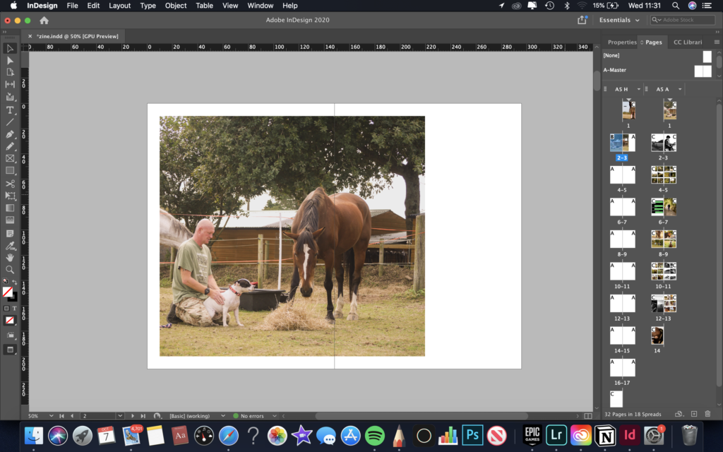
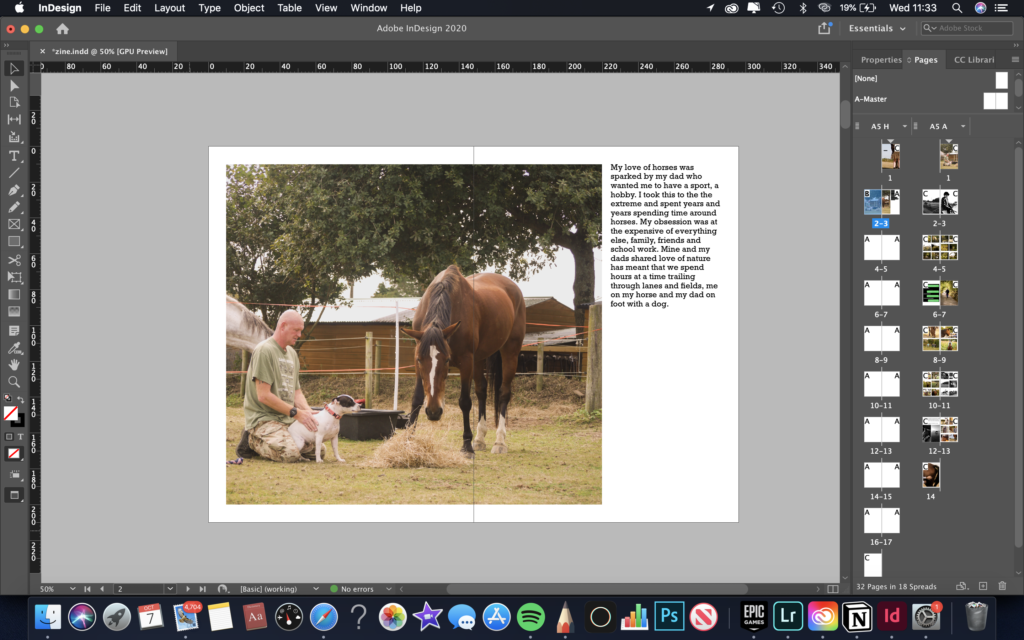
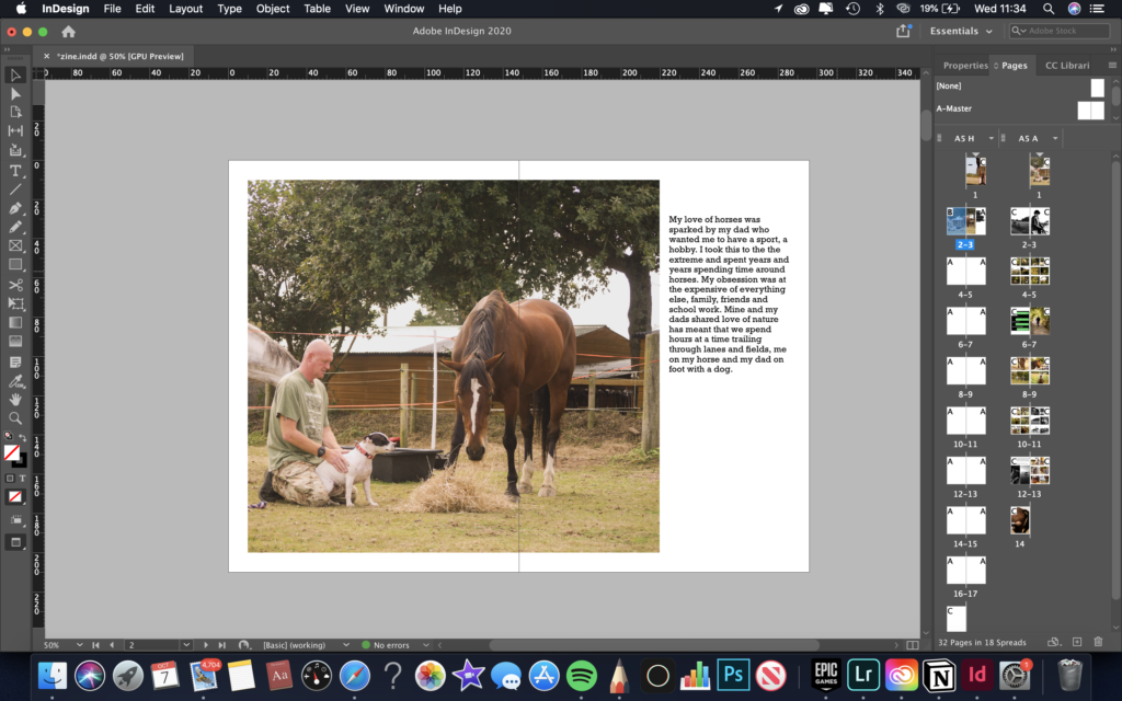
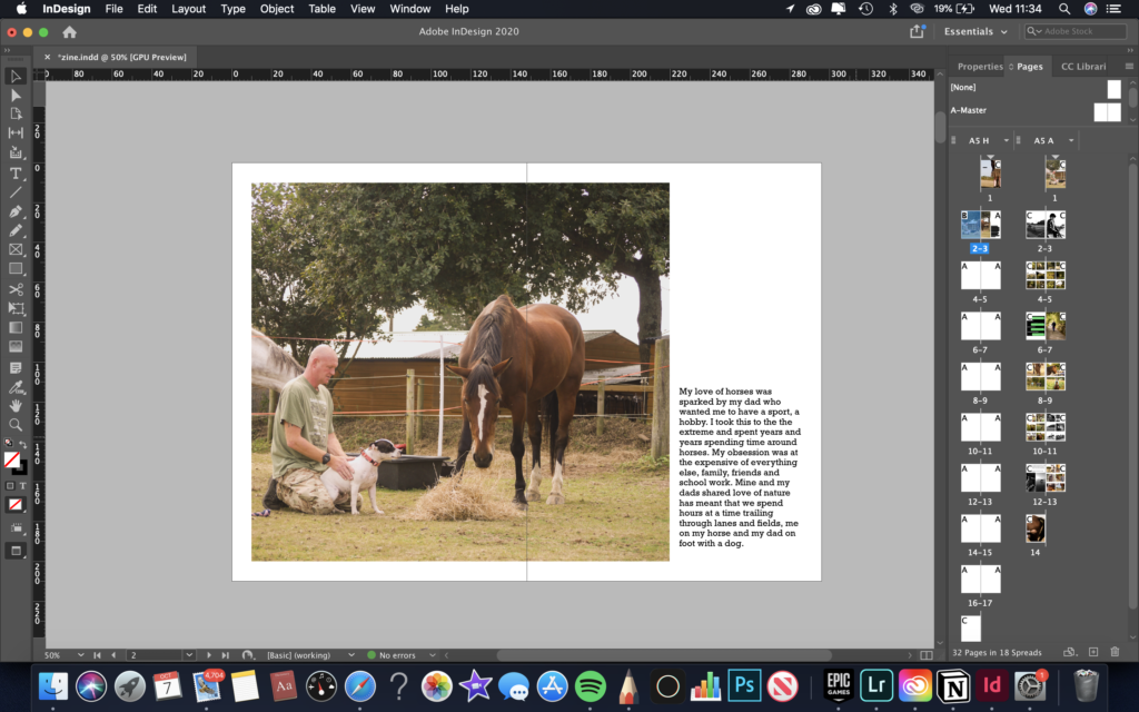
page 2-3: for this page I wanted a large image and paragraph to centre the whole narrative. I decided to shift the image to the left so that the writing could along side it easily. The second, third and fourth image shows different placements of the text. I decided to place it in the bottom right hand corner because it balanced and sat well with all the figures which are towards the middle bottom of the image.

page 10-11: for this page I was deciding which side to have the large image and the other set of grid images. I decided on have the large image on the left as it made more sense in the narrative, as the images on the right are showing my dad looking after my horse, which is described in the adjacent photograph.

page 6-7: for this page I was figuring out which image worked best with the grid of images and the text below them. I went with the idea three, as the colour scheme and composition looked most aesthetically pleasing.

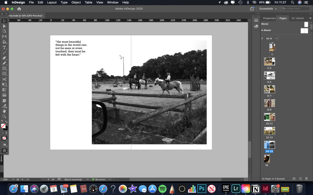
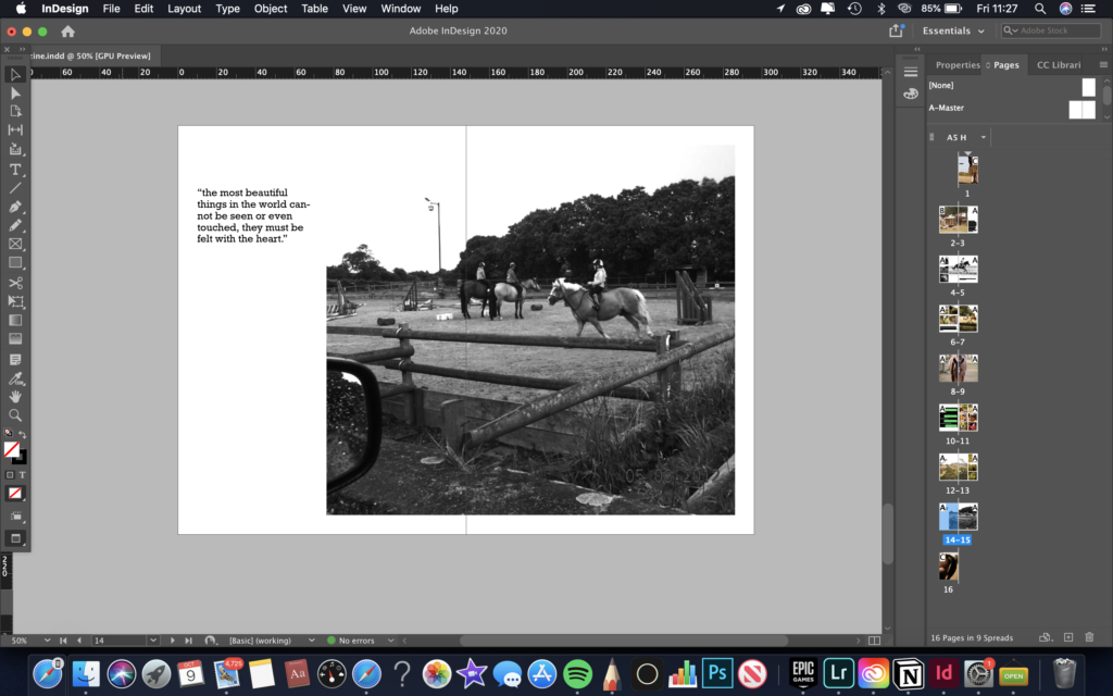
page 14-15: for this page I was trying to see where to place the text. I decided to go with idea one, as it works best with the composition, colour and tonal range of the adjacent image.

richard billingham

RICHARD BILLINGHAM is an English photographer but was first a painter. His photographs, of his parents in their tower story block, were discovered by one of his teachers in his university room. His photos mainly consisted of documenting his parents relationship, his dads battle with alcohol consumption and his mums addiction with puzzles. BILLINGHAM has also made many short films, the most recent being, Ray and Liz, which told his childhood story.

The colours in the image are very bright and saturated. Overall the image is very light and airy, and there isn’t a very large tonal range, as there are mostly only light tones and near to no dark tones, except BILLINGHAMs’ dads jeans. There are various different types of textures within this image, such as the carpet, the tiles on the wall and the wooden door. The linear aspects direct the eye to the figure in the image, this aspect is very clever and means the viewer is instantly drawn into the image. RICHARD BILLINGHAMs’ dad struggled with alcholism, so the image clearly shows how bad his situation was. This image is clearly not staged but documentative.

photo shoot plans

what/who?landscapes from sat on the horse
where?out on the countryside
when?weekend, early morning, when the light is soft but powerful
how?using my camera, or my iphone
why?to gain photograph which relates to mine and my dads love for nature and horses
what/who?dad and horses
where?at the yard or out in the countryside
when?weekend, when the light is soft but powerful
how?with my camera and a tripod
why?to capture my dads love for horses and nature
what/who?people doing jobs around the yard
where?at the yard
when?whenever people are doing jobs
how?with my camera on a tripod
why?to capture candid shots of people doing jobs around the yard
what/who?self portraits
where?at the yard, at home
when?early evening when the light is low and moody
how?with my camera set up on a tripod while using a hand held shutter button
why?to capture photos of my self around the yard, capture myself getting ready for a meal out
what/who?people at the horse shows, getting ready for the show, my dad at the show
where?at the showground
when?this sunday, early morning
how?with my camera
why?to capture the behind the scenes at a horse show, how i get ready for a show and my dads dedication to me and my showjumping career.
who/what?archive photographs of me and my old horses
where?either in the studio or in my room near the window
when?midday
how?on some white paper, to make sure the pictures stand out
why?to capture my dedication to my sport

edited images – love

For all the images I edited them in Lightroom. I made all the images have a very warm tone, by decreasing temperature, as I wanted the photos to have have sense of warmth, which relates to love.

image one

image two

image three

image four

image five

image six

image seven