All posts by Jessica P

Filters

Author:
Category:

landscape final images

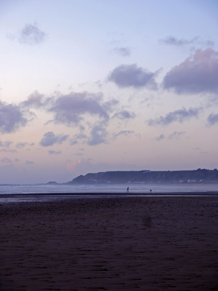
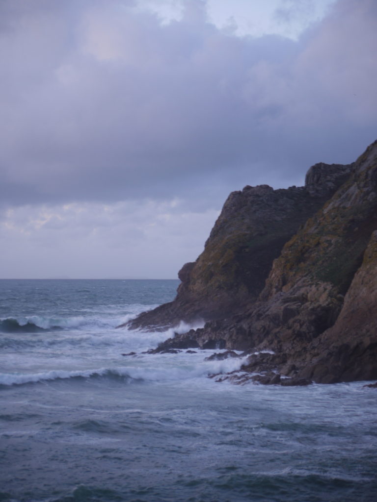
These images I have selected are my best images, in response to the landscape project, whether its responding to romanticism, urban or altered. All the below photographs have been edited to enhance colour, contrast, highlights and shadows, to increase their interest.

final image one
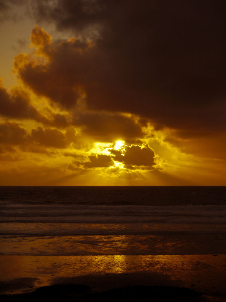
I chose this photograph, as one of my final images, because I enjoy the colour and the composition of the photograph. I enjoy how the sky is free flowing and eye catching and how the sea is linear and structured, but what is most interesting is the two components juxtapose.

final image two
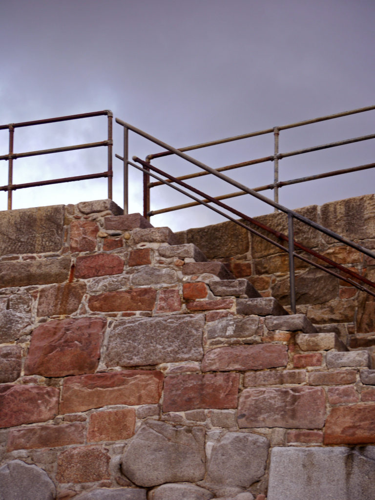
I chose this photograph, because I like the structure of the metal rails and steps and how they sit on the grey clouds behind them. The complexity of the stairs and the clouds juxtaposes and works perfectly together. I also enjoy the colour of the rock too, and how it contrasts well with the colour of the sky.

final image three
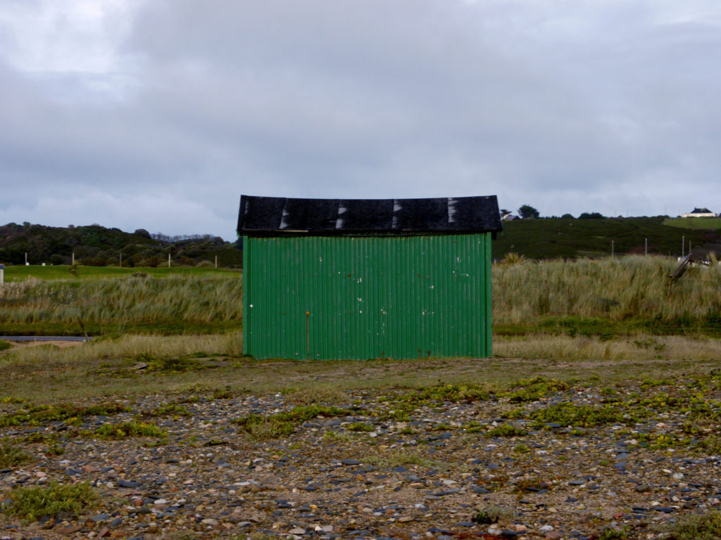
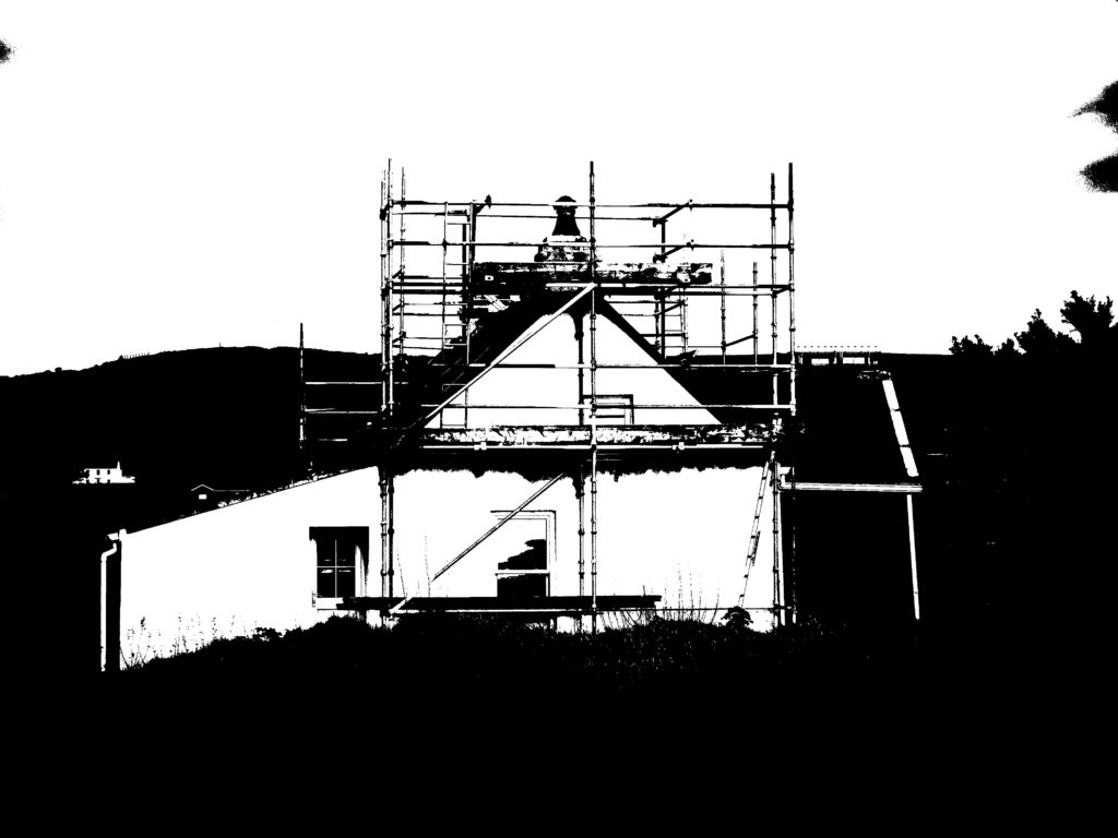
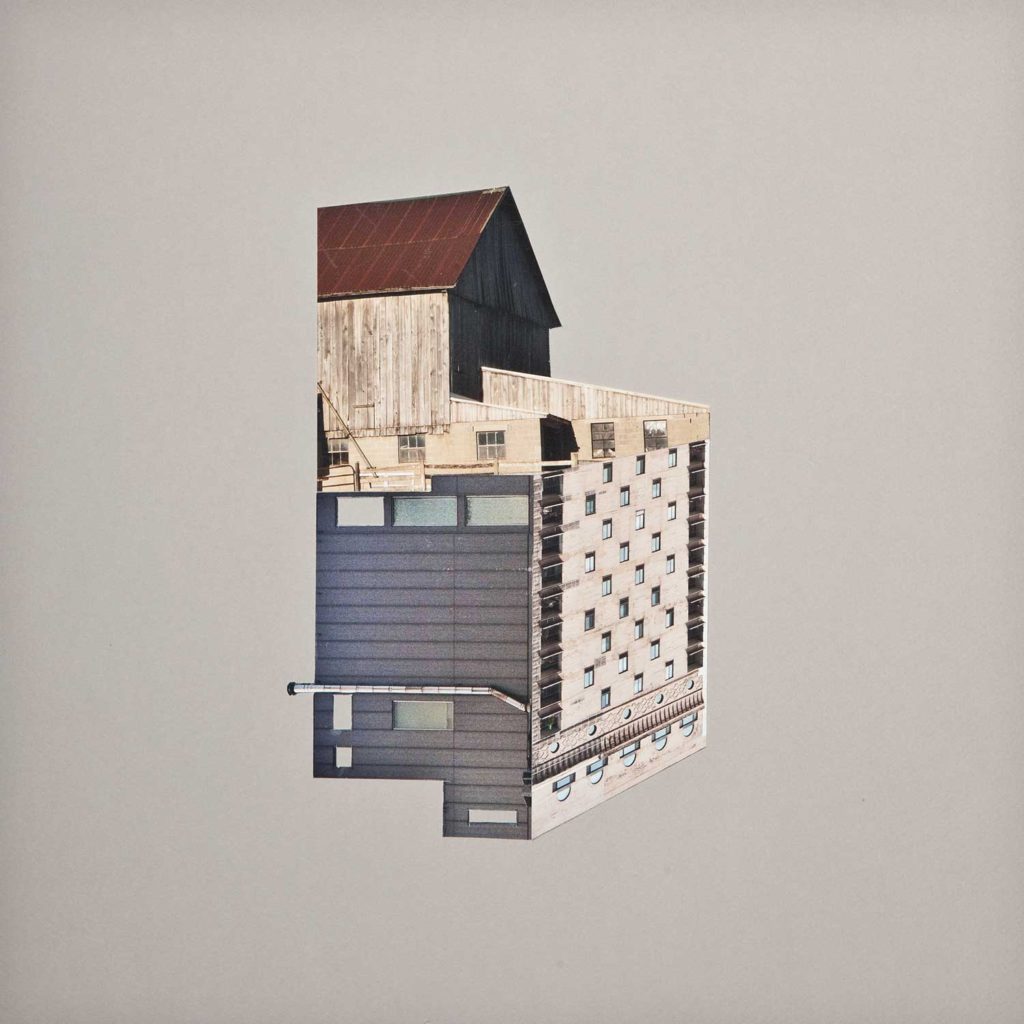
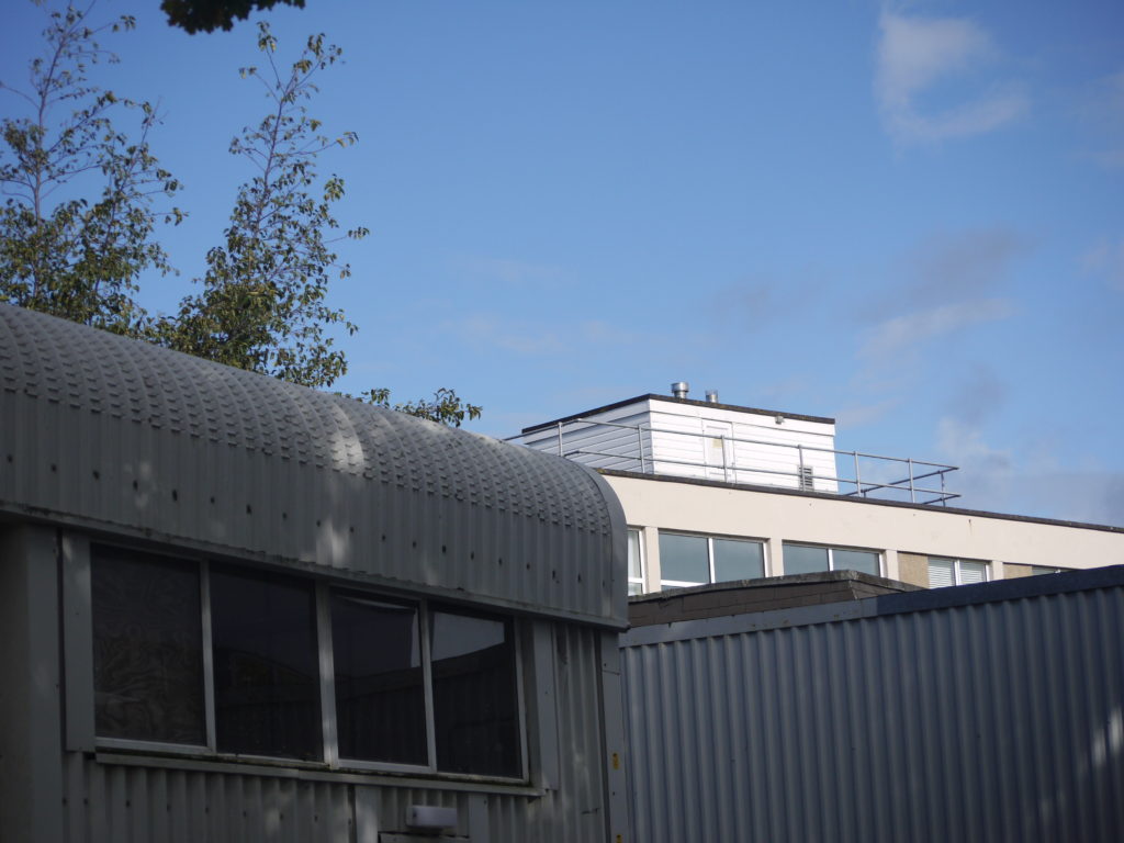
I chose this photograph, because I like the composition and the way the photograph was shot, in the sense that it is documental and is easy to view. I decided to shoot this photograph very simply, and straight on, because then I could capture the building and the landscape behind, which juxtapose, as the building is unnatural and industrialised.

final images (selection) four

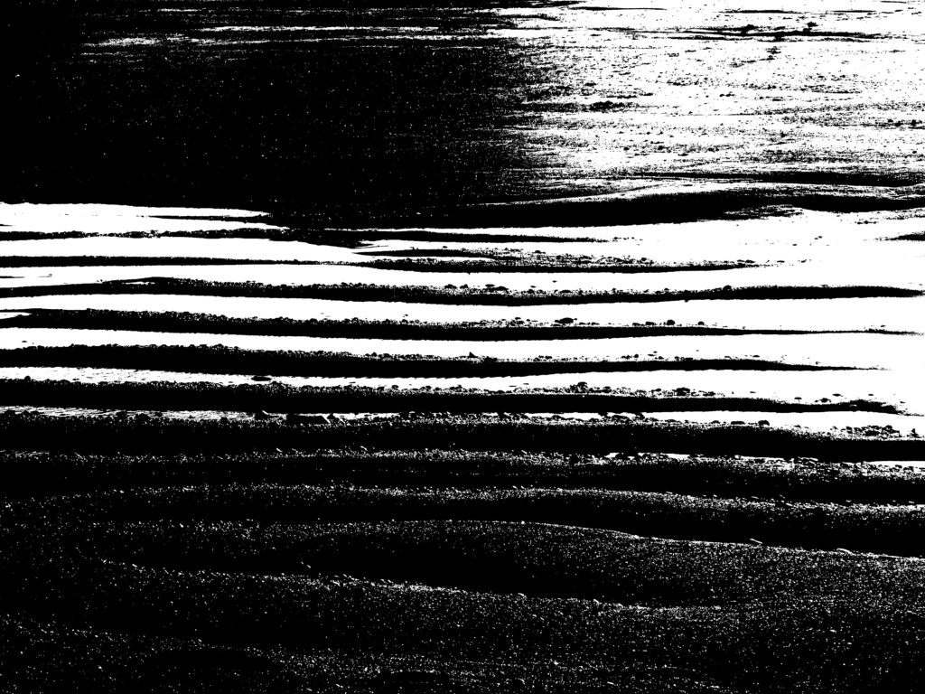
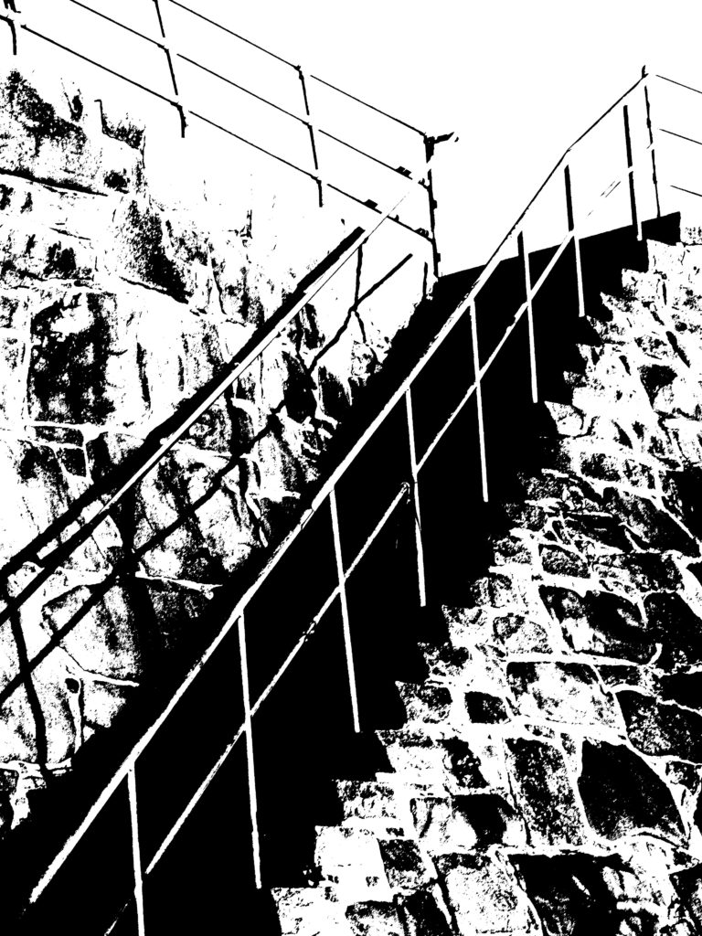
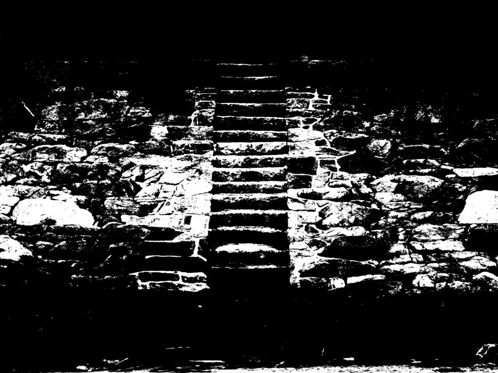
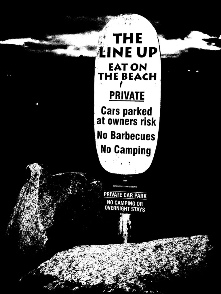
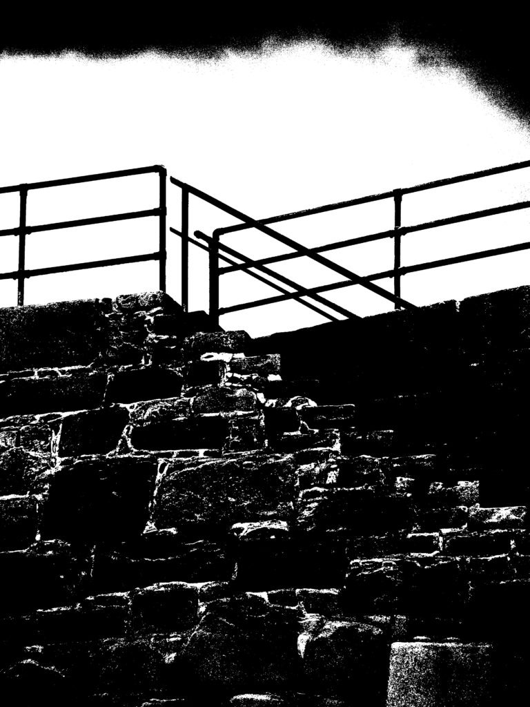
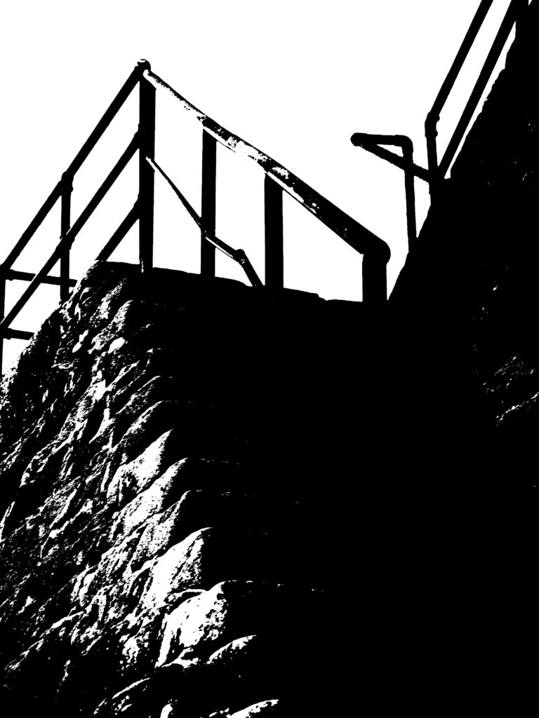
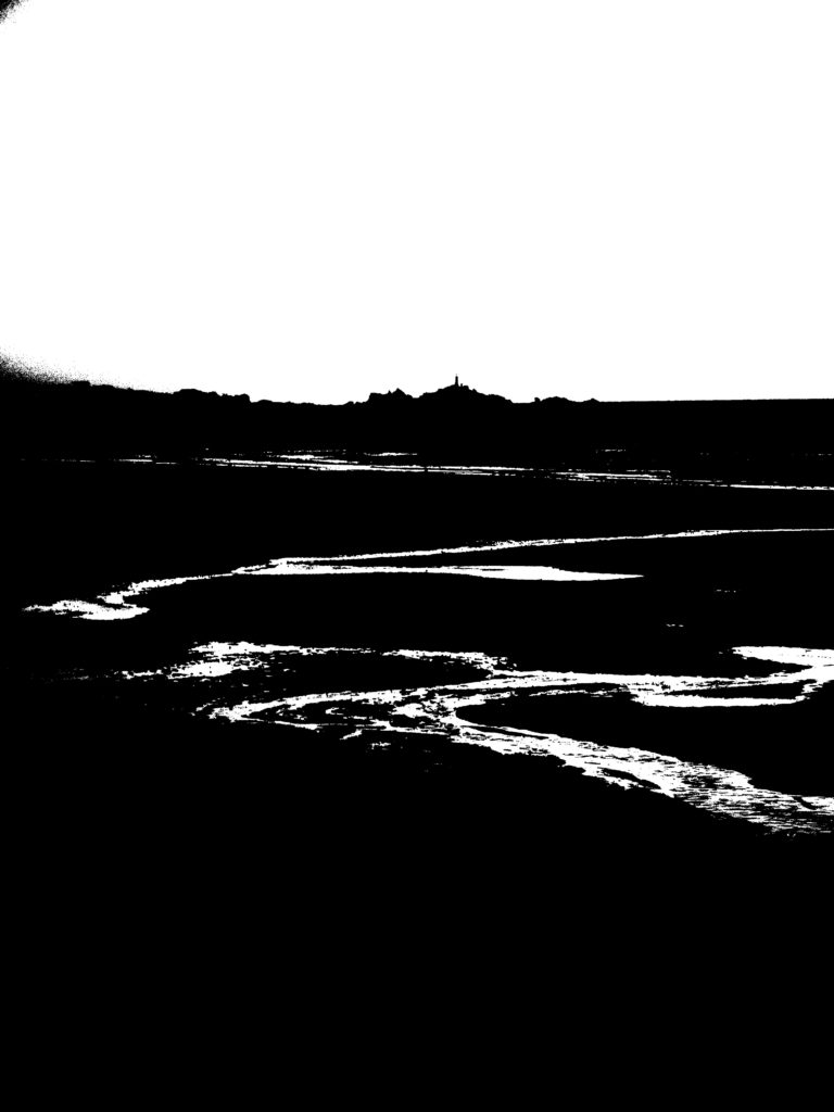
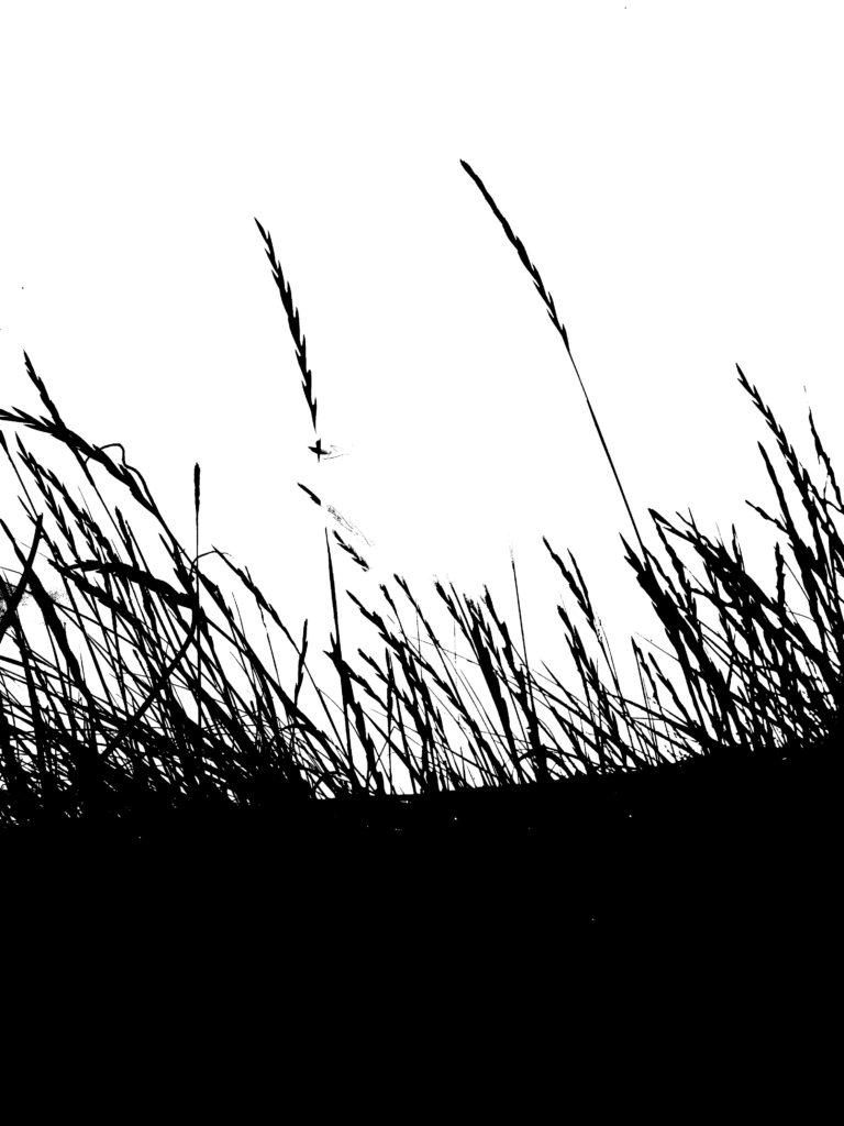
I chose these photographs to be in a selection, as I feel they work well together as a group of three. I edited these to be very minimalist and easy to view, as the backgrounds tended to distract from the focus, which can now be easily viewed.

final images (selection) five

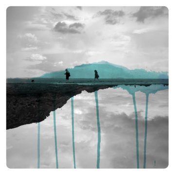
I chose these photographs to be in a selection, as I feel they also work very well together as a group of three. I edited these photographs to have elements removed and replaced by colour, because I feel they bring a different element to my photography. These photographs are edited in this way to allow the viewer to interpret the photograph in any they want.

photographs for printing

I have decided to print these photographs are they are my strongest photographs and are the ones that show the best of my ability too. The first photograph shows my ability to take a good composed image, with strong contrasts and colours. I selected those three photographs because they show my ability to edit images, to allow them to be viewed completely differently.

MICAH DANGES

who is MICAH DANGES and what do they do?

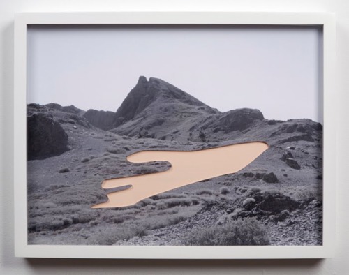
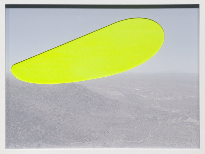
MICAH DANGES, born in 1979, pushes their photographs to the limit. DANGES uses optical distortions to create abstact pieces. They also print on unusual textures, including silk and cotton.

favourite pieces of MICAH DANGES

analysis of MICAH DANGES piece

The lighting of the photograph is flat, meaning there is no contrast or definition of the background. DANGES may have digitally lowered the contrast, to create this flat light image. The photograph is perfectly exposed, and is not overexposed in any areas.

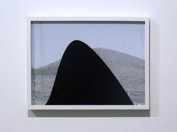
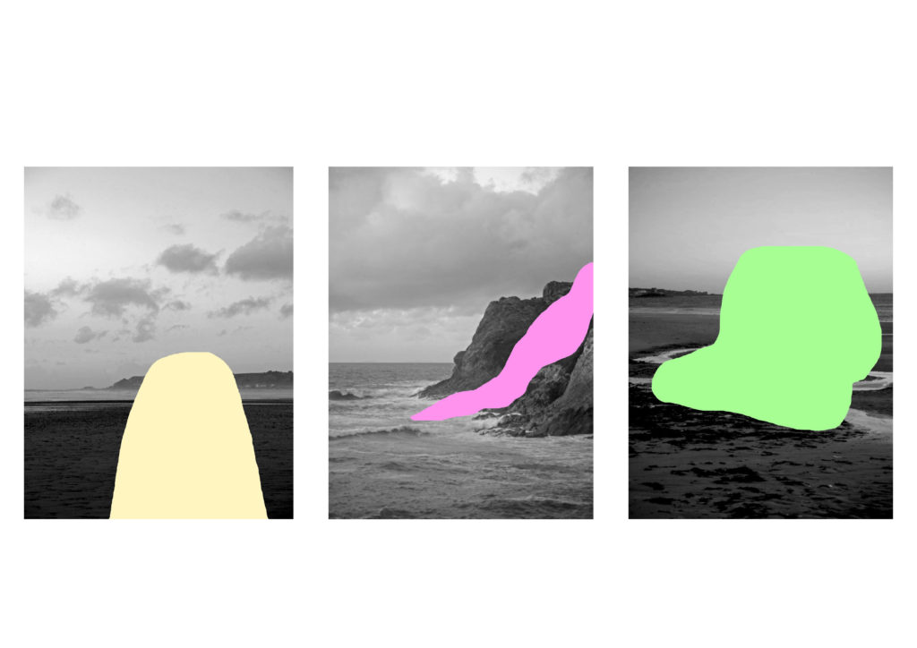
MICAH DANGES works with black and white images, to allow the colour blocks to really stand out and be a focus for the viewer. The colour block mainly covers the whole of the photograph, this is interesting for the viewer, as they will not know why it has been covered. The shape allows the viewer to think and pick out what they want the photograph to be.

my experiments inspired by MICAH DANGES

I think some of these experiments have turned out very well (ones annotated ‘successful’). This is because they look similar to MICAH DANGES pieces and interest me too. They also have a completely different meaning and intention to the original did.

black light

who is KELD HELMER-PETERSEN and what do they do?

KELD HELMER-PETERSEN is a Danish modern photographer, who captured city scapes, industrial buildings, and nature. They tended to photograph patterns and structures. HELMER-PETERSEN published books that held their creations, that were mostly abstract, which lack context.

my experiments

my favourite outcomes

I picked these 4 as my favourite outcomes, because they are simple and easy to view. I like how minimalistic they are and outlines of really detailed photographs. I would definitely use this method in the future, as it is very easy to do and the outcomes are effective and impressive.

ALTERED LANdSCAPES

what are altered landscapes?

Altered landscapes are photographs of landscapes that are digitally or physically altered to create an entirely different photograph, that has a new intention and way of being interpreted. These photographs may end up becoming more abstract and modern looking, than the traditional landscape photography.

examples of altered landscapes

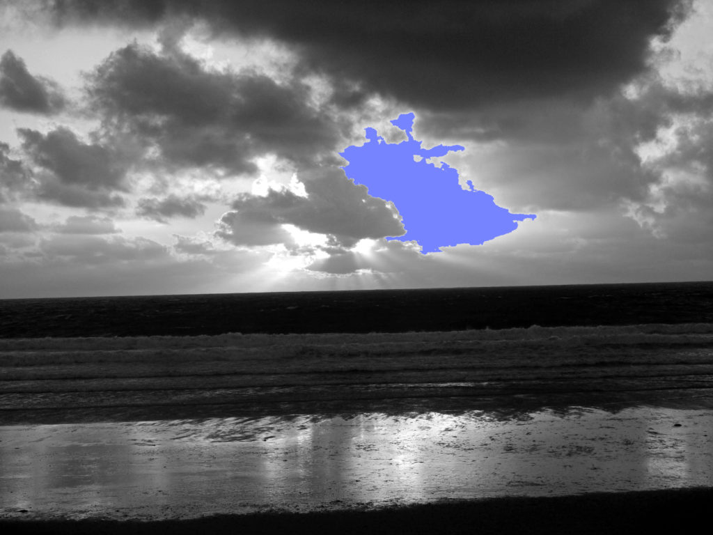
I have decided to look closer at the photographer, MICAH DANGES, as I like how they remove a part of the photograph, and replace it with a colour. I think it looks very effective and allows the viewer to use their imagination, as to what was in the area previously.

examples of MICAH DANGES work

Image result for micah danges

my experiments, using MICAH DANGES techniques

original image

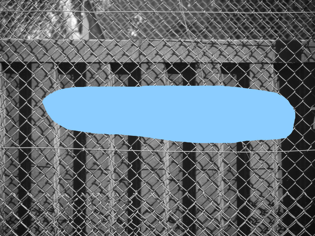
With this experiment, I used the magnetic lasso tool, which meant I could cut out an exact portion of my photograph, and fill it with a colour of choice. However I didn’t think this looked similar to what DANGES did, so I decided to try something different on the next experiment.

With this experiment, I just used the standard lasso tool, to remove a section of my photograph, and replace it with a colour, and similarly with my other experiment, I didn’t feel it was directly inspired by DANGES, as the coloured part didn’t relate to the photograph.

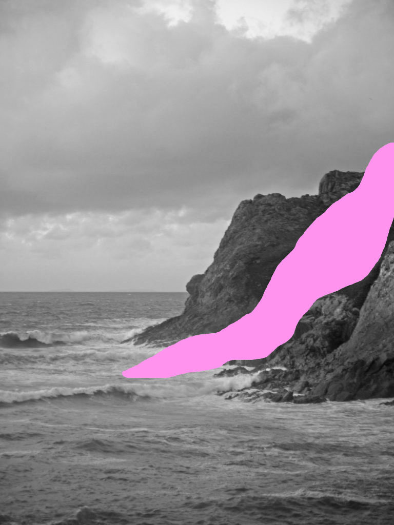
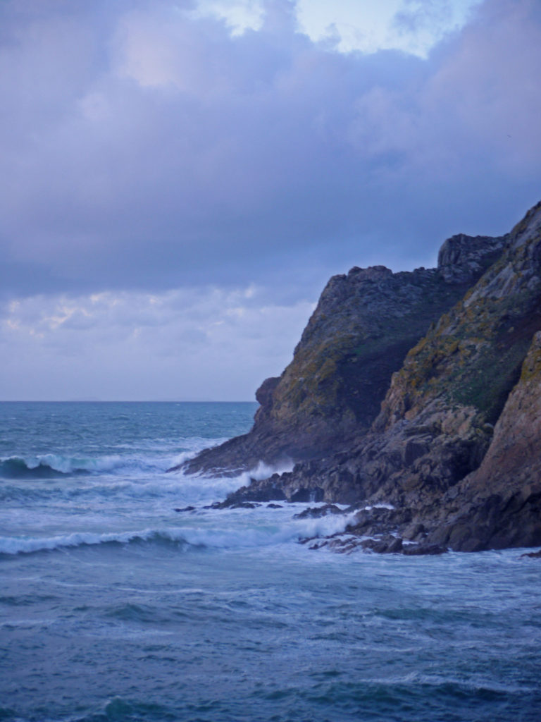
With this experiment, I decided to remove and replace a portion of the rock face, which I think worked particularly well, as the viewer has to work out and interpret what I have removed. I also think the colour that I have used complements the photograph too, and juxtaposes with the rough sea.

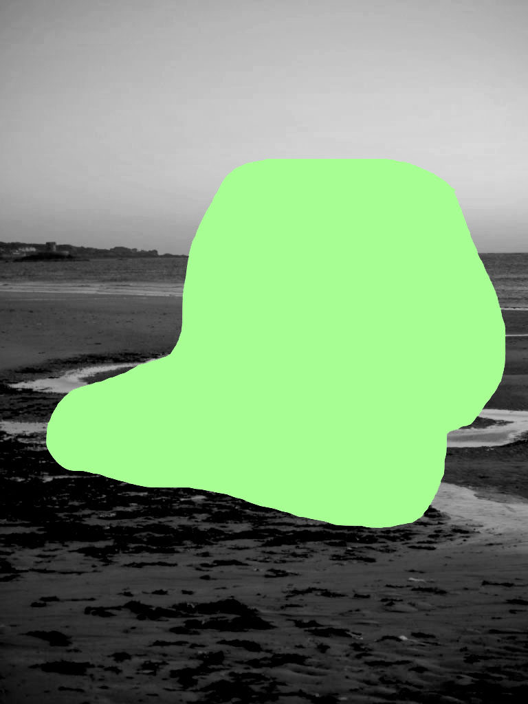
In this experiment, I used the lasso tool again, as I liked the freedom it gave me to remove a certain part of the photograph. I removed this area, because the viewer could interpret it any way, as anything could be behind the green area, which makes it quite interesting.

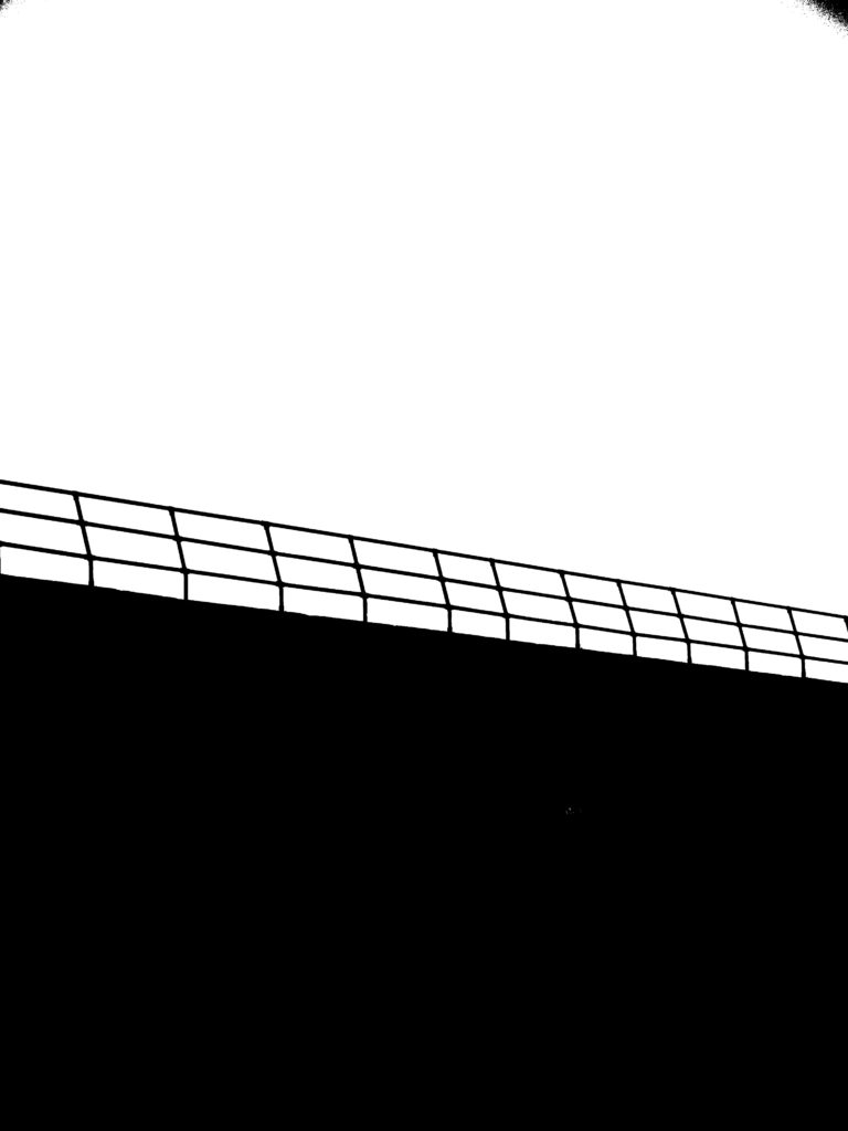
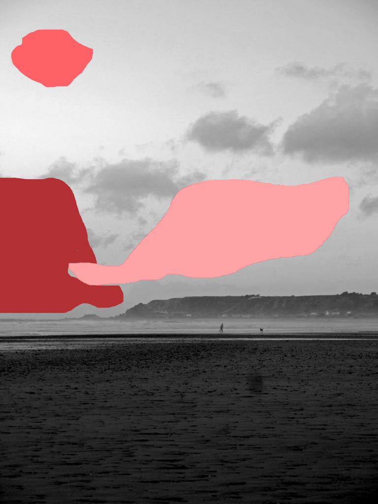
For this experiment, I tried out removing more than one area, however I don’t really like the outcome, as I think it looks more abstract with only one area removed. Because of this I decided to retry this experiment again.

For this experiment, I removed the area where the man and the dog were, and I like how it has turned out. This is because it could be interpreted that there is a figure in the foreground, or other objects, which would lead the viewer imagining what the object is, and why it has been covered. This is my favourite experiment outcome, because it is exactly what I imagined my outcomes to look like.

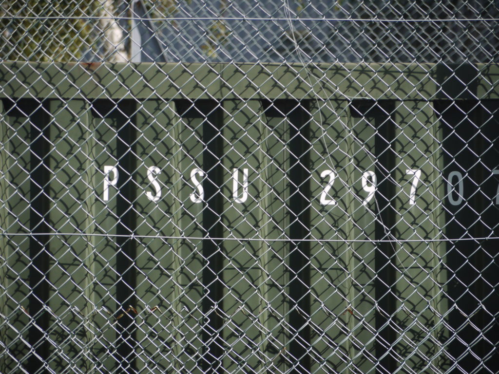
In this experiment I removed the letters with lasso tool, but I didn’t really like how it turned out. I also don’t think I would use urban landscape photographs in this experiment, as it doesn’t really fit what I am trying to achieve.

For this experiment, I tried to remove two parts of the photograph. I think it turned out better than my other outcome, where I removed multiple sections. This is because these parts look as if they are covering people or objects, which don’t want to be in the photograph, however the viewer could interpret in any way they could.

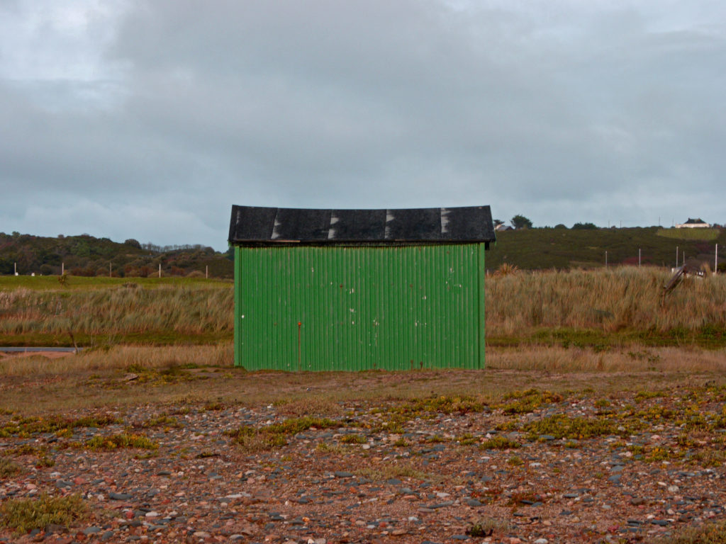
In this experiment, I decided to remove the shed, as I thought it would be interesting to cover the focus of the photograph, to allow the viewer to use their imagination and decide what the focus was themselves, whether it be a house, a car or a person.

Overall, I am impressed with my outcomes as they bring a totally different intention to all my photographs and allow them to be viewed in a different way, than they were previously.

using exposure bracketing to create hdr images

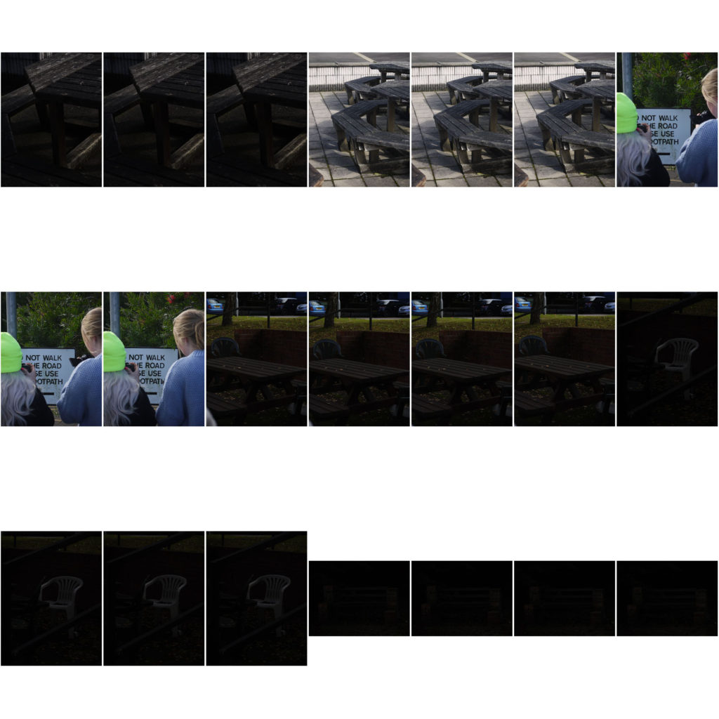
When out taking photographs for my landscape shoots, I tried out exposure bracketing, which is when you change the exposure. This means that you have a selection of photographs, of the same subject, at different exposures, going from over exposed to under exposed. Using exposure bracketing means that you can merge them together, on Photoshop, to create a highly detailed and impressive image, that you would not be able to create with a single shot.
hdr image one

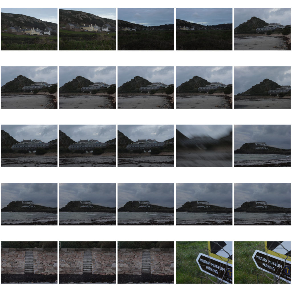
These are the images I used to create this merged image.

I feel this image, that was produced, was the best, as it has the full range of tones, and was exactly how I pictured it to be when i took the photographs.

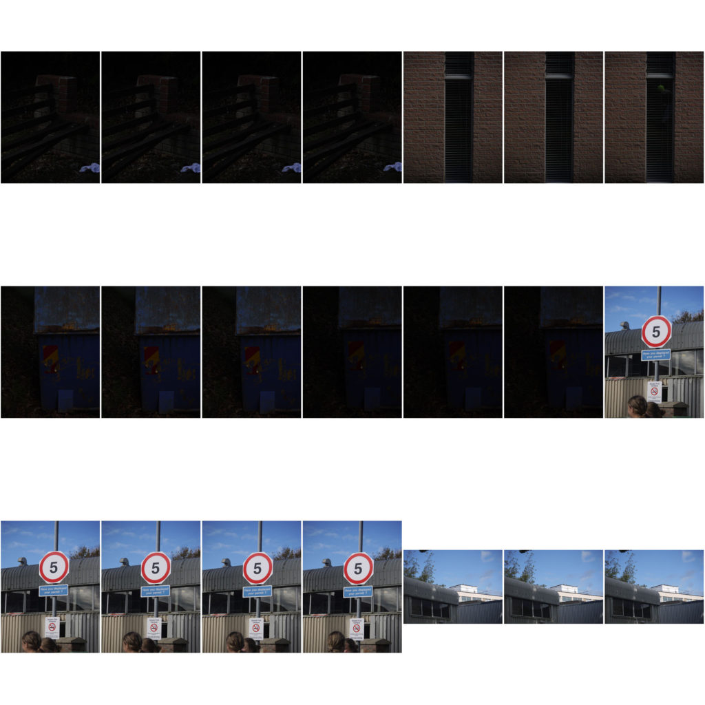
hdr image two

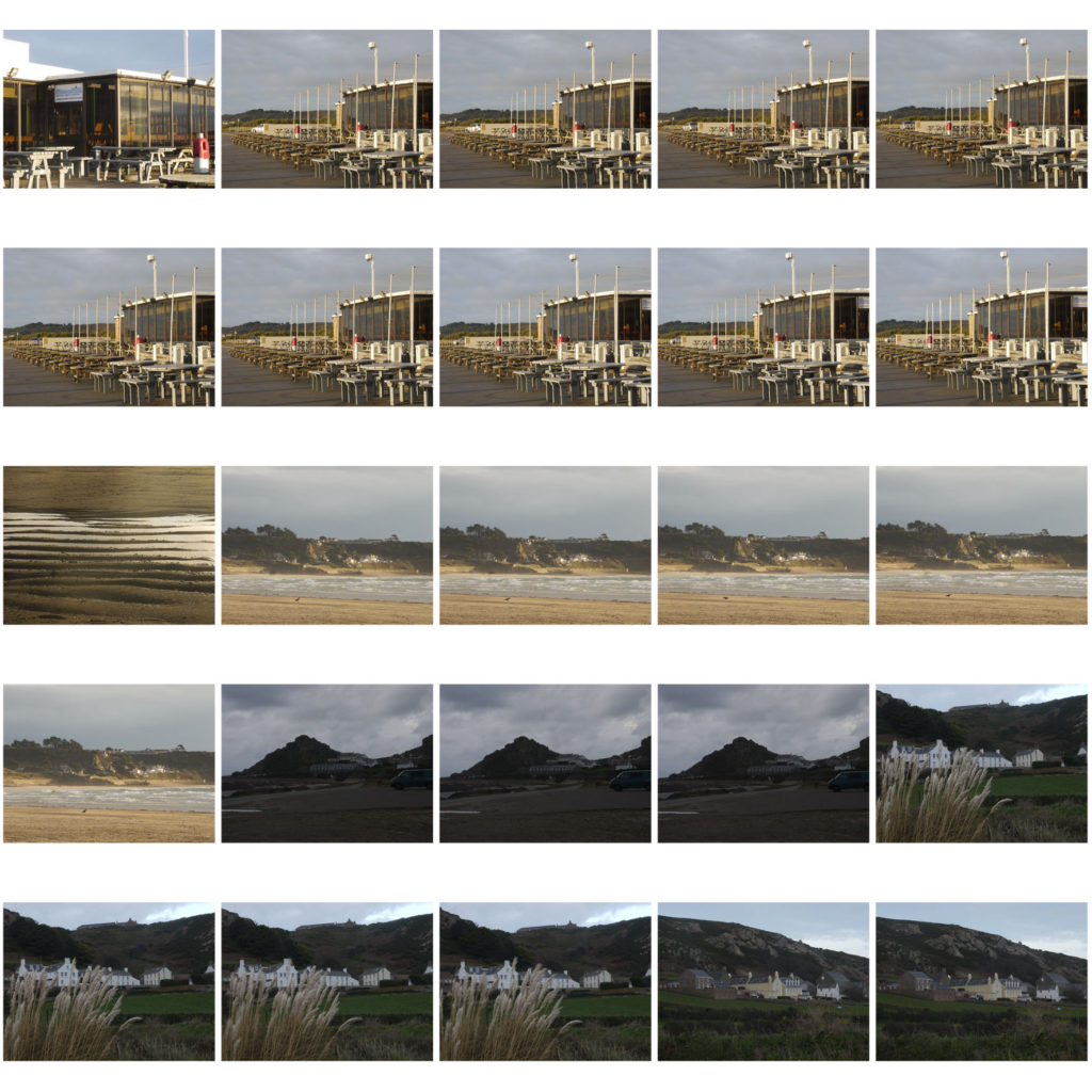
Here are the images that I merged together to create this image.

I don’t think this turned out as well as the first, and this is purely down to the fact that the images the I took to make this HDR image, are not the greatest and are lacking interest and colour. This means that the image produced, is not going to have a full range of colours.

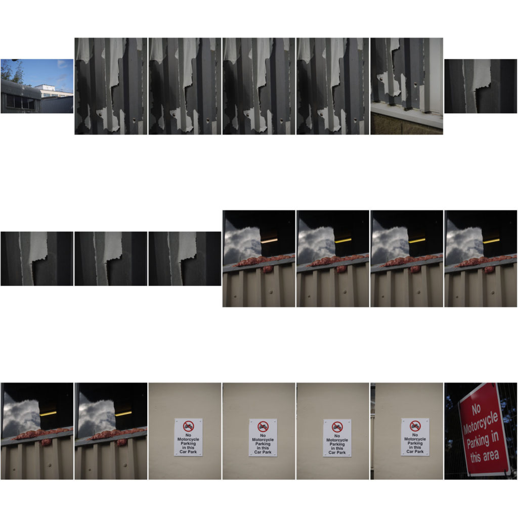
hdr image three


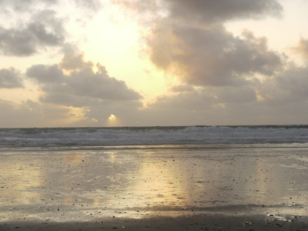
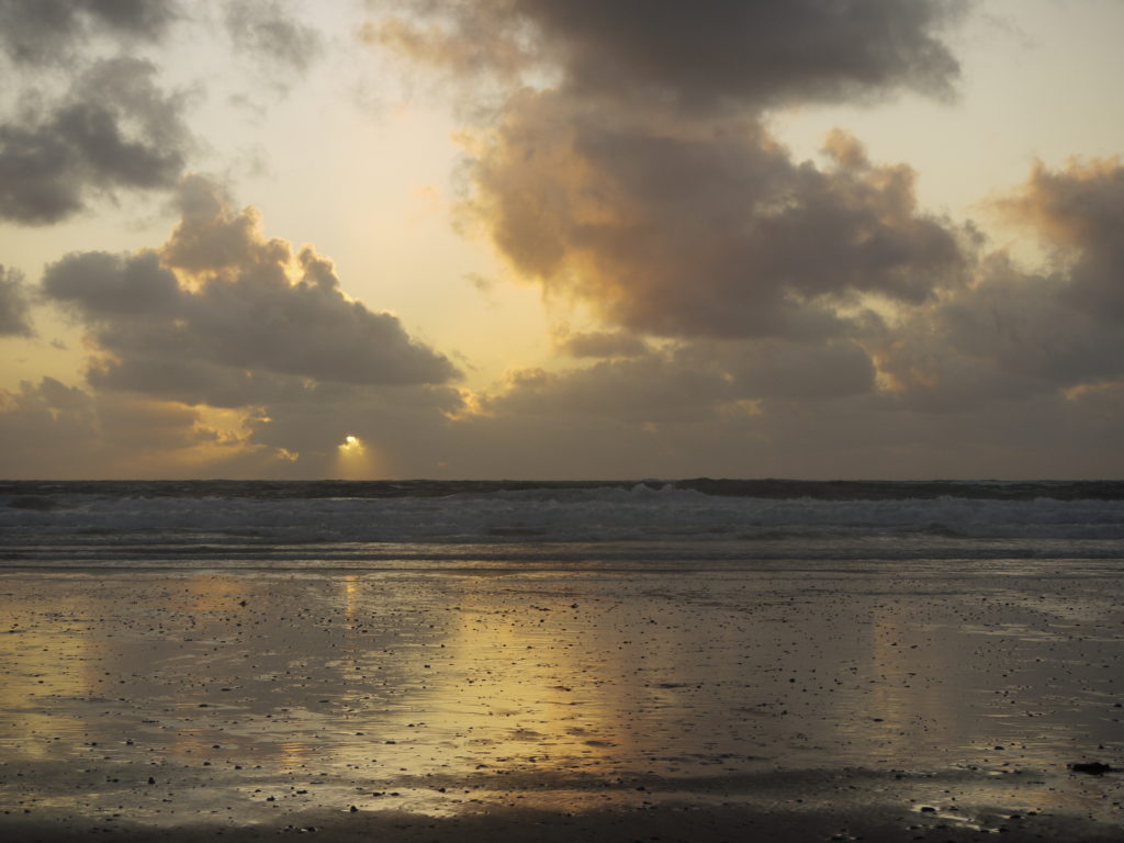
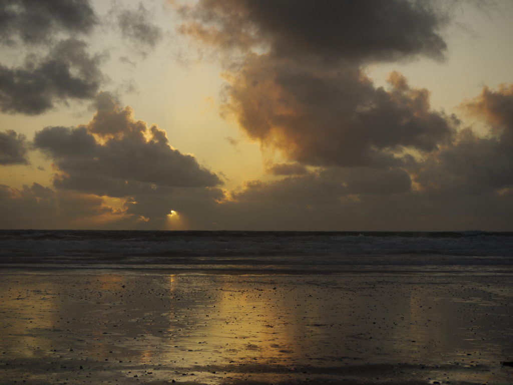
Here are the images that I merged together to create the image above.

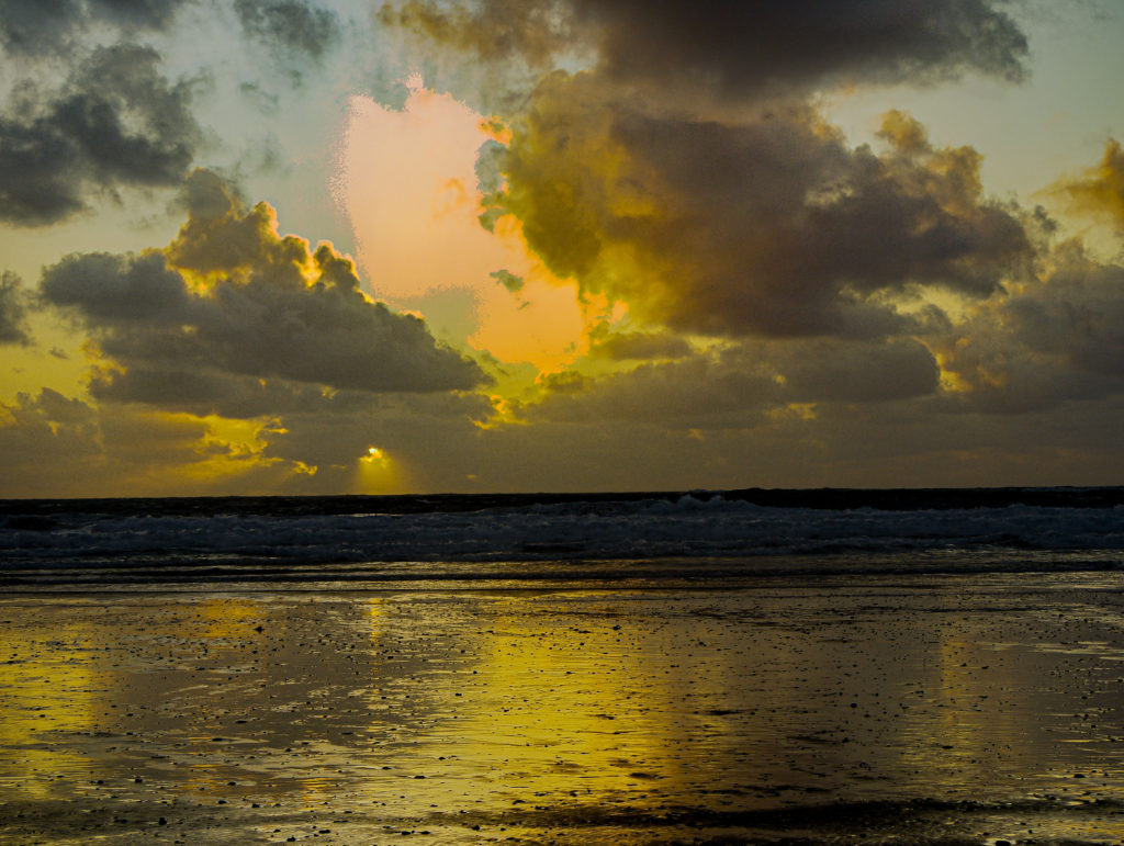
I think this image, that was produced, could be improved, meaning when I take my next of images, I need to quick in taking the photographs, at different exposures, because then the clouds won’t move as much, and the light will not change dramatically either. If I did this next time, then I think the strange orange space will disappear.

Overall, I would definitely do HDR imagery again, using exposure bracketing, because you get some very interesting and intense photographs produced.

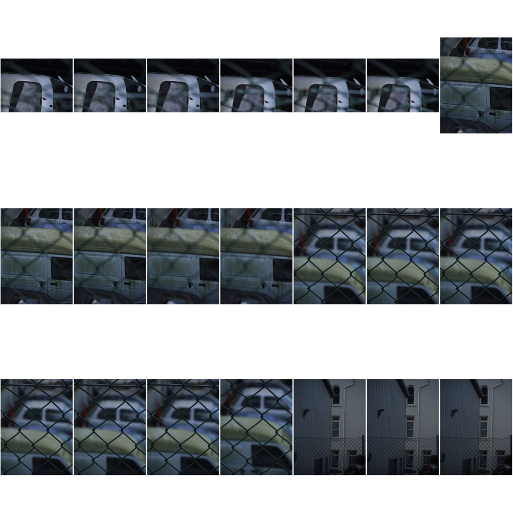
urban landscapes contact sheets

Over the past 2 days, I have gone out, at around 5. I went around this time so I could get good lighting, strong contrasts and dramatic shadows. Some of my photographs have been NICHOLAS NIXON, as I took photographs capturing structured buildings and the natural landscape it sits in. I have also gone in and selected my favourite outcomes, which I will edit and evalute.

nicholas nixon

who is NICHOLAS NIXON and what does he do?

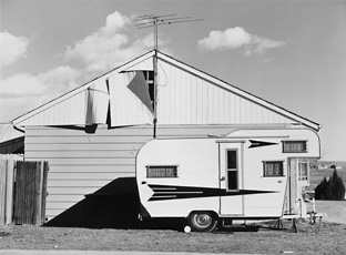
NICHOLAS NIXON was born in 1947, in Michigan. NIXON is known for his black and white photographs of cityscapes and portraits, trying to capture emotion, that can effect his viewers. He was influenced by 2 photographers called, EDWARD WESTON and WALKER EVANS, and worked with large-format cameras. NIXON was part of the group ‘the new topographics’, who photographed urban landscapes to display how industrial and manmade building have taken over the natural landscapes.

my favourite photographs from NICHOLAS NIXON

These photographs are my favourite, because I like how NIXON has captured repetition of the houses and how unnatural they look, compared to the free flowing elements that occur in nature. When I go to take photographs, I am definitely going to look at capturing this, and I think it looks impressive.

analysis of NICHOLAS NIXONS piece

technical

The lighting of this photo is natural, as NIXON has taken this photograph in the outdoors and has probably not used any additional lighting techniques. If you look closely, you can see how the natural light hits some of the cabins and illuminates some of the features, eg the windows. The lighting of photograph is flat, as it is quite plain. The tonal range is large, as there are very dark blacks and very light whites, and this links in with the contrast, in the sense that it is very strong.

visual

This piece was taken in black and white, and I find it makes the photograph look very effective and simple. The way that NIXON took this image means that the background, the mountain range, is viewed as being 2D, as it is flat and has no definition. Whereas the cabins are viewed as being 3D, as the edges are defined, some are illuminated, and some are shadowed. NIXON has captured this landscape very carefully, as he has thought about the composition. It is clever how the mountain range is free flowing and natural, and the cabins are angled and structured. NIXON has deliberately juxtaposed these 2 elements together to show how nature is controlled by industrial buildings, that mankind has created.

contextual and conceptual

This piece links to the era contextually, in which it was taken, in the sense that NIXON captured both a natural landscape and an urbanised and industrialised landscape in one photograph, which references the time of the industrial revolution. This is because during the industrial revolution natural scapes were industrialised by manmade buildings, which NIXON and the ‘new topographics‘ enjoyed to photograph to portray their thoughts on the enlightenment.

romanticism final outcomes and evaluation

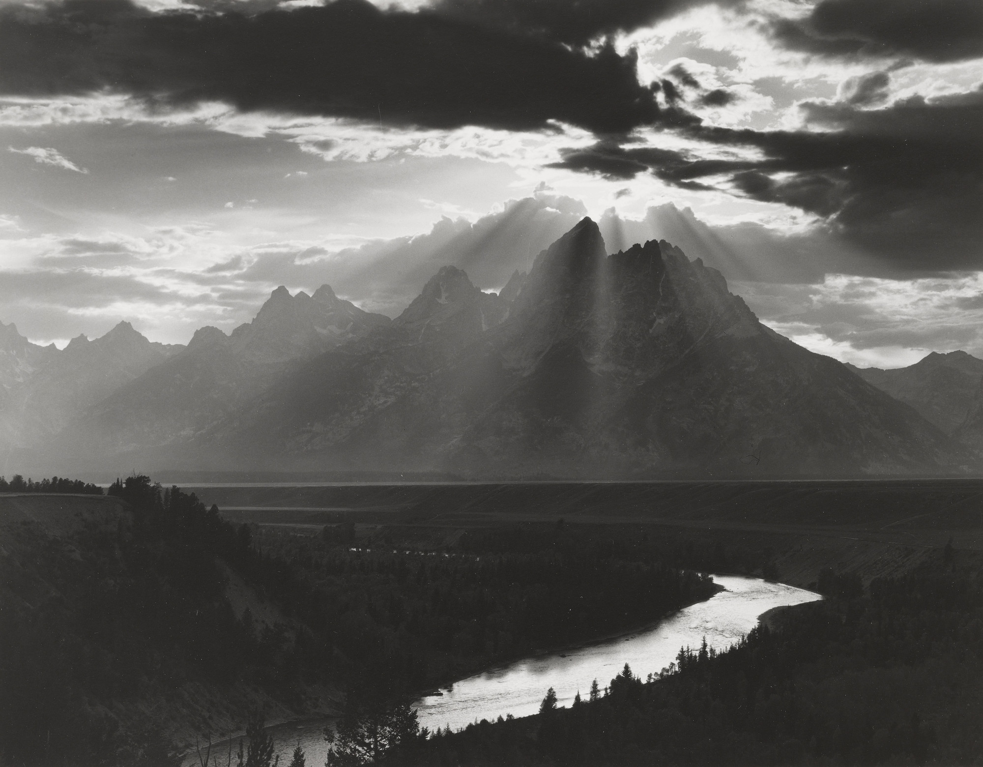
Below are my favourite outcomes from this shoot, either because they are personally eye-catching or they are directly inspired by the photographer I was inspired by, MINOR WHITE

outcome 1

I have chosen this as one of my favourite outcomes because I feel it is directly inspired MINOR WHITE, in the sense I have tried to gain the same tonal range he has captured, meaning this photograph has intense blacks, bright white and every tone in between. I also feel it is similar to a photograph of WHITES, pictured below, as they both have a similar sky and the way light scatters is similar too.

Image result for minor white
MINOR WHITEs photograph that is similar to mine

outcome 2

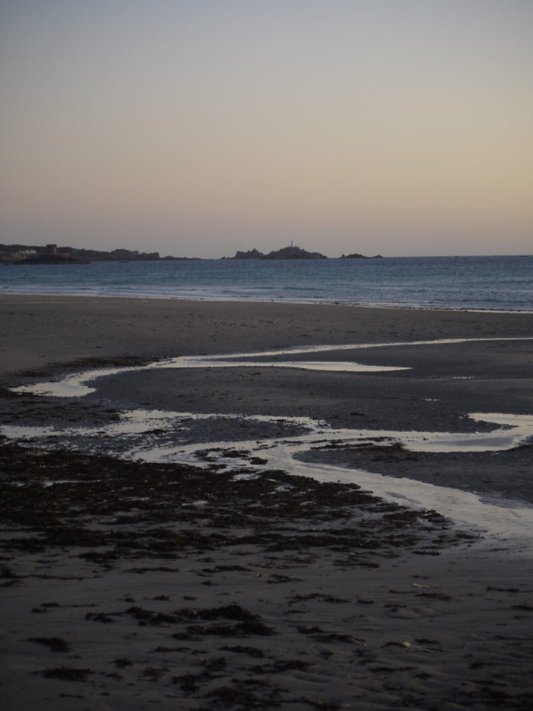
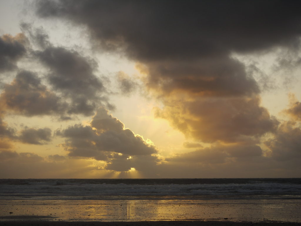
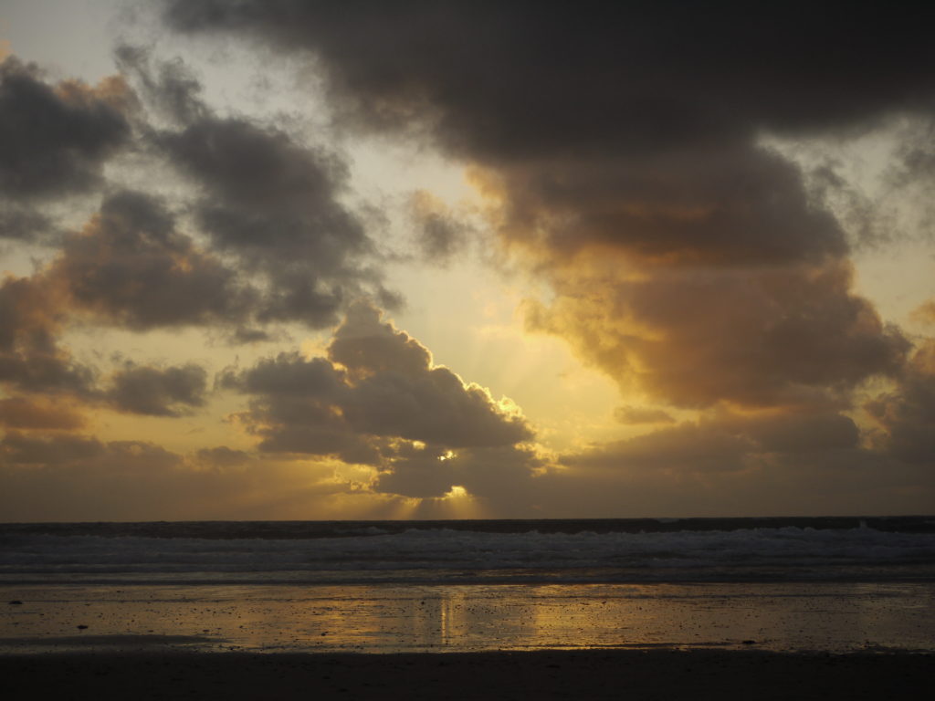
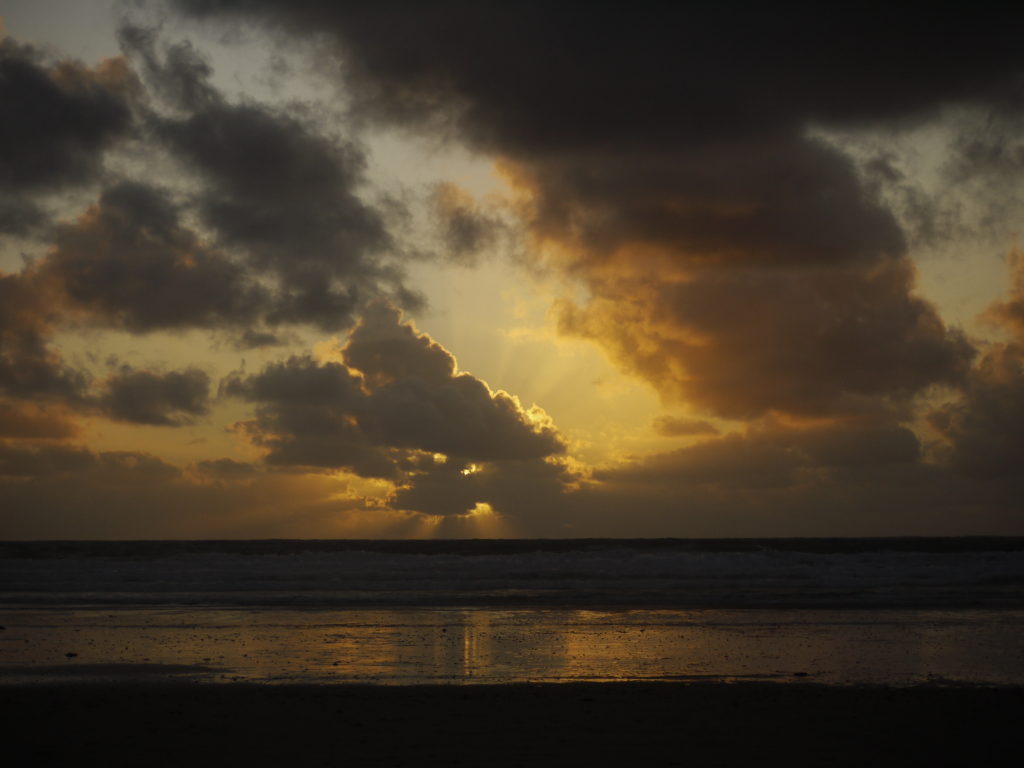
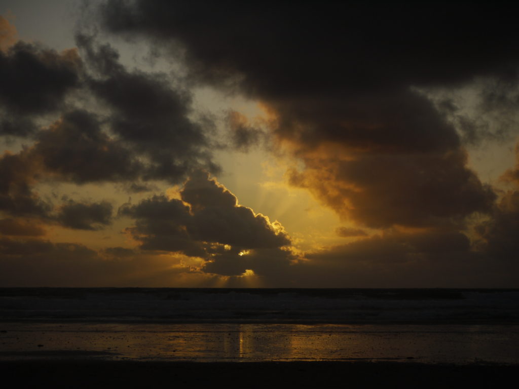
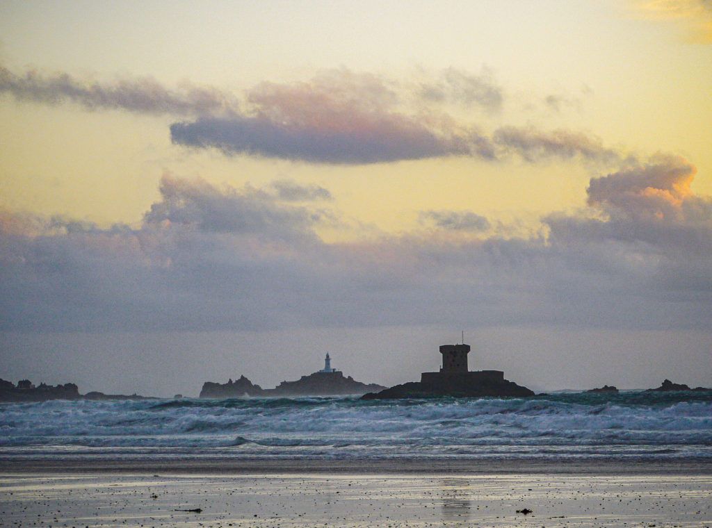
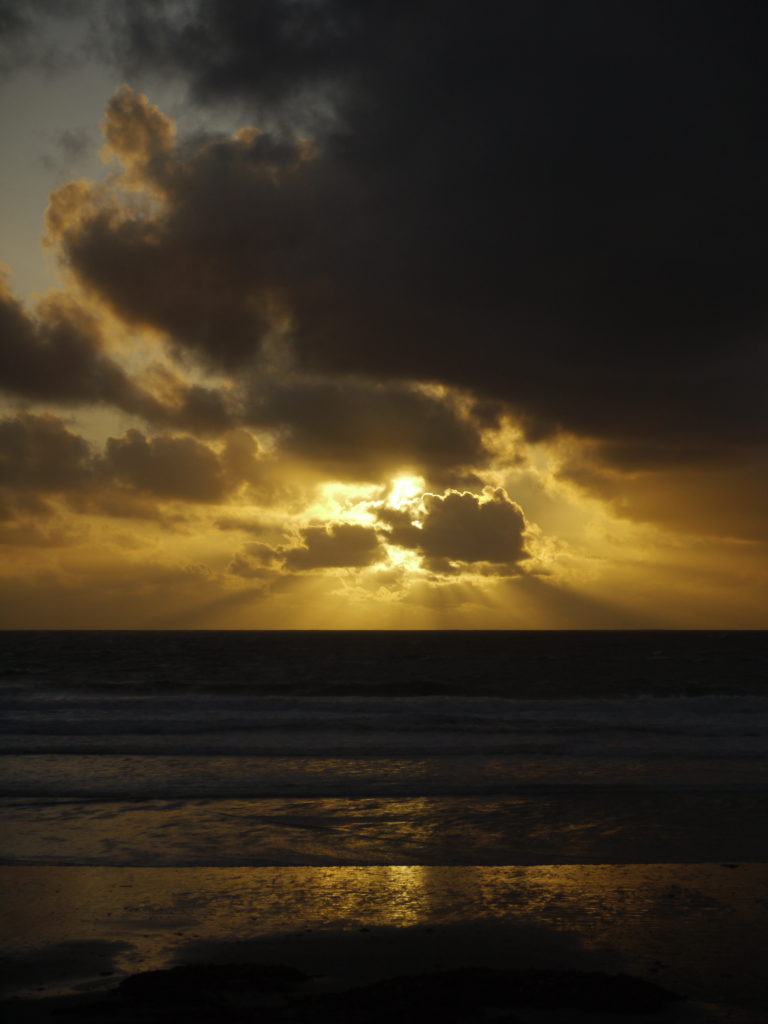
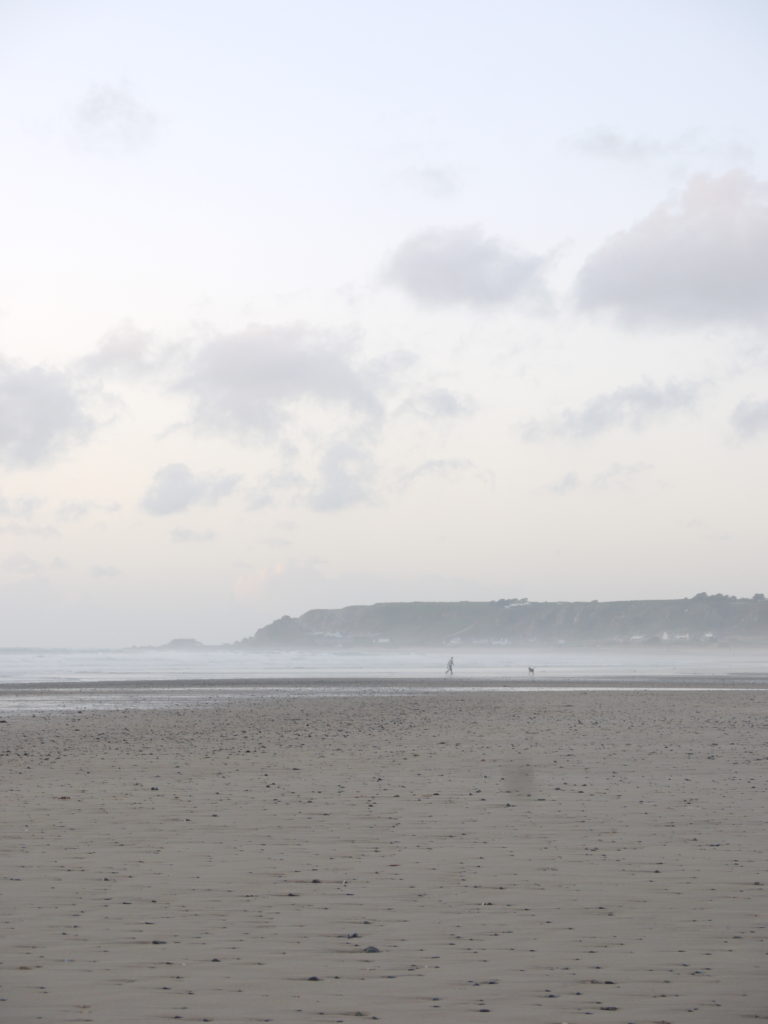
I have chosen this as one of my favourite outcomes because I feel it closely relates to the theme of romanticism, in the sense that the landscape is idyllic and awe inspiring. I like how subtle the oranges are in the sky and the way the cloud sit and diagonally drag from left to right. The light sky then is balanced out by the dark sand, which I personally find very eye-catching. The bottom half of the image is linear, whereas the sky is more free flowing, which I find interesting too.

outcome 3

I have chosen this as one of my favourite outcomes because of the intense colours and the reflection on sand is very eye-catching. The cloud arrangement is particularly intricate, and it is interesting when the light hits the clouds too. I enjoy the dramatic darks and how they balance and contrast with the vibrant oranges and yellows.

evaluation

Overall I am happy with all of my photographs I have taken and all of my final outcomes, as they are what I imagined them to be. I am also impressed with my photographs that were inspired by MINOR WHITE, in the sense that I think his work is incredible and for my pieces to hold the dramatic mood, is what I was hoping for. If I were to do this shoot again, I think I would try to capture a few more elements and at few different angles, because then I would have vaster range of photographs.

ROMANTICISM​ SHOOT 2 – Edited versions

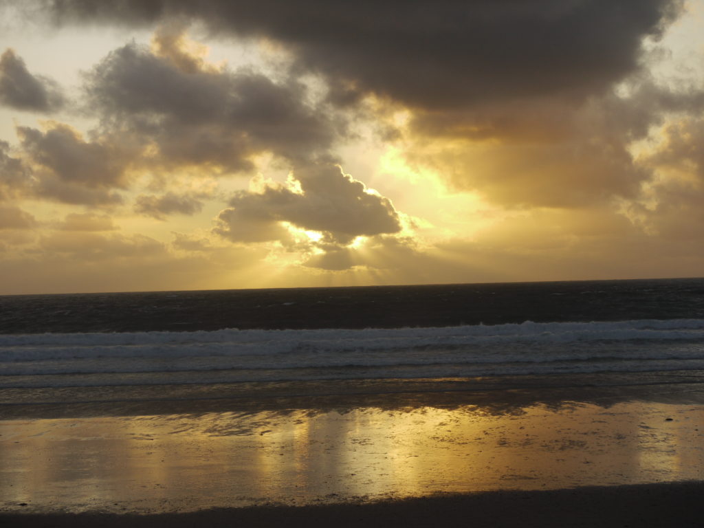
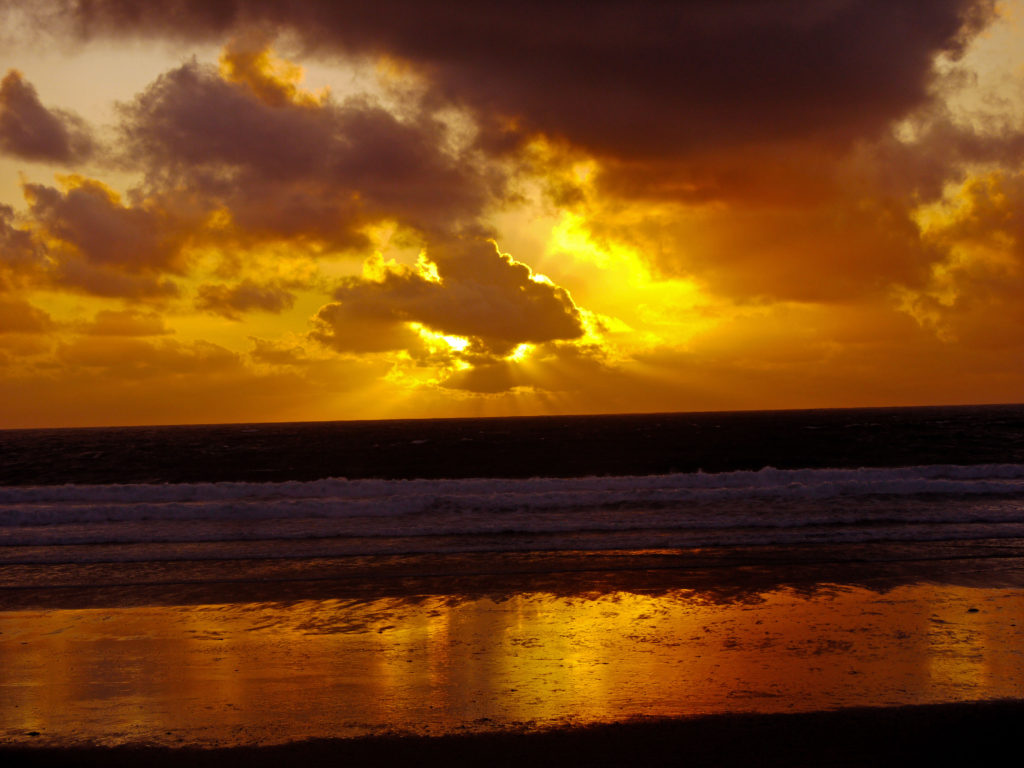
Here are the photographs that I felt turned out the best, which I edited, to enhance the colours, contrast and exposure.

photograph one

original version
edited version

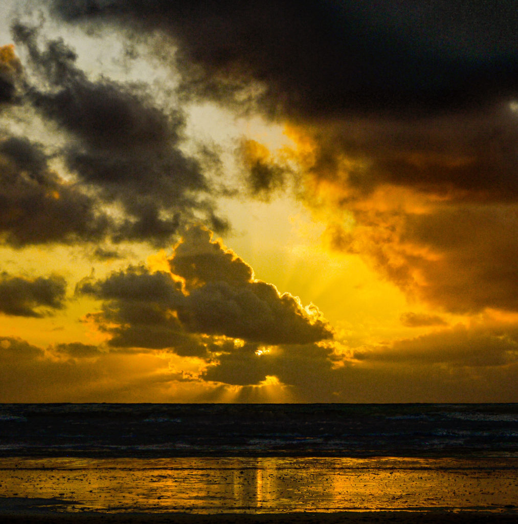
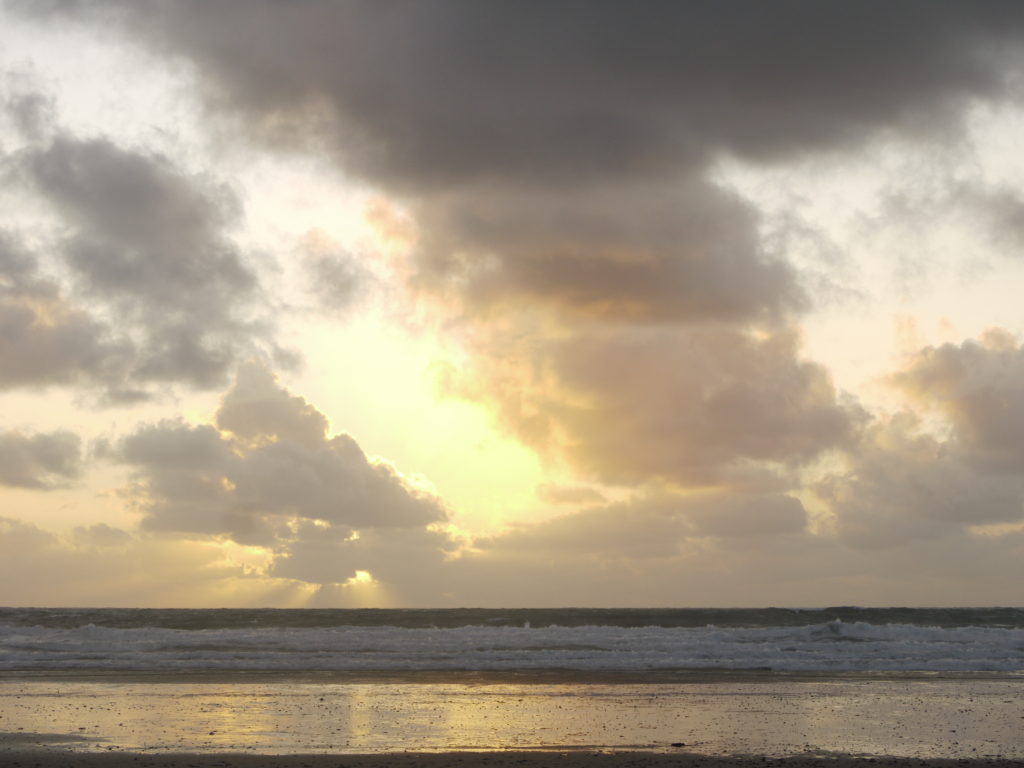
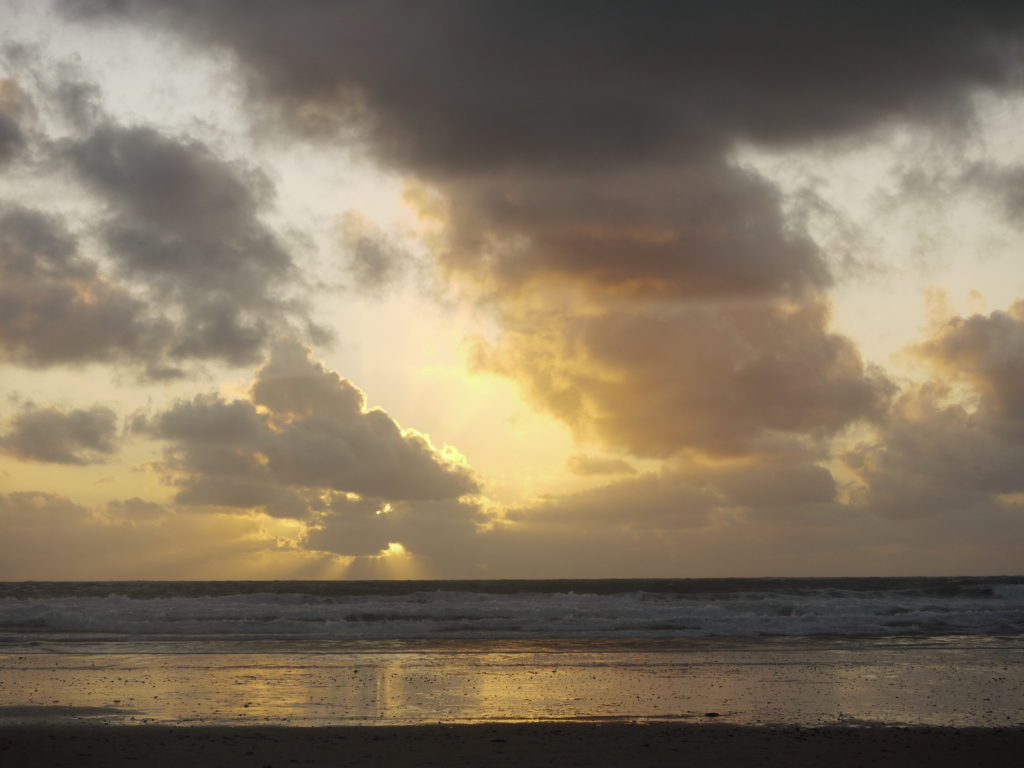
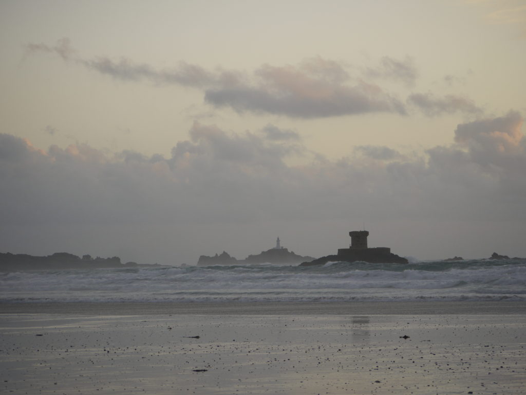
I edited this photograph by adjusting the levels, to enhance the blacks, midtones and whites. I did this because I wanted to create an intense contrast between the sunset, the clouds and the sea. I also increased the saturation, which brought out the oranges and reds, meaning the photograph stands out and is more interesting. Doing this also allows there to be a brighter reflection on the sand too, adding interest for the viewer.

photograph two

original version
edited version

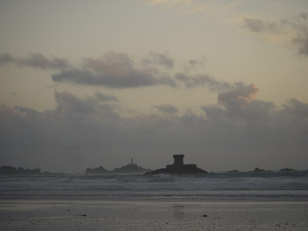
For this photograph I practically did the same as the photograph above, as I wanted to achieve the same output, a more colourful and appealing photograph. If I was to edit this photograph again I would fix the horizon line, mean it would be even more aesthetically pleasing and would have a better composition.

photograph three

original version
edited version

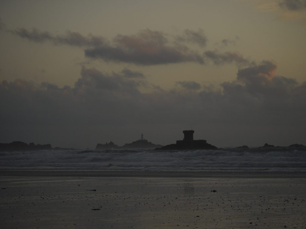
For this photograph, I enhanced the saturation and contrast, to accentuate the colours and details in the picture. I like the fog that sits on the horizon, as it creates an ominous tone. This photograph has very extreme darks in the bottom half, which balances out the photograph.

photograph four

original version
edited version

For this photograph, I enhanced the contrast, to allow all the elements to be more bold and set apart from another. This meant that the rock face has more detail and 3D.