All posts by Jessica P
Filters
environmental portraiture photoshoot plan
what will I photograph?
my friends in environments that relate to them
when am I going to photograph?
after school when the the light is bright
where will I take my photographs?
outside of a church, in the library and outside the hospital
why am I designing my shoot in this way?
these areas relate to my friends and what they would like to do in the future
how am I going to take my photographs?
with my panasonic camera, with a tripod is necessary
candid portraiture photoshoot plan
what will I photograph?
people at the Christmas lights turn on at the town square.
when am I going to photograph?
at night time, on the day of the Christmas light turn on.
where will I photograph?
in the town square, where the main turn on is held.
why am I designing my shoot in this way?
to be able to capture people when the lights are turned on, with excited faces.
how am I going to take my photographs?
I am going to use my panasonic camera, with the settings adjusted for the dark. the lights in the square will allow for the faces to be illuminated.
robert frank
who is ROBERT FRANK and what do they do?
ROBERT FRANK was a swiss photographer and documentary filmaker, born in 1924. His most famous work was his book ‘the americans’, which documented american people during their everyday life. FRANK later went on to experimenting with photomontages and film. Their photographs were expressive and raw, which changed the way documentary photographs were taken.
my favourite photographs from ROBERT FRANK
In these photographs, from FRANK, i like the expressions on the faces of the subjects and how natural they look. These photographs really capture the joy and the happiness of the people.
analysis of a ROBERT FRANK piece

technical
The lighting in this photograph is coming from infront, because there are shadows and highlights on the subjects faces. If there were no lighting from the front the subjects faces would be dull and not illuminated, which they aren’t. The lighting is also natural, as the faces are not over exposed, or over powered by light, but the light is subtle. The lighting allows for there to be a high contrast between the lights and darks. This photograph has a varied tonal range, as there are dark darks and bright whites too.
visual
This particular photograph is taken in black and white, FRANK must have decided to do this because it allows the photograph to look more powerful and poignant. There are a varied different textures, from the metal with the pattern of bolts, to the reflections on the windows. These textures allow the photograph to be more interesting and eye catching. FRANK has captured this scene very well, because of the repeating pattern of the windows, and how they also form a frame around the individuals, which is interesting too. The arrangement of the people also relates to a contextual link from the time of the photograph being captured.
contextual
Around the time of this photograph was taken in 1958, and before this time, there was a big divide between the social classes, races and ethnicities. So this photograph is important because it shows how all people, whatever race, class or ethnicity get the bus. Even though it does still show the divide, in the sense that the black people are sitting separated from the white people, at the back of the bus.
conceptual
This photograph really highlights the segregation of the different people of America, due to each different groups being separated in a window. Each window frames a different, and shows how they are separated in society and on the bus. But what it is interesting about this photograph, by FRANK, is how it shows the variation of people in America and how they are represented too.
how am I going to relate to ROBERT FRANK in my photographs?
I am going to capture people in their natural environment and take their photograph without them knowing they are being photographed, because then you really get the natural and candid shots, that look very effective and eye catching.
candid portraiture photography- mindmap
Below are photographs that inspire me and are photographs I would like to relate to and recreate, with my own ideas.
arnold newman
who is ARNOLD NEWMAN and what do they do?
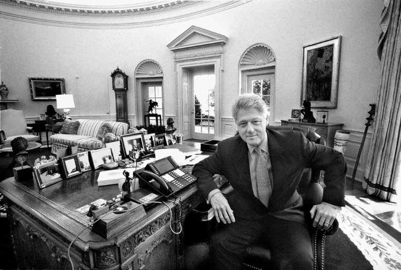
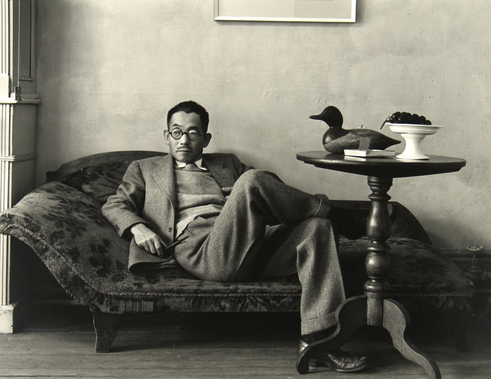
ARNOLD NEWMAN is a photographer, born in New York City in 1918, who studied art in Miami. NEWMAN is acknowledged for being the pioneer of the genre of photography called environmental portraits. He worked as a documentary photographer, who took still portraits of subjects in an environment that symbolises the individuals life and work.
my favourite photographs from ARNOLD NEWMAN
These photographs from ARNOLD NEWMAN are my favourite, because they are very strong and hold a lot of power within them. They also display the emotion and stories of the individual within the photograph, and what NEWMAN thinks of them too.
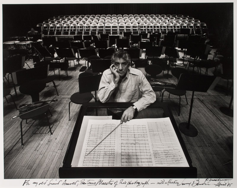
analysis of an image from ARNOLD NEWMAN

technical
The light source is coming from behind the individual, this allows the subject to be lit and to stand out. It also allows the background to be illuminated to add the importance of this feature in the photograph. There also may be light coming from in front of the individual as their facial features are visible but not quite contrasted. The depth of field, in this photograph, is long, as the background are sharp and in focus.
visual
The photographer has decided to shoot in black and white, it is very powerful as it allows for there to be a high contrast, which is interesting for the viewer. There is a varied tonal range, as there are dark blacks and bright whites. The bright whites stand out, when mixed among the dark blacks. The bright whites are also limited as the only white things are the music paper, the subjects shirt and the chairs in the background, this allows the subject to be the focal point of the photograph, as the paper is directly infront of him and the chairs are directly behind him. There are many textural aspects, from the notes on the paper to the wooden flooring. These aspects add interest and detail to the image. The chairs in the background are repetivitely placed, and form a pattern behind the subject, which contrasts with the scattered stands directly behind the subject, as they are more randomly placed. The sections on the music paper kind of act as leading lines, pointing towards the subject as they are arranged in a way that direct the viewers eye to them.
contextual
The subject in the photograph is Leonard Bernstein, a conductor, composer and piano player, who was one of the first American born conductor to be praised for his musical ability. Bernstein was also the first conductor to give lectures on television on classical music. He was a very talented musician, as he composed lots of music for theatre and ballets. Although Bernstein was known for his musical talents, he was also known for his social activism, hoping for further social change, and was heavily involved with left wing organisations. The reason why NEWMAN captured Bernstein in an empty concert hall was to highlight how unimportant Bersteins audience was to him, which contrasts with the thoughtful look on his face demonstrates how much his music meant to him. For NEWMAN to photograph Bernstein he must have agreed with his views on social activism and social change, as it was important for him to relate to the subject on a more obscure reason.
conceptual
ARNOLD NEWMAN took photographs of subjects in an area that represented and connected to their job, or other aspects of their life. So in this photograph of Leonard Bernstein, NEWMAN captured him in a concert hall that related to him, as he was a composer and conductor.
how am I going to relate to ARNOLD NEWMAN in my photographs
I am going to photograph my subjects in an area that is related to them and hold direct eye contact with the camera, similar to how NEWMAN captured his subjects.
environmental portraiture photography- mindmap
Below are photographs that inspire me and are photographs that I would like to relate to and recreate, with my own ideas.
portrait photography
PORTRAIT PHOTOGRAPHY is a photograph that captures the personality of a person or a group of people. They can be taken using effective lighting, powerful backdrops and dramatic poses to display the mood that the subject wants to create. A portrait photograph can be used for creative purposes or part of a medical study.
some types of PORTRAITURE PHOTOGRAPHY
- traditional portraiture
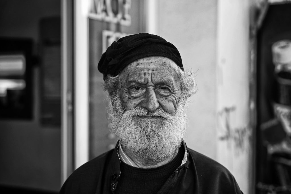
- environmental portraiture
- candid portraiture
- glamour portraiture
- lifestyle portraiture
- surreal portraiture
- conceptual portraiture
- abstract portraiture
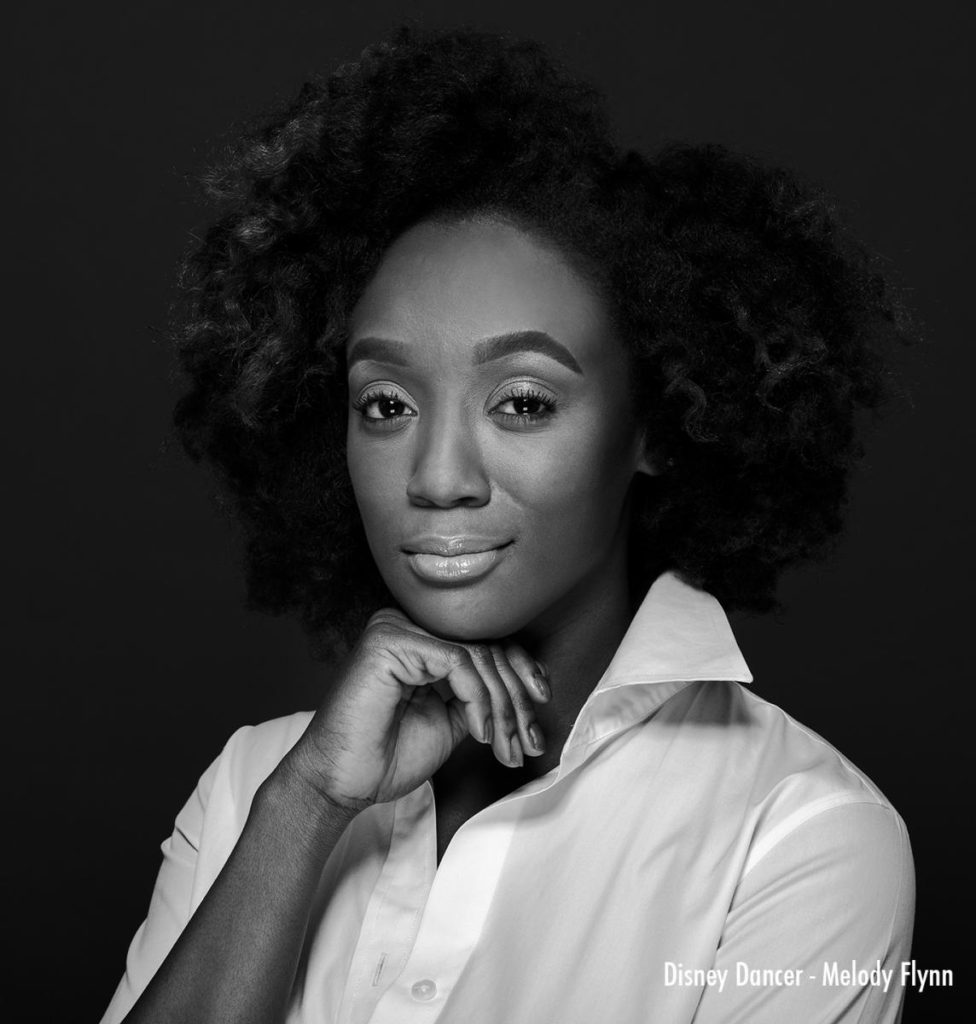
traditional portraiture 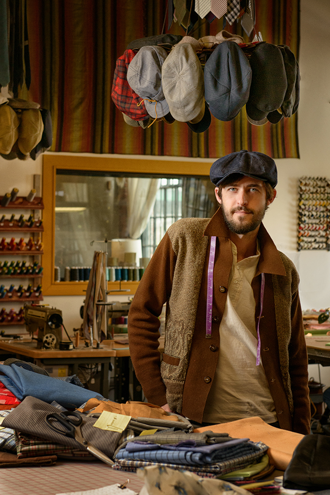
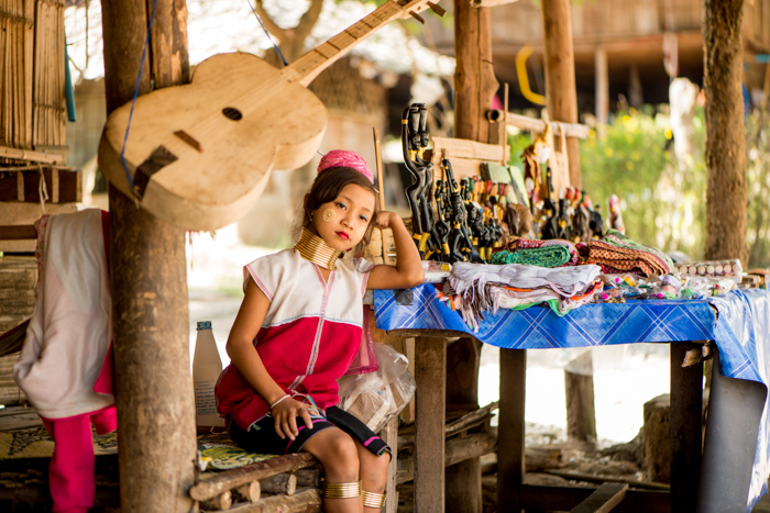
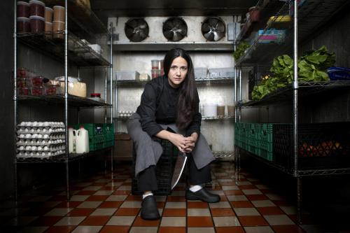
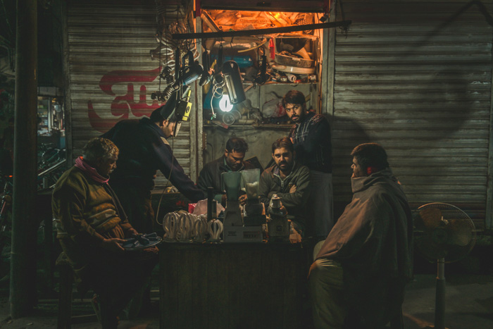
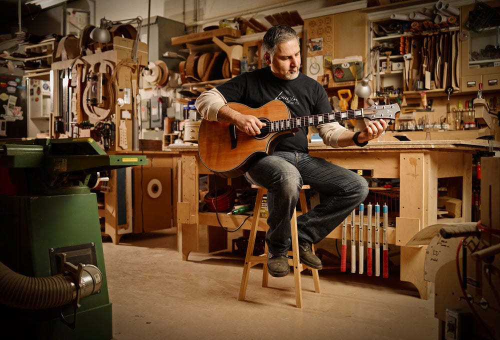
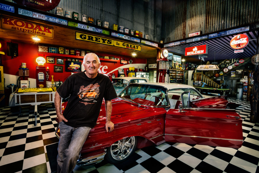
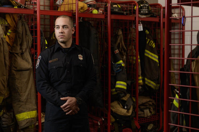
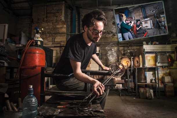
environmental portraiture 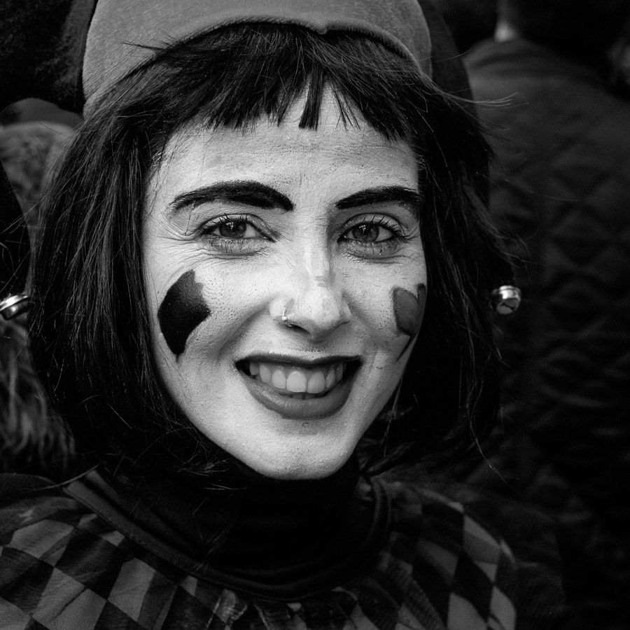
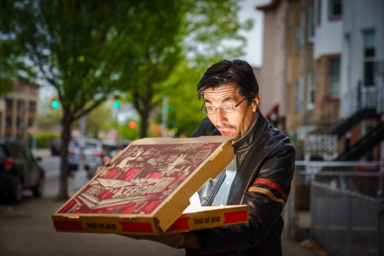
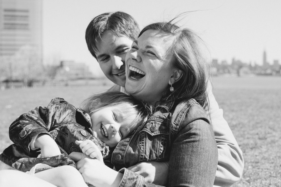
candid portraiture 
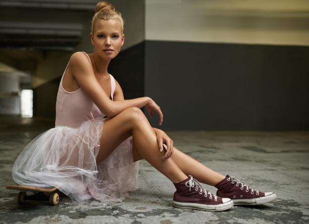
glamour portraiture 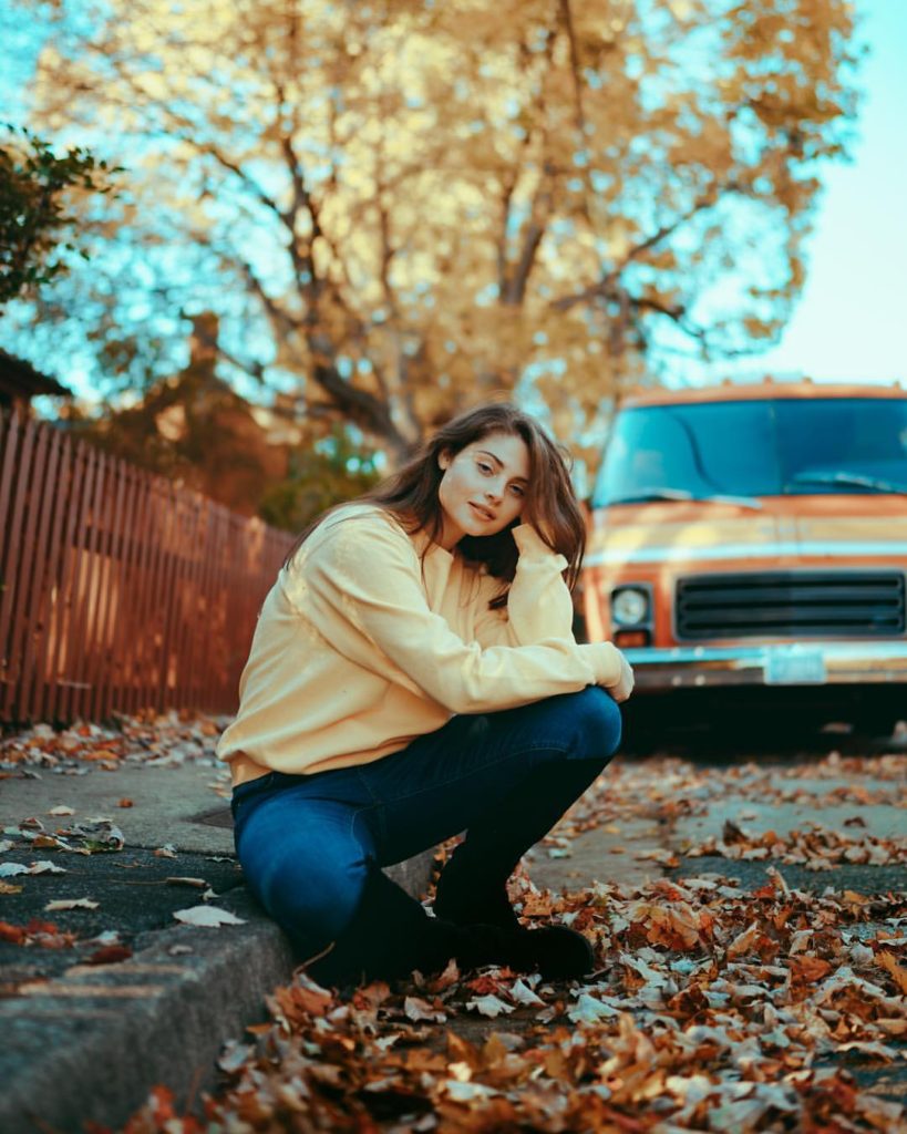
lifestyle portraiture 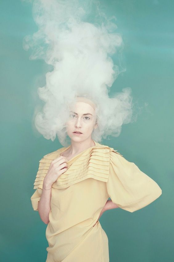
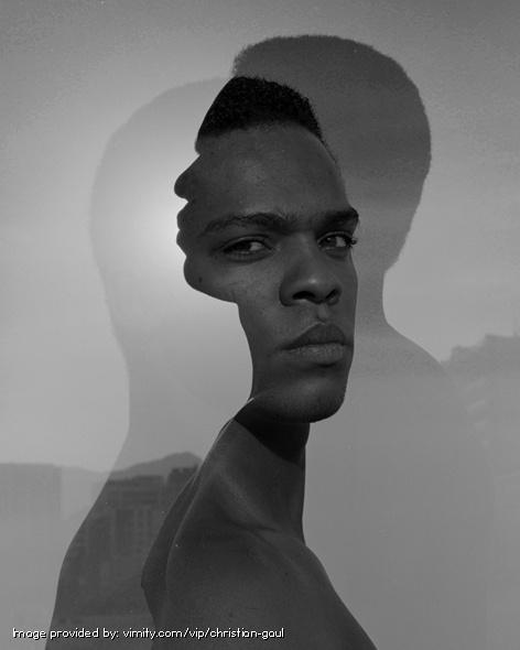
surreal portraiture 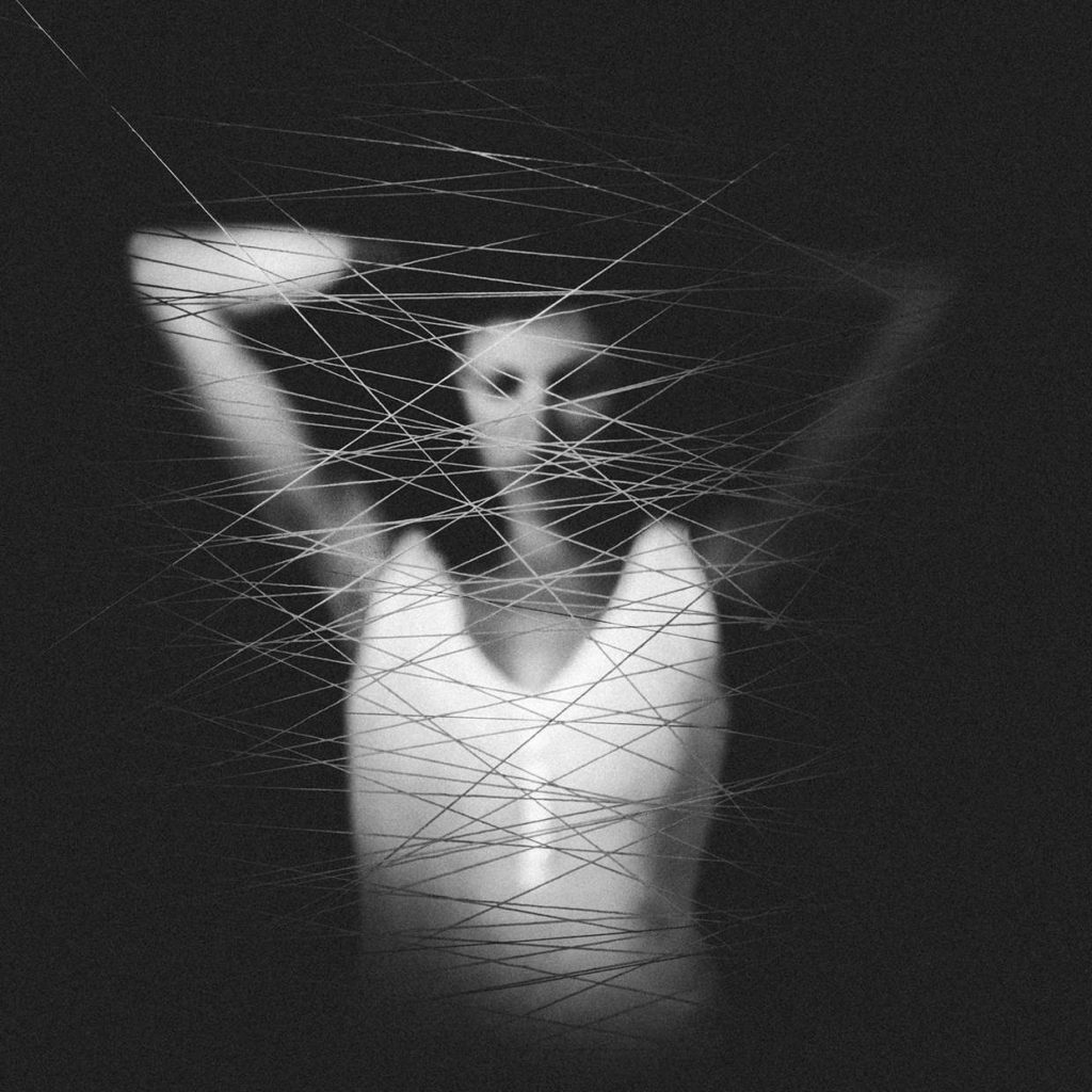
conceptual portraiture 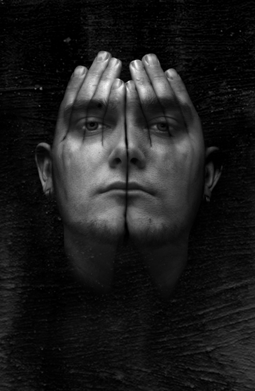
abstract portraiture
mood board
CONTEMPORARY PORTRAIT PHOTOGRAPHY is a photograph which relates to the time/era in which we are in, they may reflect values, challenges, and perceptions that are important in this particular era.
technical aspects of PORTRAIT PHOTOGRAPHY
PORTRAIT PHOTOGRAPHY can be taken in different ways. They can be formal, meaning the subject is posed to reflect their mood or something similar. Portraits can also be informal or candid, meaning the subject is captured in a natural way, and they may not even know their photograph is being taken at that time.
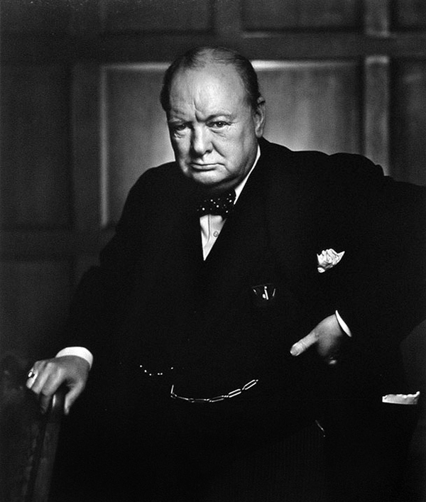
formal 
candid
PORTRAIT PHOTOGRAPHY can be just a head shot, which is a photograph that is just of the subjects head. Photographs can also be half body, which is a picture of the subject trunk and head. Photographers can also capture full body photographs, which is a picture of the subjects full body.
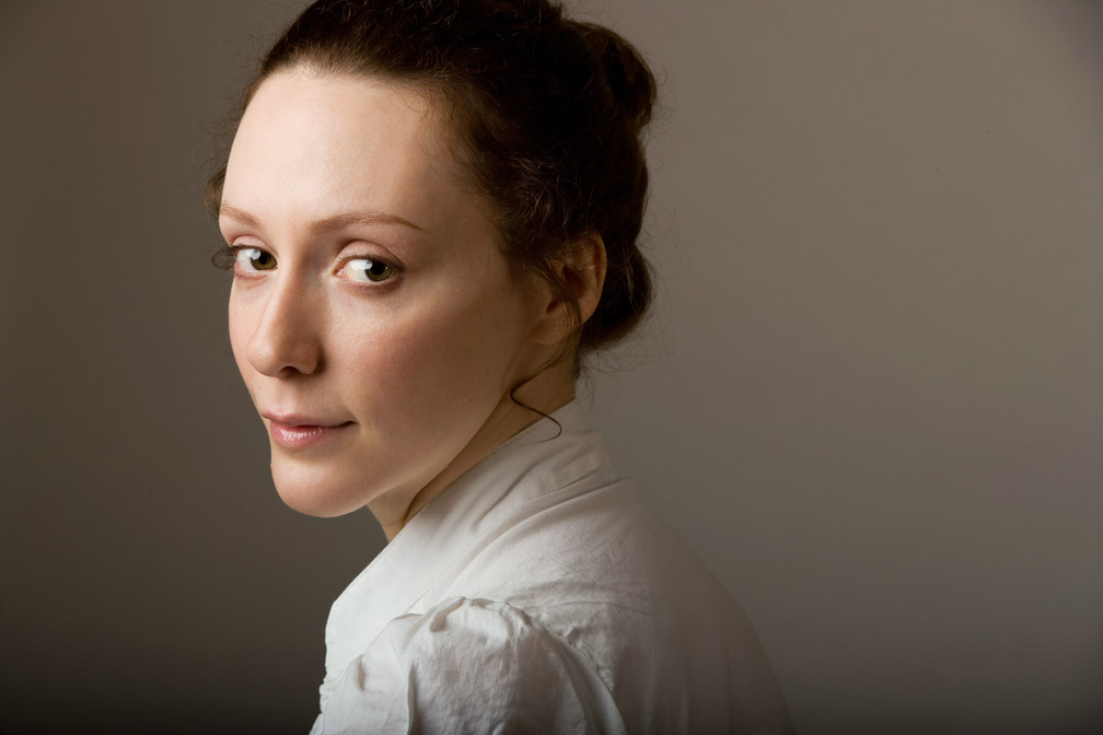
head shot 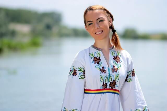
half body 
full body
PORTRAIT PHOTOGRAPHY can be taken at different angles. Photographers may decide to take a photograph at a high angle, which means that it is taken from above eye level to get a more expressive and creative shot. Photographers may decide to also take a photograph at a low angle, which means that it is taken from below eye level to produce a more interesting shot. Photographers may decide to take a photograph at a canted angle, which means that it is taken at a tilted angle to produce the mood of tension or uneasiness.
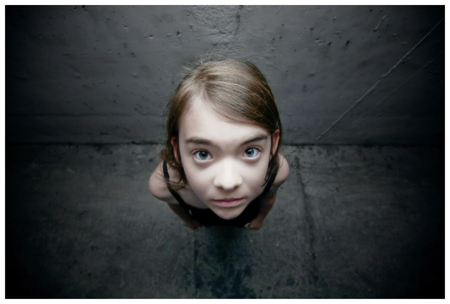
high angle 
low angle 
canted angle
PORTRAIT PHOTOGRAPHY may be to edited to change them to black and white, which will produce a more contrasted and interesting image. A photographer may decided to keep the photograph in its original state, allowing the photograph to be bright and colourful.

black and white 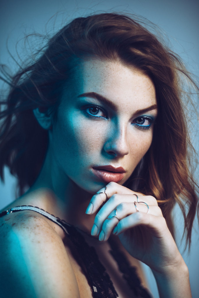
colour
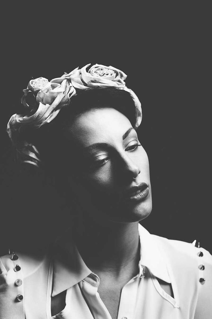
PORTRAIT PHOTOGRAPHY can be taken to light and airy, which would be classed as high key photographs. Portraits can also be highly contrasted, which would be classed as low key photographs.
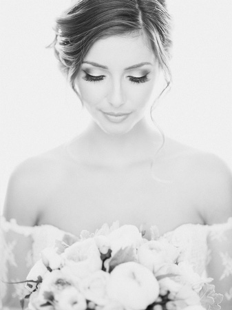
high key 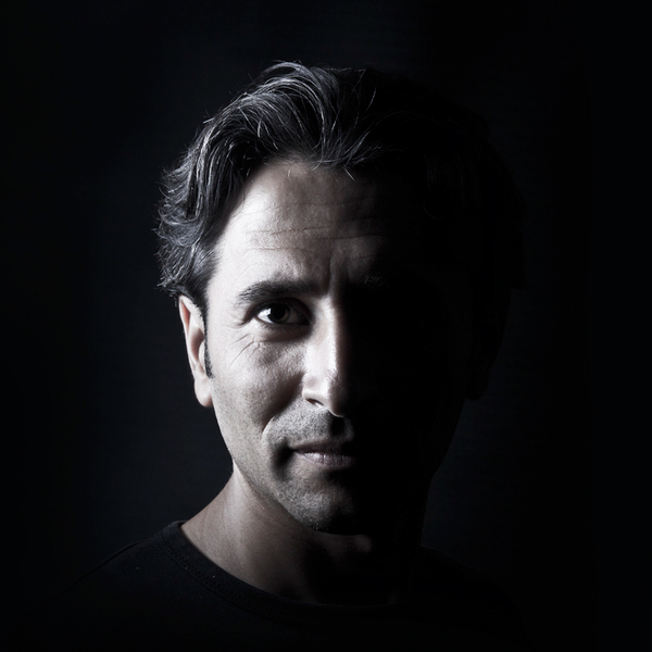
low key
urban landscapes outcomes and evaluation
Below are my favourite outcomes from the urban landscape project. I like how they were shot and how they have edited to enhance the photograph.
outcome one
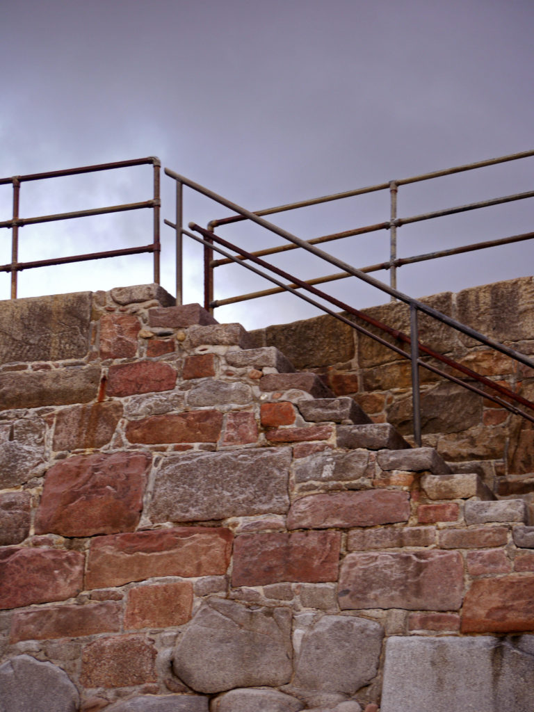
I chose this photograph as one of my favourite outcomes, because I like how the metal contrasts with grey sky. I also think the colour of the rocks is interesting and eye-catching. If I were to take this photograph again, I would try and get more of the sky into the photograph to improve the composition and balance the photograph out.
outcome two

I chose this photograph as one of my favourite outcomes, because I like the lettering on the tank and the way it stands out against the army green tank. The fencing adds dimension too, which I like. If I were to take this photograph again, I would try to centre the writing to make it more aesthetically pleasing.
outcome three
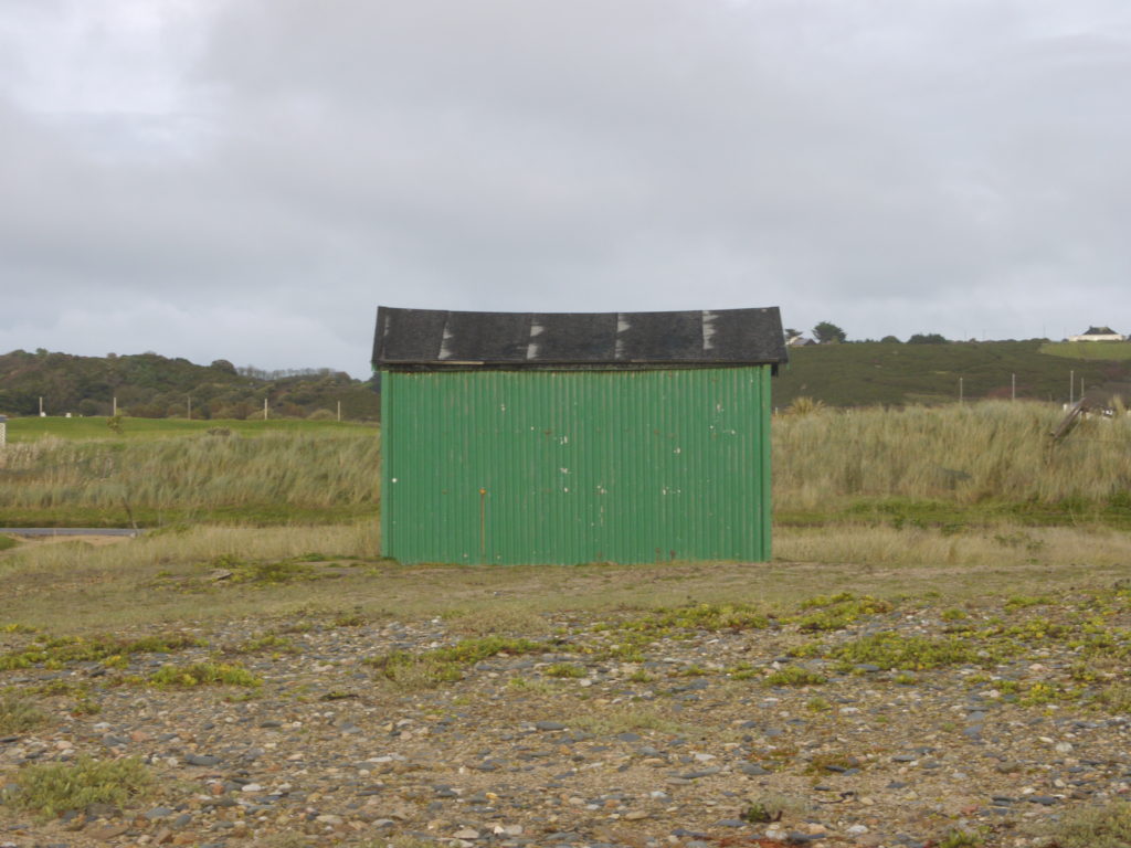
I chose this photograph as one of my favourite outcomes, because I like the simplicity of the shot. The composition is simple but effective as it is very easy to view. If I were to take this photograph again, I would try to centre the horizon line to get a balanced shot.
evaluation
I found that most of photographs that i took didnt turn out very well, because they were either too under or over exposed or they werent in focus. I also didnt think they fitted in with the urban landscape genre or were very interesting. I really enjoy the more simplistic shots that I took, because I like the way they look.
urban photographs – edited
Below are my edited images from both my urban landscape shoots. I have enhanced the photograph to make them more eye-catching and interesting.
photograph one

original 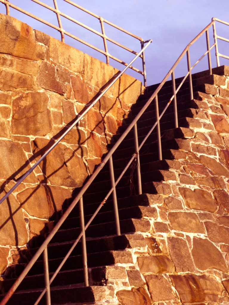
edited
I decided to enhance the contrast to make the shadows on the steps bolder and darker, to create harsher lines. I also found the original was very yellow, so I changed the colour levels, saturating the red, to make the rock more of an orange colour.
photograph two

original 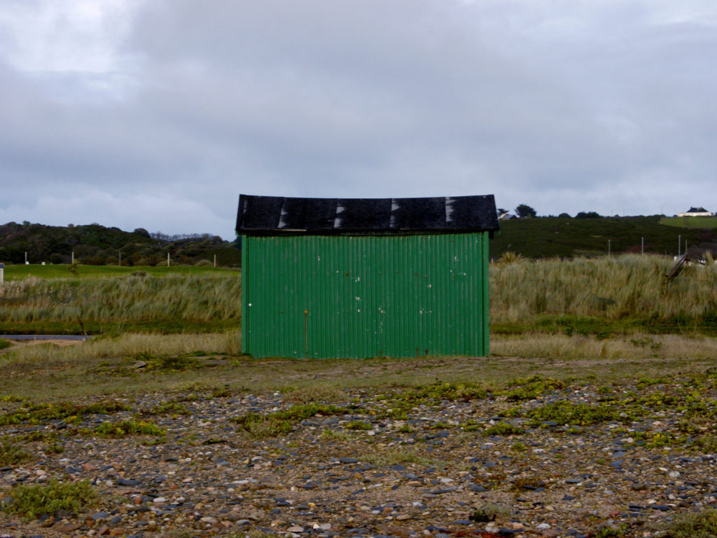
edited
I decided to only change the saturation, to make the shed more of a greener, meaning it would blend into the scenery. This idea kind of goes against the theme of urban landscapes, as I wanted to make it fit into the background and look natural, even though it was not.
photograph three

original 
edited
I decided to increase the contrast, to allow the structured metal fixtures to stand out on the grey skies, and be more of a promenant feature in the photograph. I also increased the saturation of the whole photograph to allow the rock to become more of a red colour and the sky to become more moody and slightly purple.
photograph four
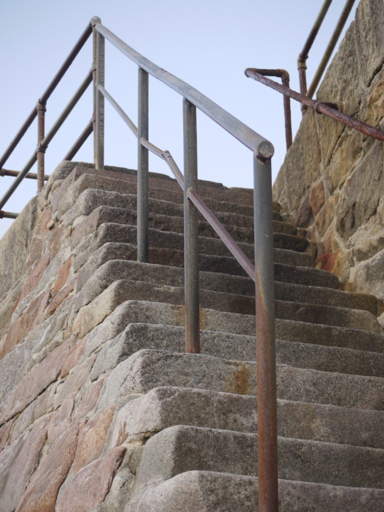
original 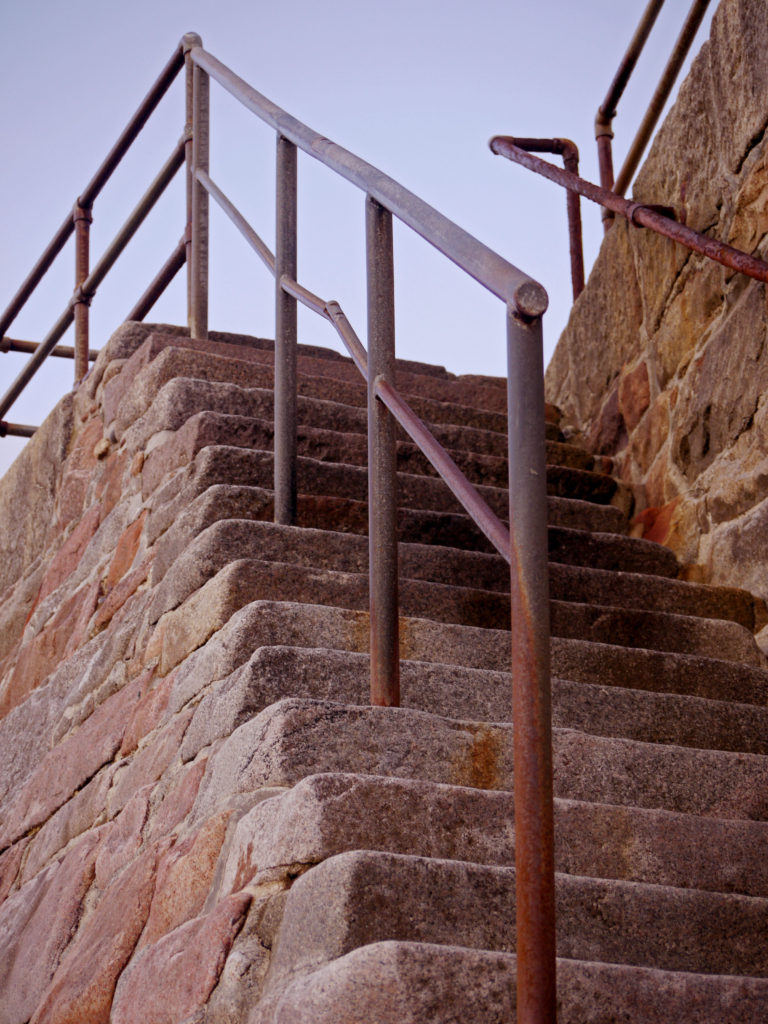
edited
All I did for this photograph was change the colour levels, and I increased the saturation for the red colour, allowing the rocks to become more of a red and orange colour. This allows the photograph to be more eye-catching.
photograph five

original 
edited
For this photograph, I increased the contrast, which meant that the blacks become darker. It also allowed for the mesh fence to stand out and be more visible.


