All posts by Emma Price

Filters

Author:
Category:

Contemporary Photographer- Shannon O’donnell

Shannon O’Donnell is a contemporary, documentary photographer. Her work focuses on modern issues, directly responding to the world and the immediate environment around her. She claims she has to be ‘hyper-aware’ when it comes to her work and she pays close attention to the news and events happening round the world to achieve this. O’Donnell incorporates history, media and photography together to create her work, which predominantly deconstructs gender binary. To O’Donnell, gender is a socially-constructed concept.
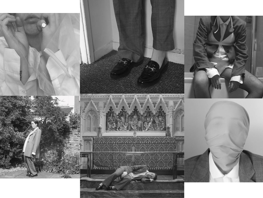
That’s not the way the river flows

O’Donnell’s inspirations

Claude Cahun:

As a previous student of Hautlieu, O’Donnell had been introduced to the politically charged work of Claude Cahun, who she claims is now a major influence on her work. In her own words, O’Donnell describes Cahun’s work as “strange” and was inspired by the way she presented the theme of rebellion through her ‘gender bending’ themes within her work.
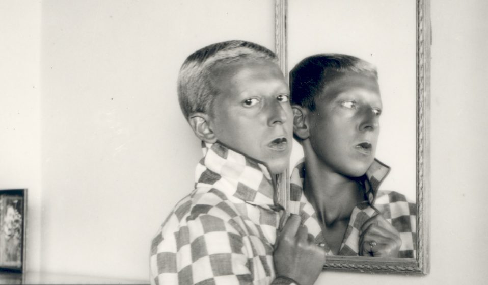
O’Donnell is fixated on the history of Cahun and how she wrote letters for the soldiers of WWII and placed them in their uniform, asking them to shoot their sergeants. This act was extremely rebellious.

Karl Marx:

Marx is another political inspiration for O’Donnell. She incorporates into her work the ideas brought about by the following quote:

The oppressed are allowed once every few years to decide which particular representatives of the oppressing class are to represent and repress them.

Karl Marx

Additionally, photographers Walter Pfeiffer, Adi Nes, and writer June Singer’s book on androgyny, ‘The opposites within’ have also majorly influenced O’Donnell’s work.

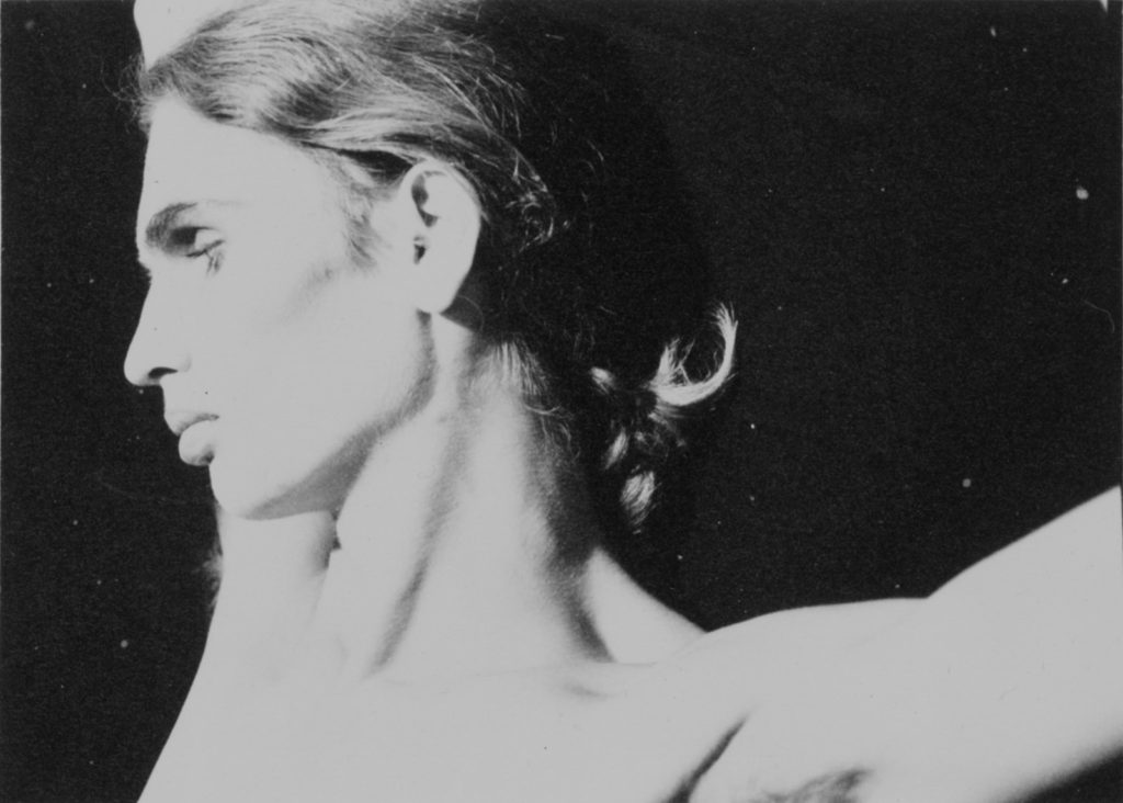
O’Donnell claims Pfeiffer’s work is ‘poetic’, capturing the true nature of his subjects as well as giving them control over how they want to present themselves to the camera and to the world.

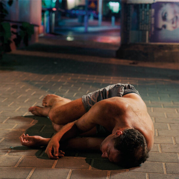
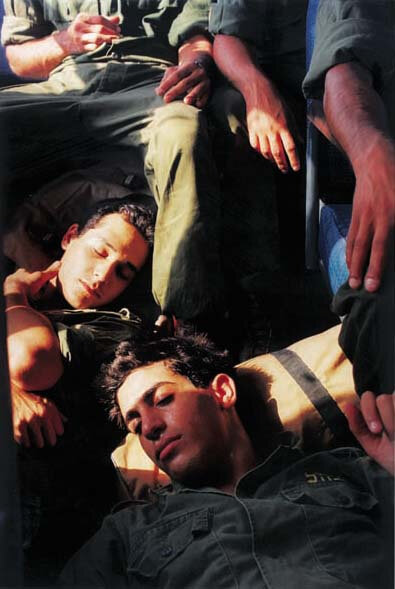
Adi Nes is an Israeli photographer who incorporates a mix of sexuality in his work, deconstructing masculinity as a concept. His use of soft lighting in his work inspired O’Donnell, as she viewed it as juxtaposing the harshness and boldness of manhood. His images are highly staged, often based on parables and cultural memory. His work resembles that of renaissance paintings. Additionally, sexual tension is present in his work as he explores the ideas of homosexuality.

O’Donnell’s work

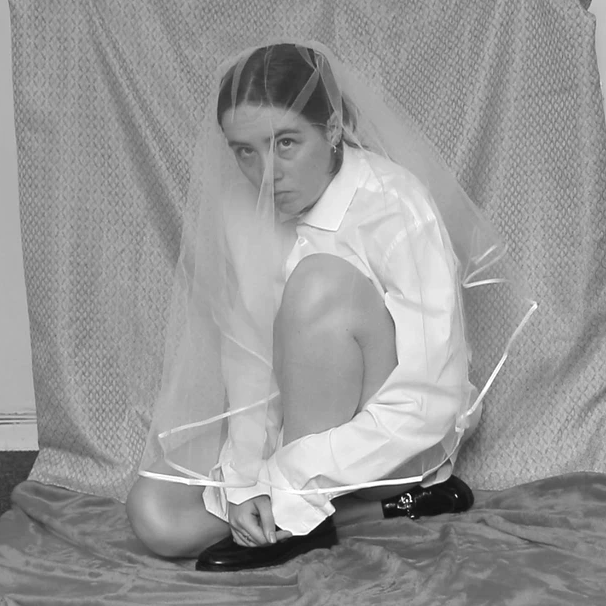
Her earliest work, ‘Shrinking Violet’ is based on the role of her mother within her household and workplace. She claims it’s ‘mocking the traditional roles of women’. This piece of work particular shows a criticism of the traditionally patriarchal society we live in and her work clearly reflects a protest against this.
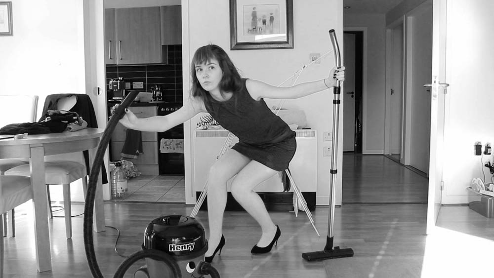
Shrinking violet

O’Donnell then progressed with her work, producing ‘Abort Mission’, ‘By your bedside’ and ‘The Cat and the Mice’ in 2018. ‘Abort Mission‘ addresses the culture wars between religion and abortion. O’Donnell was inspired to make this as she came across anti-abortion protesters praying outside of an abortion clinic, claiming that their protesting was relevant and important to their religion. Intrigued by this, O’Donnell read through the bible and researched the church, in turn finding no evidence of abortion being ‘wrong’. For her work, she added a sense of focus towards the church as well as inspecting how society view women.
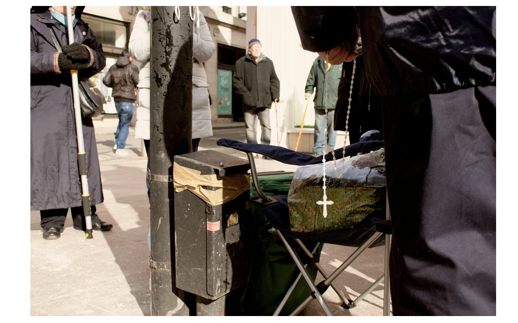
Abort Mission

The Cat and the Mice‘ is a clearly political project and highly important to O’Donnell’s work. It focuses on the Suffragettes, who carried out acts of violence in response to the extreme patriarchy they lived in. The movement was started by middle class women for women’s suffrage and particularly for their right to vote. In order to get in front of the newspapers, the suffragettes felt they had to be ‘militant’. They were considered as terrorists by society, as well as being mocked. A main story that inspired O’Donnell was about the suffragette who jumped in front of the King’s horse in an attempt to attach a flag to it during a live television broadcast. Unfortunately, the act resulted in a horrific accident that was broadcast live, clearly showing the desperation these women had for freedom. Her project is named after the Cat and Mouse act, aimed at the militant suffragettes who went on hunger strike during their imprisonment.
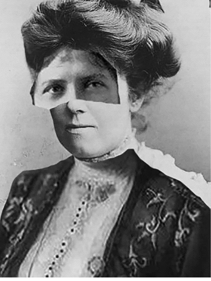
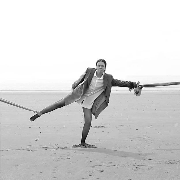
Finally, her film project ‘That’s not the way the river flows from 2019 encapsulates the ambiguity of gender and masculinity. In this short film she questions her own gender identity, whether she is defined primarily by being a woman, rather than how she is as a person.

The film is made using what she refers to as ‘moving stills’. O’Donnell also wrote her own poem about society’s strict binary of male and female as a voice over for the film. The stills for her project are taken from these ‘moving stills’. In the video, she can be pictured wearing a suit (strictly male connotations) as well as mixing and incorporating female elements, such as heels, fishnet stockings and bras etc.

Her photography process

O’Donnell states that her audience is primarly aimed towards herself and that she works only for her own personal gain. Anyone else who resonates with her work is a bonus. Her process involves ‘performing’ for the camera.

  1. She sets up her tripod with her camera and starts to record.
  2. She then carries out a performance in the nature of her work (i.e. male, female, etc). O’Donnell claims that this is the ‘theoretical underpinning’ of her work.
  3. She then imports the video into Premiere, and takes stills from the video here.

The process removes the staged and unnatural feel of photo-shoots and allows more fluidity in her photographing process, in turn also giving her more flexibility in capturing the images she wants.

Photo Analysis
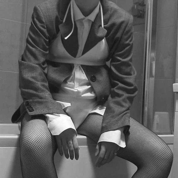
This image in particular presents O’Donnells personal issue with gender identity. Taken from the project ‘That’s not the way the river flows’, O’Donnell explores the social construct of gender binary, deconstructing it and questioning whether her own identity is entirely defined by being ‘female’.

The photo is set in what looks like a private bathroom in someone’s house. The setting itself amplifies the personal struggle O’Donnell is experiencing as a bathroom is easily lockable, small, private and enclosed. It has limited distractions and can possibly be comforting for the subject to access her own thoughts in. Additionally the lighting is fairly bright, showcasing the reality of O’Donnell’s existence and highlighting her outfit clearly. Though, the image is presented in black and white. The monochromatic effect of the image allows for a sharp focus on the subject.

The clothing she wears is obviously stereotypical. The first thing you notice when you look at the image is the bikini. Bikinis have female connotations, and so it initially shows the gender of the subject. However, this is juxtaposed by the suit it’s layered on top of. The blazer and shirt is associated with male clothing. Additionally, O’Donnell is seen wearing a signet ring (predominantly male) and fishnet stockings (predominantly female). This outfit choice is messy and contradictory, clearly showing the desperate nature of the subject trying to understand her identity. Possibly, she is criticising society by posing the question as to why these items of clothing are stereotyped to be male or female in the first place.

The positioning of subject is hunched. She also has limp arms resting upon her legs. This body language signifies a defeat after an internal struggle or effort to get free of social restraint and constriction. She looks as though she is sat in exhaustion.The theme of identity (or lack thereof) is prevalent in this image as her face has not been included, implies a struggle with a personal definition of herself.

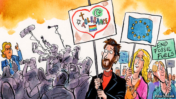
IDENTITY POLITICS AND CULTURE WARS

Identity politics: A political approach whereby people of a particular religion, race, social background, class or other identifying factor (usually minorities) follow and support political movements that share this quality with them

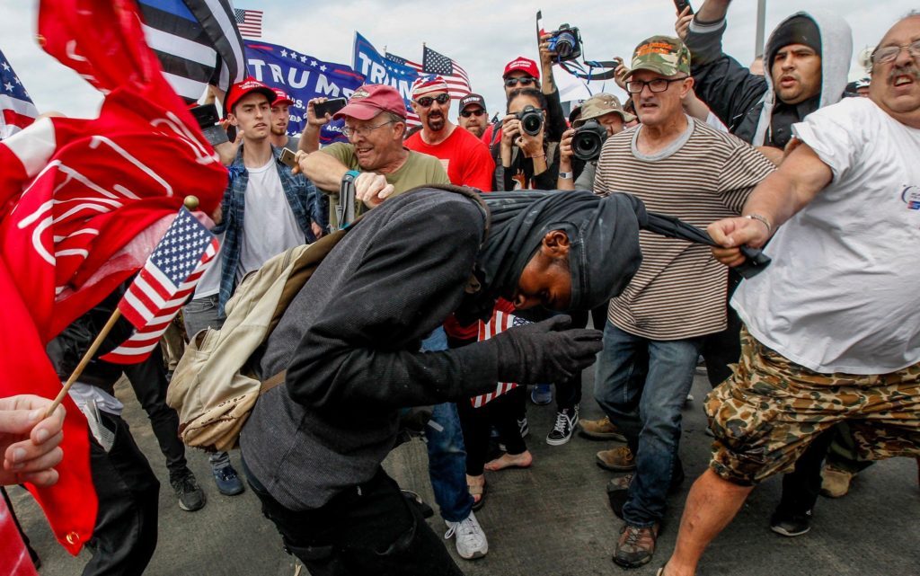
Culture wars: Cultural conflicts between social groups and the struggle for dominance of their values, beliefs, and practices.

Examples of culture wars: For example, the clash between gay marriage advocates and conservative religious groups in the United States is a major culture war.

Similarly, the conflict between religion (pro-life) and abortion advocates is another culture war.

Positive impacts of groups harnessing their identity and views:

Identity politics and the privilege lens have many good effects.  They have made students more sensitive and attuned to each other, and attuned to structural discrimination and bias issues.  Students, teachers, and politicians who use the privilege lens are less likely to trade in generalizations and stereotypes of marginalized groups (although they may trade in stereotypes of dominant groups).  Because of these lenses, many do a better job creating atmospheres that are inclusive to individuals of a wide range of identity groups that have been marginalized or excluded from important conversations.  These effects have been important for a broadened perspective in our academic discourse.

Negative Impacts of identity politics:

Identity politics is now affecting our daily language. For example, following Britain and USA’s issues with immigration, the use of the term ‘migrant’ has become politically charged with negative connotations and has turned into a discriminatory and unfair title used against those seeking refuge. These connotations equate migrants with threats and fuel xenophobia, also leading to racism against British or American citizens that identify as the same race as these migrants or look similar to them.

Global culture wars

In America, the war between reversing climate change and maintaining the economy has caused extreme conflict within their society.

https://www.japantimes.co.jp/opinion/2020/01/24/commentary/world-commentary/climate-change-global-culture-war/

Additionally, Russia has a major culture war between same-sex married couples and more ‘traditional’ heterosexual couples. Russia’s tyrannt dictator, Putin, has removed same sex couple of their right to adopt children.

https://www.firstthings.com/article/2014/04/global-culture-wars

Photozine evaluation

I am thoroughly satisfied with the contrast between urban and natural landscapes. I’m happy with the connotations surrounding each landscape. Dedicating the natural landscapes to one subject and the urban landscapes to the other shows the contrast between both of my subject’s personalities: the first subject can be viewed as free-spirited and whimsical by the audience due to the sublime nature of natural landscapes and the the second subject comes across as more calm and self-contained as urban landscapes often connote feelings of security and sense of community.

A major issue with my photo-book is that I used two subjects instead of the three I had planned. Only using two subject implies a link between the two, having three subjects would have clearly shown the pattern within the zine in regard to the placement of the images. This proved to destroy the narrative I aimed to create. Additionally, a lack of a clear colour scheme throughout proved to hinder the effectiveness of my zine. Mixing black and white images with coloured images ended up fracturing the narrative of the book. However, the idea behind my photo-zine allowed for the exhibition of still life, portraits as well as landscape photography. This gave me the opportunity to showcase different skills and photograph at different times of day, in different lighting etc.

Another successful aspect of my photo-zine the clear division between my two subjects through the use of the middle page. I decided I wanted the psychological sheets to be present here to keep the first half of the book completely separate from the second half of the book.

Something I aim to consider for the next project is how the final result will appear to someone who has never seen the work before and has no knowledge of the context and ideas behind it. If I was to do this photo-book again I would incorporate the idea of closeness more thoroughly. For example, I may create a link between the two subjects within my book, such as meeting at a workplace/party/public place etc. to link the idea that proximity and frequent encounters are major influences on whether two people build a relationship. This may have worked better than attempting to show the significance of these individuals to me. Additionally, I could have considered taking self portraits and including myself in the narrative.

Photozine design

Placing the portraits:

Draft One

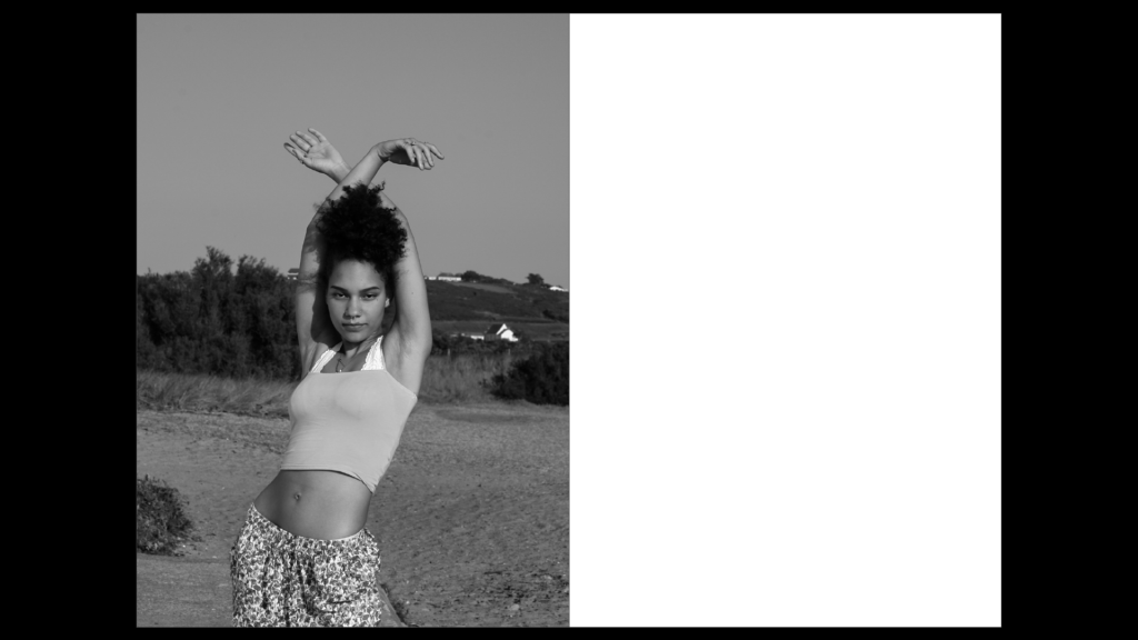
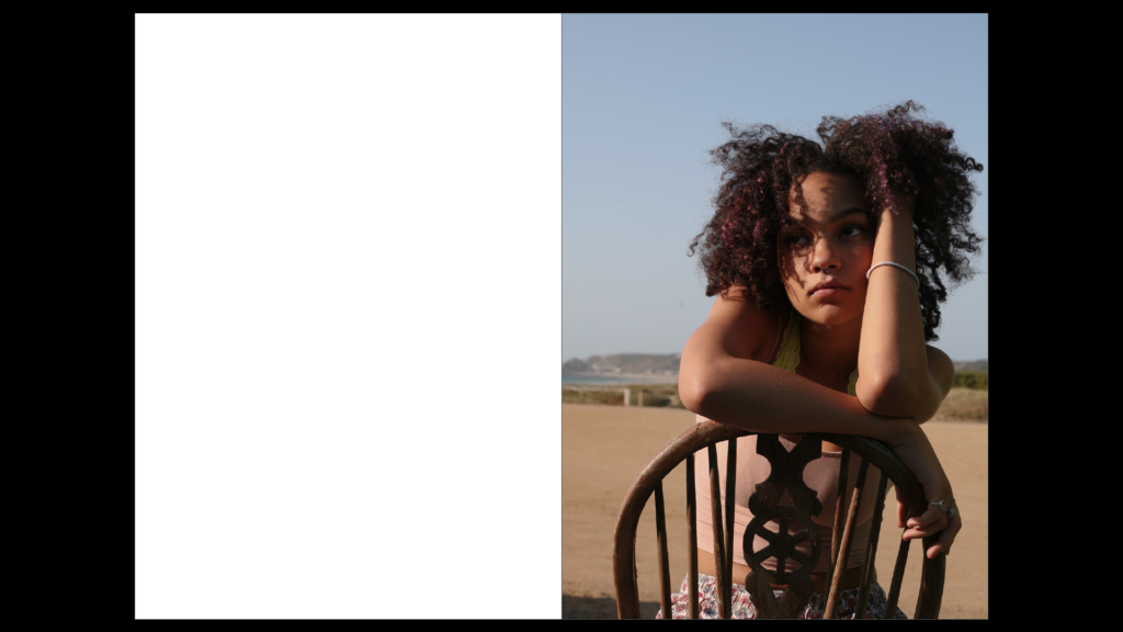
As a first draft, I aimed to place the full body portraits in the beginning as it’s the first impression of my subject that the audience sees. When you see someone for the first time, it usually tends to be from a distance, so I aimed to capture this by placing these images first for each of my subjects. By choosing the image to be black and white, it represents the lack of knowledge the audience knows about the subject: they are not in close proxemity, they don’t see them in full colour and they cannot see them in great detail. My intention for this was to spark interest about the subject to the audience. To amplify this ‘first impression’, I placed the portrait on the first page of the zine.

As you turn the page, I’ve positioned the half-body portrait on the right hand page. This immediately closens the proxemity between the audience and the subject. Choosing a half-body portrait for this page amplifies this idea of getting to know someone more intimately. Additionally, the introduction of colour allows the audience to see the person in more detail with the physical closeness leading to my idea of ‘interpersonal attraction’.

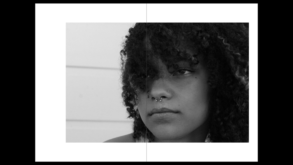
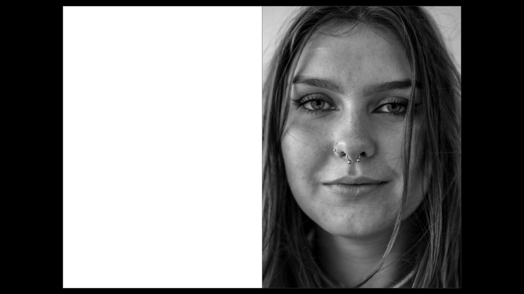
To place the head-shot, I experimented with having the portrait covering a double page spread. The image is the most intimate, the most detailed and shows the subject’s comfort with the camera.

Draft Two

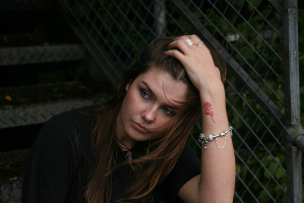
Having gained more images to work with, I experimented with my second case study, finally deciding on the positioning of all my portraits for the zine. I kept the plan of the full body portrait being the first image they see and kept the positioning of this. However, I didn’t feel that having the image in black and white was necessary- as the first impression you have of someone in real life wouldn’t be without colour.

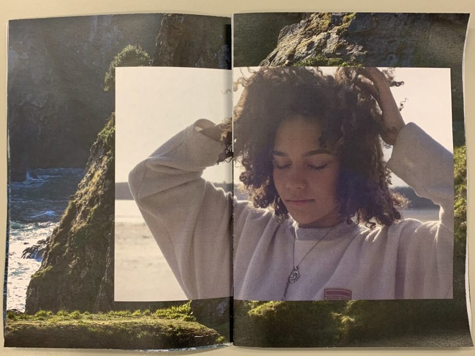
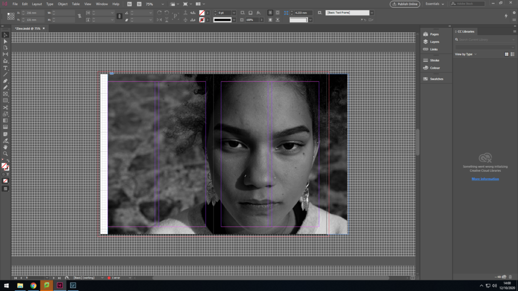
I then decided that I would keep the second portrait on the right hand side of the zine (for the immediate closening of proxemity) but I wanted to have the image come across two pages- As I wanted to place the location my subject felt sentimentality towards surrounding this.

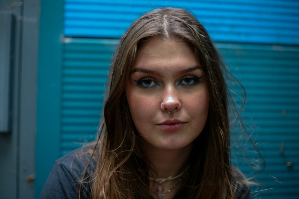
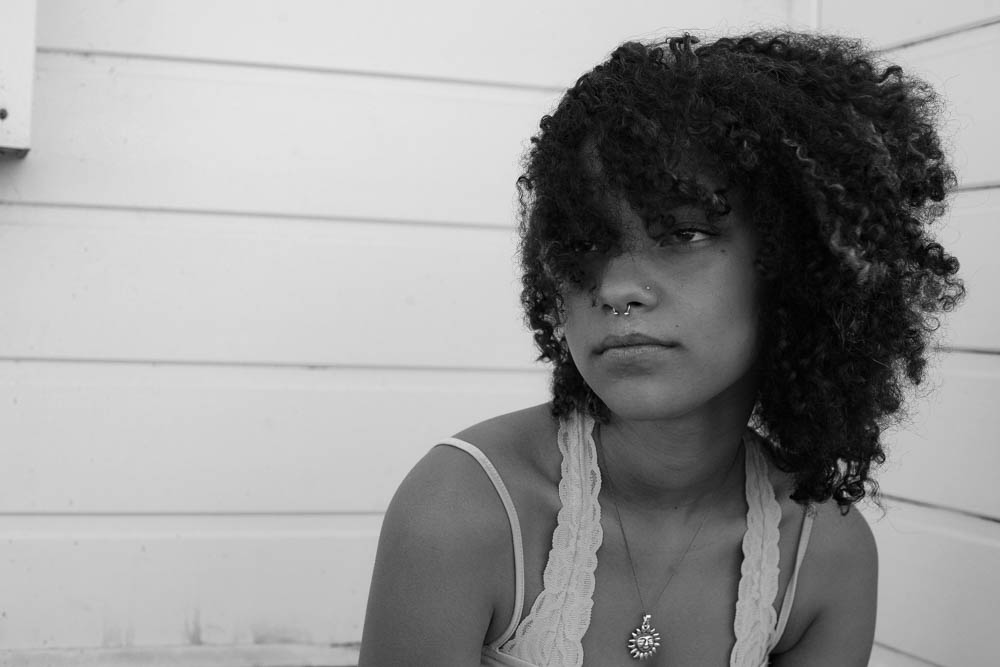
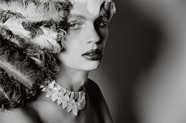
I finally chose that the head-shot should also be on the right side of the zine, again causing an immediate effect when turning the pages. My decision for black and white for this image was to capture the details of my subjects face, rather than the focus being on the colours of the image. Furthermore, having the subject make direct eye contact with the camera redirects this idea of comfort towards the audience.

Final placement of portraits

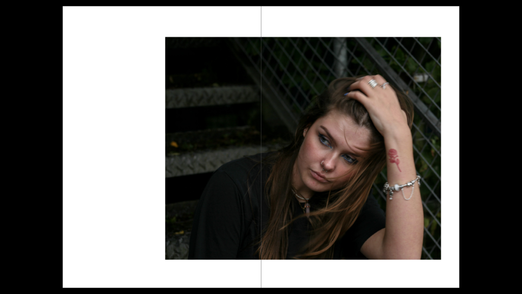
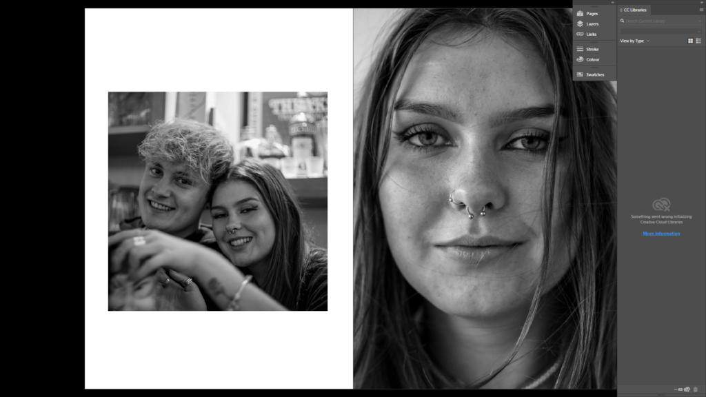
I was unhappy with the placement of some images within my zine, and so, after taking another photoshoot, I replaced a few images within my zine. These are pictured below. Additionally, I inserted images of people my subject’s cherish.

I experimented with this portrait taking up two pages. I found that it became a very strong image by doing this, although it seemed to ruin the design of my photobook as a whole, as it stood out as an anomaly

Placement of locations:

Draft One

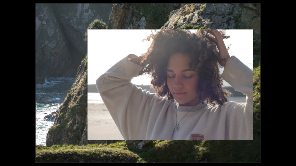
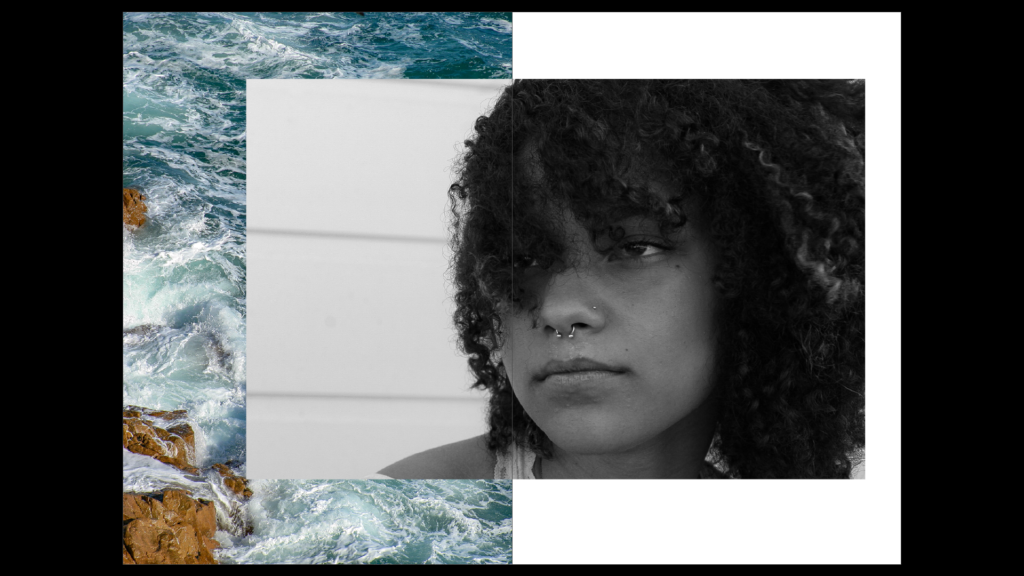
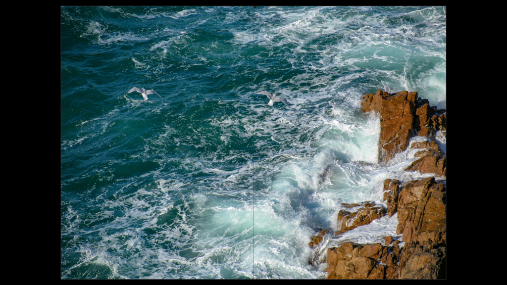
I experimented with the placement of this coastal image. Initially, I flipped the photo horizontally, placing a portrait on top of it. In this first draft, the photo only took up half the page. I later decided that the photo was a better candidate for taking up a full, double-page spread. I decided that this double page photo would be placed before any portraits as a sort of ‘setting’.

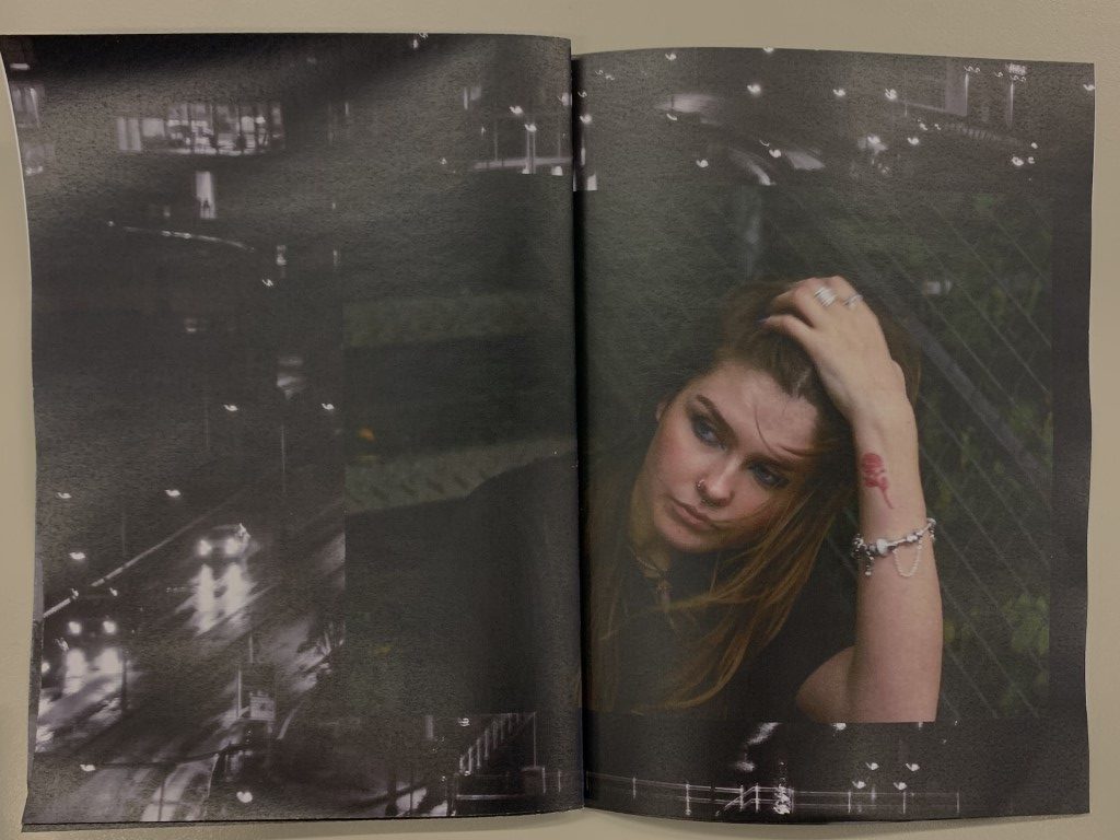
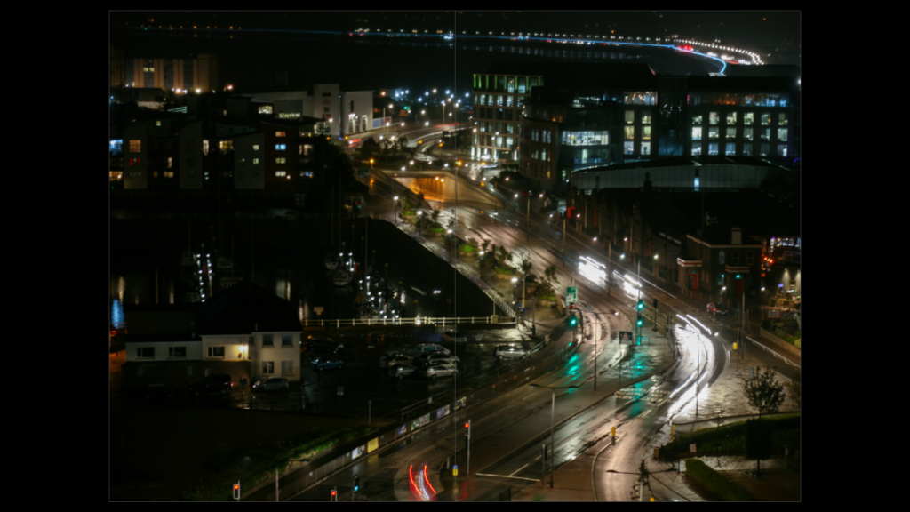
I did the same with my second case study. I took an urban landscape photograph and placed it over a double spread before any portraits of my subject could be seen.

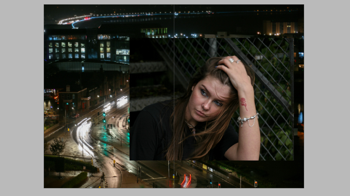
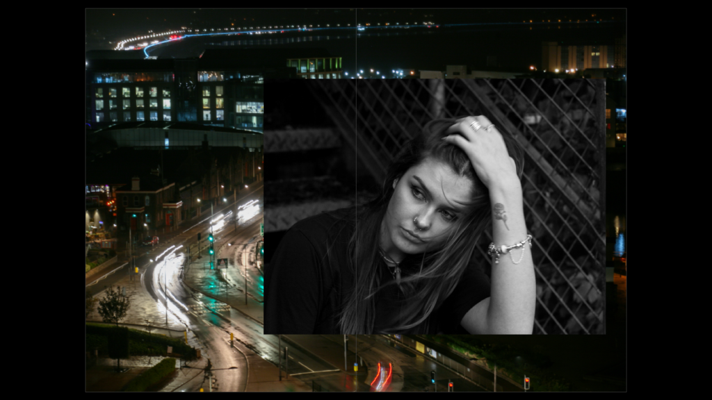
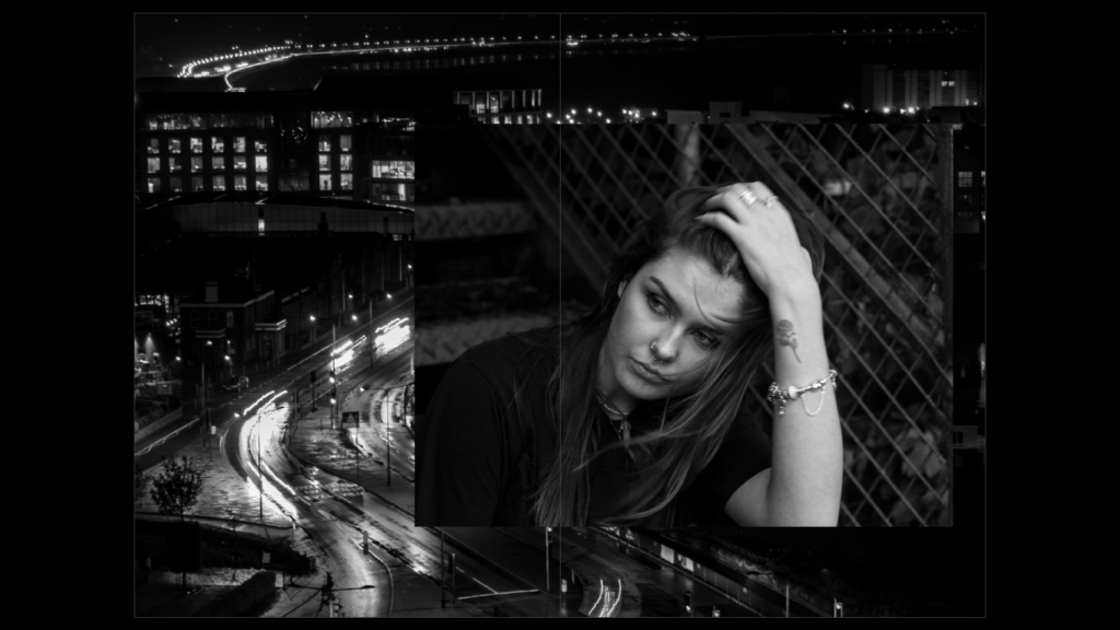
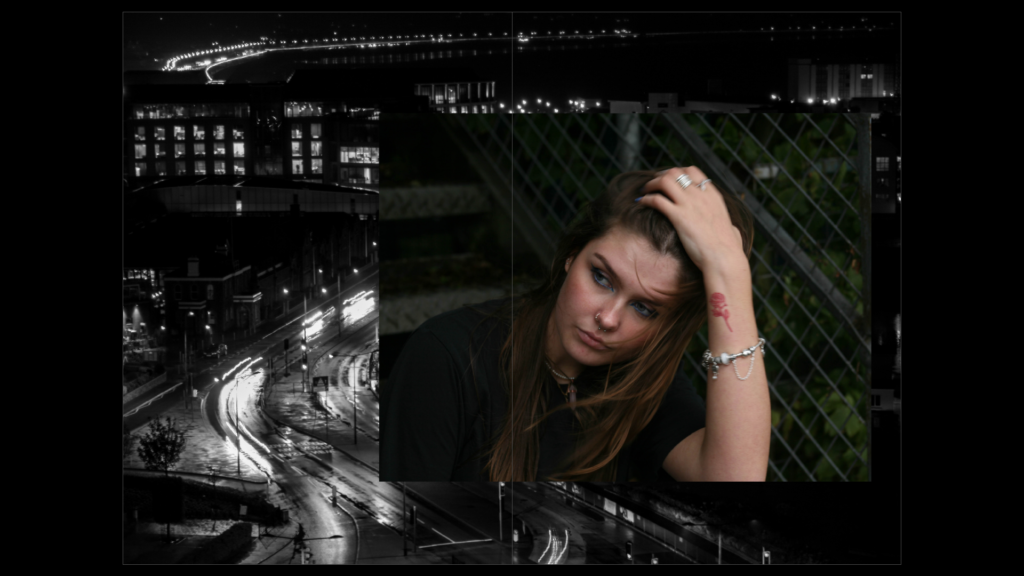
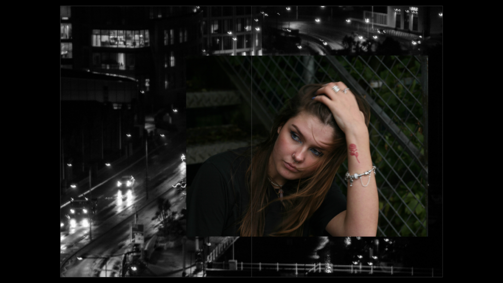
I liked the idea, however, of overlapping the portrait over a landscape photo. I experimented with black and white versions of each image, placing them against colour versions of the other. I finally decided that the most successful positioning was the ((coloured portrait over the black and white landscape)). I didn’t have an issue with removing colour from the landscape, as I had already shown a similar area in colour over a double page spread. so, this had no effect on how my audience would see the photo.

Draft Two

I was unhappy with the landscape I used within my zine, so I moved the positioning of the photo, allowing the image to take up a double page spread. I then used a different black and white image to place behind the portrait.

Placement of their passions/things they love

Draft One

Draft Two

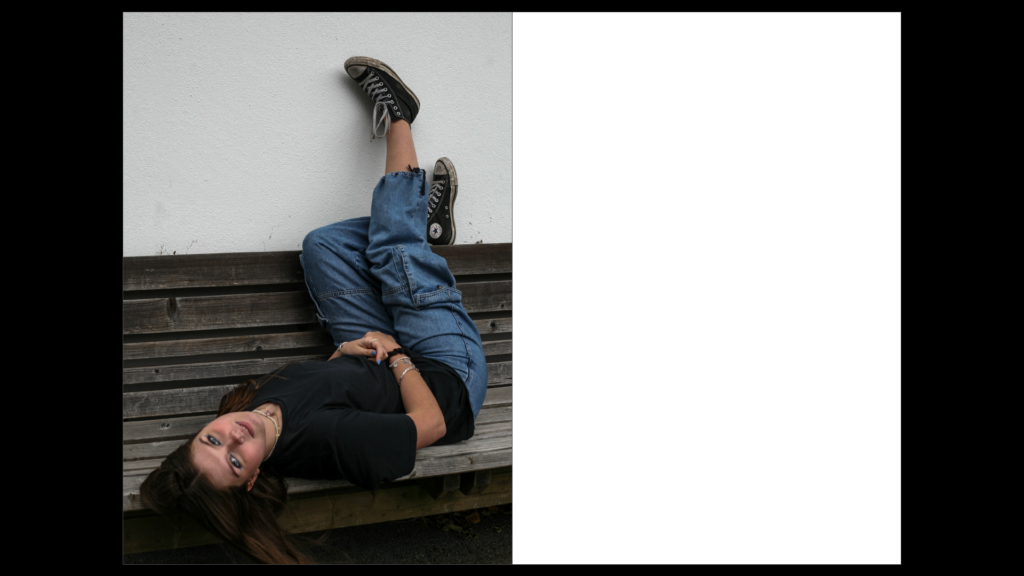
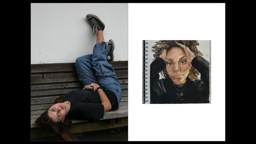
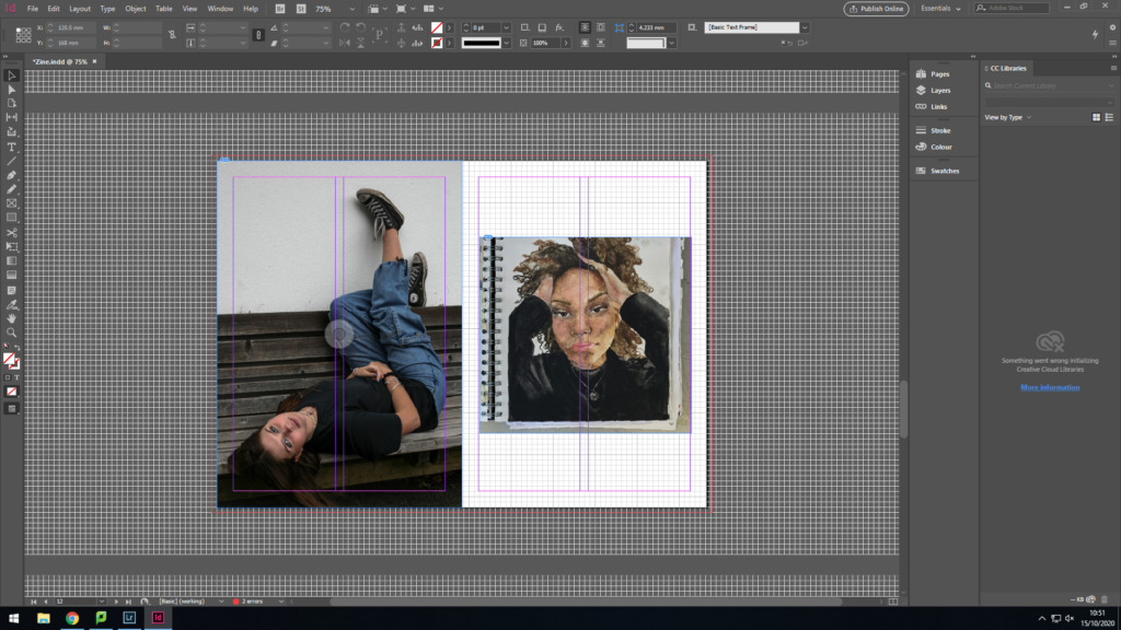
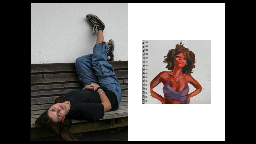
Unhappy with the colour contrast between the two images, I finally decided ona piece of art that matched the colours within the portrait. The browns of the artwork matched that of the bench and the black within the artwork matched the black clothing of my subject.

Draft 3

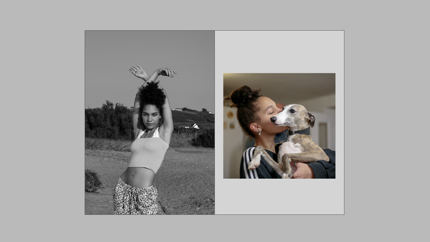
When placing my subject’s passion, I decided to use an image of their pet to show the caring nature and the passion my subject has for nurturing animals. The image had many neutral tones, which I felt fit well next to the monochromatic image. The subject is clearly behind the dog and so the main focus is on the animal itself.

Final Design

Inserts:

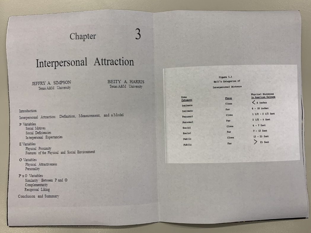
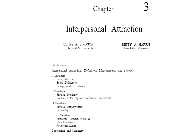
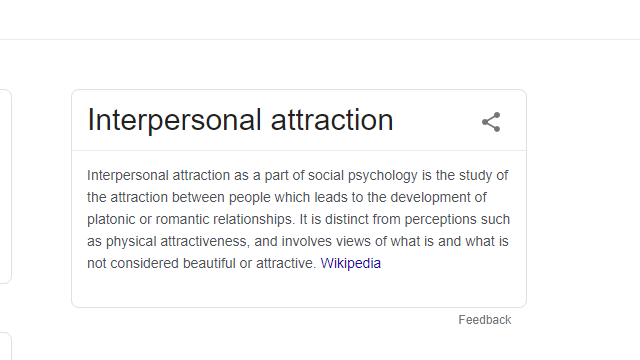
To further this idea of interpersonal attraction, I researched and found psychological experiments and results that are abstract without context but reflect this idea.

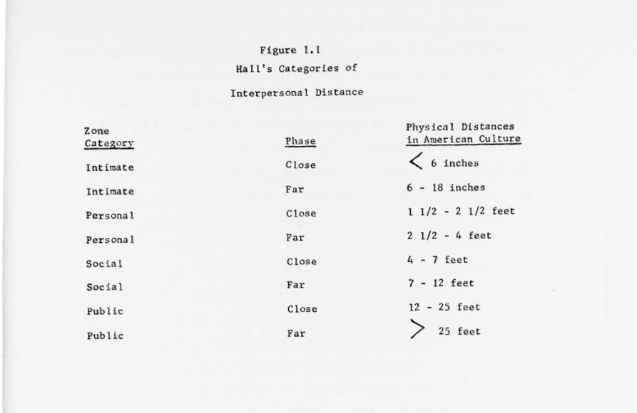
The image pictured above shows the idea of closeness (in intimate situations) being less than 6 inches (Similar to the head-shots within my case studies). Additionally, it shows that in public, the idea of closeness is 12-25 feet which is similar to the first images my audiences sees within my zine- the full-body portraits. This ‘closeness’ implies the likelihood of interpersonal attraction taking place, which I wanted to present throughout my zine.

Naming the Zine

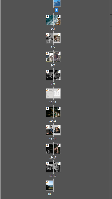
The Propinquity of Interpersonal attraction

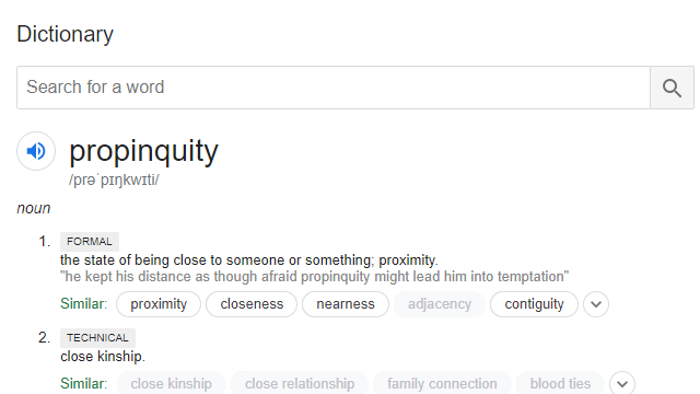
The process of how I came to develop this name stems from the idea of closeness throughout the development of my zine. I aimed to show how proximity (or propinquity) plays a part in getting to know someone more intimately.

Psychologists argue that frequently encountering someone and the proximity between two people can be fundamental in the process of developing strong relationships with individuals. The more people come into contact with one another, the more likely the interaction will cultivate a relationship.

By forming these ‘case-studies’, I’ve been able to present my subjects so that the audience encounters them multiple times, alongside places and things they associate themselves with.

Designing the cover

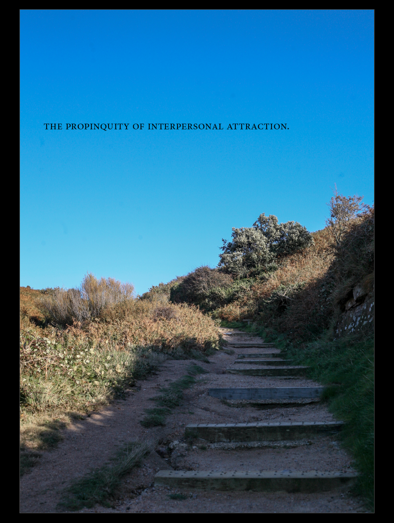
I aimed for the words in the title to be spaced closely to one another to amplify this idea of closeness.

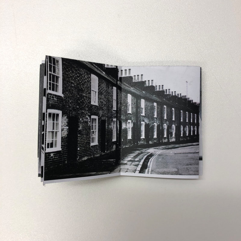
The image incorporates both man-made and natural aspects. The man-made alteration to the landscape is present in the steps, and the theme of urban landscapes can be seen in the latter half of the book. Additionally, natural landscapes can be seen in the first half of the book within my first case study. Incorporating both of these aspects allows me to link the two case studies together. Placing the title in the negative space of the image allows the the audience’s focus to be easily shifted towards it. The placement within the negative space creates a ‘spot’, to which the audience can return to.

Additionally, the staircase has no definite end and so the image becomes ambiguous. The lack of clarity as to where the pathway finishes implies a sort of ‘journey’. One which the audience will take with each case study or which the case studies take with one another.

Photozine- Case Study 2

Selection Process

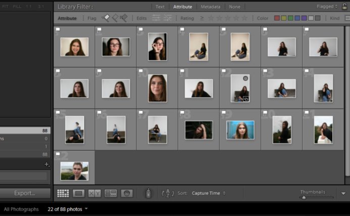
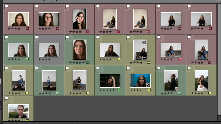
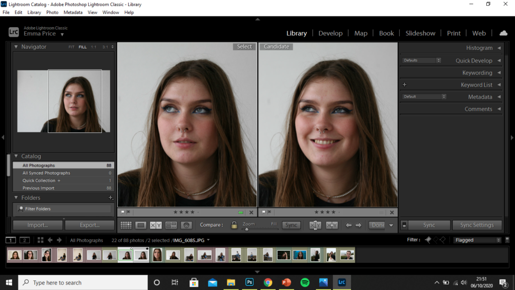
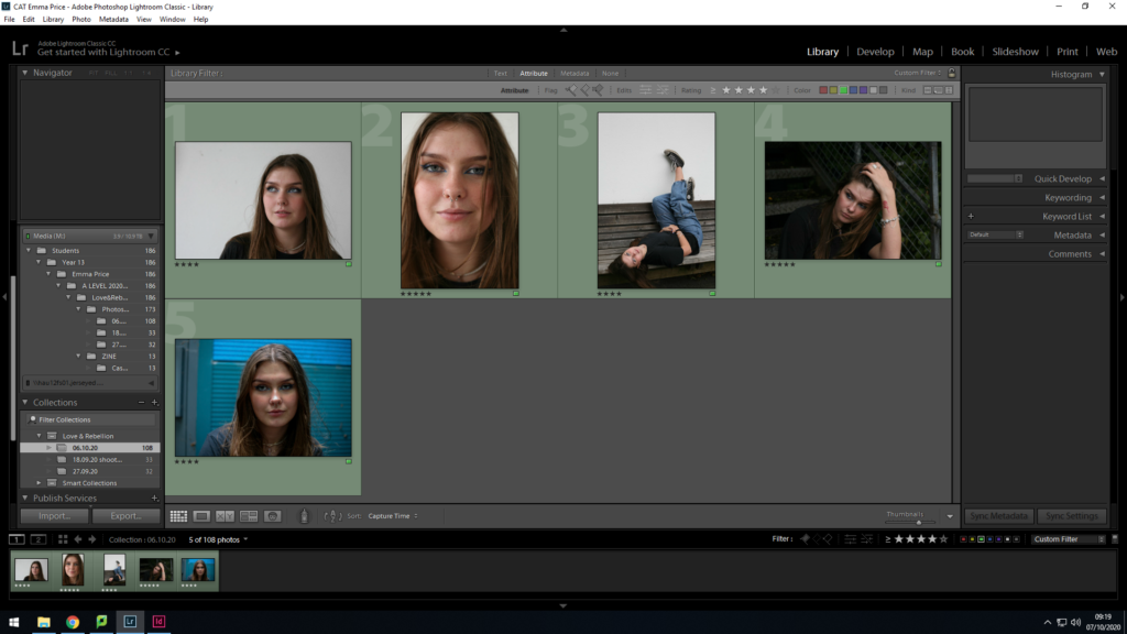
Out of the 88 photos, I made the first edit of 22 images which I felt were the most successful candidates for my zine.

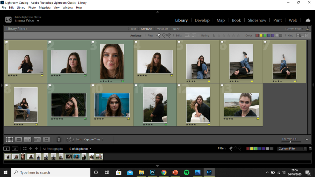
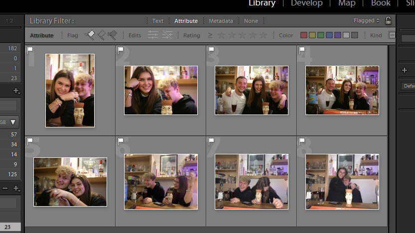
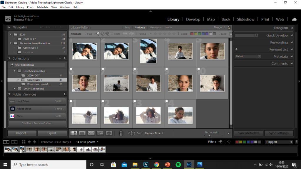
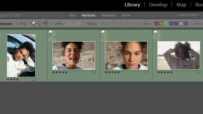
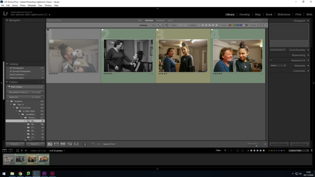
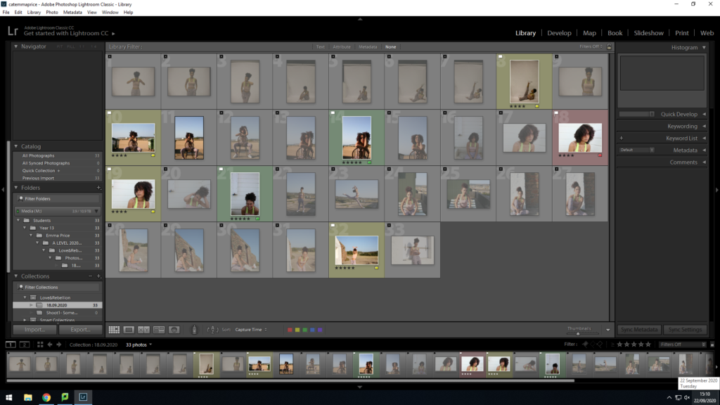
I then used the rating system of 4 stars if I’m unsure about and image and 5 stars if I’m completely certain about using it. Having rated each image I then colour co-ordinated accordingly. I used green for the images I rated with 5 stars, yellow for those I rated with 4 stars and red for those I felt weren’t good images for my zine.

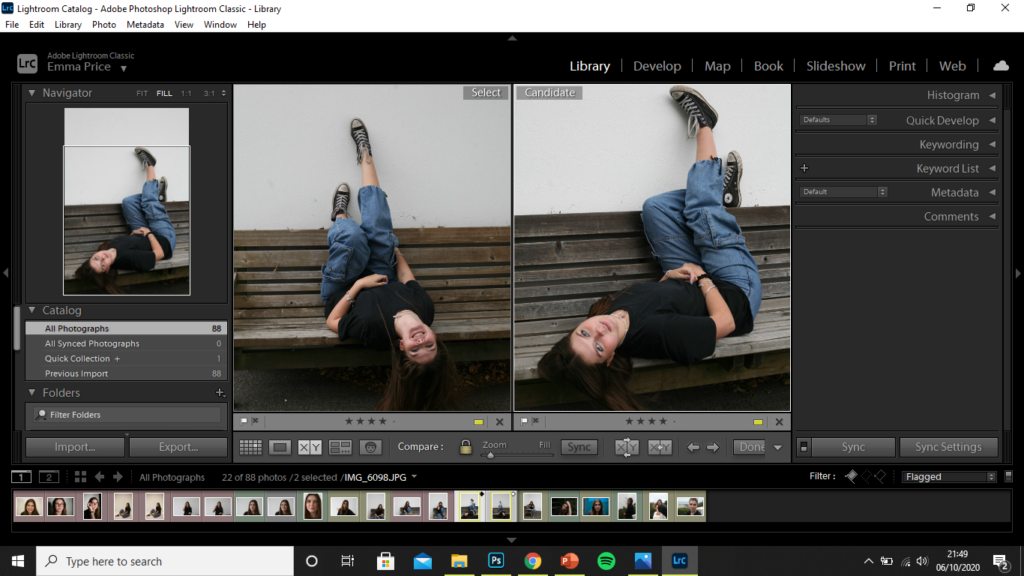
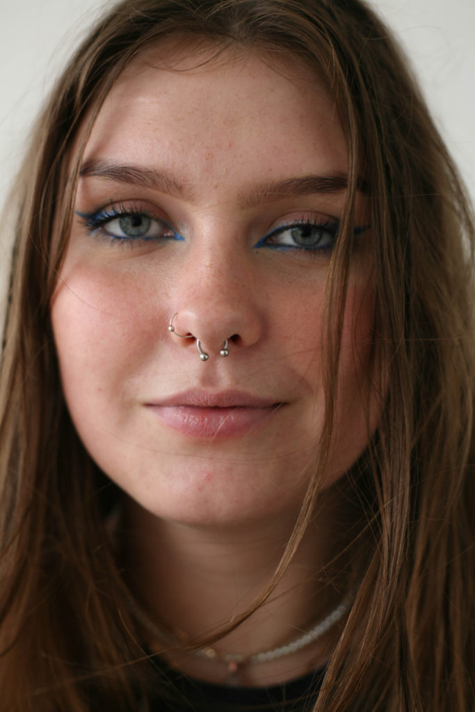
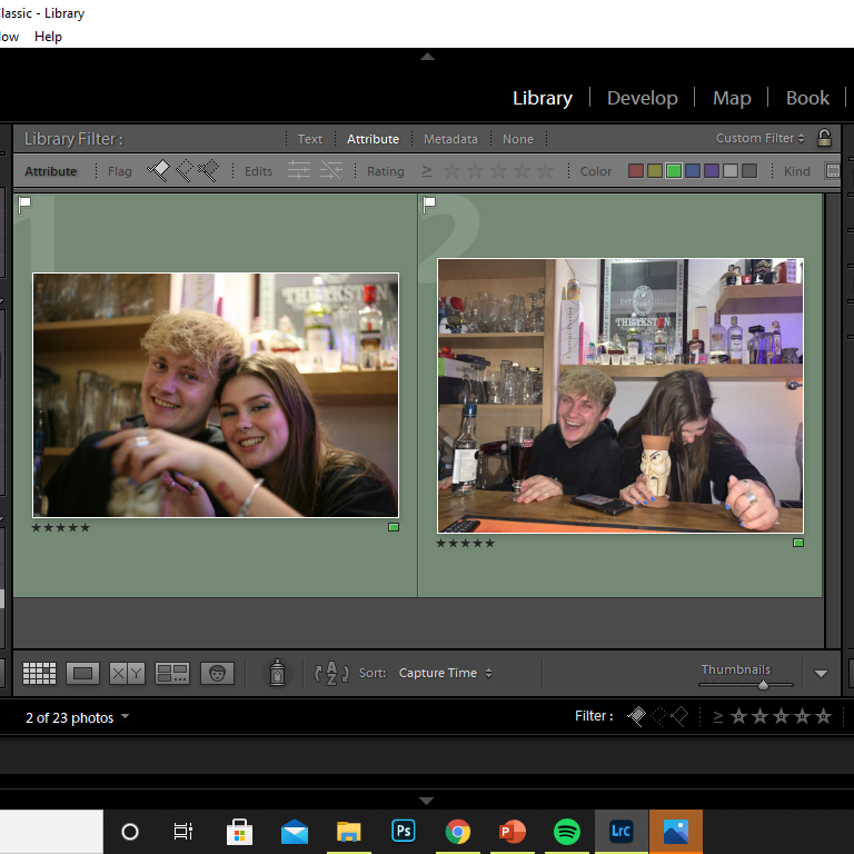
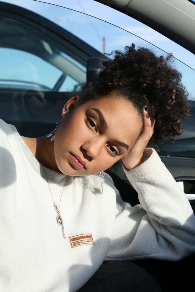
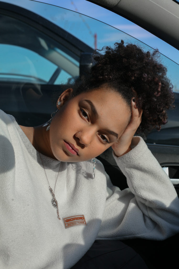
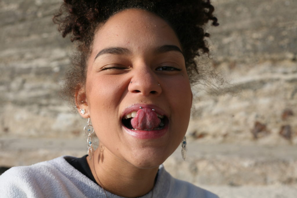
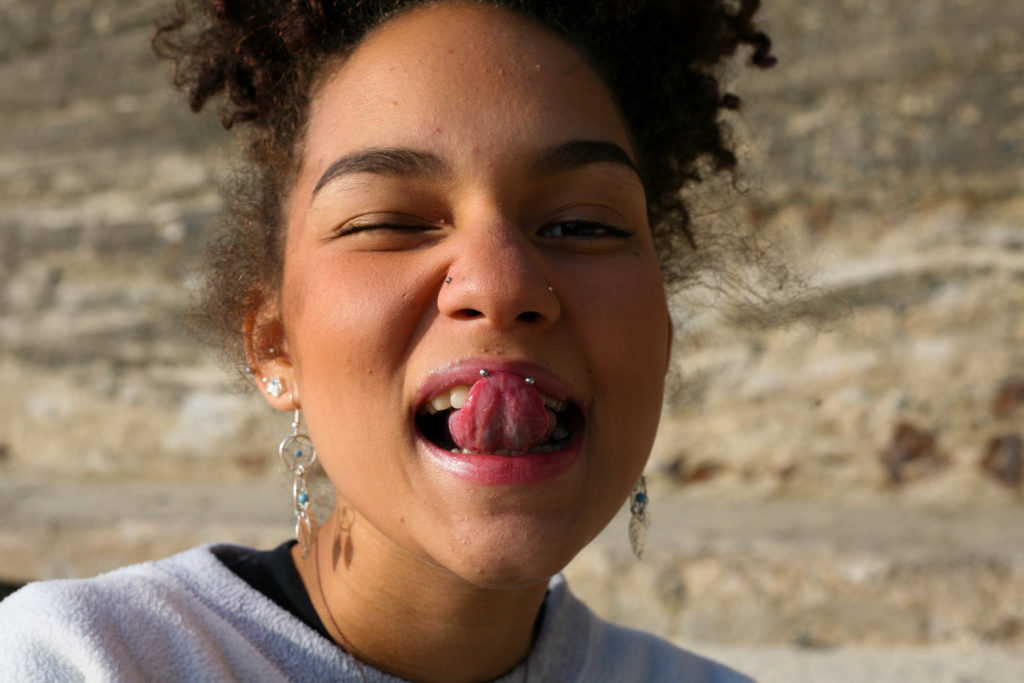
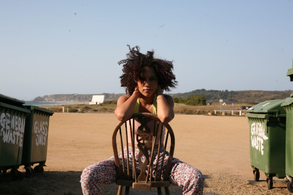
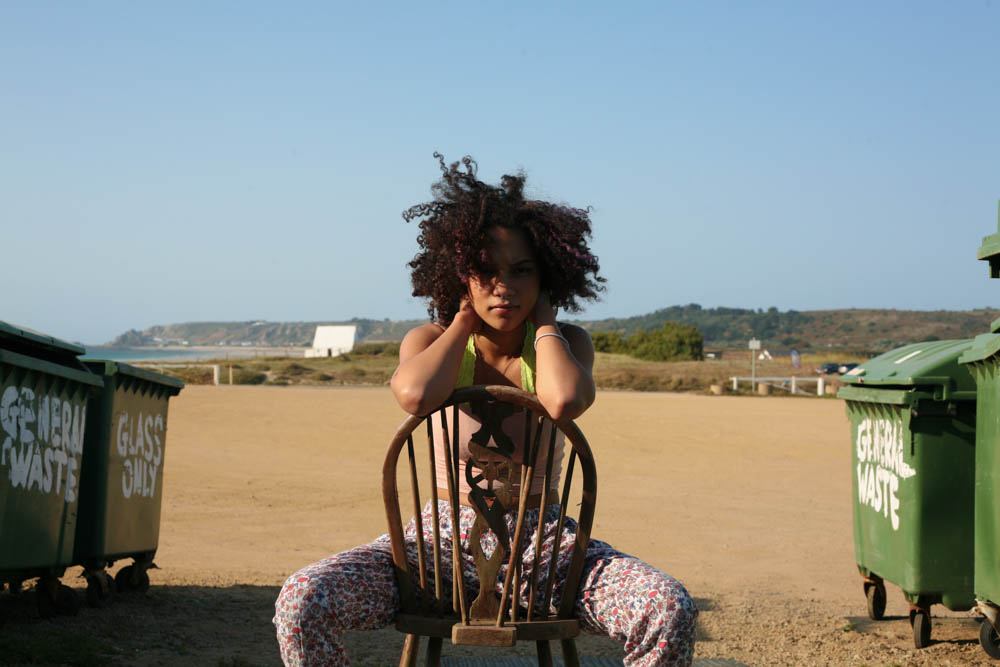
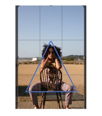
To filter through the images I used the colour-label of yellow for, I used the ‘X|Y’ tool, to compare similar images with one another. (I concluded that the image on the right was a better photo as the subject took up a larger proportion of the frame, improving the composition of the image. Her face is also more clearly defined and the position of the subject creates a triangular shape, leading the audience’s eyes around the image.)

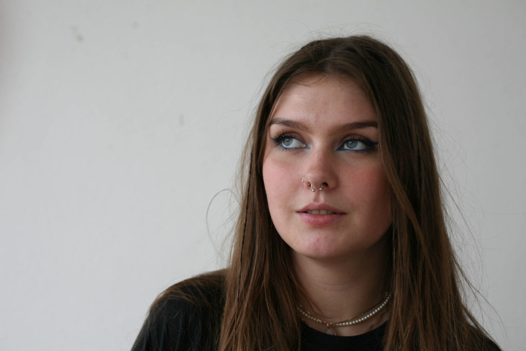
The image I decided on for the zine out of these two photographs was the image on the left. The photo is candid, capturing the subject unaware, whereas the image on the right seems forced and the subject looks uncomfortable. There is no engagement with the camera in the photo on the right and so, I feel as though it wasn’t as successful of an image. Additionally, the image on the left is a higher clarity image.

Final Selection.

Editing Process

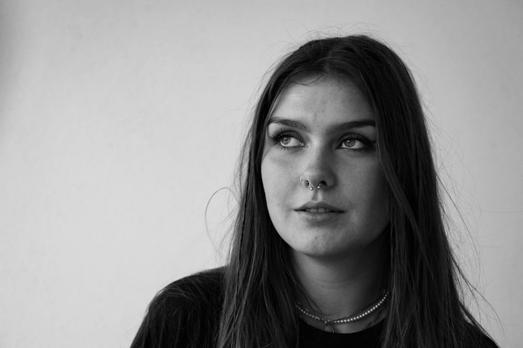
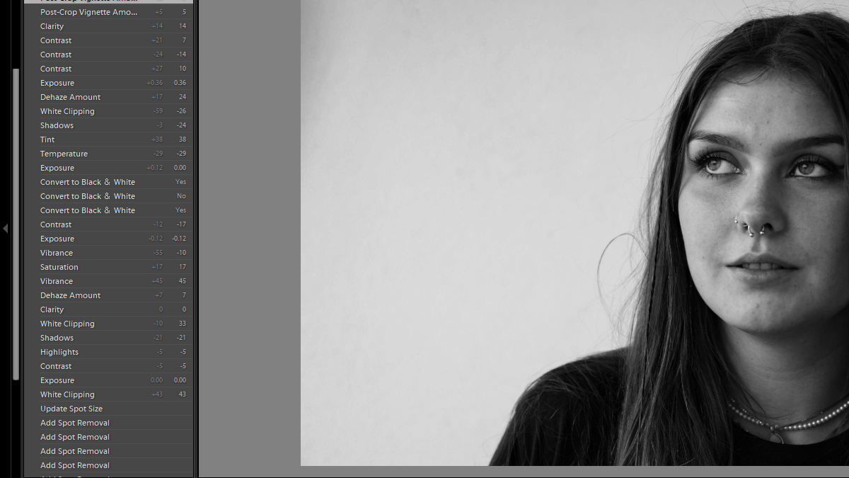
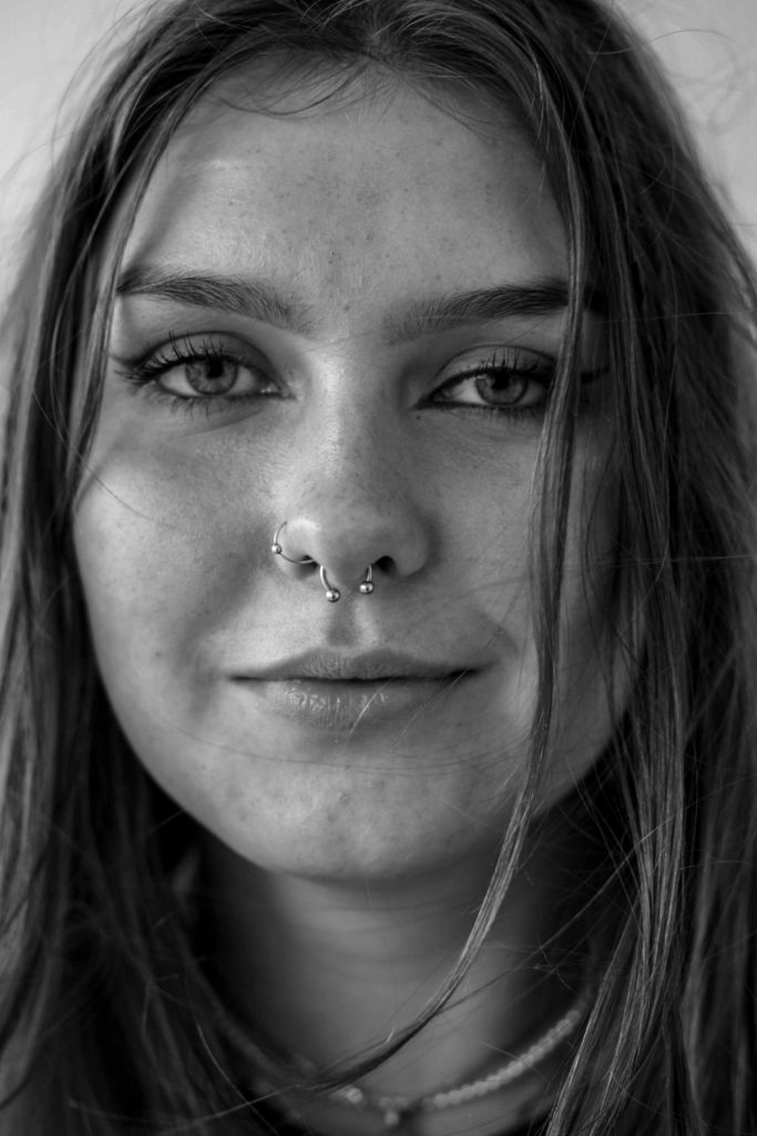
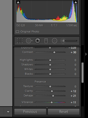
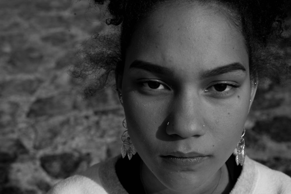
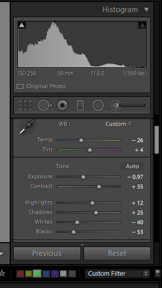
I began by using the spot removal tool, to remove marks from the image that were a result of a damaged camera lens. I then decreased the contrast and highlight slightly to create a better base before the conversion to black and white. I then de-hazed the image, so as to increase the clarity of the photo. Decreasing saturation, vibrancy and exposure all allowed for better focus on the details of my subject’s face. Finally, I converted the image to black and white, decreasing the temperature so as to produce a cooler image, as well as decreasing the contrast of the image, so that the hair wasn’t too dark against the complexion of my subject. I finally used a vignette tool, and decreased it so as to lighten the edges of the image that had become darkened during the conversion to black and white.

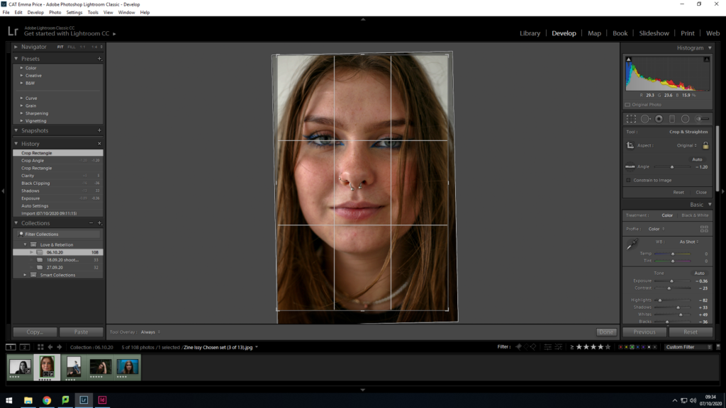
As a base before conversion, I enhanced the image by decreasing exposure and contrast. I then majorly decreased the highlights of the image so as to gain a better focus on the subject’s face. Additionally, the increasing of shadows and whites amplified this. As a final preparation, I cropped the photo, realigning it so my subject’s face was more to the centre.

I then converted the image to black and white, finalising the image by increasing the clarity. This conversion allowed my to shift to focus on to the details of the subject’s face, with a bold focus being on her eyes.

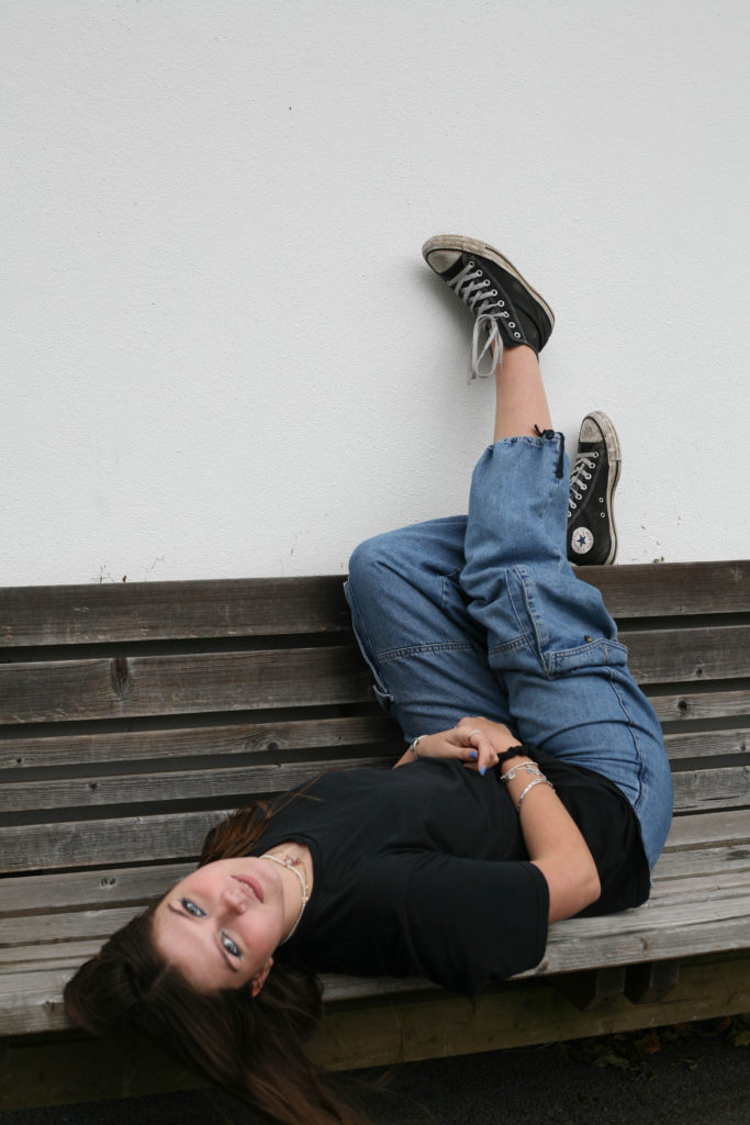
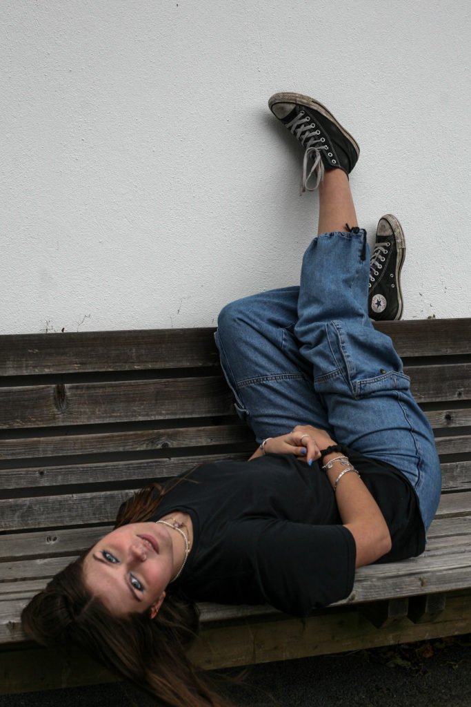
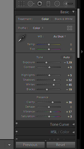
To enhance this image, I began by cropping the photo. I decided to crop it so that the bench took up half of the composition, creating a clear contrast between the brown hues and the white tones of the wall. Furthermore, I readjusted the image so that my subject took up majority of the frame. A final edit to the photo was an increase in the contrast and shadows, as well as a decrease in the exposure, so as to reduce the glare present on my subjects face and exposed skin.

To enhance this image I slightly increased the exposure and the clarity, as I was happy with the contrast within the image but wanted to achieve an image which is clearer. Additionally I wanted to ensure that my subject’s clothing didn’t clash with the shadows in the background.

Although it is not the most successful of images, I edited it by increasing the exposure, and vibrance of the image, so as to minimise the shadows on my subject’s face.

The person they love- Photoshoot

first selection

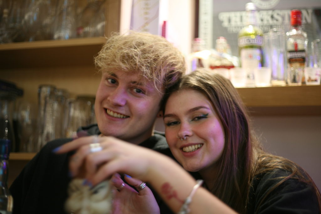
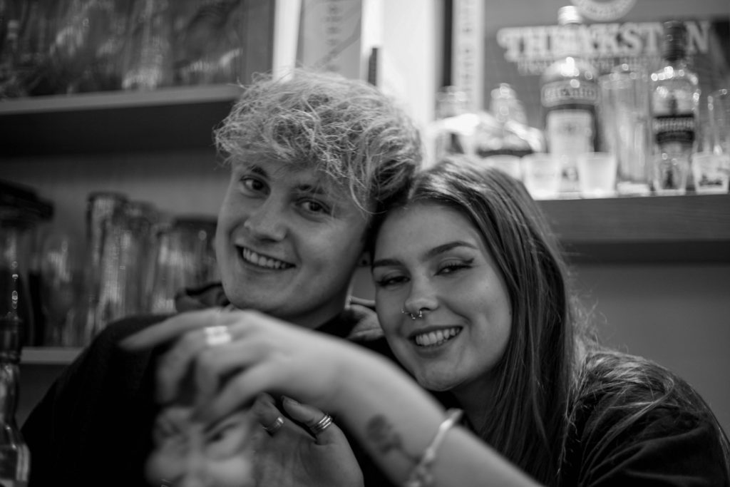
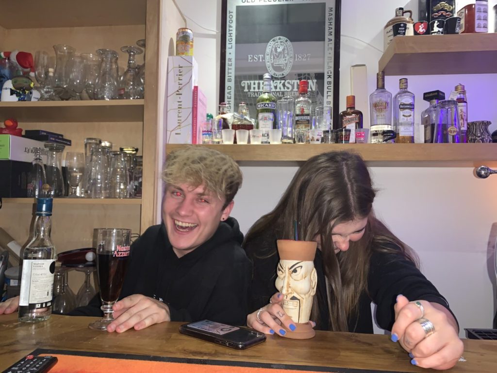
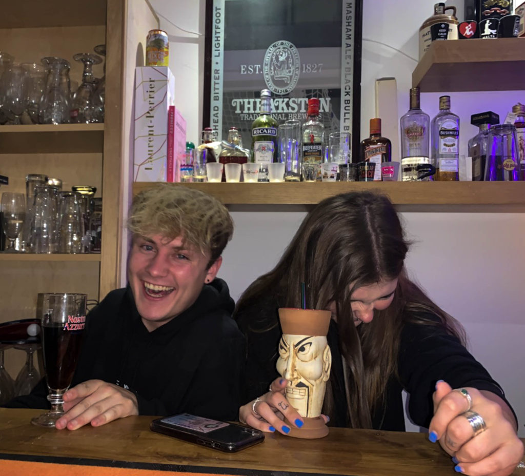
I used a rating system to select my final two candidates. I chose these two images as they were the most clear. The first image, was taken while the two subjects were aware of the camera, whereas the second image was more candid.

Editing

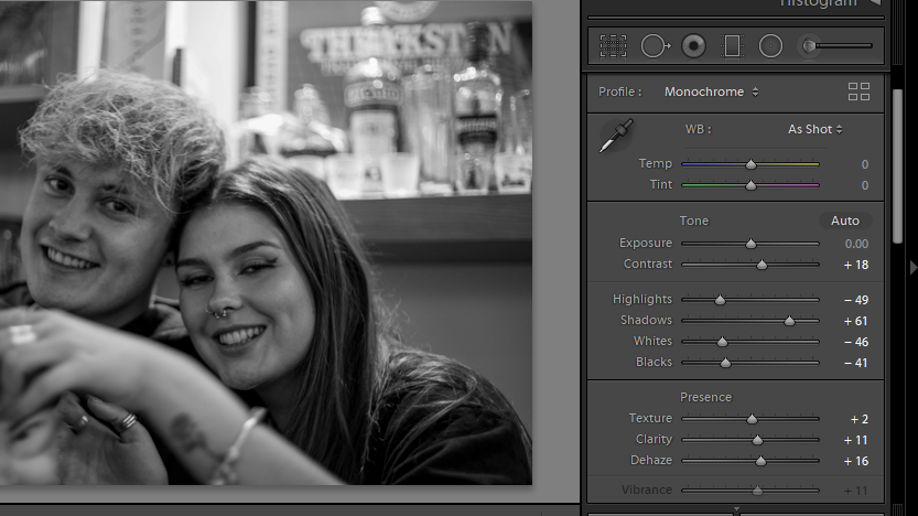
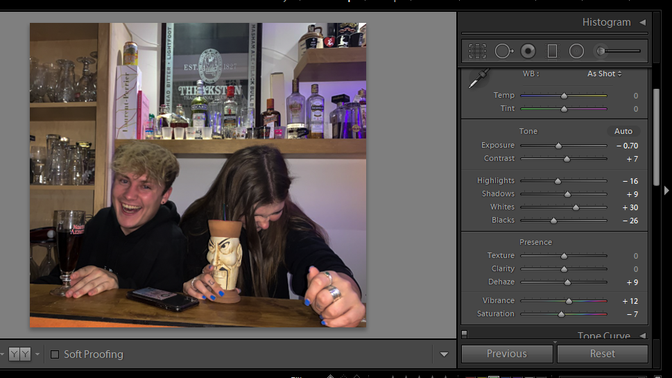
My main focus for this image was to increase the clarity. I used to de-haze tool to aid this. Reduction of highlights and whited allowed for a more contrasted image. Converting to black and white resulted in the focus being primarily on the subjects, rather than on the brightest part of the image (in the background).

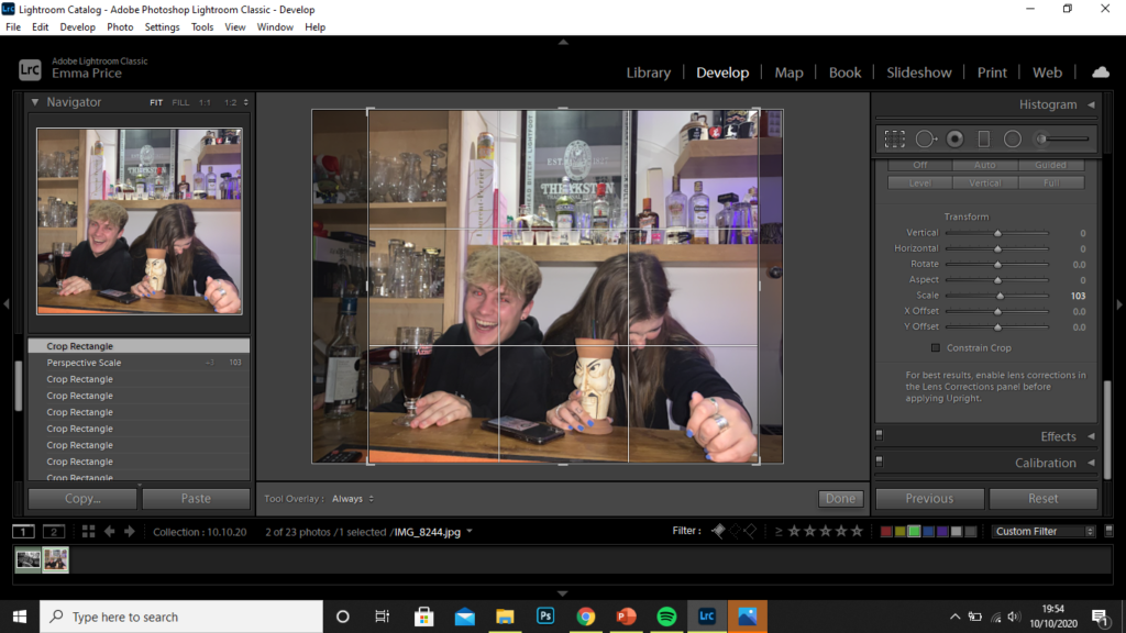
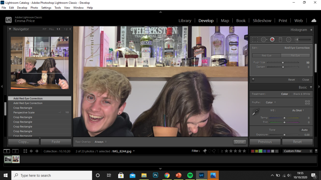
I started by cropping the image. This resulted the the frame being filled by the subjects. The crop allowed me to remove any parts of the of the image that crowded the frame, like the glasses in the background or the bottle on the left-hand side, for example. I then used the red-eye tool on the subject to the left as the flash during the shoot resulted in red eyes.

I finally, increased the highlights and whites of the image, as well as reducing the exposure to produce a more contrasted image.

Photozine- Case study 1

For this case study, I aimed to incorporate some of the successful images from my photo-shoot of ‘Someone you love’. These are pictured below:

Additionally, I carried out a second photoshoot, with the knowledge that my subject is used to the process of the photo-shoots and comfortable in front of the camera.

Selection Process

initial selection

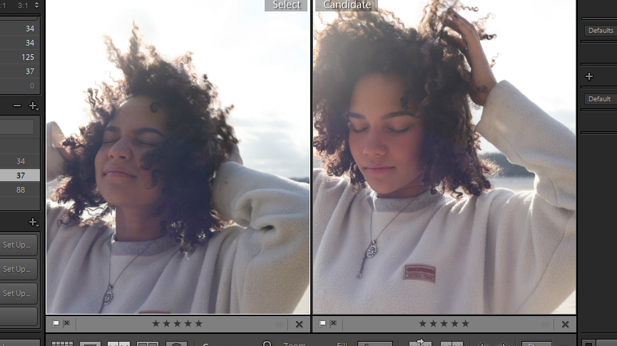
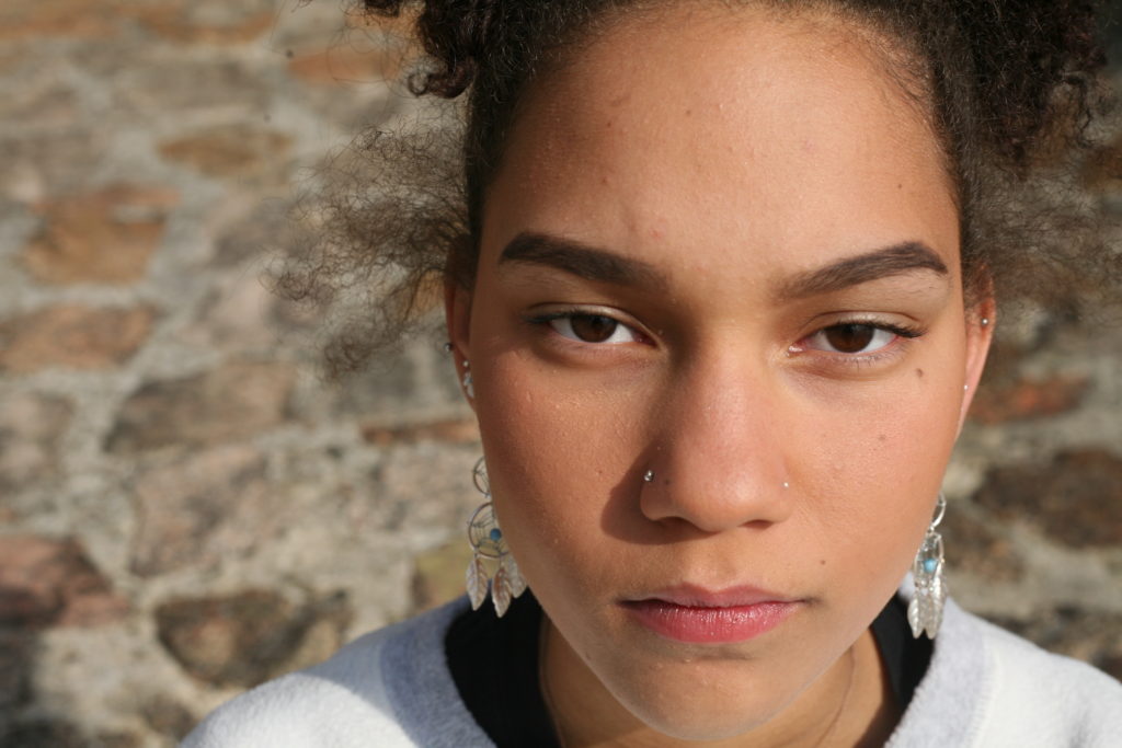
Using the compare view (‘X|Y’ tool), I compared similar images like the two above. I decided that the image on the right was more successful as a larger portion of my subject’s face is visible, as well the colours on her face being more vibrant. Additionally, the horizon in the background takes up half of the frame, reducing the negative space in the photo.

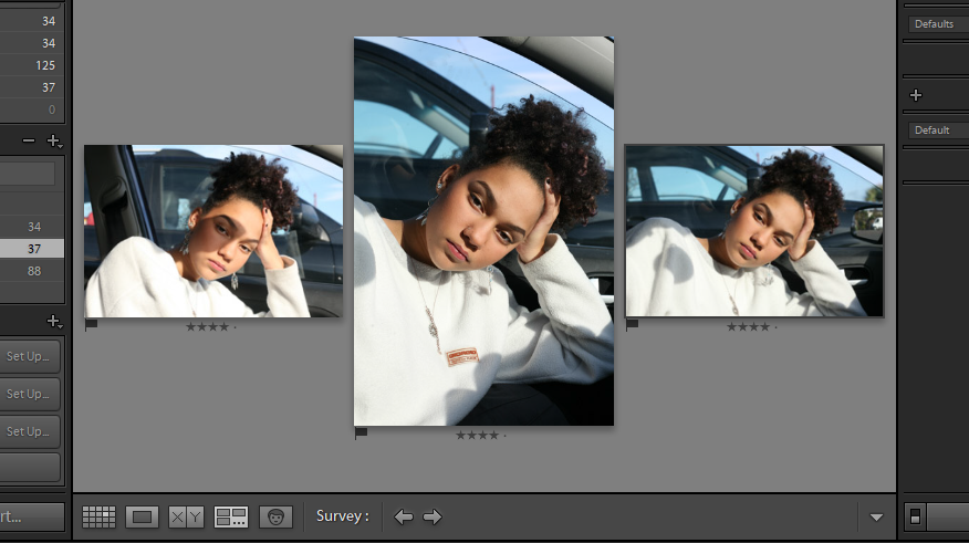
I also used the survey view to pick between a set of similar images. Out of these three photos, I decided the most successful was the portrait in the middle. The angle is more flattering on my subject and she takes up the majority of the frame, with his face in the golden third of the image. Her eyes are also opened more widely, improving the connection the subject as with the camera.

final set.

Editing

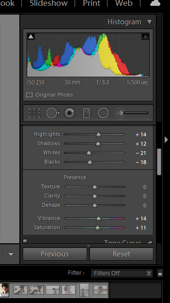
For this image I was fairly content with the exposure, clarity and contrast within the image, so the only thing I decided to amplify was the vibrancy and saturation. I slightly increased both of these using Lightroom to create a more vibrant image.

For my second image, I felt as though it showed the playfulness of my subject and so I wanted to amplify this by increasing the vibrancy and saturation of the image. Additionally, I wasn’t entirely happy with the angle I took the image at, so I used the … tool to adjust this, making the subject’s face appear more straight on to the camera.

My intention for this image was to focus on the details of my subject’s face. The best way to achieve this is by converting it to black and white. I started by decreasing the temperature (in turn upping the contrast), I then decreased the exposure and ‘whites’ within the image to reduce to glare of white tones in the monochrome image. Increasing the shadows also allowed me to increase the contrast of the image. The darkest tones are present within the pupils and irises and so, by increasing the contrast, I could make my subject’s eyes a main focus.

For this image, my main concern was to reduce the glare of the background. As the image was taken candidly, I didn’t get the opportunity to move the subject away from the natural lighting. Because of this, the background is very over-exposed.

Someone they love

The editing process for these photos was relatively simple. I reduced the saturation of yellow tones within the images. This yellow tint was a result of the lighting within the house which was easily corrected using the HSL/Colour tool and decrease the hue or saturation of the tone.

Photozine- Location

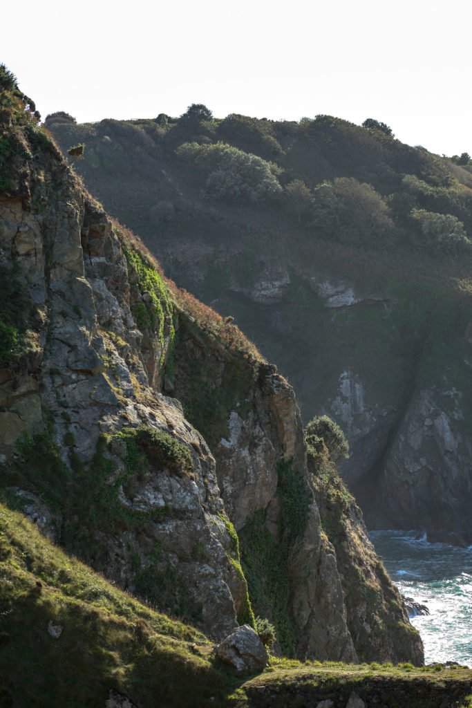
To start the process of my photozine, I photographed the first location that held significance to one of my subjects. After a conversation with my subject, they concluded that Devil’s hole was a place they wanted photographed.

Location 1- Devil’s hole. (natural landscape)

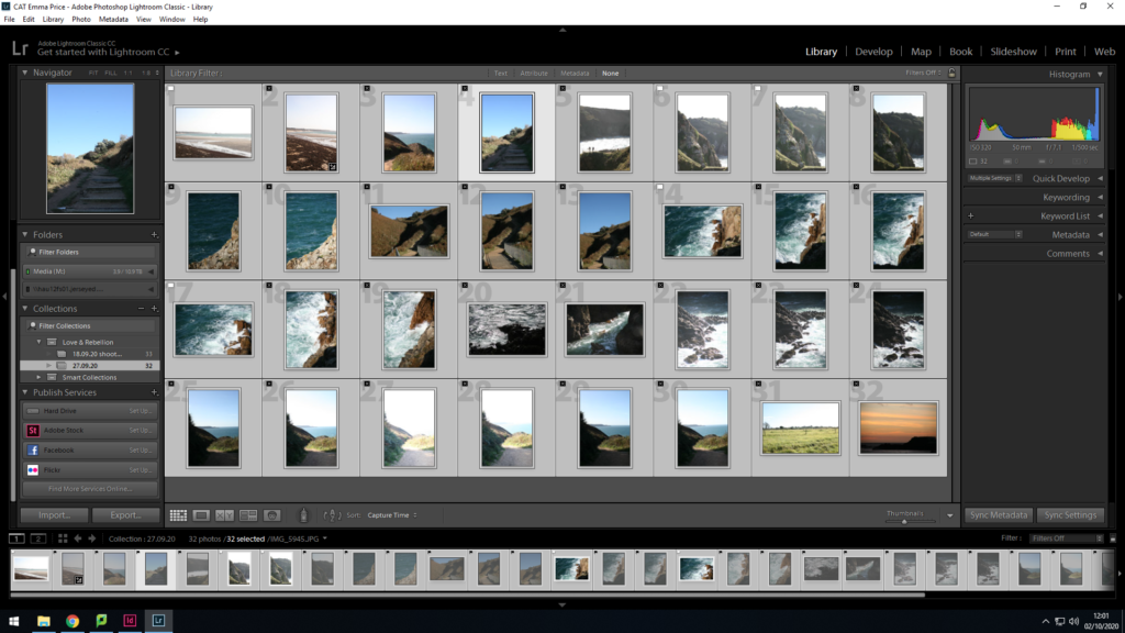
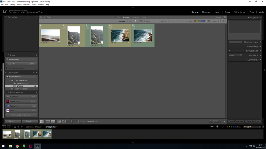
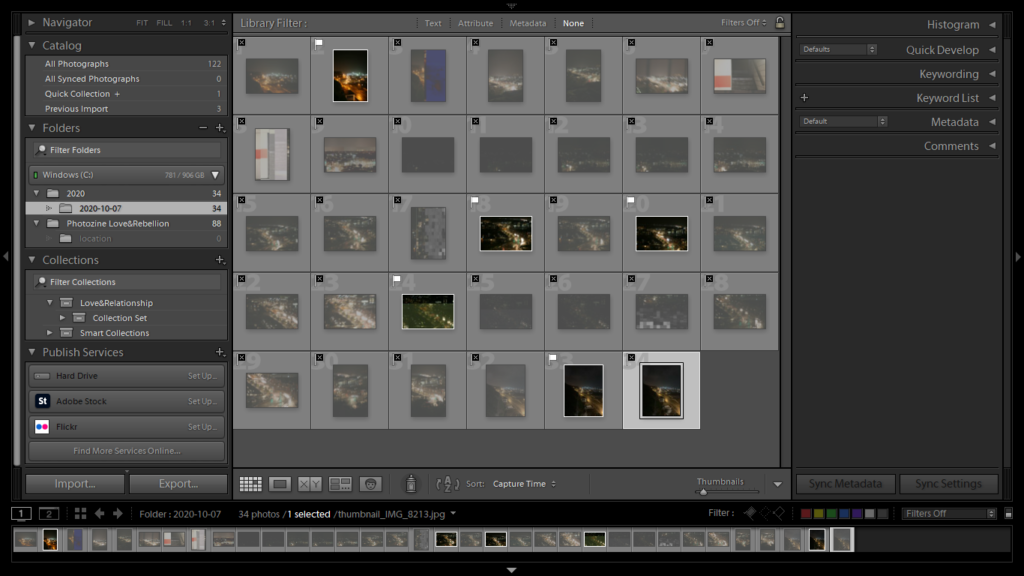
I began the filtering process of my images by going through each image and either flagging (Ctrl+P) or rejecting (Ctrl+X). I then did a rating system of 4 stars if I was unsure of the image and 5 stars if I was completely satisfied with the image.

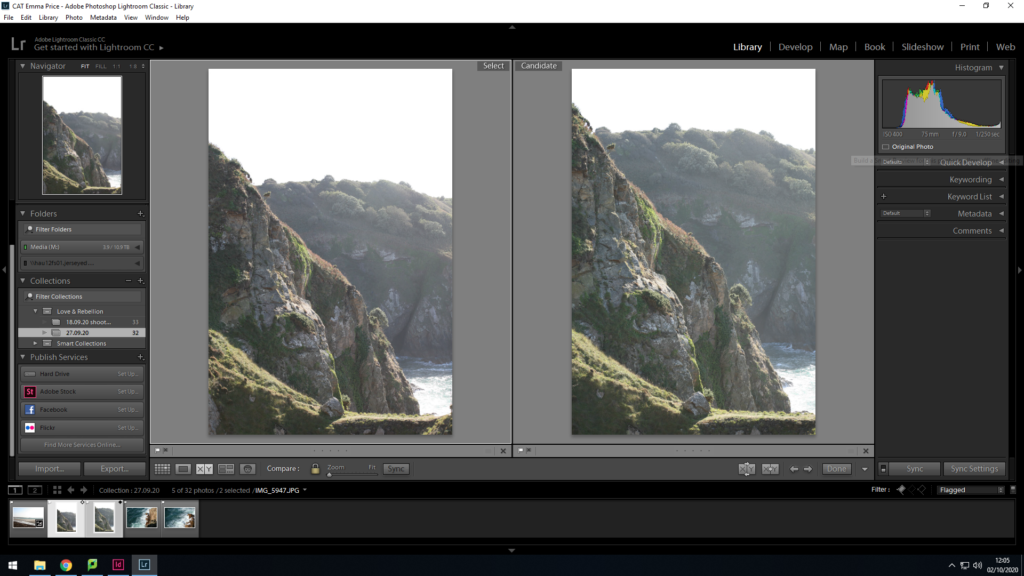
To decide the final image out of these two I used the ‘X|Y’ tool. After a quick comparison, I decided that the image on the right had a better composition, as the grassy area in the foreground took up a larger proportion of the frame, as well as having more vibrant coloured shrubbery. Additionally, I altered the exposure when taking the shot on the right, in order to reduce the amount of light entering the lens (due to the bright conditions).

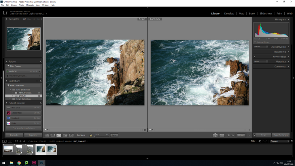
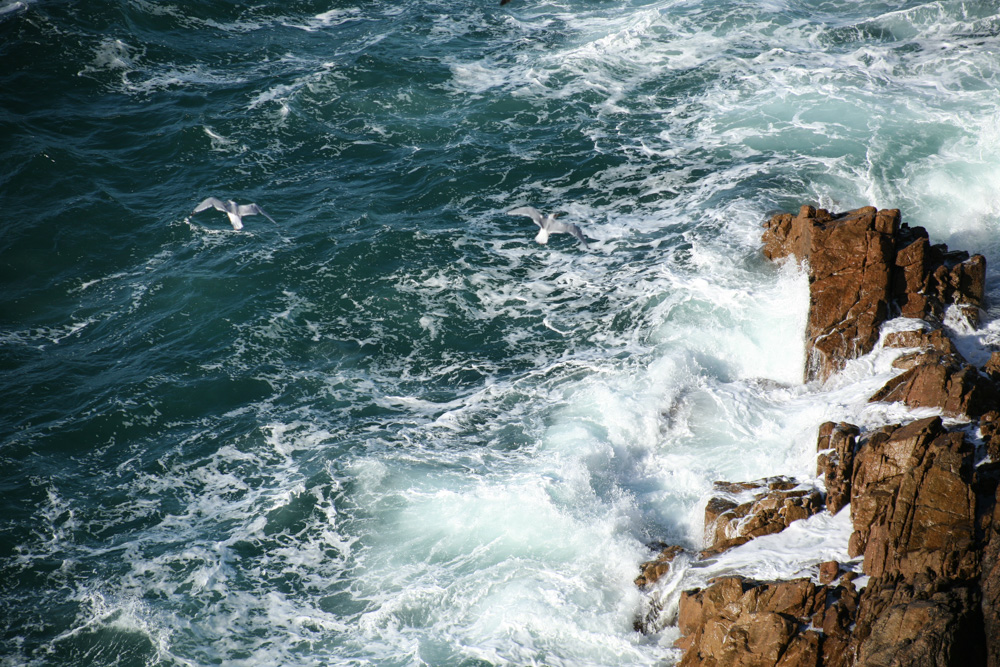
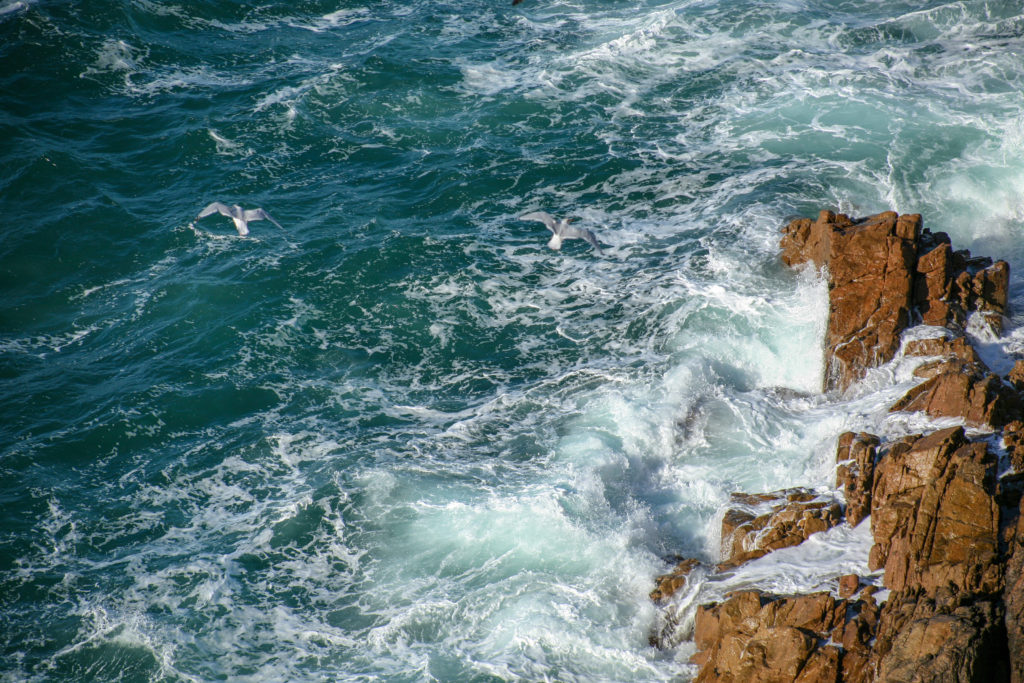
To decide between these two images I analysed the composition, and how it may look when placed in a photozine. As a double page spread, the image on the right proved to be a better candidate as it had a stronger contrast between the brown of the rocks, the white of the broken waves and the blue of the sea. As well as this, the positioning of the seagulls within the frame creates a spot in the negative space of the sea for the audience’s gaze to avert to.

As a final selection, I came out with two mages I felt were the strongest candidates for my Zine, which I have colour coded as green in Lightroom.

editing:

1.

colour editing-

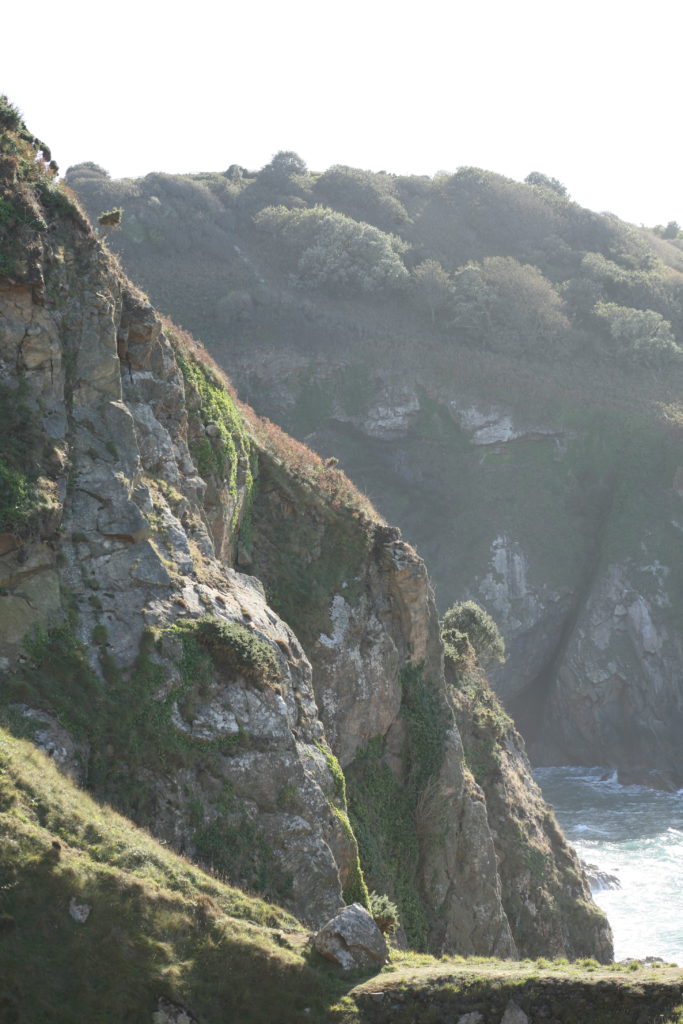
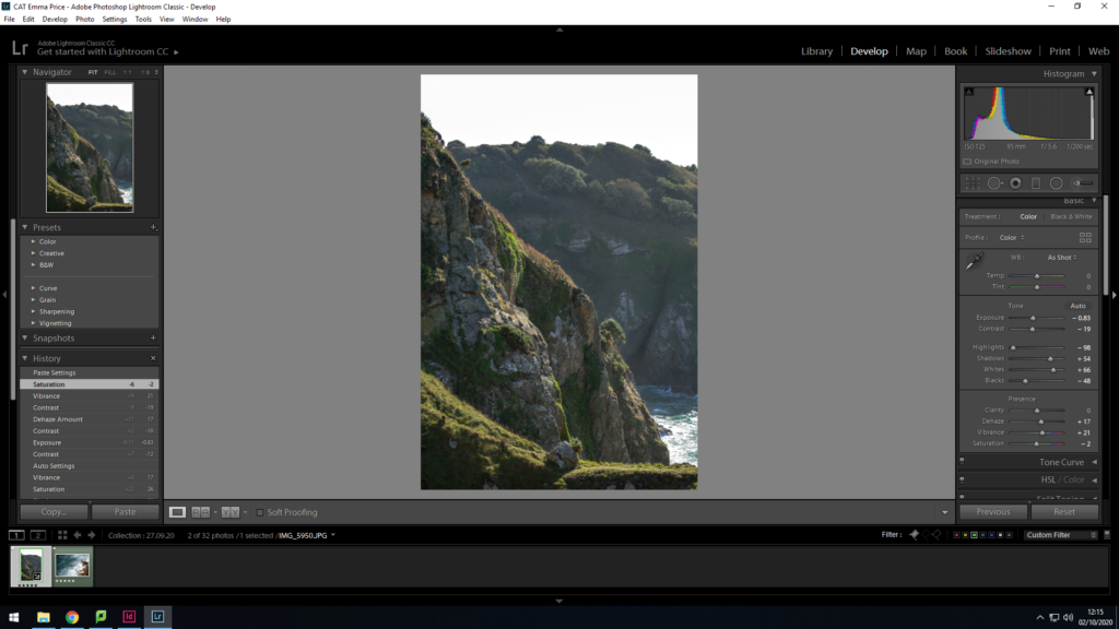
To enhance this image, I wanted to decrease the haziness of the image, in order to increase the clarity of the image. To achieve this I increased the shadows within the image and increased the vibrancy. This had a major impact when editing the photo, as it brought out the greenery of the grassland and allowed for a clearer view of the sea.

2.

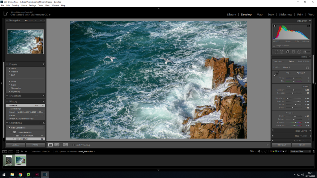
To edit this image, I wanted to make the colours within the image lighter and more vibrant. I increased the saturation slightly but mainly focused on the basic tone of the image. I decreased the exposure and the contrast, as well as a strong increase in the shadows of the image. Increasing the highlights of the image resulted in a photo that’s less gloomy than the original.

Location 2- Fort Regent carpark/ St brelades (urban landscape)

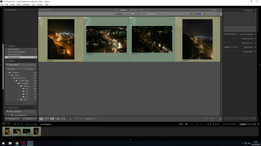
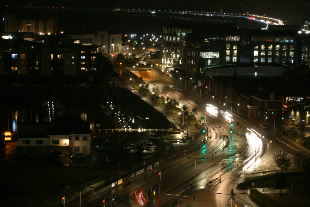
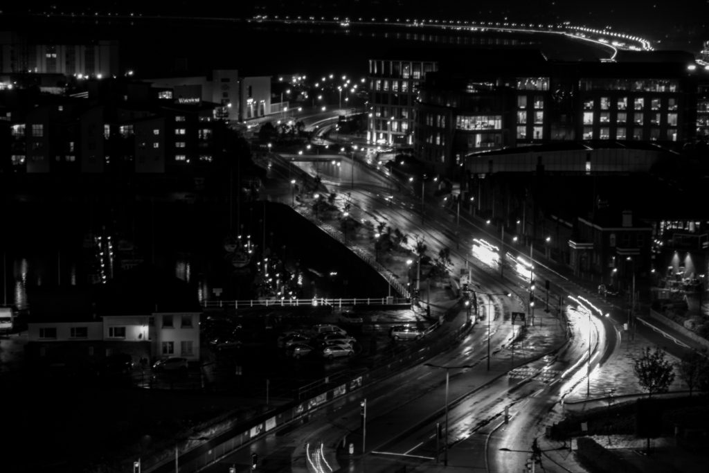
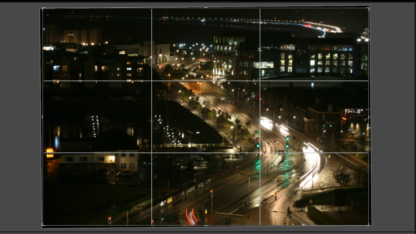
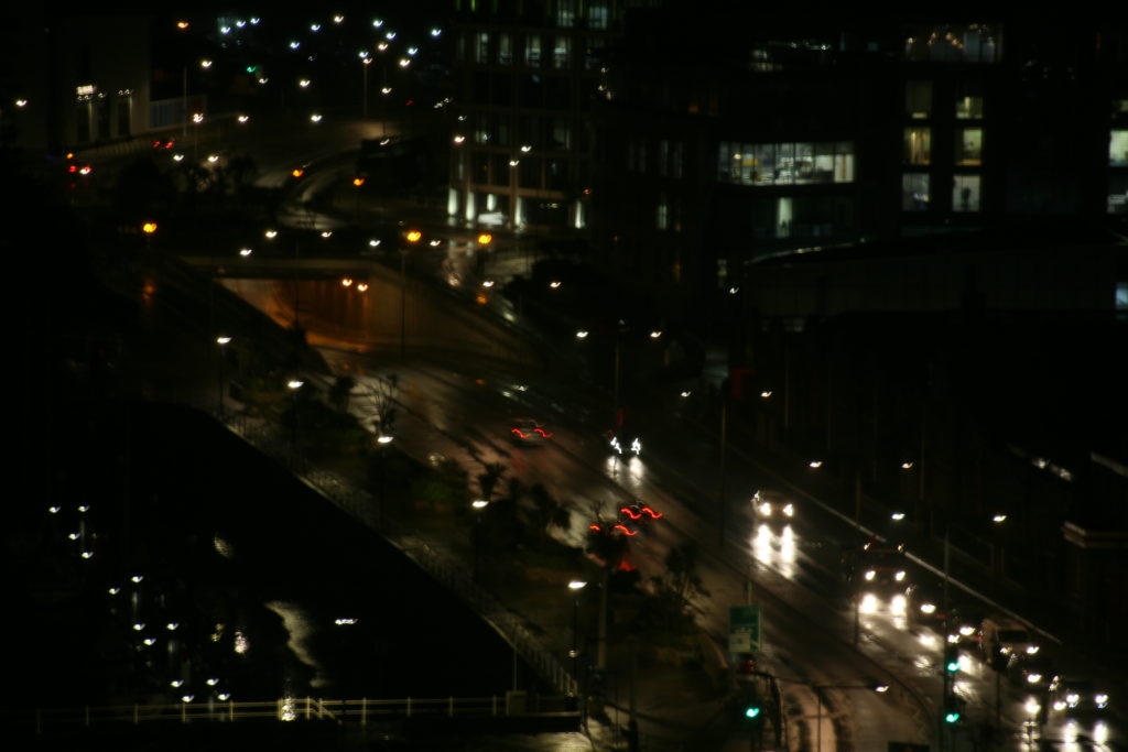
For my second location, I photographed an urban landscape, a place that held strong meaning to my second case-study. Stating that the lights have a significant effect on her I decided to take the shoot at night. A long exposure time was required and I used flat surfaces to steady the camera. The conditions were adverse, allowing many of the street lights and car headlights to be reflected off the avenue.

I selected 4 of the most clear and vibrant images by ‘flagging’ (Ctrl + P) or ‘rejecting’ (Ctrl + X) each image within the library. I colour rated (green for certain, yellow for uncertain) before the editing process.

Editing

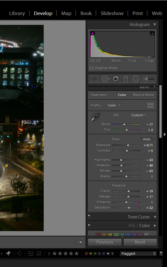
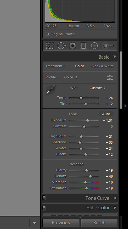
I initially began the editing process, by cropping the image. I rotated the image slightly so as to straighten the image. Then, I enhanced the image by decreasing the temperature, which allowed me to get rid of major yellow tones within the image. From this point forward, I increased exposure and contrast to amplify the effect of the street lights as well and increase the effect of the shadows. Additionally, I decreased the highlights and shadows to reduce the glare of these lights and to improve the visibility of the photo.

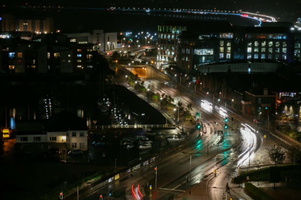
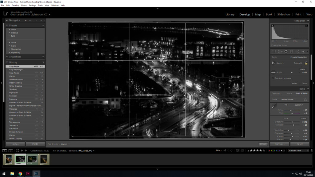
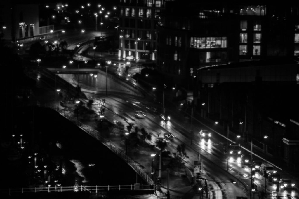
As a final experiementation (to design my photo zine), I converted the image to black and white.

I converted the image to black and white to be able to layer a portrait over it without the colours clashing.

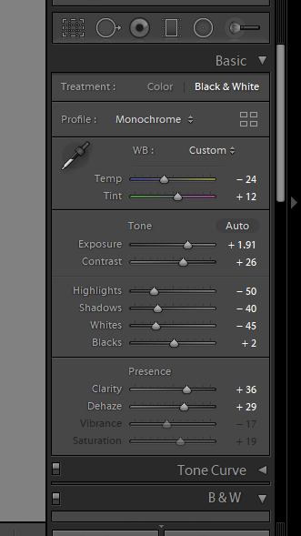
I began the editing process by increasing the exposure. This allowed the road and other areas of the image to become more visible. I also want to reduce the yellow of the lights, so I decreased the temperature of the image and reduced the highlights so as to limit the glare from the lights. Additionally, I reduced the shadows in the image to increase visibility

Lastly, I converted the photo to black and white, increasing the contrast and clarity of this image. This resulted in a successful image I could use for my zine.

Photozines

DEFINITION: “A photo zine is a self-published, often handmade collection of photographs laid out in a magazine style. It can include written text and illustrations as well as photos. They are designed to display and share photo stories.”

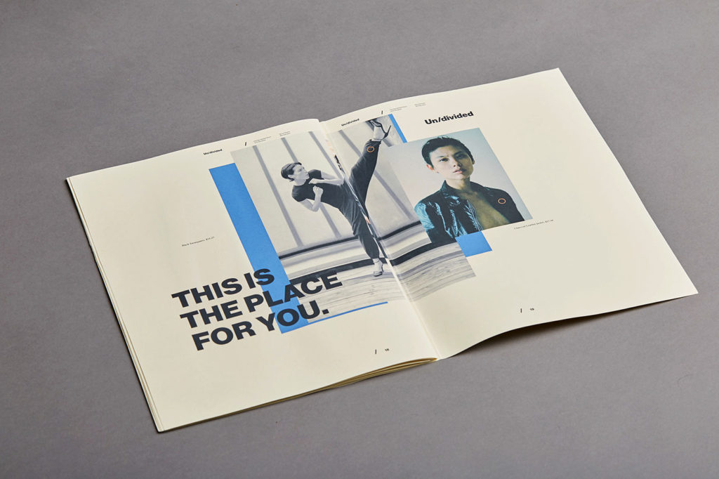
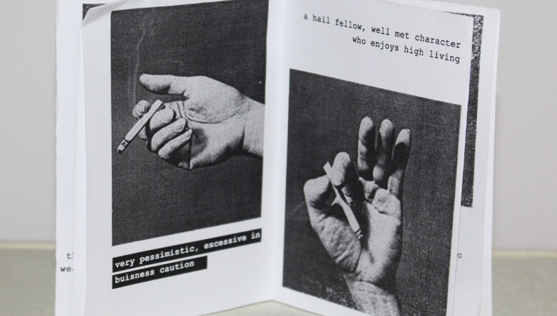
Photozines can be incredibly idiosyncratic and personal. They allow photographers and artists to experiment with their work, enabling them to portray their images in ways that oppose the traditional publishing of a photobook. A photographer’s zine can connect the artist more directly with their intended audience, appealing to them through not only the images but the placement of the photo within the book, the relevance of the page or the juxtaposition created between images throughout the book can make the presentation of the artist’s work much more meaningful and expressive.

Rita Puig-Serra Costa

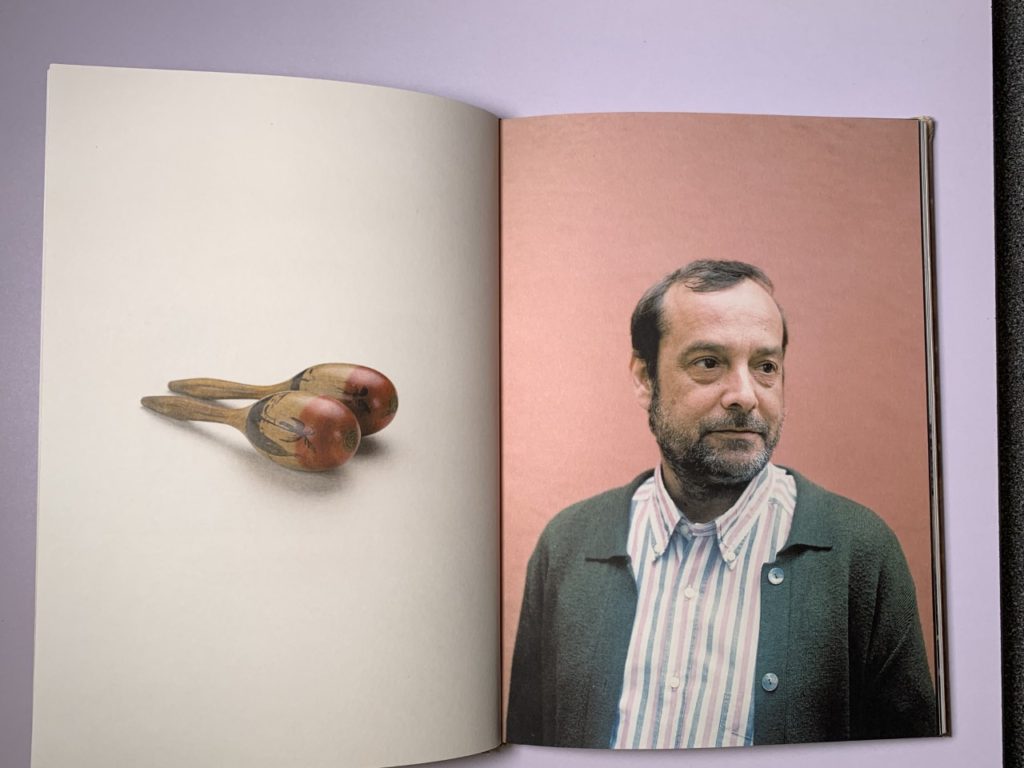
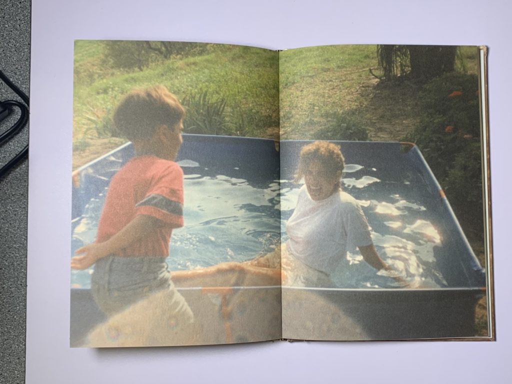
Many photographers use photo-zines to tell a narrative. In Costa’s zine ‘Where mimosa bloom’, she has created a story about her own family (starting her zine off by introducing family members in her family tree) and her connection to her mother.

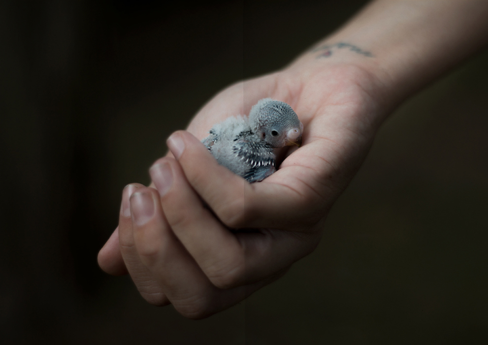
Among the most arresting photographs is Little Bird, a double-page close up of a premature baby bird cradled in Puig-Serra Costa’s softly lit hand. Life-size and featherless against a black background, it evokes abandonment and fragility, but also the strength to rescue and attend to life’

¬Janelle Lynch, on her review of ‘Where Mimosa Bloom’

Costa focuses on the depth of love that can be expressed after experiencing an immense amount of grief. The zine took over two years to create, as she spent the time collecting materials and taking photographs of places, objects and people that had an impact on her relationship to her mother. The photo zine is dedicated to her mother, who passed away from cancer in 2008.

However, despite the upsetting context behind the project, the zine itself avoids the self-pitying, isolating effects of grief. Costa acheives this through her bright colour scheme and implantation of significant people, places, objects and nostalgic photographs that captures her relationship with her mother both before her diagnosis, during and after her passing.

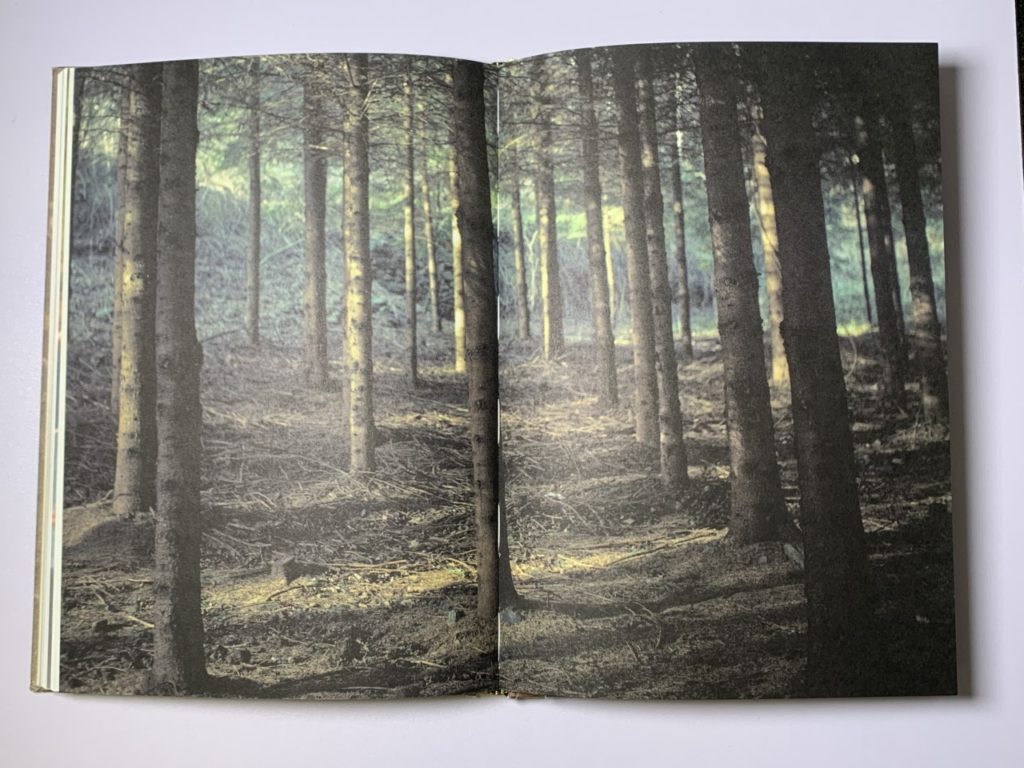
Her use of double page spreads for particular images of locations and old photographs amplifies the importance of these contextual places and the prominence of these childhood memories to Costa herself. The incorporation of these images on a large scale includes her audience in a private, personal part of her life, intensifying the rapport Costa has created with them.
My personal zine

For my own personal zine, I wanted to incorporate a similar colour scheme. Because my photo-zine presents the stages of becoming intimate with someone, I intend to adapt the colour scheme of the portraits throughout. I plan to experiment with black and white monochromatic images, shifting to more vibrant and colourful images as the zine progresses. Additionally, I aim to try and match the colours of my portraits with the image they are directly adjacent to. To do this I may choose the colour of my subject’s clothing based off of the image I want to place them with.
I was inspired by the way Costa used photos of simple objects that have deeper context- acting as staples of her relationship with her mother. I aim to include objects, places and people that have significance to my subjects, which have had a clear impact on their character and personality. The objects and places in particular will allow the viewers to feel more connected to the subjects in my zine as they will have seen the places that are sentimental to each person as well as their passion towards their hobby or a person that is dear to them.

Furthermore, I want to set context in a similar way to Costa. Her use of double page A4 spreads for significant photos stood out to me. I plan to experiment with this idea, to see the effect of placing context so prominently.

Design and Layout: Lightroom

Creating an edit.

When creating an edit of images, Lightroom provides a quick and efficient system to pick your best images.

1.

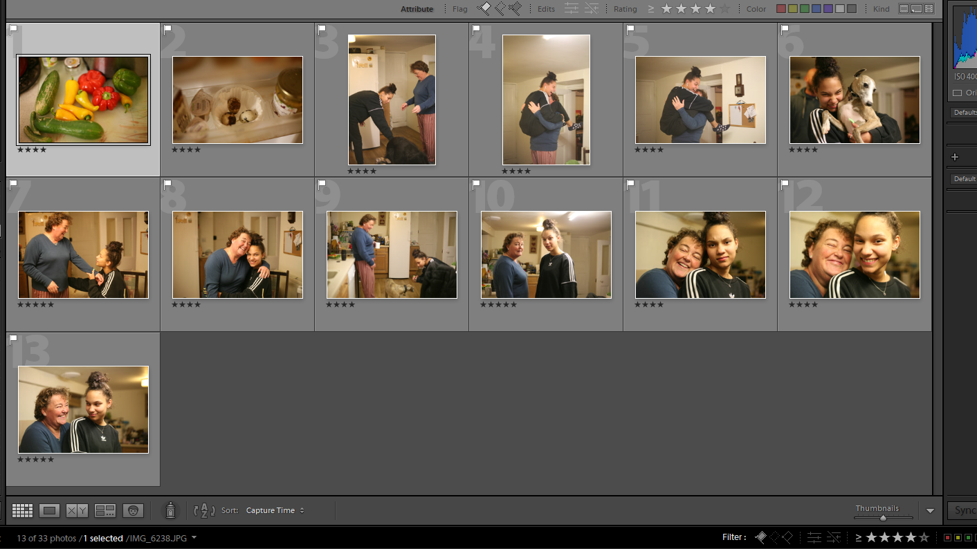
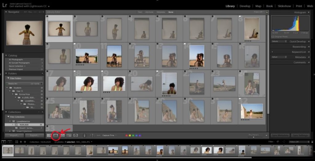
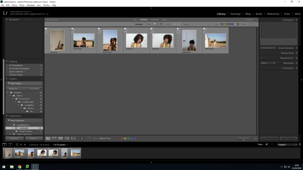
I began with a small photoshoot of 33 images. To filter through these images I clicked the single view button starting at the first photo. I held down the shift key and pressed P (for images I wanted to flag) or X (for photos I wanted to reject).

2.

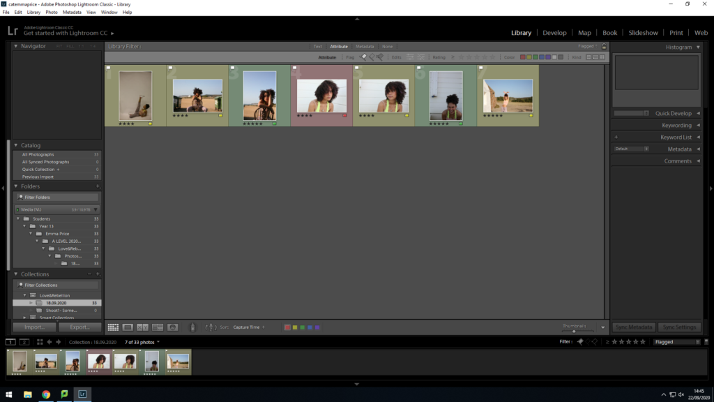
Once I flagged my top images, I viewed them by clicking the ‘flagged’ option in filters. With only these photos in view, I was able to start ranking them. I decided that if I rated my photo 4 stars, then it’s an image I’m unsure about. If I rated it 5 stars, then it’s a photo I’m fully confident with and will definitely use.

3.

After rating the images, I colour-coordinated my choices. Green= Definitely using. Yellow= Unsure. Red= Rejected.

4.

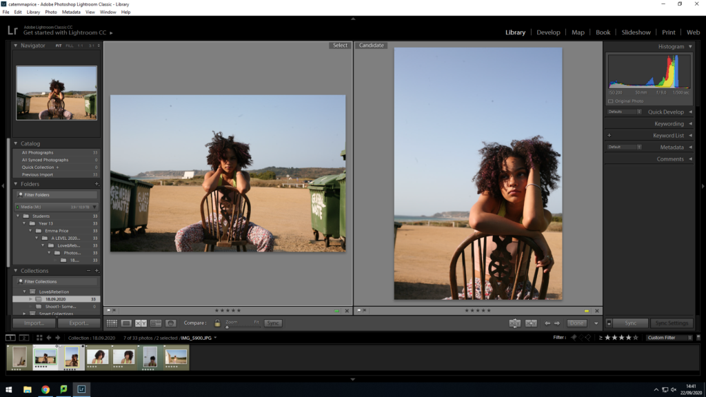
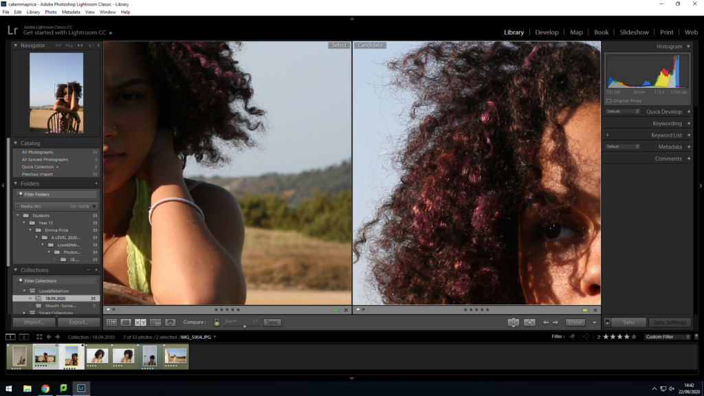
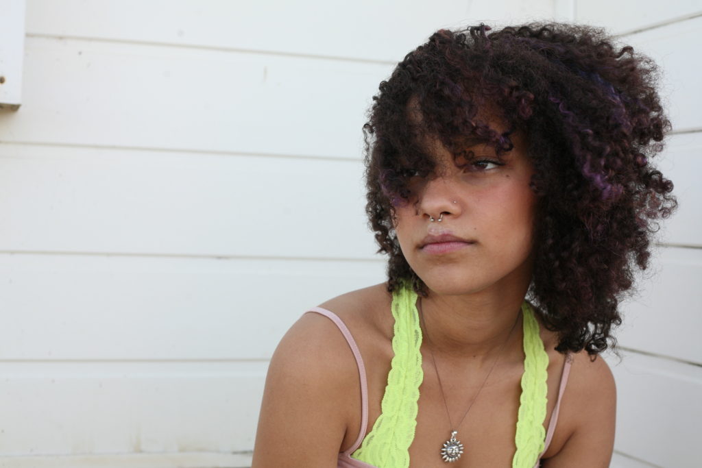
To decide between images that are similar, I used the ‘X|Y’ tool with the magnifying glass. For these two images I wanted to compare the exposure and the visibility of my subject’s eyes. I selected the image on the right for a final selection as the colour within her hair is more vibrant and the eyes are far more visible.

5.

Finally, once all the images for the set have been selected, I am able to easily pick them out from the whole shoot.

Developing images.
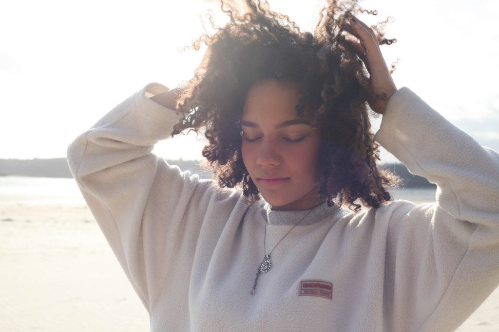
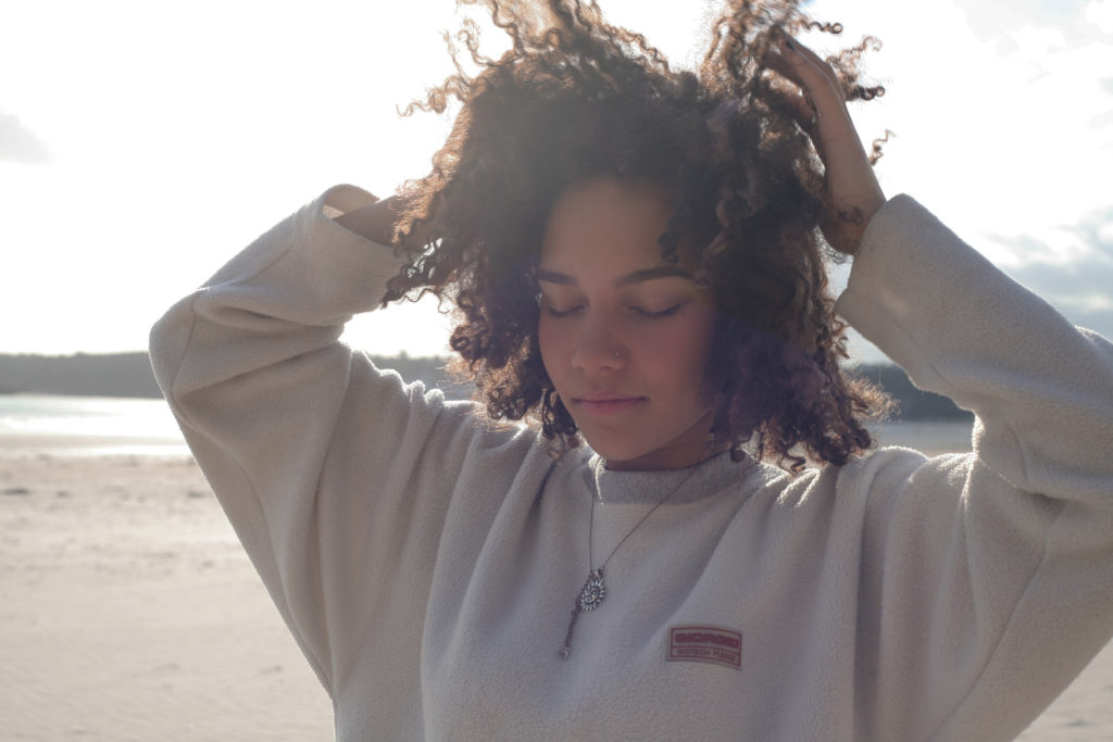
Firstly, my choice for this pose was to create a triangular focus, to lead the eye around the image, rather than the focus being in just one area. 

I started by using the spot removal tool to remove marks present on my camera lens. The tool colour matches the area you want to cover with the surrounding part of the image, meaning the spot can be covered effectively

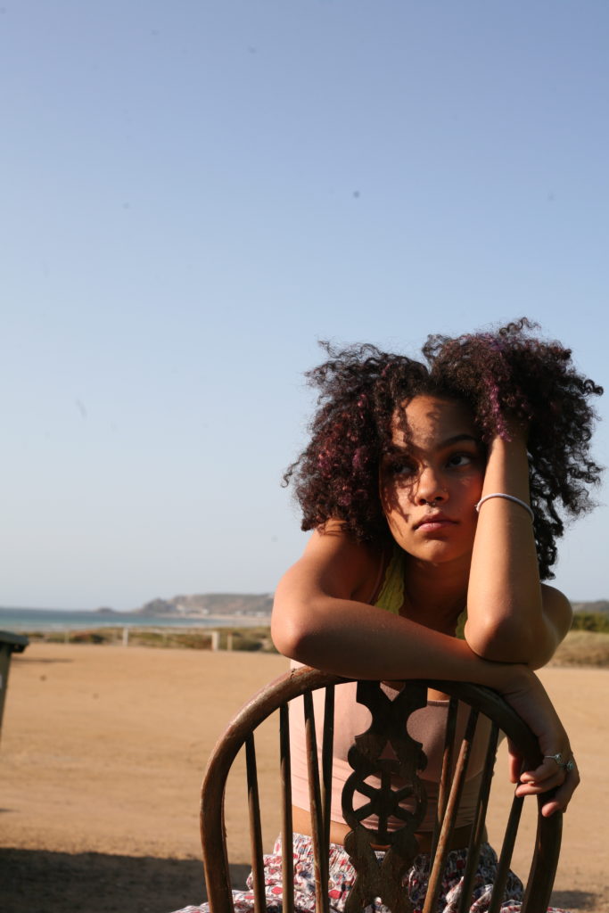
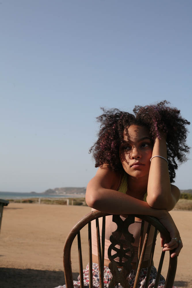
For this particular image, I wanted to reduce the orange tones of the image and increase the vibrance of the blue background. I made small adjustments to the exposure and highlights within the image, then made more drastic changes tot he vibrance of them image, resulting in a photo with a larger range of colours.

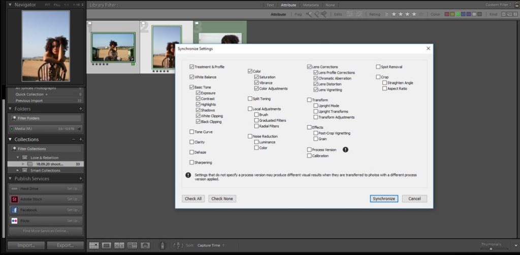
To reduce the amount of time editing images, I imported the edits I made on my first photo and applied it to the image I wanted the same effect for. This is both efficient and effective as the images are very similar in terms of setting (beach) and colour-wise.

I selected the colour effects (increase in vibrance) that I wanted to apply and unselected the basic tonal changes, as I planned to adjust this seperately. I didn’t select the spot correction, as the positioning of each spot had changes due to the orientation of my two images.

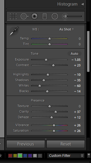
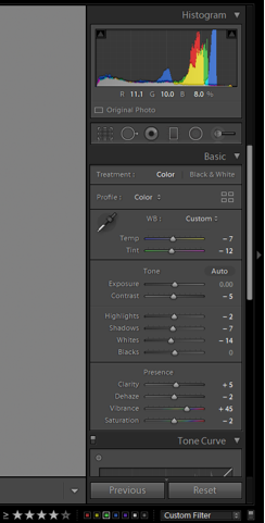
To finish the image, I reduced the contrast by -36 and reduced the exposure slightly by -48 to ensure that my subject’s face was enitrely in focus. I selected the spot removal tool and manually picked out the parts of the image that were affected by the lens. The darker effect of the sky in the final image intensifies the mood of the image. The subject has a somber face and is not masking direct eye contact with the camera and so I felt the darker sky would amplify this.

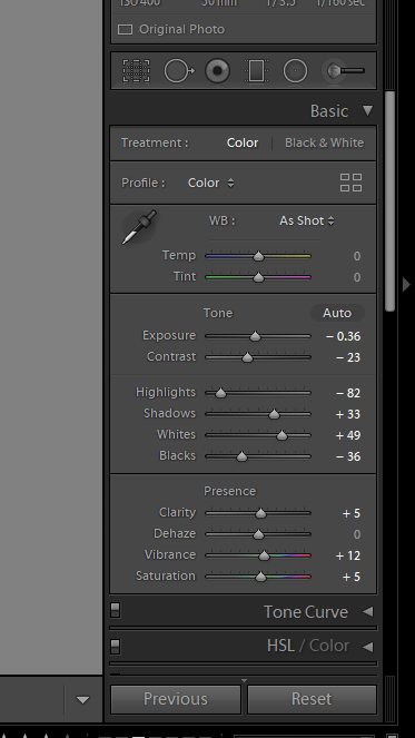
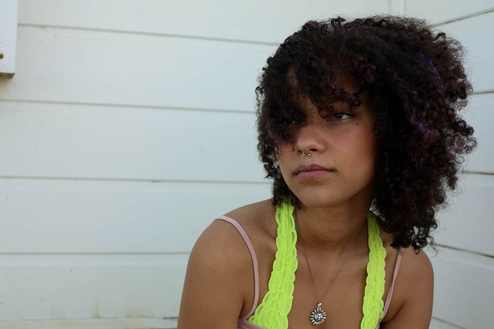
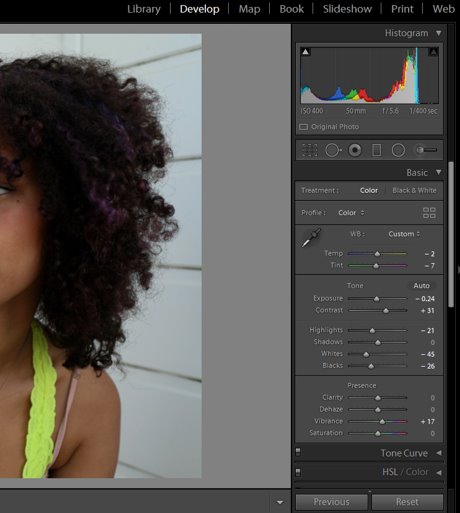
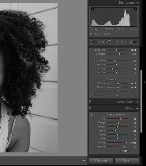
For this image I began by editing the basic tone and presence of the photo. I initially decreased the exposure by -0.24 and majorly decreased the ‘whites’ of the image by -45 to decrease the glare from the background. Increasing the contrast and vibrancy, alongside the shadows, allowed me to create a more vibrant and striking image, where all the graphic details of my subject can be seen.

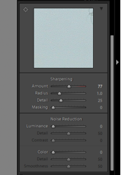
I then used the sharpening tool under ‘Detail’ to enhance the clarity of the image. I increased the amount of sharpening by 77 and the detail by 25 to achieve this.

I experimented with the transform tool to adjust the lines in the background (make them parallel to the frame of the photo) but it took the focus off of my subject and resulted in her being too close to the right side of the composition.

Finally, I converted the image to black and white. I majorly increased the purple and magenta tones to make my subject’s highlights in her hair stand out. I decreased the highlights and whites of the image so as to reduce the glare that appeared during the conversion. Additionally, I increased the contrast to produce an image with a large tonal range.

Specification- A Love Story

STORY+NARRATIVE: What is your love story? And how will you tell it?


In three words: Area, article, affinity

In a sentence: Getting to know people more intimately through three clear stages.

In more detail: For this narrative, I’m aiming to portray the people who hold sentimental value to me using three aspects of photography: Landscape, Still life and Portrait photography. I intend to have three case studies. For each page of the book I plan to have a portrait of the person with an image of these three things directly adjacent to them.On one page I will have a place that holds emotional significance to them next to a full body portrait. On the next page I will have an object or article that represents their passion for a hobby or a guilty pleasure next to a 3/4 or half body portrait. Finally I’ll have an image with a person who holds significance to them next to a head-shot of my subject.

By gradually getting into close proximity with the subject, I can convert my subject into an allegory for intimacy. For these portraits I aim to take them in the studio, with a plain background. The outfits I aim to match with the colour scheme of the 3 things I’ve chosen to represent them. This will prevent my photo-zine from looking garish and will clearly separate each of my case studies from one another alongside keeping the theme of the zine constant.

AUDIENCEWho is it for?

The people I’m photographing are similar ages to myself and so represent younger, more innocent relationships. It may appeal to older generations as sweet nostalgia or as a resemblance to themselves as a child or resemblance to their children/grandchildren/etc.

Similarly, it may connect with those in my own generation as the people, places or objects remind them of relationships they have with hobbies or areas or even the relationships they have with their own friends/families/significant others.

My reasoning for the three different types of portraits (Full, 3/4 body and head-shot) is to represent three stages of getting intimate with someone:

Stage one: Curiosity. To represent this stage I decided to use a full body portrait. I feel as though it represents this word accurately as a person can easily spark your interest from a distance.

Using a landscape next to this portrait gives gives the narrative a setting. The setting I use for each case-study will be a place that has importance to them. Not only does this create imagery, it also leaves some ambiguity as to why this place holds significance to the person they’re looking at. Leaving ambiguity allows the viewer to deduct and create their own narrative alongside mine.

Stage Two: Bringing Your Lives Together. As you get closer to someone emotionally, you can be comfortable standing close to them or seeing them close up. By doing a 3/4 body or a half-body portrait I can convey this stage of becoming intimate with someone.

By adding still life images, I can further progress my narrative for each case study. The audience can then engage with this, learning more about the individual they’re looking at and making possible links to the setting they previously viewed.

Stage Three: Deeper Level of Commitment. Finally, I felt as though a head shot was appropriate to present this stage as having that accessibility to a person/ being comfortable that close to someone shows how attached you are to that person and how valuable they are to you.

Adding an photograph of someone the case study is intimate with allows the audience to feel attachment to the subject. I aim to make them feel as though they know the key things about each case study as they progress through the zine. By creating this affinity between the subject and the audience I can keep the viewer’s interest in the zine. Having ambiguity towards the significance of the person close to the subject and the place the subject chose allows freedom for the audience to create multiple story-lines and narratives.

By having multiple narratives it means the viewer may look over the zine multiple times to try make further links, rather than understanding the clear plot and looking through it once.

CONTEXT: Who is your inspiration?

After viewing multiple photo-zines, I was particularly inspired by Rita Puig-Serra Costa and her photo-book: ‘Where mimosa bloom’. The design aspect of the book appealed to me as she used portraits of people adjacent to formal elements such as shape and colour.

Where Mimosa Bloom by Rita Puig-Serra Costa – ÉDITIONS DU LIC
Where mimosa bloom

Similarly, I was inspired by Chloe Jafe and the way she presented her subjects. The stance held by the women in a number of her portraits comes across as confident. Additionally, the women in her project represent the trust and strength within her relationships with them. I wanted to incorporate this into my work by photographing my subjects in more detail and more intimately than a standard formal portrait.

Inochi Azukemasu by Chloe Jafe, France Contemporary Issues (Professional  competition) This is a project I started

Inochi Azukemasu