All posts by Emma Price

Filters

Author:
Category:

Exam Theme- Statement of intent

Statement of intent

Chosen theme: Transition

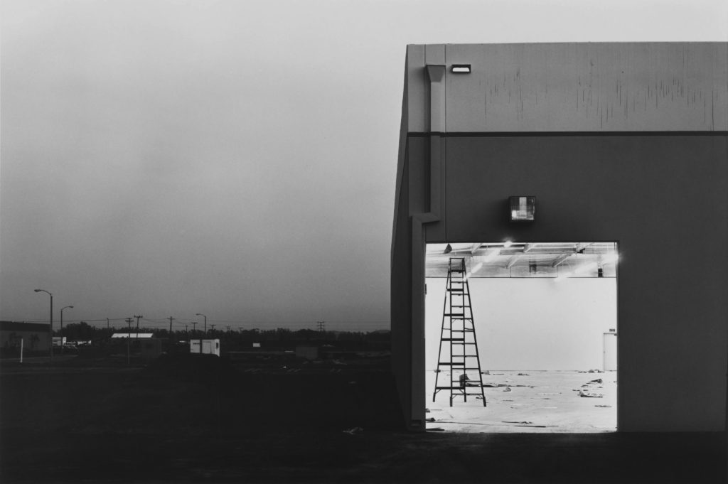
For this photobook, I aim to explore gentrification and urban landscapes in response to the stimulus of ‘Transition’. The images are to be taken and presented both objectively and pragmatically, responding to The New Topographic and The New Objectivity movements. I want to explore abstract photography alongside this by including the manipulation of light within my images and, additionally, showcasing my exploration of form, shape, texture, pattern, colour and space. With one of my main inspiration coming from Lewis Baltz, I intend to take a deadpan approach towards some urban landscapes.

In order to take advantage of lighting, I’m going to experiment within urban areas at daybreak, as well as midday, in order to capture the landscapes in both soft (morning) light and harsher (midday) light. Soft lighting will allow me to draw focus on the form and shape of the environment and amplify the contrast within my photos, whereas harsh lighting will enable me to bring a great deal of focus to the colours and textures of certain landscapes and architectural structures. By carrying out photoshoots at dawn, I can also capture larger landscapes without the interference of human life.

The implications of the weather will play a part in my project. Warm lighting from sunny days will bring focus onto the bold colours in the landscapes I’m focusing on. Cooler lighting and tones will come through on overcast days, reducing the focus on colour and allowing me to focus on the banal aesthetic and deadpan approach Lewis Baltz took towards his work.

The theme of transition ties into my project through the depiction of urban environments, how they’ve developed due to human interference and the gentrification or modernisation present throughout them.

Lewis Baltz and The New Topographics

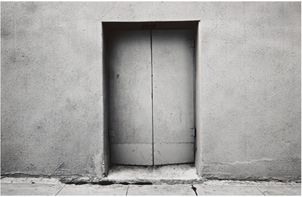
Baltz’s work is hyper-focused on searching for beauty in desolation and destruction, specifically documenting the changing landscape of America in the 70s. Baltz’s images depict the architecture of the human landscape: offices, factories and parking lots are a few examples. There’s a great deal of importance around the contrast and geometry within the pictures, but what stands out is Baltz’s attention to surface texture and lifeless subject matter. His deadpan approach encourages the viewer to consider the environment outside of the frame as well as what Baltz has focused on. The pictures resist any single point of focus, framed to present the scene as a whole and avoiding bringing attention to any particular element within. This, overall, amplifies the objective nature of his work.

His pictures reflect the control and power influenced by and over human beings. His topographic work expose the crisis of technology: aiming to define both objectivity and the role of the artist in photographs.

The 1975 exhibition New Topographics provoked a radical shift away from traditional and romanticised depictions of landscape. 

The New Topographic group responded to human impact on the land by casting a somewhat ironic or critical view on what American society has become. Each photographer photographed urban and/or suburban landscapes that were under expansion, gentrification or other changes. In a sense, they were photographing against the tradition of nature photography that the likes of Ansel Adams and Edward Weston had pioneered.

The images of stark industrial landscapes by that of Robert Adams, Lewis Baltz and Bernd and Hilla Becher successfully illustrated a sense of beauty within the ordinary ugliness of functional land use- a banal aesthetic.

Lewis Baltz soon became a central figure in the “Topographic” movement. His investigation on the crisis of technology as a means of human independence, the role of the artist and objectivity contributed to the aesthetic shift that the exhibition began provoking among a young generation of artists during the late 1970’s.

The role of Baltz in my project:

As previously mentioned, I intend to take a deadpan approach to many of the urban landscapes I’ll be photographing. These Baltz-inspired images will be taken at eye-level on a tripod so as to capture the objectivity reflected in much of Baltz’s work. Additionally, the images will focus on shape texture tone, patterns and other formal elements of photography rather than creating a main focal point; in turn amplifying the matter-of-fact approach I want to exhibit.

Gerry Johansson and his Pragmatic approach

Gerry Johannson is a swedish photographer, praised for his urban landscape images presenting an objective view of various geographical locations. Much of his work could be considered topographic and, at times, mirroring the work of Lewis Baltz. His predominant use of black and white images amplifies the objectivity of the photos and, paired with the chronological ordering of his photos, allow the viewer to interpret them individually.

Johannson primarily photographs in places where there is a lack of human life, avoiding social events all together.

Johannson states that the most important aspect of his work is not to create a narrative with his images, but rather to ensure each of his pictures are considered as a single, individual image. This reiterates the pragmatic approach he takes towards his work.

In the interview below, Johannson states he has a great deal of interest in areas with ‘patina’ or, in other words, places that have had time to age. Additionally, he states he focuses on places that show how humans have interfered with their surrounding environment. This connects Johannson to Baltz as the work can be interpreted as a criticism against gentrification or, adversely, as a depiction of the banal aesthetic- the beauty within the ordinary ugliness of urban environments.

The role of Johannson in my project:

In comparison to Lewis Baltz, Johannson’s approach to his images are less ‘deadpan’; the areas he photographs have a great deal of depth. A focus on repetition and patterns, as well as lines and form, create striking images with a sense of beauty that would normally be overlooked by the typical passerby.

In order to capture the boredom, repetition and inertia of urban landscapes in a new light, I aim to take inspiration from Johannson (alongside Baltz) by prioritising the composition of the picture rather than the conceptual meaning behind it. Not only does this carry forward the theme of objectivity; It allows me to break the paradigm of ‘landscape photography’ by showcasing the attractiveness in cityscapes and gentrified areas that would normally be associated with nature.

Irina Souiki and her use of Colour

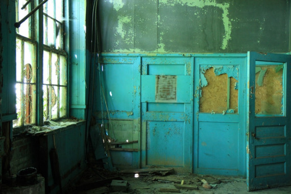
Taking a more abstract approach to photography, Souiki captures the unexpected beauty in abandoned buildings. Peeled wallpaper, abandoned furniture and layers of dust or rust depict the essence of what’s referred to as ‘urban decay photography’. Her work is more conceptual, creating thought-provoking pictures that inspire those who view it to consider the past lives of the places and objects she’s photographed. She successfully captures the impact of decay on a room or place’s atmosphere.
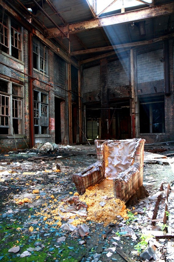
Despite the reoccurring ‘memento mori‘ theme throughout her work, her images include bursts of colour that radiate a sense of beauty in the area being photographed.

What Souiki’s photographs is determined by the colourful and unique details of her surrounding environment. She picks out these elements which are often overseen. Her focus on abandoned places is rooted in their transient nature- their decaying beauty is momentary, mercurial and bound to disappear. This type of photography presents a sense of urgency- to take in the beauty surrounding her in the moment before it degenerates further.
The role of Souiki in my project:

For some images, the composition is greatly improved with the usage of colour. The choice of colour in architecture has a remarkable effect on the way a building is perceived by those that view it, walk by it or occupy it. In most cases, architects appear to view colour as a distraction, preferring to focus on form and structure. However, when colour is included, it can impact the viewer emotionally or even physiologically; additionally drawing focus to different areas of a composition in a way that a monochrome image struggles to achieve.

In response to this, I may experiment with both monochrome and colour images. The main conflict with this is that colour takes away from the objectivity of the place being photographed. However, if captured successfully, colour can accentuate the form and shapes within a structure. Additionally, Souiki takes a more abstract and conceptual approach to her work, one which I may explore further for my project.

Exam Theme- Initial Ideas

Transition

After being given the choice of Freedom/Limitations or Transition, I decided to explore the exam theme of Transition as I had mainly focused on themes of ‘liberation’ and ‘rebellion’ in my previous project.
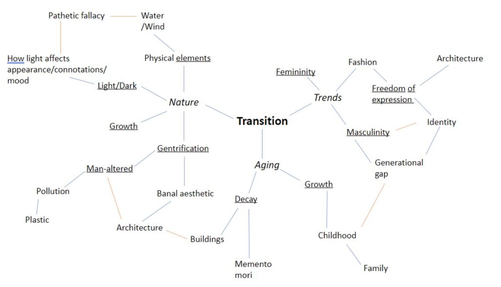
In order to develop ideas about the nature of my project, I created a mind map. I started with the three things that I initially associated with the word ‘transition’, which were: Nature, Aging and Trends (political/social/cultural). Having established these three sub-themes, I noted down ideas about Light and physical elements and how different elements or lighting can manipulate mood (Pathetic fallacy). I also noted down ideas about Gentrification and architecture, as well as gender, decay and aging.

Artists to explore

Lewis Baltz:

Important figure in the New Topographics movement of the late 1970s. In the New Topographics, “The pictures were stripped of any artistic frills and reduced to an essentially topographic state, conveying substantial amounts of visual information but eschewing entirely the aspects of beauty, emotion and opinion,.” “[…] rigorous purity, deadpan humor and a casual disregard for the importance of the images.”

Gentrification and the Banal Aesthetic:

Lucien Hervé:

https://blogs.getty.edu/iris/the-photographer-with-the-soul-of-an-architect-lucien-herve-le-corbusier/

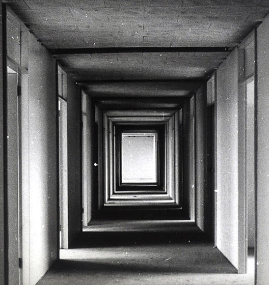
Hungarian photographer. He was notable for his architectural photography, beginning with his work for Le Corbusier, who was a French architect, designer, urban planner and one of the pioneers of what is now regarded as modern architecture.

He aimed to create “cinematic visual experiences unfolding over time.”

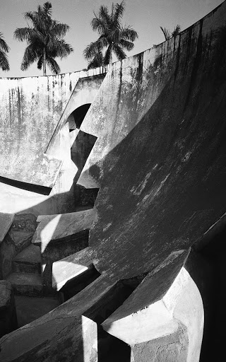
Architecture: Light and form

Irina Souiki:

Peeling paint, crumpled wallpaper and empty chairs are a few of the unexpected beauties that Irina Souiki has found while photographing abandoned buildings. Her images pay attention to the fine detail that creates decaying beauty.

Urban Decay:

Gerry Johansson:

Tokyo

Swedish photographer. He makes “straight and pragmatic” photographs with “an objective view of a geographic location.”

Banal Aesthetic:

Elle Pérez:

American photographer whose work explores gender identity, intimacy, vulnerability, and the relationship between seeing and love. Pérez is a gender non-conforming trans artist.

Gender Identity and expression:

Gillian Wearing:

British artist whose conceptually driven photographs and videos investigate power dynamics and voyeurism in everyday life.

Newspaper Spreads

FULL-BLEED:

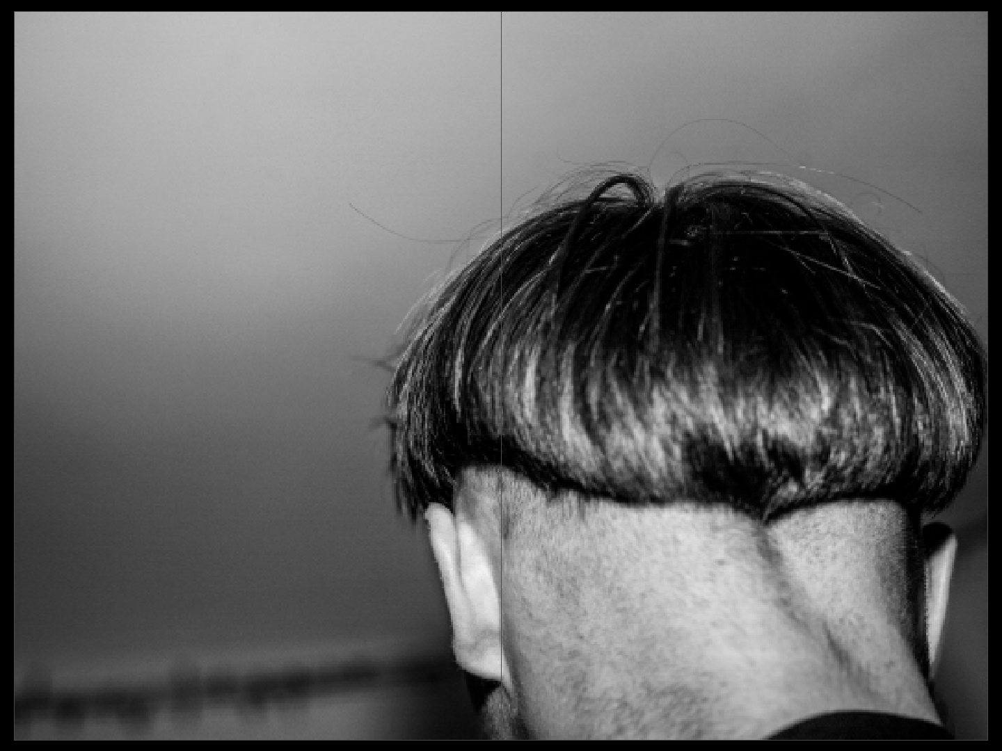
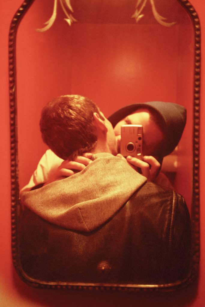
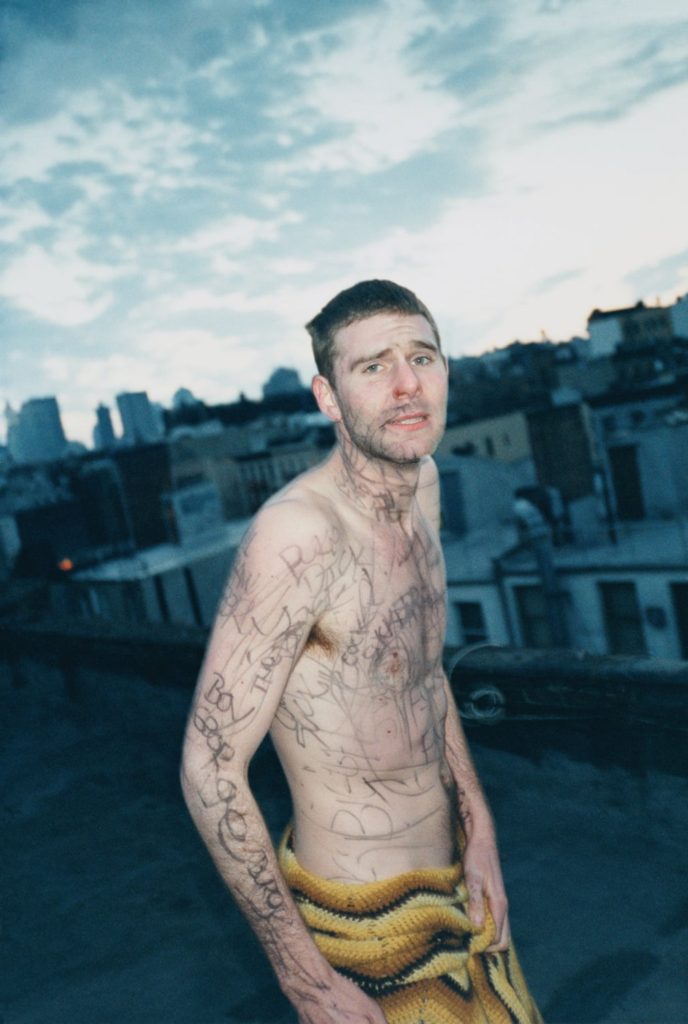
Similarly to my photobook, I chose this image as a full-bleed spread as It’s highly ambiguous. The image doesn’t reveal any one identity but represents the actions and shared experience of much of the modern youth- D.I.Y haircuts and a lack of concern for ones appearance, as they continue to develop their identities and experiment with different experiences.

JUXTAPOSITION:

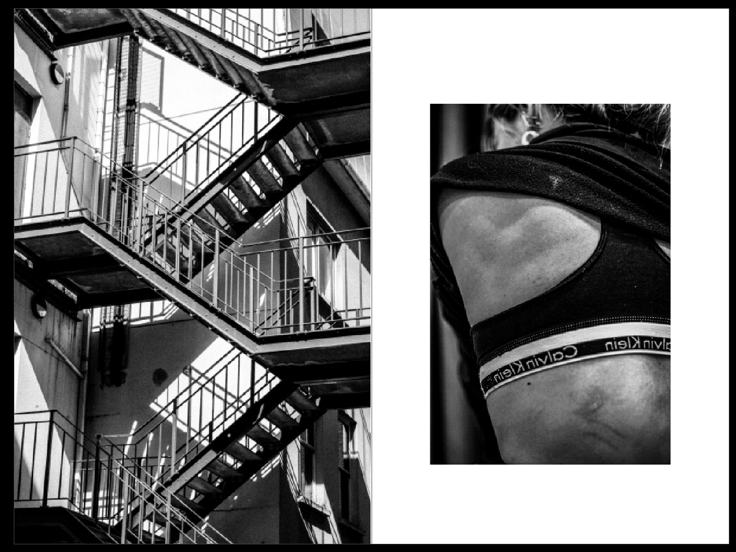
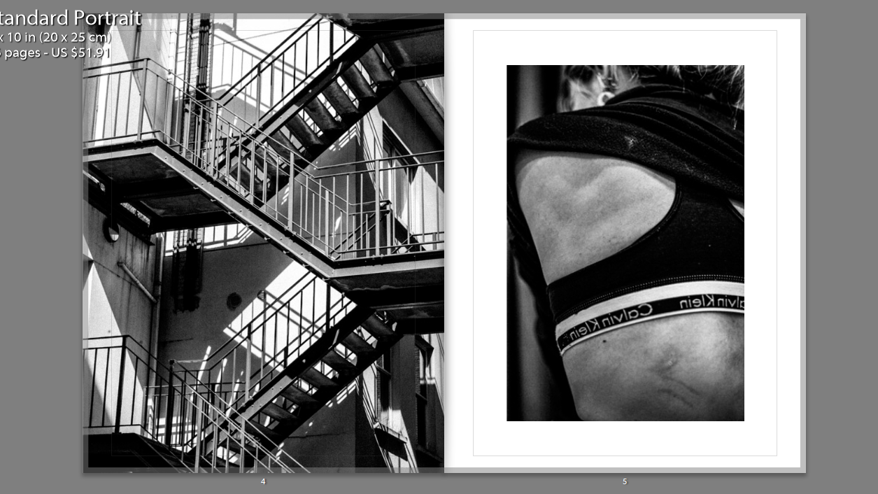
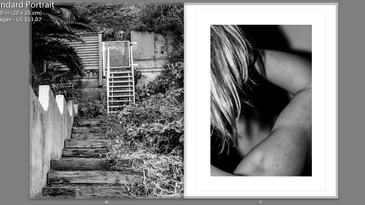
Using another pair of images from my photobook, I juxtaposed an abstract image of a staircase alongside an image of my back. The images are both presented in black and white, so as to focus on the structure and form of the photos. The regularity and structured nature of the stairwell mirrors that of the bone structure and anatomy of the human body. This is a strong juxtaposition as, despite the different experiences we go through as people, we’re all connected via our function- just as the function of a stairwell is the same no matter how it is designed or where it is located.

SEQUENCE:

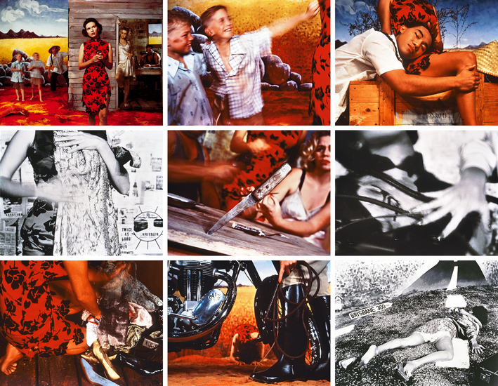
My initial inspiration for my sequence piece was from the nine images from Tracy Moffatt‘s ‘Something more’. The sequence tells a somewhat ambiguous story of a young woman who, from the title of the piece, is searching for something more- bringing in themes of lost innocence and the sense that this woman has outgrown the security and comfort within her life.

The set of images are highly theatrical. Each of these ‘scenes’ can be displayed in pairs, threes, rows or in a grid to manipulate the storyline. There is a clear arc, however, from naïve country girl to fallen woman abandoned on the roadside no matter how the images are arranged.

Moffatt piece focuses on the device of montage, mixing together a continuous narrative, flashbacks, cutaways, close-ups and memory or dream sequences, to structure the series.

My response:

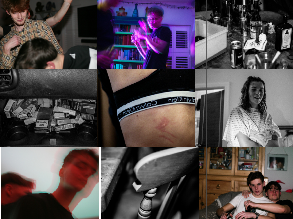
For this particular sequence I used a mixture of high clarity images and low shutter speed images. The images with clarity were placed in black and white to amplify the objectivity of them. In contrast to this, the images showing bright colours and fast movement allowed for a depiction of altered states, if not caused by then at least related to the images with high detail.

MONTAGE:

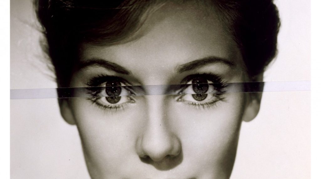
Finally, to create my montaged images, I focused on John Stezaker, a British artist who is fascinated by the lure of images. Stezaker’s work is produced by taking classic movie stills, vintage postcards and book illustrations and making collages to give old images a new meaning.

The different adjustments (inverting and slicing) of these separate pictures together allows Stezaker to explore the subversive potential of found images.

My Response:

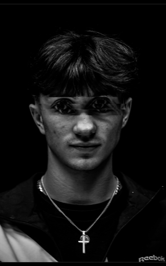
To carry through this depiction of altered states, I took a formal portrait I created and placed it on multiple layers in photo-shop. Having done this, I cropped the eyes of the layered images and placed them unevenly above or below the eyes of the original photo. This allowed me to create a portrait depicted the possible feeling of being in an altered state, to which the audience can take inference from.

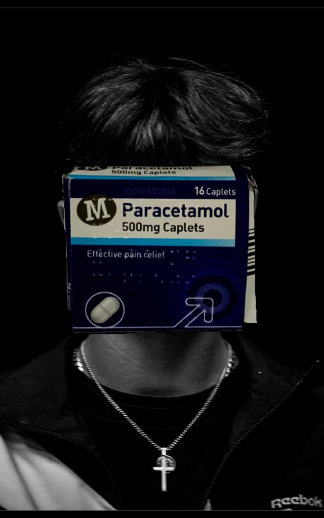
Additionally, I superimposed a pack of paracetamol (commonly mixed or overdosed with) on top of the same formal portrait. Like previously, this removed the identity of my subject and resulted in an image that represents the social issue of drug use throughout the modern youth.

Final Prints

Selection 1:

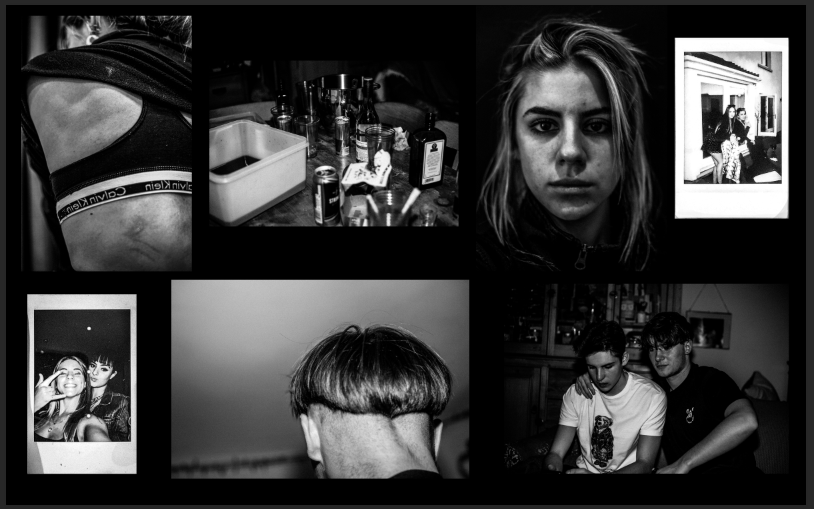
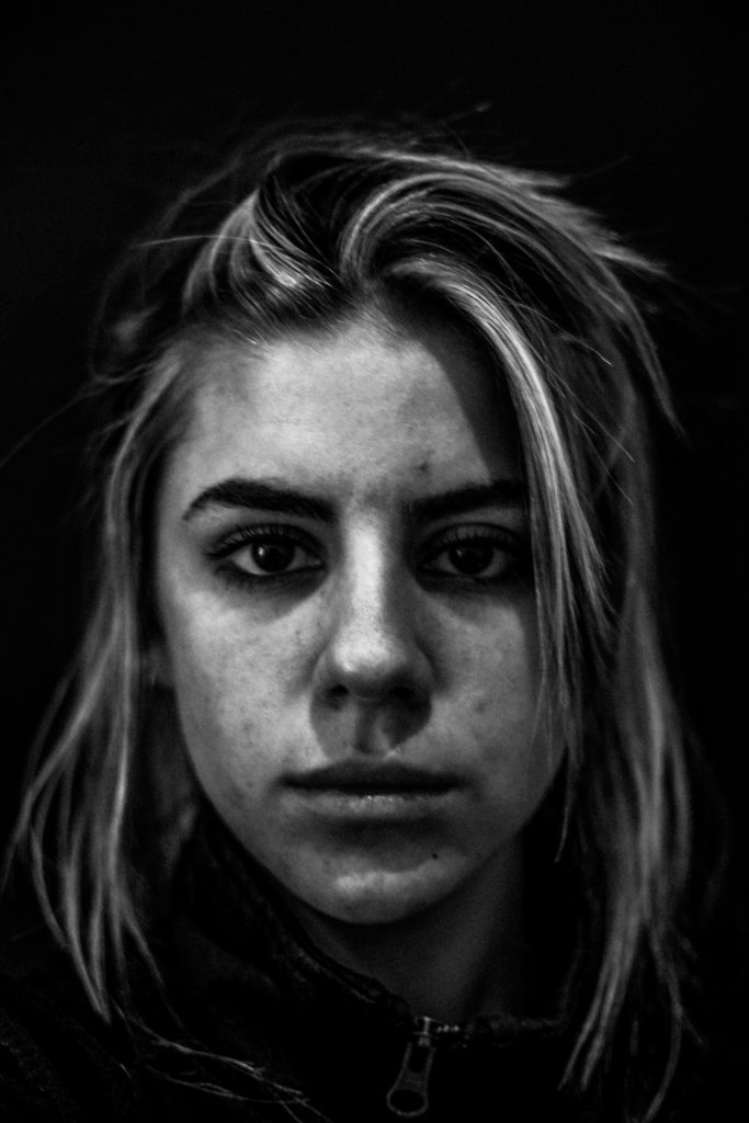
To create this selection of images, I chose the ones that best represented, to me, the aspects of youth culture. By including a portrait of myself making direct eye contact with the camera, I can personally address the audience. By having the remainder of my subjects facing away from the camera, it is clear that the project shows the characters within my life rather than depicting their own lives.

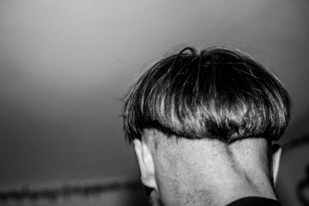
I converted all the images into black and white to give a timeless and archival feel to the images. The lack of colour allows the focus of the images to be on the concepts behind it. For example, the portrait depicting the back of my subjects head (when in black and white) shows the nature of his haircut- impulsive, choppy and d-i-y.

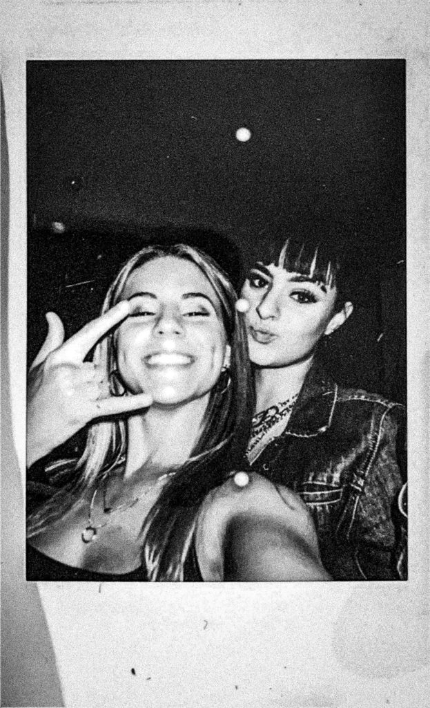
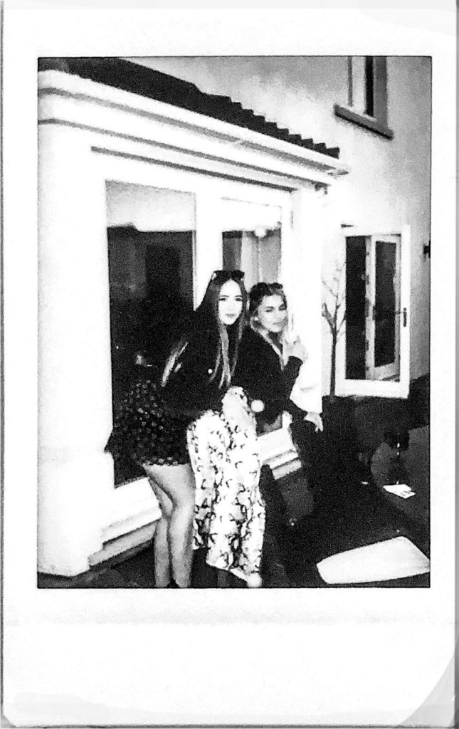
I felt that this selection of images presented themselves quite randomly and didn’t link together the way I had aimed them to. To rectify this, I decided to include the use of Polaroid images so as to amplify the archival feel of the set. Not only did this show the personal aspect of the images, providing an insight into the creation of the images and the nature of the project. An additional advantage of adding these images to the set is that it allowed me to place the images in a closer proximity to one another, which, in turn, amplified the link between the images. The lack of space from one image to another implies a sense of immediacy which shows the chaotic and frenzy-like nature of youth.
Selection 2:

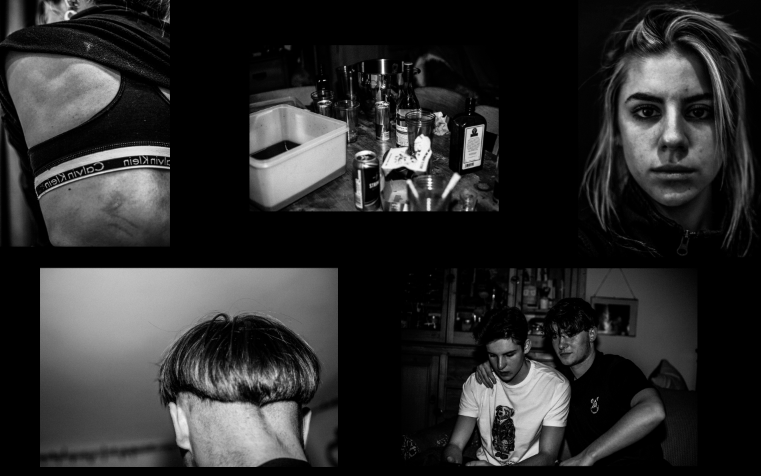
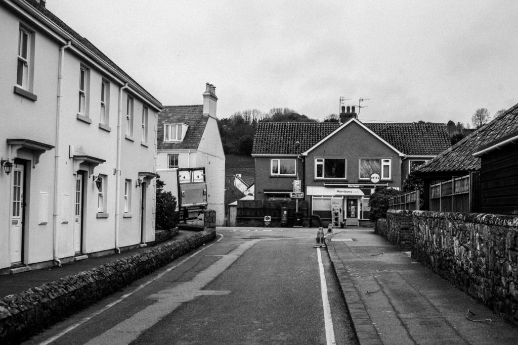
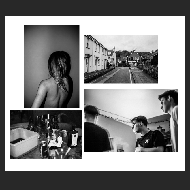
For the second selection, I aimed to shift the narrative of the images from youth as a group to the life on one individual. Filler images, such as location and alcohol use, provides an account of the subject’s life and aids in giving insight into the lifestyle of the individual pictured.

When creating the layout of the images, I decided to maintain a sense of anonymity about the individual, by keeping the portrait taken of their back and removing the portrait where their face can be seen. My reasoning for this is to provide a sense of intimacy, as the person can only be recognised by others if they have been seen first-hand with this same intimacy. However, paired alongside my photo-book, the audience will already have knowledge of the identity of the subject and so the collection of images provides a new perspective as well as the possibility of a new narrative.

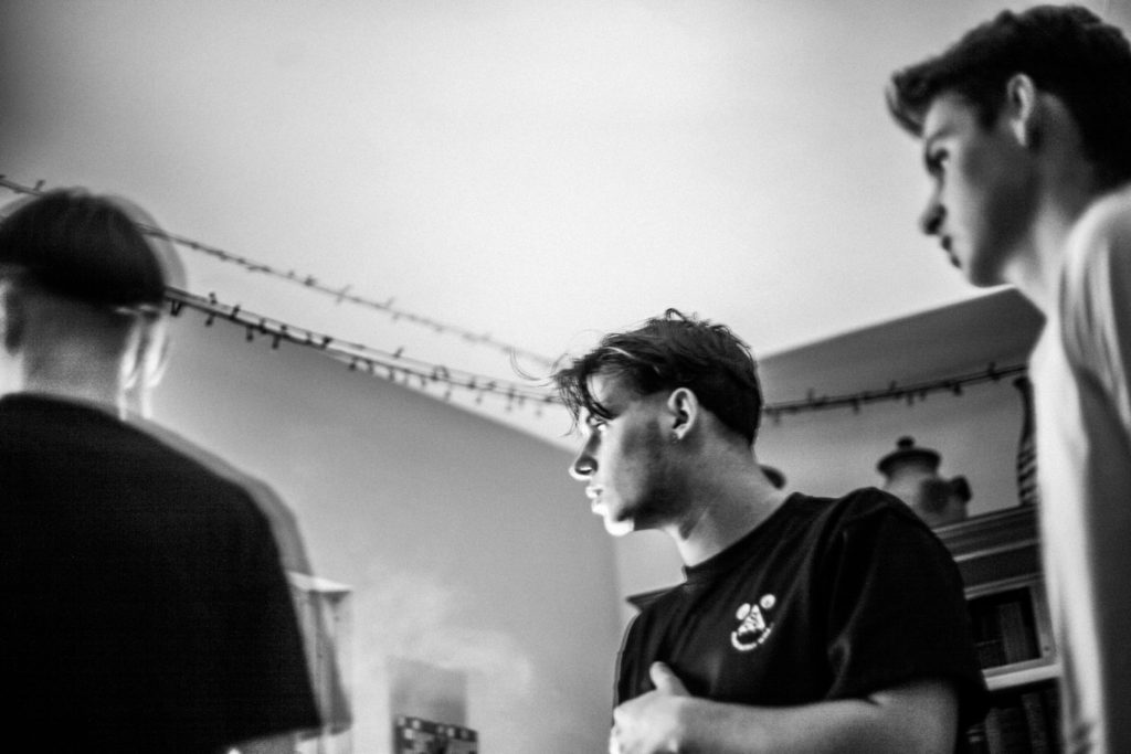
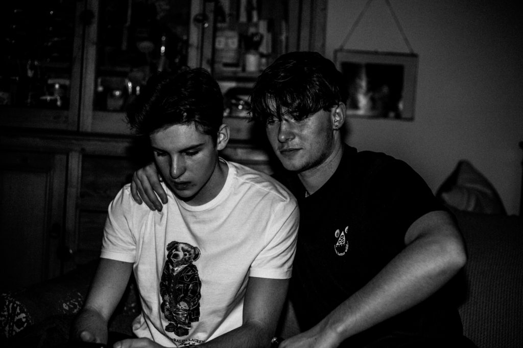
Choosing A3 for this portrait immediately establishes its importance in the narrative of the selection. I chose a second image to print as A3, a candid photo depicting three male individuals, whose focus is pictured away from the camera. This composition provides a sub-narrative, one of which implies promiscuity in accordance with the intimate portrait pictured alongside it. Having both these images as establishing shots creates a clear link between the two. The ambiguity of this link provides several different narratives to which the audience can interpret- The strong and dominating stance of the males (due to low camera angles) is contrasted by the fragility and vulnerability presented by the second portrait (due to the fact the subject is facing away from and possibly oblivious to the presence of the camera)

Essay Entry

In what way have Jim Goldberg and Ryan McGinley represented youth in their work?

‘Youth’ is described as the period of life in which one is young. It often describes the time between childhood and adulthood where individuals are maturing, filled with vigour, spirit and a sense of freshness. More specifically, ‘youth culture’ refers to how children, adolescents and young adults conduct their lives. It calls attention to the way they express their own identities and demonstrate their sense of belonging to a particular group. The concept behind youth culture states that teenagers are part of a subculture in which the values, rituals, behaviours and norms they share differ from the widely accepted culture of older generations within society. Jim Goldberg and Ryan McGinley explore youth culture towards the end of the 20th century and investigate how modern youth are stereotypically viewed. Goldberg focuses on the lives of derelict children and, specifically, how their behaviour is a result of neglect from their own families and of a failing institutional society. In contrast, McGinley focuses on the reckless experimentation adolescents carry out, not as a result of external influences but rather as a decision to rebel against the governing law. Both photographers, however, explore ways to gain insight into the practices of these individuals in order to dissolve society’s judgement of the youth subculture. In response to McGinley and Goldberg, I have produced a photo-book incorporating the themes of youth and rebellion. The project is a social commentary, showing a rejection of the governing law and of societal standards as a whole. The product explores the freedom of youth and, more specifically, the culture that surrounds myself and one particular social circle.

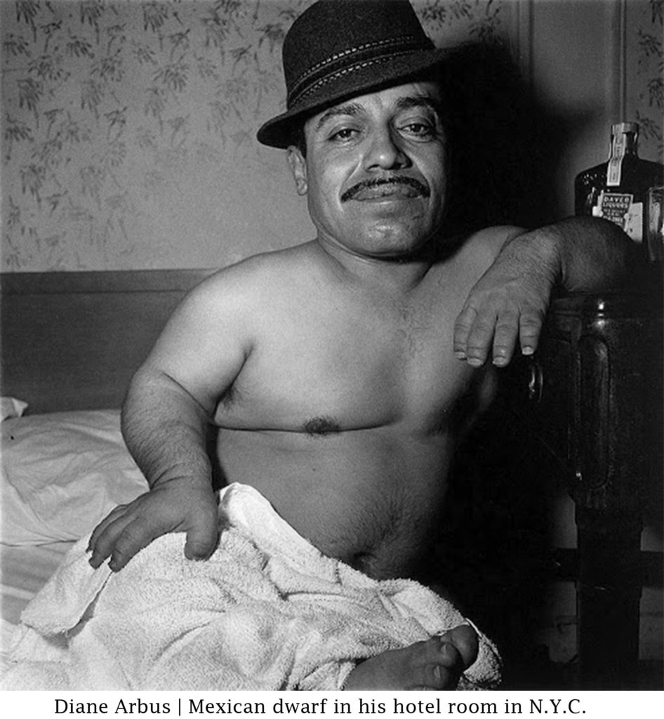
In her seminal essay Inside/Outside, postmodernist critic Abigail Solomon-Godeau dissects and explores the two different positions that a photographer can take on when photographing their subjects. Firstly, Solomon-Godeau describes Susan Sontag’s view on these roles, where she argued ‘the insider’ as implying a position of ‘…engagement, participation, and privileged knowledge…’ whereas the position of ‘the outsider’ produces an ‘…alienated and voyeuristic relationship…’ between photographer and subject, in turn emphasising the differences between them. Solomon-Godeau refers to Susan Sontag’s criticism of Diane Arbus in her book, On Photography in which she states that the work of Arbus was exploitative and complicit with processes of objectification. Sontag’s criticism raises questions about the morality of the person behind the images, arguing that Arbus is a ‘voyeuristic and deeply morbid connoisseur of the horrible’. However, Solomon-Godeau questions this strict binary established by Sontag and argues how a photographer’s involvement with their subjects might be more complicated. She does so by investigating the relationship between photography and truth.

A concern of Solomon-Godeau is how an insider position- in which the photographer lives with and has emotional connection to the subjects- can determine the reception of the images or, still, the nature of the images itself. In regards to Arbus’ photographs, Solomon-Godeau believes it may not have been Arbus’ intent to manifest distate towards marginalized people she’s represented; that- contrary to her intention- Arbus’ subjects became that of objects and spectacles due to the ways of society at the time.

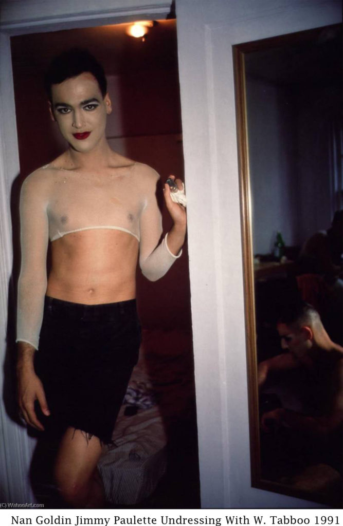
For Solomon-Godeau, Nan Goldin in particular represented the ‘confessional mode’ of privileged knowledge and experience in which the photographer has an inside position and a personal relationship with the subjects presented. Goldin’s work is compared to Diane Arbus as its characters are drawn from the outskirts of society. Often appearing in the images herself, it is clear that Goldin is devoted to and invested in her subjects. However, despite this deeply personal relationship, it’s pondered whether this can alleviate the phobia and contempt manifested towards her subjects by a hetero-normative society. Solomon-Godeau questions whether photographic representation, however sympathetic it may be, can change the views of society towards those considered outside society’s normal standards.

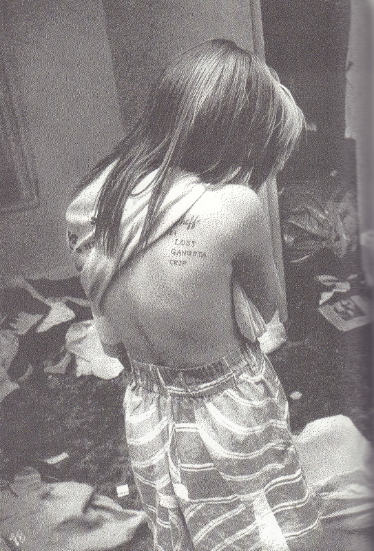
In regards to Raised by Wolves, Sontag may argue that Goldberg takes an outsider’s approach to the subjects within his project. Yet, arguably, Goldberg’s approach differs from Sontag’s assumption in Solomon-Godeau’s eyes. In this case, the assumption that taking an outsider perspective leads to an unsympathetic, objectifying and voyeuristic attitude to those being photographed can be easily rejected. Though he is not pictured, Goldberg’s presence is evident throughout his project and, particularly, in the conversations that take place between himself and his various subjects. The book opens with a double page spreads of what appears to be a grey suburban home, obscured by trees and shaped as though the house is being viewed through binoculars. Almost immediately, an interview between Goldberg and staple character ‘Echo’ is written in text about her backstory and what led her to living in the streets. This instantaneously shows Goldberg’s involvement with the subjects. Similar interviews and anecdotes told by the subjects are present throughout Raised by Wolves. This, in turn, indicates that there isn’t as strict of a binary as mentioned by Sontag referencing a photographer’s position. Despite being an outsider, Goldberg approaches his subjects with sensitivity and empathy, repeatedly allowing for their input throughout. Goldberg gave back to his collaborators (his subjects) by returning photographs to comment on and personalise. The images are sometimes scrawled with text signifying the different identities, challenges, and resilience of the adolescents, and other times capturing a bleak and quiet reality of street life.
Raised by Wolves reveals itself to be a political piece of post-modernistic work. It discloses itself as photographic documentation, social intervention and piece of artwork, additionally incorporating the multitude of approaches made by postmodernist artists such as eclecticism and collaboration. In her book, On Photography, Susan Sontag states that the photographer who photographs a subject cannot intervene in the event occurring, while the photographer who intervenes cannot take the photographs. This pattern within traditional documentary photography states plainly that the photographer should be entirely separated from their subjects’ lives. Goldberg breaks this paradigm in Raised by Wolves by placing himself directly within the narrative. Some argue that the lack of pictures of Goldberg is merely a case of the photographer avoiding interfering with the occurring event, though a stronger argument is that Goldberg’s intervention in the lives of his subject creates a more intimate and sincere reflection of his subjects compared to a photographer who explicitly photographs from outer bounds.

Goldberg presents his subjects, a subculture of neglected and out-casted adolescents, with great delicacy. The narrative focuses on dysfunctional family life in America, about the way teenagers have been led astray, how each one of their rituals is driven by drugs, violence and lack of affection. However, it also highlights love and friendship as a key theme. The compassion Goldberg approached his subjects with revealed and reflected the kindness they showed each other, which is often overlooked and blocked out in the average person’s encounter with the destitute. The narrative is gripping, encouraging the reader to question, rather than to judge the lives of these homeless teens. His in-depth focus on this group of youth has a huge emotional impact on the reader and the political aspect behind Goldberg’s images is present throughout the book. He challenges the generalisations often made about homeless groups in America, in turn posing the reader with questions about the survival of these teenagers, and what their motivation is for survival, considering the bleak reality of their lives. His project aims to question the faults within America’s institutional society that resulted in the troubled lifestyles of these adolescents. As a result, his work presents itself as a highly successful social campaign, attempting to alter the views on vagrant communities and encouraging the current society to approach these groups with sensitivity and to address the failures apparent in society they live in.

Goldberg and Mcginley both take a post-modernist approach to their work. Postmodernism emerged as a response to modernism and a reaction to the age of enlightenment in the late 19th century. Modernism had been based on idealism and an idyllic vision of human life and society. It made the assumption that specific universal truths such as those formed by religion or science could and should be used to understand the nature of our reality. Postmodernism, however, has been built on scepticism and suspicion. It aimed to challenge the idea that there are universal certainties or truths; embracing the complicated and contradictory meanings of images. Postmodernism is focused on the context of its art by making references to things outside of the art work itself such as political, psychological or cultural issues. It focuses on the reception of the artist’s work by their audience.

Regardless of his focus on adolescent lifestyle in America, the work of Ryan McGinley majorly differs from that of Goldberg. In his self-documentary book, The Kids Were Alright, Mcginley captures the outrageous antics and activities of himself, his peers and collaborators, such as street artist Dash Snow, within lower Manhattan through the late 1990s. Taking an insider’s approach, his photographs are that of present and intimate moments, such as those with first boyfriend, as well as moments of exhilaration and introspection. Despite the often mundane setting, McGinley’s images of his youth demonstrate an extensive range of emotions.

McGinley’s approach to his work is similar to Goldberg in the sense that it is mixed with assorted objects and ephemera, such as a set of cameras that he repeatedly threw up upon. In an interview with Autra, McGinley states ‘I would do this project where I would drink Ipecac syrup, the stuff that you give babies if they eat poison berries or something, and it makes them throw up’. This is a clear example of the reckless and absurd behaviour typically associated with youth subcultures. A number of people McGinley drew himself to were considered compulsive and obsessive, many of which died young from AIDS, suicide and drug overdoses. Additionally, McGinley also approached his subjects with a great deal of respect. Having surrounded himself with graffiti writers, McGinley learnt about and presented the paranoia that these artists had. Creating graffiti and vandalising properties was a risky pass-time due to the ‘Grafitti Squad’: a commission established to stop graffiti in New York City. McGinley gained the trust of and photographed the entirety of the IRAK graffiti crew, which had been prioritised by the Graffiti Squad as a group to dismember. He respected these individuals by avoiding their faces and tags whilst they were producing their art. McGinley describes their paranoia as ‘healthy’ and states that he was fascinated by the similarly obsessive and compulsive nature of graffiti, two themes which are present throughout his work.

His post-modernistic approach is present through the collaboration with Dash Snow, an American artist multi-media artist, well-known for his work that embodied a rebellious, drug-fueled lifestyle; one which ultimately led to his demise. In reference to McGinley’s work, Snow stated that “People fall in love with McGinleyʼs work because it tells a story about liberation and hedonism: Where Goldin and Larry Clark were saying something painful and anxiety-producing about kids and what happens when they take drugs and have sex in an ungoverned urban underworld, McGinley started out announcing that ‘The Kids Are Alright,’ fantastic, really, and suggested that a gleeful, unfettered subculture was just around the corner—’still’—if only you knew where to look.”. Similarly to Goldberg, his images show the theme of love and friendship; the intense connection he had with his group at the time. The lifestyle of this particular group of youth separates them from that of a typically normal society, claiming that they slept all day and took advantage of the night, therefore becoming the only people in each others lives.

The work of Ryan McGinley is not in the same political sphere as Jim Goldberg. Whilst Goldberg focuses on how society fails to protect and support children in America and, furthermore, represents the teens that use drugs and carry out illicit activities as a way to escape their past, McGinley presents the thrill-seeking and hedonistic approach him and his friends had during their youth, shooting heroin and carrying out all manners of debauchery in the pursuit of pleasurable experiences. These differences are clear in the nature of their photographs, McGinley’s images are expressive and unrestrained showing the self-indulgence and deviance present in their lives, whereas Goldberg presents the desperation and troubled nature of his subjects. Both, however, are strong examples of post-modernism- giving insight into the varying youth subcultures in America.

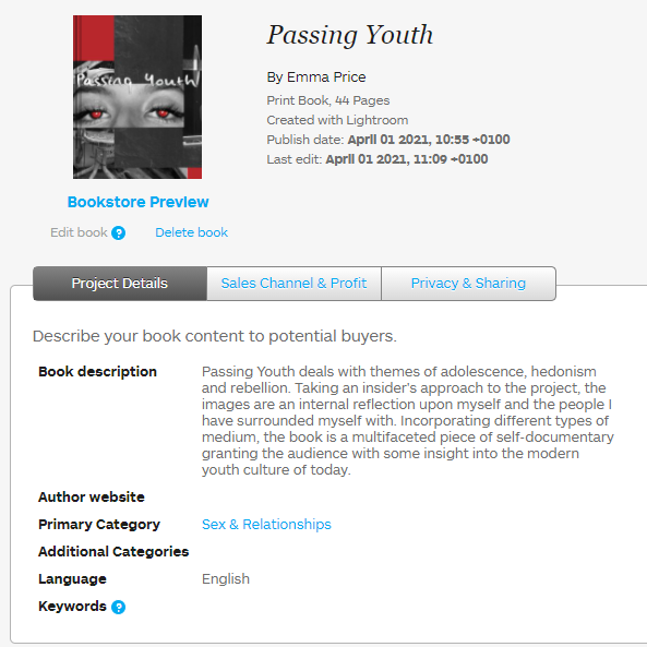
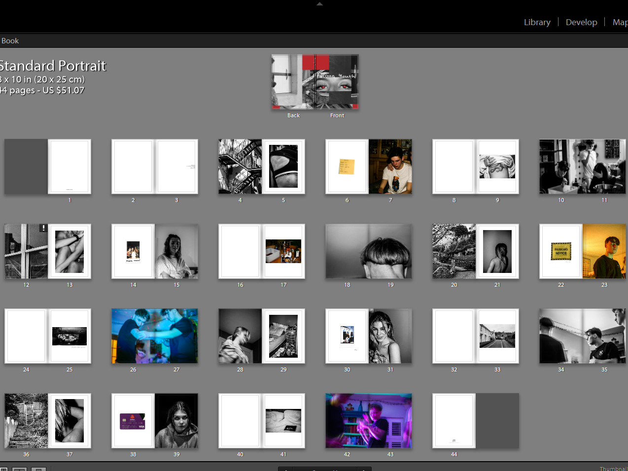
In response to Jim Goldberg and Ryan McGinley, the photo-book Passing Youth deals with similar themes of adolescence, hedonism and rebellion. Taking an insider’s approach to the project, the images are an internal reflection upon myself and the people I have surrounded myself with as of late. Incorporating different types of medium, the book is a multifaceted piece of self-documentary. Ephemera within the book include parking notices, polaroids and debit cards, some of which represent the irresponsible and absent-minded nature of modern youth. Passing Youth is similar to that of McGinley’s work as it focuses on my personal life, rather than a whole generation. The images of people within the book have a great deal of significance to me, as well as the locations and personal items throughout the book. My project has a clear personal input, involving myself directly into the narrative through my presence in the images and, additionally, through the use of personally handwritten captions to add context to the images. This aspect allows my project to directly correspond with the work of Jim Goldberg as his collaboration with his subjects produces a similar outcome to my own work.

https://autre.love/interviewsmain/2017/5/20/the-kids-were-alright-an-interview-of-ryan-mcginley

https://www.nytimes.com/2017/02/06/t-magazine/art/ryan-mcginley-kids-were-alright-museum-contemporary-art-denver.html

https://www.e-flux.com/announcements/90076/ryan-mcginleythe-kids-were-alrightbasquiat-before-basquiatwall-writers/

Design Process

Front cover

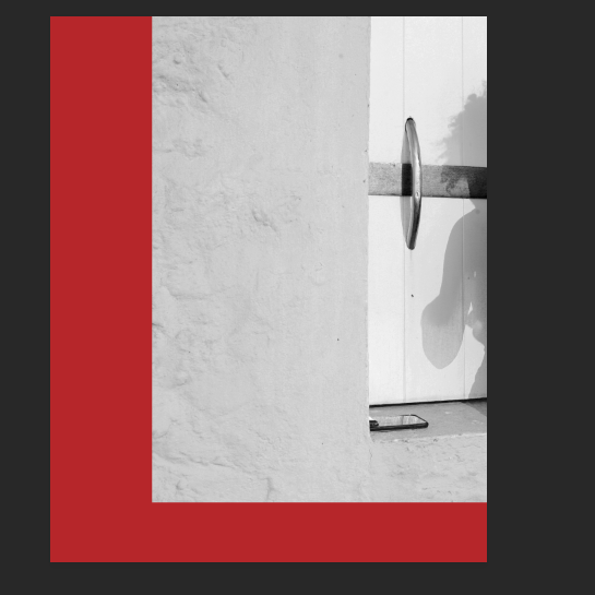
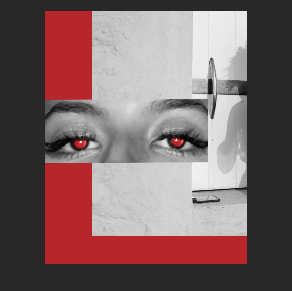
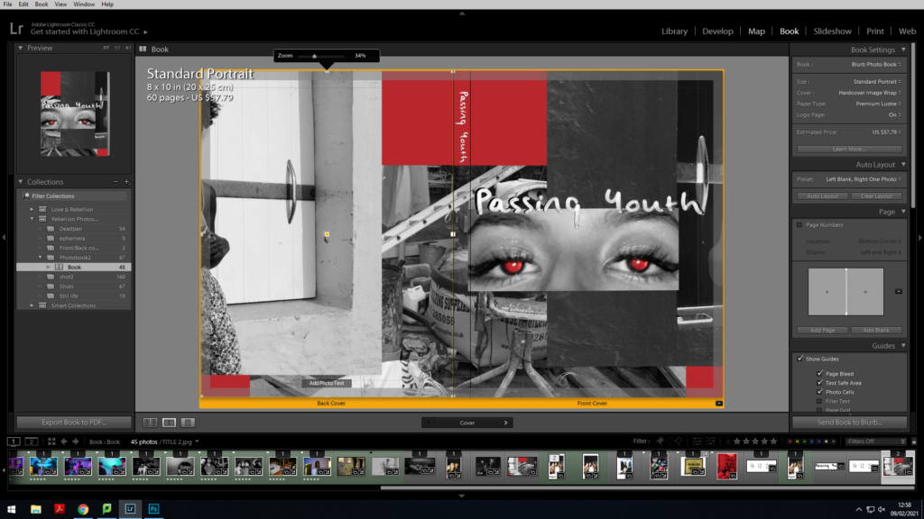
Using photoshop, I began my initial design by layering a monochrome image on top of a red background. The vertical line splitting the image is parallel to that of the frame of the photo as well as the frame of the book and so provides a strong format. The image I chose depicts the shadow of my subject and thepresence of their phone. I felt that positioning the image so you cannot see the subject is successful in drawing the reader in, as the identity of the subject is ambiguous.

I broke up the format of the image by superimposing my subject’s eyes on the top layer. I selectively chose to keep the red pupils and keep the remainder of the image black and white so the red colour in the background can be present throughout the design without looking random.

This image has an empty alt attribute; its file name is image-146-1024x576.png

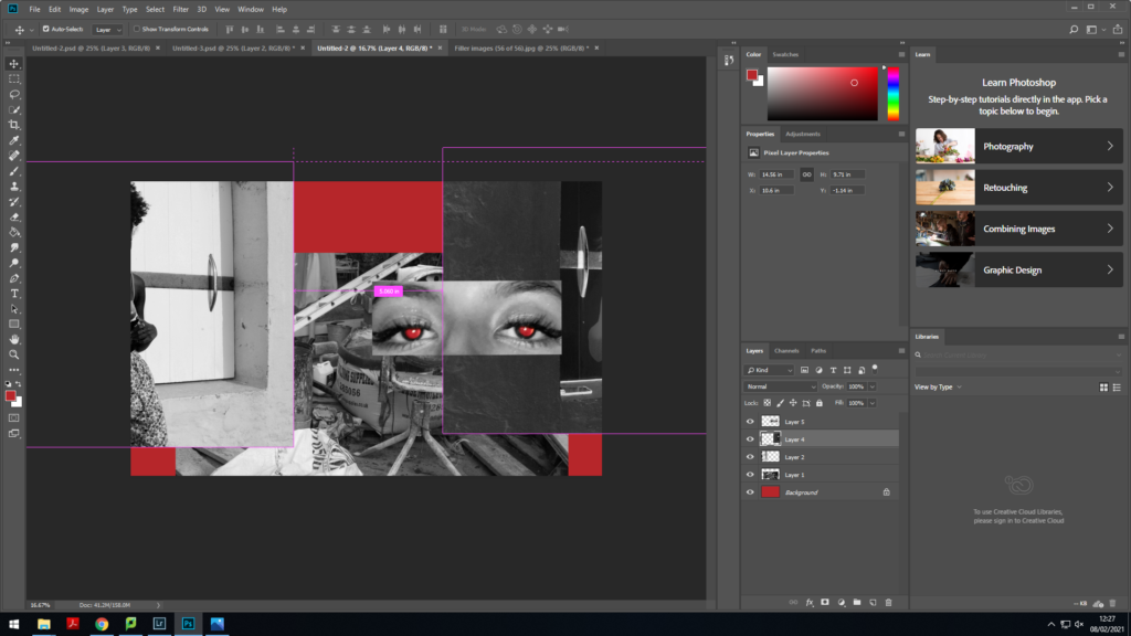
I felt as though the cover wasn’t as contrasted as I had initally hoped. To improve the cover, I inverted the colours of the second layer and placed the original image on to the back cover (left-hand side). I chose one of my images from my shoot which had a lot of objects within the composition to place behind the second and third layer. The composition of this particular image allowed me to incorporate a lot of noise into the cover. By layering the images and choosing ones with a busy composition I could successfully show the fast-paced, confusing and messy nature of youth.

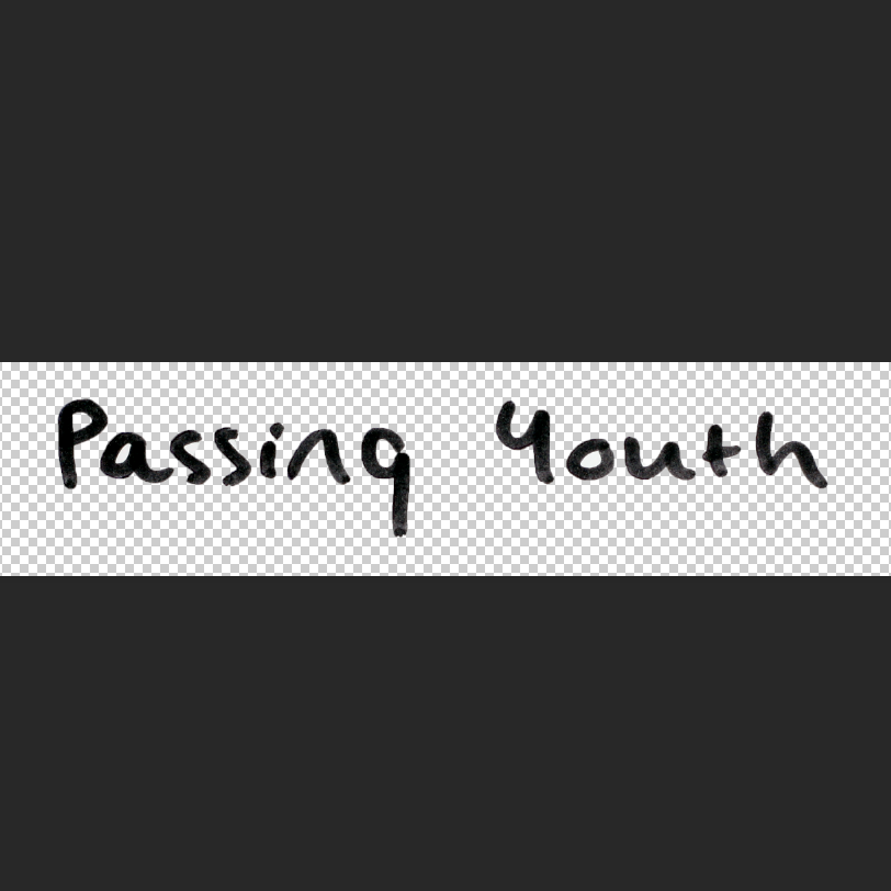
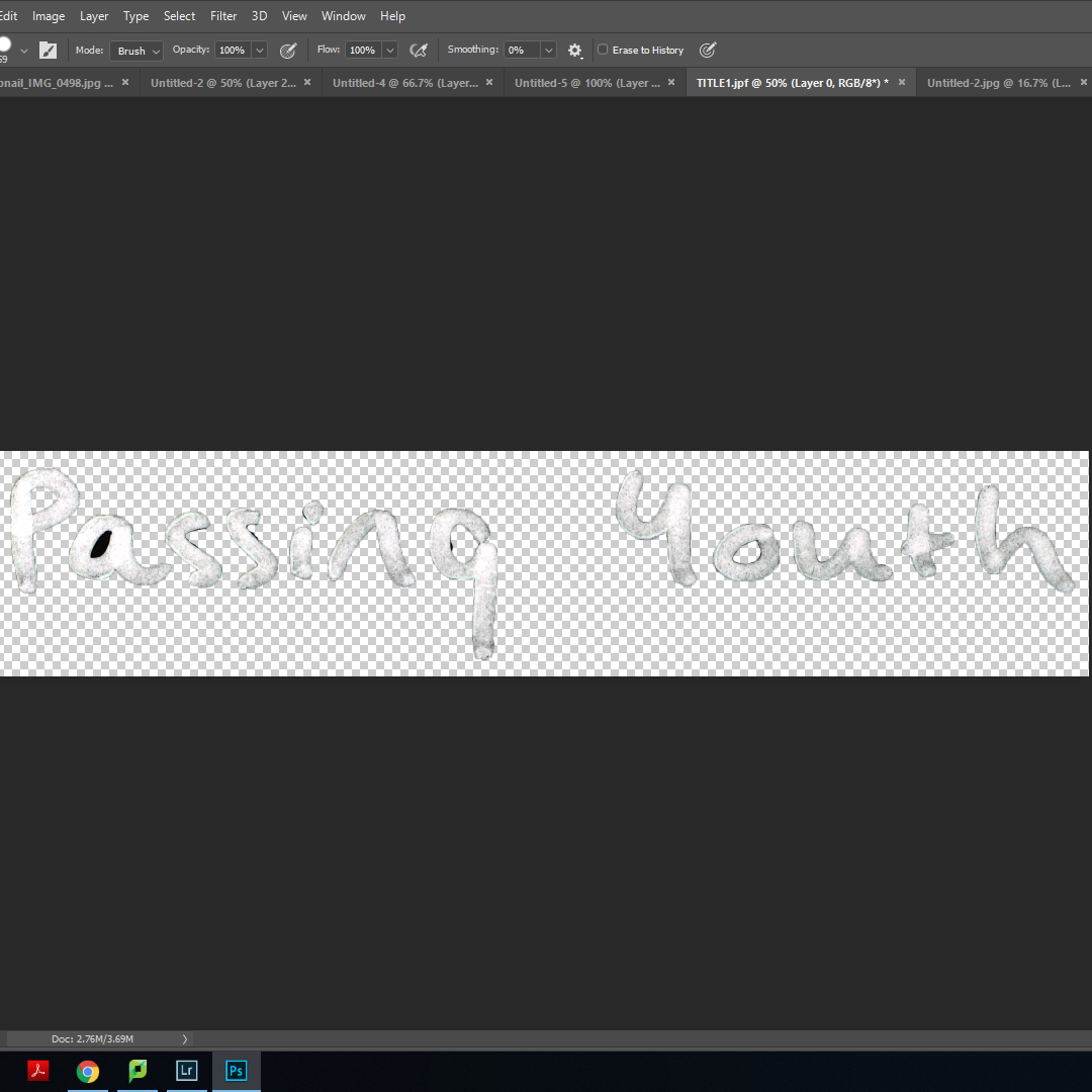
To create my title, I wrote ‘Passing Youth’ in my own hand-writing. Using a marker pen allowed me to get the width that I desired. I photographed this using a copy stand and imported the image into photoshop. I then selected the text and placed it onto a new layer, deleting the original background. This allowed me to place the text directly on to the front cover without any white background. I created another copy from this and inverted the colours to make the text appear white.

I used the black title as a base for the white text and placed it just above the eyes. Placing the white text on top of this created a title that stood out amongst the background. The fact it was handwritten adds to the personal-scrapbook feel I had intended my book to have. I then reused the white text and placed it where the spine of the book would be so you can see the title when the book is stored upright.

Super-imposing images

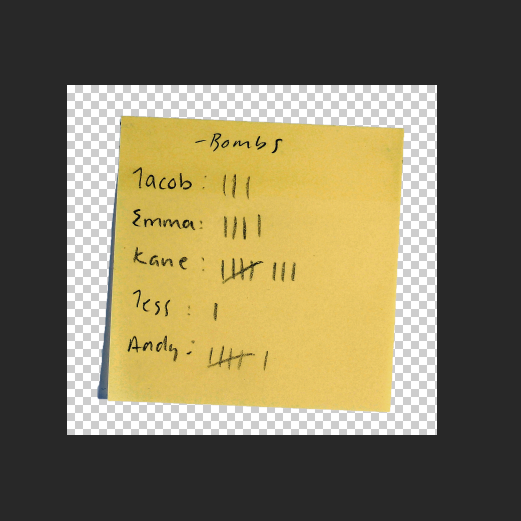
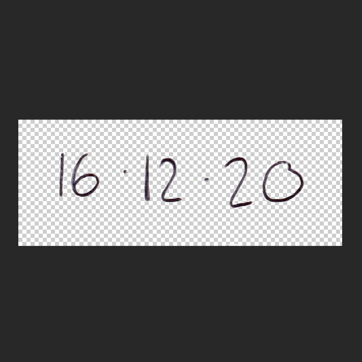
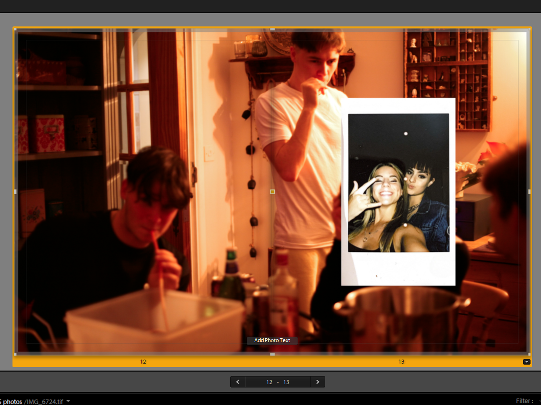
Having designed the cover, I aimed to incorporate a similar layering style throughout my book. To carry this out, I planned to have hand-written elements acting as captions to provide context as well as adding personal mementos from my own life to give the reader context as well as a deeper insight into my life and adding depth to my character. I wrote on post-it notes, white paper and used the copy stand to re-photograph these as well as scanning in polaroid pictures and other ephemera.

Using photoshop, I carried out a similar process to that of my title; selecting the desired object or text and removing the background so it can be seamlessly placed on top of another image.

For the image pictured on the left, I imposed an image of myself I had taken on a polaroid. The lack of depth in the polaroid compared to the background image creates the illusion of a physical scrapbook in which you stick images or artefacts on top of other images or pages.

Pictured on the right, I used photoshop to cut out my handwritten note ‘dizzee rascal’ and place on top of the polaroid I scanned in. The text provides context to the image as the reader can now create their own narrative about the subjects getting ready and attending a music concert.

Editing images:

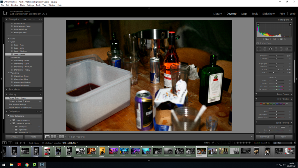
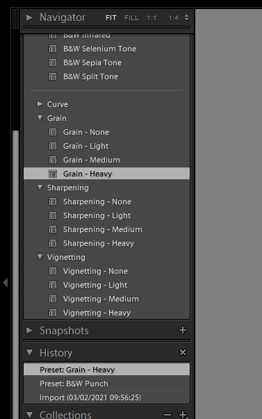
In order for my images to fit accordingly with the eggshell paper and front cover of my book, I felt that adding a grain to my images made them feel more authentic and amplified the rough-edged nature of the book.

For the majority of my images, I wanted to amplify the authenticity of my book

Architecture

For the layout of my book, I finally decided on the sequence pictured above. For each section of the book, most open with an image of a location juxtaposed against an abstract image of myself. It then transitions into an image of ephemera and a quiet image or portrait. This leads into another quiet image either establishing a location or decision/action which develops the reader’s insight into the characters. The sequence is broken by an establishing shot (mostly in bold colours) and then repeated.

Juxtaposition:

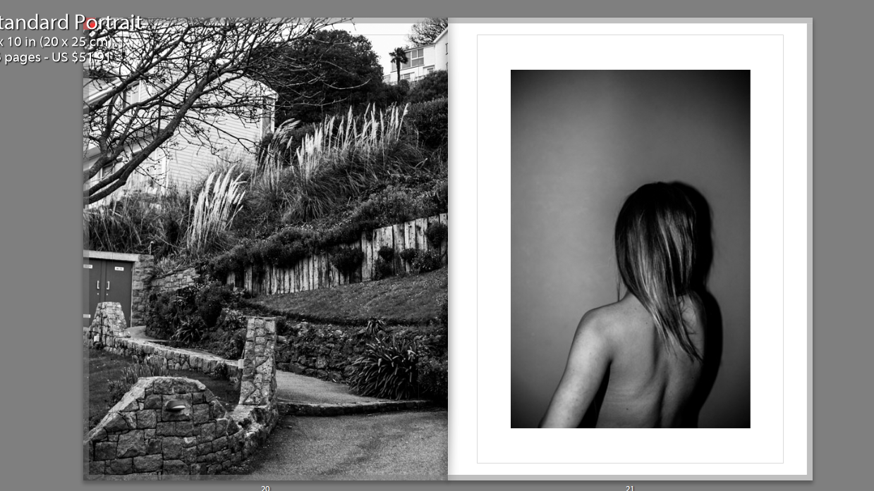
I juxtaposed an abstract image of a staircase alongside an image of my back. The images are both monochrome, allowing focus on the structure on form of the photos. The regularity and structured nature of the stairwell mirrors that of the bone structure and anatomy of the human body.

Additionally, without showing my face, it creates a sense of intimacy between the reader and the subject pictured as they attempt to create links between the two images.

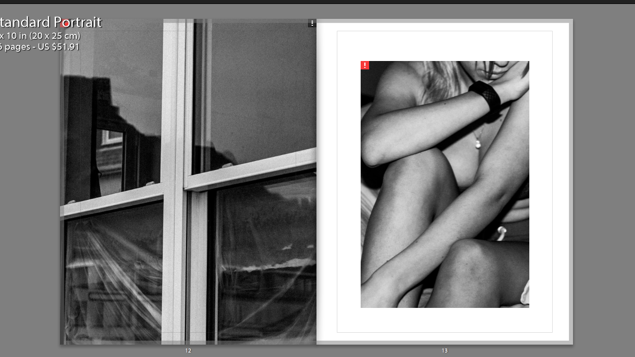
In this set of images, the form of the window, particularly the borders, mirror the body language of the subject photographed. The fact the window is covered up creates an idea of secrecy and privacy, amplified by the lack of facial identification in the portrait.

The depiction of skin in the portrait paired with the secrecy portrayed by the window frame creates ambiguity, which can be interpreted subjectively by each reader- presenting a place of comfort, for example, or creating a narrative in which the character presented feels the need to be recluse and hide the nature of their life.

Once again, the structure of the location mirrors the body language of the portrait. The sloping of the shoulders mimics the sloping face in the location photographed. Additionally, the curvature of the path mimics the curvature of the spine and shoulder blades. In contrast, the softness in the texture of the foliage mirrors that of the subject’s hair.

The location pictured depicts a mixture of natural structures and man-made structures. The foliage and nature within the image paired with the large amount of skin shown creates themes of liberation and a sense of rebellion against socially accepted norms (usage of clothing to cover skin). This is contrasted against the man-made structures which present a theme of limitation, due to human intervention, which again reiterates the governing laws in which the subject’s in my book are working agaisnt.

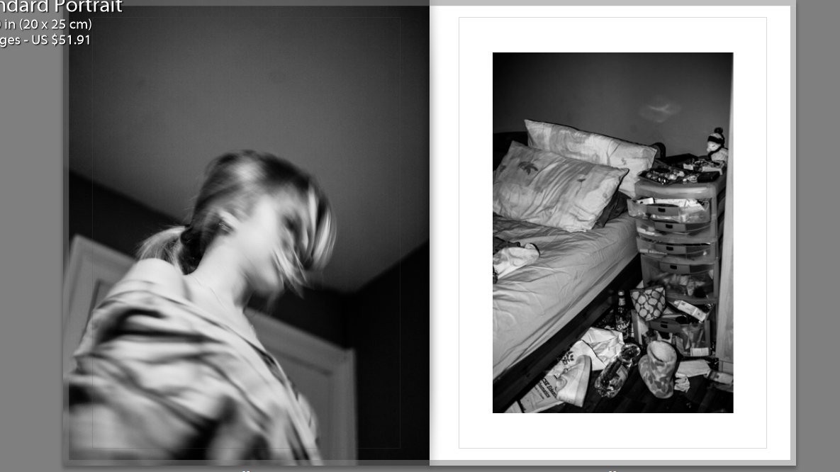
Though it differs from the structure of the other juxtapositions, the location on the right shows a lack of self-care due to the mess, in turn presenting a disregard for expectations of cleanliness and in turn order as placed by society.

Juxtaposed against a slow-exposed image, the movement presents a fact-paced lifestyle in which order and “self-care” has no place in. It may also represent the turbulent mindset and head space of the individual

The texture of the hair mirrors the texture of the foliage, again reiterating the connotations mentioned earlier. Additionally the curvature of the muscles and where they overlap imitates that of the staircase.

Sequencing

First Pages:

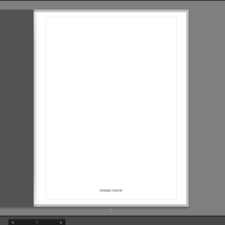
The first page has the title written out in formal writing, so as to reiterate the connotations associated with it. The same font is carried on to the next page, which begins the narrative which is, contrastingly, written in lowercase. The uppercase lettering of the title ‘Passing Youth’ shows the order established by society, amplifying the presumptions held by the reader about youth cultures.

The next page has the quote:

“hedonism is a rational response to a difficult life”

This immediately presents the idea that the characters inside each have a set of issues that they cope with by becoming reliant on different outlets- drugs, alcohol, body modification etc.

The lowercase letters present the quote with delicacy and fragility, encouraging the reader to approach the characters with sensitivity.

End Layout

Personal Investigation: Headshots

What am I photographing?

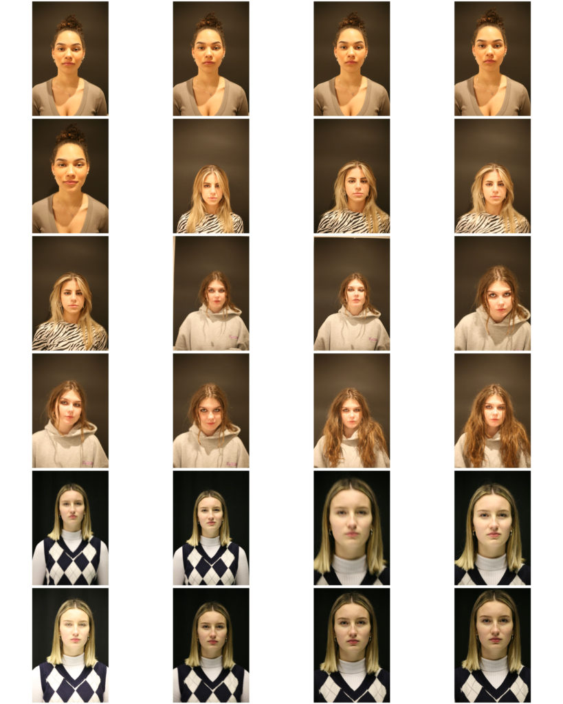
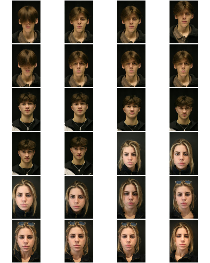
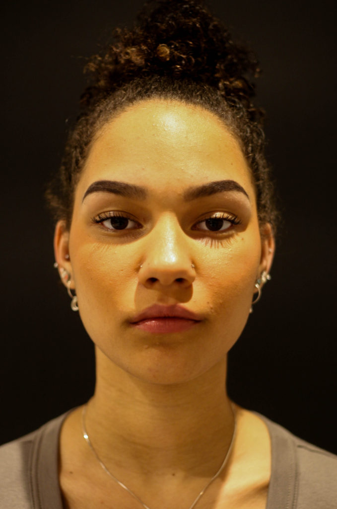
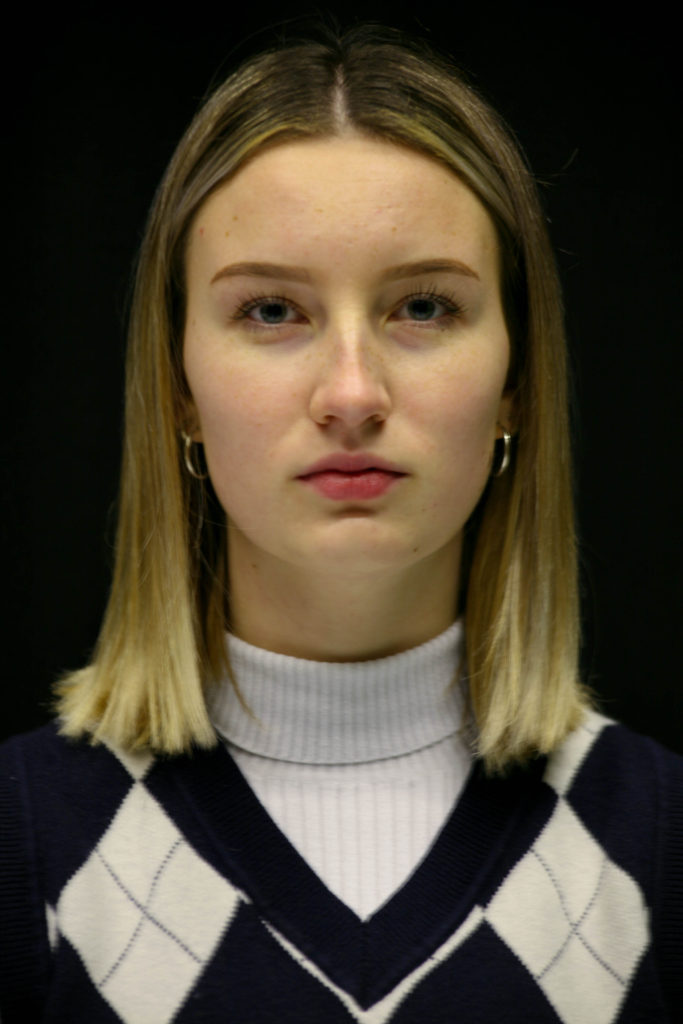
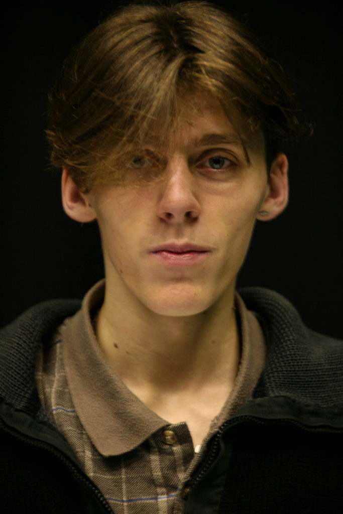
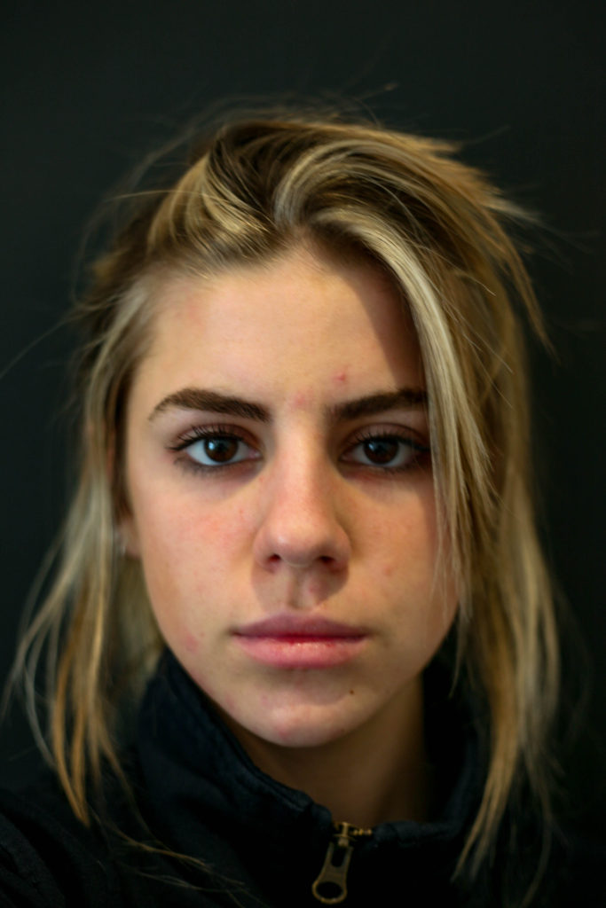
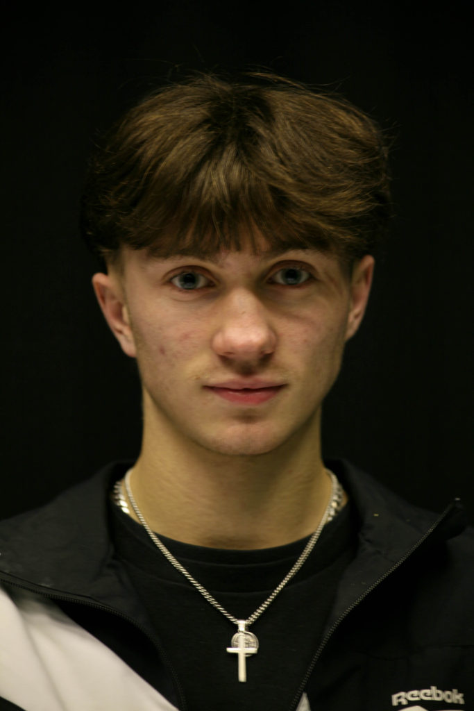
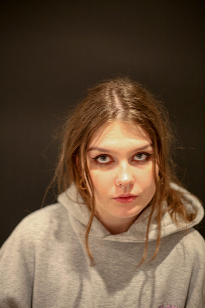
In an effort to further develop my photo-book, Passing Youth, I decided I want to create a photo-shoot in response to the deadpan approach. With my initial narrative focusing on a group of young adults, I aim to photograph each of these individuals using the same format. I am going to place my subjects in front of a black background, having them face to camera directly with a neutral face.

Images:

Selection Process:

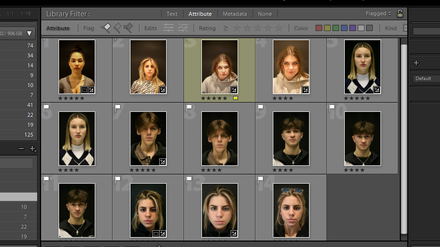
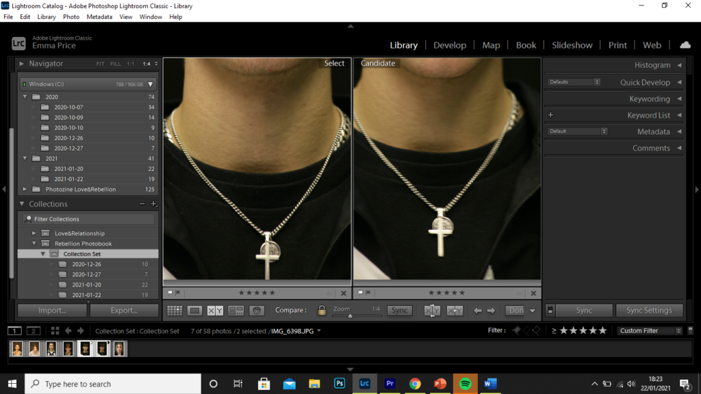
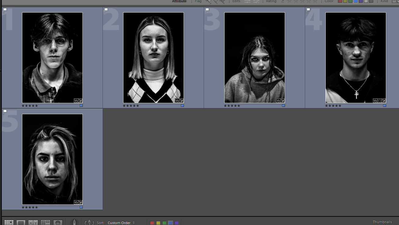
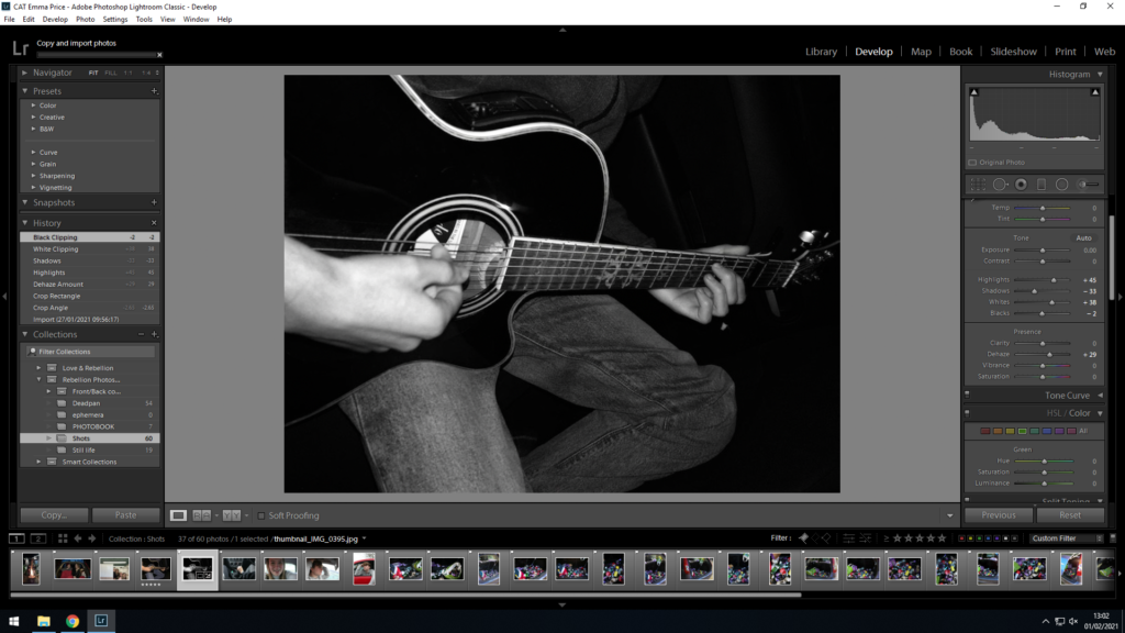
In deciding the most successful images, I picked the images with the best clarity. To do this I used the X|Y tool in Lightroom to compare, in greater detail, the quality of the images.

However, after placing these images alongside the remainder of the content for Passing Youth, I decided that I wanted the book’ narrative to become more revolved around myself. I response to this change, I carried out multiple photo-shoots of myself, capturing different angles, lighting and different body parts. My aim with these images are to give an insight into my character and by juxtaposing these with different contextual images, it gives the reader an understanding of the circumstances and different properties I’m surrounded by that have shaped my life.

Second set of Images:

Rebellion photobook shoot- LOcations

I reduced all the original ideas for my photo-book to:

  1. Location +Abstract portraits
  2. Ephemera + portraits
  3. Quiet images
  4. Full-Bleed establishing shots

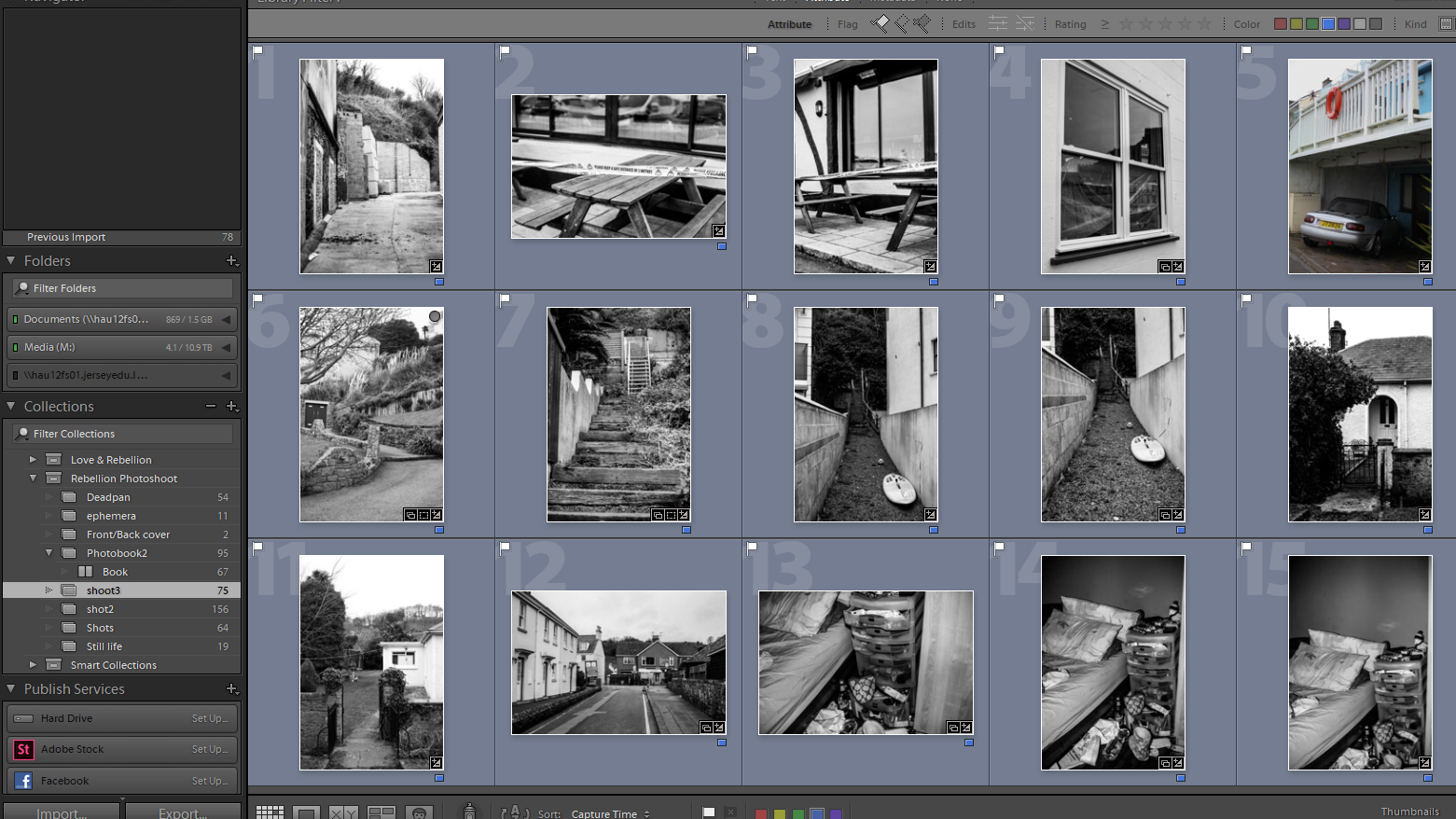
Focusing on the ‘Location’ aspect of my project, I focused on form and shape, and capturing images to use as quiet photos. I aimed to create images that would juxtapose with an abstract portrait of mine when designing the book.

I created a final selection (pictured below) to which I transferred to my ‘Book’ collection to be experimented with in the design process

I converted each of the images into black and white to keep the focus on the form and structure of the locations.

Personal Investigation: Establishing/Filler photos

What am I photographing?

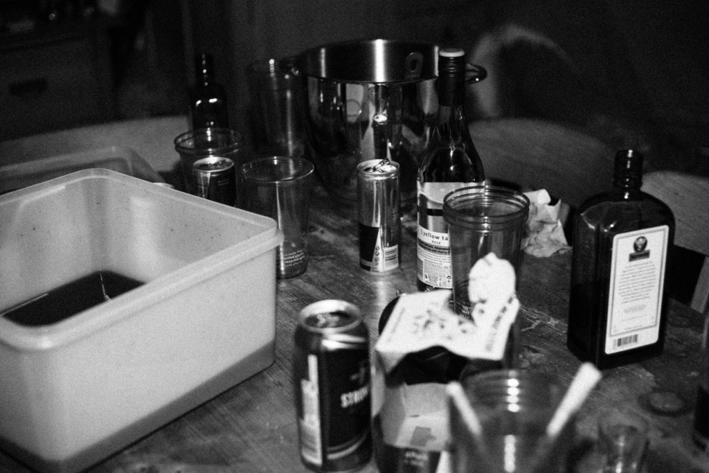
For this particular set of images, I mainly focused on the driving aspect of youth culture. A driver’s license typically marks the ‘coming of age’ for adolescents; the transition from the dependent nature of childhood to the responsibility and freedom that’s accompanied with adulthood. I aimed to capture the pleasures and frustrations of repairing or customising a car. Additionally, I aimed to photograph the abuse of freedom that’s common in youth. I am to carry out a shoot including the boot of a car, overloaded with alcoholic cans and bottles. This represents the careless driving aspect of my project, which I will accompany with a collected parking notice earlier on in the photobook.

Some other images I plan to capture, are candid portraits, images of injuries and finally of landscapes to add a sense of location to the project.

Selection process

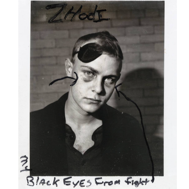
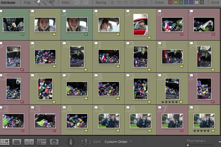
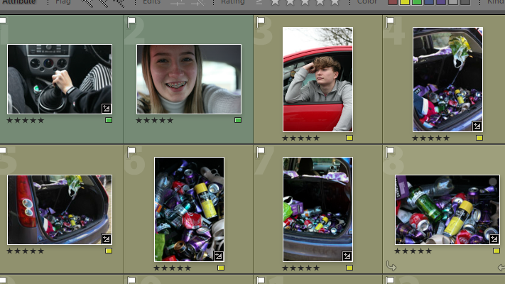
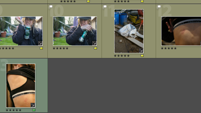
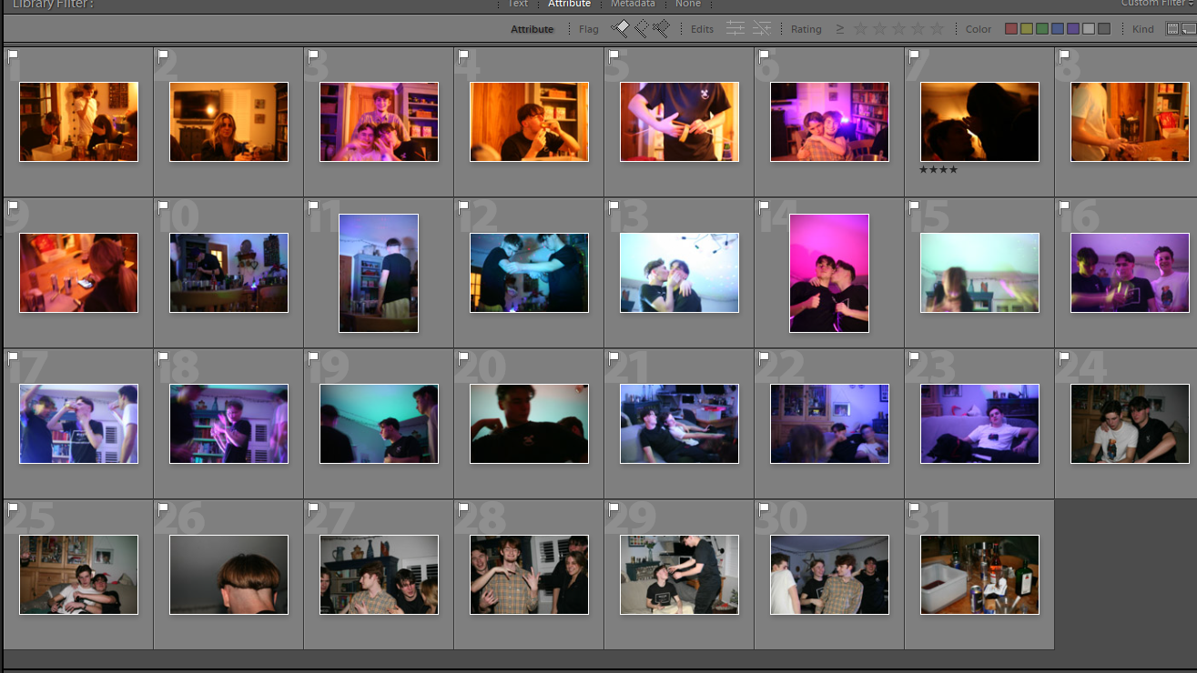
Considering the large amount of images I started out with, I went through each photo and flagged the best quality ones. I rejected images that I felt had no relevance to the project, that were bad quality, blurred or had a bad composition. Having flagged all the images above, I went through each image colouring it either red, yellow or green: a traffic light system to sort which images I disliked, which images I was undecided on and which images I was 100% certain on.
Finally, I rated each of the images either 4 stars or 5 stars. Rating the images with 5 stars indicated to me that these were the images I was certain on using for the project and 4 stars indicated images that I still thought were good but am less likely to use. Rating the images with 4 stars allows me to return to the images should the 5 star photos not work in my photo-book.

Selection Process

For another shoot, I had 161 photos to filter through. Using the same process as before, I narrowed my photo-shoot set down to

Editing