All posts by Diana DR

Filters

Author:
Category:

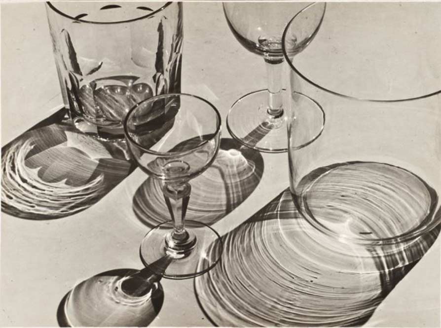
THE FORMAL ELEMENTS – ALBERT RENGER-PATZSCH

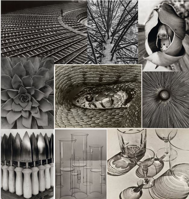
Albert Renger-Patzsh was a famous German Photographer (June 22, 1897 – September 27, 1966) known for his association with New Objectitvity; this was a German Movement which was their attempt in a reaction against expressionism.

He began his photography career when he was only twelve years old, in Würzburg where he was born in. After completing military service in the First World War he worked as a press photographer in the early 1920s, for the Chicago Tribune before becoming a freelance photographer. by 1927 he had his first museum exhibition!’

Albert Renger-Patzsh belived that “ the value of photography was in its ability to reproduce the texture of reality, and to represent the essence of an object.

He has also had many books for example this one titled: Die Welt ist schön which means The World is Beautiful
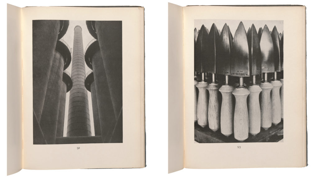
Image Analysis:
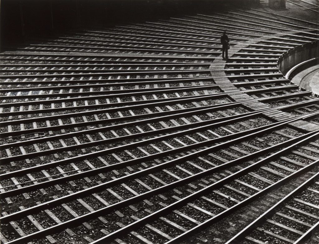
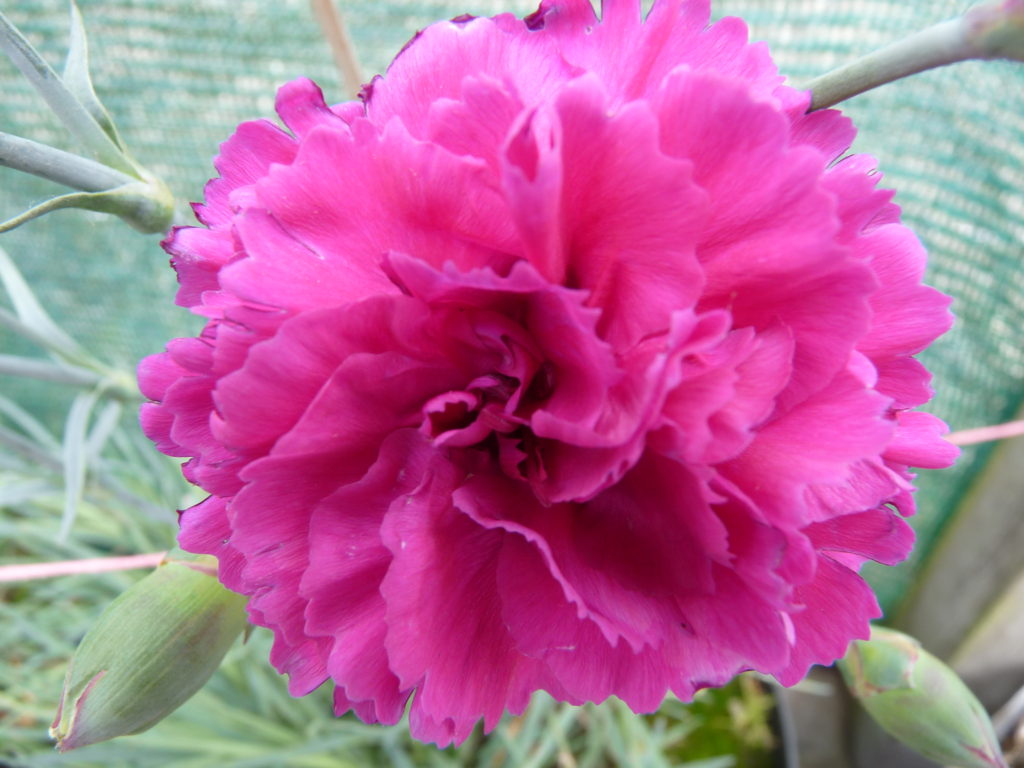
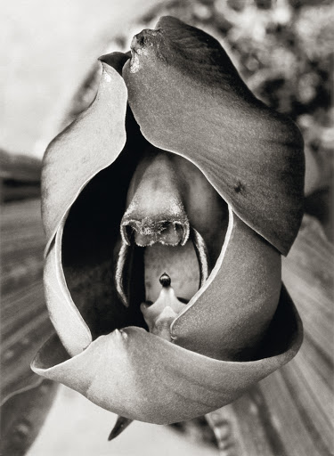
Organic vs Geometric / Natural vs Man Made: Here it is Clear that image 1 is Geometric through the clear distinction of sharp straight lines and has been made by humans through the use of tools and knowledge in order to create the almost spiral effect with these objects. Whereas Image 2 is Organic as it has been made by nature and has come from living matter without the use of chemical. It is also Natural as it has not been tampered with but simply allowed to grow and nourish naturally.

Rhythm: Both images seem to have a Circular / Spiral rhythm, In image one half the circle is shown dragging my attention to the inner circle and the man in the frame. In image 2 The flower petals form a natural spiral again bringing my attention to the center of the flower.

Pattern/Repetition: In image 1, it is shown through the arrangement of the wooden planks and the metal railings, In image 2 this is shown in the flower petals.

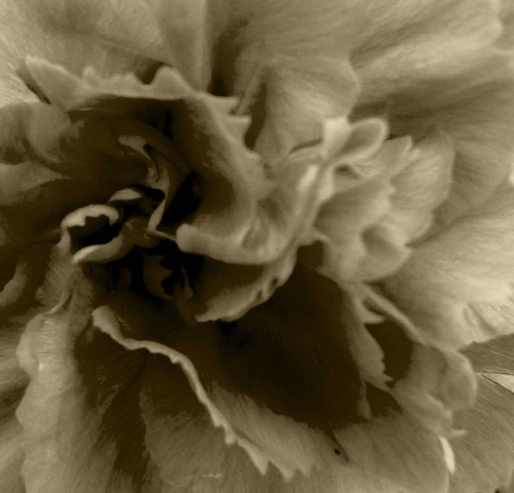
Tone/ Light: In image 1, dynamic range is present through the darkest points being the shadows on the top left edge of the frame and the lightest point being the shine of the metal railings from a source of light. This makes the image have a high contrast making the image look dramatic. In image 2, the tones are much more muted and the dynamic range is much smaller which almost romanticises the plant to show the power and natural beauty of nature instead of making it dramatic.

Depth: Both images show Depth as in the first image depth is shown through the use of shadows and the man in the frame and in image 2 depth is shown due to the angle the image was taken in again showing depth due to the different angling of the petals themselves.

Line: Line is shown clearly in image 1 through the metal railings and the wooden rows, In Image 2; however’ lines are shown through the outlining of the petals.

Framing/Cropping: In both images, they both seem to be cropped and not showing the entire objects/ buildings, In image 1 only half of the building design is shown, and in image 2 it is clear that some of the petals have been cropped out of the picture, I think this makes the audience think about the detailing of the objects instead of the object itself.

Photoshoot Plan

What: I will be taking photoshoot for this formal elements project in which I will be taking inspiration for Albert Ranger Patzch.

When: I will be taking these photos on multiple days during lock down in order to find object that will work with this project.

Why: I want this photoshoot to be different as this style doesn’t compare to my previous shoots so I hope to reflect that through my work.

How: I will use my Lumix camera with the sun guard for outdoors shoots.

Where: I will take pictures just outside my home for safety reasons.

Editing Process

For this project I decided to use Photoshop in order to edit my images.

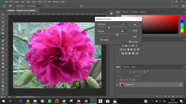
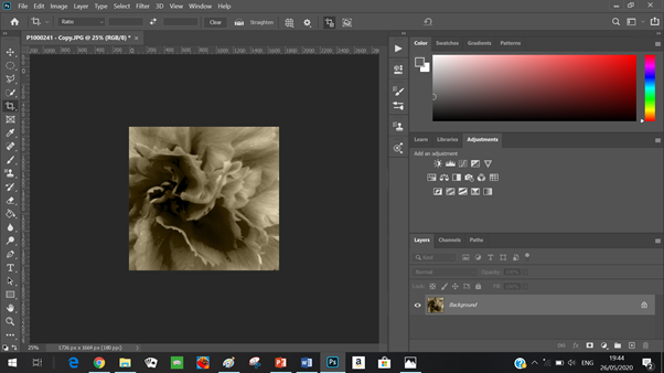
I started off by decreasing the brightness and increasing the contrast in order to add more dimension to the image without making the image too harsh.
I increased the Gamma correction slightly in order to again bring more dynamic range and dimension.
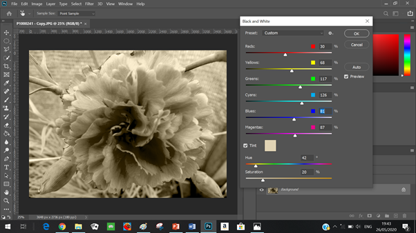
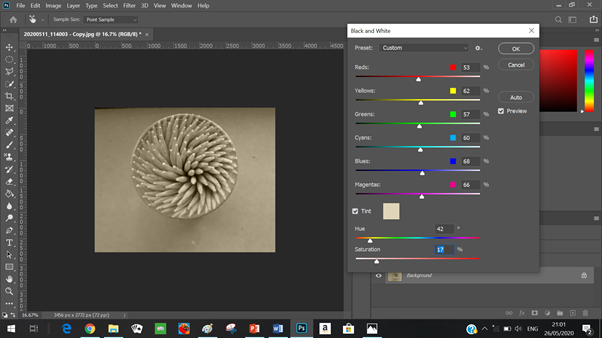
I then created a black and white filter which I adjusted to best fit the image, I also added a slight tint and saturation to create a type of sepia filter which I think reflected nicely with the style of my photographer.
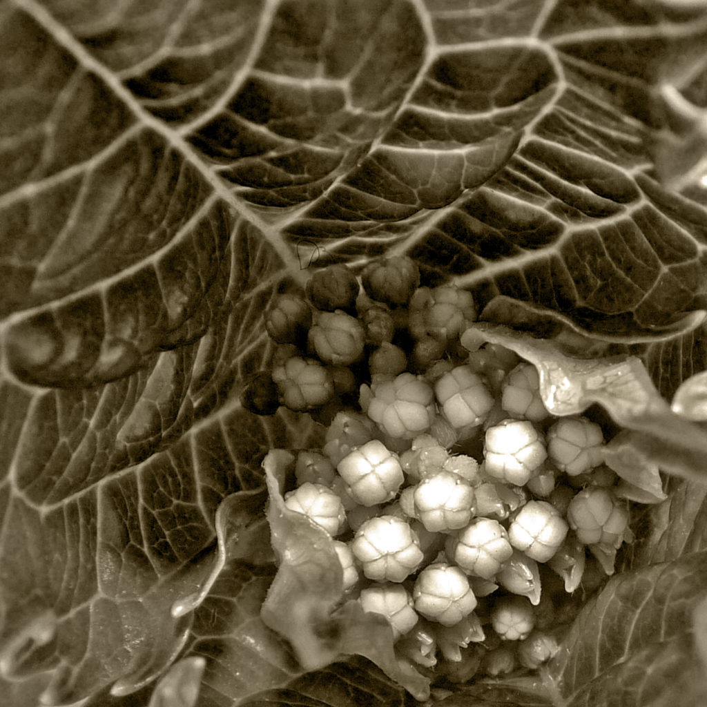
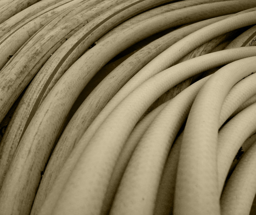
I then went ahead and cropped the image quite substantially as I wanted the audience not to focus on what the object in the image is but the tone, the shapes and repetition of petals.
Here again I followed the similar process as with all my images here I adapted the brightness and contrast of the image in order to highlight the detail.
I then again created a black and white filter and added a slight saturation in order to make my image resemble my photographer
I then cropped this image in order to focus on the formal elements of the images.
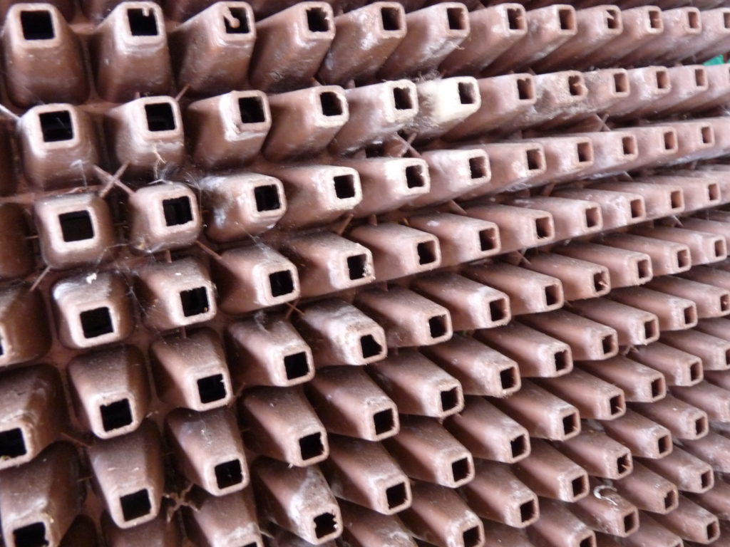
Once again I started by adding contrast to the image and decrease the brightness in oder to enhance the detail and texture in the photo.
I then altered a black and white filter in order to make it best work for the image and added saturation to the image to mimic a sepia filter.
I wanted to get a different perspective and therefore rotated the image, i think this gave a great modification as it put the attention in the top right corner which I thought works best.
I then cropped the image and adjusted the brightness and contrast once more so that the image would look sharper and more defined.

Edited Images

Original
Original
Original
Original
Original
Original
Original
Original
Original

Final Outcomes

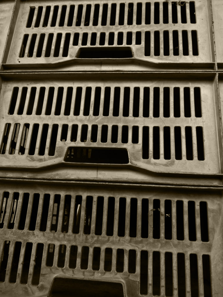
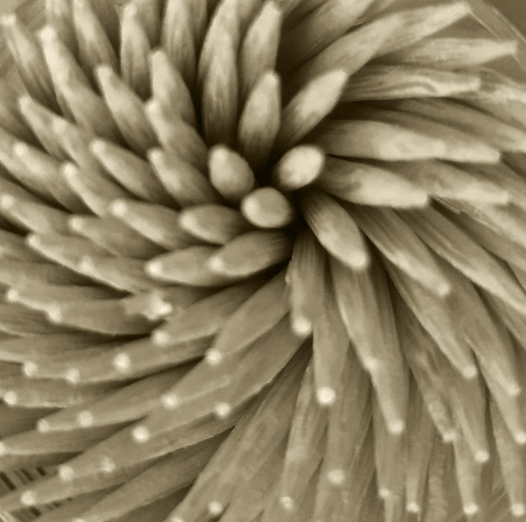
These were my favourite pictures from my photoshoot for the Formal Elements topic. I tried to focus on the idea of repetition, natural vs man made, geometric shapes, spiral rhythm, depth, line etc. I think my work overall worked well as I have tried to focus on the idea of taking an object and using certain angles and cropping to take the focus away from the object and onto its formal elements, here I found this challenging at times as I wasn’t taking photos to make them”aesthetically pleasing ” or have a “conceptual” meaning and instead had to focus on the face value of the objects and what formal elements they bring.

Spiralized shows the geometric, man made side of the formal elements this is due to the wooden picks being carved by humans into straight tooth picks and therefore emphasied the lines of each individual toothpick. Their is a circular rhythm shown through the arrangement of the picks their is also depth and dynamic range shown through the shadows towards the top right corner of the image which allows the image to look. Another point to add is the repetition of the amount of picks and all the points at the end of the pic this draws the attention of the audience. Overall I think I have linked well with my style of images to my photographer not only by the colour but through the style and careful choice of objects; I think this has helped to achieve these outcomes and I believe that they blend in well with Albert Ranger Patzch’s photographs.

Main photos of inspiration from this photoshoot:

Displaying: Portraits & and Identity

Identity

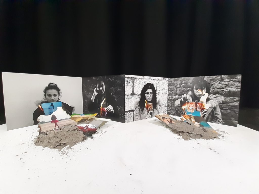
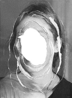
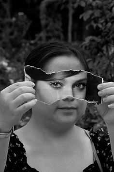
For My identity project I decided to print out these 4 (A4) images shown above. As two had a light and 2 had a dark background i decided to mix these so that I would display them going 1 dark 1 light etc. I decided to stick my images together in order to create a zigzag pattern which I thought would create an interesting pattern. I then wanted to use the images that were burnt and incorporate them back into my display. Here I got some ash from the burnt photos that got completely burnt and made two piles then collected remaining photos that didn’t fully burn and place them into the burnt pile of ashes.

I think that displaying method worked really well as it helped to continue the story of the idea on my identity piece as from the audiences perspective, it looks as though the images are looking down at the burnt remains of their childhood, which helps to symbolise the loss in their memories and the people in their memories. Overall I am really happy with these outcomes as I think they look quite professional and I like the fact that the combinations of my two artists worked well and the conceptual side of my project really shined through.

Studio

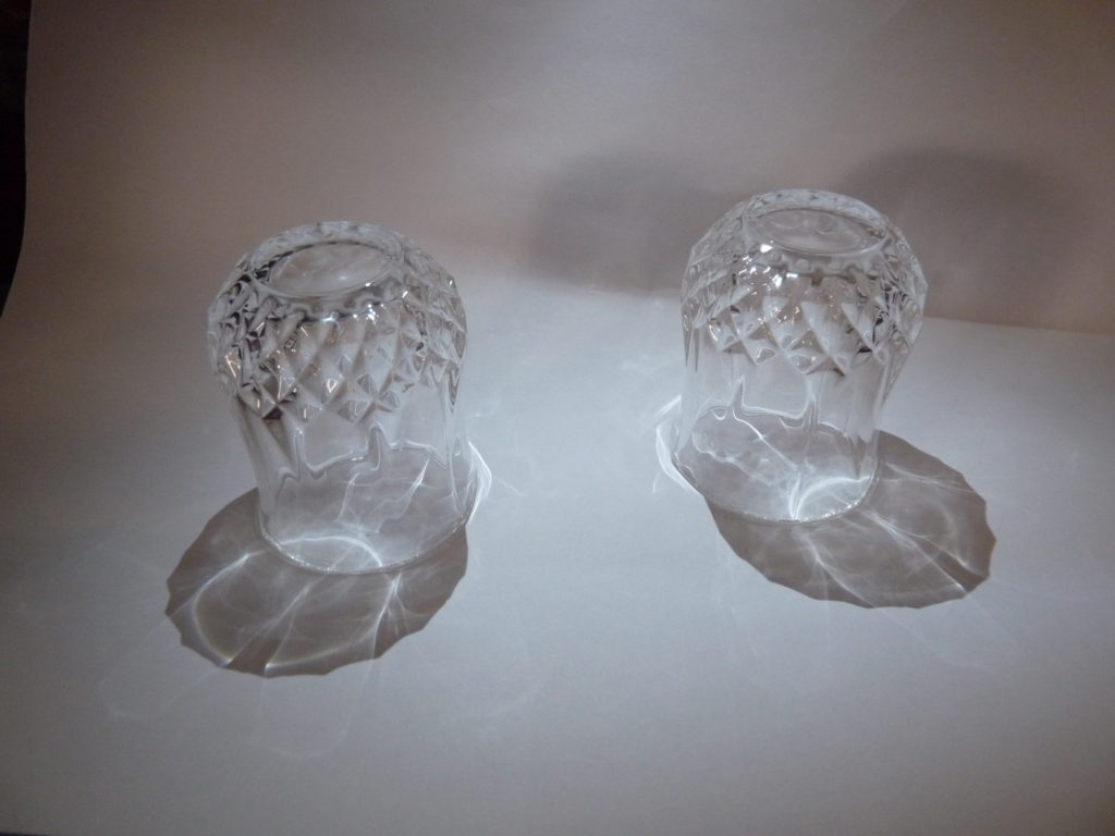
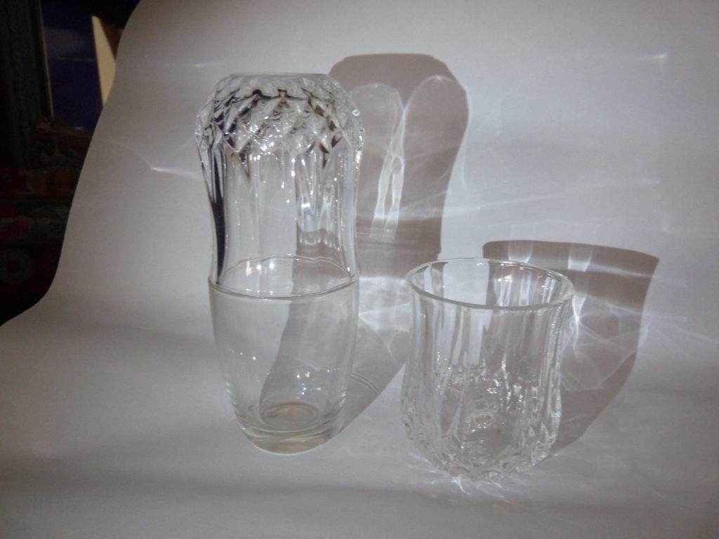
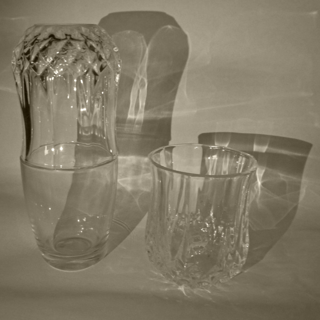
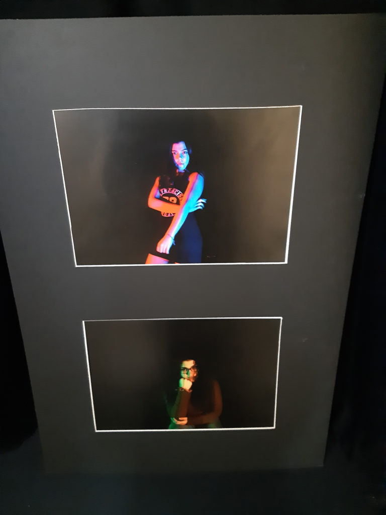
For this project I decided to print off 2 A3 pieces, here I placed them onto a window mount which I thought was the best way to present the images as I didn’t want a crazy way to display it as I wanted the images to be the main focus onto the audiences eyes.

Tableau

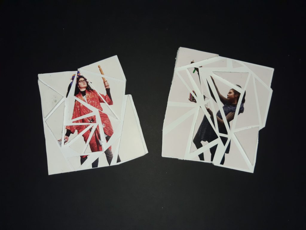
For my Tableau project, I decided to print off 2 A5 sheets here for this project I decided to cut these images into different sized triangles, here I placed them onto a foam board and placed them slightly apart form each other, to add more of a 3D effect I decided to give some of the triangles more height by sticking them to another piece of foam board. Finally I wanted to keep the edges of the images different also therefore instead of just cutting 4 straight lines around my images I followed the triangles shape on the stuck down image and cut around that accordingly which is shown above. I think that this displaying method worked quite well as it gives the idea that the images have been broken with a hammer.

Environmental

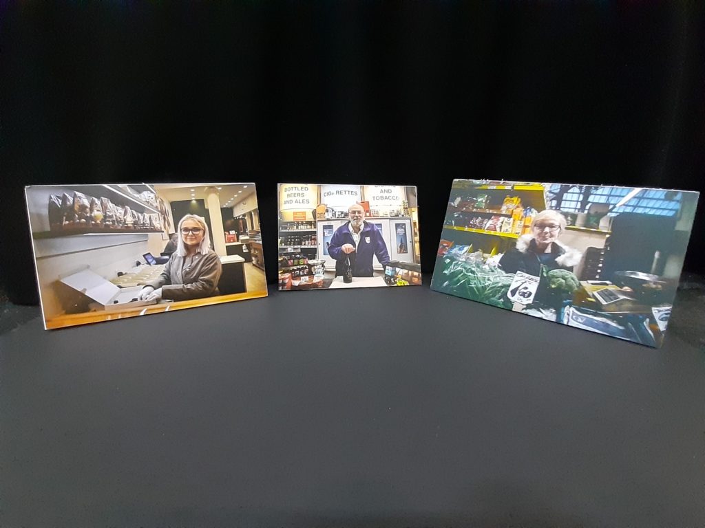
For environmental, I printed off 3 A4 images, and again I wanted to keep my displaying quite simple and make my image “do all the work” as I wanted the audience to engage with the images and again not be overly distracted. Here I simply placed my images on a foam board.

Identity

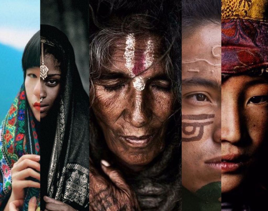
Identity is what represents you, what identifies and separates you from different people. This can be done through your appearance, the way you dress or more internal things such as mental illnesses or emotions that you are known for e.g always being happy or having a short temper.

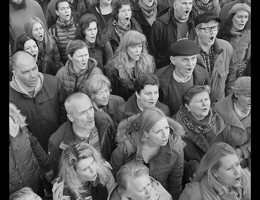
Cultural Identity: can be represent a range of different things:Cultural identity: This is when people identify in a specific group or culture this generally refers to nationality, ethnicity, religion, social class, generation, locality or any kind of social group that has its own distinct culture. 

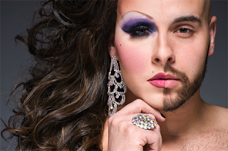
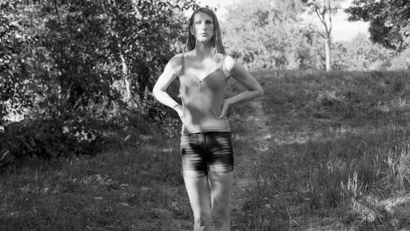
Gender Identity: This relates to what gender a person identifies as either a female or male (however in some cases people can identify as non-binary or gender fluid where they prefer not to identify as any gender.)

Social identity: This type of identity is similar to cultural Identity as its the type that makes you stand out from society such as your job or the way you dress.

Geographical identity: This relates to what helps to represent you; which is determined by where you are in the world this could be shown through how different countries dress differently or how they look.

Political Identity: This refers to what political party or movement that you follow and or represent.

Lack of / loss of identity: As mentioned before Identity is what truly represents you and what makes you stand out from other people; therefore lack/loss of identity is when a person feels as though they have lost their identity. This can be due to mental illnesses such as anxiety, clinical loneliness, depression; or other things such as grief , or just loosing something which made them, them.

Identity: Artists

I chose loss of identity for this project as I thought that it would be the best choice in terms of creativity and best fit my initial ideas on identity.

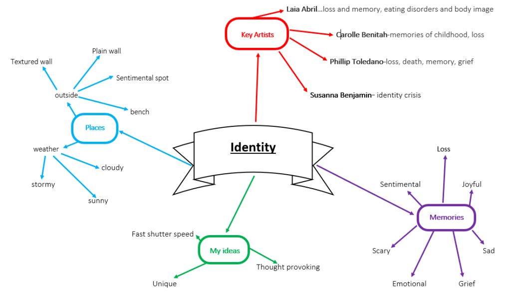
For my idea I was inspired by a range of artists which I wanted to join their ideas and create my own idea on identity.

Carole Benitah

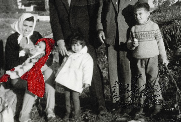
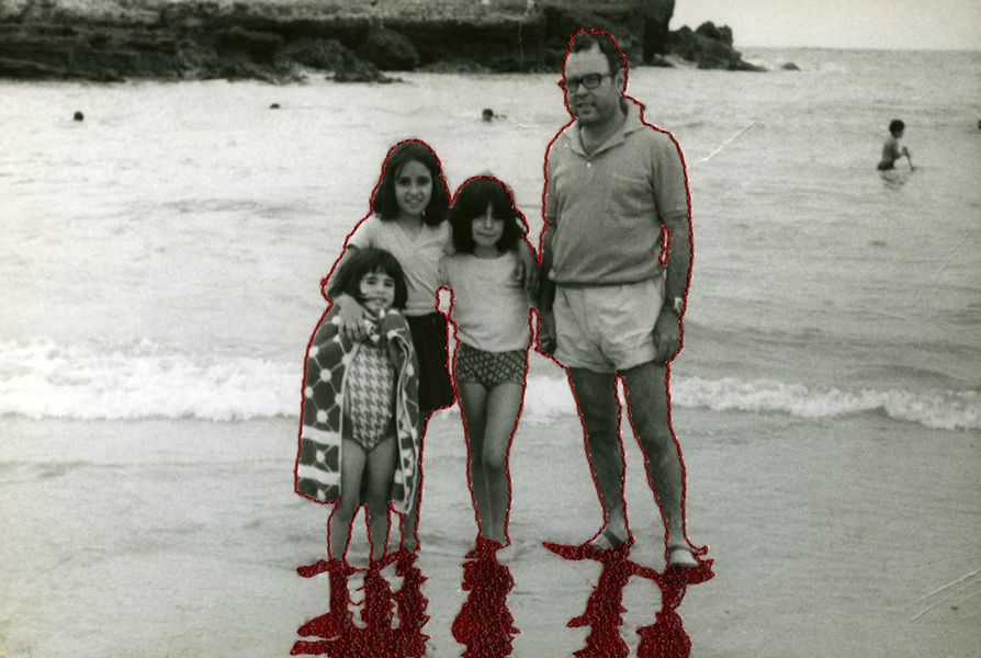
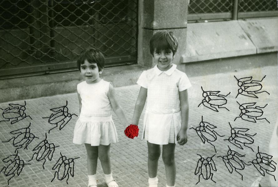
Here I really liked the ideas of memories from her childhood; these images clearly have sentimental value to this photographer and it shows the fact that she wants to bring that memory back to life as maybe she has suffered a loss between the time that the photo was taken and now. I also like the idea of here changing the images and adding the red and black thread to the images as it makes the images stand out and changes them.

Susannah Benjamin

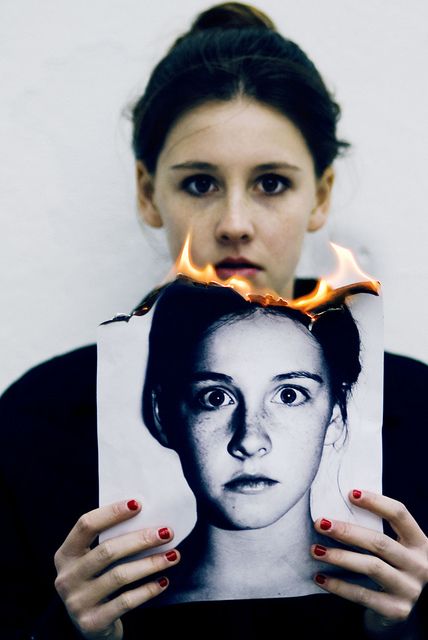
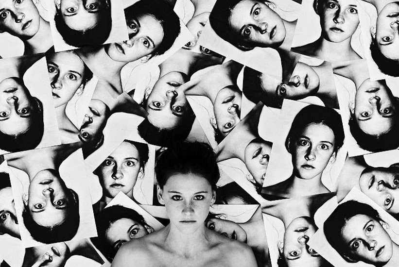
This photographer explores the ideas of an identity crisis and no longer able to identify themselves, I really like the repetition of the women’s photograph as it makes the audience question who is the real person before quickly realising it. I also really like the idea of the person burning the a picture of herself as its striking and it makes the audience question why this might be happening and what her thought processes are.

My Idea:

I decided that I wanted to combine these two images of these photographers and create my own idea. I want to get a couple of models to find a photograph which holds a memory for them, good or bad, here I will then create a copy of that image then burn it, here they will hold the burnt image to show the two worlds that that person is living in or has lived in. The past; which holds there chosen memory and the present; their true emotions towards that photo in the perspective of what they now know about life and their situation.

I thought that it would be a good idea as the audience could interpret my sets of images in different ways such as a memory that they want to go back to, a memory that they are slowly forgetting about due to age and or time passing, or even a memory which they want to get rid of.

Case Study

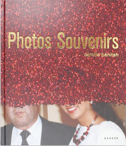
Carolle Bénitah

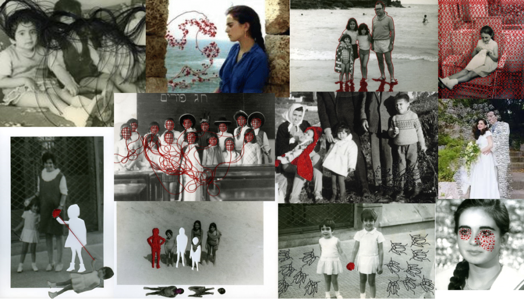
Carolle Bénitah is a French-Moroccan photographer; she is known for working as a fashion designer for 10 years before switching to photography in 2001. Here her work mainly explores the ideas of memories, passage of time and family. She uses old family pictures and alters them slightly using different coloured threads and sometimes even cutting parts of the image out. She also tries to reinterpret the memories as a mother, daughter and wife. She is said to do these all these alterations to her images in order to help her understand her current identity.
Her work has been published in various magazines such as Leica World, Shots Magazine, Photos Nouvelles, Spot, Center for Photography Houston, Foto Noviny, and Lens Culture and more.

Carolle Bénitah was originally born in Casablanca in Morocco, as a student she graduated from the Ecole de la Chambre Syndicale de la Couture Parisienne (Paris); where she was selected for an exhibit with her work titled “Photos-Souvenirs” (shown above) in FotoFest’s 2014 Discoveries of the Meeting Place showcase of past Biennial portfolio reviews.

Video showing many of Carolle Bénitahs work in her Photos-Souvenirs book.

Analysis

Image result for carole benitah+Magazine"

Technical: Here the photographer has seemed to use flash lighting in this image which is shown through the highlights at the center of her face; however, it could also be outdoor lighting due to the reflection onto the wall behind her. Here there is a short depth of field onto her which is shown as that is the sharpest part of the image comparing to the background. Her image has a slightly higher sensitivity shown through the use of an old image which would have been taken with an older camera. Here the colours seem to be leaning on the warmer side due to brown wallpaper and the her skin tone. The image is 16.5 x 24 in. and is said to be an Archival Pigment Print.

Visual: Visually the colours of the photograph are quite toned down due to it be an older photo and not having the colour quality of many of today’s cameras; furthermore this highly contrasts between the rich red silk thread which has been used to alter this image. Texture is present through the use of thread and the over laying that has been creating as she used long pieces of thread, which I think gives her a unique style as I have not seen anything like this amongst other photographers which I think is quite important. Here once again due to the use of red string the image becomes 3D as the string is physically coming out of the photograph to recreate this image and show the models thought processes. The eye is first lead to the models eyes as that’s where all the thread starts and is lead down and onto the photo frame and back up to the top of the image to create a sentence.

Contextual: Here Bénitahs work is all about going back to her old memories and reinterpreting them so that they fit her current identity, it also helps her to show her memories in a more vivid format. The red thread creates a semantic field against her other photographs showing how they all once represented Carolle Bénitah and her younger life. Here every of her images are different creating a more distinct image with the addition of the thread to more clearly show her thought processes behind the image.

Conceptual: Here the Red Silk Thread vividly shows the models tears; here they lead to a phrase in french saying “il ne dit pas que je suis jolie” which reads “he doesn’t say that I am pretty”. This may well be the reason why she is crying. I love this idea as this might be her recurring thought whilst this image was taken. Here the image itself may be her trying to keep things altogether and not showing emotion however through the use of thread here emotions are now more visible and clear.

Identity: Photo shoot plan

What? I will be taking multiple shoots for my Identity project. I will be using Carolle Benitahs and Susanne Benjamin’s ideas in order to create my own idea towards this Identity project.

How? With a Cannon EOS 750D and using outdoor lighting. I will be burning my images with a lighter and I use a fast shutter speed in order to be able to capture the fire in a focused way.

Who? I will taking a picture of a variety of my friends and people that I know to show that everyone has different memories and lives.

When? I will taking my photo shoots on a variety of days and times due to me using more people and I will need to work around both of our schedules.

Where? I will take my photos outside for safety reasons but I will try and use a different backgrounds for each model.

Why? I want to try and create thought provoking images to compare with my photographer and try a more creative and conceptual approach to my projects.

For my photoshoot to be able to include photographs of my models’ old memories I will photocopy their photos then place some images on card and keep others in a paper format to be able to burn the images with a slower flame (giving me more time to take the image) and a faster and more rapid flame (to create more dramatic and striking flames as they will burn quicker).