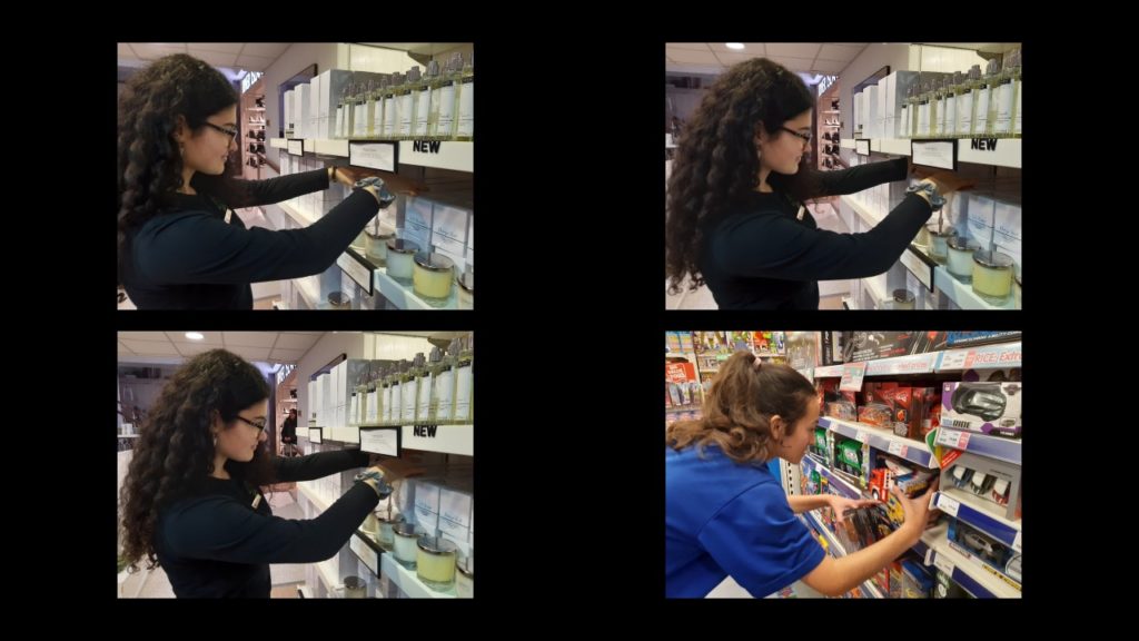
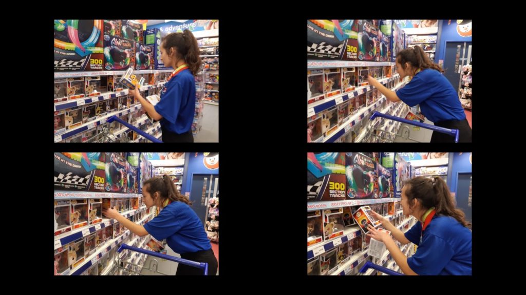
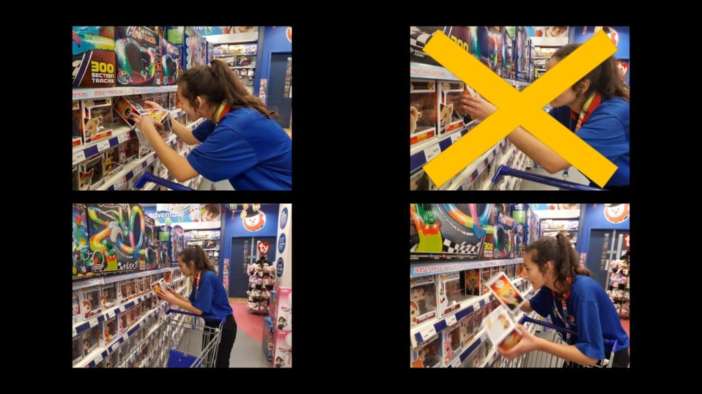
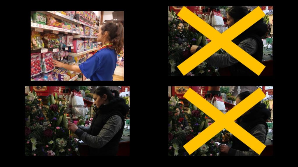
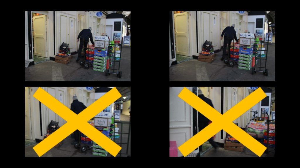
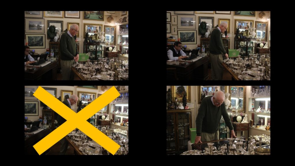
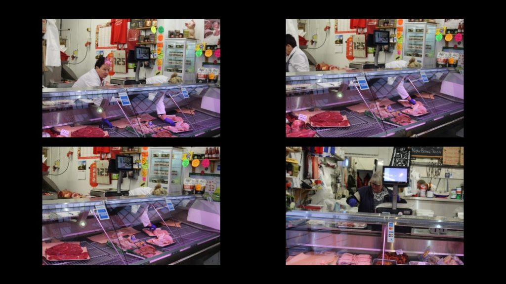
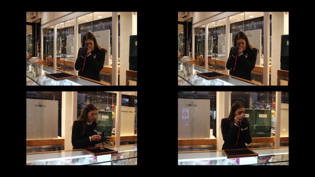
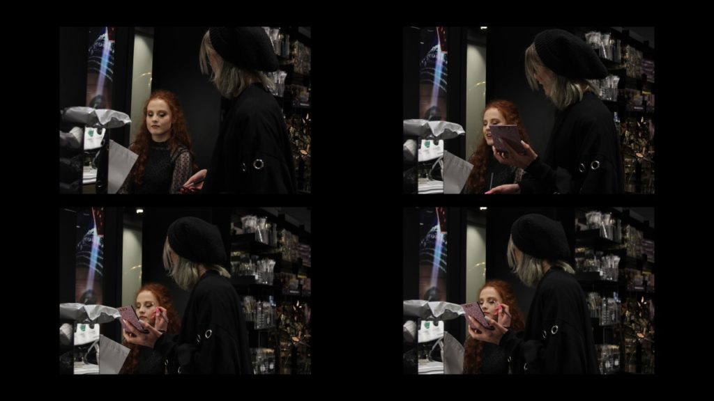
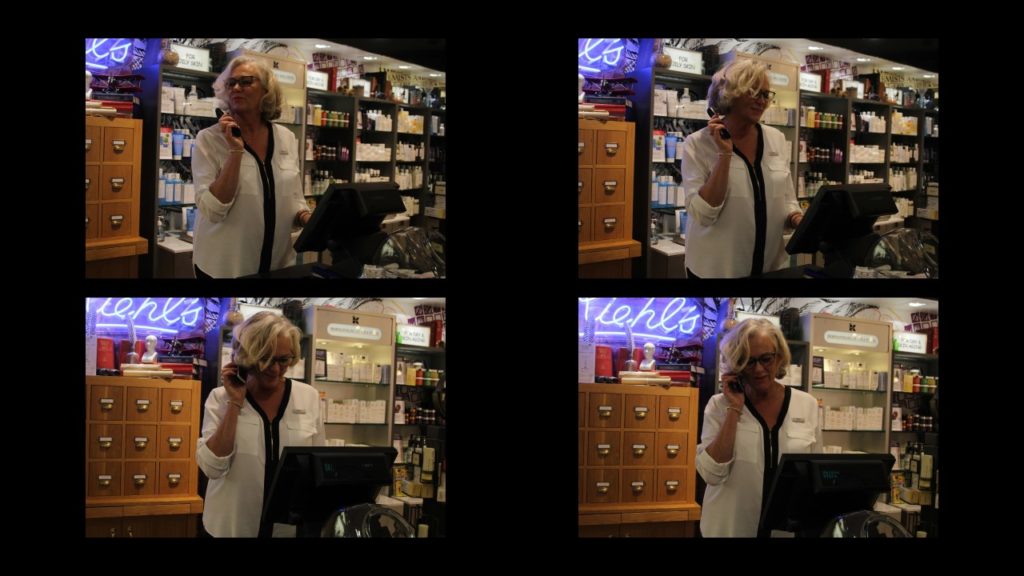
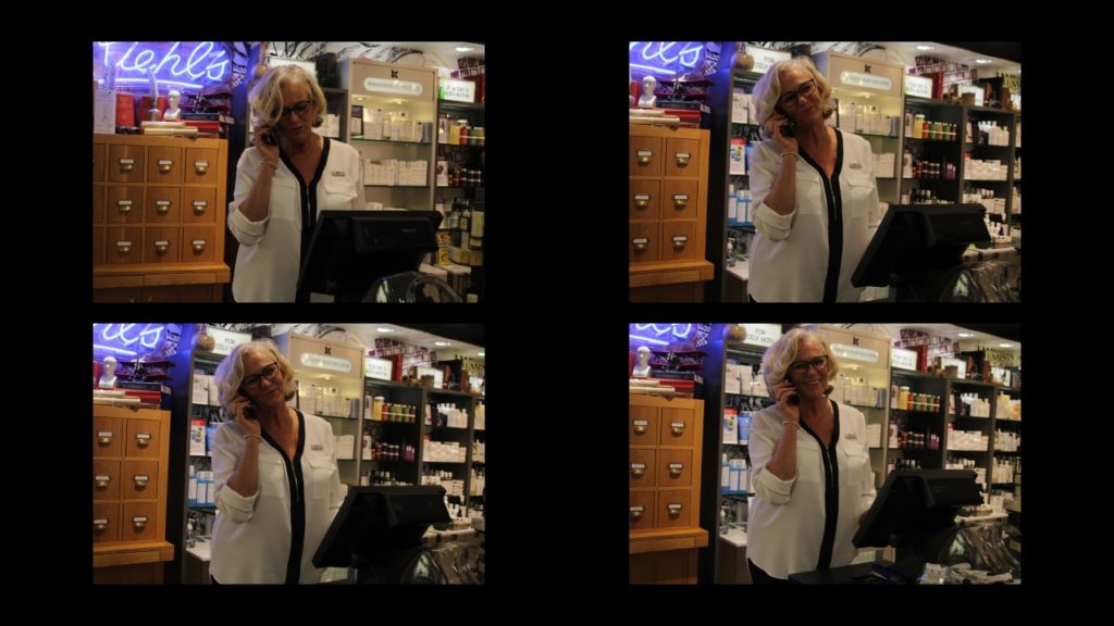
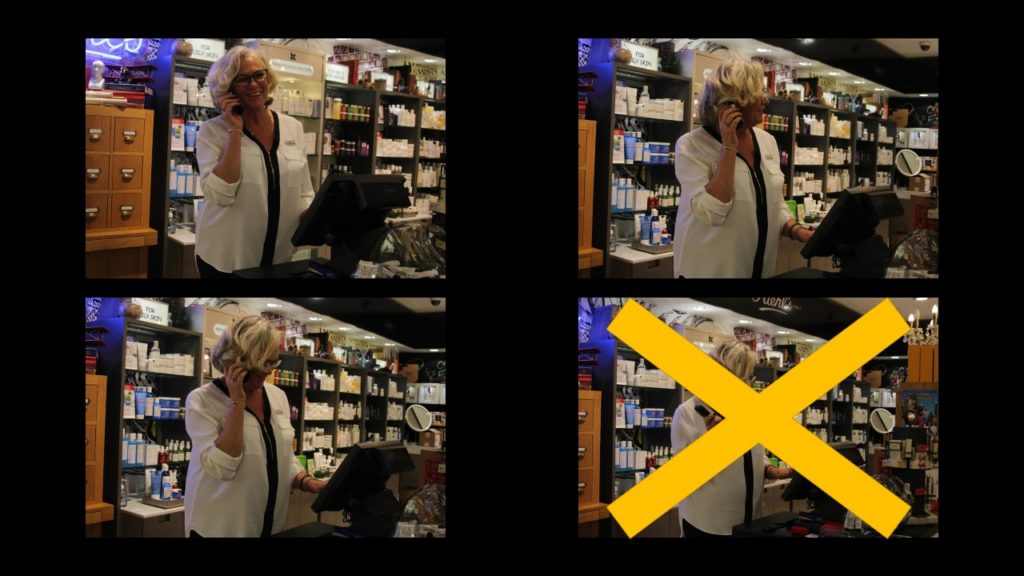
Red: Image was out of focus / Motion Blur
Blue: Over/ Too under exposed


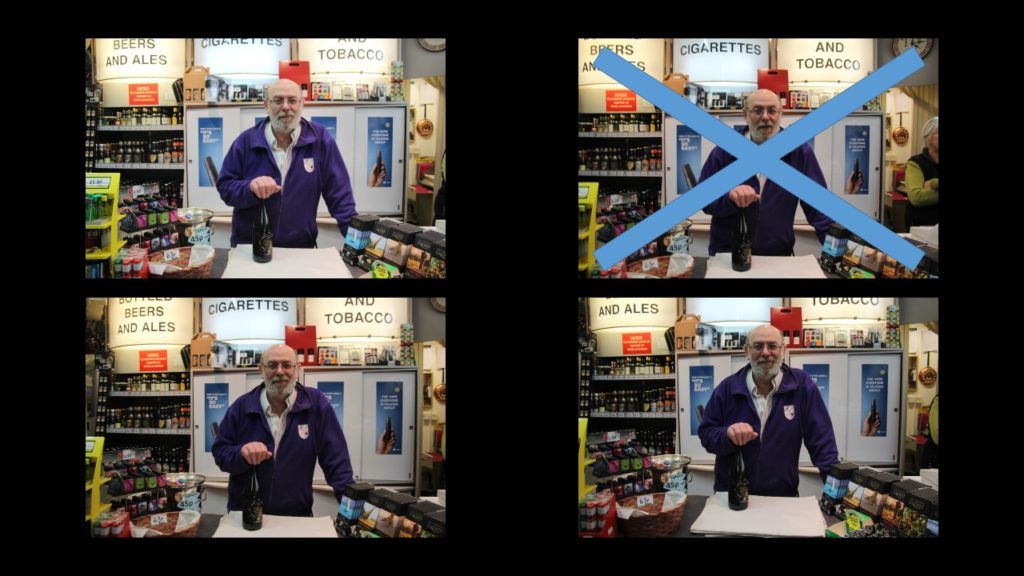

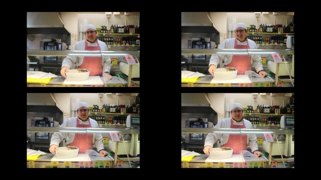
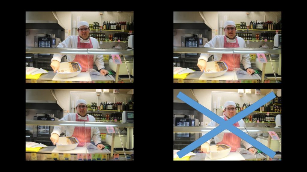
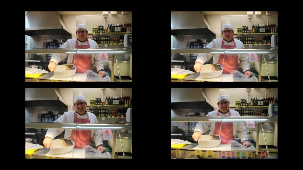
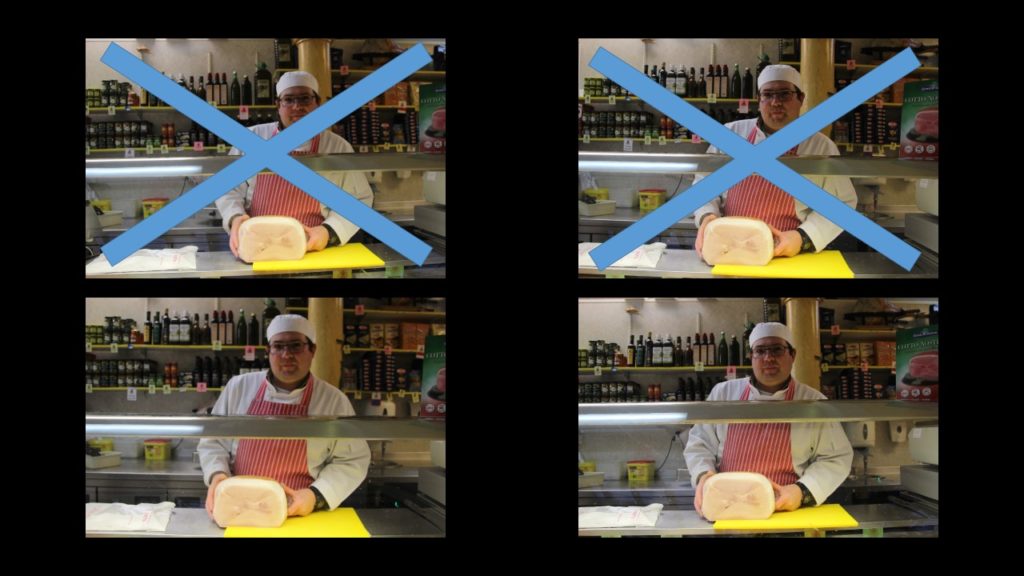

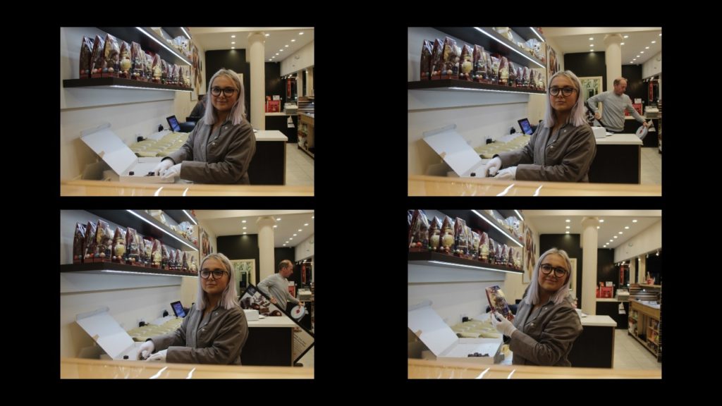


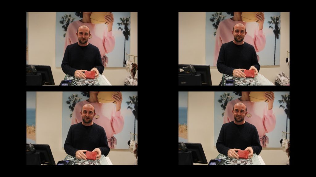

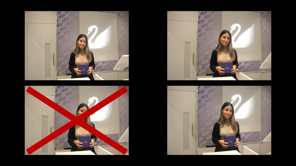
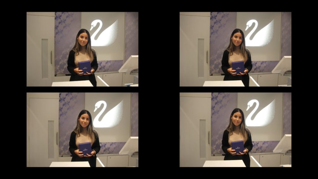


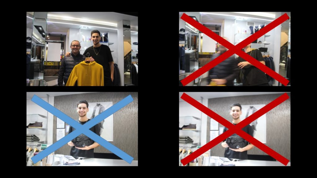


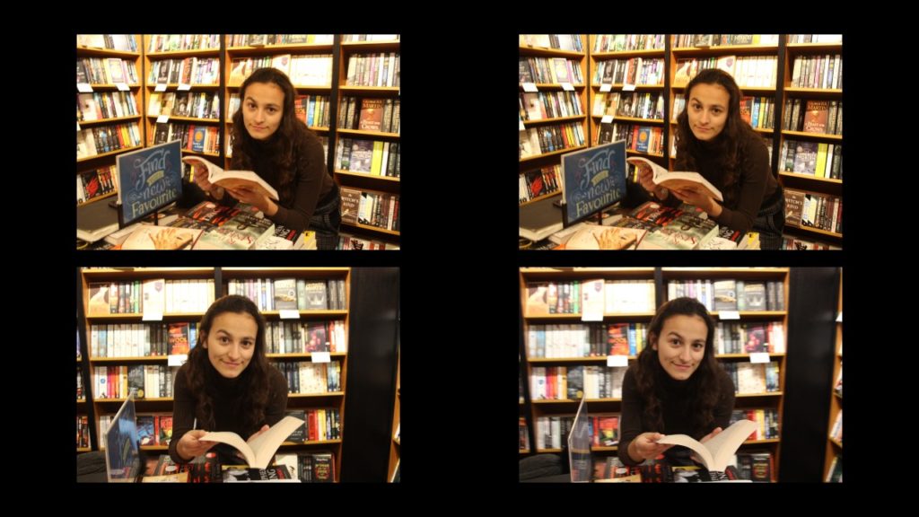

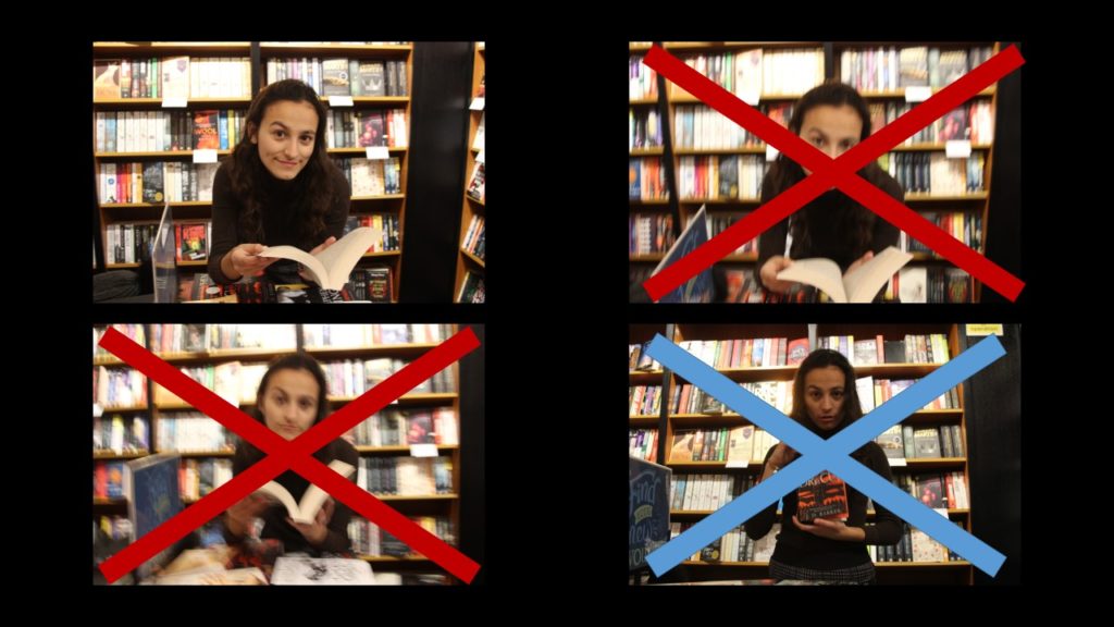
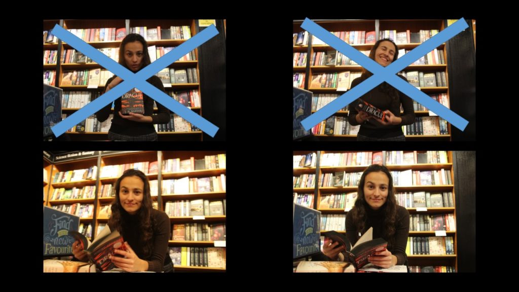
Red: Image was out of focus / Motion Blur
Blue: Over/ Too under exposed


Yellow: Out of Focus / Motion Blur
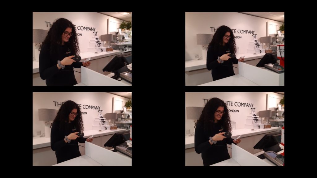


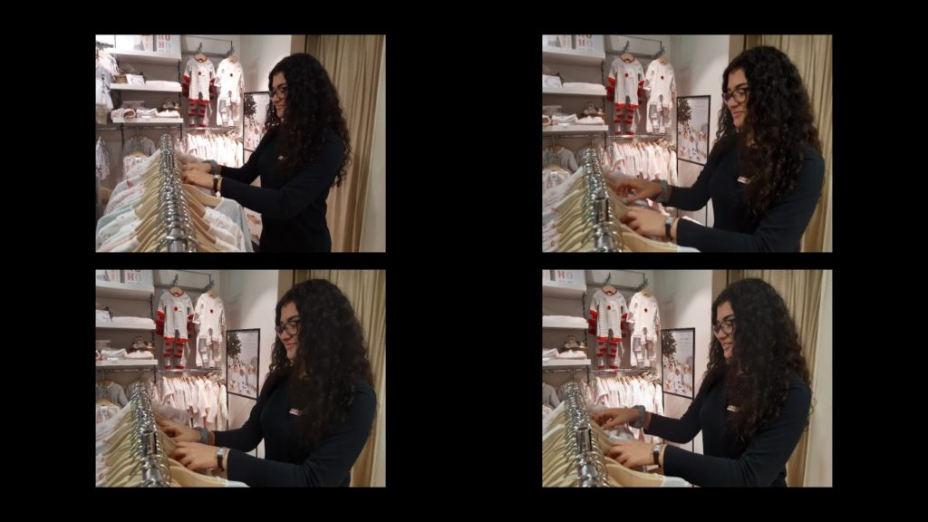
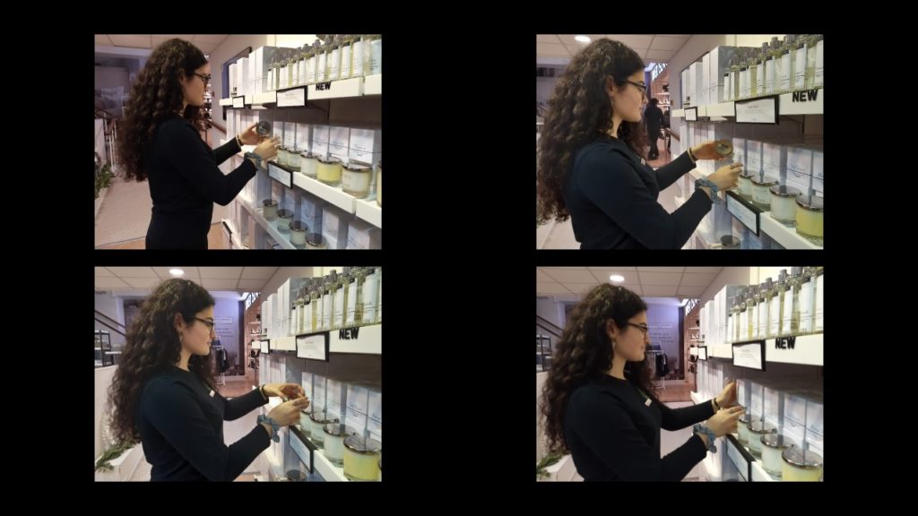



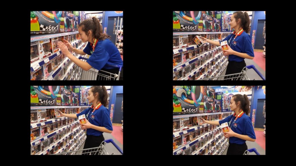

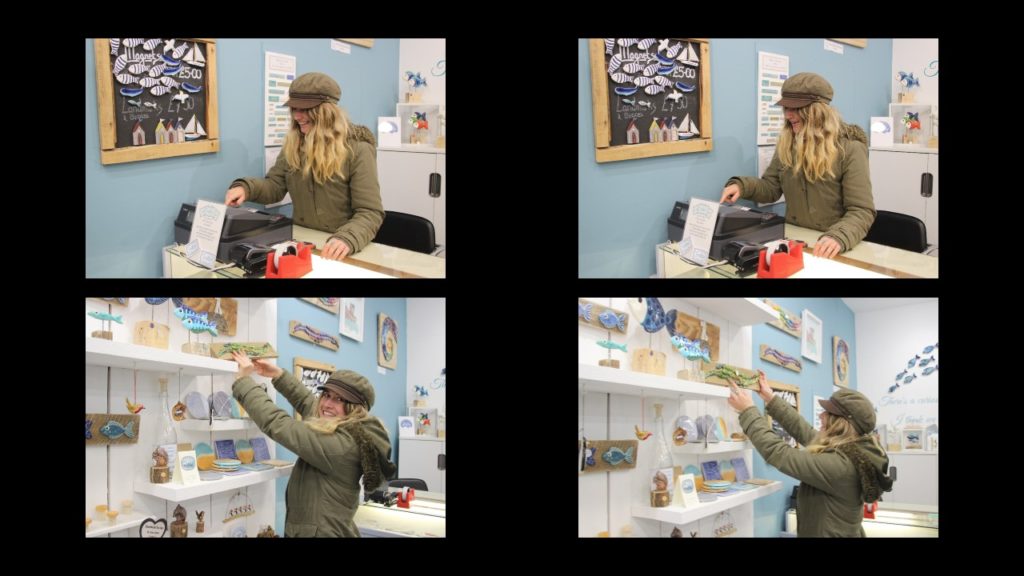


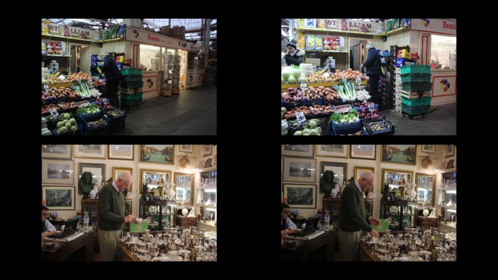





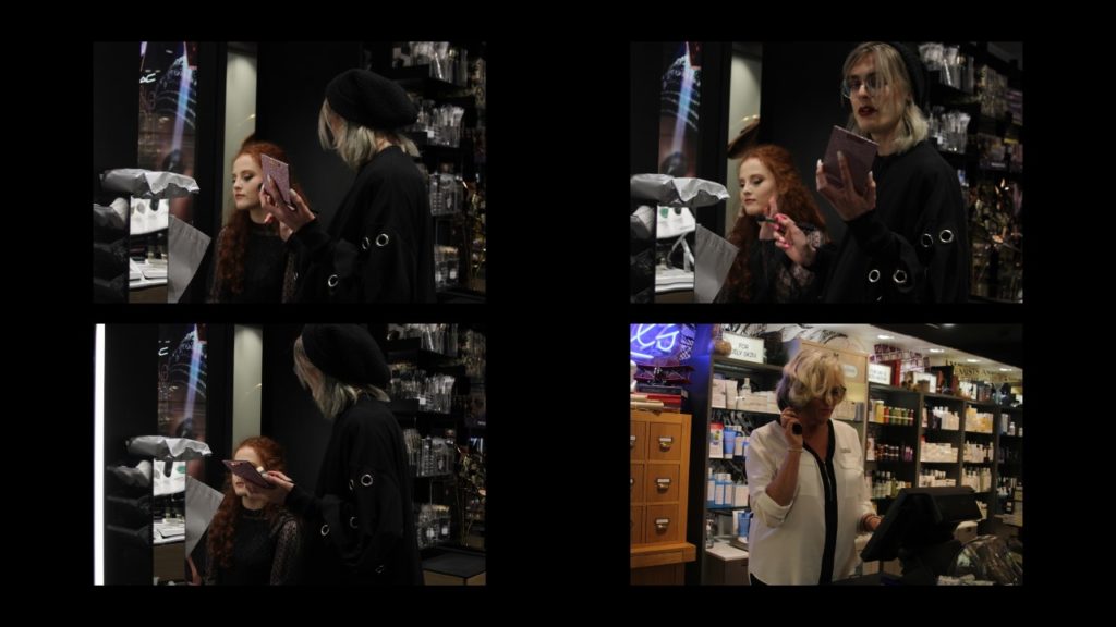

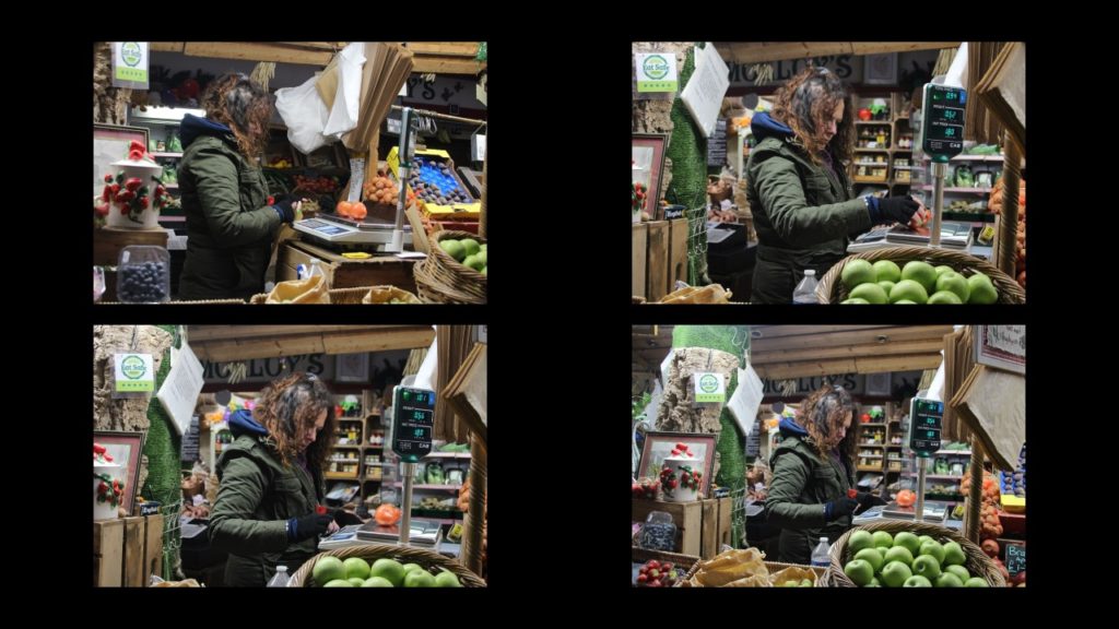
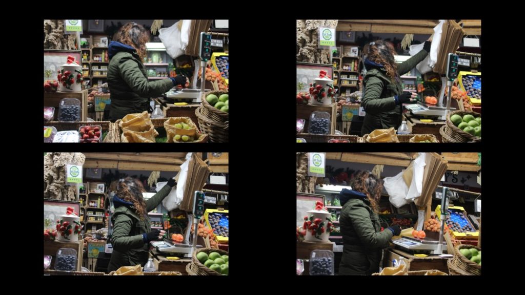







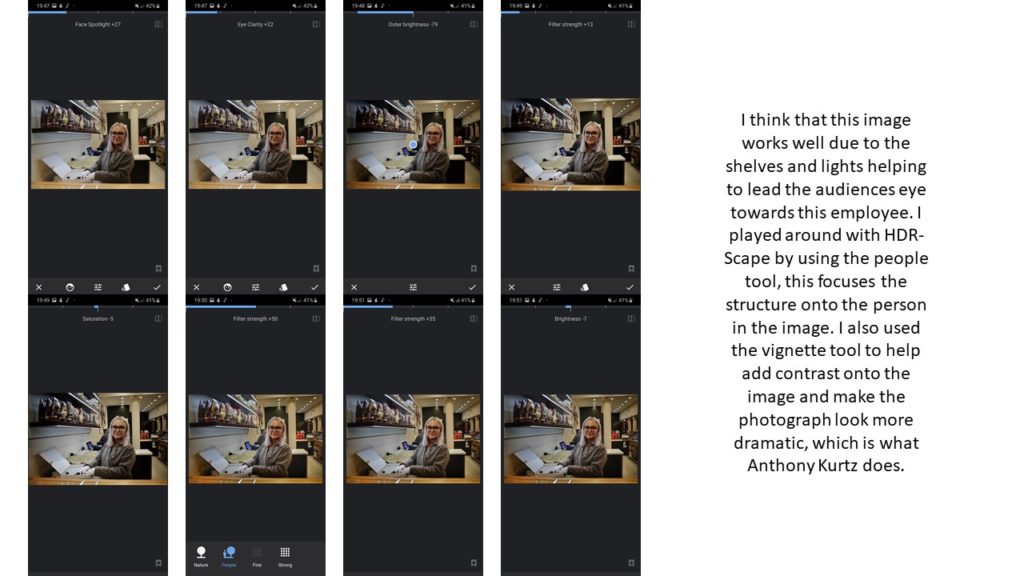


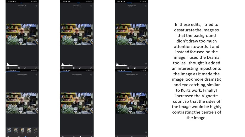

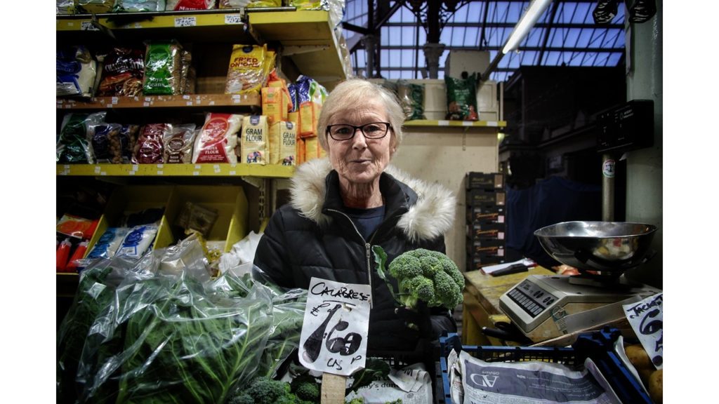


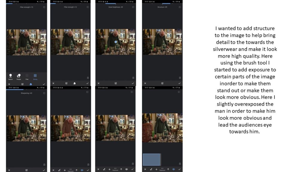
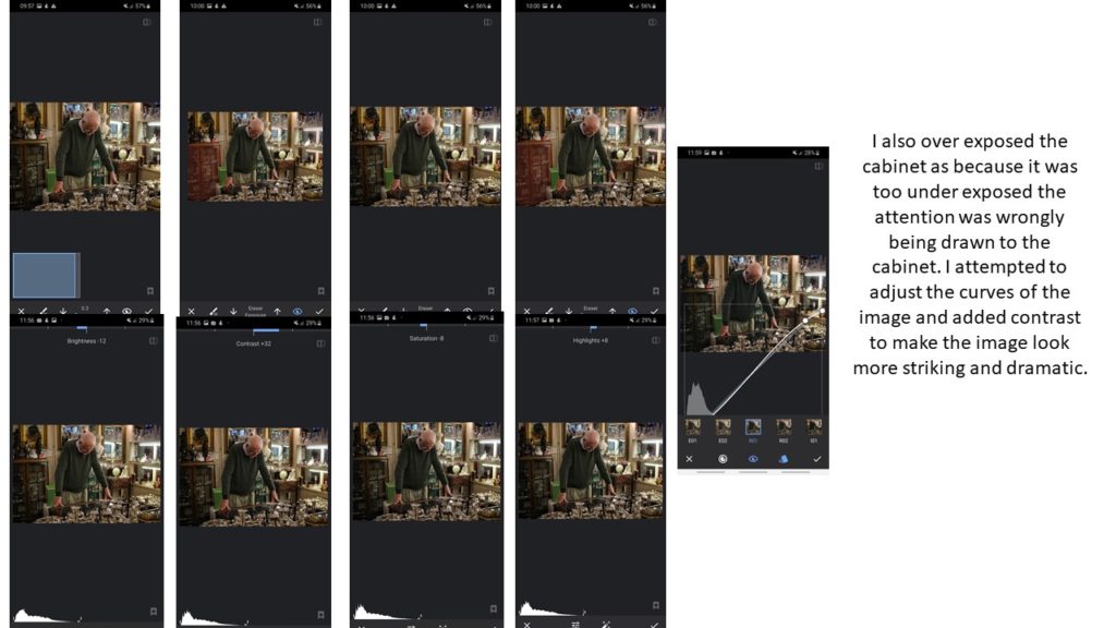
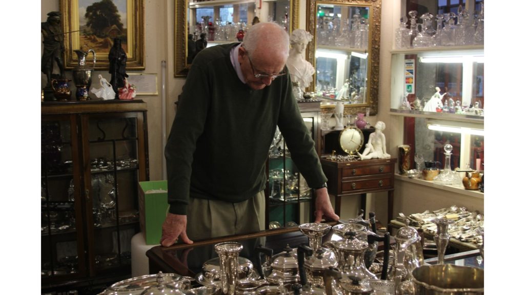
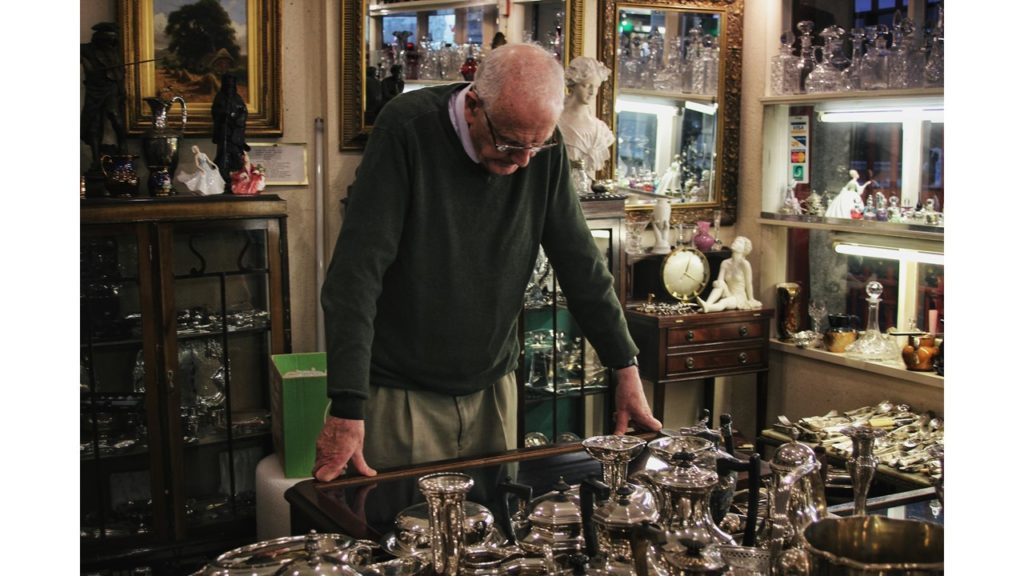
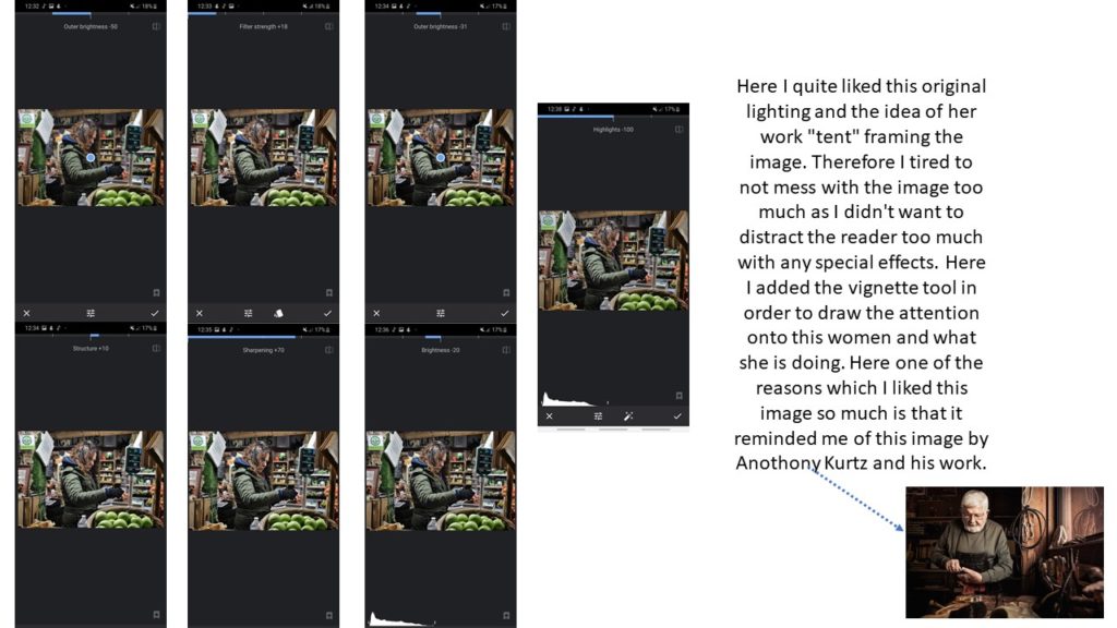
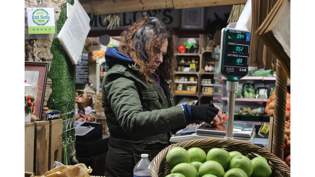
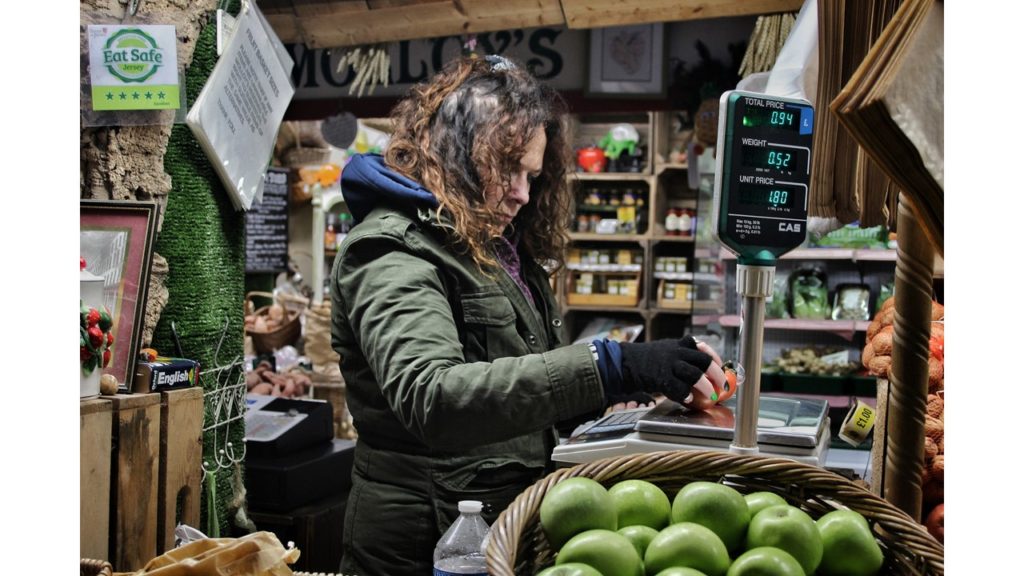
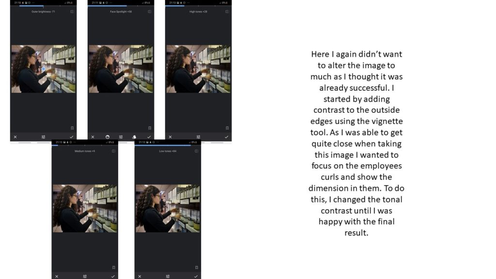
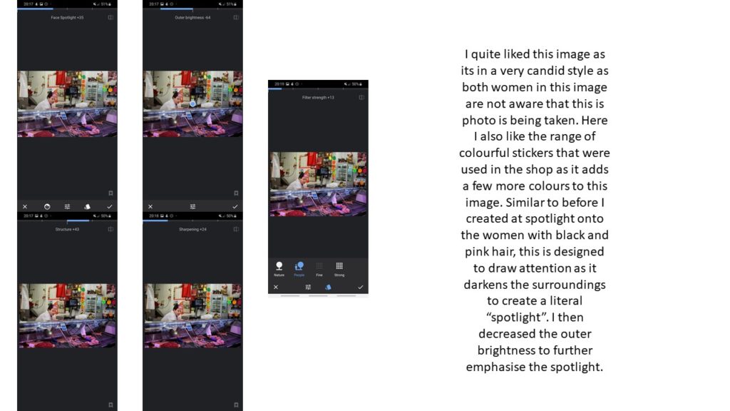
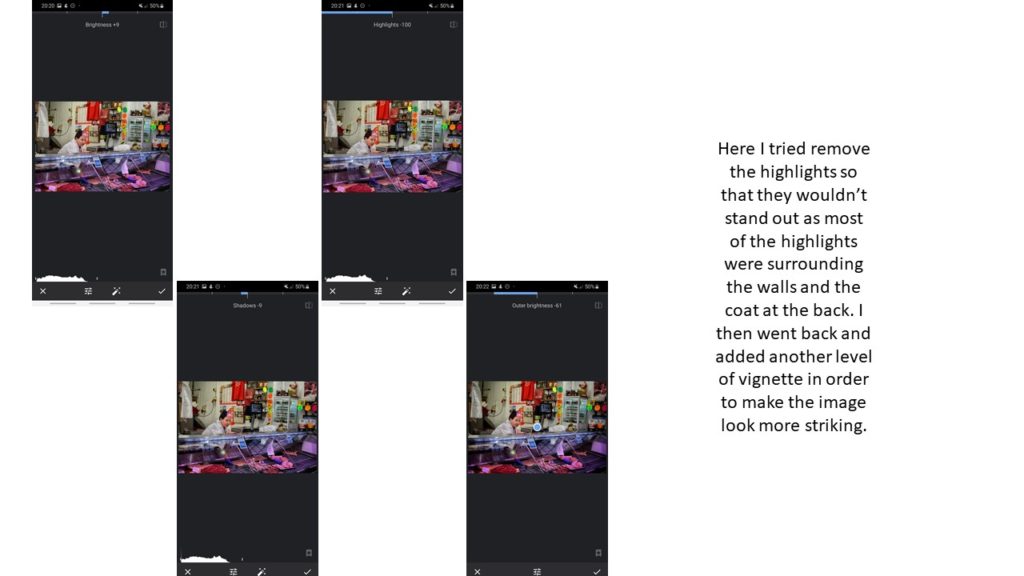
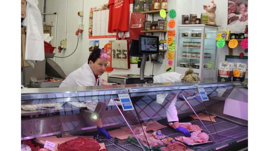
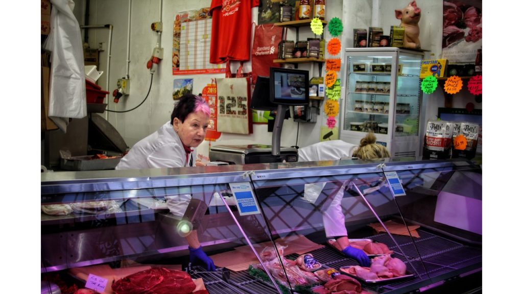
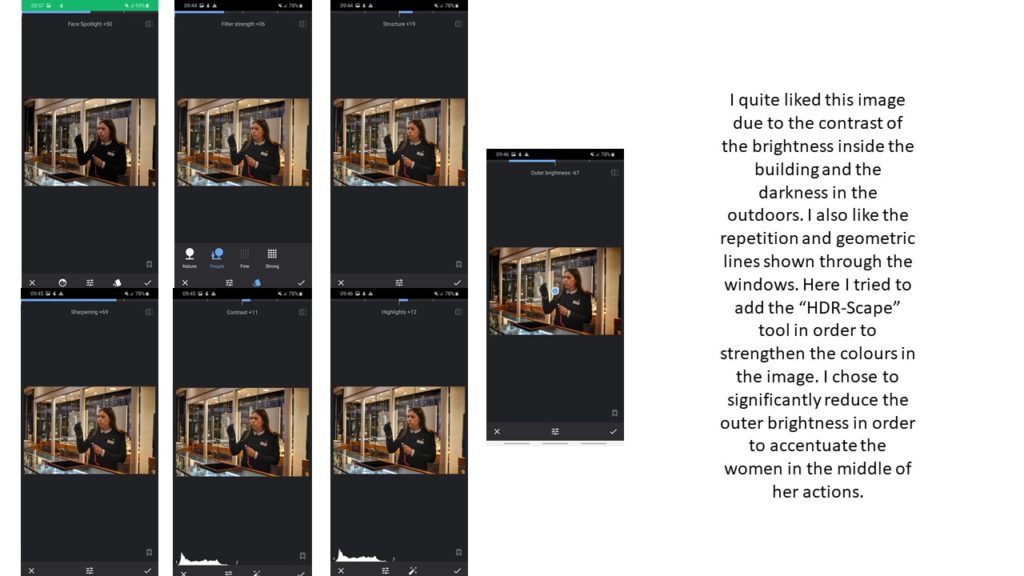
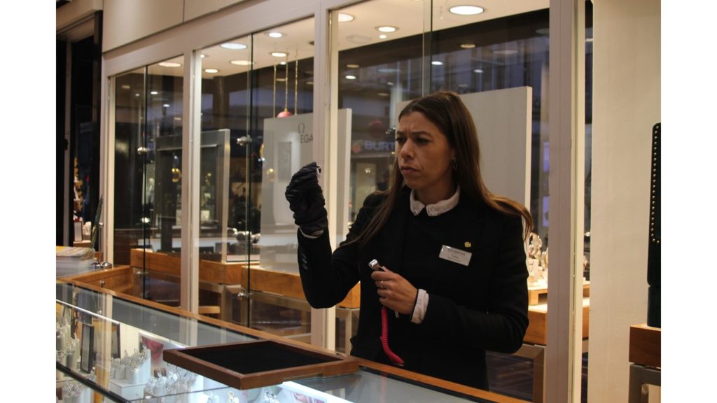
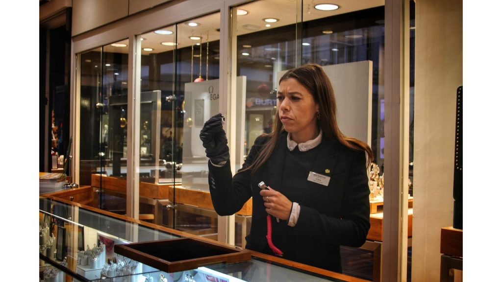
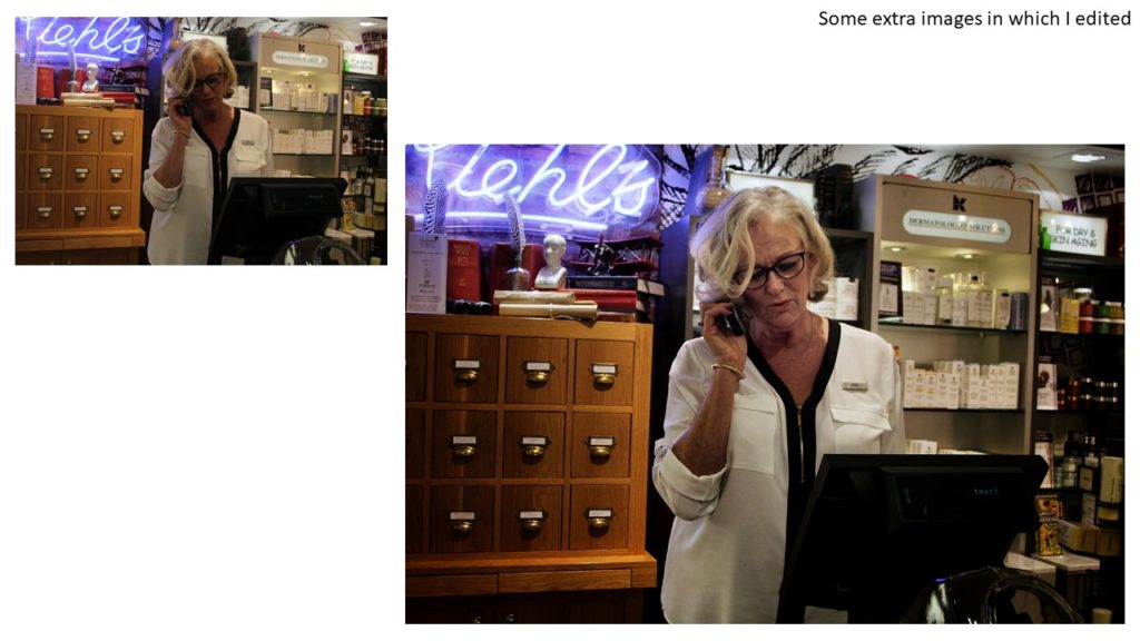
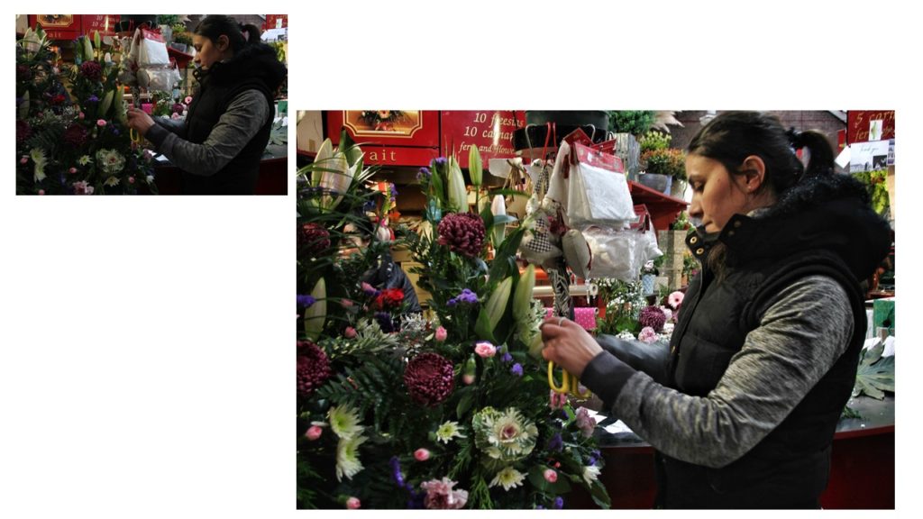
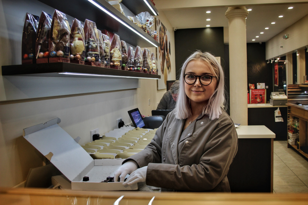
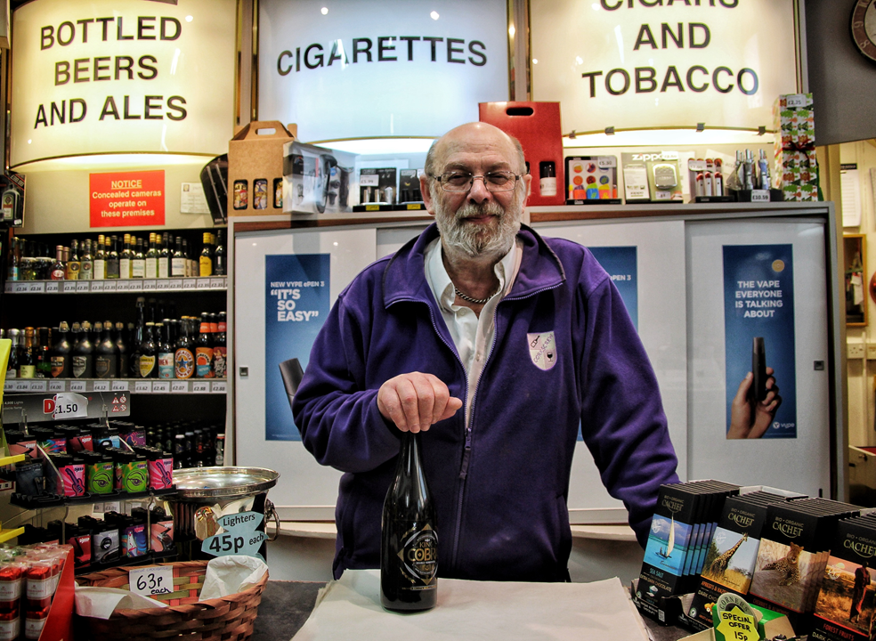
For this photoshoot I had to choose these two images as I could not decide between them.
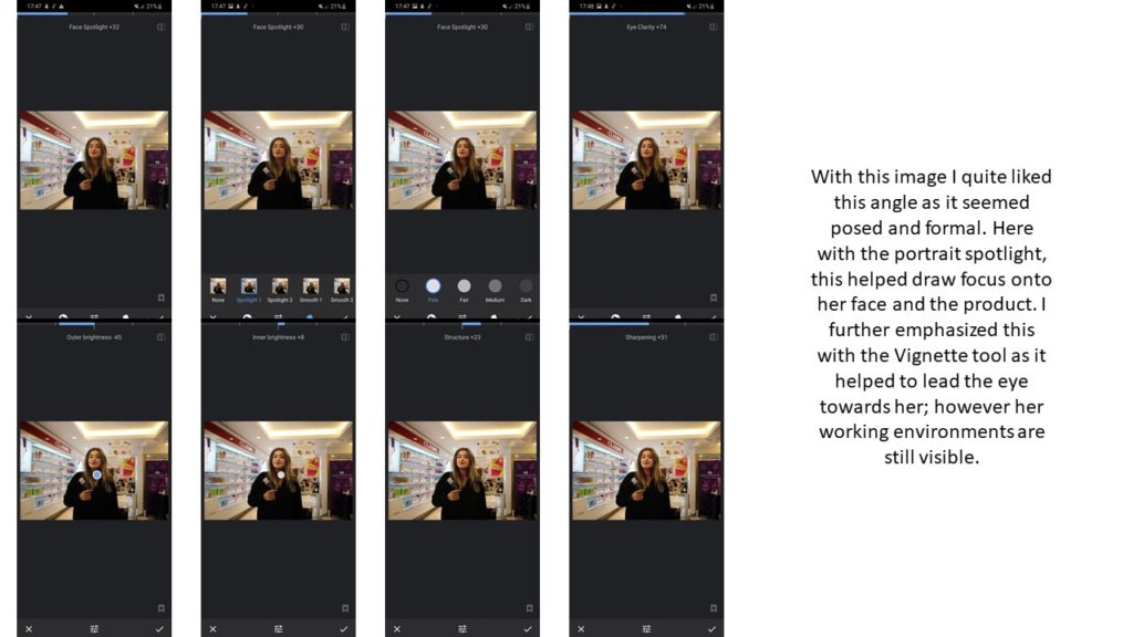
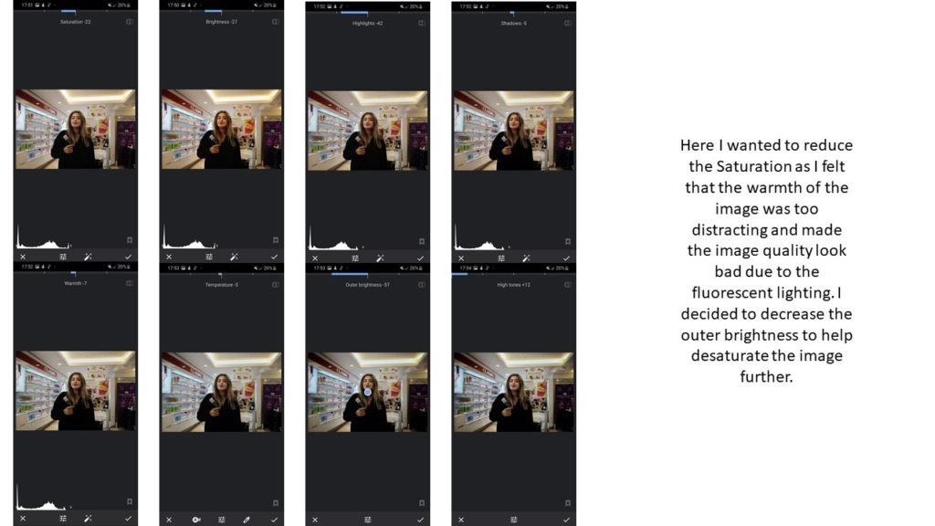
I chose these images as they are striking and dramatic which is exactly what I wanted to achieve from the beginning. Here my first image is full of different yellows and browns which ties into the chocolate theme, and helps to remind me of famous chocolatiers. Whereas in the second image, their is a variety of vivid colours which help to represent all of the different items that are available to be purchased at this shop, they help to create a sort of pattern within the image. I think the “Face Spotlight” worked very successfully as they allowed the attention and the eye of the audience to be lead towards the person, despite of their busy everyday background. Overall, I feel as though both the image and the editing worked hand in hand to help create these images and I am quite happy with their outcomes.
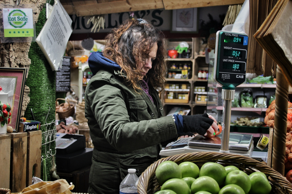
Overall, I think that this image was successful from start to finish, I loved the idea of the frame around her as it helped to round off the image. In my opinion the definition of candid is capturing someone when they are in the middle of an action which I think I have achieved. This allows the audience to see this person in the middle of their thought processes as they are trying to get along with their day-to-day activities. Similar to Anthony Kurtz’s works, I have displayed a background, midground and foreground of food / groceries which allows the audience to see what they might be doing, which also makes the image look 3D. I wanted to stick with the fluorescent lighting used as it created a spotlight effect onto the image which I felt effectively drew the attention onto her.
For my final images I selected the images from a variety of photo-shoots
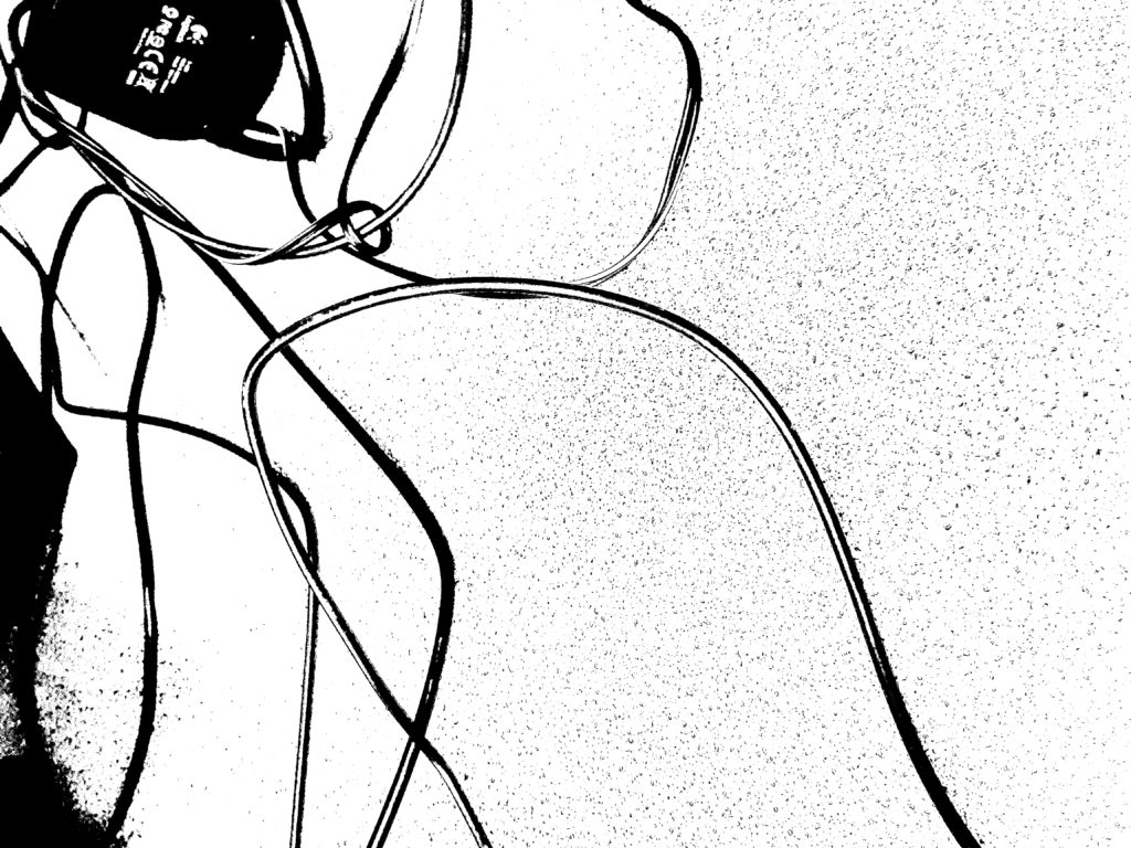

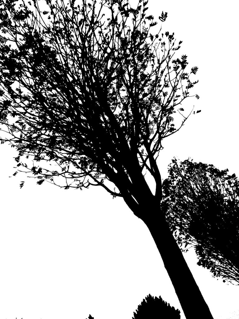
I chose these Blacklight’s images as I liked the contrast shown; I also thought that these were the pictures that worked the best as they have the right amount of detail and texture. I also think that these pictures resemble my photographer as especially my first two images look abstract.
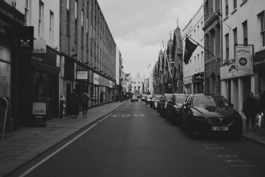
I chose this as one of my final images as I thought it worked the best from my Urban photoshoot. I think this resembles Thomas Struth well due to the symmetry of this image, similar to his work, Struth shows the beauty of urban landscapes through the use of geometric shapes; which I think I have shown in my image.
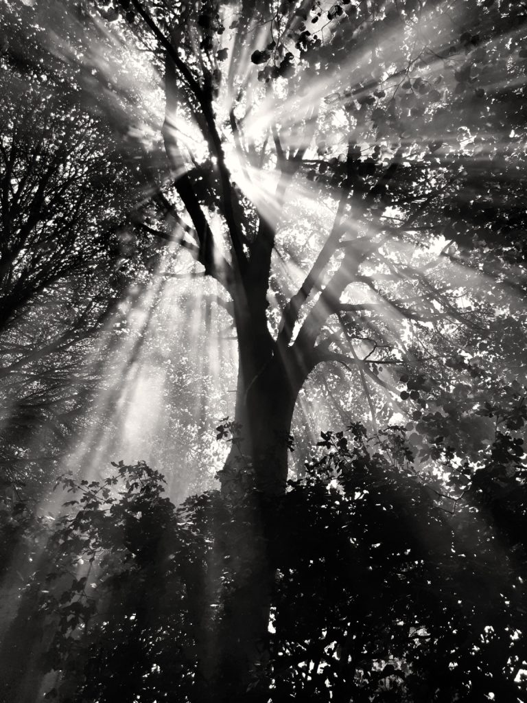
I chose the this image as I think this was my best image through my entire process until now. Similar to Micheal Kenna’s work, he uses striking and contrasting images in order to convey the idea of the power and beauty of nature.
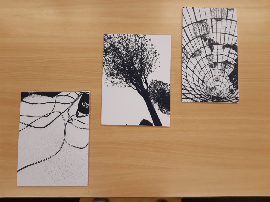
For my Black Light images I decided to place them onto foam boards as this made them stand out compared to just printing out these images. I think this worked well as it makes the images look 3D. I decided to take this photos together in this format as it outlined the geometric shapes of the photographs.
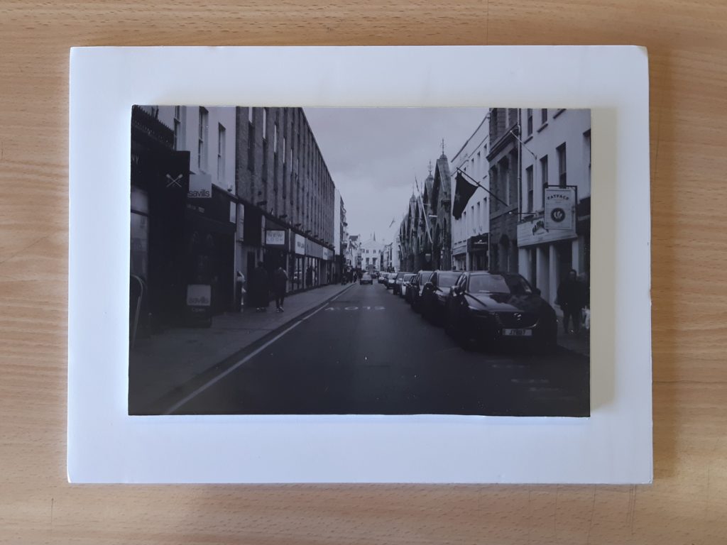
For this image, I decided to create a foam boarder, here I placed foam onto the back of my image then placed it on the another piece of foam. This also adds a 3D effect onto my image due to the shadows shown.
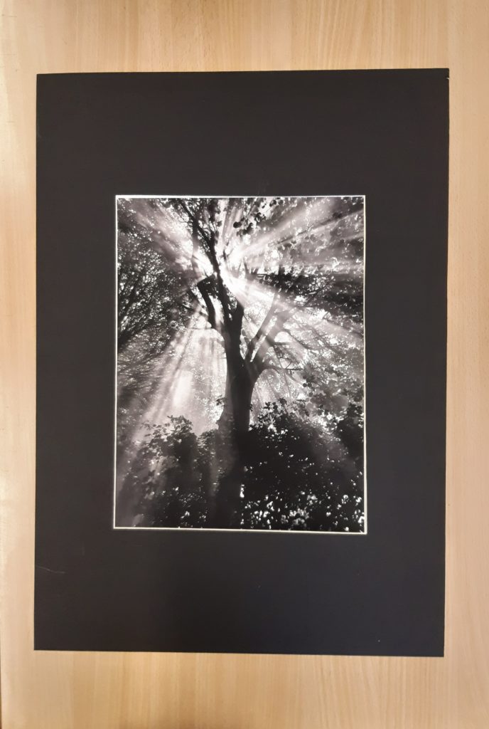
For this image I decided to use a Black window mount, I think that this worked really well due to the contrast between the highlights in the image and the black window mount. I think that this is a simple but effective method as it allows the audience to focus on the image without getting distracted from anything else that might have been added.
What? I will be taking photographs for my Street Photography project. Here I will be trying to follow Vivian Maier’s Work and using a couple of her ideas and techniques.
When? I will be taking my images on Monday 25th November 2019, Here I will be taking the images from 4-6pm to get a range of different images with different natural lighting as it will get dark around 5pm.
Where? I will be taking most of my images in St. Helier, Jersey as it’s one of the most highly populated places in jersey therefore having many photographic opportunities as there will be many people.
How? As I want to be discrete I will be using my phone’s camera, this way less people will notice me, I will also be using natural lighting as I will be taking the photographs in the outdoors.
Why? I want to try and capture a successful set of images showing peoples thought process and emotions, as I think this makes the image more interesting and more thought provoking.
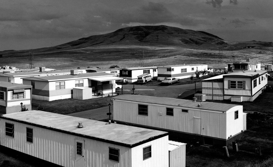
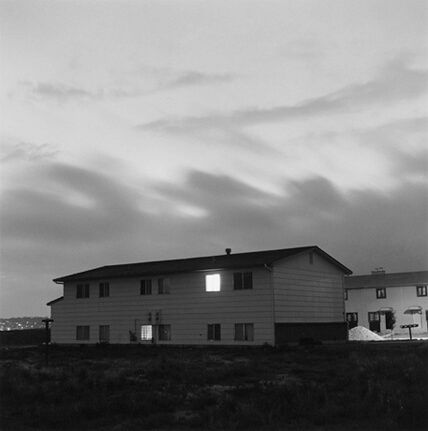

After the Romanticism movement, photographers soon tuned to “The New Topographics”, here photographers focused on buildings and anything that have been altered by man.
This new movement started in 1920s/ 1930s, in central Europe. Artists like El Lisstzky were the first to change from taking photos based on Romanticism, Here artists focused on the limited ranges of colours and geometric shapes. However the main focus was to find the beauty in our man altered landscapes.
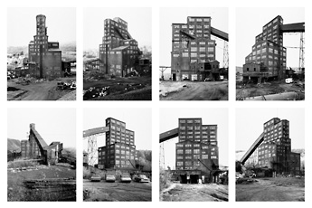
Later on in 1975 which marked a further landmark in photography, an exhibition called “The New Topographics: Photographs of a Man-Altered Landscapes” became a turning point in the history of photography. This took photographers like Robert Adams, Lewis Baltz, Bernd and Hilla Becher, Joe Deal, Frank Gohlke, Nicholas Nixon, John Schott, Stephen Shore, and Henry Wessel. They then displayed 150 photos showing how “The New World” isn’t as bad as it seems and there is beauty behind it.
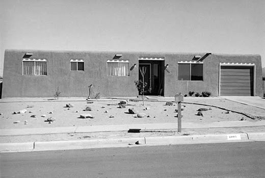
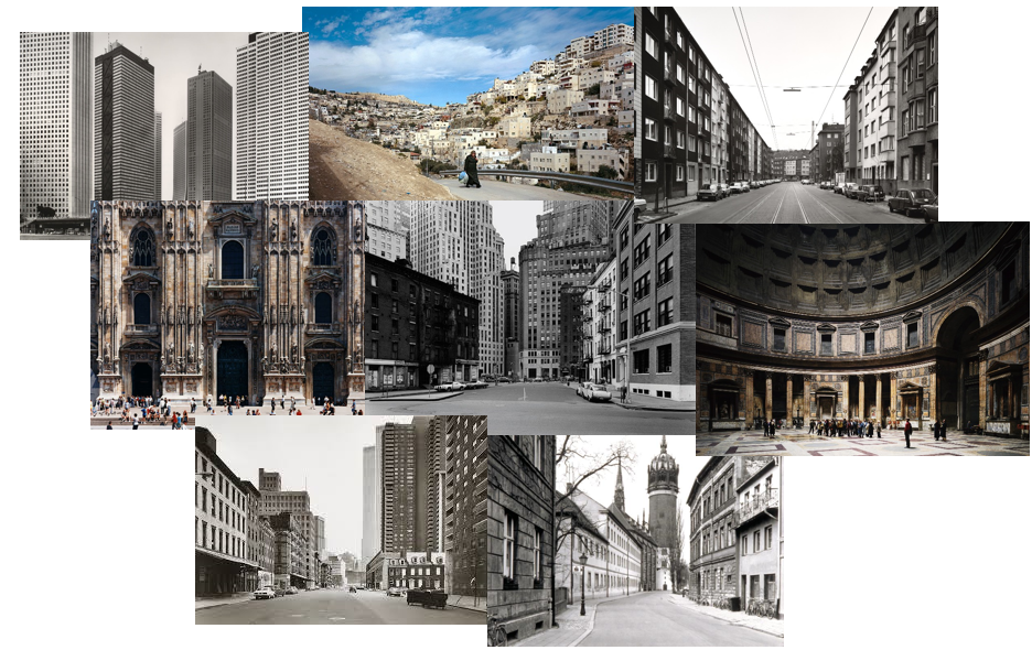
Thomas Struth is a German photographer which was born in 1954. He is best known for his Museum photographs, Family portraits and his 1970s black and white street photos in New York and Germany.
His mum, Gisela Struth worked as a ceramic potter and his dad, Heinrich Struth was a Bank Director, they both lived in Geldern, Germany which was where Thomas Struth was born.
In 1973, Struth initially studied painting; however, in 1974 he began to become increasingly drawn to Photography which is where his passion commenced.
In 1977 Struth was awarded a scholarship by Kunstakademie, which allowed him to live in New York City. This lead to his progress in unusual images of streets devoid of people, traffic, and the unceasing movement typical of a major metropolis.
His work is well known for his attention to detail, He wants to show the intricacy of the landscapes he captures to show that there is more than meets the eye. He is also well known for printing at a large scale; for example after vising places like Europe, Asia and America he created mural-sized colour photographs of up to 4 meters long, these were of dockyards, pharmaceutical plants, and physics institutes.
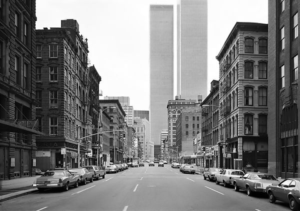
Visual: Here in this image the eye is lead down the road and into a sort of “never ending” view of buildings, this allows the image to look 3D. I like the use of repetition with the buildings, as although there may be quite a few similar buildings at first glance, when you take another look it is clear to see the detail and the contrast shown between all the buildings. The colour in this image is clearly black and white which allows the audience to focus on the image itself without getting distracted by all the colours. All items such as buildings and cars seem to have been placed in neat little lines pointing towards the centre background of the image, which further leads the eye to each and every building before the audience I able to take a further glance.
Contextual: This photograph is called “West Broadway” due to the location in which it was taken. It was taken in 1978 at West Broadway, Tribeca, New York. This image is currently in The Metropolitan Museum of Art in New York.
Technical: This picture has used Gelatin silver print which is an image suspended in a layer of silver gelatin, but on a paper substrate. The lighting is natural due to daylight. This photo was taken in the middle of this road which is shown through the symmetry of the image. Tonal range is shown in this image by the the different tones from Black-Grey-White. The photo also seems to have low sensitivity giving a better quality image. Warmth and temperature are not shown dut to the image being in Black and White.
Conceptual: I think the main idea behind this photograph by Thomas Struth is similar to the New Topographics movement in that he is trying to show the beauty in this new man altered world. This gives depth and meaning to the image as it is not another photo of New York to show of that he has viszited that place; but an image to show a different side of New York that many people may not be aware of.