All posts by Diana DR

Filters

Author:
Category:

Final Evaluation

Here is a link to my book on blurb: Grinase

For this project I explored the theme of transition through the linear narrative of my parents work life including where it started and how their work is now. I think this project worked really well as I was able to take many high quality images and create a successful story line about the greenhouses.

In past projects I struggled in creating books and zines as I struggled to creative a successful narrative that made sense. However when creating this book I had three distinct points in which I was able to create a narrative; which was their first job when coming to Jersey; their current job and the future greenhouses in currently in construction.

I think I matched Chris Hoare’s Ideals of having warm toned images and uses of juxtapositions within images which I showed in my choice of images items and there colours. Similar to Brykczynski’ s work I made sure to enhance the greenery in my images as that was one of my main focuses in many of my photographs. With Tofts’ work I worked towards the emotive side by adding old photos to represent memories that we have. I also got influenced by his use of monochromatic photos so I decided that the first image inside the book would be monochromatic in order to enhance the detail and texture in the photo. Toft also used many portraits throughout his book which inspired me to create a portrait of my parents at the end of the book; I think this added a nice ending to the book and made it work well.

I like how I managed to include a small element of my past work which was childhood memories into my book as I managed to therefore make the book more sentimental and more personal for my parents as this book showed how my family grew around their work which I think is is a great story for them to carry with them along their lives. Although many of the memories surround myself, I think that my parents will have many more memories in which I felt that it was essential to create this book for them.

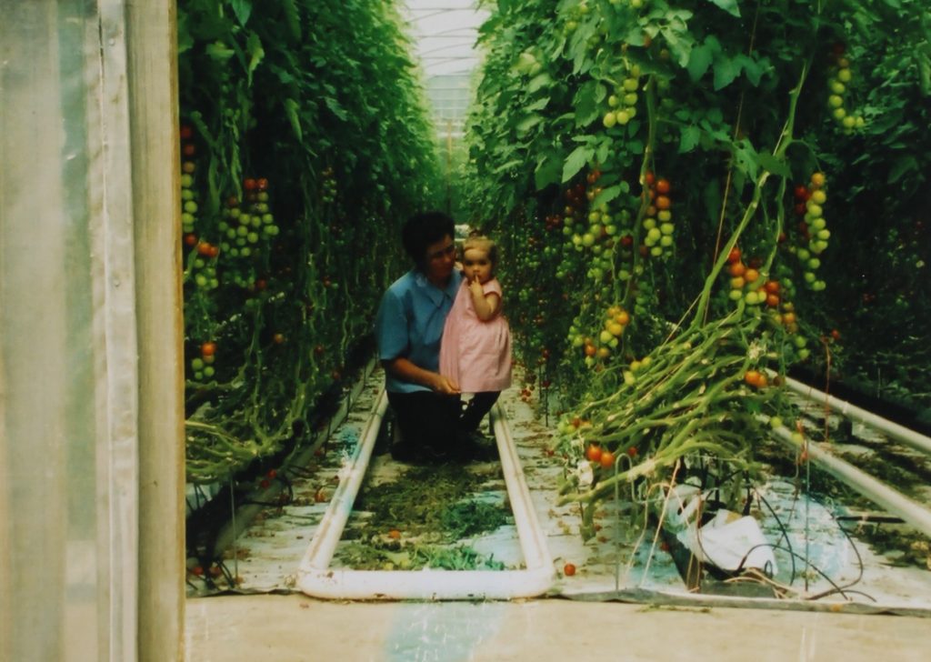
Photobook Layout

The following images shows how I decided to layout my images in my photobook

For my front cover I decided I wanted to keep it simple with a Emerald coloured cover and the word Greenhouse in portuguese.

I then have Greenhouse written in English on this page however to plan to place a real photograph here of me and my parents next to the greenhouse when I was younger; I think this give the book a more personal touch.

On these two pages I wanted to write in Portuguese and English to link the idea to link their language and the language they learnt in Jersey. I made this image monochromatic to give the idea that its an older memory.

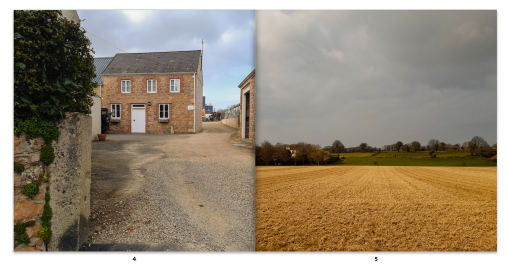
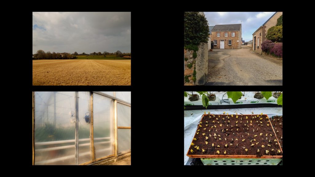
These images show where they used to live and where they worked at the beginning of their lives in Jersey

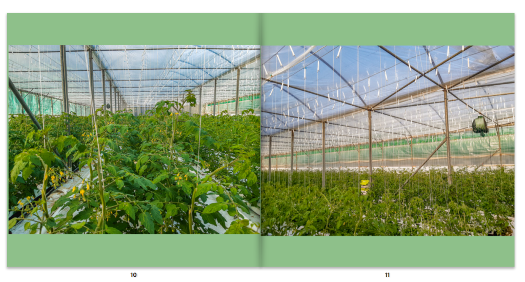
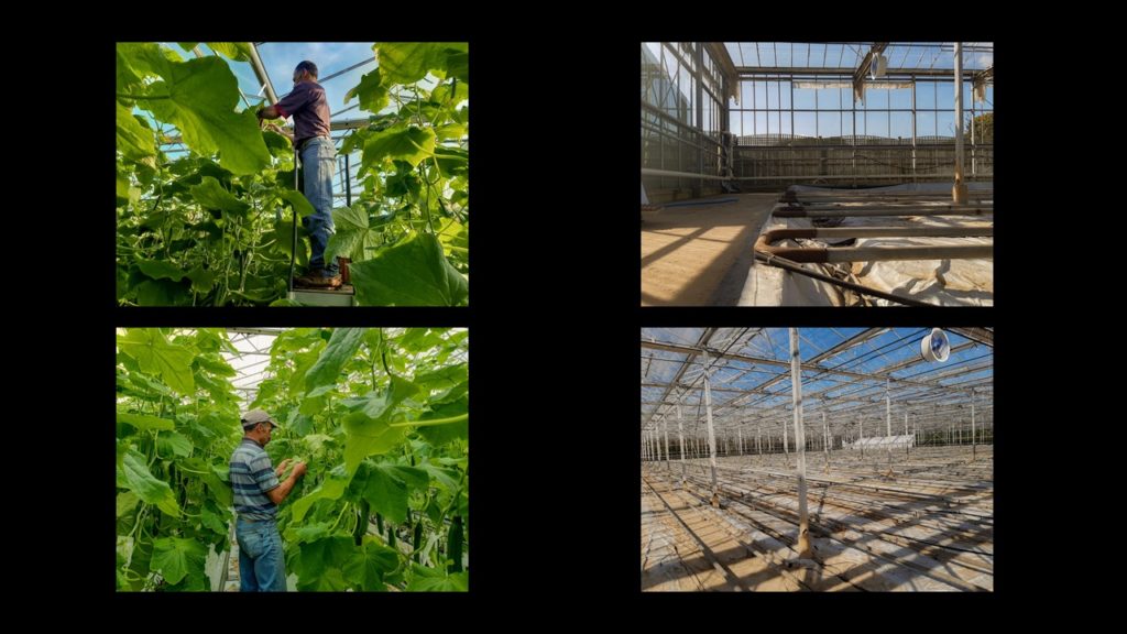
I used these images to show the transition into the tomato greenhouse in which we call “the tunnel”; I think these images work well due to the old photograph as it reminds them of how long they lave been working here.

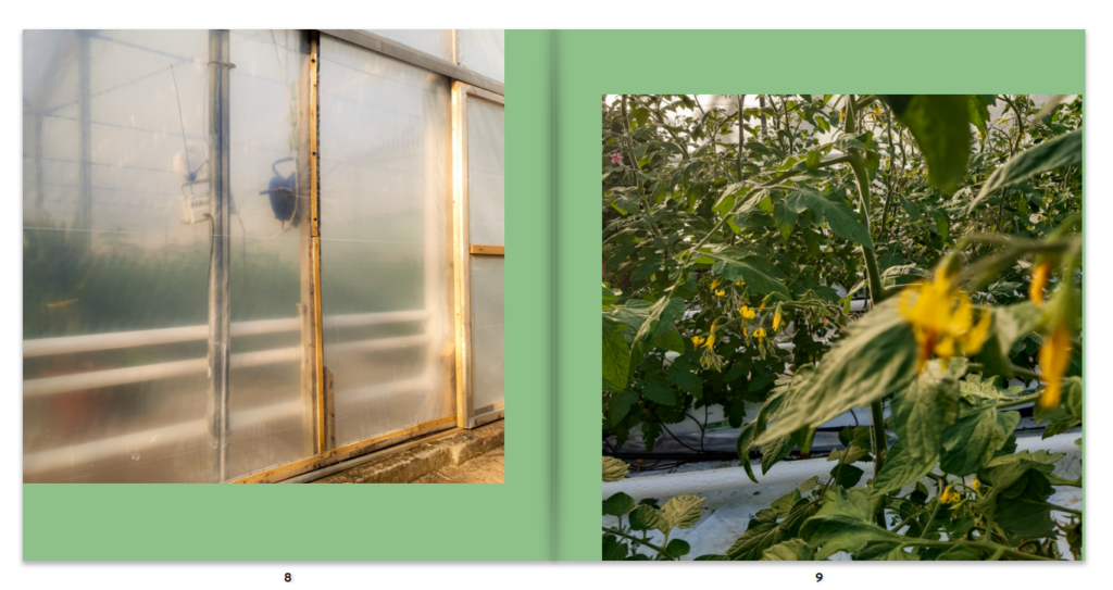
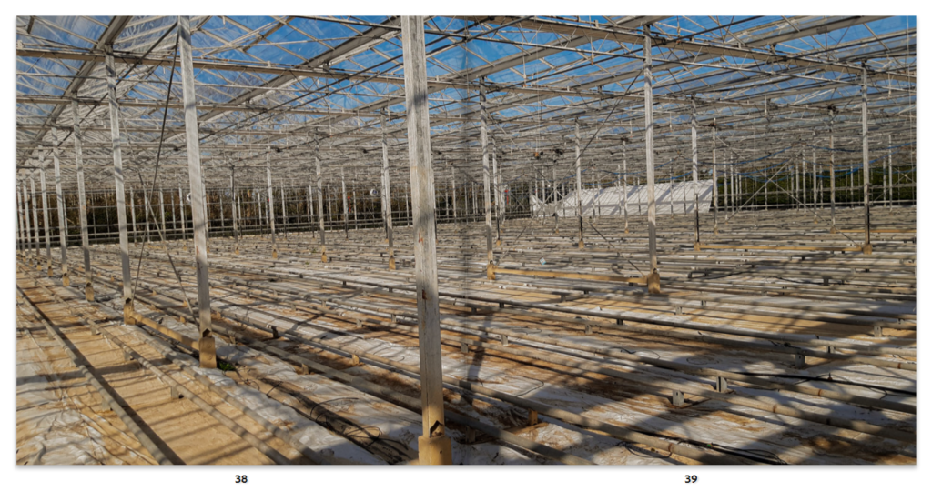
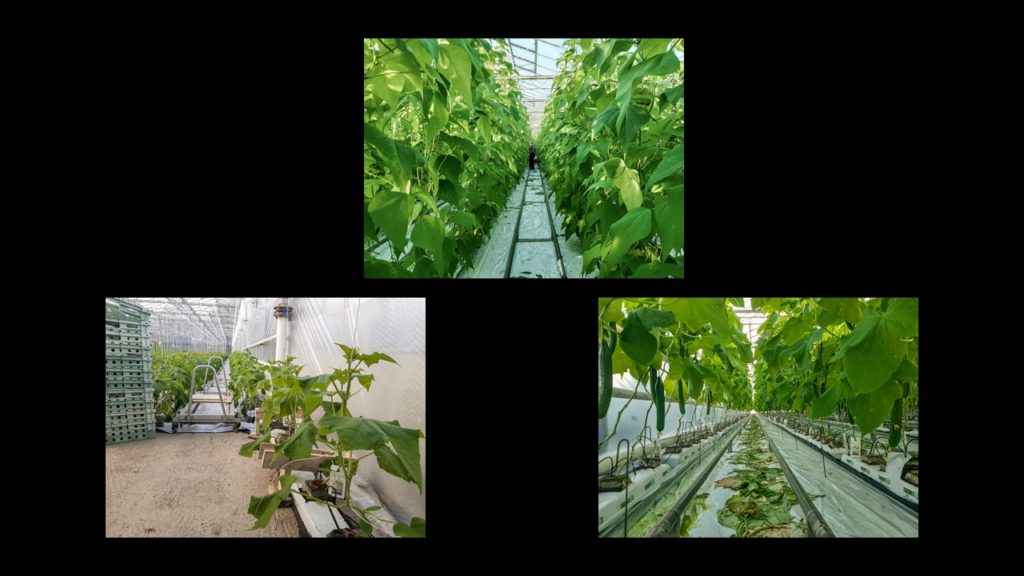
These images I thought worked well as it shows the outside and the inside of the Greenhouse.

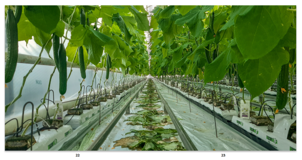
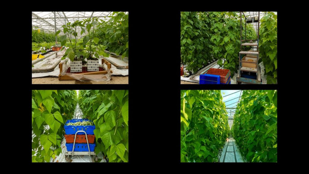
I then used a double page spread to show the transition into the other greenhouse they they also work in.

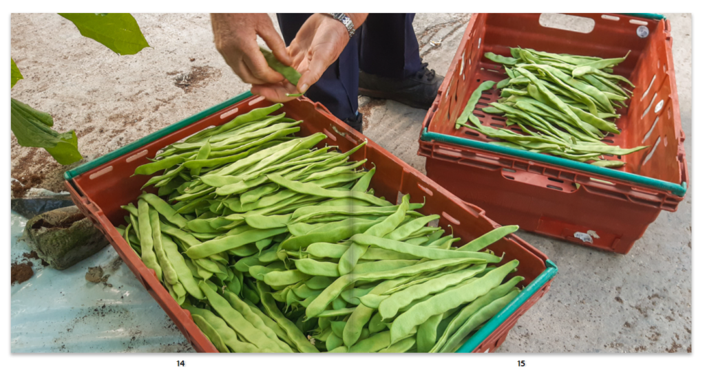
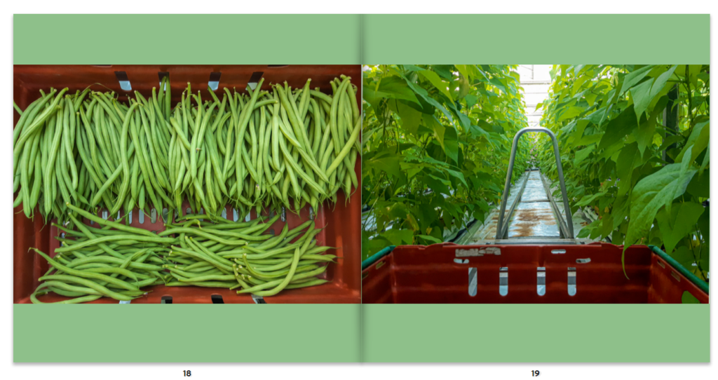
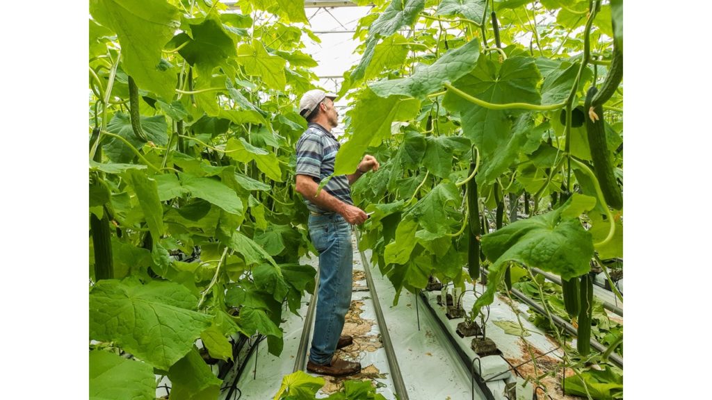
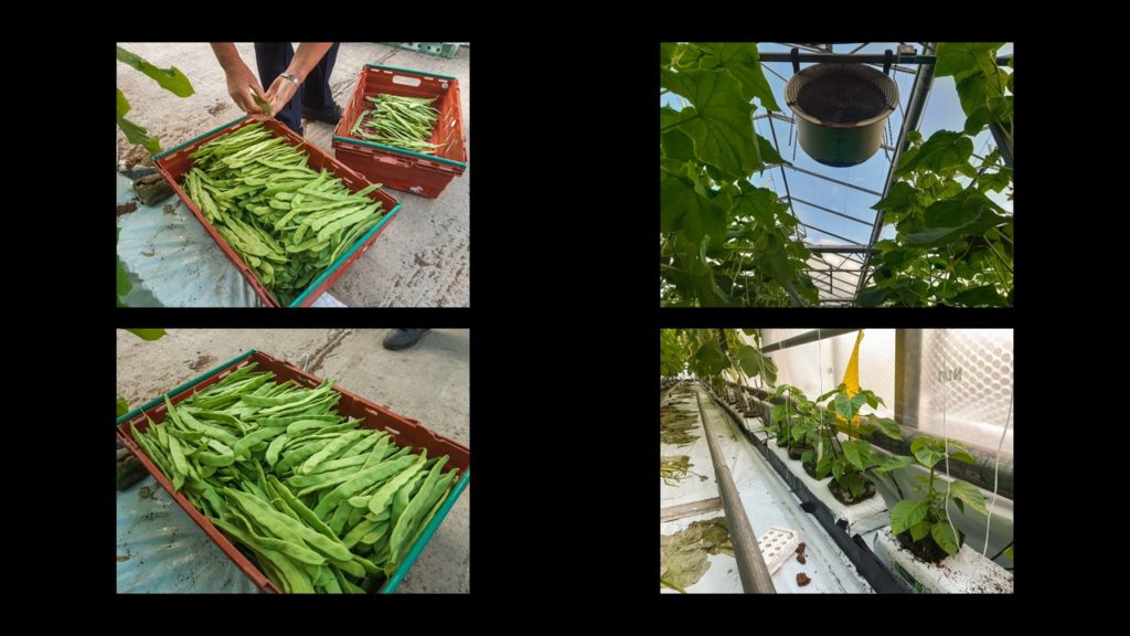
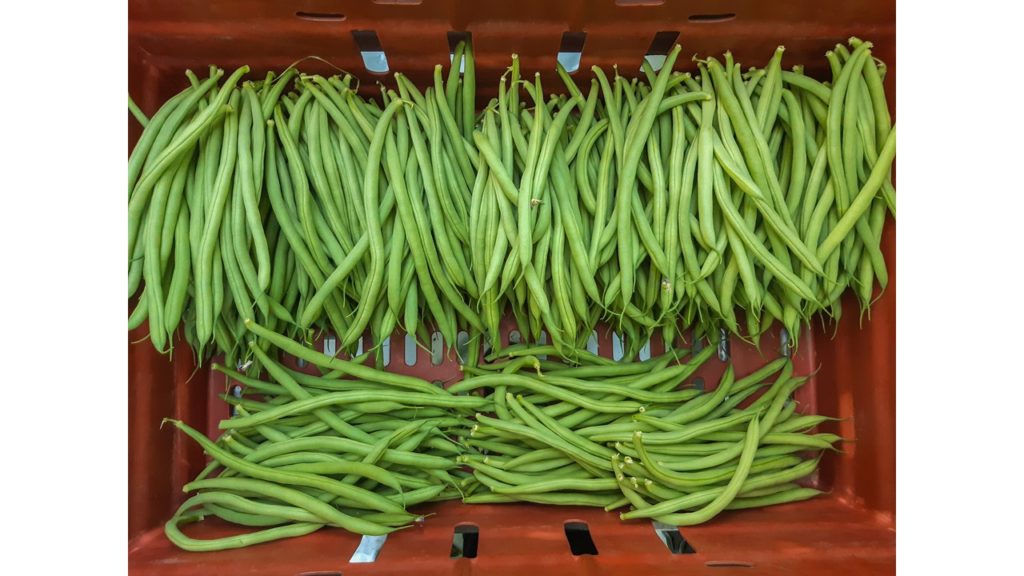
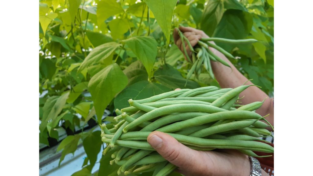
I love the use of contrast between the green and the red in the images as it makes the green beans stand out.

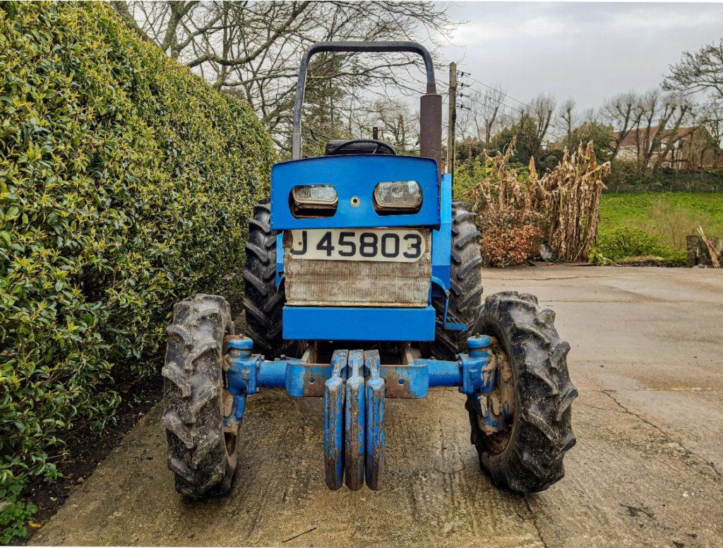
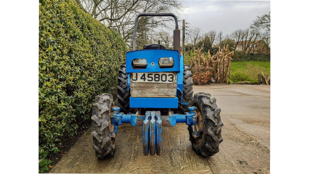
I used these images for again, the use of contrasting colours which make the images stand out. The car also holds memories me and my mother.

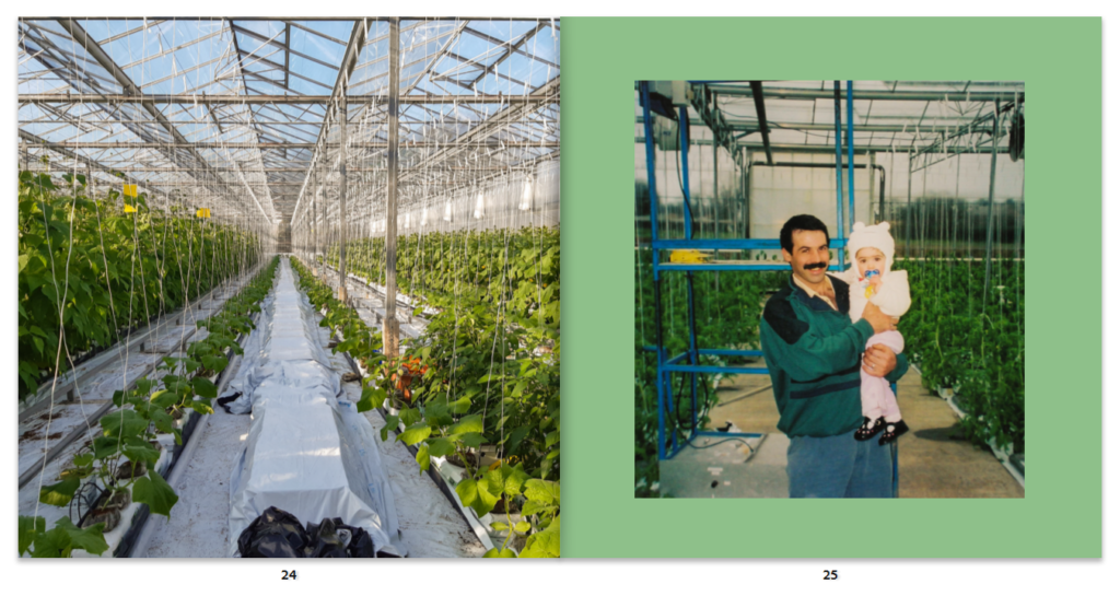
I love this image for its symmetry and the nice balance between green and white.

I used this divide to show the new the greenhouse; again in portuguese and english.

I created a divide again by the use of two plain pages and showing an image of my parents to nicely finish off the book.

Photobook ideas

In order to figure out how to create a good photobook I had to research different books in order to inspire me and create new ideas.

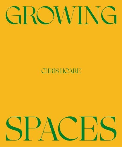
Growing Spaces – Chris Hoare

Growing Spaces (Paperback)

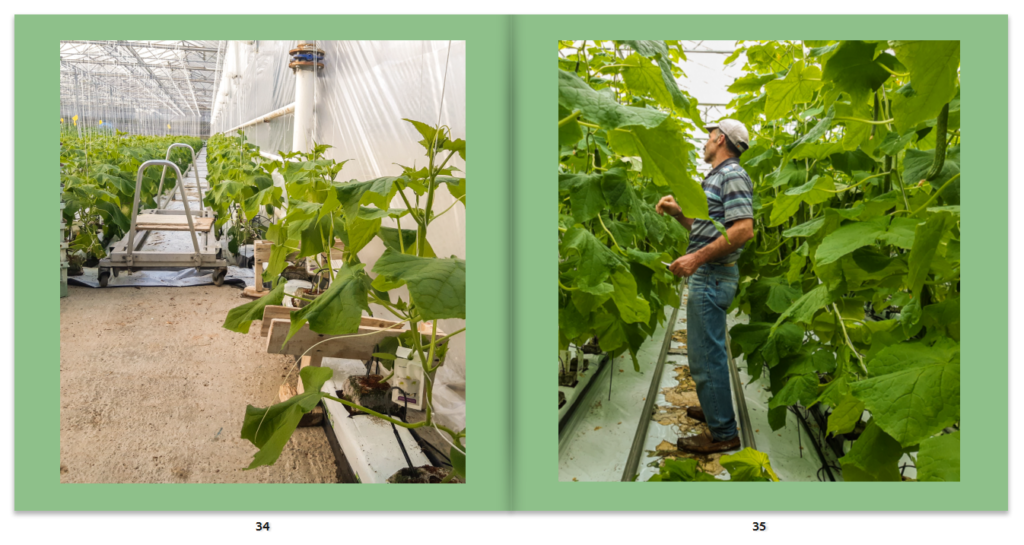
Chris Hoare is a photographer which was born 1989. His work surrounds areas of society that he thinks are overlooked and likes to create visual stories in a metaphorical way. He worked on 11 sites across the city. The work started pre -pandemic but its timing worked well to highlight the demands that the pandemic brought the workers to create and harvest produce.

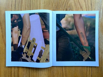
I like the way Hoare created juxtaposition between the two images as it forces the reader to look for the similarities and differences between the two images. Overall I like the colour scheme used by Hoare as it creates a warm and emotive feel to the images which helps us to create a bond with the workers and their workplace. I think the story he creates displays the reality of working in the fields and outside whilst still showing the beauty of the greenery which helps make their hard work worth it in the end.

Idyllic photos of Bristol’s allotments over lockdown (huckmag.com)

Growing Spaces by Chris Hoare | Photography | Setanta Books

The Gardener – Jan Bryczynski

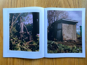
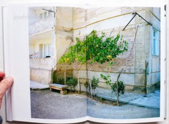
The Gardner follows a set of images or urban gardens in different countries and continents such as Nairobi, New York, Warsaw, and Yerevan in Armenia. The owners of the gardeners are members of the village from low income communities; they create the gardens with what they have at hand including reusing materials to give them a new purpose which will help them in their gardens. Each garden is arranged differently and structurally which interests Jan Brykczynski as it is a space for the villagers to express themselves and aid them with their everyday lives.

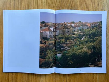
I like the way Jan edits his images to enhance the greenery in the photos; I think it works well as it helps add dimension to the images. I also like His use of two page spreads as it allows the important parts of the image not be distorted by the spine of the book.

Jan Brykczynski – The Gardener, Dewi Lewis, 2015, Stockport – photobooks josef chladek

Jan Brykczynski Photography

Te Ahi Kã – Martin Toft

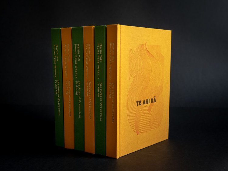
TE_AHI_KĀ_book-1.jpg

Te Ahi Kã – The Fires of Occupation is a book which follows the Whanganui tribe which live by New Zealand’s Whanganui river and shows their connection to the river and the Maori. Toft photographed them whilst the tribe worked on reversing the acts of colonialism.

He has two covers one for women which is the green cover with a design of a fern which the Maori Women used in terms of protection, purification and prayer. The Male version which is the yellow cover with a flame design as embers are said to be “traditionally wrapped in a Ponga tree leaf (silver fern) to carry the fire from one village to another as a symbol of occupation.”

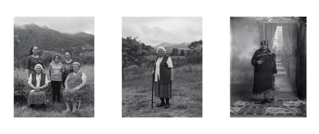
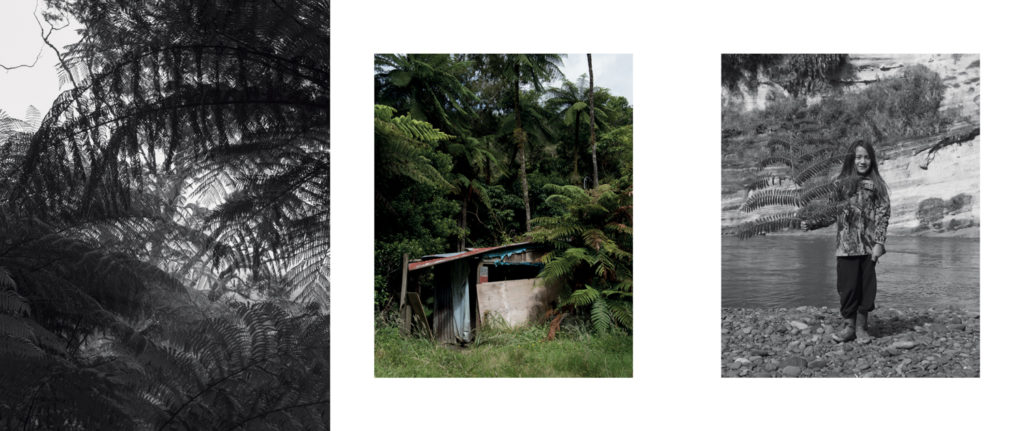
I really liked his use of monochromatic images in order to highlight the detail and texture of the trees and plants. On certain pages the page opens up on both sides to reveal a photo with colour and on the left side and pages of writing on the right side which gives more information about the Whanganui tribe including some of their traditional songs and conversations with the members. I love his consideration of of background, midground and foreground in his portraits as he photographs the people in their homes or outside in their land which makes for much more interesting portraits that help to tell the peoples stories, cultural heritage and traditions.

Similar to Tofts Idea, I want to gift my book to my parents so that they can have something to look back on to show their life and work in this job in order to help them recall and tell others about their work and stories that came with them.

Te Ahi Kā – The Fires of Occupation on Vimeo

Te Ahi Kã – The Fires of Occupation — Martin Toft

About — Martin Toft

Martin Toft – Te Ahi Kā – PhotoBook Journal

Mini Project

I wanted to create a mini project surrounding Femininity and the reality of being a women.

Feminism is a movement which is about of trying to get equal rights for women.

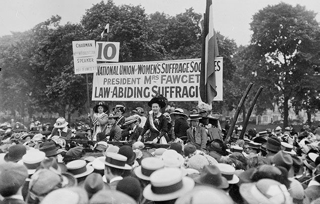
The wave started in the 19th to 20th century with the Women’s suffragette movement where their main focus surrounded getting women the right to vote.

Suffragettes facts

These were my two artist inspirations:

Lauren Marek

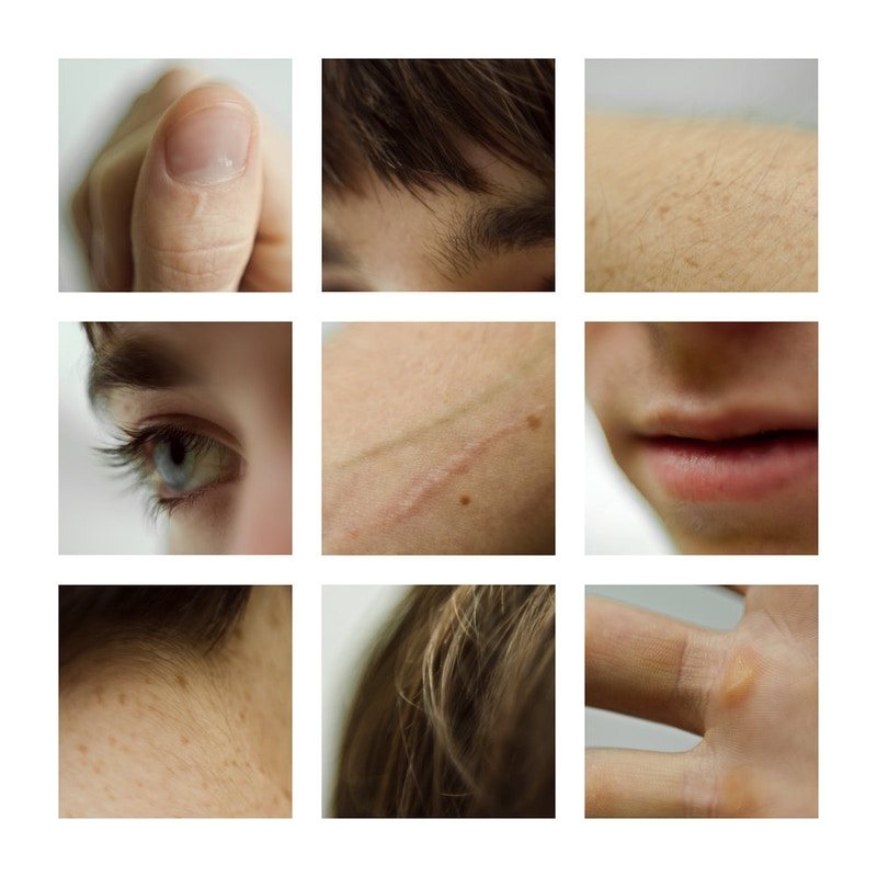
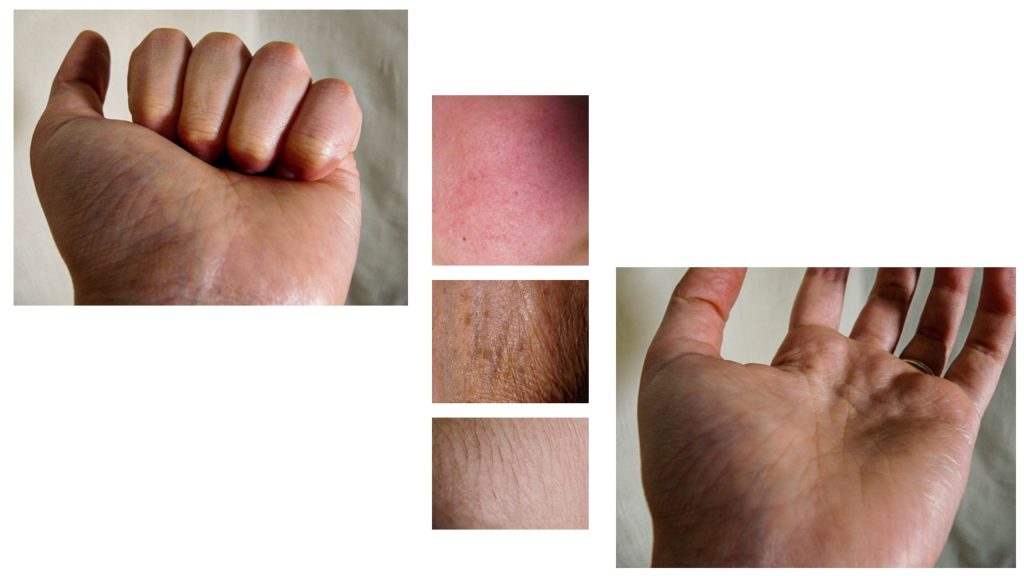
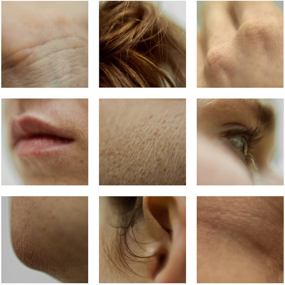
I chose Marek in order to photograph insecurities that many people have such as wrinkles, rosacea, hair and skin texture; I chose this as due to social media many of us constantly see airbrushed and photoshoped images which hide skin texture which can make many people insecure that they do not match the influencers body/skin. I wanted to enhance my skin texture and and “blemishes” in order to show the beauty and naturality of texture as everyone has it and it shouldn’t be something to be ashamed about.

Babara Kruger

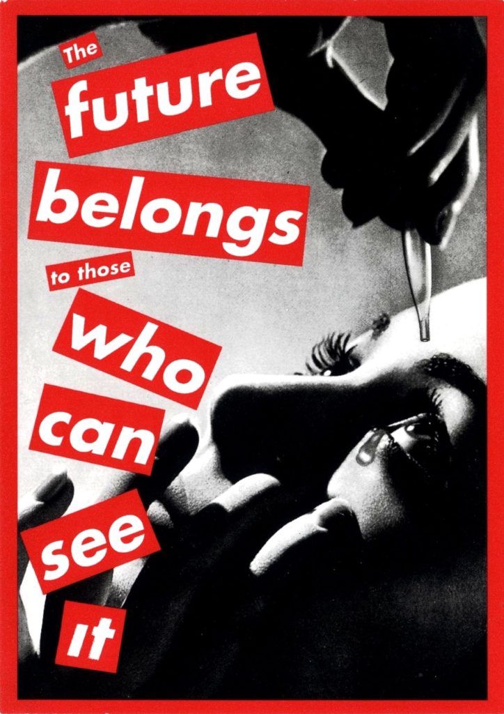
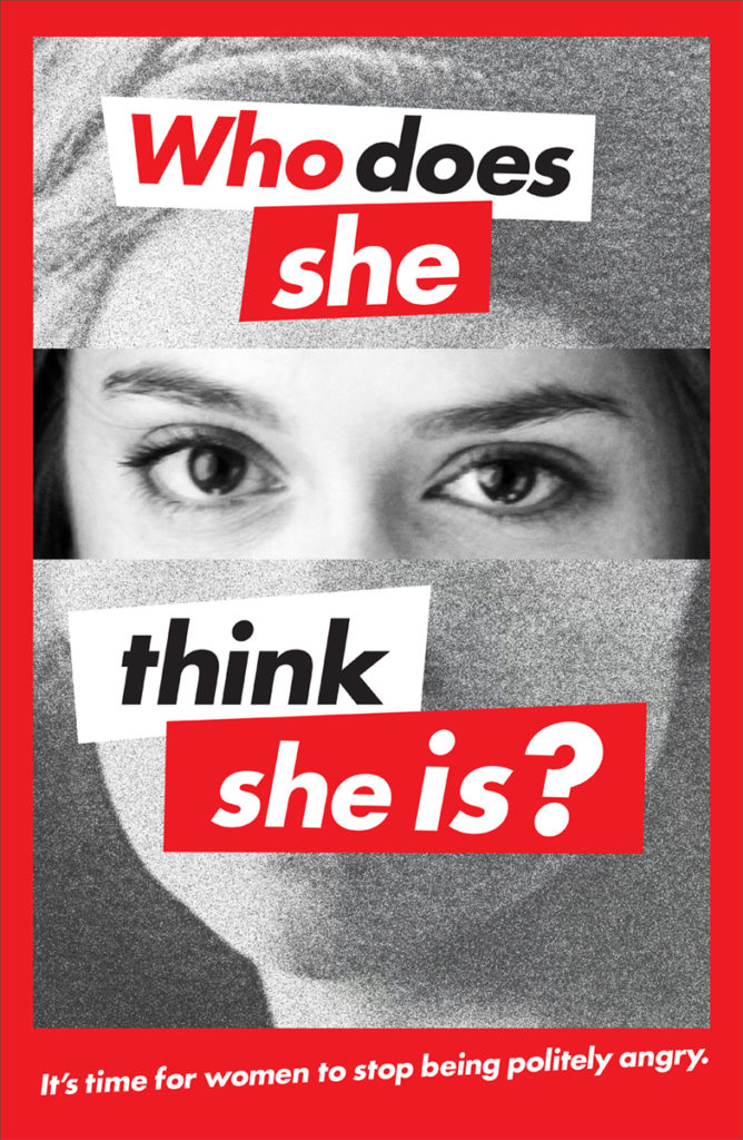
I choose Kruger due to her feminist influences ans the idea of giving people power. Her use of red and white lettering against monochromatic images really stood out for me as it helps get Kruger’s message across. I wanted my photo shoot to be empowering yet still show the struggles that women face in their every day to day.

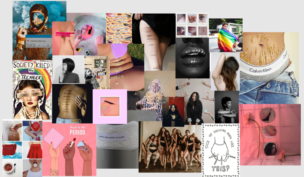
Other influences:

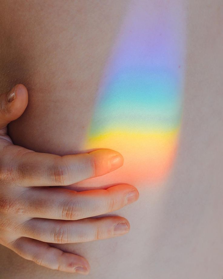
Favourite Images Inspired by Lauren Marek:

I think these images help to highlight the reality of skin and its different natures. I really liked these images as they help to show different elements of the human body and show “insecurities” which I find that with enough coverage people settle with reality and understand that not everyone does fit with societies standards but can still love their skin for everything that it does for them.
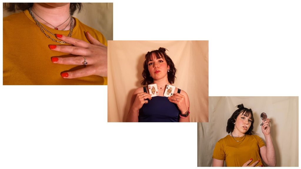
Favourite photos Influenced by Babara Kruger:

These were my portraits which have more subtle meanings. In the first image during the shoot i placed the nail varnish messily and wanted to photograph that to symbolise that not everything has to be or is perfect. I thought that the colour red was important to show power and confidence as people can create their own version of perfect. The second image shows A Queen and a King playing cards; this image helps to symbolise the patriarchal society and the divide their is between men and women; whether that be the pay gap or simply the way society treats people differently depending on their sex. The third image makes references to social media and society as in more ways than not many people find themselves obsessed with the way they look due to insecurities and the desire to fit in. I feel that as a women I need to check and make sure I look presentable so that I don’t get called out for “letting myself go” or “dressing inappropriately”.

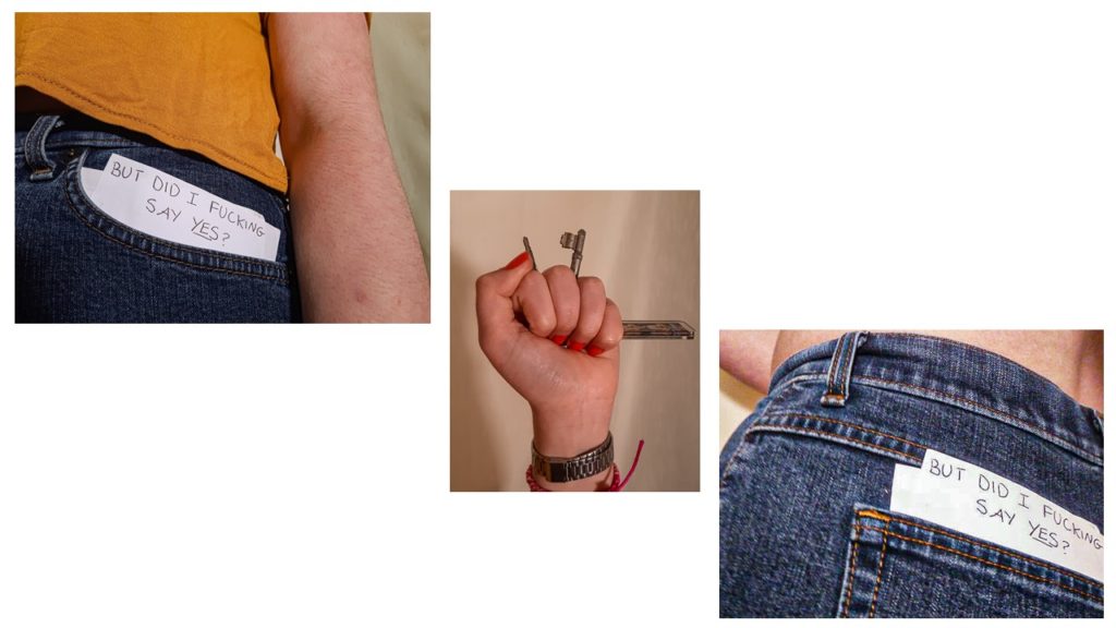
These final images have more of a powerful and clear meaning. The first and third images are references to sexual harassment and the rape culture that society has brought up. with the news showing that at least 97% of women have experienced sexual harassment I thought that these were important images. Society still tends to condone women for getting sexually harassed and abused with constant questions of “well what were you wearing?” and “what time where you out?”; whereas they were asking the wrong questions as it does not matter the piece of cloth in which people decide to wrap themselves in but rather the people who rape and abuse others and their rewarded attitudes. The use of the keys relates to the fear that many women face when walking alone, as they feel the need to carry around with them something to protect themselves so that men will not abuse them.
Overall, I am quite happy with my outcomes and the way they turned out as I think I have managed to touch on many important subjects through the use of experimentation with different objects and poses. I hope that this project inspires future projects in hopes to speak up about important topics and raise awareness of normal and natural bodies and skin and the issues that still apply to women in this patriarchal society.
Editing Process for all shoots

For all my photos I followed the same steps but just slightly adjusted it to best fit the image and lighting.

On Lightroom I began by selecting the photos that I wanted by giving them a 3 star rating if I wanted to use them then editing the best photos.

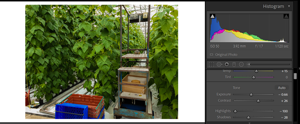
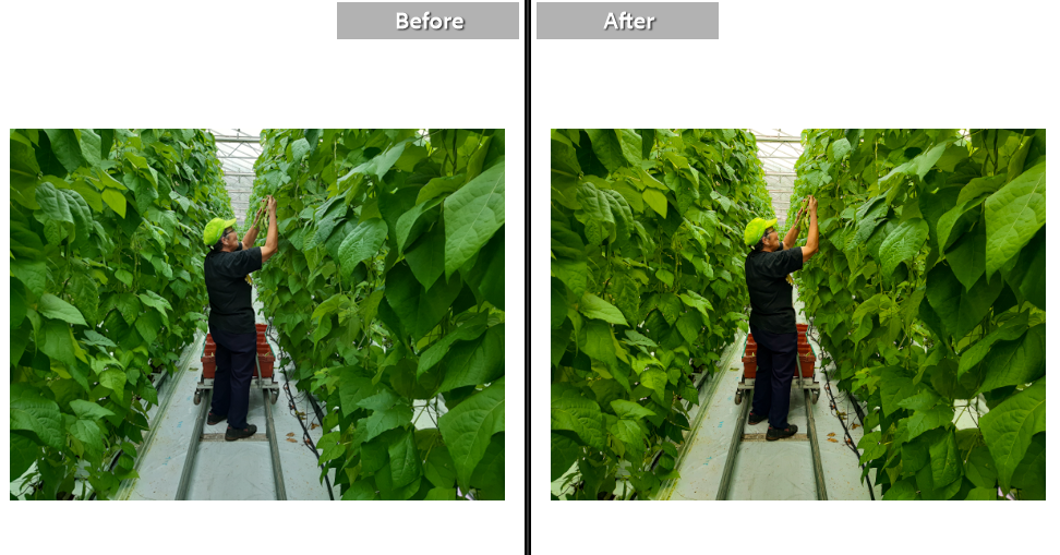
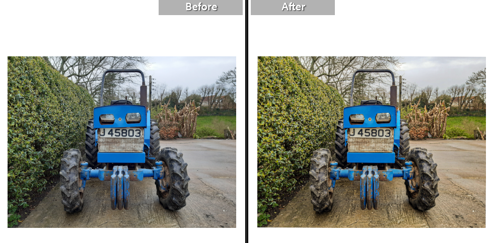
I started by increasing the temperature in the images to add to the memorable idea of the image. I then adjusted the exposure to work best with the contrast to help add more dimension to the photos. I also decreased the highlights to avoid making the photo too bright

I then similarly played around with the whites and the blacks and adjusted them to best fit the image; this differed from image to image. I increased the texture to bring out the detailing in the leaves and the rust in the car and increased the dehaze to make the photos more clear. I added vibrance to make the other coloursz of my images pop out such as the red and the blues

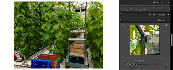
I finally added the slightest bit of sharpening to the images to again bring up the quality of the photo.

Before and Afters

PHOTO SHOOT Plans

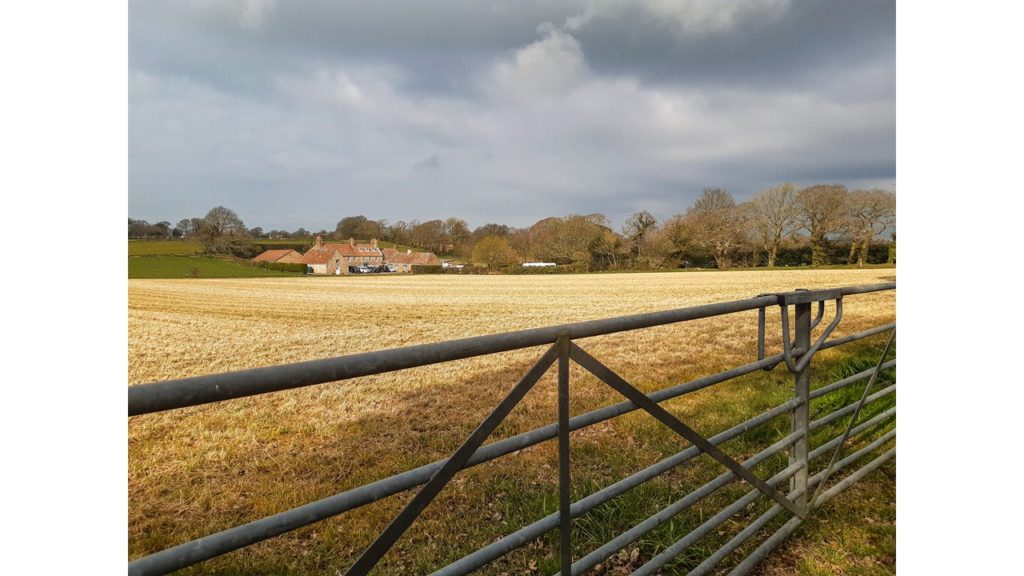
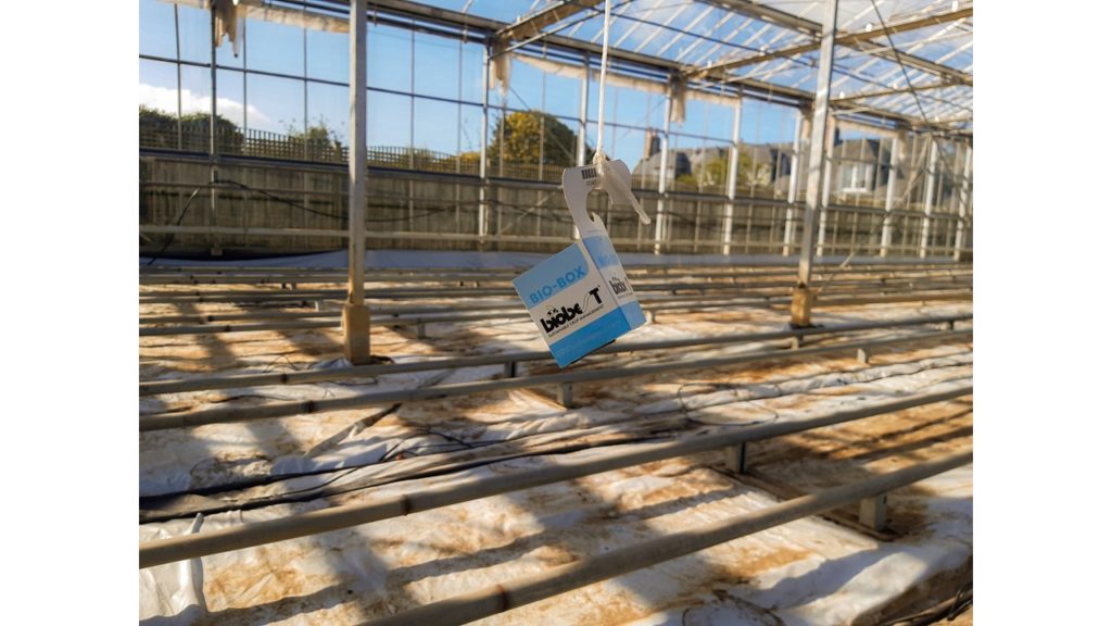
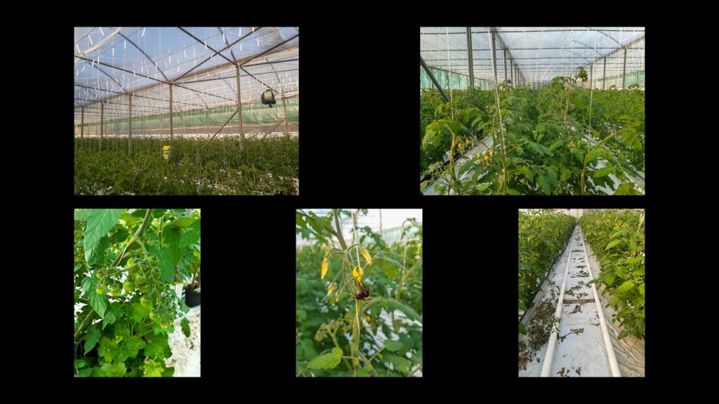
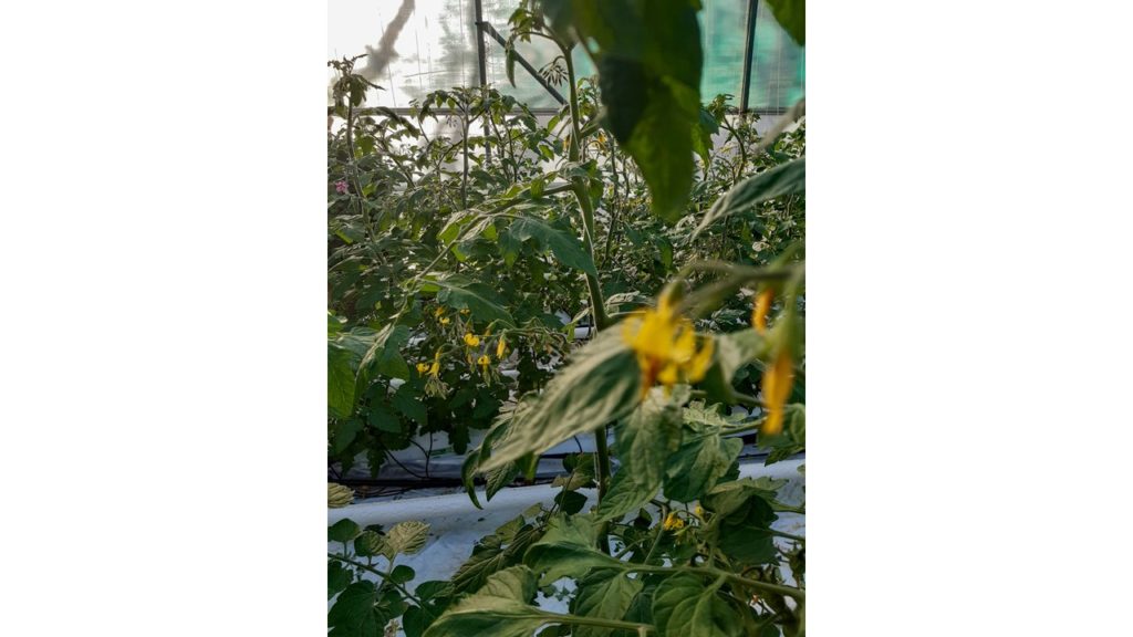
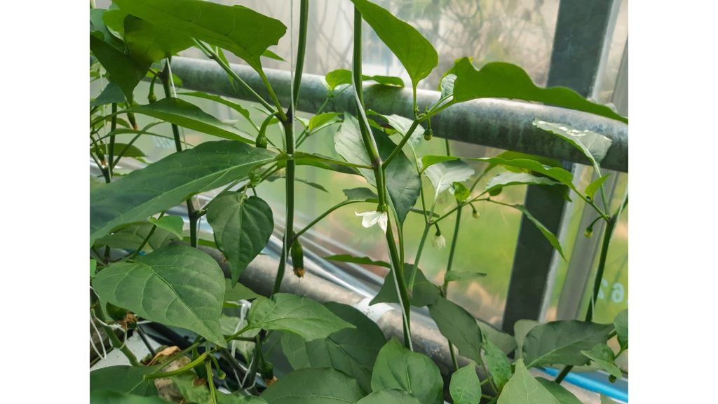
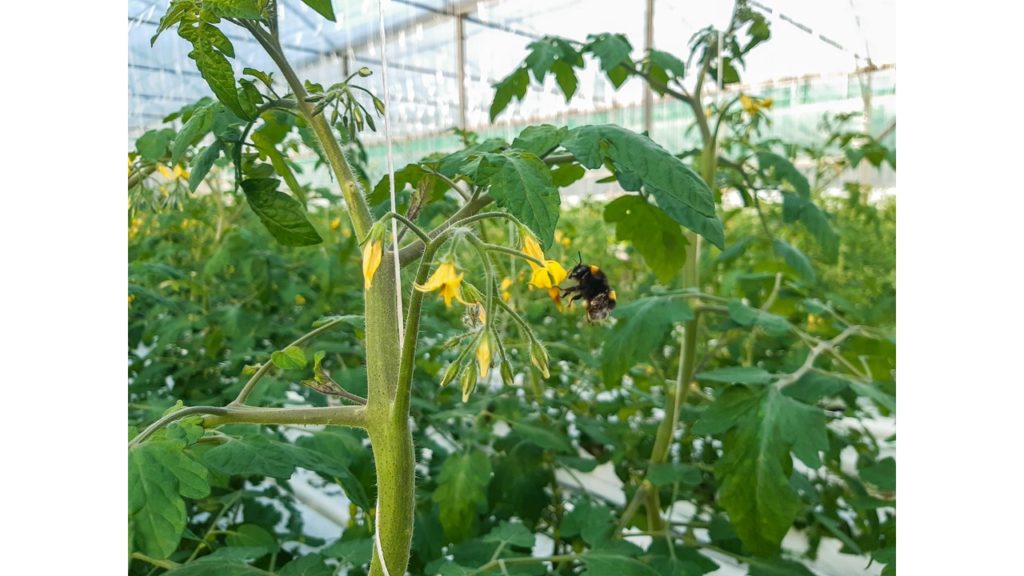
What: I will be photographing my parents work in greenhouses and the landscape of it

When: I will take my images throughout the next month including Easter holiday; during the day and after school, and at any changes for example seed germination and sewing.

Why: I hope to show their hard work and commitment whilst telling a story of their work life

Who: I will be photographing the site: plants and my parents

How: I will take photos with my personal camera using the natural daylight as a source of lighting.

Location: I will be taking photographs inside the greenhouses and I will be walking outside to other sites in which my parents used to work at.

Framing: I will be typically taking large frames as I will be taking pictures of the main aspects of the greenhouse; however I plan to take a couple close ups

Overall Feeling: I want to show an insight of my parents day to day work whilst still tying in tiny elements of myself and my memories in the greenhouse as well.

The greenhouse technique for infinite tomatoes - easyPonic

Case Study

Alicja Rogalska 

“allowing the participants, the users and/or the performers to shape them and create content through their own responses, behaviours or opinions.”

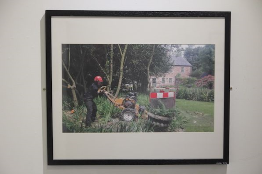
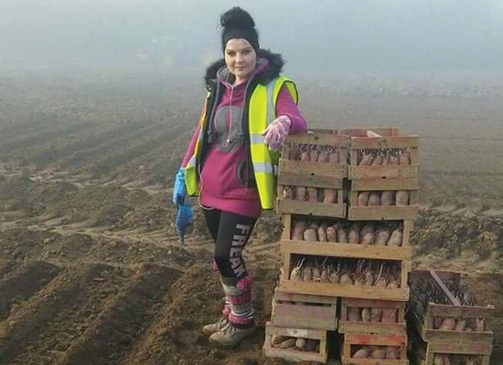
Alicja Rogalska is a polish female photographer which is Uk based and has done a photoshoot/film based around agricultural workers and their working conditions.

Her work specialises in working alongside local specialists such as farmers; here she uses her platform to allow the workers voices to be heard which sparks talks and helps start change to create better conditions for workers.

“Some of the most significant improvements to working conditions can only be made through legislative changes. Ensuring safe, non-exploitative and attractive working conditions for migrant labour is something that will be welcomed by farmers and worker alike."

Labour of migrant workers have been an essential part of this island for over 150 years; however this has been hardly documented which is why Rogalska started this project.

12Migrant_Worker_Archive.JPG

Research Sources:

https://www.bailiwickexpress.com/jsy/news/island-life-seen-perspective-migrant-workers/?cpage=1#.YIWKupBKg2w

https://www.works.io/alicja-rogalska/texts