All posts by Chloe B

Filters

Author:
Category:

IDENTITY photoshoot plan-

WHO-

Two or three of my friends, all from places other than Jersey, possibly myself also? If I do use myself, I will set up the camera settings and have the camera on a tripod and self timer, so it will still be me taking the picture. They will be wearing their own clothes (modern, vibrant colours)

WHERE-

In typical Jersey locations such as a public park or on the front by the beach (weather depending)

WHEN-

During the day to have natural lighting, maybe when it is overcast to have brighter all-round light and a blank screen effect for the background

EDITING NOTES-

I am going to use the flags of each person’s nationalities as a frame around each of my elected images, mimicking the style of Hassan Hajjaj

IDENTITY CASE STUDY- DIANA MARKOSIAN

Image result for diana markosian

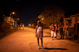
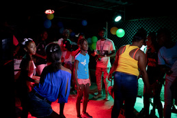
Diana Markosian is an American and Russian photographer, of Armenian descent, but I am only going to focus on one piece of her work for this project, which is the photographs she took when in Cuba, all about the tradition of quinceaneras.

A quinceanera is a lavish and grand celebration of a girl’s 15th birthday, where she wears an (often elaborate) princess-style dress and has a big procession to celebrate her journey into womanhood. It is a big part of Cuban and Latino culture, which is why I chose to use it for my case study.

The images below are from Diana Markosian’s trip to Cuba, and I like them because of their vivid colours and the clear sense of cultural pride that they portray, and when researching them, I found that these quinceaneras are very much a part of the Latino shared cultural identity.

A girl steps on to the seat of a vintage Chevrolet after she has been paraded around town © Diana Markosian | Magnum Photos

TECHNICAL- This image uses natural light and a warm tone as it was taken during the day. It has a high saturation and is very vibrant, which helps to provide a contrast between the red and white of the seat and the girl’s leg in the centre foreground of the image. There is no motion blur, which shows how it was taken with a fast shutter speed to capture a single moment in time.

VISUAL- The image has a good composition; the main focal point is the foot, which is in the centre of the image to lead the eye directly there. The texture of the image is smooth, shown by the reflection in the back of the seat, which demonstrates how the material of the seat is smooth.

CONTEXTUAL- This image was taken as part of a series of images to demonstrate the significance of quinceaneras, which can be seen through the extravagance of the car (a vintage Chevrolet) and the shoe: glitter, heels, gems. However, the image also shows how Cuba is a relatively poor country, as the ground in the bottom left segment of the image is dirty and scuffed, showing the contrast between this one ceremony and the rest of these Cubans lives.

Identity- initial research

I want to focus on cultural and geographical identity, and how someone’s origins and nationality can affect their sense of identity. Jersey is a very multicultural island due to the many waves of immigration from all over Europe, which can be seen simply by walking through town, and I want to use this to my advantage to gather a range of different cultural experiences and identities for this project.

Reference artists-

Diana Markosian, specifically her work on quinceañeras in Cuba. I love how the colours are bright and vibrant and how the main subject of the photo is in the centre of the image, and how the images are not too posed, but not completely candid either. I am going to use this almost natural but slightly posed method of shooting to capture my subjects to keep their liveliness in the image.

Hassan Hajjaj is a Moroccan photographer who lived much of his life in London, and his work mimics this by blending London’s hip-hop and street-style into Morocco’s vibrancy and intense colours. His images show the vivid personalities of each subject, as well as a sense of strong cultural pride. He uses the pop-art style as well, with each image having a frame of everyday objects around it, which I am going to use in my own images.

Plan-

I am going to take pictures of my friends wearing the clothes that they would normally wear (modern, vibrant) in typical Jersey locations where the tone is different (rural, different colour palette) to show how people’s backgrounds differ from where they live, and specifically how Jersey as an island has a very multicultural population.

IDENTITY INTRODUCTION-

Identity is defined as what a person or thing is, and can be separated into several different categories. It can be influenced by where you were born, where you grew up, how you identify as a gender, your past experiences, the political history of where you live or simply how society expects you to act.

Gender Identity is a person’s perception of their gender, possibly different to their birth sex, which can be influenced by the societal roles of their gender in whichever country they come from or are living in. This can be explored through the study of drag queens or the traditional gender roles in other countries, such as in the Middle East.

Cultural Identity is defined as the feeling of belonging to a particular nationality or ethnicity, but it can also relate to groups defined by language, religion or generation.

Geographical Identity is the attachment and belonging one feels with their country, region, city of birth, or where they are living at the moment. Often this type of photography involves people wearing their traditional dress, emphasising their geographical roots.

Loss of Identity is also a prominent feature when discussing identity photography, as it is becoming more and more prevalent in today’s modern world, for many reasons. One may be the freedom that technology gives us to explore different ways of life, changing them from our original ones, or perhaps mass immigration has given people a sense of lost identity, as their connection to their place of birth has been severed, or maybe even age and diseases like dementia and Alzheimer’s can cause elderly people to feel as though they have lost their identity.

Tableau Vivant final outcomes-

Image result for john william waterhouse echo and narcissus
original image I am intending to recreate

FINAL SELECTION-

#1-

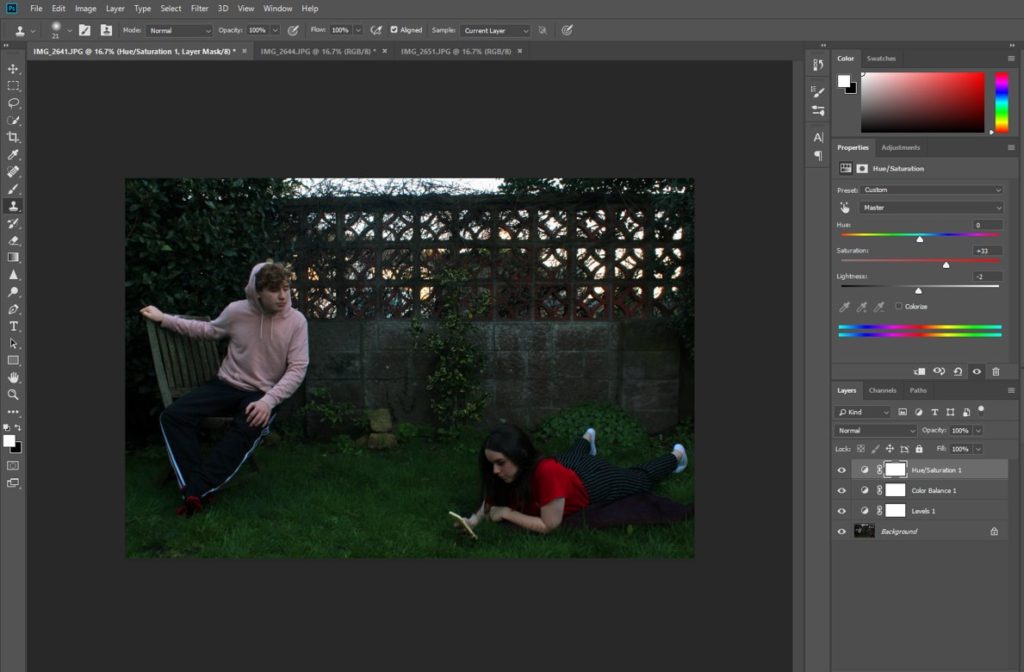
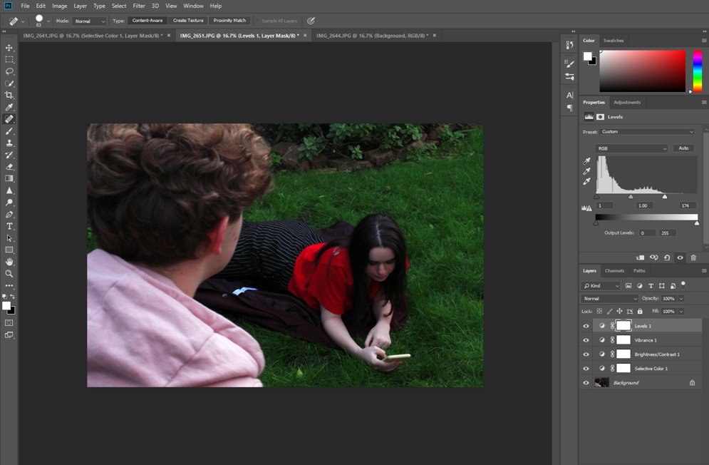
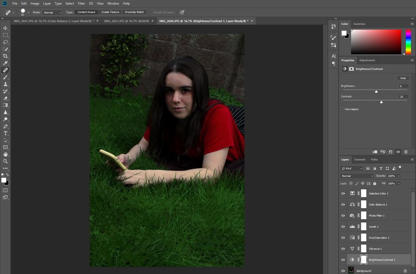
First, I edited the colour saturation of the image, specifically of the red and green shades, in order to make the grass stand out more as well as making the red t-shirt more prominent. I also subtly changed the black and white levels to add more contrast and definition, additionally making the image brighter in order to make it more similar to the original painting.

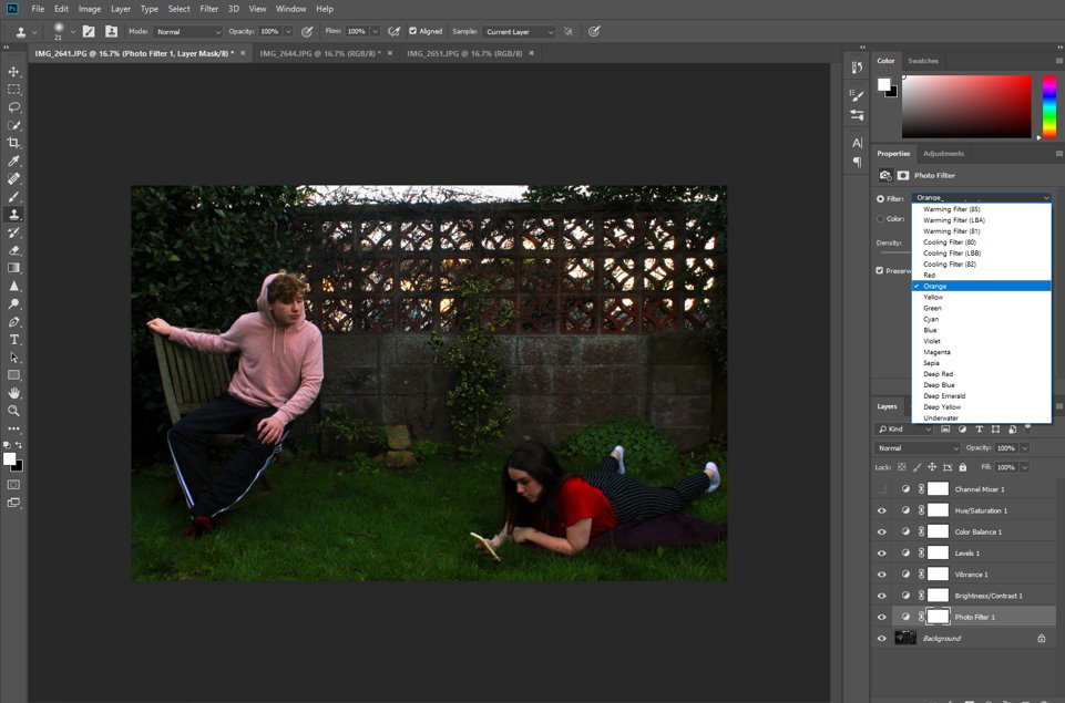
Then, I also added a photo filter in the orange shade, also to increase its similarity to the original painting, which has quite an orange tint. This also had the effect of drawing more attention to the pink jumper, as well as making the sunset behind the wall more saturated.

Finally, I used the spot healing tool to fill in the patches in the grass and bush behind, remove some of the marks on the wall, and smooth out the pink jumper, which was a little wrinkled. I did this with the intention of making the image seem more “perfect,” like the painting, which would have been edited in many little ways whilst being painting, whereas I had to turn to digital editing.

#2-

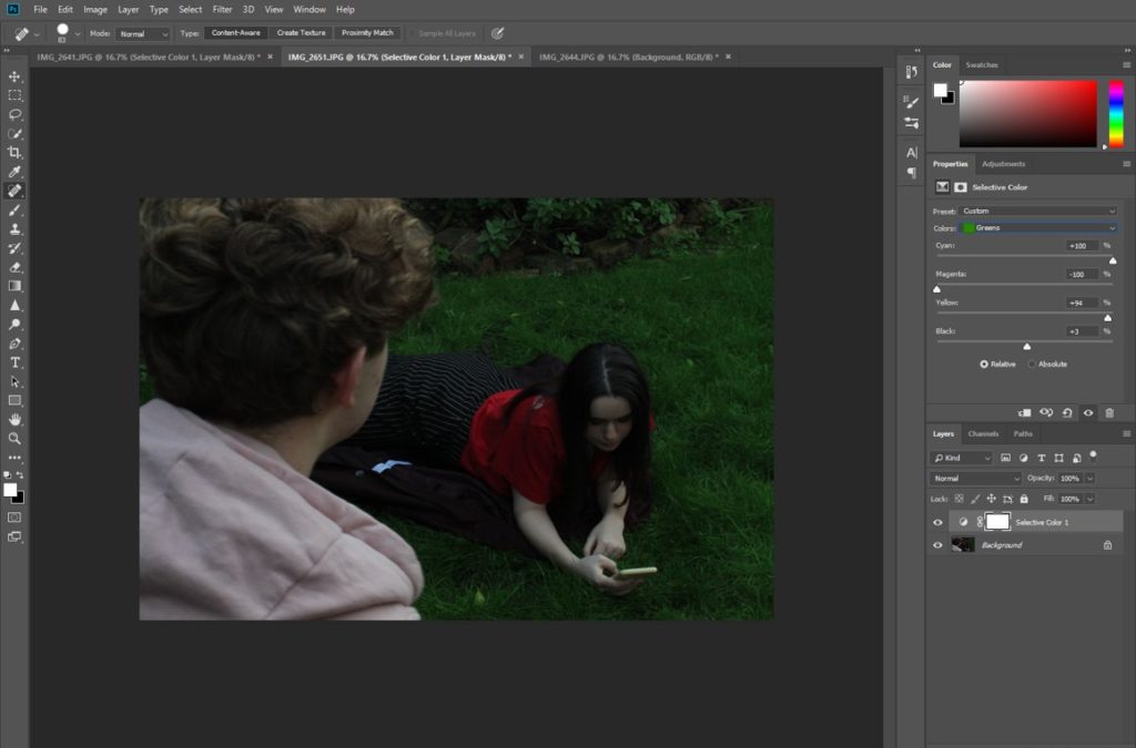
First, I use the spot healing tool to fill in the patches in the grass while still keeping it as natural looking as possible. I also added a green filter in order to increase the saturation of the grass, which was not as green in the image as it was in real life, and also to make it reflect the painting more as well.

I then adjusted the saturation and vibrancy of the main colours in the image, namely red and green. I also made the image brighter and increased the saturation of the pink hoodie in the foreground.

#3-

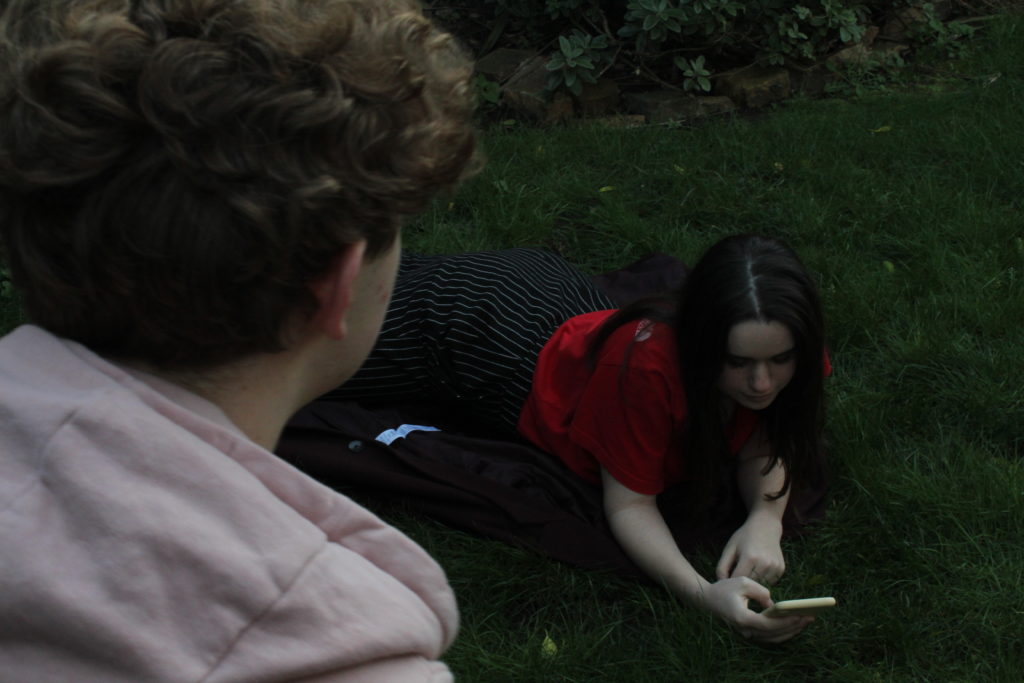
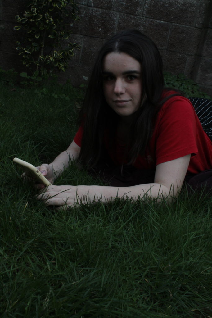
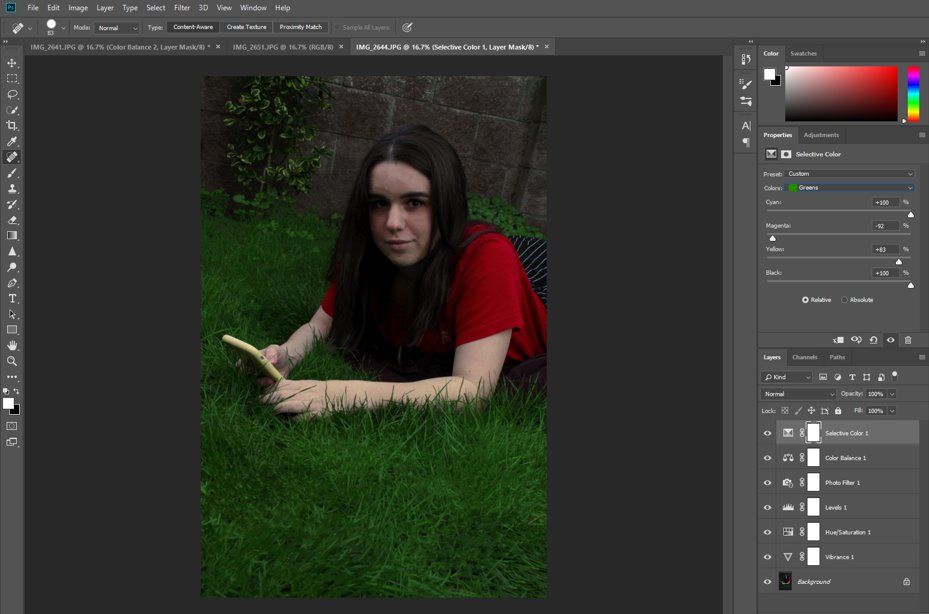
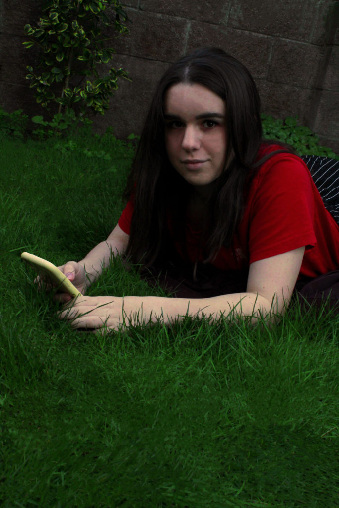
I added a filter, increased the saturation of the green grass and the red t-shirt to make them the focus of the image, as well as making the image brighter and increasing the contrast. I also used the spot healing tool to patch up the grass and smooth out the irregularities in the wall, to make the image more cohesive.

I took this image from a canted angle, which I decided not to change as it adds a little drama to the image and makes it more interesting. I also used the spot healing tool a little on the subject’s face, as well as to smooth out some of the wrinkles on the shirt.

TOP IMAGES-

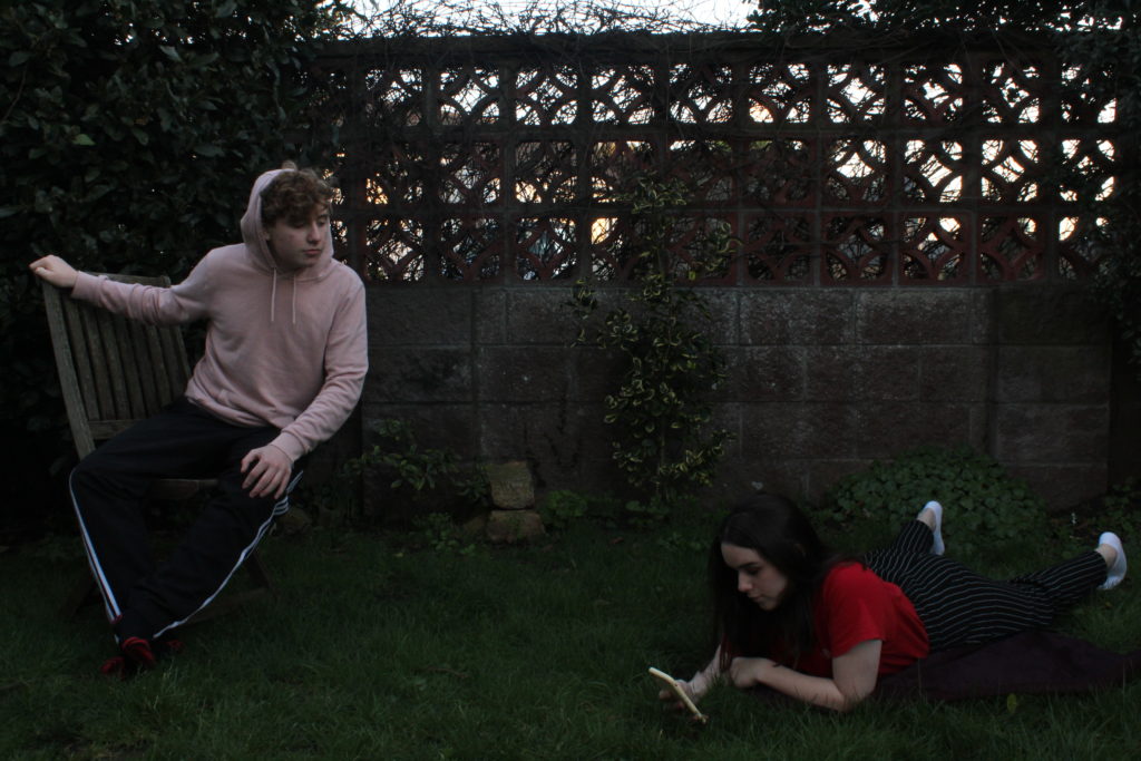
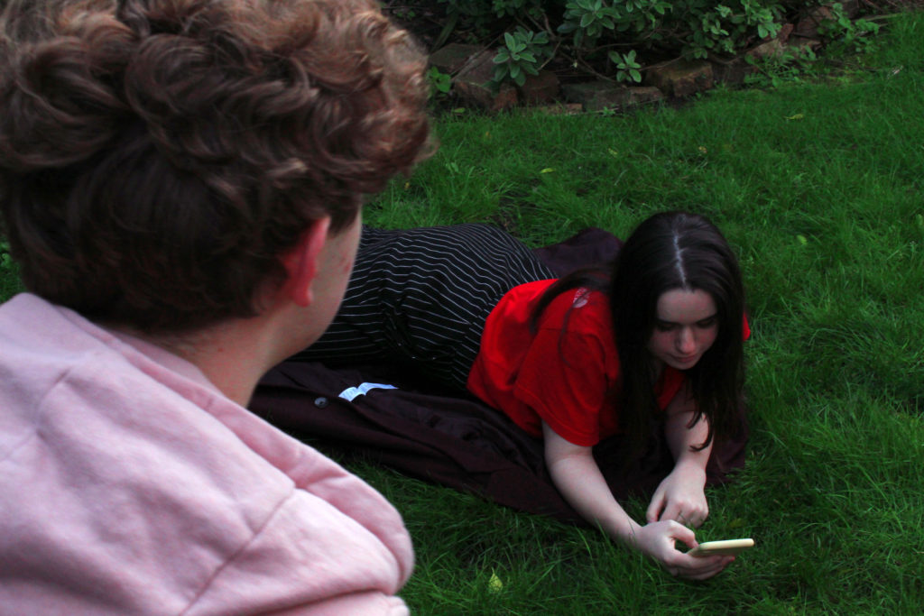
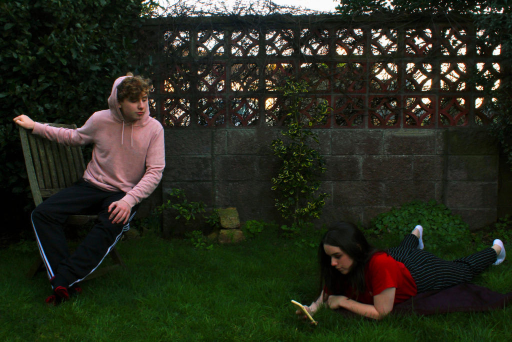
I really like how this image turned out as the composition is very similar to the original painting, and the the colours are saturated but still lifelike and not too over-edited. I feel like gender-swapping the roles made it more modern and relevant to today’s world, while also keeping with the tone of the painting, and replacing the pond with a phone also modernised the photo, reflecting how technology and social media can make people narcissistic and vain. The image has a fairly medium ISO and uses natural lighting, as it was taken outside during the sunset.

Tableau Vivant contact sheets-

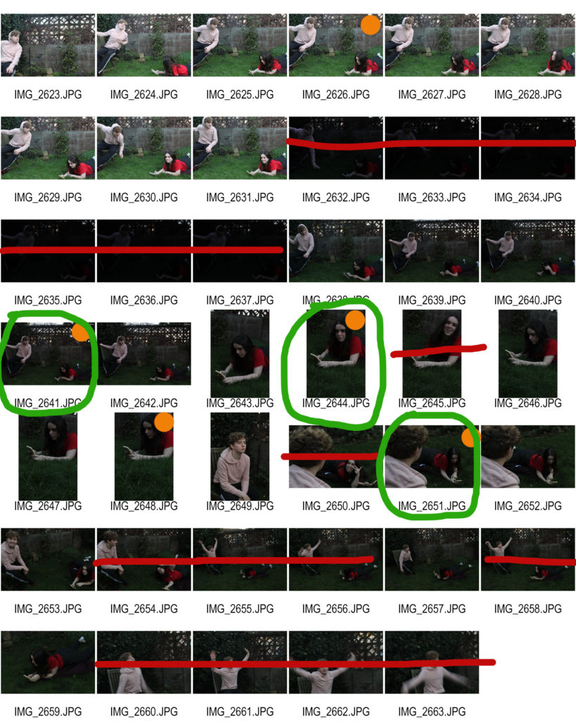
CONTACT SHEETS-

EVALUATION-

I chose the three final images because I felt they best recreated the painting and gave it some additional depth also. I took some images that were not in the exact same position as the painting but that were of the same scene, just from different angles.

I took the pictures outside to mirror the setting of the painting, and I also dressed the two people in the colours that the two figures in the painting are wearing, but the actual clothing itself is modern to represent how I am giving the painting a modern twist. I had “Narcissus” look into her phone instead of a pond to reflect how technology can be argued to be making people more self-obsessed and vain, much like looking into your own reflection constantly. I also gender-swapped the roles for an additional modern twist.

Tableau Vivant Photoshoot plan-

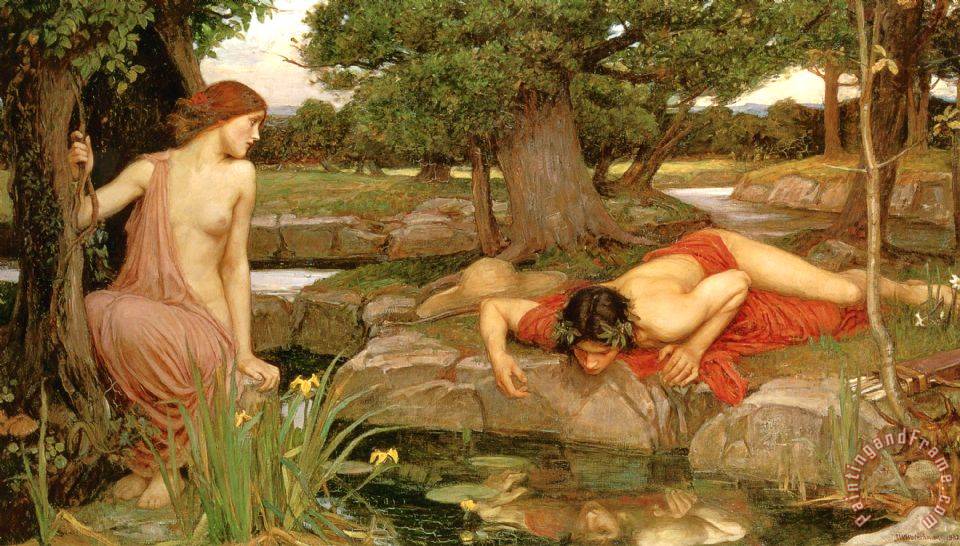
With this shoot, I am planning to do a photoshoot to recreate a historical painting. I will be working off a work by John William Waterhouse, and representing a key story from Greek mythology.

Image result for john william waterhouse echo and narcissus
“Echo and Narcissus” by John William Waterhouse

This is a painting depicting a scene from a Greek myth; the story of Echo and Narcissus. Echo was a nymph who was cursed to only be able to repeat the last words spoken to her and never speak on her own, so she wandered the woods alone. Narcissus was a handsome young man who got separated from his friends in the woods one day and came across Echo, who immediately fell in love with him but couldn’t say so, because of her curse. Then came a confusing moment where Echo repeated exactly what Narcissus said to her again and again, and eventually he grew annoyed and said he could never love her. She became so upset that she ran into a nearby cave and collapsed, starving herself until she withered away and only her voice was left, repeating the last things said to her. Narcissus was later cursed by the goddess of revenge for refusing Echo’s love and he fell madly in love with his own reflection in a nearby pond, refusing to leave it for even a second. Eventually he also starved to death by the same pond.

what- recreate this image with a modern twist, so the roles are gender-swapped and the setting is modern as well.

who- two friends wiling to pose, gender swapped, so that Narcissus will be played by a girl and Echo by a boy, because I think it will be interesting to see how the overall tone of the scene changes when the gender roles are reversed

where-in an outside environment, maybe a garden of a field

how- will explain the story of Echo and Narcissus to the two “models” so that they understand the roles they will be portraying, then set them up in the pose and start shooting. I might get them to move around naturally in those characters and capture some images in a similar style but with slightly different positions. I will dress them in the same colour schemes but most likely not exactly the same style of clothing, and I will have Narcissus look into a phone instead of a pond’s reflection, to make the image more modern.

other notes- there will be no actual nudity involved

Tableaux Vivants-

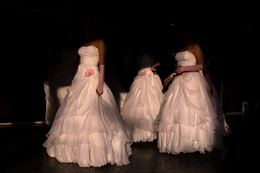
“Tableau vivant” is a French phrase, literally meaning a “living picture.” They feature a single or several models/actors who have been staged and posed by the photographer. Often they recreate a famous historical or artistic scene, wearing costumes or holding props. This may be a famous painting, myth, story from the Bible or other religious book, scene from a film, or even a dream.

Image result for tableau vivant of famous paintings hd"
Caravaggio
Image result for tableau vivant of famous paintings hd"
“Reply of the Zaporozhian Cossacks” by Ilya Repin

Tableaux can be used to represent a number of issues in modern society, such as gender roles, the meaning of masculinity, identity, sexism, poverty, political issues or environmental problems. If they do depict a recreation of a scene, there may be some vital changes made such as possible roles being gender-swapped, or more modern issues making an appearance, like pollution or the impacts of war and poverty.

Image result for tableau photography"
“The Dining Room (Francis Place)” by Sarah Jones
Image result for hustlers dicorcia"
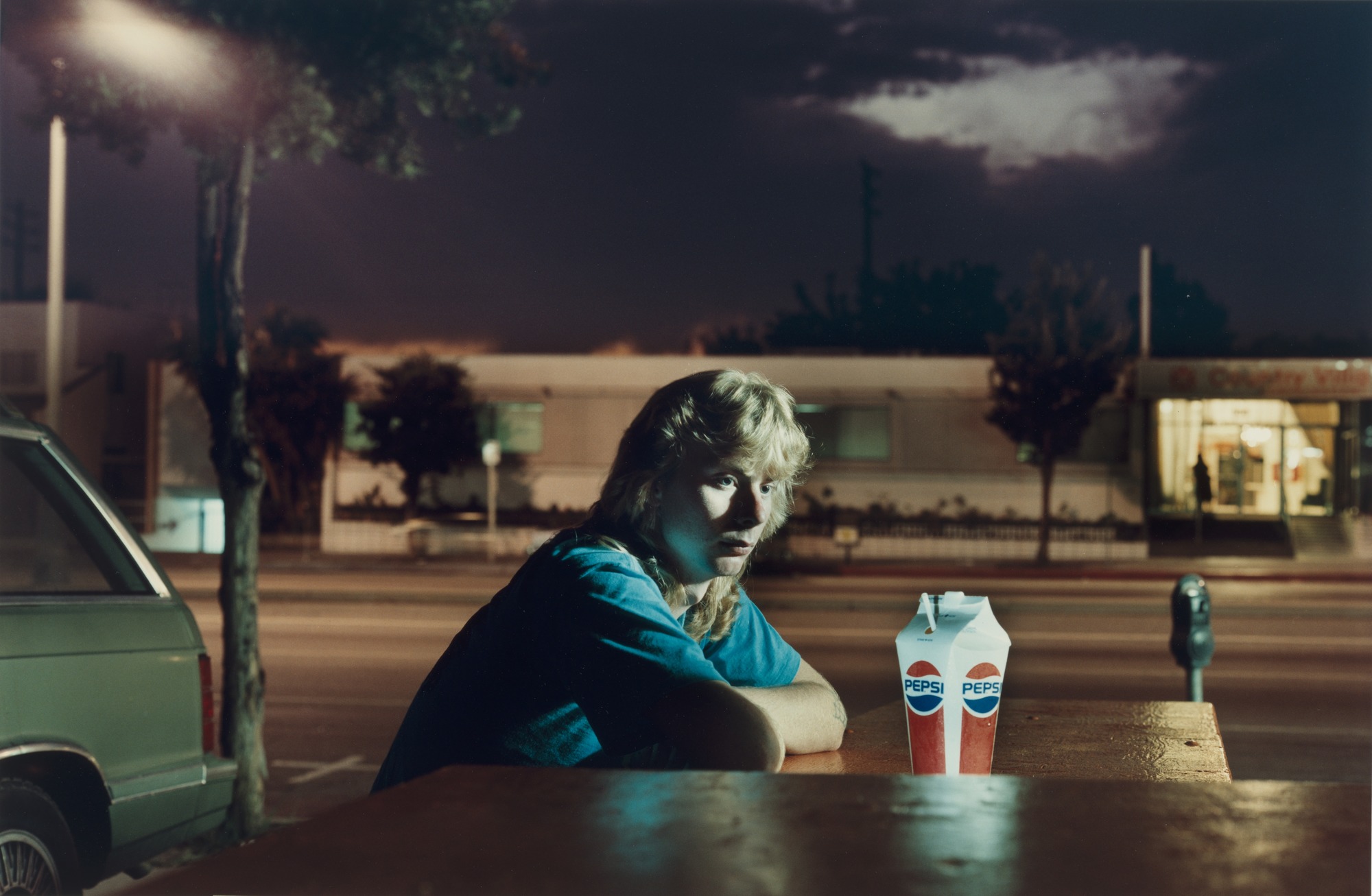
Brent Booth; 21 years old; Des Moines, Iowa; $30“, from the series ‘Hustlers’ by Phillip-Lorca diCorcia

In this way, it essentially combines theatre and photography together, as often the tableaux are shot with dramatic theatrical lighting to properly recreate the effect of the original painting. However tableaux vivants aren’t a modern invention, as it was a popular dinner-party game in the Victorian era to recreate famous Shakespeare scenes or well-known Greek myths in the style of a tableau vivant.

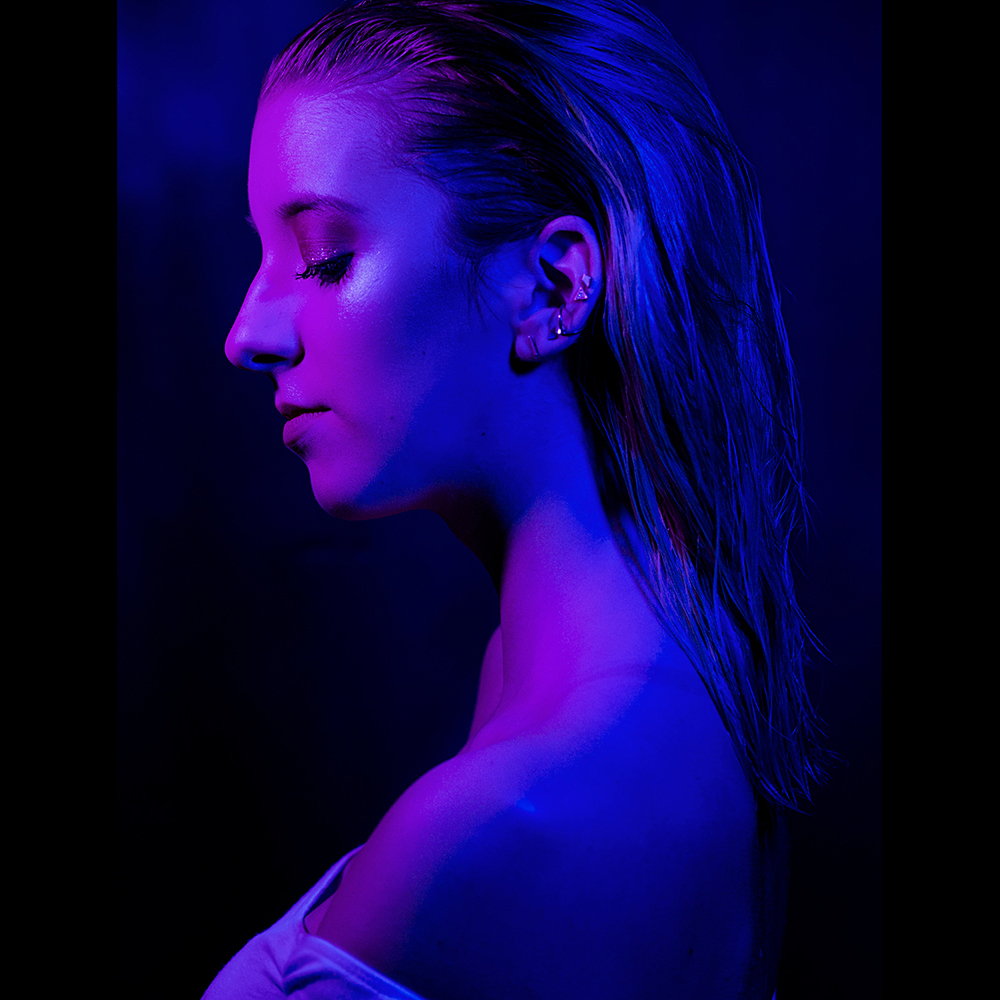
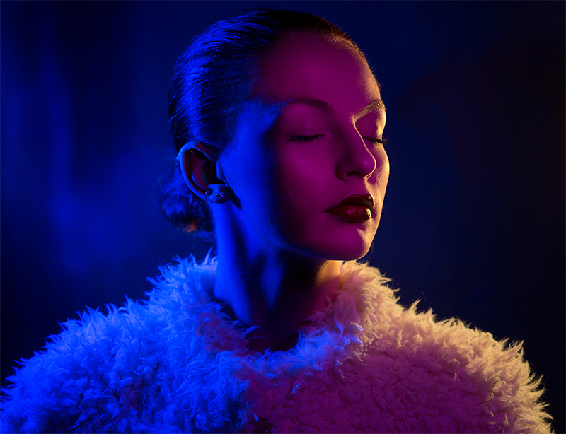
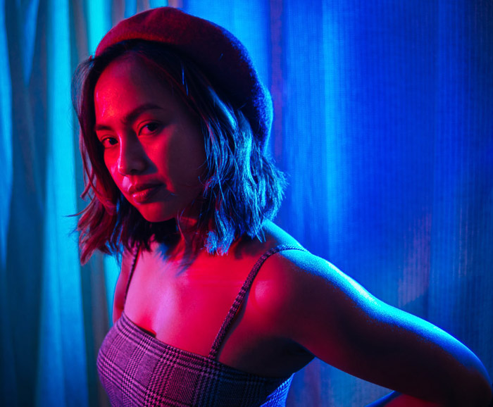
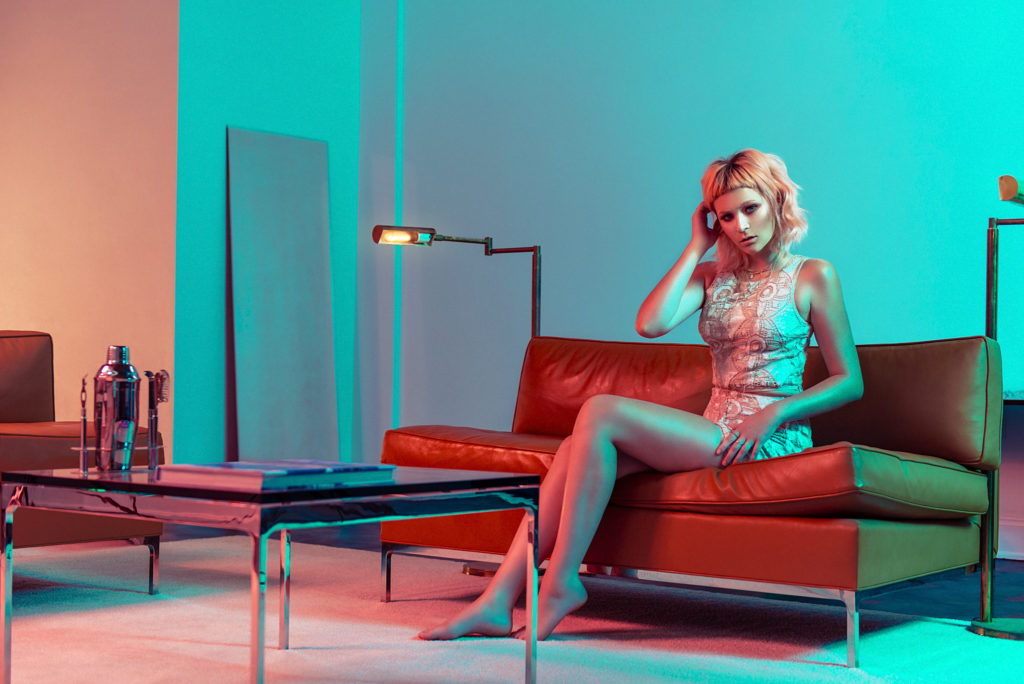
Studio shoot- colours

PLAN-

where- photography studio in school

when– during a free period, booked beforehand

who– one or two people to be the model/s and help with light positioning

how– use two point lighting with the colour filters to provide two different colours on different angles of the image

any other notes- use red and blue lights to mirror the 3D-glasses effect, maybe go down to a single colour during the shoot as well (?)

MOODBOARD-

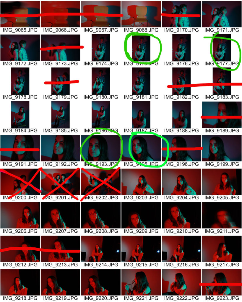
SHOOT CONTACT SHEET-

SELECTION-

FINAL EDITED OUTCOMES-

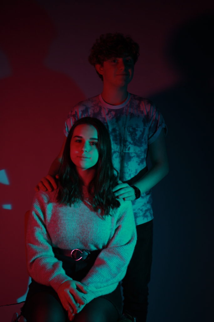
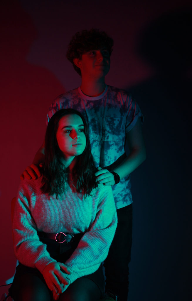
I used two people in this picture because I intended to emulate the “family portrait” style of image but with the modern twist of bright coloured lighting. I had them face towards me and look directly down the camera lens to create a sense of connection with the person looking at the picture, as a result the red light creates an effect mimicking chiaroscuro, as it obscures her face in red.

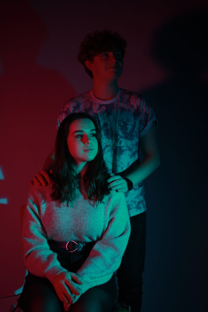
I really like this picture because the red casts a shadow on the side of her face really well, and it almost completely obscures the guy behind her, creating a contrast. I prefer this image to the previous one in the same style because I feel like them looking off into the distance mirrors more the “family portrait” style of image.

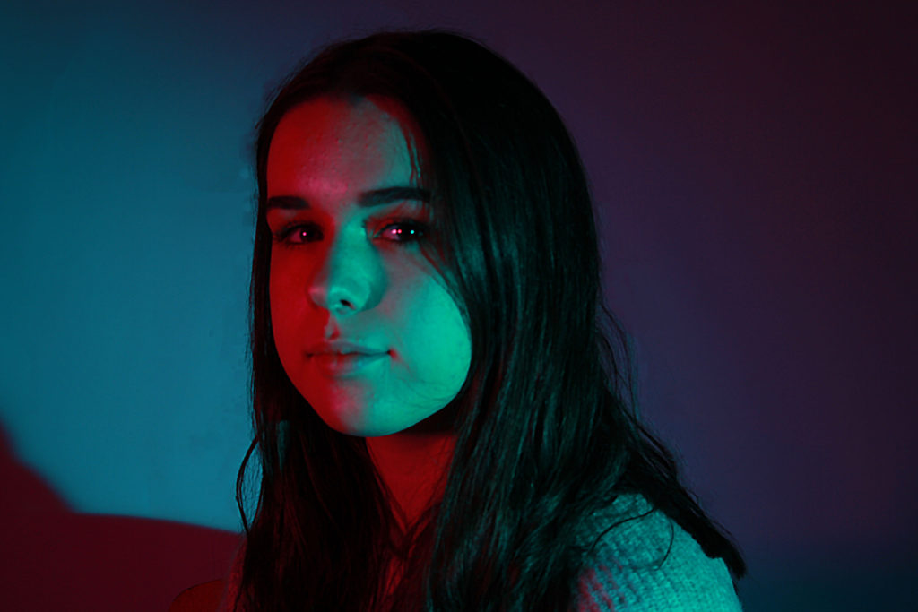
I like the lighting of this image as it has the two-toned colours on either side, so red and blue on both sides of her face, which makes the image interesting to look at. To edit, I covered up the wisps of hair using the spot healing tool, as well as increase the vibrancy of the coloured lights and the contrast, in order to make the shine in her eyes stand out. This photo is, unfortunately, slightly blurry due to a problem I had with the camera, so if I were to improve I would fix that problem.

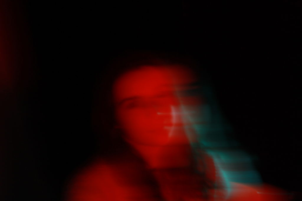
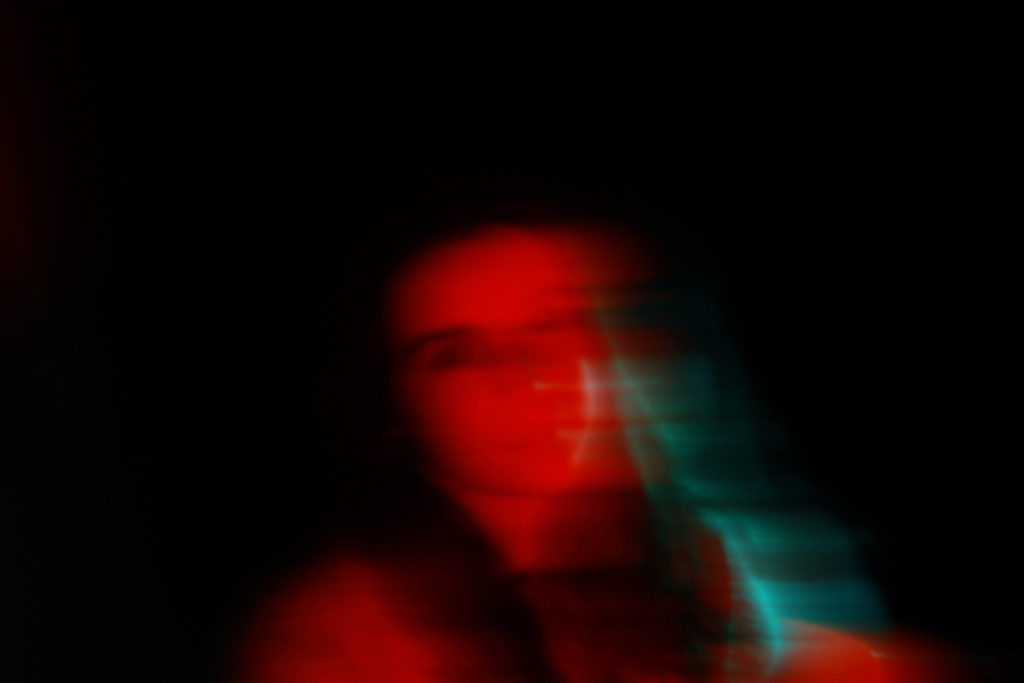
I decided to have my subject turn towards me in this image so that she was almost completely in one colour, expect for her back, which is still lit by the blue. I really like the blur in this picture as it shows more of my own style than imitating the other photographers’ I saw when researching colour portraits, and I feel that it is effective.

FINAL SELECTED IMAGE-

I chose this image because the colour contrast works best and the positions the subjects are in also works best with the lighting positions. I edited it by adjusting the vibrancy and saturation, as well as making small adjustments to the hue in order to maximize the blue and red colours as much as possible. I didn’t want to edit the image too much because it would take away from my own camera skills, which is what my time in the studio was for, and I feel like this image best encapsulates that.

EVALUATION-

If I were to do this shoot again I would experiment with more colours to see if that changes the overall tone of the image, as well as maybe trying with a single colour only. Additionally, I would make sure all of my images are clear and in focus, and if there is a camera issue I will resolve it before the actual shoot, as I found this was a major obstacle to properly succeed with this photo-shoot.

Studio shoot- shadows

PLAN-

where– studio at school

when– during a free period (1 hour session)

who– one person to be the model and another person to help position the paper and the lights so that I can fully focus on the camera

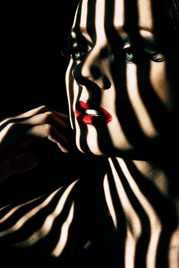
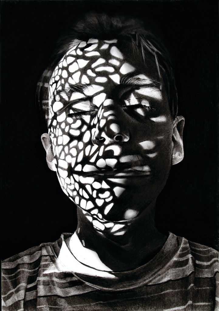
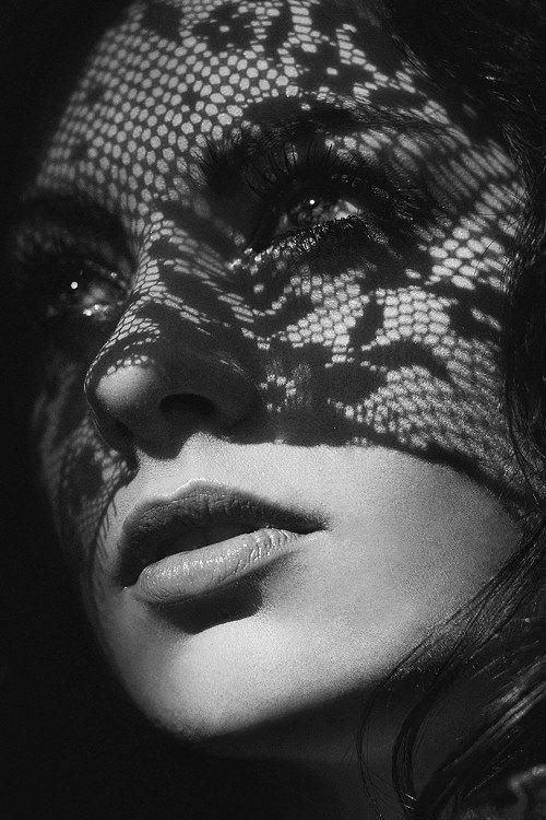
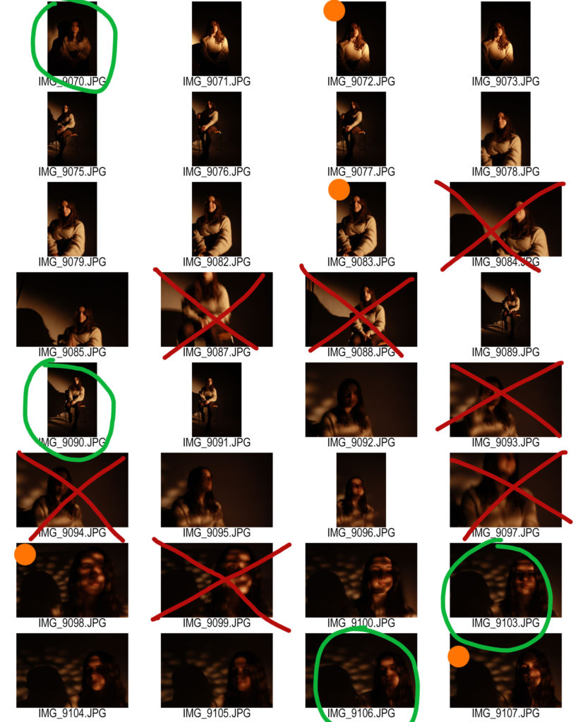
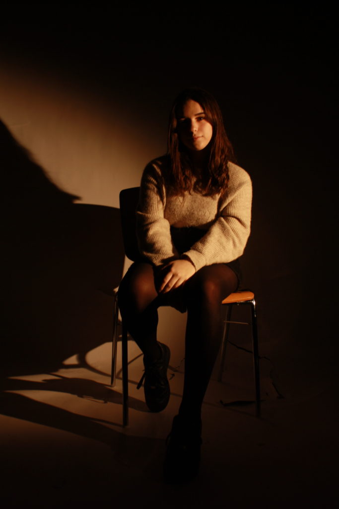
how– use single point lighting for a low key, chiaroscuro effect, work with shadows on the face. use a chair and infinity curve, as well as spotlights

any other notes– use paper with holes and interesting shapes cut out to make a creative shadow on the face, have someone else hold it up to the light so that both the subject’s and my hands are free

MOODBOARD-

SHOOT OUTCOMES-

FINAL OUTCOME-

FINAL EDITED OUTCOMES-

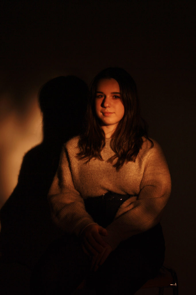
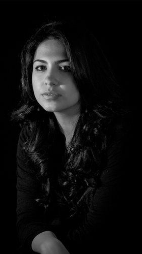
For this image I increased the brightness and saturation in order to maintain the bright spotlight on her face, as well as keep the highlights and the yellow tone of the whole image.

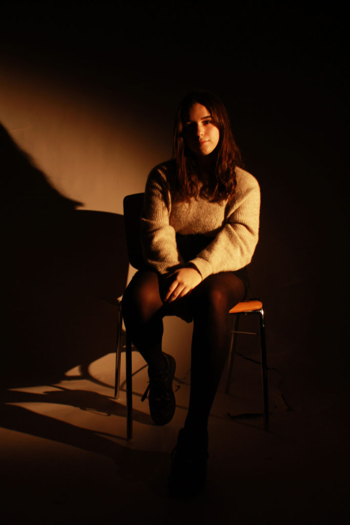
I like this image because of the position the subject is in, the single leg out closer to the camera draws the eye into the image and into the subject’s face, as well as making the image seem less boring. The spotlight had a nice chiaroscuro effect here, as one side of her face is completely obscured in shadow, while the other half is brightly lit by the light.
I edited the shadow mainly in this image, as it had a lot of wispy hairs that I felt detracted from the main focus of the image: the subject’s face. As with the rest of the images, I only did minimal editing to maintain the tone and brightness of the spotlight on the face.

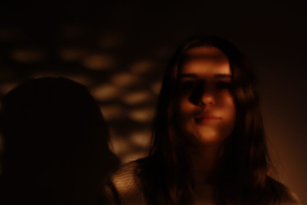
With this image, I reduced the blur and increased the effect of the light on the subject, including brightness vibrancy and saturation and overall just increasing the highlighting effect on her face.

FINAL IMAGE-

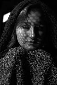
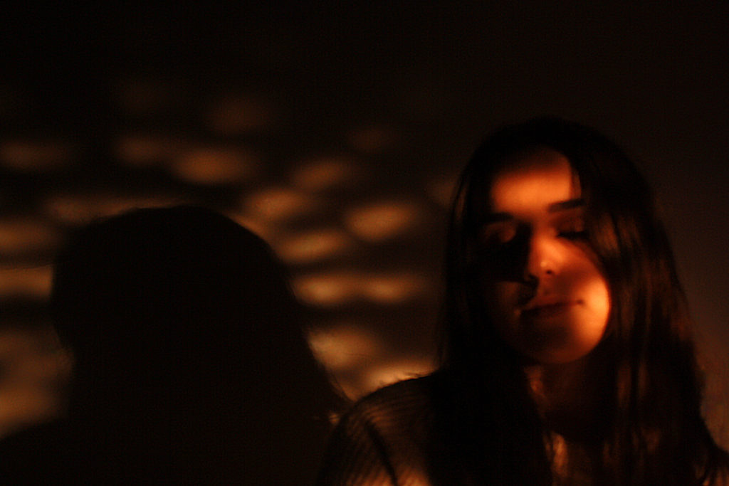
This image was one of the most successful I feel, even though it is slightly blurry due to an issue with the camera I had, because it demonstrates the shadows I was using the most effectively and it is an interesting image. The position the subject’s head is in mimics the position that the Virgin Mary’s head is often in in artwork, and the pattern of the light behind also imitates the artwork and stained glass windows often found in great cathedrals. This adds some background knowledge to the image and represents for other forms of art can influence photography, not just other photographers.

EVALUATION-

Overall, I feel that this shoot was well-carried out, with attention paid to the details of the props I would need (the paper) as well as the actual pattern of holes I would need to cut out to achieve the best overall result. I researched several different possible results and used them as inspiration for my own, as well as other artwork found in places where this sort of light pattern is normally found (i.e churches and cathedrals). If I were to do this shoot again I would make sure that the issue with the camera’s focus is resolved so that all of my images are sharp and clean, and I might experiment with different colours.