falling apart 
family 
marriage 
soulmates 
divorce 
marriage 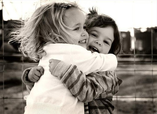
friendship 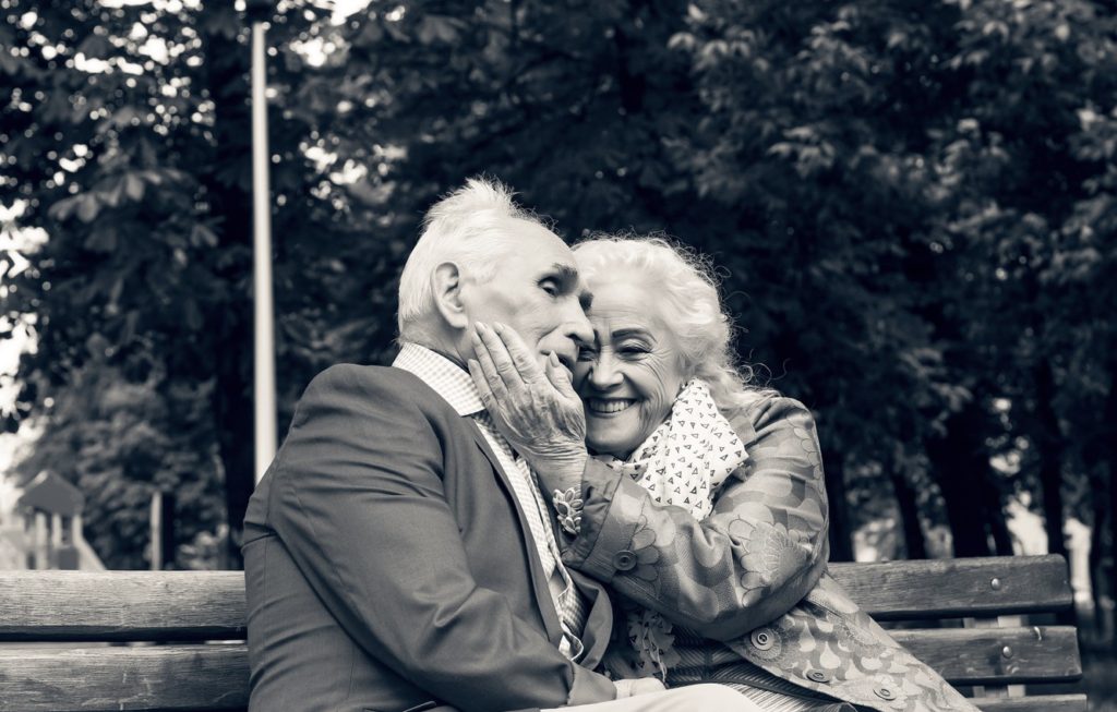
long-lasting love 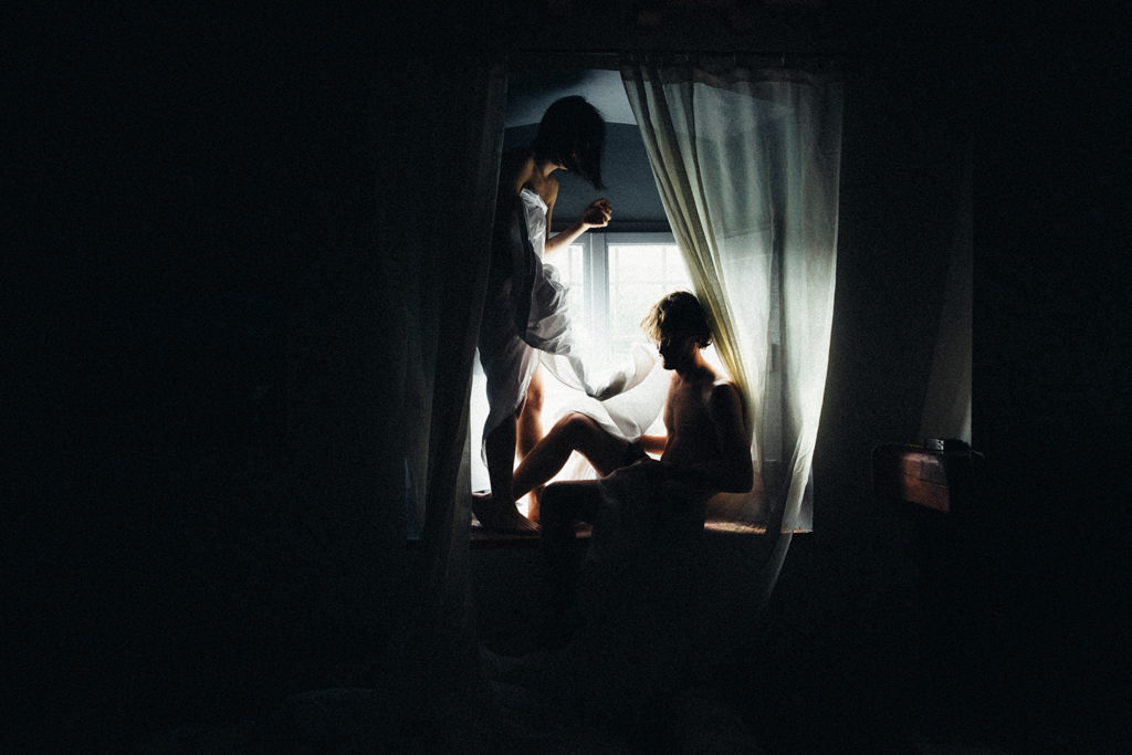
relationships 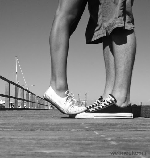
young love 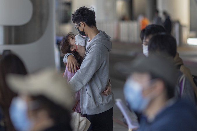
love through hard times 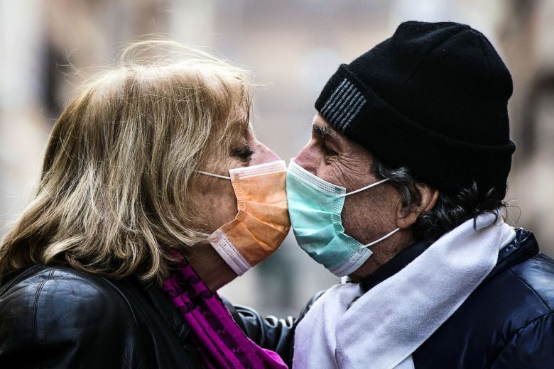
love through difficulty 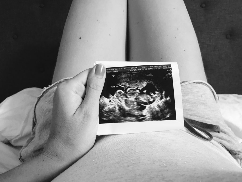
maternal love 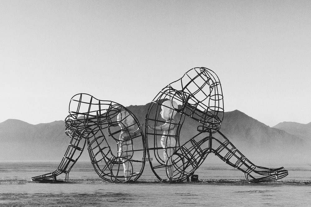
heartbreak
All posts by Chloe B
Filters
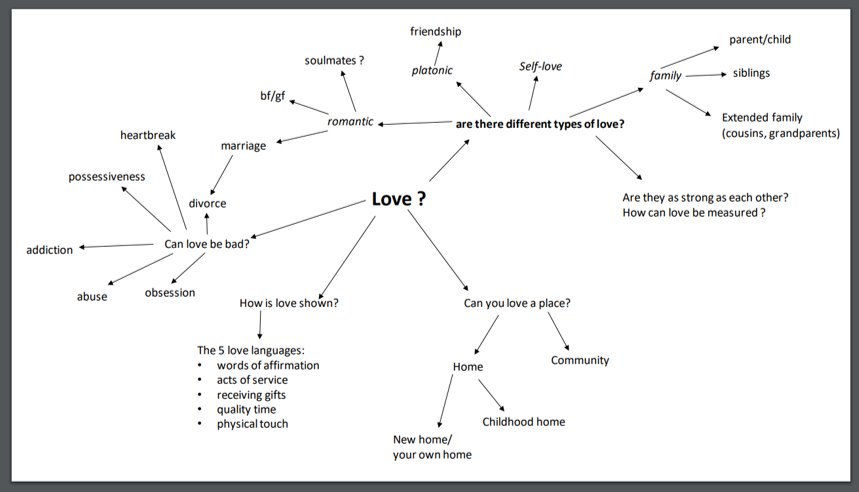
Love mindmap
What makes an image iconic?
The question “what makes an image iconic?” has been asked over and over again throughout the history of photography, and with good reason. Photography has developed into an art form and an aide to journalism as well as a method of historical documentation, all of which have contributed to a massive amount of images being produced and spread all through the media and online constantly. In fact, according to a 2014 survey, an average number of 1.8 billion images are digitally uploaded every single day, and the vast majority of them are almost instantly lost in the depths of personal social media accounts, or news articles that are quickly discarded and lost to time. So if so many images are being produced with little to no consequences, how is it that certain images become so famous and well-known, so much so that some iconic images are familiar to us without us ever knowing the true context of them?
Currently, social media plays a vastly important role in the world of news and journalism, with viral social media stories being picked up by actual newspapers, stories being shared online through sites like Twitter or Facebook, and many young people relying on social media to find out global news stories as they come into contact with them. As a result, the “aestheticism” of an image plays a big role in whether it becomes iconic or not in today’s world, because it needs to be eye-catching and emotionally-charged enough so that people share it with others and remember it as well as its original context. Some people may argue that this is unfortunate and unfair, that it is a clear indicator of how images and legitimate news nowadays have been completely devalued as a result of the younger generations being vain, narcissistic and obsessed with outward appearances. However, I strongly disagree with this. Throughout the history of iconic images, there is a clear pattern of the more poetically powerful and artistic images becoming incredibly popular and well-known time and time again, and often they (even unintentionally) mirror famous paintings and methods found in art such as the Golden Triangle or the Fibonacci Spiral. Consequently, it seems that in order for humanity to view a certain image as iconic and for that image to stand the test of time, it must have some sort of artistic structure. This can clearly be seen in iconic photos throughout history, for example Joe Rosenthal’s 1945 image of US soldiers raising an American flag, or the famous kiss between a US sailor and a woman in Times Square at the end of the Second World War (“V-J Day in Times Square), or the “Saigon Execution” image from the Vietnam War.
Additionally, an image can become iconic due to its context, either at the time or as a result of events afterwards, and whether it “reinforces or undermines dominant ideologies”, as in Susan Bright’s article (“Why is it famous?”). Some historical events carry such significance that they can elicit an emotional reaction from people simply by looking at them, for example how many of the images taken on 9/11 have become iconic and are widely known even to people who were not alive during those events. An example of this form of iconic imagery can be seen below.
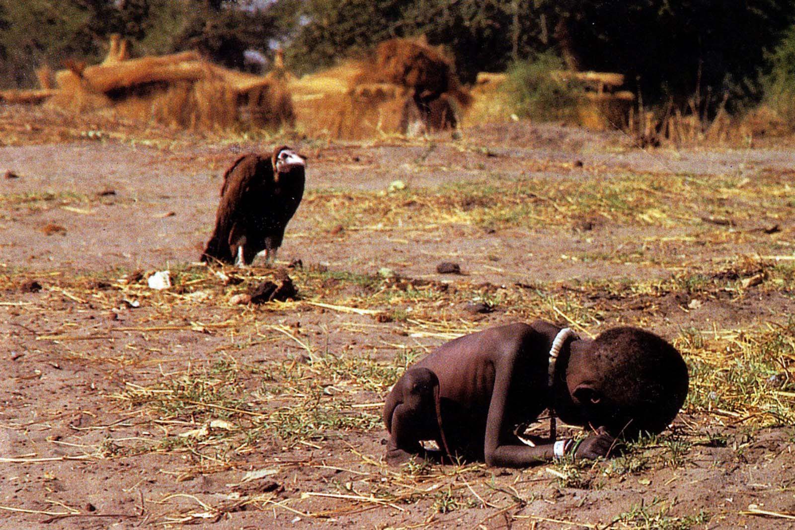
This image was taken by a South African photographer called Kevin Carter in 1993, during the famine in Sudan, and it features a young boy (initially believed to be a girl) struggling to reach a United Nations food centre roughly half a mile away. The boy is clearly emaciated and is suffering from extreme famine and malnutrition, but it is the vulture in the background, hovering over the close-to-dying boy, that makes this image so powerful in my opinion. This almost artistic macabre imagery of the shadow of Death makes this image almost painful to look at, and creates a sense of guilt for the viewer, as they would most likely be looking at this in a newspaper, magazine or online article, from a position of privilege and comparative luxury in contrast with the small child dying alone in the wilderness. In fact, even directly after this photograph was taken, the photographer himself was so struck with guilt and empathy for the child that he helped him get to the feeding centre, and the child survived the ordeal. However this image was heavily criticized by people who asked why Carter even stopped long enough to take the photo at all, and even though he was awarded with the Pulitzer Prize for this image, he was so consumed by guilt and depression, traumatised by the things he had witnessed, he committed suicide by carbon monoxide poisoning only months after receiving the prize, in 1994.
The image features two main figures, positioned almost opposite to each other so that the image can be divided into two clear sections, representing Life and Death. The background of the image is mainly sepia-toned and features a brown colour palette, which increases the contrast between the background and the two figures in the foreground, as they are both darker colours and are more tonally contrasted. It clearly depicts the social issues of famine, poverty, but also subtly presenting the effects of extreme wealth inequality and the after-effects of colonialism in African countries.
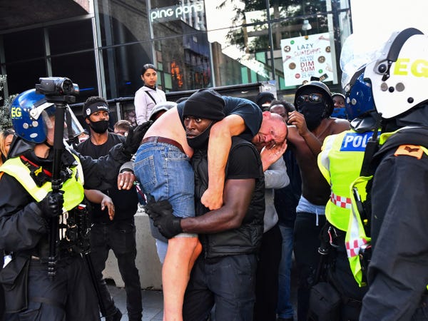
This image is much more recent, having been taken during the BLM protests in London in mid-June this year, and it presents a black man carrying a white man to safety amidst police officers and other protesters. It reverses the typical “White Saviour” imagery that can be seen to perpetuate many forms of activism, the travel industry, and even the film industry. The issue of the “White Saviour” is that it shows white people “saving” struggling people of colour instead of showing those people of colour surmounting their own barriers, as is often the case, and it raises white voices talking about racism instead of simply amplifying the voices of people of colour who have been talking about racism and fighting racism for generations with relatively little media attention. It can also be found in aid-trips to African countries, which although probably had good intentions, end up perpetuating the stereotype of African countries as all being poor, war-ridden and rife with famine and disease. This photograph goes against all that, and as a result may be more memorable to many viewers who have been subjected to the same image of the nice, kind white person saving the poor, hungry black person again and again and again.
This photograph, much like the previous one, is centered around two figures, however in this case they are both human instead of a human and an animal. Both images depict social issues, however this image is different in that it illustrates racism and current affairs, which may help it become a more iconic image, as images with political meanings behind them that were taken during periods of great societal change often tend to be more long-lasting and become “iconic” in the public’s view. The image is in full colour, but the contrast between the two main figures’ skin tones is powerful enough to draw the eye immediately and becomes the main focal point of the image. The camera lens was also slightly tilted when the pictures was taken, meaning the image and the people it features are angled, which adds a sense of movement to the photograph in its entirety and makes it more dynamic and actually interesting.
In conclusion, it tends to be the context in which they were taken that makes certain images iconic (or to go viral, in the online world), whether that be their political and global context, for example photographs taken during crucial moments in history or depicting traumatic moments in time, or their emotional context, for example if it depicts a particularly powerful emotion such as pain, fear, love or hatred. Symbolism also plays an important role, for instance the imagery of Life vs Death, or the White Saviour, or even the ever-popular Madonna and Child, a theme often found in religious imagery but also (unconsciously or not) replicated throughout many iconic images and art.
PORTRAIT PROJECT EVALUATION & ANALYSIS-
Here I will be evaluating my final portraiture images. These are my favourite images taken from across the whole portrait project, and I believe they showcase my work the best.
ENVIRONMENTAL PORTRAITS-
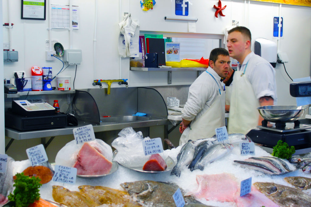
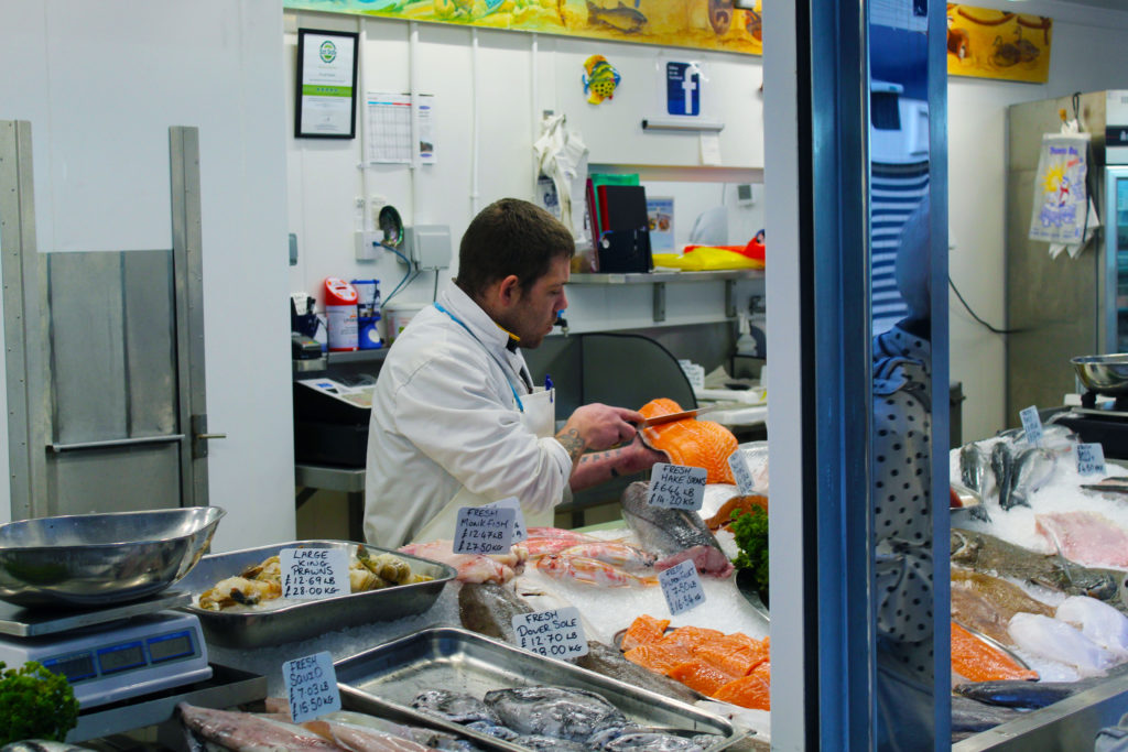
I chose this set of images because I really like the way the individual colours pop out against the clinical white background. I achieved this through adjusting the vibrancy settings and increasing specific colour saturation individually. I especially like the composition of the top image, as I feel that it complies with the rule of thirds and the main subject of the image, the fishmonger, staring directly into the camera gives it a sense of depth.
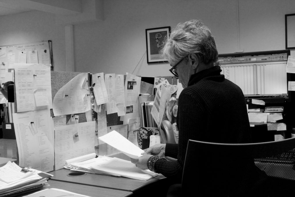
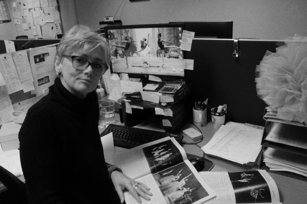
I also like these two images because of the details in the background, for example the portrait of the dancer mid-jump in the first image and the magazines and tutu in the second image. This adds some context to the image and helps the viewer to understand the environment more, seeing as many places of work nowadays are in office environments and so the little details add clarity and make the image far more interesting. When editing this I made use of the levels adjustment in Photoshop, which helped to add a wider tonal range between the black and white in the image.
If I were to do this project again, I would try with different angles and more interesting compositions to make the images themselves more interesting, maybe from a high or low angle instead of just straight on, or perhaps experimenting with foreground and background visibility in certain shots.
IDENTITY PORTRAIT PROJECT-
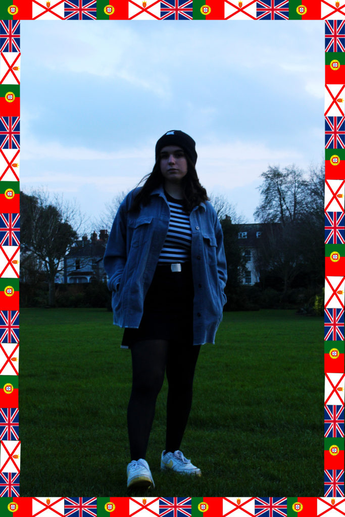
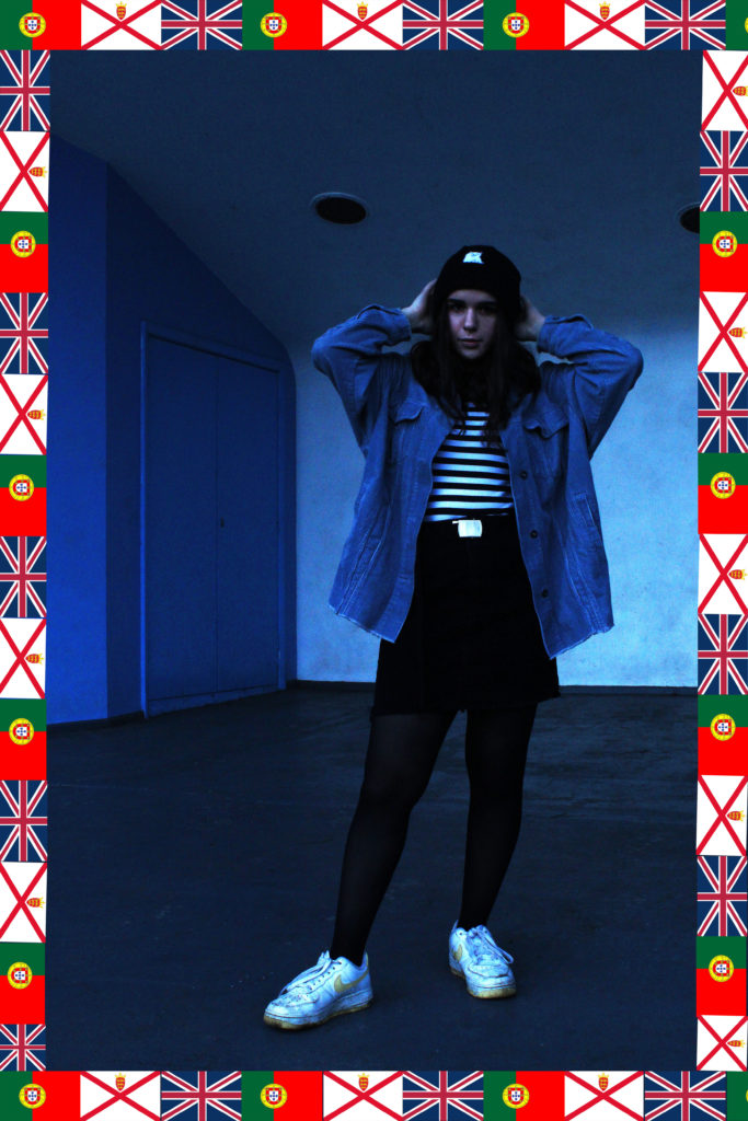
I prefer the blue images in this set, however they both have positive aspects. I planned this shoot quite meticulously, so the subjects’ outfits each compliment the backgrounds, so each image has a colour palette, which makes the whole thing cohesive and easy on the eye. I also was inspired by the work of Hassan Hajjaj and so added a frame/border around each image, however I decided to tie this into the theme of identity more and make them flags depicting each of the subjects’ nationalities.
If I were to redo this component, I would probably attempt to reduce the grain in the images, and maybe continue with the colour-palette theme and take some more images of people in monochrome outfits in a background that reflects that colour.
STREET PHOTOGRAPHY-
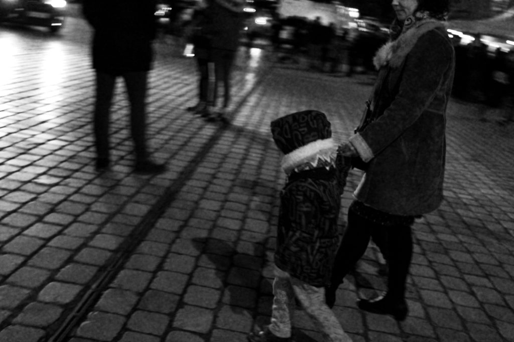
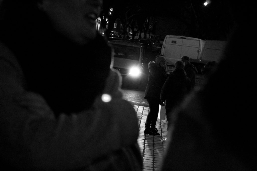
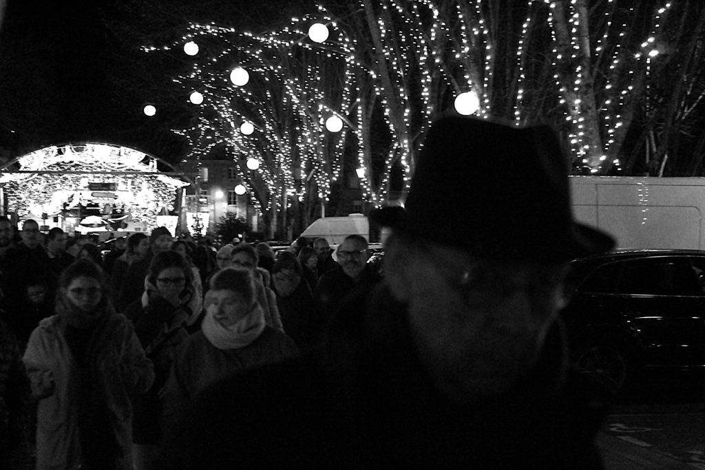
I find these images all very intriguing in their own right, as they all have this continued tone of intrusion on the behalf of the viewer, especially the third photograph. The old man in the foreground looking directly into the camera adds a sense of unease, and him being blurry and out of focus adds to this, as well as creates a sense of movement/motion. The first image also has a strong sense of movement, or a singular moment captured in time, which was my main focus throughout the street photography section. I decided to make these images black and white to focus more on the subjects and their expressions instead of their environments, and also to emulate the style of Henri Cartier-Bresson, who was the artist I studied beforehand as inspiration.
If I were to do this section again, I would like to have taken more interesting images like these, as I had a lot of photographs that weren’t good enough, even though this is difficult due to the candid nature of street photography. Even though I was outside taking pictures for several hours, I could make have done with another shoot to ensure that I had multiple images that were up to standard.
TABLEAU VIVANT-
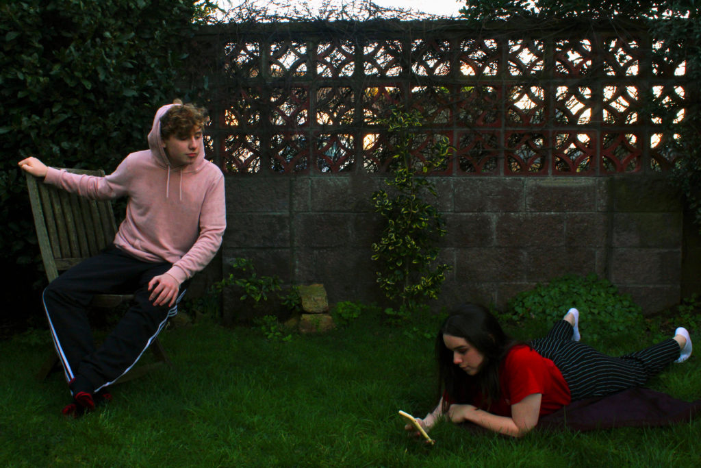
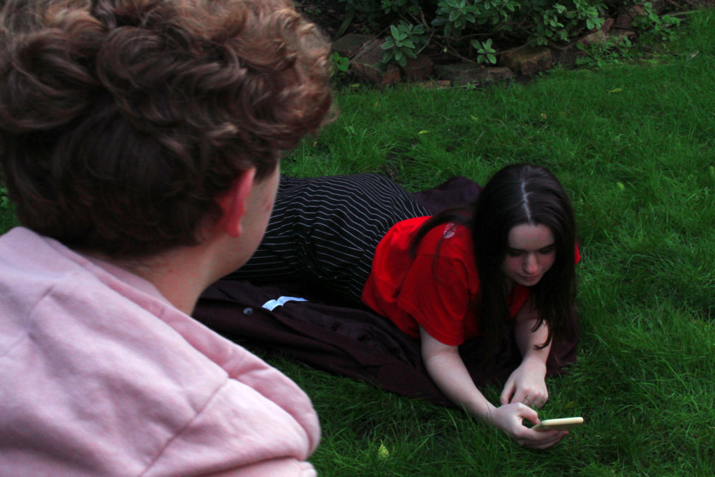
I modeled these images off a painting by John William Waterhouse, depicting the Greek myth of Echo and Narcissus, however I gender swapped it and replaced the traditional pool with a phone to modernise it further. I believe I was successful with these images, and I spent some time on Photoshop in order to make the colour palette of the image resemble that of the painting.
If I were to redo this part of portraiture, I would probably try and find a more interesting location to shoot in, more accurate to the original painting, and attempt to find some better lighting, so that the final image has an altogether lighter and brighter tone to it.
STUDIO PORTRAITS-
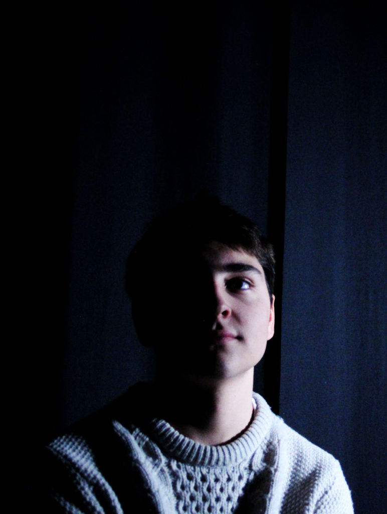
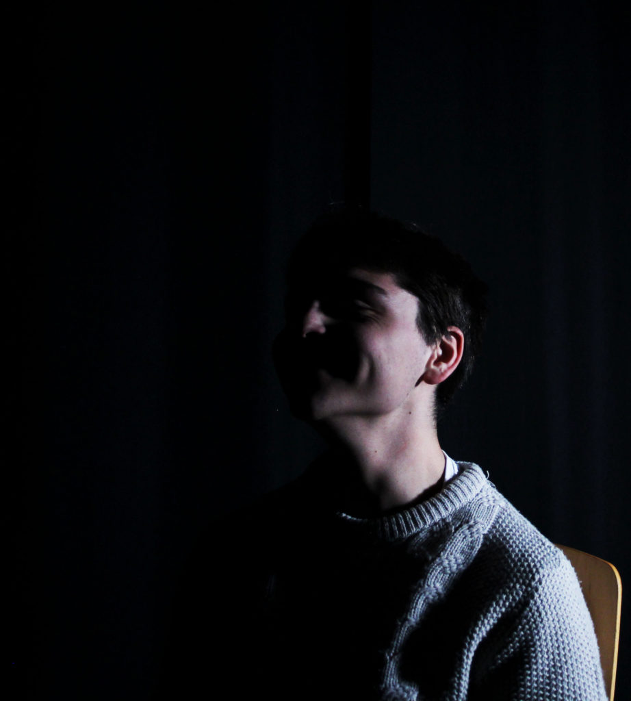
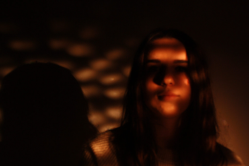
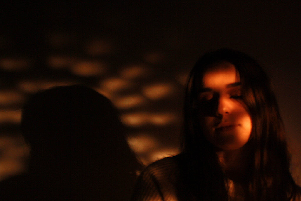
These images were taken in the chiaroscuro style, obscuring half of the face in shadow, and I feel that they were well executed in that respect. To improve, I could have tried to make the background completely black, and possibly also have more successful images.
I like these images as they have somewhat religious undertones, mirroring stained glass windows in cathedrals. Improving this section would involve making sure the images are all in focus, as well as possibly experimenting with different colours.
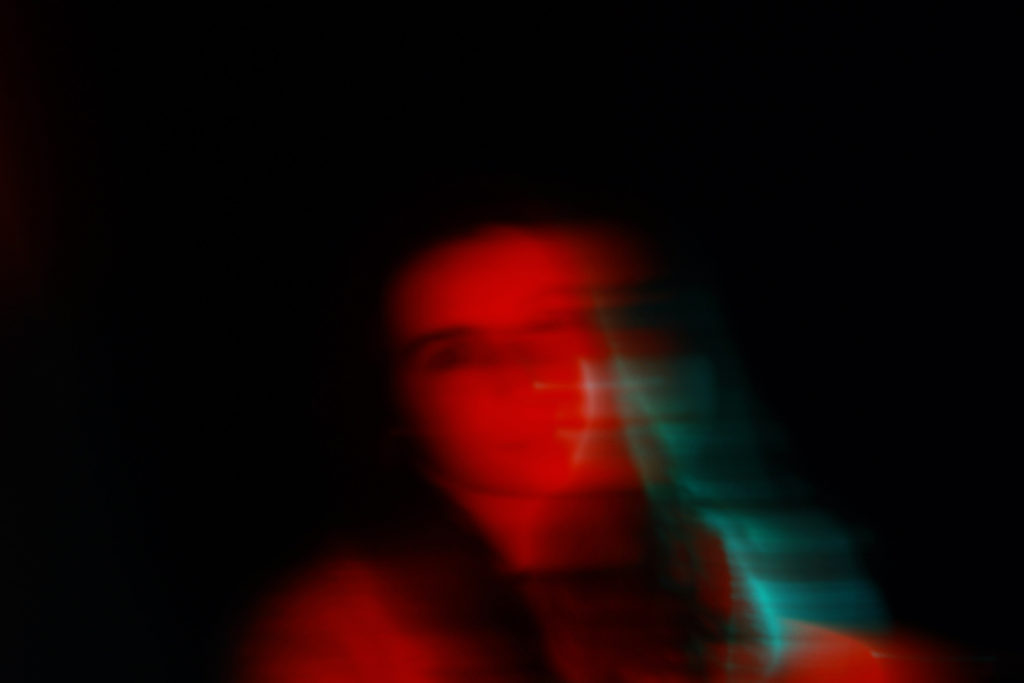
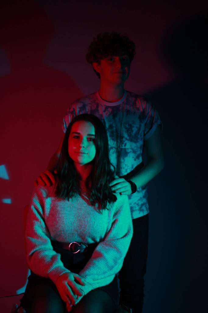
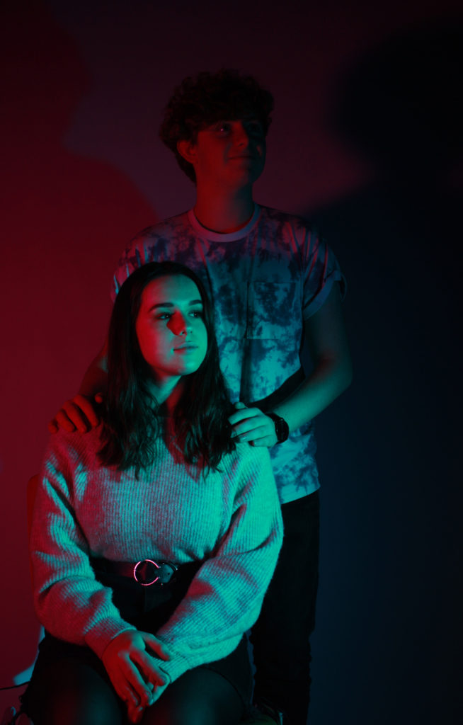
I like these images because they make good use of the colour, adding depth and interest to the people featured. The colours themselves are contrasting, which is a good aspect of the set of images.
If I were to do this shoot again, I would experiment with different varieties of contrasting colours, using the colour wheel for inspiration, ending up with a wider range of colour images.
Identity- critical analysis
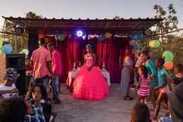
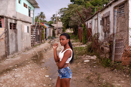
Overall I am happy with how this identity project turned out, as it can clearly be seen how I used the reference artists of Hassan Hajjaj and Diana Markosian to inspire my work, and I developed a clear plan beforehand, which I then followed through to completion. I used Hassan Hajjaj’s slightly pop-art style of a frame of repeated images around the outside of each portrait, and followed my theme of representing cultural identity by having these images be flags of all the nationalities of each person. I was inspired by how, in Diana Markosian’s portrait work in Cuba, the subjects are all in a natural position and don’t look too posed, which gives them a sense of power as they are in their home environment and whoever is looking at the image is the outsider. This sense of power is also featured in Hassan Hajjaj’s work as well. The settings for each of my selected pictures reflect the person and their personality well through colour palettes and general vibe also.
However if I were to pick out a flaw it would be how the images turned out slightly grainy. This is because, due to the time of day I did the shoots and the (lack of) natural light available, I had to increase the ISO which reduced the picture quality a little, and I also had to adjust the brightness and such in editing afterwards, which has the same effect. I don’t feel as though this affected my pictures too negatively as they still turned out well in my opinion and I was still able to use some images for my final editing process
Nevertheless, if I were to do this project again, I would redo the photoshoots with more natural lighting, for example in the early afternoon or morning, so that the sun would be in a good position, and possibly I would use a tripod for the first shoot, in order to reduce this grainy effect.
On the other hand, I feel as though the grainy quality of the images has a positive effect, as it can be seen to represent how these pictures were taken in well-known public places, where many people have passed through for years and even decades, and may have even taken pictures like these, where the grain would have been due to the camera quality of the era.
VIRTUAL GALLERY-
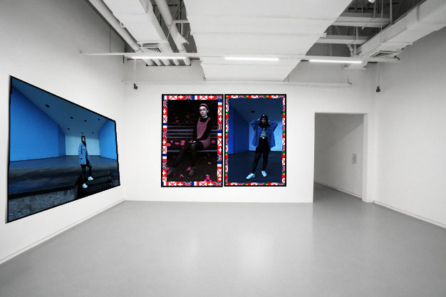
I am going to present the two portrait images together as they are the same sort of style, in A4 and using the window mount method. I am going to present the landscape image in A3 and mount it on a foam board. The to set of images will showcase how my project had multiple influences and how I carried them out.
IDENTITY- final image evaluation

I like the colour scheme of this image and how the background uses the same image as the subject in the foreground’s clothing, which makes this image cohesive and nice to look at. Her position is casual and relaxed yet the way she maintains eye contact directly down the camera lens adds a sense of power to the whole image and present her as being comfortable in her home environment. I believed I executed the flag border well which helps to carry how I am intending to represent cultural identity here,
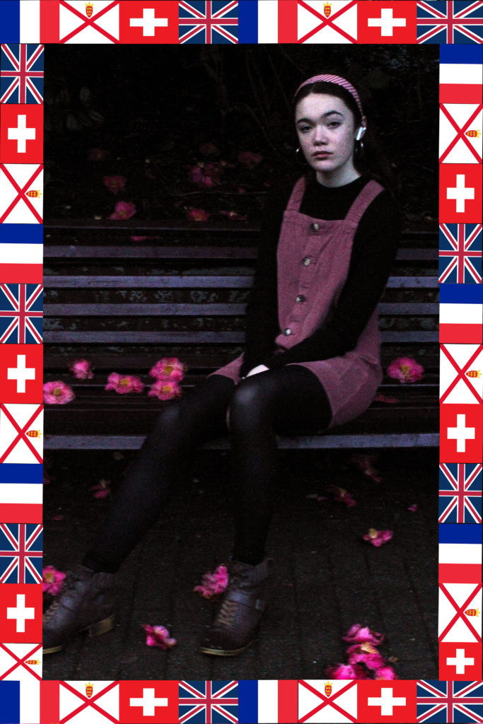
I also like the subject’s (me) position here as the leg extended in the foreground leads the eye deeper into the picture. The colours all work together and the pink colour of the dress and headband is reflected in the flowers scattered on the ground and in the red repeated in the flags in the border. The flags also stick with my ideas for this project, representing how people’s cultural identity is mixed with their ethnicity and where they live currently, and is not a singular and fixed thing.

This third image is not following the style of Hassan Hajjaj, but more Diana Markosian (my second case study artist), hence the lack of flag-border. I like it because the colours are all cohesive as well as the composition making the subject in the best possible position, against a white background with two blue accent walls against her either side, reflecting her clothing.
COMPARISON-
Hassan Hajjaj-
Own work-
Diana Markosian-
As can be seen above, I was inspired by several elements from these two photographers and combined them together along with my own personal style in order to create the finished products. I employed Hajjaj’s use of a vibrant colour palette throughout each image and using clothing to represent the subject’s personality, as well as Markosian’s style of photographing the subject in their home environment in a natural pose.
IDENTITY- edited outcomes
1ST SHOOT-
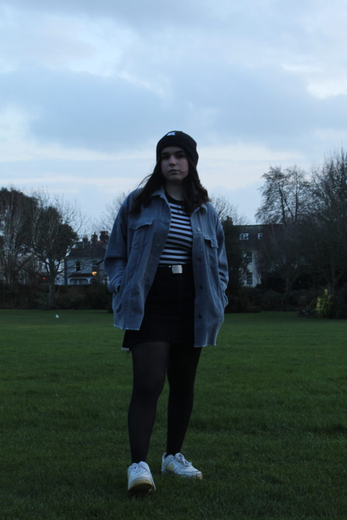
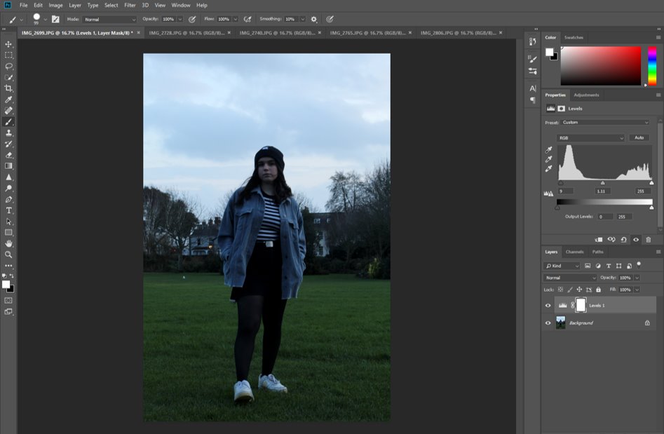
First, I edited the levels of black and white in the image to increase the contrast and bring more attention to the stripes in the subject’s top and deepen the black of the rest of her clothes.
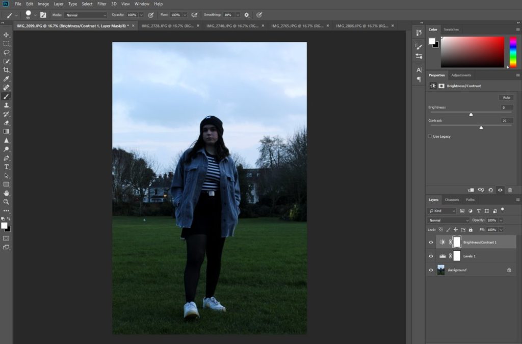
Then I changed the brightness and contrast in the ‘Adjustments’ tab in order to reduce how overpoweringly bright the overcast sky in the background was, to make the person the main focal point of the image.
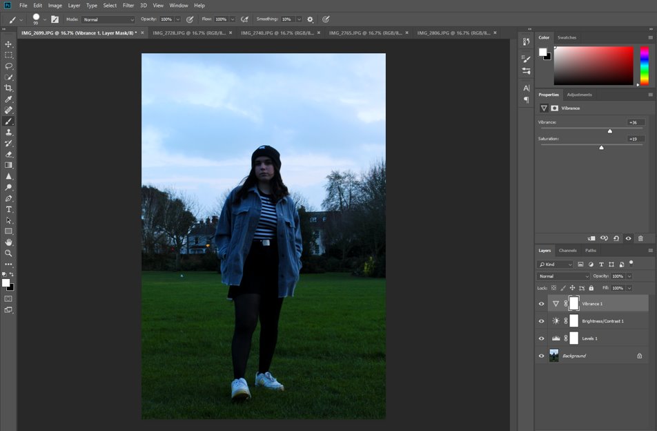
I then adjusted the vibrancy and saturation levels to make the colours of her clothing stand out more, and also the colours of the background, such as the green grass.
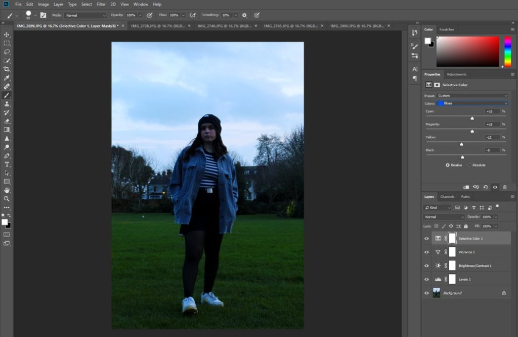
I went into the ‘Selective Colour’ tab and made the blue in her jacket much more saturated and vibrant, which also had the effect of bringing out the blue in the sky in the background.
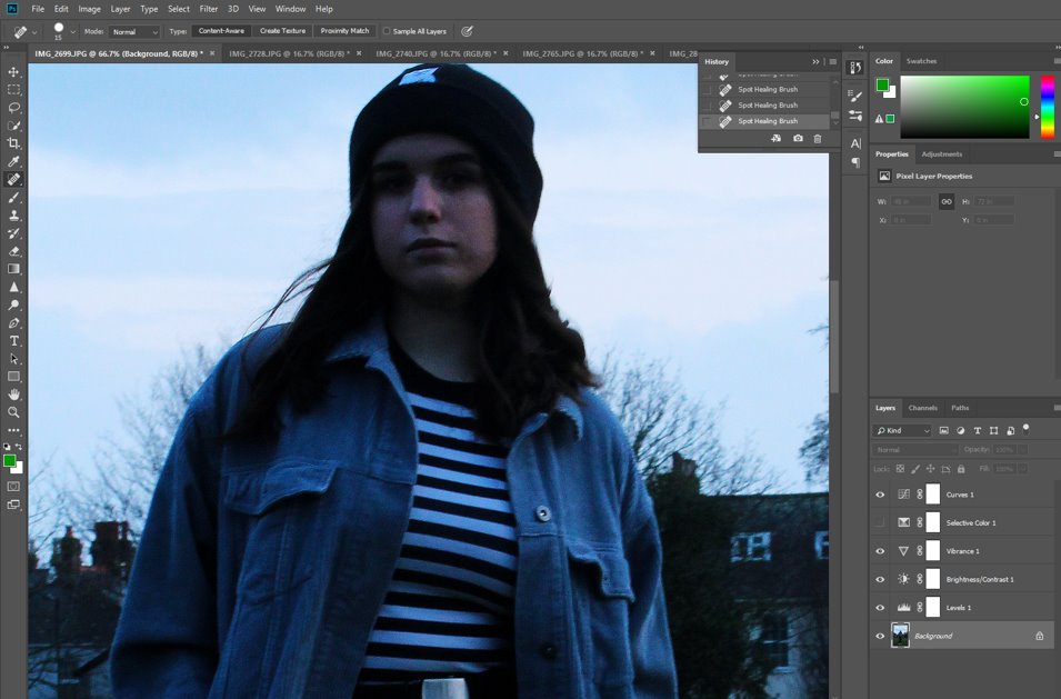
I used the ‘Spot Healing’ tool to edit out any imperfections in the subjects, as well as any stray hairs and loose threads on her clothing, and distracting leaves or patches on the grass, to make the whole image cohesive and keep the person as the main focal point.
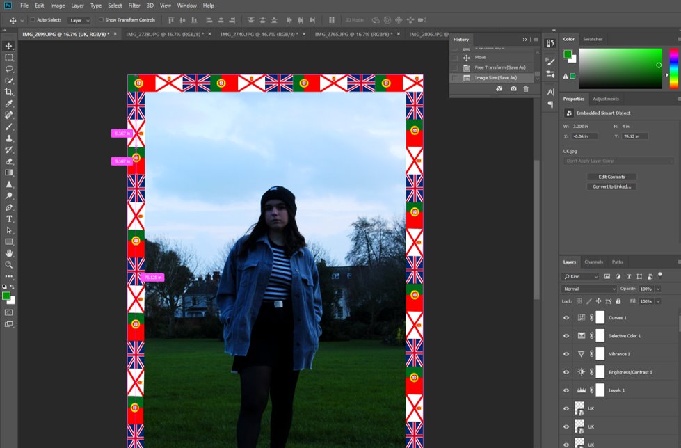
I then added some JPGs of the flag of her nationalities around the edge of the image, resizing them so that they are all the same and keeping them in a repeated pattern, like Hassan Hajjaj does.

I quite like how the subject’s foot is pointing forwards and is more in the foreground of the image as it draws the onlooker’s eye into her. I also like how the blue in her jacket is reflected in the sky and contrasted by the grass, but how the black and white adds some contrast and stops the image from being entirely a clash of colours, reflecting her own personal style as well.
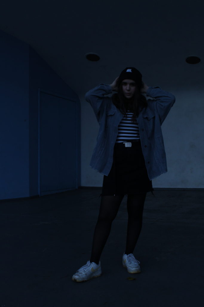
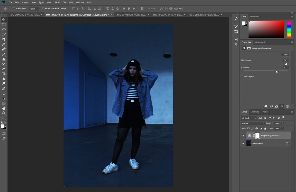
To begin with I increased the brightness of the image as it was a little dark.
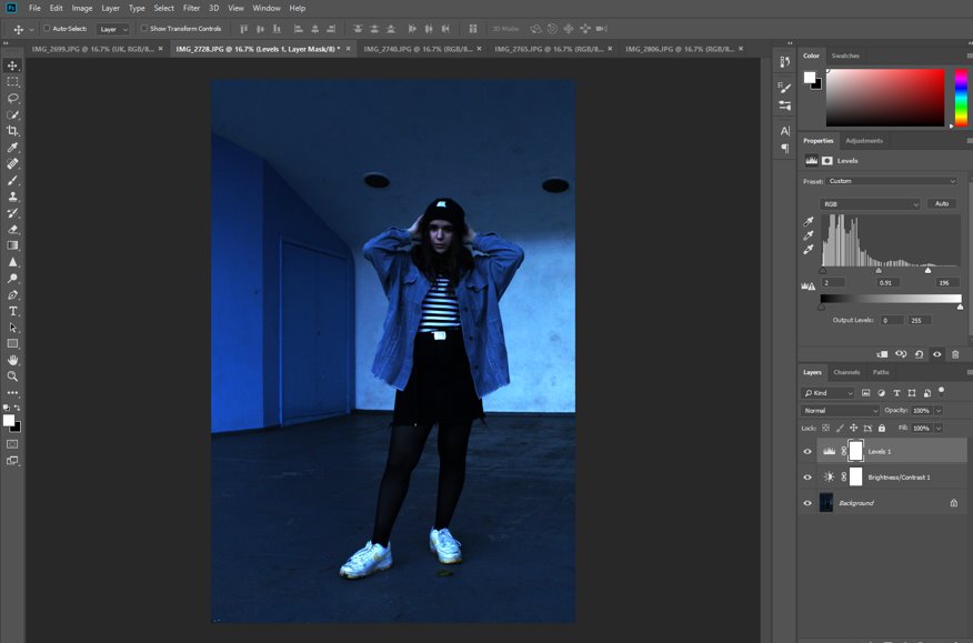
Then I adjusted the levels to increase the contrast of the black and white of her whole outfit and make the image more cohesive. At this point I also went in with the spot healing tool and removed any marks in the wall and door behind her, as well as loose hairs, threads or stray leaves that may distract they eye from her.
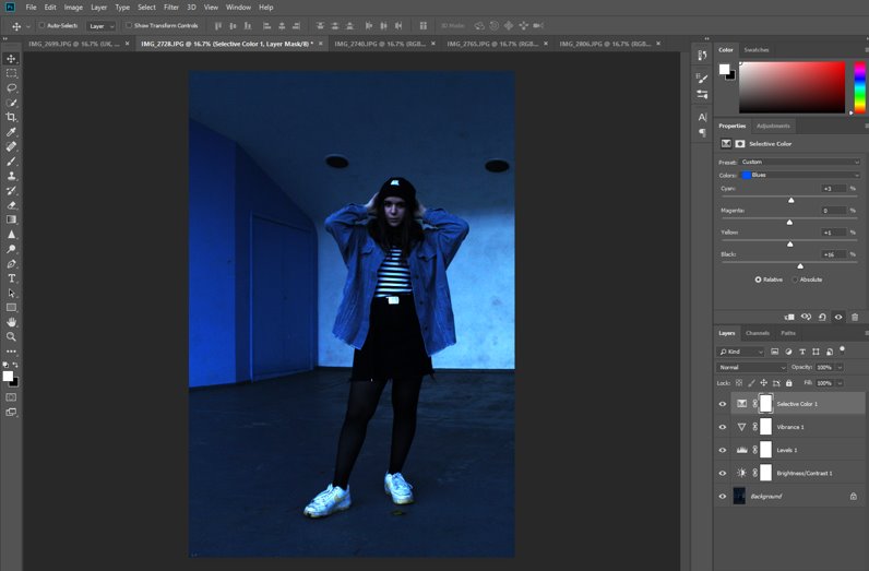
I then went into the ‘Selective Colour’ tab in ‘Adjustments’ to increase the blue, as I positioned her purposely in front of the white wall adjacent to the blue one in order to provide some contrast and mirroring of the two colours, as this whole image has the same colour palette, being almost entirely comprised of black, white and blue.
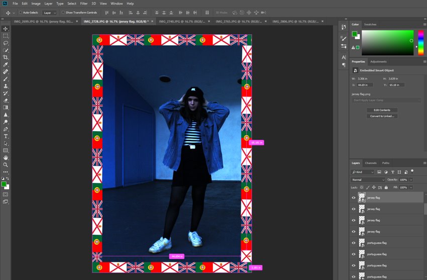
I then repeated what I did before with the flags to create the same border around this image as well.

I really like this image as her position against the white wall helped to highlight her outfit (and personality as a result), and the blue tint of the whole image stands out nicely.
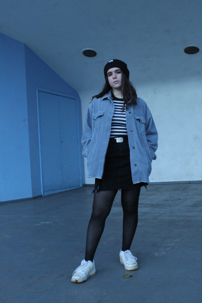
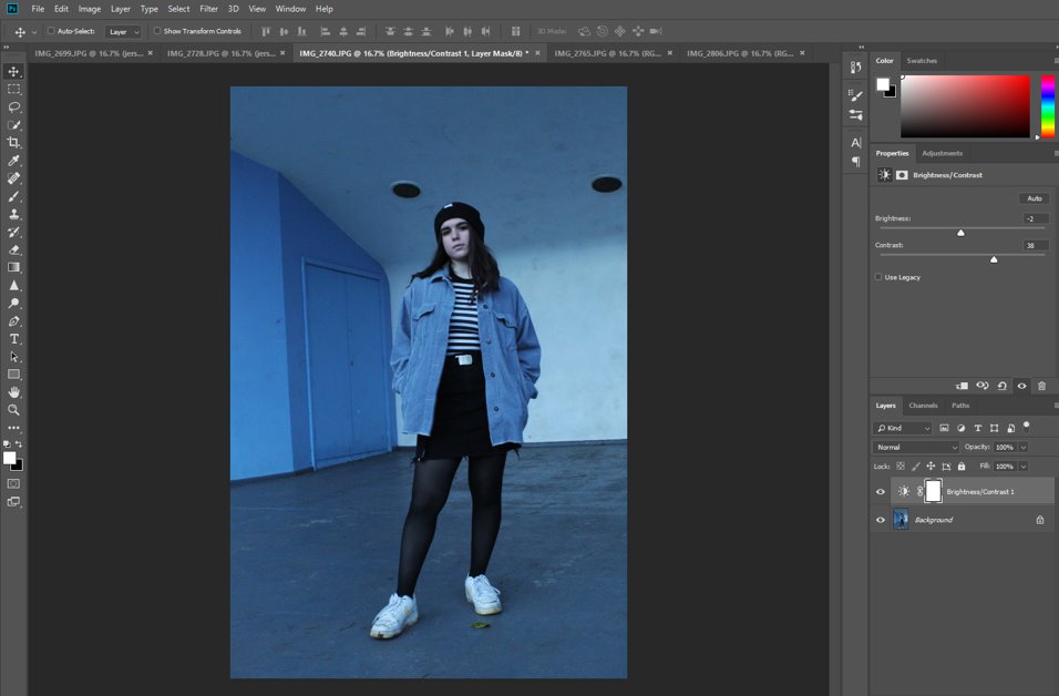
I increased the brightness of this image as well, as it was also a little too dark, as well as using the spot healing tool on my subject’s face slightly.
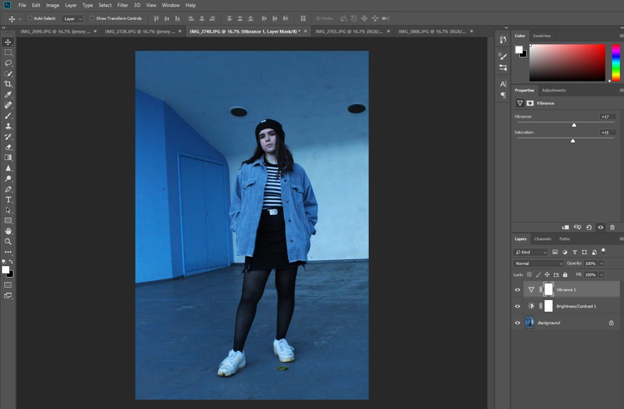
Here I used the ‘Vibrancy and Saturation’ sliders to make the blue wall and jacket more colourful and add a cooler tint to the whole image.
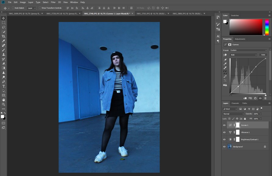
Here I used the spot healing tool to remove any stray leaves, threads or marks in the wall and floor to make the image more cohesive. I also used ‘Curves’ in order to balance out the white and black contrast and make the image look better.
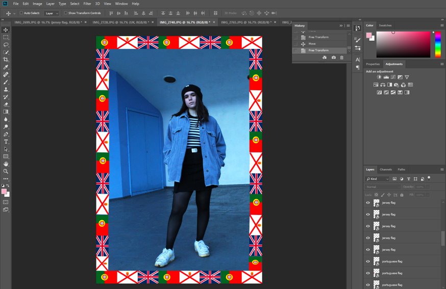
I repeated the same process as before to create this border of flags once again.
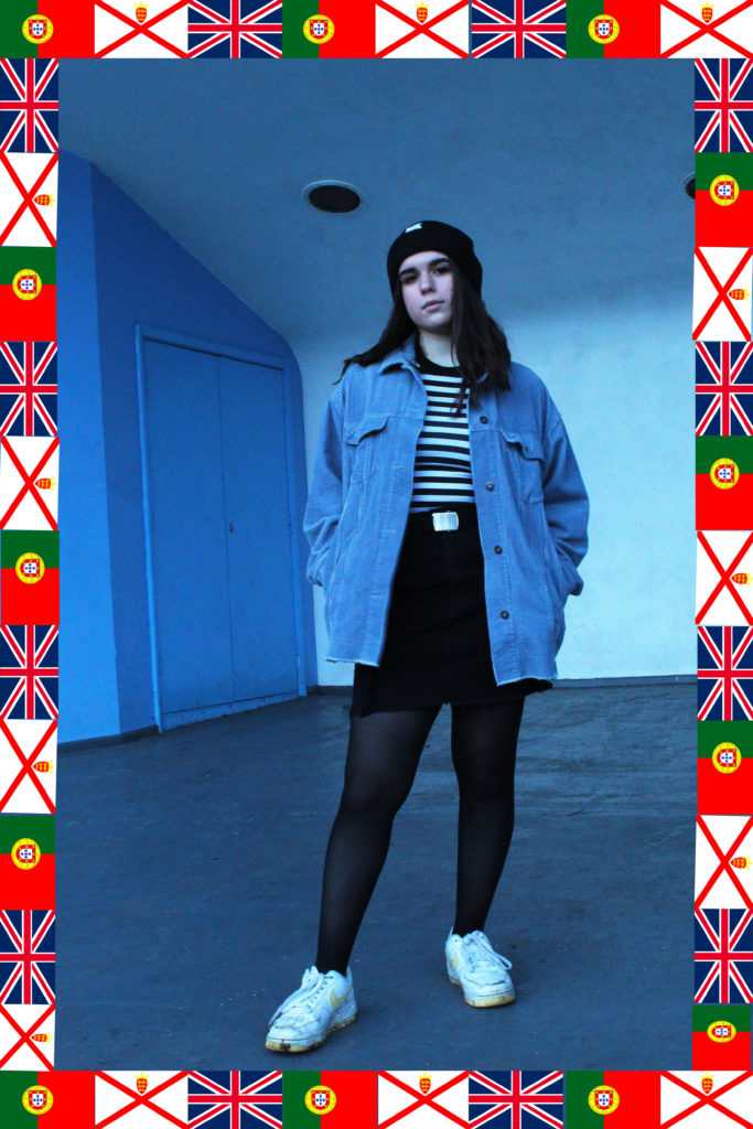
This image was taken from a slight canted angle, which I quite like, as it adds a dramatic tone and slightly dynamic feel to the whole photo. I also like the contrast between the black and white strips and the rest of the outfit (and background as well). Her position and expression is also note-worthy because it has a feeling of power, as the image was taken from below and she is on a stage, and her head tilt suggests that she is comfortable in her environment as it is her home.
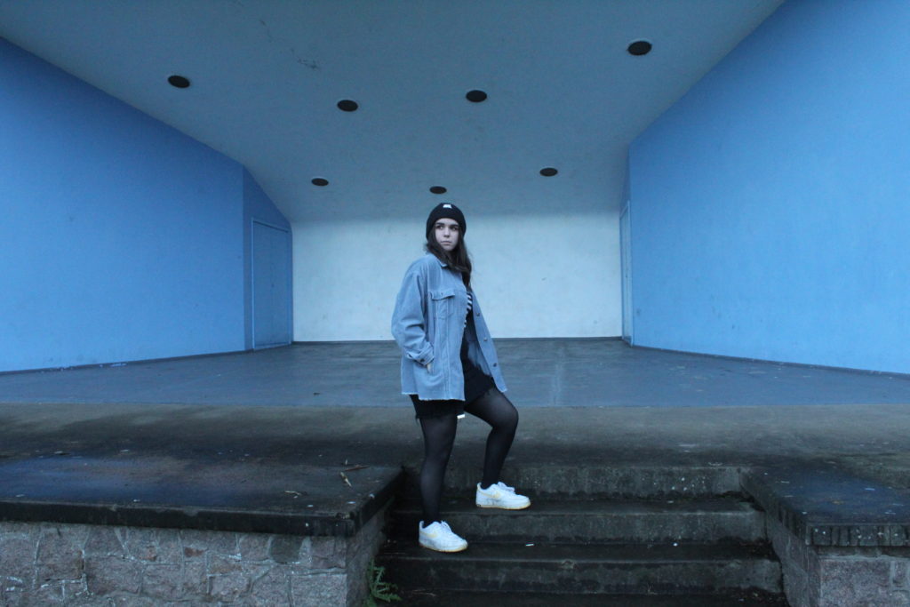
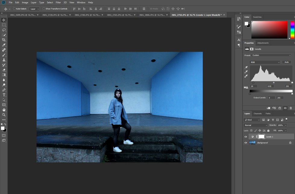
Firstly, I changed the contrast and brightness using levels to make the subject the main focal point of the image.
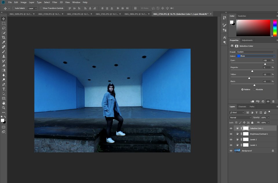
Then I adjusted the blue shades in the photo using the ‘Selective Colour’ tab in ‘Adjustments’ to increase that colour tone over the whole image and emphasise her jacket and how the blue walls behind her mirror her outfit.
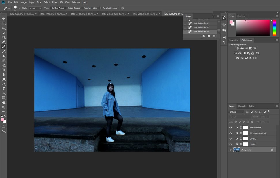
Then I also used the spot healing tool to remove any loose threads, hairs, marks on the floors and walls and the dirt on her shoes.
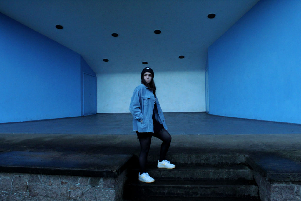
I really like this final image as she is positioned in front of the white wall, which adds relief to her blue jacket, which is also reflected in the blue walls on either side of her. Her position, with her leg one step higher than another, adds a more dynamic tone to the image and makes it less stiff or posed, as does her head being tilted slightly to the side.
2ND SHOOT-
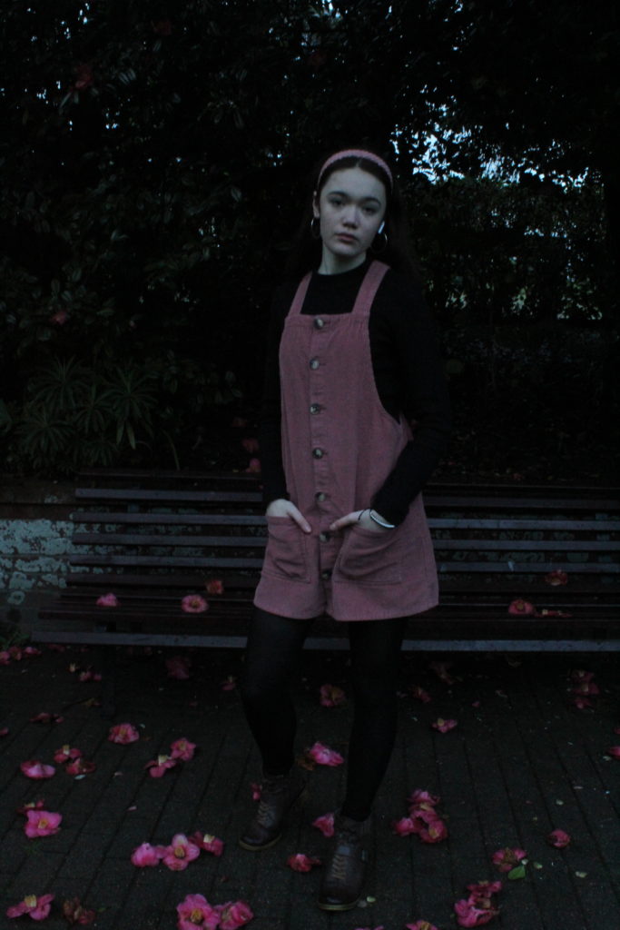
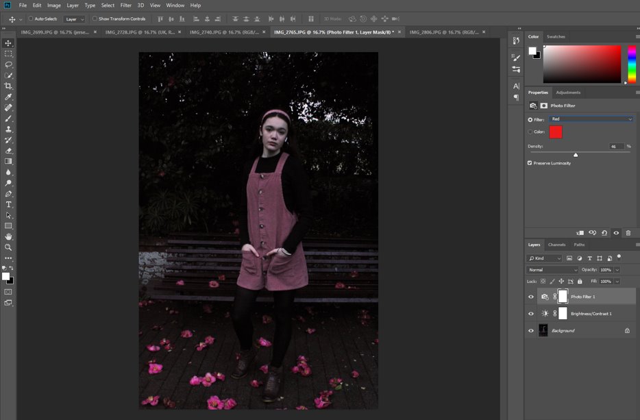
Firstly I added a red filter to the image to bring out the colour of my dress and the flowers on the floor, I took this image here for the specific reason of the flowers, as they mirror the colour of my dress and make the image cohesive and carefully considered, not just random.
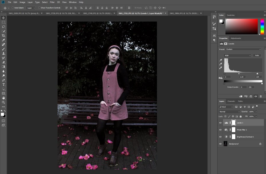
Then I adjusted the black and white levels to bring the image back to more of its natural colour, as the red filter has distorted the colours of the background a little. This also had the effect of adding contrast throughout.
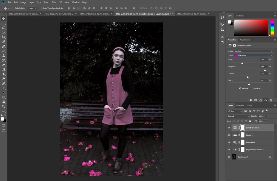
Then I went further and readjusted the magenta tones of the image in the ‘Selective Colour’ tab to make the dress and flowers stand out even more.
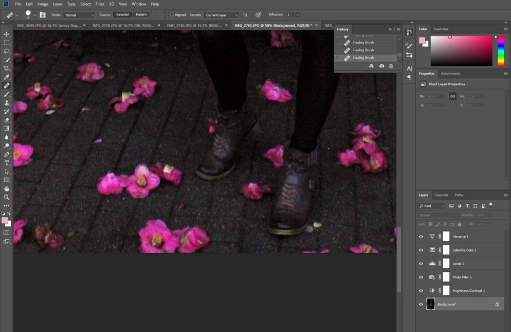
I used the ‘Spot Healing’ tool to fix some of the blemishes on my face and shoes, as well as the flowers, some of which were a little damaged, so I fixed them, and I filled in some of the patches in the bush behind me as well.
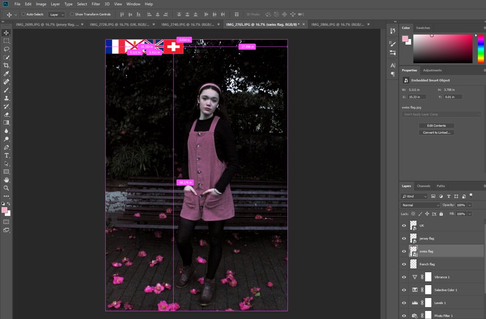
Then I added in different flags, all of the same sizes, of my own nationalities and cultural background, to recreate Hassan Hajjaj’s style and keep with the same ideas throughout these shoots.
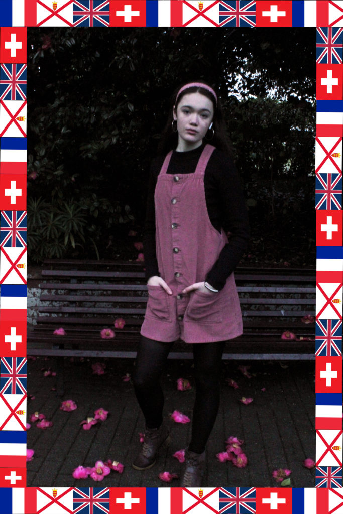
I liked how all the flags have the same colour scheme and how the red in all of the flags brings out the pink dress, flowers and headband even more, as well as how my position looks casual and not overly posed, as in Hassan Hajjaj’s work and Diana Markosian’s as well.
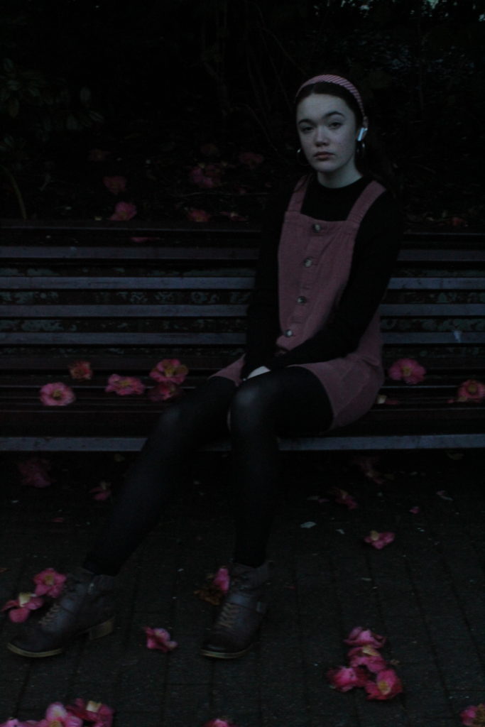
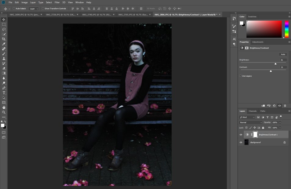
Initially, I increased the brightness of this image as, due to the time of day, the natural light available was reducing.
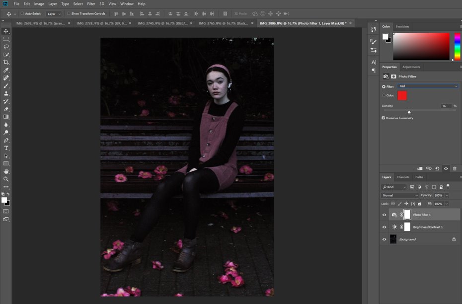
Then, I added another red filter to increase the colour saturation of the dress, flowers and my headband also.
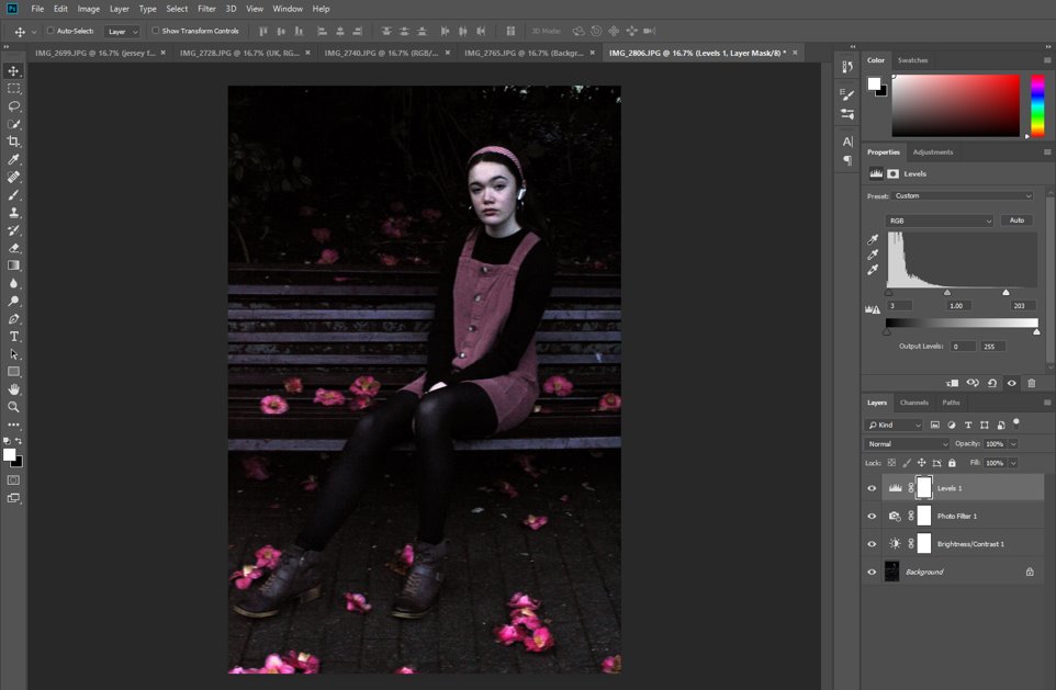
I used the Levels tab to manage the contrast in the image. I also used the spot healing tool at this point to fix any damaged flowers, blemishes, and unnecessary leaves on the floor which distracted from the main focal point of the image.
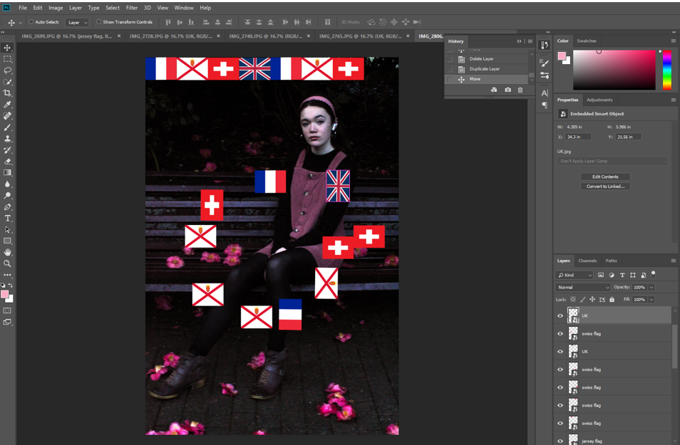
Then I repeated the previous process and added in a border of flags, keeping them them neat and ordered.

I really like this image as I feel that it is cohesive and the colour tones are well managed, the background well chosen and that my position, with a single leg drawn out further than the other, draws the eye in and adds a sense of foreground and background to the whole thing.
IDENTITY- contact sheets
I took these images over two separate shoots, one with a friend as my subject, and the second with myself where I had set up a tripod and self timer so that I am still in control of my images. They were both taken at Howard Davis Park, a central spot in Jersey’s town centre, where many people pass through every single day. It had a range of spots that I could use to take pictures, so we moved about, trying a couple of different places. My goal was to reflect how my subject’s personality and clothing was different to the environment she lives in and how this represents the multicultural nature of Jersey nowadays.
KEY- red= no, orange=possible, green=definitely
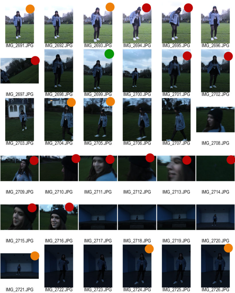
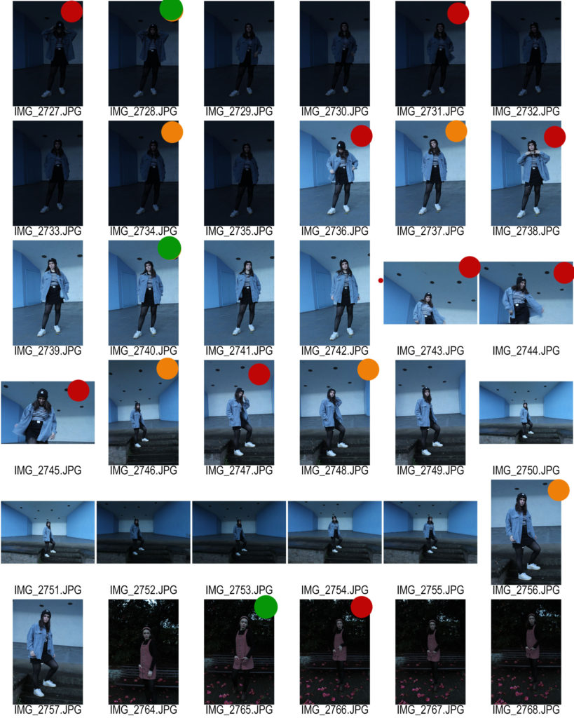
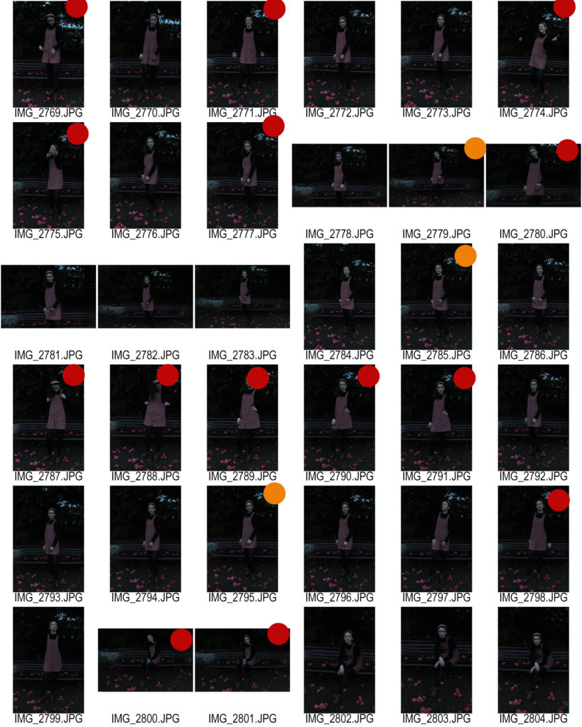
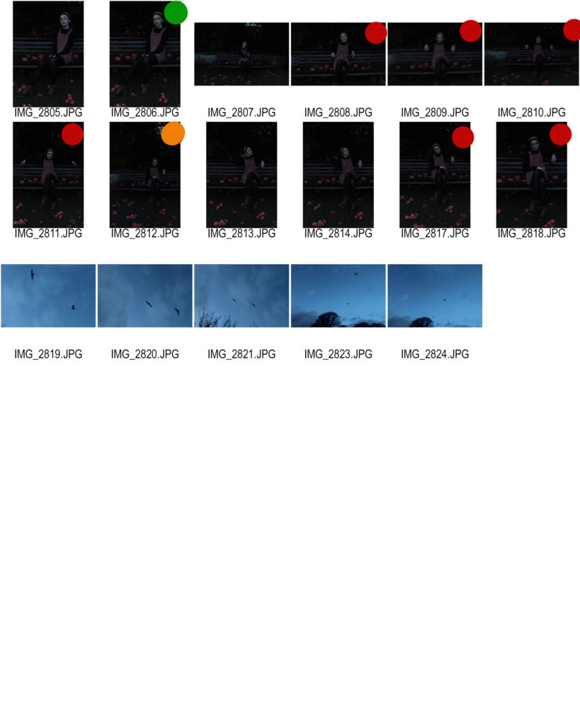
FINAL SELECTION-


I chose these images because they are all centred on the subject as the main focal point of the image, like my reference artist Hassan Hajjaj’s work, they all have a cohesive colour palette according the the clothes each person is wearing and their background, and they all have the subject in a natural pose that reflects how they are at home in their environment, even if it does not reflect their identity completely, as I intended to do from the beginning.
Now, to edit these images I am going to make them brighter and bring out all the colours, as well as create a frame around each image representing their cultural identity.
IDENTITY CASE STUDY- Hassan Hajjaj
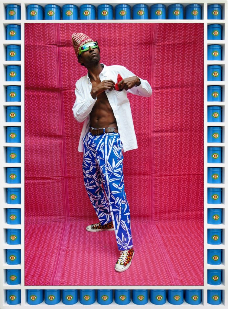
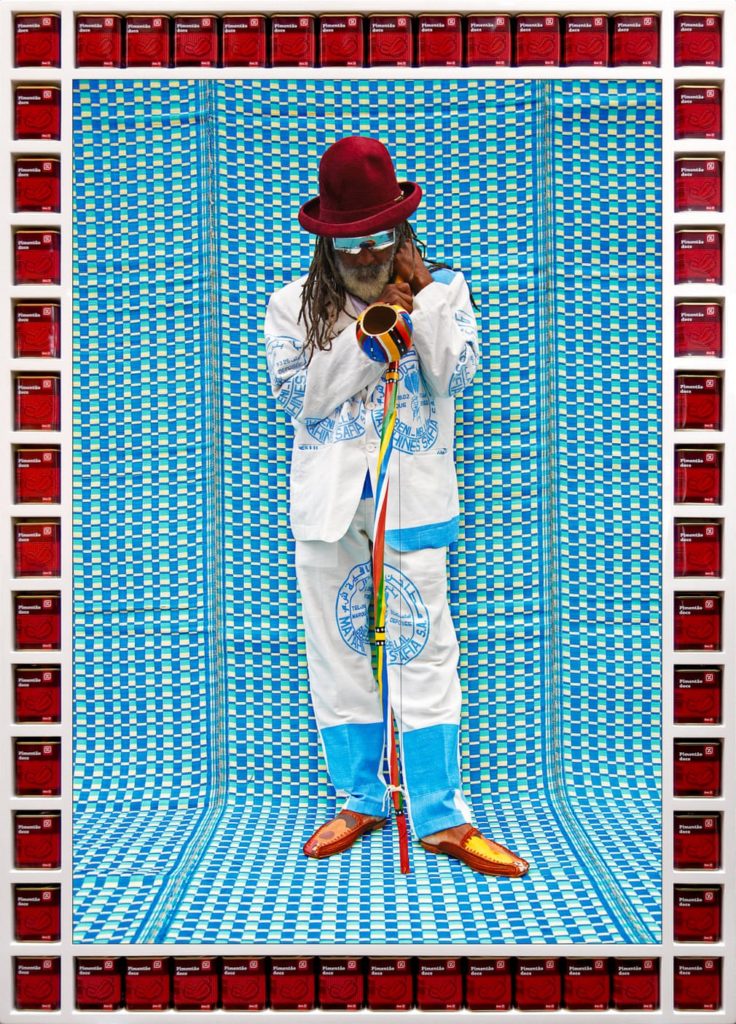
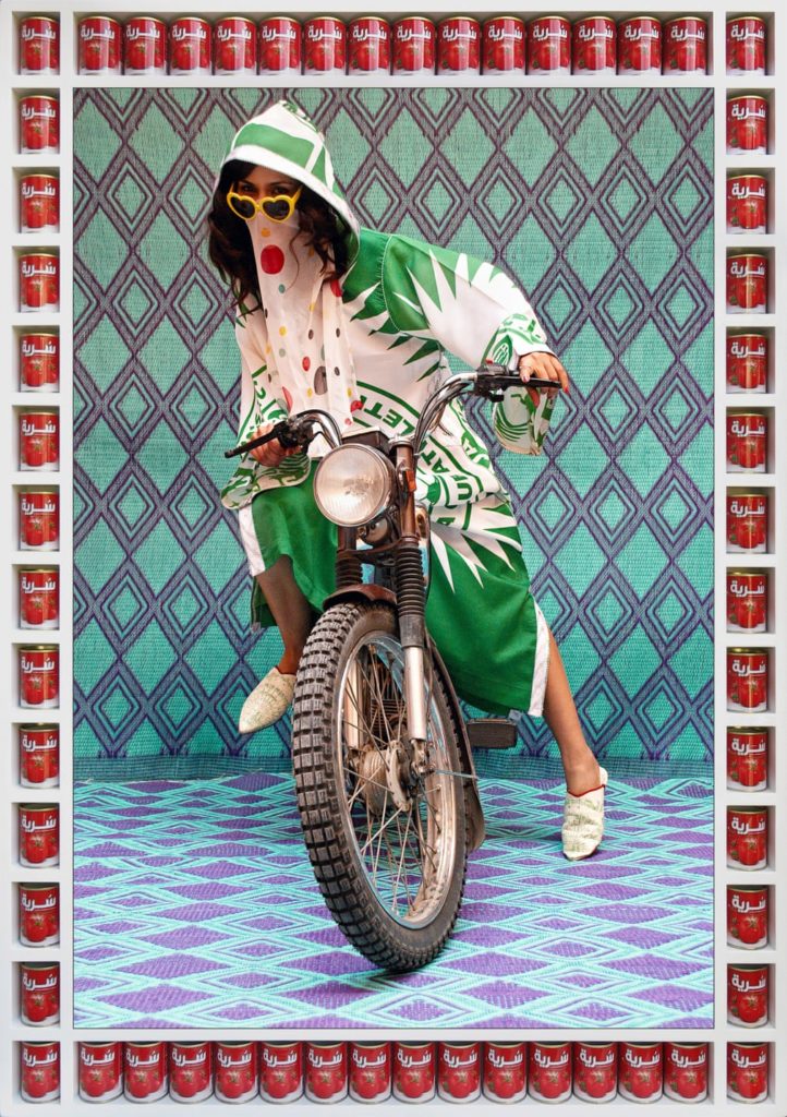
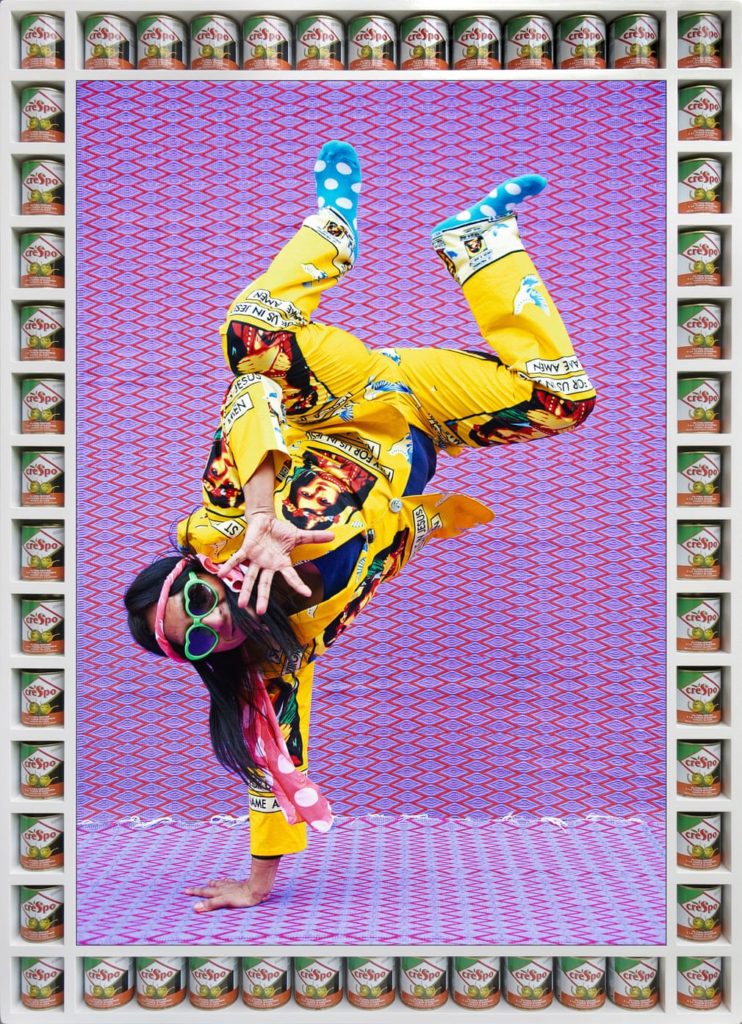
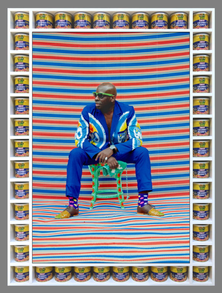
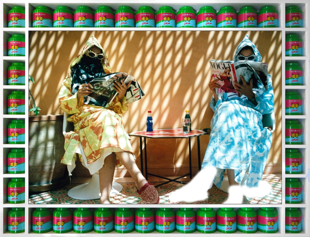
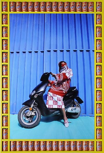
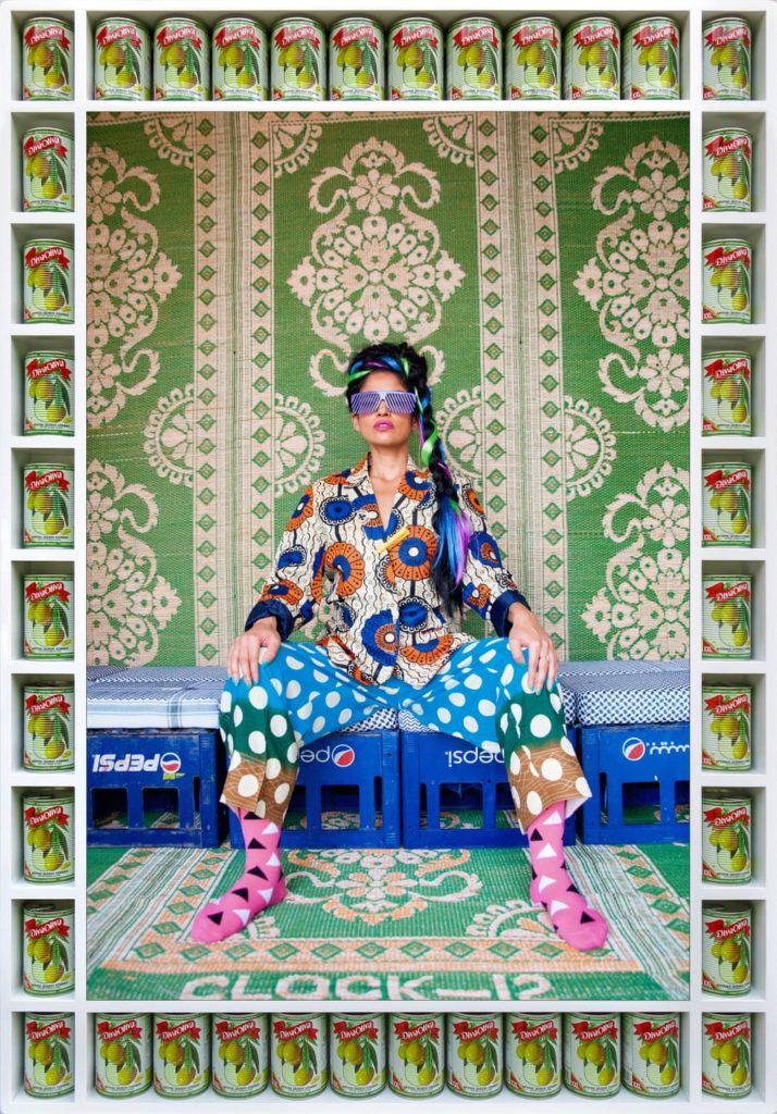
Sometimes called the “Andy Warhol of Marrakesh”, Hassan Hajjaj is a Moroccan contemporary photographer who spent much of his youth living in London, which influenced the almost hip-hop style in his artwork. He mixes Moroccan vibrant colours and heritage with modern street style clothing and poses to create a more current portrayal of Morocco than is often seen in the media.
His images are bright and vibrant, but even more so they take people’s personalities to another level, almost making them caricatures of themselves or works of art.
He uses the pop-art tradition of using everyday objects in artwork by photographing cans of Moroccan food and duplicating them until they create a digital frame around the portrait of the person, using colours that enhance the colour scheme of the image, either by using the colour wheel and using contrasting colours or by using the same ones.
His subjects all wear bright clothes and clashing patterns, which helps to modernise the image of Morocco and Northern Africa that the Western world often has of a third-world country suffering from oppression to a flourishing country with its own rich cultural history.
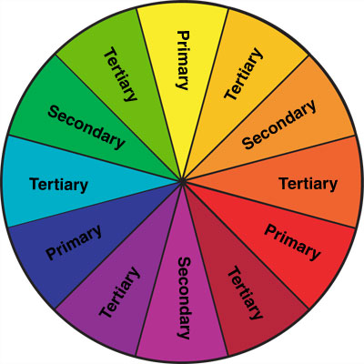
Hajjaj’s images are characterised by their distinctive bright colours, and he makes very good use of the colour wheel, specifically contrasting colours such as purple and yellow, and blue and orange. This scheme helps his images to stand out and allows the subject to remain the main focal point of the picture.

