All posts by Chloe B

Filters

Author:
Category:

ps artist reference: sophie calle

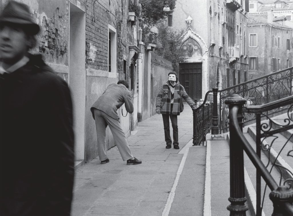
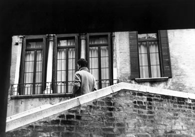
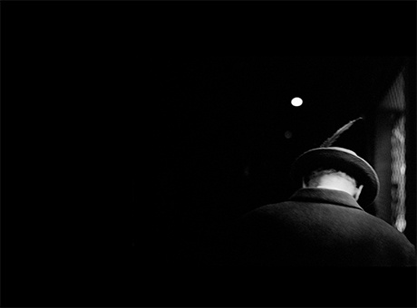
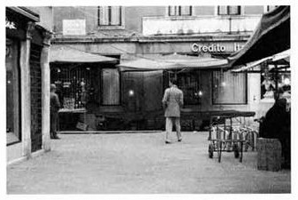
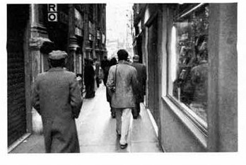
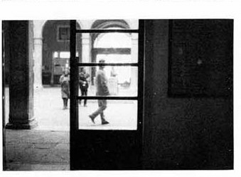
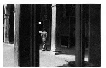
Sophie Calle is a French photographer and writer, who often analyses human vulnerability and identity. I will mainly be investigating her series “Suite Venitienne”, which documents her following strangers around Venice, constructing lives for them in her own head. This series in particular was made fairly early on in her career, and was quite influential to the rest of her photographic career and artistic style. Much of the work features one man in particular, who she met at a party and decided to follow to Venice, and she demonstrates a unique capability to intrude so much into a stranger’s private life without actually revealing anything real or personal about their identity.

Calle explains that she feels inspired by works of literature, specifically Charles Baudelaire, drawing on his view of “romantic beauty in the fleeting gaze of a stranger”. She is also inspired by Edgar Allen Poe’s short story “The Man of the Crowd”, in which the narrator follows a mysterious old man through the streets of Paris for 24 hours, never even discovering his name, for no other reason than he was “struck by the absolute idiosyncrasy of his expression”. In a way, “Suite Venitienne” is a re-telling of this story, as the pursuit of the man (named ‘Henri B’ in the project) is equally as unusual and unjustified.

Christine Macel described Calle’s work as a rejection of the…notion of the “death of the author” by working as a “first-person artist” who incorporates her life into her works and, in a way, redefines the idea of the author.

Sophie Calle, M’as-tu vue. Munich: Prestel Publishing. 2003

Specifically in her “Suite Venitienne” series, the images are very much taken from a first person perspective, as she is using the camera lens as a replacement for her own eyes. The images are from her distinct point of view, and as a result, the onlooker feels as though they are intruding in these people’s lives in the same way that she is, as though Calle is bringing us along with her as she acts almost like a detective on her journey of stalking strangers. They are reminiscent of old French films, and are cinematic in the way that most of the images feature the rule of thirds, which draws more emphasis on the figure Calle is following, and makes the overall series of images more engaging and impactful.

Much of her work is in black and white, which has been argued to lend a more artistic value to the images rather than purely documentary, and she often uses the exposure to create the illusion of movement within an image. What I like about Calle’s work is that, even though you don’t know anything about the subject and that for the most part you can’t see their faces, they have a distinct and strong sense of emotion. You almost feel as though you can relate to both the person being photographed and the photographer, in that you have experienced being the stranger living your own life on the street, and the stalker watching other strangers out in public.

IMAGE ANALYSIS-

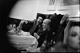
The image was taken in natural daylight, and the exposure was not adequately adjusted so as a result the two figures are somewhat obscured by the bright light coming from outside, possibly reflecting how their true identities are also obscured from us through their anonymity. The image uses the rule of thirds to frame the man – Henri B – as the main focal point. Like the rest of the series, it is in black and white. As colour photography was widely available at the time this was taken (1980s), and it was actually used more than black and white, it’s clear that Calle chose black and white on purpose, possibly to add a sense of timelessness of mystery to the final products.

This photograph, and the whole series, all feature a fairly high tonal range, which is more obvious in other images, but this image has far more midtones and bright whites than most. The lines of the horizontal stairs and the vertical pillars provide a sort of repetition, which contrasts against the two figures walking in the middle, cutting across the pattern. However they do have a sort of symmetry : they are in the centre of the opening, in stark contrast to the over-exposed white light.
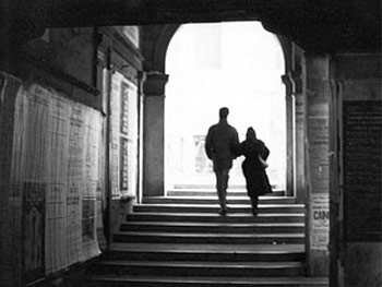
The 3D feeling to the image, which is created by the receding pillars from the foreground into the background, emphasises the concept that this image is meant to be seen as if from a person’s own perspective, with the camera lens acting as the eyes. Calle has a very candid approach throughout this series, as the nature of it means that none of the images can be really planned and rely more on the subject’s own personal plans, and this photo clearly falls under the same category. It feels quite simple and normal, the sort of situation everyone has been in, but the act of photographing it in such an artistic manner gives it meaning and significance outside of just an everyday activity.

LINKS/SOURCES-

https://en.wikipedia.org/wiki/Sophie_Calle

https://www.latimes.com/books/jacketcopy/la-et-jc-sophie-calle-suite-venitienne-20150324-story.html

https://www.theransomnote.com/culture/articles/suite-venitienne-sophie-calle-a-reflection-on-the-art-of-stalking/

http://sigliopress.com/book/suite-venitienne/embed/#?secret=3b97ZyGRdu

ps artist reference: francesca woodman

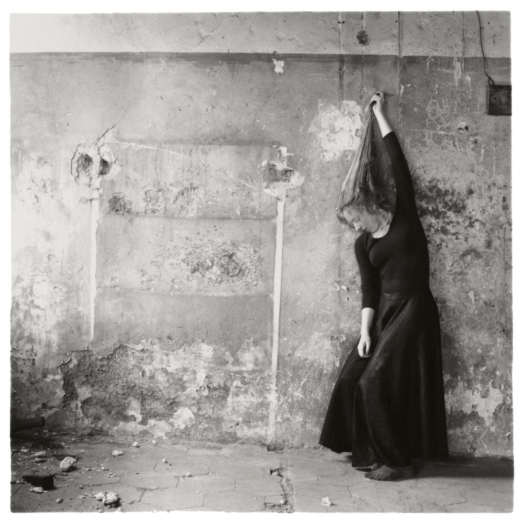
Francesca Woodman’s life was short but very productive, as even though she was only 22 years old when she died she was still able to produce over 800 images, quite a large amount in those days. She was born in 1958 in Colorado, US, to two fairly artistic parents, meaning she grew up in a household where art was a central focus, where she was raised to question everything and find beauty in everything as well. She was inspired by both Surrealism and the Conceptual art movement, and the majority of her work features the recurring themes of death, sexuality and the human body. Often, she would include mirrors, skulls or representations of ghosts in her work, creating a recognisable style throughout her whole body of work. This theme of death has been interpreted by some as a sort of foreshadowing to her death: as a result of a lack of success in her work and a failed relationship, she killed herself in Manhattan in 1981.

“I would rather die young leaving various accomplishments, some work, my friendship with you, and some other artefacts intact, instead of pell-mell erasing all these delicate things”

Francesca Woodman, in a letter left to a friend before her first (unsuccessful) suicide attempt.

Woodman only published one photography book during her lifetime, called “Some Disordered Interior Geometries”. It was released in 1981, a couple days before her death. It’s printed on an antique Italian geometry exercise book, is 24 pages long, and includes some of Woodman’s own drawings and handwritten notes. One of Woodman’s friends described it as “a very peculiar little book indeed,” with “a strangely ironic distance between the soft intimacy of the bodies in the photographs and the angularity of the geometric rules that covered the pages.”

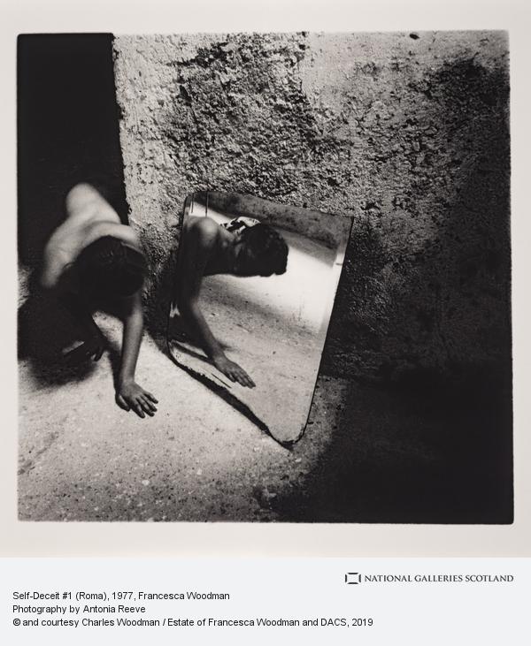
She is often described as haunting, eerie and delicate and her work mostly reflects this, with the majority being mainly bright and the focus being on the subjects and their body language – which is usually distorted and odd, in unusual positions. She manipulates her own body to be, not inherently sexual, but more a reflection of her internal thoughts and feelings. Even though a lot of her work features nudity, it is never very sexualised, and she seems to be objectively presenting her body as it is, in a variety of different and odd positions or situations rather than in the traditional poses most commonly seen in artworks containing nudity.

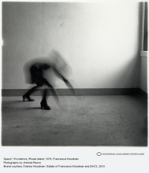
Her use of exposure is also quite particular and fairly well-known, often using excessively long exposure to intentionally blur herself or her subjects, creating a sense of movement and, in some cases, emotion in the image. She uses black and white almost exclusively, with only a very small selection of images produced in colour.

IMAGE ANALYSIS-

This image was taken in a setting with natural lighting, as can been seen by the shadows coming in from the right. The image is clear and sharp, demonstrating a high shutter speed, and as a whole it feels fairly cold. The image is in black and white as an conscious artistic choice, because colour cameras were widely available when Woodman was alive. The image is fairly light and there is almost a pattern in Woodman’s figure in the background and the chair in the middle ground. There is a feeling of repetition in the image, as the woman’s arms outstretched above her are mimicked in the two V-shaped bars on the back of the chair. Woodman was still a teenager/young adult when she produced the majority of her work but even so, her images features themes of depression, isolation and death, as well as commenting on femininity and the constraints of gender roles in the 70s. Her photographs provoke self-reflection and questioning about body image and identity. The form of the image is reminiscent of Christ’s crucifixion, as Woodman is in a similar position and the pattern of the door is in the shape of a cross. It also may symbolise someone hanging themselves, as Woodman did suffer from depression, however the young woman’s strong and toned arms suggest strength and athleticism; contrasting the hopelessness found in the modern depiction of suicide.

LINKS/SOURCES-

https://www.nationalgalleries.org/search/artist/francesca-woodman

https://www.vogue.com/article/francesca-woodman-photographs

http://www.artnet.com/artists/francesca-woodman/

https://www.studiointernational.com/index.php/francesca-woodman-on-being-an-angel-review-foam-amsterdam

ps artist reference: laia abril

Laia Abril is a Spanish documentary photographer who often tells stories through her work, mostly relating to femininity and the struggles of life as a woman in the modern world. She has a degree in journalism, which is perhaps where her interest in telling a narrative in her work evolved from, Her long-term project, “A History Of Misogyny” has been awarded the Royal Photographic Society’s Hood Medal and the Paul Huf Award from Foam Fotografiemuseum Amsterdam.

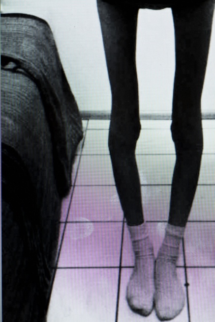
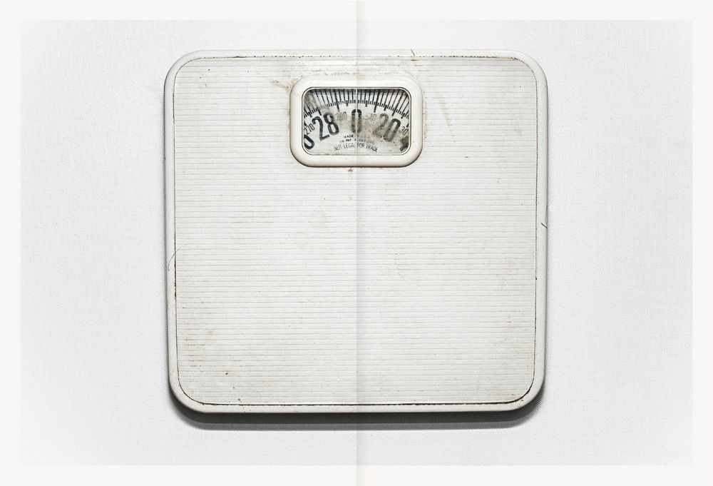
Another of her notable projects is “On Eating Disorders”, including “Thinspiration” and “The Epilogue”, which explored and documented both anorexia and bulimia. “Thispiration” comes from the term used by the pro-ana (pro-anorexia) community to describe the images of skinny, sometimes skeletal women that they surrounded themselves with and used as incentive to keep restricting their diet; literally “thin-inspiration”. It is a zine comprised of a collection of these images, exploring the connection between photography and social media culture and the battle with a person’s identity and self-worth that accompanies these sorts of disorders. These images (below) can be quite difficult to look at, as the widespread increase of eating disorders from the early 2000s onwards resulted in many fatalities and are still prevalent today. Unfortunately some of the women pictured may have succumbed to the disease and passed away as a result of continued and extreme malnutrition, but this hasn’t stopped young people, men and women alike, to develop the disorder even nowadays.

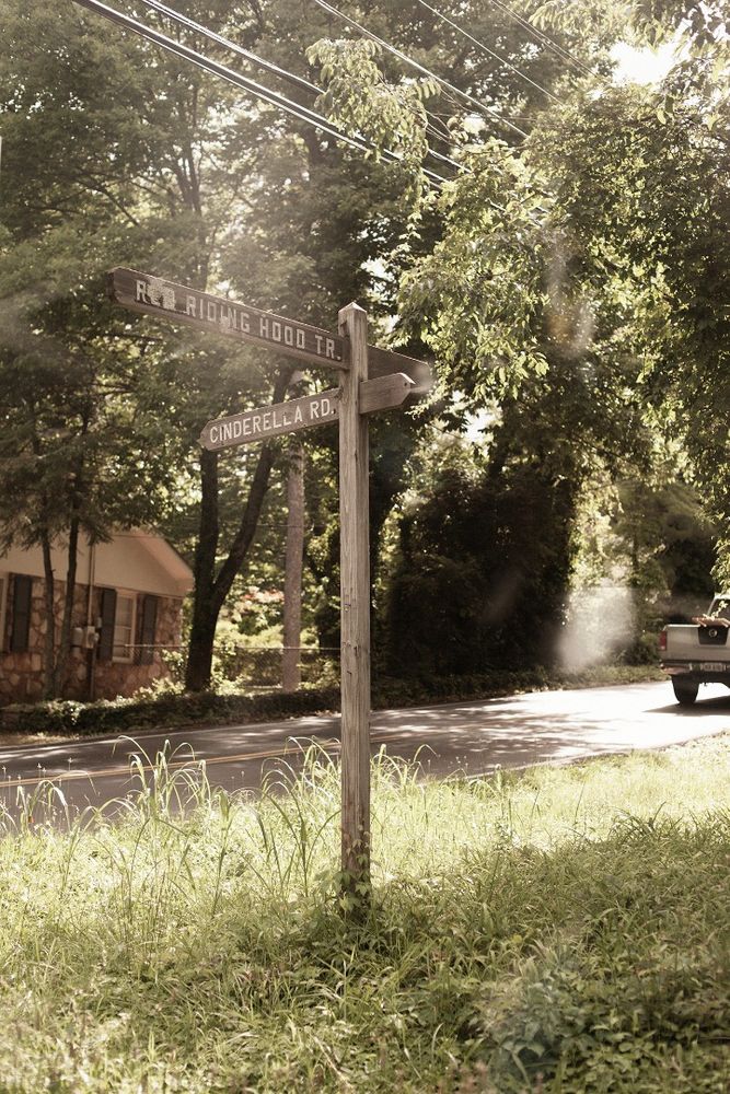
Abril focuses on bulimia in “The Epilogue”, but in a more personal way than the generalised study in “Thinspiration”, as she followed a family recovering from the loss of a daughter as a result of bulimia. It feels far more intimate and painful, as she closely captures how the family are grieving their child from an inside perspective, as well as featuring images and memories from Cammy’s (the daughter) childhood and young adult life. It switches between photographing her absence in the aftermath of her death, and how she was present but quietly suffering when she was alive. The book also features commentary from both her parents and other loved ones, discussing how they perceived her illness and their struggles with guilt, shame, confusion and loss following Cammy’s passing.

IMAGE ANALYSIS-

Cammy’s father

The image is darker in the foreground than in the background, as the bright sun casts highlights on the outside. The picture as a whole feels undoubtedly lonely, and the father’s expression, deep in thought, conveys this further.

This image is particularly impactful for several reasons, in my opinion. The colours and angle of the image result in it feeling like the camera lens is replacing your own eyes, and the image could be something that you see for yourself while walking through the house. Cammy’s father is the main focal point of the image, and so is centre-frame, looking off in to the distance as if deep in thought. the image is spilt into three parts through the separations of the window in the foreground, so it is easier to recognise how it symbolises his sense of loneliness and the self-isolation that can occur during the grieving process.

LINKS/SOURCES-

review + reflect-

THEMES-

Over the course of the various Love and Rebellion projects I explored several different themes, including:

  • home
  • family
  • self-love, self acceptance
  • platonic vs romantic love
  • youth/adolescence
  • isolation + loneliness
  • anti-art

I also did a lot of research on the subthemes of racism and colonialism; how they came about, historical events that were caused or affected by them, how they impacted Jersey, and the Black Lives Matter movement.

MEDIUM-

  • still photography
  • film/moving images

I used still photography for my photo zine and in some parts of my film project, however the majority of my film is made up of moving images. I preferred using moving images for the film because I felt it made it more dynamic and engaging, however I do also generally like still photography for the rest of my projects.

APPROACHES-

I tried to use a variety of approaches, including:

  • candid
  • environmental
  • portrait
  • documentary
  • monochrome
  • colour

I think using different approaches through different projects is beneficial because it allows you as a photographer to develop your own persona; style as well as develop your skills. I used a candid and documentary-style approach in my photo zine in order to fit with the theme of “capturing moments in time”, which worked very well in my opinion. I’ve experimented with either monochrome or colour in all of the projects in “Love and Rebellion”, and decided on which way to go depending on the theme/subject, the artists I was inspired by, as well as how good it looked visually.

ARTISTS-

I studied many different artists, not all of them photographers but all of them using a variety of different styles and approaches.

  • Claude Cahun- French photographer who took mainly self-portraits revolving around her gender identity/self-expression; she was a pioneer in the Surrealist art movement and a resistance fighter during the Nazi occupation of Jersey
  • Alec Soth- American portrait photographer, does lots of environmental photographs of people from different backgrounds; contemporary work, often colourful, bright and natural
  • Laia Abril- documented the after-effects of death within a family, themes of grief, eating-disorders, recovery and family; published in a photobook called “The Epilogue”
  • Shannon O’Donnell- contemporary photographer focusing on gender roles/identity, questioning authority figures; often uses film/moving images as a medium
  • Carrie Mae Weems- American photographer focused on the “human experience” as well as issues facing black people in society and her own struggle with personal identity
  • Banksy- world-famous anonymous street artist, often his work is very political and rebellious and uses a very distinctive stenciling technique

SKILLS-

I also learnt how to use a few new pieces of software:

  • Adobe Premiere Pro
  • Adobe Lightroom
  • Adobe InDesign

In my film, I use Premiere Pro as well as Lightroom to edit the footage and put it all together. For my zine I made good use of Lightroom to select the right images and edit them, then put the actual zine together on InDesign.

Additionally, I improved my Photoshop skills by using it throughout all of my projects.

PAST PROJECTS-

Overall I have two final products on the theme of “Love and Rebellion” : a short film and a photo-zine.

The photo-zine came from the prompt title “A Love Story” and focuses on the sub-themes of youth, friendship, home and family. I was inspired by a past student’s work as well as the photographer Laia Abril. The images are mainly unplanned and candid, with a few staged portraits, mixing between images of individuals and group photos. My intention was to represent how close-knit young friendship groups can be and present a fairly ambiguous story of platonic love, as well as document my own friends and my youth. Specific aspects of this project I enjoyed and want to continue using is the candid style of the images, as well as the generic themes of youth and non-romantic love, because I feel like romantic love is used very often in photography and non-romantic forms of love can be so much more interesting and original.

The second project I worked on in “Love and Rebellion” was a 90-ish second film that I made with a group, called “Some Sunny Day”. Our starting themes were anti-art, risk and the absurd, which we linked to the island’s covid-19 lockdown, young people’s response to it, along with Jersey’s historic occupation during the Second World War. We filmed all of the footage in a trip to an isolated bunker left over from the Occupation and incorporated a quote from a popular war song of the era, “We’ll Meet Again” by Vera Lynn (which is where the title comes from). Another key part of the film was our soundscape which was mainly made up of a homemade recording of a radio announcement made in early March explaining the first lockdown. We are all quite pleased with the end-result, and I particularly like how the medium of a film allowed us to incorporate sound and more emotion, as well as making a clearer narrative, which is why I think I am going to make another short film for my Personal Study.

ESSAY Q-

In what way can the work of Claude Cahun and Shannon O’Donnell be considered political?

Both Claude Cahun and Shannon O’Donnell deal with similar themes of rebellion against society’s expectations and tradition in general, which could both be considered political in a way. They relate to the expectations placed upon women to look and act in a certain way, using self-portraiture to project their own feelings on the subject in a way that others can comprehend and relate. The two artists present the subject of gender, it’s link to biological sex, and their own personal experience in their photography in a way that directly and indirectly challenges both the individual viewer and society as a whole to reflect on gender identity, feminism, and the politics surrounding gender.

The theory that gender, “the roles, characteristics, and activities that distinguish men from women” (MoMA, Constructing Gender) is not some biological fact but rather a series of notions constructed by society, is apparent throughout much of both artists’ work, with the differences being that O’Donnell uses it to explore and experiment with her gender identity, and Cahun is much more continual and secure in representing herself as always on the line between society’s idea of a woman or a man, firmly placing herself on the spectrum of androgyny, instead of simply experimenting with it like O’Donnell. The idea of gender being a social construct link into the Surrealist art movement as well, which Claude Cahun was a key part of during her lifetime.

Claude Cahun

The link between gender identity and political rebellion is not a new one, as can clearly be seen in Cahun’s work, which dates over sixty years ago in some instances. The connection rises from the continued control of women in the law, from abortion and sexual health nowadays to the right to get married, own property, have a job in any particular career, all of which were limited to women in Cahun’s era, although they would be considered basic rights in modern times. This historic oppression and attempted control of women leads to rebellion from women and men alike, often resorting to art or literature as mediums to express their anger. The use of art as a form of rebellion against politics is one of a few clear reasons why both of these artists and their work can be considered political.

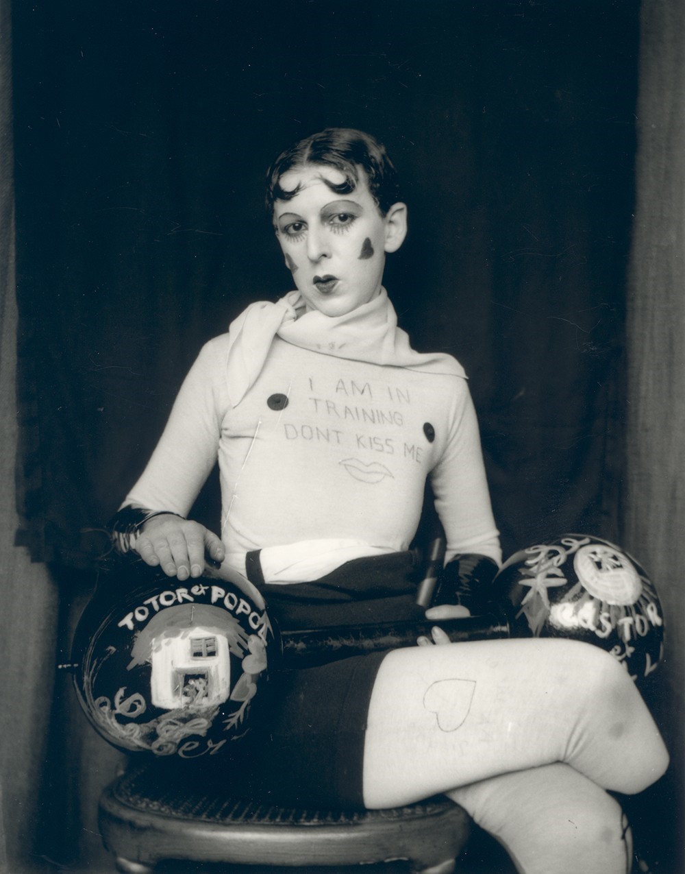
Claude Cahun’s work specifically has key links to the theme of rebellion (both political and societal), gender roles, and the concept of self-expression through clothes and other outward factors. She was a French, queer, Surrealist and Absurdist photographer born to a Jewish family and was active from the 1920s through to the 40s. During the Second World War she was residing in Jersey with her partner Marcel Moore, and while the island was occupied, they both became key resistance fighters against the Nazis. They weren’t originally seen as targets to be feared by the occupants due to their age and the fact they were women, which helped them elude punishment for years while they published and spread anti-Nazi propaganda, often mocking officers and higher-ranking Nazis, criticised fascism, attempted to incite soldiers into rebellion or desertion, and spread news they had heard (illegally) from the BBC. Eventually, they were both arrested and sentenced to death, but were held in prison and released when the island was liberated in 1945.

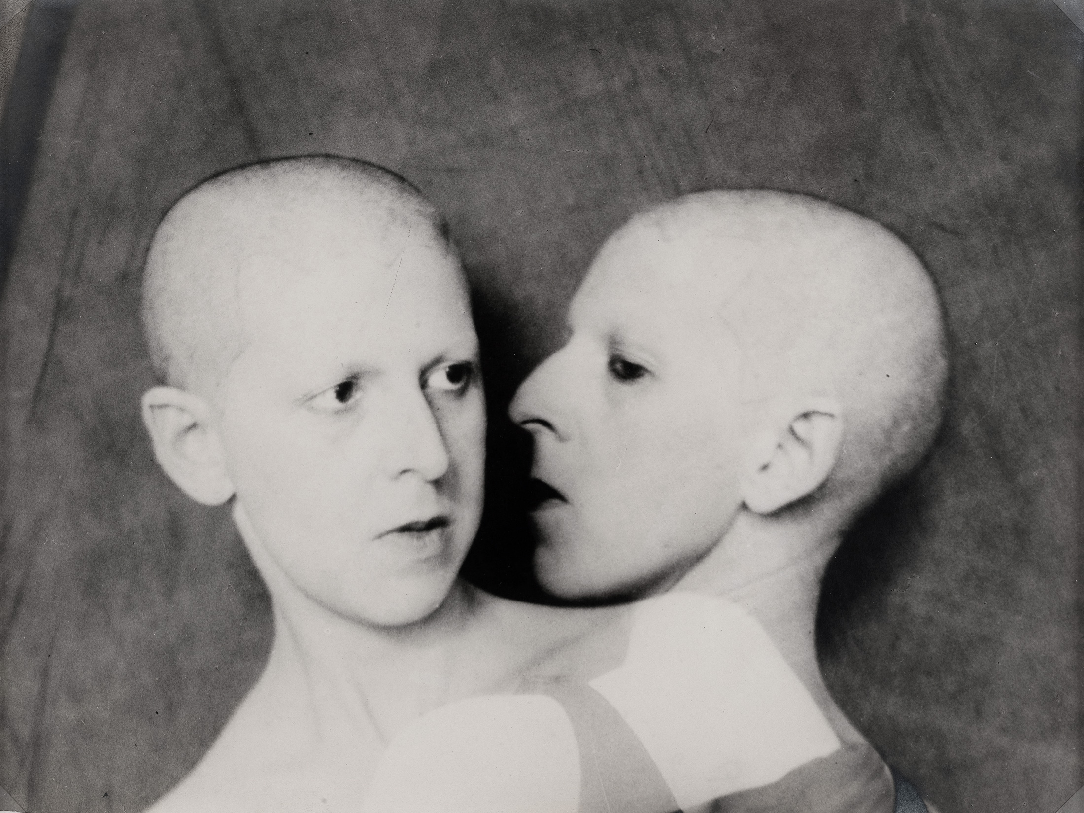
This image represents Cahun’s belief that she had multiple identities at once, famously quoted saying “I will never finish removing all these masks,” demonstrating how her gender was more of a performance than a set of rules she adhered to that were presented to her by other people/society. Her skin is clear and bright white due to the exposure, as a result her dark eyes stand out prominently from the whole image, inviting us to judge her expression and guess her thoughts through them. She was very fond of the double exposure method and often used it in her self-portraits to illustrate two separate identities, or “selfs”, sometimes with completely contrasting characteristics of emotions.

However, in this image, the double exposure is more used to demonstrate how she feels herself pulled between two different sides of herself, perhaps between genders. She said in Disavowed Confessions, “Masculine? Feminine? It depends on the situation. Neuter is the only gender that always suits me.”, which is possibly what this image is visually representing.

The image is black and white, typical of the time it was taken (1920s). The focus of the image is clearly the two heads of Cahun in the centre foreground, with a plain dark background drawing even more attention to them. The image is titled “what do you want from me?” in French, which further reveals how Cahun is indifferent to the expectations placed on her by other people to be traditionally feminine, and that her art is a direct rebuttal and refusal of this. Another interpretation could be that the question is directed to herself, and she is internally struggling with how to define herself as a person and be content with it.

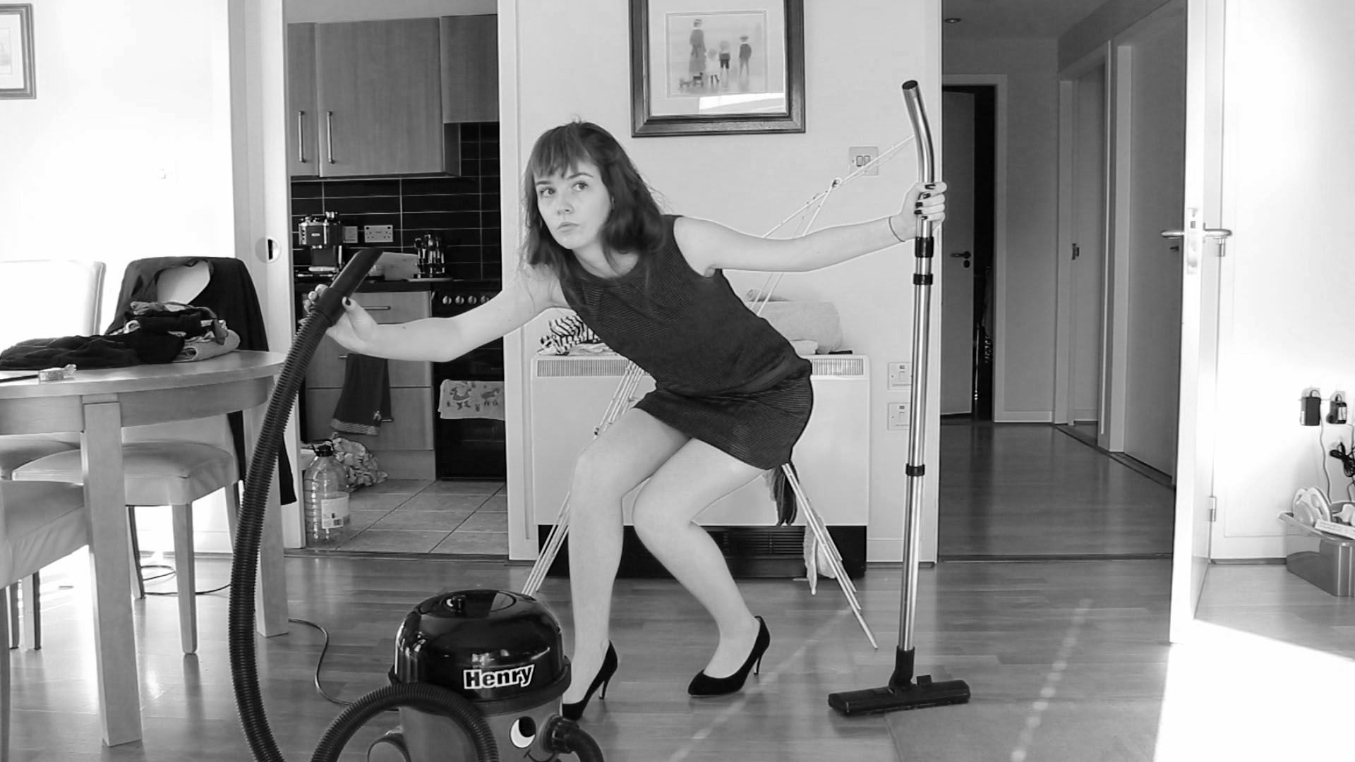
Shannon O’Donnell is a contemporary photographer who also focuses on gender roles as topic of exploration, and her work often questions authority figures and prescribed ideas in society. Her series “Shrinking Violets” mocks women’s traditional roles in the household, “Abort Mission” links the Catholic Church to the continued control over women’s reproductive rights and the general oversexualisation of women, and “That’s Not The Way The River Flows” illustrates O’Donnell’s own exploration of her gender identity and traditional ideas of gender in society.

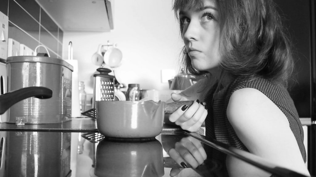
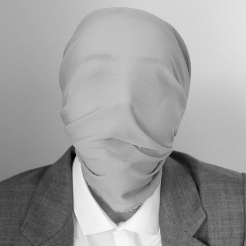
This image is taken from O’Donnell’s project “That’s Not The Way The River Flows,” and it mirrors the image I analysed by Cahun in that it is a self-portrait of her face, representing her internal struggle and her perception of her own identity. She is dressed in a suit, which is stereotypically masculine, but we can see her feminine facial features through the fabric wrapped around her head. This piece of fabric could be interpreted to symbolise how she feels trapped by the societal norms she is expected to follow, or possibly it could be that she feels, much like Cahun, that she is wearing a mask and that the way she presents herself normally is not the way she wants to be.

The image is also in black and white, but less harsh than Cahun’s as the technology nowadays allows for far more tonal range. There are a lot of grey tones in the image, and the fabric covering O’Donnell’s face is practically the same colour as the background; it could almost fade into the background if it weren’t for the fact that O’Donnell’s eyes, eyebrows and lips are still visible underneath. The greatest contrast is between the blazer and the white shirt, as the shirt is quite noticeably brighter white, plus the textures of the two fabrics are visually different: the shirt is smooth, crisp and soft, and the blazer looks rougher and more coarse.

In conclusion, both artists use their gender identity and self-expression to project their rebellion against authority figures, which is in its own way a political statement. In Claude Cahun’s era, the images she created would be a good deal more political and rebellious than O’Donnell’s work is now, due to the growth in acceptance of different gender expressions nowadays and the increase of LGBTQ+ rights, however they are both making a statement in opposition to some form of authority figure. The historic oppression of people expressing themselves freely, particularly queer people like Cahun, has led to these sorts of statements and artworks being inherently linked to politics.

LINKS TO SOURCES USED-

film CRITIQUE-

Overall, I am quite pleased with our group film and the way it turned out. I think we did adequate planning before going out and taking the footage so that we were able to use the vast majority of what we got, and we weren’t missing any key clips.

We worked well together as a team, splitting responsibilities equally and all having a say in how the final video should be edited and just generally put together.

I think we stuck with our starter words of “risk, absurd, anti-art” well enough too. The element of risk was incorporated through going out and spray painting the bunker, essentially vandalism, and the actual medium of graffiti is well-known to be fairly anti-authority/establishment/tradition, which ties in with anti-art. The way we put the different clips together also links to the absurd, in my opinion, because there was no clear storyline or orderly sequence of images, therefore making it slightly nonsensical in the way that it could be interpreted differently by each individual who watches it.

I think if we were to do the project again, we could maybe have tried to have a wider variety of close up shots mixed in with the landscape ones, or maybe even experimenting with using black and white instead of colour. We kept the film as a whole fairly minimalist and simple, which worked well with what we had planned, but I wonder how it could have turned out if we had made it a bit more eclectic or flashy.

Personally I am happy with the final product, I think we included the three key aspects that inspired the project well, and we clearly also combined it with our own personal artistic styles.

film- editing process

SOUNDSCAPE-

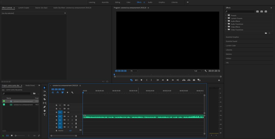
We started off by adding a recording of the first coronavirus announcement in Jersey from right before we went into lockdown as the main sound to run underneath the whole film, because it adds context to the rest of our film and makes it more specific to where we live. It was quite a bit longer than 90 seconds so we just cropped it down when it came to a natural pause in speaking around our time limit.

Then we incorporated a couple of other ambient sounds that we’d collected, like siren noises in the beginning and wave sounds later on, where we knew we would be showing footage of the ocean crashing against the rocks. We used the same skills of just cropping them to fit the timing of the associated footage, and raising or fading out the volume when necessary, using the Editing features in Premiere Pro.

VIDEOS-

We essentially used the same skills throughout the whole editing process, because we mainly only needed to crop video length, extend them by slowing down the speed, and also splitting videos into separate bits so as to make a more visually cohesive final product. We quickly learnt how to separate the video element from its original audio, because that would mess up our planned soundscape, and it would be a lot more effective and impactful if the videos were silent too.

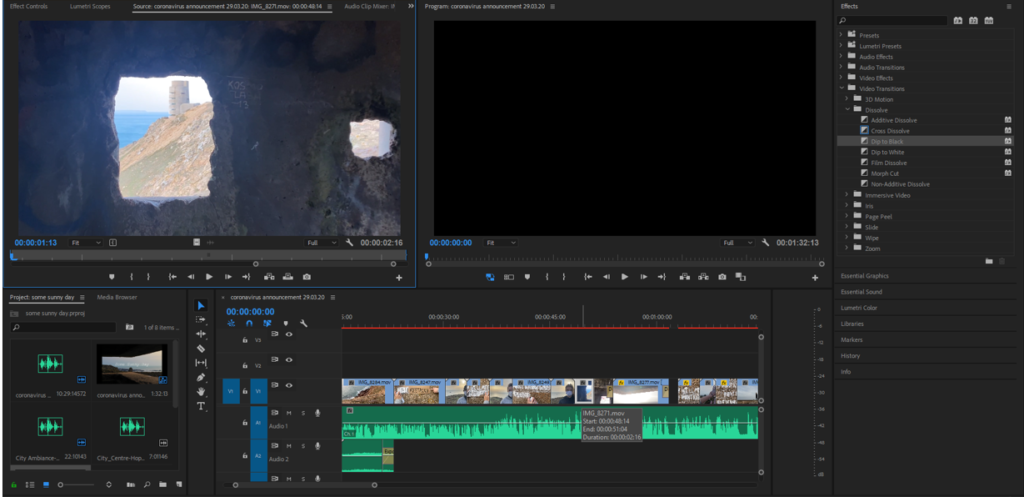
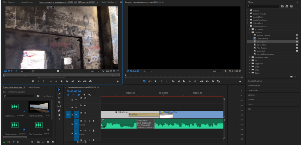
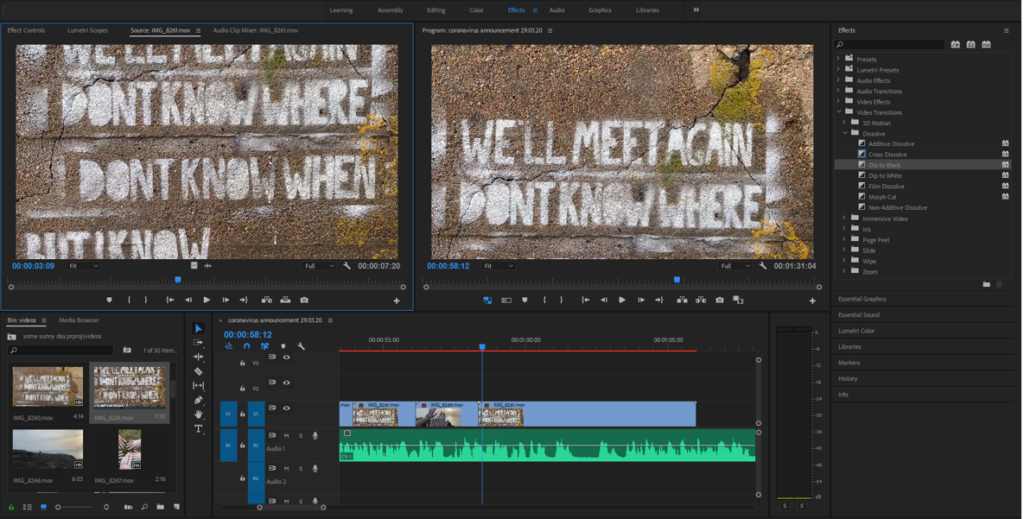
Here is an example of the sort of effects/transitions we used. For these couple videos we thought it would be best if the previous clip faded into white at the end and the clip afterwards faded into black, because the beginning and end of the middle clip were quite bright/dark, respectively. We achieved this using the Effects and Video Transitions panels in Premiere Pro.

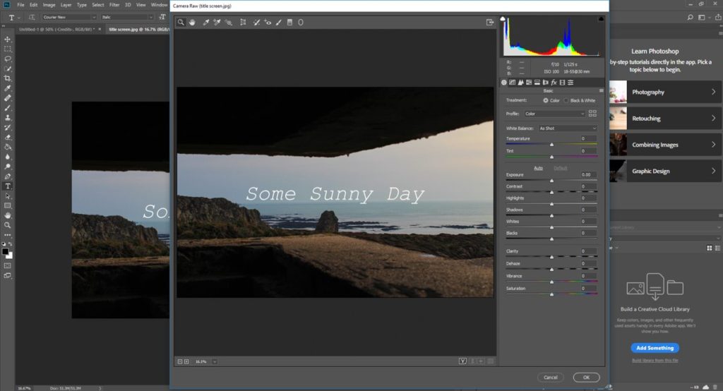
At this point we were roughly halfway through putting our short film together and we had finally decided on a title, which referenced the quote that features throughout the film, relating to Jersey’s historic Occupation period and also current affairs (lockdown/isolation). We thought a typewriter-style font would look good, and using a still image from the shoot at our location we switched to Photoshop to put together this title card, then imported it to Premiere and added it to the beginning of our film, leaving a couple of seconds of black screen whilst the audio started.

We had quite a long video which panned over the main quote as a whole, and we thought it would be good to cut it up into shorter parts, seeing as a lot of the rest of our clips were roughly the same length, and it would add some variety and make it more interesting if they were shorter. We had to slow the actual footage down to make the words easier to read, but it still had the intended effect, and we were able to incorporate much more of our footage by splicing it in-between each couple of lines.

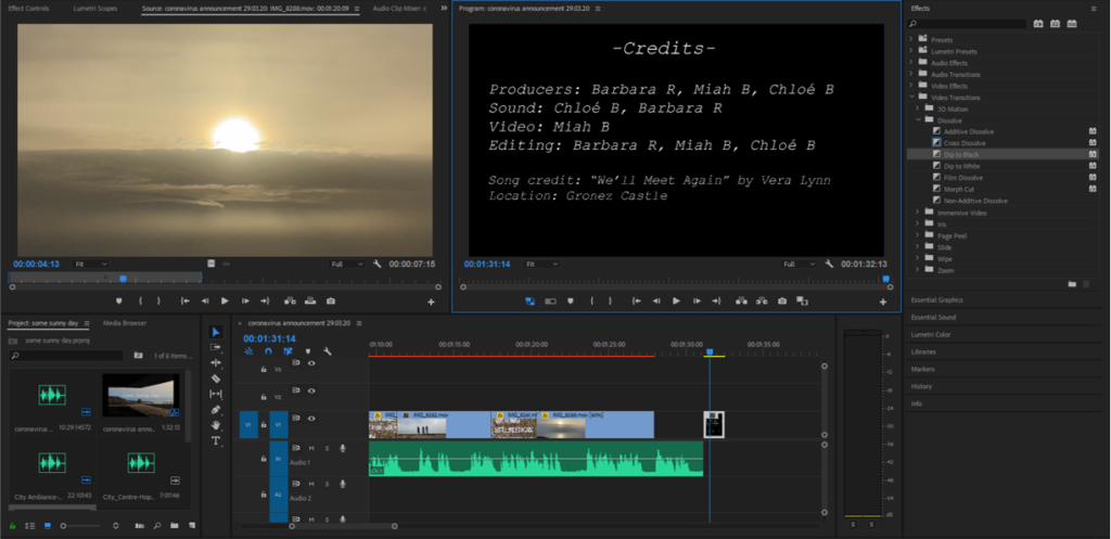
By this point we had used most of our good footage and were coming up to the 90 second mark so we added a longer landscape clip to tie up the whole film, then switched back out to Photoshop and created a credits end card with the roles we assigned at the very beginning. We chose to have a couple of seconds of just black screen with the audio still playing as it finished, because it mirrored how we started the film and it was a nice conclusion that wasn’t so visually overwhelming, keeping with the simple and minimalist vibe of the whole thing.

film plan-

  • landscape shot, figures against the sea/sky
  • close ups of masks/faces
  • hair blowing in the wind
  • messy hands after spray paint
  • seagulls (if there are any)
  • general landscape shots, empty, isolated
  • waves on the rocks

TITLE-

  • some sunny day
  • we’ll meet again

film manifesto-

OUR FILM-

THEME: Rebellion

SUBJECT: anti-art, risk, absurd, authority

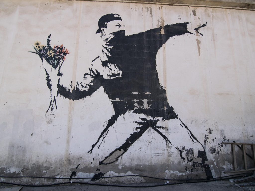
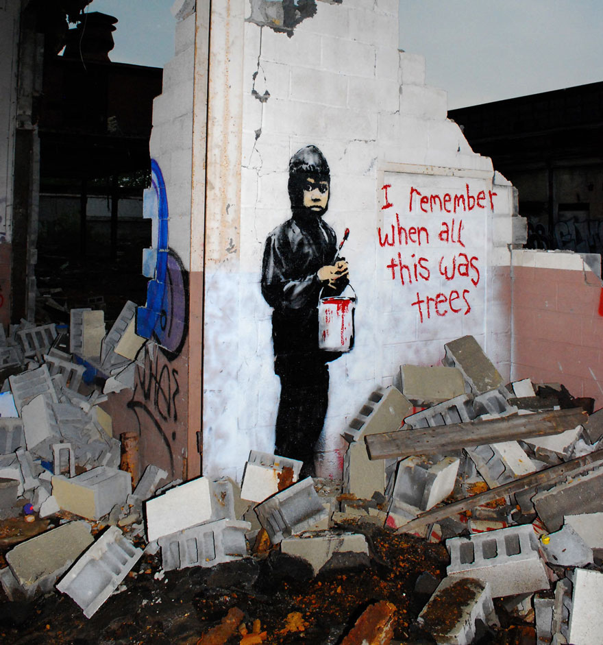
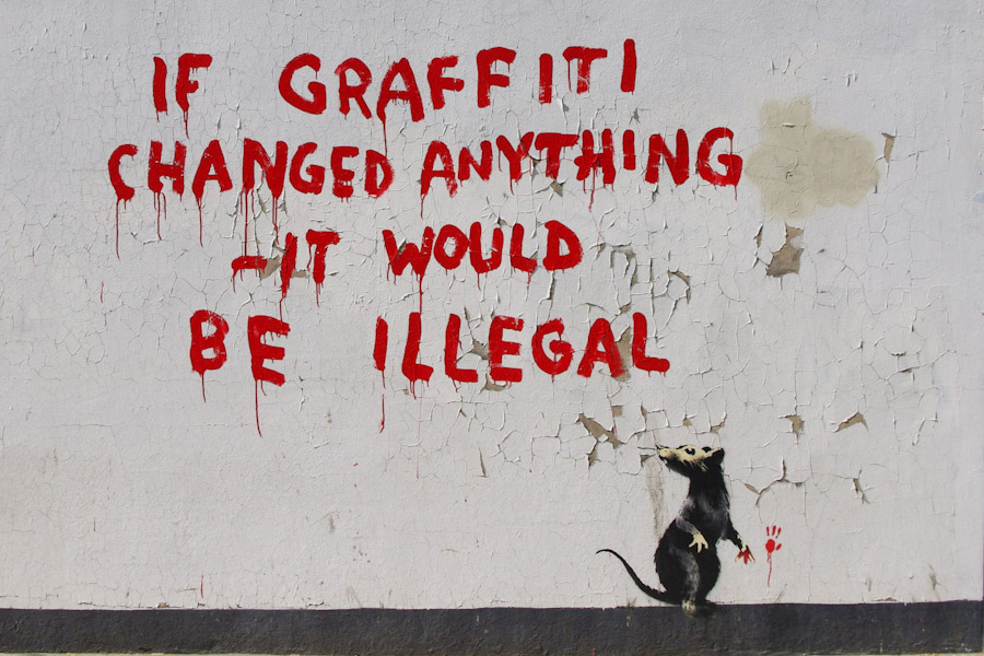
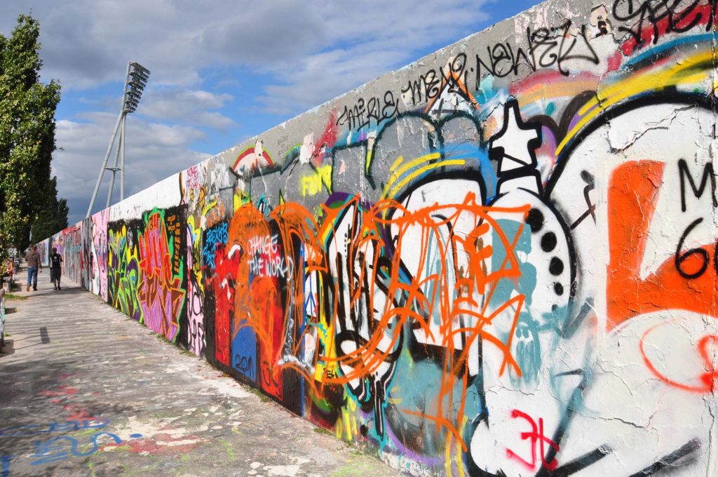
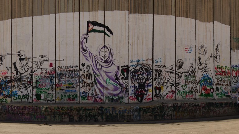
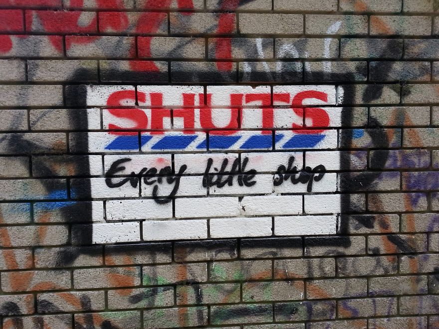
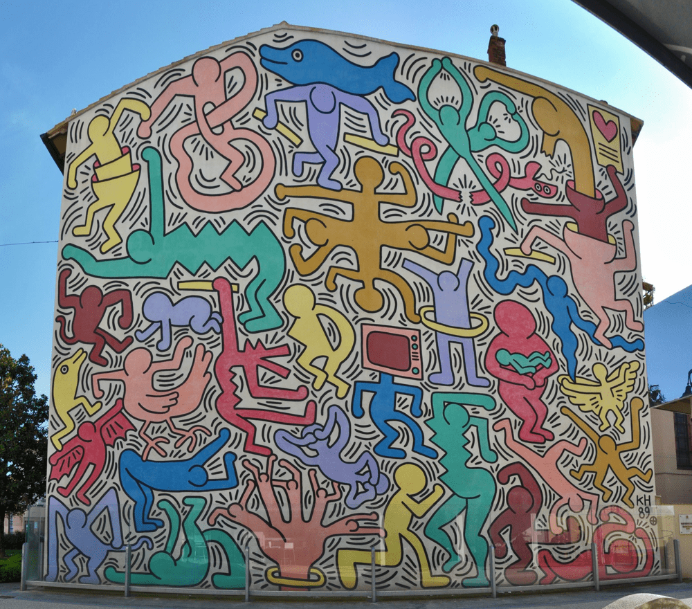
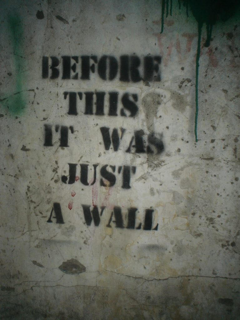
VISUALS: inspiration from The Rebel Bear, Banksy, political street art in Melbourne and general everyday graffiti 

SOUND: hustle and bustle of life, ambient street sounds, interspersed with periods of quiet and one individual in isolation

TITLE: pending

ROLES: we are all sharing the roles of producer, photographer and editor equally so that we can understand what goes into each role and learn more about film-making as we work

RISK+ABSURD+ANTI-ART

  • vandalism, laws/legality, challenging comfort zone
  • Dadaism, nonsense words, randomness
  • Dadaism, graffiti, political messaging, Banksy

EXAMPLES-

OUR PLAN-

We’ll meet again
Don’t know where, don’t know when
But I know we’ll meet again
Some sunny day

Above are the words we are planning on graffiting because they come from a song that was popular during Jersey’s occupation and it also relates to lockdown, loneliness, and feelings of isolation.

We planning to create a soundscape made up of ambient beach and weather noises, mixed with sounds of large groups of people talking switched with silence, to represent the difference between before and after/during quarantine.

ARTIST REFERENCES-

BANKSY-

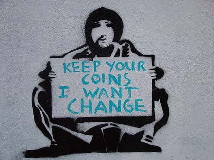
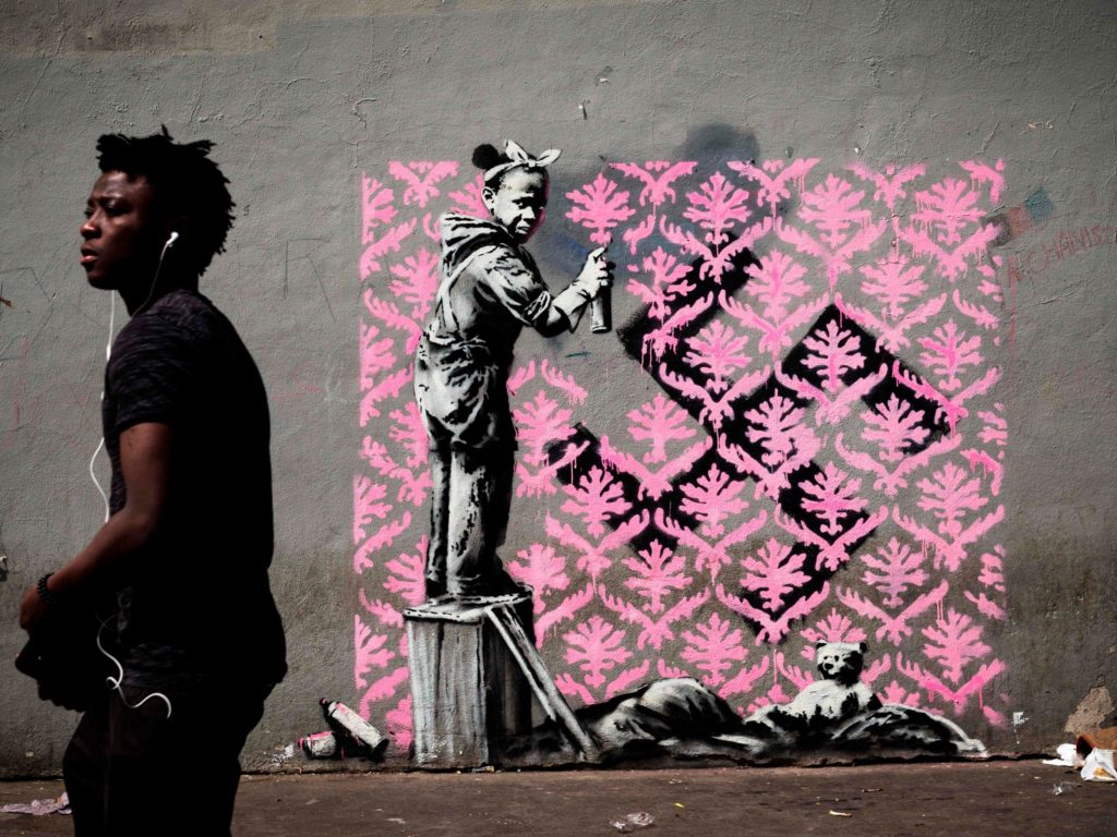
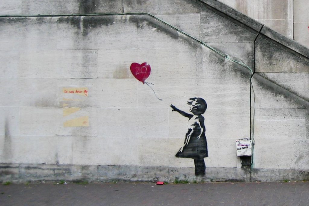
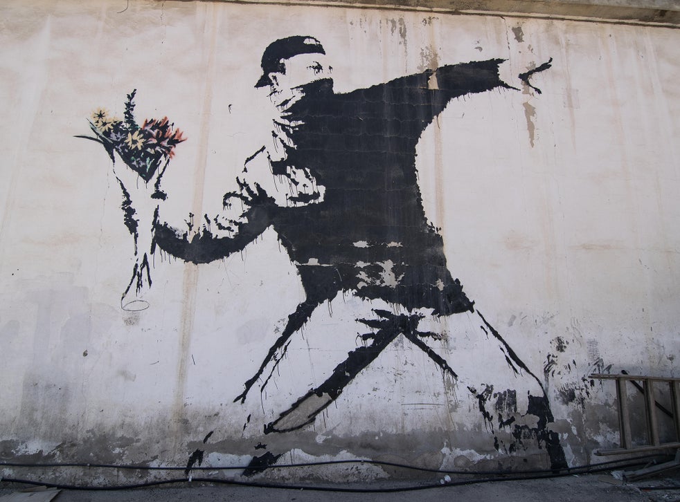
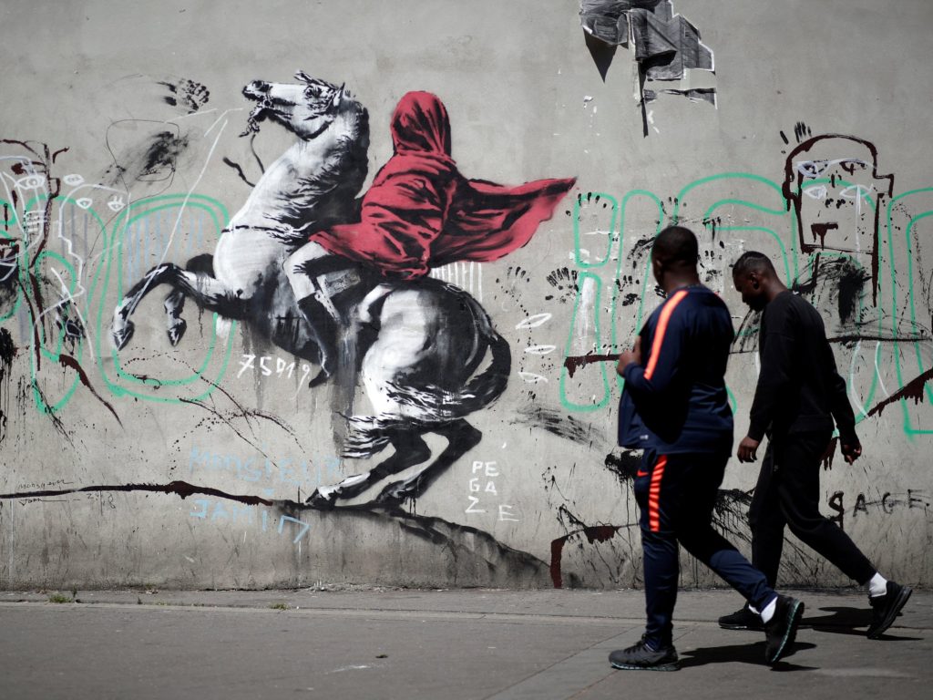
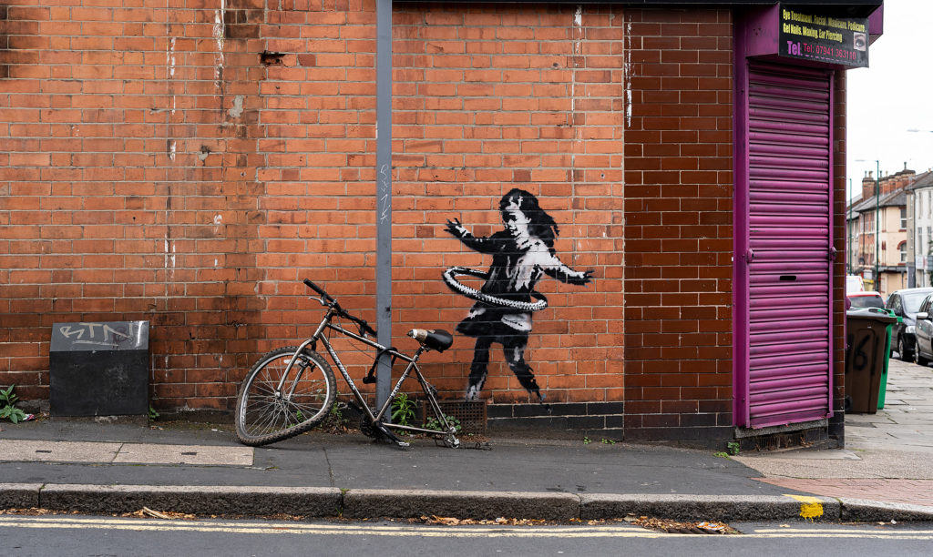
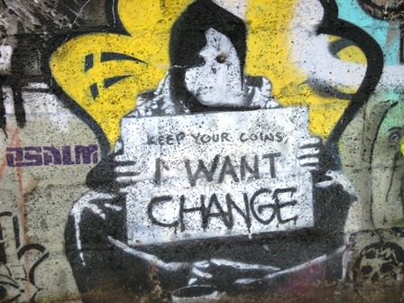
Banksy is a world-famous British anonymous street artist, who uses a distinctive stenciling technique to reveal strong political messages and question society and its issues. His works often sell at auctions for hundreds of thousands of pounds, even millions, but other times they are defaced within hours of being painted on public streets. He has been described as the trigger for a cultural revolution, making graffiti and street art not just mindless vandalism but a legitimate art form worth money and attention. A concept, “the Banksy effect” has even been created by journalist Max Foster, describing how other street artists have also grown and gained fame due to Banksy’s success. His anonymity has led to an almost cult-like following f fans who track his every visible move and treating his work as the highest of art forms.

EXAMPLES-

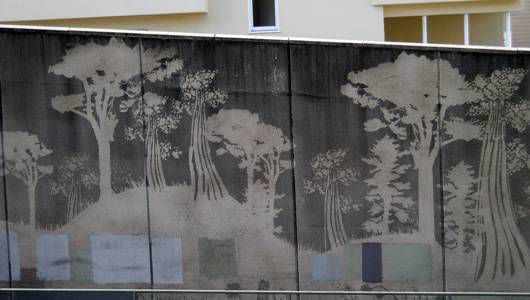
THE REBEL BEAR-

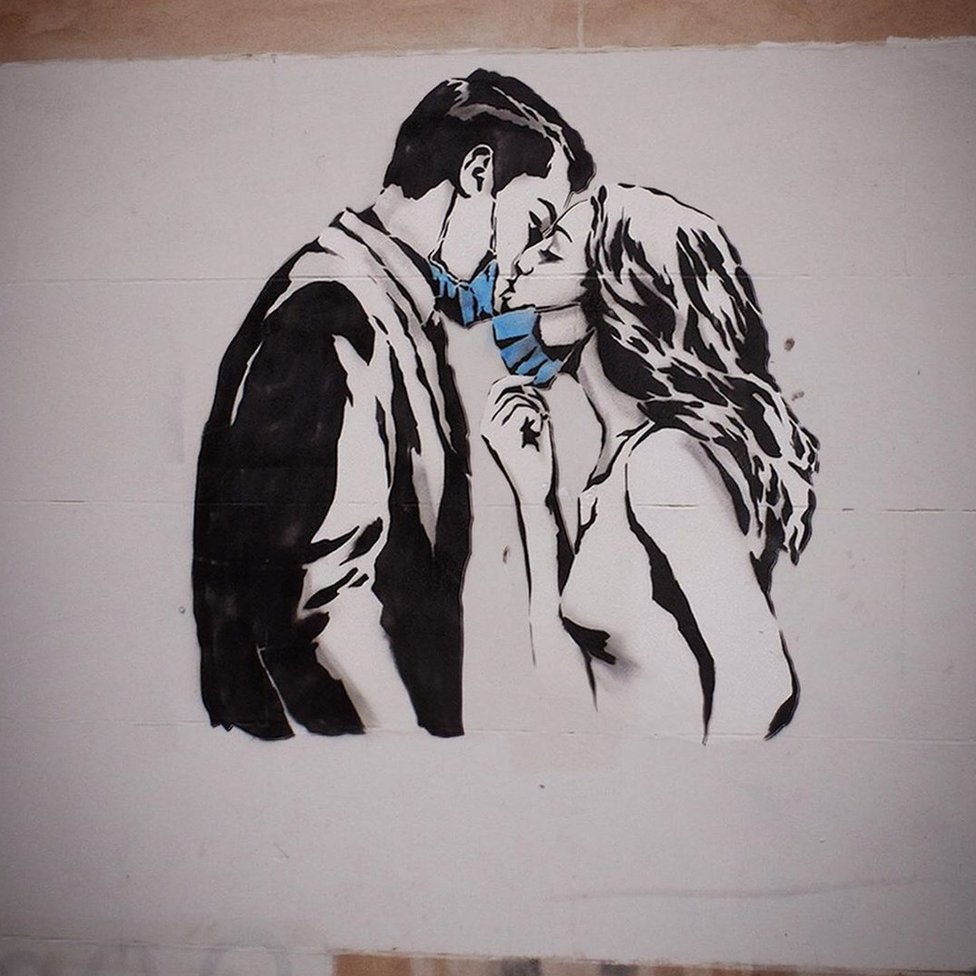
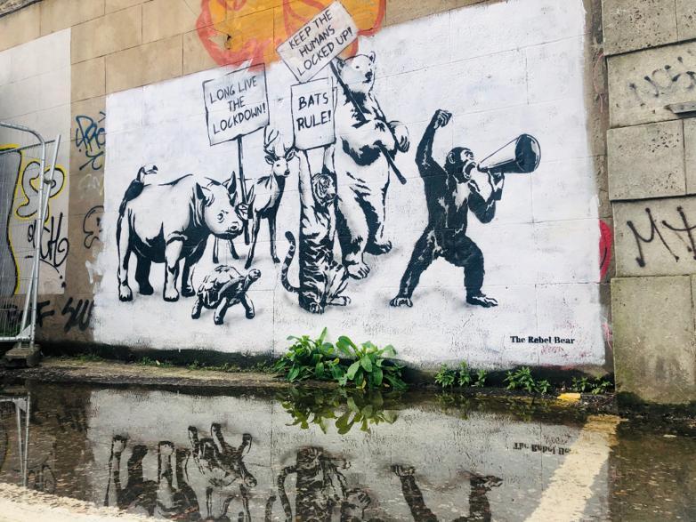
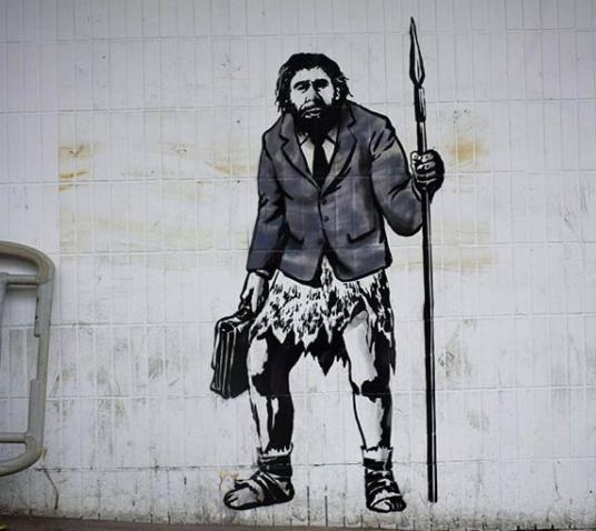
The Rebel Bear (also known as the Scottish Banksy) is an anonymous Scottish street artist who created lots of street art during lockdown and quickly became well known for his often political monochrome graffiti. He says that his work is “not strictly legal”, and apparently goes out in the middle of the night to avoid being noticed or caught by the authorities. His art often has strong political messaging, relating to many contemporary issues like the pandemic, climate change, or the general state of humanity.

EXAMPLES-

MELBOURNE’S POLITICAL GRAFFITI-

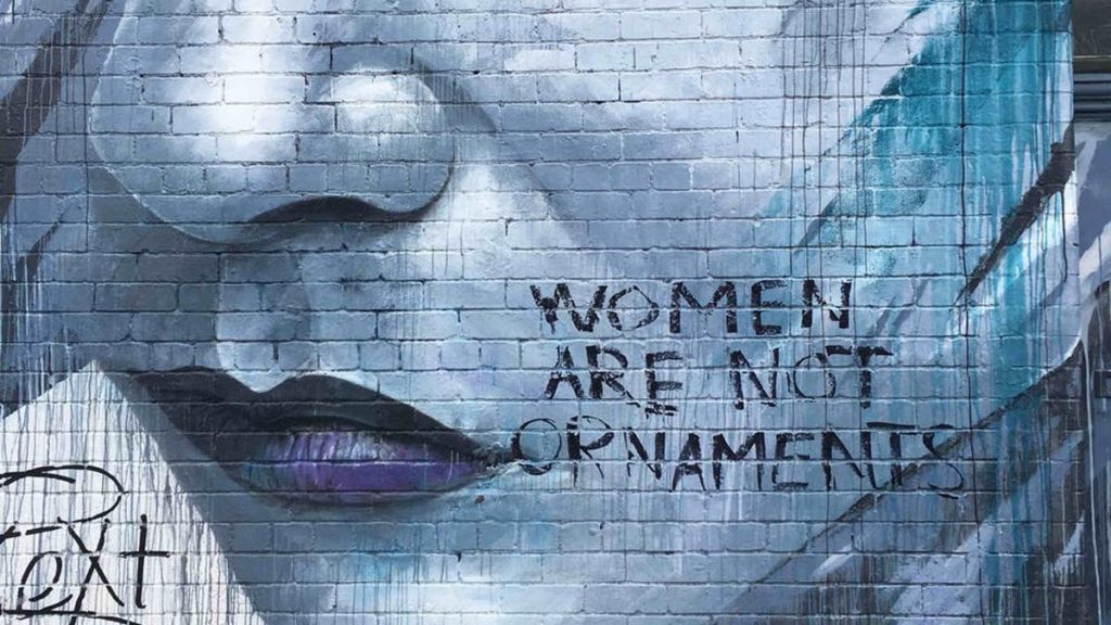
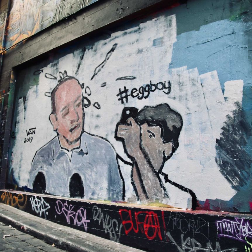
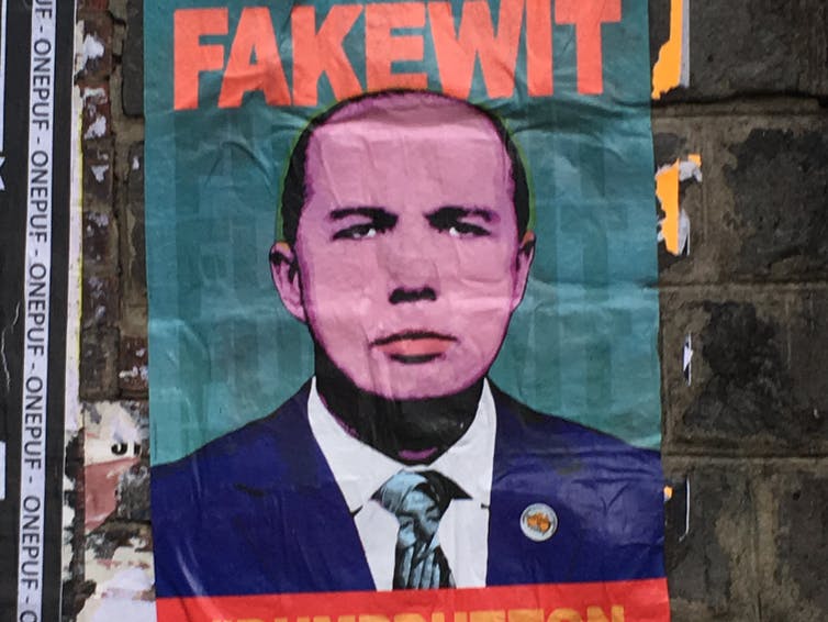
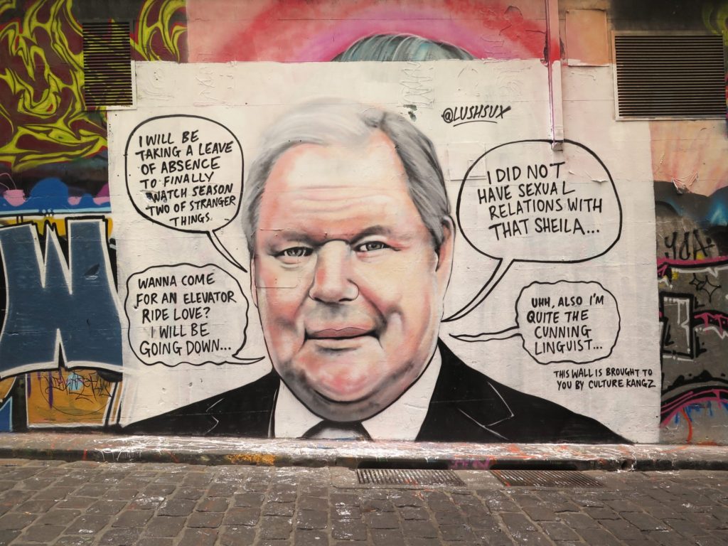
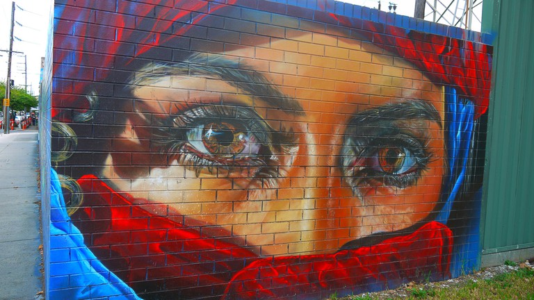
Even more anonymous street art, this time over is Melbourne, Australia, well-known for painting enormous street artworks with strong political messages. The work is almost always highly political, but recently a lot of it has been painted over or taken down, to the outrage of many residents and the artists, who feel as though their freedom of speech is being targeted.

EXAMPLES-