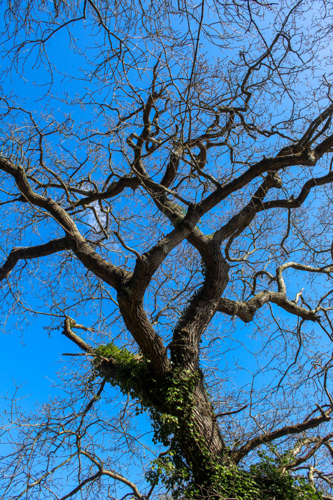
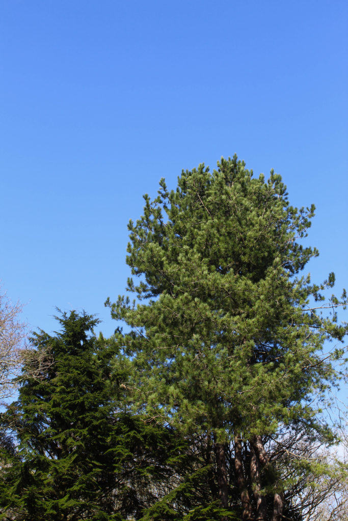
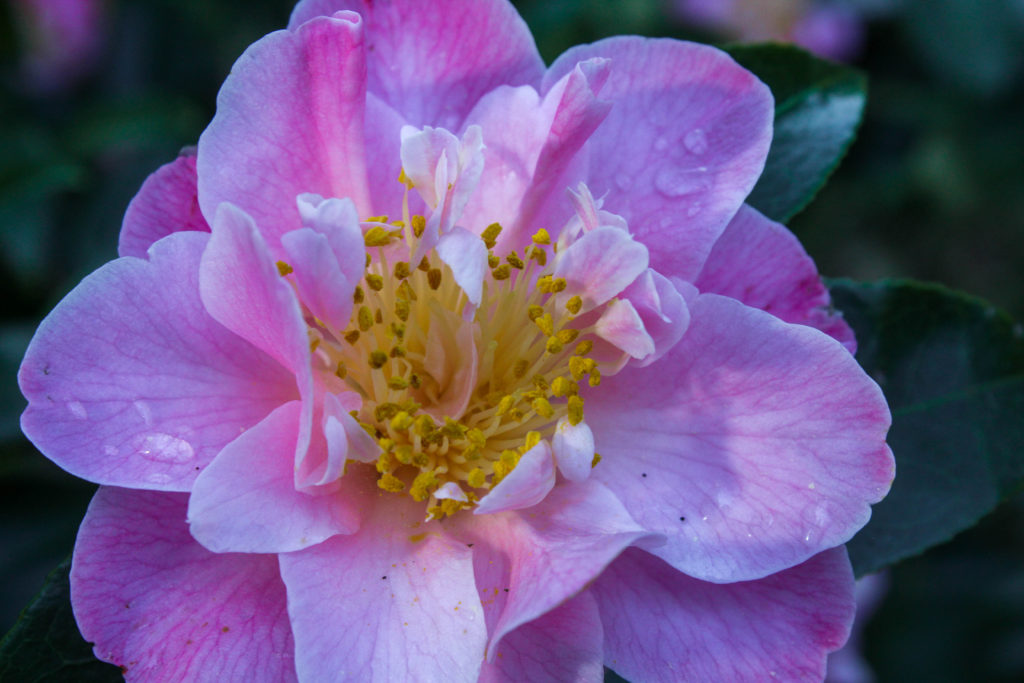
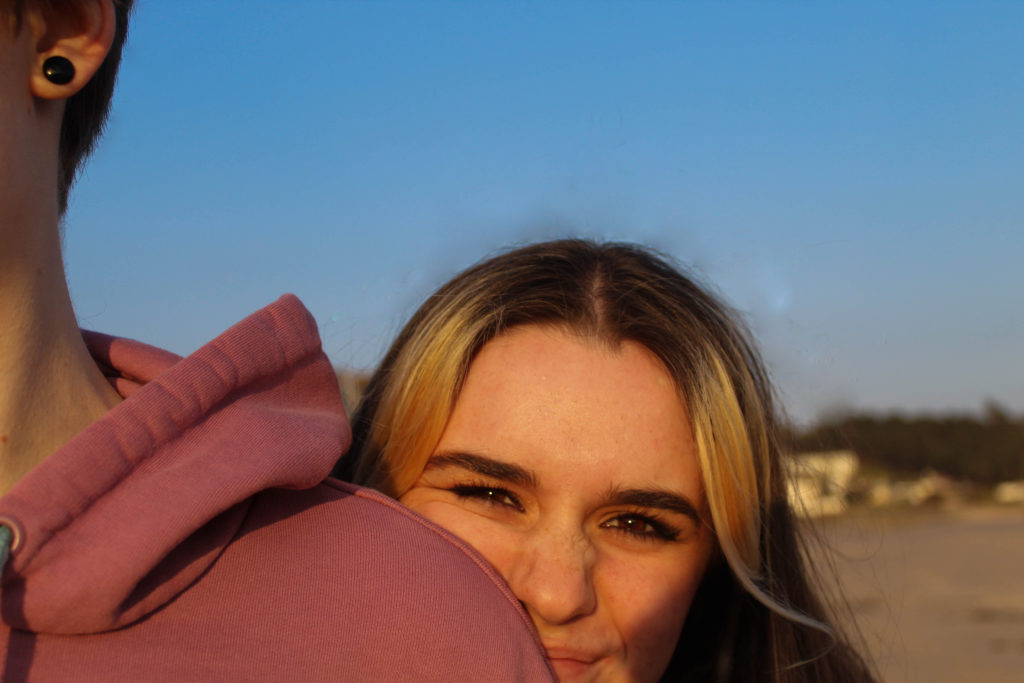
https://www.blurb.co.uk/b/10712153-equinox
Above is the link to my completed photobook in Blurb, with all pages available to look through.
https://www.blurb.co.uk/b/10712153-equinox
Above is the link to my completed photobook in Blurb, with all pages available to look through.
The exam brief was to create a project portraying a transition of some sort. In my statement of intent, I explained how I interpreted it to mean a transition between the winter season to the summer months, from cold, dark weather to warm and brighter weather. I also planned on including some portraits among these images to show how humans also change and transition and age over time. I did both of these things as well as I could have, I think. My process of image selection was quite time-consuming, because of the sheer amount of images I took in order to have the best possible selection of images, but I think it was time well spent to be able to produce the best version of my photobook. In my statement of intent I set out that i wanted my photobook to be in colour, to properly showcase the transitioning seasons, and i kept to this and had all of my images in colour. In my statement of intent I also said that I wanted to insert some quotes or some form of writing alongside my images as well, but I reviewed this idea and decided it wasn’t important and would take away from the final project as a home, so I didn’t do it.
I had a few artist references: Eliot Porter, Robbie Lawrence, Katrien de Blauwer, and I also analysed Rinko Kawauchi’s photobook “Illuminance” to inspire my photobook layout and design. I was inspired by how Porter captured nature with such vibrant colour but still stayed true to it’s original essence, how Lawrence used soft light and how he photographed plants, and also how de Blauwer connected images through their shape and form to create a narrative. I used all of these elements in my own work, as well as including my own personal style.
My final product, the photobook, contains 58 images (not including the cover image, which is also one of my own images) in a carefully curated order specifically planned out to tell a narrative of the changing seasons. Overall I am pleased with the final book and the way it came together as a whole. I think my images were successful technique-wise and in how they contributed to the narrative. In my opinion, my overall photographic technique and skill level has improved through the course of this exam project. If i had to make any changes, or if i had to re-do this project, I would probably try to take more focused portraits and maybe try for more in-depth close-ups. Other than that I’m fairly happy with the project as a whole and I think I accurately fulfilled the exam brief to the best of my abilities.
Now that i’ve gone through all my images and put together a rough layout of how I want them to be in the book, I have to actually put the book together. I’m doing this in Lightroom to make it easier to navigate before moving it into Blurb.
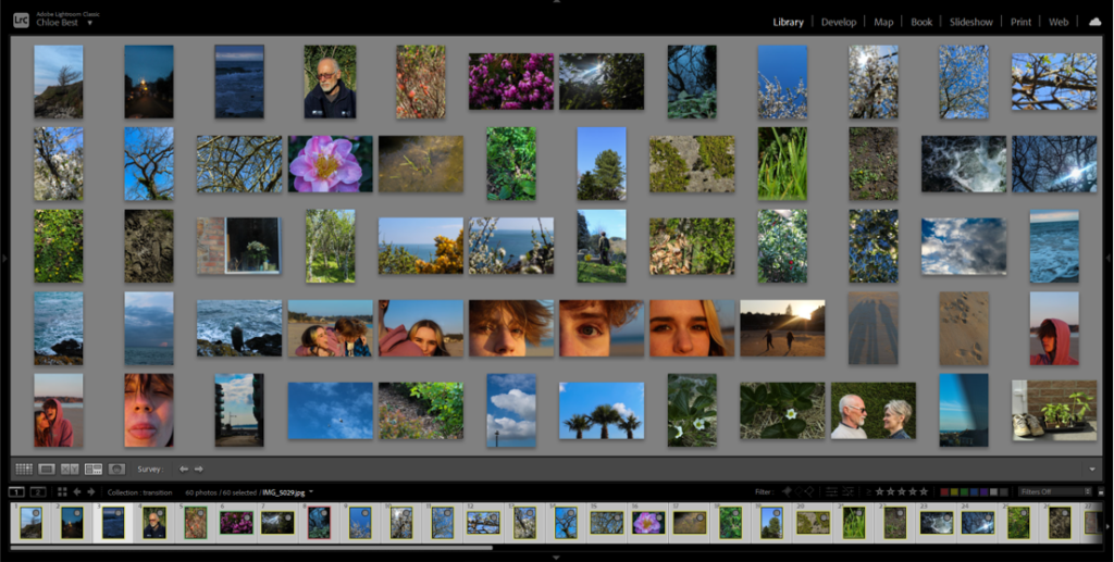
I used survey view to rearrange the images into the pre-planned layout then carried on rearranging it through trial and error, as the way they were before in the rough plan didn’t entirely work out.
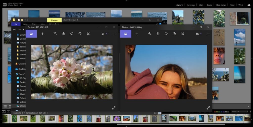
This rearranging process involved reviewing how certain images fit in with the project as a whole. For example, the image above on the right was previously paired with a different image, but on consideration it didn’t look too good with the others so i switched it out for another image from a different shoot. I also removed about three other images because they just didn’t fit in.
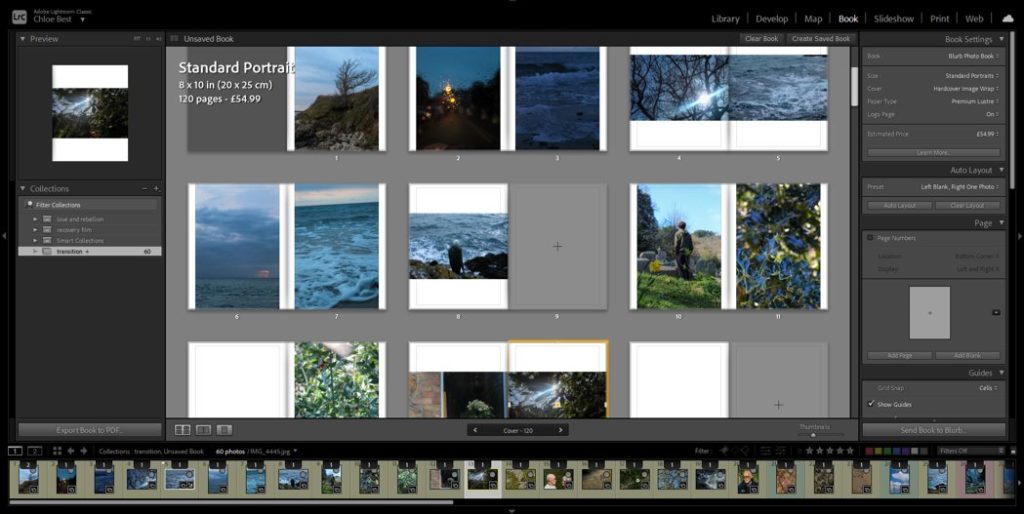
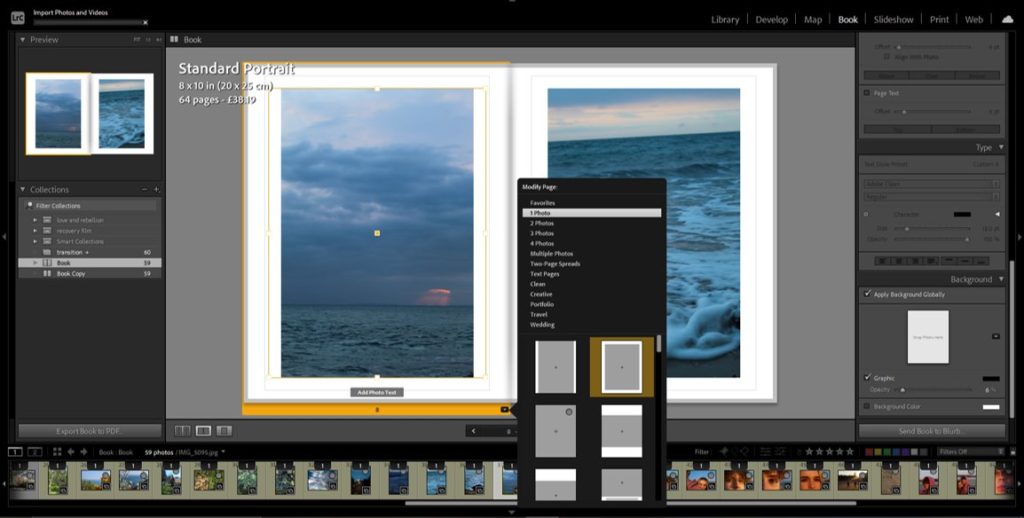
After I had completely worked out the layout I used the “book” tab in Lightroom to begin actually putting together the photobook, and because I had rearranged them before doing this they were already in the correct order.
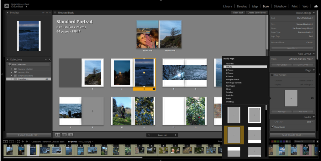
I decided to modify the layout of the portrait images and add a small border, essentially creating a frame within the page for each portrait image. I tried this with the landscape images, but it didn’t have the same effect, so I kept them the same as they were before.
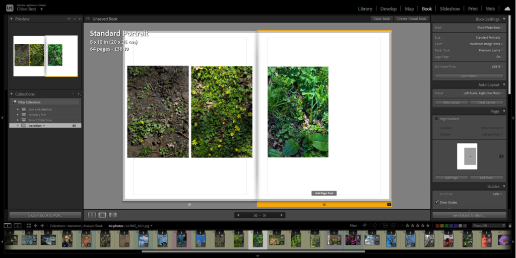
The images above are the only example i have in the photobook of a triptych-style layout. I experimented with a couple different layouts, for example: all three small on the same page, the first two on one side, the second two on the other side, different sizes and orientations. Eventually I went with having the first two images on the same page and the third as close to them as possible on the other page.
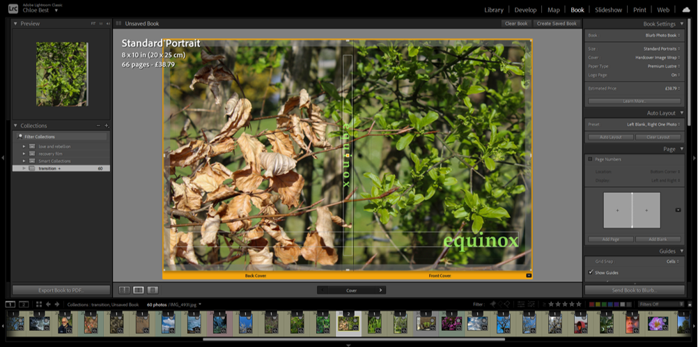
At this point i thought i should probably have a title and cover page. I immediately knew what image would work best to represent the narrative of the photobook; it features dead leaves from winter on the back cover and the new, fresh green leaves of spring on the front cover. I went through a couple of variations on the title, for example “rejuvenation” and “vernal equinox” which is the proper name for the spring equinox. I liked the look/sound of the word “equinox” though. so i just dropped the “vernal”. I wanted to have the title in clear view on both the front cover and the spine of the book, and in the beginning I had them in the colour white. However i thought this look had too harsh of a contrast and although I tried experimenting with the opacity, that just made the writing look grey in the end. I thought a pale green would be a good colour as it is often associated with spring and the season of transition, as well as the fact that there is already green on the cover so it looks more cohesive.
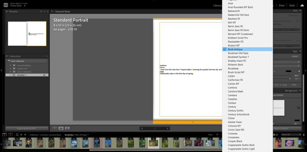
In the beginning i intended to have a few words here and there throughout the book, possibly about people’s perceptions of spring and the changing of the seasons, or even some more formal famous poetry of some sort about the same thing. However after working with the images on their own I felt that having words would be too distracting to the overall effect. But i thought it would make sense to have some sort of text at the beginning to clarify the link between the title and the photobook narrative, as well as add some explanation about the narrative itself. So i created a couple lines mimicking a dictionary entry, just before the photos begin.
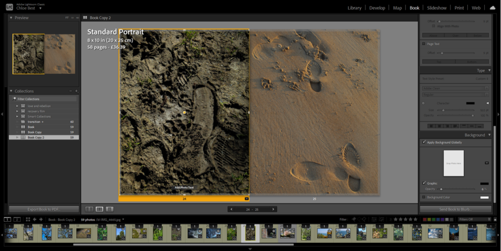
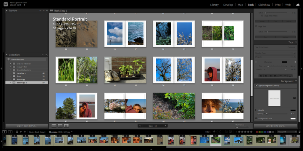
I chose to mix up the layout of some of my images so make it more interesting; I did this by making some images full bleed instead of having that same white border. Some I had only one image in the pair be full bleed, but i also had one where both were full bleed. I also made a couple of the singular images into a full bleed two-page spread for further effect. Above you can see examples of some of the changes.
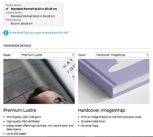
Finally, I uploaded the book from Lightroom to Blurb and adjusted how I wanted it to be produced. I decided to have it portrait because most of my images are portrait orientation so it would make the most sense. I chose the paper to best show the photographs, and I chose hardcover because I like it the most. Then I finalised the upload to Blurb so that the photobook is able to be ordered and bought.
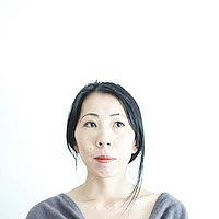
Rinko Kawauchi is a Japanese photographer whose work is defined by her almost poetic style and the peaceful subtle beauty they have. She works mainly in colour, but her images aren’t always particularly bold in their use of colour. What I take most from her work is how she transforms an otherwise ordinary moment from the most mundane of daily routines and turns it into something beautiful and incredibly artistic.
Her photobook “Illuminance” in particular interests me, not only because of her particular use of soft light, but also because of her use of juxtaposition in her photobook layout. She seems to have a clear idea of the form of her images, their lines and structure, and she is particularly adept at marching them up and creating this feeling of linking completely different images together through this. For example, the middle left image seems to be comparing a droplet of water on a leaf with a small diamond, perhaps revealing her own personal beliefs and view of the world at the same time.
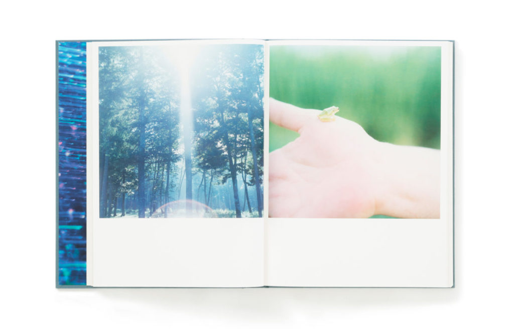
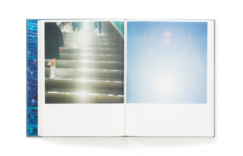
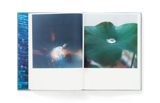
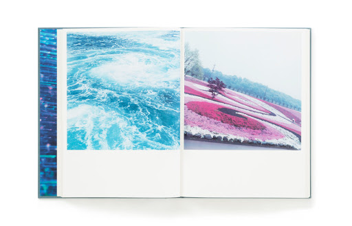

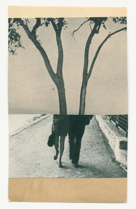
This sort of comparison between natural and manmade, between different landscapes and people and situations only connected by a similarity in their shape/form is something that i am planning to do within my own work. For example, a comparison between the figures of trees and of people seems like it would be quite effective and it is in my plan to do.
These are just my selected images from the two new shoots along with the unused images from the original layout plan I did.


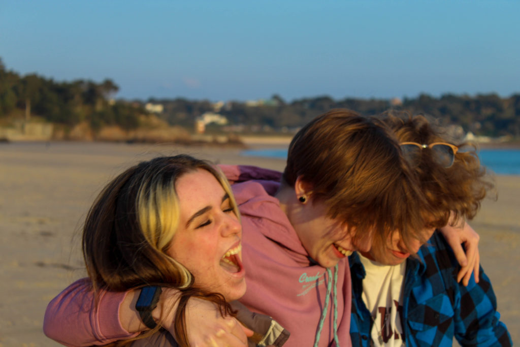
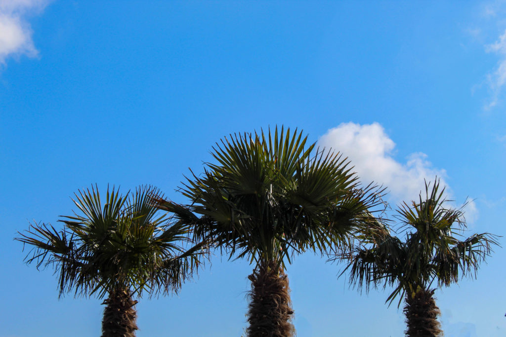
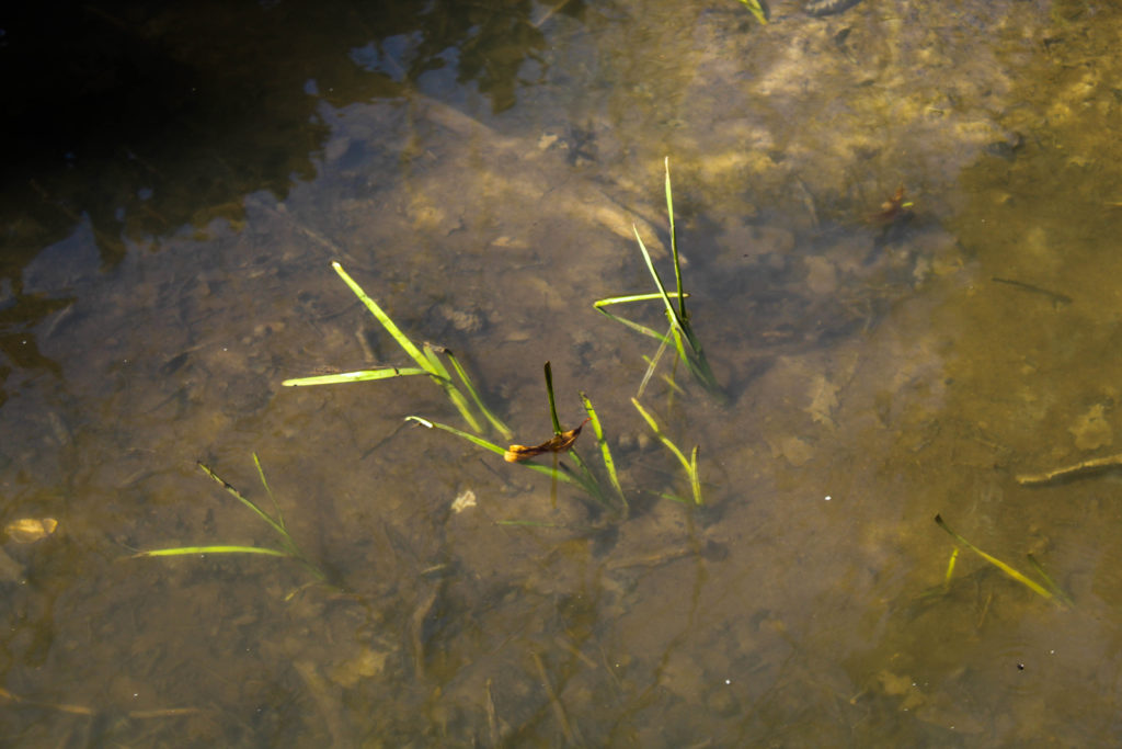
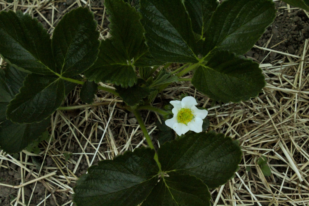
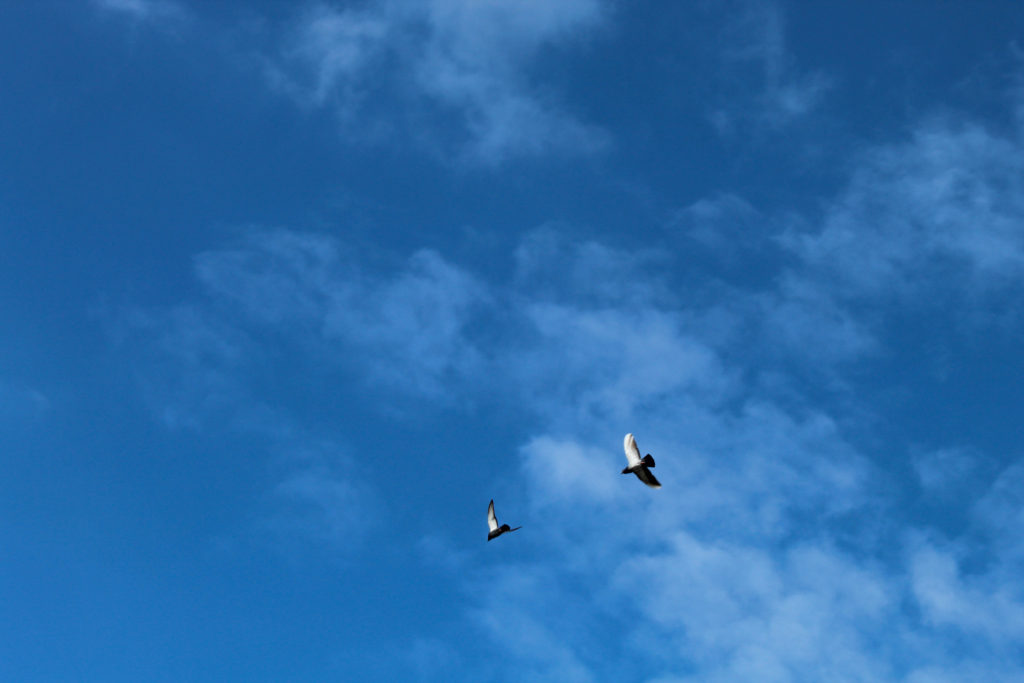

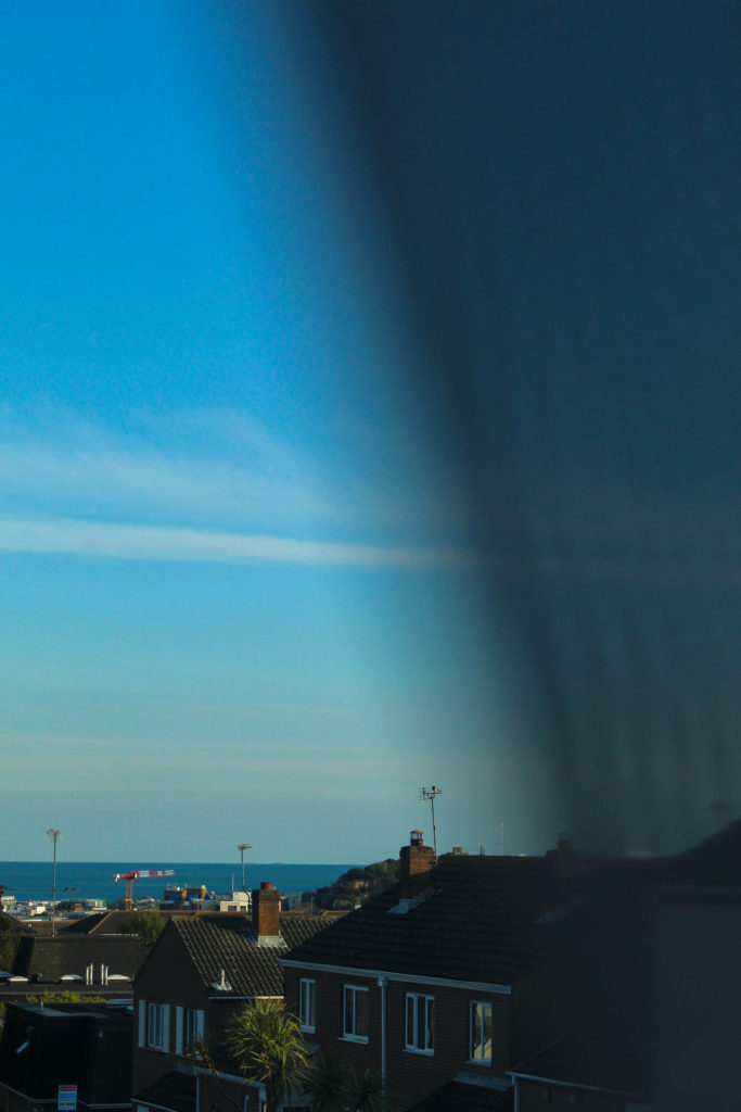


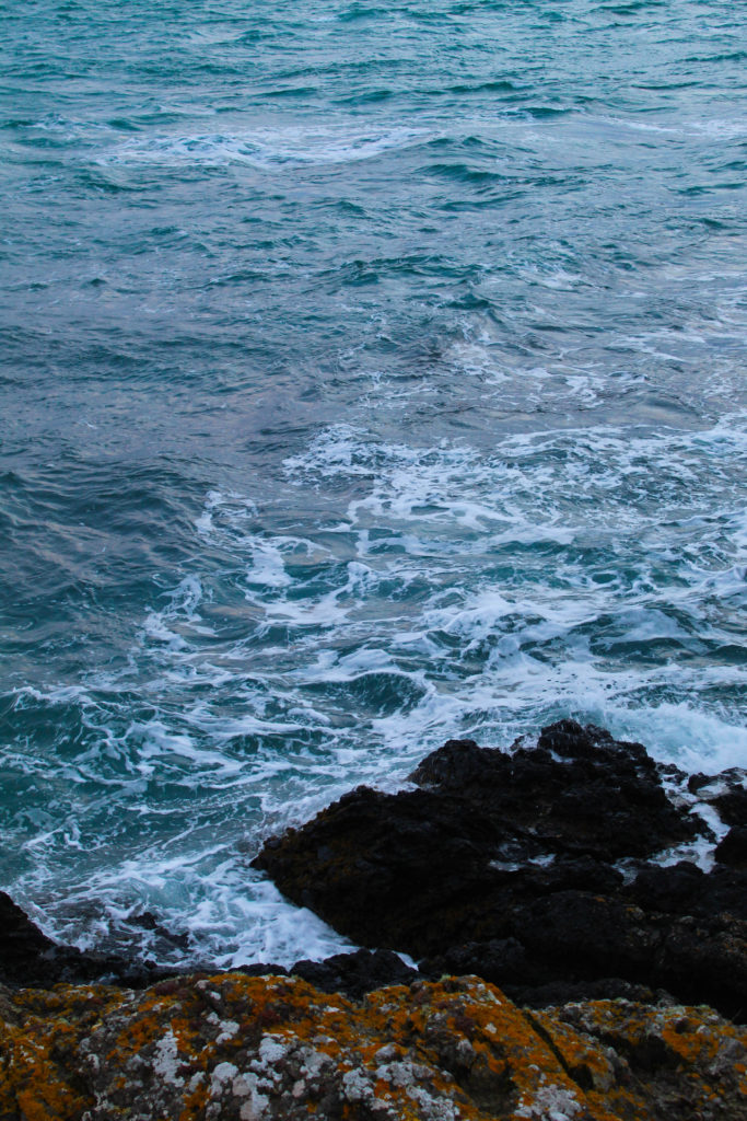
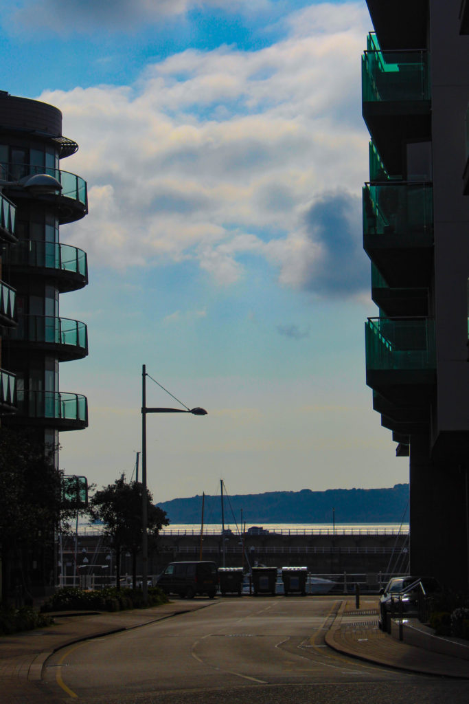

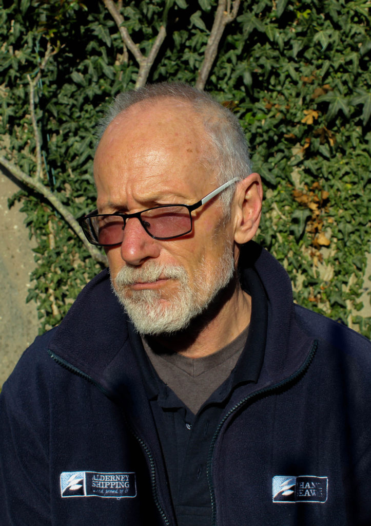
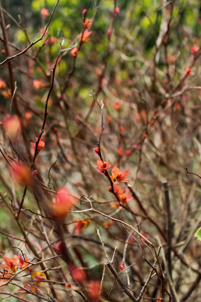


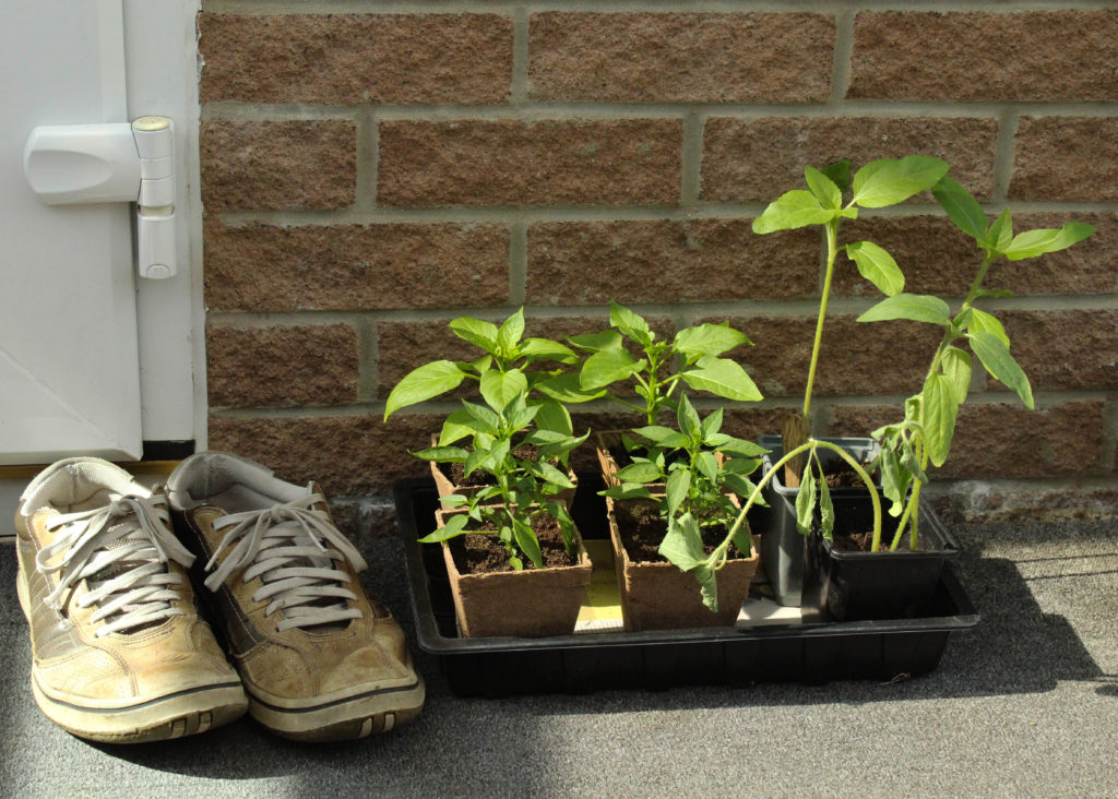
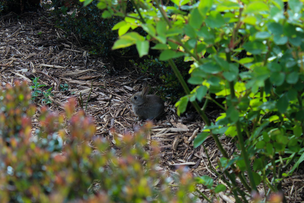
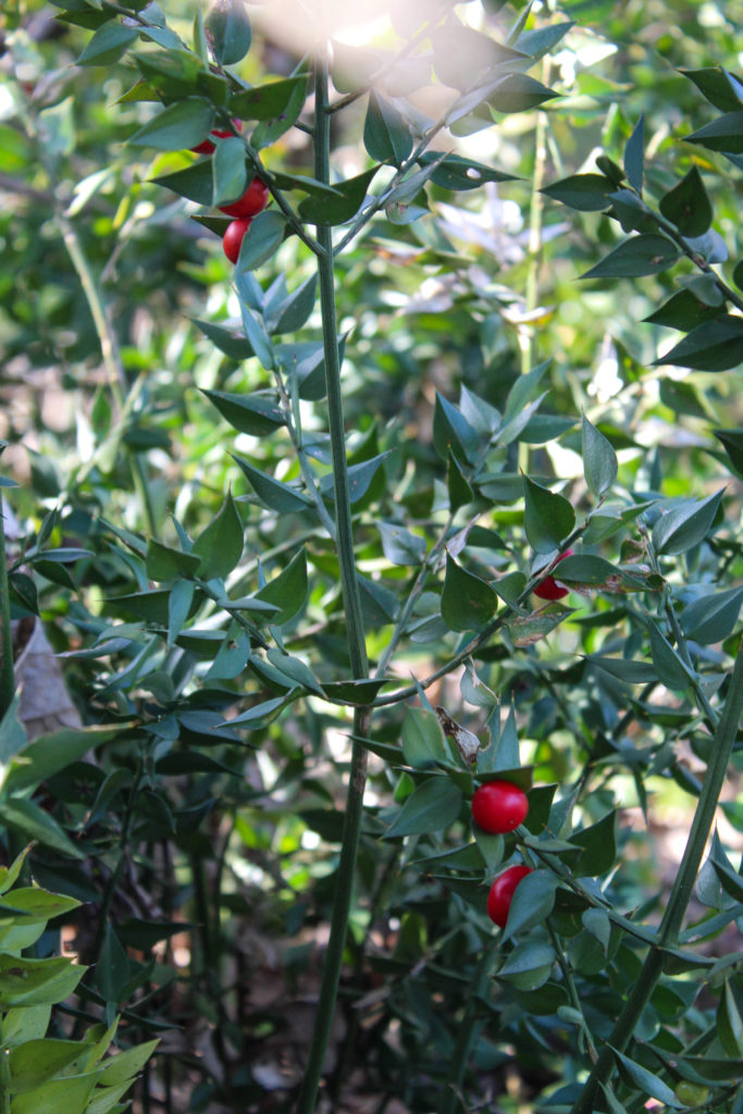
I’ve now gone through all of my shoots, paired/layed out all of the images I can and reviewed and removed any images that just don’t work with my project as a whole. I know that as I move on to actually creating the photobook I will probably cut a few more images out and re-work the layout as I go along, but that depends on whether they turn out differently in the final product than in the temporary blog post layout here.
All in all I’m okay with the selection and layout of images I have here and I think they showcase the best of the shoots I did. Moving forwards, I’m going to put them into the photobook and do some more experimentation with the order of the images and how it forms my narrative, as well as possibly adding text of some sort.
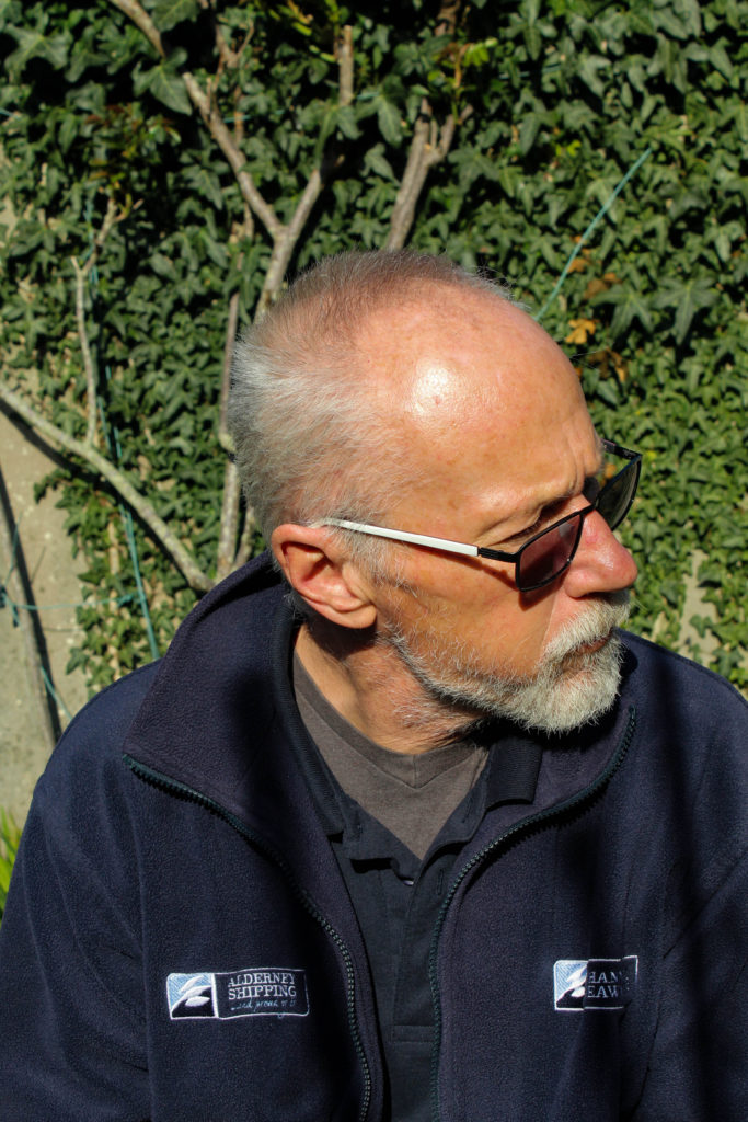
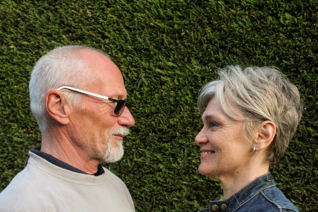
For this shoot i wanted the location to be in my garden because it was easier to control the background. I wanted to take pictures of my parents to contrast against the pictures of my friends in the later sections of the book. I used the same selection process in Lightroom with the colour labels, but this time it was easier to select my final images as I already knew what specific images i needed them to work with. I had individual portraits of my dad as well as both of my parents, and I also took a few images of the strawberry plants in the garden because they’re just begun to bloom properly.

I was working with fading sunlight at the time so I only took about 50-something images.
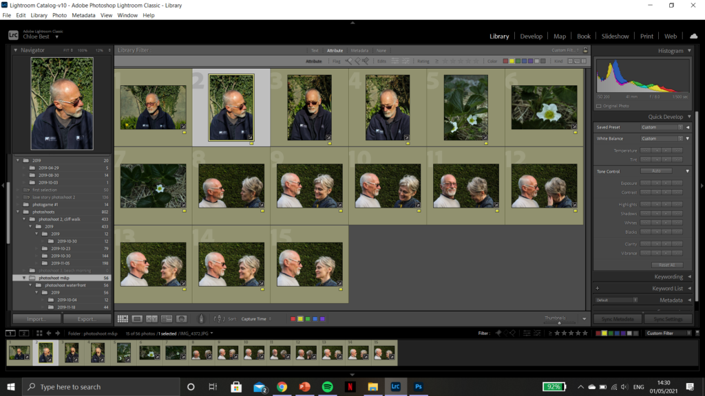
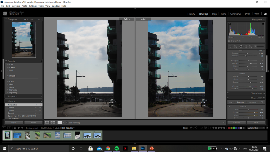
Then I got them down to 15 images that i felt were worth going through and editing. My editing process has also stayed pretty much exactly the same throughout the whole series: only correcting minor flaws and improving technicalities in the photos, as well as tweaking the colours slightly sometimes to fit better with the theme and the other images. Below are some examples of the before and after of a few images.
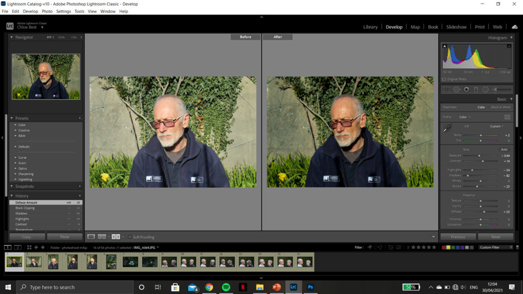
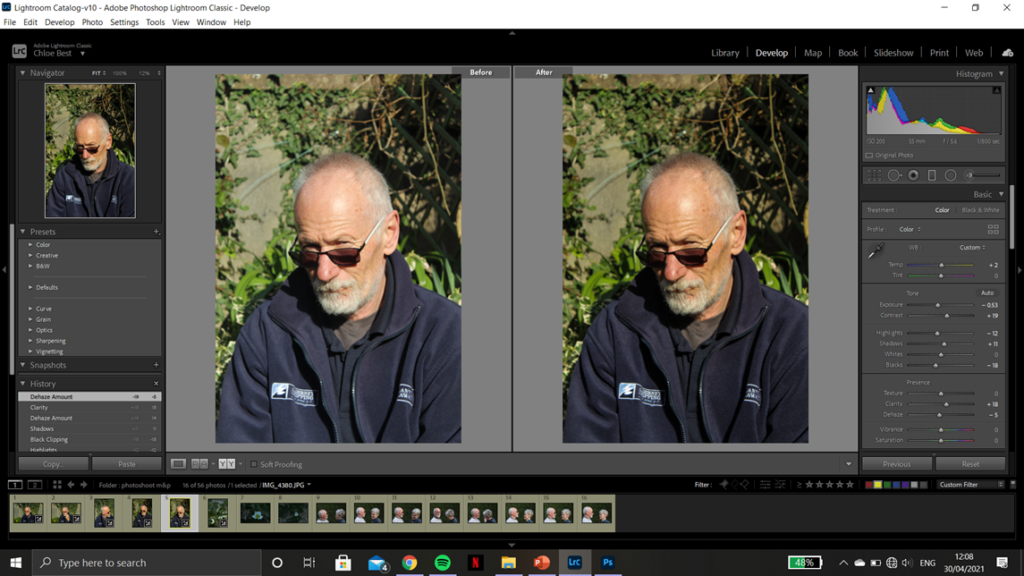
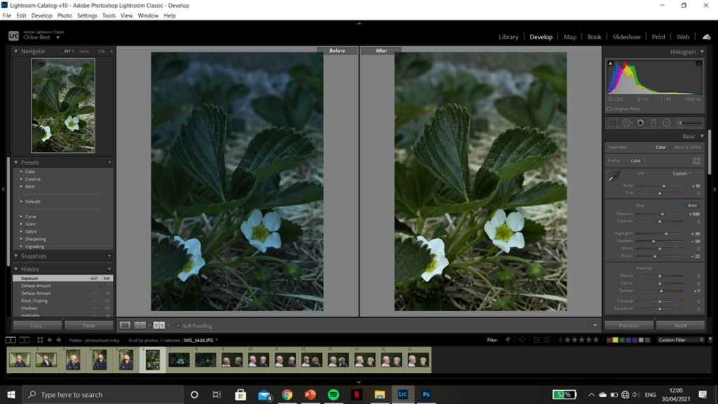
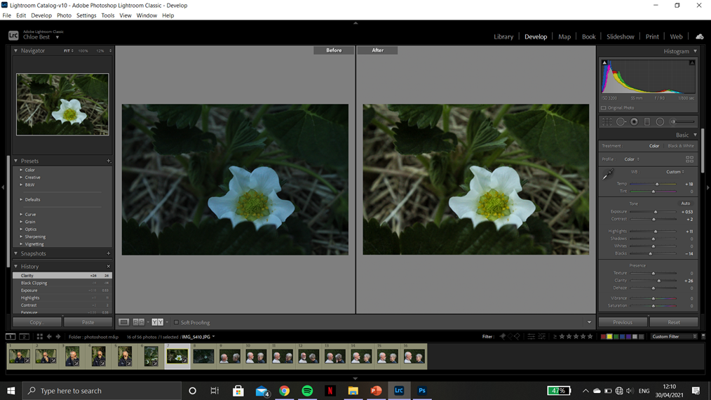
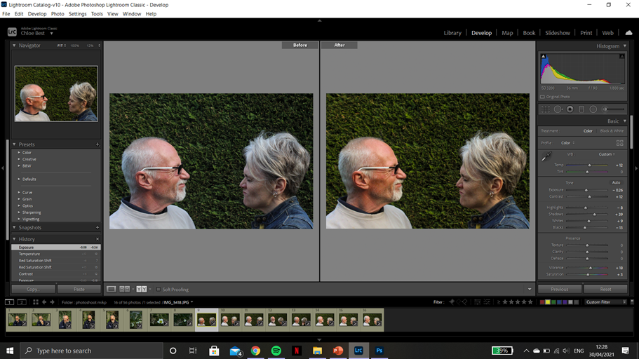
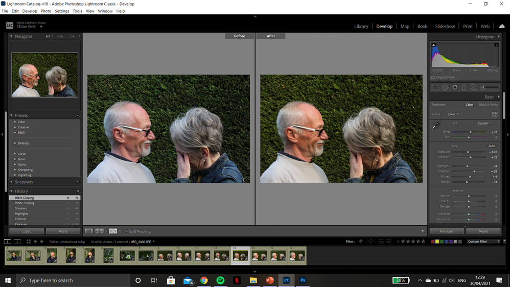
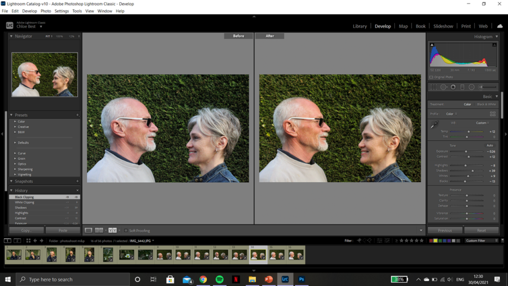
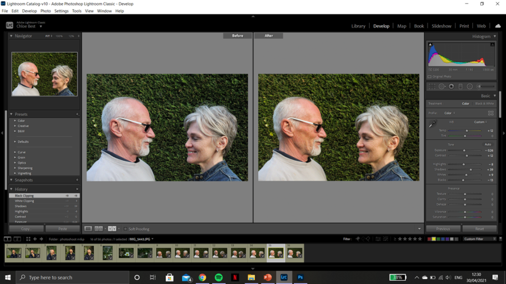


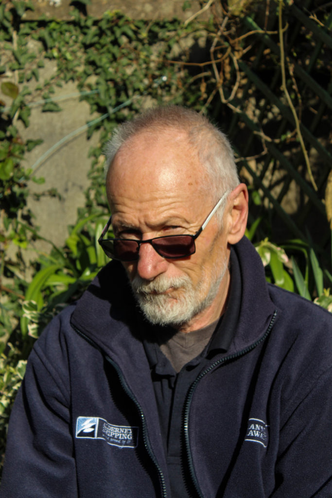
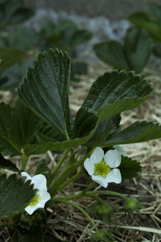

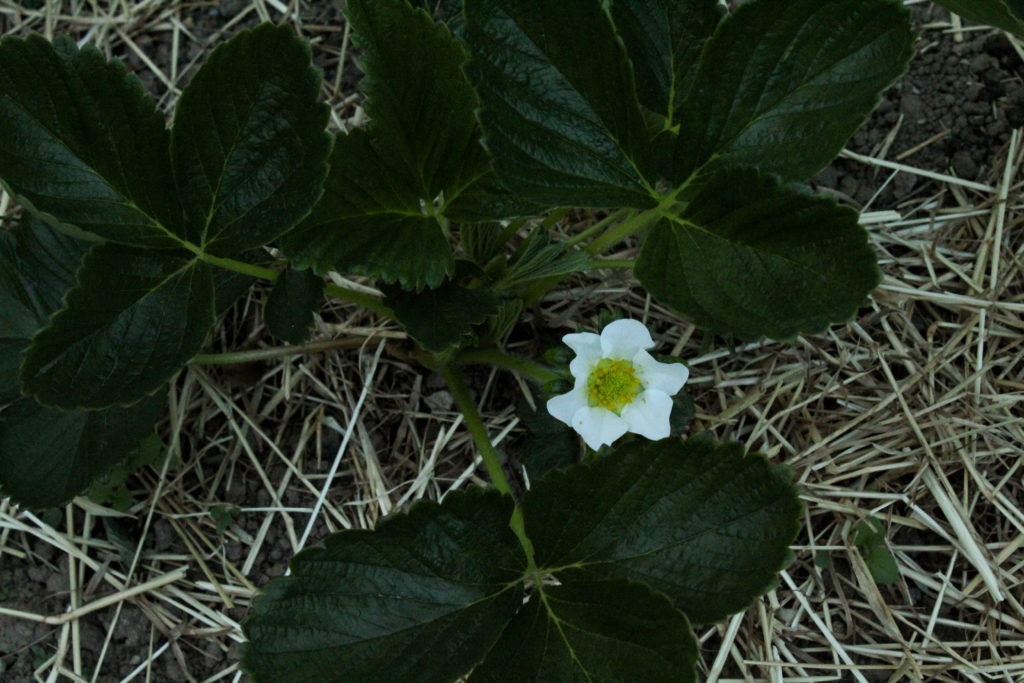

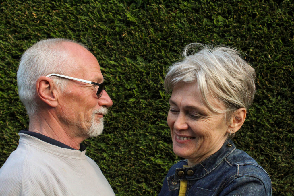
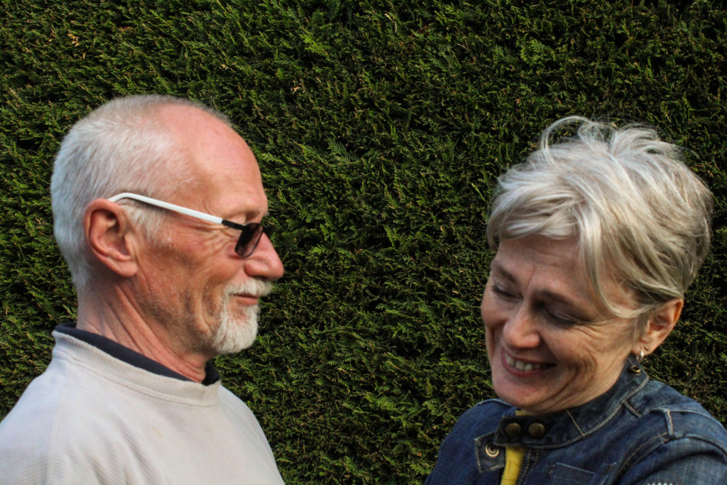
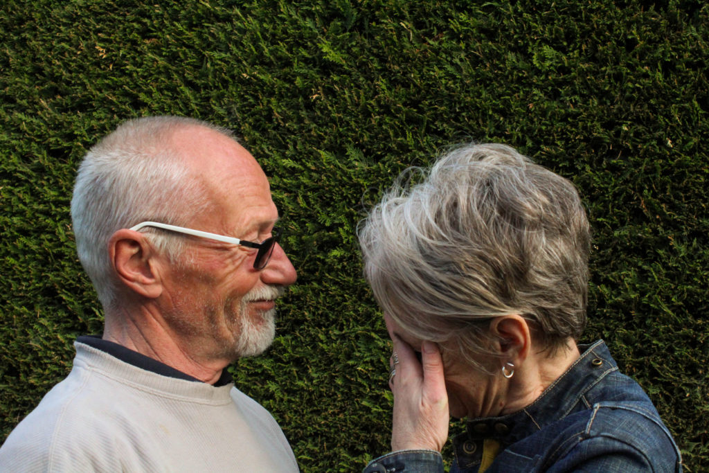
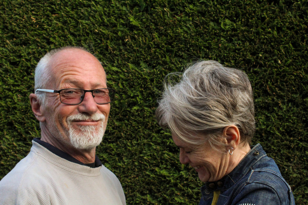
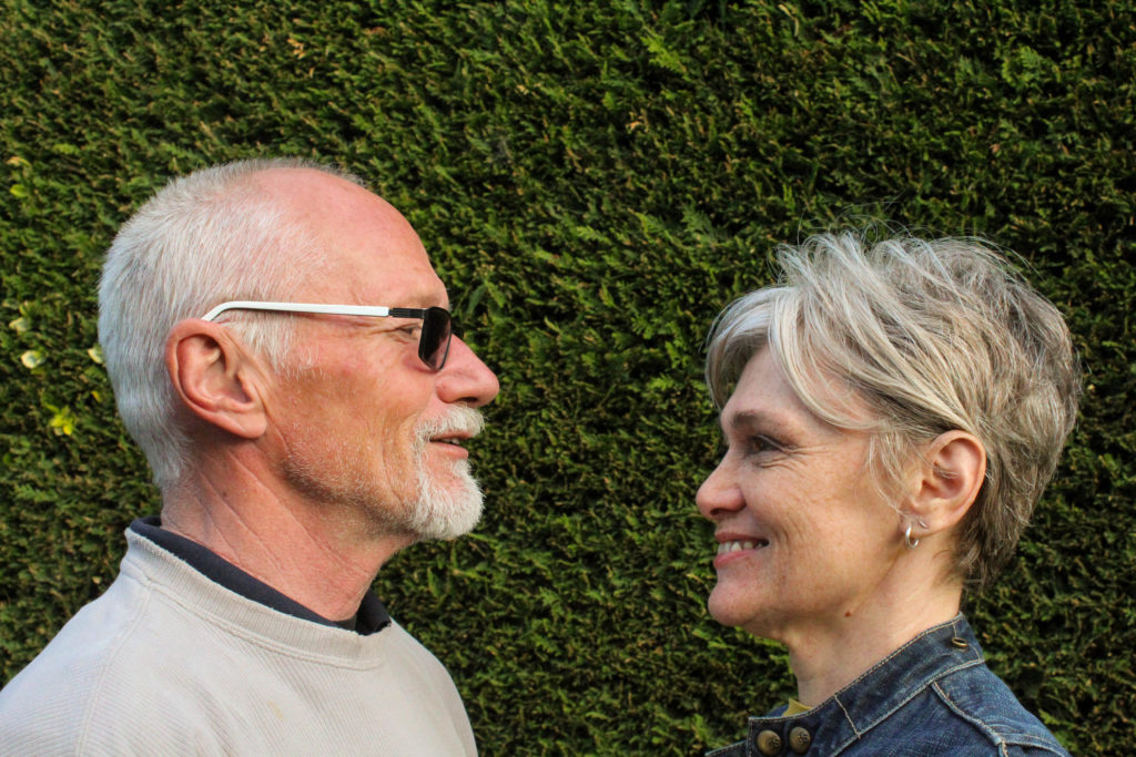
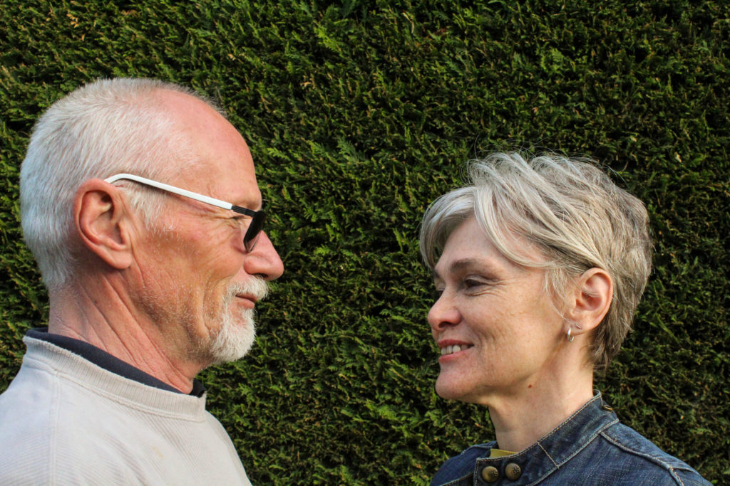
I’ll probably only use three or four of these images and will have to use trial and error to see which fits best, but the image below I know i’ll use for sure. Of the images taken with both of my parents there wasn’t one that had them both in the right position and properly focused, so I decided to use Photoshop and splice two image halves together. This was pretty simple and it didn’t take long to produce the final product, and i think the end result is fairly seamless and natural-looking.
This shoot was pretty short because I only wanted to fill in the gaps of some necessary images. I went down to the Waterfront green while it was sunny because the gaps i needed to fill in are in the “summer” part of the project, and i ended up with about 20-30 images to sort through in Lightroom.
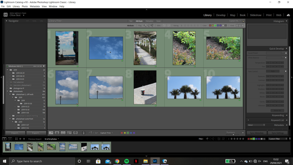
After going through them I ended up with 10 images to move on with. A couple are the same image in both portrait and landscape because I’m not sure which orientation fit best with the rest of the book layout, but I’ll decide which to keep after some experimentation. Below are the before and after screenshots from the editing process showcasing what adjustments I made and how they improved the image as a whole.

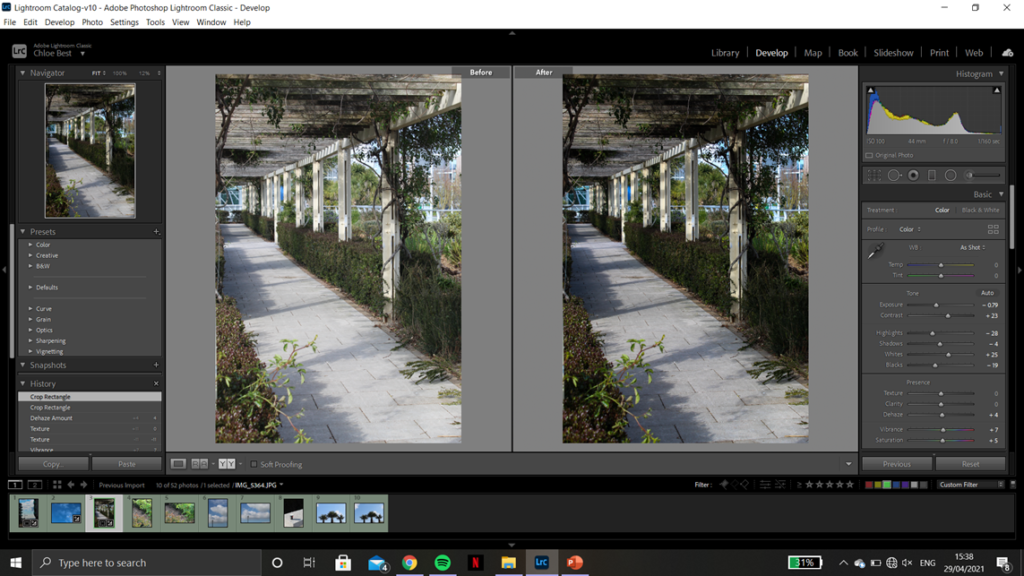
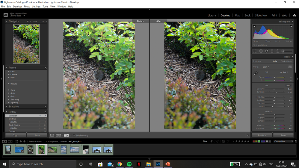
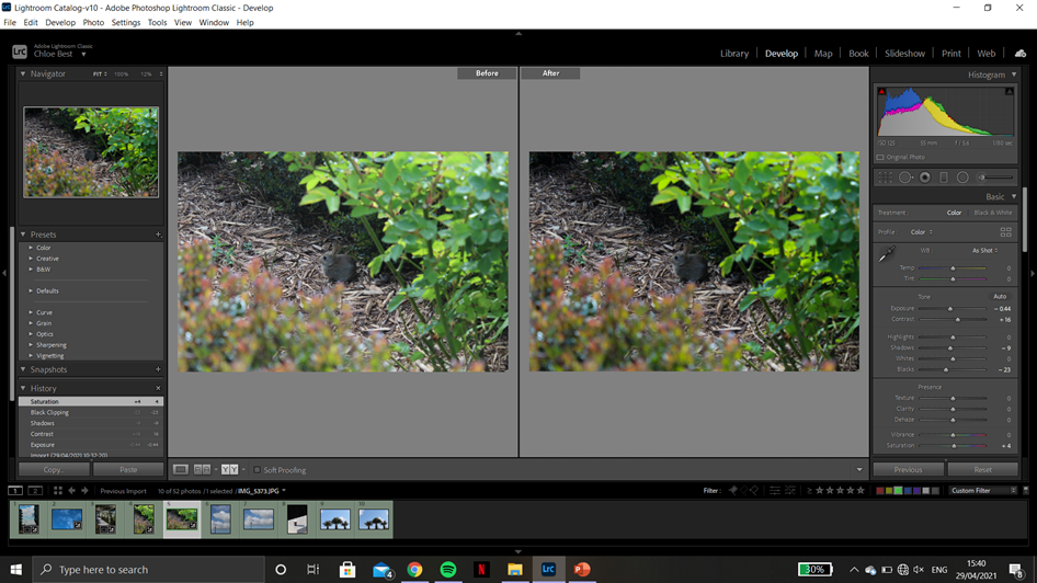
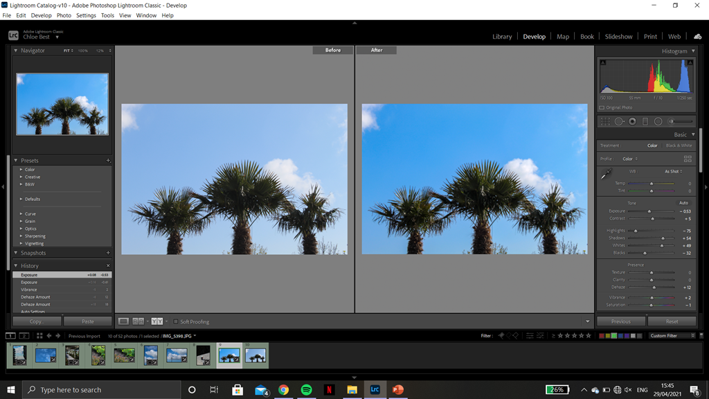
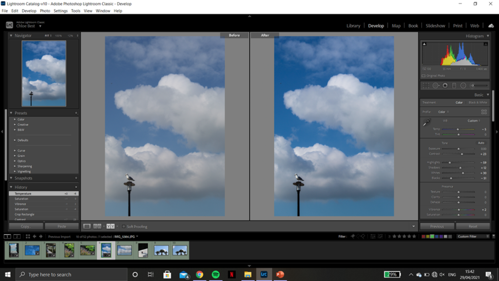
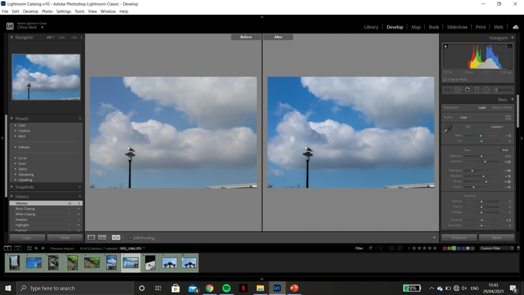
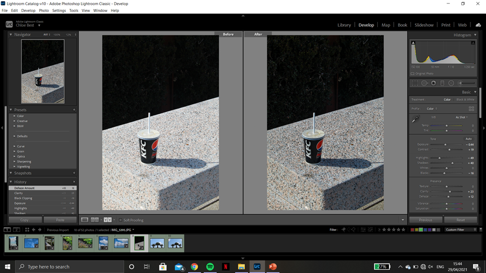
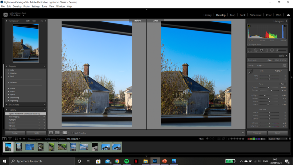

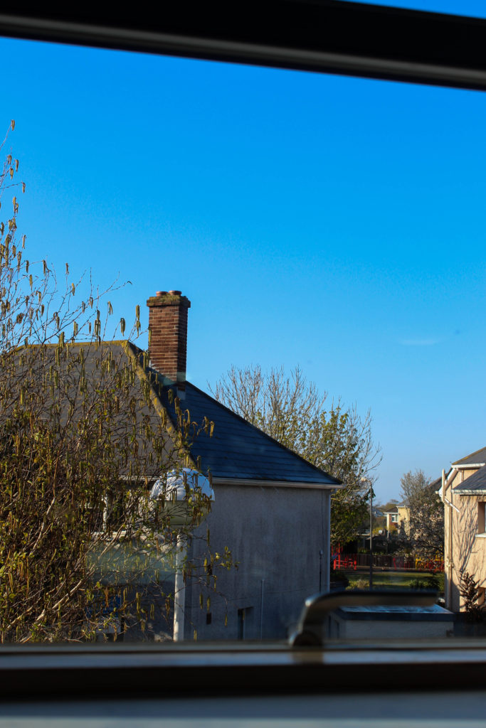
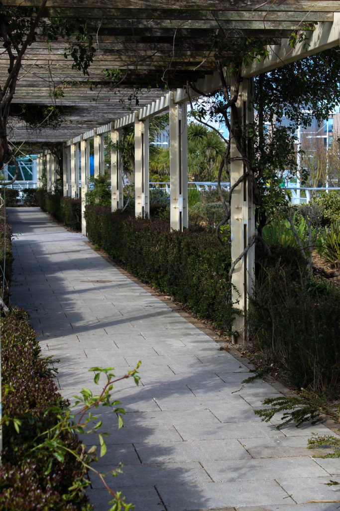


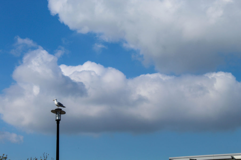
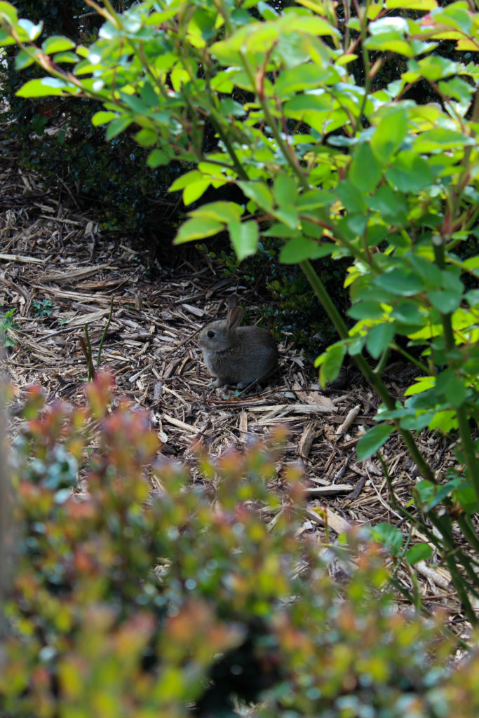


With the last image, I imported it into Photoshop t remove a few stray branches coming up from the bottom form surrounding trees. This was done using the spot healing and the healing tool to remove any distractions and keep the three trees as the main focus of the image.


I liked this layout because it both images are similar in that the main focal point in the singular stem of a plant with a more crowded background, and also because it showed the transition from winter-type plants to more spring/summer flowers.
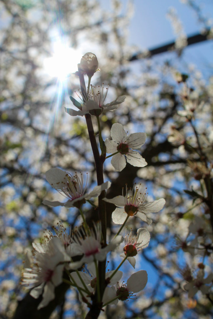
I think i prefer this layout because both images have similar colours and they are still the same sort of image in that they have the main focal point front and centre. However, they are both summer/spring feeling images and the left has a much more simple background, providing some contrast. Overall these two images together feels more cohesive and artistic than the previous pairing.
I think I’m going to use the other image from the old pairing as an individual image in the book, because I do quite like it.


I paired these images together because they both had a sort of circular shape in the bottom corners, and they were both wintery and cold in feeling. However I don’t love how they work together which is why I’ll be trying out a couple other images instead.


I wanted to keep the image on the left from the previous layout because I think i have too many plant-based images otherwise, but it proved difficult to work with and I don’t think it would have worked well as a standalone image in the photobook. In the end I put it with the dark-clouds image but I don’t think it worked.
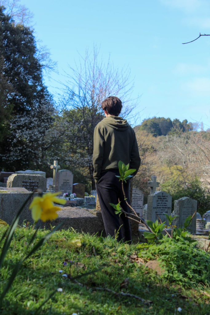
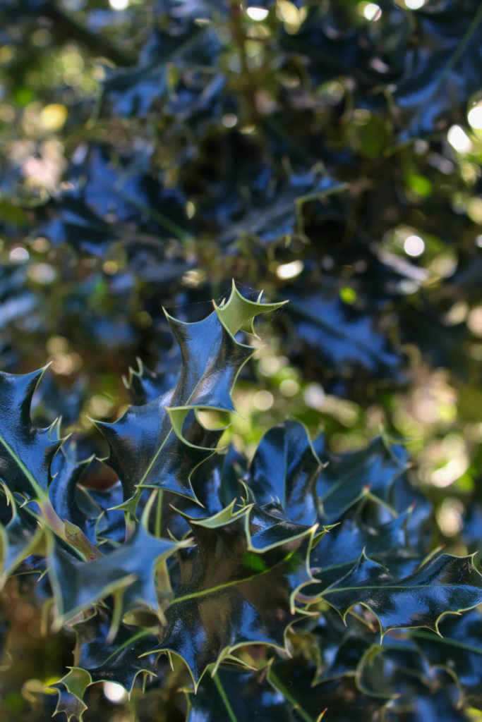
What i like about the image on the left is how the light reflected off the dark green leaves looks almost blue. I chose to try it with the image on the left because i felt there was a lot going on, particularly in the background, and the image on the left is fairly simple. Also, I class them both as winter photos as the right features the holly plant and the left is at a cemetery, symbolising how winter is traditionally thought of as a season of “death”.
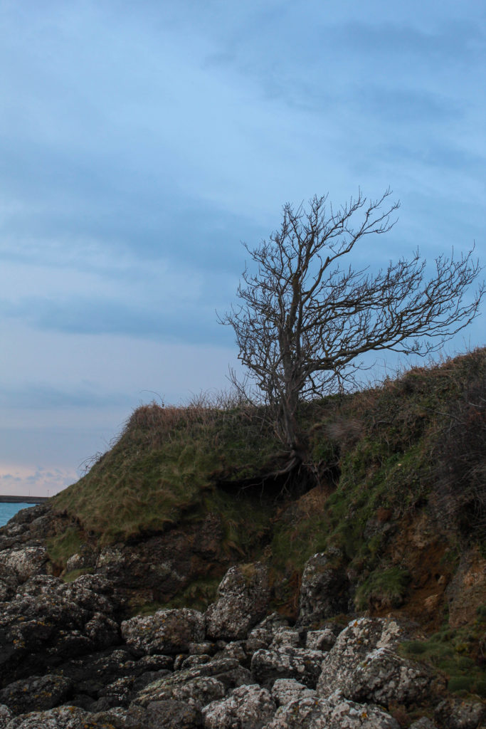
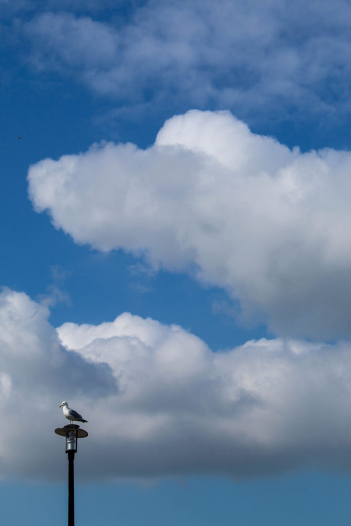
I kept this image as a standalone photo because I thought it would be a good opener to the book, but after working with some of the newer images I thought I should probably see how it looks with a pair.


I chose this image because they both have a similar “wintery” vibe to them, meaning they are both cool-toned, as well as the fact they are both fairly simple images with no crowding in the background or the foreground. However I think I’m going to keep this image as it is (standalone) because I still think it works well as an opener and I prefer it this way.
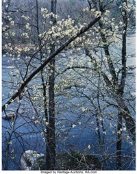
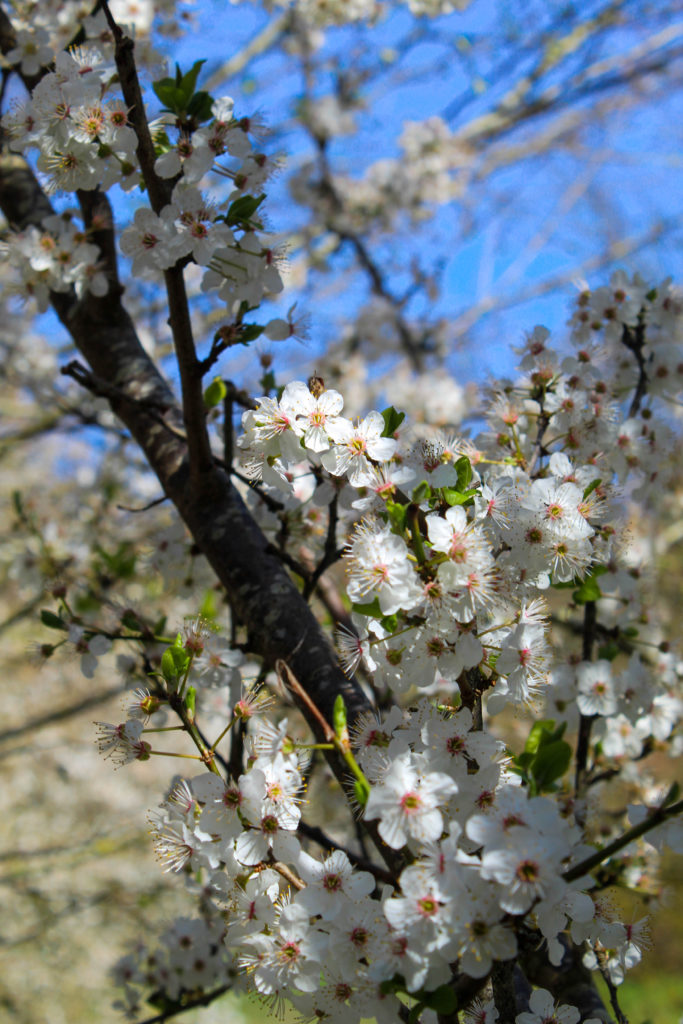
Eliot Porter was the first photographer i researched and i was really inspired by how he captured the beauty of nature with such bright, vibrant colours that still felt natural and true to the original scene. It inspired me to work in colour for this photobook project, as I usually tend to switch to black and white for my still images. I was particularly taken by the far left of his images below, and i recreated it with a little series of three images below depicting the changing seasons.
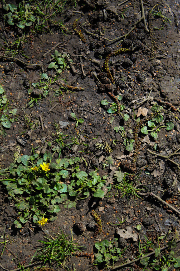

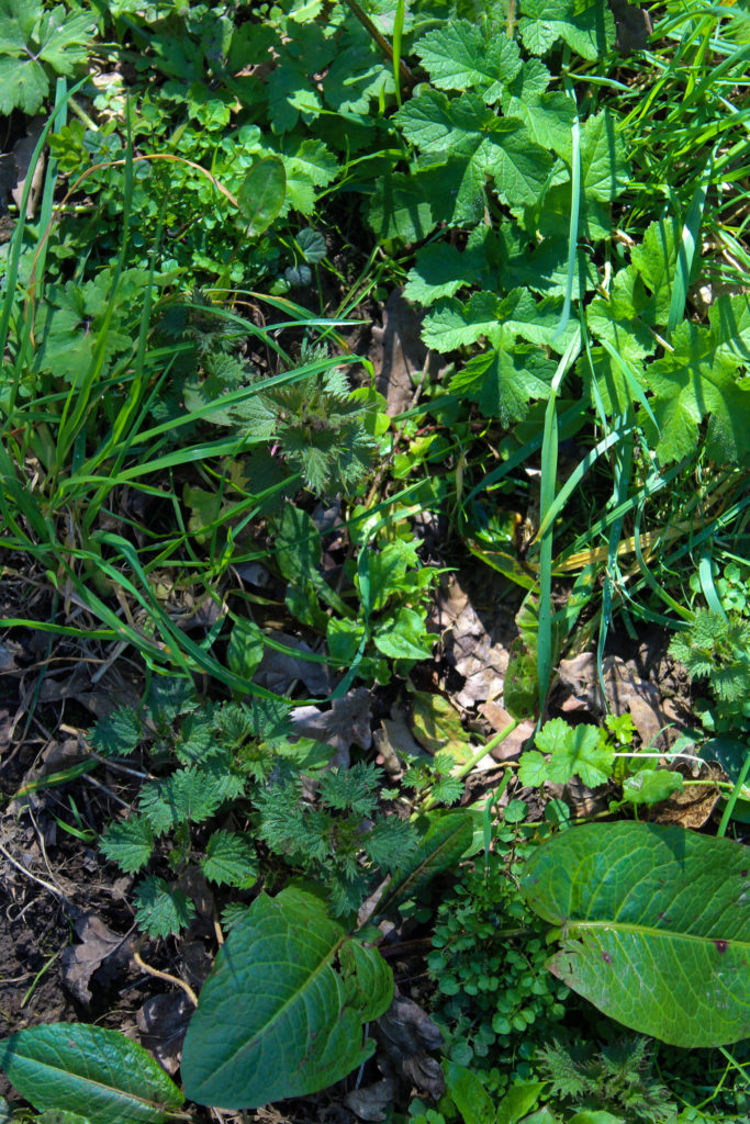
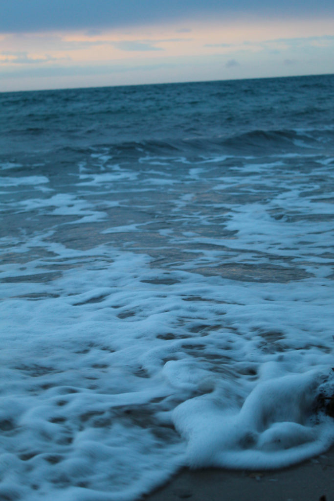
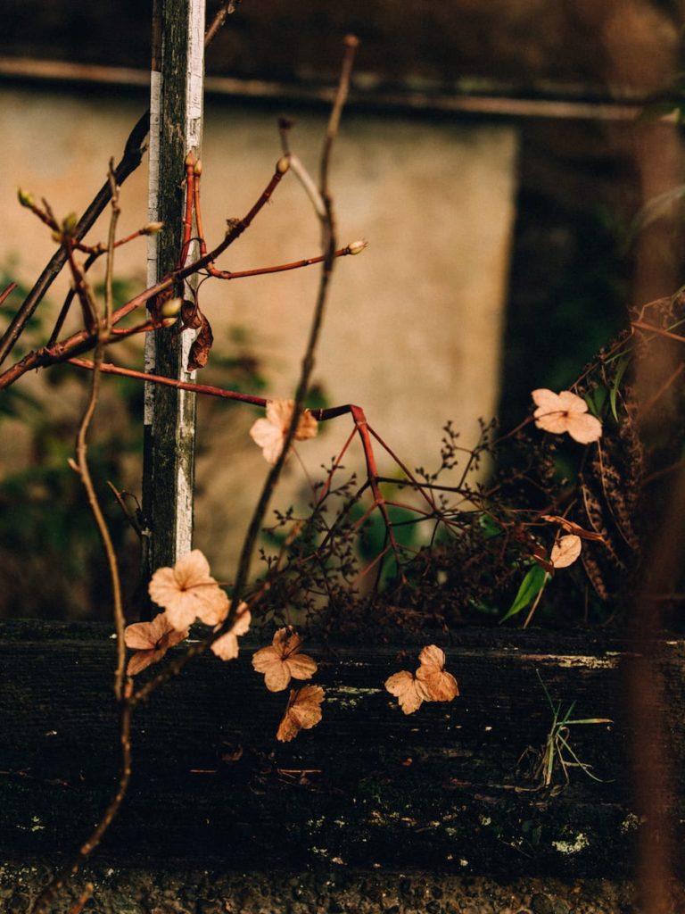
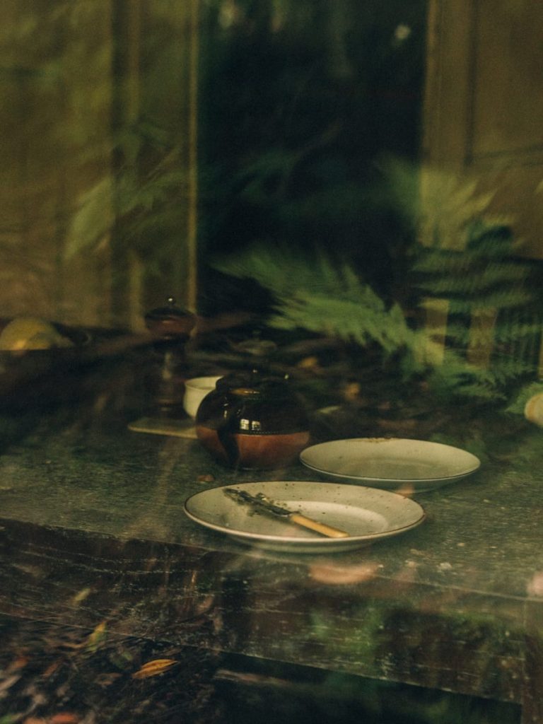
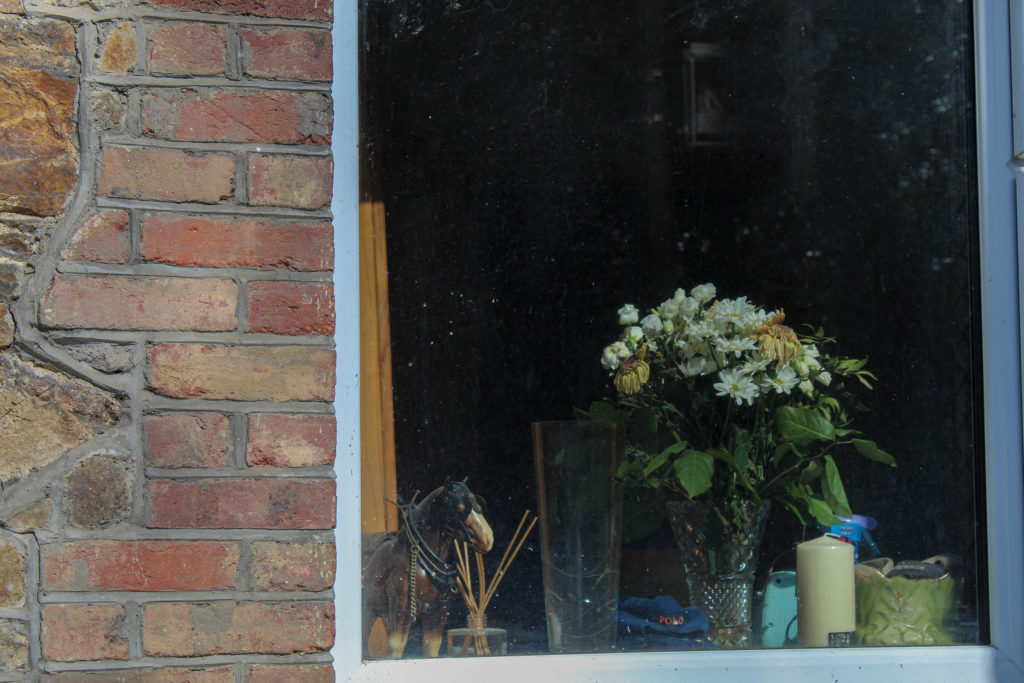
I was inspired by his use of softer light and dark green colours that i tried to bring into my own work. I was particularly interested in the far right image below and the way the reflections appeared through the window, which I attempted to recreate in the last of my images just below. Overall i do like Robbie Lawrence’s work a lot, but i was more inspired by the narrative of the specific project i researched than his general style.

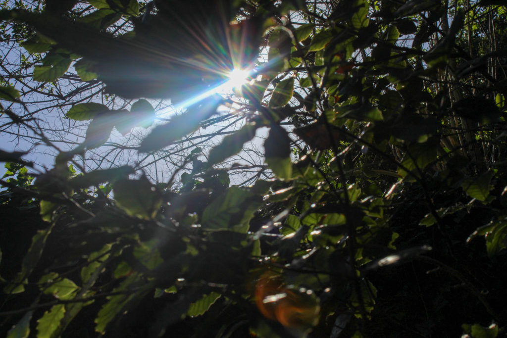
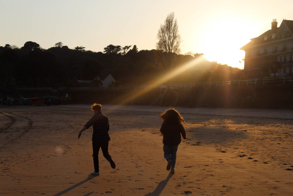
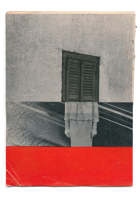
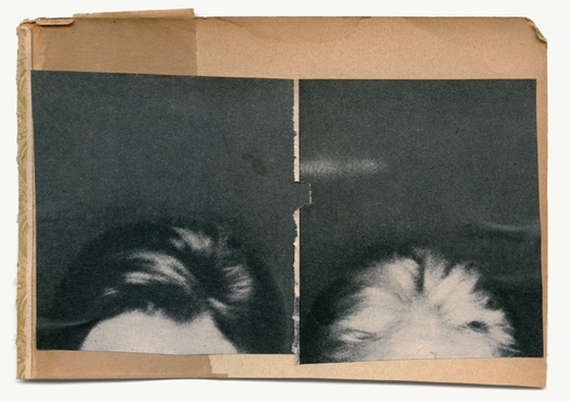
What i took from looking at Katrien de Blauwer’s work was her way of connecting images together through their similar visual form. I decided against using her style of chopping images up and joining them up as one singular image, but I am going to take inspiration from her work when sequencing and pairing images together in the photobook itself.
