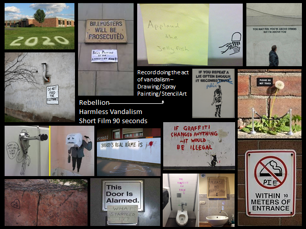
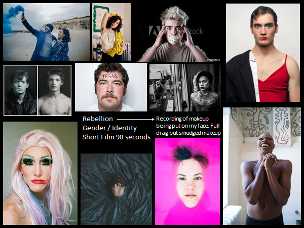
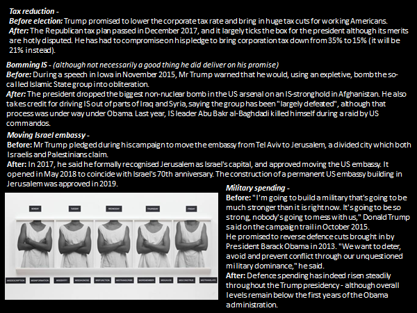
Out of 198 photos I have selected 25 photographs as a rough start to my project
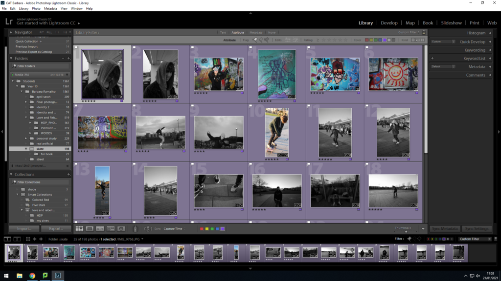
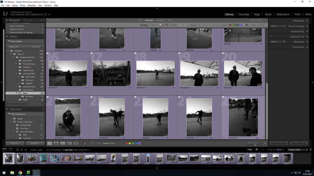
Out of 198 photos I have selected 25 photographs as a rough start to my project


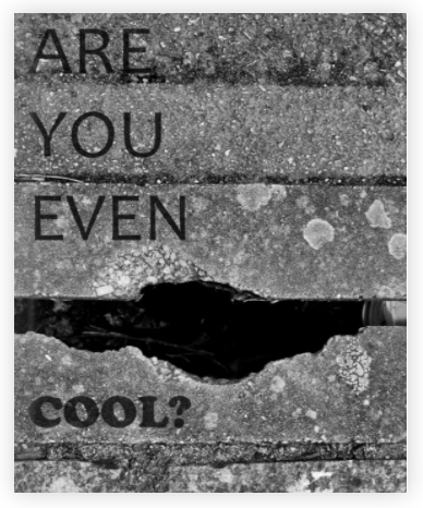
ARE YOU EVEN COOL?– Is the title of the photo-book it references Friendship, Identity and Youth Culture the photographer uses a mix of styles from portraits and close ups of certain body parts to landscapes and environmental photography.
The photographer is called GIO RIOS, I think he aimed his audience at the youth and society in general. I believe he made the book to show people some stereotypes of a “COOL KID”.
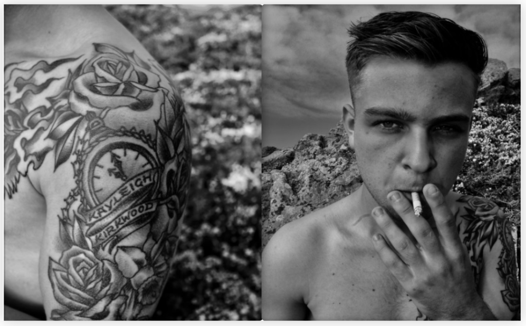
The book feels smooth with a dark glossy hard cover paper, inside the photo-book the pages are a mix between glossy and a little rough feeling. The whole book is in black and white with some pages being left white- blank. The photo-book is made to be portraiture and A4 sized with 56 pages. The binding of the photobook is saddle stitch and it has an image wrap with a durable matte finish.
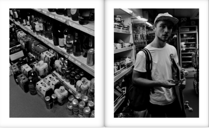
The title is quite poetic and sarcastic and relevant to the youth it was intriguing as you didn’t know exactly what to expect. I felt like the title was purposely open to interpretation.
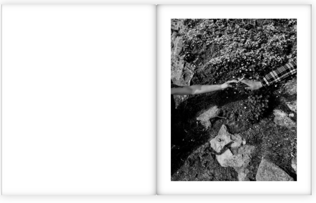
the story’s first few pages start by showing a hangout spot a tree that’s been cut to look like a chair, followed by a tattooed arm and a boy smoking. Cigarettes seem to be a reoccuring theme as some images feature passing a cigarette, smoking, or blowing out smoke. The cigarette concept of the photo-book might be hinting at the TITLE that the stereotypical teenager smokes and smoking is for “COOL KIDS” making it a motif.
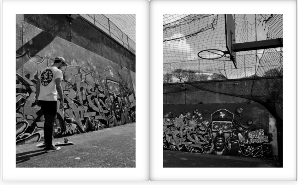
Most images are a full bleed covering the whole page with occasional plank white pages in between, however there are no double page spread or fold- outs/ inserts. Gio Rios made sure to evenly space out the images where there is a cigarette, the portraits of his friends were also kept together or either on the next available page. The only text throughout the photo-book is the title and the first page where he wrote: ‘aesthetic of attitude, behaviour, comportent, appearance and style which is generally admired.
In what way can the work of Claude Cahun and Shannon O’Donnell be considered political?
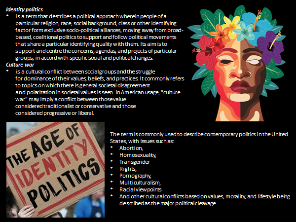
Both photographers works are considered to relate to identity politics which is a term that describes a political approach where people of a particular sexuality, gender, race or other identifying factors form exclusive socio-political alliances, moving away from broad-based coalitional politics (political parties that formed an alliance). It aims to support and center the concerns, agendas, and projects of particular groups, in accord with specific social and political changes.

Claude Cahun was a Surrealist photographer whose work explored gender identity and the subconscious mind. The artist’s self-portrait from 1928 epitomizes her attitude and style, as she stares rebelliously at the camera in an outfit that looks neither conventionally masculine nor feminine. with her photography one of her many skins is gender-defying as she gives this photograph a very neutral look that leaves to question ‘What is this persons gender?’ this was one of the many question that were going through my head when I first saw this photograph.
I think she is trying to show us and tell us that it really should not matter what gender she identifies as because she is still going to be this quirky photographer from jersey and her gender does not identify her. She is the main focus point in this image which is quite symmetrical is a way as she has a heart on both sides of her check and her hair is styled the same and gives it an even more symmetrical look. I am pretty sure this image has been taken in the studio as she is sat on a chair with what looks to be a curtain for a backdrop.
Claude Cahun’s photographic self-portraits present mix of mystery, exuberance, and sobriety. Born in France, she lived most of her life on the island of Jersey with her stepsister and long-term love, Marcel Moore.
Themes of melancholy, futility, and uncertainty run deep through Cahun’s career. Cahun’s exploration of self is relentless and at times unsettling. From circus performer, clothed in layers of artifice, to a stripped-down Buddhist monk grounded by integrity, Cahun is engaged in an ongoing dialogue with abundance.

Shannon O’Donnell is an artist born in Jersey, Channel Islands. Her work explores themes around the gendered experience with a focus on femininity and masculinity as gendered traits. She studied Documentary Photography at the University of South Wales, Cardiff.
Her area of photography is in the genre of contemporary filmmaking, performed and documentary photography and is based around the claustrophobia of gender binary. She explores this through deep sociological research, with historical references, a mixture of archival images, a contemporary interview with specific demographics that enlighten her conceptual and visual approach to image making. She explores the self and identity. Her work lies with questioning society and challenging traditional views of gender through my work. “My work is informed by my personal experience.” Is one of my favourite quotes from her. Shannon O’Donnell’s work focuses on the sociological understanding of how gender is viewed or challenged within mainstream society.
That’s Not The Way The River Flows (2019) – Gender is being reconceptualized. Our experience of gender is changing, transforming from being solely male and female, opening to a multitude of subcategories including gender queer, non-binary, transgender and gender fluid. As we unpick the complicated narrative of gender and the generalizations that it encapsulates, we are forced to re-imagine what it is that makes us who we are and what we want or can identify as. The beginning of change starts with the self.
It is a photographic series that playfully explores masculinity and femininity through self-portraits. The work comes from stills taken from moving image of the photographer performing scenes in front of the camera. This project aims to show the inner conflicts that the photographer has with identity and the gendered experience. It reveals the pressures, stereotypes and difficulties faced with growing up in a heavily, yet subtly, gendered society and how that has affected the acceptance and exploration of the self.
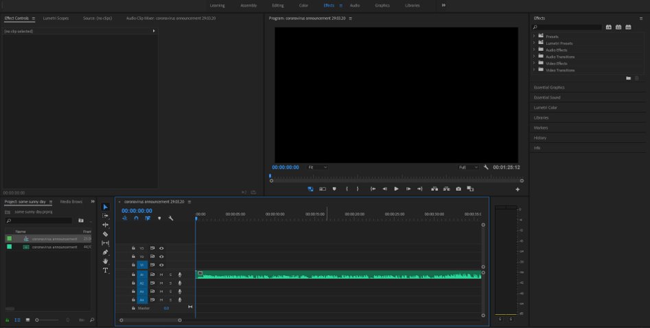
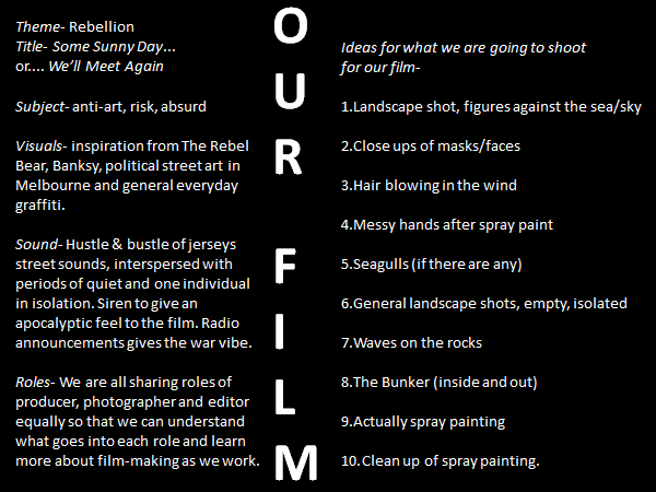
We started off by adding a recording of the first coronavirus announcement in Jersey from the radio, right before we went into lockdown as the main sound to run underneath the whole film, because it adds context to the rest of our film and makes it more specific to where we live. For example when jersey was occupied the only source of information they could receive was through a radio and radios were banned. It was illegal to listen the the radio, which I believe to link in with the rebellion side of ourn film. The announcement was quite a bit longer than 90 seconds so we just cropped it down when it came to a natural pause in speaking around our time limit.
Then we incorporated a couple of other ambient sounds that we’d collected, like siren noises in the beginning and wave sounds later on, where we knew we would be showing footage of the ocean crashing against the rocks. We used the same skills of just cropping them to fit the timing of the associated footage, and raising or fading out the volume when necessary, using the Editing features in Premiere Pro.
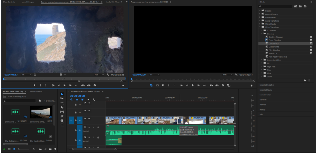
We essentially used the same skills throughout the whole editing process, because we mainly only needed to crop video length, extend them by slowing down the speed, and also splitting videos into separate bits so as to make a more visually cohesive final product. We quickly learnt how to separate the video element from its original audio, because that would mess up our planned soundscape, and it would be a lot more effective and impactful if the videos were silent too.
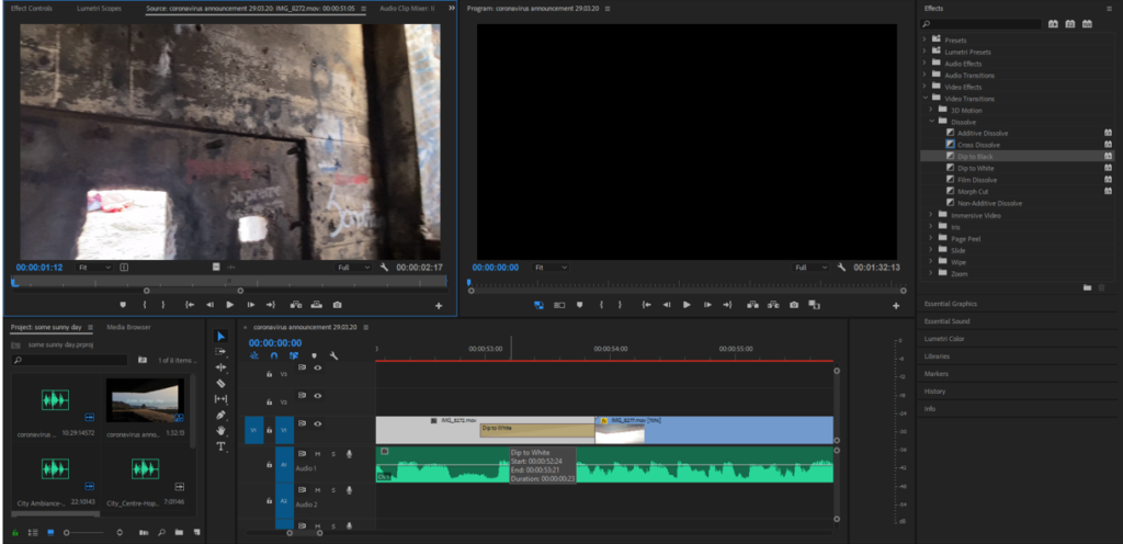
Here is an example of the sort of effects/transitions we used. For these couple videos we thought it would be best if the previous clip faded into white at the end and the clip afterwards faded into black, because the beginning and end of the middle clip were quite bright/dark, respectively. We achieved this using the Effects and Video Transitions panels in Premiere Pro.
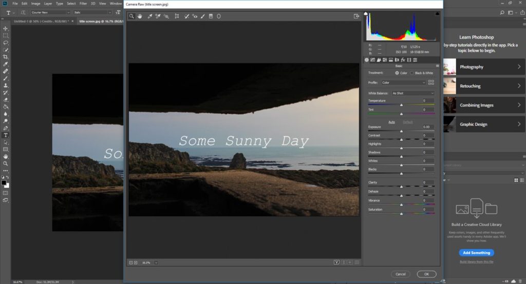
At this point we were roughly halfway through putting our short film together and we had finally decided on a title, which referenced the quote that features throughout the film, relating to Jersey’s historic Occupation period and also current affairs (lockdown/isolation). We thought a typewriter-style font would look good, and using a still image from the shoot at our location we switched to Photoshop to put together this title card, then imported it to Premiere and added it to the beginning of our film, leaving a couple of seconds of black screen whilst the audio started.
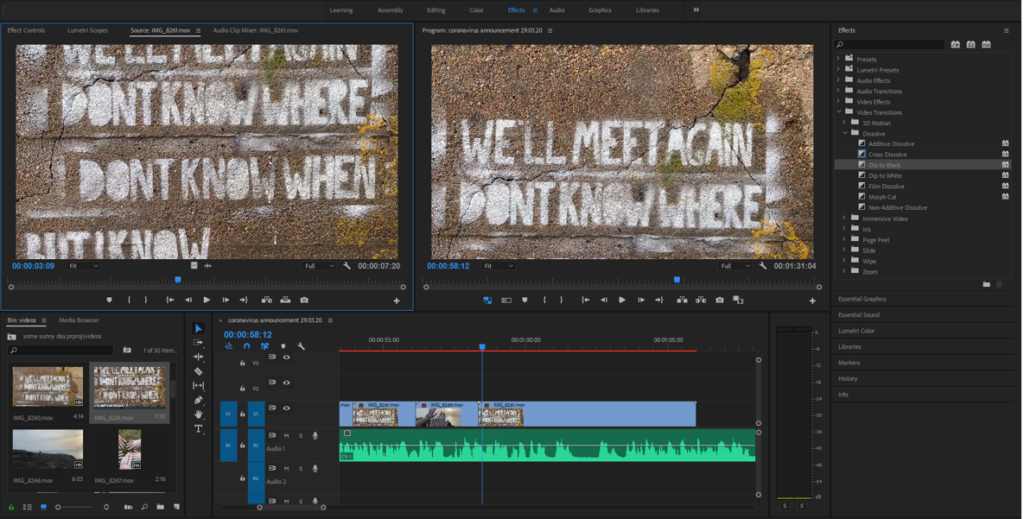
We had quite a long video which panned over the main quote as a whole, and we thought it would be good to cut it up into shorter parts, seeing as a lot of the rest of our clips were roughly the same length, and it would add some variety and make it more interesting if they were shorter. We had to slow the actual footage down to make the words easier to read, but it still had the intended effect, and we were able to incorporate much more of our footage by splicing it in-between each couple of lines.
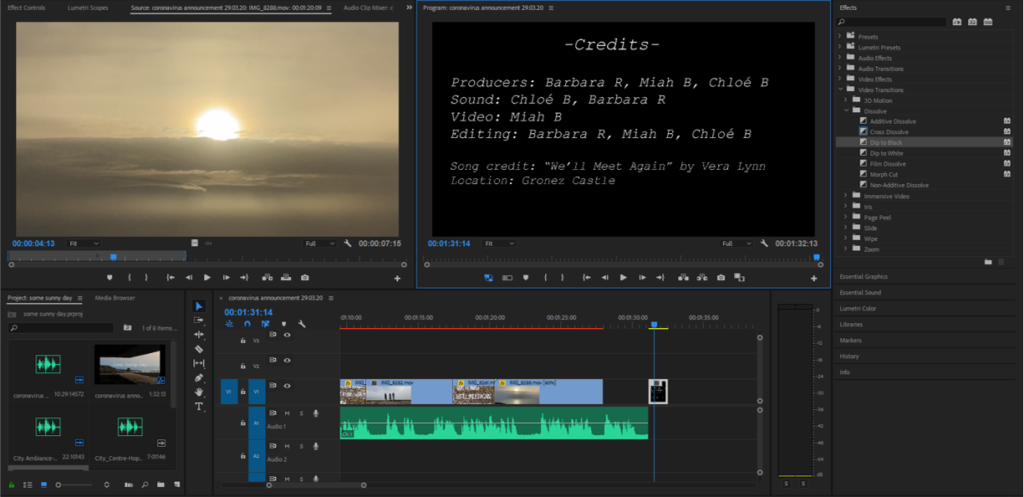
By this point we had used most of our good footage and were coming up to the 90 second mark so we added a longer landscape clip to tie up the whole film, then switched back out to Photoshop and created a credits end card with the roles we assigned at the very beginning. We chose to have a couple of seconds of just black screen with the audio still playing as it finished, because it mirrored how we started the film and it was a nice conclusion that wasn’t so visually overwhelming, keeping with the simple and minimalist vibe of the whole thing.
