All posts by Beth P

Filters

Author:
Category:

Identity Politics and Culture Wars

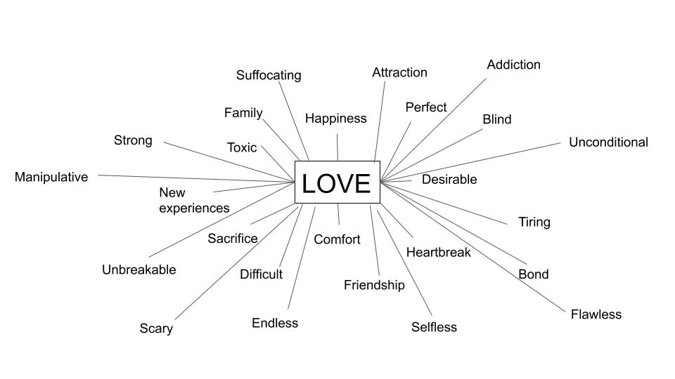
Identity politics is a term that refers to a political approach wherein people of a particular race, religion, social background, class or other identifying factor from exclusive socio-political alliances, moving away from broad-based, coalitional politics to support and follow political movements that share a particular quality identifying with them. It’s main aim is to support and to center the concerns, agendas and projects of particular groups, in accord with specific social and political changes.

Opinion: Identity politics counterproductive, damaging to inclusivity |  Daily | lsureveille.com

There are many different types of identity politics that raises awareness and many issues that comes with the identity of many people; which in my opinion shouldn’t really even be an issue in the first place. For example issues such as: Racial and Ethnocentral this topic is increasingly analysed in media, especially recently with the Black Lives Matter movement which involved Police Officers in the US discriminating against black people purely because of their skin colour. This has been an ongoing issue historically. However there are many different types of racial politics such as: Arabic Identity Politics and White Identity Politics. There is also Gender Identity Politics which basically looks at how different genders affect the way that people look at certain individuals and also LGBTQ Identity Politics which may involve different rights between heterosexual and homosexual people – which is bizarre.

The battle over identity politics, explained - Vox

In my opinion, identity politics doesn’t really make any sense to me. There should be no need and there is no room in the world to discriminate someone based on their identity. At the end of the day we are all human and we are all the same no matter our race, gender, sexuality, hair colour etc. However, this is still an ongoing issue with people from all around the world being discriminated against due to certain stereotypes that we have come up with as a society. However in a sense, Identity politics can be helpful and we should seek to understand it as it is am important and influential aspect of our world. All politics in the end has an element of identity.

A culture war is a cultural conflict between social groups and the struggle for dominance of their values beliefs and practices. It commonly refers to topics on which there is a general societal agreement and polarization in societal values is seen. The term is commonly used to describe contemporary politics in the US. Issues such as abortion, homosexuality, transgender rights, pornography, multiculturalism, racial viewpoints and other cultural conflicts based on values, morality and lifestyle being described as the major political cleavage.

However, as liberalism becomes more dominant we have seen figures concerning culture wars significantly change. For example, between 1989 and 2019, the proportion of the population that thought gay relationships were wrong fell from 40% to 13% and the numbers opposed to abortions halved. This is a positive change to our society however culture wars do still exist when concerning things such as immigration, the corona virus pandemic, racism etc. As you have seen with the Black Lives Matter Movement, there was lots of controversy.

Photography can be an influential and powerful way to reveal different opinions, outlooks, identities and cultures. These are some links for you to look at which links photography with identity politics and culture wars:

https://www.tate.org.uk/art/art-terms/i/identity-politics

evaluation Of My Zine

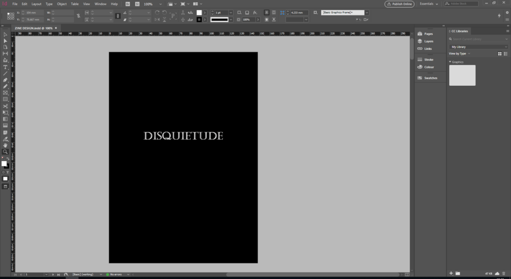
To begin with I really like my front cover. Although it may seem quite simple, I believe it is very intriguing and holds a lot of dull, sad atmosphere, which essentially was what I was trying to achieve. I really enjoy the font I used for my title, it is easy to read although it has a sense of uniqueness and history to it. I feel as though a plain, simple front cover grabs the readers attention and pulls them in to discover what it is about. The title in itself I love too, I actually have never read/seen this word until I researched it which I think would be beneficial in the sense it will grab peoples attention also. Potentially, if i were to do it again, I would’ve maybe added some line drawings of flowers just to give it that edge, however I am not sure how well that would’ve printed.

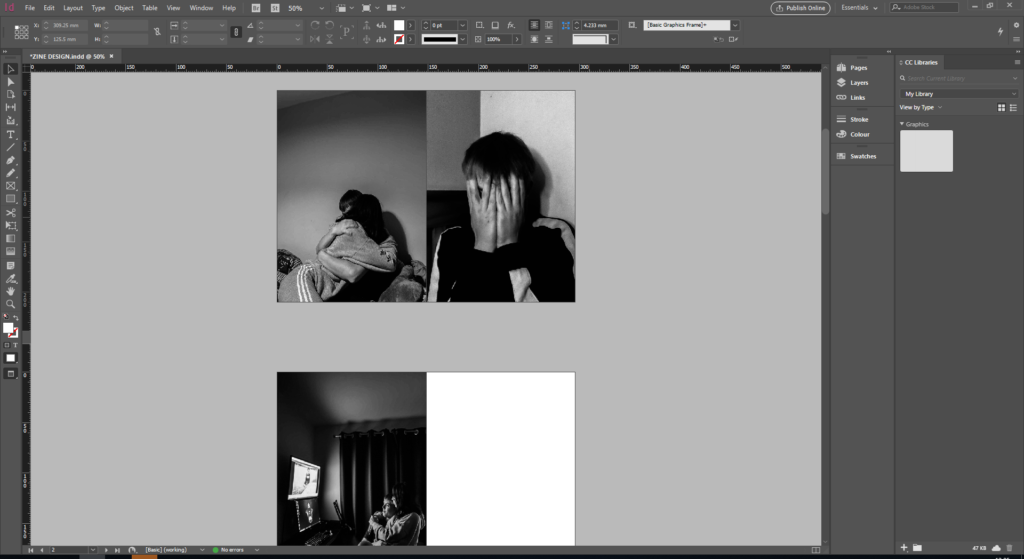
I also really like how my images turned out within the booklet. However the colouring and lighting within the images came out a little darker than I anticipated. This isn’t necessarily a bad thing however it looked different from the original images. The bleeding pages is another thing I really like, I’m not a fan of white boarders as I feel like sometimes it can make an audience lose interest in an image so I like how my images are large, bold and obvious to the audience. Another thing I would’ve liked to of changed is the composition of some images. For example, as you can see above, the image on the left is fairly zoomed out whereas the image on the right is very zoomed it. This creates a great juxtaposition however I feel as though the overall aesthetics of the booklet would have been better if the composition of the images were similar.

Overall, I really like the outcome of my zine and feel as though it creates a lot of atmosphere and symbolism of the struggles and also thew happy times within a relationship. Concerning my narrative though, I feel as though I could’ve represented my insecurities a little bit better, for example insecurities like; body image, confidence issues in general etc. These would’ve been really effective images to create.

Photo Zine Design

How Do I Want It To Look/Feel?

I want my zine to look dark and almost have a depressive feel to it so that the audience can potentially relate to my work. Dark colours such as purples, blacks, grey’s etc would be best to create that dark tone. I may even turn my images black and white to enhance that depressive tone that I’m going for, however I will look at this when it comes to my experimentation.

Format Size and Orientation

I would like my images to bleed out to the edges of the book so that there is no white margin around the edges. I’d like to do this because I feel like it is more appealing to the eye and I also feel as though it makes the image a lot bolder and more appealing to look at. My images will be portrait on the pages so that the audience doesn’t need to turn the book around in order to look at the images and so that everything is the exact same.

Narrative and Visual Concept

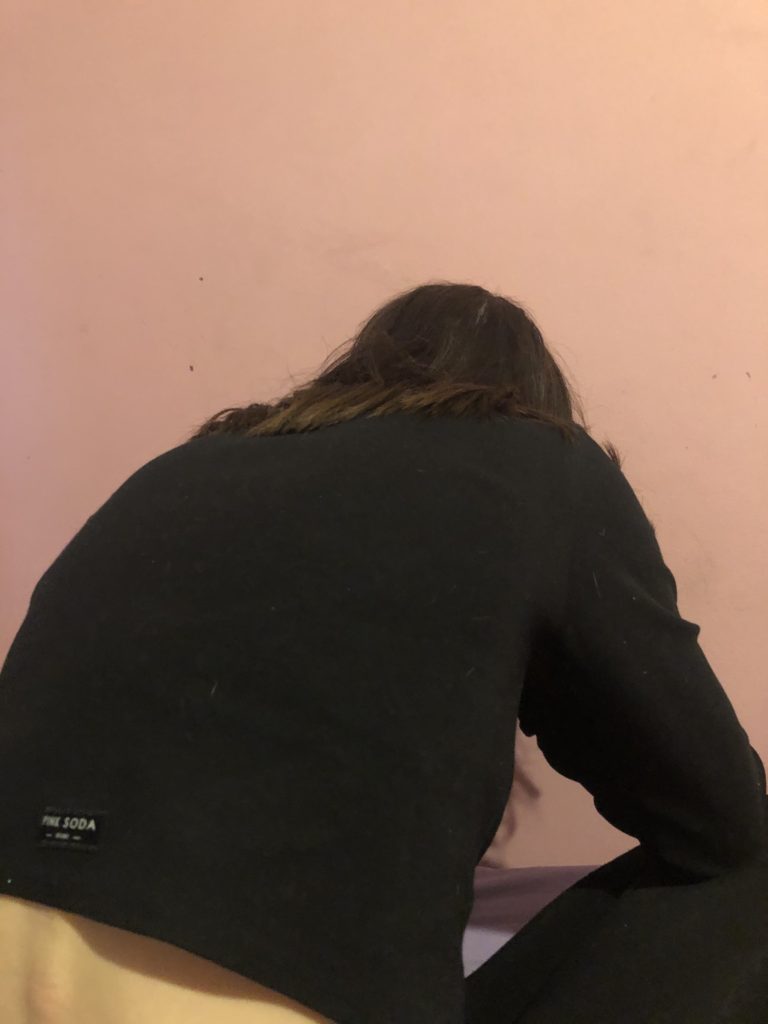
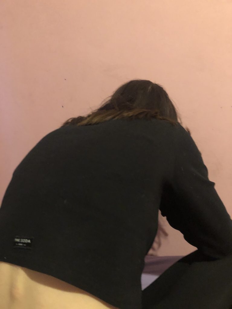
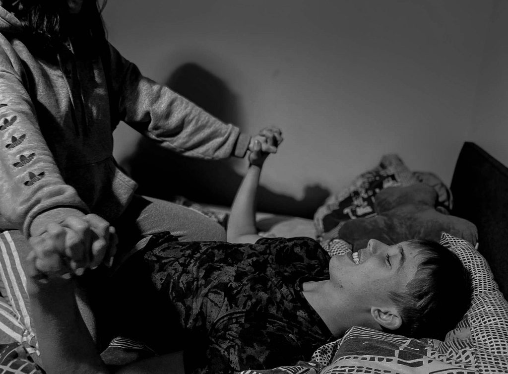
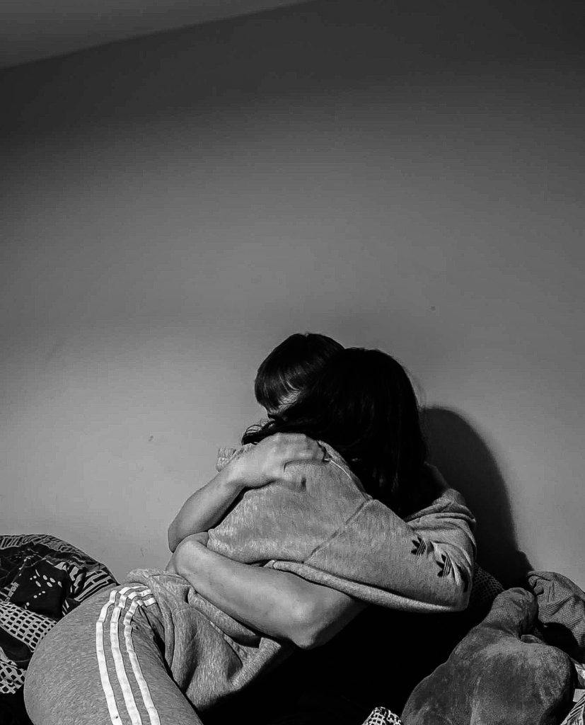
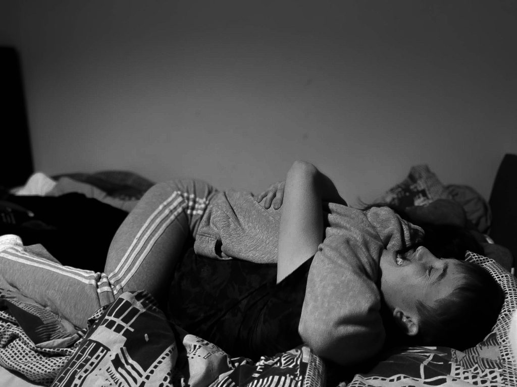
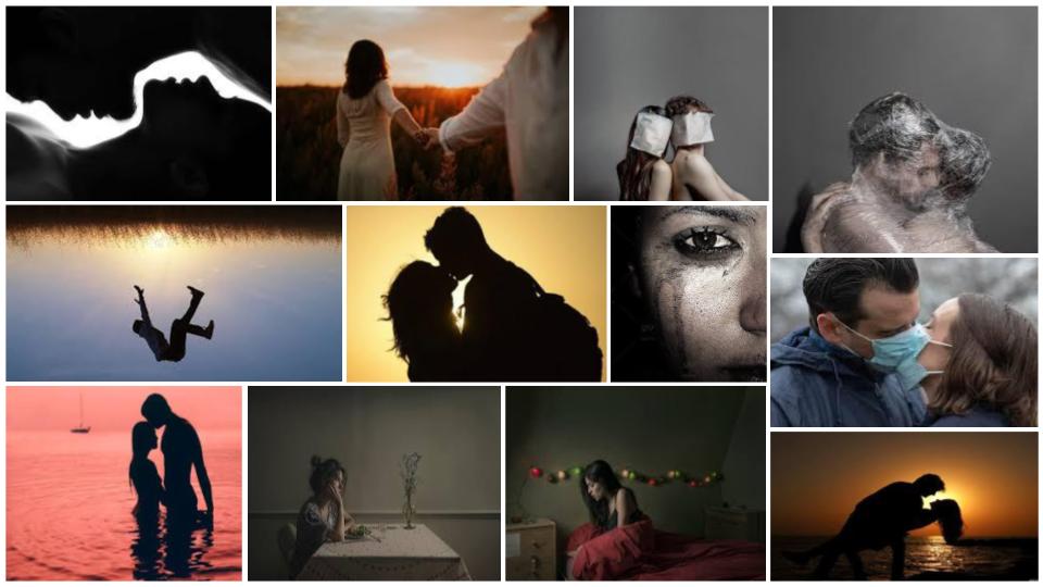
So, my narrative is; revealing my true emotions within my relationship. emotions such as, insecurity, low self esteem, paranoia etc. However, I am going to be comparing these images that symbolize my emotions to the good times that happen within my relationships. I have taken two photo shoots, one symbolizes the happy times and the other symbolizes the sad times. The way I’m going to show this is; on the double page spreads, I will put one image of our happy side and next to it, to add juxtaposition, the sad times that we have. The photographs I have decided, will be in black and white, just to add the tone of sadness a bit more.

This is what I mean by juxtaposing the images. So, as you can see, there is a happy, sentimental moment on the right, and on the left there is a not so happy, depressing image on the right to show the struggles that come with relationships.

Title and Captions

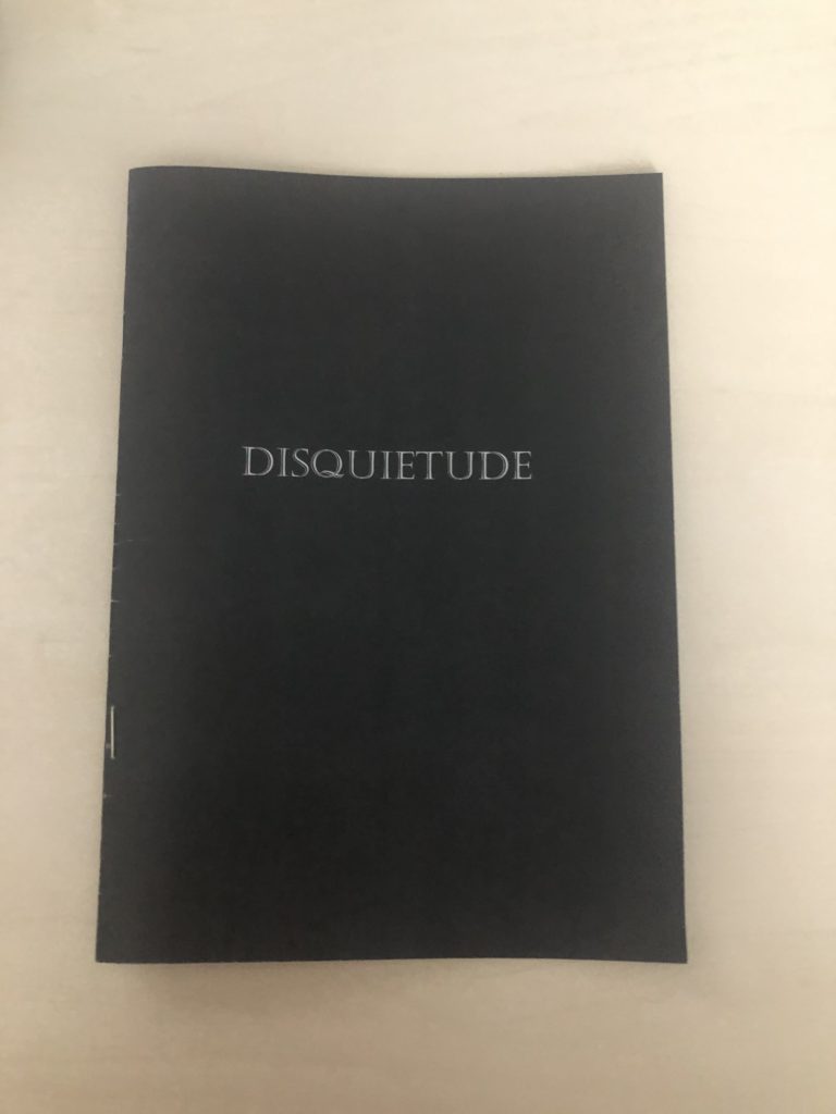
The title for my love story is DISQUIETUDE – this means a state of uneasiness or anxiety, which essentially is the narrative to my story. I THINK, somewhere I will put a piece of text explaining my emotions if i have room – I will have to look into this a bit more. Although the text will be quite ambiguous so that it’ll leave the audience open for interpretation.

Front and Back Cover

I want my front and back covers to be quite plain, I don’t want anything overshadowing the story that’s inside. Maybe a plain black or grey to compliment the images inside and to add the somber tone, I feel as though a plain and simple front cover sometimes can also intrigue the audience a bit more. My title ‘DISQUIETUDE’ will most probably be in white writing to stand out from the dark tones behind, the font is to be decided.

This is what I’ve finally decided for my front cover. It is all black to set the tone and to make the title stand out. I chose a font that I liked and one that is easily read, with a touch of edge to make it aesthetically pleasing.

Photo Assignment 2: Photograph A Couple

PLAN

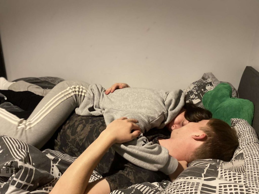
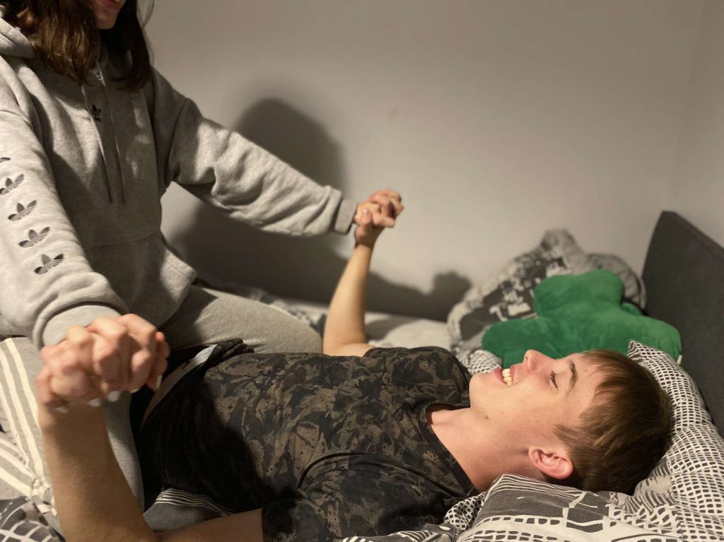
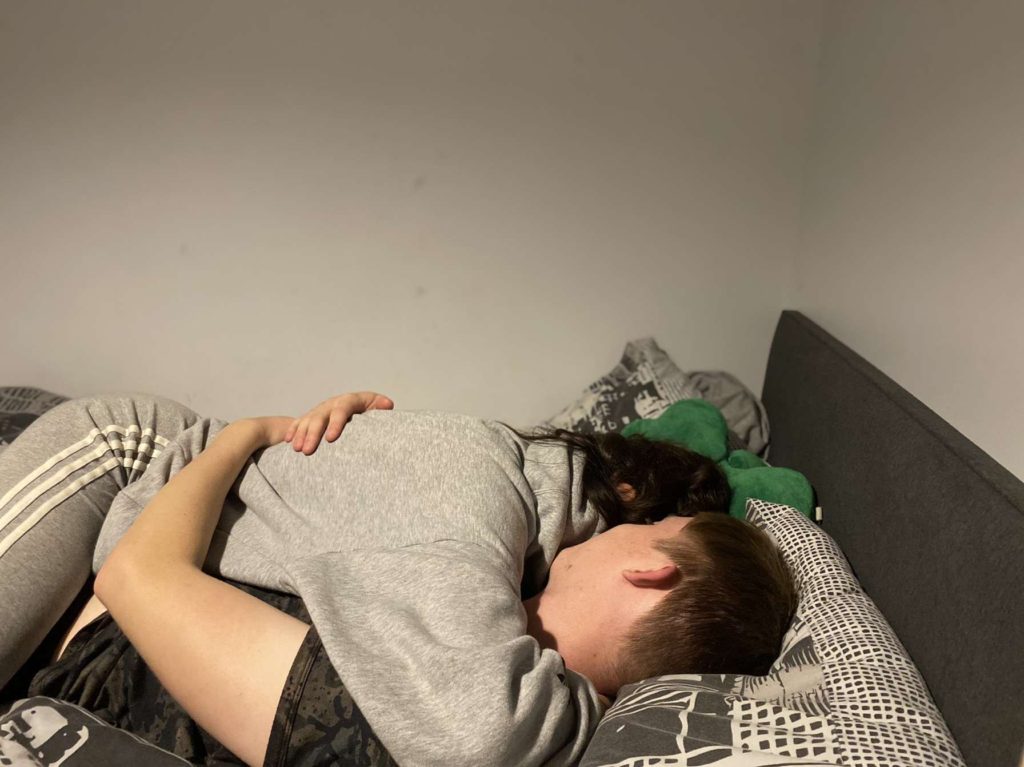
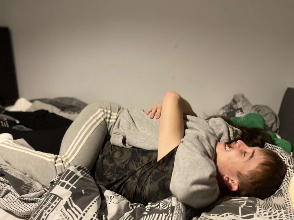
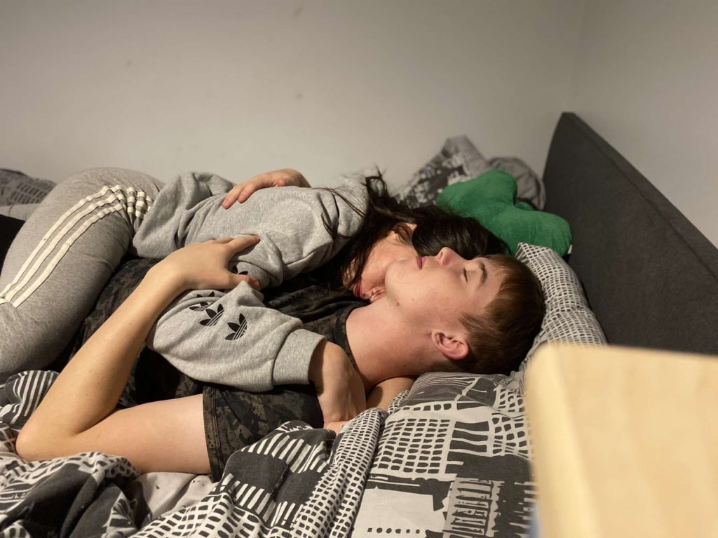
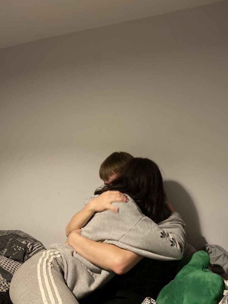
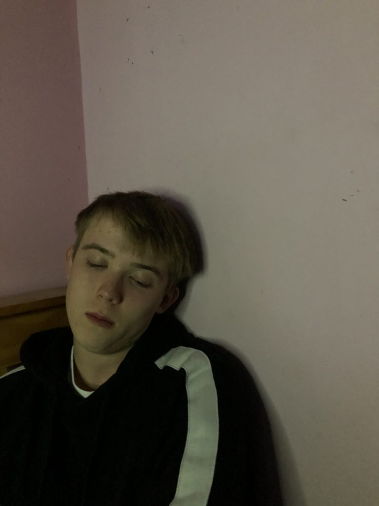
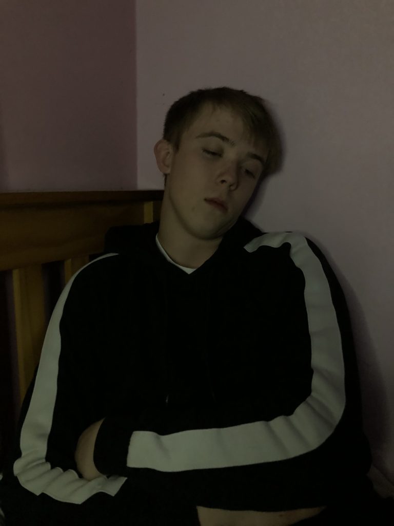
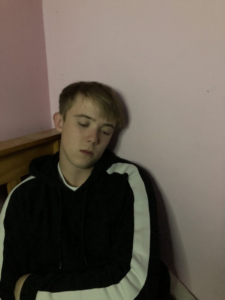
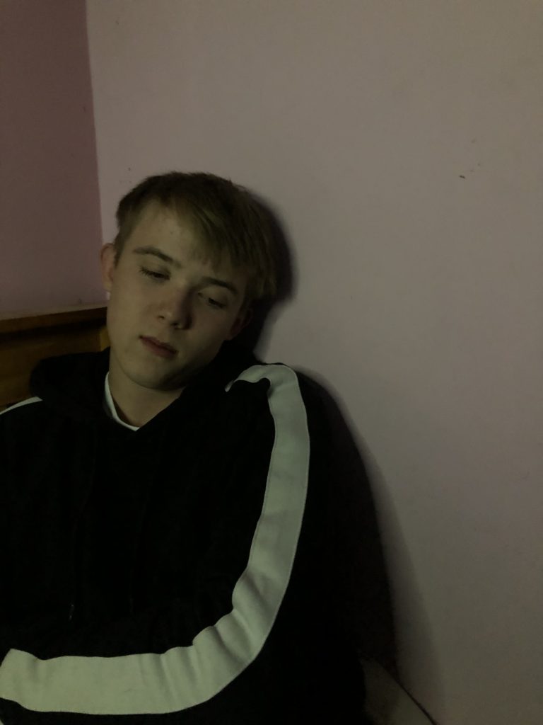
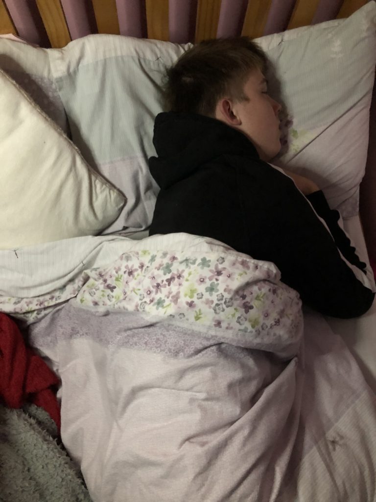
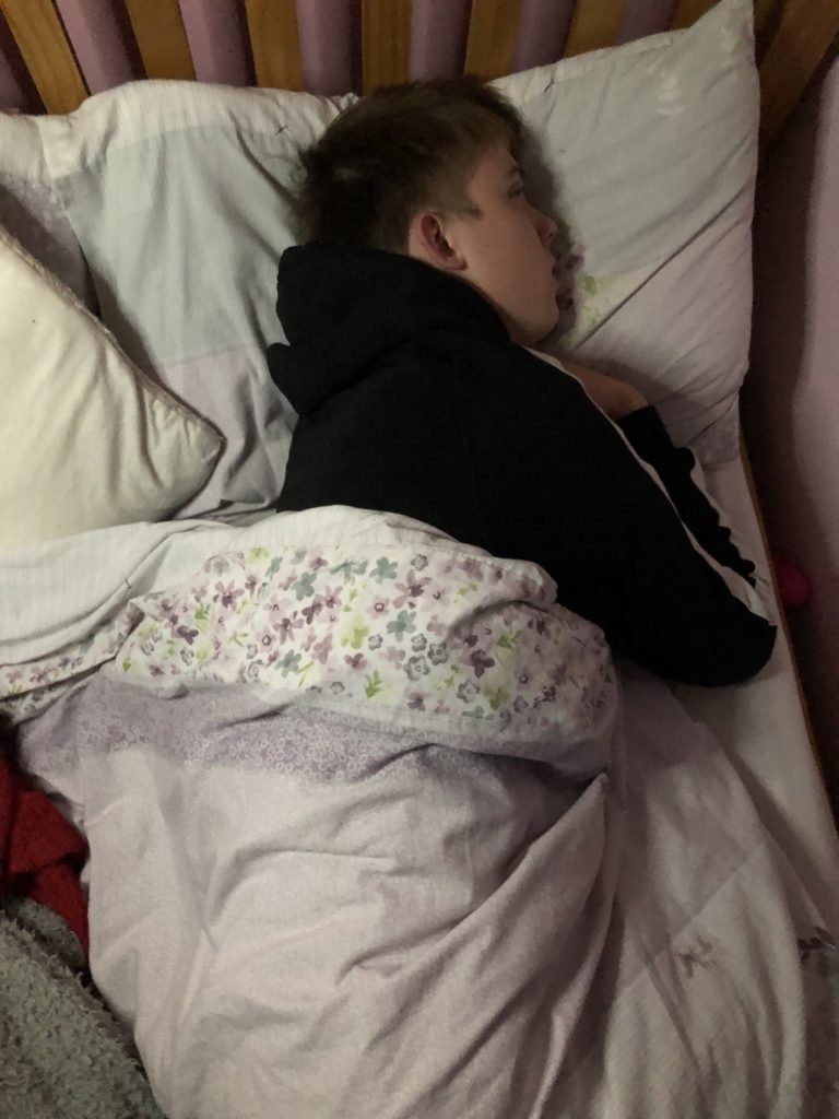
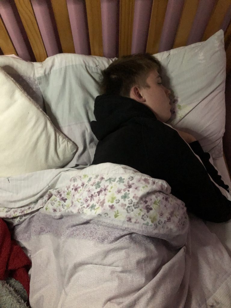
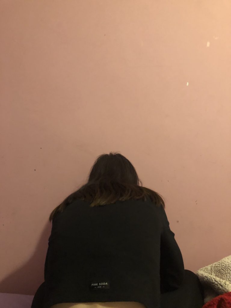
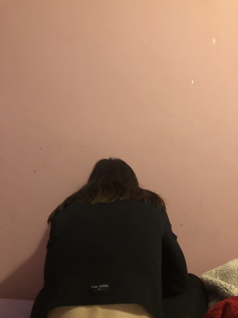
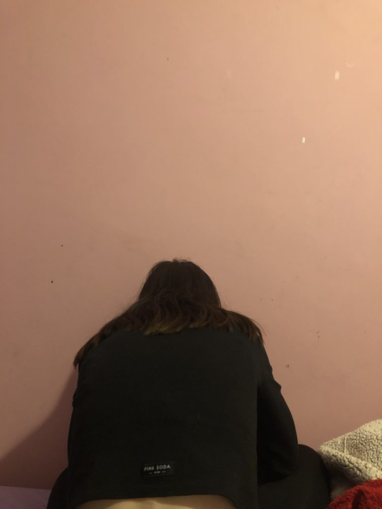
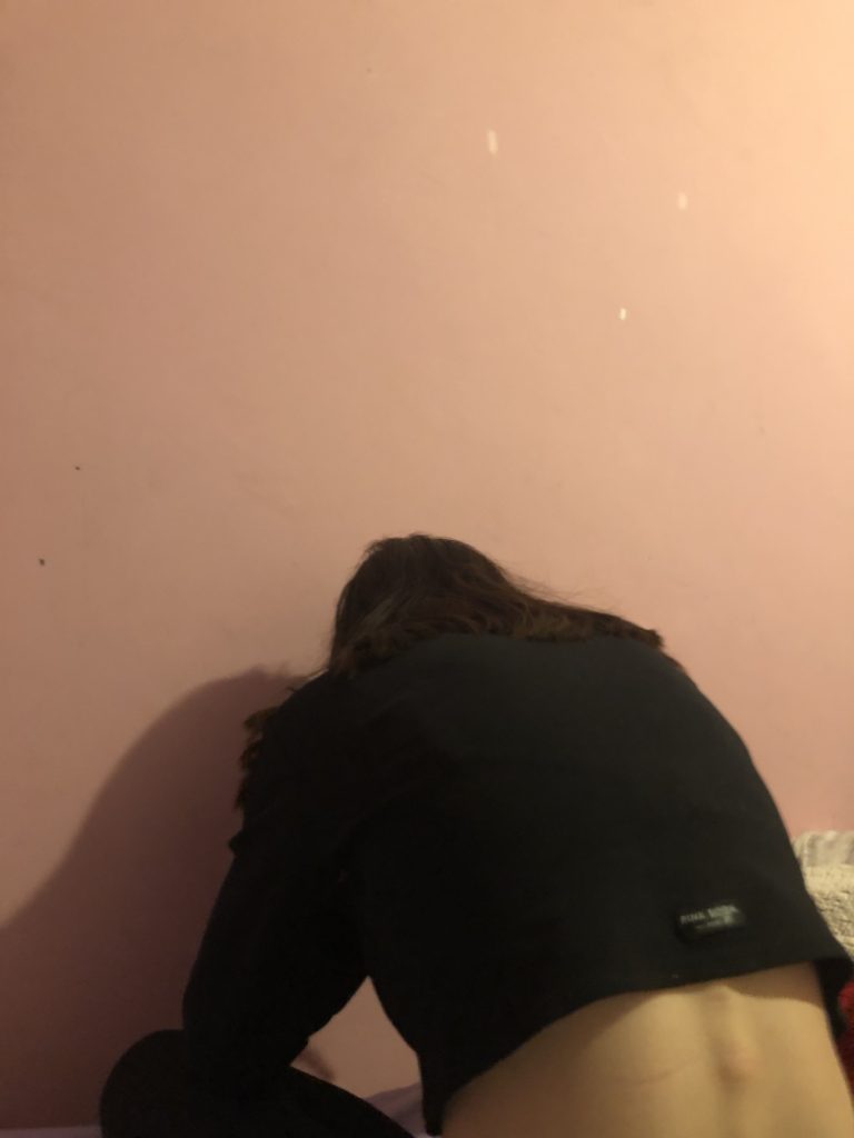
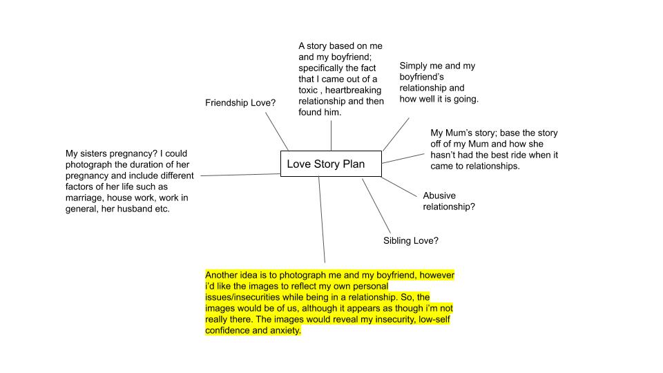
WHO?: The couple I am going to photograph will be me and my boyfriend. As mentioned in my specification, I will be exploring my own personal issues that effect my relationship on a daily basis, this assignment will help me get some practice and help get a feel of how I want to portray this symbol.

WHAT?: So like the artist that I analysed, I am mainly looking to explore my ideas through body language:

  • Paranoia – shown by me having the urge to look at his phone all the time, me sitting next to him with a closed body language, me looking bored etc. That is how i could portray paranoia.
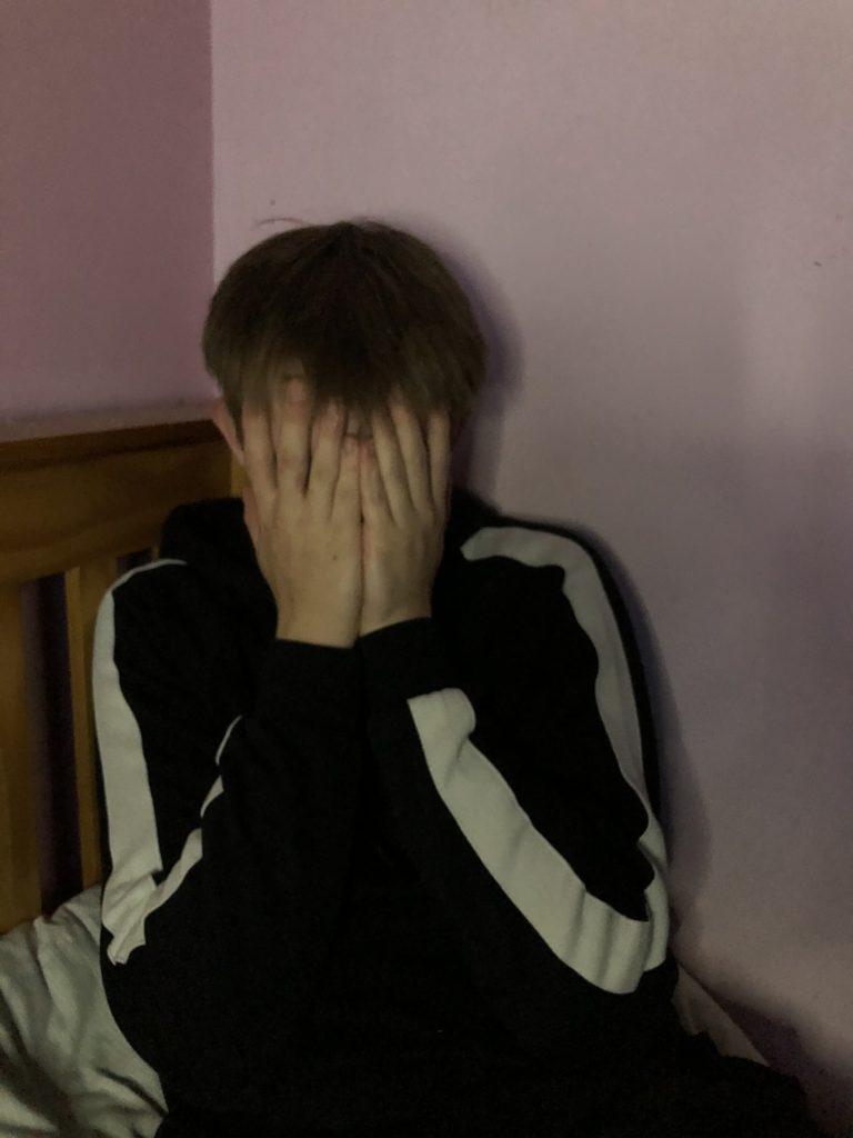
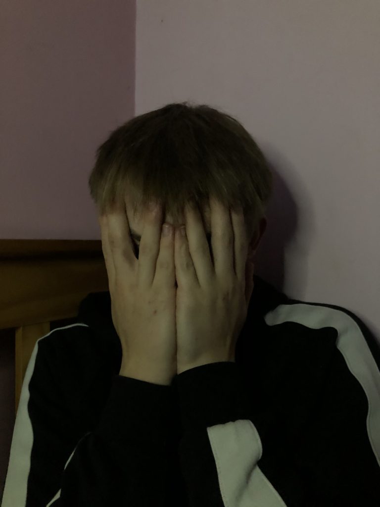
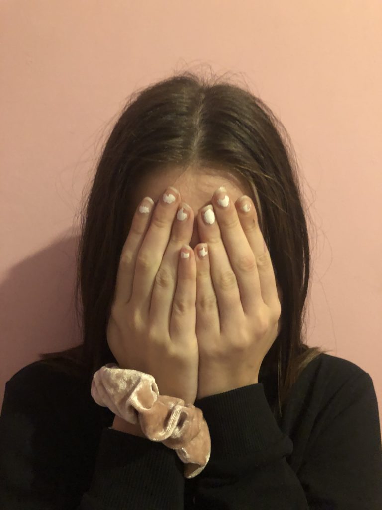
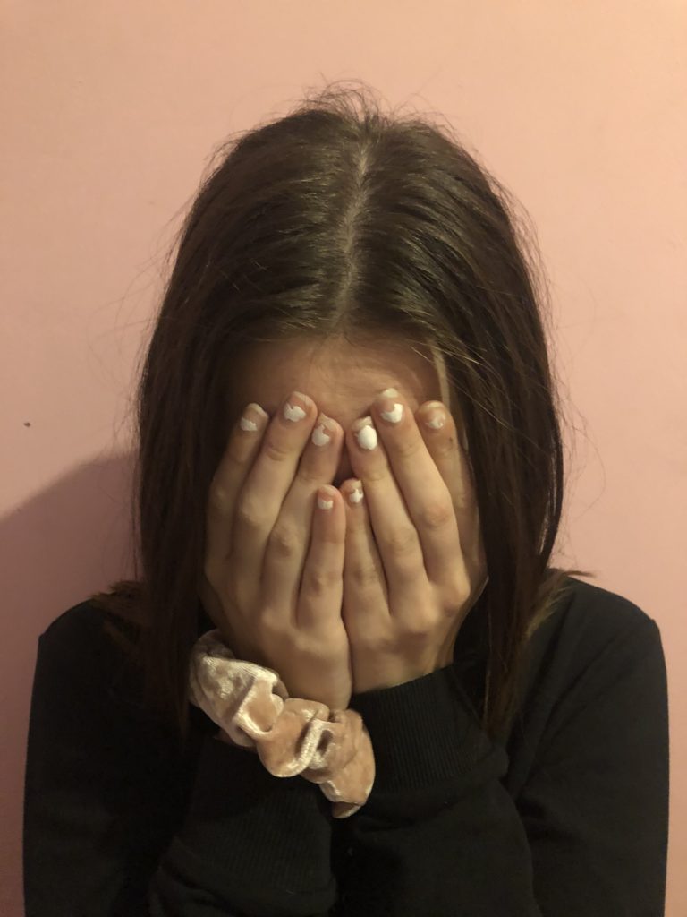
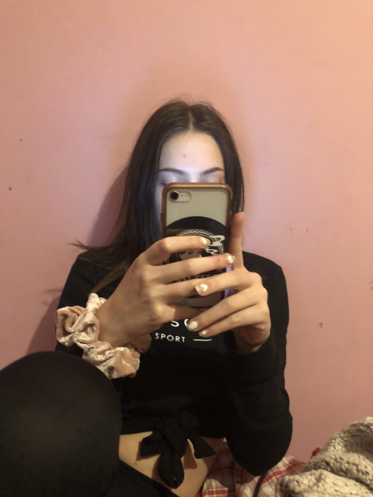
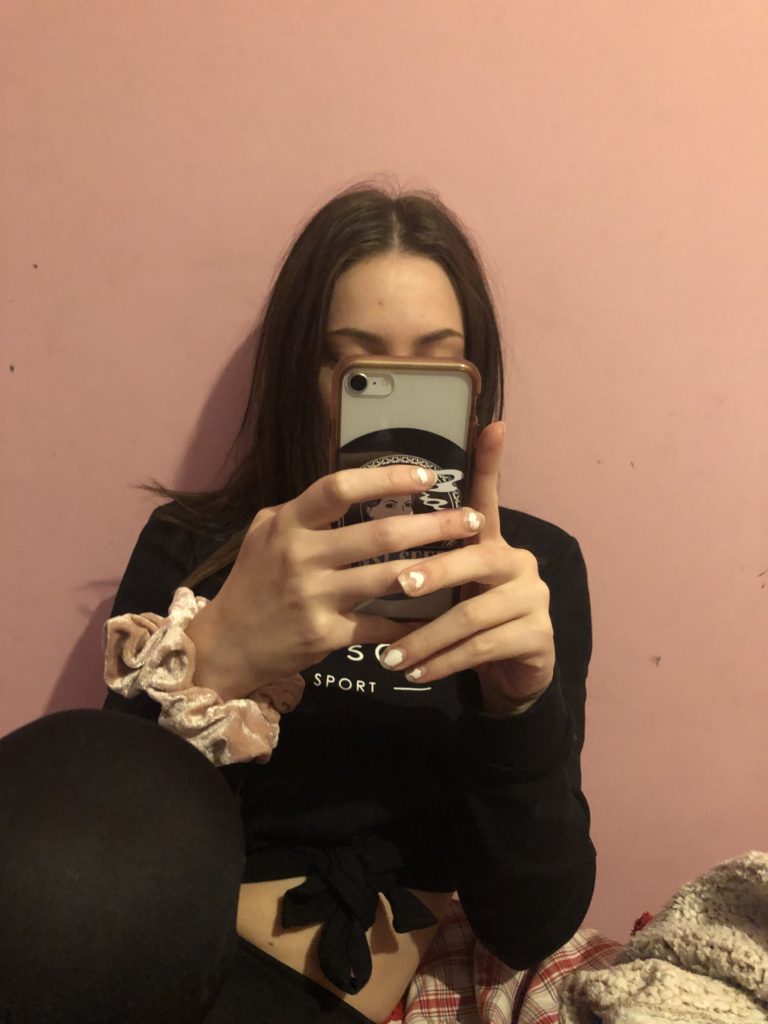
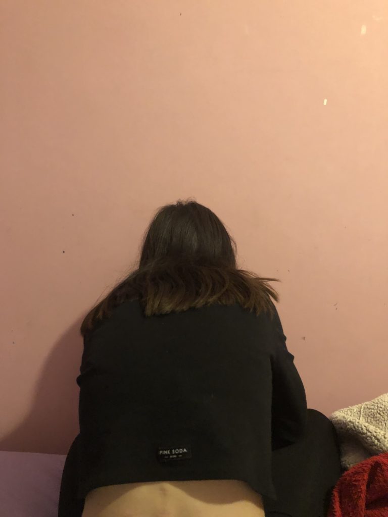
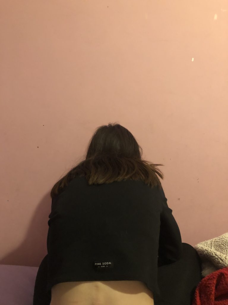
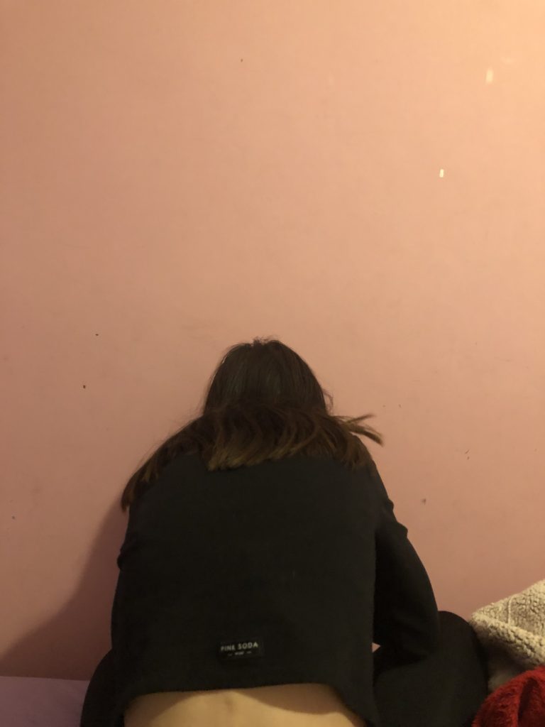
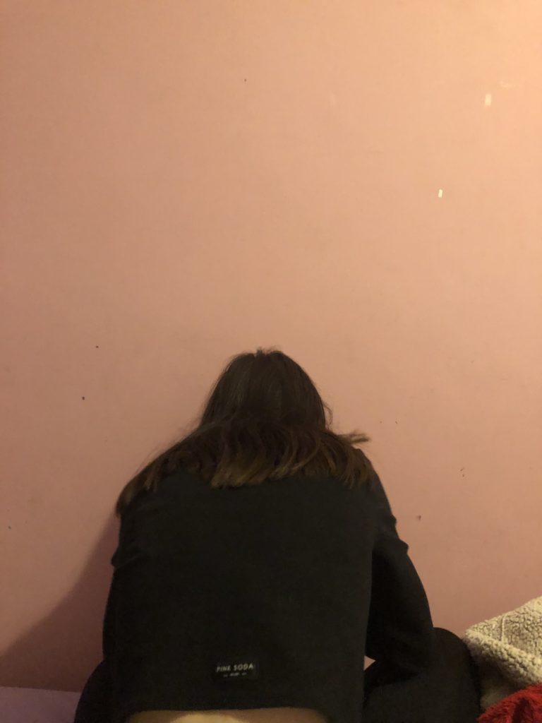
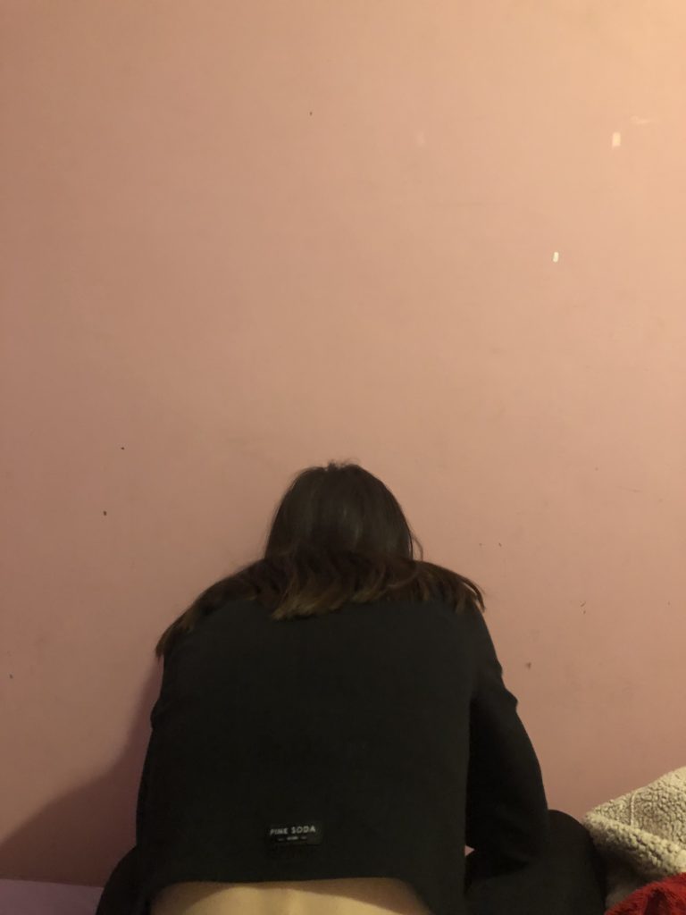
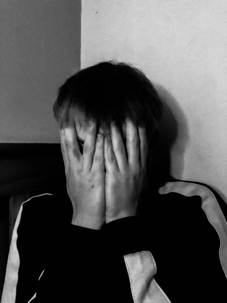
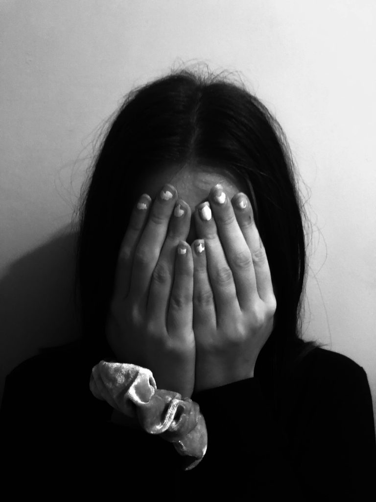
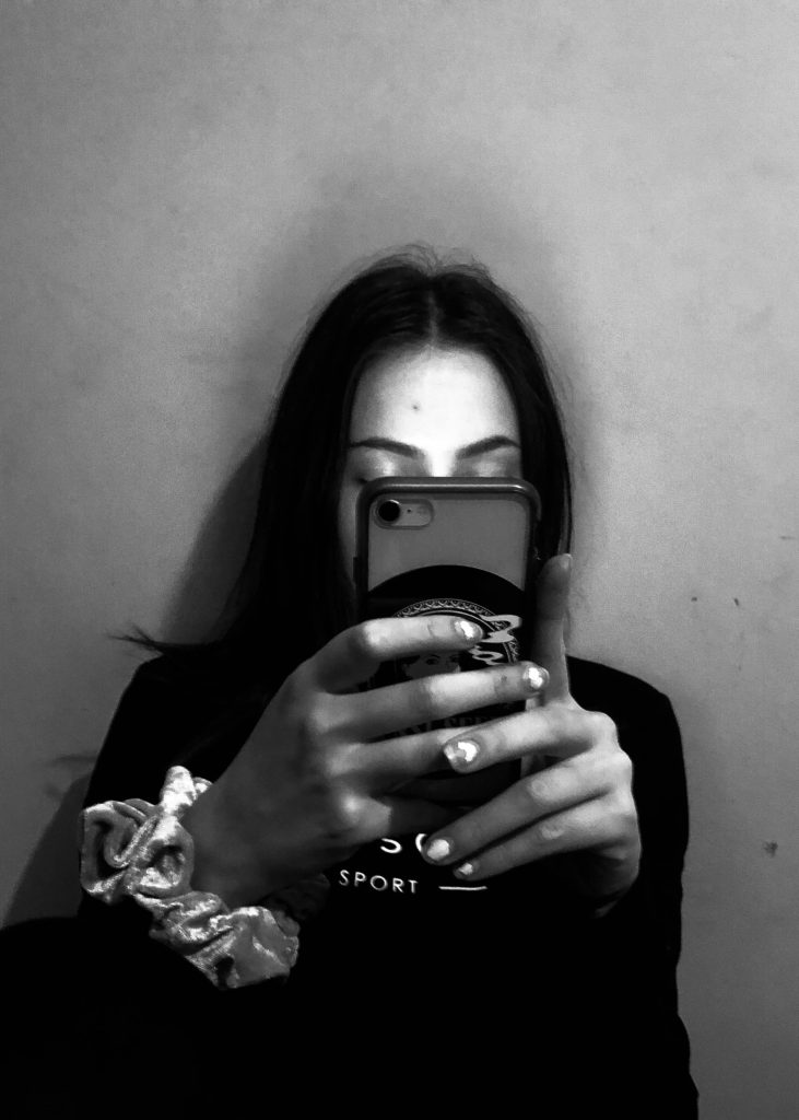
  • Self-Confidence issues – me looking in the mirror with his reflection in the background behind be, me covering up my body, me looking at models on Instagram, me crying etc.
  • Anxiety – me never knowing whether I am annoying him, could be shown through doodles on the images with my mouth appearing to be shut.
  • ^ doodling could also actually be a really good idea in order to show my emotions and my inner thoughts, I will have to explore this idea carefully within my editing process.

WHEN?: The week of 21st September-24th September in order to get the assignment in by the deadline and to keep up.

WHERE?:I will most probably base my photographs around the areas me and my partner are a lot of the time. So this would be my house, his house, his car, aesthetically pleasing out-doorsy places. However, I want a similar aesthetic to Hsing Wang, so, plane and bleak, so I will most likely be shooting and mine or his house.

HOW?: I will be taking these images on an IPhone and most likely, a DSLR camera as this would give better quality and will give the tones that I want my images to have. A tripod will also be extremely helpful with this shoot as I am photographing myself and my partner, this would mean having to pose in a specific position in order to get the perfect frame.

Shoot:

Editing

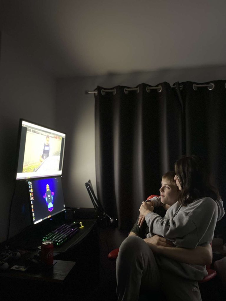
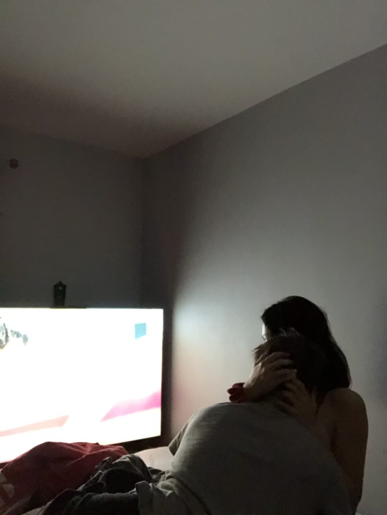
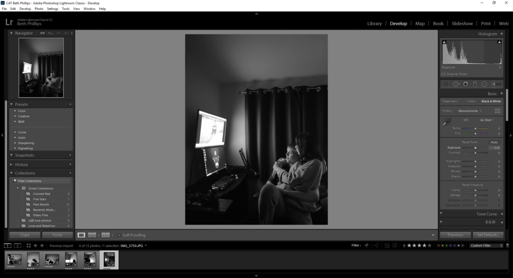
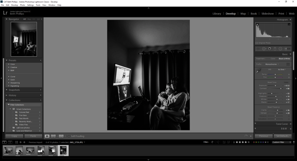
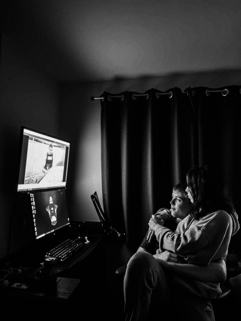
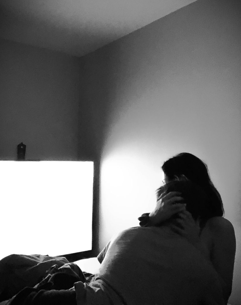
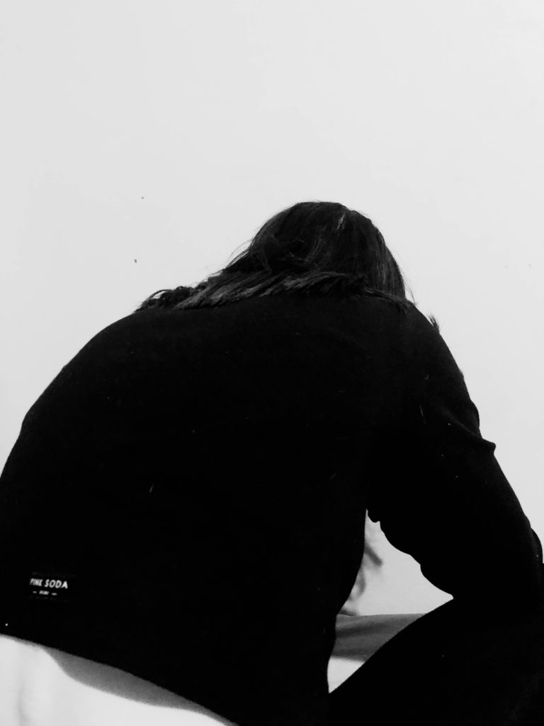
To start editing, I cropped the image to my preference, mainly to cut out all of the extra space in the image that wasn’t needed. After, I turned the image into black and white. Firstly because I didn’t particularly like the photograph in colour and secondly because it fitted my narrative for my story which is insecurity and isolation based, therefore creating a somber tone. Black and white helps to create that overall mood.

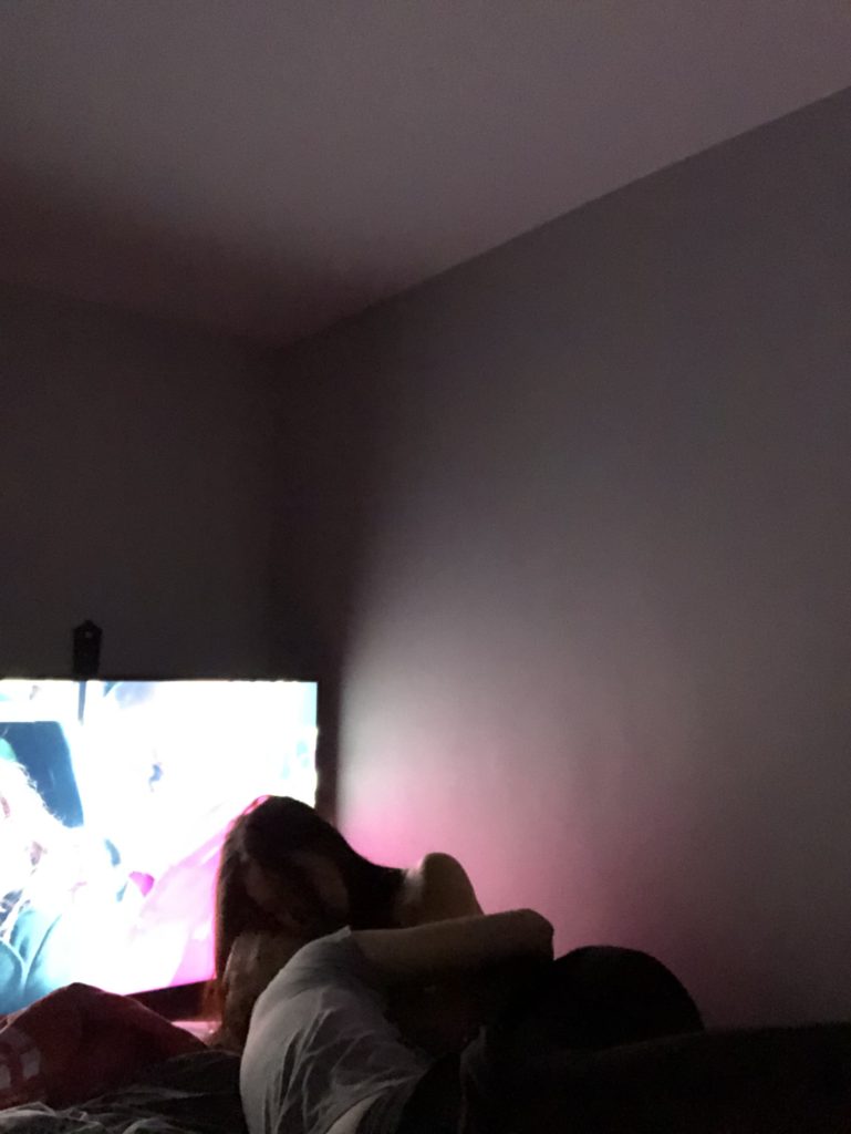
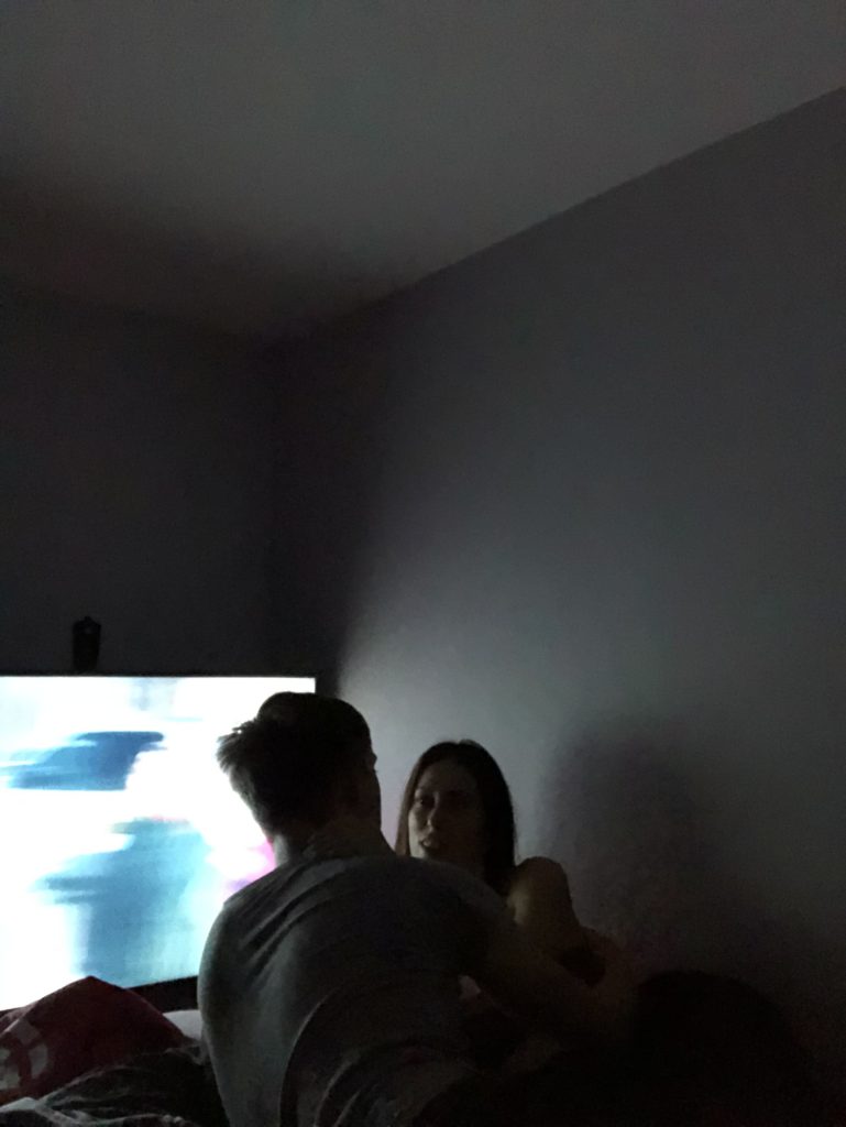
After turning it black and white, I then played with the shadows/exposure/contrast etc. I increased the level of shadows to increase the glow of the TV, this made the image more aesthetically pleasing. After, I increased the contrast, this helped boost the blacks within the image and gave the image more structure. I also lowered the exposure as I didn’t want the image to be too bright, as again I wanted it to match the tone of my overall narrative, this darkened the image nicely. Lastly, I increased the sharpness of the image. Since these images were produced on the phone they were a little grainy, therefore I decided to increase the sharpness of the images just to add more detail and quality.

I repeated this process with every photo until I was happy with the quality of each image.

Final Images

Evaluation Of Final Images

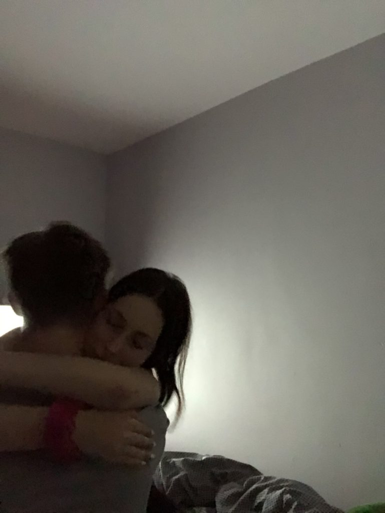
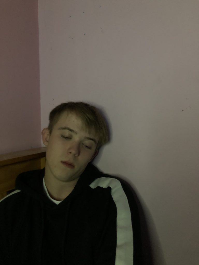
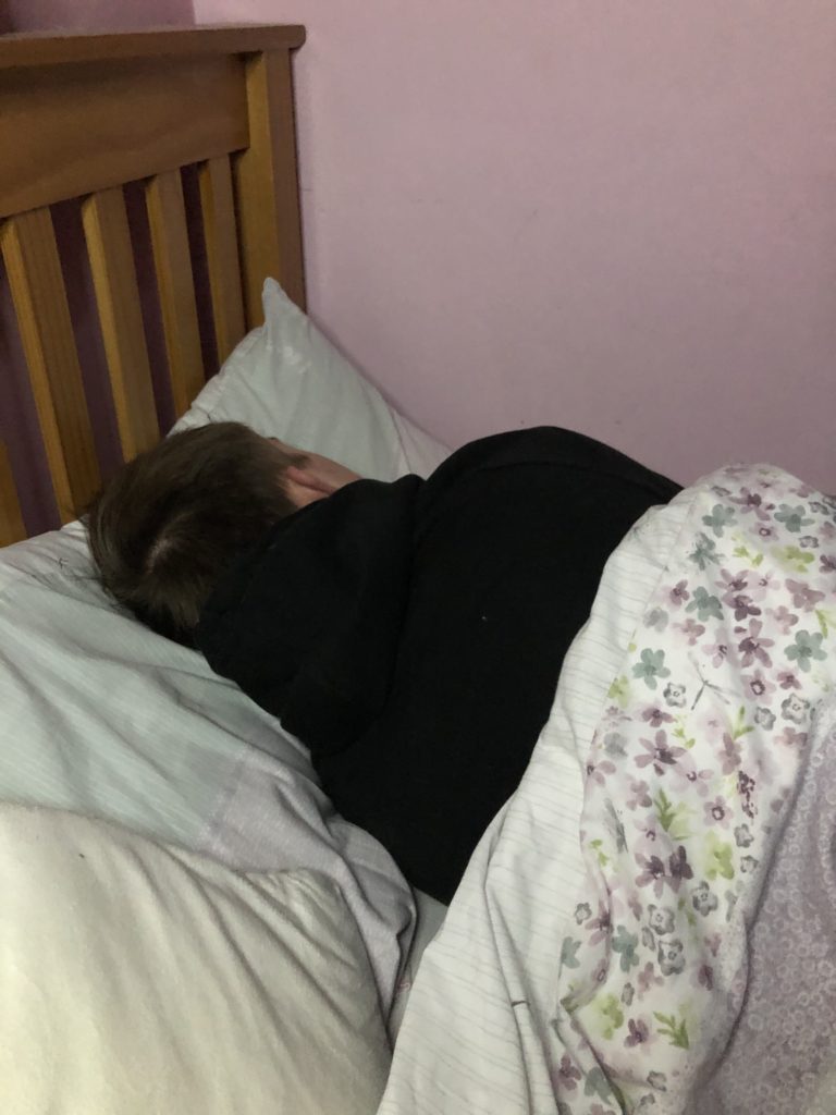
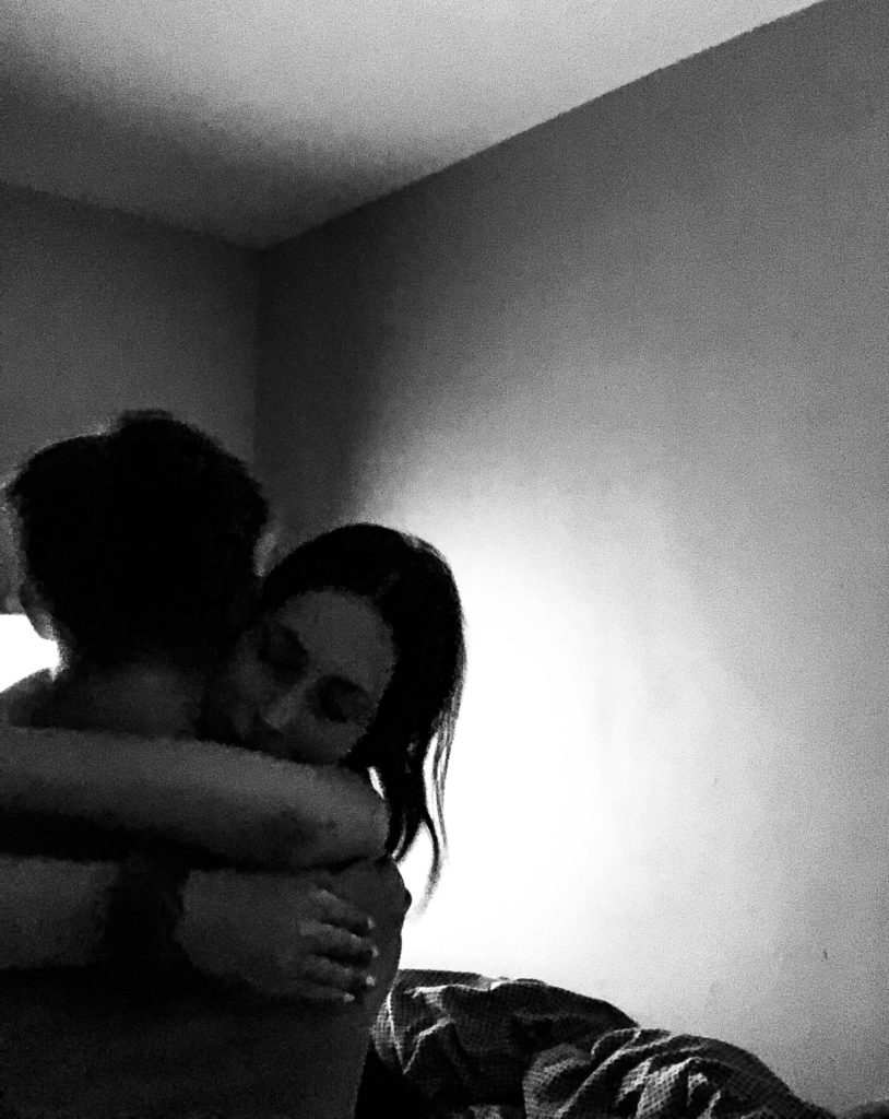
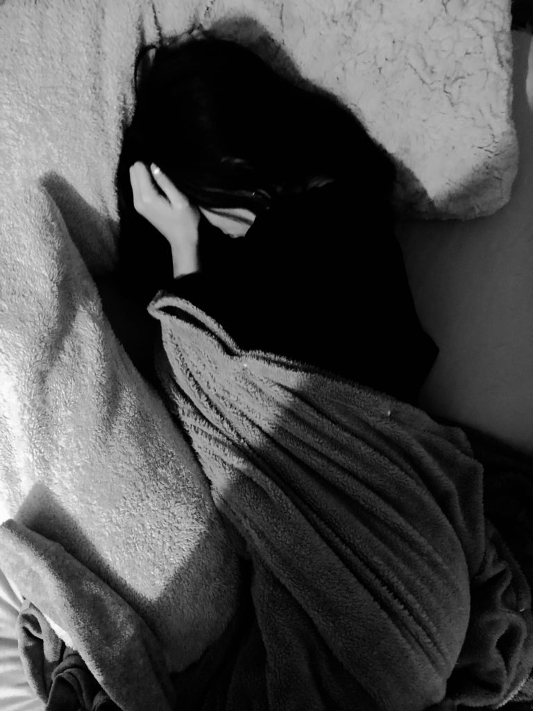
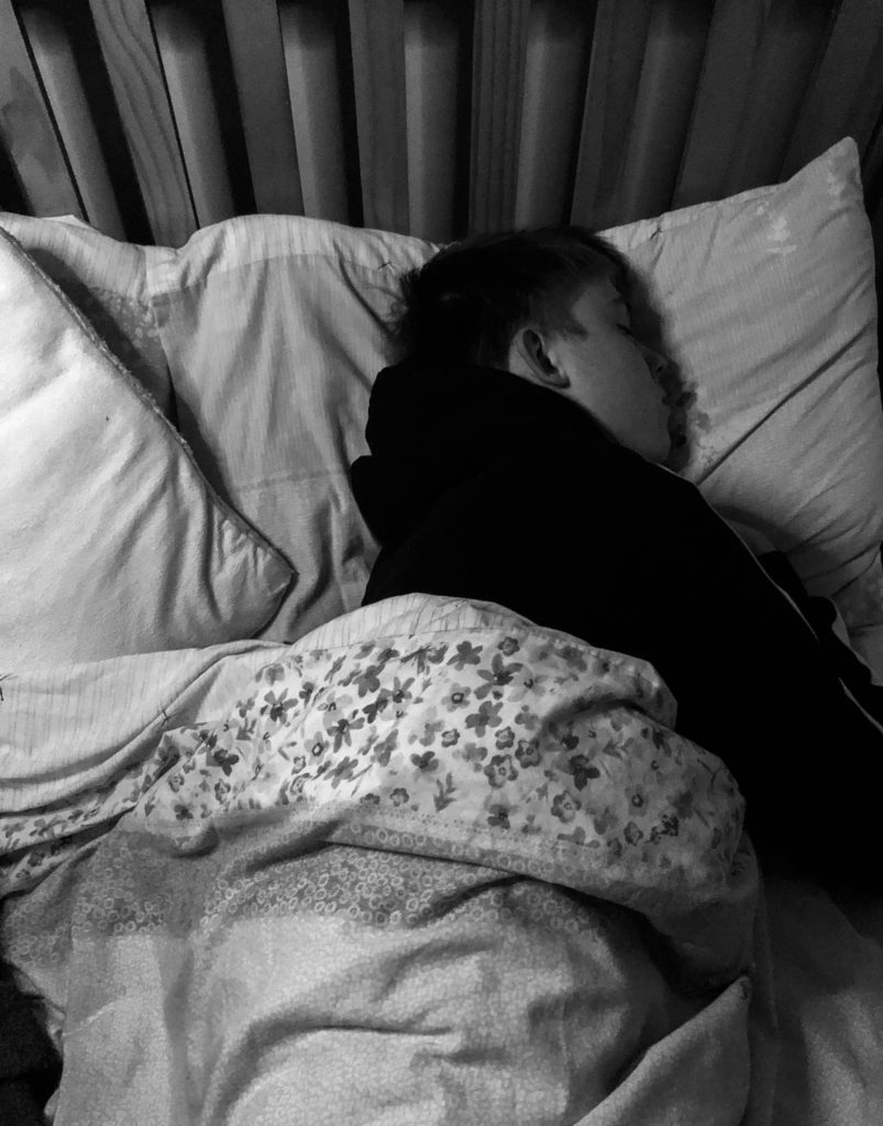
So, just to restate I changed my plan for this photo shoot in order it to fit yet juxtapose with my narrative. These are images of me and my partner in some of our happiest moments and saddest moments that will contrast with each other in order to create my sense of narrative.

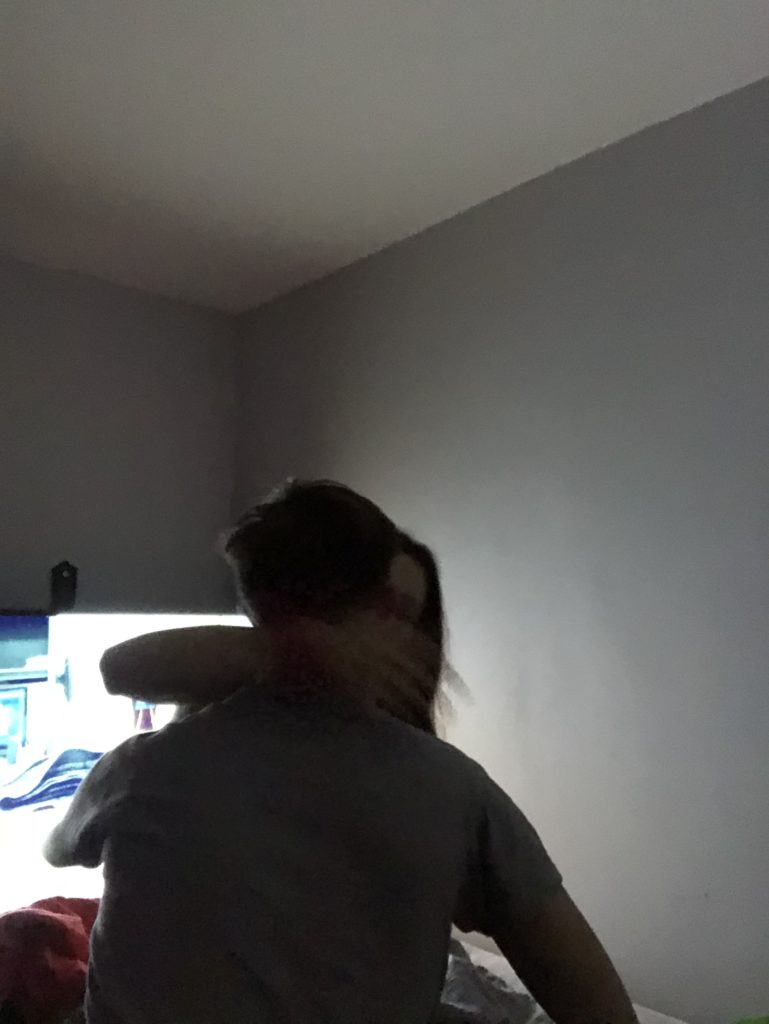
One thing that I would change about the images is the framing. I found it quite difficult, considering I was taking the photos without a tripod and with a timer, to frame the images well because often, I couldn’t see what I was photographing; it was almost a hit and miss when it came to framing. So, in some images there are fragments that I wish were not in the frame to make the image more aesthetically pleasing. However, considering it was quite difficult, I do also think I did well.

In addition to framing I feel as though there was more that I could’ve done concerning the background; in some images the background was quite cluttered and for me this takes away the aesthetics of an image. I wish I I had done something about that when photographing.

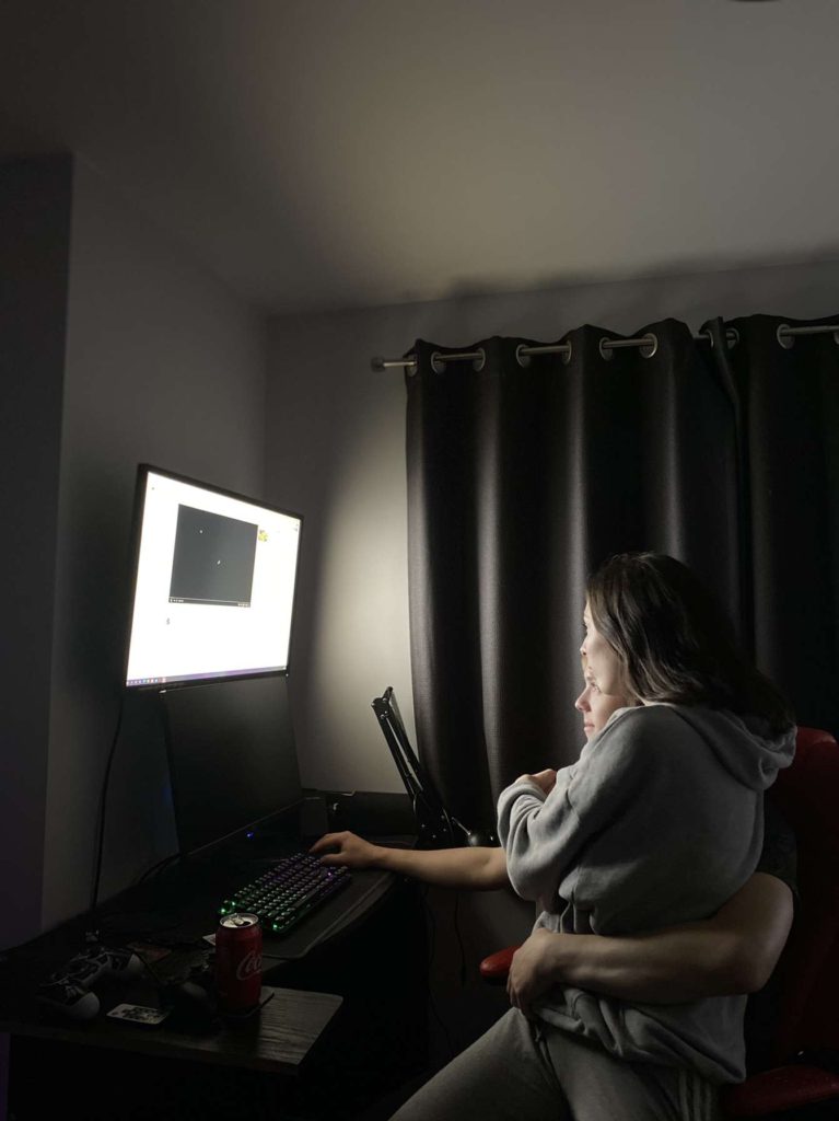
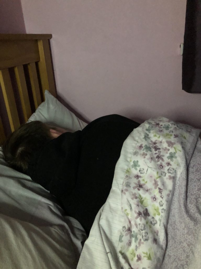
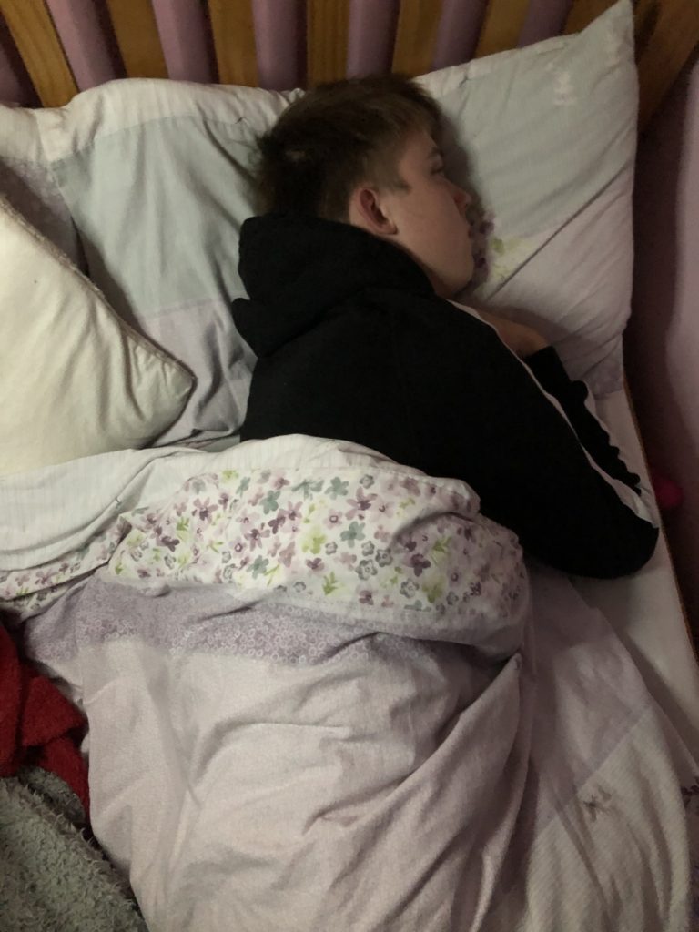
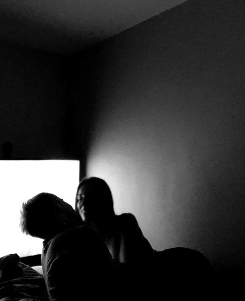
Another thing that I wish I would’ve focused on more is the lighting. One image that I loved was the image with me and my partner in front of his computer as there is a nice glow that lights up the room. However in other images, there was a harsh artificial light right above us that I don’t think compliments the images very well. The atmosphere is quite bland and I feel as though there could’ve been more depth and manipulation when it came to lighting. The lighting also affected the quality of the images. For example, in the last image the lighting was very dark which therefore affected the camera ability to pick up me and my partners outline. Therefore it made the images quite grainy and unfortunately lacked in quality, however this could add to the tone potentially.

Another thing I lover about the final images is my editing. In some images, the lighting made the quality of the images grainy, however, turning the images into black and white almost concealed the low quality and almost increased the atmosphere of the images. Also, editing the highlights, exposure and contrast also turned the low quality images into silhouettes which added to the tone beautifully in my opinion. This is why I feel as though my editing of my images was a good aspect of this process.

My Love Story – Specification

Story Options/Planning:

STORY TITLE: DISQUIETUDE

3 Words: A Love Story

A Sentence: A Reflection of Deeper Issues Within My Relationship.

A Paragraph: Within my love story I am looking to photograph my own relationship and how my own personal insecurities and personal issues effect my relationship. This includes things like low self confidence, trust issues, anxiety, stress, family problems etc. These issues cause arguments, feelings of loneliness and isolation, feelings of paranoia and overall make a relationship very stressful and harder than normal for me. On the other hand, I am also going to be photographing the good side of me and my partners relationship. Thus, my photo zine will almost be a battle between the two sides: the good vs the bad.
AUDIENCE: The audience will mainly be aimed at teenagers. This is because young teen relationships face a lot of pressure and a lot of struggle when it comes to making this work. This is down to things like social media, social expectations, toxic friendships, our age and naivety etc. These factors make it hard to maintain a strong relationship in this day and age. I feel as though a lot of young couples, or even teenagers not in a relationship will be able to relate to these every day struggles which will form a sort of relationship between my images and the viewers.

NARRATIVE: I will be exploring this idea of isolation and own personal struggles through images and most probably texts – most likely hand written notes to my partner or to myself explaining my emotions that were shown in the images i will take.

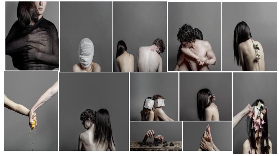
My aesthetic and inspirations come from Hsin Wang with her series named De-Selfing:

She is a Taiwanese photographer currently based in Portland. Her work is “arresting through the intimate, honest and provocative approach, turning her personal stories into powerful metaphors and symbolic images of the complex relationship not only with the other, but with one’s own self.”

https://www.hsinnyc.com/about

Analysis

Worbz - Hsin Wang
Part of the De-Selfing Series

TECHNICAL: The type of lighting used within the image is most likely to be studio lighting. This is because it looks very artificial and quite harsh, probably a type of fluorescent lighting. There is clearly a high level of control in this particular image. You can tell that everything has been carefully located and positioned, this includes the lighting and even the subject’s within the image. This would enhance the overall metaphorical meaning behind the images. The camera would’ve most likely been selected to a lower f/stop in order to allow more light into the camera as these images appear to be moderately bright.

VISUAL: The colours within the image are very pale and dull and overall un-exciting. Again, this could help with the overall metaphorical meaning that the image holds. The tones are also very bland with no range at all in them. Everything in the image is of a light, bright tone. The composition of the image is clearly very well planned and very intricately located. She really wants to get her emotions through, through her and her partners body language. You can see, as they look away from each other and lean away from each other that they are visibly dealing with their own struggles or that they are falling out with each other over one person’s struggles. Whatever the symbolic reason is, there is clearly and element of discomfort and isolation that has been represented within this image.

CONTEXTUAL AND CONCEPTUAL: As mentioned in the description of Hsing Wang, she is exploring her complex relationship with herself and her partner. You can really see this through the composition of her images as i said before, especially her/their body language. She almost always seems to cover her face also, which says to me that she is dealing with her own issues such as confidence which is having an effect on her relationship. The lighting and tone of the images as well also hint to me that there is a struggle. Usually, within photography, happiness is shown by bright, bold, warm colours whereas Wang’s photographs have a bleak, pale tone to them indicating that there is a lot of unhappiness or loneliness trying to be put across.

A Portrait Of Someone I Love

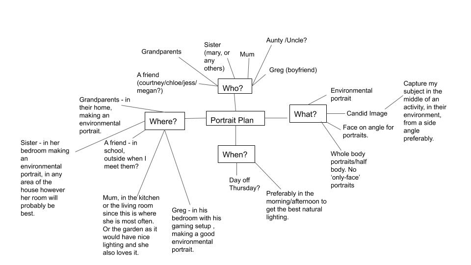
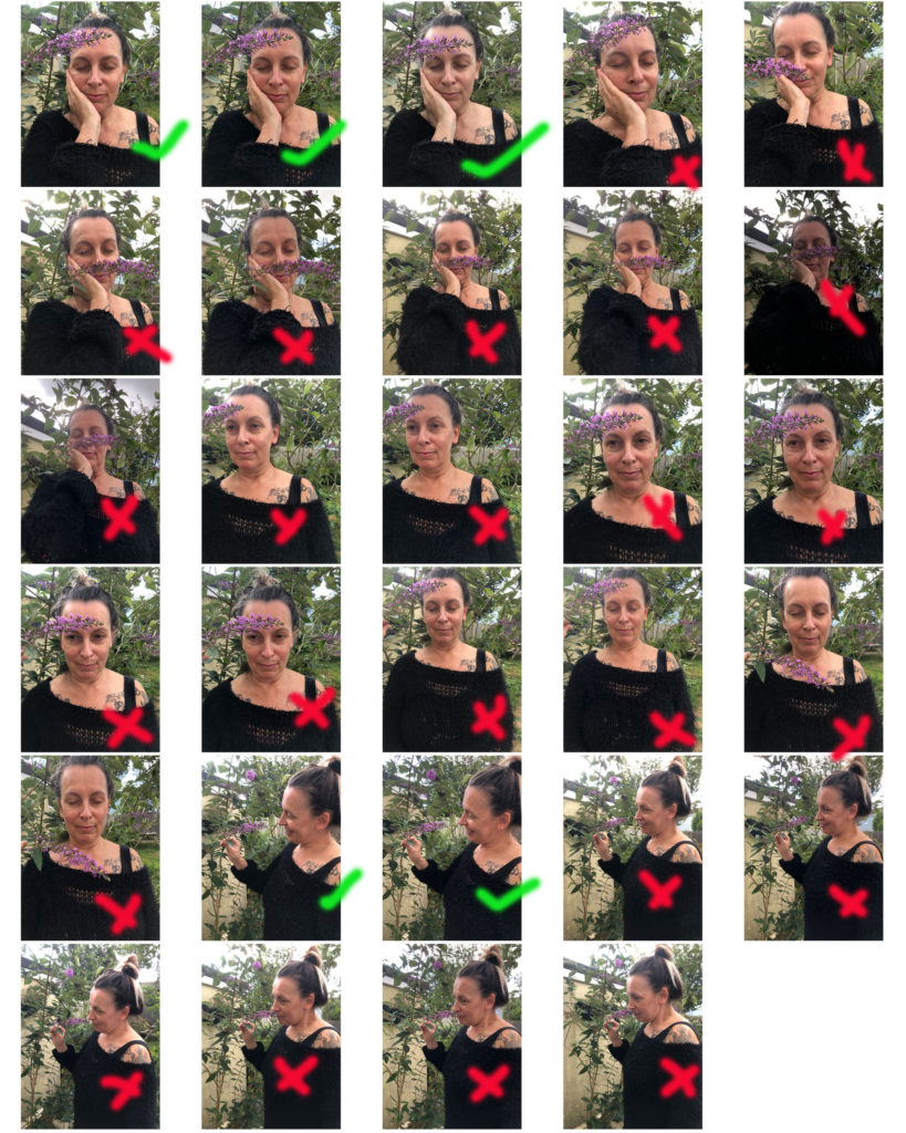
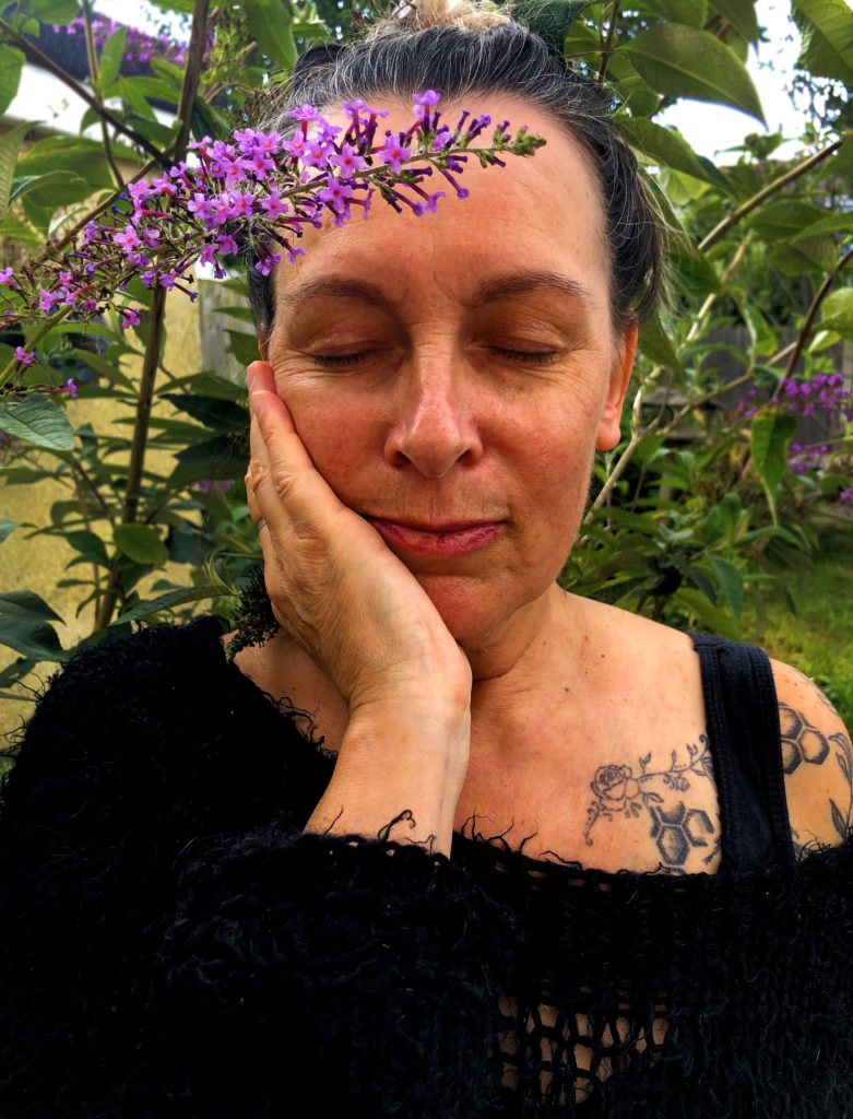
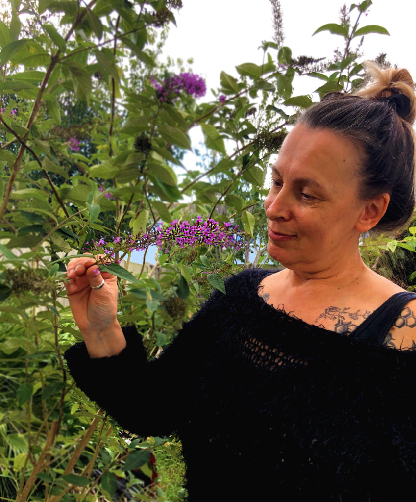
I followed the plan that I made and decided to use my Mum for this task. I positioned her in the garden, as mentioned before, because she loves being in the garden therefore making it an environmental portrait. I also chose my mum because of opportunity reasons; she was readily available to me and because I find she has such interesting character which shows through her tattoos especially.

Environmental Portrait

I edited these photographs first by cropping them, so that my subject was the centre of attention and that no other irrelevant objects could be seen. I feel like this made the image a lot prettier and satisfying to look at.

Candid Portrait

To finish off my editing, I used many different tools. Firstly, I used the blur tool to defocus the background a little more so my subject was even more the centre of attention than before. I then levelled the image to how I preferred. After, I increased the vibrancy and the saturation of the image to make it look warmer and more appealing to the viewers of the image. Also, to make the flowers stand out a bit more. I also increased the sharpness of the image to somewhat improve the quality and I also used the dodge tool to brighten up some areas.

Research and Analysis

Percival Dunham

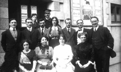
States Members arriving for a special sitting in 1914.

Percival Dunham was Jersey’s first ever Photojournalist. This was for a newspaper, ‘Jersey Illustrated Weekly’ and the ‘Morning News’ who were great competitors with the Jersey Evening Post.

A wedding at Rosel Manor.

He had a candid style of news photography and was seen as well ahead of his time. His images mainly represent the remarkable picture of life on this small island and captures Jersey right before the outbreak of the War.

His images are very unique, especially since Jersey is a small, unknown island to some. As mentioned before, his images were well ahead of their time, similar to modern street/candid photography and he captured many different things.

Image Analysis

Outside the Grand Hotel on the promenade. Snow Day.

TECHNICAL: the type of lighting Dunham tends to use natural lighting, since his photographs are usually candid, however when not, they are outside in daylight. His levels of control within his work vary, sometimes there is a strong level of control in which he has positioned his subjects and got them in a way in which he desired. However, sometimes there is a lack if control where his candid images are concerned, you may find his images blurred as the subject is not located or positioned in some way. His camera would’ve been old, since most of these were taken between 1913-1914, the shutter speed however, would’ve been quite fast when taking his images as mentioned earlier some of his subjects are blurred, and the lighting in most isn’t to bright.

VISUAL: The colour in this particular image, and in all of his others, the colour is black and white, often with brown or orange tints however this would’ve been due to the age of the camera, and even the weather. The tone of the image above is quite dark, again because the day would’ve been dull, enhancing the blacks and taking away any brown tints. This also could be because he had a higher aperture. The black’s and white’s in this images seem to contrast each other very well, creating a very bold image. There is no arrangement or organisation in this image; it is not composed. It is very much candid and similar to street photography. However, you could argue that it is slightly composed, there is a slight lead of the eye within this image that highlight the ‘West Park’ sign and the hotel behind.

CONCEPTUAL: The concept behind the images may not only be Photojournalism. The images almost feel as though they are made to be memories. Especially since they were available to the public and were able to keep by everyone. It’s almost as though he made these images for people in the future to see, and that’s why they are candid; memories aren’t positioned or faked. He really pictured a lot of events, occupations, locations etc, almost as if he wanted to tell a story. However, it has been said that most of his EARLY images were promotional to keep the advertisers happy, until he worked for the ‘Illustrated News’.

Michelle Sank

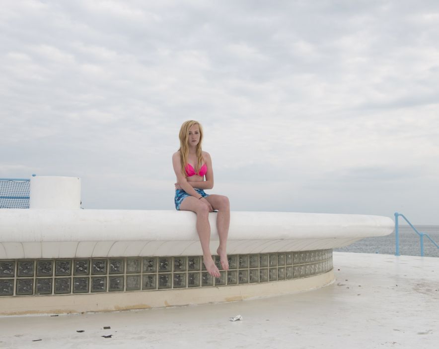
Michelle Sank – Insula

Michelle Sank’s images “reflects a preoccupation with the human condition and to this end can be viewed as social documentary. Her work encompasses issues around social and cultural diversity”

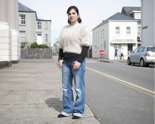
In 2013, she came to Jersey for 6 months to undergo this project. Click this link to read more about her and this project: http://www.michellesank.com/portfolios/insula

Image Analysis

Insula

TECHNICAL: The type of lighting in this image is very clearly natural lighting, because the image is clearly taken outside and no particular harsh/florescent lighting can be seen. You can also see the natural shadows on the subject’s faces that indicate natural lighting from the sunlight. There is a medium level of control here, the subject’s are clearly position and located, however their posture and the light from the sun hasn’t been manipulated in any way therefore you could argue that there is a low level of control. There is a large aperture, due to the brightness of the image with a small depth of field.

VISUAL: The tone of the image is very light, giving the image a summery vibe. The composition of the image is very simple as most of her images tend to be with her subject’s facing toward the camera in a neutral posture, like an environmental portrait. It is clear that Sank’s images have a connection between the background and the subject, maybe that is where the subject likes to hang out a lot, where they live etc.

CONTEXTUAL&CONCEPTUAL: It is said that Sank came to Jersey as it created a vision within place and cultural photography. When she got here though, the geographic and historical influences ‘loomed large’ which also had an impact on her photography. It is also said, that her images are called ‘residency photographs’ and that they are procured under certain psychological precepts.

See here: http://www.michellesank.com/portfolios/insula

Comparison

TECHNICAL: The lighting in both images is natural lighting, they are both taken outside and have the natural shadows forming due to the sunlight. Both images above are positioned and located in a particular way to make the subject’s look more appealing in the images. Michelle Sank tends to use a higher aperture, where the images come out brighter, whereas Dunham may have used a lower aperture, however time differences must be taken into account as approximately 100 years sits between these images and the camera quality is far different. Dunham most probably would’ve had a lower shutter speed due to the model of camera however I can image Sank used a fast shutter speed.

VISUAL: Both artist’s seem to create environmental portraits, and similarly, they also seem to take some candid images also. The colour of the artist’s images are also very clearly different, this again, would be due to the time difference. As you can see Sank’s images are in colour whereas Dunham’s images are in black and white. Sank’s tone is also a lot more brighter than Dunham’s, however you can also get the odd bright image from Dunham due to the natural, bright lighting.

The overall idea and technique by both artists is similar. Both use environmental portraits and sometimes candid images to capture life in Jersey and to capture certain influences such as our location and history. The background has just as much influence as the subject does in their images.

ESSAY: WHAT MAKES AN IMAGE ‘ICONIC’?

What Makes an Image Iconic?

There are many factors to think about when you are considering an image to be iconic. The actual definition of iconic is, relating to or of the nature of an icon. This infers that images are usually iconic if it contains a person or thing regarded as a representative symbol or as worthy of veneration.


There must be some criteria when considering an image to be iconic since it’s a strong word for an image or anything in general to be labelled as. Susan Bright asked, when thinking about criteria “What is the social value of the image?”, “Does it reinforce or undermine dominant ideologies?”, “Where does it sit in the history of photography and in social history?”, “Does it have any metaphorical messages beyond the frame?” These questions usually identify the iconic nature of an image. For example, if the social value is strong, if it reinforces dominant ideologies, if it sits recently and popularly in photography or social history and if it has strong metaphorical messages beyond the frame, an image usually becomes iconic.


An iconic image is well-known and extremely popular. Even if an individual might not know the context or background of the image, they will have recognized it from media sources, posters, merchandise etc. and would have had many connections with the photograph. You may even say that the image is overused. Take the Queen, for example. Her effigy has been reproduced 220 billion times in more than 130 different colors. It’s been on stamps, money, merchandise etc. Her image is said to be one of the most iconic images in the world, and we would all know it if we saw it.


Another factor when considering whether an image is iconic or not is the photographic strategies that are used. For example, this image to the bottom of this paragraph is Guerrillero Heroico. It is an iconic photograph of Marxist revolutionary Che Guevara taken by Alberto Korda. There are many photographic strategies within this image that help upkeep and enhance its iconic view. For example, the camera angle is from below, making the subject appear large, and powerful. The original image was much wider, however it has been cropped for dramatic effect and other photographic information within the image has been removed to make it even more graphic and to single the subject out, to again enhance his power. The black and white were enhanced when the image was printed and reproduced, the photo was therefore made to look more dramatic and important. His gaze is also important, it shows his vision and strength, especially since it is upturned. Korda said himself, as he took the image, he was drawn to Guervara’s facial expression which showed, what he said,” absolute implacability” as well as anger and pain. The Maryland Institute College of Art called this image” a symbol of the 20th Century and is one of the most famous images of all time. Versions of it have been painted, printed, digitized, embroidered, tattooed, silk screened, sculpted or sketched on nearly every surface imaginable.

Guerrillero Heroico - Wikipedia

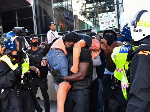
Consider this image below, let’s discuss the criteria. This photograph was taken at a Black Lives Matter protest and has been widely spread throughout the media as it shows a black person helping a white person. This provides a wonderful message of equality and love, and how races can join to fight against something that is wrong within the world.


What is the social value of the image? This image is highly socially valuable. The protest in general, are very valuable to not only to black lives, but to all races that support the movement, have experienced racism or police brutality, family members of people who have experienced this etc. This is not only valuable to a certain community of people. Police brutality is also a huge problem that nearly every single member of the public disagrees with, therefore the protests are highly valuable, thus images of the protests are highly valuable. This image in particular would be valuable because it shows two kinds of races together in unity and not hate. Thus going against racism which is a problem the public want to solve.


Does it reinforce or undermine any dominant ideologies?
The answer is simply yes. The dominant ideology that has been maintained for a number of years is that white people are superior to black people, and also that police are superior to the citizens and are able to do whatever they like. The protests were mainly to stop police brutality after the nursed of George Floyd, however this image undermines the ideology that white people are superior to black people. This specific image shows that we are all equal and that we should help each other, regardless of our race. Within this image it also shows the white person as inferior and a black person as superior as he is helping the white person. However, I disagree with this message as equality is what we should be looking for, just an interesting perspective.


Where does it sit in the history of photography and in social history? It sits very recently in both. Which is most probably why the image has done so well. The image is relevant to today’s issues and today’s events. The camera quality shows that it sits recently in photographic history, and more obviously the date it was taken, and also the clothing within the image and the technology shown within the image.
Does it have any metaphorical messages beyond the frame? I touched on a number of messages above that this image may have. It has a metaphorical message of equality and how no matter our race, we should all help each-other. We should not prejudice due to our skin colour. We are all human, we all bleed the same, therefore we should take care of each other.


The photographic strategies used are also interesting. It is taken almost face-on however a little below to make the black man appear strong and large, which is the opposite of racists ‘beliefs’ of black people which are that they are inferior and weak. The photographer also got it from an angle where the two subject’s are surrounded by police in lots of protective gear, enforcing the idea of police brutality and fear of the police, however the two seem almost untouched by the police, giving the message of freedom and rebellion against the brutal police force.
Because that specific image reached all of that criteria positively, we may say that it is an iconic image.

ARTIST REFERENCES

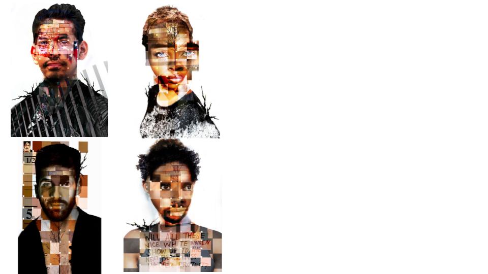
JANA CURCIO

THIS SERIES OF COLLAGES BY JANA CURCIO IS NAMED ‘SKIN TONES’. IT REVELS HOW OUR SKIN COLOUR AFFECTS THE WAY OTHERS SEE US. IT EXAMINES THE NOTION THAT AN INDIVIDUALS PERCEPTION OF THEMSELVES IS IMMEDIATELY TIED TO ONE’S SKIN COLOUR AND THEREFORE DETERMINES ONE’S PERCEPTION OF OTHERS.