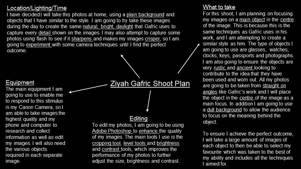
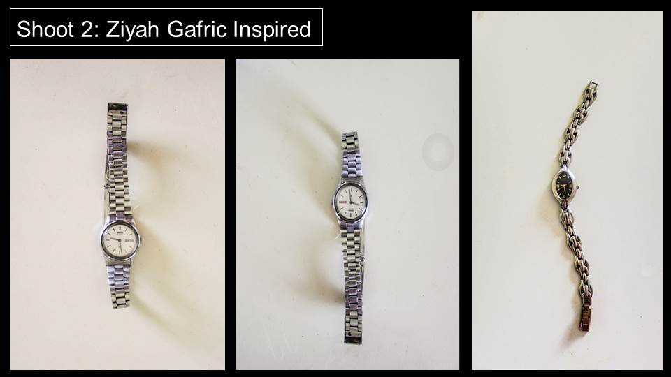
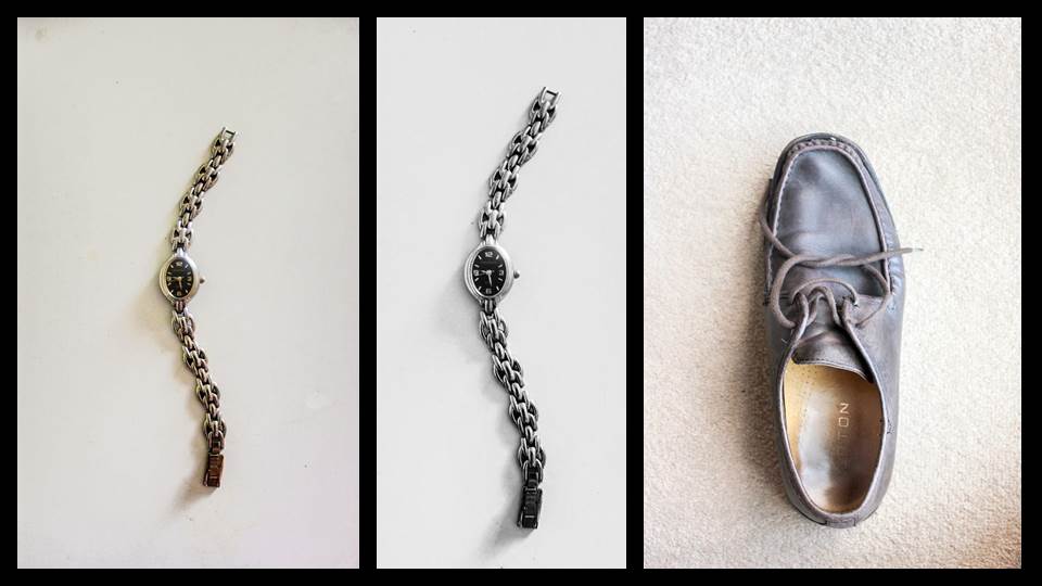
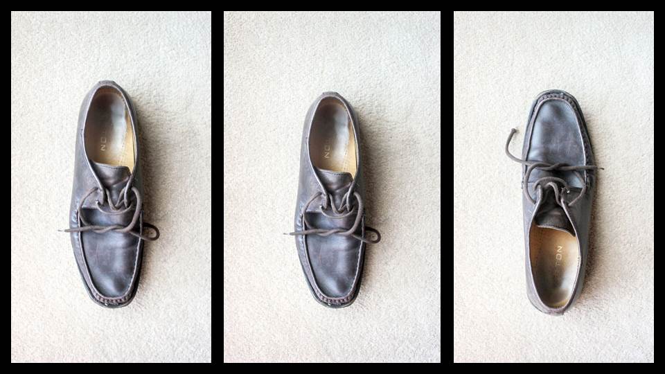
All posts by Aimee O
Filters
MANUAL FOCUS
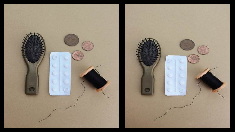
In my collection, I focused on the non- conventional aspects of the theme ‘Mathematics’ and instead focused on capturing a range of different shapes and patterns within my work to create aesthetically pleasing photos. We used the manual focus setting on the camera to take this series of images to help improve our camera skills and techniques.
My Favorite Outcomes:
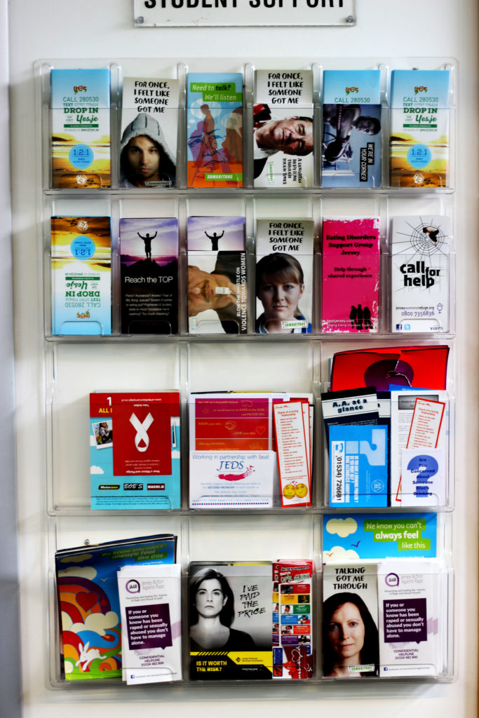
The reason why I think this image works so effectively is due to the aesthetically pleasing pattern created by the range of magazines. In addition, the vibrancy of the different tones all compliment each other. This photo was taken from a straight on angle and I captured it in natural lighting . Furthermore, the concept of the different rectangular and square shapes created links to the stimuli of ‘Mathematics’.

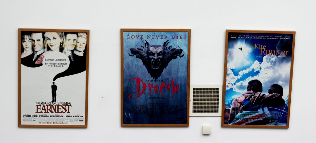
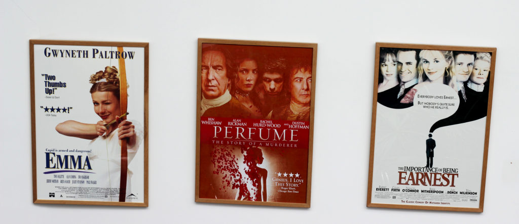
I particularly like this image due to the layout of the different posters next to each other. In addition, the plain, bright background allows the viewer to focus on the colorful posters as the main aspect in the image. The simplicity of this photo works effectively and it creates identical rectangular frames from the outlines of the posters, therefore linking to the mathematics theme.
APERTURE/DEPTH OF FIELD
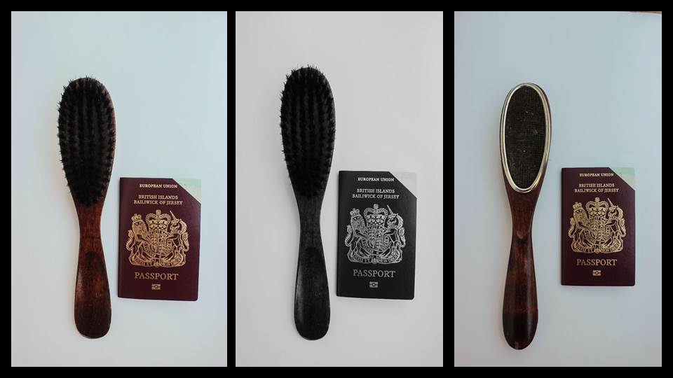
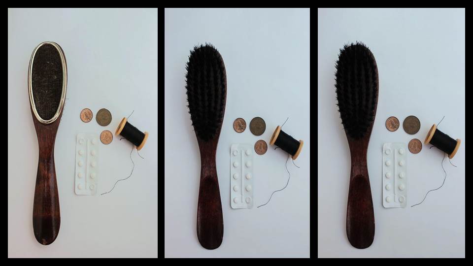
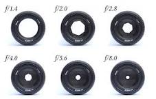
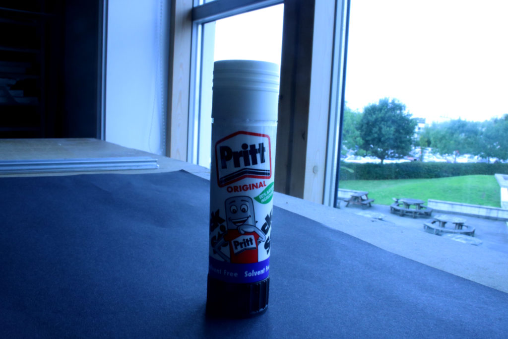
An aperture is a hole or an opening through which light travels. More specifically, the aperture and focal length of an optical system determine the cone angle of a bundle of rays that come to a focus in the image plane. It is calibrated in f/stops and is generally written as numbers such as 1.4, 2, 2.8, 4, 5.6, 8, 11 and 16.
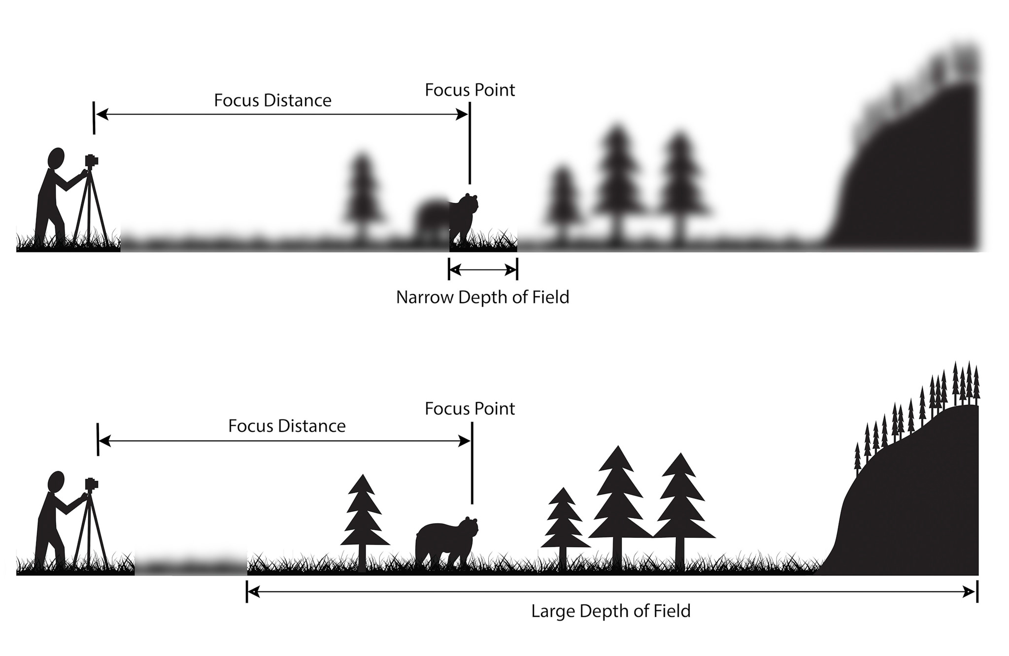
Depth of field is the distance between the closest and farthest objects in a photo that appears acceptably sharp. Now your camera can only focus sharply at one point. But the transition from sharp to unsharp is gradual.
The depth of field can be calculated based on focal length, distance to subject, the acceptable circle of confusion size, and aperture.
My Outcomes:

F4 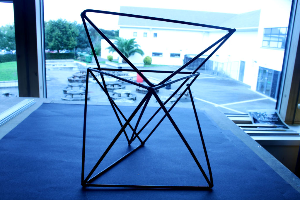
F10 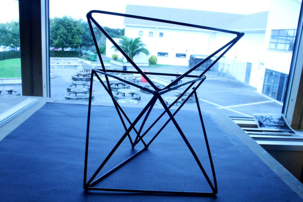
F16 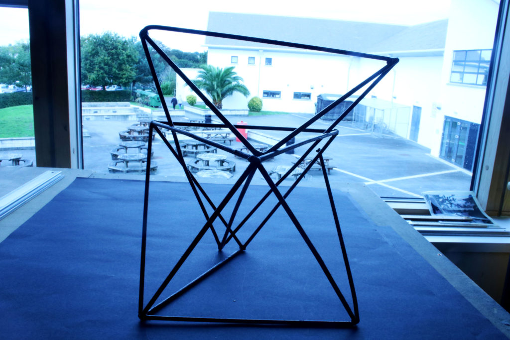
F22 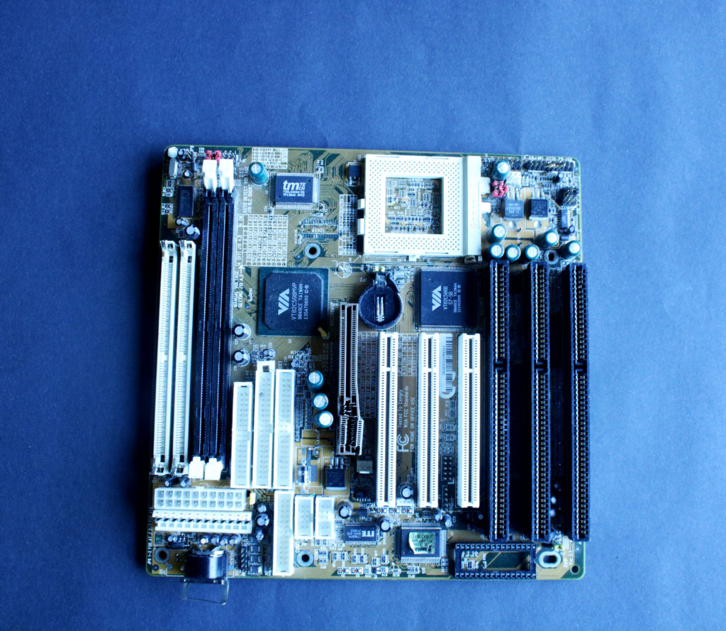
F4 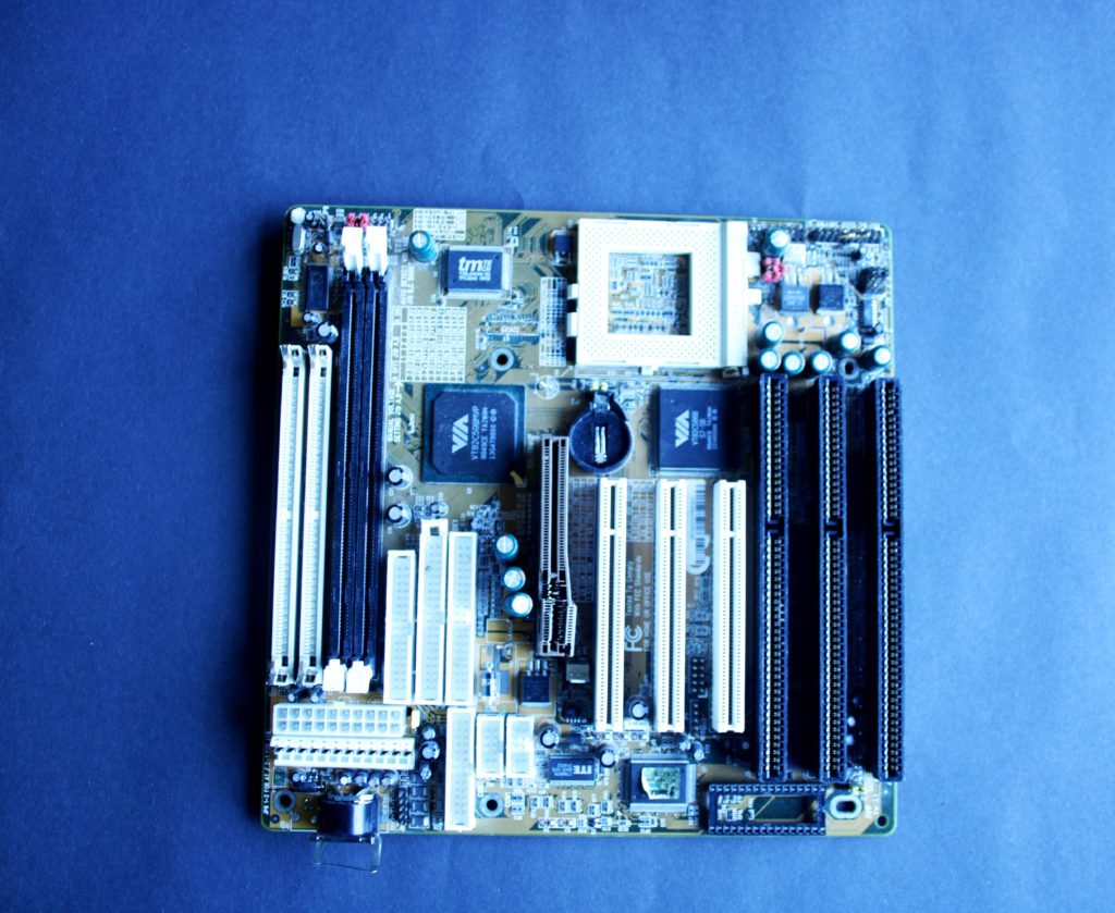
F10 
F16 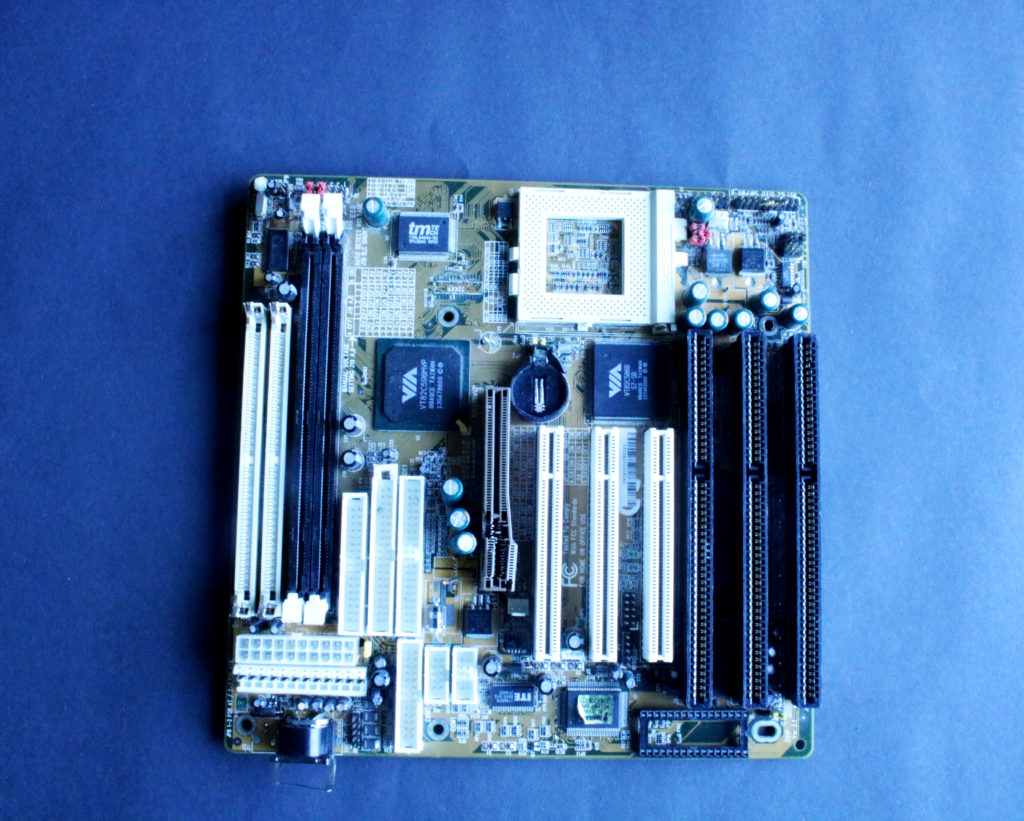
F22
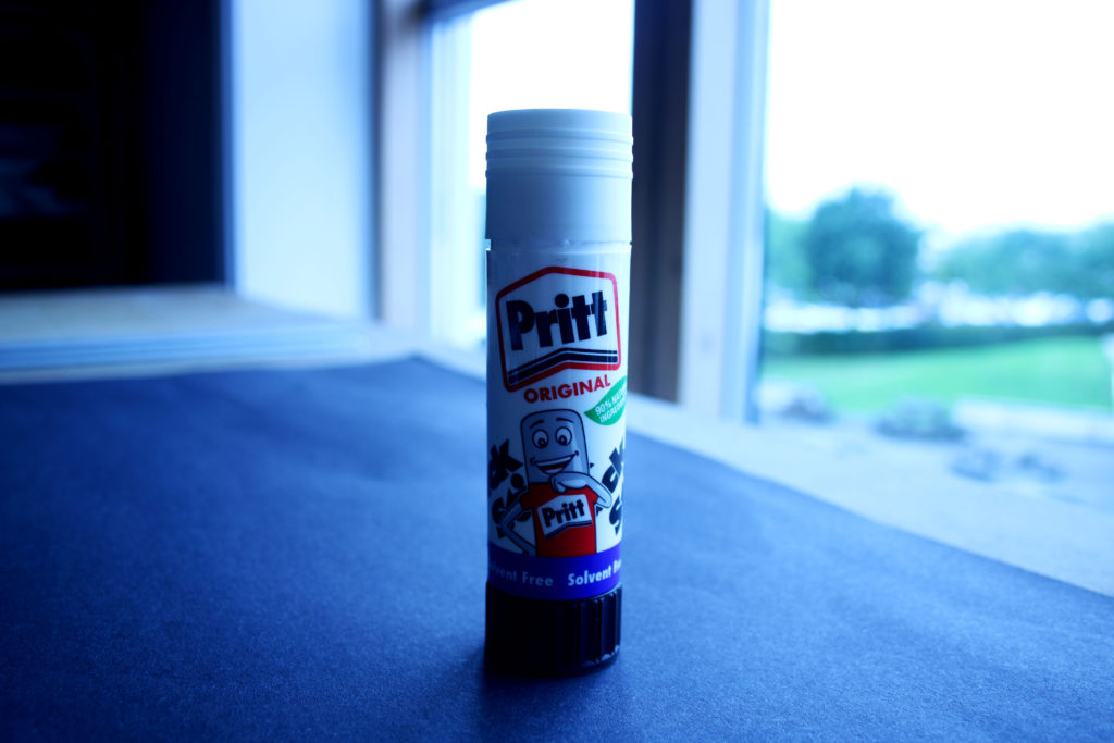
F4 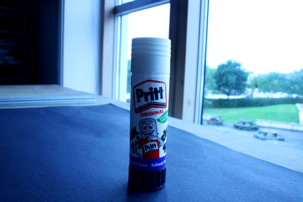
F10 
F16
F22
Favorite Outcome:
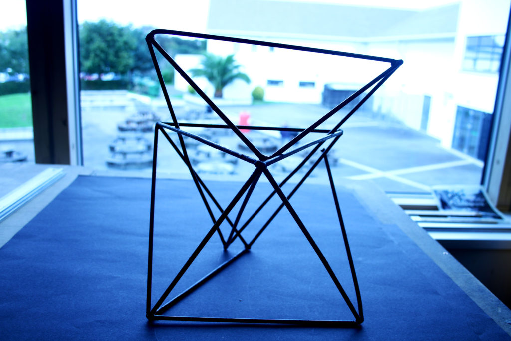
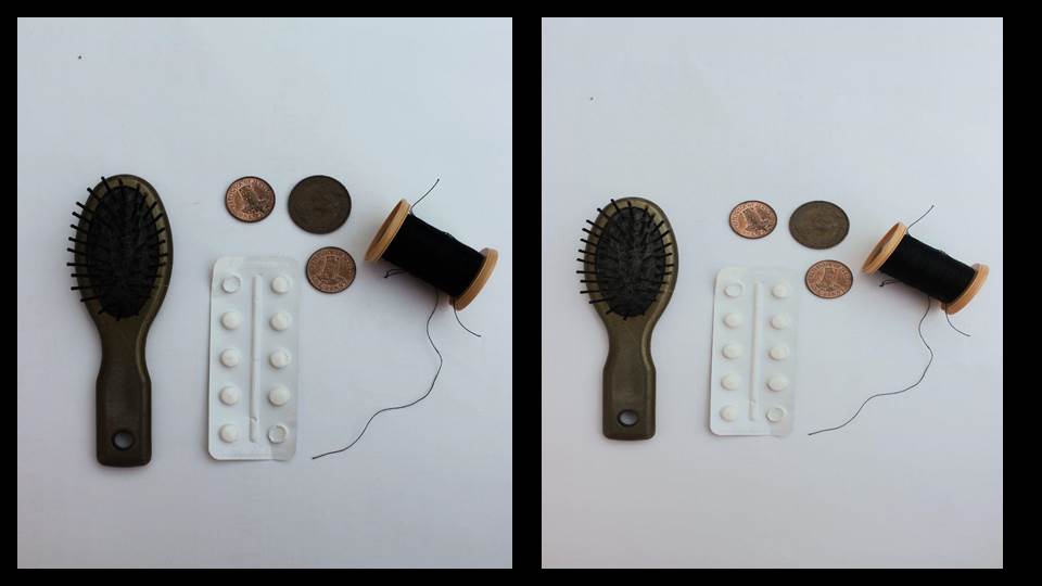
To create this image, I set my camera setting to AV and adjusted it to F stop setting 4. This is my favorite outcome out of my collection as it is an example of a shallow depth of field as it is focusing on the object as the main aspect in the image, drawing the viewers attention to the center. In addition, the object is portrayed as sharp and crisp and the dark tones of it also contributes to this.
COLOR BALANCE SETTINGS
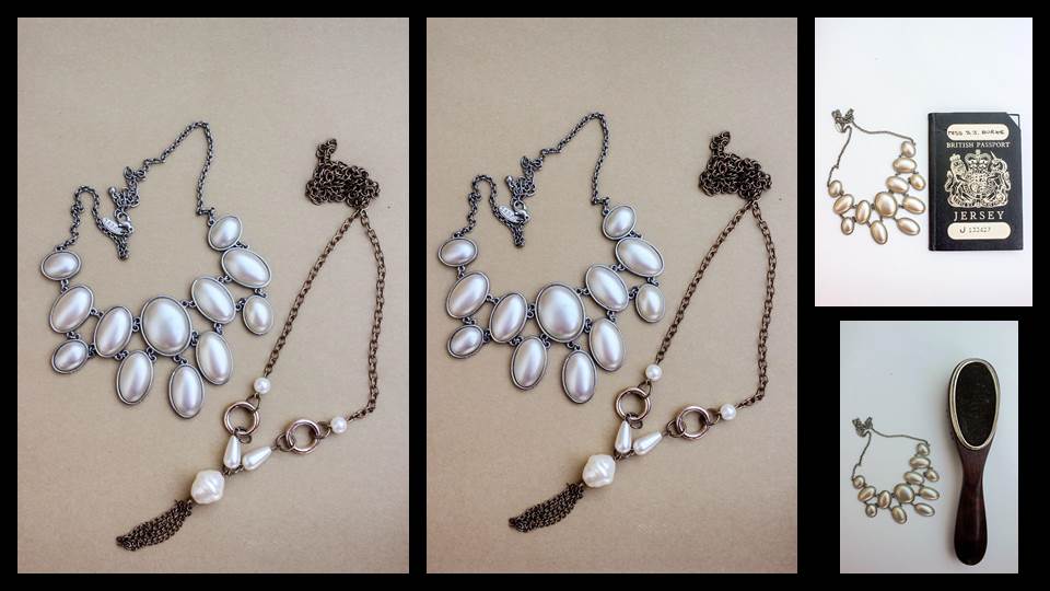
White balance (WB) is the process of removing unrealistic color casts, so that objects which appear white in person are rendered white in your photo. Proper camera white balance has to take into account the color temperature of a light source, which refers to the relative warmth or coolness of white light.
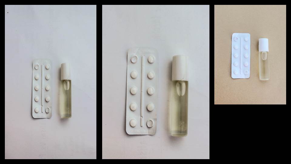
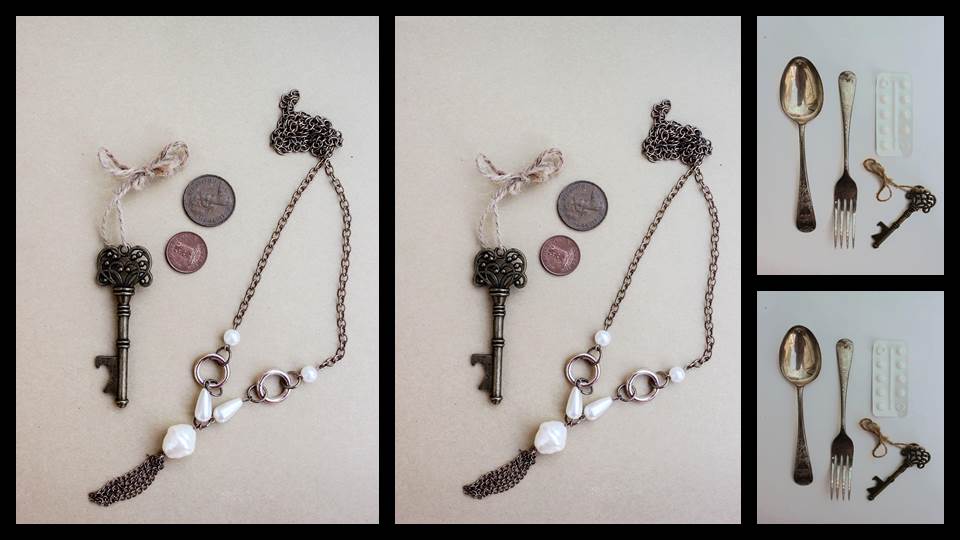
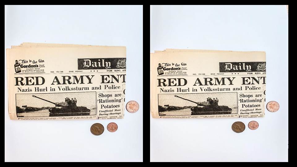
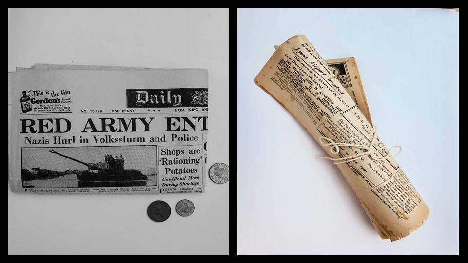
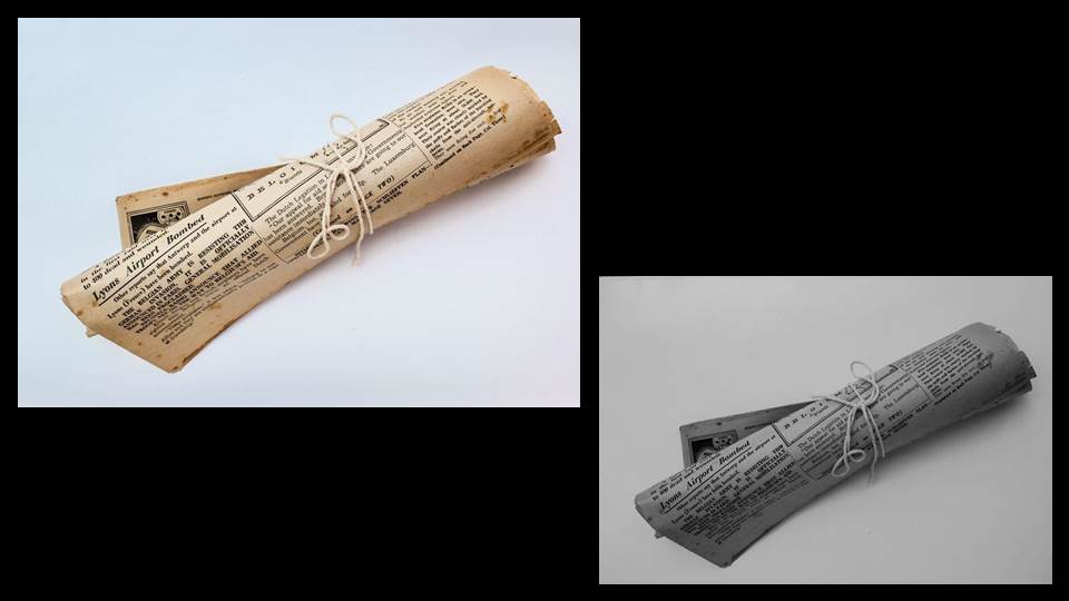
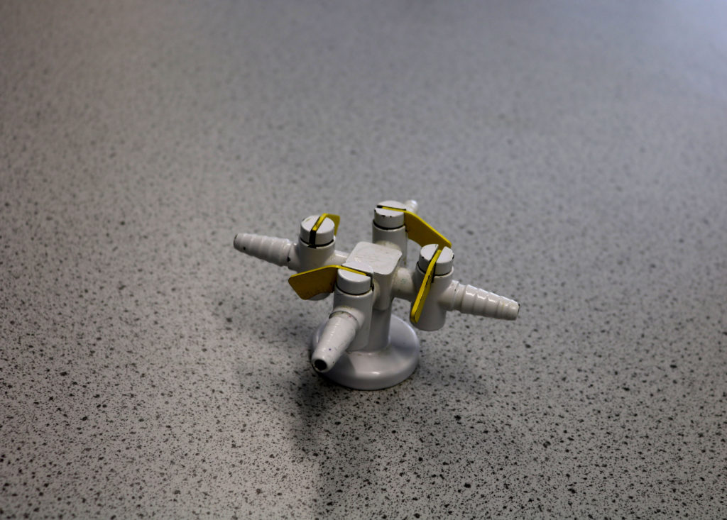
In this photo shoot, we adjusted the color balance settings on the camera by putting the camera into full auto mode, then selecting WB and adjusting the different white balances. The different settings included auto, daylight, shade, cloudy, tungsten light, white fluorescent light and flash. The theme we were following for this particular set of images was ‘Science’.
My Outcomes:
Auto Setting 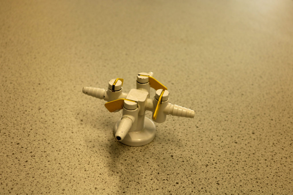
Daylight Setting 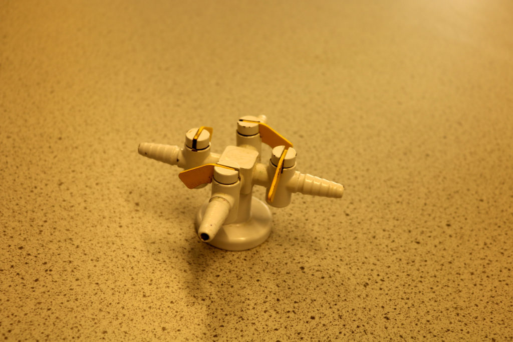
Shade Setting 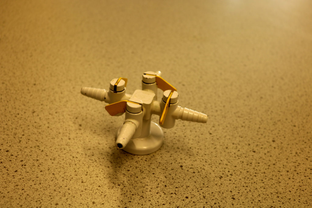
Cloudy Setting 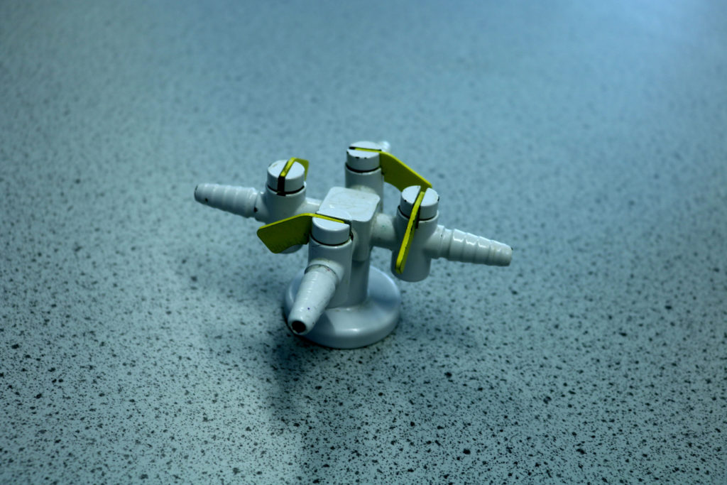
Tungsten Light Setting 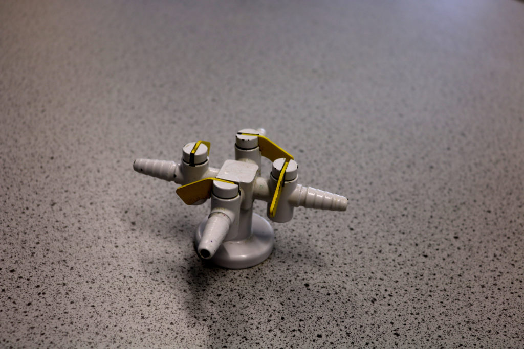
White Fluorescent Light Setting 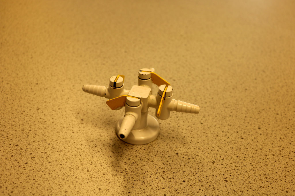
Flash Setting
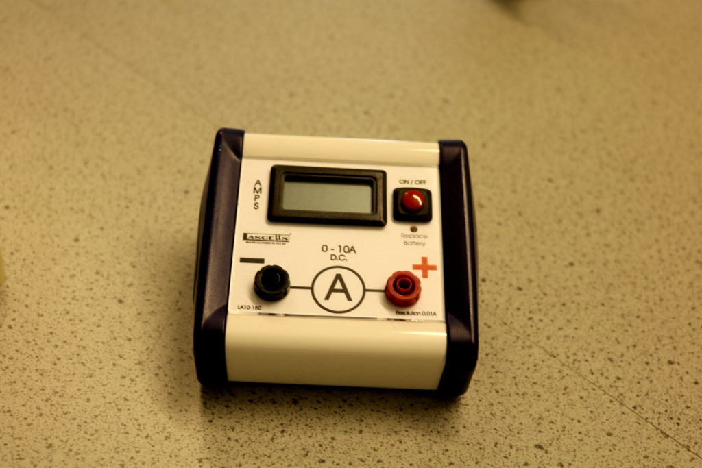
Daylight Setting 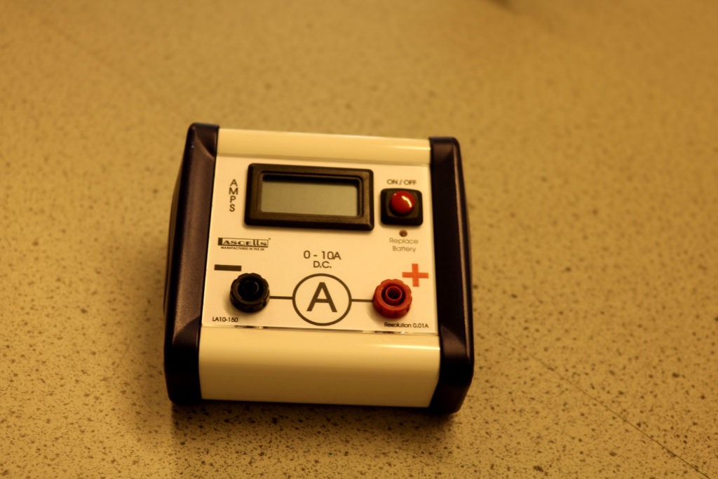
Shade Setting 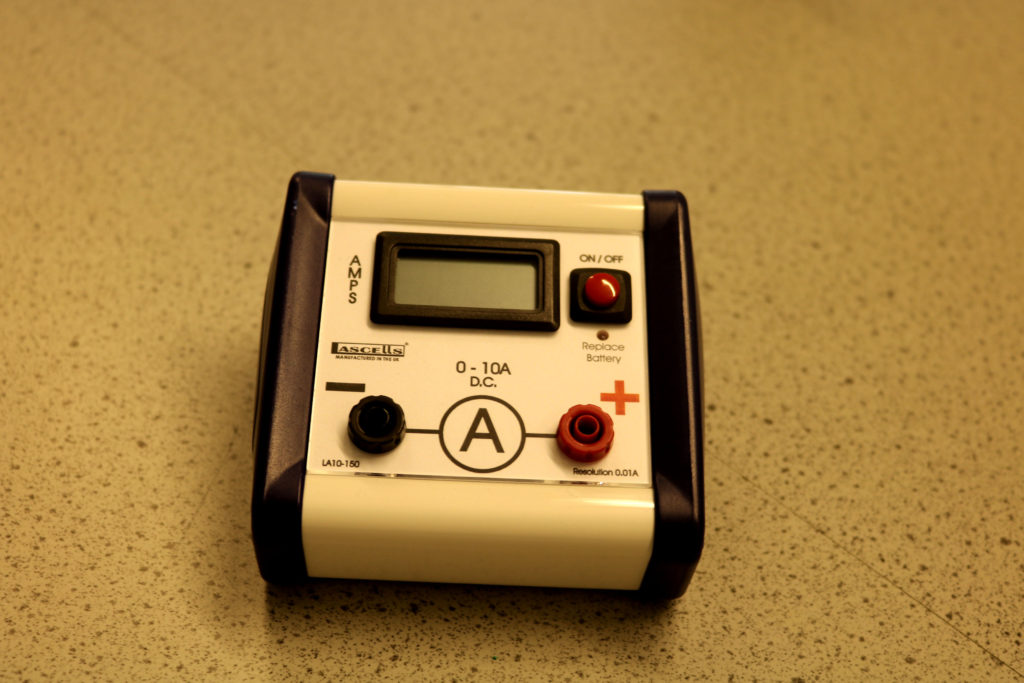
Cloudy Setting 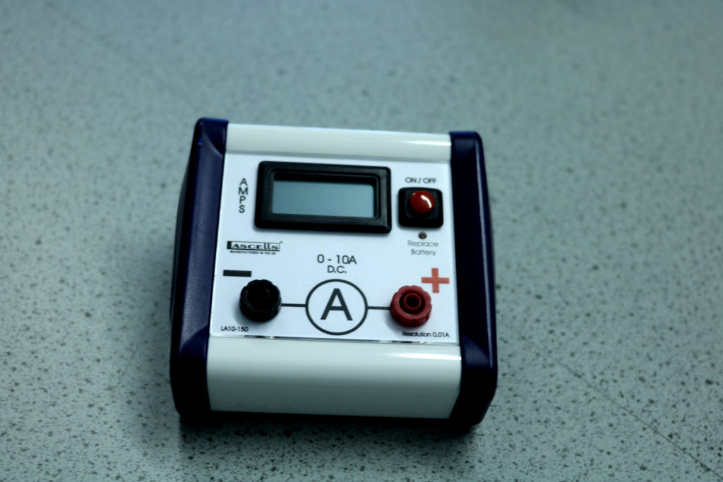
Tungsten Light Setting 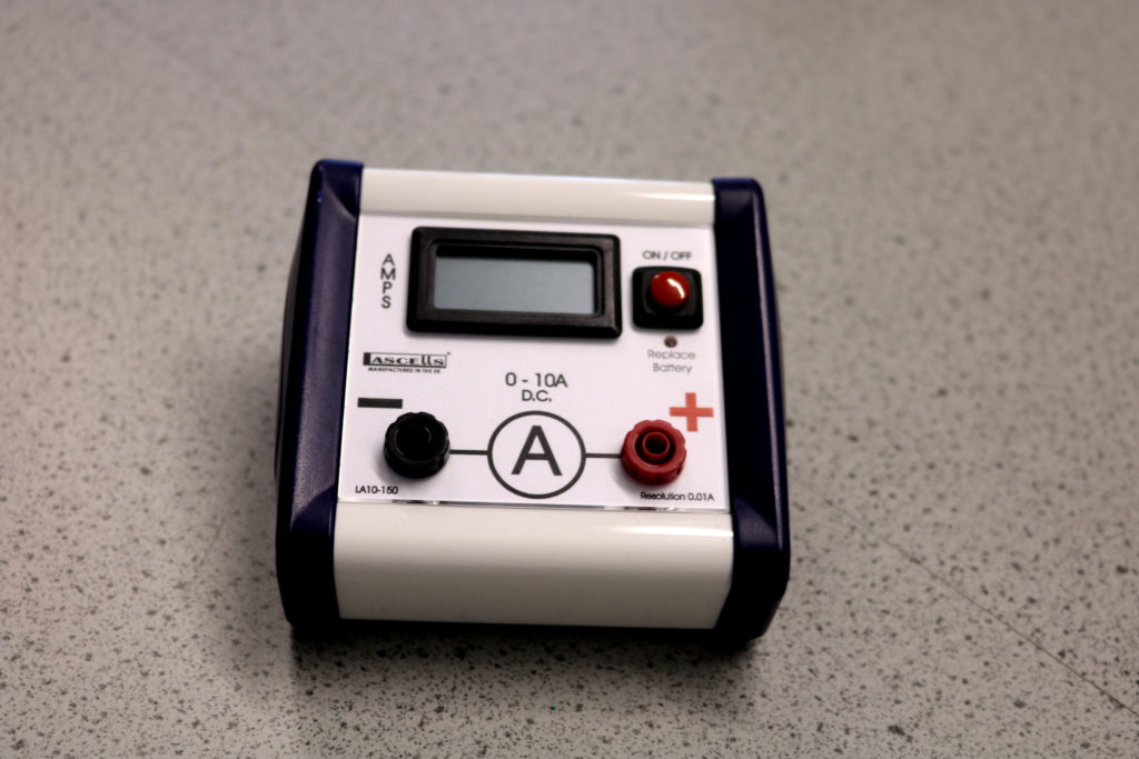
White Fluorescent Light Setting 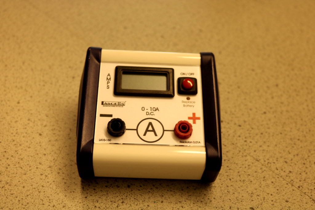
Flash Setting
CONTACT SHEET
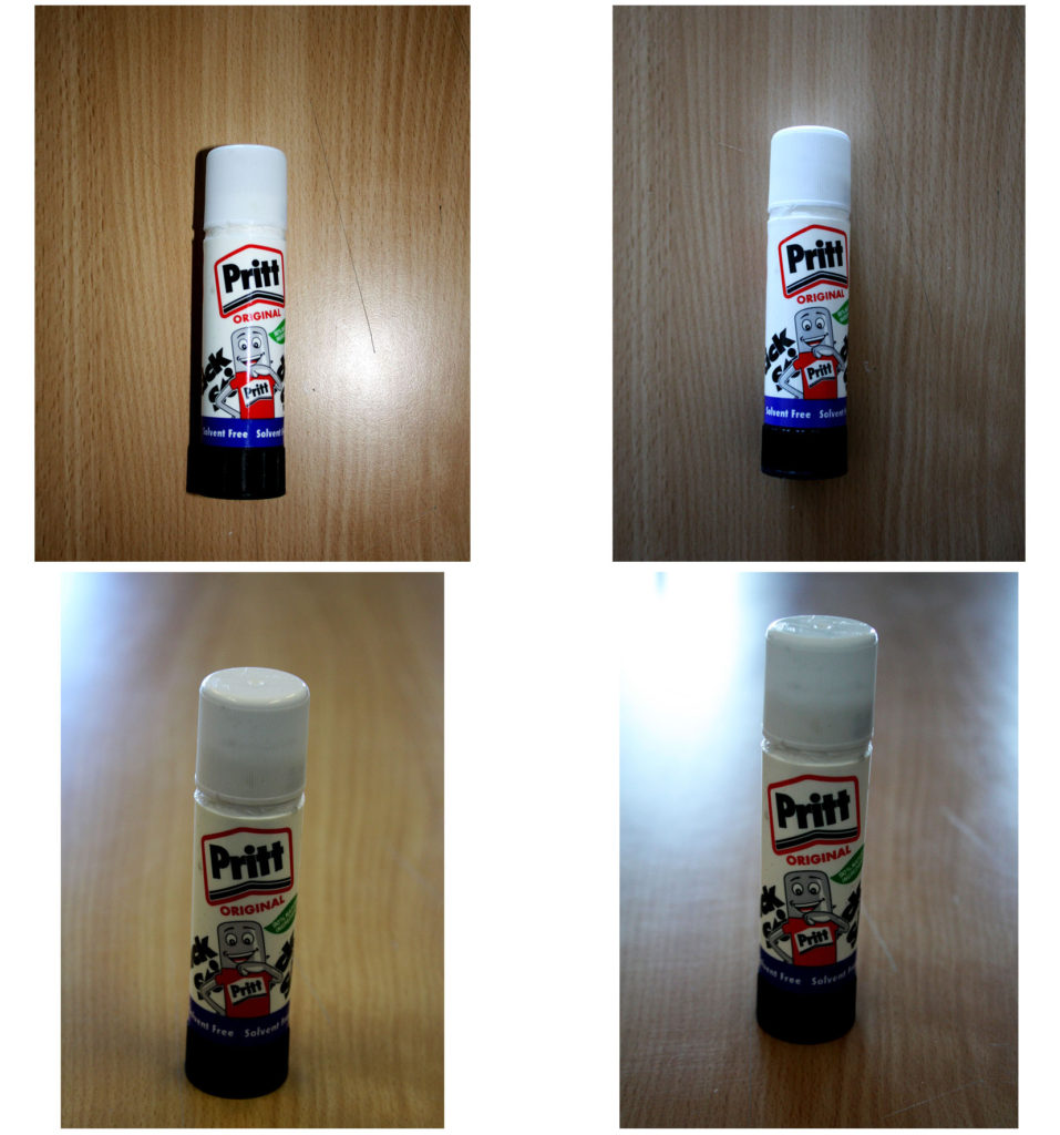
Fully automatic with/without flash and manual focus.
RESEARCH: ARNOLD NEWMAN
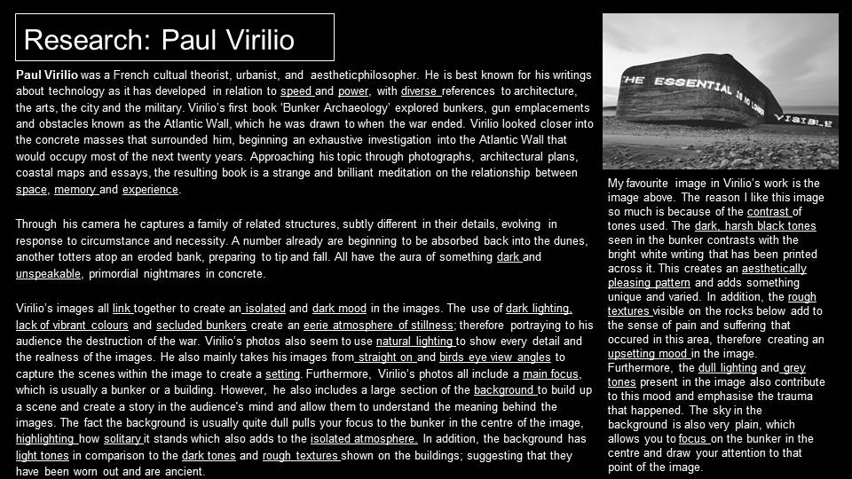
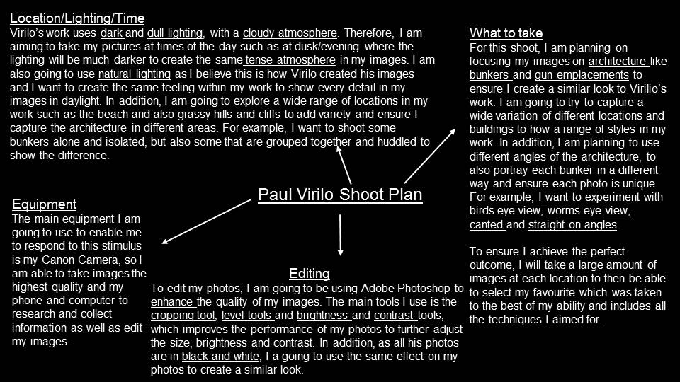
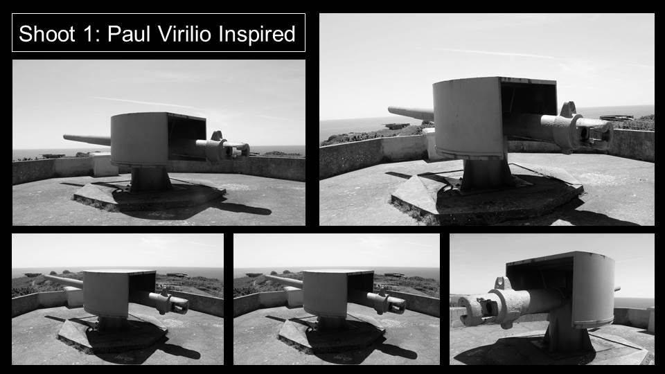
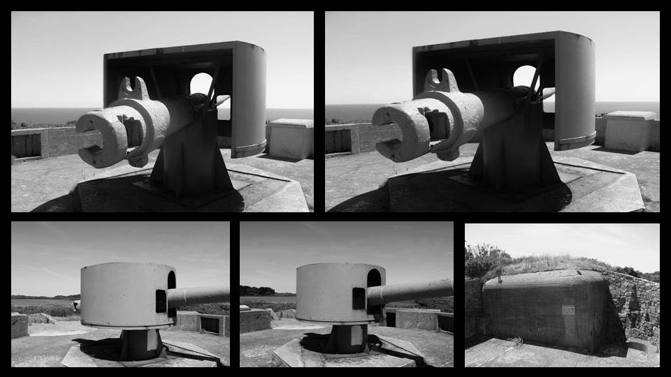
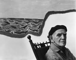
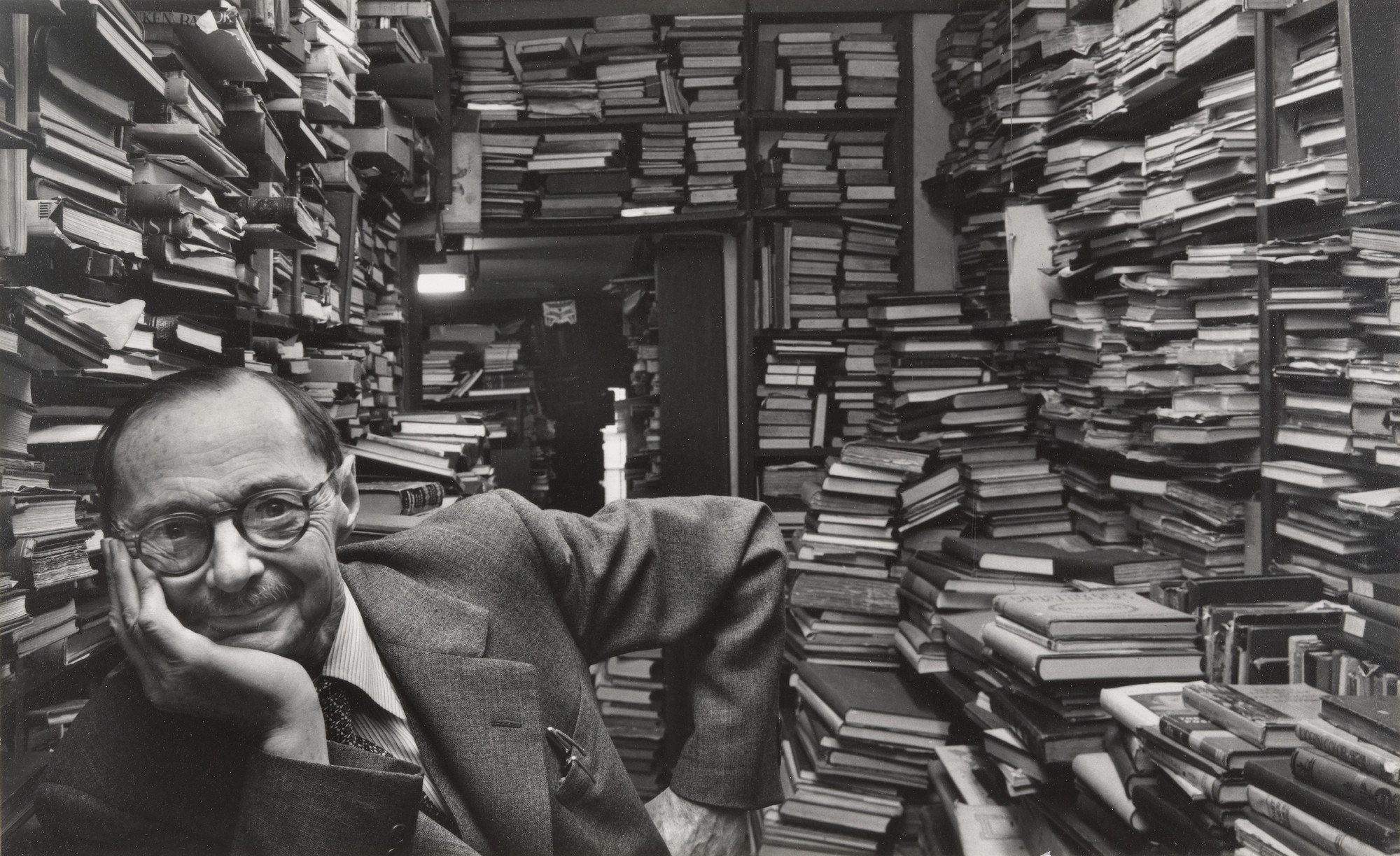
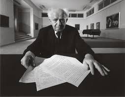
American photographer, Arnold Newman is acknowledged as one of the great masters of the 20th and 21st Century and has his work has enhanced and changed portraiture. He is most well known for his carefully composed abstract still life images and his environmental portraits of artists and politicians. Newman found his vision in the empathy he felt for artists and their work. Although he photographed many personalities , he maintained that even if the subject is not known, or is already forgotten, the photograph itself must still excite and interest the viewer. He usually uses a carefully framed and lit setting, and its contents, to symbolize the individual’s life and work. Newman normally captured his subjects in their most familiar surroundings with representative visual elements showing their professions and personalities.



TECHNICAL: The lighting in this image has been created to invoke fear and evil. This is because in a natural environment we seldom see light falling in such a way, making light from below is deeply bizarre and other-worldly. Here Newman has used two key lights that are placed behind Krupp on both sides, creating yet another highly unnatural and disfiguring effect. In addition, the camera has used quite a wide angle to be able to capture the background of the factory and portray to the viewer an insight into what is occurring around the large figure. There is also a warm tone to the image from the factory lights in the background, however it is very dark and and colourless at the front of the image where the subject is placed. This creates a demonic feel around the subject as the black tones used can be associated with evil.
VISUAL : Newman used a green colour cast, resulting from the factory’s fluorescent lights, which he deliberately did not filter for. As well as being highly unusual, green skin is almost universally perceived as a sign of ill health. The frame around the subjects outline is shown as having a rough and worn out texture which presents the factory as ancient and industrial. The use of this frame also draws the viewers attention to the subject in the centre of the image, making him look larger and dominant. In addition, the subjects facial expressions and body language presents him as a dark character due to the fact he is glaring into the camera and this intimidates the viewer. The cropping of the subjects body creates an element of disguise as we can only see his upper half this could contribute to the fact he is secretive about something. Furthermore, the light coming through the ceiling creates an aesthetically pleasing pattern at the top of the image which makes it look extremely effective. The crowded setting behind the main subject creates a busy atmosphere with flashing lights and vehicles, suggesting that there is chaos around this man which he has caused, but it isn’t directly affecting him.
CONTEXTUAL: Krupp and his father had built up the Krupp business empire largely through their early support of the Nazi party and had heavily profited from the use of slave labour during the Second World War to supply arms for the Nazi war machine. Despite later being convicted of crimes and being sentenced to twelve years imprisonment, he had been pardoned after three years. He, for various reasons, got off lightly despite the magnitude of his crimes. I thought this could relate to his facial expressions in the image that are presented as smug and intimidating– he feels powerful. In addition, Newman knew a great deal about Krupp, so had initially turned down the shoot, but after reassurances from the editor, he finally decided to take the job, promising others that he would make Krupp look like the devil. I believe this could reflect the positioning of Krupp in the image, his body language and facial expressions and the dark shadows that surround him creating an eerie and evil atmosphere that is associated with his presence.
CONCEPTUAL: I believe the main purpose and meaning behind this image is to portray Krupp as a demonic character. The positioning of Krupp is vital, by placing him in this elevated position is declaring that he is the highest authority within these premises, that he is master of all he surveys and ultimately the man responsible for all that happens or has happened. The clever use of the symmetrical lighting allows Krupp to be revealed as a pitiless and brutal overseer answerable for so many deaths. Overall, Newman experimented with a variety of techniques and strategy’s to build up a corrupt personality of Krupp that is presented to the audience and shows how Newman perceived him as an individual.
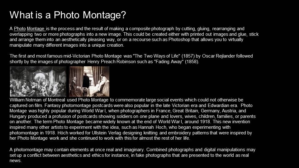
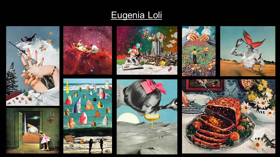
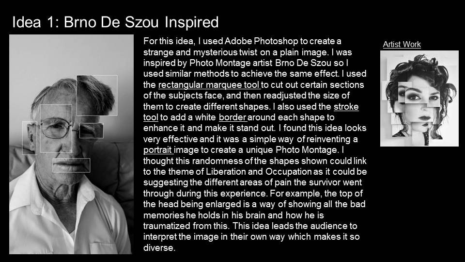
PHOTO MONTAGE










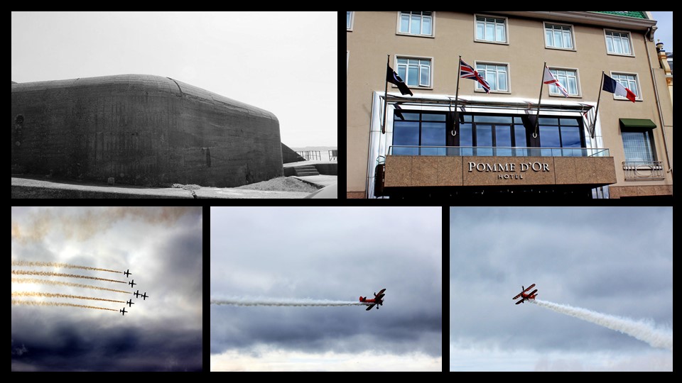
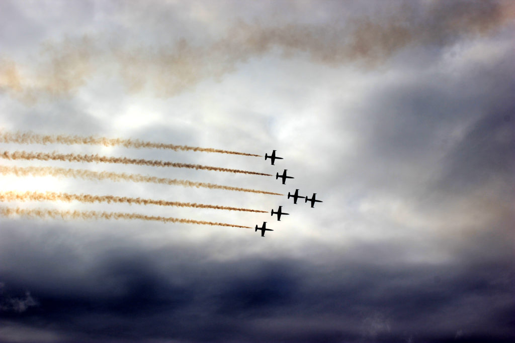
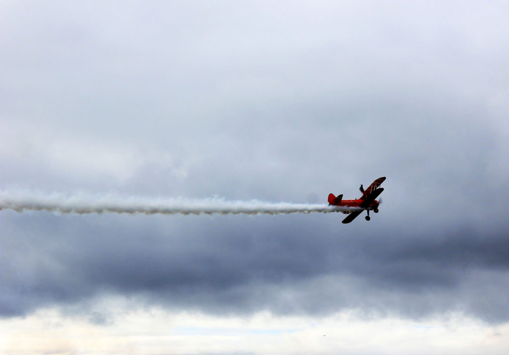
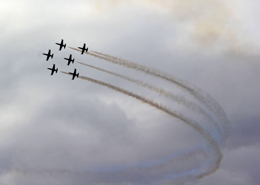
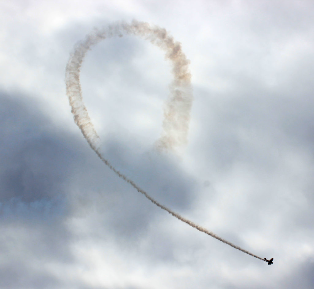
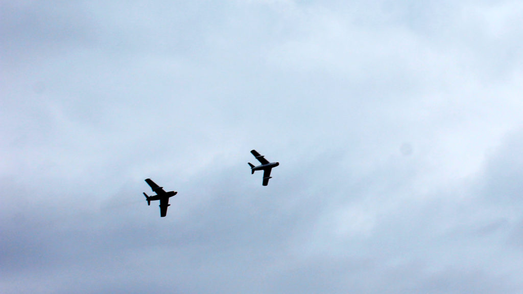
AIR DISPLAY IMAGES AND EDITS
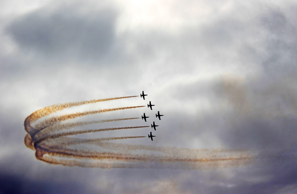
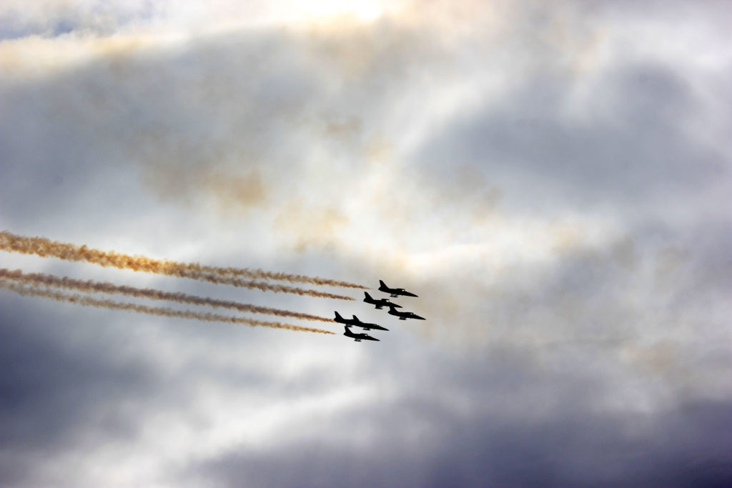
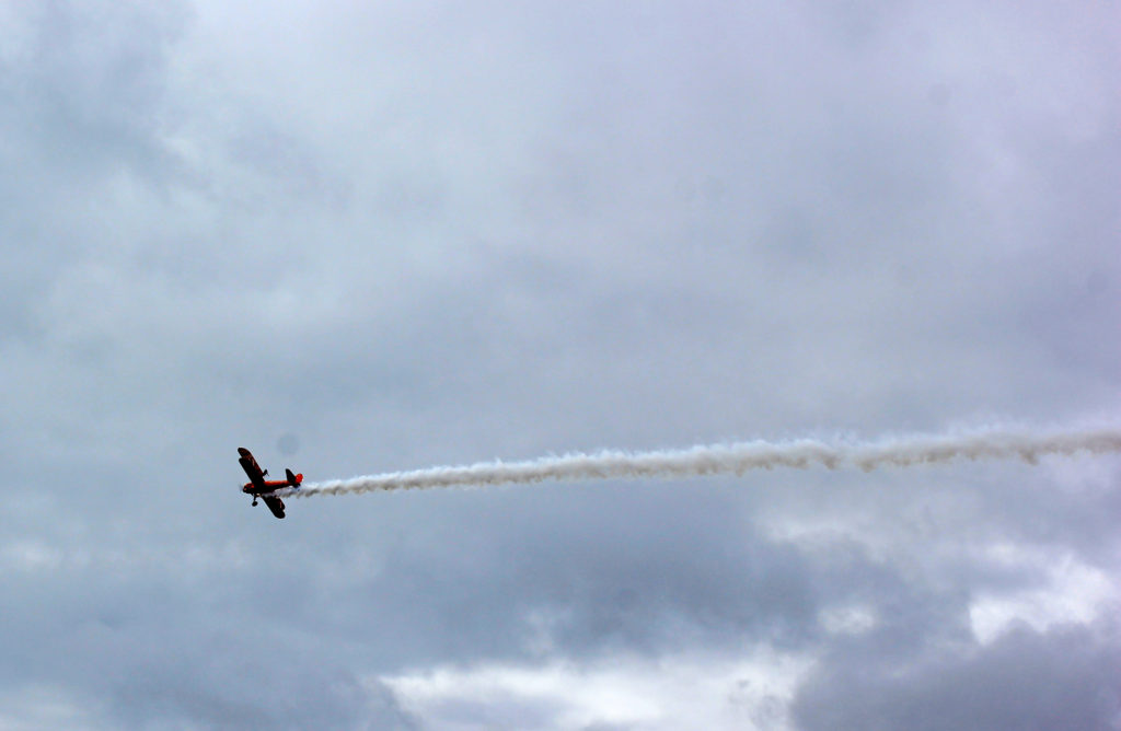
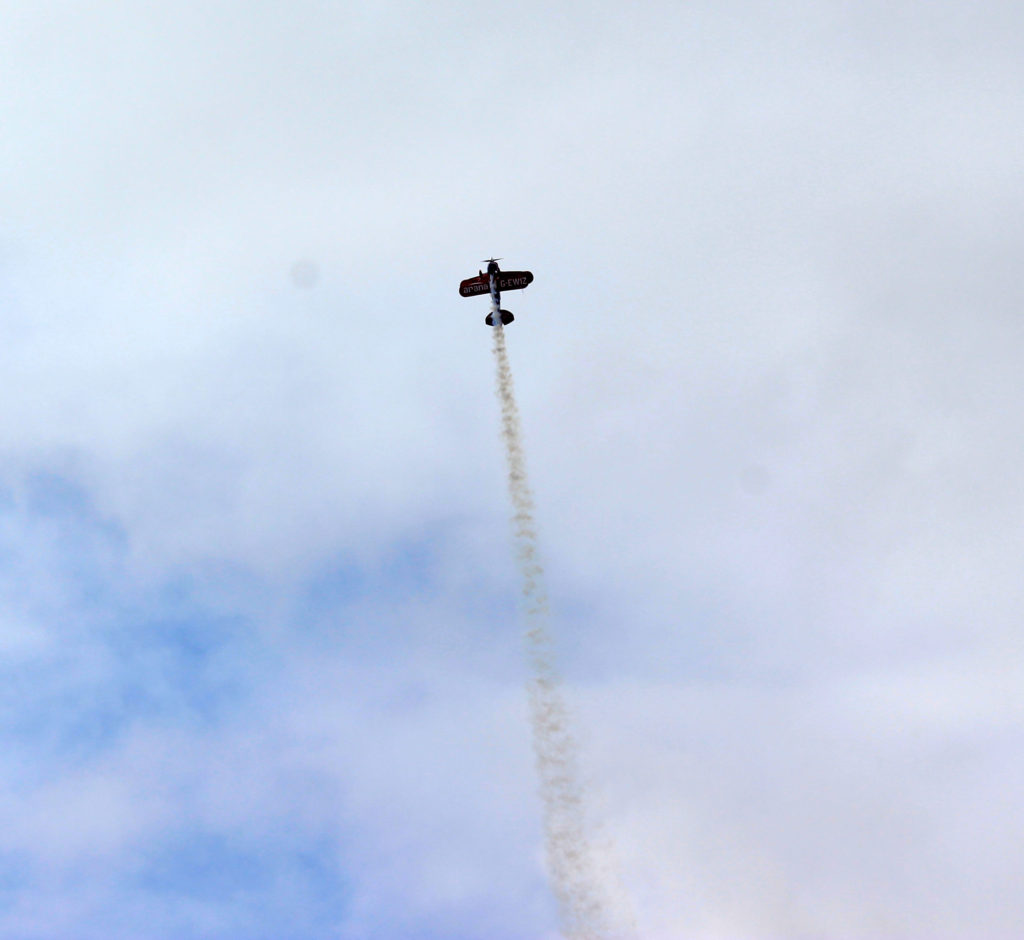
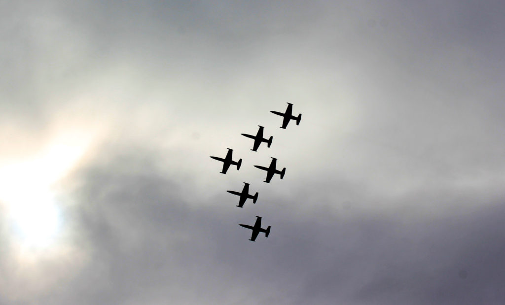
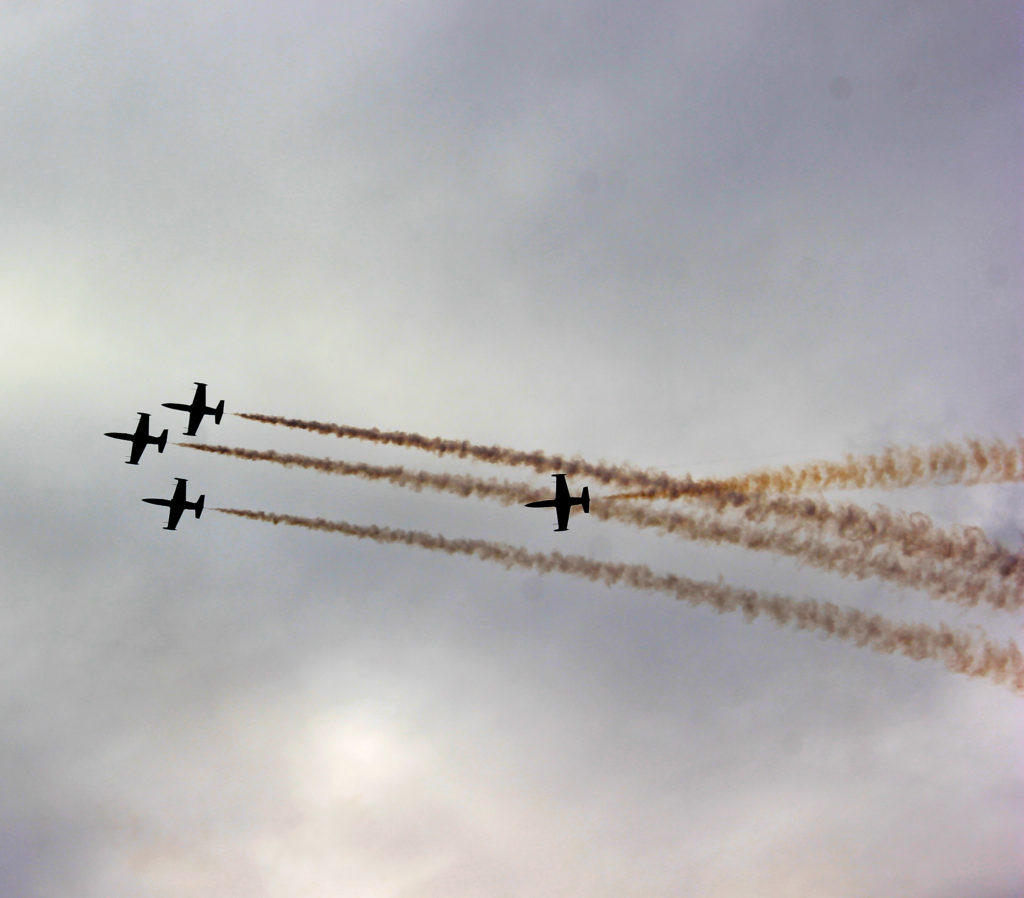
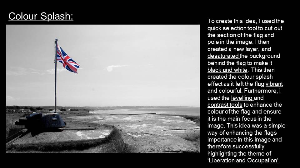
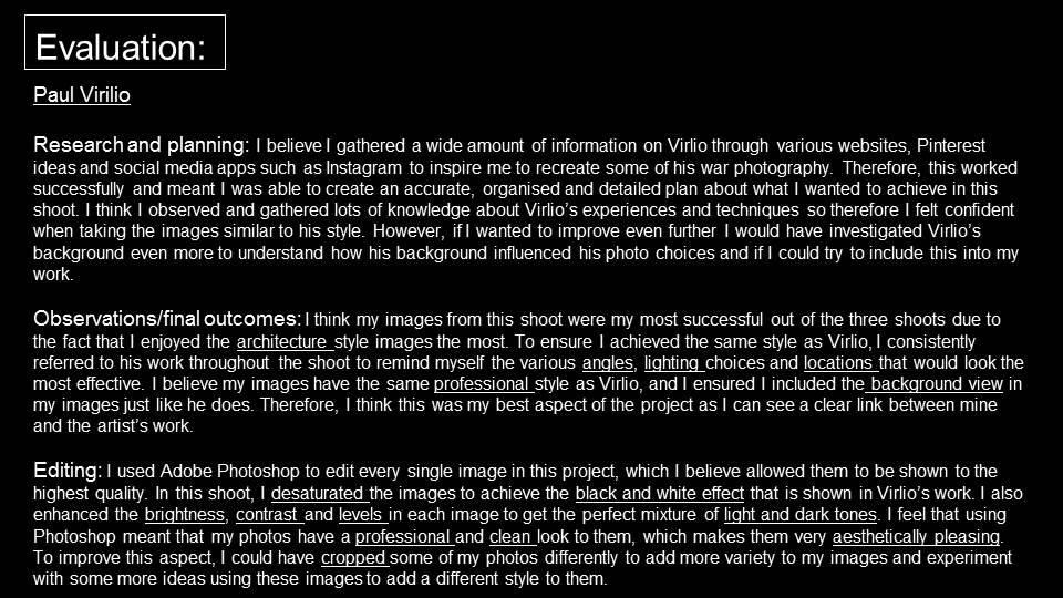
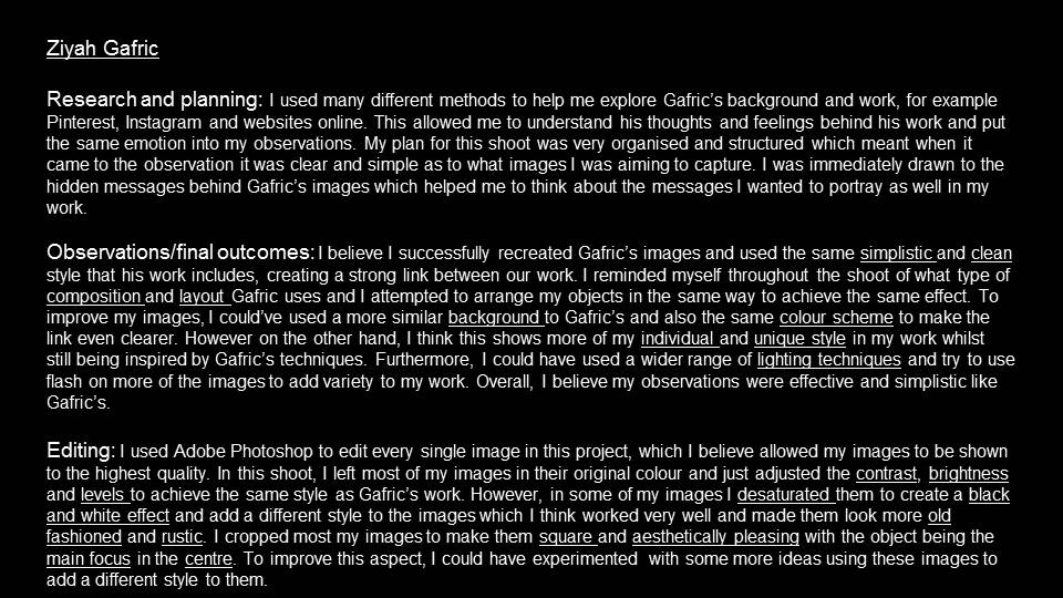
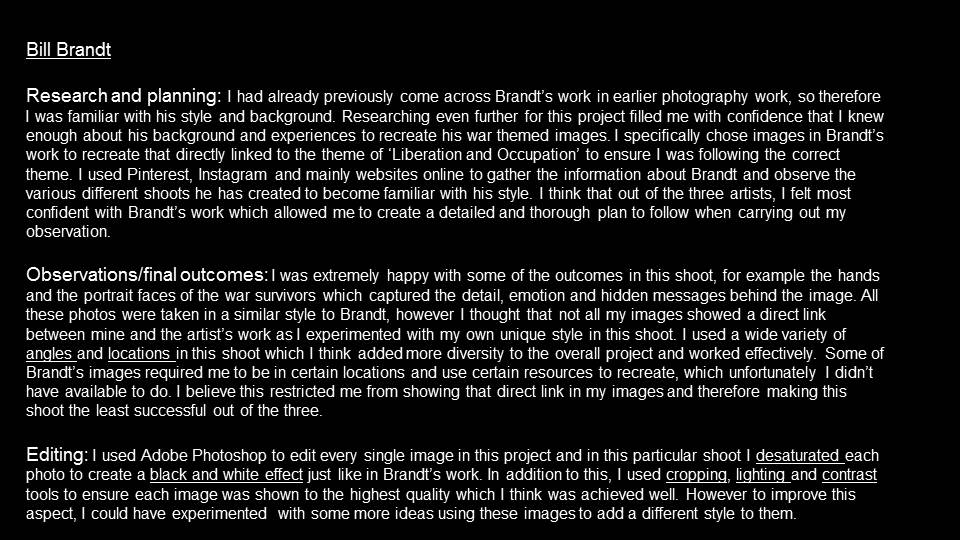
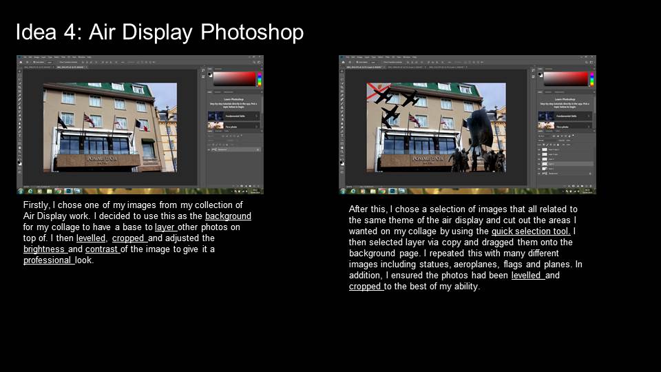
I used Adobe Photoshop to edit a selection of my air display images to achieve a professional style. The tools I mainly used were the cropping, levelling, brightness and contrast, shadows and highlights and saturation tools. Using a combination of these enhanced the colour and lighting of my images to ensure they are presented to the highest quality.
AIR DISPLAY IMAGES CONTACT SHEET

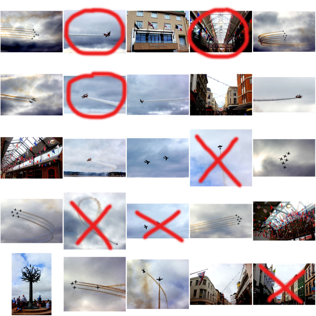
I have displayed a collection of my Air Display images into a large contact sheet using Photoshop, so I was able to compare each image and decide which ones were my best outcomes. I used the pen tool to cross and circle what I believe are the best and worst images in this series, and which ones I will be using again. My reasons behind the crossed out images were mainly to do with the lighting, lack of clarity, composition and view. For example, the planes were very far away, making the image unclear, or the positioning of them wasn’t aesthetically pleasing in my image.
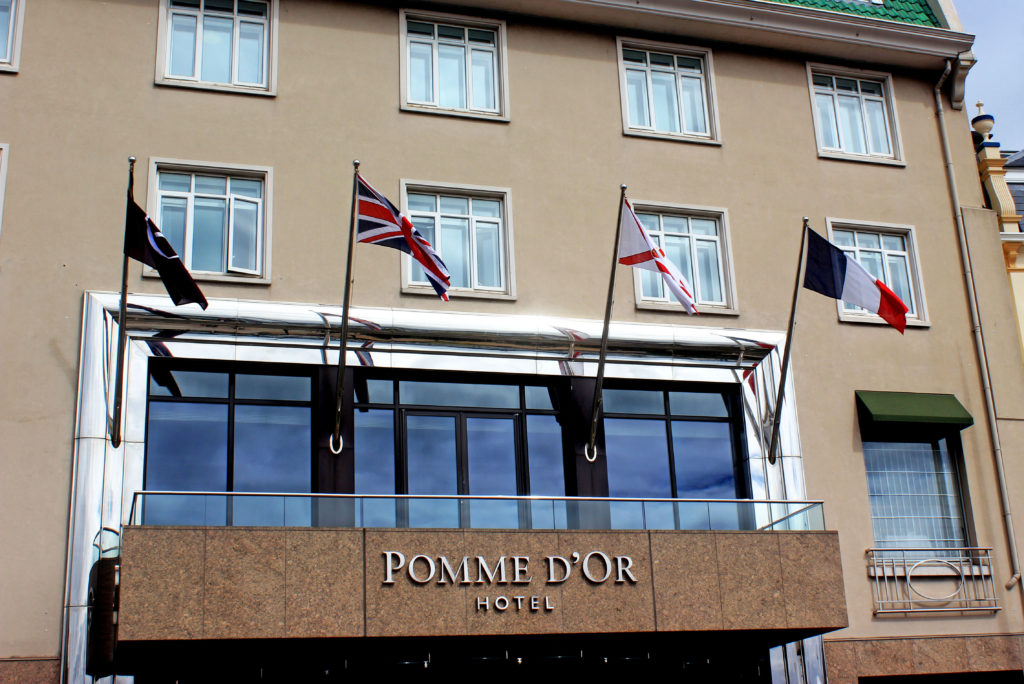
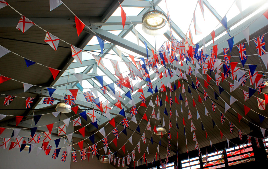
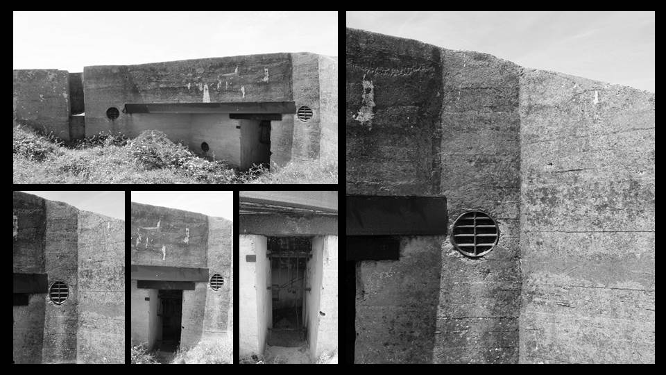
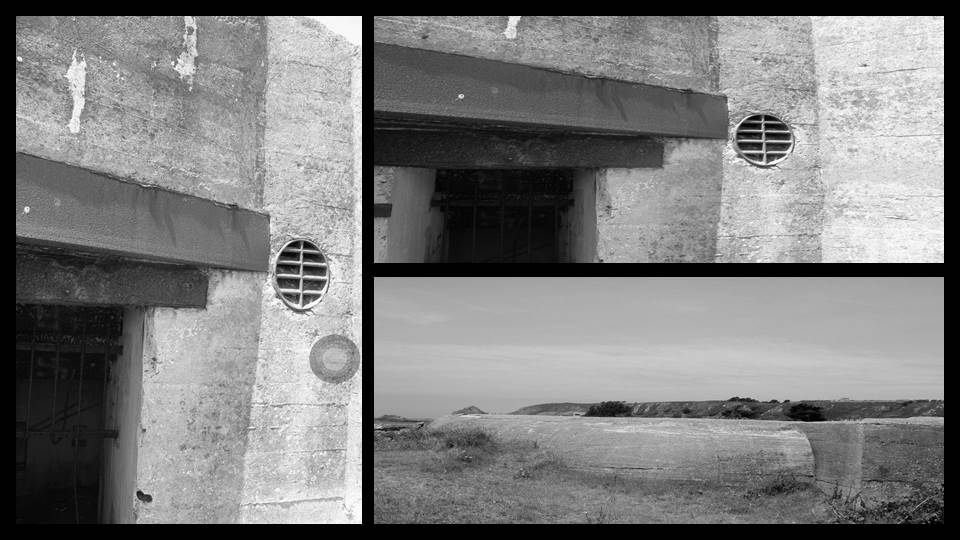
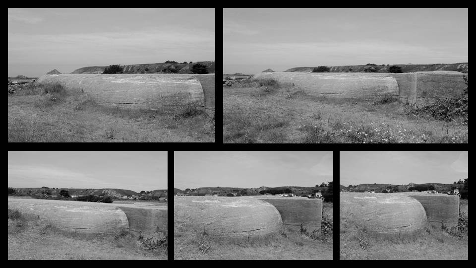
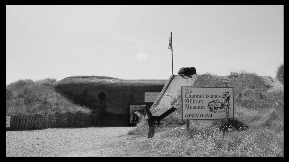
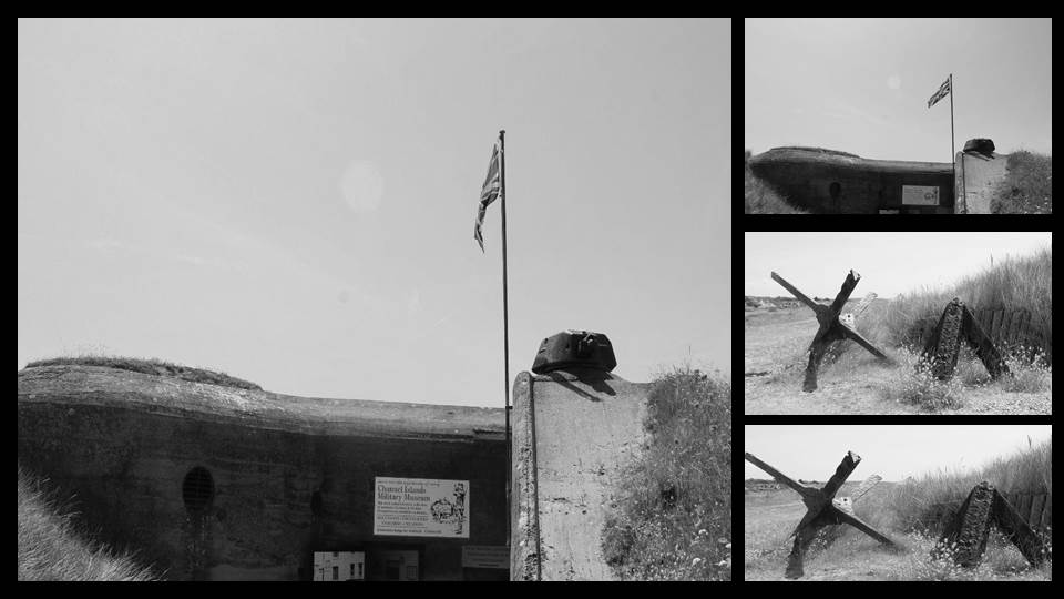
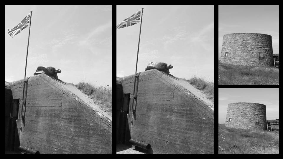
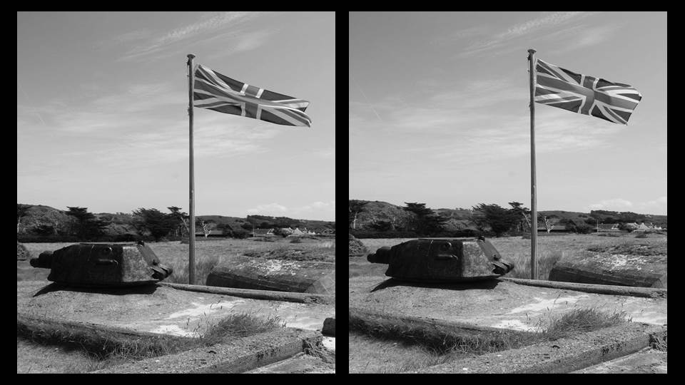
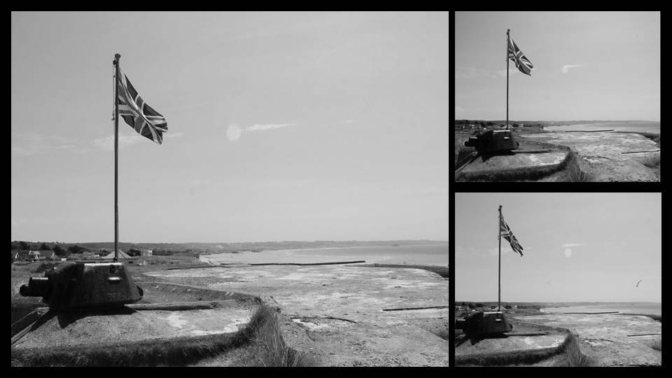
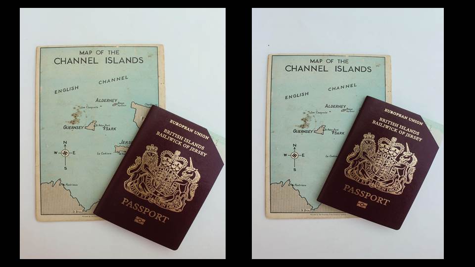
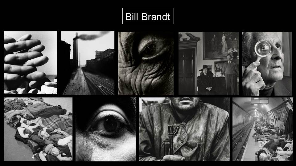
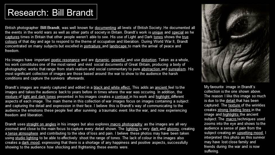
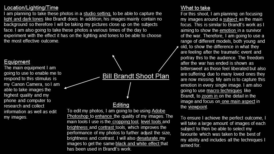
SUMMER TASK: OCCUPATION AND LIBERATION
