All posts by Aimee C

Filters

Author:
Category:

Peter Horvath- Artist Reference

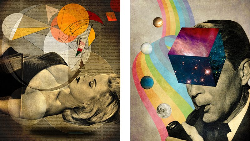
Peter Horvath is a Canadian photographer whose revolves around video, sound, photo-based and new media art as well as digital art.  His recent work focuses on taking images out of context, deconstructing and creating completely unique imagery through collage , drawing from his archive of mid-20th Century material. He uses juxtaposition and scale combined with saturated colour to produce surreal and sometimes humorous re-workings. Usually he mixes photos/images from different times and puts modern images with older images and links them together.

He first started using digital art in 1995 when his friend gave a Macintosh Plus, allowing him to discover the capability of computers and how they expand the range of edits you can do to make a photograph look different/better. He was also inspired by other photographers, Hannah Hoch and John Hartfield because the way they create new images with photo montage techniques e.g. cutting, gluing, rearranging and overlapping two or more images (less technological).
school university news like home student people staff education phone office

Horvath is most known now for intentionally displacing and disturbing anything remotely familiar or nostalgic, or both. Due to his discovery of computers he could now fulfill his desire fro his personal artist expression;
a feeling of freedom from the two-dimensional context had an effect on his exploration of social, creative and conceptual boundaries and identity issues, interlaced with psychic and emotional relations.

Technical

  • Lighting – the hands in this photo montage have been shot in a shaded lighting as well as the city in the background (or made to look this way). As for the iceberg, it’s been taken in a lighter area and is highlighted/they used flash. The iceberg’s intensity is also high due to its saturation, Horvath has most likely done this because it is the main focus of the image because it’s positioned in the center. The city in the background’s exposure is lower and is faded to make it look more polluted. Horvath has put circles on the image to make it look like the light is reflectin off the camera lens as well as for several other reasons that will be exp-lained later on.
  • Aperture – (DoF) the hands and iceberg have been sharpened whereas the city is blurred.
  • Shutter Speed – There isn’t any motion blur.
  • ISO – Both the city and the hands have high light sensitivity creating a grainier image allowing there to be more texture.
  • White Balance – The colour accuracy for the iceberg is not accurate as the colour intensity has been heightened and has a very cold colour (blue) this is due to the contrast being higher. The city’s intensity of colour is much lower and has mostly brown tones to makee it look dirtier to get the message of it being too polluted across better. The warm colours of the circles are meant to remind you of the sun and the warmth from it so they have a higher contrast to intensify it.

Visual

Visual elements – The tone on the hands is darker in the shadowed area but the lighter areas have been highlighted. As for the city it does have much depth to it when it comes the darker tones of that section of the montage. The texture on the iceberg is very detailed and you can see that in the majority of the image making it look quite rough. The on 2D images are the circles and the hands, the iceberg and the city are 3D forms. The circles are also repeated.

Contextual

This photo montage also has a lot of context to do with environment and also the selfishness of some humans (social context). Firstly the misty and faded back background of the buildings are meant to represent pollution caused by humans and is believed to be in the background because it’s so unnoticed in reality. As for the iceberg in the hands of a human, this is meant to represent humans destroying the earth and global warming and the polar ice caps melting because of it and the warmth from the human hands is making the ice melt quicker. The iceberg in the hands has a double meaning, the image of the hands also represents third world countries struggling for clean water. Over all this photo montage is meant to be an example of all the major isues in the world.

Conceptual

The overall reasoning behind producing this photo montage is to make people more aware of the problems around them and how they all link to each other.

Contact sheets/photo shoots

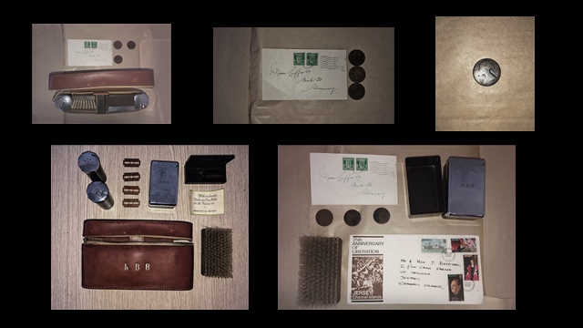
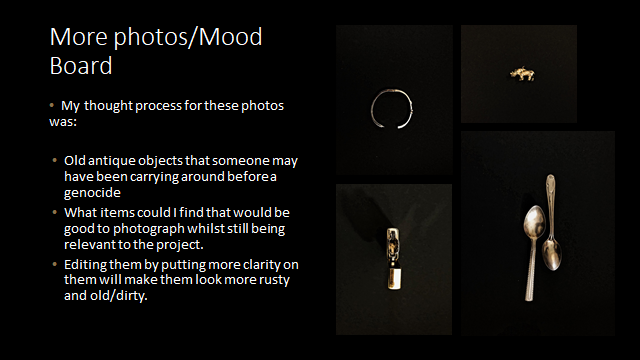
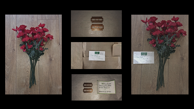
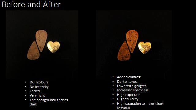
I started selecting my favorite photos out of the shoots and discarding others I knew i wouldn’t use. I used poppies to symbolize the soldiers lost in the war as well as the colour of them standing out a lot against black and white photos. All of them are unedited apart from the last photos.

These photos in particular stand out the most to me and are the ones i will most likely be using in my photo montages.

Key Photo Montage Artists (Europe 1910+)

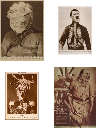
John Heartfield


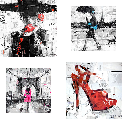
Modern looking photo montages, such as Derek Gores work have a different look and feel compared to older looking photo montages, such as John Heartfield.

Derek Gores’ work consists of colour pop (mostly black and white images with certain areas/objects/people highlighted with colour) and darker contrasting. His work may be seen on the cover of a fashion magazine which is a very modern day thing.

On the other hand, John Heartfield’s work has a much older feel to it due to older photos being used in montage being faded, less sharp and having murky brown tones.

Derek Gores
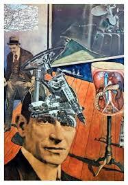
Raoul Hausmann
Image result for rodchenko photomontage
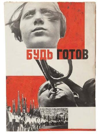
Aleksander Rodchenko

Ideas about Photo Montage

There are no limitations to what you can create in one photo montage:

  • No limit to the amount of time a photographer takes to create the photo montage or the photos for it.
  • Any location
  • Any time
  • Any place
  • Any person/object merged together
  • Any weather
  • Any amount of photos
Image result for peter kennard

Some photo montages may be a combination between photos and videos e.g. Peter Kennard’s work. It also allows you to be creative and create things you wouldn’t be able to make in a normal unedited photo.


Basic History of photo montage

Photo montages are multiple photos all put together to create a new image by glueing, sticking, cutting, layering/overlapping and rearranging images either through photoshop of physically creating a new image.

The first show of photo montage was in Germany in 1931 and the term photo montage became known are the end of the first World War but the first montage was made in 1857 and was called “The Two Ways of Life” which was famously created by Oscar Gustave Rejlander in the mid Victorian ages. As well as Rejlander, Henry Preach Robinson followed behind him with his work such as “Fading Away” created in 1858.

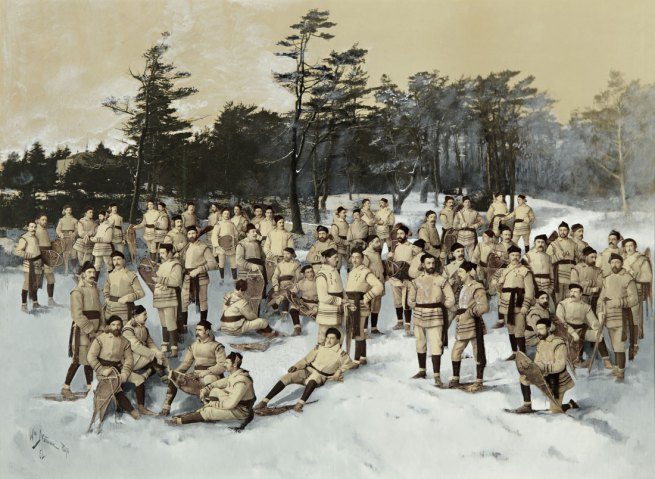
William Notman (Montreal) used photo montage to create huge social events that couldn’t be captured whilst creating a film in that generation. Notman had a studio where Montrealers could dress up and appear as if they’re taming the elements whilst staying indoors.

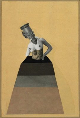
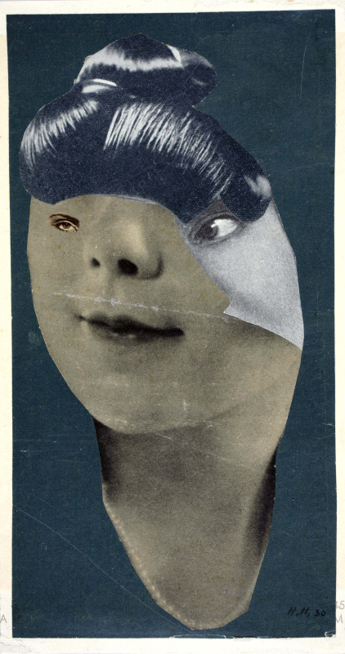
Another Photographer who is more recent, Hannah Hoch, is known for her political photo montages and collages. She became associated with the Berlin Dada group ( mostly male artists) and she exhibited in their exhibitions such as the First International Dada Fair in Berlin in 1920.

 She explored gender and identity in her work and criticized the concept of the “New Woman” in a humorous way in Weimar Germany. In Indian Dancer: From an Ethnographic Museum she combined images such as Cameroonian

Mask and the face of silent star Maria Falconetti. Hoch’s mixture of a traditional African mask and an iconic female celebrity as well astools that reference the style of the 1920s avant-grante theatre and fashion and offers an evocative commentary on feminist symbols of that time period.

Unfortunately, Hoch’s work was banned from exhibiting during the Nazi regime because her work didn’t meet the Nazi’s standards of what art should look like. In 1945, after the war, she began exhibiting again.

This image has an empty alt attribute; its file name is hh2.png
Hannah Hoch


Other Photo Montage Artists

Man Ray


Peter Horvath

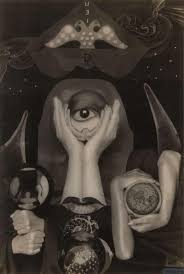
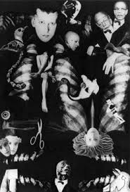
Claude Cahun
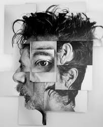
Brno del Zou

Arnold Newman

Technical

  • Lighting – The majority of this lighting is very shaded in this photo with some natural lighting coming from the windows at the top of the building. Some of the photo is under exposed e.g. the foreground but towards the background the photo becomes more exposed.
  • ISO – The light sensitivity is low in this image, hence why it’s sharp.
  • White Balance – This image has mostly warm tones and the colour of it looks accurate.

Visual

  • Visual Elements – The tones in this photo are very dark making it look more intense and gloomy and the colours look like they’ve been washed out slightly making the most eye catching thing the white lights coming from the windows in the ceiling. You can see a lot of the textures on the man in the foreground e.g. his hair, wrinkles and freckles. The symmetry of the pillars either side of the man frames the photo better making the man the main focus of the photo. The space above the man makes the building look like it’s towering over the man, although the man already looks quite evil and powerful due to his posture and the way he’s looking straight into the lens of the camera as if he was looking into the eyes of another person which would be considered intimidating, the building being greater in size gives the whole photo an intimidating feeling.
  • Composition – The photo looks like its been cropped as the photo looks longer that a normal length photo, as well as this the space at each sided of the man looks like their the same size meaning it’s likely it’s been cropped or it’s been arranged that way. The eye is automatically lead towards the man in the photo because the light is hitting certain points of his skin therefore highlighting him as well as him being in the centre of the photo. The light from the top third of the photo contrasts with the bottom third of the photograph as well.

Contextual/Conceptual

The photographer, Arnold Newman, was an American Jew, giving the photo a string meaning because the main focus in the photo is Afried Krupp who was a German who was accused of slave labour (manufacturing trains) in the Nazi regime. The inspiration for the photo most likely came from this and the reason as to why he made the man in the image look so evil and why he made the photo look so ominous. The negative image Newman gave Krupp was to show Newmans hatred towards him and the Nazis overall.