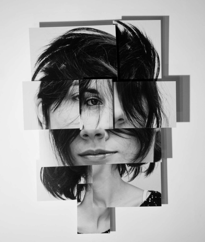
All posts by Aimee C

Filters

Author:
Category:

Identity Photoshoot 2

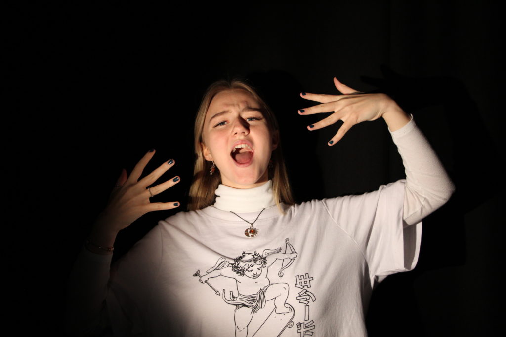
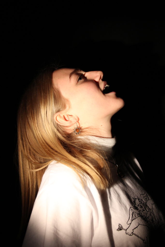
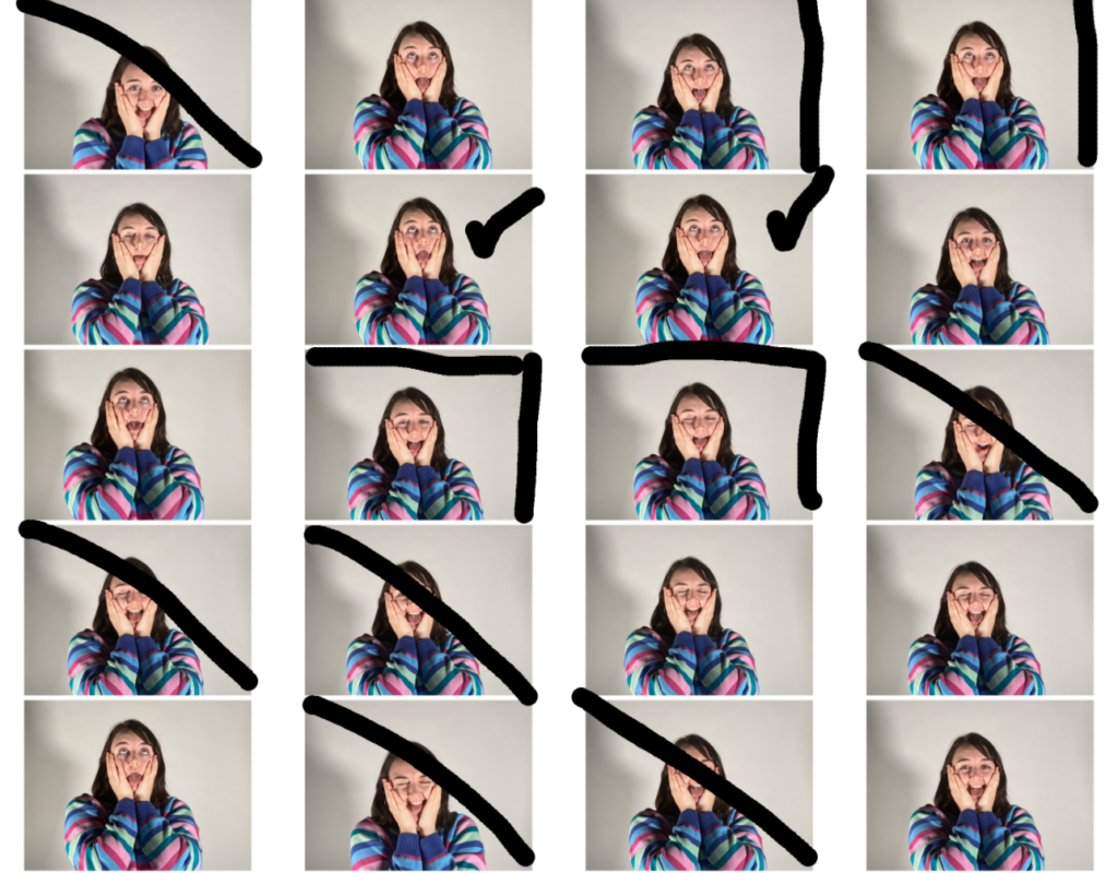
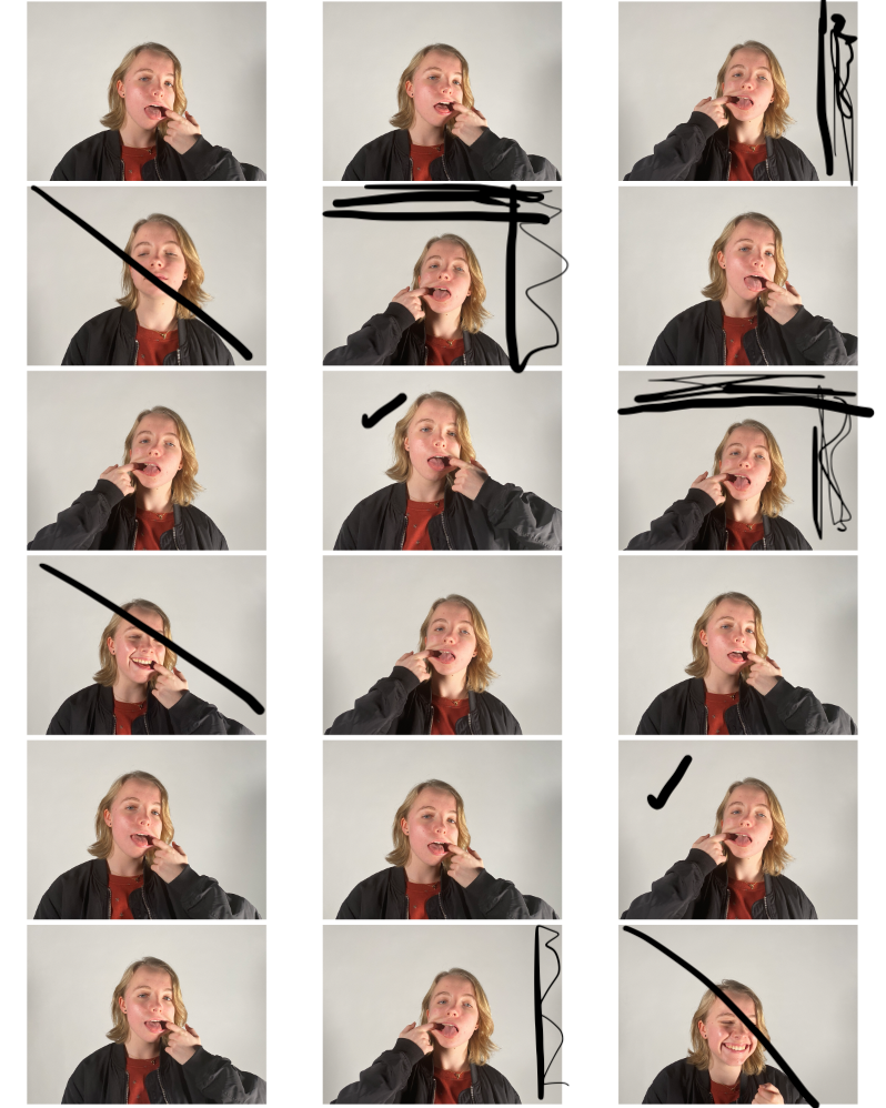
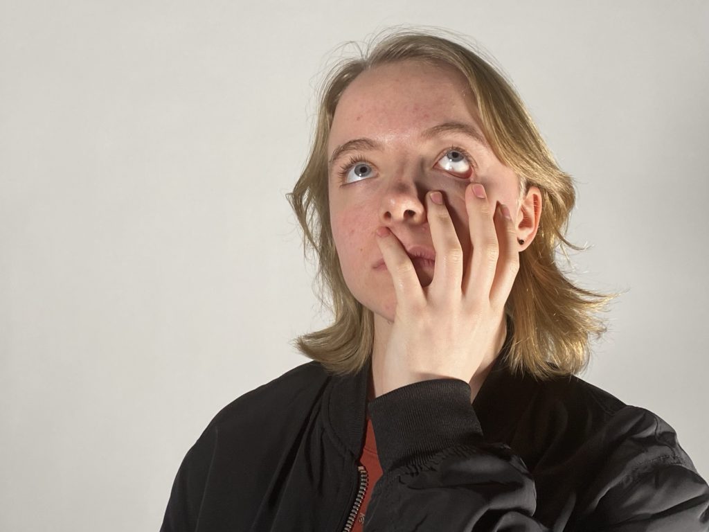
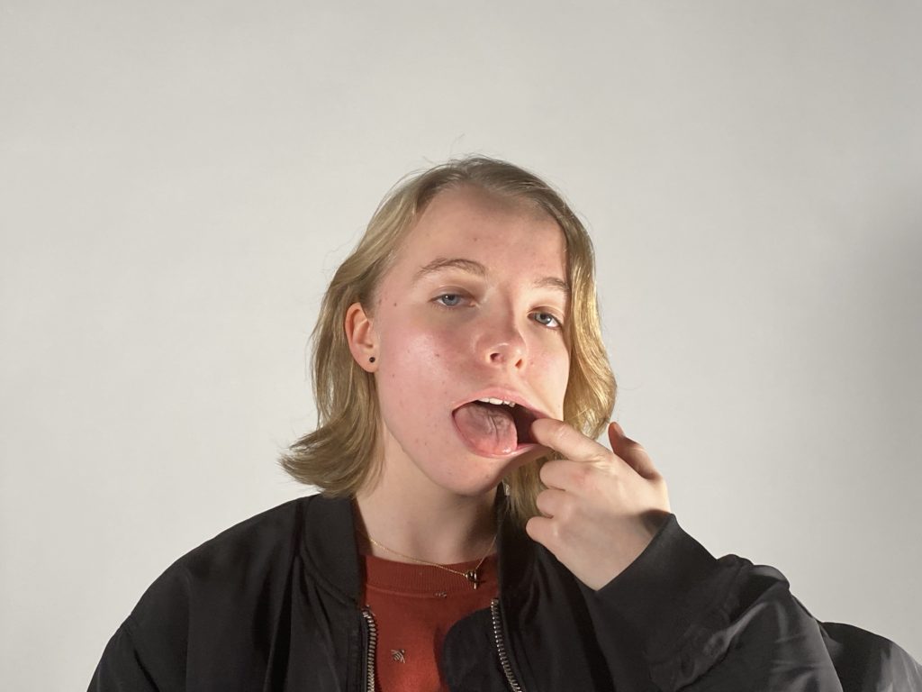
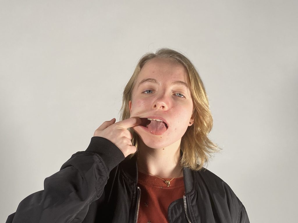
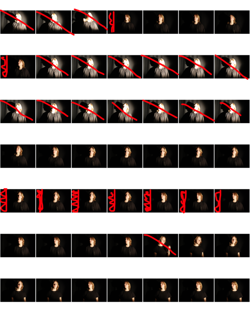
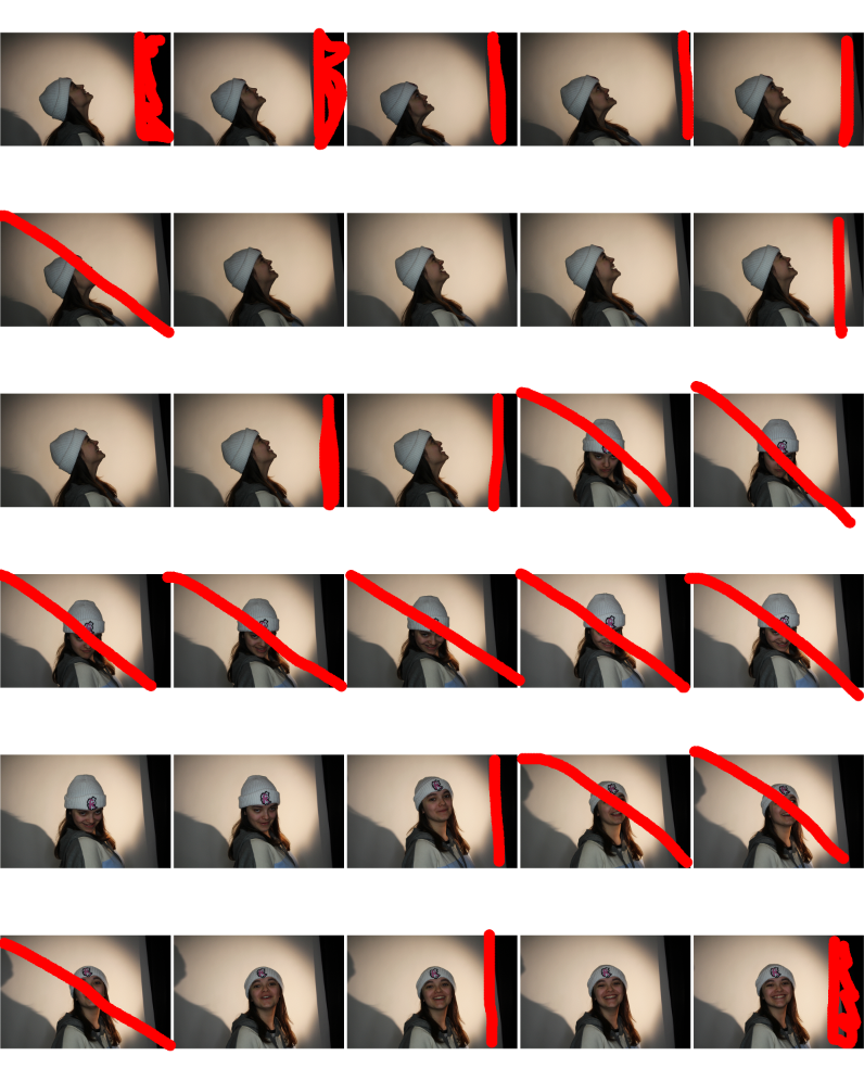
In this photoshoot I took the photos in the studio using a ring light to get the brightness and exposure that I wanted in the images below as the light exposes the face perfectly. The models I used were asked to pull different facial expressions that were similar to the some of models facial expressions in Lee Jeffries’ photos. I also used a spot light for a different part of my shoot as I wanted to change the background in order to make the image look darker.I have chosen not use some of my photographs as the models were not always pulling the right facial expressions. I have also chosen to crop some parts of the images to make them more symmetrical. My best images were the ones where the models were pulling the correct facial expression, such as neutral. Overall I think I prefer the majority of the photos with the black background over the photographs where I used the ring light as I want my photos to be darker and gloomier to match Lee Jefferies’ style.

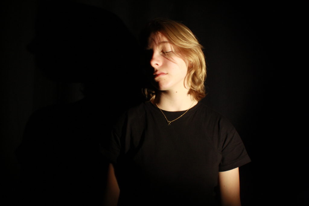
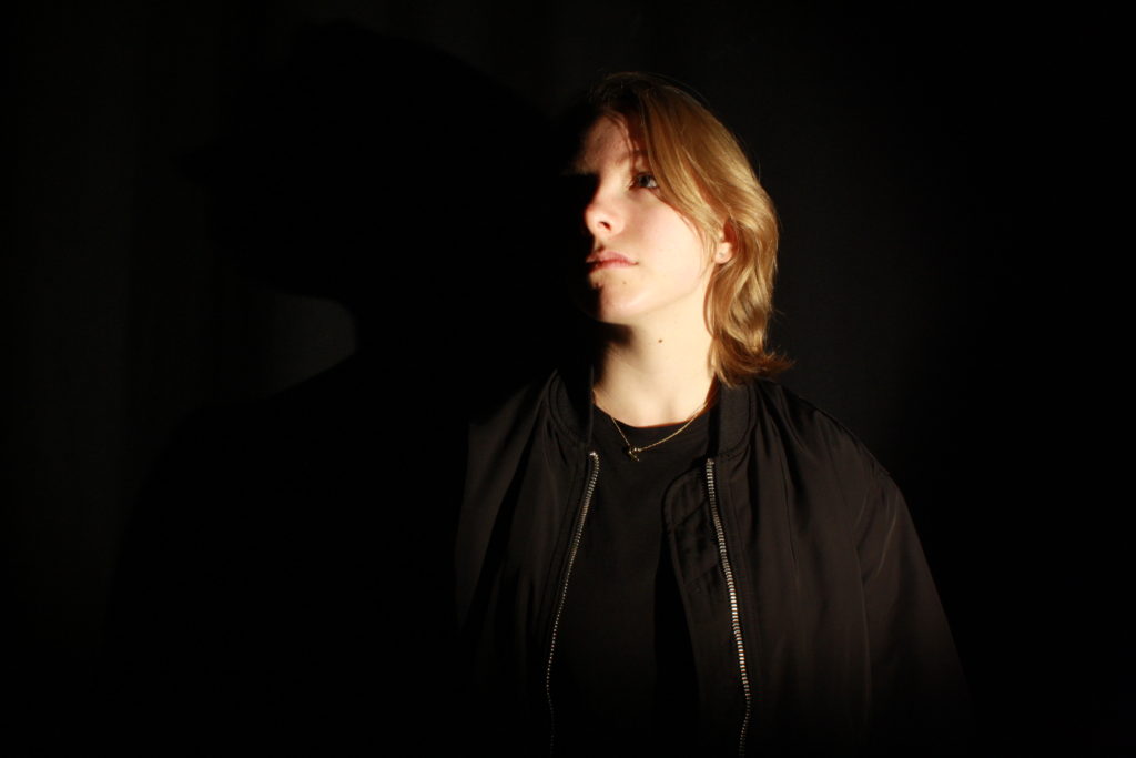
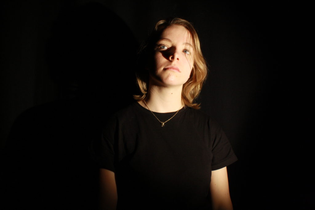
My Best Photos

I have specifically chosen these photographs as my best images as because they had the best lighting on the models face and in the background/the models had the best facial expressions. These images were also the most in focus due to the camera being on a tripod keeping the camera steady.

Editing one of my best images

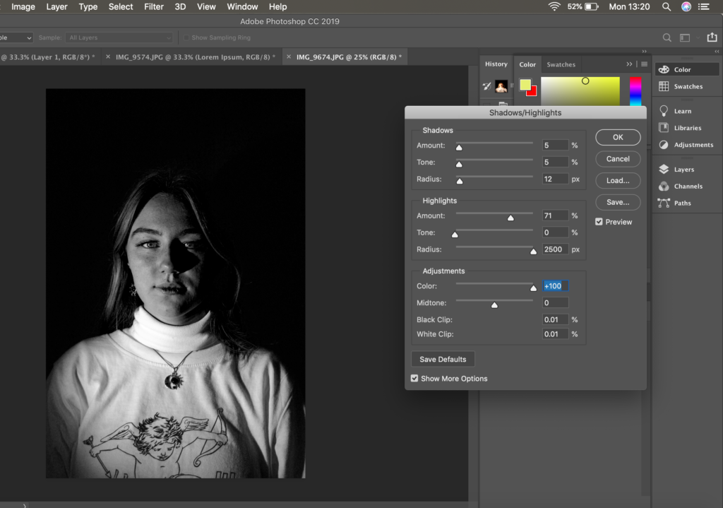
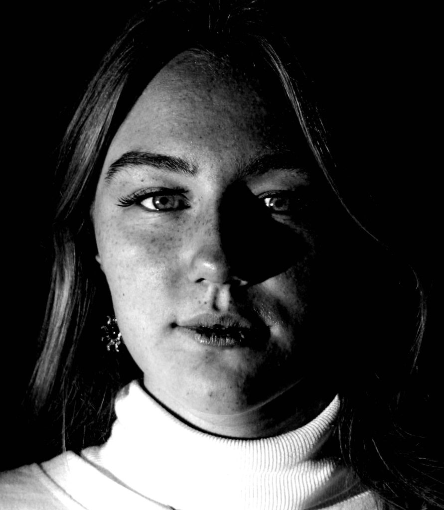
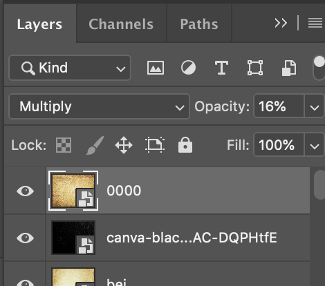
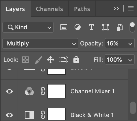
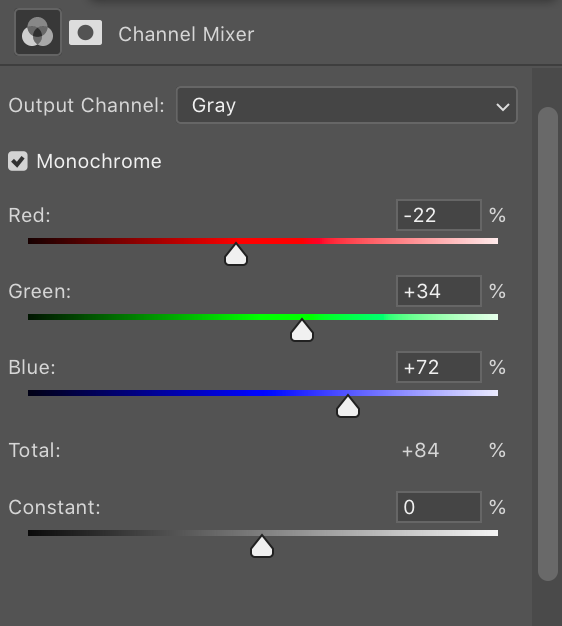
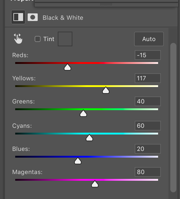
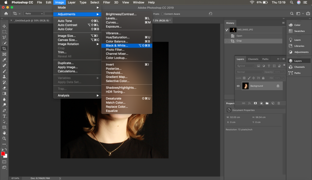
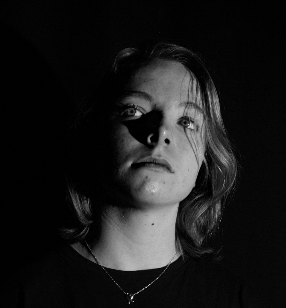
I have edited one of my best images from this photoshoot to look more like Lee Jeffries work. I have made the photo black and white and I have intensified this by lowering the red and yellow tones do allow more contrast to be seen. This image was one of the most successful as it was the most in focus and you can see minute details such as the freckles on the models face, similarly to some of Jefferies’ models. I have also edited the photo to be in black and white because the loss of colour links to the sub theme “loss of identity”. The photo also links to this theme as the background tells the observer no further information about what the model is like personality wise or what their life is like as well as what their past/background is like. I cropped the image in order let the observer focus more on the details of the models face, this is similar to what Jefferies does with his own photography.

Final Image from the photoshoot:

IDENTITY PHOTOSHOOT PLAN 2

Who

Younger models, preferably females. They will most likely be some of my friends from my school.

What

I will focus on the face of the models, as well as hands put near their face. I will experiment with emotions, taking photos of the models with a range of different expressions which are similar to the models in Maurizio Anzeri’s photographs, such as; happy, serious/neutral (mostly), obscure/silly and other emotions. I want to make sure the photos of the models faces are as sharp as possible, similarly Lee Jefferies photography.
Where

I will take the photos in the studio at my school using one point lighting like did in my chiaroscuro photoshoot and maybe change the lighting to a ring light half way through the photoshoot. I will ask the models to stand slightly to the side of the spotlight the create shadows on their faces and I will also as them to stand directly in front of it also, I will do the same for the ring light.

When

I will take the photographs during a photography lesson or in one of my free periods at school, i will photographs as long as possible to ensure I have a good amount of quality photographs, although this depends on when the studio is free and when my models are free.

Why

I am deciding to have the lighting and models positioned this way in order to get similar images to the photographer Lee Jefferies’ work. Although I will not be able to get the exact photo I want without editing the image on photoshop as this photographers photographs look extremely dark due to certain tones being diminished to allow other tones to stand out, as well having to lower the aperture. I have chosen this photographer so I can express what I think identity is through loss of identity and identity shown through lack of emotion and loss of belonging.

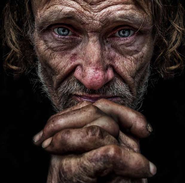
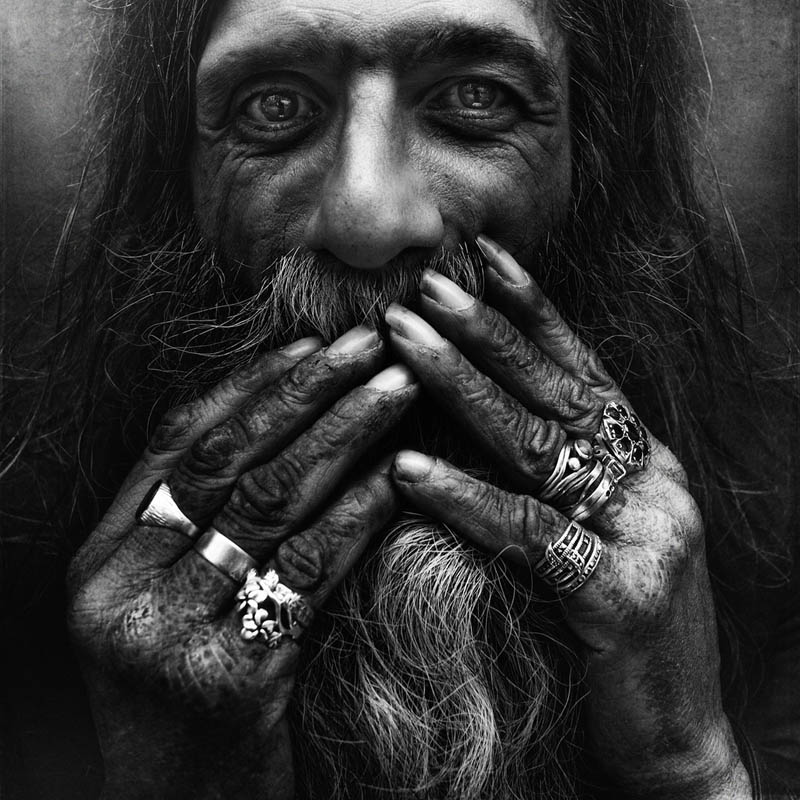
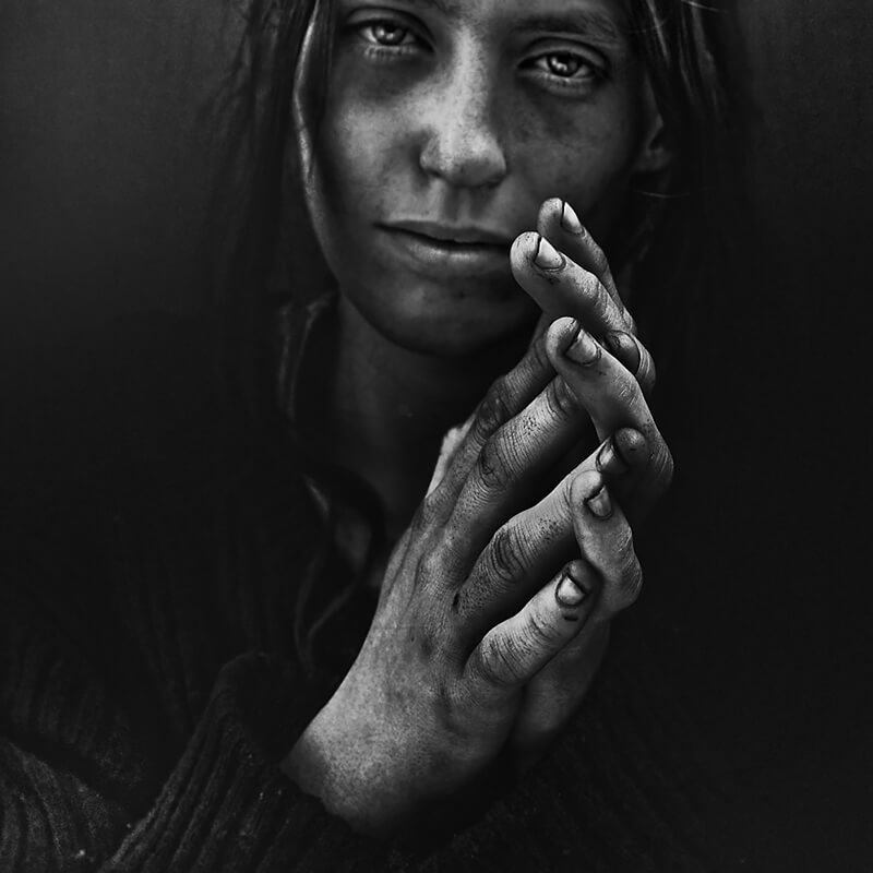
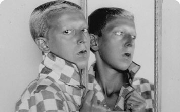
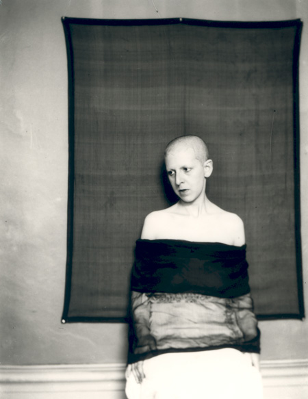
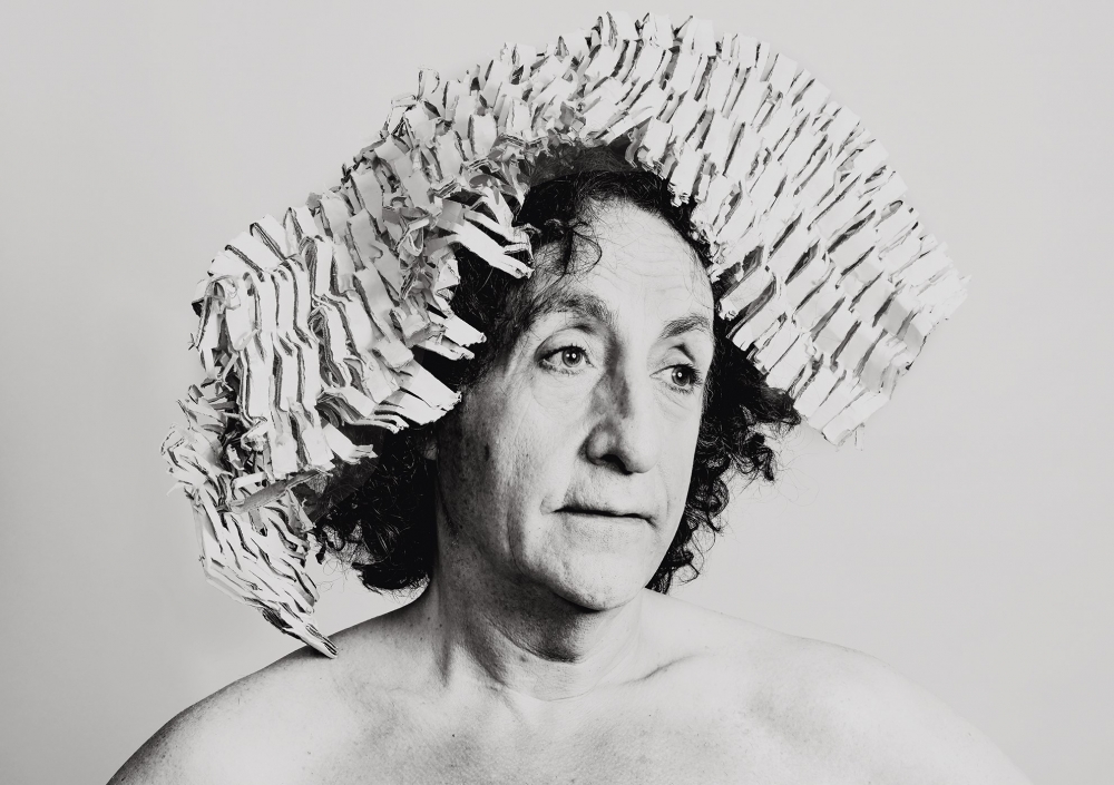
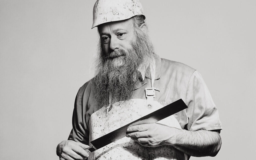
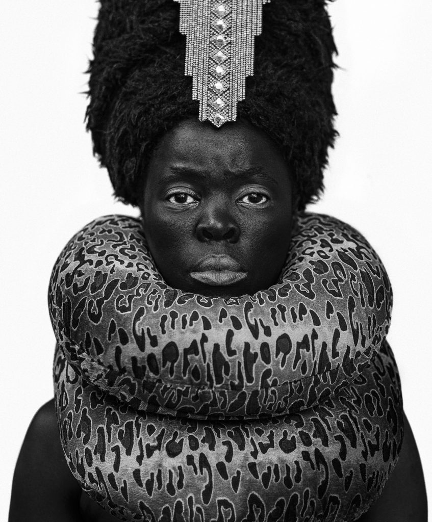
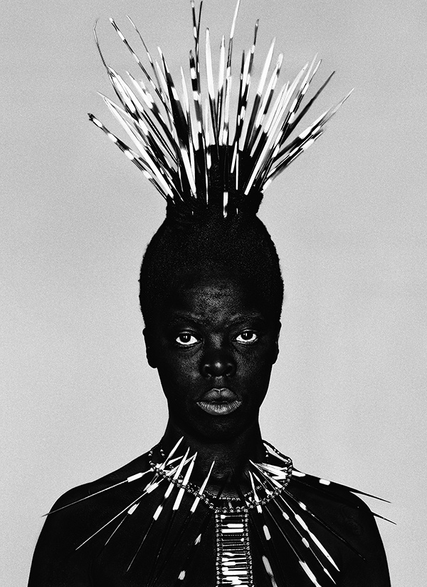
Here are some of the images that inspired me:

How

I will set up the studio with the camera on a tripod to prevent camera shakes, so the images are in focus, as well as this I will set up a one point lighting system in order to allow the faces and hands of the models to be exposed and seen properly without the background being shown in detail, the same goes for the ring light. I will set the shutter speed to a lower setting to make the photo come out sharper and in focus and the aperture should be around f/4 or lower.

Lee Jefferies

A lot of emotion is meant to be felt when looking at Lee Jefferies work especially the images from his photography project called “Homeless”, the emotions felt when looking at these photos are meant to be something which observers rarely experience in front of photographs. This might be because these are mean to be raw photographs as if you are looking at these people in person. Of course the camera still has to be used to capture the image but on the other side of the lens there is a real person. On the bodies and faces portrayed the signs of devastation due to an existence without any warmth, the closest thing these people get to happiness is from alcohol or drugs. This photographer has tried to get the models too look into thew camera lens and has tried to get them to make the emotions across the observer. His main question from this project is ” What is left of such a person?” . The darkness and lack of exposure is meant to represent how little the homeless have and the little bit of light and hope that they do get is vigorous and violent (the flash from the camera). Lee Jeffries portrays those without a home, without a land, without anything, is the same way that light has emerged from the faces of sinners, saints, common men and women painted or sculpted in marble at the feet of the Divine, such as Jesus Christ or the Virgin Mary, by artists such as Caravaggio, Leonardo, Michelangelo, Bernini, and in the greatest art pieces of European Renaissance. His work is said to not just be looked at as photography, but as “Sacred Art”, And this is what remains of Jeffries’ “divine tragedy”: the Sacred, the real meaning of being Human, too Human, in the descent towards the netherworld and return to Heaven.” All of this project links to identity and the “loss of identity” as these homeless people has expressed what little they have which prevents them from expressing themselves.

Photo Analysis

Technical

Lighting – The lighting used for this photograph is most likely flash or a spotlight using one point lighting (chiaroscuro), as it looks like the model is in a studio due to the the plain background behind her. The flash seems to be directed and position to lead towards the top of the models body as the photo is more shaded towards the bottom.

Aperture – The depth of field seems to be shallow as the photo is seems to be focused and sharpened mostly around the centre of the photo where the face and hand is.

ISO – The photo seems to have a very low sensitivity meaning it the photo appears to be grainier than usual. There is also a lot of tonal range and contrast.

Visual

In this photograph there seems to be a lot of tonal range especially when looking at model against the black backdrop. The viewer is able to the all the textures and blemishes on the woman’s face due to the sharpness of the photo. The photo is 2D although the model is in such high definition that the woman can appear as if she is being seen my our own eyes rather than through a photo allowing there to be a slight 3D concept. There is a repetition of white dots on the woman’s clothing and in many of Jefferies photos there seems to be drastic tones, shadows and highlights. The model fills up the majority of there space in the photograph although there is dome space on the side of the photograph in order for the woman to contrast with such a dark background.

Contextual/Conceptual

A lot of emotion is meant to be felt when looking at this photograph, the emotions felt when looking at this photo is meant to be something which observers rarely experience in front of photographs. This might be because the photo is meant to be a raw photograph as if you are looking at the person in real life. Of course the camera still has to be used to capture the image but on the other side of the lens there is a real person. On the body and face portrayed the signs of devastation due to an existence without any warmth.

Identity Photoshoot 1

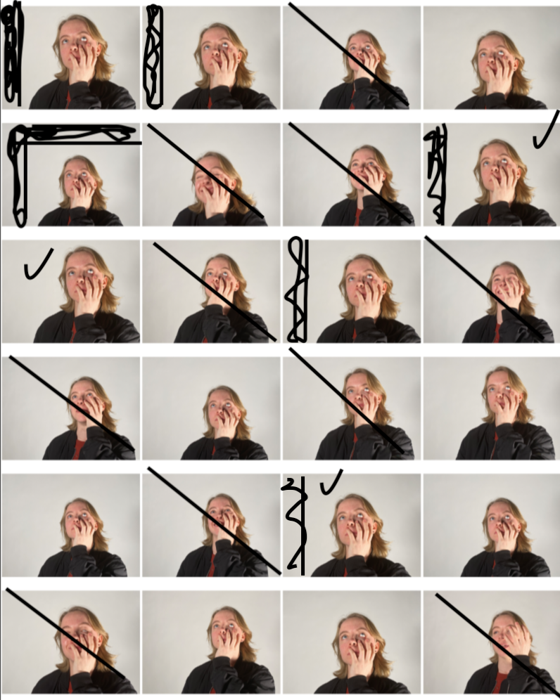
In this photoshoot I took the photos in the studio using two point lighting to get the brightness and exposure that I wanted in the images below. The models I used were asked to pull different facial expressions that were similar to the some of models facial expressions in Maurizio Anzeri’s photography.  All lights where set at a neutral colour rather than tinted warm or a cold colour but I had the lights as bright as possible.  I had the two LED panel lights illuminating the models from the right and the left also. I have chosen not use some of my photographs as the models were not always pulling the right facial expressions. I have also chosen to crop some parts of the images to make them more symmetrical. My best images were the ones where I barely had a any shadows in the background although I have chosen some photographs with shadows in the background because the facial expressions the models had were better than some of then. photographs with no shadows in the background.
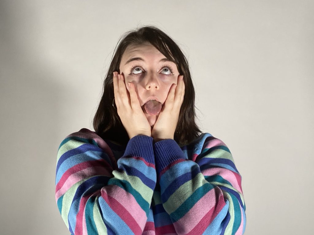
Best Photos

I have specifically chosen these photographs as my best images as my best images because they had the best lighting on the models face and in the background/the models had the best facial expressions. These images were also the most in focus due to the camera being on a tripod keeping the camera steady.

Editing My Best Photo

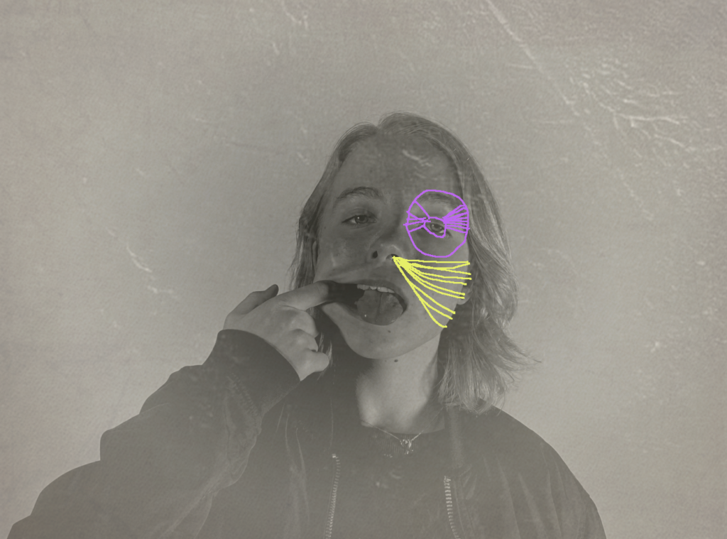
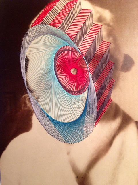
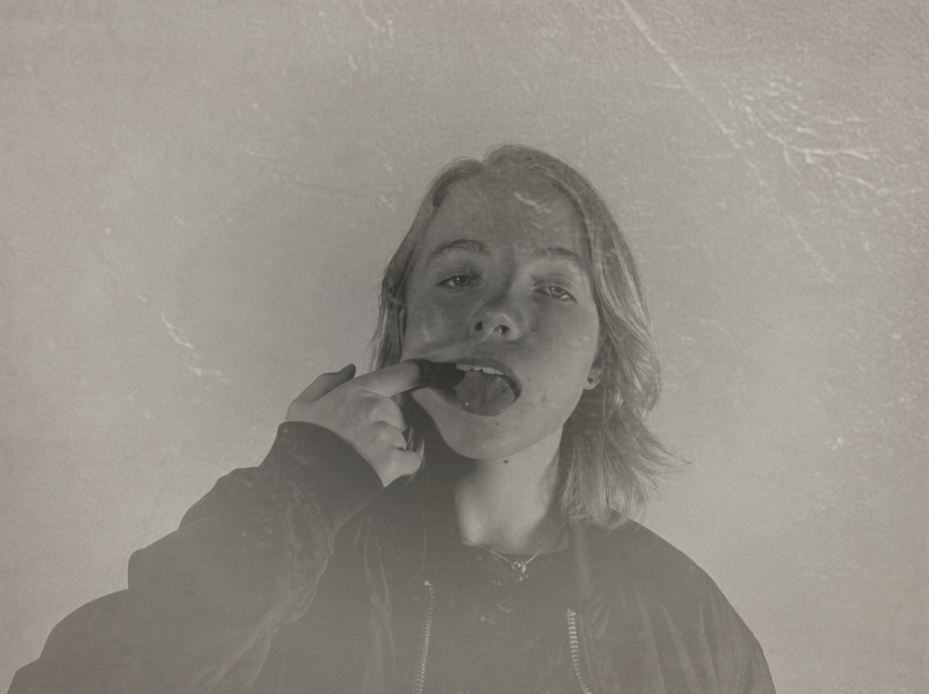
I have edited this photo to look like an older photograph although I had still tried to make the model look in focus and not grainy. I did this using photoshop using various tool and layering filters and lowering their opacity in order to see the model clearly. I will be sewing different coloured string onto the final image just like Maurizio Anzeri’s work. I have edited the photo like this as the images from Anzeri’s work are mostly old images. This photo links to the loss of identity as I am taking photo with a modern camera and then trying to make it look vintage which takes away the photos identity of being a modern photograph. The sewing I will be doing on top of the image is also related to loss of identity as the string will be cover up some of the face in the photograph.

The photo I was referring to when n photographing my model :

Identity Photoshoot plan 1

Who

Younger models, preferably females. They will most likely be some of my friends from my school.

What

I will focus on the face of the models, as well as hands put near their face. I will experiment with emotions, taking photos of the models with a range of different expressions which are similar to the models in Maurizio Anzeri’s photographs, such as; happy, serious/neutral, obscure/silly and other emotions.

Where

I will take the photos in the studio at my school using two point lighting with LED lights. I will ask the models to stand in between the two lights to ensure that the lighting is symmetrical on both sides of the model which creates less shadows.

When

I will take the photographs during a photography lesson or in one of my free periods at school, i will photographs as long as possible to ensure I have a good amount of quality photographs, although this depends on when the studio is free and when my models are free.

Why

I am deciding to have the lighting and models positioned this way in order to get similar images to the photographer Maurizio Anzeri’s work. Although I will not be able to get the exact photo I want without editing the image on photoshop as this photographers photographs look old and vintage rather than modern photos taken on a modern camera. I have chosen this photographer so I can express what I think identity is through loss of identity and identity shown through emotion and personality.

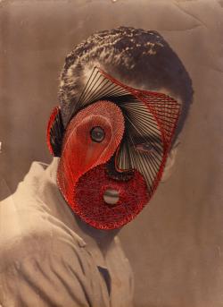
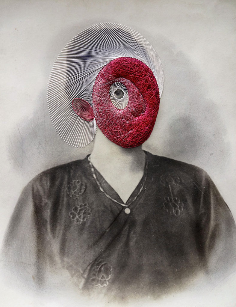
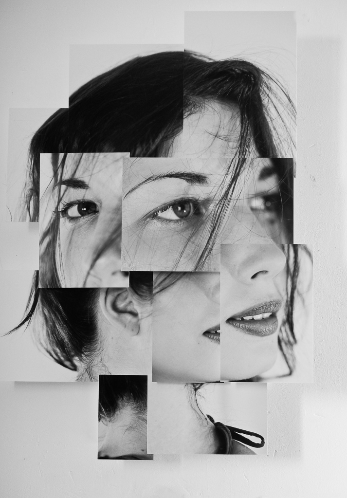
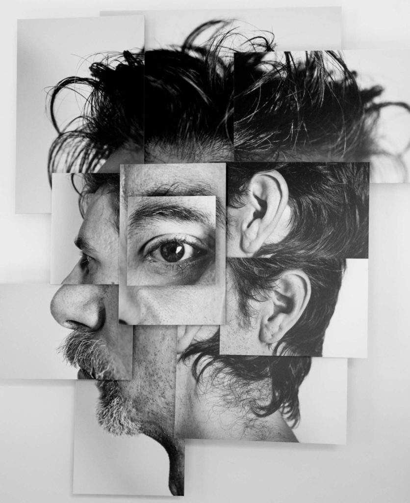
Here are some of the images that inspired me:

How

I will set up the studio with the camera on a tripod to prevent camera shakes, so the images are in focus, as well as this I will set up a two point lighting system with a neutral coloured LED panel in order to allow the faces and hands of the models to be exposed and seen properly.  I will set the shutter speed to a lower setting to make the photo come out sharper and in focus and the aperture should be around f/4.

Maurizio Anzeri

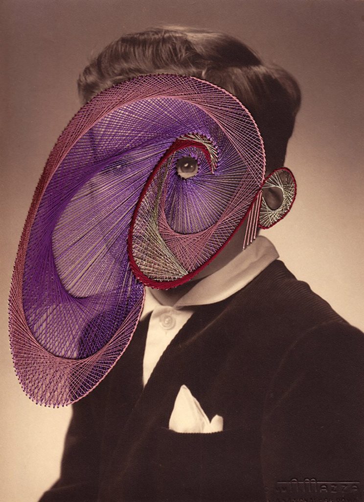
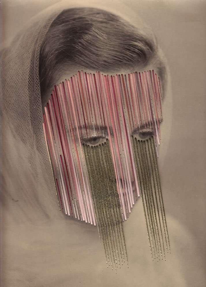
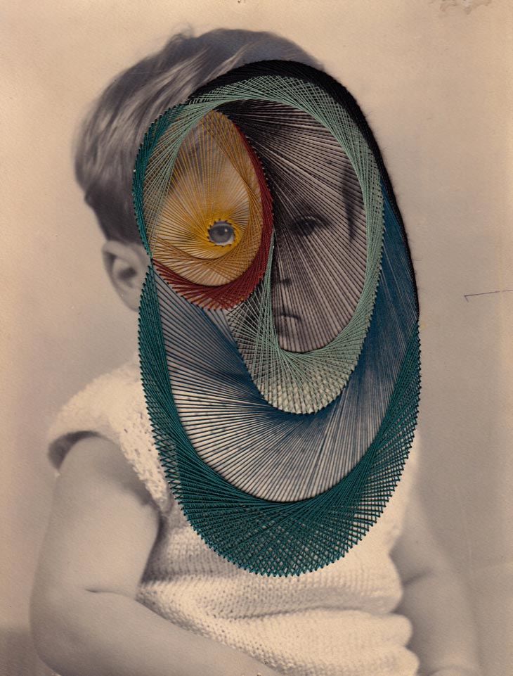
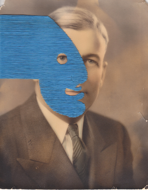
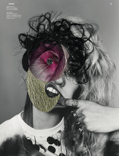
The photographer Maurizio Anzeri makes his portraits by sewing directly into found vintage photographs. The faces of serious-looking children, sophisticated adults, and prim newlyweds are obscured by intricate thread-work masks, while leaving exposed an eye, a mouth, or an ear to make the observer slightly uncomfortable as it seems like the person in the photograph can see you completely but you can’t see the majority of their face and you are unable to identify who they are or what they really look like.His embroidered patterns can also cover the figures like abstract costumes, but they also suggest a “psychological aura”, as if revealing the person’s thoughts or feelings therefore linking to their identity. The antique appearance of the photographs often contrasts drastically with the sharp lines and silky shimmer of the threads. The combined media of the photograph and the threads gives the effect of a dimension where history and future join together.

Maurizio Anzeri has inspired me to do something very similar with my work when it comes to the theme of identity and how identity can control what you think of yourself and how other people look at you.

Photo Analysis

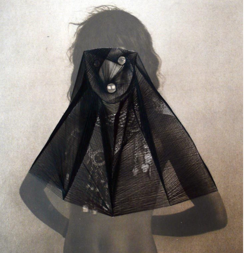
(Round Midnight)

Technical

Lighting – The lighting used for this photograph is most likely flash as it looks like the model is in a studio due to the the plain background behind her, as well as their not being much choice in lighting in the early 20th century compared to the choice of lighting we have today. The flash seems to be directed and position to lead towards the top of the models body as the photo is more shaded towards the bottom

Aperture – The depth of field seems to be very shallow as the photo is not very sharp although that may be due to the lack of camera quality used in the early 20th century.

Shutter speed – Early cameras had a very slow shutter speed, meaning that the shutter remained open exposing the plate to light for a longer period of time.

ISO – The photo seems to have a very high sensitivity meaning it the photo appears to be grainier than usual. There also isn’t much tonal range due to the camera being so dated.

White Balance -The colour accuracy is not quite right due to their being some brown tones towards the bottom of the photo although it adds warmer tones to the image.

Visual

There aren’t many colours in this image but the variation in tones is quite dramatic when looking at how the background d fades from light to dark mostly due to the flash being used and the black thread contrasts dramatically to the photo. There is texture in this photo but its not very sharp or clear and the thread adds much more texture to the photo as well as forming the 3D effect to a 2D image.

Contextual/conceptual

This photo was used in Round Midnight in an early 20th century ‘glamour shot’ that at the time would have been considered visually pleasing for its ethnicity. Anzeri’s delicately stitched veil changes the figure with an uncomfortable modesty, overlaying a past generation with something modern (the threading). This image is also quite ironic as it was taken when nudity was deemed as even more inappropriate than in modern society, so the fact that someone from the present generation is covering up someone from the older generation seems very unlikely and ironic.

Identity

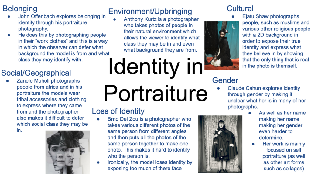
Identity in portraiture photography can have a lot of variation in meaning. There are many sub themes that come under this main title of Identity with in portraiture, such as the ones below. Identity’s true meaning is: the fact of being who or what a person or thing is. The way the photographer explores what identity is with in a person exposes their own identity as a photographer and what the word means to them.

Here is a mood board of examples of different photographers who’s work I able to express these different sub themes using portraiture:

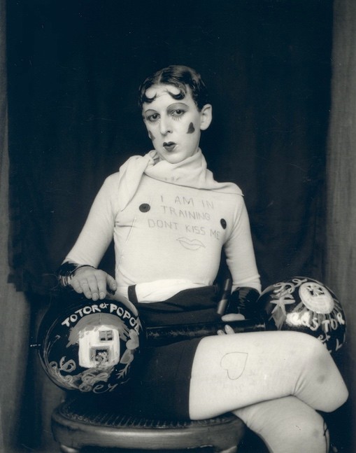
Gender

Belonging

Environment/ upbringing

Cultural identity

Social/Geographical identity

Lack of / loss of identity

STudio photoshoot

First experimentation with colour lighting

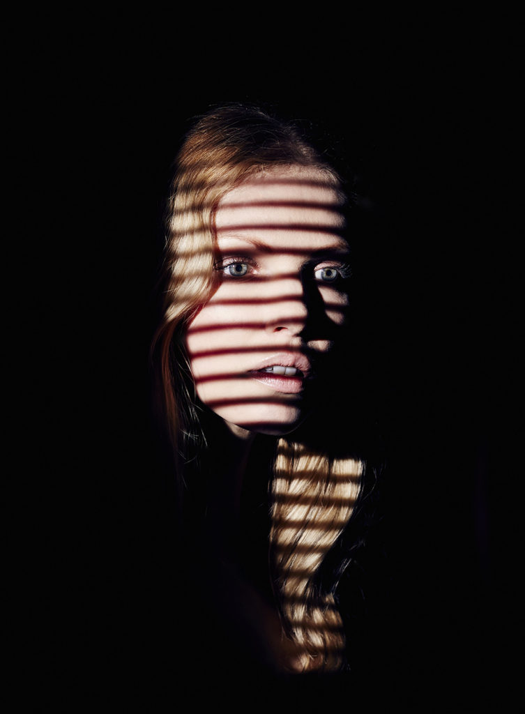
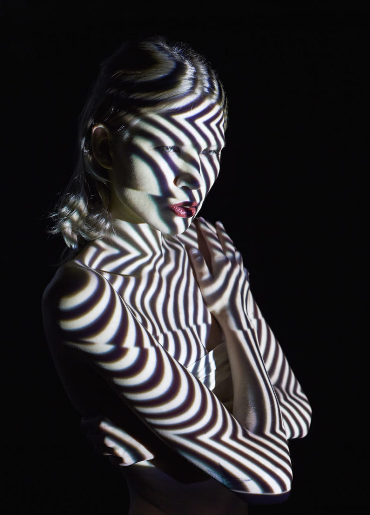
I took these photos in the studio and used the technique Chiaroscuro using one point lighting as well as adding the coloured filter so I can relate the photos to the photographer Mads Perch, as he use various colours in his photography as well as creating dramatic contrasts with shadows. I set the ISO at a lower setting to make the image less grainy to make the photo look as sharp as Mads Perch’s images. In the foreground there is a lot of shaded areas that look under exposed in comparison to the light on the model. The lighting reflects off the models skin which allows there to be some tonal range and the lighting also brightens the back drop behind her. I changed the aperture as wells depth of field in the photos are quite shallow to make the most sharpened part of the image is the model, again like Mads Perch’s photography.
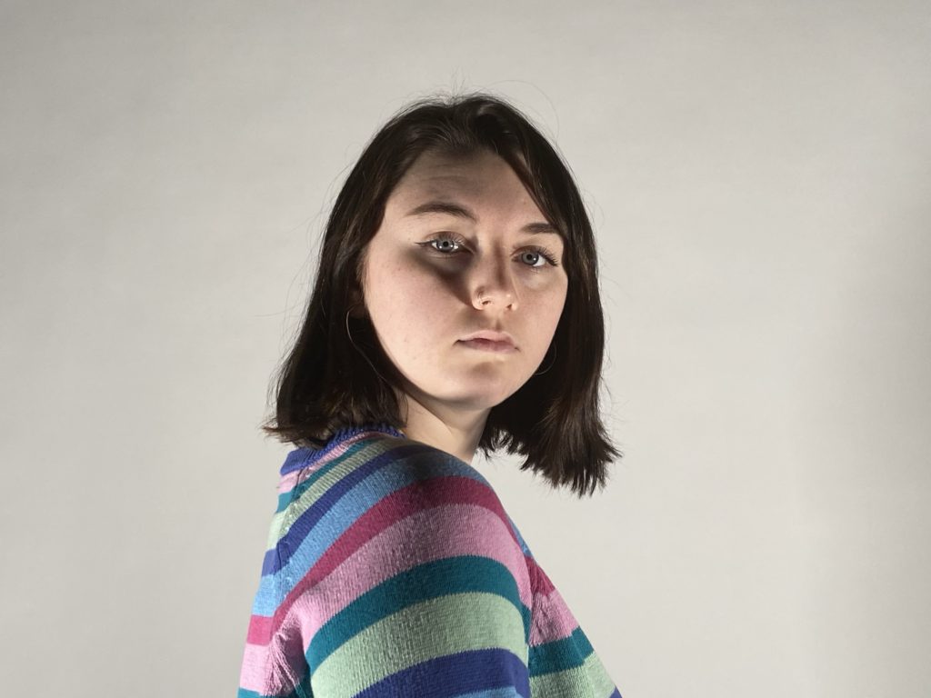
Contact sheets

Best Photos

I have chosen my best photos from the contact sheets above. They are the sharpest and most successful out of the photos above although I have cropped some them so they are more symmetrical. I have also chosen these images as the models poses are the most dramatic and most similar to Mads Perch’s work/photography. I haven’t chosen more as I wanted to display quality of quantity.
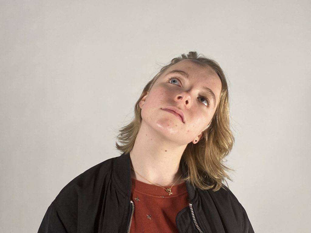
Editing My Best Image

On photoshop I adjusted the brightness to allow you to see the mode more clearly as the image came out quite dark. Although I brightened the photo I still tried to have a good contrast of the the darker and lighter tones to get the final image I wanted. As well as this I changed the intensity of the shadows and highlights to ensure certain points were more exposed to the viewer as well as drawing their attention to it particular parts of the photo. I also cropped this image on photoshop to allow the model to be in the centre of the photo.
Final Outcome

Mads Perch

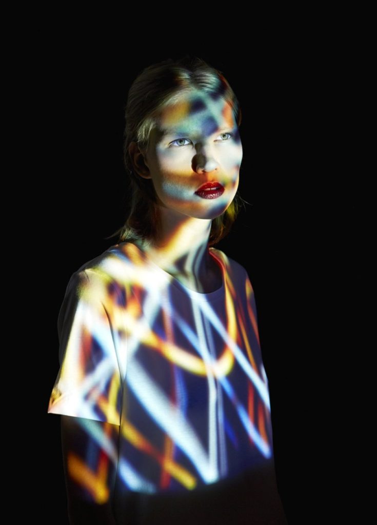
Mads Perch is a London based photographer who works mainly within music, editorial and advertising photography

Over the last ten years his photography has been centered around projections, double exposures and other creative techniques which all helps him create his unique style. 

Mads Perch’s photography has allowed him to work with a wide range of advertising agencies. Over the last few years he has been lucky enough to work exclusively with artists such as MIA, Robert plant, Alt J, and many other great bands and photographing them in this unique way.

I think that his use of photography is very unique and is inspiring for the kind of photo shoots that I want to do e.g. colourful in contrast a dull background to make the portrait stand out more.

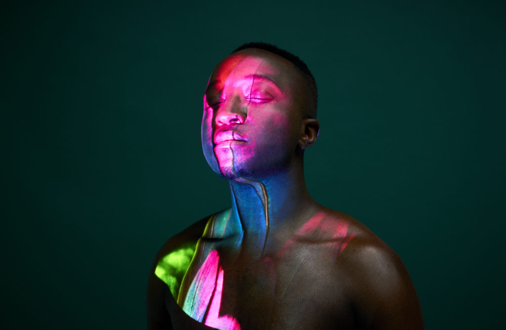
Photo Analysis

Technical

Lighting – Lighting from the studio with a projector to get the high contrast of colour of the models face. In the foreground there seems a lot of shaded areas that look under exposed in comparison to the light on the model. The lighting reflects off the models skin which allows there to be some tonal range and the lighting also brightens the back drop behind him.

Aperture – The depth of field in this image seems to be quite shallow as the most sharpened part of the image is the model.

ISO – The light sensitivity is fairly low on this photo because the image doesn’t look grainy.

White Balance – There is a variety of cold and warm tones in this photograph.

Visual

There are some very vibrant and saturated colours in this photo. There are also a lot of different tones in this photo which contrast with each other, especially because the darker tones are right next to the bright vibrant colours being projected onto the subjects face. There doesn’t to seem to be much texture in this photo other than on the models face and especially in the background as the photo is set in the studio. In this photo the background may be considered as 2D which makes the models look more 3D and makes the viewer focus on the model more.

Contextual/Conceptual

This photo is meant to represent the model embracing their colour and they have no shirt on to show that they are fully absorbing the colour with nothing getting in their way.

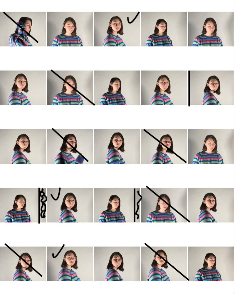
CHIAROSCURO Photoshoot

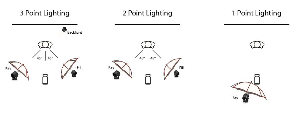
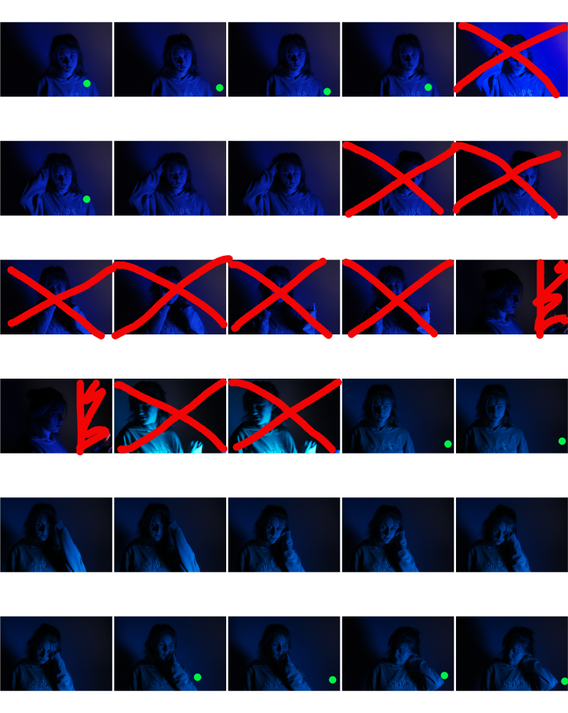
In this photoshoot I took the photos in the studio using one point lighting to get the brightness and exposure that I wanted in the images below as the light exposes part of the face rather than all of it whilst leaving a dark background with hardly any light hitting the backdrop. The model I used was asked to move and tilt their head at different angles to get different outcomes that were similar to the some of models facial in other chiaroscuro photographers work, such as Clair Obscur. I wanted to use another spotlight for a different part of my shoot in order to experiment with the one point, two point and three point lighting but unfortunately only one light was working during this photoshoot. I have chosen not use some of my photographs as the model was not always pulling the right facial expressions or didn’t have their head tilted at a good angle. I have also chosen to crop some parts of the images to make them more symmetrical. My best images were the ones where the model was pulling the correct facial expression and had their head titled at the right position as well as the photos being in focus. Overall I think I prefer the majority of the photos with the black background over the photographs where you could see the backdrop more clearly.

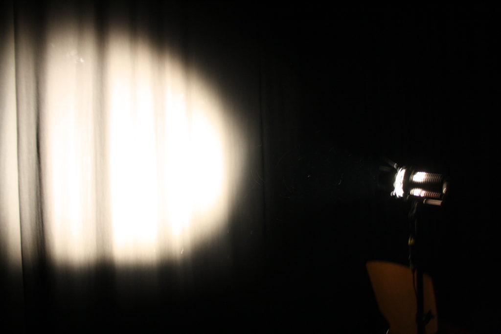
This is how I set up the one point lighting in the studio in order to get the outcome I wanted.

Contact Sheet

My Best Photos

I have specifically chosen these photographs as my best images because they had the best lighting on the model’s face and in the background/the model had the best facial expressions. These images were also the most in focus due to the camera being on a tripod keeping the camera steady.

Editing My Best Image

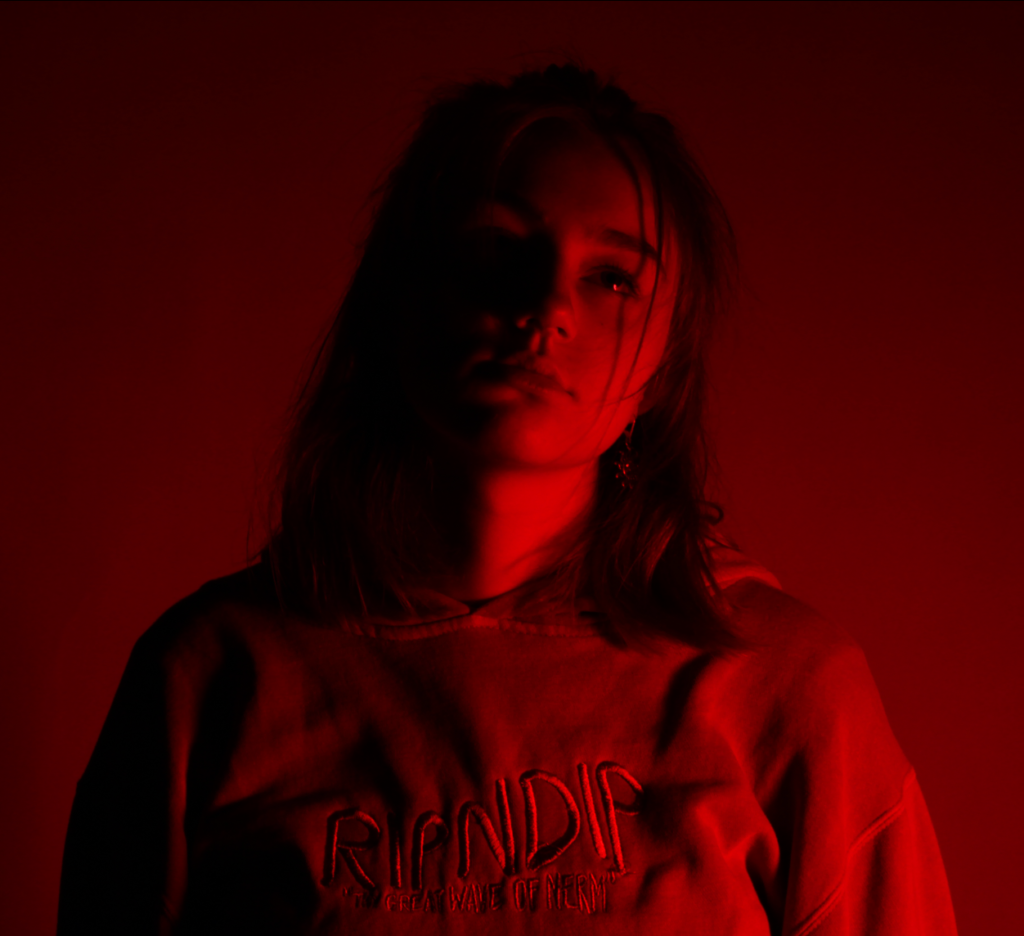
I have edited one of my best images from this photoshoot to look more like Clair Obscur’s work. I have made the photo black and white and I have intensified this by lowering the red and yellow tones do allow more contrast to be seen. This image was one of the most successful as it was the most in focus and you can see minute details such as the freckles on the models face, similarly to some of Clair Obscur’s models.

Final Outcome: