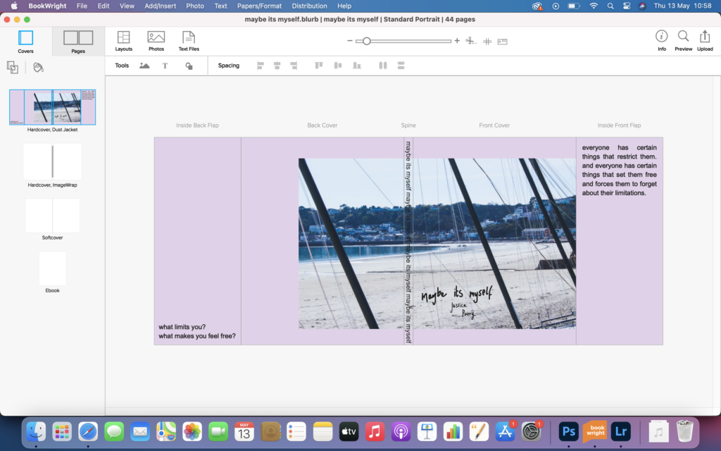
front cover – I decided to do a hard back cover because I wanted this book to feel and look sturdy. I picked this picture because I feel it pushes the boundaries of the theme of limitation. I decided to handwrite my title and name to add a personal touch to the book. 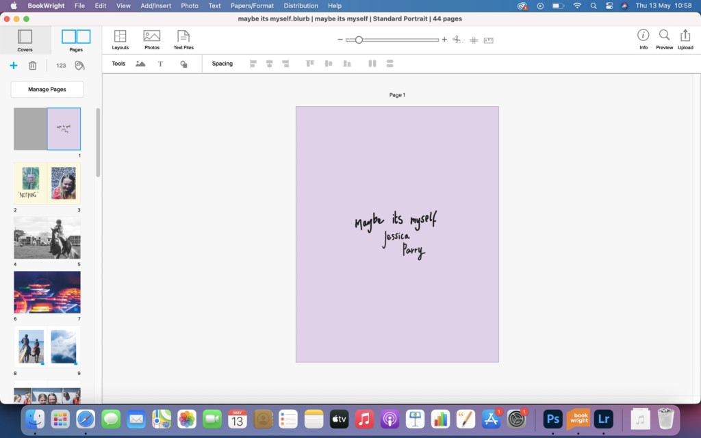
I wanted to use this first page as a title page, that included my favourite colour, the book title and my name. I wanted to consolidate the idea that this book is about myself and others, without actually having myself featured in it at all. 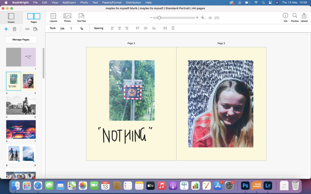
This double page spread is dedicated to my first person that I interviewed, my sister. With these double page spreads I wanted to show how they responded to the questions that I asked them. I feel this page worked very well, and the images really represent who my sister is. 
I wanted to add images into my book of things that make me feel free, horse riding being one, probably the most important one. I like this image a lot, and by making it black and white adds to image. I decided to make this image a full bleed because I wanted to show how much horse riding means to me. 
I put this image in my book, because I feel it represented the theme of freedom, because of how it is of a speed dials and the fact that it contains motion blur, suggesting quick movement. I liked this image that much I felt it needed to be a full bleed. 
I decided to place these images together as they are both images of free things. Although I feel this page works well, I wish I had thought about it a little more, and had experimented more with colours. 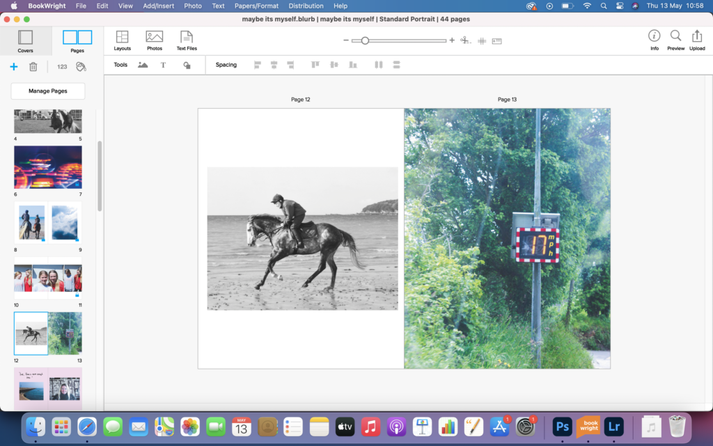
This spread is of 2 images that relate to each other. The image on the left is of an 85 y/o women who still rides out racehorses. The image on the right I feel relates well to the lady, in the sense that she has no limitations. I feel this images work well together as they relate nicely. 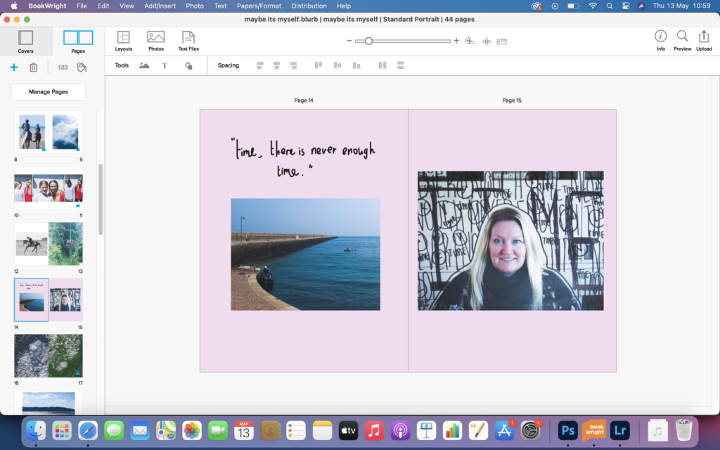
This double page spread is again dedicated to my second person I interviewed, my mum. I decided to print off the portrait and add handwritten things on the image and rephotograph it. I like this as it adds interest and relates well to how my mum answered to the questions I asked about freedom and limits. 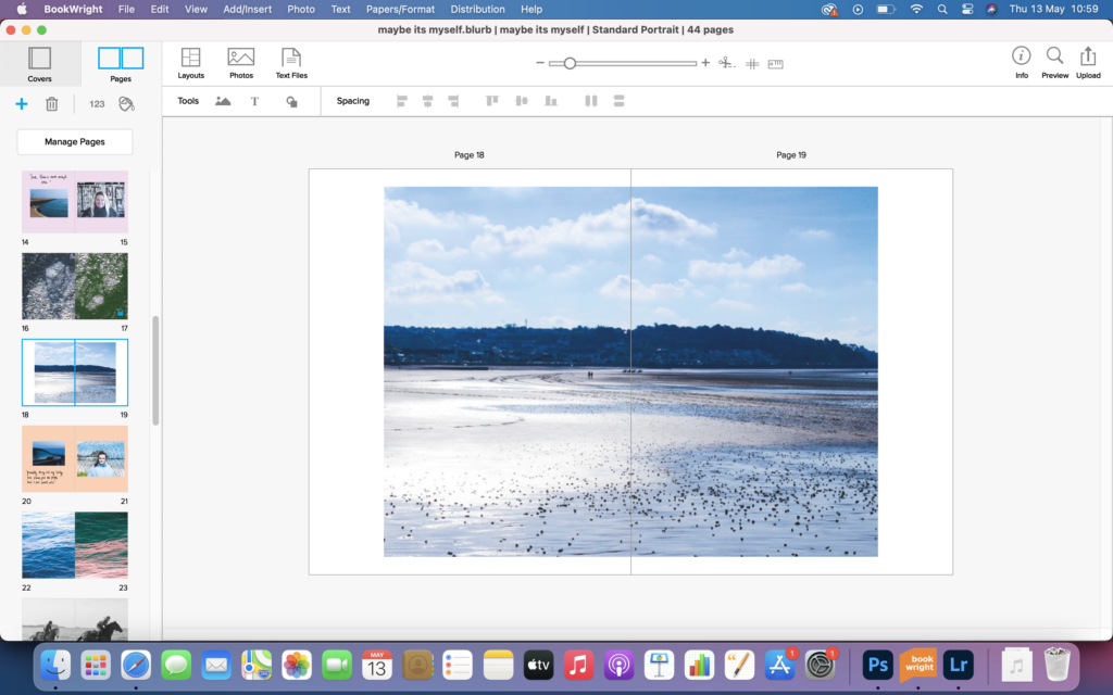
I added this image as it truly relates to freedom to, with the clouds and light and airy feel to it. On reflection I feel I should have made this image a full bleed as it is a strong image, but like this I feel it works okay. 
This is another double page spread dedicated to another person I interviewed, my friend, Rosie. Overall I feel this double page spread is quite poor, because the image on the left is quite dark and the one on the right is very bright. On reflection I should have gone back to make it brighter, in order to make the spread better. 
This double page spread, is one of my favourites. It incorporates the same image, but both of them are edited very differently. The one on the left represents limitation and the one on the right represents freedom. 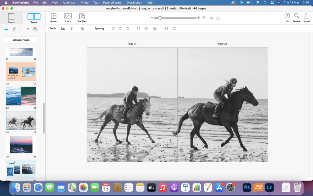
This full bleed is a very strong image and needed to be added into the book. It truly encapsulates freedom, 2 horses galloping on the beach. The airy feel of the image really links to freedom, and the lack of limitations. 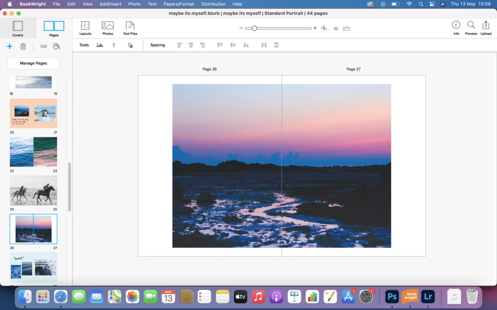
This image was taken at sunrise, and I feel needed to be added into the book because sunrise is when I feel most at ease and free. The reflections in the sand are truly beautiful and really add to the image and increase the interest of it. 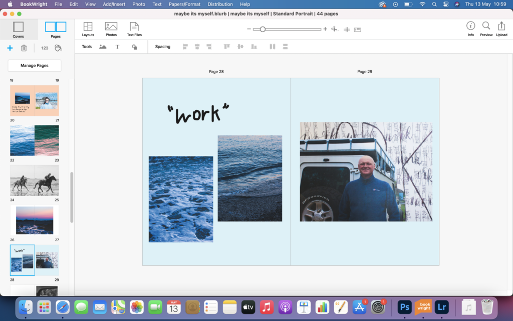
This double page spread is another that is dedicated to one of the people that I interviewed, my dad. Overall I feel this page contains too much blue tones and would work best if I used black and white images instead. 
I included this image in my book because I liked the carefree mood it brought to the book. The almost abstract image represents freedom, and needed to in the book. 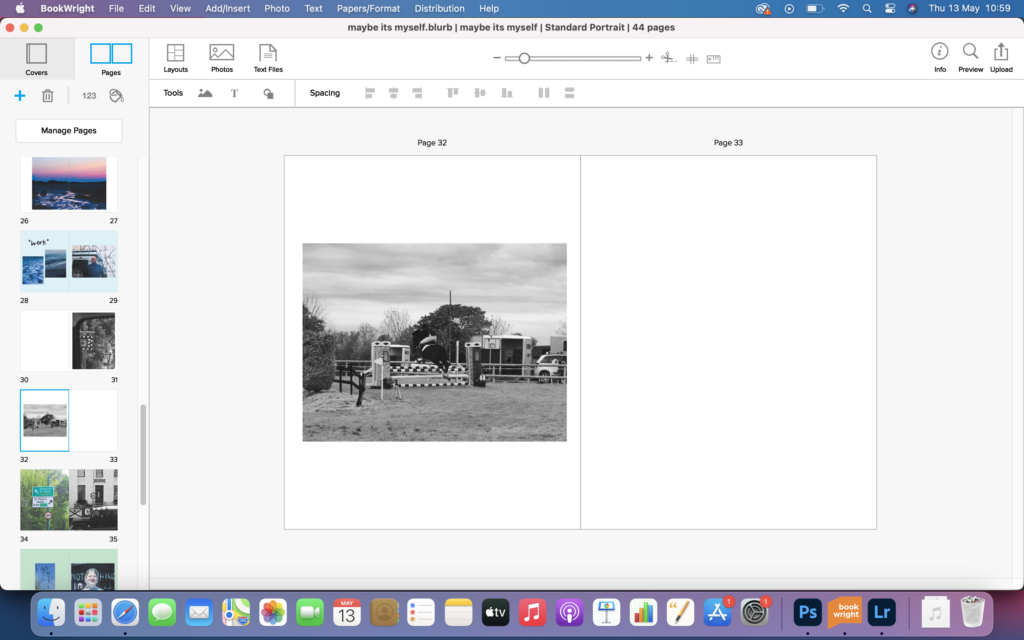
This is another image of something that makes me feel free, horse riding. My intention of this book was for it to essentially be about myself without it actually including any images of myself, so this image is perfect. To make this spread better I would made the image slightly bigger to show the importance of the image. 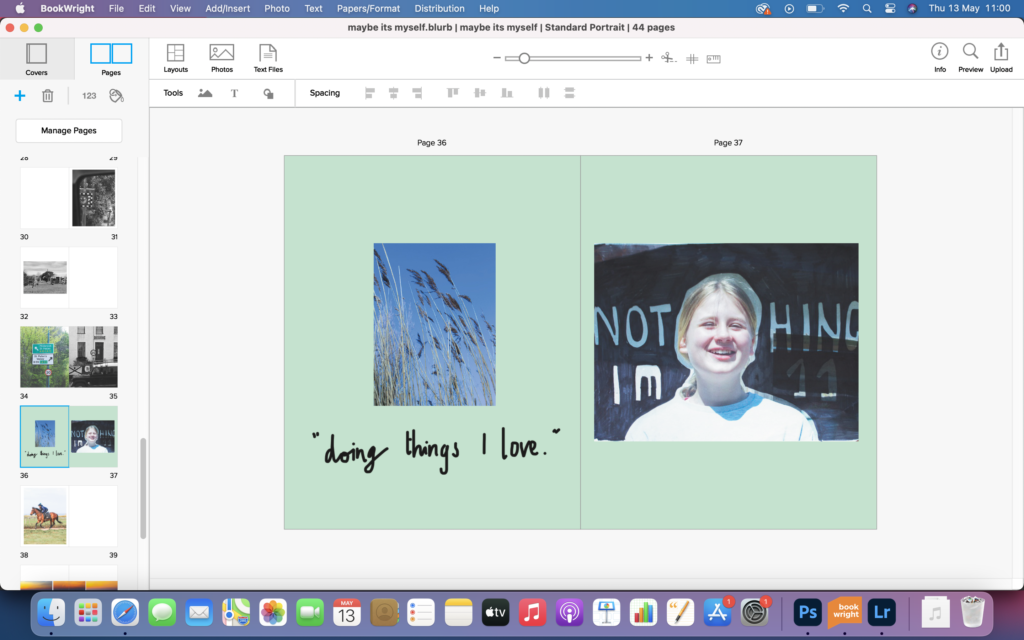
This is the last double page spread that was dedicated to one of the people interviewed, my sisters friend, Olivia. I really like this spread, as I experimented with the printed image and decided to black out the background to represent how nothing limited her. I contrasted this image with a free flowing image, which stands out nicely on the cool green background. 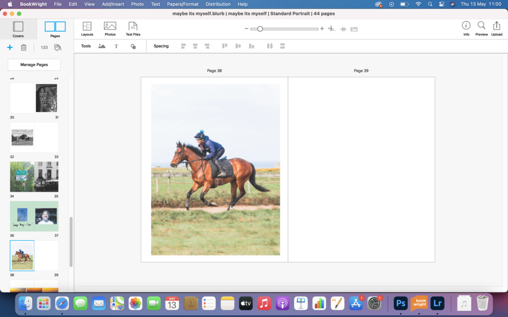
I put this action shot in purely because I liked how well it came out. If I were to take it again I maybe would take in landscape, to really get more of the background in the image. 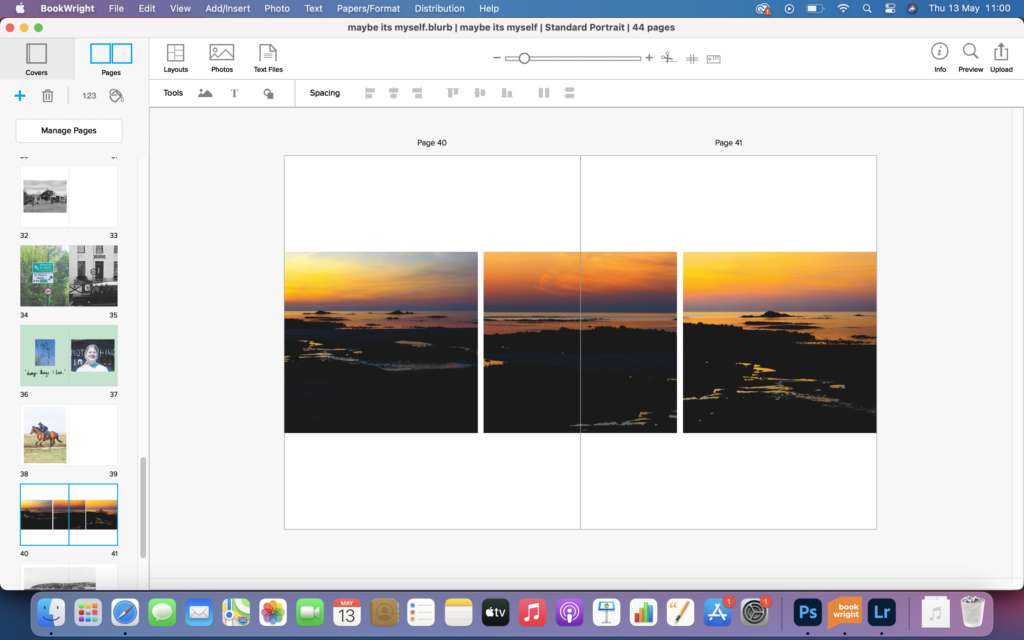
I used this images to explore the freedom I really had. After taking and editing these images I realised I could used them sort of as a panoramic image, as the horizon fit in nicely and the reflections flowed from one to another. 
I wanted the last big image in my book to be the thing that really makes me feel free. I chose this one because of the light and airy feel it has to it. I liked how the horses were galloping away, almost hinting to lack of limitations. 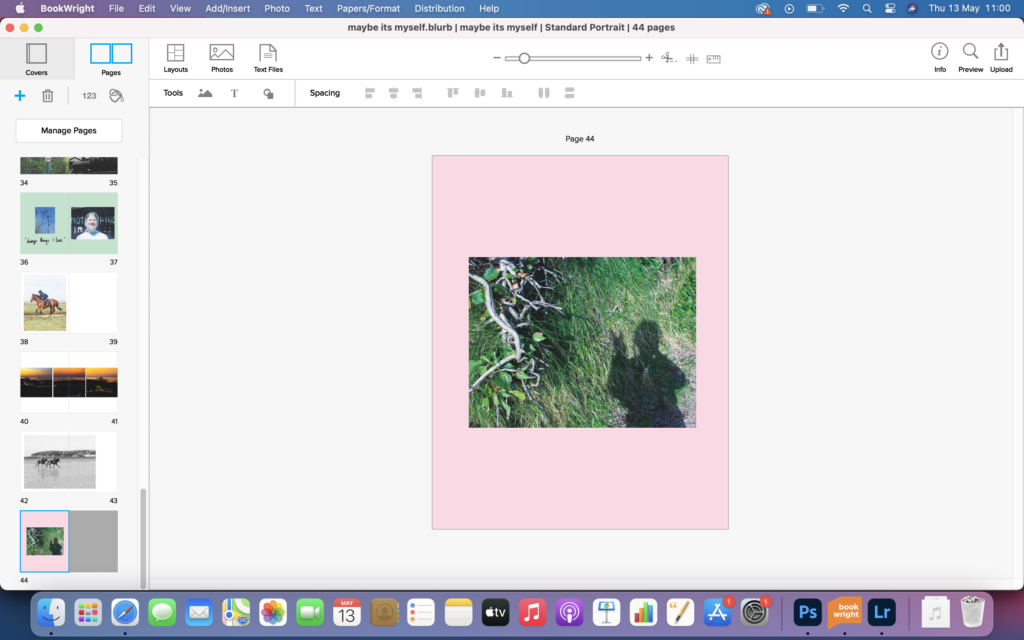
The last image of the book is of a shadow of myself. I used this image to consolidated how the book was about me, and not anyone else. If I were to make this page again I would make the image smaller and include a quote, similar to the double page spreads dedicated to those who I interviewed.
Overall I feel this photobook turned out how I wanted it to. It was set out to capture freedom and limitation, and I feel it has done that, with the images of horses galloping on the beach, hinting at freedom and with the images speed signs, hinting at limitations. I wanted the book to be free flowing and to have ability to be picked up and opened at any page, I feel I have done this as it has no narrative or real set out structure, just pictures on a page, that can be interpreted by all. This project was interesting and allowed me to gain a good insight into what myself and others feel limit and make them feel free. Things are so very different to what meets the eye.
