The following images shows how I decided to layout my images in my photobook

For my front cover I decided I wanted to keep it simple with a Emerald coloured cover and the word Greenhouse in portuguese.
I then have Greenhouse written in English on this page however to plan to place a real photograph here of me and my parents next to the greenhouse when I was younger; I think this give the book a more personal touch.

On these two pages I wanted to write in Portuguese and English to link the idea to link their language and the language they learnt in Jersey. I made this image monochromatic to give the idea that its an older memory.
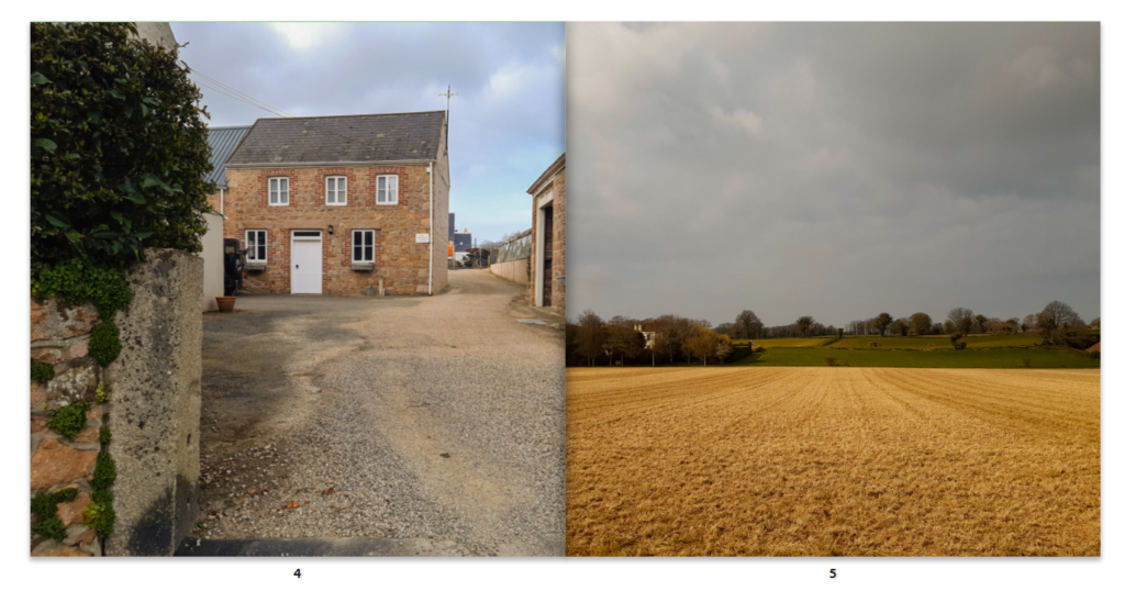
These images show where they used to live and where they worked at the beginning of their lives in Jersey

I used these images to show the transition into the tomato greenhouse in which we call “the tunnel”; I think these images work well due to the old photograph as it reminds them of how long they lave been working here.
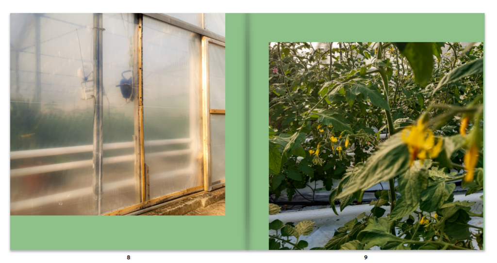
These images I thought worked well as it shows the outside and the inside of the Greenhouse.
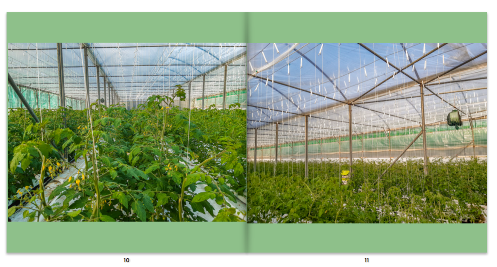

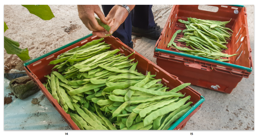
I then used a double page spread to show the transition into the other greenhouse they they also work in.

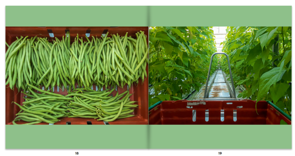
I love the use of contrast between the green and the red in the images as it makes the green beans stand out.

I used these images for again, the use of contrasting colours which make the images stand out. The car also holds memories me and my mother.
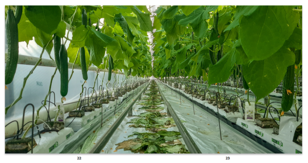
I love this image for its symmetry and the nice balance between green and white.
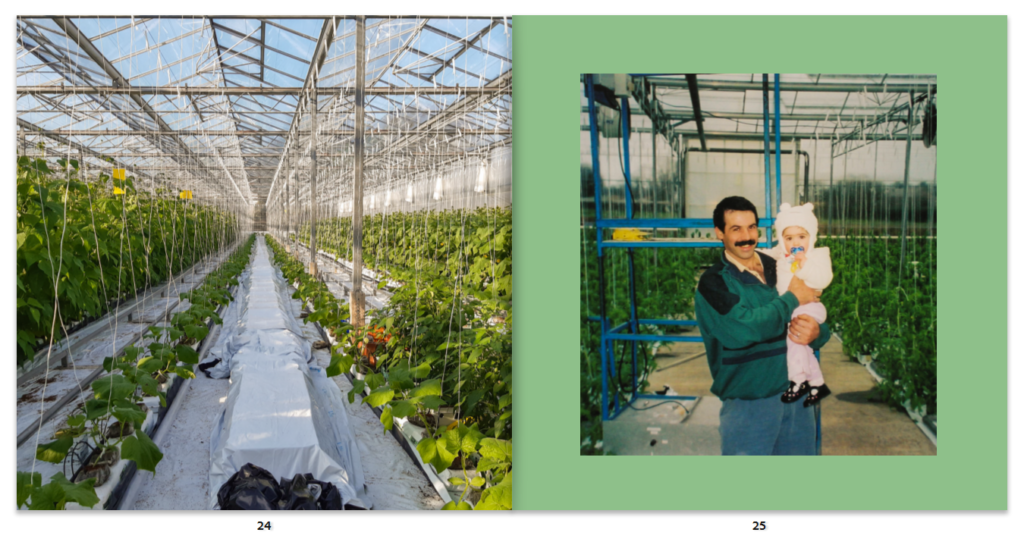


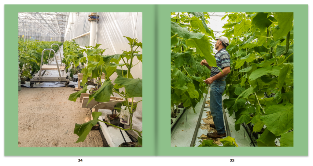

I used this divide to show the new the greenhouse; again in portuguese and english.
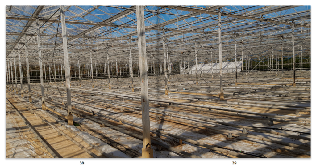

I created a divide again by the use of two plain pages and showing an image of my parents to nicely finish off the book.
