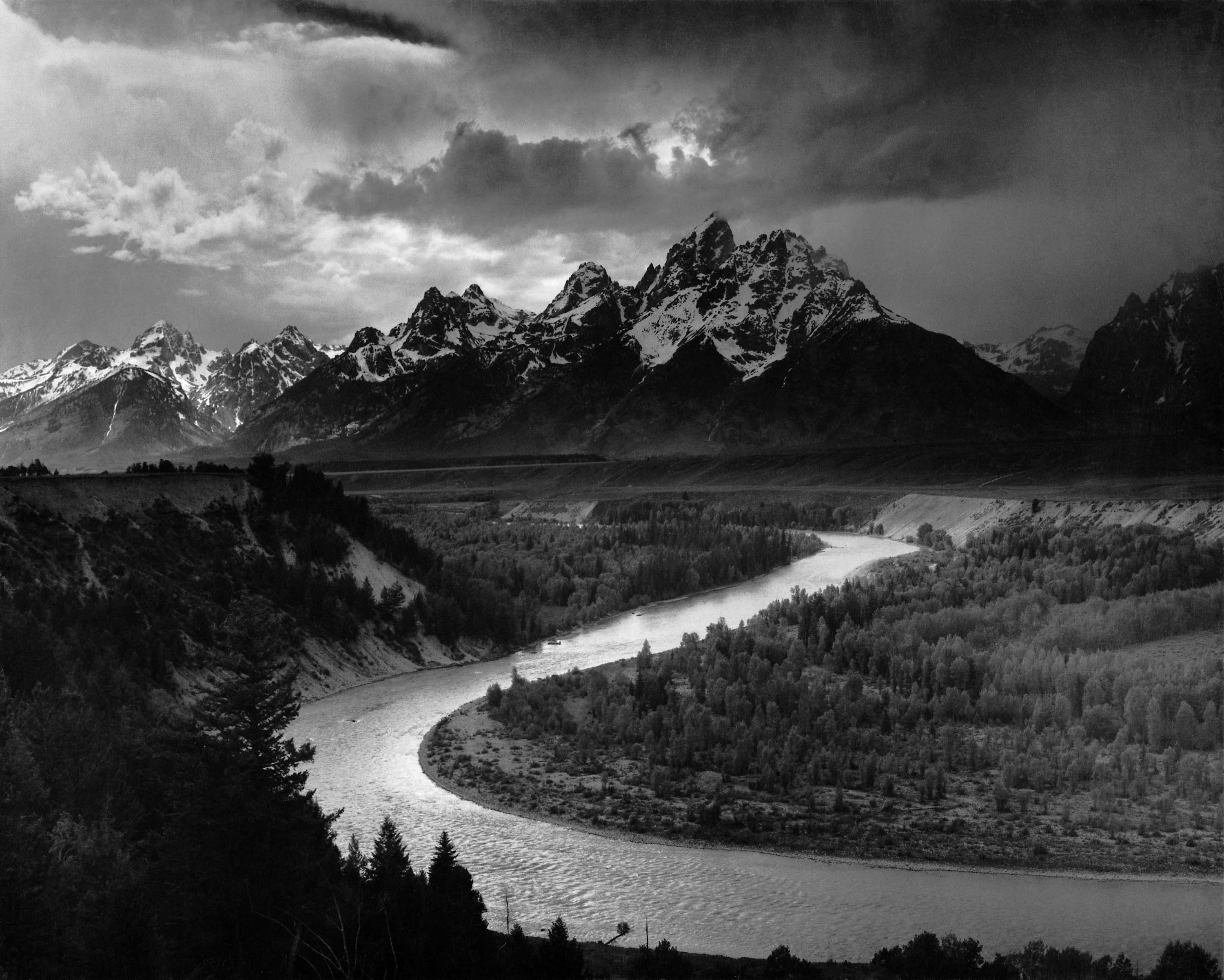
In 1916 Ansel Adams started experimenting with photography after he went to Yosemite National Park. He learned darkroom techniques and started read photography magazines, attended camera club meetings, and went to photography and art exhibits. He developed and sold his early photographs at Best’s Studio in Yosemite Valley.

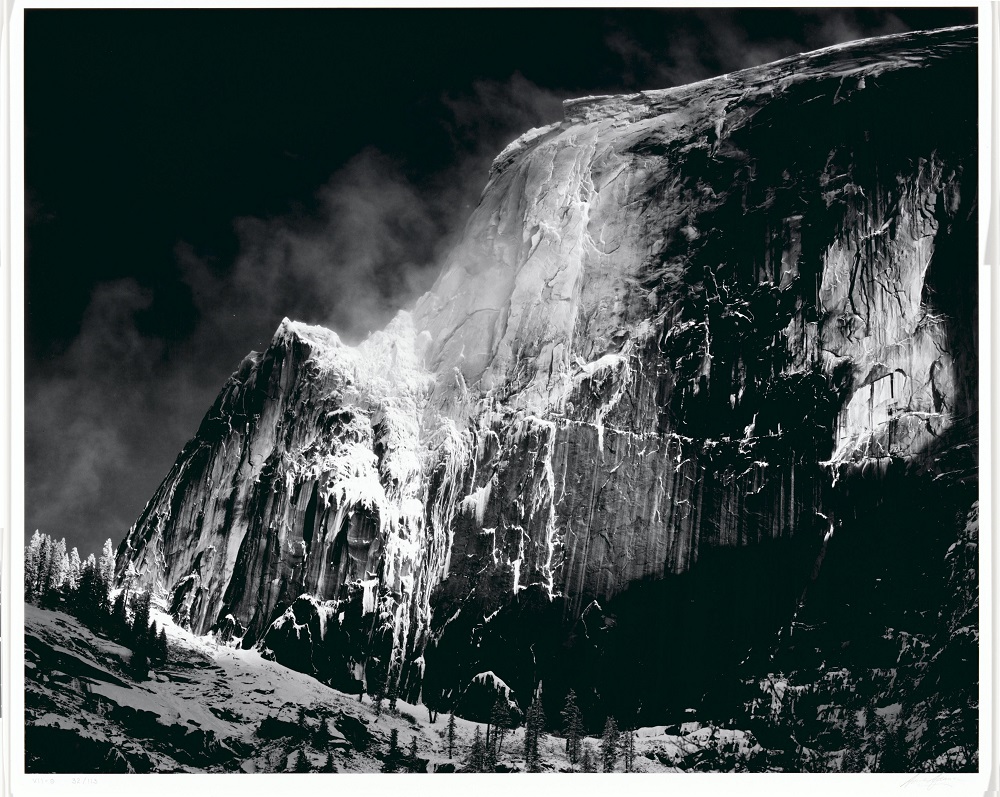
Adams professional photography breakthrough occurred due to his first portfolio Parmelian Prints of the High Sierras, which included his famous image “Monolith, the Face of Half Dome” from this he became very successful through commercial assignments. Between 1929 and 1942, Adams’ work and reputation developed and he started working in New Mexico with other photographers such as: Alfred Stieglitz, Georgia O’Keeffe and Paul Strand.

Technical
- Lighting -the lighting in this image looks very dark and shaded with some natural daylight hitting certain points of the mountain and landscape. This allows the the photo to have more contrast and looks more manipulated to add more depth and intensity as well as there being over exposed areas, such as the snow on the mountain and there is also under exposed areas, such as the shadows and the trees near the bottom of the mountain.
- Aperture – The photo has been sharpened immensely to allow you to see the textures of the mountain and the slight details of the trees, such as their branches.
- ISO – The sensitivity in this image seems to be lower as it looks very clean and sharp. As for the contrast, it is very high and the very light white against the dark black make each other stand out more.
Visual
- The tones range in this photo from very light to very dark and this makes the textures of the mountain stand out even more. The shadows on the mountain look very 2D compared to the rest of the mountain as it’s mostly one block colour but the majority of the photo looks 3D and formed e.g. the majority of the mountain.
- Composition – Not all of the mountain seems to be in frame in this photo but the layout is made to make the mountain standout with a background with not much going on and the the foreground compliments the main focus of the photo. The white in the photo also leads the eye towards mountain as the snow is highlighting it.
Contextual
- This photo is meant to remind you of the beauty of nature with nothing man made in site. The romanticism in this photo also dramatizes the image to really amaze us. The trees in comparison the the mountain also exaggerates how humongous the mountain really is and compared to us also because those trees are most likely to tower over us and shows us how much more powerful nature can be compared to ourselves.
Conceptual
- I think the overall message behind this photo is to show hoe beautiful and drastic nature can be although you can’t see the image in real life and it’s in black in white, therefore dulling out the image but it still looking incredible.

