LAYOUT PLAN-
(open to change)
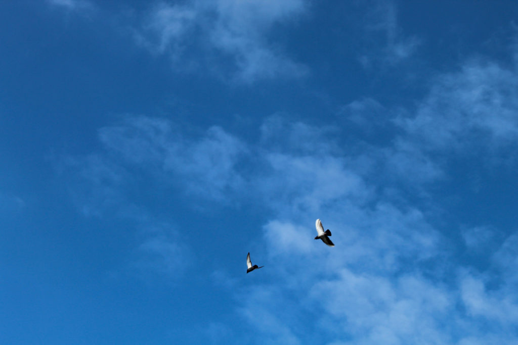
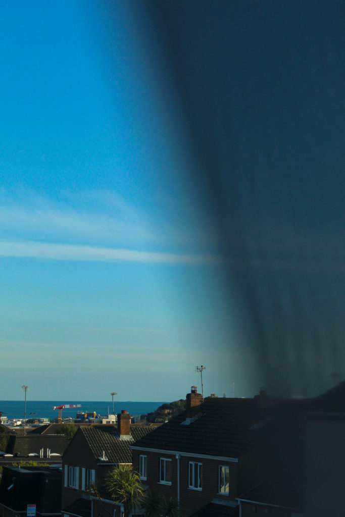
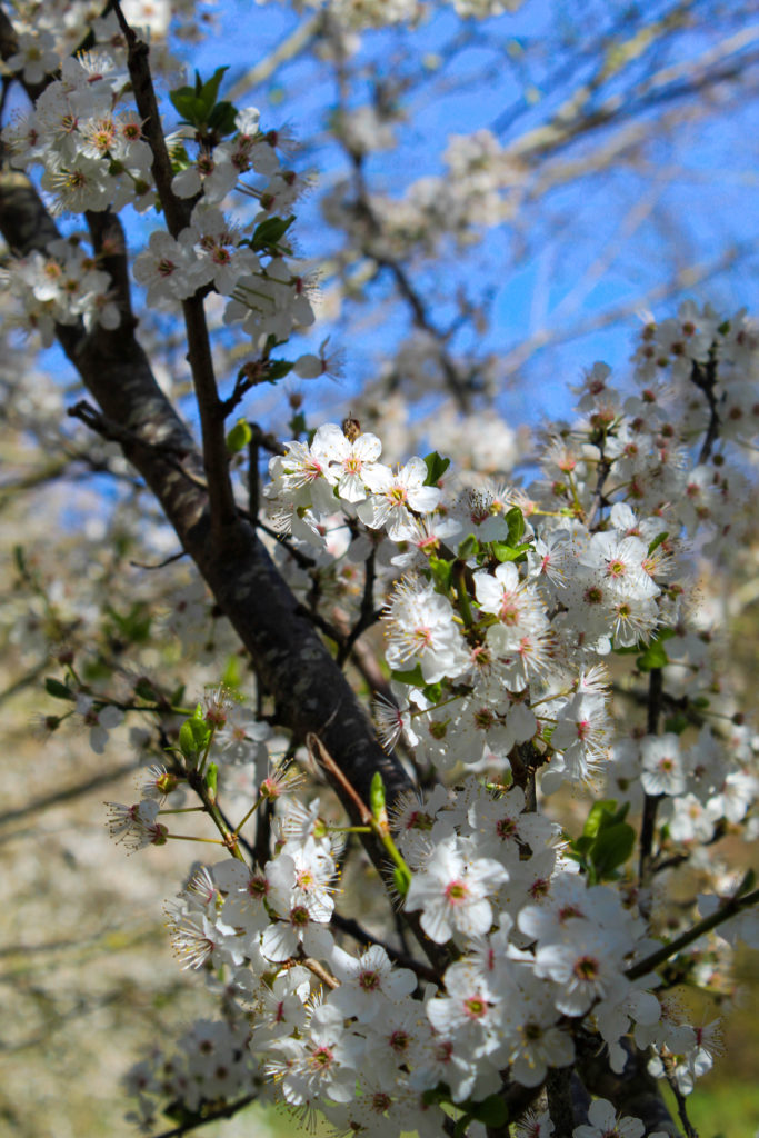
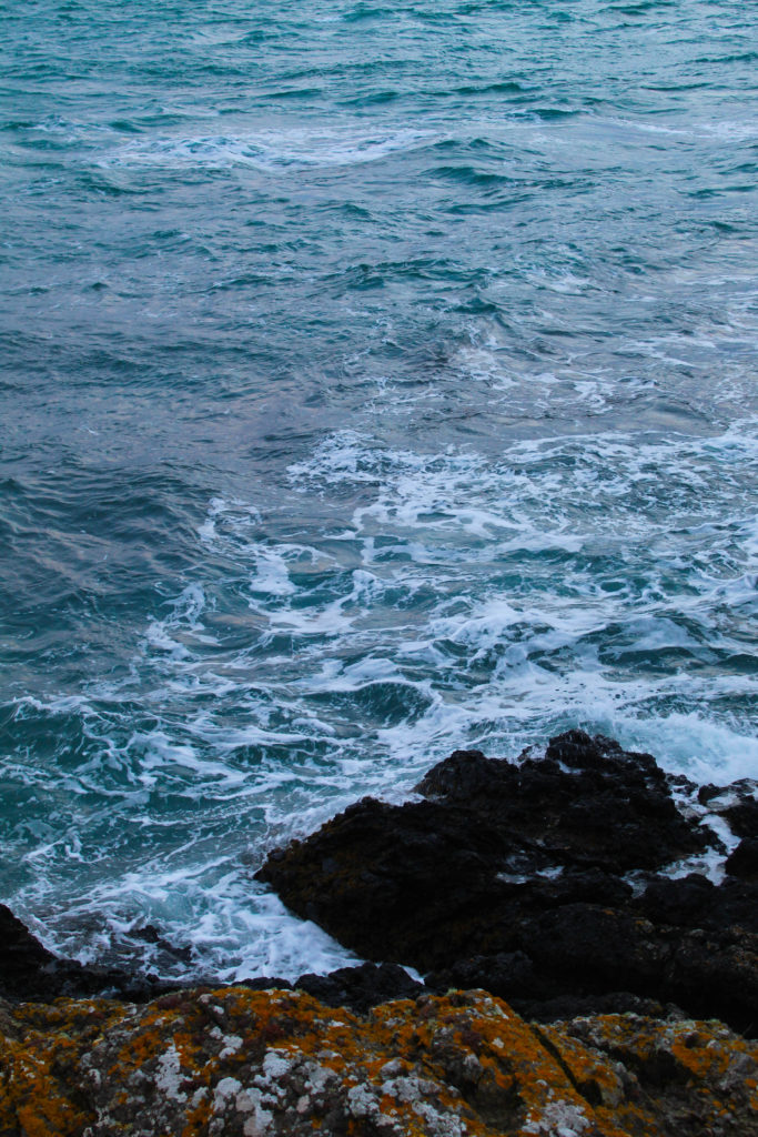
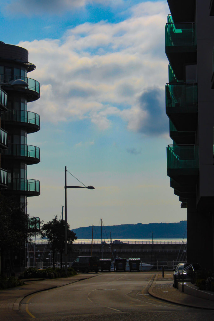
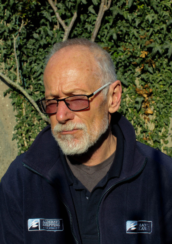
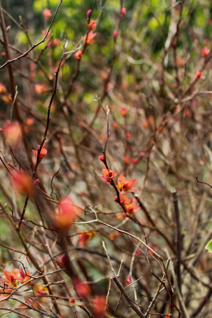
These are just my selected images from the two new shoots along with the unused images from the original layout plan I did.
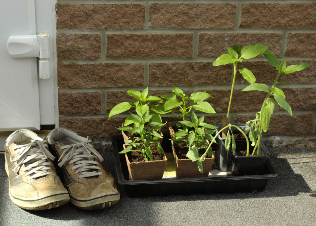
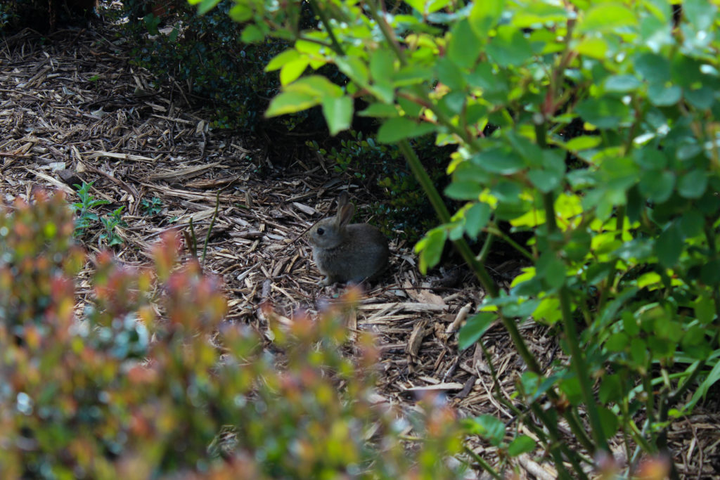
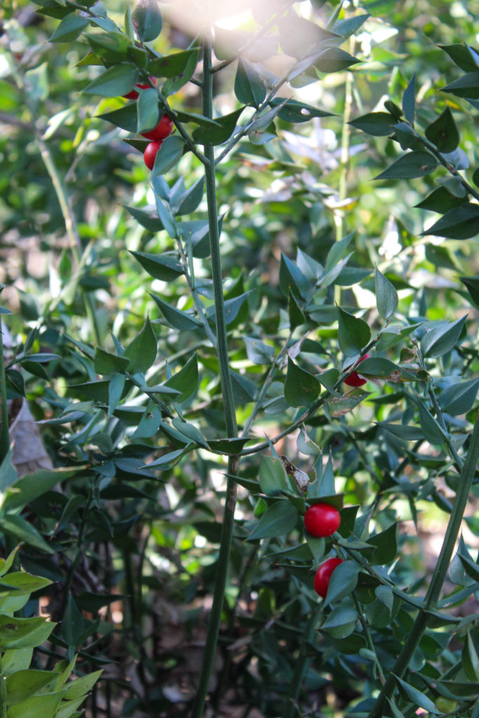
I’ve now gone through all of my shoots, paired/layed out all of the images I can and reviewed and removed any images that just don’t work with my project as a whole. I know that as I move on to actually creating the photobook I will probably cut a few more images out and re-work the layout as I go along, but that depends on whether they turn out differently in the final product than in the temporary blog post layout here.
All in all I’m okay with the selection and layout of images I have here and I think they showcase the best of the shoots I did. Moving forwards, I’m going to put them into the photobook and do some more experimentation with the order of the images and how it forms my narrative, as well as possibly adding text of some sort.


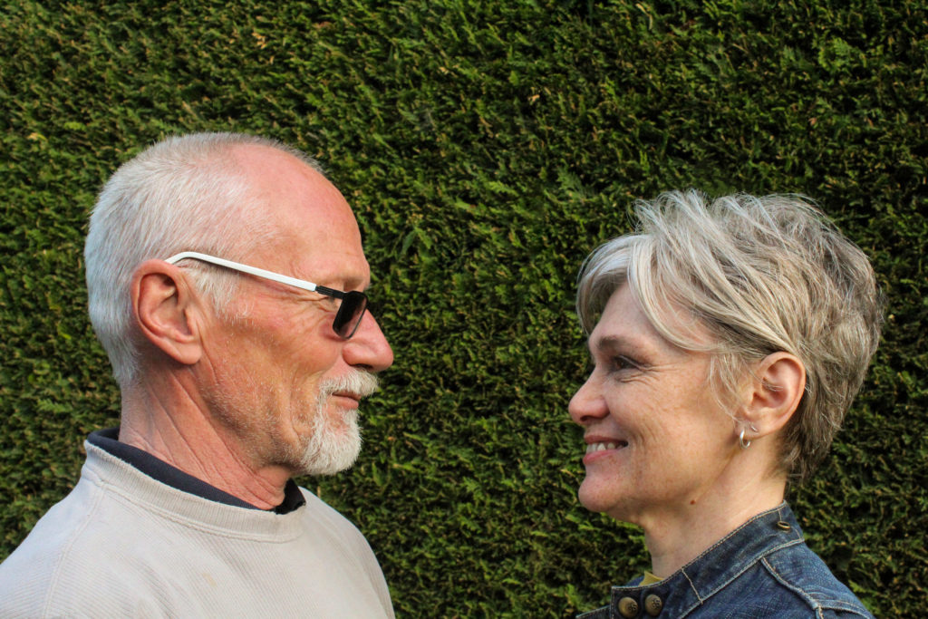
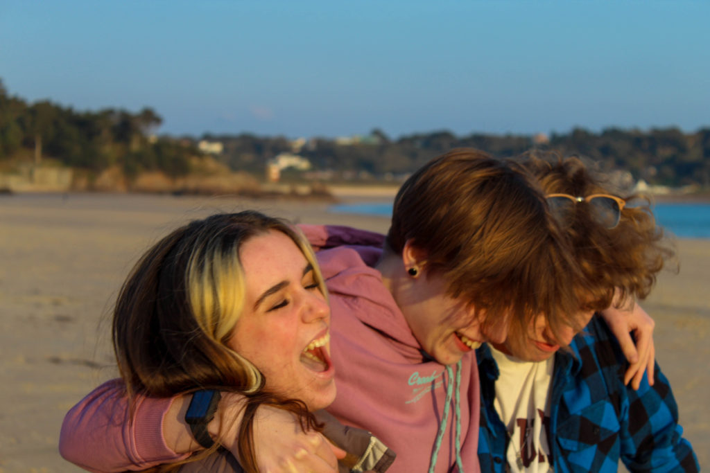
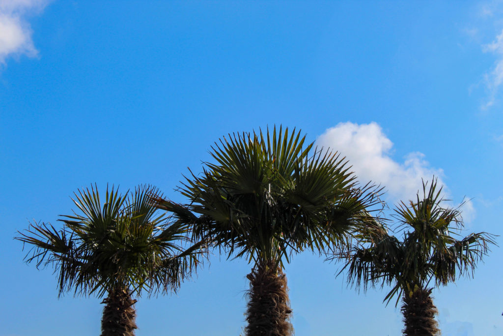
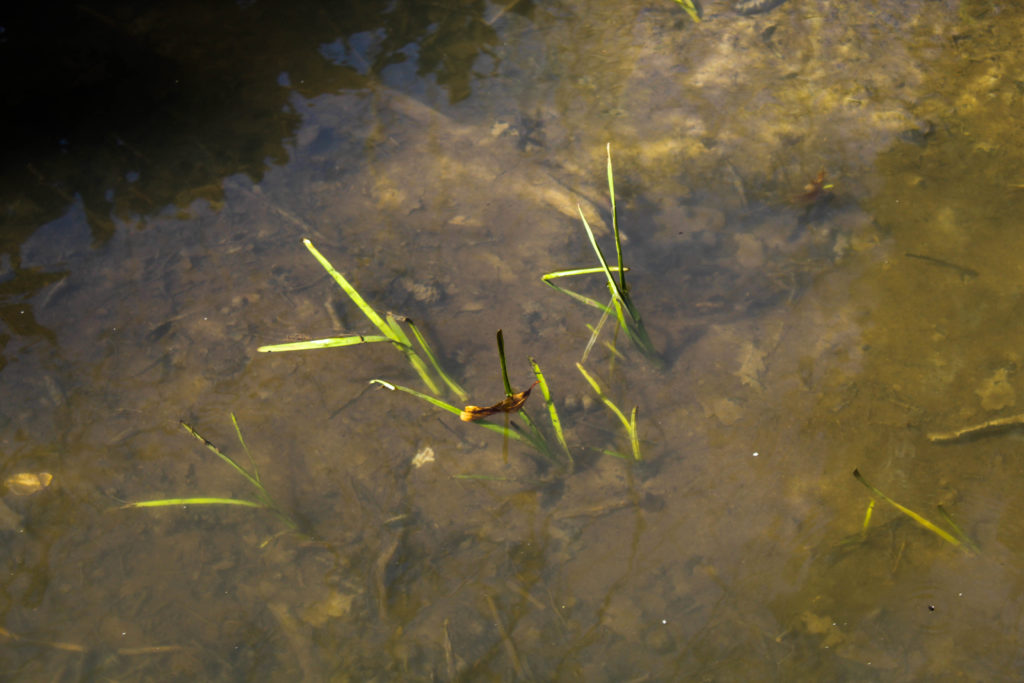
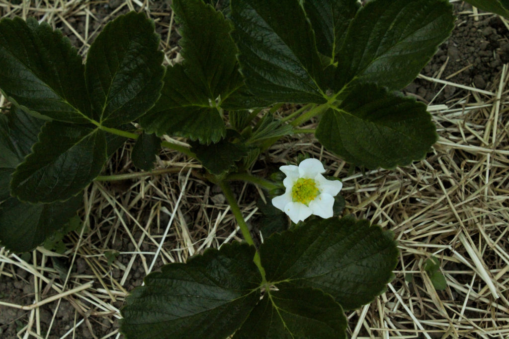





Chloe, I think you should experiment with adjusting some of the images you have selected for the book in monochrome, particularly some of the portraits which I think will work well in B&W.
For your book project, you also need to have a blog post that discusses some of the key elements of your narrative, design & concept. See link to check list here (also use use this for photobook research/ analysis below)
1. Write a book specification and describe in detail what your book will be about in terms of narrative, concept and design with reference to the same elements of bookmaking as above.
Narrative: What is your story?
Describe in:
3 words
A sentence
A paragraph
Design: Consider the following
How you want your book to look and feel
Paper and ink
Format, size and orientation
Binding and cover
Title
Structure and architecture
Design and layout
Editing and sequencing
Images and text
2. Produce a mood-board of design ideas for inspiration. Look at BLURB online book making website, photo books from photographers or see previous books produced by Hautlieu students on the table in class.
In addition you need to have done some research and analysis of other photobooks that in some ways have influenced your own design.
See more here:
https://hautlieucreative.co.uk/photo21al/2021/01/17/photobook-design/
Maybe have a look at :
Rinko Kawauchi: Illuminance – I have book in classroom downstairs.
See also students who previously made books as inspiration from her – check out Anna’ blog for research and development too.
http://rinkokawauchi.com/en/publications/430/
CHRIS HOARE: GROWING SPACES
https://photobookstore.co.uk/collections/all-books/products/growing-spaces-signed
https://www.chrishoare.org/growingspaces