CURRENT LAYOUT-
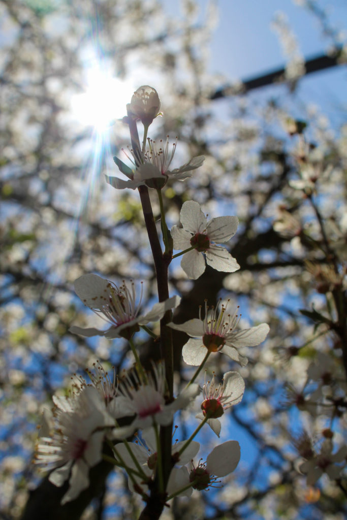
I liked this layout because it both images are similar in that the main focal point in the singular stem of a plant with a more crowded background, and also because it showed the transition from winter-type plants to more spring/summer flowers.
ALTERNATE LAYOUT-
I think i prefer this layout because both images have similar colours and they are still the same sort of image in that they have the main focal point front and centre. However, they are both summer/spring feeling images and the left has a much more simple background, providing some contrast. Overall these two images together feels more cohesive and artistic than the previous pairing.
I think I’m going to use the other image from the old pairing as an individual image in the book, because I do quite like it.
CURRENT LAYOUT-
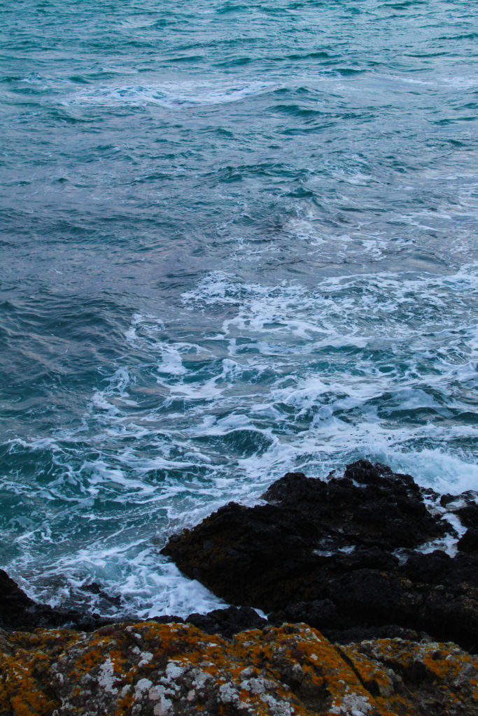
I paired these images together because they both had a sort of circular shape in the bottom corners, and they were both wintery and cold in feeling. However I don’t love how they work together which is why I’ll be trying out a couple other images instead.
ALTERNATE LAYOUTS-
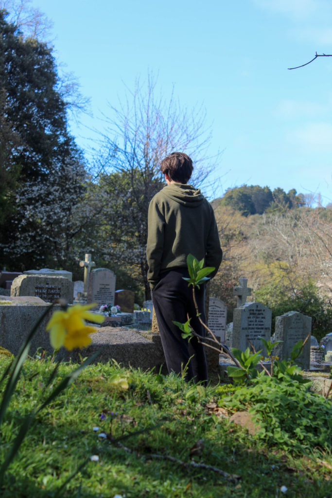
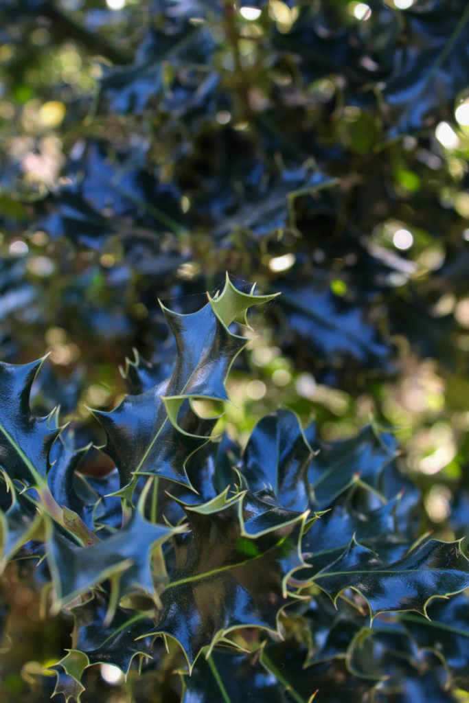
I wanted to keep the image on the left from the previous layout because I think i have too many plant-based images otherwise, but it proved difficult to work with and I don’t think it would have worked well as a standalone image in the photobook. In the end I put it with the dark-clouds image but I don’t think it worked.
What i like about the image on the left is how the light reflected off the dark green leaves looks almost blue. I chose to try it with the image on the left because i felt there was a lot going on, particularly in the background, and the image on the left is fairly simple. Also, I class them both as winter photos as the right features the holly plant and the left is at a cemetery, symbolising how winter is traditionally thought of as a season of “death”.
CURRENT LAYOUT-
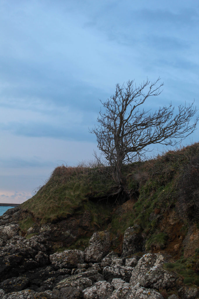
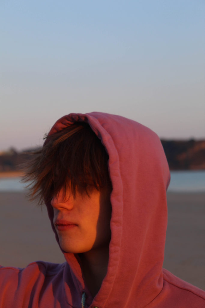
I kept this image as a standalone photo because I thought it would be a good opener to the book, but after working with some of the newer images I thought I should probably see how it looks with a pair.
ALTERNATIVE LAYOUT-
I chose this image because they both have a similar “wintery” vibe to them, meaning they are both cool-toned, as well as the fact they are both fairly simple images with no crowding in the background or the foreground. However I think I’m going to keep this image as it is (standalone) because I still think it works well as an opener and I prefer it this way.


