FINAL LAYOUT DESIGN
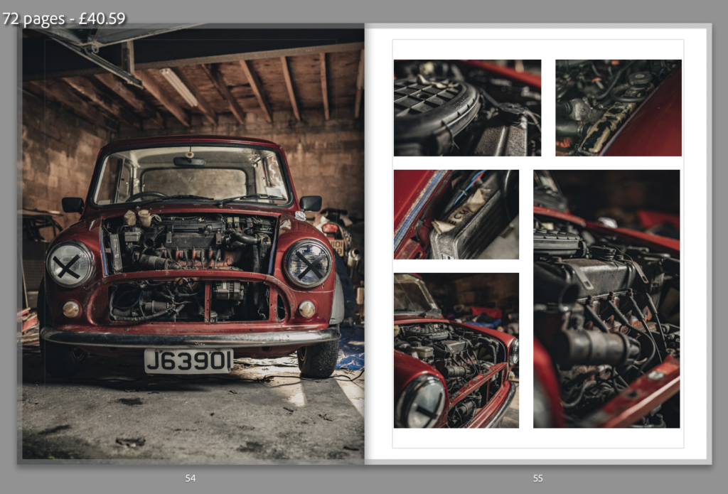
Overall I am happy with the design and I think it flows well. I went for a minimalistic approach using a similar design layout to the book ‘The Epilogue’ by Laia Abril. I chose to keep the paper white as it helps to lighten the mood of the book as the book is about happy memories rather than being sad. I wanted the order and layout of the images to try and tell the story without using words. The concept was that I had gone to see my Nan at her house where my Papa lived with her. We started looking through albums and memories started flooding back. I go to the garage where Papa’s mini used to be kept and where all his tools are. The book then moves on to the present day where I have my mini which I am fixing up so I can take out for a drive with my Papa’s mini. The book finishes with an image if me with both cars but I mention that the project car is not finished.
SECTIONS
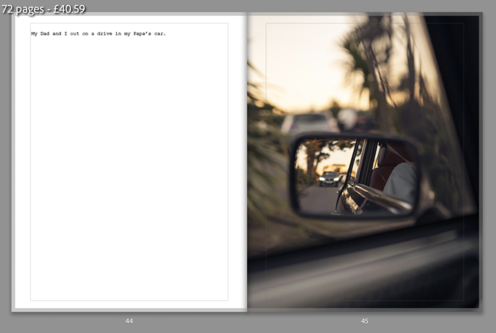
For the beginning of each section I usually used a full bleed image on the right page with a short description at the top of the left page. I chose to do this a subtle way of separating the sections of the book. It is not consistent throughout the book but thee story flows well.
GRID/MULTIPLE IMAGE PAGES


I was happy with the grid layouts I ended up using to show multiple images


