Freedoms and Limitations
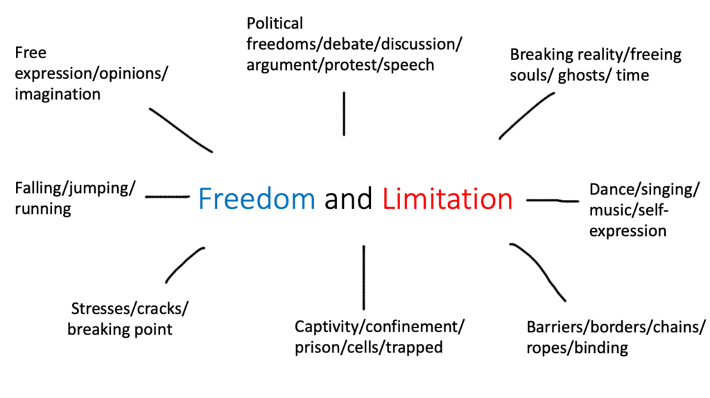
Freedom – “The power or right to act, speak, or think as one wants”
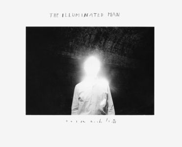
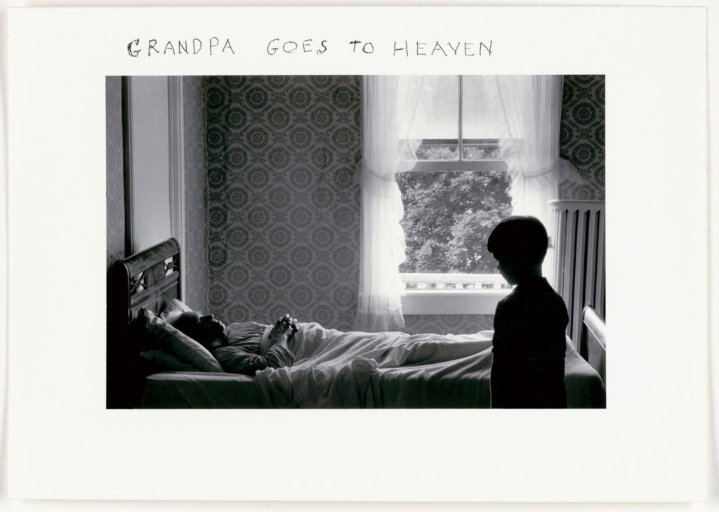
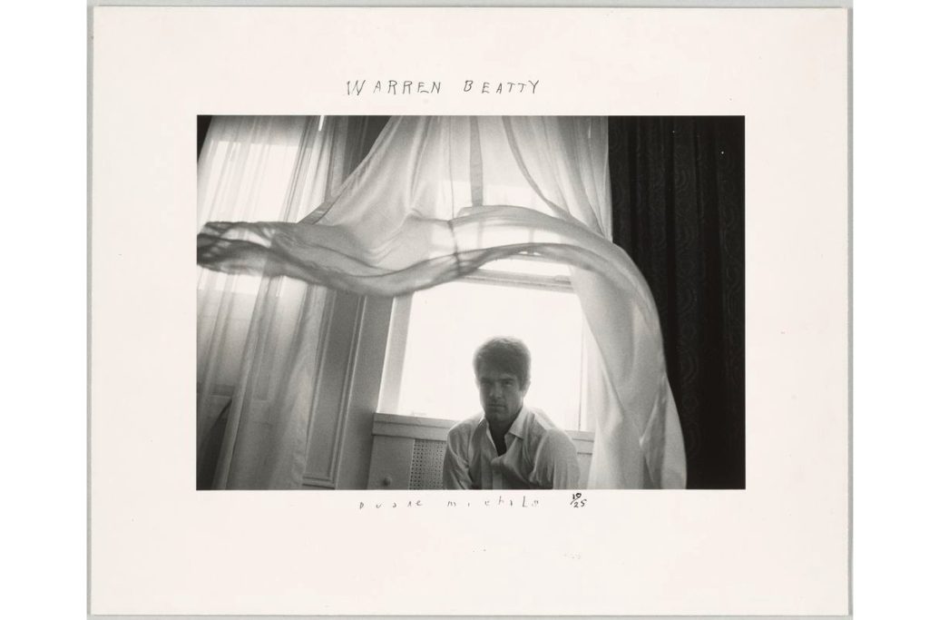
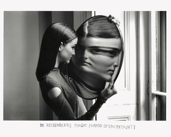
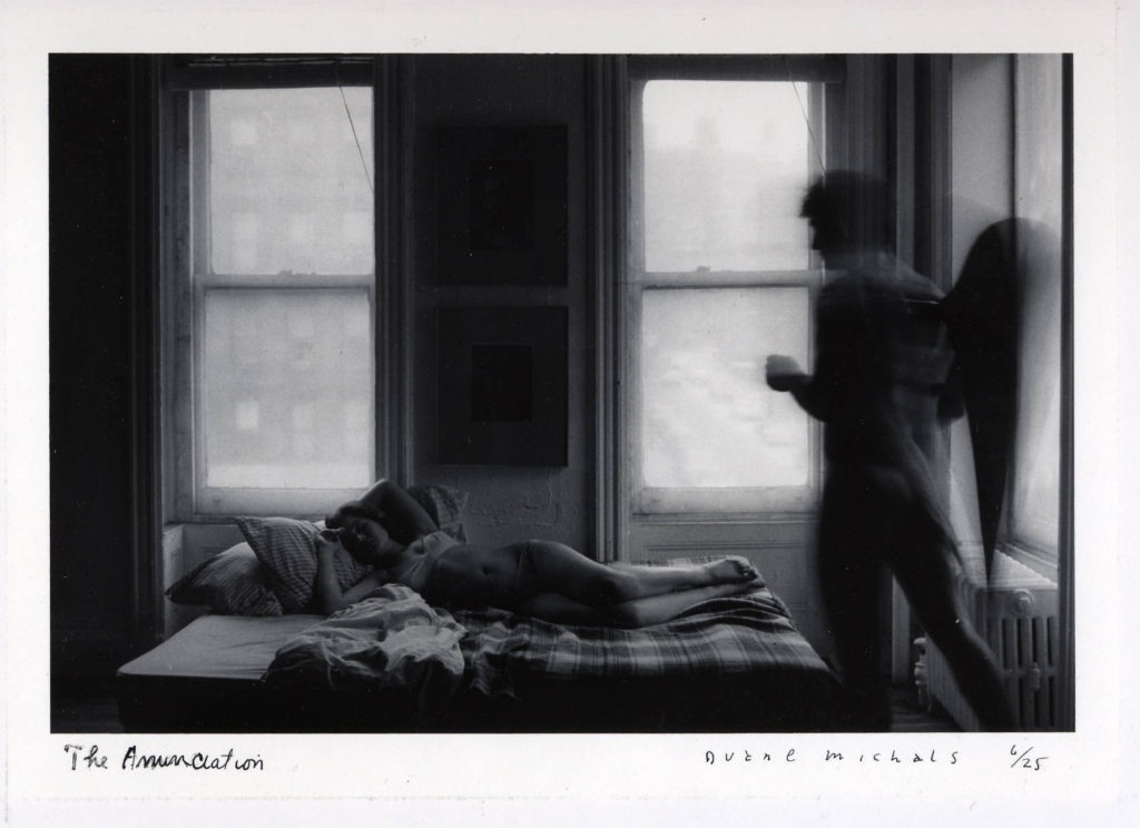
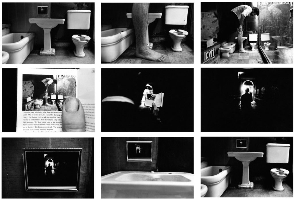
I’ve chosen the theme of freedom as the ideas I had in mind about souls, spirits, ghosts and possibly the angel and the devil links in quite nicely. I think that the freedom to push limits and have the freedom to do things that reality prevents you from doing usually whether it’s physically or having too many responsibilities in the real world to be able to do the things we wish to do. The theme of freedom is extremely similar to the theme of limitations which is why I decided to do both. I think photographers like Duane Michals are very inspiring when it comes to the idea I want to present in the film I’m going to make. I think that being inspired by his work and recreating it to come to life will be very interesting.
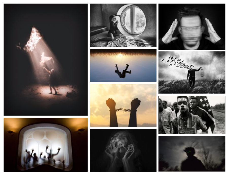
“Freedom is the right to choose” – Archibald MacLeish
The quote above was originally expressed in a political context, this phrase could also sum up many of the fundamental ideas that have inspired artists. For Fauves it was the right to paint in whatever colours they chose. For Cubists, the choice was how to depict form and space. In Marcel Duchamp’s “Readymades” he chose ordinary objects to be transformed into pieces of artwork. Artists and designers relish the freedom to explore ideas and express their own personality in their work. Van Gogh is perhaps the archetypal “romantic artist”, who chose to take his own path, expressing with brushstrokes, colour and energy his unique vision of the world. Mondrian’s highly disciplined paintings were governed by the wish to condense experience down into its simplest expression.
As for other freedoms we come across in life like; freedom of speech, singing, running, freedom to express and imagine all come together to make what life is – along with the limitations of course. As well as the freedom to move, to travel, to dance and to have fun has inspired many artists. Sydney Carline and Peter Lanyon explore the soaring freedom of flight. Francis Alys and Tania Kovats explore more conceptual possibilities of travel. Dance inspired Degas and Matisse. Music inspired Paul Klee and Romare Bearden. No artist has been more playful than Picasso, who would insert clues, such as letter “JOU” (inferring “play” in French), into his Cubist paintings and collages.
Michals first made significant, creative strides in the field of photography during the 1960s. In an era heavily influenced by photojournalism, Michals manipulated the medium to communicate narratives. The sequences, for which he is widely known, appropriate cinema’s frame-by-frame format. Michals has also incorporated text as a key component in his works. I like the way that Michals presents his work as dark and ominous as that’s the way I like to go about presenting my work also. I like the theme of black white where shadow and light appears to be a lot more dramatic than it would be if the photograph or film was in colour.
Other occurrences that happened in the 1960s was the new materials and ideas fuelled a revolution of possibilities. Synthetic materials such as plastic could be used to create forms with great freedom. Verner Panton’s cantilevered S shaped chair was playful, brightly coloured and inspired by popular culture, echoing the sense of fun and liberation that was a characteristic of the 1960s design. Art crossed into design, for instance Bridget Riley’s Op Art paintings inspiring the design of miniskirts, and commercial design crossed into art, for Warhol and other Pop Artists. Musicians such as the Doors and the Beatles drew on multiple influences from literature and art.
Limitations – “A limiting rule or circumstance; a restriction”
As for limitations, I think the idea of barriers and unable to have the freedom to do what you want easily links into the theme of freedom also. The idea that humans aren’t able to do to limitless things even if they wanted to gives me a lot of inspiration. The limits that people face everyday intrigues me to think how much you can push the limits. For example people 200 years ago thought it would be impossible to fly around the world but now it is completely normal to think about hoe planes to fly across the sky as well as phones being able to find out limitless information whenever we need to. The inventions that people have created in the last 100 years have been incredible and may be limitless.
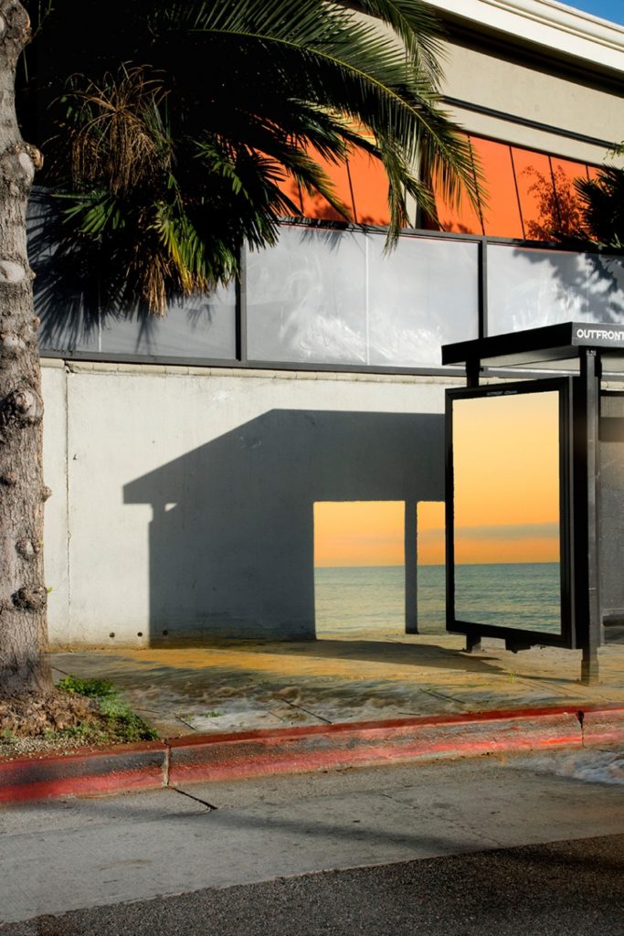
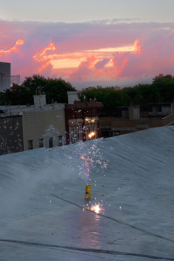
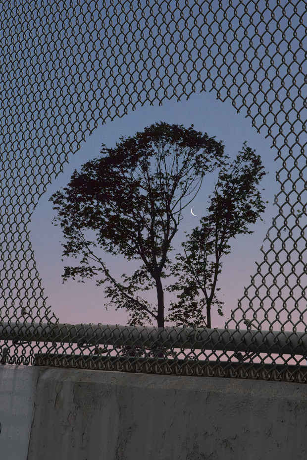
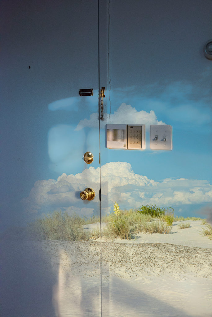
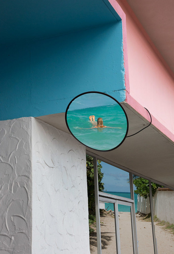
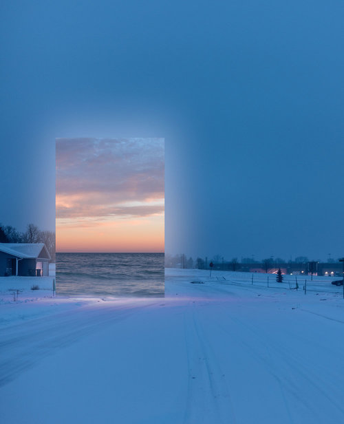
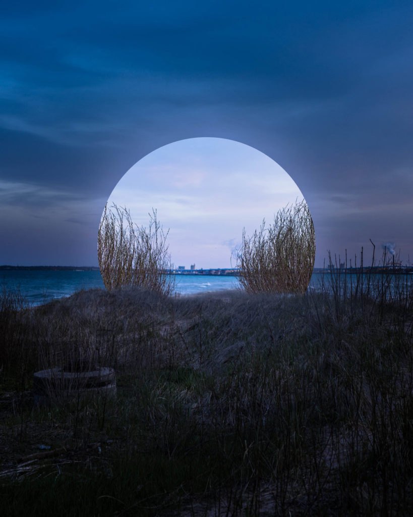
A photographer that explores limitations, escapism and surrealism within reality is KangHee Kim. Kim studied painting at the Maryland Institute College of Art, graduating in 2014. It wasn’t until her senior year that she began using photography as a creative outlet, enjoying the freedom that came with the minimal equipment required. One of her ongoing series, Street Errands, began in 2016 and was born out of the mundane daily encounters of living in New York. “I realized, instead of waiting for miracles, I could instead create the magical moments in my imagination,” Kim says. “I construct my own form of escapism.” To create these photographs, she uses Photoshop to merge and manipulate multiple images from her travels in New York, California, Colorado, and Hawaii. Rather than preplan the scenes, Kim lets intuition guide her – creating cohesion with a uniform aesthetic and colour palette, and the returning motifs of moons, clouds, oceans, and skyscrapers.
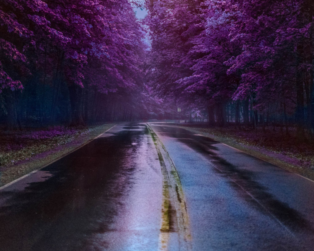
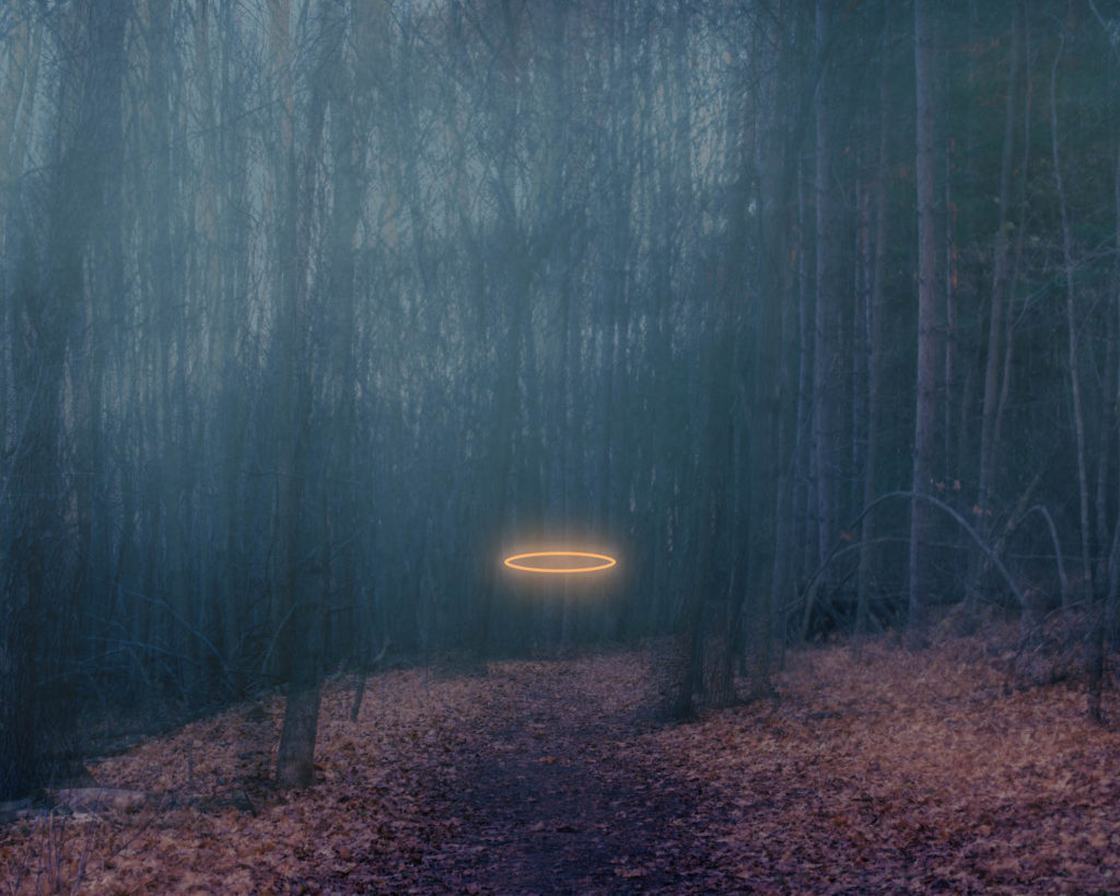
Marti is another photographer who springs to mind when thinking about freedoms and limitations. Jenna Rose Marti is a Milwaukee, Wisconsin based digital artist and photographer. She works within installation and digital photography to explore themes of identity, religion, memory, and escapism. Though her work, she creates a sense of escapism in order to find comfort in the unfamiliar while revealing the discomfort in the familiar. The surreal nature of her work creates a sense of fantasy that exists within the familiarity of the physical world, and seeks the balance of the good and the evil in life. She pulls from her own experience with religion, personal relationships with people, and other worldly experiences to create this dialogue.
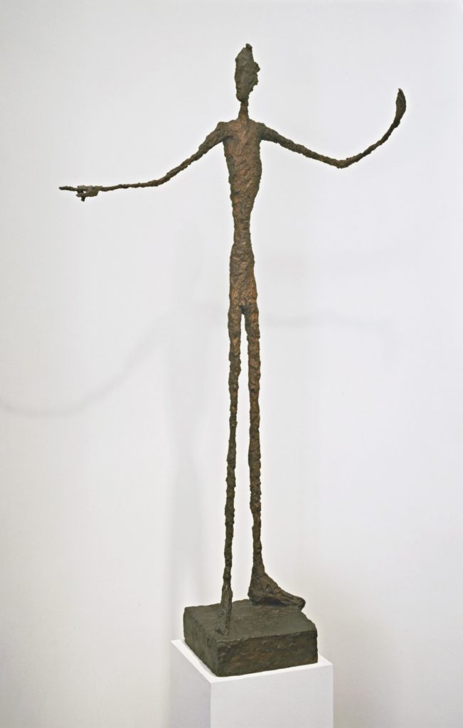
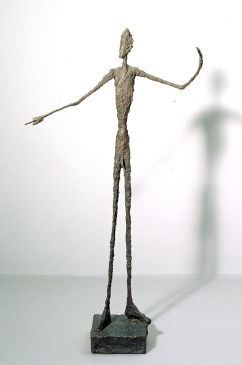
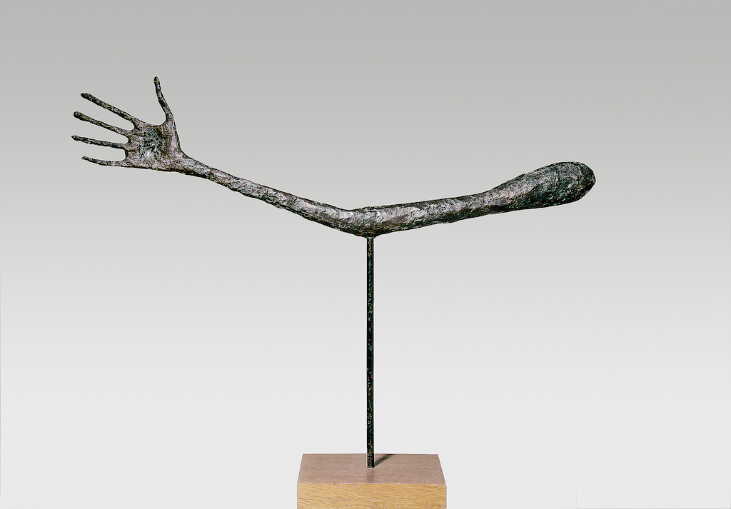
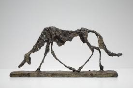
Alberto Giacometti – freedom to explore and experiment
Giacometti was the great enthusiast of plaster and one of the artists working in Paris in the 20th century. He worked away at it with his knife, often subjecting it to so much pressure that it finally crumbled away, forming the rubbish observed by Genet. When he was happy with it, he painted it. The original Women of Venice exhibited at the Venice Biennale in 1956 were plaster figures with black and brown lines etched on to their faces and bodies, making them resemble the women in his paintings.
Now the Giacometti Foundation in Paris has found new methods of restoring his plaster sculptures, many of which were damaged by being broken apart and covered in orange shellac to be cast in bronze. The Women of Venice, whose painted surfaces have been revealed, can once again be exhibited as they were at the Biennale, rather than as bronzes. And they will make their first appearance at a major retrospective opening at Tate Modern in London next month. This will be Giacometti’s first Tate show since a retrospective in 1965, when the sculptor worked away in a basement, perfecting the works that he was never quite prepared to declare finished. It will be his first major exhibition in London for a decade.
The Bone Chair – Joris Laarman
Art, photography and film can be shown in many different forms and one form that intrigued me when it comes to thinking about limitations and freedoms was the Bone Chair:
“My fascination with the digital era really took off when I saw an animation in a documentary about German Professor Claus Mattheck. To me this was not just an animation of an optimized engine mount, but a visualization of how the industrial era in general is transforming into the digital era. Industrial times and modernist pioneers were all about assembly and standardized parts in a geometric form language dictated by the limitations of industrial machines. In our digital era, however, we are no longer bound by these limitations. With digital design and fabrication tools we can create smarter customized forms that are much more complex. But it is also true that throughout design history, designers have striven to make objects inspired by nature: from Art Nouveau, driven by innovations in materials like cast iron, to Streamline, driven by innovations in materials like aluminum, and the organic design of the 1960s, driven by innovations in plastics and plywood. But our digital age makes it possible to not just use nature as a stylistic reference, but to actually use the underlying principles to generate shapes just like an evolutionary process.”

While trees have the ability to add material where strength is needed, bones have the ability to take away material where it is not. With this knowledge, German engineer Professor Lothar Harzheim, together with the International Development Centre Adam Opel, developed a dynamic digital tool that copies these ways of constructing, and used it to optimise car parts. This software mimics quite precisely the way evolution constructs. For me, this opened up an entire world of possibilities that we can only begin to imagine.
The design of the Bone Chair actually began back in 1998, when Adam Opel, a German General Motors subsidiary, developed new imaging and simulation software with the intention to create a more efficient engine mount. The purpose of the engine mount design software was to fix specific elements in place while providing optimum strength, using a minimum of materials. This is done by creating a virtual three-dimensional model and simulating the application of stress to specific points on the design. Then the algorithm takes away all of the material that isn’t necessarily needed, without weakening the part. What most amazed Laarman about this process is that it uses the very same principle that evolution does in living organisms. Bones in particular are highly efficient in growing internal structures to achieve an optimal weight-strength ratio as they constantly add and remove material in response to stresses from their environment. The software designed by Adam Opel replicates the same process: repeated generations of the simulation add material where strength is needed, and chip away material everywhere it is not, creating a design that achieves maximum strength with a minimum amount of material. When Laarman was asked to participate in the Smart Deco exhibition initiated by Droog and Barry Friedman, his proposal was to create an entire chair by using this algorithm as a high tech digital sculpting tool. If Mother Nature wanted to create a chair, it would probably look something like the results he would get.

