During the Love and Rebellion project, there has been a possibility of producing a newspaper based on the themes of love and rebellion. I have decided to focus on designing 4 versions of a newspaper spreads using images from my photo book; dear Liw, and from my film, multiple identities. Shannon O’Donnell uses the technique of selecting key frames from the timeline in Premier and presenting them as still-images. I will also print my spreads as final outcomes for mounting.
INSPIRATIONS:

Death Comes to the Old Lady, 1969

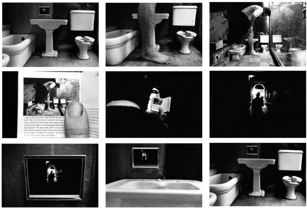
Things Are Queer, 1973 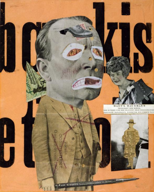
The Art Critic 1919-20 Raoul Hausmann 1886-1971 
Claude Cahun 
EXPERIMENTING WITH FILM STILLS:
SEQUENCE / STORY BOARD:
Here are 9 images from my film, Multiple Identities, which display the major/ key frames in my short film. The first 4 represent the stereotypical women identity, the 5th and 6th represents coming back to a neutral identity, and the last 3 represent the stereotypes of being a man. Here is also 9 images from my photo book what compliment each other the best to create a story board.
MONTAGE:
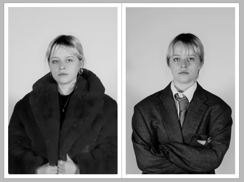
These two montages are what I enjoyed putting together the most, as I am able to show my creativity through them. Foe the two collages I’ve tries to mix the female and male scenes together. The one of the left is my model earring the suit but I have edited in the fur coat instead. Her hair is tied back however I’ve places earring and lips with lipstick on her. On the right is the opposite, with her completely wearing the suit but with er hair down, being more feminine.
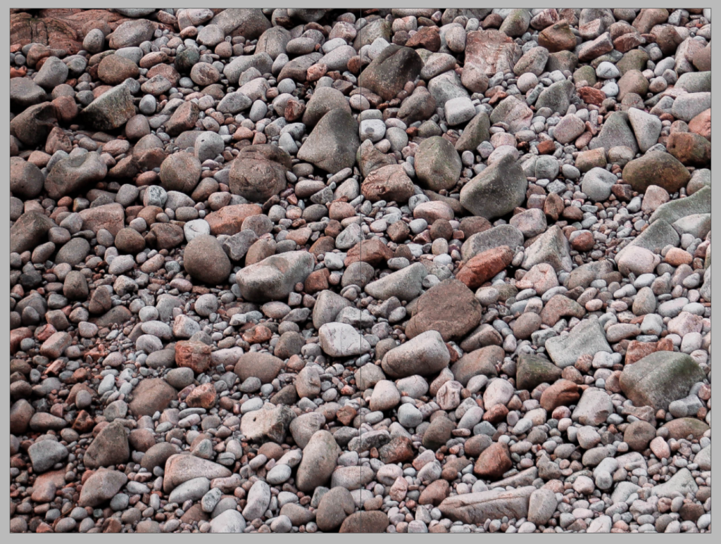
The montage underneath was created from images from by photo book; dear, Liw. I’ve used different textured from a couple of my images to create an interesting monatge.
JUXTAPOSITION:
This juxtaposition is one of the most important spreads in my piece. It shows the two identities that my model has expressed in the film. The first image on the left shows the stereotypical women’s identity, with ‘girly’ clothing, makeup and jewellery, while the contrasting photo on the right shows the stereotypical identity of a man, with a suit and tie, no makeup or jewellery. I think these two images contrast each other very well because they explain how one gender can express their personality and individuality in different ways, no matter what the stereotypes are. I like how their facial expressions are the same as it continues to show that they are the same person being revealed in different ways.
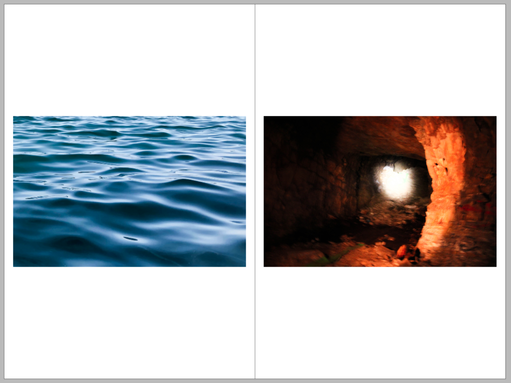
The images below are from my photo book. I think that the orange and the blue contrast very nicely to create a juxtaposition
FULL-BLEED:
I really enjoyed the composition of this still image from my short film and I have decided to use it as a full bleed for my newspaper spread. The image shows my model putting on a tie for the ‘mens’ outfit, however the positioning of her hands and the soft glare feels very feminine and gentle to me, and is somewhat a juxtaposition in one image itself. I love how the shadows from the model fill the backdrop and leave a halo of light around her head, centring face as the focal point. I really enjoy how the image is mid motion, and seems very candid and relaxed. I also made sure that the models face was not in the middle of the speed to ensue the fold of the page would not distort the focus.


