
This process had to start with a careful run-through of the finished film in Premiere Pro and, using the frame capture tool, I selected roughly 30 individual frames that I felt worked well not only as single images but also with each other.
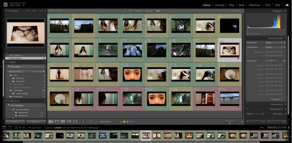
I then imported them into Lightroom in order to continue with the selection process and later the editing process. The first move was to go through using the Colour Label tool and rate them all either red, yellow or green.
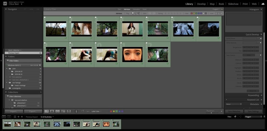
Then I went through and filtered out all the “red” and “yellow” ones which didn’t work out or were near-duplicates of other images/frames. After I re-evaluated my chosen images and removed any that didn’t particularly fit in well with the others.
Next, I organised them around, experimenting until I came up with two different layouts, with different concepts but both utilising the chronology of the film and with varying image sizes. Because I’m using an odd number of images (9) they both are more oriented circularly, but the differences are that while the second is central to a single image, the first version revolves around a chronological group of three images, with the remaining ones grouped around them in groups of which are most aesthetically pleasing together.
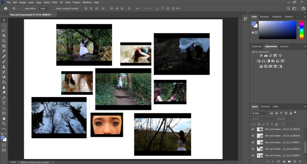
version 1 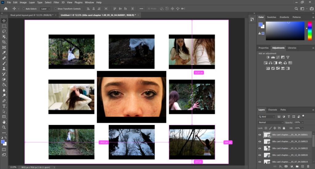
version 2
After careful consideration, I am choosing to use version 1 for my final print layout, because I think it has a more interesting organisation and spacing and the images are more varied in terms of sizes. It also follows the theme of pairings of threes that I used in the actual film, so it stays close to the source material and my original ideas.