
For my project I have decided to use Bookwright as it is a relatively easy and well made program to make my photo-book. I created an account with blurb and downloaded bookwright. I chose a small square layout ( 18cm x 18cm ) with premium matte paper and a hardcover design.
COVER DESIGN:

Above is my final edited cover image that I will use to wrap my photo-book cover with. Using an app called ‘coolors’, I was able to pick out and create a palate of the main colours from my image. This enabled me to make a direct colour decision that would compliment my image; whether the colour would be added to the spine only, or on the pages its self. Some of the colours I experimented with are shown below.
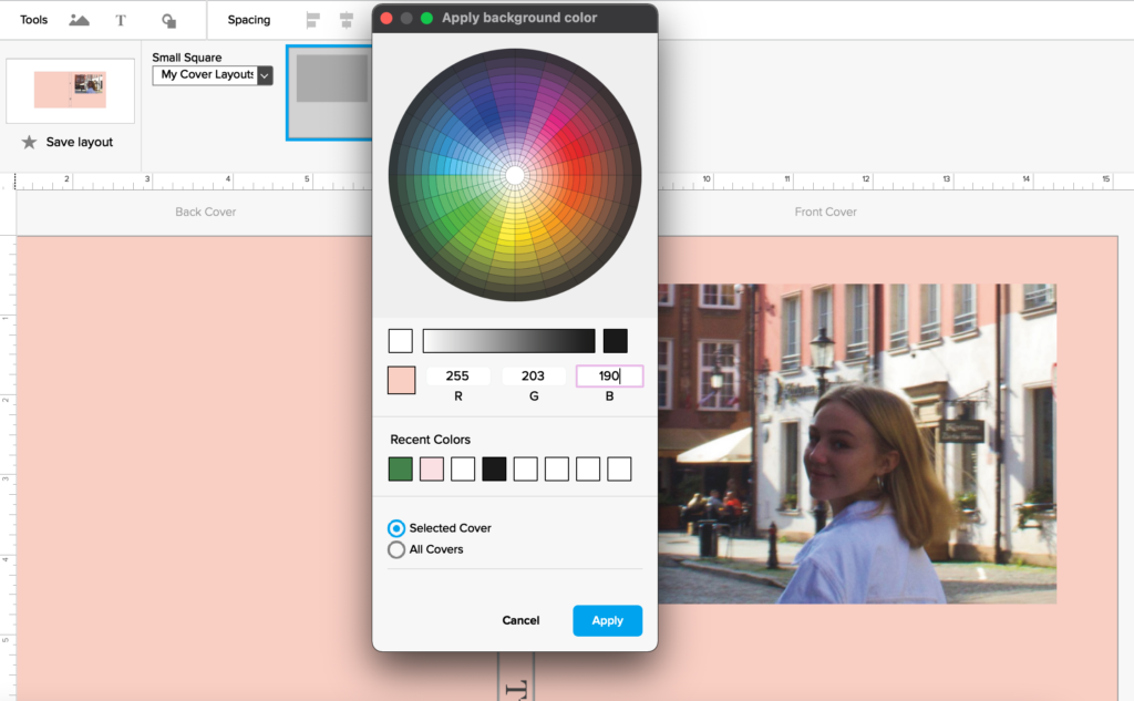

The colour I decided to use in the end was a light purple called ‘Wild blue yonder”, a colour I picked directly from the jacket I was wearing. The bright but cool tone compliments the image while also contrasting the warmer pinks and oranges. I also added my title and name to the front cover; Dear, Liw.
MY FINAL COVER DESIGN:

MY PAGE DESIGN:
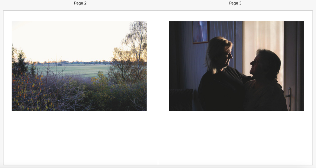
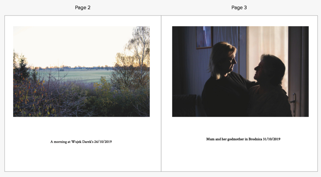
I decided to set up all my image sizes and orientations on my page. I chose an image setup of 6 x 4 inches, top centre of a page and copied it onto all the other pages. Like in my specification, I wanted all images to be the same size and place on each page (consistency). I also chose 6 x 4 in because that was the size of the original capture of all images, meaning the images can display the true qualities and angles of the raw image.
- I have also decided to keep the pages white to contrast the images.
- all images are 6 x 4 inch.
- all images same place on the page.
- text will go underneath the images

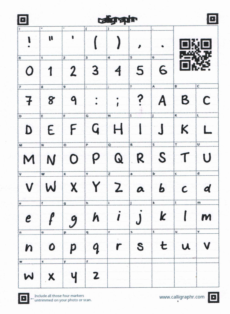
MAKING MY OWN FONT:
For this particular project, I am deeply inspired by Corrine Day’s use of her own handwriting to annotate her photographs. I have decided to create my own font to make my photo-book more personal to me, and allow it to have a home-made feel. I used a website called calligraphr.com and I was able to print and complete a template to scan later on. This was easy to download onto my laptop and was readily accessible to use in Bookwright.


For the first page of my book I would like to include a very personal statement about all my images in the book:
Intimacy is a beautiful thing, a close, familiar, and usually affectionate or loving personal relationship with another person or group. Throughout my life, I’ve found myself in sheltered in the private and relaxing atmosphere of my own photos. Always aiming for a tranquil aesthetic in my images, I have enabled myself to be constantly encompassed in the hundreds of complimentary images I have created. Despite intimacy being regarded as an emotional connection between one person and another, I’ve found myself sharing a sentimental relationship with my photographs, an intimate relationship. A relationship where I feel a closeness of observation or knowledge of a subject – a unique love for the memories arranged within beautifully crafted filters. Aesthetics have always been a huge piece of my craved visual experiences.
FINAL BOOK LAYOUT:


Processes:


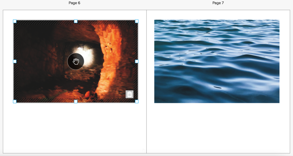
In my original plan, I was going to add text below my images. However, after deciding that it didn’t look that aesthetic, even after I experimented with different designs, I didn’t add any text under the images. I feel that this also allowed the viewer to create their own narrative and interpretation of the images, without context to influence their outlook on the image. Although, I will add a page at the back of my book with annotations of each page and image, so people can see my thought on each image at the end.