Front cover
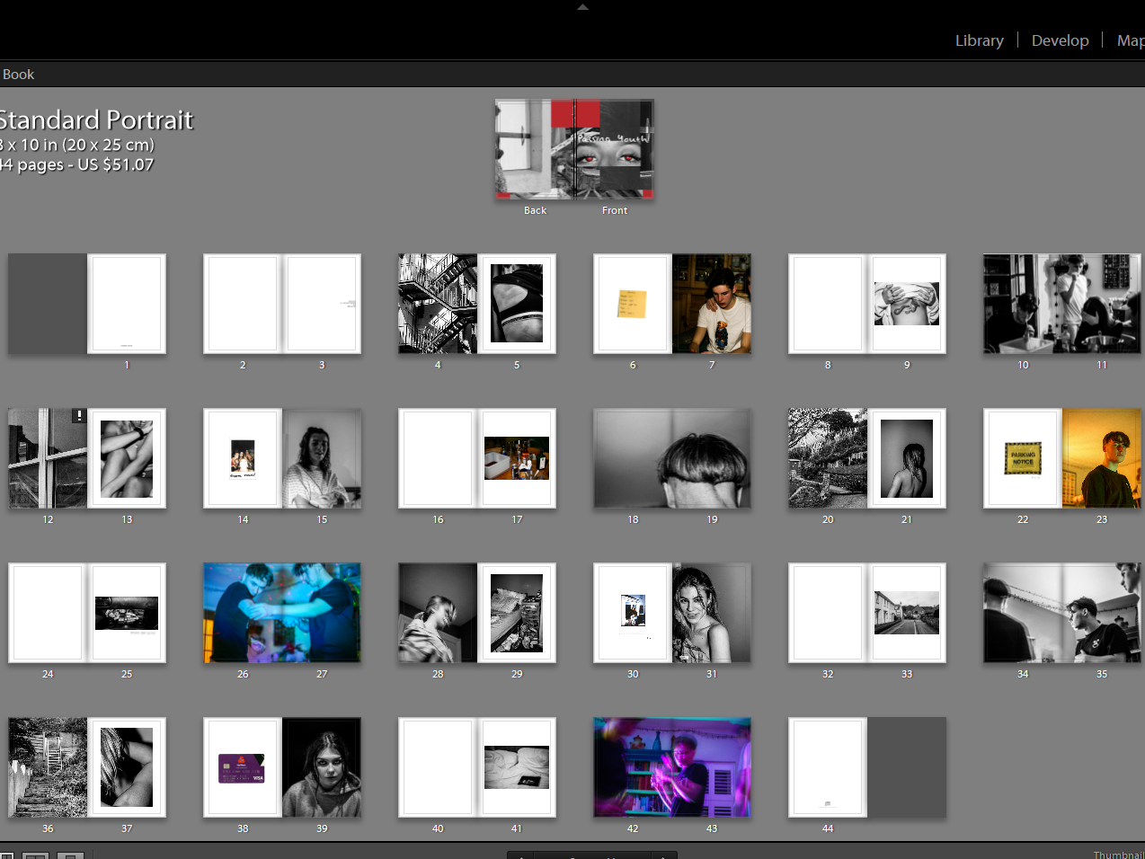
Using photoshop, I began my initial design by layering a monochrome image on top of a red background. The vertical line splitting the image is parallel to that of the frame of the photo as well as the frame of the book and so provides a strong format. The image I chose depicts the shadow of my subject and thepresence of their phone. I felt that positioning the image so you cannot see the subject is successful in drawing the reader in, as the identity of the subject is ambiguous.
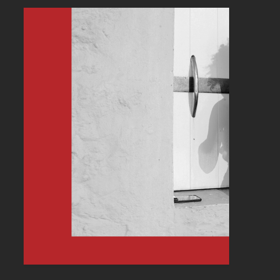
I broke up the format of the image by superimposing my subject’s eyes on the top layer. I selectively chose to keep the red pupils and keep the remainder of the image black and white so the red colour in the background can be present throughout the design without looking random.
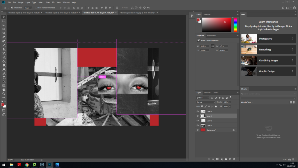
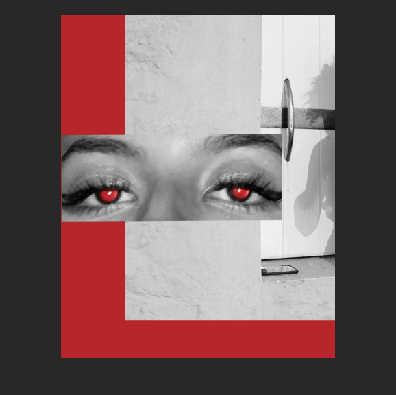
I felt as though the cover wasn’t as contrasted as I had initally hoped. To improve the cover, I inverted the colours of the second layer and placed the original image on to the back cover (left-hand side). I chose one of my images from my shoot which had a lot of objects within the composition to place behind the second and third layer. The composition of this particular image allowed me to incorporate a lot of noise into the cover. By layering the images and choosing ones with a busy composition I could successfully show the fast-paced, confusing and messy nature of youth.
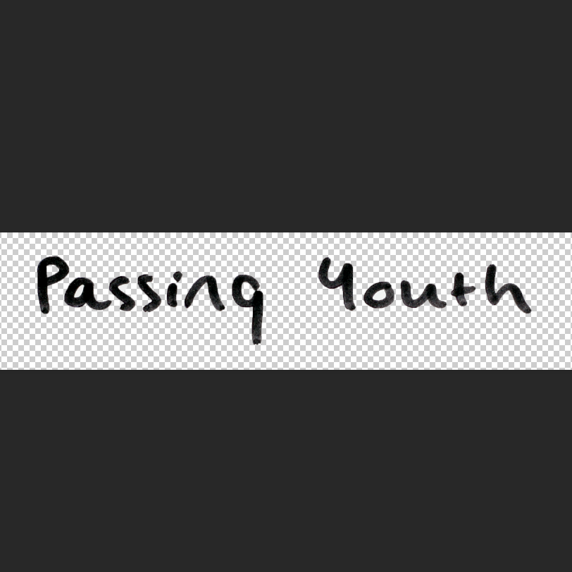
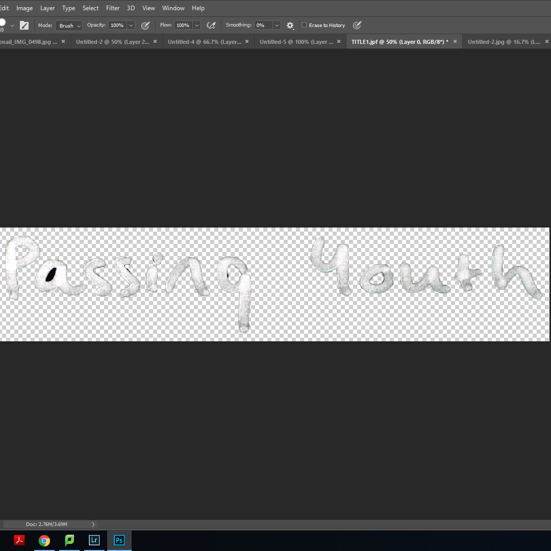
To create my title, I wrote ‘Passing Youth’ in my own hand-writing. Using a marker pen allowed me to get the width that I desired. I photographed this using a copy stand and imported the image into photoshop. I then selected the text and placed it onto a new layer, deleting the original background. This allowed me to place the text directly on to the front cover without any white background. I created another copy from this and inverted the colours to make the text appear white.
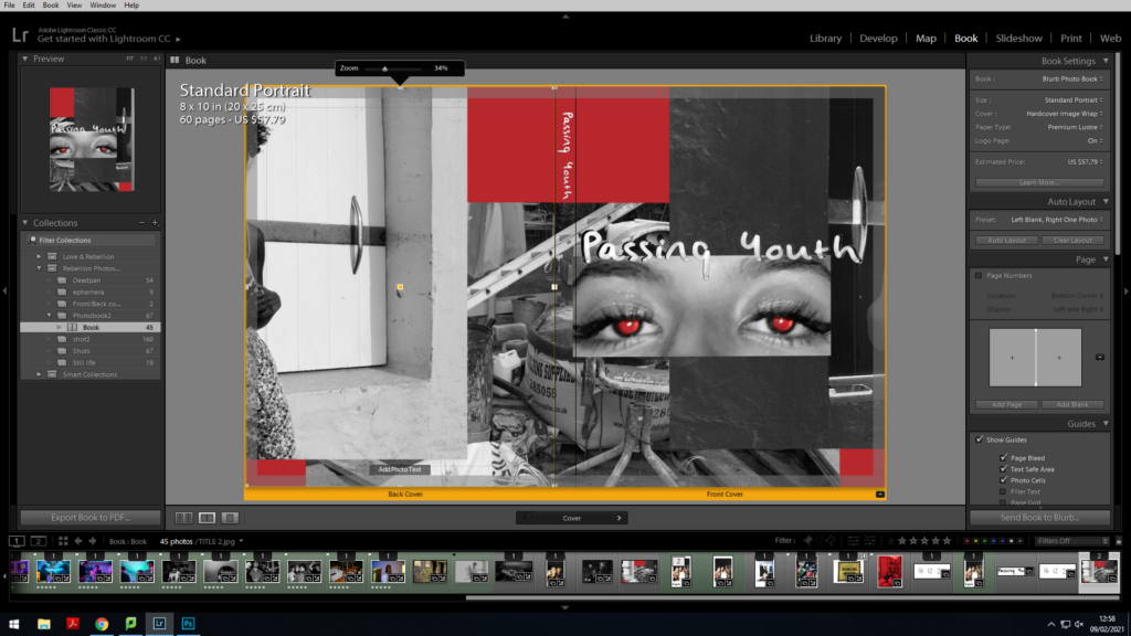
I used the black title as a base for the white text and placed it just above the eyes. Placing the white text on top of this created a title that stood out amongst the background. The fact it was handwritten adds to the personal-scrapbook feel I had intended my book to have. I then reused the white text and placed it where the spine of the book would be so you can see the title when the book is stored upright.
Super-imposing images
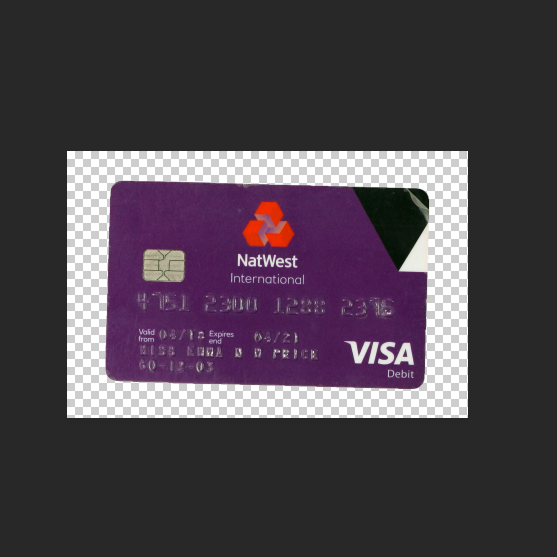
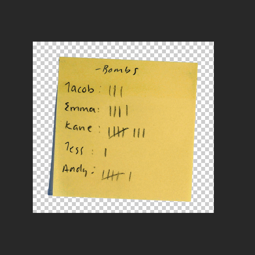
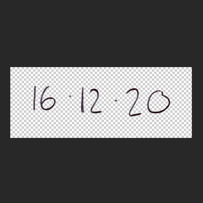
Having designed the cover, I aimed to incorporate a similar layering style throughout my book. To carry this out, I planned to have hand-written elements acting as captions to provide context as well as adding personal mementos from my own life to give the reader context as well as a deeper insight into my life and adding depth to my character. I wrote on post-it notes, white paper and used the copy stand to re-photograph these as well as scanning in polaroid pictures and other ephemera.
Using photoshop, I carried out a similar process to that of my title; selecting the desired object or text and removing the background so it can be seamlessly placed on top of another image.
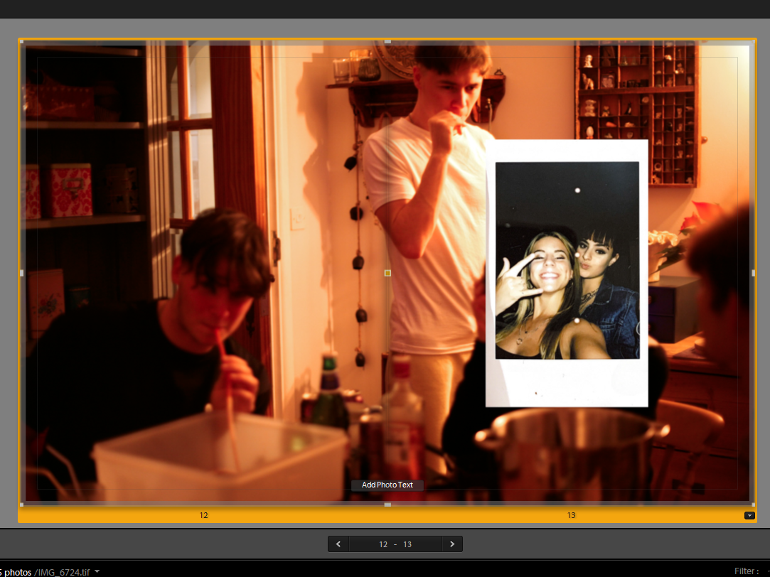
For the image pictured on the left, I imposed an image of myself I had taken on a polaroid. The lack of depth in the polaroid compared to the background image creates the illusion of a physical scrapbook in which you stick images or artefacts on top of other images or pages.
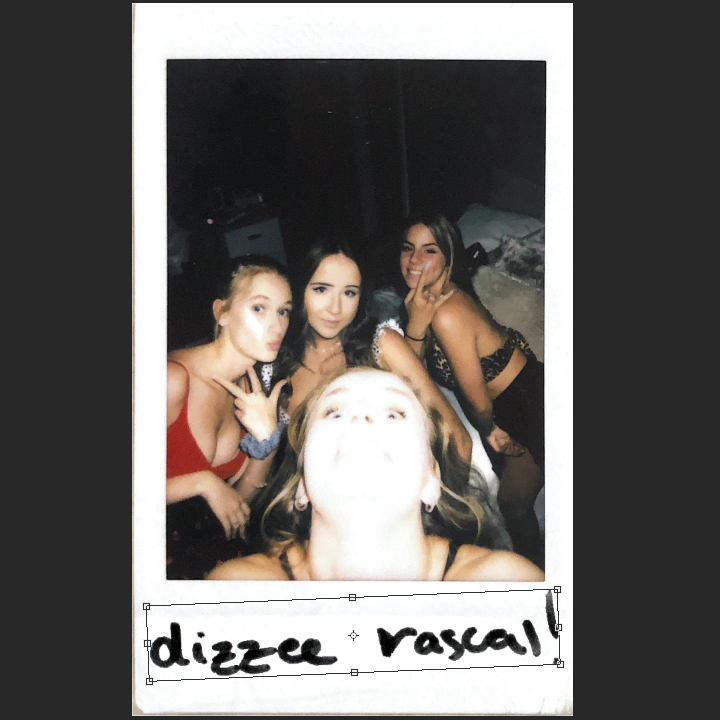
Pictured on the right, I used photoshop to cut out my handwritten note ‘dizzee rascal’ and place on top of the polaroid I scanned in. The text provides context to the image as the reader can now create their own narrative about the subjects getting ready and attending a music concert.
Editing images:
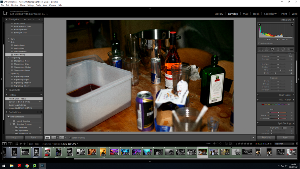
In order for my images to fit accordingly with the eggshell paper and front cover of my book, I felt that adding a grain to my images made them feel more authentic and amplified the rough-edged nature of the book.
For the majority of my images, I wanted to amplify the authenticity of my book
Architecture

For the layout of my book, I finally decided on the sequence pictured above. For each section of the book, most open with an image of a location juxtaposed against an abstract image of myself. It then transitions into an image of ephemera and a quiet image or portrait. This leads into another quiet image either establishing a location or decision/action which develops the reader’s insight into the characters. The sequence is broken by an establishing shot (mostly in bold colours) and then repeated.
Juxtaposition:
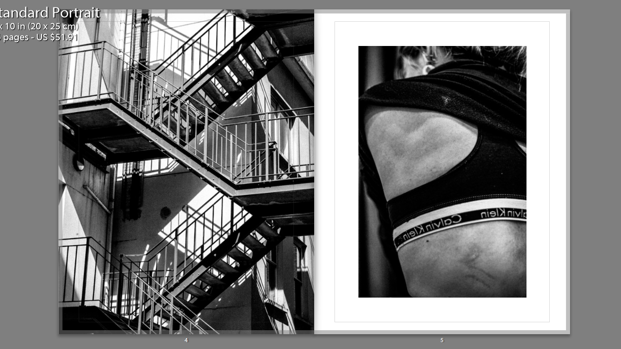
I juxtaposed an abstract image of a staircase alongside an image of my back. The images are both monochrome, allowing focus on the structure on form of the photos. The regularity and structured nature of the stairwell mirrors that of the bone structure and anatomy of the human body.
Additionally, without showing my face, it creates a sense of intimacy between the reader and the subject pictured as they attempt to create links between the two images.
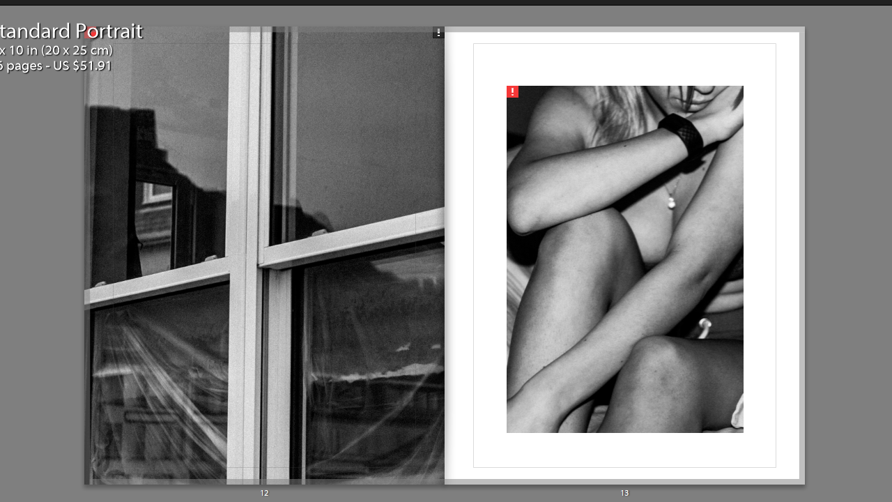
In this set of images, the form of the window, particularly the borders, mirror the body language of the subject photographed. The fact the window is covered up creates an idea of secrecy and privacy, amplified by the lack of facial identification in the portrait.
The depiction of skin in the portrait paired with the secrecy portrayed by the window frame creates ambiguity, which can be interpreted subjectively by each reader- presenting a place of comfort, for example, or creating a narrative in which the character presented feels the need to be recluse and hide the nature of their life.
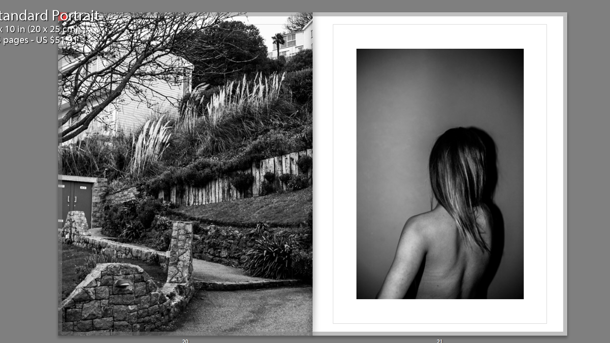
Once again, the structure of the location mirrors the body language of the portrait. The sloping of the shoulders mimics the sloping face in the location photographed. Additionally, the curvature of the path mimics the curvature of the spine and shoulder blades. In contrast, the softness in the texture of the foliage mirrors that of the subject’s hair.
The location pictured depicts a mixture of natural structures and man-made structures. The foliage and nature within the image paired with the large amount of skin shown creates themes of liberation and a sense of rebellion against socially accepted norms (usage of clothing to cover skin). This is contrasted against the man-made structures which present a theme of limitation, due to human intervention, which again reiterates the governing laws in which the subject’s in my book are working agaisnt.
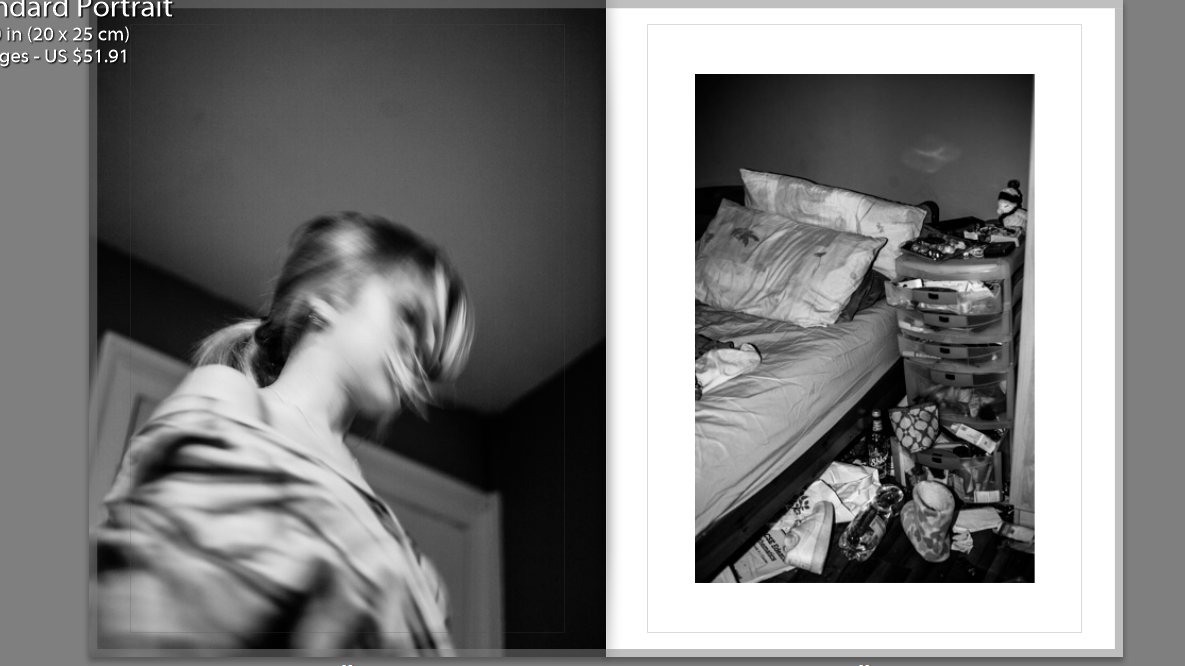
Though it differs from the structure of the other juxtapositions, the location on the right shows a lack of self-care due to the mess, in turn presenting a disregard for expectations of cleanliness and in turn order as placed by society.
Juxtaposed against a slow-exposed image, the movement presents a fact-paced lifestyle in which order and “self-care” has no place in. It may also represent the turbulent mindset and head space of the individual
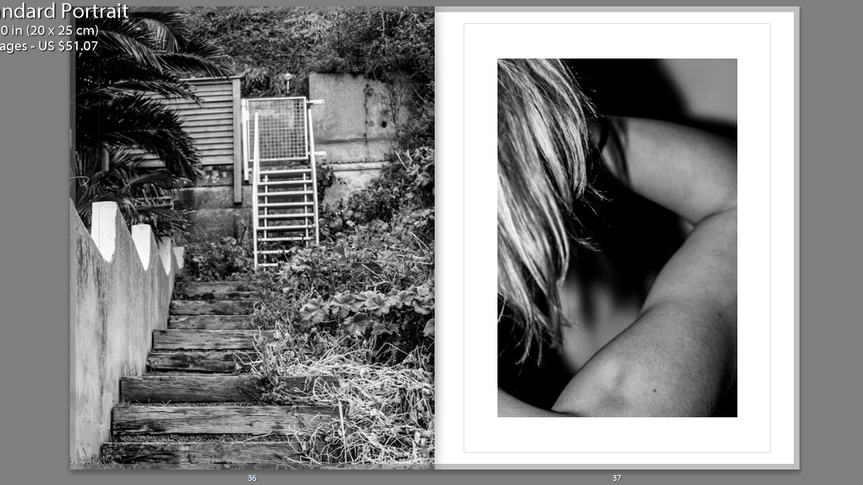
The texture of the hair mirrors the texture of the foliage, again reiterating the connotations mentioned earlier. Additionally the curvature of the muscles and where they overlap imitates that of the staircase.
Sequencing
First Pages:
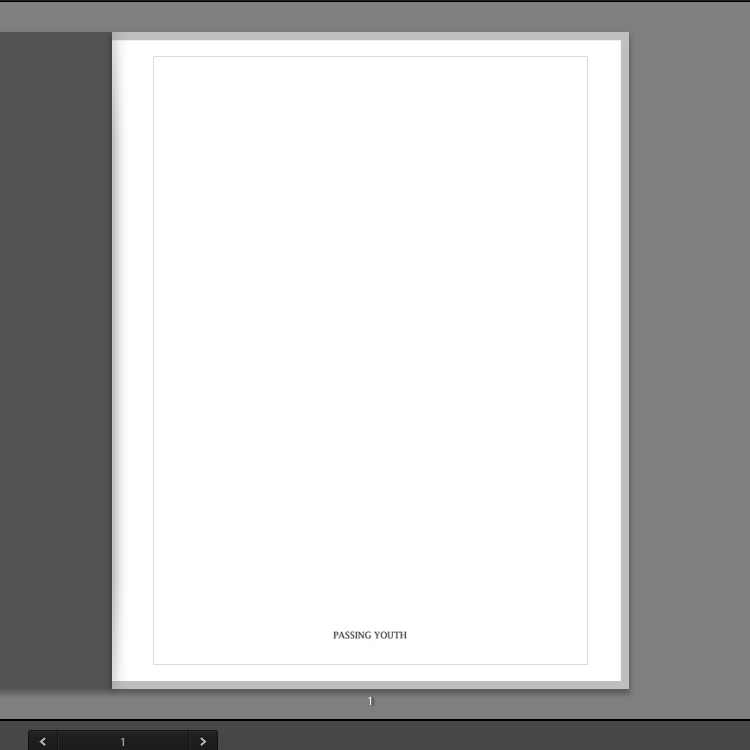
The first page has the title written out in formal writing, so as to reiterate the connotations associated with it. The same font is carried on to the next page, which begins the narrative which is, contrastingly, written in lowercase. The uppercase lettering of the title ‘Passing Youth’ shows the order established by society, amplifying the presumptions held by the reader about youth cultures.
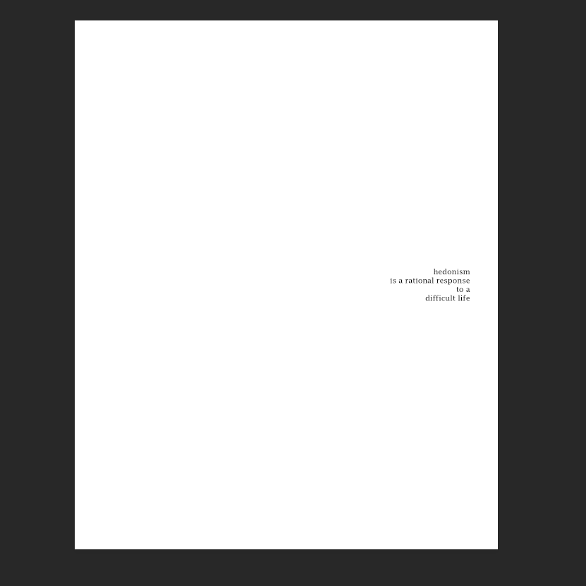
The next page has the quote:
“hedonism is a rational response to a difficult life”
This immediately presents the idea that the characters inside each have a set of issues that they cope with by becoming reliant on different outlets- drugs, alcohol, body modification etc.
The lowercase letters present the quote with delicacy and fragility, encouraging the reader to approach the characters with sensitivity.
End Layout
