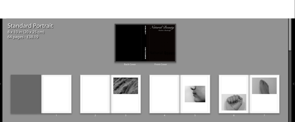
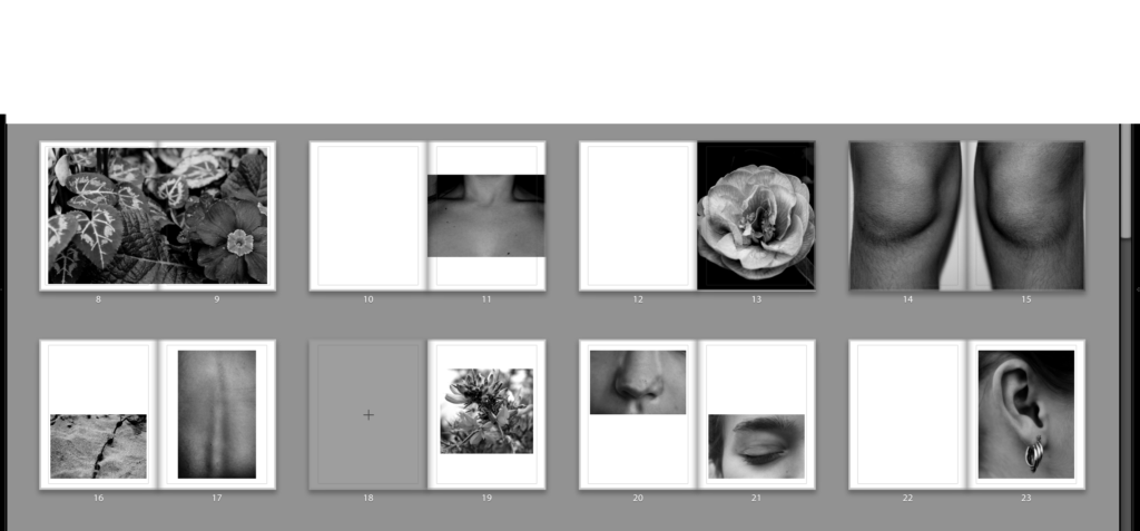
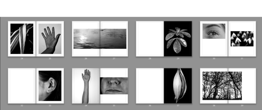
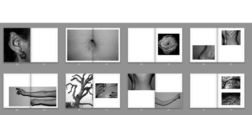
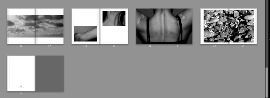
When designing my book, I decided to keep pages blank pages to break up the flow of images. I tried pairing different images together to find the right match and contrast. Some of the strongest images feature on their own page with some of them as a double page spread. I feel the full bleed images are the most engaging, drawing in the attention of the viewer. The sequence of body parts are imposed by images of nature. I tried to create some similarities between the nature and the body by matching two images together. For example the image of the spine along side the seaweed reflect each other nicely, demonstrating the similarities of nature and the body and how both can be perceived as equally beautiful. I decided to put all my images in black and white as it creates a more serious tone throughout the book, symbolising the importance of loving oneself. Using black and white also removes any distraction of colour, enabling attention to be focussed on the finer detail of texture, shape and pattern.