Shoot Plan
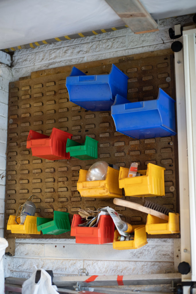
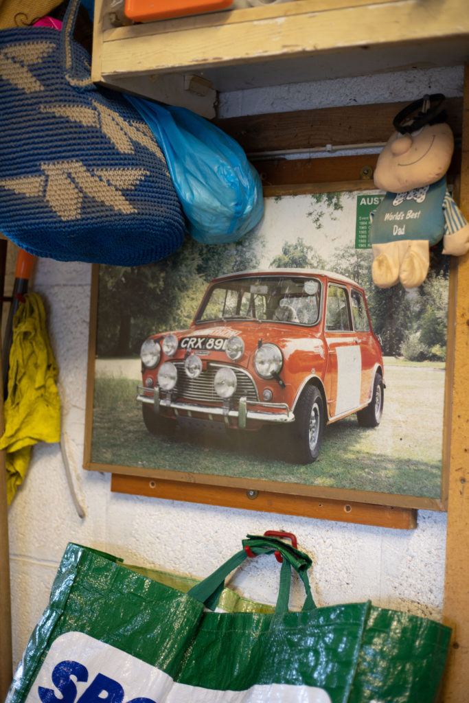
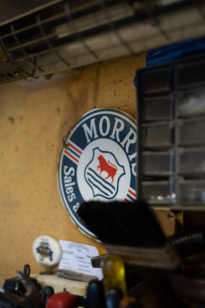
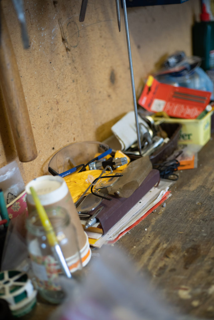
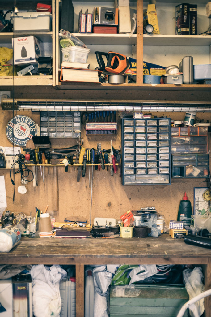
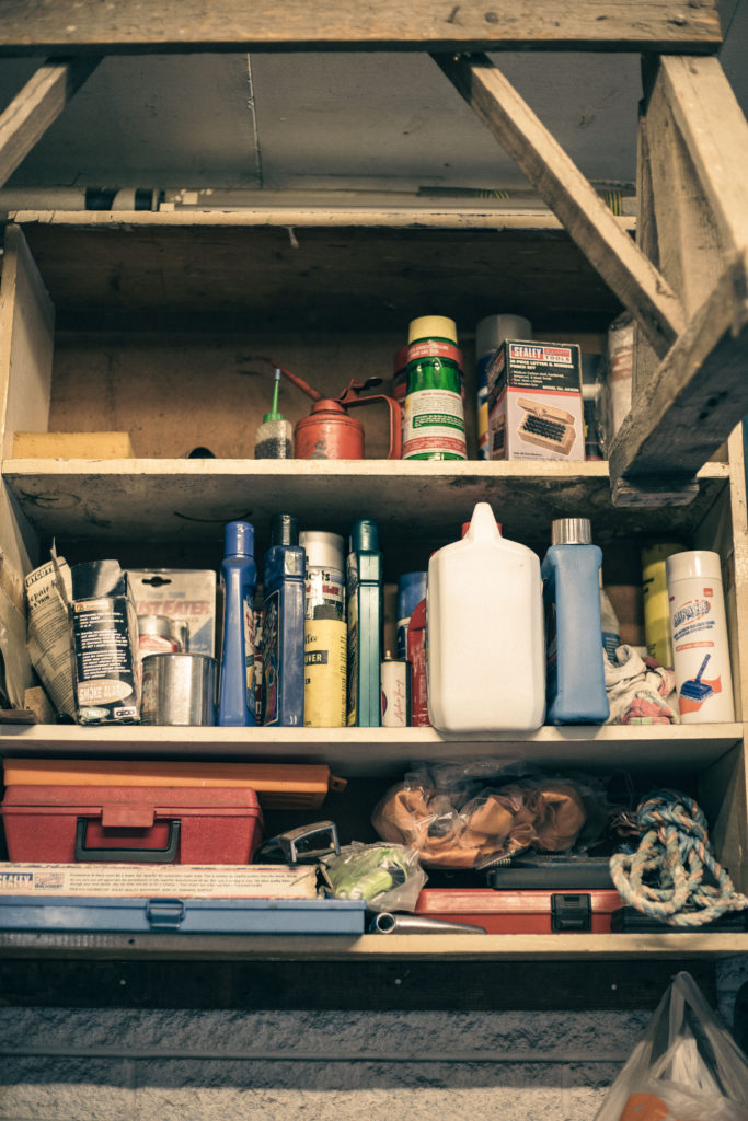
WHAT: Take some images of his garage where he kept his mini highlighting details and his tools. Also the spare room where there are trophies and stuff he won. I want to capture the details around the house where he lived, and his my Nan who still lives there.
WHERE/WHEN: In my Nan’s house and in her garage. During the day so I can use natural light in the house to take the photos.
EQUIPMENT: I am going to use my Sony A73 with my 35mm lens to get the wider interior shots of the house and of my Nan. For the details I will use either the 50mm or the 70-200mm zoom lens to really isolate the the details I am capturing. I want to use window light for most the interior shots of the house and not use the ceiling lights as they are a different colour and make the photos look really dingy and colour contrast with the cool window light. For areas where more light is needed and definately in the garage I will set up my SL60W light with a softbox. I will put it off to the side of the work bench and point it down onto the desk as this will cause some nice shadows.
Initial Shoot – Test
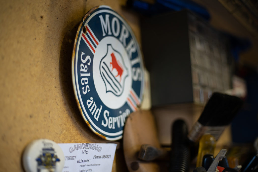
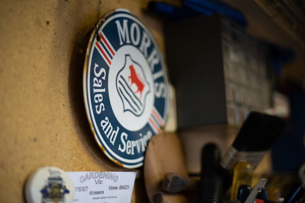
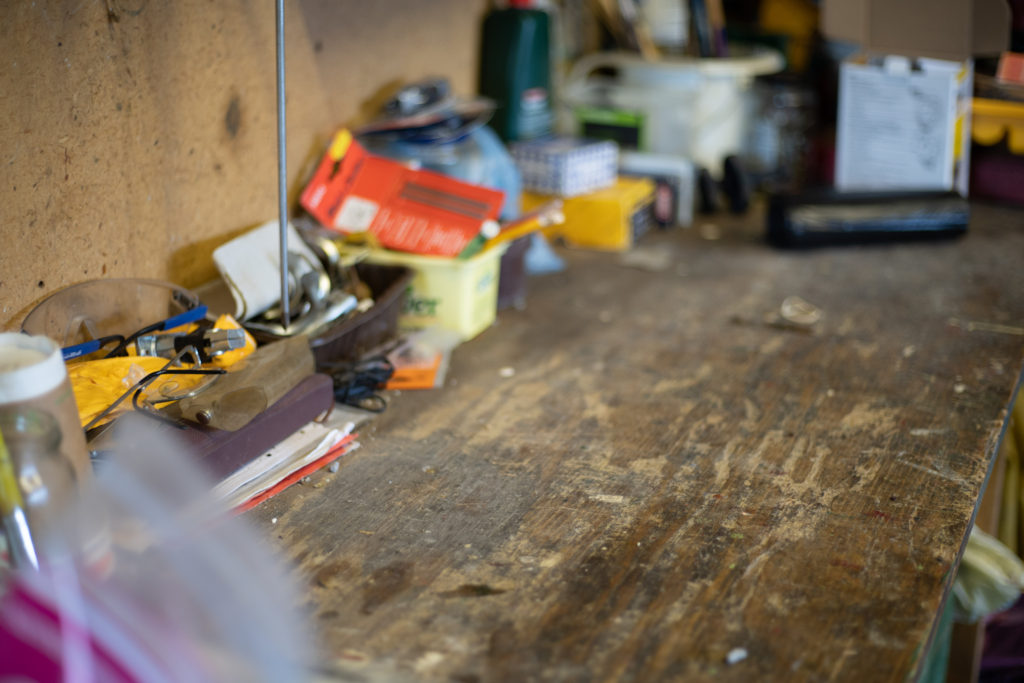
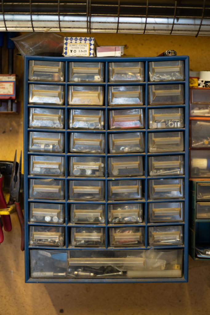
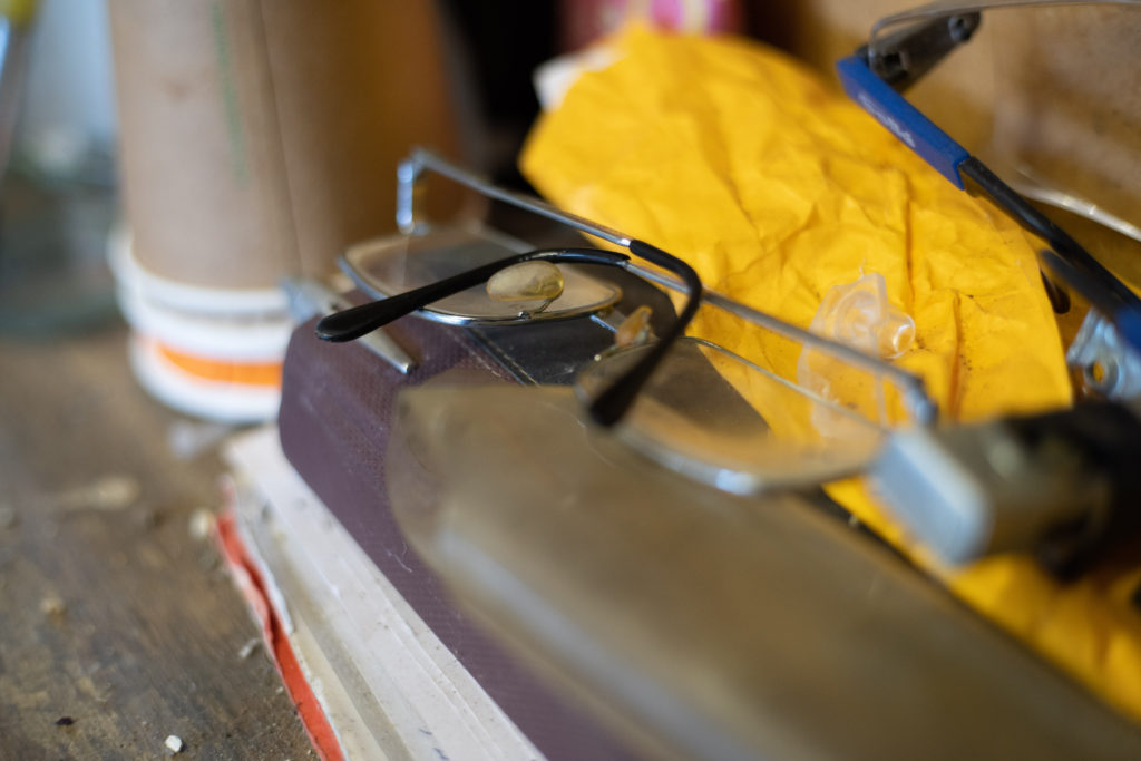
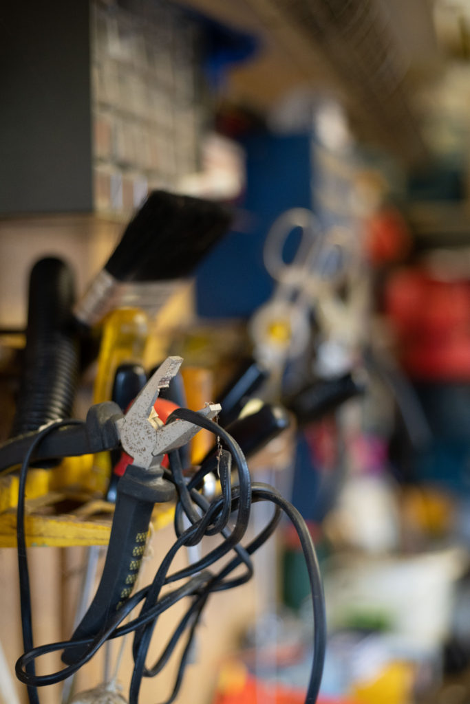
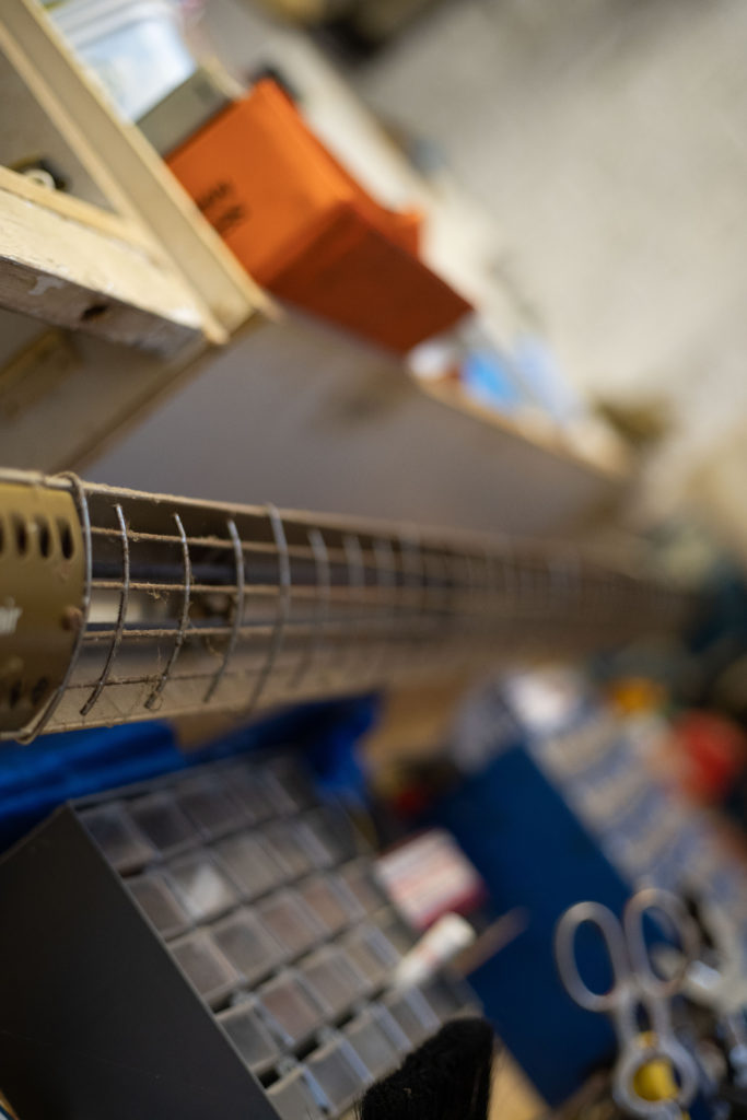
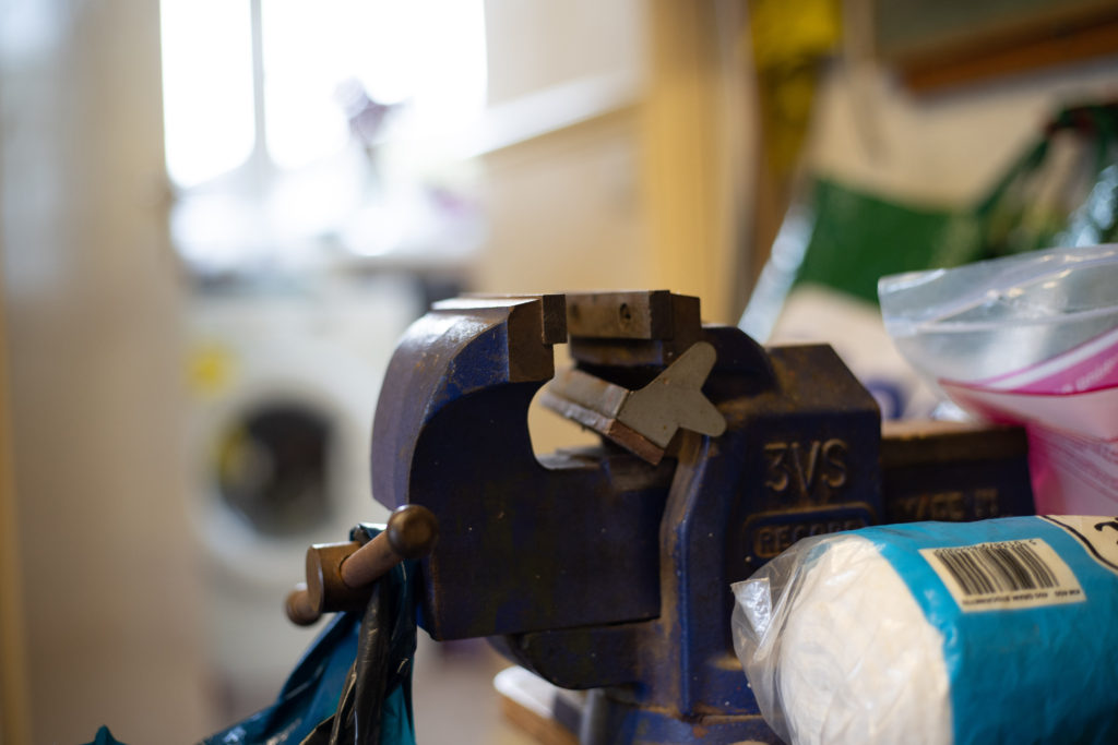
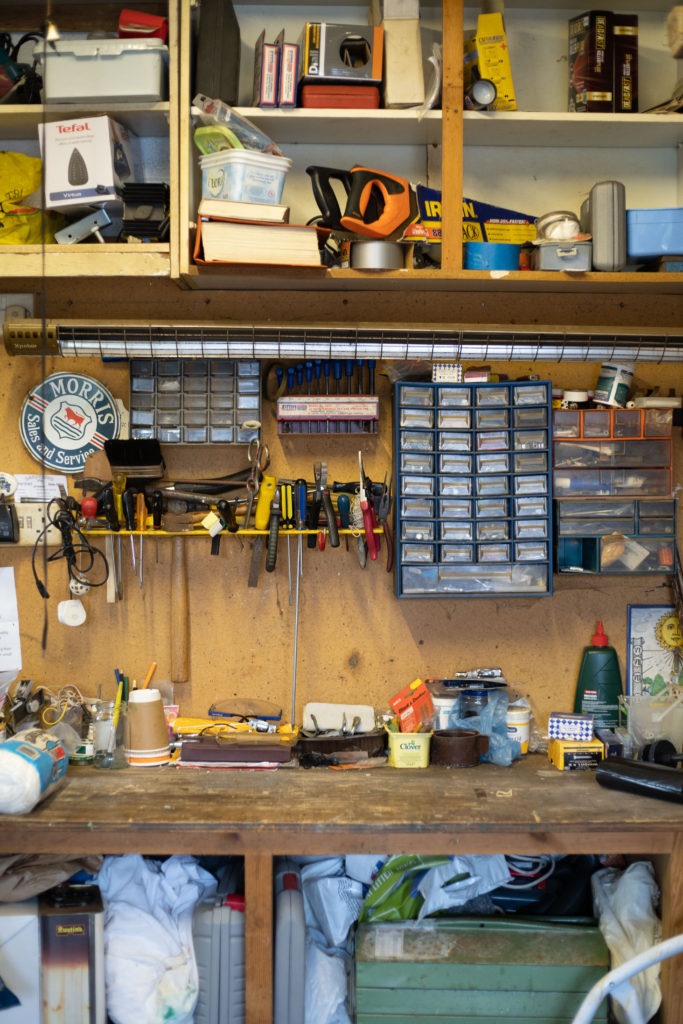
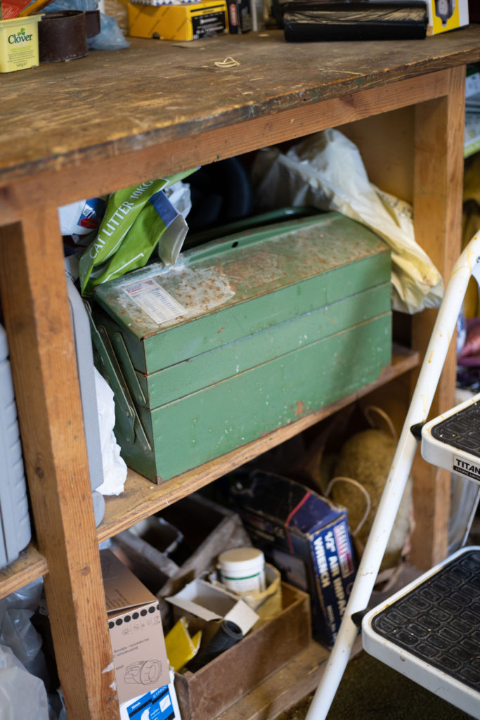
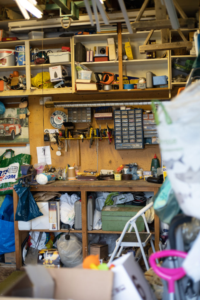
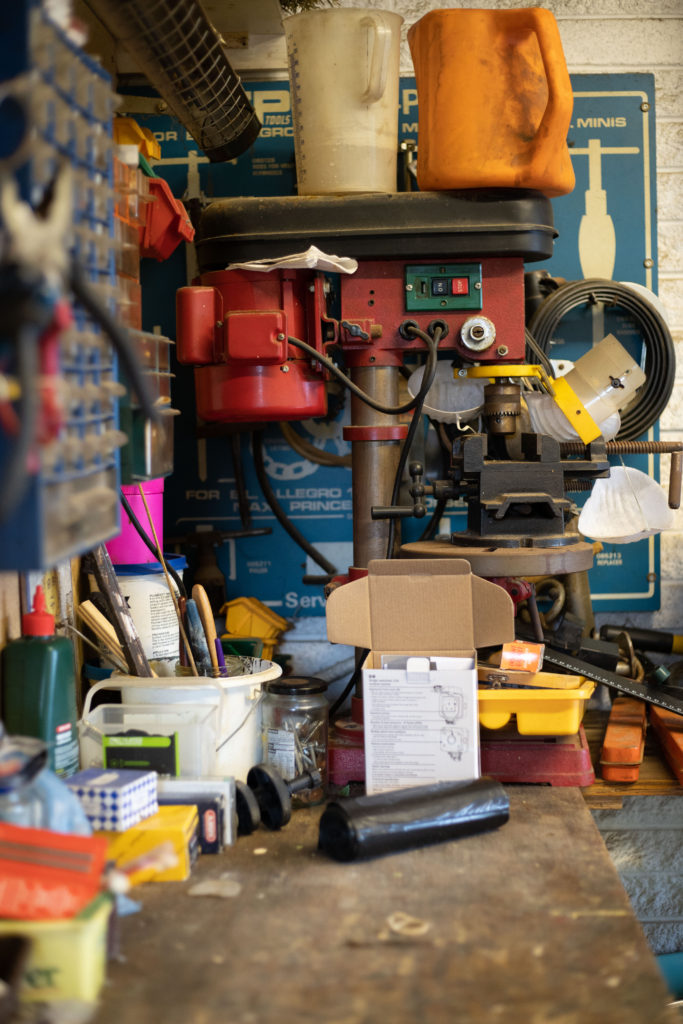
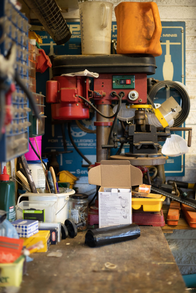
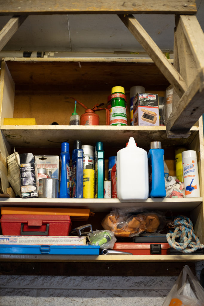
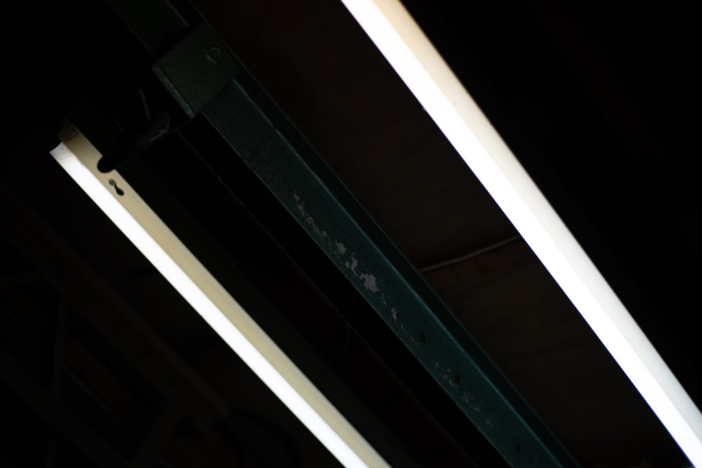
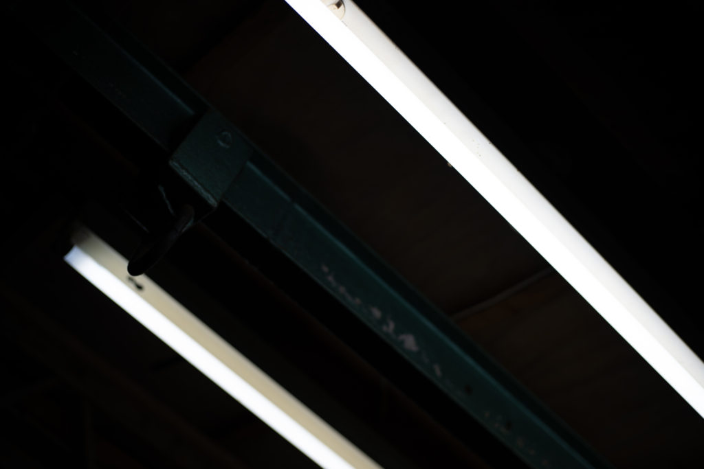
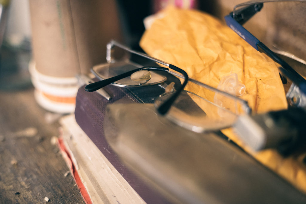
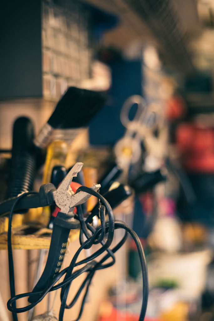
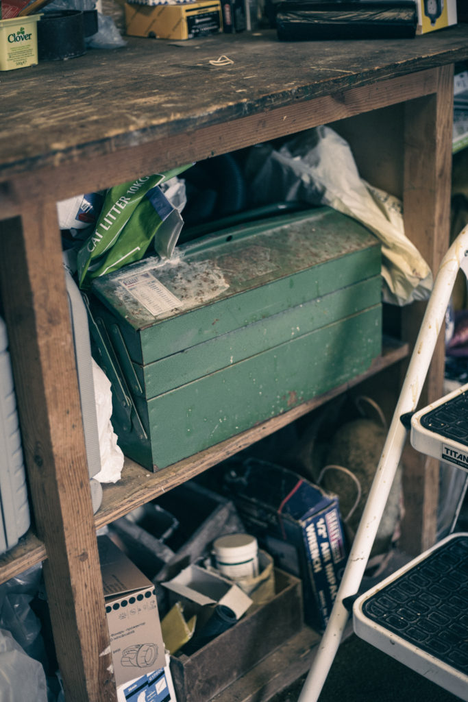
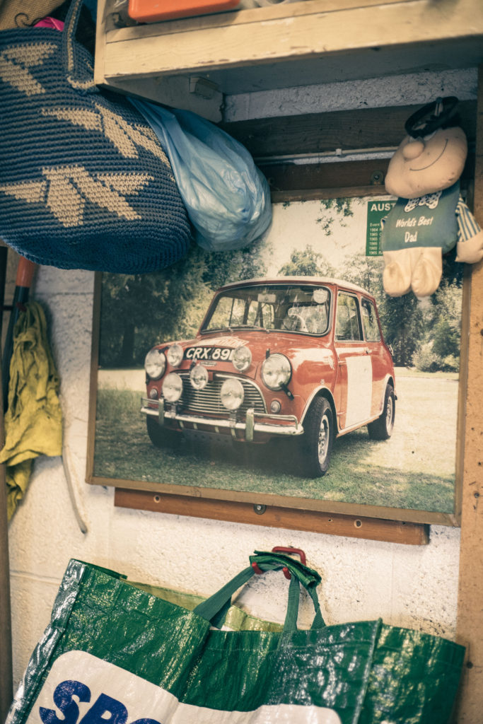
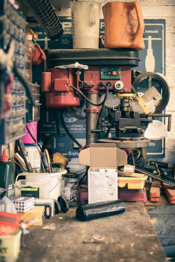
I took these initial images as I was already visiting my Nan’s house. I wanted to see what the lighting is like just from the ceiling lights. I wanted the chance to edit these images first and see whether I need to bring a light when I do the proper shoot. I am happy with these imaged but I think they are lacking contrast which I can get from using an artificial light.
Edited Images
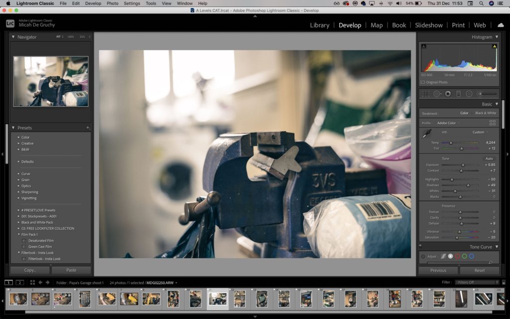
I am happy with the outcomes of these images, I didn’t want to completely change the images but rather enhance the old look and make them look aged.
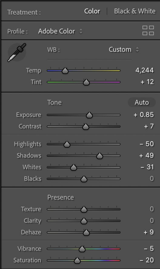
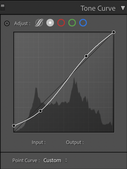
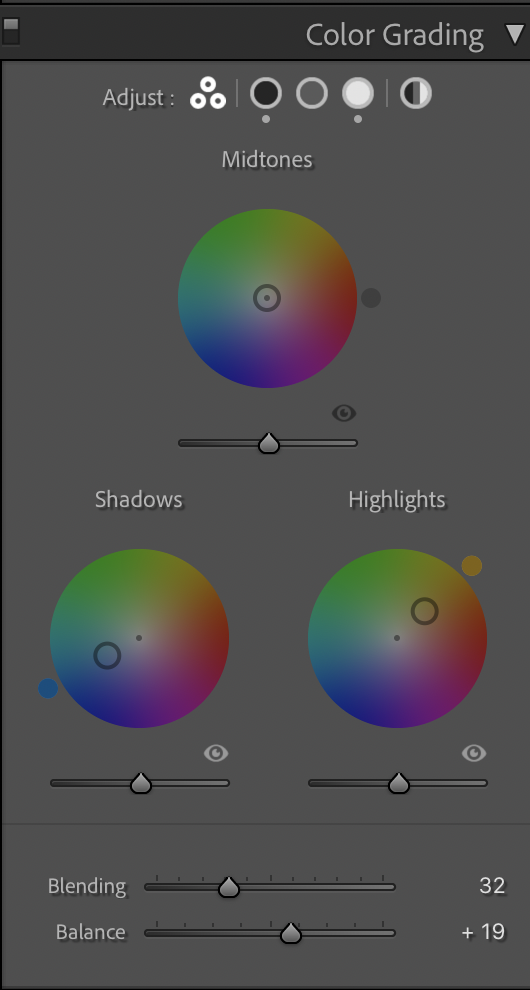
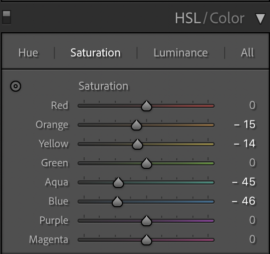
Edit Process
