
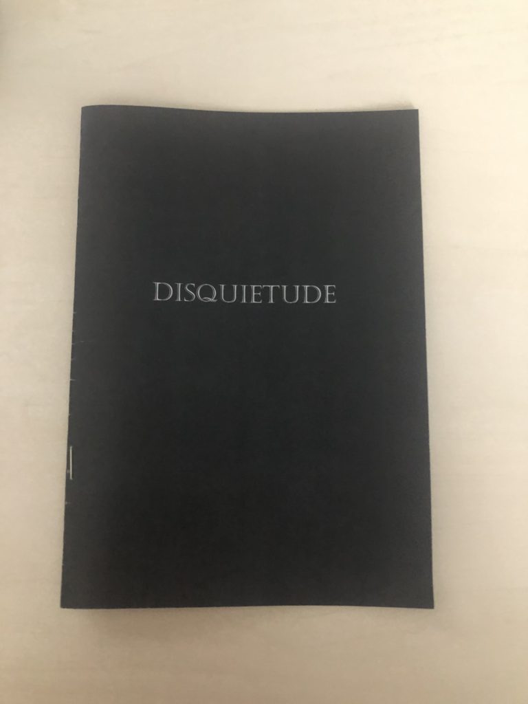
To begin with I really like my front cover. Although it may seem quite simple, I believe it is very intriguing and holds a lot of dull, sad atmosphere, which essentially was what I was trying to achieve. I really enjoy the font I used for my title, it is easy to read although it has a sense of uniqueness and history to it. I feel as though a plain, simple front cover grabs the readers attention and pulls them in to discover what it is about. The title in itself I love too, I actually have never read/seen this word until I researched it which I think would be beneficial in the sense it will grab peoples attention also. Potentially, if i were to do it again, I would’ve maybe added some line drawings of flowers just to give it that edge, however I am not sure how well that would’ve printed.

I also really like how my images turned out within the booklet. However the colouring and lighting within the images came out a little darker than I anticipated. This isn’t necessarily a bad thing however it looked different from the original images. The bleeding pages is another thing I really like, I’m not a fan of white boarders as I feel like sometimes it can make an audience lose interest in an image so I like how my images are large, bold and obvious to the audience. Another thing I would’ve liked to of changed is the composition of some images. For example, as you can see above, the image on the left is fairly zoomed out whereas the image on the right is very zoomed it. This creates a great juxtaposition however I feel as though the overall aesthetics of the booklet would have been better if the composition of the images were similar.
Overall, I really like the outcome of my zine and feel as though it creates a lot of atmosphere and symbolism of the struggles and also thew happy times within a relationship. Concerning my narrative though, I feel as though I could’ve represented my insecurities a little bit better, for example insecurities like; body image, confidence issues in general etc. These would’ve been really effective images to create.