When designing my photo-zine I had to make many design decisions in order for it to fit the aesthetics I had in mind. During this process I took many screenshots to make the decisions. Below are the screenshots and why I made the choice I did.
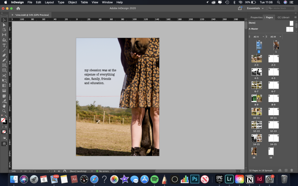
page 1: here I was deciding what and where to place my title. The first image is my final decision because it looked clean and smart. The third image is where I place a sentence on the front cover. I didn’t like this because it overcrowded the image and didn’t work well with all the other textures. The fourth image was too plain and didn’t contain a title, which is what I need. I decided to place the image over the whole page, as it is important and set the narrative for the photo-zine.
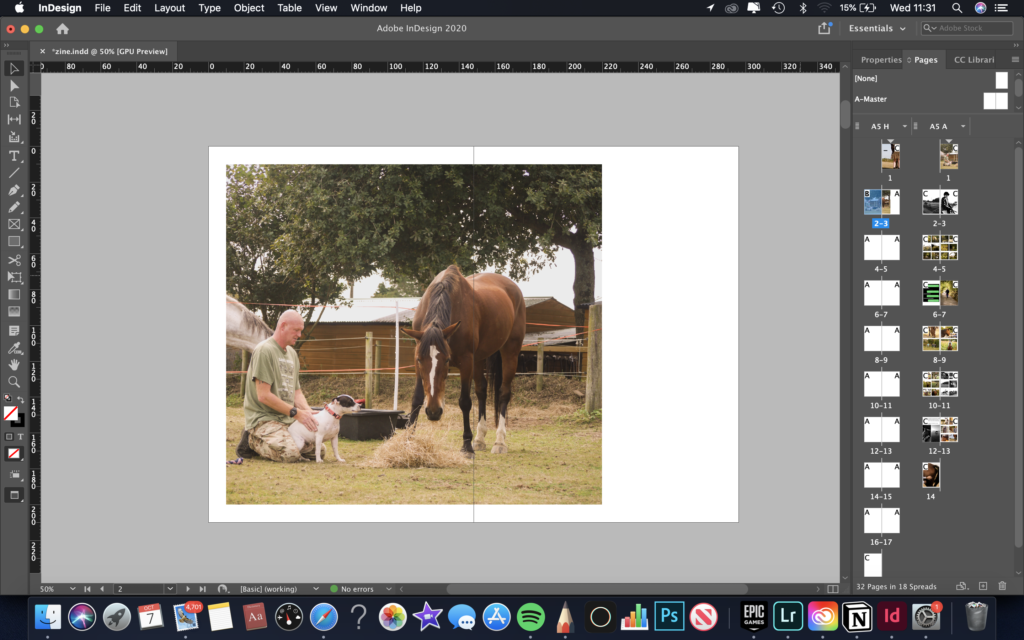
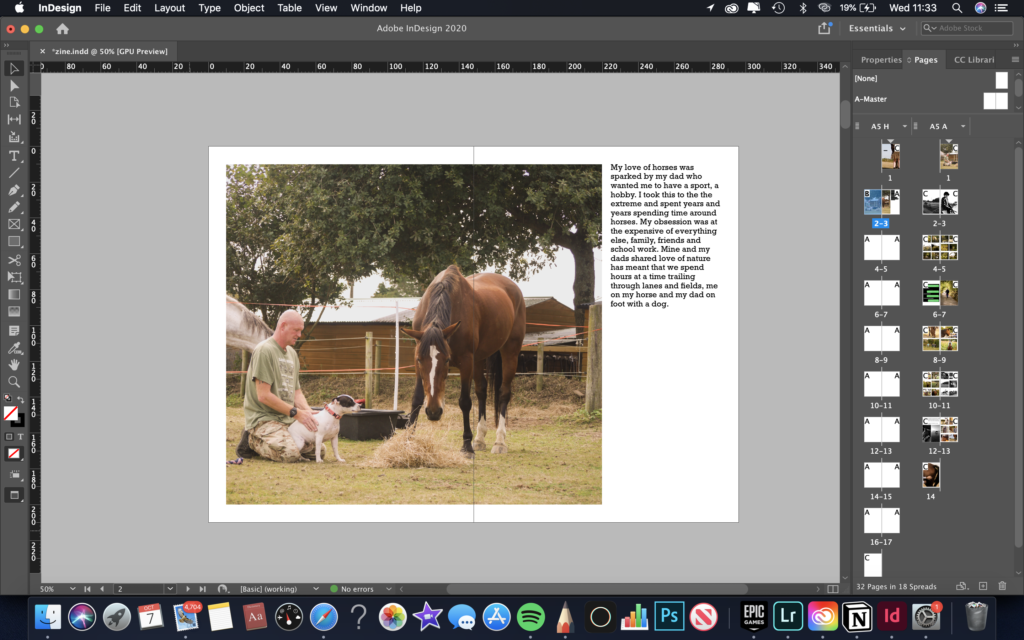
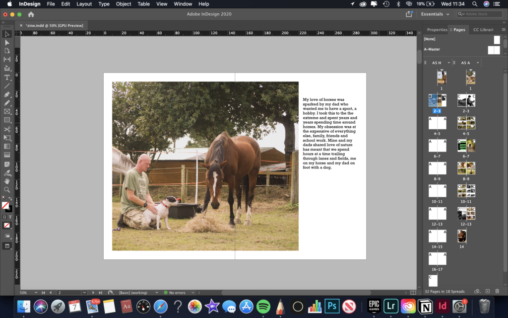
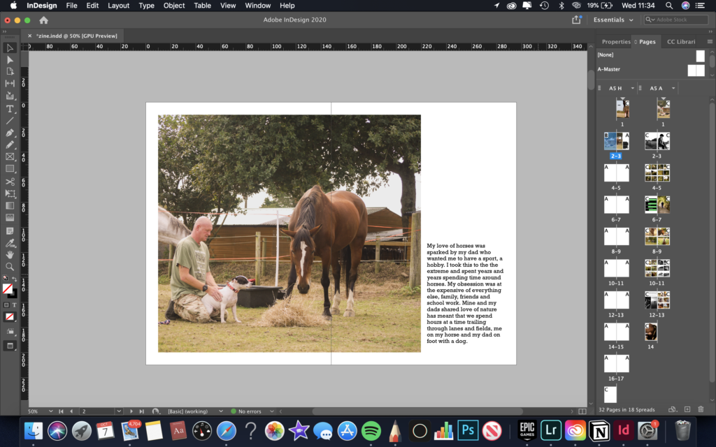
page 2-3: for this page I wanted a large image and paragraph to centre the whole narrative. I decided to shift the image to the left so that the writing could along side it easily. The second, third and fourth image shows different placements of the text. I decided to place it in the bottom right hand corner because it balanced and sat well with all the figures which are towards the middle bottom of the image.
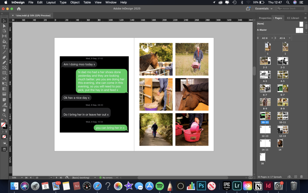
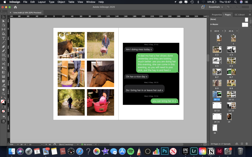
page 10-11: for this page I was deciding which side to have the large image and the other set of grid images. I decided on have the large image on the left as it made more sense in the narrative, as the images on the right are showing my dad looking after my horse, which is described in the adjacent photograph.
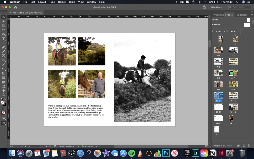
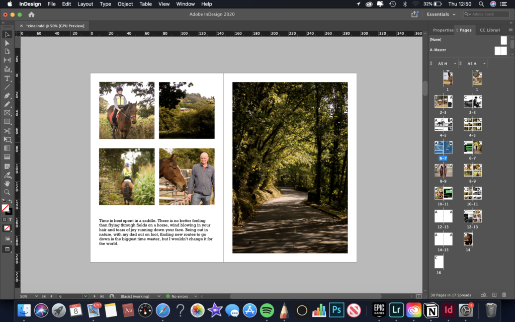
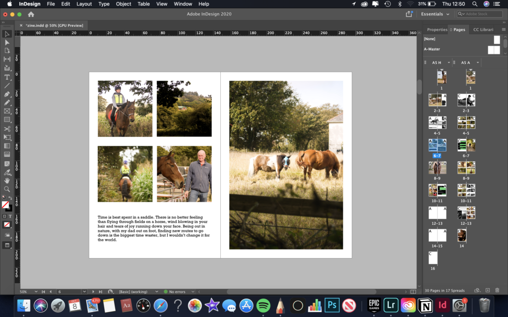
page 6-7: for this page I was figuring out which image worked best with the grid of images and the text below them. I went with the idea three, as the colour scheme and composition looked most aesthetically pleasing.
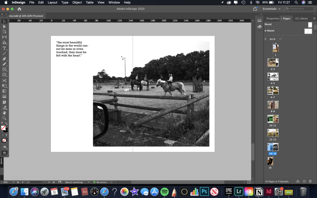
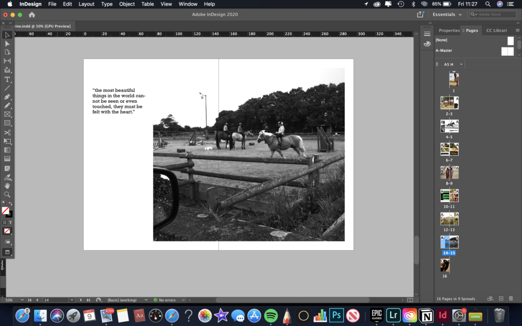
page 14-15: for this page I was trying to see where to place the text. I decided to go with idea one, as it works best with the composition, colour and tonal range of the adjacent image.


