
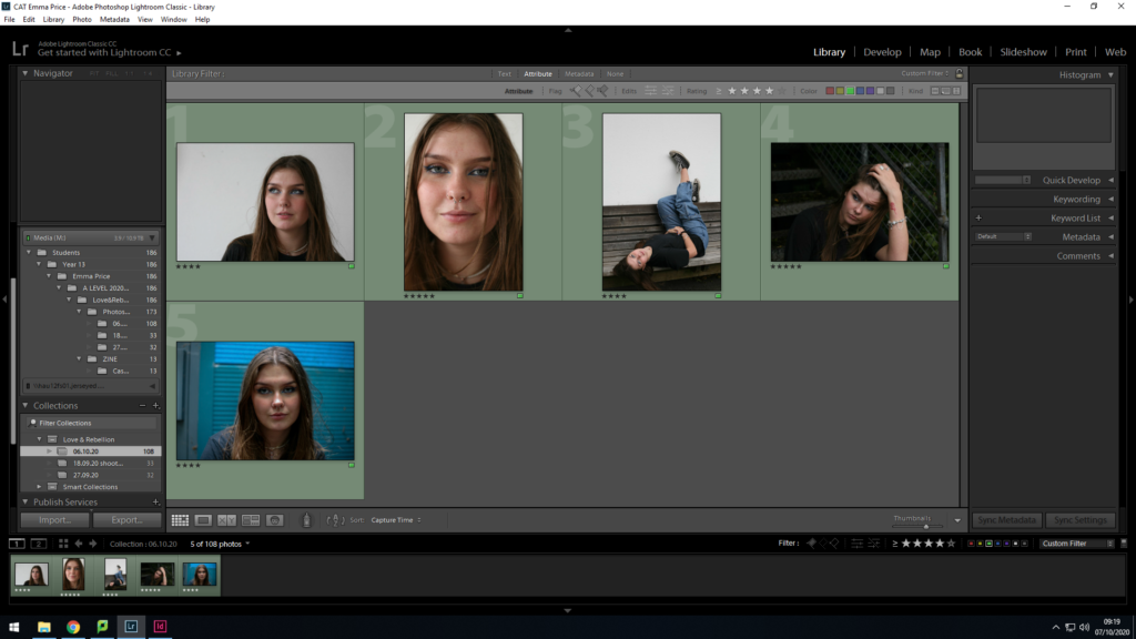
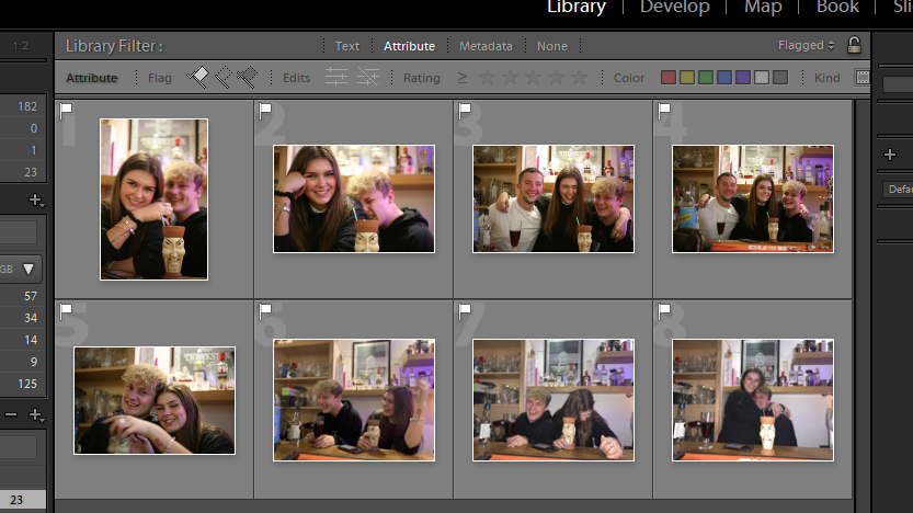
Selection Process
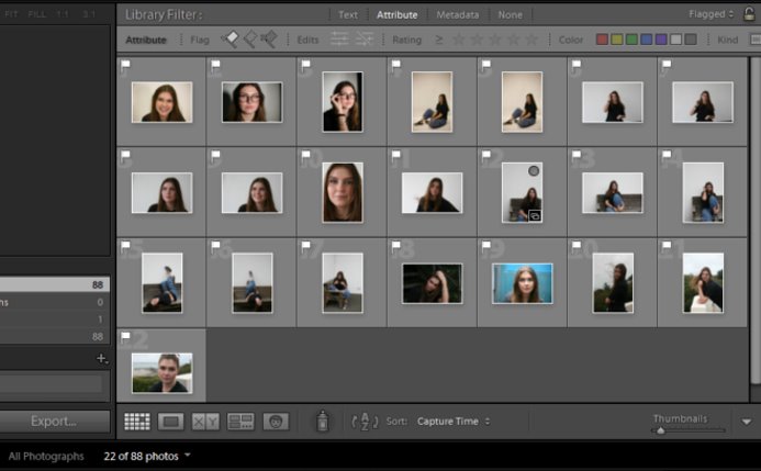
Out of the 88 photos, I made the first edit of 22 images which I felt were the most successful candidates for my zine.
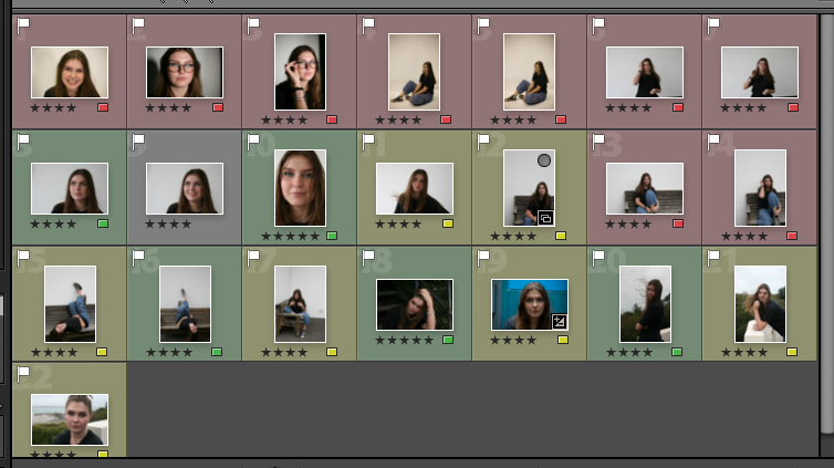
I then used the rating system of 4 stars if I’m unsure about and image and 5 stars if I’m completely certain about using it. Having rated each image I then colour co-ordinated accordingly. I used green for the images I rated with 5 stars, yellow for those I rated with 4 stars and red for those I felt weren’t good images for my zine.
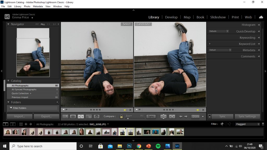
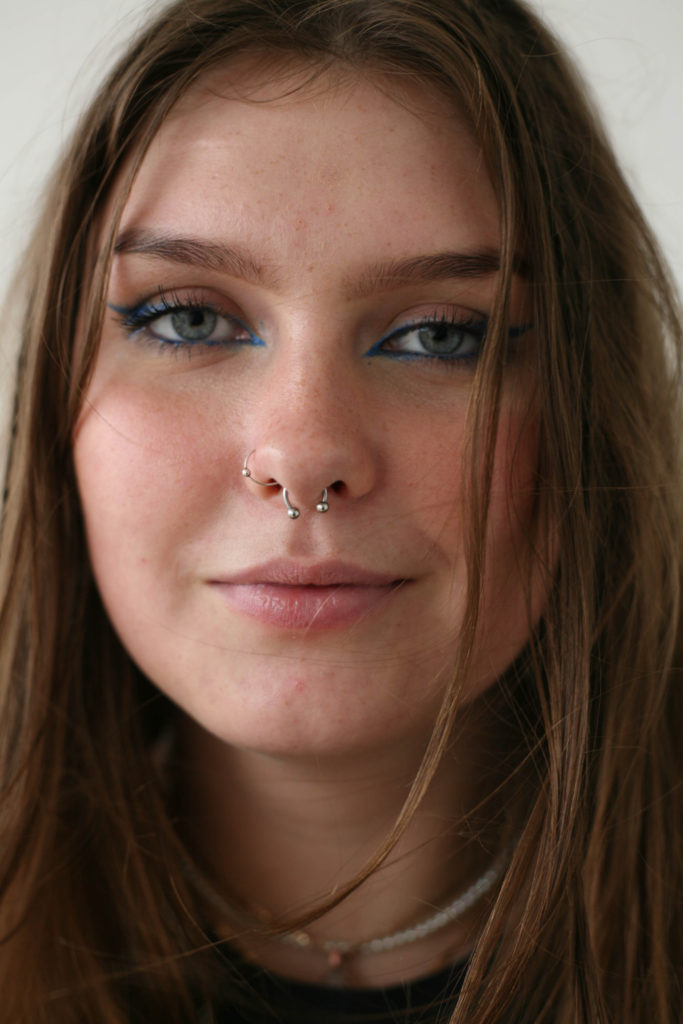
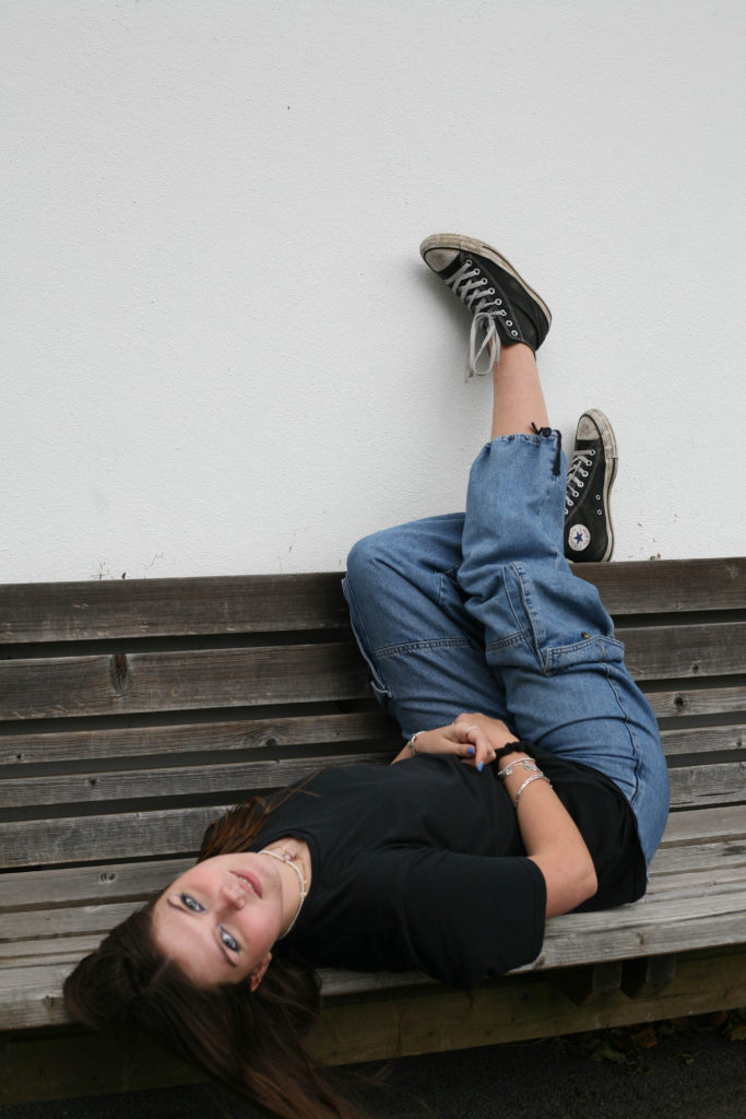
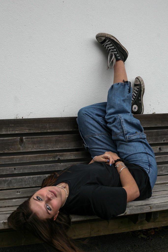
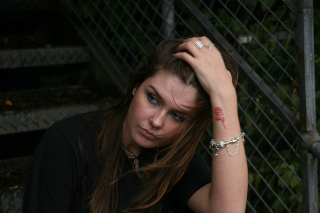
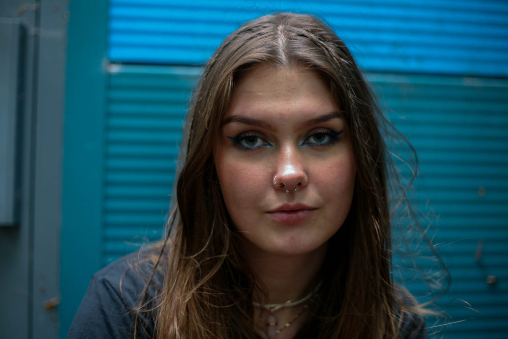
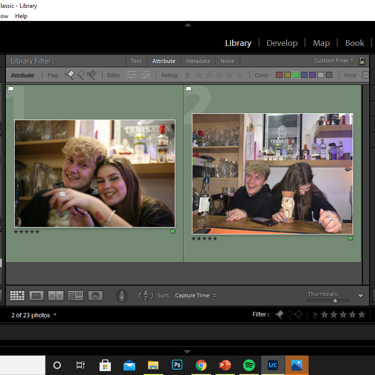
To filter through the images I used the colour-label of yellow for, I used the ‘X|Y’ tool, to compare similar images with one another. (I concluded that the image on the right was a better photo as the subject took up a larger proportion of the frame, improving the composition of the image. Her face is also more clearly defined and the position of the subject creates a triangular shape, leading the audience’s eyes around the image.)
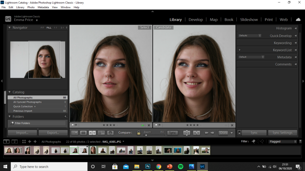
The image I decided on for the zine out of these two photographs was the image on the left. The photo is candid, capturing the subject unaware, whereas the image on the right seems forced and the subject looks uncomfortable. There is no engagement with the camera in the photo on the right and so, I feel as though it wasn’t as successful of an image. Additionally, the image on the left is a higher clarity image.
Editing Process
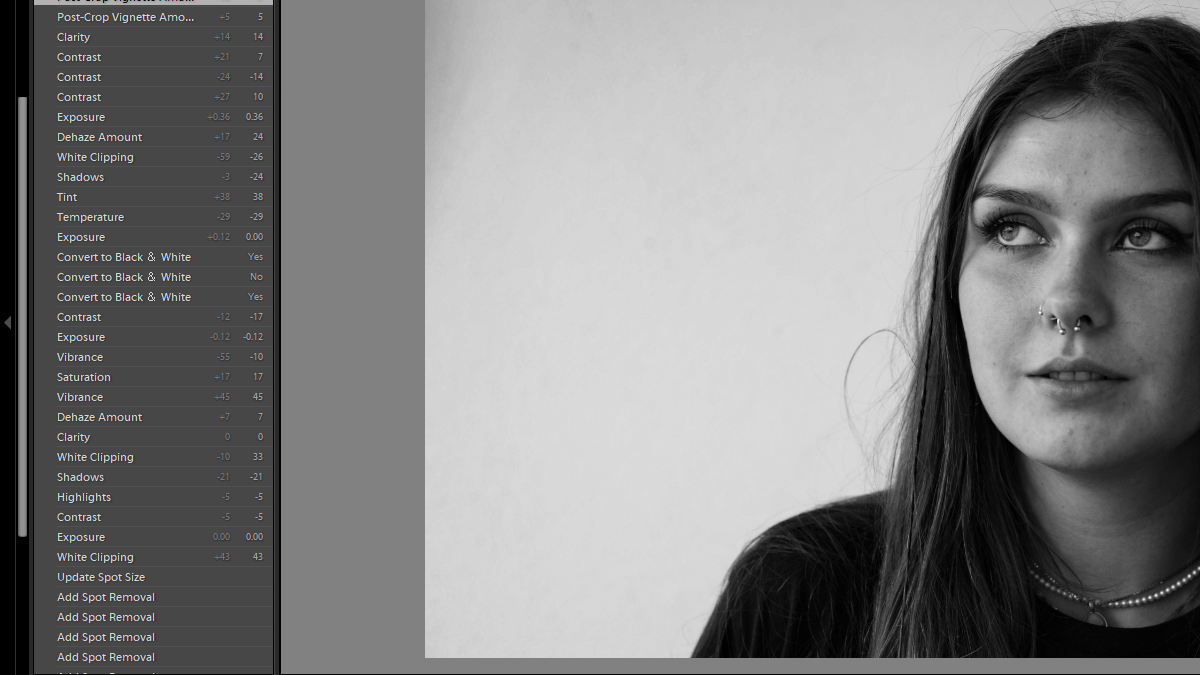
I began by using the spot removal tool, to remove marks from the image that were a result of a damaged camera lens. I then decreased the contrast and highlight slightly to create a better base before the conversion to black and white. I then de-hazed the image, so as to increase the clarity of the photo. Decreasing saturation, vibrancy and exposure all allowed for better focus on the details of my subject’s face. Finally, I converted the image to black and white, decreasing the temperature so as to produce a cooler image, as well as decreasing the contrast of the image, so that the hair wasn’t too dark against the complexion of my subject. I finally used a vignette tool, and decreased it so as to lighten the edges of the image that had become darkened during the conversion to black and white.
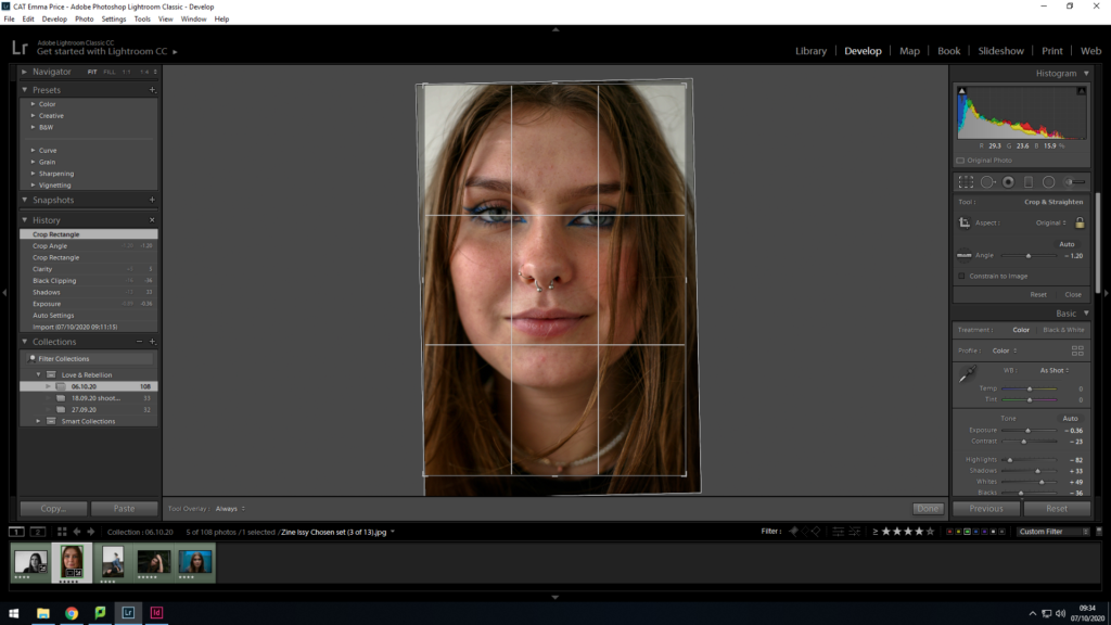
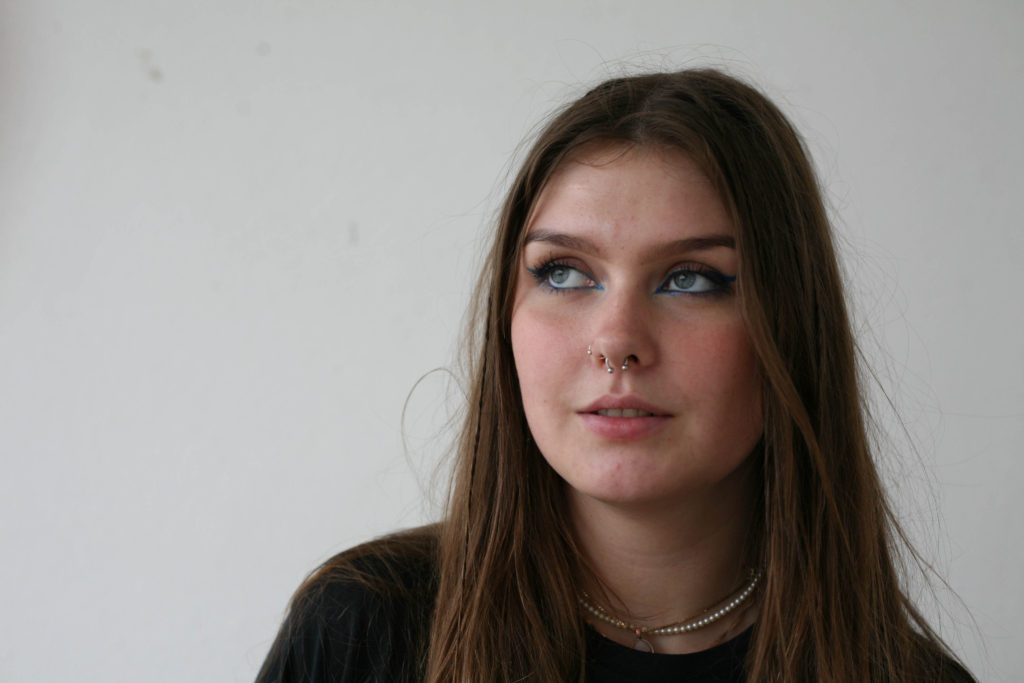
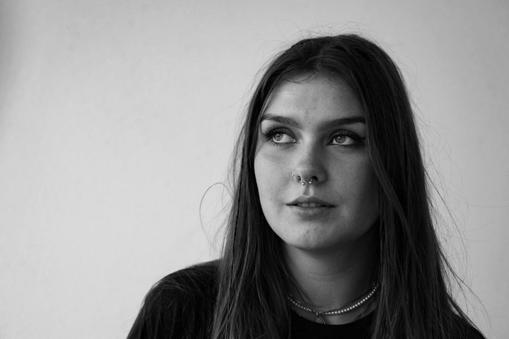
As a base before conversion, I enhanced the image by decreasing exposure and contrast. I then majorly decreased the highlights of the image so as to gain a better focus on the subject’s face. Additionally, the increasing of shadows and whites amplified this. As a final preparation, I cropped the photo, realigning it so my subject’s face was more to the centre.
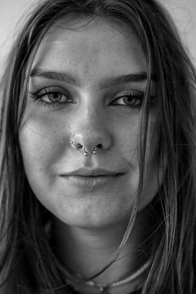
I then converted the image to black and white, finalising the image by increasing the clarity. This conversion allowed my to shift to focus on to the details of the subject’s face, with a bold focus being on her eyes.
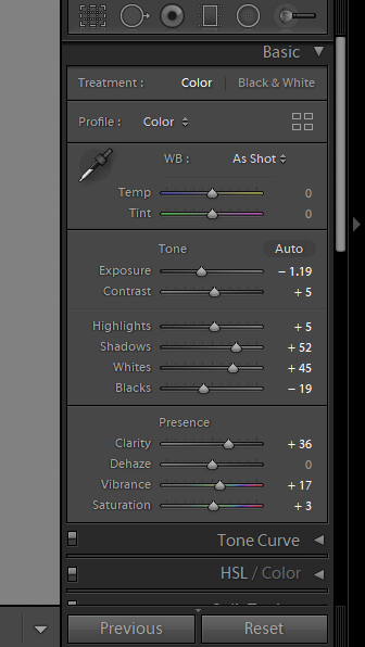
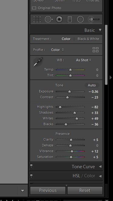
To enhance this image, I began by cropping the photo. I decided to crop it so that the bench took up half of the composition, creating a clear contrast between the brown hues and the white tones of the wall. Furthermore, I readjusted the image so that my subject took up majority of the frame. A final edit to the photo was an increase in the contrast and shadows, as well as a decrease in the exposure, so as to reduce the glare present on my subjects face and exposed skin.

To enhance this image I slightly increased the exposure and the clarity, as I was happy with the contrast within the image but wanted to achieve an image which is clearer. Additionally I wanted to ensure that my subject’s clothing didn’t clash with the shadows in the background.

Although it is not the most successful of images, I edited it by increasing the exposure, and vibrance of the image, so as to minimise the shadows on my subject’s face.
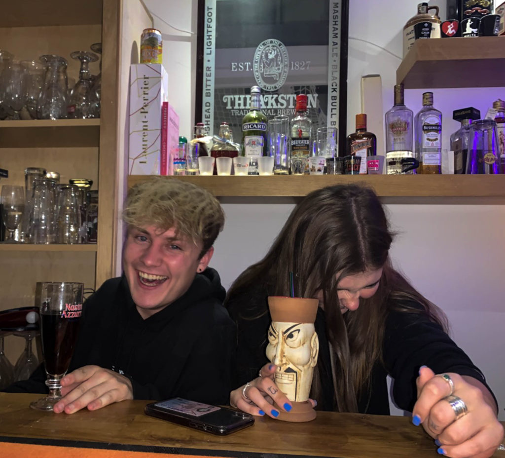
The person they love- Photoshoot
I used a rating system to select my final two candidates. I chose these two images as they were the most clear. The first image, was taken while the two subjects were aware of the camera, whereas the second image was more candid.
Editing
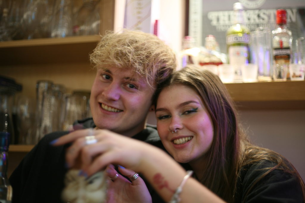
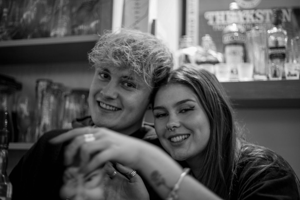
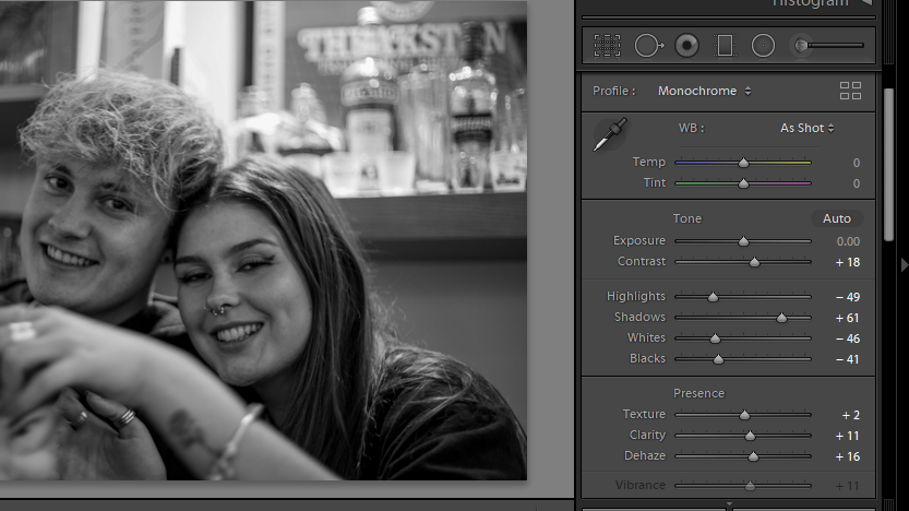
My main focus for this image was to increase the clarity. I used to de-haze tool to aid this. Reduction of highlights and whited allowed for a more contrasted image. Converting to black and white resulted in the focus being primarily on the subjects, rather than on the brightest part of the image (in the background).
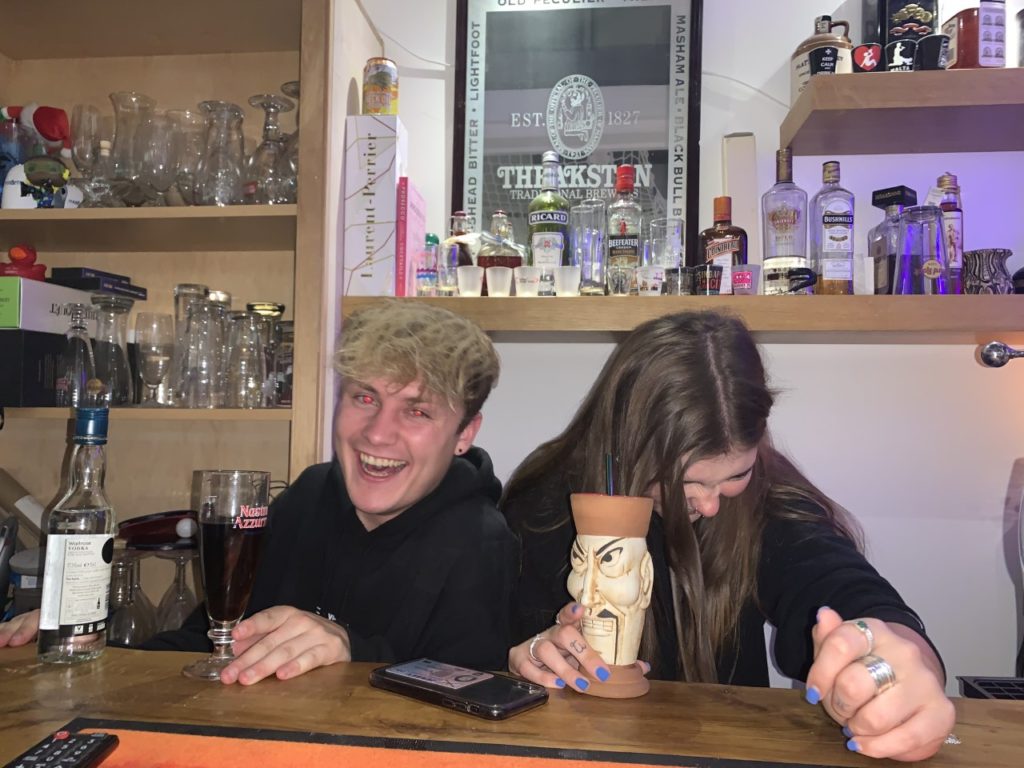
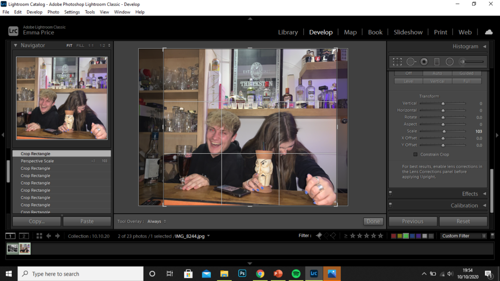
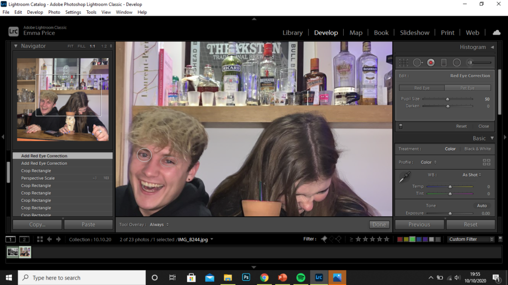
I started by cropping the image. This resulted the the frame being filled by the subjects. The crop allowed me to remove any parts of the of the image that crowded the frame, like the glasses in the background or the bottle on the left-hand side, for example. I then used the red-eye tool on the subject to the left as the flash during the shoot resulted in red eyes.
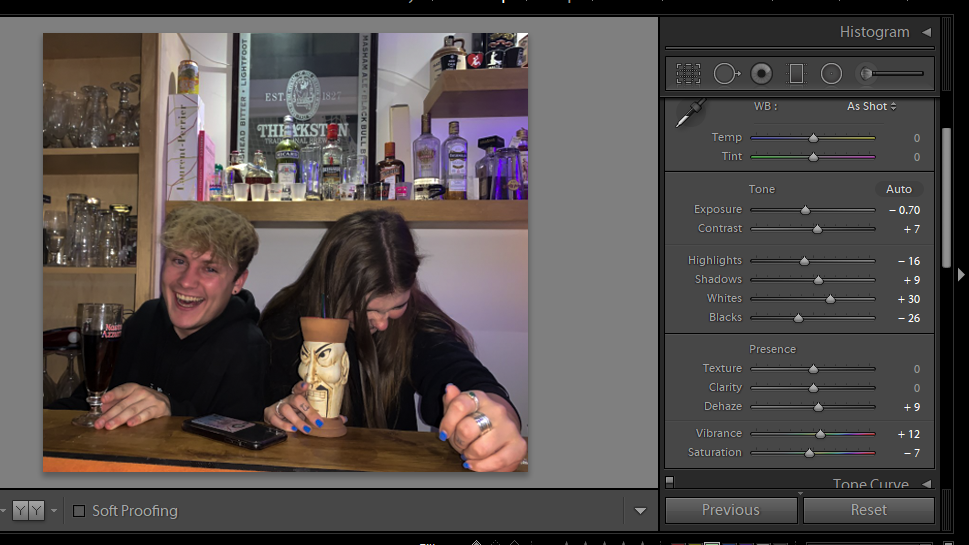
I finally, increased the highlights and whites of the image, as well as reducing the exposure to produce a more contrasted image.