
Placing the portraits:
Draft One
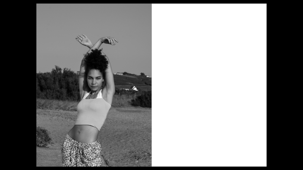
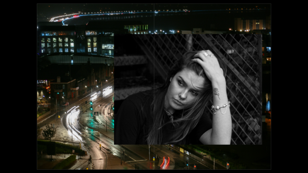
As a first draft, I aimed to place the full body portraits in the beginning as it’s the first impression of my subject that the audience sees. When you see someone for the first time, it usually tends to be from a distance, so I aimed to capture this by placing these images first for each of my subjects. By choosing the image to be black and white, it represents the lack of knowledge the audience knows about the subject: they are not in close proxemity, they don’t see them in full colour and they cannot see them in great detail. My intention for this was to spark interest about the subject to the audience. To amplify this ‘first impression’, I placed the portrait on the first page of the zine.
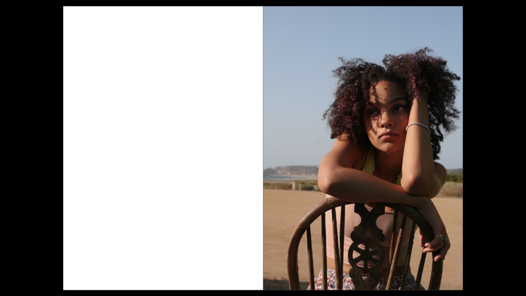
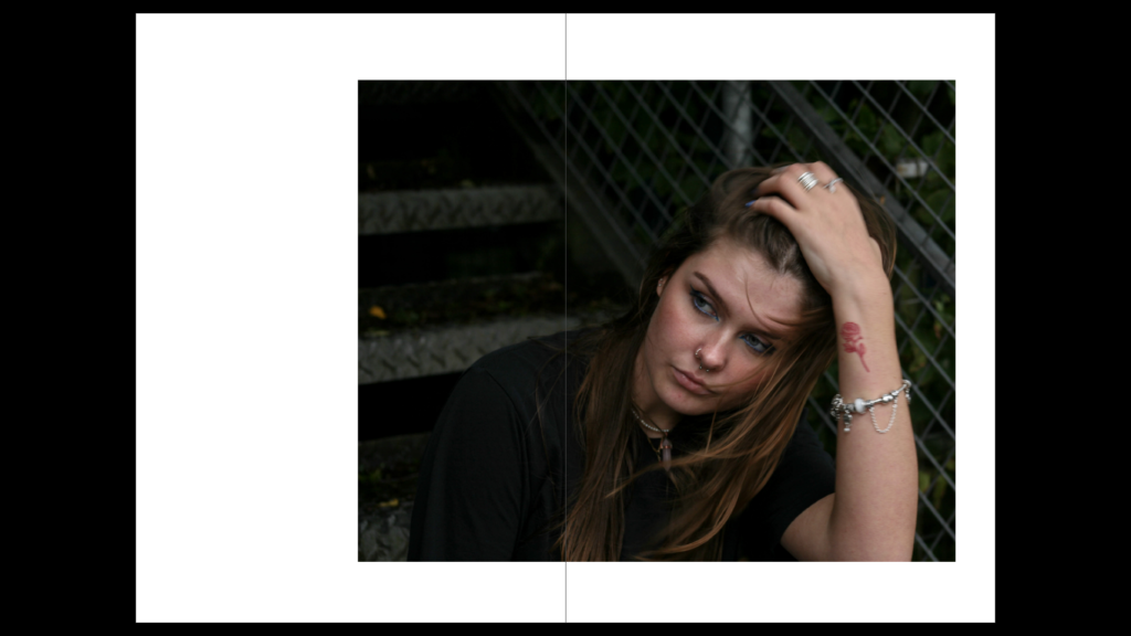
As you turn the page, I’ve positioned the half-body portrait on the right hand page. This immediately closens the proxemity between the audience and the subject. Choosing a half-body portrait for this page amplifies this idea of getting to know someone more intimately. Additionally, the introduction of colour allows the audience to see the person in more detail with the physical closeness leading to my idea of ‘interpersonal attraction’.
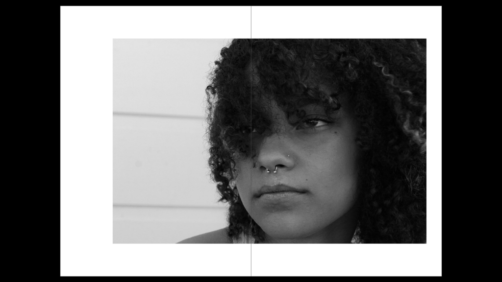
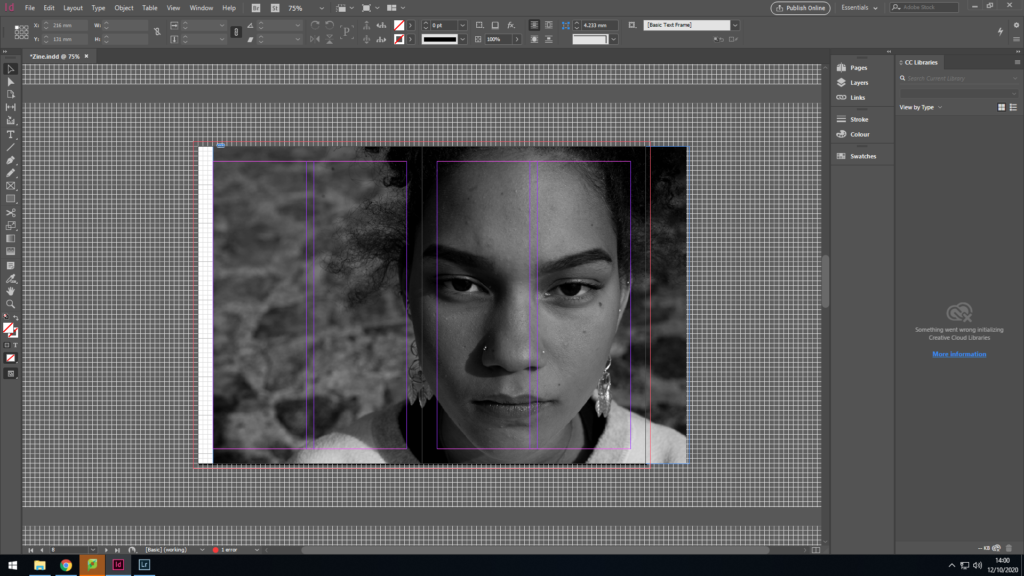
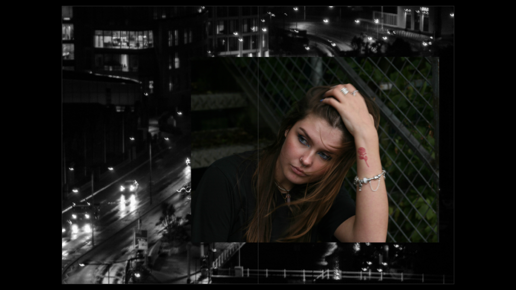
To place the head-shot, I experimented with having the portrait covering a double page spread. The image is the most intimate, the most detailed and shows the subject’s comfort with the camera.
Draft Two
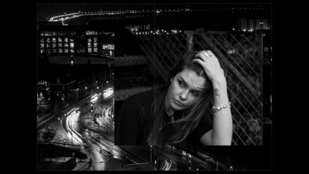
Having gained more images to work with, I experimented with my second case study, finally deciding on the positioning of all my portraits for the zine. I kept the plan of the full body portrait being the first image they see and kept the positioning of this. However, I didn’t feel that having the image in black and white was necessary- as the first impression you have of someone in real life wouldn’t be without colour.
I then decided that I would keep the second portrait on the right hand side of the zine (for the immediate closening of proxemity) but I wanted to have the image come across two pages- As I wanted to place the location my subject felt sentimentality towards surrounding this.
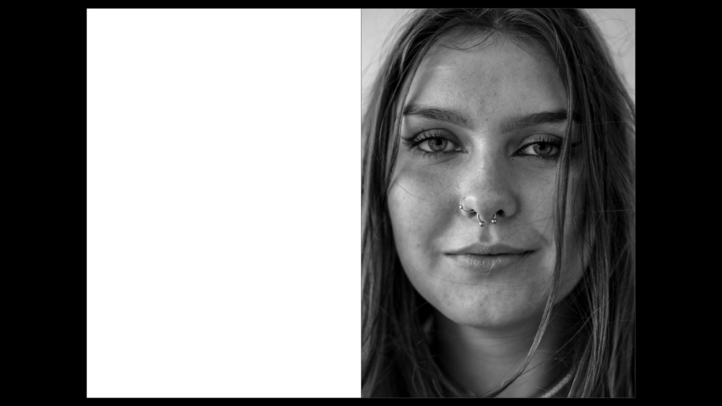
I finally chose that the head-shot should also be on the right side of the zine, again causing an immediate effect when turning the pages. My decision for black and white for this image was to capture the details of my subjects face, rather than the focus being on the colours of the image. Furthermore, having the subject make direct eye contact with the camera redirects this idea of comfort towards the audience.
Final placement of portraits
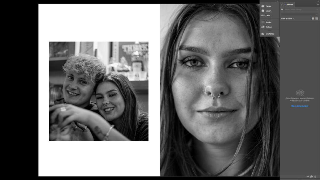
I was unhappy with the placement of some images within my zine, and so, after taking another photoshoot, I replaced a few images within my zine. These are pictured below. Additionally, I inserted images of people my subject’s cherish.
I experimented with this portrait taking up two pages. I found that it became a very strong image by doing this, although it seemed to ruin the design of my photobook as a whole, as it stood out as an anomaly
Placement of locations:
Draft One
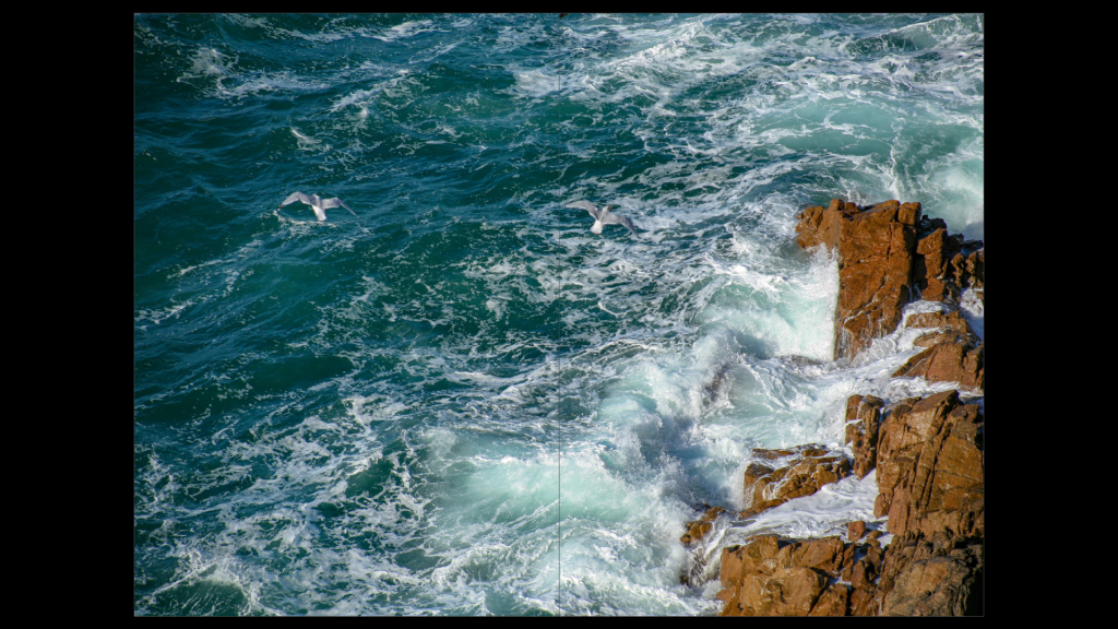
I experimented with the placement of this coastal image. Initially, I flipped the photo horizontally, placing a portrait on top of it. In this first draft, the photo only took up half the page. I later decided that the photo was a better candidate for taking up a full, double-page spread. I decided that this double page photo would be placed before any portraits as a sort of ‘setting’.
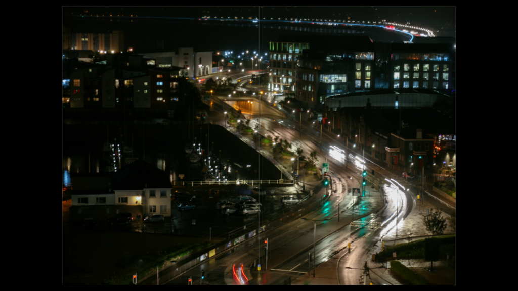
I did the same with my second case study. I took an urban landscape photograph and placed it over a double spread before any portraits of my subject could be seen.
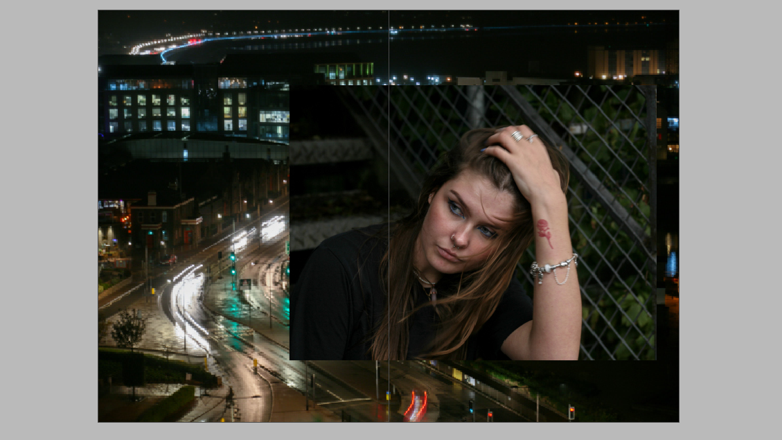
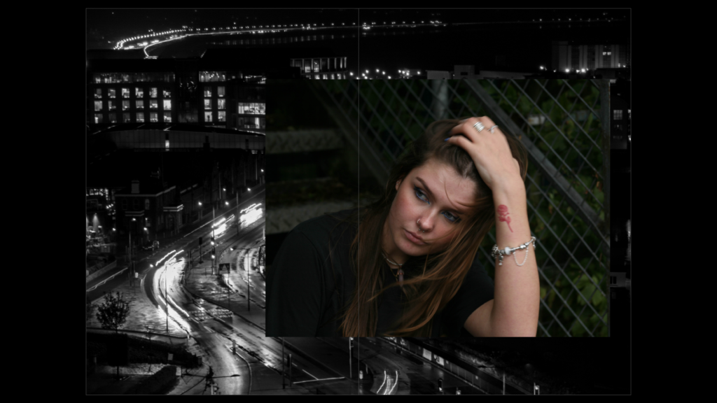
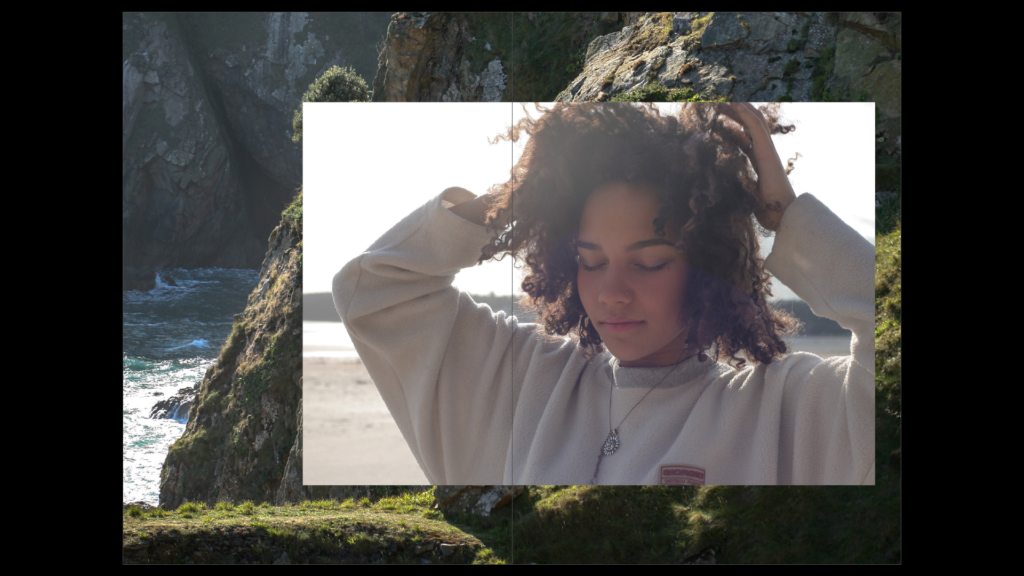
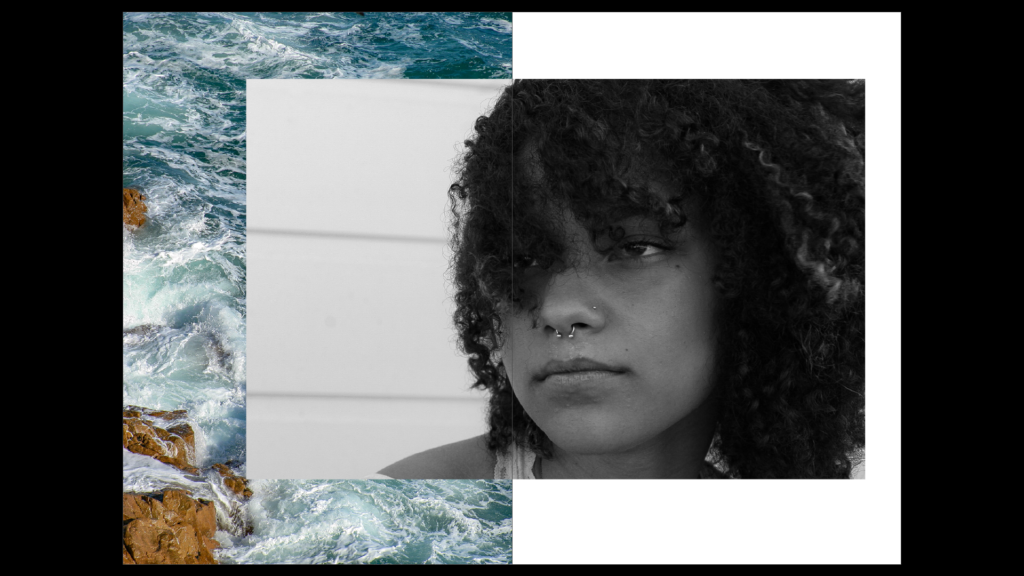
I liked the idea, however, of overlapping the portrait over a landscape photo. I experimented with black and white versions of each image, placing them against colour versions of the other. I finally decided that the most successful positioning was the ((coloured portrait over the black and white landscape)). I didn’t have an issue with removing colour from the landscape, as I had already shown a similar area in colour over a double page spread. so, this had no effect on how my audience would see the photo.
Draft Two

I was unhappy with the landscape I used within my zine, so I moved the positioning of the photo, allowing the image to take up a double page spread. I then used a different black and white image to place behind the portrait.
Placement of their passions/things they love
Draft One
Draft Two
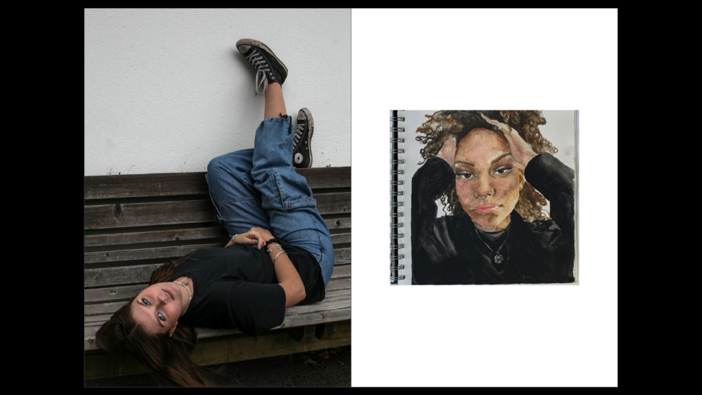
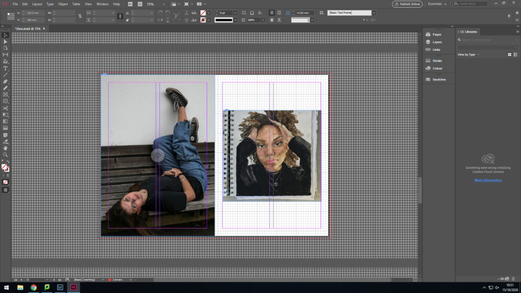
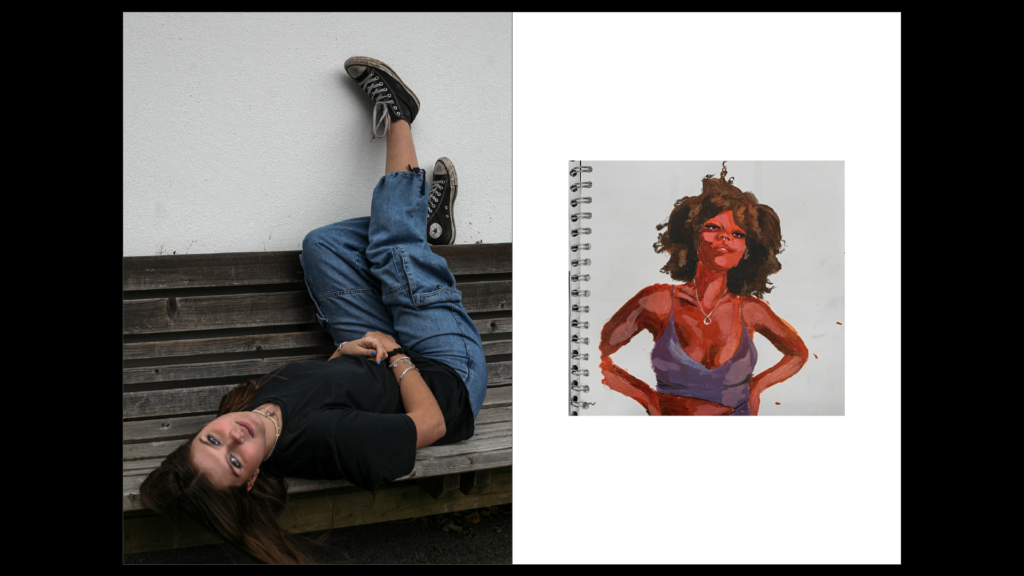
Unhappy with the colour contrast between the two images, I finally decided ona piece of art that matched the colours within the portrait. The browns of the artwork matched that of the bench and the black within the artwork matched the black clothing of my subject.
Draft 3
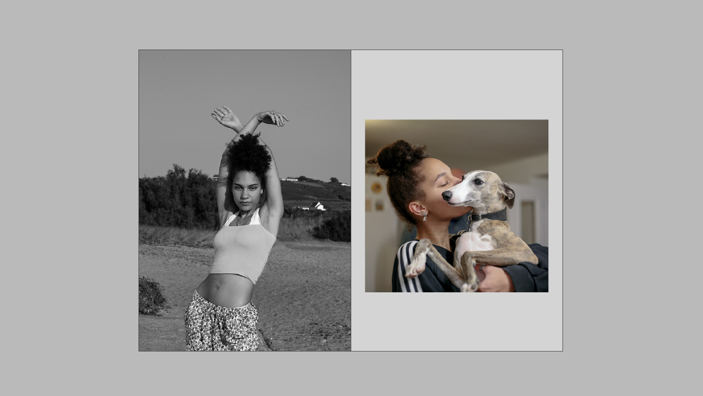
When placing my subject’s passion, I decided to use an image of their pet to show the caring nature and the passion my subject has for nurturing animals. The image had many neutral tones, which I felt fit well next to the monochromatic image. The subject is clearly behind the dog and so the main focus is on the animal itself.
Final Design
Inserts:
To further this idea of interpersonal attraction, I researched and found psychological experiments and results that are abstract without context but reflect this idea.
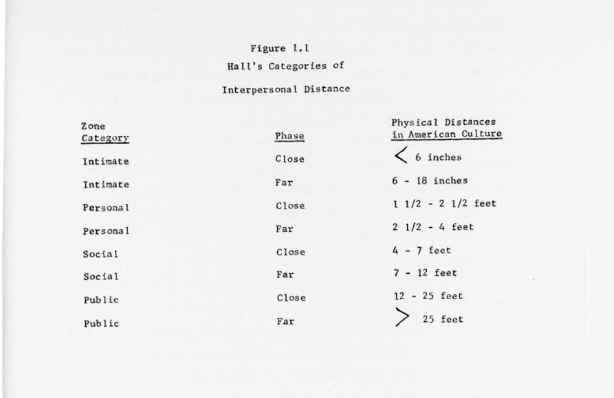
The image pictured above shows the idea of closeness (in intimate situations) being less than 6 inches (Similar to the head-shots within my case studies). Additionally, it shows that in public, the idea of closeness is 12-25 feet which is similar to the first images my audiences sees within my zine- the full-body portraits. This ‘closeness’ implies the likelihood of interpersonal attraction taking place, which I wanted to present throughout my zine.
Naming the Zine
The Propinquity of Interpersonal attraction
The process of how I came to develop this name stems from the idea of closeness throughout the development of my zine. I aimed to show how proximity (or propinquity) plays a part in getting to know someone more intimately.
Psychologists argue that frequently encountering someone and the proximity between two people can be fundamental in the process of developing strong relationships with individuals. The more people come into contact with one another, the more likely the interaction will cultivate a relationship.
By forming these ‘case-studies’, I’ve been able to present my subjects so that the audience encounters them multiple times, alongside places and things they associate themselves with.
Designing the cover
I aimed for the words in the title to be spaced closely to one another to amplify this idea of closeness.
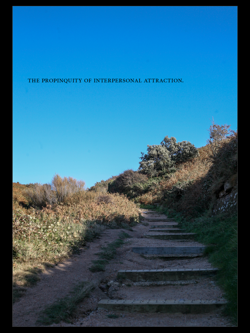
The image incorporates both man-made and natural aspects. The man-made alteration to the landscape is present in the steps, and the theme of urban landscapes can be seen in the latter half of the book. Additionally, natural landscapes can be seen in the first half of the book within my first case study. Incorporating both of these aspects allows me to link the two case studies together. Placing the title in the negative space of the image allows the the audience’s focus to be easily shifted towards it. The placement within the negative space creates a ‘spot’, to which the audience can return to.
Additionally, the staircase has no definite end and so the image becomes ambiguous. The lack of clarity as to where the pathway finishes implies a sort of ‘journey’. One which the audience will take with each case study or which the case studies take with one another.
Have you printed and bound your final zine?