DEFINITION: “A photo zine is a self-published, often handmade collection of photographs laid out in a magazine style. It can include written text and illustrations as well as photos. They are designed to display and share photo stories.”
Photozines can be incredibly idiosyncratic and personal. They allow photographers and artists to experiment with their work, enabling them to portray their images in ways that oppose the traditional publishing of a photobook. A photographer’s zine can connect the artist more directly with their intended audience, appealing to them through not only the images but the placement of the photo within the book, the relevance of the page or the juxtaposition created between images throughout the book can make the presentation of the artist’s work much more meaningful and expressive.
Rita Puig-Serra Costa
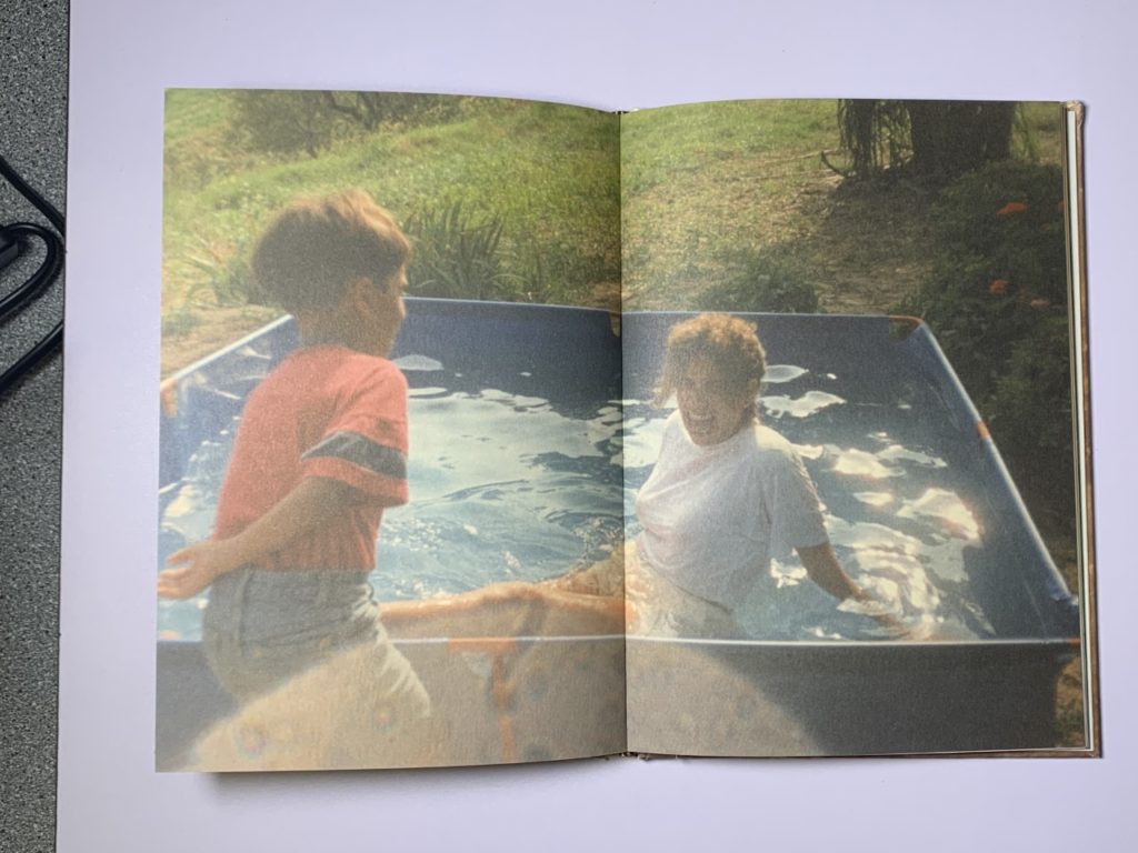
Many photographers use photo-zines to tell a narrative. In Costa’s zine ‘Where mimosa bloom’, she has created a story about her own family (starting her zine off by introducing family members in her family tree) and her connection to her mother.
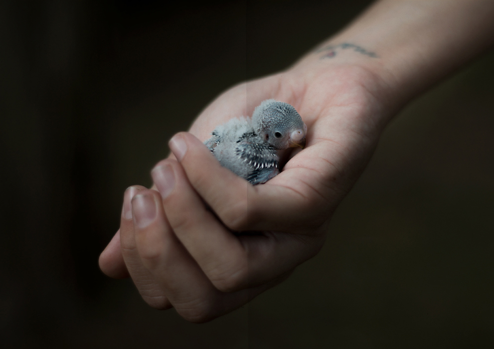
‘Among the most arresting photographs is Little Bird, a double-page close up of a premature baby bird cradled in Puig-Serra Costa’s softly lit hand. Life-size and featherless against a black background, it evokes abandonment and fragility, but also the strength to rescue and attend to life’
¬Janelle Lynch, on her review of ‘Where Mimosa Bloom’
Costa focuses on the depth of love that can be expressed after experiencing an immense amount of grief. The zine took over two years to create, as she spent the time collecting materials and taking photographs of places, objects and people that had an impact on her relationship to her mother. The photo zine is dedicated to her mother, who passed away from cancer in 2008.
However, despite the upsetting context behind the project, the zine itself avoids the self-pitying, isolating effects of grief. Costa acheives this through her bright colour scheme and implantation of significant people, places, objects and nostalgic photographs that captures her relationship with her mother both before her diagnosis, during and after her passing.
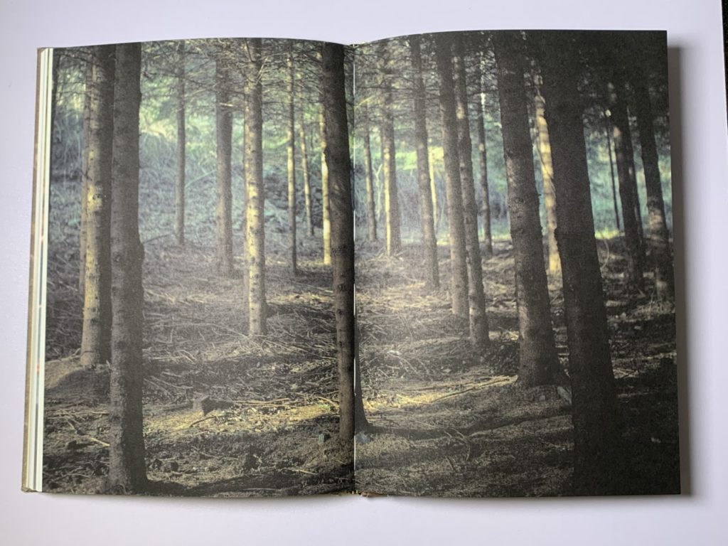
Her use of double page spreads for particular images of locations and old photographs amplifies the importance of these contextual places and the prominence of these childhood memories to Costa herself. The incorporation of these images on a large scale includes her audience in a private, personal part of her life, intensifying the rapport Costa has created with them.
My personal zine
For my own personal zine, I wanted to incorporate a similar colour scheme. Because my photo-zine presents the stages of becoming intimate with someone, I intend to adapt the colour scheme of the portraits throughout. I plan to experiment with black and white monochromatic images, shifting to more vibrant and colourful images as the zine progresses. Additionally, I aim to try and match the colours of my portraits with the image they are directly adjacent to. To do this I may choose the colour of my subject’s clothing based off of the image I want to place them with.
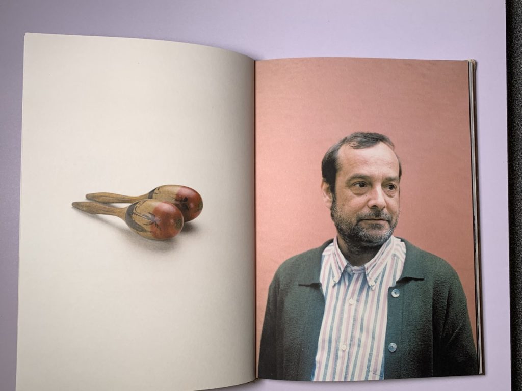
I was inspired by the way Costa used photos of simple objects that have deeper context- acting as staples of her relationship with her mother. I aim to include objects, places and people that have significance to my subjects, which have had a clear impact on their character and personality. The objects and places in particular will allow the viewers to feel more connected to the subjects in my zine as they will have seen the places that are sentimental to each person as well as their passion towards their hobby or a person that is dear to them.
Furthermore, I want to set context in a similar way to Costa. Her use of double page A4 spreads for significant photos stood out to me. I plan to experiment with this idea, to see the effect of placing context so prominently.

