
Whilst editing my images for my zine I tried to consider my previous artists references to make the photos look as high quality as possible.
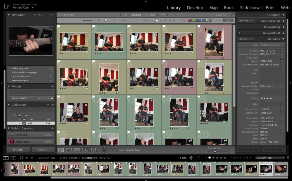
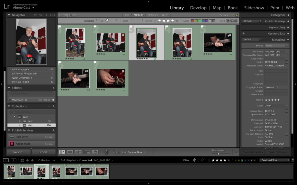
In Light Room I selected several images using the rating tool and colouring different images to show which ones I liked the most and which ones I thought were the best quality e.g. green being the best quality and red being the worst, 5/4 stars are photos i like the look of due to their composition or the vibrancy etc and less than 5/4 stars are photos i don’t like the composition of.
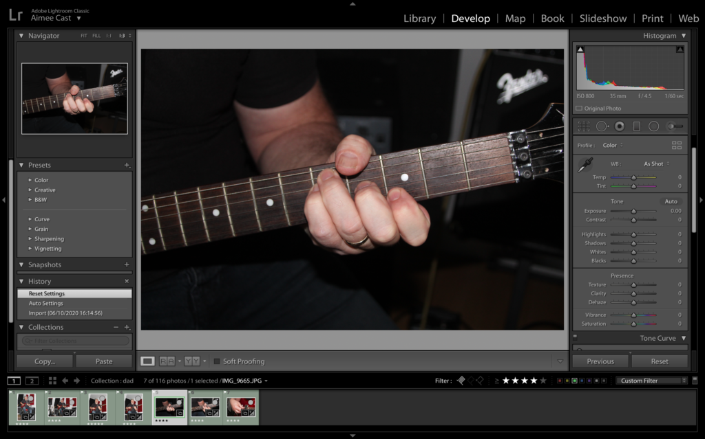
Whilst editing this image I thought that the photo was slightly too dark, so I decided to lighten the exposure, as well as lightening the shadows a lot and darkening the highlights so it wasn’t too bright. I also lowered the contrast so there wasn’t such a drastic difference between the light and dark tones.