
Percival Dunham

Percival Dunham was Jersey’s first ever Photojournalist. This was for a newspaper, ‘Jersey Illustrated Weekly’ and the ‘Morning News’ who were great competitors with the Jersey Evening Post.

He had a candid style of news photography and was seen as well ahead of his time. His images mainly represent the remarkable picture of life on this small island and captures Jersey right before the outbreak of the War.
His images are very unique, especially since Jersey is a small, unknown island to some. As mentioned before, his images were well ahead of their time, similar to modern street/candid photography and he captured many different things.
Image Analysis

TECHNICAL: the type of lighting Dunham tends to use natural lighting, since his photographs are usually candid, however when not, they are outside in daylight. His levels of control within his work vary, sometimes there is a strong level of control in which he has positioned his subjects and got them in a way in which he desired. However, sometimes there is a lack if control where his candid images are concerned, you may find his images blurred as the subject is not located or positioned in some way. His camera would’ve been old, since most of these were taken between 1913-1914, the shutter speed however, would’ve been quite fast when taking his images as mentioned earlier some of his subjects are blurred, and the lighting in most isn’t to bright.
VISUAL: The colour in this particular image, and in all of his others, the colour is black and white, often with brown or orange tints however this would’ve been due to the age of the camera, and even the weather. The tone of the image above is quite dark, again because the day would’ve been dull, enhancing the blacks and taking away any brown tints. This also could be because he had a higher aperture. The black’s and white’s in this images seem to contrast each other very well, creating a very bold image. There is no arrangement or organisation in this image; it is not composed. It is very much candid and similar to street photography. However, you could argue that it is slightly composed, there is a slight lead of the eye within this image that highlight the ‘West Park’ sign and the hotel behind.
CONCEPTUAL: The concept behind the images may not only be Photojournalism. The images almost feel as though they are made to be memories. Especially since they were available to the public and were able to keep by everyone. It’s almost as though he made these images for people in the future to see, and that’s why they are candid; memories aren’t positioned or faked. He really pictured a lot of events, occupations, locations etc, almost as if he wanted to tell a story. However, it has been said that most of his EARLY images were promotional to keep the advertisers happy, until he worked for the ‘Illustrated News’.
Michelle Sank
Michelle Sank’s images “reflects a preoccupation with the human condition and to this end can be viewed as social documentary. Her work encompasses issues around social and cultural diversity”
In 2013, she came to Jersey for 6 months to undergo this project. Click this link to read more about her and this project: http://www.michellesank.com/portfolios/insula
Image Analysis

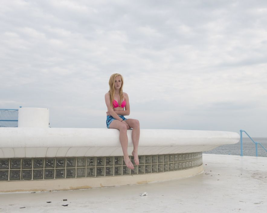
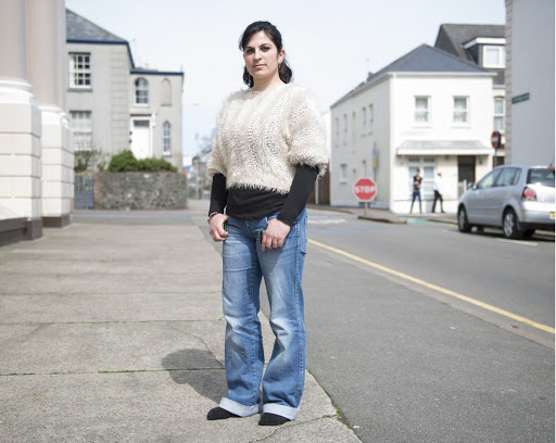
TECHNICAL: The type of lighting in this image is very clearly natural lighting, because the image is clearly taken outside and no particular harsh/florescent lighting can be seen. You can also see the natural shadows on the subject’s faces that indicate natural lighting from the sunlight. There is a medium level of control here, the subject’s are clearly position and located, however their posture and the light from the sun hasn’t been manipulated in any way therefore you could argue that there is a low level of control. There is a large aperture, due to the brightness of the image with a small depth of field.
VISUAL: The tone of the image is very light, giving the image a summery vibe. The composition of the image is very simple as most of her images tend to be with her subject’s facing toward the camera in a neutral posture, like an environmental portrait. It is clear that Sank’s images have a connection between the background and the subject, maybe that is where the subject likes to hang out a lot, where they live etc.
CONTEXTUAL&CONCEPTUAL: It is said that Sank came to Jersey as it created a vision within place and cultural photography. When she got here though, the geographic and historical influences ‘loomed large’ which also had an impact on her photography. It is also said, that her images are called ‘residency photographs’ and that they are procured under certain psychological precepts.
See here: http://www.michellesank.com/portfolios/insula
Comparison
Michelle Sank 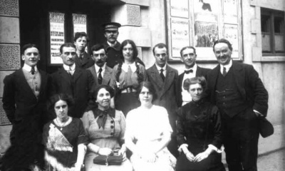
Percival Duncan
TECHNICAL: The lighting in both images is natural lighting, they are both taken outside and have the natural shadows forming due to the sunlight. Both images above are positioned and located in a particular way to make the subject’s look more appealing in the images. Michelle Sank tends to use a higher aperture, where the images come out brighter, whereas Dunham may have used a lower aperture, however time differences must be taken into account as approximately 100 years sits between these images and the camera quality is far different. Dunham most probably would’ve had a lower shutter speed due to the model of camera however I can image Sank used a fast shutter speed.
VISUAL: Both artist’s seem to create environmental portraits, and similarly, they also seem to take some candid images also. The colour of the artist’s images are also very clearly different, this again, would be due to the time difference. As you can see Sank’s images are in colour whereas Dunham’s images are in black and white. Sank’s tone is also a lot more brighter than Dunham’s, however you can also get the odd bright image from Dunham due to the natural, bright lighting.
The overall idea and technique by both artists is similar. Both use environmental portraits and sometimes candid images to capture life in Jersey and to capture certain influences such as our location and history. The background has just as much influence as the subject does in their images.