Tone= The range of lightest to darkest parts of an image as a whole or the particular area in an image.
Jerry Reed
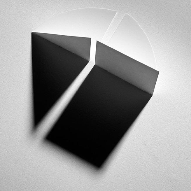
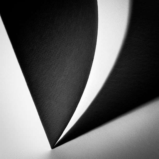
Jerry Reed is an English, abstract photographer, predominantly known for his three-year project titled ‘Paper Work’. In his project, Reed explores light and tone, focusing on the heavy contrast caused by shadows, resulting in a bold, two-toned effect in his images.
The series is based on paper sculptures carefully designed and created by Reed, which explore the spatial relationships between the architectural forms he’s created. Many of his projects began conceptually, “like Sol LeWitt” he states.
LeWitt was an American artist who helped to establish Conceptualism and Minimalism in the postwar era. LeWitt’s work presents geometric shapes, a clear element within Reed’s pieces.
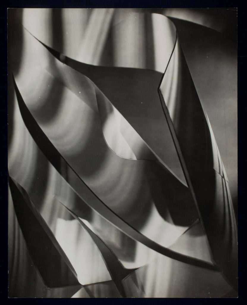
Reed directly cites both Rössler and Bruguière as heavy influences towards his work. His work can be described as objective and analytic, possibly reflecting his past career as a scientist.
The work Reed presents is majorly conceptual. He believes his work ‘speaks indirectly, but with continued caring about how society’s institutions affect its members.’. The effect of light within his ‘Paper Work’ series clearly reflects this. He incorporates the imaginative use of Fresnel lighting (usually found in theatres) to provide a powerful and linear light source to illuminate certain parts of his structures and completely blackout others.
Photo Analysis
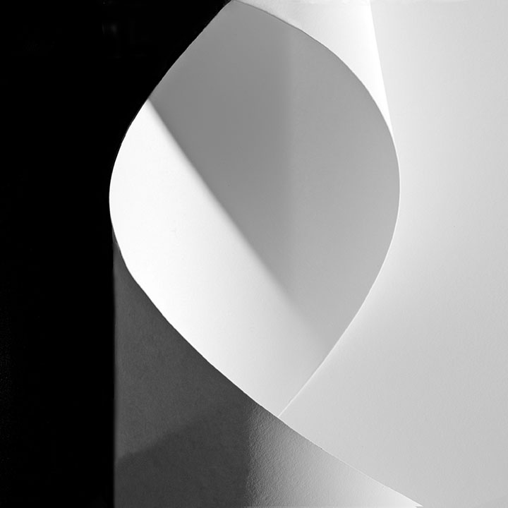
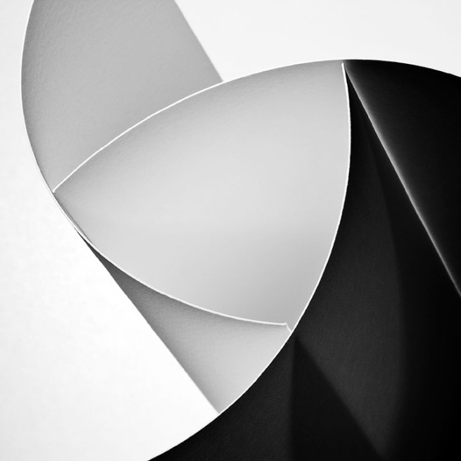
The lighting within the image is artificial, possibly taken in a studio. A strong source of light illuminates the right side of the paper, creating dark, heavy shadows as the paper blocks the light from travelling any further.
Reed incorporates line and tone within the photo. The curve of the paper creates curved, overlapping lines guide the eye around the centre of the image. Soft shadows form an almost parallel line with the curve of the paper.
His image has a low tonal range (three or four main tones) which creates a highly contrasting image. The lightest tones are in the centre of the image and to the right. The light tones take up the majority of the image, possibly inferring the power of societal institutions over its members. The darkest tones are apparent in the shadows behind the paper (pictured to the left), continuing with the allegory of society it may represent how people’s individuality is ‘overshadowed’ by these institutions or societal norms, influencing the behaviour of individuals away from how they might usually act.
The subject of the image itself (white paper pictured centre) splits the image into thirds. Negative space on the left and right third of the image creates a strong contrast in the image. Sharp corners in the paper subject make the shapes within the image almost geometrical, yet the lack of straight lines (the curve of the paper) creates more organic shapes, which juxtapose the sharpness of the angles created by overlapping paper.

