
Here I will be evaluating my final portraiture images. These are my favourite images taken from across the whole portrait project, and I believe they showcase my work the best.
ENVIRONMENTAL PORTRAITS-
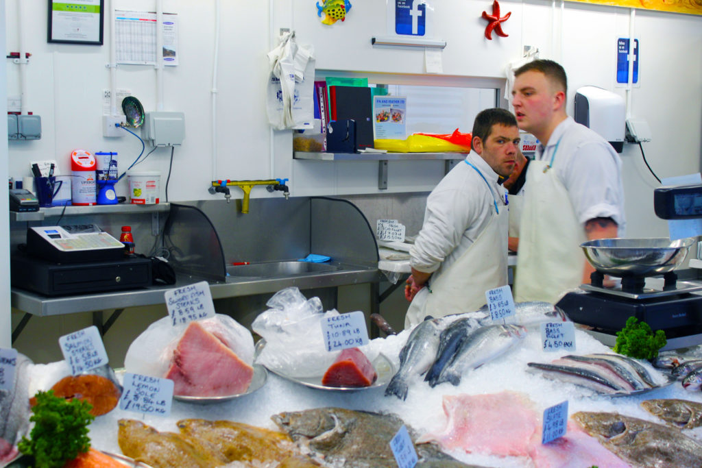
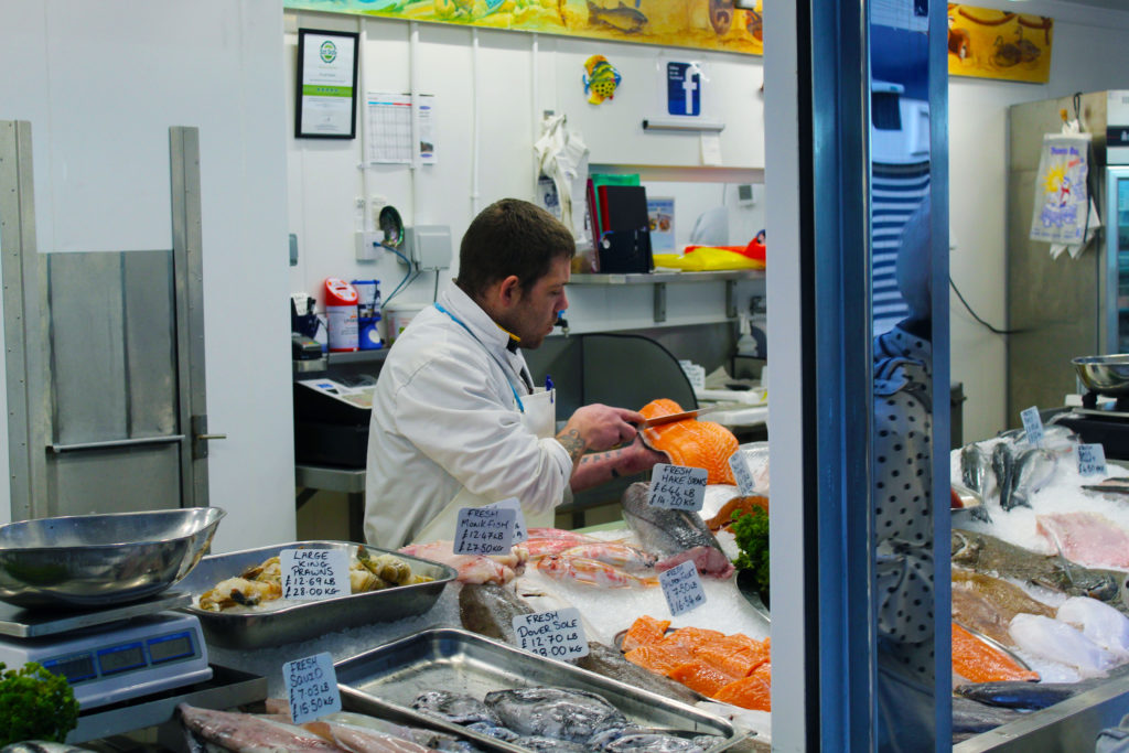
I chose this set of images because I really like the way the individual colours pop out against the clinical white background. I achieved this through adjusting the vibrancy settings and increasing specific colour saturation individually. I especially like the composition of the top image, as I feel that it complies with the rule of thirds and the main subject of the image, the fishmonger, staring directly into the camera gives it a sense of depth.
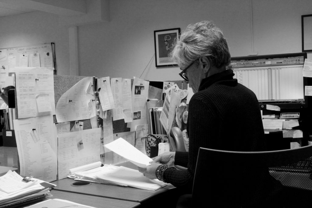
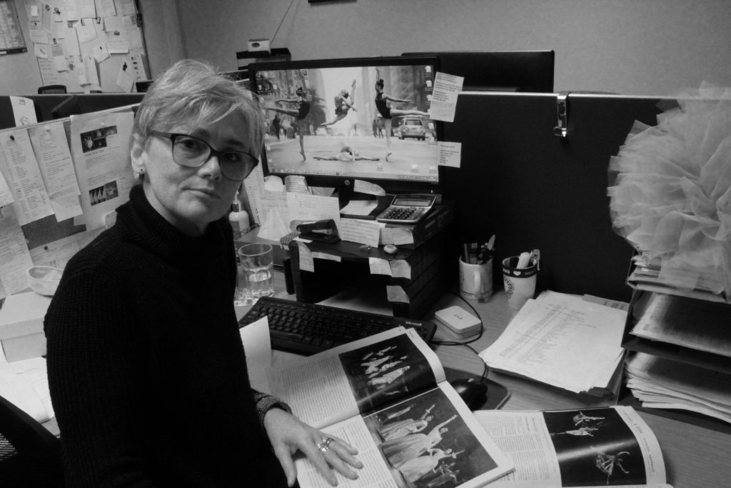
I also like these two images because of the details in the background, for example the portrait of the dancer mid-jump in the first image and the magazines and tutu in the second image. This adds some context to the image and helps the viewer to understand the environment more, seeing as many places of work nowadays are in office environments and so the little details add clarity and make the image far more interesting. When editing this I made use of the levels adjustment in Photoshop, which helped to add a wider tonal range between the black and white in the image.
If I were to do this project again, I would try with different angles and more interesting compositions to make the images themselves more interesting, maybe from a high or low angle instead of just straight on, or perhaps experimenting with foreground and background visibility in certain shots.
IDENTITY PORTRAIT PROJECT-
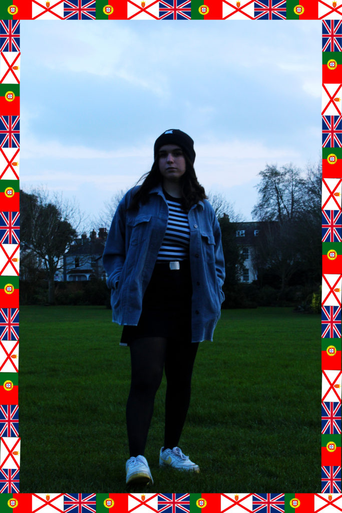
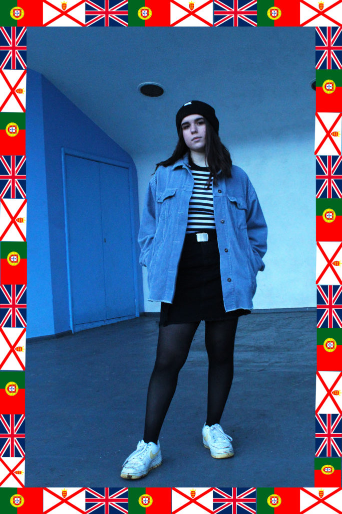
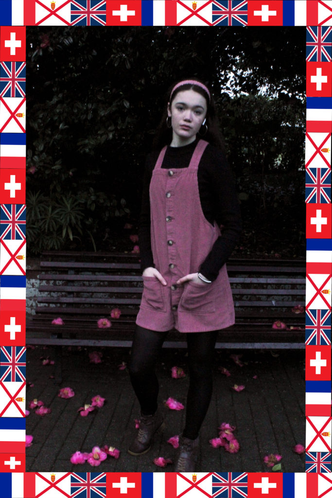
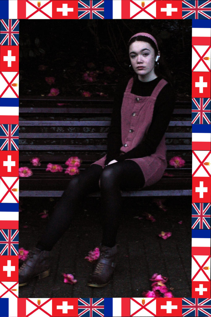
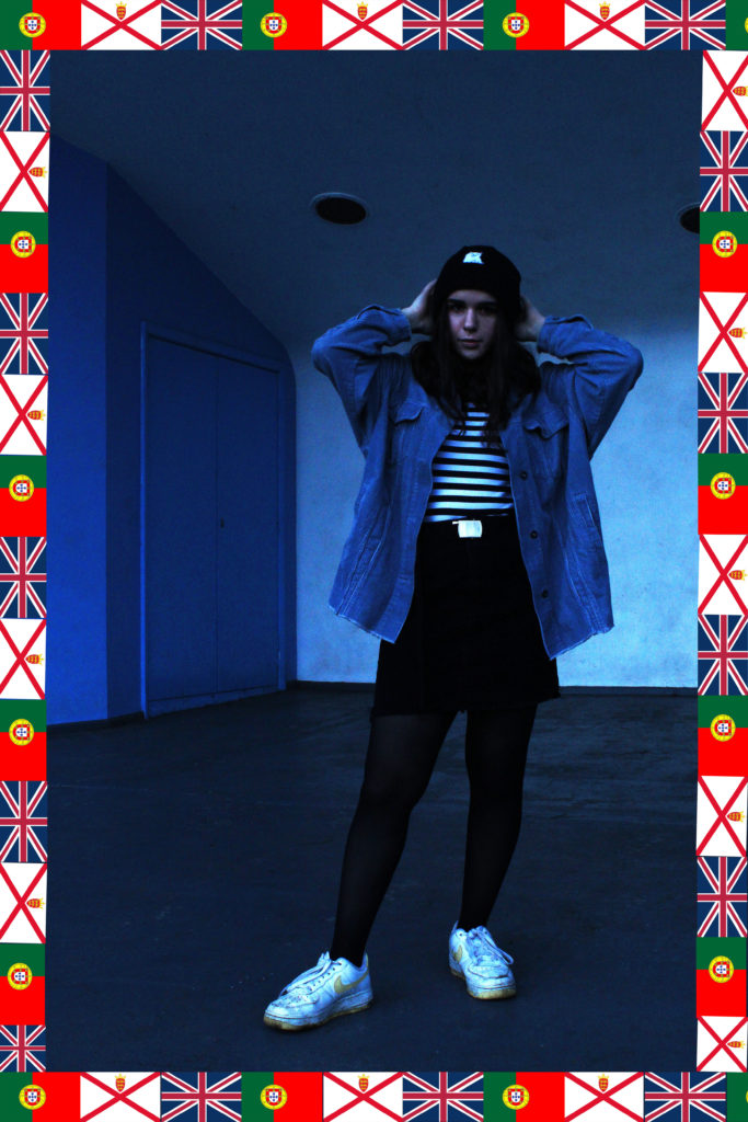
I prefer the blue images in this set, however they both have positive aspects. I planned this shoot quite meticulously, so the subjects’ outfits each compliment the backgrounds, so each image has a colour palette, which makes the whole thing cohesive and easy on the eye. I also was inspired by the work of Hassan Hajjaj and so added a frame/border around each image, however I decided to tie this into the theme of identity more and make them flags depicting each of the subjects’ nationalities.
If I were to redo this component, I would probably attempt to reduce the grain in the images, and maybe continue with the colour-palette theme and take some more images of people in monochrome outfits in a background that reflects that colour.
STREET PHOTOGRAPHY-
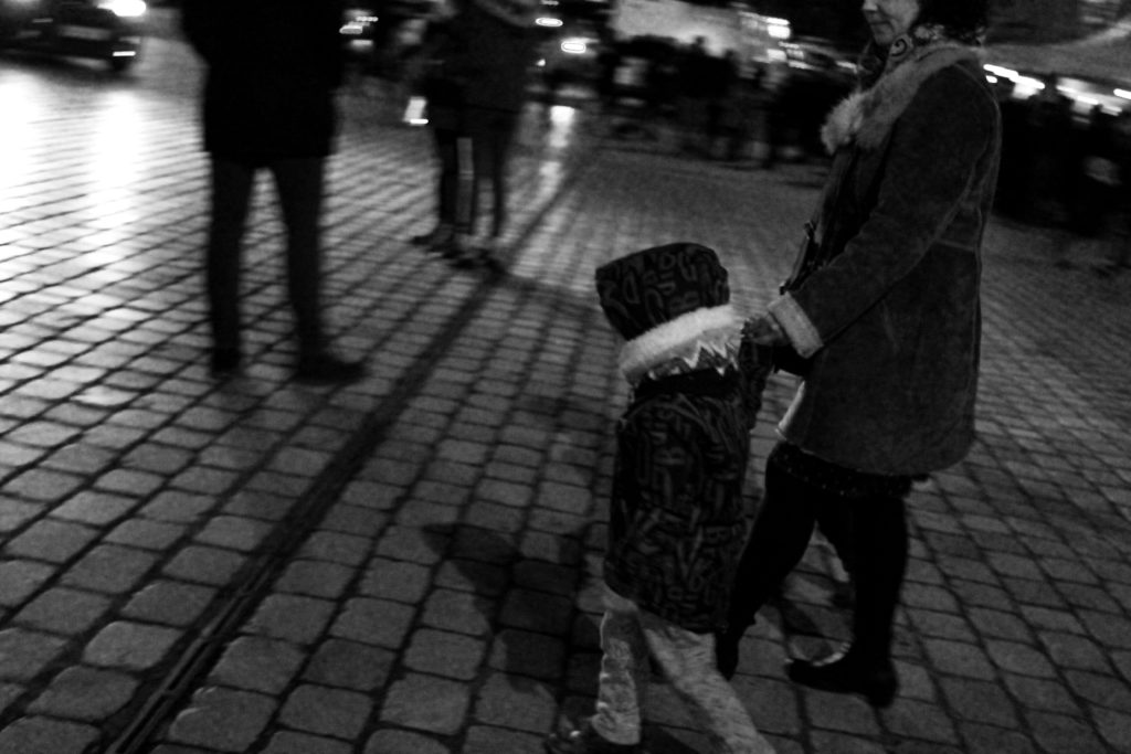
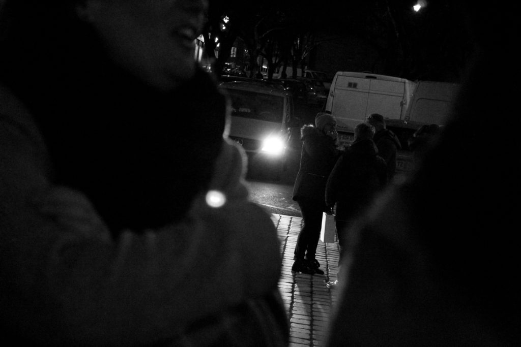
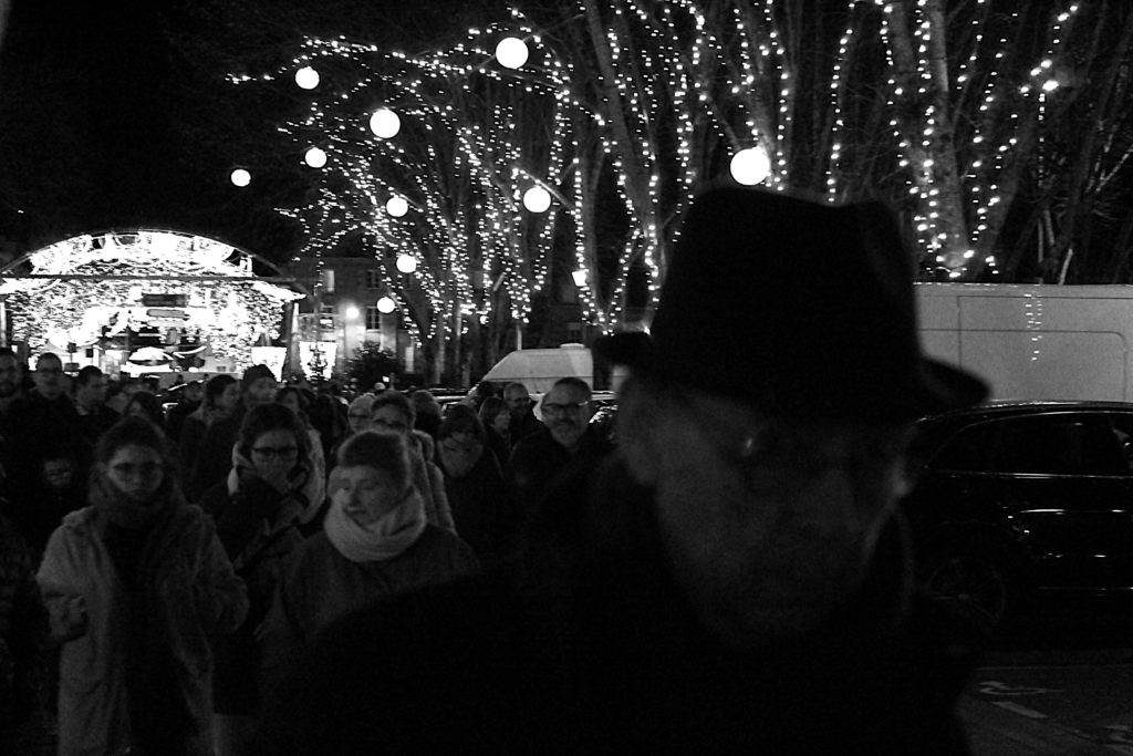
I find these images all very intriguing in their own right, as they all have this continued tone of intrusion on the behalf of the viewer, especially the third photograph. The old man in the foreground looking directly into the camera adds a sense of unease, and him being blurry and out of focus adds to this, as well as creates a sense of movement/motion. The first image also has a strong sense of movement, or a singular moment captured in time, which was my main focus throughout the street photography section. I decided to make these images black and white to focus more on the subjects and their expressions instead of their environments, and also to emulate the style of Henri Cartier-Bresson, who was the artist I studied beforehand as inspiration.
If I were to do this section again, I would like to have taken more interesting images like these, as I had a lot of photographs that weren’t good enough, even though this is difficult due to the candid nature of street photography. Even though I was outside taking pictures for several hours, I could make have done with another shoot to ensure that I had multiple images that were up to standard.
TABLEAU VIVANT-
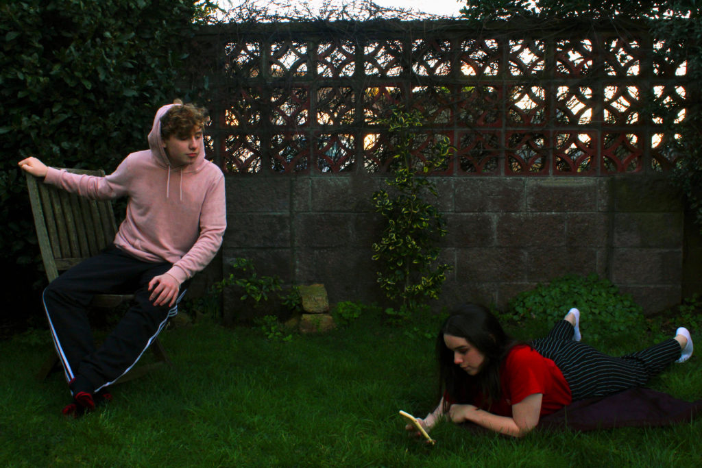
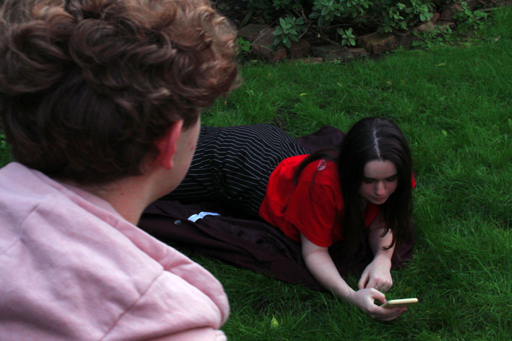
I modeled these images off a painting by John William Waterhouse, depicting the Greek myth of Echo and Narcissus, however I gender swapped it and replaced the traditional pool with a phone to modernise it further. I believe I was successful with these images, and I spent some time on Photoshop in order to make the colour palette of the image resemble that of the painting.
If I were to redo this part of portraiture, I would probably try and find a more interesting location to shoot in, more accurate to the original painting, and attempt to find some better lighting, so that the final image has an altogether lighter and brighter tone to it.
STUDIO PORTRAITS-
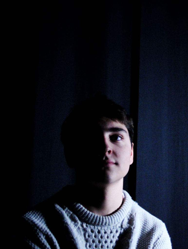
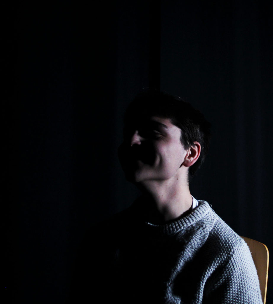
These images were taken in the chiaroscuro style, obscuring half of the face in shadow, and I feel that they were well executed in that respect. To improve, I could have tried to make the background completely black, and possibly also have more successful images.
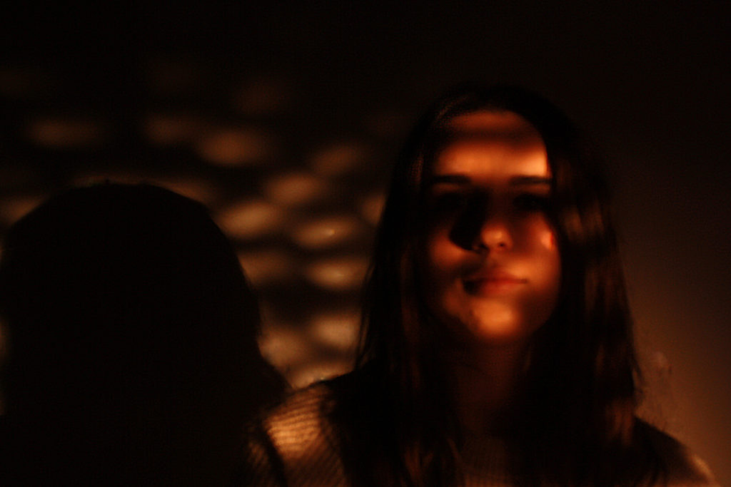
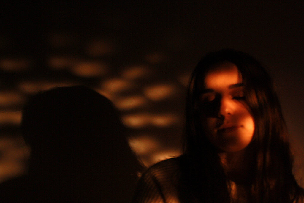
I like these images as they have somewhat religious undertones, mirroring stained glass windows in cathedrals. Improving this section would involve making sure the images are all in focus, as well as possibly experimenting with different colours.
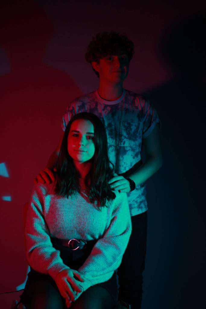
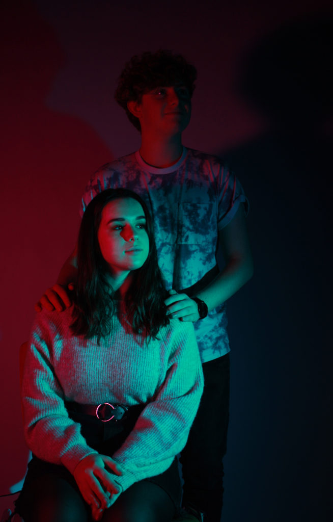
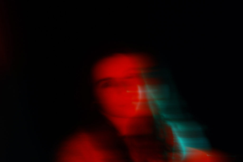
I like these images because they make good use of the colour, adding depth and interest to the people featured. The colours themselves are contrasting, which is a good aspect of the set of images.
If I were to do this shoot again, I would experiment with different varieties of contrasting colours, using the colour wheel for inspiration, ending up with a wider range of colour images.