Below are my final portraiture images. I have chosen this images due to them being interesting and showing my skill, which i have developed during the portraiture project.
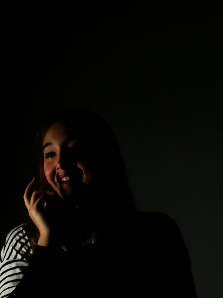
final image one

I have chosen this image for one of my finals as it is a strong image in terms of composition and aesthetics, as there is negative space that draws more attention to the individual. The pose the individual did is also effective, as it allows for shadows to be cast on the face and a more interesting pose than a simple straight on shot. The contrast between the light and dark is also very powerful too. This element was captured by placing a continuous light on individuals face, which only illuminated parts of it, to create strong shadows and bright lights. If I were to take this photograph again, I would try to position the light in a way that would mean that the backdrop was not illuminated as much, as it is a little distracting. Having a darker backdrop would also allow there to be a stronger negative space to draw more eyes towards the individuals face.
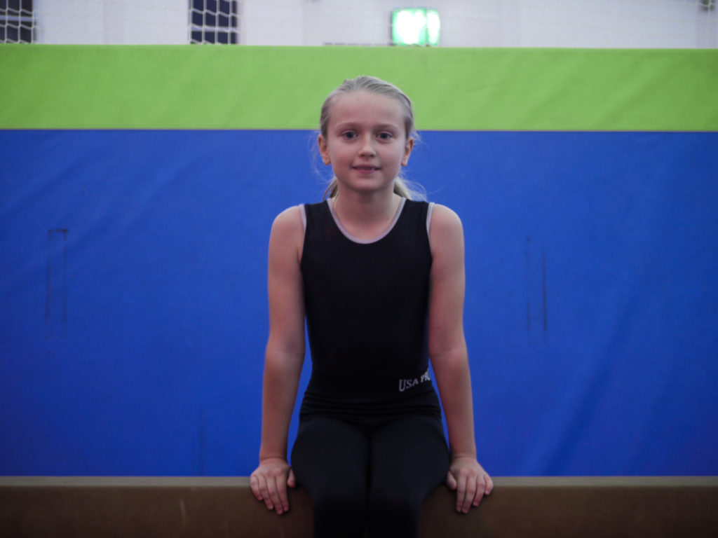
final image two

I have chosen this image to be one of my final images because i enjoy the simplicity of the image, which makes it look like a strong image. The horizontal lines along the image add to the overall look of the image and aesthetics. If i were to take this photograph again I would try to get more of the legs in the image to gain more of a full body shot, as i think it would be more interesting for the viewer. This is because at the moment the photograph cuts off at a strange place and looks odd.
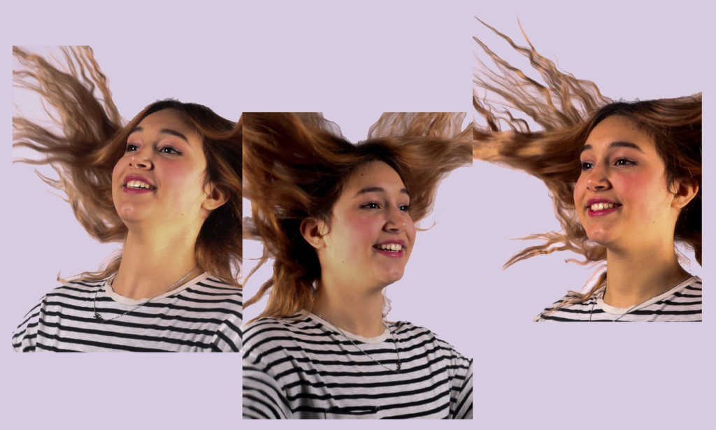
final image three

I have chosen this image to be one of my finals as it is creative and includes more than one image doing the same activity. By lining up the photographs in a way to look like they are joined in a way, came to me on the spot, as I liked these images but found they were very similar. However by placing them into Photoshop and playing around with the position of the images, this idea was created. The background colour adds to the creativeness of the image and how fun it is, even though it is only a light colour. I made it a pastel colour so it would not distract from the images. If I were to create this image again, I would try to take the photographs from straight on, so that the hair could flow and connect in a more realistic way.
final image four

This is one of my final images because it clearly shows how peoples identities are comprised of different elements that make the person who they are. By placing them on one sheet makes the images look more effective than displaying them separately. This is because on their own, the images have no story or link to anything. If i were to make this piece again i would try to get more images as the more images the more i could portray my point of how identity is made up of lots of elements.
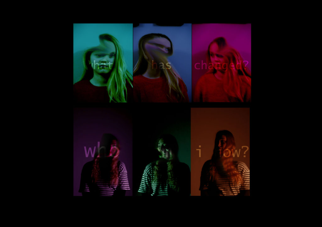
final image seven

This is one of my final images because it captures and shows the theme of lack of identity. The colours work together well and are eyecatching too, which will draw in viewers. The captions are subtle but do still hold the same power and share the same message as to if there were bold. If they were bold it would distract from the images below them, which would mean that the aestethics and overall look of the image would be lost. The image shows how people change and will lose their identity throughout this process, and this can clearly be seen where the faces have been smudged and the images arent in focus. If i were to make this image again I would try to blur the faces more, as then it would show how the people have been changed. I could also progressively blur the faces to show a change the images, to portray the notion of identity changes.
virtual gallery

