
1ST SHOOT-
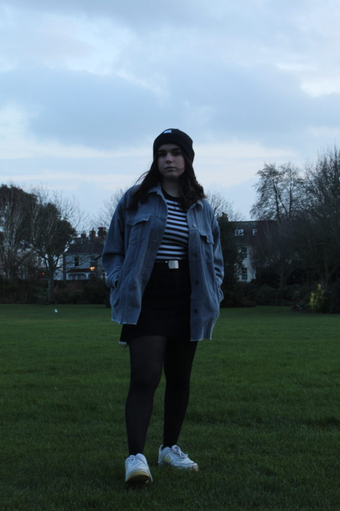
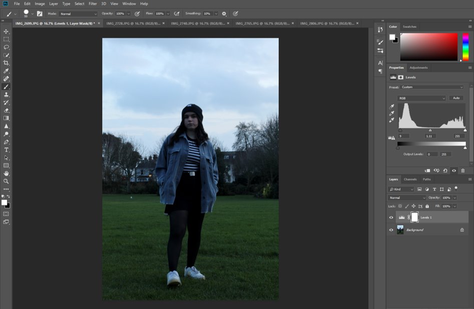
First, I edited the levels of black and white in the image to increase the contrast and bring more attention to the stripes in the subject’s top and deepen the black of the rest of her clothes.
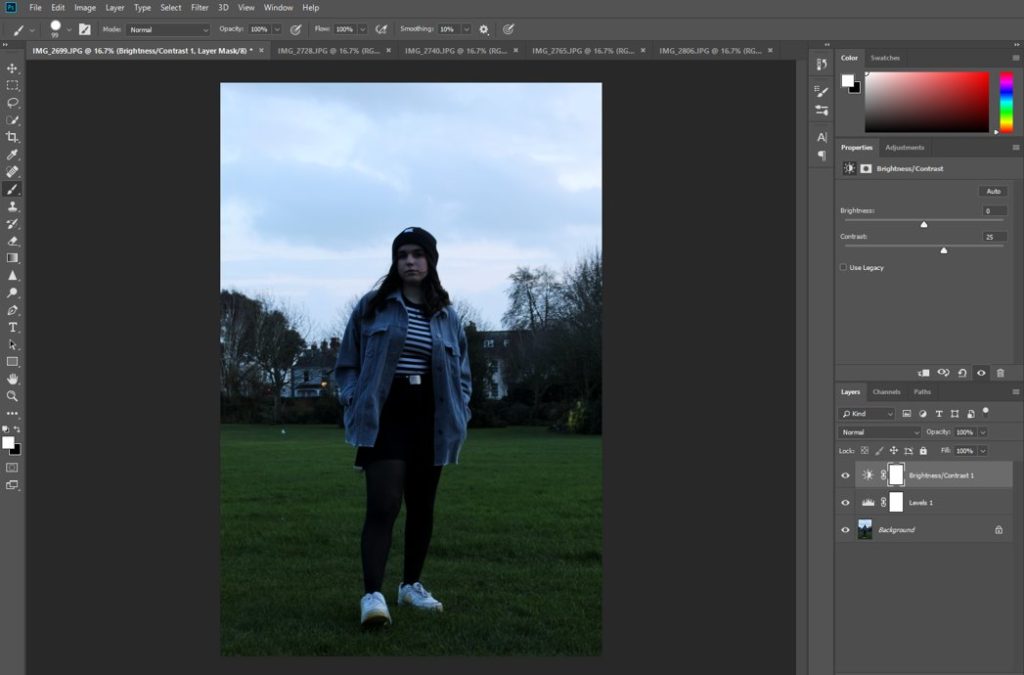
Then I changed the brightness and contrast in the ‘Adjustments’ tab in order to reduce how overpoweringly bright the overcast sky in the background was, to make the person the main focal point of the image.
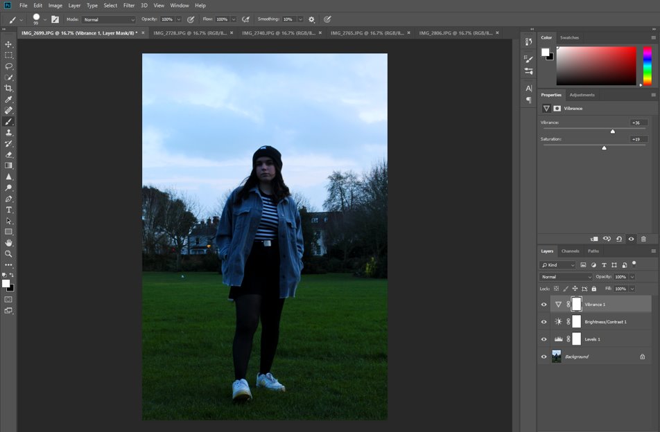
I then adjusted the vibrancy and saturation levels to make the colours of her clothing stand out more, and also the colours of the background, such as the green grass.
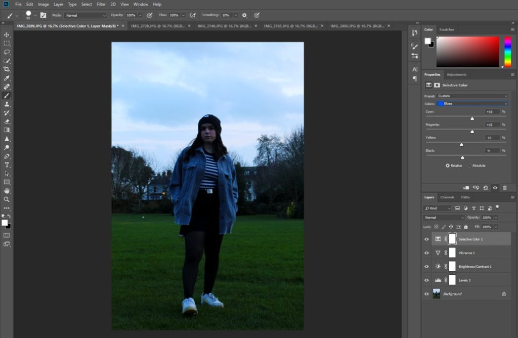
I went into the ‘Selective Colour’ tab and made the blue in her jacket much more saturated and vibrant, which also had the effect of bringing out the blue in the sky in the background.
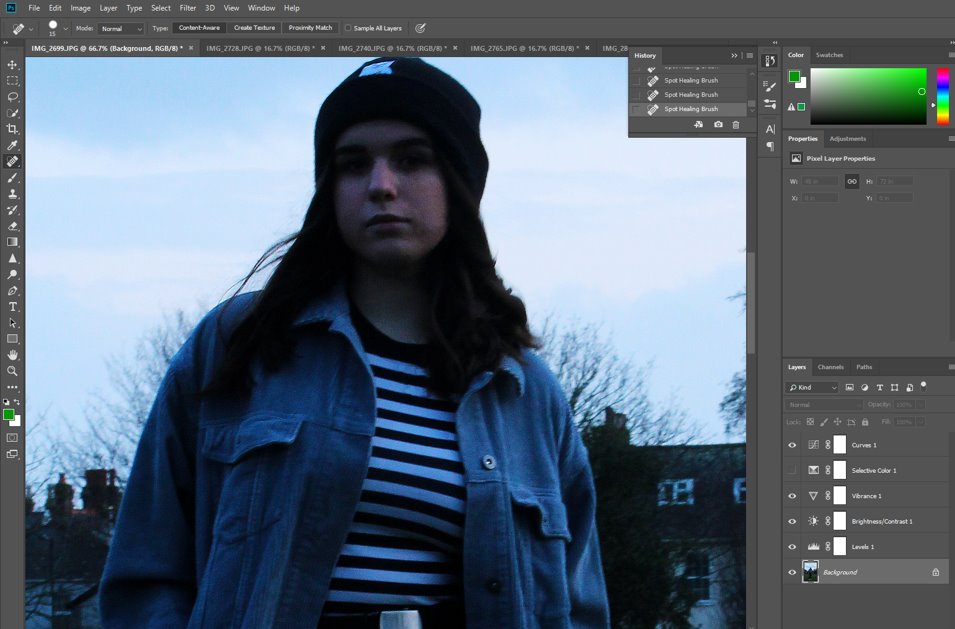
I used the ‘Spot Healing’ tool to edit out any imperfections in the subjects, as well as any stray hairs and loose threads on her clothing, and distracting leaves or patches on the grass, to make the whole image cohesive and keep the person as the main focal point.
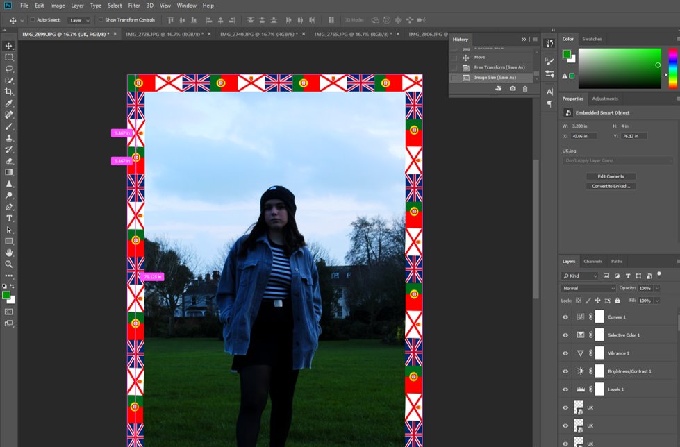
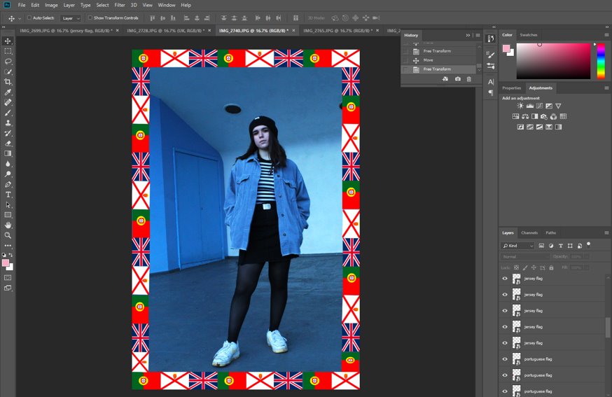
I then added some JPGs of the flag of her nationalities around the edge of the image, resizing them so that they are all the same and keeping them in a repeated pattern, like Hassan Hajjaj does.
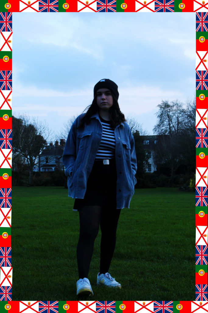
I quite like how the subject’s foot is pointing forwards and is more in the foreground of the image as it draws the onlooker’s eye into her. I also like how the blue in her jacket is reflected in the sky and contrasted by the grass, but how the black and white adds some contrast and stops the image from being entirely a clash of colours, reflecting her own personal style as well.
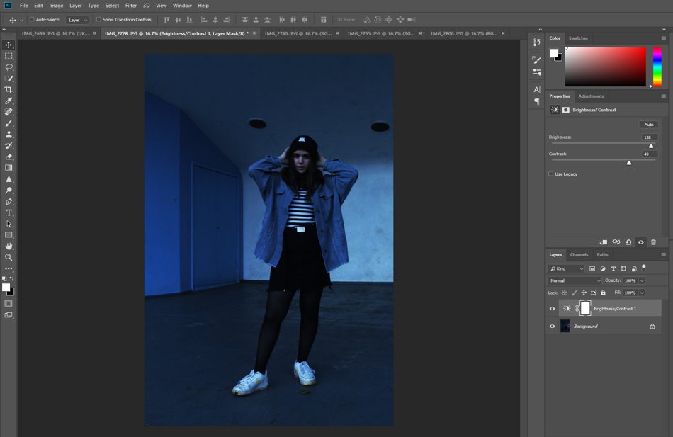
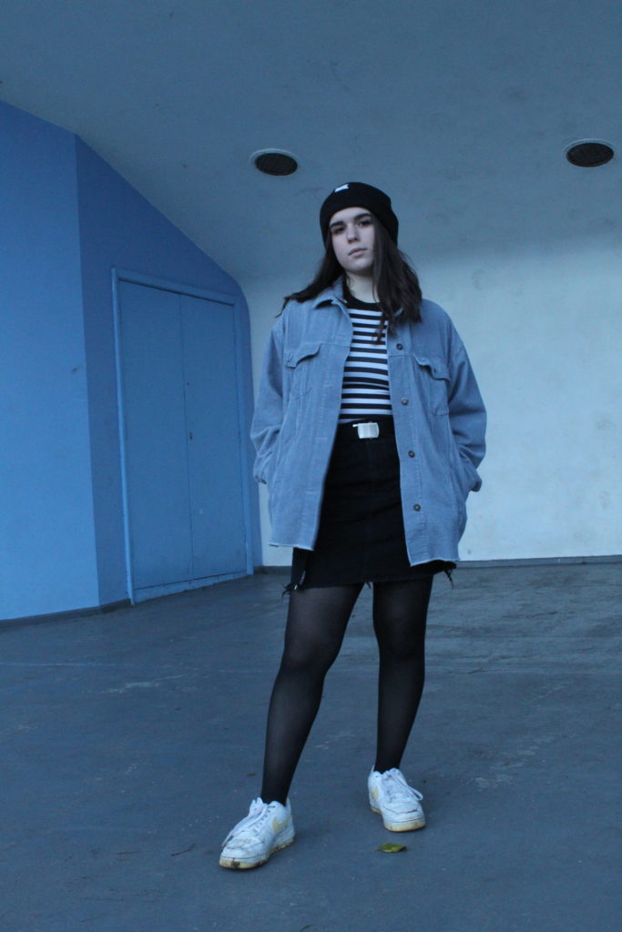
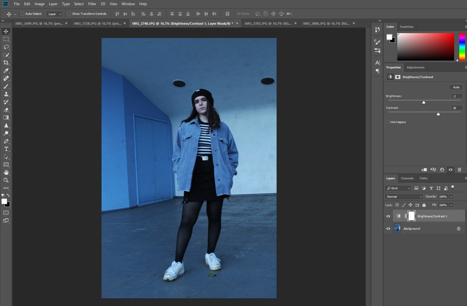
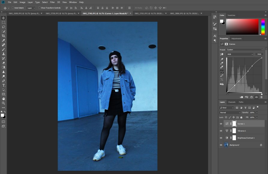
To begin with I increased the brightness of the image as it was a little dark.

Then I adjusted the levels to increase the contrast of the black and white of her whole outfit and make the image more cohesive. At this point I also went in with the spot healing tool and removed any marks in the wall and door behind her, as well as loose hairs, threads or stray leaves that may distract they eye from her.
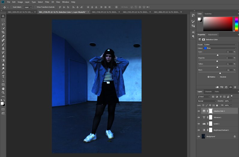
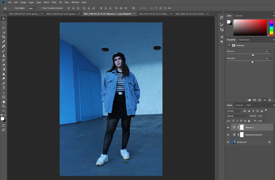
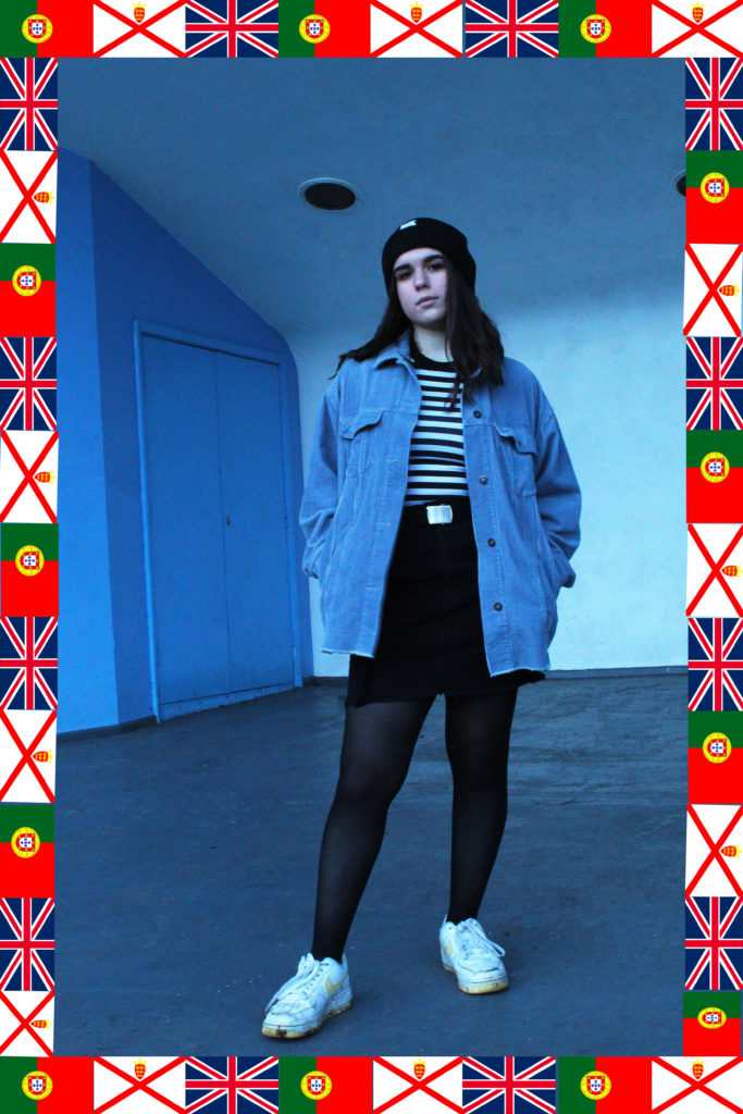
I then went into the ‘Selective Colour’ tab in ‘Adjustments’ to increase the blue, as I positioned her purposely in front of the white wall adjacent to the blue one in order to provide some contrast and mirroring of the two colours, as this whole image has the same colour palette, being almost entirely comprised of black, white and blue.
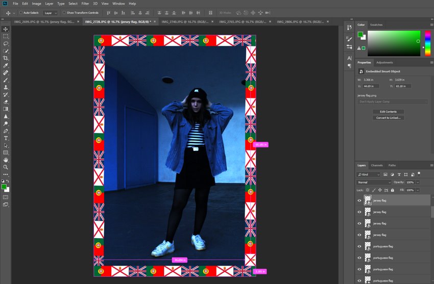
I then repeated what I did before with the flags to create the same border around this image as well.
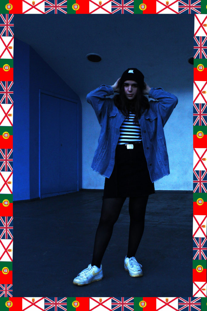
I really like this image as her position against the white wall helped to highlight her outfit (and personality as a result), and the blue tint of the whole image stands out nicely.
I increased the brightness of this image as well, as it was also a little too dark, as well as using the spot healing tool on my subject’s face slightly.
Here I used the ‘Vibrancy and Saturation’ sliders to make the blue wall and jacket more colourful and add a cooler tint to the whole image.
Here I used the spot healing tool to remove any stray leaves, threads or marks in the wall and floor to make the image more cohesive. I also used ‘Curves’ in order to balance out the white and black contrast and make the image look better.
I repeated the same process as before to create this border of flags once again.
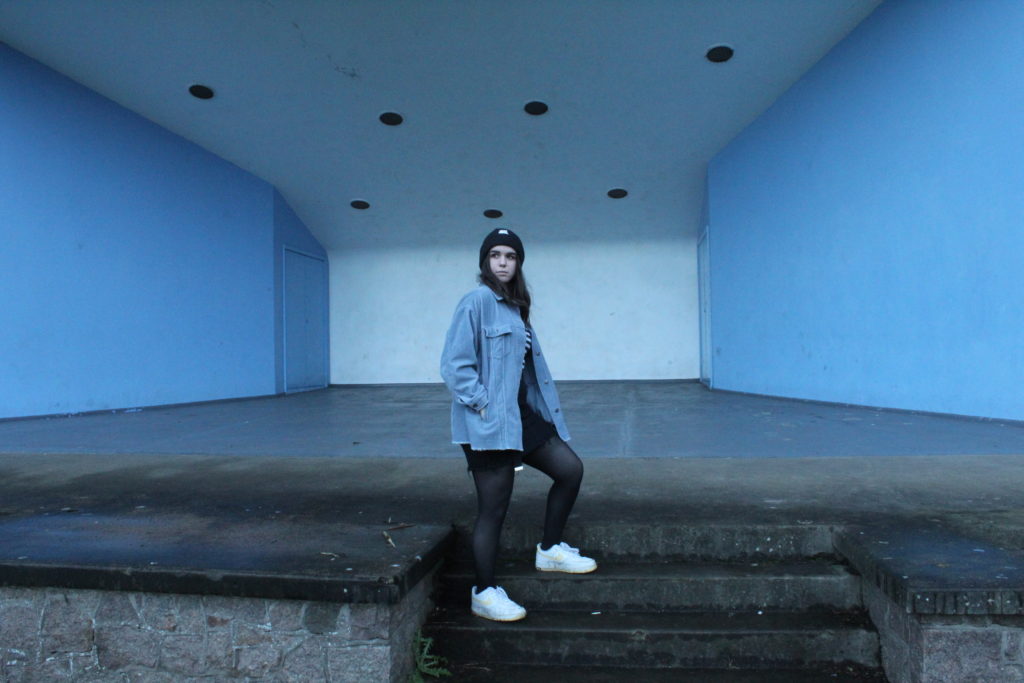
This image was taken from a slight canted angle, which I quite like, as it adds a dramatic tone and slightly dynamic feel to the whole photo. I also like the contrast between the black and white strips and the rest of the outfit (and background as well). Her position and expression is also note-worthy because it has a feeling of power, as the image was taken from below and she is on a stage, and her head tilt suggests that she is comfortable in her environment as it is her home.
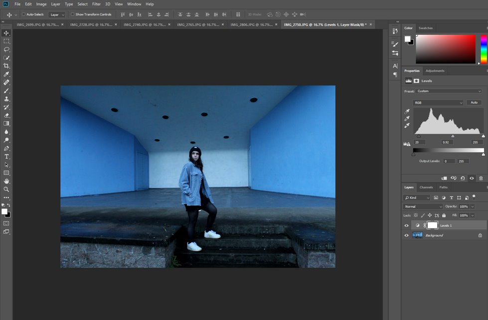
Firstly, I changed the contrast and brightness using levels to make the subject the main focal point of the image.
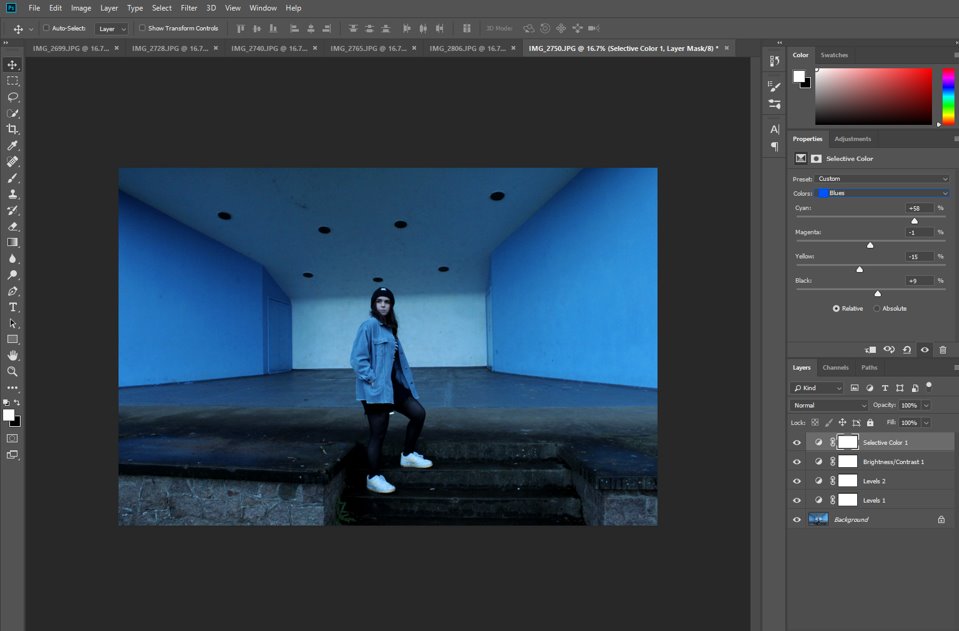
Then I adjusted the blue shades in the photo using the ‘Selective Colour’ tab in ‘Adjustments’ to increase that colour tone over the whole image and emphasise her jacket and how the blue walls behind her mirror her outfit.
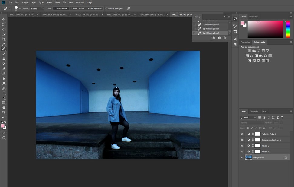
Then I also used the spot healing tool to remove any loose threads, hairs, marks on the floors and walls and the dirt on her shoes.
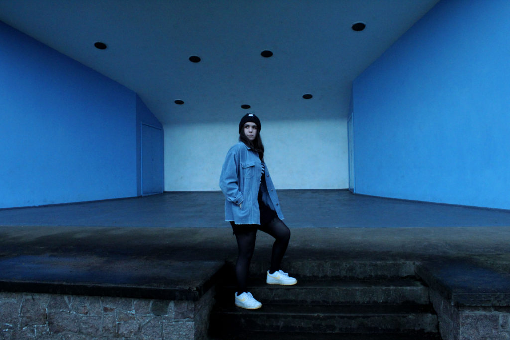
I really like this final image as she is positioned in front of the white wall, which adds relief to her blue jacket, which is also reflected in the blue walls on either side of her. Her position, with her leg one step higher than another, adds a more dynamic tone to the image and makes it less stiff or posed, as does her head being tilted slightly to the side.
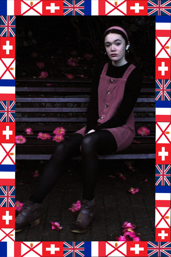
2ND SHOOT-
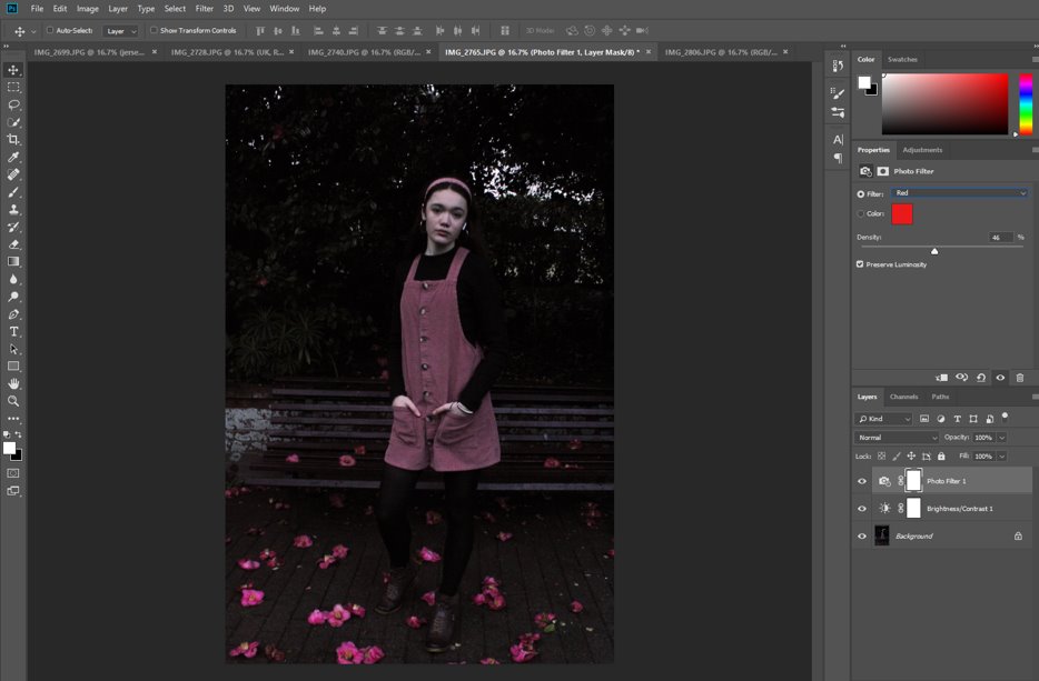
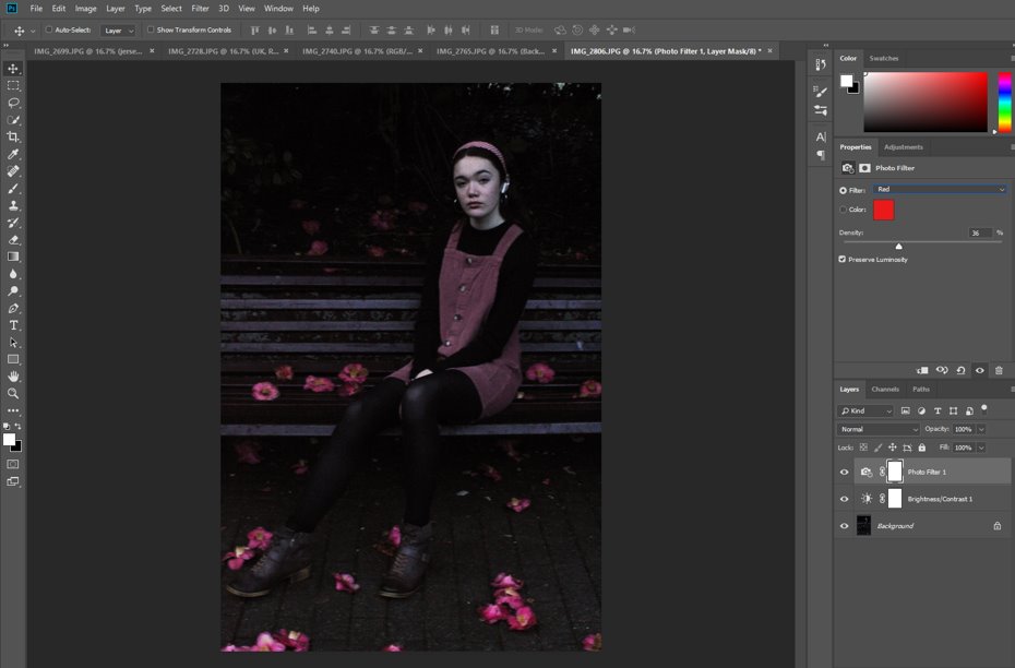
Firstly I added a red filter to the image to bring out the colour of my dress and the flowers on the floor, I took this image here for the specific reason of the flowers, as they mirror the colour of my dress and make the image cohesive and carefully considered, not just random.
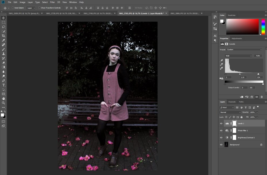
Then I adjusted the black and white levels to bring the image back to more of its natural colour, as the red filter has distorted the colours of the background a little. This also had the effect of adding contrast throughout.
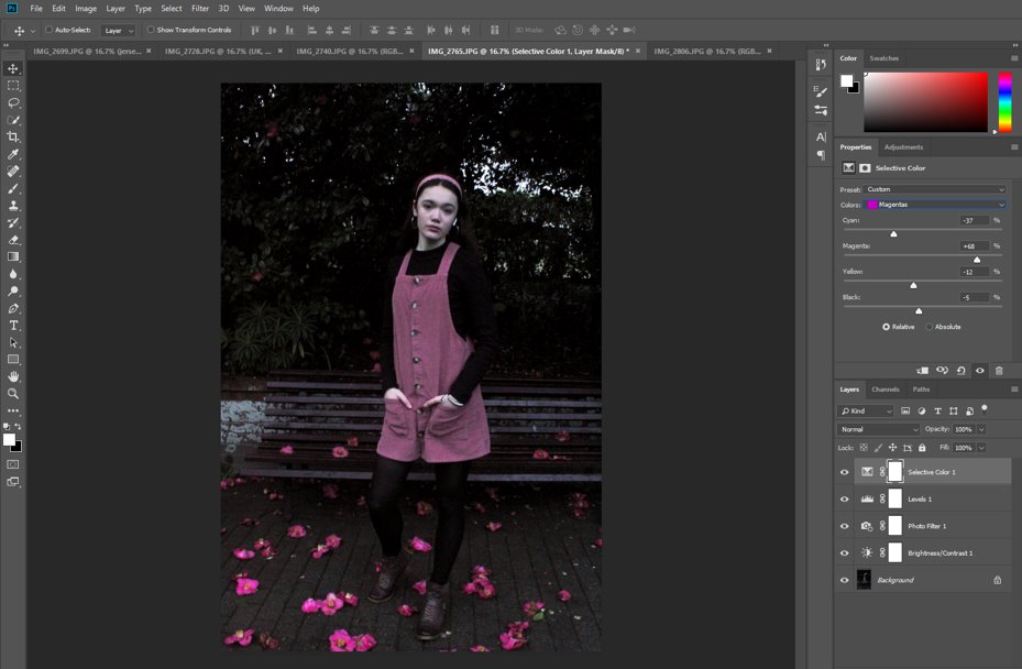
Then I went further and readjusted the magenta tones of the image in the ‘Selective Colour’ tab to make the dress and flowers stand out even more.
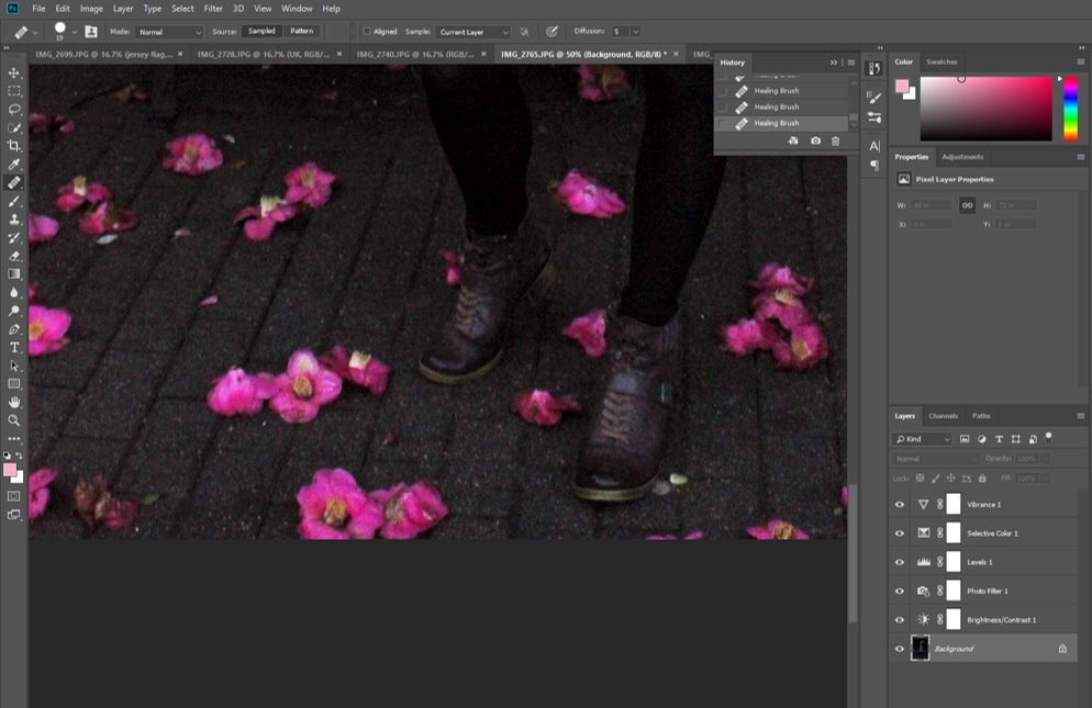
I used the ‘Spot Healing’ tool to fix some of the blemishes on my face and shoes, as well as the flowers, some of which were a little damaged, so I fixed them, and I filled in some of the patches in the bush behind me as well.
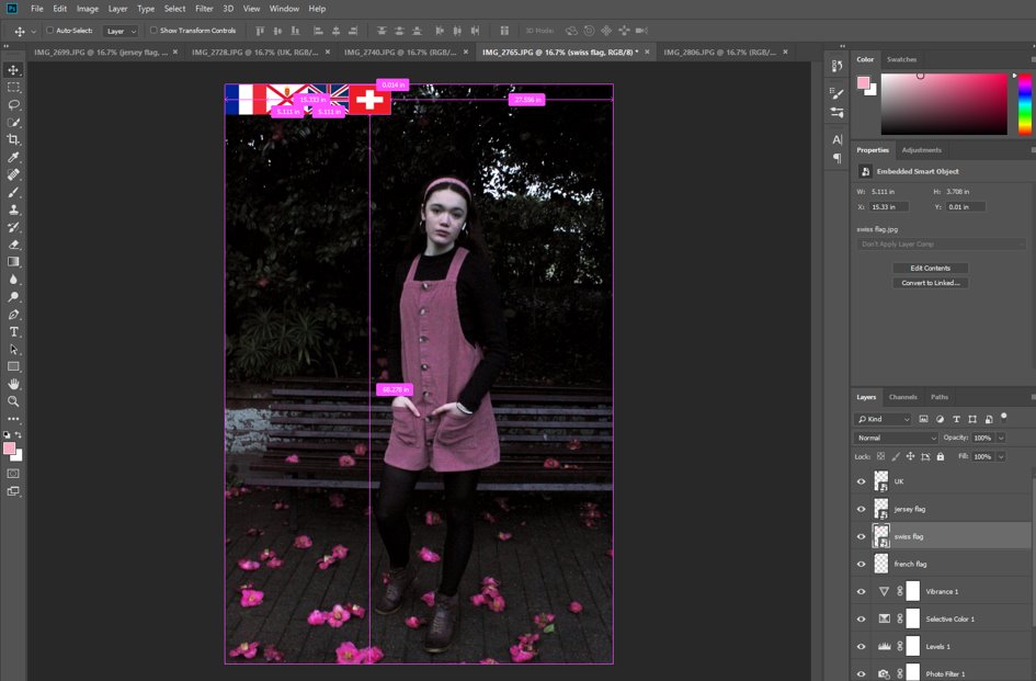
Then I added in different flags, all of the same sizes, of my own nationalities and cultural background, to recreate Hassan Hajjaj’s style and keep with the same ideas throughout these shoots.
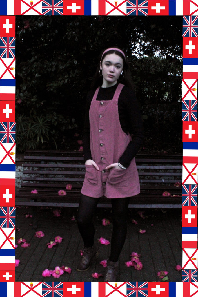
I liked how all the flags have the same colour scheme and how the red in all of the flags brings out the pink dress, flowers and headband even more, as well as how my position looks casual and not overly posed, as in Hassan Hajjaj’s work and Diana Markosian’s as well.
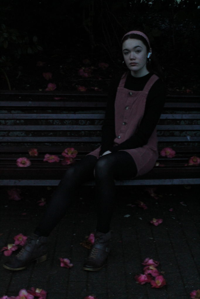
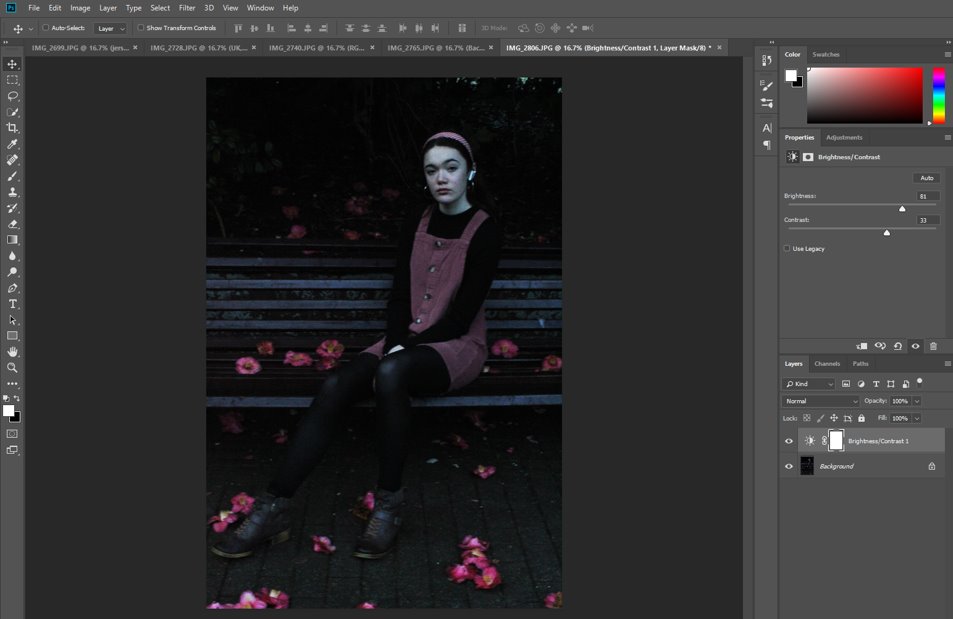
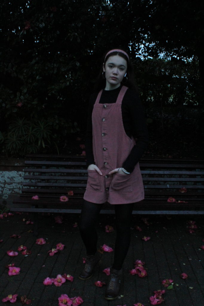
Initially, I increased the brightness of this image as, due to the time of day, the natural light available was reducing.
Then, I added another red filter to increase the colour saturation of the dress, flowers and my headband also.
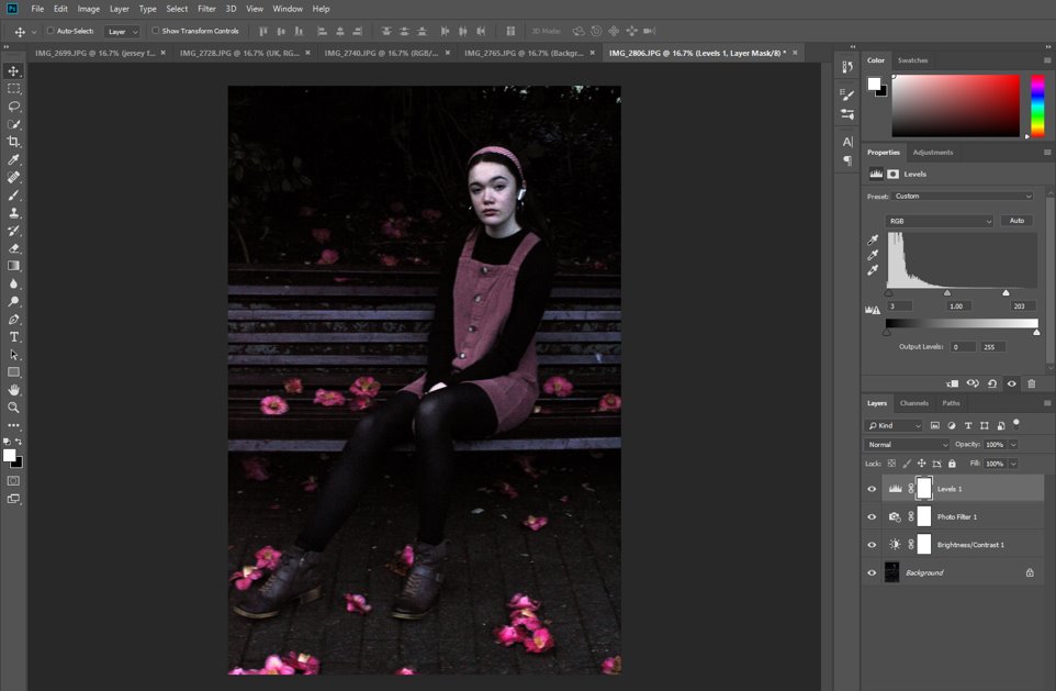
I used the Levels tab to manage the contrast in the image. I also used the spot healing tool at this point to fix any damaged flowers, blemishes, and unnecessary leaves on the floor which distracted from the main focal point of the image.
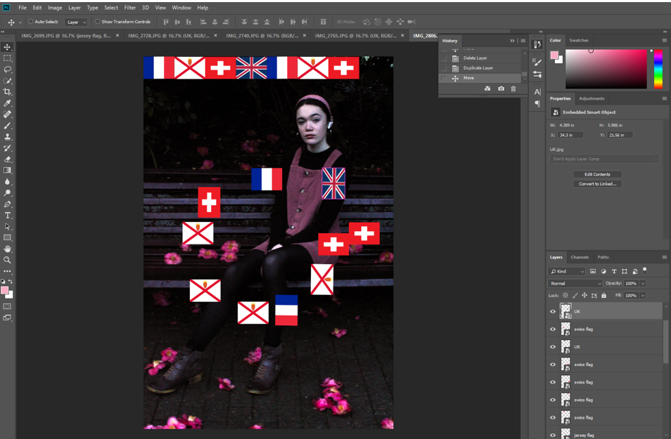
Then I repeated the previous process and added in a border of flags, keeping them them neat and ordered.
I really like this image as I feel that it is cohesive and the colour tones are well managed, the background well chosen and that my position, with a single leg drawn out further than the other, draws the eye in and adds a sense of foreground and background to the whole thing.